
The Texans yesterday became the latest NFL team to take advantage of the lifting of the one-shell rule, as they unveiled a new alternate red helmet. It will be worn for training camp workouts on July 30 and when the team wears its alternate red jerseys while hosting the Eagles on Nov. 3.
Annoyingly, the Texans didn’t provide any photos showing the new helmet with the red jersey. But the team apparently put a red helmet on a red-jerseyed mannequin last year. Here’s a side-by-side comparison of that mannequin with a game photo:
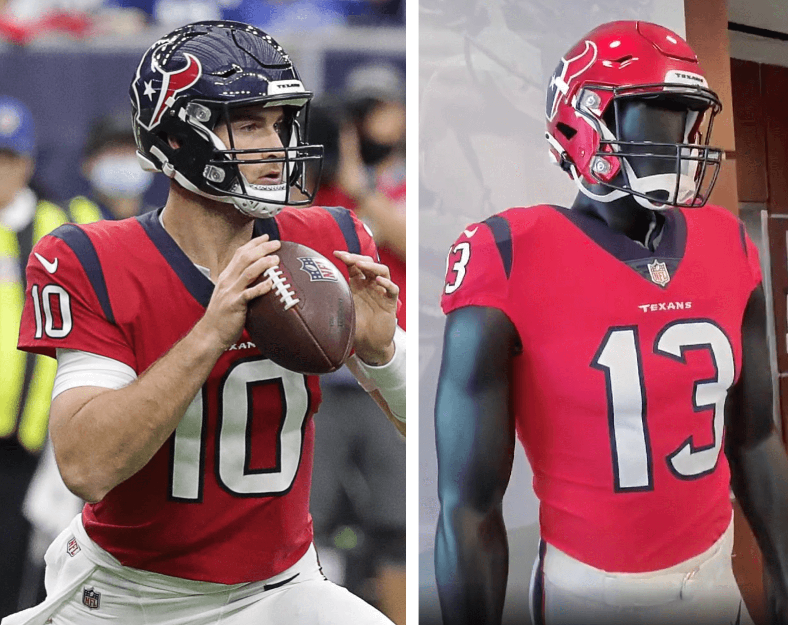
I guess the red helmet looks better for the red jersey, but I think the bigger issue is that this team needs a makeover. Maybe one day.
By my count, the Texans are the sixth team so far to add a second helmet color for 2022. The other five are the Eagles (black alternate), Falcons (red throwback), Patriots (white throwback), Saints (black alternate), and Commies (black alternate).
Meanwhile: The Texans weren’t the only NFL team making uni news yesterday. Kansas City released a new 50th-anniversary logo for their stadium:
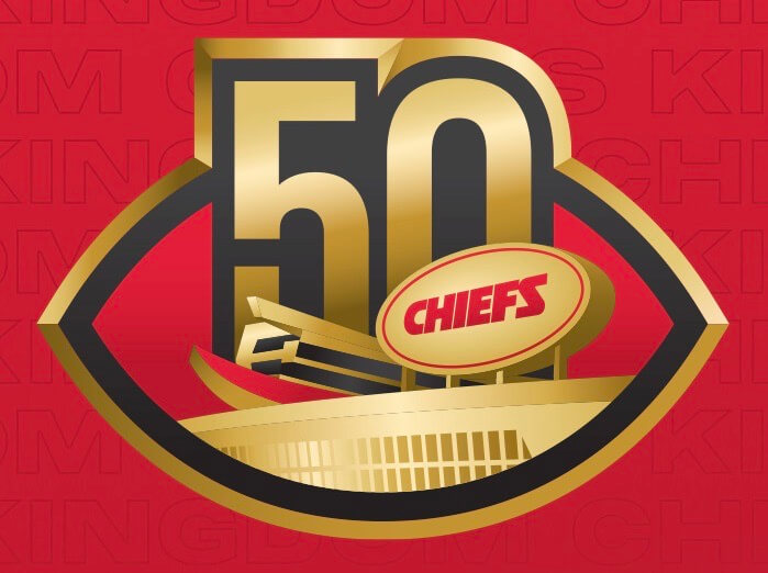
The team didn’t announce whether this logo will be worn on the uniforms, or if it will just be used for marketing purposes. A team spokesman tells me, however, that the logo will probably be worn as a rear-helmet decal, although he stressed that this isn’t yet a 100% certainty.
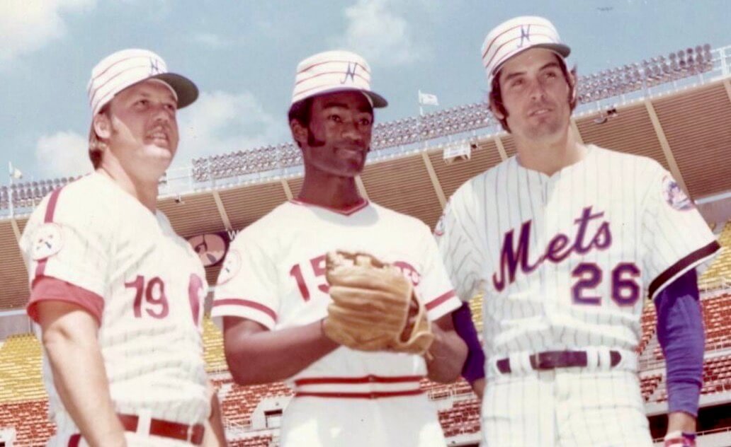
ITEM! New Bulletin column: With the MLB All-Star Game coming up next Tuesday, I’ve chosen my top 10 uni-related moments in MLB All-Star history (including the National League’s 1976 pillbox caps, shown above). Spoiler alert: Last year’s uniforms did not make the cut.
My Premium Subscribers can read the article here. If you haven’t yet subscribed, you can do that here (you’ll need a Facebook account in order to pay). Don’t have or want a Facebook account? Email me for workaround info. Thanks!
LAST CALL for the All-Star contest: The deadline to enter our latest design contest (to create MLB All-Star uniforms that don’t suck) is today. Full details here.

Membership update: A few more designs have been added to the membership card gallery, including Marc Mayntz’s card, shown at right. If Marc’s name sounds familiar, that’s because he’s the guy who designs all the “national flags” for MLB, NFL, NHL, and NBA teams. So naturally, he also created a flag design for his membership card. In Marc’s own words:
The design is what I hope to propose to our County Commission in the near future as a replacement for our current county flag in Brevard County, Fla. The four horizontal stripes represent the county’s four modes of transportation tfor people and cargo: black for space; sky blue for air; Atlantic blue for sea; and forest green for land. At the moment, Brevard County is the only place on Earth that can make this claim.
How cool is that? Love it!
Ordering a membership card is a good way to support Uni Watch, and fun to boot. And remember, a Uni Watch membership card entitles you to a 15% discount on any of the merchandise in the Uni Watch, Uni Rock, and Naming Wrongs shops. (If you’re an existing member and would like to have the discount code, email me and I’ll hook you up.)
As always, you can sign up for your own custom-designed card here, you can see all the cards we’ve designed so far here (now more than 3,300 of them!), and you can see how we produce the cards here.
The Ticker
By Lloyd Alaban

Baseball News: Orioles P Jordan Lyles had an upside-down 8 on his front jersey number last night (from John Fonte). … Stirrups for Guardians P James Karinchak last night (from @Rengetang). … Reader @MrLeitel saw a SS Derek Jeter commercial last night that featured a burgundy jersey with a “KC” logo similar to the Royals’ logo. Turns out that’s the jersey Jeter wore in high school for his alma mater, Kalamazoo Central in Michigan.

Football News: Newly acquired Panthers QB Baker Mayfield has acquired his preferred No. 6 from teammate Johnny Hekker (from our own Phil Hecken). … Here’s a look at the equipment staff of the CFL’s Montreal Alouettes putting the team’s new helmet together (from Ted Taylor).

Hockey News: Predators star Filip Forsberg signed a new deal with the team, so the Preds celebrated by putting a mustache on their logo. … The Premier Hockey Foundation announced a Montréal expansion team. When they redid their name and logo, they made French versions but hadn’t used them until now (from our own Jamie Rathjen).

Soccer News: Here’s a list of the new Premier League kits that have been revealed so far (from our own Phil Hecken). … New shirt for New Mexico United of the USL Championship. … New shirt for GD Chaves of Portugal (from Mike D.). … New home kit for FAS of El Salvador (from Ed Zelaski).

Grab Bag: We know golfer Tiger Woods’s signature color is red. But how many shades of red has he worn across his victories? … New 15th-anniversary logo for fast food chain Smashburger (from John Cerone). … The Premier Lacrosse League has released its mono-black and mono yellow uniforms for its upcoming All-Star Game. You can see the sublimation in more detail here (from Jared Buccola).
IMPORTANT Uni Watch News: As most of you know, this website is old, creaky, and glitchy. I’m happy to report that we’ve been working on a complete site overhaul and redesign, and it’s almost ready to go.
From tomorrow through Sunday, Uni Watch will be closed while we work to get everything ready for the launch of the new Uni Watch site on Monday morning. Or at least that’s the plan — here’s hoping we get all our ducks in a row by then!
The redesigned site will be sooooo much better in so many ways. I think you’ll really like it! On the other hand, I know that many people — myself included — can get stressed out when something familiar undergoes changes, so I hope you’ll be patient as we all get used to the new format (and deal with the inevitable hiccups and growing pains that come with a new tech setup).
That’s it for now. See you on Monday! — Paul
I can’t take 4 days of no uni watch to start my day, but also congrats on getting the new website up and running
Excited about the updated website! Congratulations are in order!
Yay for a site redesign – looking forward to it.
Fun follow up from yesterday’s ticker item on the NKOTB jerseys: they had the jerseys custom made for this year’s tour and they actually were not ready in time for the start of their tour – they didn’t wear them until their third concert stop. Makes the VistaPrint logo mismatch a little more interesting since they were brand new from a couple months ago.
Interesting site news! Keep up the great work!
First, congrats on the site redesign. I’m sure it’s going to be awesome.
Now, the Texans uniforms. I’m never certain if I think they need an overhaul or not. Sure, the current set isn’t terrific. But the Texans were born in 2002. This was only about 5 years after the Broncos shifted to the crazy duds they still (mostly) wear today. In the twenty years since, many teams have gone off the wall with new uniforms. Some (Bucs, Bills, Jaguars) have even gone crazy and then come back to earth. The Texans uniform is relatively clean and free of modern doo-dads. And it’s been their look for around 20 years. I’m tempted to give them some credit for keeping it simple and sticking with it in an era of frequent change and gimmicks. They just need some on field success to go with it.
Hopefully the redesign won’t include any makers marks or ad patches. ;-)
Hopefully those annoying pop-up ads on this site will be less
intrusive.
Yesterday they came from the bottom AND the top.
I understand the need for advertising, but it’s extremely hypocritical
considering how Paul rails against ads on uniforms, buses, benches, etc.
Actually, Dave, it’s not hypocritical at all. Here, read this:
link
The Texans new helmet feels like it is being done just because they can, I don’t think it adds much and the red helmet with red jersey makes them look derivative of the Chiefs.
That said, the picture of the red jersey with navy helmet is yet another reminder what a good look that is for them, and far more unique than going with the navy jersey, which makes them look so similar to the Bears, Seahawks, and now Titans.
I don’t think the Texans need an overhaul at all, rather make the red jersey their primary, perhaps put a red facemask on the navy helmet, and that would be good. Their look now is not bad, just sort of boring with the drab navy, red as the primary makes them pop.
Several years ago, ESPN.com did a major site redesign, revealing it on April 1. Not a good day to try that sort of thing. Hope it goes well, and expect some hiccups.
So there are now six 2-shell teams…
Falcons (YEEEEEEEEEEEEEESSSSSSS!)
Patriots (YEEEEEEEEEEEEEESSSSSSS!)
Texans (Makes sense, they’ve never really done a major overhaul in their existence)
Saints (Makes sense, could have been MUCH better)
Commies (In five years the team gets a mulligan to try everything again)
Eagles (Are you SURE there isn’t another color you could do besides black? Think real hard)
There are a lot of teams who need to step it up and make this rule change worth it.
“Eagles (Are you SURE there isn’t another color you could do besides black? Think real hard)”
I’m *pretty* sure the Iggles will be getting a kelly shell next season, when they (hopefully, finally) break out one of their kelly green throwbacks. Now, getting a one-season black shell doesn’t really make sense, so I won’t get my hopes up to 100% until they actually do unveil a kelly throwback. But I believe that’s the plan. The BFBS hat is stupid, yes, (if you want to argue black is technically a team color, fine, but c’mon), and their current midnight green bucket link as it is, under certain lighting conditions. But I do still *expect* the kelly green next season, which will hopefully replace this one year-one off.
The article I linked to makes it clear that the black lid is just for this season, with Kelly coming next season.
I know. But we also thought about half the teams *this* year would have new color shells (mostly with throwbacks) but SCI pushed that back. That’s why I couched it with the I’ll believe it when I see it-type reply — believe me, I WANT the kelly throwbacks (as has been reported in multiple places). We’ve seen stranger things happen.
“and their current midnight green bucket almost looks black as it is, under certain lighting conditions.”
And as shown in the photo you linked to, it especially looks black when paired with the black jersey. I can remember being at the first game they wore the black jerseys in 2003, and thinking they also had also switched to black helmets.
Little sad that the Texans’ best combo BY FAR, blue/red/blue, is likely not due to make an appearance for a long while now that this red lid has been introduced. But should they ever start mixing and matching elements again some point in the future, maybe they’ll end up trying red/blue/red, which would look pretty good too in my estimation.
Japanese sports newspaper Sports Nippon has not changed their design in basically a decade. NPB in Japan is basically the same over the same time.
Looking forward to it.
Speaking of the Texans needing a refresh. I would be for the new red helmet to become their primary helmet. This red helmet/navy jersey/white pants would be a good look for them and an upgrade in my books. A refresh.
That sounds great to me!
That look you suggest would look good, but I’m going to go out on a limb and predict they’ll go red/red/red.
Jeter in his Kalamazoo uni:
link
link
No hype video for the site unveiling date?
Way to bury the lede, Paul!
Congrats on the site rebranding!
Looking forward to the breakdown of the significance of specific elements.
Is there a rule for the 2nd shell limiting the amount of times it can be worn (similar to the jersey rule) or can teams wear an alt helmet as much as they want? If there’s no limit, we could see (but I hope not), both teams with their 2nd lids when the Texans play the Eagles (think black, white, black). Just some food for thought.
Congrats on the site update as well!
“At the moment, Brevard County is the only place on Earth that can make this claim.”
Huh? Not sure how to even arrive at this conclusion. I can think of multiple places that have space-related travel, air transport, ocean transport, and ground transport.
Every human spaceflight has either originated in Brevard County or a very inland location. The Guiana Space Center is the only place that has all 4 travel modes, but has never launched people.
OK, not to be “that guy” but doesn’t Virgin Galatic launch from New Mexico?
ah, i see… no ocean/// nevermind … my bad
Congrats on the refresh!
As a long time visitor to Uni Watch and a ‘classicist’ who hates new things (TFPIC), I’ll miss this time-tested design…maybe it’ll someday reappear as a throwback option.
I disagree that the Texans need a makeover, but if they do I hope it will be well thought out enough to silence the calls for something Oiler-esque, but a white helmet would have been a better option.
As a long time visitor to Uni Watch and a ‘classicist’ who hates new things (TFPIC), I’ll miss this time-tested design…maybe it’ll someday reappear as a throwback option.
A throwback website design — I like that idea!
In all seriousness: As you probably know, I too consider myself a classicist — if it ain’t broke, don’t fix it. But our site *is* broke, in various ways — changes are definitely needed.
That said, I realize change is challenging. The person who’ll have to make the biggest adjustment to the new site — and who’ll face the biggest challenges in doing so — will definitely be me! But I think it’ll be worth it. Here’s hoping you agree!
“The person who’ll have to make the biggest adjustment to the new site — and who’ll face the biggest challenges in doing so — will definitely be me! But I think it’ll be worth it. Here’s hoping you agree!”
I, too, fear this brave new world, but I gotta admit I’m excited for the overhaul. And as someone who also hates changes, I’m both trepidatious and enthusiastic! Bigger adjustments for Paul, obviously, but also for me; still, I’m confident everyone will love the new, bigger and better Uni Watch!
It sure has been a long time since the last site redesign, hasn’t it? I remember the old “uniwatchblog dot com” days.
Congrats on the redesign, Paul. I hope everything goes smoothly. I will miss this format which has been a part of my daily life for the past 15 years, though.
Congrats on the site update, Paul! Here’s hoping everything transitions smoothly. See you next week!
Why is it that every team who hasn’t changed their uniforms every 5 minutes “needs” a new uniform?
there isn’t really anything wrong with the Texans uniforms. Maybe you could say they should have chosen a better color combo back in the day, but what they have chosen at least looks like a football uniform 20+ years later. Some may say because they have never changed their uniforms the Texans are boring, but “boring” alone isn’t the reason a team should change their uniform.
I save saying a team “needs a makeover” when their design is flat-out ugly or poorly executed (Cowboys, Titans, Falcons, etc…)
Lee
I second that totally. Nothing wrong with the Texans colors or logo, with the addittion of a red helmet I hope they can make even more nice combinations with white, red or navy shirts and white, red or navy pants as long as it is not monochrome (red/red/red or navy/navy/navy). As the Patriots include more white and silver in their uniform it will never look too close to them. My favorite would be red/navy/ white or navy/red/navy. No orange involved so they do not look like the Bears, no gold involved so they do not look like the Chiefs. It is a different hue of red as the Chiefs or the Patriots as well, I think.
Looking forward to the new site, very curious indeed!
Is there any technical barrier to the Texans adopting a helmet shell that’s red on one side, blue on the other, like their logo? I ask, knowing next to nothing about the technical ins & outs of gridiron helmet decoration.
And what about the jerseys? My idea had been to make their jerseys half red, half blue with white numbers. Could that be done?
Lee
I know link what you’re referring to, but I’m sure it can be done. Then again, the NFL already did try a version of the link helmet. I think we can agree it was the worst helmet in NFL history.
Shouldn’t be any barrier to a half-and-half helmet. Last fall I wrote about a high school that did that:
link
Anyone else hoping New England will pair their white throwback pants with the current “Home” jerseys? I think it would be a BIG improvement over the mono set they have now!
I wish the entire UniWatch team the best of luck in migrating to a new website. I’m excited for this and looking forward to the new site. Having been a part of a few product launches like this, I definitely empathize and know that we have to exercise patience and to show grace to Paul and gang. Cheers!
My co-workers love to tease me about my daily lunchtime visits to a website that “looks like it’s from the 90s”*, but for me, that’s part of the charm!
Looking forward to the updated site all the same!
*it’s a very young office so most of my colleagues have never even been on a “90s website”, hence the exaggeration.
I’m 56, so I am at an age when literally nothing is specifically created for me – uniforms obvs, but movies, music, clothes, cars, WEB SITES.
I am also accused whenever I express an opinion of either being grumpy OR not caring enough – nothing in the middle.
Anyways…
So I look forward to the new site and I ain’t skurred!
Lee
Looking forward to seeing the new site and all the great content