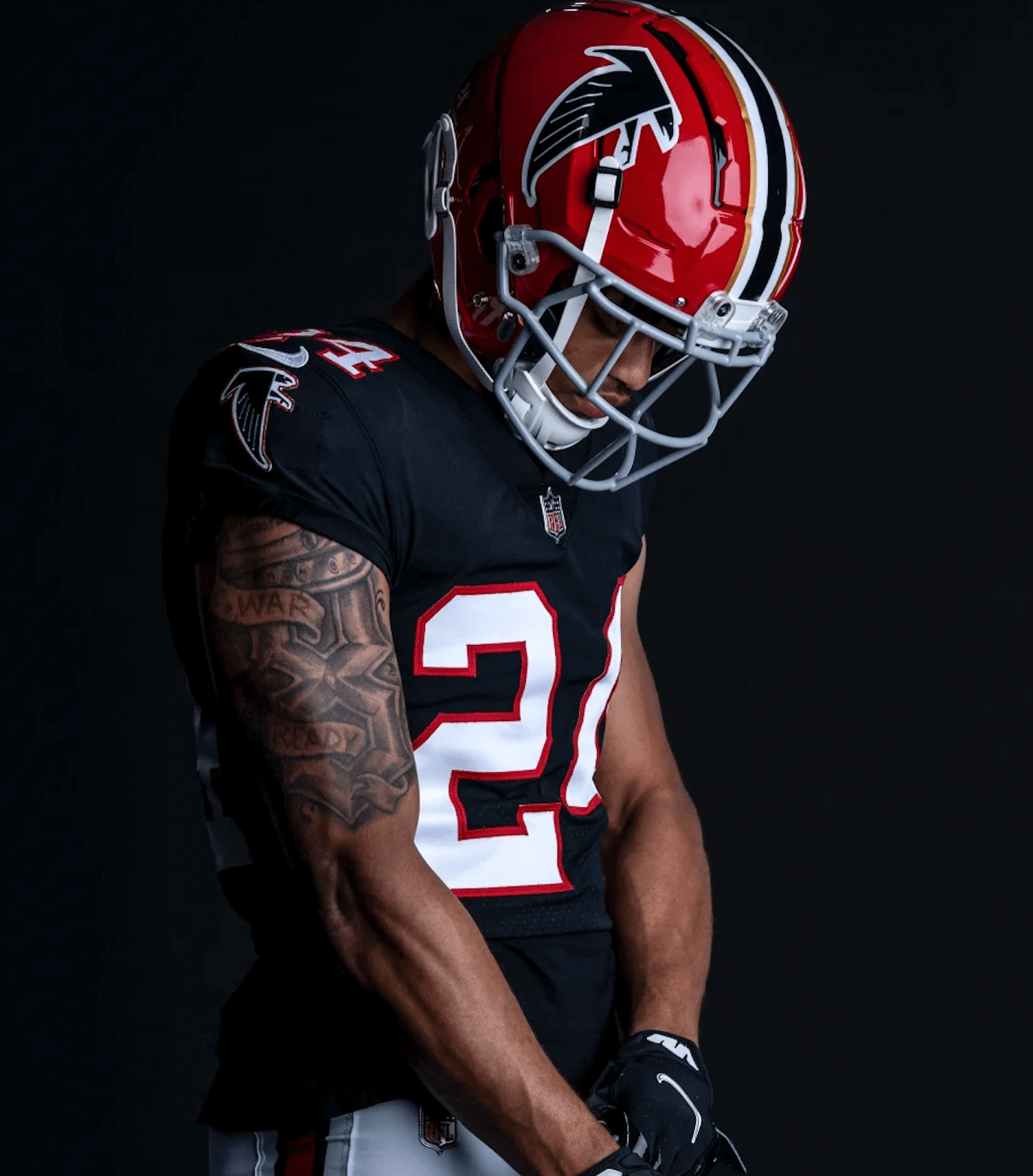
Click to enlarge
While some NFL teams are holding off on adding new throwbacks until 2023, it’s full speed ahead in Atlanta, where the Falcons yesterday announced that they’re bringing back their red throwback helmet. It’ll be worn for the Oct. 16 home game against the 49ers.
Quick thoughts:
• This move isn’t exactly a surprise. As reported here on Uni Watch three weeks ago, the Falcons’ schedule-release made it pretty obvious that the red helmet was being revived.
• The throwback uniform they’ll wear with this helmet is the same one they’ve been wearing (with a black helmet) for the past few years, most recently on Dec. 26 against the Lions. The only change is the helmet.
• That noise you hear in the background is everyone saying, “They should just wear this uni combo full-time.” Yes, duh, they should. But no, they won’t.
Additional photos are available here and here.
What is wrong with the kerning on Zamora’s jersey? #mariners pic.twitter.com/lGUQIUJOUf
— Richard Brodie 🤫🦁 (@QuietLion) June 5, 2021
ITEM! MLB’s most troublesome font: For this week’s Bulletin article, I’ve done a deep dive on the NOB font on the Mariners’ navy alternate jerseys, which over the past 20 years has provided a steady stream of kerning issues and other typographic glitches. In an effort to get at the root of the problem, I interviewed the team’s equipment staff, the guy who created the NOB font, a team exec, and more. Proofreader Jerry Wolper, who usually maintains a very even keel while performing his duties, calls this “peak Uni Watch,” and I don’t mind saying I’m pretty pleased with the article myself.
My premium subscribers can read the article here. If you haven’t yet subscribed, you can do that here (you’ll need a Facebook account in order to pay). Don’t have or want a Facebook account? Email me for workaround info. Thanks!
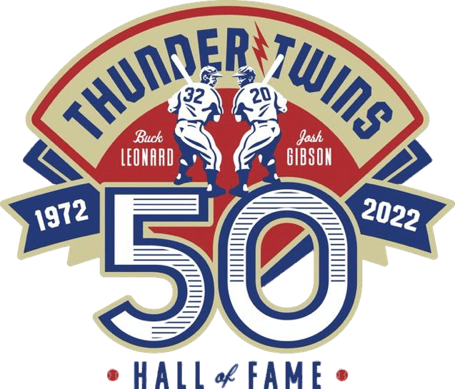
Too good for the Ticker: The DC Grays are a team in the Cal Ripken League, which is a summer collegiate circuit. They wear uniforms based on the Negro Leagues’ Washington Grays, and now they’re taking the Negro Leagues connection a step further with the spectacular new logo shown above, which celebrates the 50th anniversary of former Washington Grays players Buck Leonard and Josh Gibson (also known as the “Thunder Twins”) being inducted into the Baseball Hall of Fame.
The Grays haven’t yet announced if this logo will be worn as a patch (it looks like it might be too busy for that). So far they’ve just said they’ll “pay tribute to the Thunder Twins at a special event this season.” For now, we can just enjoy the excellent logo.
(My thanks to Rob Bindeman for letting me know about this one.)
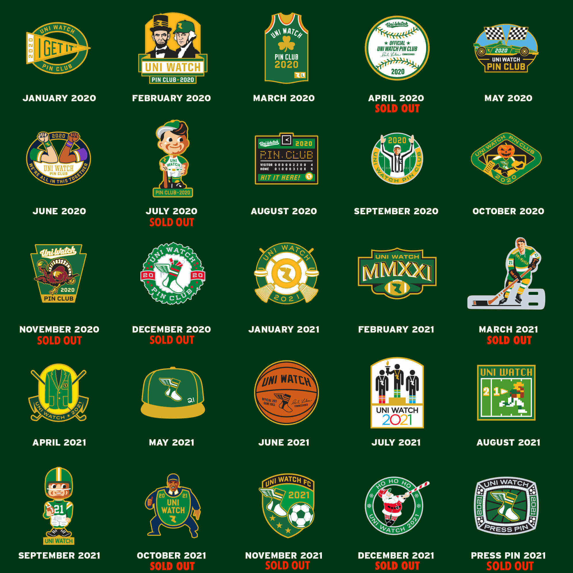
Click to enlarge
Periodic pin-ventory reminder: As you can see above, we have now sold out of the 2021 Press Pin. The remaining Uni Watch Pin Club designs are still available at the super-low price of just $3 apiece. Full details here.
The Ticker
By Paul

Baseball News: Today is Lou Gehrig Day. All uniformed MLB personnel will wear a commemorative patch, and expect to see lots of wristbands and related accessories. … Atlanta OF Ronald Acuña Jr. has a new BMW emblazoned with his personal logo. … New CC-style alternate for the Triple-A Nashville Sounds (from R. Scott Rogers). … Here’s a look at the bold team logos in the Old North State League, which is a summer collegiate league. … New SpongeBob-themed alternates for the El Paso Chihuahuas. … Giants skipper Gabe Kapler has gotten a lot of attention lately for his national anthem protest, but I don’t think we’ve mentioned that he has a new tattoo on his hand this season. That’s gotta be an MLB managerial first, no? The tat is a salute to his late father. … The Mets’ Tom Seaver statue is apparently not the only MLB statuary with a design error. William Yurasko reports that the Frank Howard statue outside Nats Park has the wrong uni number. … The Rays announced back on May 1 that they’d be wearing green ribbons for mental health awareness throughout the month of May. They were still wearing them last night for the first game of June. … The hallway leading to the visitors’ clubhouse at Dodger Stadium has some very nice old-school logo displays (thanks, Jerry).

Pro Football News: Here’s the logo for the USFL championship game. … The late John Madden will be on the cover of his namesake video game this year.
College Football News: New uni and helmet for Georgia (thanks, Phil). … Virginia Tech has announced the dates for this year’s “color effect” games (from Andrew Cosentino). … In a related item, here’s an article on the history of Penn State’s whiteout games (from Kary Klismet). … Also from Kary: I think we’ve seen this before, but BYU’s royal blue helmet now has a metallic finish. … New uni number assignments for Texas.

Basketball News: The uni schedule for the NBA Finals is now available on LockerVision. … Two new logos showed up on the Cavs’ website yesterday — apparently the start of a rebrand redesign that will be fully unveiled today. … Here’s a backgrounder on NBA championship rings (from Kary Klismet). … Also from Kary: Memphis’s men’s team is inviting fans to design the team’s new court.

Soccer News: New shirts for third-tier English side Accrington Stanley (from Ed Zelaski). … Fans are loving the Vancouver Whitecaps’ new Indigenous logo, which was designed by a local artist. … The USL W League’s South Carolina United wore pink shirts on Tuesday because their coach, Sandy Burris, was recently diagnosed with breast cancer (thanks, Jamie). … Also from Jamie: The USMNT wore rainbow Pride numbers for yesterday’s friendly against Morocco and will do so again for the June 5 friendly against Uruguay, with the USWNT doing likewise for two friendlies at the end of the month. … The NWSL’s Kansas City Current have unveiled renderings of their proposed new stadium (from Kary Klismet). … Also from Kary: New away kits for German side Greuther Fürth. … New home and road shirts for fourth-tier English side Stevenage (from Ed Zelaski).

Grab Bag: Interesting article on a particular trope in movie poster design (from Jason Hillyer). … The mayor of Aurora, Ill., will not march in the local Pride parade this year because police officers have been asked not to participate while in uniform. … Public school students in Lamar County, Miss., will no longer be required to wear uniforms. … Here’s why police uniforms in Trinidad and Tobago include a sleeve patch of the Jewish Star of David. … After an earlier dispute over the size of an ad on her dress, Camila Giorgi changed her French Open outfit (thanks, Brinke). … The U.S. Marine Corps is marking Pride Month with the strangest Pride graphic I’ve ever seen (from Jimmy Lonetti). … Buick has a new logo to symbolize the brand’s transition to all-electric vehicles by the end of the decade. … The rest of these are from Kary Klismet: New jerseys for the Marshalstown-Castledockrell U12 club, an Irish youth team that plays camogie, a bat-and-ball sport similar to hurling. … New Italian airline ITA has crew uniforms created by fashion designer Brunello Cuccinelli. … Brussels Airlines is holding a uni-design competition at a Belgian art school. … The new grooming standards the U.S. Army implemented last year have presented many new hairstyle options for soldiers of color, especially Black women. … At the coin toss prior to the start of yesterday’s men’s test cricket match between England and New Zealand, England captain Ben Stokes wore a shirt with former player Graham Thorpe’s NOB and No. 564, because Thorpe is in the hospital (thanks, Jamie).
I am from Atlanta, born and bred since Fulton County Stadium. I always thought that the red was better than the black. Even the “hybrid” throwback uniform was nice. The current uniforms are something I will never endorse(damn millenials). Wish they would have these for the Week 1 game on my birthday. As for UGA, again, if it ain’t broke don’t fix it. The “white out” uniform obviously is to attract recruits, but it just is “off” to me.
Might be due to modern helmets, but the Falcons’ gold / white / black / white / gold stripe looks different from the last time the Falcons wore the red helmets. The white stripes might be wider than before. Great that the Falcons will be wearing the throwbacks against the 49ers. Hopefully a classic uni matchup. Always hated it when one team wears a throwback against a team wearing an ugly modern uni.
I’m with you, Jay: the red Falcon Unis and the red/black combos are both dramatically superior to the current kit. But you gotta sell the new stuff, because NFL teams have to scrap for every dollar !!!
Atlanta: doing throwbacks this year because it only involves a new helmet not a new jersey.
Tampa, Philadelphia, Seattle, possibly more: not doing throwbacks this year because they involve new helmets and new jerseys.
So NFL totally verifying that uniform changes are completely dictated by their ability (or lack there of) to stock the shelves with jerseys to sell.
Do they really think fans aren’t going to like seeing Tampa in orange, Philly in green, or Seattle in royal blue just because they can’t buy those jerseys to wear? If anything I would think it creates a big demand for once production issues are solved and they do become available.
Patriots: Doing throwbacks this year, which involve jerseys and helmets.
link
1. That was from December? Definitely flew under my radar…
2. An oddity with the comments system – I refreshed the page right before typing out my reply to Greg below, but your reply didn’t show up until after I posted. Weird…
Wow, don’t remember seeing that get reported. Glad to see they are on board too.
Though I wonder if possibly the Pats have been selling those throwbacks anyway because they have always been so popular, and therefore they had the sales inventory in place? Any Patriots fan out there able to confirm if you could always get the red jerseys?
It’s a shame that the NFL is totally letting the tail (retail) wag the dog (the product on the field) in this case.
True! Kudos to the Patriots to for saying screw the supply chain for retail products we’re going to bring back our throwbacks this year anyway.
Just a typo, “police uniforms in Trinidad and Tobego”. That’s “Tobago”.
Thanks, Tom. Fixed.
Very underwhelmed by what the Cleveland Cavaliers have come up with: out is the crispness of the yellow and navy, in is the drab of burgundy, old gold and black. Gone is the dagger, still around is that stupid shield. The only upgrade is that the awkward arching in the wordmark is gone. A cool team name, a nice color combi in burgundy, navy, yellow and white and they still mess it up.
I believe the word for the BYU helmets is pearlized, not metallic.
I feel like for the longest time most college and NFL helmets were painted with pearlized paint, and then the trend of matte, chrome, metallic took over and every team, including those who traditionally used pearlized, started using a glossy paint, but not a pearlized paint.
Look at the depth the Arkansas helmet has link
as compared to the Alabama helmet
link
The pearlized just pops so much better, especially in HD
Why oh why do they insist on putting the 1980’s red helmet with the 1990’s black jerseys??? Why??? ♂️♂️
link
I am thrilled to see the home team wear white in every game this NBA Finals. Finally, some coherence! I hope the NBA is trending back toward home whites more consistently.
No reason for either team to have black jerseys, but I’ll take the win for home whites all 7 games.
In an era when every team has 11 different jerseys, it’s hard to schedule home whites more than a few tines each season. This is truly a miracle.
I can’t be the only one who didn’t realize the NBA Finals had begun.
Well they technically haven’t yet
Re: Ronald Acuna: I hate players on team sports having personal logos. That may be a controversial take, but there it is. TBH, I’m not wild about ANYBODY having a personal logo. The whole concept of branding oneself is unappealing on so many levels. (Insert old person yelling “Damn kids! Get off my lawn!” here).
-I am losing track of how many times the Cavs are tweaking their colours. They had just reintroduced navy into the uniforms recently and now a possibility that may be gone? Too much.
Possibly look like trim could be black and old gold now? This, the Nuggets quick uniform changes, all the NBA alternate jerseys coming and going. Even for someone who follows sports uniforms thoroughly it is challenging to be able to tell someone what the primary colour scheme is for all teams.
-This may not be a popular opinion. I love the Falcons red helmet but I do prefer it without the gold striping. The team is red and black. There is no other gold in the uniform.
It’s a true throwback, back to the days when the Falcons began and split the difference between UGa fans (red and black) and Georgia Tech fans (white and gold) to ensure that both sets of fans would get behind the new pro team.
Accrington Stanley? Who are they?
Wow! That’s a deep cut, especially for us American blokes!
link
First, thank you Paul and Uni-Watch staff for such an informative and enjoyable website.
I grew up in Atlanta and loved the red helmet but I grew up with the later model that dropped the gold stripes. The gold was only around for the first four years and was included on the first helmet to appease Georgia Tech who weren’t happy with the red and black (Georgia Bulldogs) colors. Someone came to their senses and dropped the non-matching gold by the 1970 season. As for my beloved Dawgs, that white helmet is a recruiting prop used by potential recruits who have recently posed in a variety of red, white, and black jersey and pants combos that will never see the field. Kirby Smart is a traditionalist so I’d be shocked to ever see that helmet.
As a (nother?) proud UGA alum, I can safely say the Stormtrooper look for UGA is one that will never see the field. I do kinda like the white helmet, but the Power G looks very strange on it.
Say what you will about the Cavs’ new logos, but at least they are acknowledging that yellow is not gold.
Can we create a better color name for teams that say “gold” but really just use yellow?
Can we make “YELLOLD” a thing?
One cool thing about Buick’s switch to electric cars: they’re bringing back the model, “Electra.” But will the car hold 225 watts or 240 watts?
Is Kapler wearing sneakers with lifts? Looks like the sole is about an inch thick.
His listed height is 6’2″ so that seems pretty unlikely. Some shoes just have awful looking soles.
Georgia’s new white helmet looks great, especially the red and black stripes.