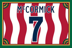
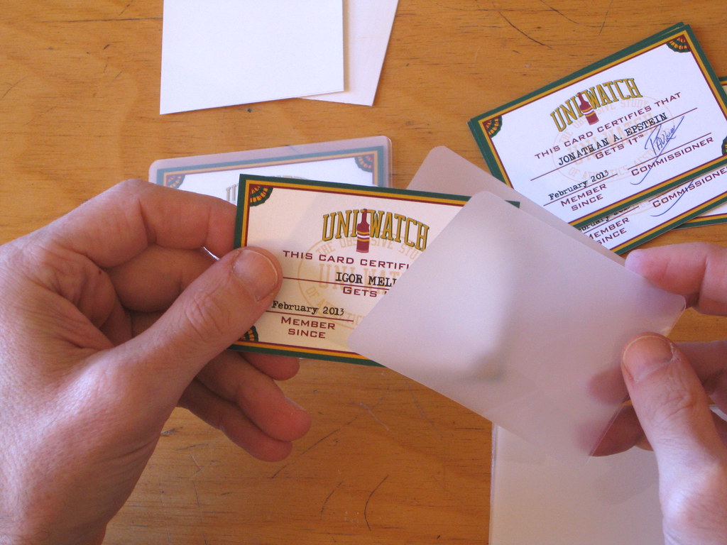
People have occasionally — okay, very occasionally — asked me about the process that goes into the making of a Uni Watch membership card. So I decided to document the production of the most recent batch (including Anthony Richard McCormick’s card, shown at right, whose design is based on the 1994 USA World Cup jersey). Here’s how it works:
Step 1. A new enrollee goes to the membership sign-up page, sends me $25 via his preferred payment method, and then sends me a separate e-mail specifying what he wants on the front and back of his card. Sometimes the design request for the back of the card is simple and/or the enrollee has provided good photos to show exactly what he wants, so I move on to Step 2. Often, though, I have to do a bit of photo research, and sometimes I have to write back to the enrollee and say, “I’m pretty sure we can do that, but can you provide a better rear-view photo?” And occasionally, depending on the design request, I have to say, “Sorry, we can’t do that — do you have a Plan B?”
Step 2. Once I feel like the new enrollee and I are on the same page regarding his design request, I enter his membership order on a master list that I maintain:
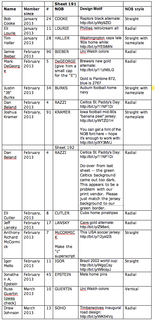
The list shows all the relevant details of each order, including links to reference photos when needed. I keep this list in my Dropbox, where my card designer, Scott M.X. Turner, can access it. Scott checks the list every so often to see if new orders have come in (or sometimes I’ll e-mail him to let him know that we’ve gotten new orders), and he uses the information on the master list to design each individual card.
Step 3. We print the cards in batches of eight, so Scott will sometimes wait until we have eight new orders in the hopper before sitting down to design them (it usually takes about three weeks for eight orders to pile up), or sometimes he’ll just do them as they come in. Either way, once he’s designed a full batch of eight cards, he sends them to me as two PDFs — one for the fronts of the cards and one for the backs — laid out as they’ll appear on the sheet that we’ll eventually get from the printer (click to enlarge):
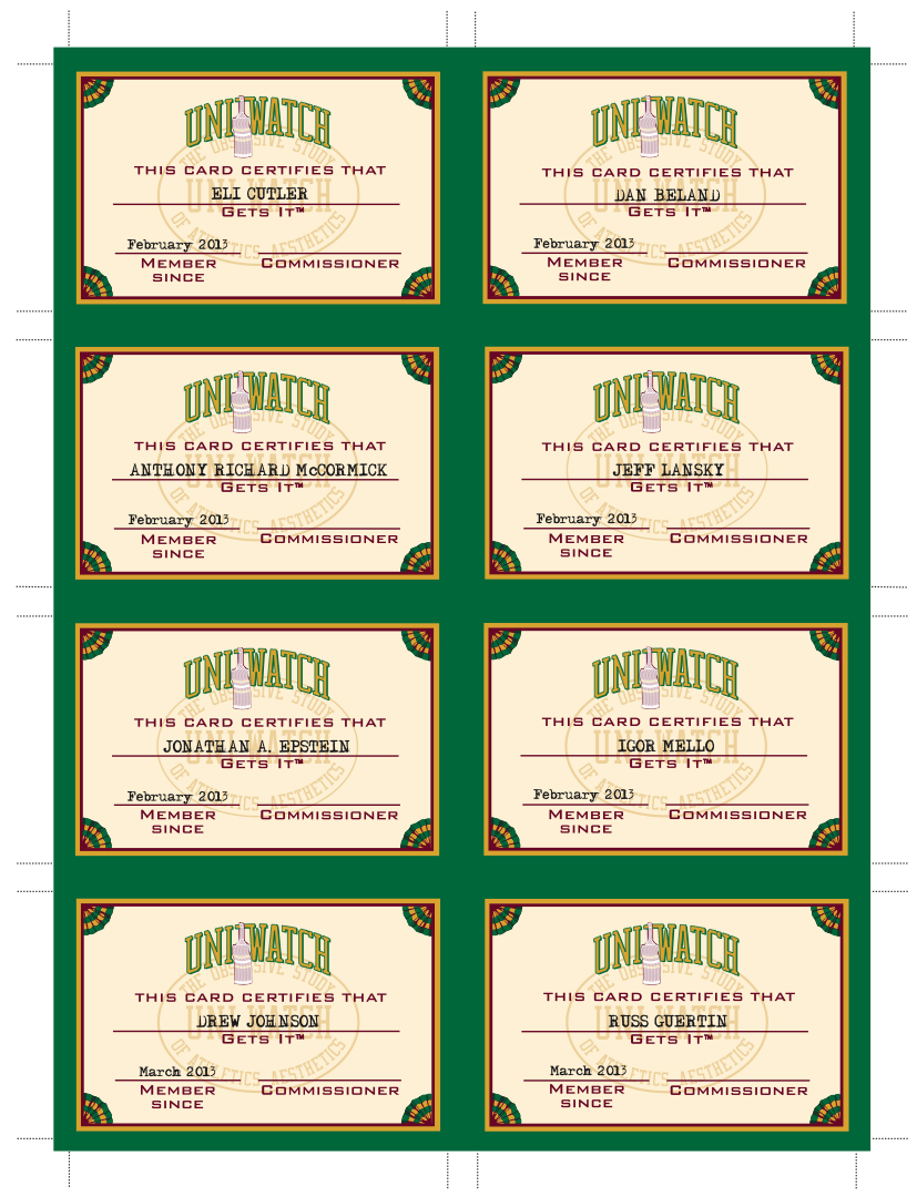

I review both PDFs to make sure everything matches up with the enrollees’ requests, to make sure the proper fronts align with the proper backs, and also to ensure that everything “looks right,” so to speak. Sometimes I’ll spot a typo or a design flaw, in which case I’ll go back to Scott and ask him to make the appropriate fixes.
Step 4. Once I’m satisfied that the two PDFs are perfect, I e-mail them to my printer, Rolling Press, so they can be printed out on cardstock.
Step 5. After I e-mail the PDFs to Rolling Press, I take screen shots of every individual back-card design from the back-card PDF, upload them to Flickr, and add them to the membership card gallery.
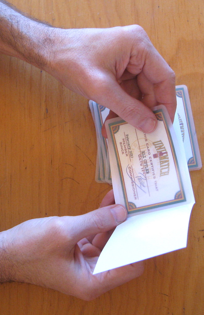
Step 6. It’s usually around this time that I grab eight envelopes, write the new enrollees’ names and addresses on them, and print out eight copies of my “Welcome to the membership program” cover letter. I set this stuff aside for later (for all of the remaining photos in this entry, you can click to enlarge):

Step 7. Rolling Press is awesome — I must be their smallest, most piddly client, but they always turn my orders around within 24 hours, or sometimes even the same day. In any case, once they’ve printed the sheet of cards, they send me an e-mail to let me know. They’re located about a 10-minute walk from my house, so it’s easy for me to scoot over and pick up the printout. They usually give me two or three copies of the sheet (the reason for this will become apparent in a minute), each of which looks just like the PDFs I e-mailed to them. Here you see the two copies of the sheet for the most recent batch — one with the front side facing up and the other with the back side facing up:

Step 8. Now comes the part of the process that I refer to as “arts and crafts.” Using an X-Acto knife, a ruler, a cutting mat, and the crop marks printed on the sheet, I cut out each individual card. It’s somewhat painstaking work, because I want to make sure that the green border on the front and back of each card is fairly even:
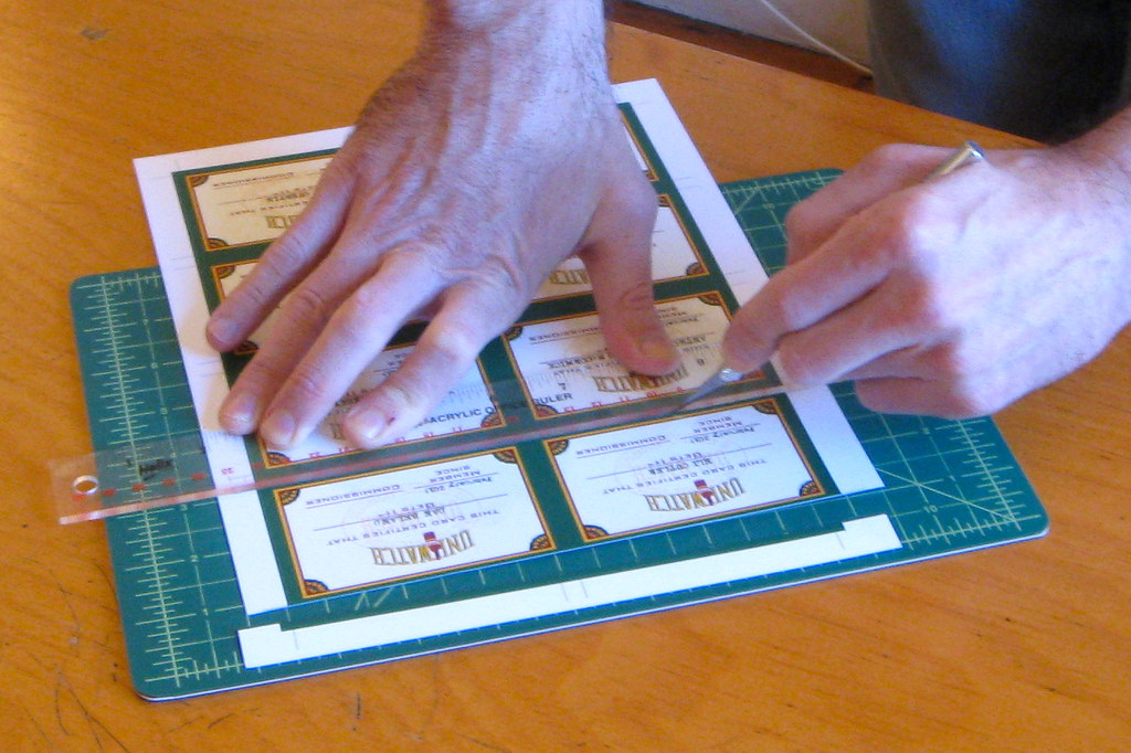
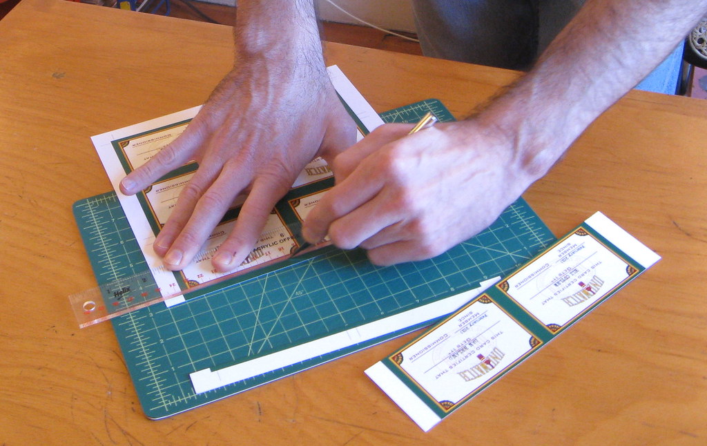
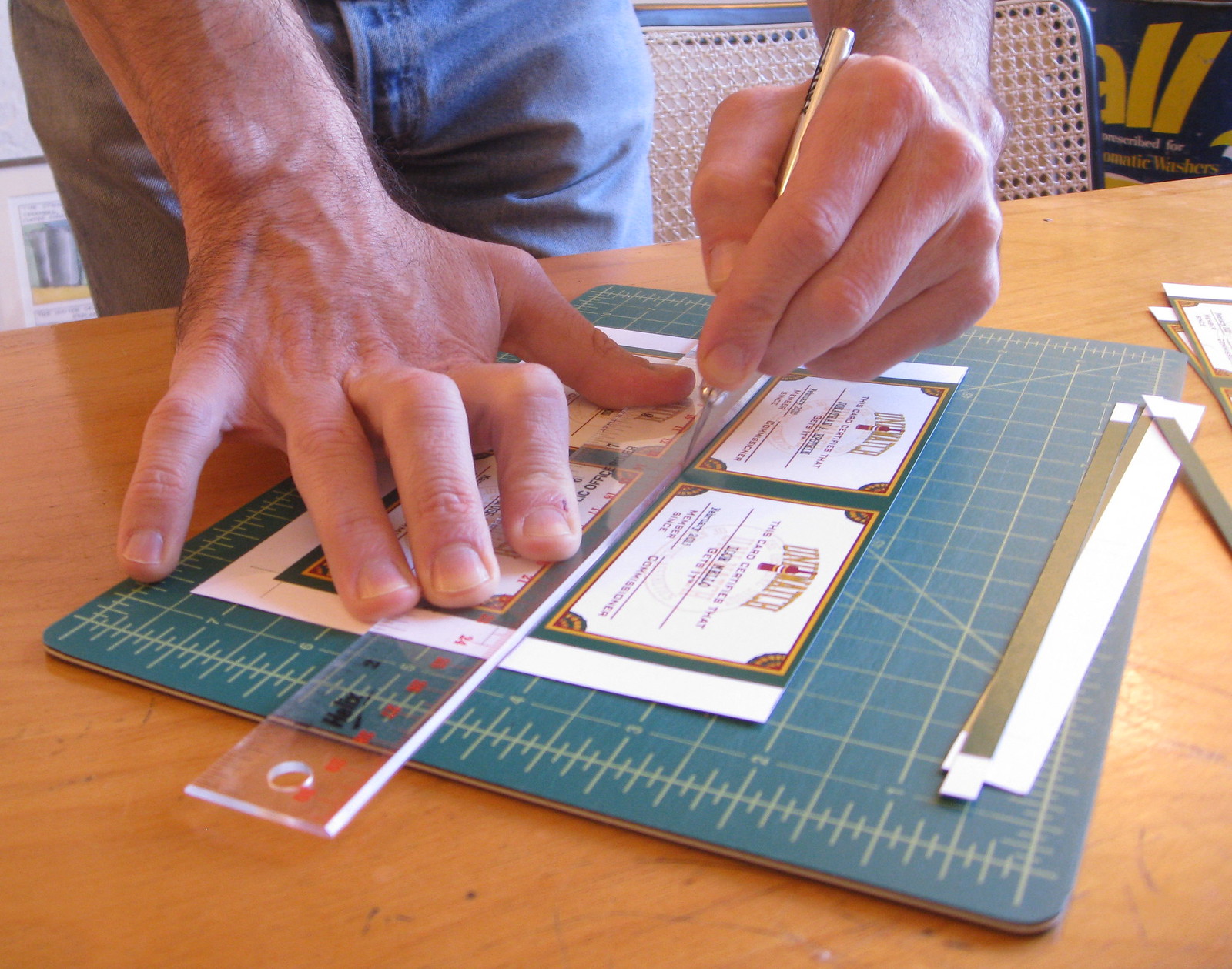

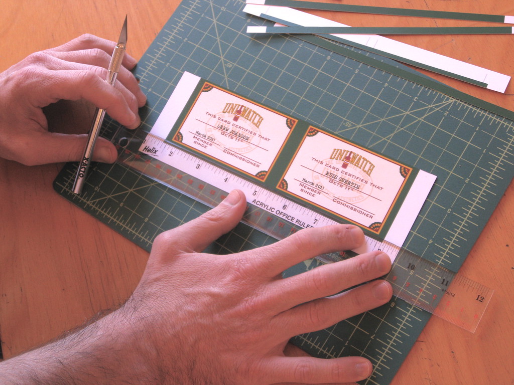
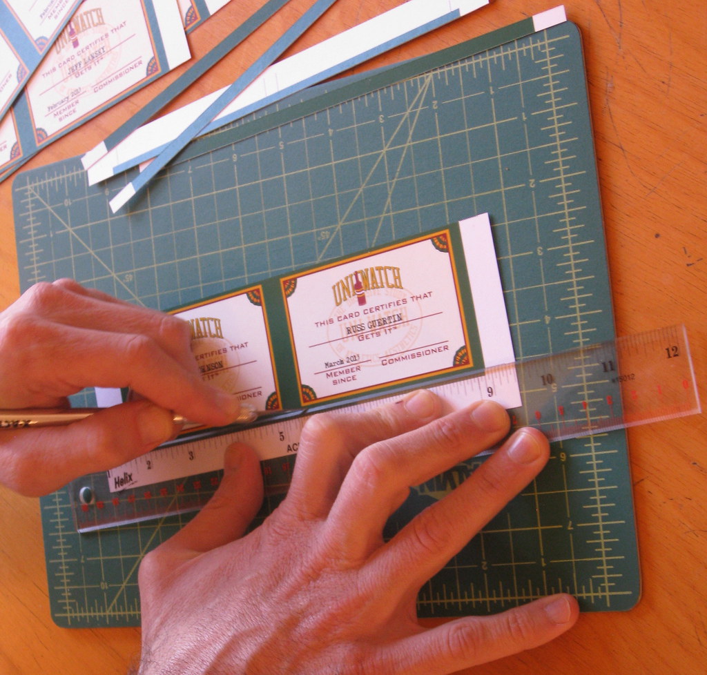
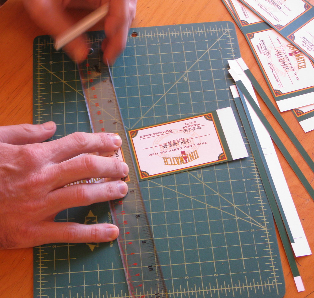
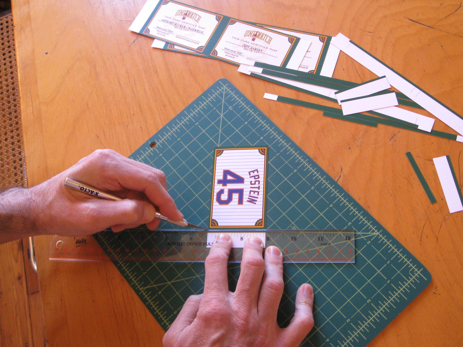
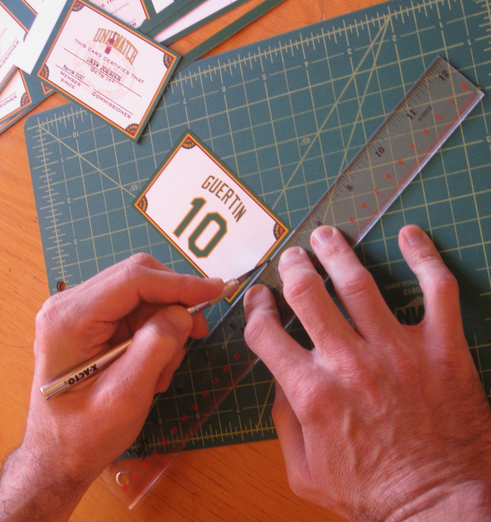

Sometimes the knife blade slips, or the ruler slips, or I mess up in some other way that ends up botching one of the cards. If that happens, I re-cut that card from the back-up copy of the printed sheet. (Not shown in these photos: Uni Watch girl mascot Caitlin, who often likes to poke her nose in the vicinity of the X-Acto blade or head-butt my hand when I’m trying to hold the ruler steady. Bad kitty!)
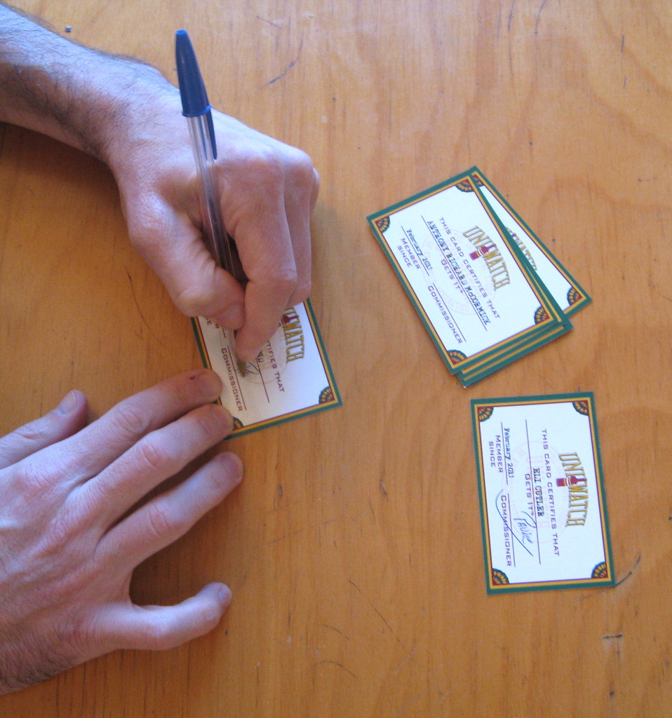
Step 9. Once all eight cards have been cut out, I sit down and sign each of them on the “Commissioner” line:
Step 10. I take my laminator out of the closet and plug it in. While it’s warming up, I place each signed card in a lamination pouch. Then, one at a time, I put each pouch-clad card in a little white cardboard folder (this is called a carrier) and run it through the laminator:


Step 11. I grab the addressed envelopes and cover letters that I had prepared earlier and stuff each envelope with the appropriate laminated card:
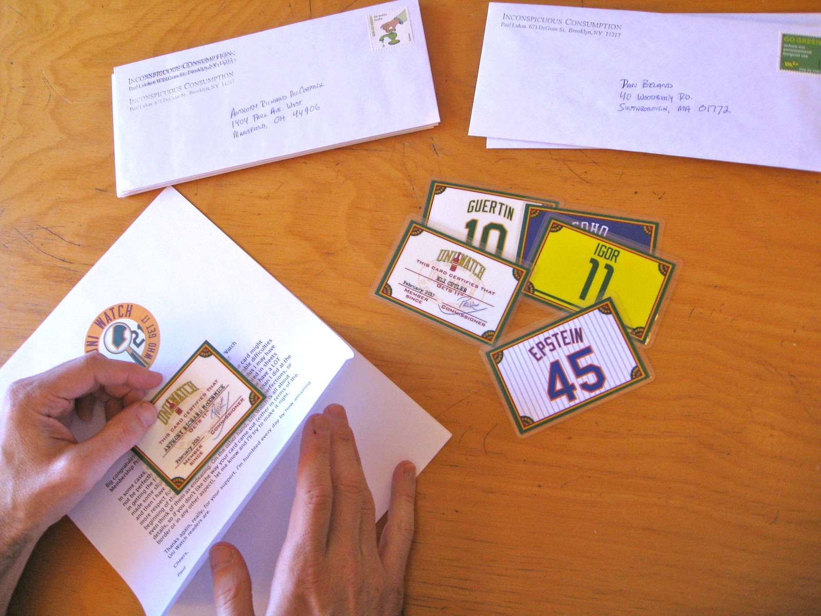
Step 12. Off to the mailbox!
These photos were taken last Saturday, and I mailed the cards later that day, so all you new enrollees should watch your mailboxes. As always, you can order your own custom-designed membership card by signing up here.
(Extra-special thanks to Heather McCabe for the arts and crafts photos.)
F1 Update, continued
By Carlos and Omar Jalife
Marussia
The Livery: By far one of the coolest upgrades. Instead of having the MR02 sectioned like its predecessor, Marussia opted for a cleaner design and sharper edges, dividing the car horizontally instead of vertically. Also, the nose is now whiter than last year and the British/Russian flags are smaller and closer to the tip (here’s the old version), while the front wing lateral panel will now have the same two-color treatment as the rear wing. Great detail: the red/white linethat goes in the lower part of the side pod. Also, it’s interesting they decided to go with two colors for the top part. The rear wing is divided in the same way as last year, except the divisor line is curved to go with the rest of the design. Lost in all of this is the team’s name, which doesn’t look that good on a red background (here’s the old version).
Vanity Panel: They decided to go against it since the stepped nose is not as apparent as for other teams.
Fire Suits: Whiter than last year. Marussia has decided to scrap the black sleeves and most of the red from the inner legs. They added some red that goes from the chest to the sides and basically that’s it. (Here’s the old version.)
Helmets: New drivers for Marussia this year, since Jules Bianchi and Max Chilton will be debuting in F1. Bianchi will probably be changing his helmet again, as he tends to use the colors of the team he is running with (here’s what he wears when he runs with Ferrari, and here when he ran with Force India), while Chilton’s only change is in the front where the little graphics beneath the visor have been replaced by a sponsor.
Carlos’s Verdict: Nice upgrade in the livery, although it looks like Penske in IndyCar. The fire suits are generic. B
Omar’s Verdict: Better than last year, but the paint scheme seems odd for F1. C+
McLaren
The Livery: One team that barely changed its livery for this year is McLaren. In fact, they basically obscured a little bit of the gray/silver tone of the MP4-28 and that’s about it (here’s the old version). The rest of the details are the same as previous seasons, with the McLaren logo on top of the sidepods and in the front nose as the more important details.
Vanity Panel: Last year they were the only top team without the step nose, so they surprised us this year when they added the vanity panel for the MP4-28 (you can tell by the height of the nose at the front).
Fire Suits: About the same as last year.
Helmets: Button basically has the same design that he has been using since his debut in Formula 1, while Sergio “Checo” Pérez surprised the world by changing his. He added more fluorescent color as a base (compare to his old version) with a sharper design and the wordmark “Checo” in front of what seems to be a chaquira design (the black and red behind the nickname). He’s also changed the style to depict the Mexican flag on top of his helmet, maintained the pre-Columbian elements but in different order (compare to the old version), added the sponsor stripe, and reinforced his brand on the back of the helmet.
Carlos’s Verdict: No biggies here and they keep the car looking great (although Checo tried to make his helmet look like Hamilton’s, which doesn’t look right). A+
Omar’s Verdict: We’ve seen this for almost 15 years now, which should give you an idea of how good it looks. A
We’ll have more F1 previews throughout the week.

Collector’s Corner
By Brinke Guthrie
To lead off, we’ve got two boxed sets of 1970s NFL pennants for you. Your choice of the AFC or NFC, of course. I especially like the “decorating suggestions” on the box back. I came across my entire set of these not too long ago, still in perfect condition.
As for the rest of this week’s haul:
• Oakland A’s fans, pay attention here. Whenever I see a DeLong item, like this A’s jacket, I feel morally obligated to mention it. The listing says it’s 1970s, but I don’t think so. The trim is too clean, and it looks 1990s to me. But as I have said in the past, DeLong made quality licensed stuff, and the varsity look is classic.
• It’s showtime, baby, with this 1970s Lakers Starter jacket.
• Staying in the same city and era, let’s take a look at these Dodgers socks, from Kinney shoe stores.
• More Starter: This is the classic Cubs jacket look.
• Look at the helmets on this 1969 NFL Eastern Conference title game program. Reminds me of “This Week in the NFL.”
• With all the hoo-ha about the new Warriors/Adidas look, it’s appropriate we go way back to the late 1970s for these Warriors shorts. [Those shorts would look a lot better with Golden State’s sleeved jerseys than the pinstriped things they’ve been wearing. ”” PL]
• Speaking of basketball shorts: If you’re in the market for game-worn, you can wear what Sam Lacey wore.
• And we conclude with this 1970s Philadelphia Eagles shirt which actually looks like a pajama top to me. Screams one word: “Sears.”
Seen something on eBay or Etsy that you think would make good Collector’s Corner fodder? Send your submissions here.
Uni Watch News Ticker: Speaking of membership card designer Scott Turner, his Seattle-based band, RebelMart, is playing tomorrow night at the Alki Tavern. You know what to do. … Yesterday I Ticker-linked to an online class in uniform design. Now the instructor of that class — former Nike and Umbro design Stew Curran — is offering a 25% discount to Uni Watch readers. Just use the code “GOAL25” when checking out. … The Giants will celebrate their World Series championship by wearing gold-lettered and -numered jerseys on April 7, the day of their ring ceremony. In addition, New Era’s Facebook page shows a gold-trimmed Giants cap, although the photo caption mentions Opening Day, not the day of the ring ceremony. ”¦ New uniform, with tequila sunrise-esque striping on the shorts, for USF. They’ll be wearing the green version tonight. … Further evidence that the Braves were lying when they claimed they’d never finalized the plans to go ahead with the Indian head BP cap: One of the caps has surfaced on eBay, and it looks like the real deal. For all you Braves staffers reading this — you know who you are — you might wanna tell Schuerholz that he’s looking worse and worse as each new revelation comes out, and that he could salvage some dignity simply by admitting the truth of what went down (from Nick O.). … A Maryland county executive pointedly declined to refer to the ’Skins by their team name in a recent interview (from Tommy Turner). … Yesterday’s story about Towson’s baseball players taping over their chest logos reminded Zack Kurland of a similar story involving the Boston University football team in 1997. “They had blank jerseys provided by unhappy alums, taped over the school’s logo, and called themselves University X,” he says. Details here and here. … New practice jerseys, complete with NOBs, for Wisconsin football. “Helps out the media bigtime!” says Nate Neumann. … This is odd: Check out this 1971 Canadiens team portrait and then take a look at Peter Mahovlich, who’s in the back row, third from left. His “CH” logo is positioned too high! (Good spot by Dave Mills.) … An estate sale taking place tomorrow in Somerset, New Jersey, appears to have a huge haul of old sports mags available (from my longtime pal Robin Edgerton). … “I had a dream Sunday night that the Cincinnati Reds came out in Ohio State football-style batting helmets with cuckeye leaves on the sides for their Opening Day game,” says Brad Francis. “I immediately e-mailed you and you hopped on a plane to make it to Cincinnati before the game ended. I have a feeling that I am too obsessed with Uni Watch.” … A Catholic cemetery in Indiana has rejected a proposed tombstone, in part because its design featured the Colts’ logo and the NASCAR logo. … Fun submission from Alec Tolivaisa, who combined his loves of uniforms and history to create personalized jerseys for each U.S. President, with the team affiliations based on which team the person would probably root for given where he grew up. Yo, R. Scott Rogers, I’m expecting some quibbles from you on a few of these, so get crackin’! … “An important part of the pre-game aesthetic at a DC United match are the displays by the supporters groups,” says Brad Warner. “Here’s an awesome video profile of one of the smallest but maybe most creative of them.” … When Deron Williams of the Nets hit a record nine three-pointers in the first half of a recent game, he was awearing a new Nike shoe design. When asked what the new kicks were called, he said, “I don’t know. Hyper-something” (from Will Nescac). … The City of Denver has issued a new style guide for the use of its logo (from Gil Neumann). … Childhood uni photo from Douglas Ford, who writes: “Here I am in eighth grade, before shorts got baggy and socks got low. Those Nikes I have on were canvas, as the leather version were a little too steep for my mom and pop.” … Reprinted from yesterday’s comments: Here’s a real find — color footage from the 1939 Army/Navy game. … Kate Bush in a hockey jersey? Sure, why not (from Patrick Woody). … Several Steelers players recently participated in a charity basketball game. You can see the uniforms in that embedded slideshow, and there’s another shot here (from Daniel Secord). … A design firm has created minimalist versions of the current NHL logos (from Joe Mueller). … Need some team-themed wallpaper for your computer desktop? Lots of it available here (from Trent Guyer). … Good news out of Paterson, New Jersey, where historic Hinchliffe Stadium — which I wrote about several years ago — has been designated as a National Historic Landmark (from Dave Rakowski). … Reprinted from yesterday’s comments: More 0-guarding-0 action, this time from Sunday’s Celtics/Thunder game. … There’s a new report on where sports fans like to get their news. Uni Watch isn’t listed as one of the top choices, but I’m sure that’s just an oversight. … VCU baseball is wearing memorial cap patches this season to honor coach Paul Keyes, who died of cancer last fall after being there for 18 years (from Rob Ullman). … The Family That Plays Together: Conor Gillaspie bats bare-handed, and so does his brother, Casey Gillaspie (from Ryan Deitchler). … Have I mentioned lately how much I love Hamilton Nolan? ”¦ Here’s another wedding garter, this time a Dodgers design, submitted by Jake Kessler. ”¦ For reasons that aren’t entirely clear to me, Iona’s basketball coaches wore track suits last night (from Steve Wilkinson). ”¦ The Cubs are doing a Zubaz-giveaway promotion on Sept. 23. “Another reason why I’m a White Sox fan,” says Ryan Lindemann. … Check out the stripes worn by Indiana lacrosse (from Jay Sullivan). ”¦ You those “A is for apple, B is for bobcat”¦” primers? Here’s one on the ABCs of the NFL (from Steve Mandich).
So… if you have to cut them by hand and laminate them yourself, why don’t you just print them at home too?
Two reasons:
1) My inkjet printer doesn’t provide nearly the print quality that a professional digital printer can provide. If I did it myself, the graphics wouldn’t be as crisp, the colors wouldn’t pop as much, etc.
2) It would be tricky for me to get the front and back to register properly. I might come within, say, a quarter-inch, but that’s too much of a variance. The professional printer can come within a millimeter or so.
Protip: If you’re cutting sheets into cards on a regular basis, you need a Dahle Rolling Trimmer. For years I’ve used one of these:
link
… for making custom APBA cards and other card-sized projects. Mine is at least 10 years old now, maybe 11, and still cuts like day one. Straight, true, and fast, and none of the paper-shifting from school-style guillotine cutters.
Oooh, I like the looks of that. Thanks for the tip!
One more tip:
In many of the images, you have the ruler pressed atop a very small section of the piece you’re cutting and you’re cutting on the “good section” of the piece (the section with the artwork as opposed to the section you’re going to discard, also known as the “scrap section”).
By placing the ruler atop the larger (artwork) section of card and cutting on the “scrap section” of the card, you’ll minimize errors due to the paper moving (you have more leverage because you’re pressing down on a larger portion of the card) and you’ll live to fight another day if your knife goes off line (because you’re cutting on the scrap, not the card itself, and you can just make the cut again).
Good point. Thank you!
I wore the White Sox version of that DeLong jacket everyday to school in 1992-93. So yes, definitely early 90s.
Jamie Bieber? Ugh, sorry for the unfortunate last name. Also, J. Bieber? Eek…
Aw, don’t hate… congratulate!
Truman rooting for the Rams, instead of the Kansas City Chiefs? What a terrible mistake.
I was thinking he should have a St Louis Cardinals jersey, rather than the Rams, myself. I’d have also put the first Bush in an Oilers jersey instead of the Texans. I think Johnson & Bush II should have white Cowboys jerseys instead of the throwback, while Clinton would have the special 1994 double star jersey because it’s flashier.
Looks like the creator just went with what’s available in the jersey preview on the NFL Shop site, thus using what’s currently available.
LBJ oughta be in a bad luck blue.
43 in a throwback is appropriate.
Truman was “The Man From Independence,” which is now a Kansas City suburb. He got his political start as part of Tom Prendergast’s political machine in Kansas City. That’s why any St. Louis jersey is out of the question.
Not to mention that Arrowhead Stadium is less than 10 miles from downtown Independence.
And also not to mention that Arrowhead is part of the Truman Sports Complex.
And Reagan represented by the Bears? Should be the Rams.
Taylor and Hoover are the only others I’d really quibble with, except with regard to home/away/throwback choice for the given team. Taylor was a proud Virginian (Redskins) who settled in Kentucky (Bengals) and spent the bulk of his life in military service on the frontier (Saints, Colts, Packers, Vikings) and then in the Mexican War (Texans) before being elected president and dying. New Orleans is probably the least important of his various military posts, but it is nice to see it represented by someone, if not Jackson.
And Hoover is tough simply because there really isn’t a team that represents him. Vikings and Bears are too distant from his Iowa home. He spent some formative years in Seahawks country, but what time he spent in the U.S. as an adult was mainly in San Francisco and Washington. And since he made his career in mining, if we stick with the San Fran connection, then he’s definitely 49ers, not Raiders.
Woodrow Wilson was from Virginia, and spent much of his career in New Jersey. The Virginians I know aren’t apt to give up their Washington team in favor of the Jets.
Scott is customarily right: New Orleans not right for Taylor; I’d go with the Virginia angle and the Rough-n-Ready frontier thing and put him in a Redskins jersey.
Hoover could not be less likely to be a Raiders fan.
And Woodrow Wilson was a Virginian and patrician all the way, unsuited for the Jets, who have few fans in Jersey anyway.
The guy who should be bearing a Jets shirt is little Marty Van Buren, associated with the locofoco elements of the Jacksonian Democrats and not the solid bankers of Downstate. Chester Alan Arthur, on the other hand, was a super-sober Manhattan Republican who probably would have had a corporate box with the Maras.
Reagan broadcast Cubs games for WHO during the time when the Bears played at Wrigley Field. While Reagan was not actually in Chicago, I think the designer made the correct sports-related decision.
Yep. That’s when he was Dutch Reagan.
It’s a defensible choice, but on balance it’s the wrong call. Sure, Reagan has strong early ties to Illinois and Chicago. But as soon as he had the ability to be nowhere near Illinois, he got himself as far away as a man could in the America of the day. That meant Southern California, where he made a successful career, made a fortune, got into politics, and made history.
Also, back when he was doing Cubbies games, he was a Democrat. Something else he left behind in becoming one of the quintessential Californians in American history. Dude belongs in an LA Rams jersey. Or even better, an LA Jags jersey, if ever that nigh-inevitable relocation happens.
Rutherford B. Hayes would also be a Browns fan, not a Bengals fan. He preferred living in northern Ohio.
Agree: Browns for Hayes.
WH Harrison should be a Redskins supporter as well, born and raised in Virginia.
Also concur on both Wilson and Taylor needing to be ‘Skins fans as well
Re Alec Tolivaisa’s Presidential NFL jerseys, I’ve a couple of issues. First James K. Polk was born in Pineville, NC and lived there the first eleven years of his lifetime before moving to TN. Therefore, a legitimate argument can be made for him wearing a Carolina Panthers jersey. The argument for Andrew Johnson is even stronger since he lived the first 18 years of his life in either North or South Carolina. Additionally, Andrew Jackson was born and spent the first 20 years of his life in either North or South Carolina, thus also a Panthers jersey. I also agree that Truman would be a Kansas City fan, not a St. Louis fan, since his hometown of Independence is a KC surburb.
Panthers fans? No such thing as a loyal panthers fan. No way Polk or Johnson would be Panthers fans. Polk spent most of his life in middle Tennessee and working in Nashville (he’s even buried at the State Capitol for goodness sake), he wouldn’t be a Panthers fan. Johnson came to Tennessee to escape the Carolinas, why would he still cheer for their team after finding a new state and becoming its Governor? It doesn’t make sense. Both are Titans fans. Even if they were Panthers fans to begin with I highly doubt they would remain Panthers fans after coming to Tennessee, the Panthers just don’t have that kind of loyalty from their fans. No, they would wear the two-tone blue.
And to say that Andrew Jackson would be anything besides a Titans fan is nonsense. You would have to be crazy to think there’s anyway Jackson would be anything but a Titans fan. Jackson’s plantation where he spent the majority of his life is less than 15 minutes from LP Field, it’s in the same county as Nashville! Jackson and Polk helped shape the state of Tennessee and especially the city of Nashville, they’re Titans fans not Panthers.
Clinton should be a Saints fan. That guy loved to party.
It’s hard to say…depends on if you consider Arkansas Cowboy territory or Saints territory.
Now if this were baseball, it’d be much easier. Clinton himself has said that his team growing up was the St. Louis Cardinals, thanks to the KMOX Cardinal radio network.
I agree. Truman grew up closer to KC than STL.
I’m thinking that Mississippi’s Jeff Davis was a Saints man.
No. His prison diary at Fort Monroe reveals how avidly he sought his release in time for the roll-out of the Redskins by George Preston Marshall.
Now why would a Mississippian care about a team from Boston?
Nixon was from southern California, Yorba Linda and Whittier, should be a Rams fan, don’t care that they aren’t there anymore, neither the Rams nor the 49ers were in CA when Nixon was anyway (he went to DC in the 40’s), and 49er fans will not accept him.
I think Mr. Tolivaisa might have been confused about Nixon’s time in the House of Representatives – he represented California’s 12th congressional district, which is essentially the city of San Francisco, but which in 1946 stretched as far south as Los Angeles County.
It’s clever now to point out that Nancy Pelosi now represents Nixon’s old district, but that’s as misleading as it is technically true. Nixon was a SoCal man through and through.
Truman should have been a Chiefs fan. The sports complex that Arrowhead and Kauffman Stadium sit on is named for him. I’ve been to his library in Independence and also Ike’s museum in Abilene, KS.
The minimalist NHL logos is using an old Penguins logo.
Martin Van Buren was no giant
Sure he was, Wikipedia says he was from New York. You’re thinking of Van Brocklin who played for the Rams & Eagles. It’s an understandable mistake. ;)
Who should he be, if not a Giant?
Or more obviously, Steve Van Buren, who was also an Eagle.
/maybe I should search a little more before I try being clever? nah…
Yeah, um…I believe he’s referring to the fact that MVB clocked in at a mere 5’0″ and according to some, he didn’t even crack that…
Hence, he’s no “giant” (small g)
Oh, yeah, I knew that.
But as John Hodgman points out, he WAS a Time Lord.
I’m not a hockey guy but am still able to easily recognize the teams from the NHL minimalization thing. cool.
Some are rather blah – Bruins, Rangers, Canadiens – but that Blue Jackets one is truly inspired.
I wish they had done more like that, stepping outside of the symbols actually used by the clubs and riffing on a theme.
for some reason, it took me a little longer to figure out the capitals logo…
I love those designs. And they look really great together like that. Really striking and powerful designs, most stronger than the logos they’re based on. My only real quibbles are the Panthers and the Islanders. But, please, more stuff like this!!
My tack is, “Wow, there’s just a circle, a stick and a puck, and even so I was able to tell it was the Islanders!” That’s simply good branding, if you ask me.
The Predators & Panthers really need to be redone. I was only able to figure those out by process of elimination. The guitar pick looks like it could/should be a Blues logo, and my other thought was “who the hell uses a palm tree?” The rest of them do work pretty well though.
I got the Panthers right away, since it’s a straight lift from their link.
Once I figured out they are roughly arranged in vertical rows according to division, the process was easy to figure out who was who.
Presenting the Target Red Wings!
McLaren isn’t using a vanity panel this year. The nose is the same as last year which was a gradually sloped nose rather than the stepped nose. link is from Austin last year, it’s nearly identical
At first I thought that as well but you can see from pictures that the nose from last year was lower (link) while this year is taller and does not complies with the change of height rule required by FIA (link). Last year the nose was lowering all the way from the cockpit while this year is not.
I tried emailing you this twice but it bounced both times.
From: Gregory Koch [EMAIL DELETED]
Sent: March 12, 2013 8:50 AM
To: link
Subject: UConn to get new, more intimidating logo
See link It will be released in April or May. “[I]nformation on the logo will not be released until it is officially unveiled and a discussion takes place regarding what will happen to the athletic gear at the Co-op.”
I wonder if this is going to be rebelled against by the student body.
On the Prez uniforms – Truman was raised near KC, not ST. Louis, so he’d be a KC Chiefs fan, as much of a shame that is!
The Montreal Canadiens were rather inconsistent with their red jerseys through much of the early
and mid 1970s. Besides the placement of the “CH” on the front of the jersey,they placed the sleeve
numbers either on the blue panel or above. This is possibly because of the team having different
jersey suppliers,including Wilson,during that period. It wasn’t until they switched to CCM/Maska,
in the late 1970s,that the look of the jerseys were more consistent.
I wonder if there are any game action shots of Mahovlich with that jersey.
-Jet
I did a quick search with little success in finding it that high up on his chest. However, the Canadiens photo was taken midseason after the trade that brought Mahovlich in.
Mahovlich was traded from Detroit to Montreal where upon he played 38 regular season games and another 20 playoff games, leading the Habs with 14 goals and 13 assists in the playoffs to another Stanley Cup.
My guess is that the photo was taken sometime before the end of the season as Ken Dryden is nowhere to be seen in that image. Dryden spent the last six games with Montreal before going on his run in the playoffs. That gives approximately a 32-game span where this photo would have been taken.
Mahovlich was traded to Montreal on January 13, while Dryden was officially called up by the Canadiens on March 7. There’s the timeframe if you want to search for the sweater with the off-kilter “CH”.
Isn’t that Dryden in the middle of the crease in the second row form the top?
Yes, the crest was often placed irregularly, but the players had their sleeve numbers in the same place; either all inside the blue stripe or all above the stripe.
A bit of google image search – the logos were ALL OVER THE PLACE in another team photo from that era.
link
I think maybe you should’ve obscured Dan Beland’s address in that one photo.
Nice to see Kate Bush wearing #4 Bobby Orr from his time in Chicago. :o)
Kate Bush (wonderful musician) in a Uni-watch column – wow, not something I would have predicted.
Could that guilty pleasure Styx be next, who by the way, were credited for being one of the first artists/bands to cash-in in a significant way on selling merchandise at concerts.
“… Kate Bush in a hockey jersey? Sure, why not (from Patrick Woody). …”
“… Kate Bush (wonderful musician) in a Uni-watch column — wow, not something I would have predicted…”
Paul is exceeding strong on the cooler precincts of popular music.
There is a long, pre-Snoop Dogg history of musicians wearing sports jerseys. Terry Kath, the guitarist for Chicago, favored Blackhawks and WHA Chicago Cougar jerseys (in part to hide is ever-expanding girth). I remember seeing Meat Loaf on (I think) the Tom Snyder show in the early 80s, wearing a Toronto Argonauts jersey. Derek Smalls, bass player for Spinal Tap, sports a Shrewsbuty Town shirt in the legendary airport metal detector scene. During their tour of the US in the early 90s, the Gallagher boys of Oasis wore Manchester City change shirts (really ugly maroon, yellow and white numbers, sponsored by Brother, ironic, given how much the Gallagher boys seem to hate one another). There are lots of others.
Kate Bush was (is?) tiny. That’s got to be a Youth Small.
Bill Bruford, drummer for Yes, King Crimson, and Genesis wore the Boston Bruins “B” logo on white overalls while on stage.
link
Billy Joel’s guitarist in the Feb. 18, 1978 Saturday Night Live wore an orange Orioles jersey. See link
John Lennon wearing the rare “Easton” baseball jersey on the Mike Douglas Show in 1972: link
I remember seeing someone in the Doobie Brothers wearing a hockey sweater on The Midnight Special (or maybe Don Kirshner?) in the ’70s and thinking it looked cool.
Christopher Cross (“Arthur” movie theme, “Run Like The Wind”, etc.) practically lived in a blue Houston Oilers #34 Earl Campbell jersey during his heyday. Wore it in numerous settings and lots of big concerts. Mick Jagger rocked the 1977-78 green fishnet Eagles #21 John Sciarra jersey for the Stones big stadium tour in that era. Lots of hockey jerseys seen in the 1970s-1980s rock era ….
Just to note, I love the Presidential jerseys (and if someone wanted to do a baseball version, please!) but the Chiefs play in the Harry S Truman Sports Complex, so that’s a slam dunk. I also agree Wilson likely would be a Redskins fan, but I wonder if Grover Cleveland would have stuck with the Bills, or would have have enjoyed the idea of being a Browns fan.
The Presidential NFL jerseys is interesting.
It would be even more interesting to see the presidents wearing the jerseys of their alma maters. I wonder how many of them attended colleges that have football programs?
Good question! “Attended college” is pretty broad, of course, and many of the earlier presidents got their professional education as apprentices or junior partners. But of all those who attended some college for at least a little while, I can’t find any of their schools that DON’T play football today.
George Washington had about as much schooling as Abraham Lincoln – precious little – and was known to be self-conscious about it in his later life, since most of his peers in politics had college degrees and he had about a sixth-grade education. Anyway, point being, Washington didn’t attend college, but he donated the seed money to found what became The George Washington University, which hasn’t had football since 1966. A GWU football picture was featured here ages ago, and here’s a shot of the team from 1905:
link
For Abe, who had about 18 months of formal education to his name, I’d go with Knox College, whose gridiron team is the Prairie Fire. Also, the school is home to a fine Lincoln studies center.
Kudos to the Hamilton Nolan article, but I hope its subject does not tarnish the name of a link
Just after halftime the ESPN announces mentioned the Iona coaches were wearing the tracks suits, the entire MAAC Tournament schedule, to bring attention to Cystic Fibrosis.
Another terrific F1 entry by Carlos and Omar!
That Marussia logo makes me a supporter of that team:
link
For all the talk of a $200 polyester shirt, how do we feel about a $10,000 logo-branded tombstone?
I’d also be very worried if my family decided that the best summary of my life was “he sure liked to sit on that couch.”
Recycled reader comment from original article?
Nope, I don’t read Gawker comments. They’re even worse than ESPN’s comments.
Which should probably make me embarrassed that somebody over there had the same thought I did.
As a militant lefty whose right arm serves only to fill out the shirt, it’s great to see a How-To (or I guess, in this case, a How-I) demonstrated from a left-handed perspective.
Southpaw solidarity, Jim!
Whoohoo! Left-handers!
And is it just me, or do lefties just naturally notice others doing things left-handed in a way right-handers don’t pay attention to?
For example, I don’t know why, but a lot of animated characters are shown as southpaw-dominant.
I’ll have to start looking for left-handed animated characters, though the first thing that came to mind is that when drawing, the artist puts the item in the hand furthest on the right, thinking they’re putting it in the “normal” right hand, when in fact, it’s in the left.
Theory #2 would be the most on-screen action occurs from left to right, the body is drawn first (on the left), and the object (pen/ball/whatever) just makes sense in the body part farthest on the right.
I can’t believe I’m thinking this through so much!
Speaking for myself, I put a pencil in my right (less dominant) hand and use it as a model. Which suggests to me a lot of cartoonists are right-handed, since they do the opposite.
Lefties totally notice handedness more than righties. It’s just something we’re more attuned to, because our handedness is more of an issue for us.
Fun fact: There’s a Simpsons episode (can’t recall which one) in which Bart is writing/drawing with his left hand in one scene and then with his right hand in another scene. In both cases, I’m sure the decision was just one of composition — wanting to compose the visual scene a certain way.
(And there’s the famous “Leftorium” episode, but that’s a whole ’nother thing.)
Here is an online store in which you sinister folks may be interested.
I really like USF’s new “tequila sunrise-esque” pattern, but feel like it could have been used better. The shoes look great, but the jersey and shorts aren’t sitting quite right with me. Would love to see a talented UniWatcher do it better (maybe put the pattern on the jersey as well/instead?).
Wonderful news about Hinchliffe!
You know, even if they preserved or refurbished just some of the stadium, what salvagable sections are remaining, as say, monuments, and made the grounds into a pleasant city park it would be a great victory.
I could not disagree more. Sadly, this will ultimately be a waste of money and resources. I like your point about salvaging parts of the stadium, such as the ticket booth, as a monument — similar to what has been done at Forbes Field, Ebbets Field, etc. — but a “pleasant city park” is a oxymoron when Paterson is the city in question.
Right. Paterson is an impoverished town, so why should they get a nice park? Fuck ’em! After all, what have they done to deserve any public amenities? And who cares if the stadium is historic? It’s in Paterson, which renders its history moot!
Makes sense to me.
I just hope that the City of Paterson does right by Hinchliffe and restores it to its former glory without taking the cheap and easy way, preserving a token detail or two and replacing the rest of this grand old stadium with so much aluminum and field turf (see Schools Stadium, Newark; Foley Field, Bloomfield).
Which firm were you linking to for the minimalist NHL logos?
The link is a facebook page, so I couldn’t get to it from work. (Ssssshhhh. . .)
I did a quick search and came across these ones: link
A couple are pretty cool (Boston, Chicago, LA), but too many of the others are just a small portion of the logo, rather than what I would see as a minimalist interpretation.
Those are interesting, but a different project.
Here it is in a non-Facebook link:
link
As a Lions fan I love the Ford jersey. Closest we will ever get to a President being presented with one since you have to win a championship first.
I love how the first three cards shown were for McCormick, Epstein, and Cutler. Very Chicago-centric!
Well, I know I won’t become a member knowing that potentially my address would possibly be available for the world to see…
News flash: Your address is already available for all the world to see, thanks to this thing called the internet. (And before that it was available for all the world to see thanks to this thing called the phone book.)
My wife has always been very anal about shredding junk mail because she doesn’t “want anyone to get our address”. I’ve reminded here every time that any information listed in the phone book is not private/sensitive.
Having “anal” and “shredding” in such close proximity makes me antsy….
It’s what we call search enginge optimization.
I’m with you on that. I just chipped the numbers off the front of my house.
“I just chipped the numbers off the front of my house.”
You can put numbers on an igloo?
;-)
Fine. I took them off with a hairdryer. Happy?
COTD
Rebuttle: Not everyone is listed in phone books and not everyone is so readily to have their home addresses visible for all (many people still use PO boxes)…I find it quite disturbing how carefree you are by not simply respecting people’s privacy when you could have simply obscured their info…but hey if they don’t have a problem with it…then they shouldn’t cry at identity theft…
If I were Mr. Guertin I’d ante up if he hasn’t done so already or somebody might show up at his address(unless he has a PO Box)to help him find his checkbook?
link
The Chive has a display of Superheros if they were sponsored. (Site sorta NSFW)
link
One of the things that strikes me as odd about the F1 suits, is not only that television logos on the sleeves and legs are not as present as they are in other forms of racing, but that the shoulder yoke, termed “epaulet” in the driver suit world is not only not present, but in some cases seems to be designed into the suit without actually being there. Granted over the last 30 years epaulets went from safety feature to decoration, but it still seems odd.
That’s probably because there aren’t so many cockpit cameras as in NASCAR and Sports Car racing which renders those useless for TV purposes other than when the driver is outside the car.
About the epaulet (didn’t knew that name) I believe the confined space of the cockpit makes the designers cut the extra fabric. It happens also to the belt which is now almost non existent in F1.
That does make sense, I don’t have much access to F1 suits, which are way out of my price range, and I only have 2 Indy suits, so I based my perceptions on those.
Arrgghhh, how is it that that great collection of team-themed desktop wallpaper includes all the defunct NHL teams EXCEPT FOR my California Golden Seals/Cleveland Barons?!?!?!?!
-Jet
Let’s get to work on that…
I like that people can comment on your card design in the membership card design gallery. Mine’s been called a joke and a shame. :)
Okay, out of 1400… which one is it?
The one that’s a shameful joke, obviously!
Gotta say, I can spend all day looking through the membership card archive. Even the ones based on terrible uniforms are pretty awesome little artifacts.
Page 8, second to bottom row, in the middle
He Burns Me?
I had to comment today, just to say thank you for the Hamilton Nolan article. Just yesterday, I read that NY Times piece on Graham Hill. While I can appreciate the notion of not needing a giant house with a ton of stuff, this guy just didn’t seem like the person who should be telling us.
Texas Tech “Lone Star” Under Armour uniforms:
link
And the black one:
link
Segments Design said they might also do NBA, NFL, and MLB versions, and might be re-working some of them like the Predators.
The NBA should be interesting since you can’t have every team using a basketball if you actually want to be able to tell them apart.
The NFL on the other hand would be really really easy, since most teams already have relatively simple logos.
Thinking deeper about the POTUS NFL unis, I realize my only real gripe is that the NFL is too much of a straitjacket. Many of our presidents are well represented by football jerseys, but many would be better depicted with other sports. Not so much on the basis of the team closest to his hometown, but in terms of either their personalities and governing styles or their actual preferences for various sports.
I mean, sure, Gerald Ford is a football jersey all the way. But come on, Barack Obama? Basketball jersey. Bush the Elder? Baseball jersey. Theodore Roosevelt? Boxing shorts, baby! Lincoln is probably a wrestling singlet. Some of the early presidents would be cricket or polo shirts, though I’d give Washington a baseball jersey, since he’s known to have played catch and “base” with his men during the War of Independence.
And Cleveland definitely needs to be depicted by jerseys from two different sports, to represent how vastly different his non-consecutive presidencies were. Probably a Bills and a Sabres jersey, but I’m not sure in which order.
I donno, I’m kinda thinking (out loud) that maybe the guy who lent his name to the nation’s capital should be repped by a Senators/Nationals jersey, and Cleveland…much as you want him in his “own” city/region’s jersey…really should be wearing a Browns/Cavs/Barons/Indians shirt, no?
No, because the city was named after Moses Cleaveland. The President was a Buffalo man through and through.
That’s fair enough. I wasn’t implying Cleveland was named for Grover, just that his last name was the same. I guess Buffalo is a little too close to The Mistake on the Lake for that to work (rivalries ‘n all).
Just thought the NOF could match the NOB…
We agree about Washington. He gets a baseball jersey, on account of being the first president known to have played some form of baseball. And of course it’s gotta be a Nationals jersey of some era – not only did he lend his name to the town, but DC is by far the closest big-league burg to his beloved Mount Vernon home.
It’s great how at the end of the 1939 Army/Navy game video, they tear down the goalposts and whip out the booze.
Mario Lemieux’s official Facebook page just posted another pic of alternate Penguins practice jerseys. Looks like link. Between this and the camos, the Pens are becoming Paul’s least favorite NHL team in no time. Of course, their placement in the Atlantic Division with the Rangers and Islanders notwithstanding…
Hello,
I designed the NFL Presidential jerseys. I wanted to address some concerns about my project…
1. For the Cowboys jerseys, the retro jersey was the only version that was compatible with MS Paint.
2. For Pres. Hoover, never settled down in one place and since he went to Stanford (if I did a college jersey, it would be a slam dunk) and the fact the Raiders weren’t represented I decided to associate him with the Black and Gold. However, after reading the comments, I’m deciding that he belongs to the 49ers.
3. Since there is not a team in LA, Pres. Nixon got assigned the Congressional District he represented. However, I think he should be a Raider, since his legacy is “raiding” the DNC.
4. I picked Pres. Van Buren as a Giants fan because I actually liked him and I felt it would have an insult to put him in Green (which is also why I put Pres. Arthur in Green).
5. Pres. Wilson was President of Princeton and Governor of New Jersey, hence I figured he would root for New York teams, however I now realize that the Redskin fans are incredible loyal.
6. With Pres. Hayes, his hometown is almost equidistant from Cincinnati & Cleveland. However, it was a little closer to Cincy than Cleveland.
7. Pres. Taylor was elected from the state of Louisiana, which is why I used the Saints. However, he should be in a Redskins uniform.
8. I absolutely blew it with Pres. Truman, he should be a Chiefs fan. I don’t know what I was thinking.
9. After reading the comments about Pres. A. Johnson & Pres. Jackson, they should both be Panthers fans.
10. I used the fact that Reagan grew up in Chicago and Bears fans are pretty loyal no matter where they live.
Thanks for the feedback.
I’ll post an updated version on my twitter page: twitter.com/atolly66
I still disagree with you on your choice for Nixon. He’s Southern California through and through. But you’re in a conundrum with no NFL team in LA. Heck, San Diego would be a better choice; you could use his connection to San Clemente and his “Western White House.”
I’d agree with this, SD is closer than the Bay Area, San Clemente is closer to SD, and the Chargers started in LA as well.
That being said, and all our nit-picking aside, thanks Alec, I enjoyed your project.
Also, Reagan didn’t grow up in Chicago. He was born in Tampico, and raised in Dixon, which is closer to Iowa than Chicago.
But he did do broadcasts for Cubs games while they shared their stadium with the Bears at the time.
Buchanan should be an Eagles fan. There are two reasons.
First…while I appreciate seeing the Steelers uni as a Steelers fan, Buchanan was from Lancaster. That’s Eagles territory long before Steelers territory.
Second…he’s the 15th President and the Eagles first Super Bowl appearance was Super Bowl XV. It just works.
I’m not sure where you’re getting your numbers, but Delaware Ohio is actually five miles closer to Cleveland by road. In addition, one simply needs to visit Delaware to figure out that it is squarely in Browns territory. Traditionally, there are more Browns fans in Ohio than Bengals fans.
Great project. My only suggestion beyond those already covered above was about Bush 41. I know he touts himself as being all things Houston, but… born and raised in New England, educated at Yale, and vacationed in Kennebunkport, Maine. The man is New England through and through. Bush 41 should be in a Patriots jersey, no matter where he calls home today.
That’s a great point about Pres. Bush 41, however he is constantly attending Houston sports games and the city named an airport after him. I think that puts in the Houston Texans camp
I’d take issue with Truman getting a Rams jersey. He should have a Chiefs jersey, considering that he’s from Independence, MO, which is practically across I-70 from Arrowhead Stadium. Chiefs play in MO, not KS.
No, Jackson and Johnson should remain Titans fans, Andrew Jackson’s house is in the same county as Nashville (it takes about 15 minutes to get from LP Field to his home The Hermitage), so he would’ve been a Titans fan not a Panthers fans.
-Johnson was from east Tennessee, his loyalty would have been to the Titans also. He ran away from North Carolina when he was a teenager and ended up in Tennessee. I seriously doubt he would have remained a Panthers fan, if he would have been one to start with. I mean, have you ever met a Panthers fan? Probably not, because they’re terrible fans who do not acknowledged their loyalties. Johnson would have flipped his loyalties to the Titans in no time flat. Actually, being from east Tennessee myself, I would say Johnson (like you mentioned with Hoover) should have a college jersey from the University of Tennessee because he is from east Tennessee and, like most UT fans, he didn’t go to college.
I went garage-sale hopping about 10 years ago and a guy was selling old sports magazines from the 70s and 80s. He was going to have a restaurant and the covers would be on the tables under glass. He said that wife and kids put an end to that idea.
He was selling them for 50 cents each, 3 for $1. After pulling eight or ten out I asked him how much for them all. He said $20. I pulled out the wallet and backed up the car. You’re looking at five large boxes, plus he brought out more from the garage.
I sold three Buffalo Sports magazines from the mid 70s on Ebay for $20. 1981 49ers yearbook was another $20. A lot of Ebay auctions were grouped (Namath covers, Marino covers, Staubach covers). I still got at least two still sitting around here. Good reading and profits!
Backed up the station wagon. And I got at least two boxes of magazines…
Watching USF in action … I quite like those new uniforms. Not as vulgar as the Fruit Stripe colors, and just silly enough to make it “fun” for the player.
I know it’s from yesterday’s ticker and from the Fleer Sticker Project, but the Cardinals wearing a side logo on their helmets begs the question whether any other team has ever done something similar and whether this was at all a design to make a batting helmet look more like a football helmet.
Reading about the Seahawks trade for Percy Harvin came across this picture. Is it normal now to hold up all the possible jerseys for the team seems odd to me but could be I just never noticed before
link
I concur, I don’t think I’ve ever seen all iterations on display at once just for a player intro. Generally, those kinds of events are the opportunities to show off NEW duds; failing that, they just go with the home jersey.
Still think William Henry Harrison ought to be a Redskins Jersey, being born, raised, and educated (mostly) in Virginia
While Im pretty sure that Wilson wasn’t an Eagles fan, Princeton is much closer to the middle of the state than you gave credit for. The line normally comes just about where Princeton is, but I doubt that Wilson would have ever been an Eagles fan.
For the record, Nixon didn’t raid the DNC. In fact he didn’t authorize or now about the break-in of the Watergate hotel until after it occurred. His crime was in joining in the cover-up once he learned about it.
I don’t know anybody that condones what he did. And he “earned” his tainted legacy. But, with some honest perspective it kind of pales in comparison to Fast & Furious, Benghazi and the obamacare debacle pushed in secret and non-partisanly.
While visiting Qatar, Prince Charles was presented with a babygrow/onesie in the style of Williams F1 racing overalls for his future grandchild; according to the Daily Mail: “The belt of the babygrow was embroidered with ‘HRH’ – for His or Her Royal Highness – just like how Formula 1 drivers have their initials on their racing overalls”
link