[Editor’s Note: Today we have a guest entry from Marc Mayntz, who’s put together a fun little design project. Enjoy. — PL]
By Marc Mayntz
Fan bases of a particular team often refer to themselves as “[team name] Nation,” a trend that I believe began with “Red Sox Nation” in 2004 and has since spread throughout the sports world. It’s an overused trope, but it got me thinking: A nation needs a flag, right?
And there went that weekend. Before I knew it, I’d created a “national flag” for each of the NFL’s 32 teams. I tried to stick as closely as possible to the North American Vexillological Association’s five principles of good flag design:
- • So simple a child can draw it from memory.
• Meaningful symbolism.
• Only two or three basic colors
• No text or seals
• Be distinctive
For this project, I added an additional guideline: no cutting/pasting of the team’s logo, no matter how distinctive or simple.
With those principles in mind, here is the inaugural NFL Parade of Nations:
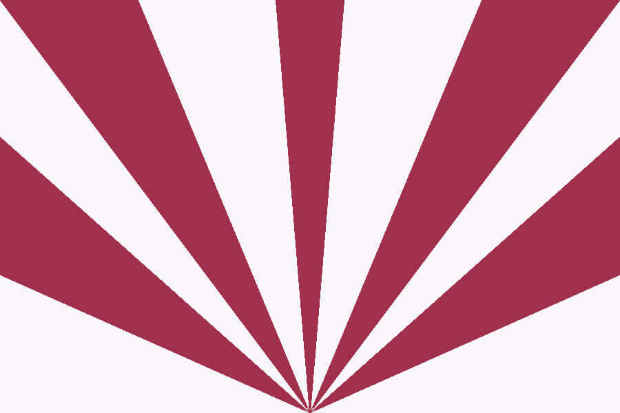
Arizona Cardinals
Taking inspiration from the Arizona state flag, the 11 cardinal/white stripes all converge at a single point, much like the 11 players on a team need to focus on a single goal.
———
Atlanta Falcons
The vertical black bars harken back to the original Falcons logo, while the red triangle stands in as a modified “A” for Atlanta.
———
Baltimore Ravens
A modification of the Maryland state flag using Raven colors, using a reflection of the Lord Baltimore banner of arms.
———
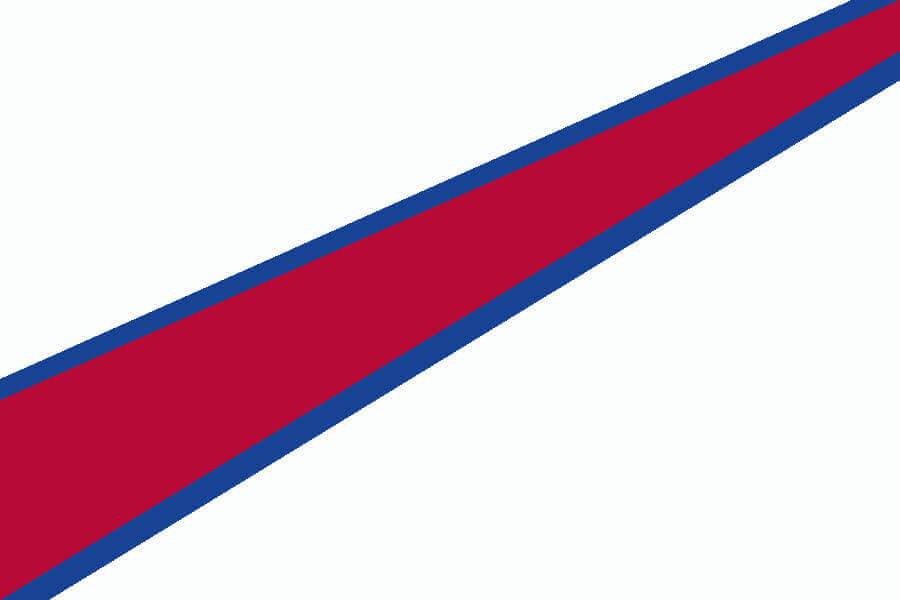
Buffalo Bills
The red “charge” of the charging blue buffalo is repurposed as a diagonal stripe while the mostly white field matches the team’s current helmet and Buffalo’s snowy weather.
———
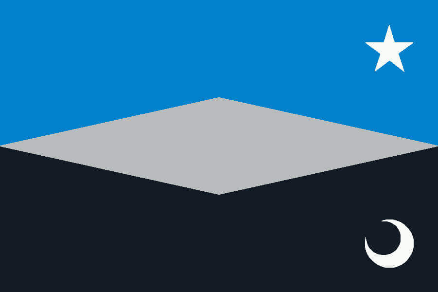
Carolina Panthers
The star from North Carolina’s flag parallels the crescent moon of South Carolina, with the silver diamond representing the Charlotte metro area that straddles both states.
———
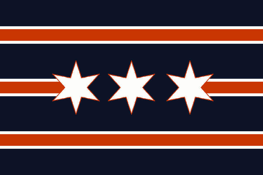
Chicago Bears
The orange stripes match the striping found on the Bears’ uniform sleeve. The three 6 pointed stars from the Chicago city flag replace the “GSH” perma-memorial.
———
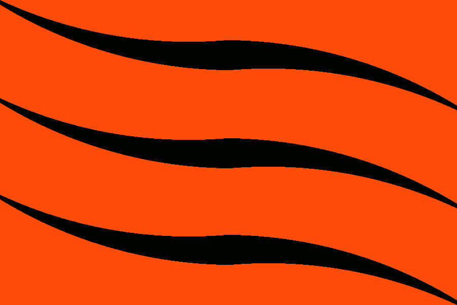
Cincinnati Bengals
The three parallel Bengal stripe “waves” represent the Ohio River flowing just outside Paul Brown Stadium and coordinate with the waves on the Cincinnati city flag.
———
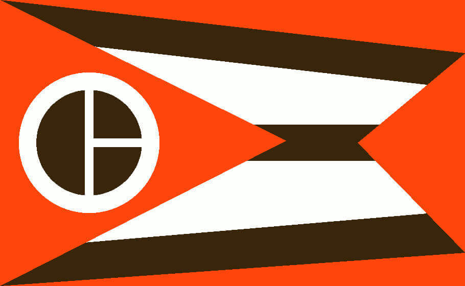
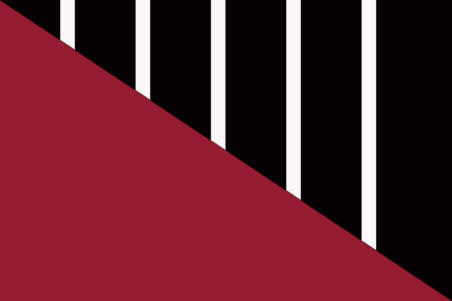
Cleveland Browns
The orange outlines the Ohio state burgee-style flag, while a stylized “CB” sits at the center of the triangular orange field. The three brown stripes represent the three main associations to which the Browns have belonged (AAFC, NFL, AFC).
———

Dallas Cowboys
The horizontal stripes match the most iconic uniform set in the NFL (silver helmet, white top, silver-green pants).
———
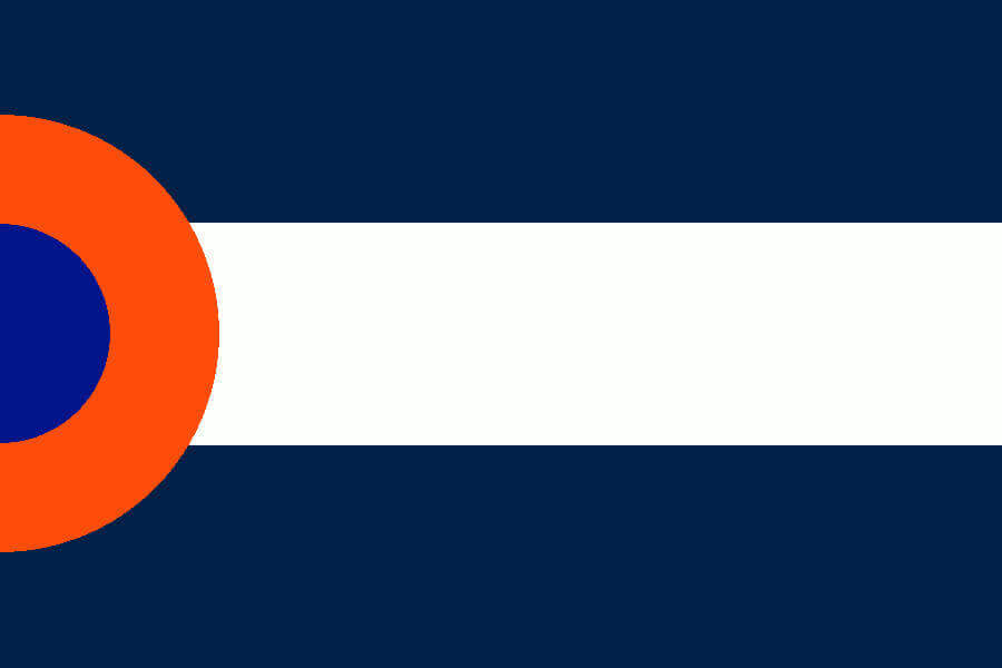
Denver Broncos
Reversing and offsetting the Colorado state flag’s “C” creates a “D” for Denver. The interior of the orange letter is the classic Elway-era blue.
———

Detroit Lions
The five-pointed star roughly points to the directions from Detroit of the five Great Lakes, represented by the Honolulu blue sectors. The white/grey background is divided in the same proportion as the areas of the Upper and Lower Peninsulas of Michigan.
———

Green Bay Packers
A silhouette of the Lombardi Trophy’s football is centered on an evenly divided yellow/green field.
———
Houston Texans
An extreme closeup of the Texans’ longhorn.
———
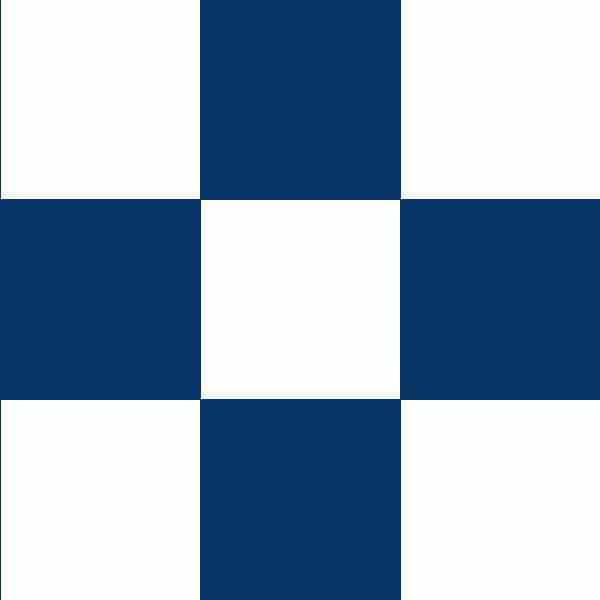
Indianapolis Colts
The only square flag in the collection, with the checkerboard pattern paying homage to the Indy 500 as well as to the eight counties that surround Marion County.
———
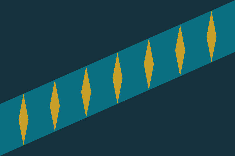
Jacksonville Jaguars
The teal stripe represents the St. John’s River that bisects the city. The seven gold diamonds correspond to the seven bridges that span the river.
———
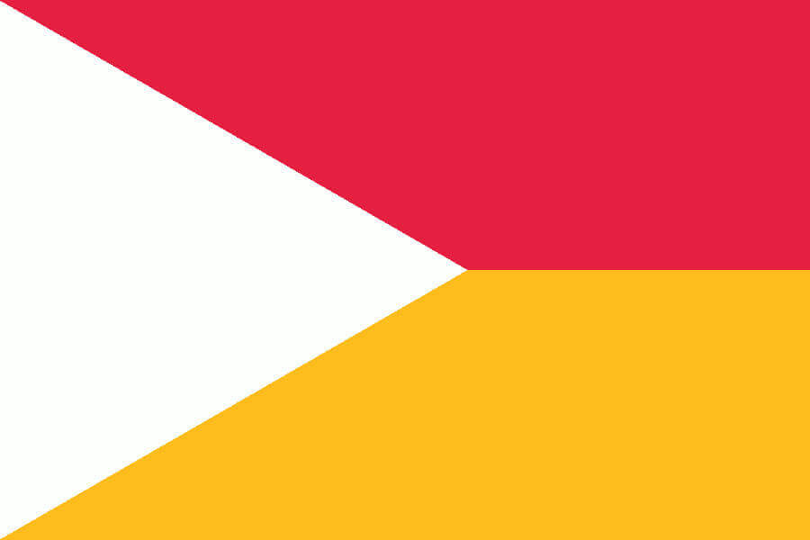
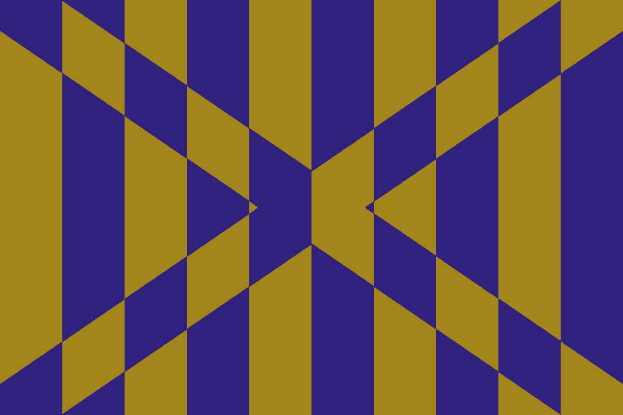
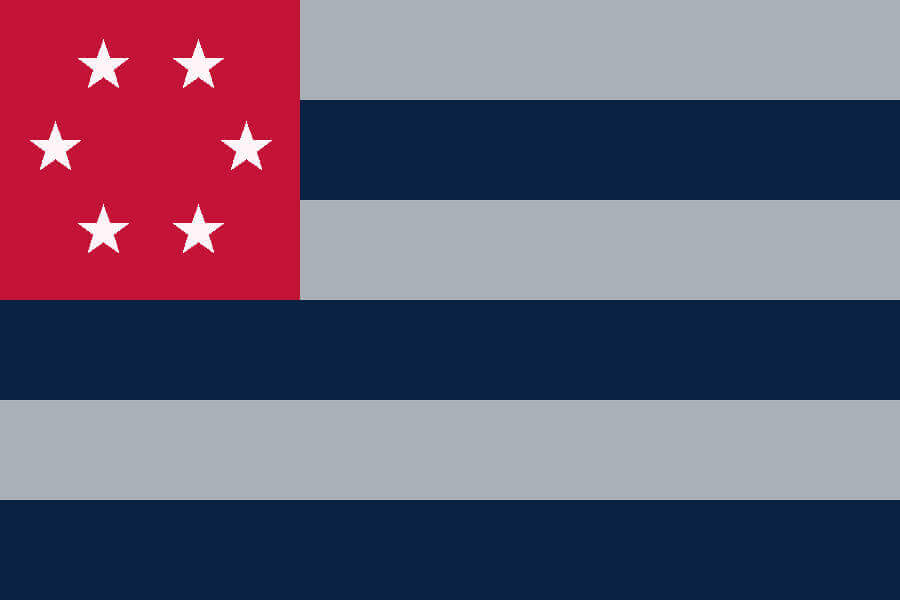
Kansas City
The white triangle acts as a more generic arrowhead to represent Kansas City’s tremendous home field advantage, while the red and yellow trapezoids represent Missouri and Kansas.
———
Los Angeles Chargers
Two lightning-shaped stripes (one each for Los Angeles and San Diego) divide white fringes from a light blue field.
———

Los Angeles Rams
The two shades of gold represent Los Angeles (top) and Cleveland (bottom), while the resulting “arch” from the Ram horns represents St. Louis.
———
Las Vegas Raiders
The silver silhouette of the Raiders logo centered on a black field.
———
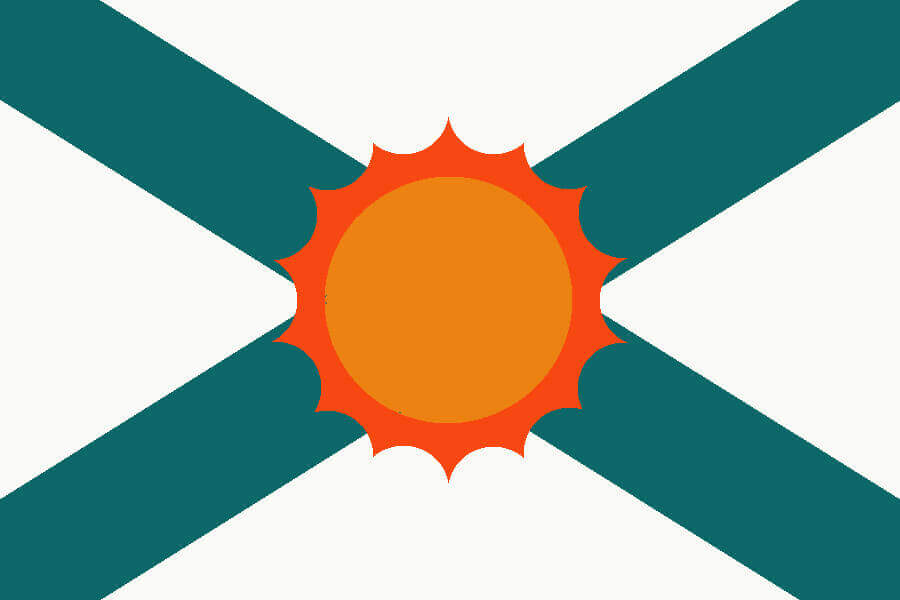
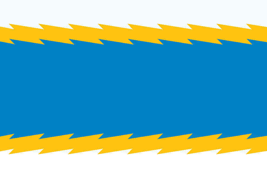
Miami Dolphins
Aqua stripes cross behind an orange sun in the same pattern as the Florida state flag. The sun has 14 flares, commemorating the team’s perfect 14-0 season in 1972.
———
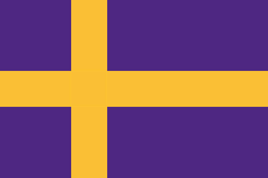
Minnesota Vikings
A Scandinavian Cross for a Scandinavian team name.
———
New England Patriots
A blend of the American and New England flags. The six stars and stripes represent the 6 New England states (and, for now, the team’s number of Super Bowl wins).
———
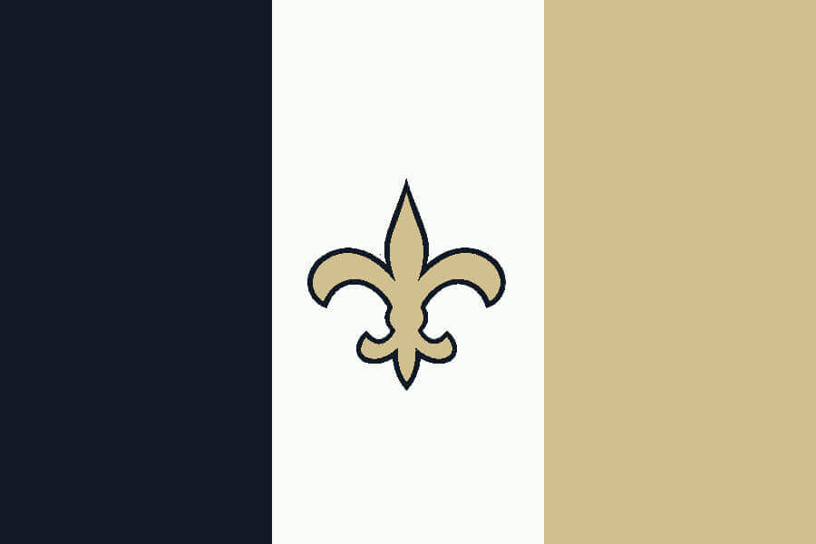
New Orleans Saints
The exception to my cut/paste prohibition, with the fleur de lis centered in a flag similar to the French tricolor.
———
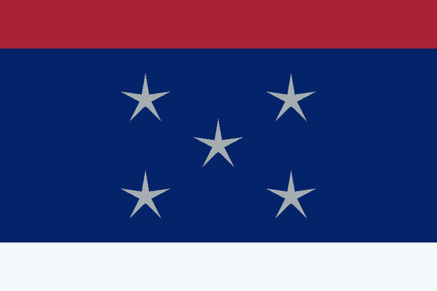
New York Giants
Big blue with red and white fringes. The five grey stars represent the five boroughs of New York City.
———

New York Jets
A futuristic jet shape modified from the team’s 1978-97 helmet logo fills the white field.
———

Philadelphia Eagles
White triangular eagle wings surround a green keystone with a silver background.
———

Pittsburgh Steelers
An empty black field next to the red, yellow, and blue hypocycloids on a white field to simulate the Steelers having a logo on only one side of their helmet.
———
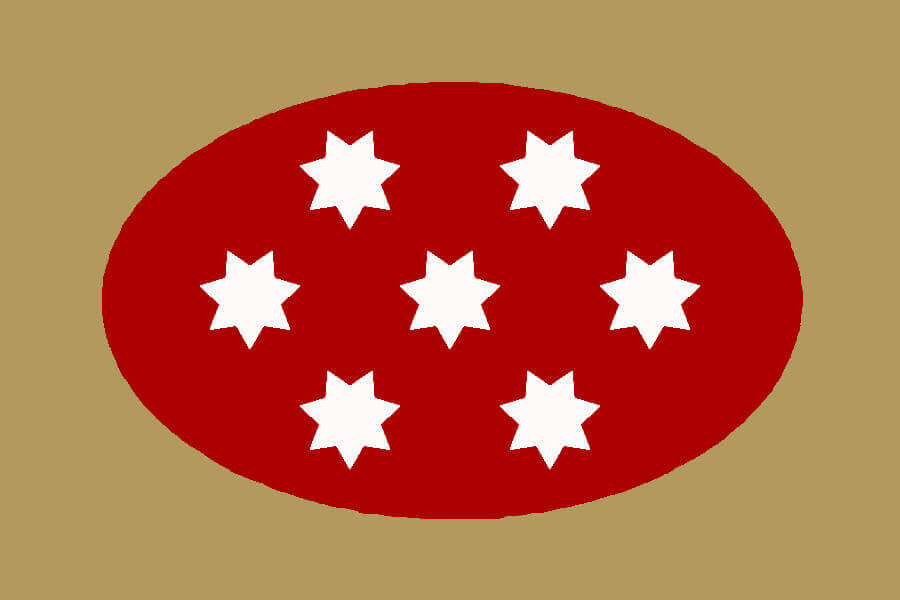
San Francisco 49ers
The red oval contains seven seven pointed stars, giving the flag 49 total star points. The gold field is for both the helmet and the gold that inspired the original Gold Rush 49ers.
———

Seattle Seahawks
The stripe pattern mimics the team’s logo. The green star is placed at upper-left to represent Seattle’s location as the NFL’s northwestern-most team. The star has 12 points, representing the Seahawks’ famous “12th man.”
———
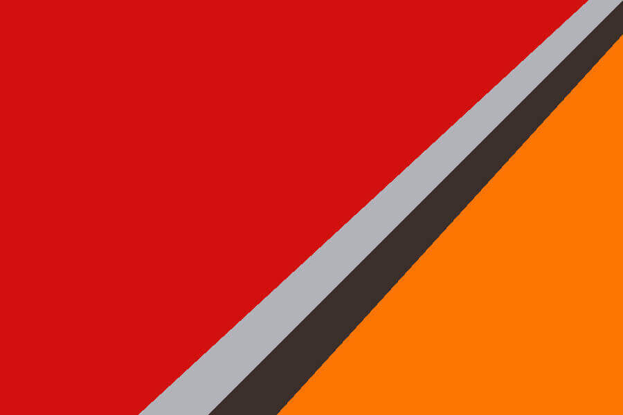
Tampa Bay Buccaneers
The grey and pewter sword point divides the red and orange sections of the flag.
———
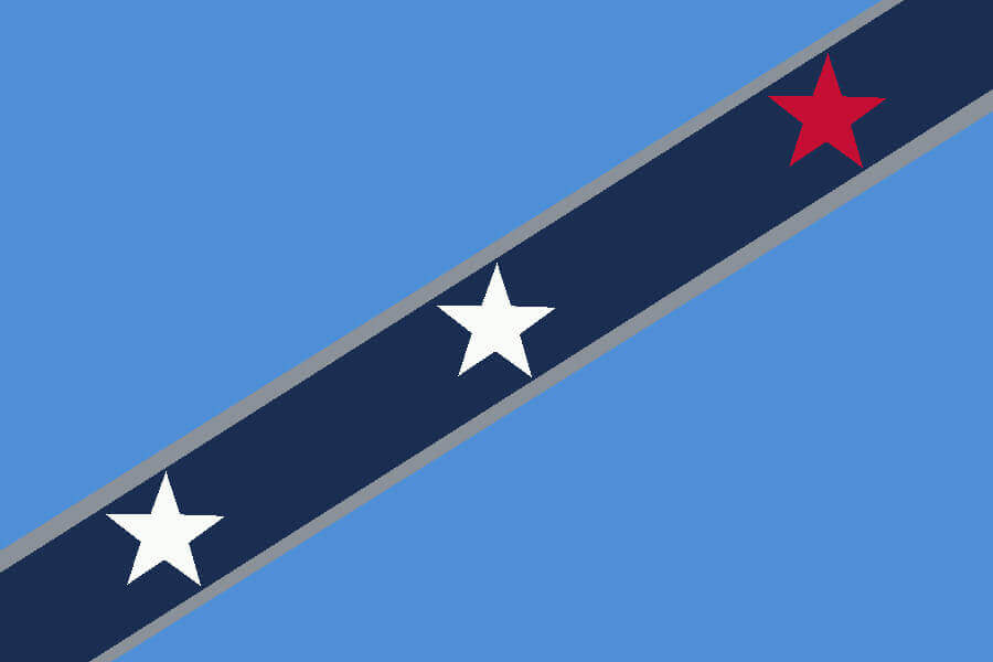
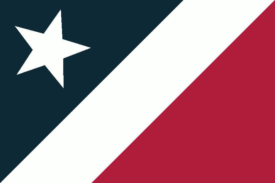
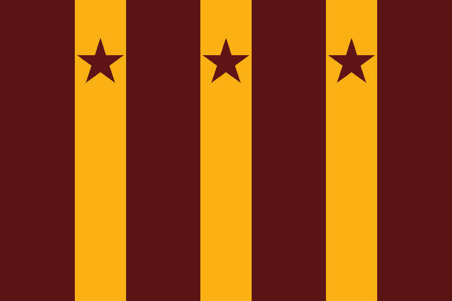
Tennessee Titans
The diagonal stripe shows the general direction of the franchise’s moves, with Nashville represented as the red star.
———
Washington Commanders
The three stars from the DC flag are contained in the triple stripes of the commander rank insignia.
———
Paul here. Interesting project, right? Obviously, some of Marc’s designs work better than others, and some of his “storytelling” is pretty silly (often intentionally so, I’m guessing), but he also has some good ideas here. Fun stuff!
The Ticker
By Lloyd Alaban

Baseball News: Here’s a photo of Atlanta P Phil Niekro in an 1870s-style uniform to celebrate the centennial of the National League in 1976 (from Austin Gilllis). … Also from Austin: Here’s a young Junior Griffey in an Atlanta uniform — a team he never played for professionally. The photo is from the late 1980s, when his dad played for Atlanta.

Football News: MLS’s NYCFC played their CONCACAF Champions League match at UConn’s home football stadium, Rentschler Field, last night. Even though the football season ended months ago, ghosts of the gridiron markings could still be seen (from John Muir). … With the Seahawks trading QB Russell Wilson to the Broncos yesterday, Wilson will continue to wear his Walter Payton Man of the Year jersey patch in Denver, as Payton winners get to wear the patch for the rest of their careers, regardless of team.

Hockey News: Shai Gilgeous-Alexander of the NBA’s Oklahoma City Thunder wore an Avalanche sweater on his way to the arena on Sunday (from Kary Klismet).

Basketball News: Cross-listed from the hockey section: Thunder G Shai Gilgeous-Alexander wore a Colorado Avalanche sweater on his way to the arena on Sunday (from Kary Klismet). … Actor Will Ferrell took some warm-up shots with the Warriors last night in character as Jackie Moon, whom he portrayed in the 2008 film Semi-Pro, complete with a throwback uniform and warm-up jacket (from Josh Claywell).

College Hoops News: Black vs. grey for Wright State and Northern Kentucky men’s last night (from Jacob Russell). … A few Bryant men’s players had square white patches on the back of their white jerseys last night. Anyone know what that’s about? … Wagner men’s head coach Bashir Mason wore a jersey on the sidelines in honor of injured G Elijah Ford, who tore his ACL and lateral meniscus in his right knee last month (from Andrew Cosentino).

Soccer News: Here is the NWSL’s North Carolina Courage’s new shirt for this season (from multiple readers). … Scottish club Aberdeen’s women’s team will play at the club’s Pittodrie Stadium for the first time on March 26 (from our own Jamie Rathjen). … New shirts for the Oakland Roots of the USL Championship (from Ed Zelaski). … New shirts for Brazilian side Internacional (from @HitTheGlass). … Cross-listed from the football section: NYCFC played their CONCACAF Champions League match at Rentschler Field, home of UConn’s football team, last night. Ghosts of the football field’s markings could still be seen (from John Muir). … New outfitter for the Italian national teams which are changing from Puma to Adidas (from Germán Cabrejo). … Following up on an item from yesterday, here’s more on Arsenal’s red shorts (from Dave Ciskowski). … The remaining items are from Kary Klismet: Spanish club Cádiz wore International Women’s Day-themed kits on Sunday. … Barcelona made the center circle on its pitch into a women’s symbol. … New home kits for the Wales and Scotland’s women’s national teams. … New third kits for Paraguayan side Guaireña FC. … New away kits for Hartford Athletic of the USL Championship. … New away kits for Jeonbuk Hyundai Motors of Korea’s K League 1. … Mono-black for Swiss Super League side F.C. St. Gallen last weekend.

Grab Bag: The head of the Central Russian Bank wears brooches that presumably symbolize her thoughts on the Russian economy (from JohnMark Fisher). … A school in Llandudno, Wales, has adopted a new costumed mascot based on the area’s wild goats that famously roamed the town during the Covid lockdown in 2020 (from Kary Klismet). … Here’s a fun look at the various shades of red that have been used over the years for Super Mario’s red shirt (from @dbrown_50).

Click to enlarge

What Paul did last night: Last night I went to a small theater and watched four women — one of them wearing Spock ears and a Spock wig — take off all their clothes and read from science fiction books for about two hours.
This was the latest installment (but the first one I’ve attended) of the Bare Book Club, an ongoing series of themed readings by naked women. It’s ridiculous and absurdist and sexy and nerdy, all of which is the point. The sci-fi texts being read ranged from the classic (a sequence from Ray Bradbury’s Fahrenheit 451) to the obscure (a 1952 short story about time travel and a butcher shop, called “The Good Provider”). Photography wasn’t allowed during the naked portion of the show, but the four participants posed for a clothed group photo at the end. A fun night!
Ironically, the team with the simplest helmet gets the most complicated flag.
Probably less “designing” than he wanted to do, but the Browns flag *has* to be the orange-brown-white-brown-orange helmet stripe
Source: I’m from Cleveland lol
Man if that Buffalo flag was readily available I have a feeling that the Bills Mafia would adopt it for tailgates in a HEARTBEAT. My clear winner of all the designs. Though I really like a large majority of them! Great stuff!
Great work, Marc! I’m surprised Vikings fans don’t already fly a purple-and-gold Nordic cross flag.
Love the national flag concept for sports teams.
Some thoughts:
Cardinals – the rays could converge on a copper star, or a bird.
Cowboys – NEEDS. A. LONE. STAR. I like the subtlety of the silver and green-silver bands but come on – the team with the star on its helmet, from the Lone Star State? Even as an Eagles fan, I can admit that this flag needs the lone star.
Chiefs – why not reorient it so that the white triangle/arrowhead faces down, so you would then have Missouri (yellow) on the right and Kansas (red) on the left?
Raiders – the head of the raider, with or without the shield, with or without swords. Some iconic logos are worth violating your cut/paste rule (Saints, Cowboys, Raiders).
Panthers – one of my favorites, but why a diamond? Charlotte is the Queen City, and the crown motif is overused but why not go for something royal?
On balance, I like these. I love the idea and the execution.
I usually don’t comment but I felt I had to say that these flag designs kept making me say “these are incredible” as I scrolled down today.
As an NYC-area ex-pat I also weep for the fact I never saw Naked Girls reading lol
Paul, today’s post only seems to visible via the direct link you posted on Twitter. When going directly to the Uniwatch home page on multiple computer it takes you to yesterday’s post.
On it.
Hi Paul, the homepage is redirecting to yesterday’s post (I’m on Mac/safari)
Working on it.
I loved this exercise. My only critique is the Cowboys flag should be modeled after the Texas State Flag.
The Texans would like a word with you about this.
Further proof Chicago has just the best flag ever.
Really fun flag project. Dallas is the one I though was the most uninteresting though. I’d add the respective blues to that one, perhaps in a thinner stripe on top/bottom of the white field. Navy on top to go with the silver and royal-ish on the bottom to go with the sea green or whatever the hell that silly other color the ‘Boys use is.
Error: It was the head coach from Wagner, not Bryant.
Fixed.
In re “… a trend that I believe began with “Red Sox Nation” in 2004 and has since spread throughout the sports world.” I’m old, and I’ve been hearing “Cardinals Nation” and “Redbird Nation” literally my whole life. It’s use was attributed to the fact that for decades St. Louis was the western and southern outpost for Major League Baseball.
link
The term may have originated with the Cardinals, but the trend of using it to describe basically any team’s fandom probably started with the “Red Sox Nation” vs. the “Evil Empire” in the 2000s. Boston may not have invented the idea, but they certainly took it to a new level.
Nice job Marc. However, the Cowboys flag needs a star. Sure it’s obvious, but sometimes it’s best to go with the obvious. Also, a couple of years ago the Cowboys, when wearing white jerseys, switched from the silver-green to a silver-blue.
The only error with the Bears flag is that it needs all four stars from the city’s flag.
Absolutely LOVE the Rams flag concept!
Thank you for the feedback, everyone. It was an artistic itch that needed scratching. The Cowboys logo was the last one that I submitted because I kept going back and forth on it.
Last couple years, Cowboys pants have gone from greenish hue to light bluish.
Nice job, Marc! I love so many of these designs. I also appreciate how they adhere to vexilological standards (at least much more so than a lot of “real” flags do). And certainly far better than Just about any team flag one can buy at retail.
Good stuff in general…though I was most surprised to see the old logo for the construction equipment manufacturer with the insect name used for Browns Nation.
Current Rams Onwership would never recognize St. Louis. Cool flags though.
In my mind, “silly” storytelling is storytelling that makes up connections after the fact that were never intended by the original designer. Since all of these connections were obviously intended by the designer, that makes them immune from the “silly” accusation IMO. (I actually thought a lot of them were really clever, but maybe I just have a juvenile mind!)
Anyway… not to bury the lede, but I absolutely loved almost all of Marc’s flags. What a cool project!
I’m sorry, but “The five-pointed star roughly points to the directions from Detroit of the five Great Lakes” is silly, whether or not it was deliberate.
The Saints and Steelers drive home how important logos are in graphically representing teams. Most of the rest of these would be impossible to identify out of context.
They really do though. The lakes themselves are represented by the blue sections on the flag, which lie to the north (Huron), northeast (Ontario), southeast (Erie), southwest (Michigan), and northwest (Superior), and at least part of each of those lakes does lie in the assigned direction from Detroit. The only one that’s a bit of a stretch is Michigan, but the southern extent of Lake Michigan is, in fact, southwest of Detroit.
See, I think that was one of the best storytelling examples in the whole set, for exactly that reason ;-)
Really cool project, but as a New Jersey resident, I feel either or both of the Giants & Jets flags needed some nod to the fact that both teams are New York in name only.
Marvelous design project! Fascinating.
Much more exciting than the typical “direct-carryover” flag and banner designs.
I wish this was a thing!
Most of the flag designs are really well done. Flags like these are frequently waved at soccer games, including the MLS. It’s about time NFL fans did likewise.
This is really excellent work. I will admit that a juvenile portion of my mind expected the Eagles flag to be a silver middle finger on a field of green, but I really like the choice of the Keystone.
Not that anyone’s asking me to rank them, but my 5 favorites:
1) Bears – brilliant work, ties together a uniform element and a city element without feeling like either was out of place.
2) Vikings – That’s too obvious not to be brilliant. As others have said, how is that not already a thing?
3) Saints – A well chosen exception that helps justify the rule. (Though I agree with the other comments that Dallas could also have justified incorporating their star logo.)
4) Cardinals – Turns out I really like it when you integrate something from the location’s flag.
5) Dolphins – See above. Cardinals pips this because the execution was so simple on that one; this is a step more complex.
Have two players on the same team ever worn the WPMOY patch at the same time? A cursory review appears to be no. Justin Simmons on the Broncos is a perpetual favorite every year, so he and Wilson could end up being our first duo.
Pretty sure that hasn’t happened — yet.
Naked book reading? Huh?
As Kramer would say “Only in New York”.
Actually, Bare Book Club has chapters all over the country (and the world).
Cool NFL flags! I’d like to see a set for the NHL.
I’d rank the Top 7 as:
Chiefs
Saints
Bears
Packers
Texans
Chargers
Dolphins
Neat idea!
The Bills design is my favorite of the bunch. So clean and simple, and yet absolutely brings the Bills visual identity to mind.
Fun project, Marc! I love the thoughtful approach you’ve taken, and I really like most of the results. The only one that really doesn’t work for me is the Eagles. (31/32 is still a solid A!) The silver on either side of the keystone makes me think of lightning, which next makes me think “why lightning, not wings?” Also, the Keystone thing is both a bit overplayed and it’s more of a general Pennsylvania, or anyway Eastern Pennsylvania thing, than specifically a Philly thing. The suggestion I’d have offered if I were the “client” on this one is, what about making the keystone more abstract, such as bisecting the hoist or fly edge, and using it to define a more wing-shaped area? Or make it a negative-space element. That sort of thing. But that bit of highly picayune criticism should only serve to emphasize by contrast how terrific I think most of the rest of these are. Kudos!
Oh, and seconding Matthew Radican: I’d love to see this for the NHL. Really for all other leagues, but I think NHL is probably the most promising, followed by basically any soccer league.
it amazes me that no one can ever design something for the atlanta falcons that’s worth a damn. red and black. takes an effort to mess that color combo up and yet i’m constantly left speechless at the ineptitude people display when trying to design anything falcons related. how hard was it to base the design off the cuban/puerto rican flags? already has the triangle and stripes thing down just pick how you want the colors displayed.
dolphins, vikings, and bears were top 3 designs for me
Please share your Falcons design!
Great stuff Marc!
Great work on the flags, Marc!
What a great set of flags! The moon and star motif of the Carolina flags NEVER occurred to me. I could see teams/fans flying these.
Did anyone comment on the seven-pointed stars also being the shape of the San Francisco police badge? Was that only chosen to fit the 49-points narrative and that was just a coincidence? Other than the flag of Australia and I don’t see many 7-pointed stars.