For all photos, click to enlarge
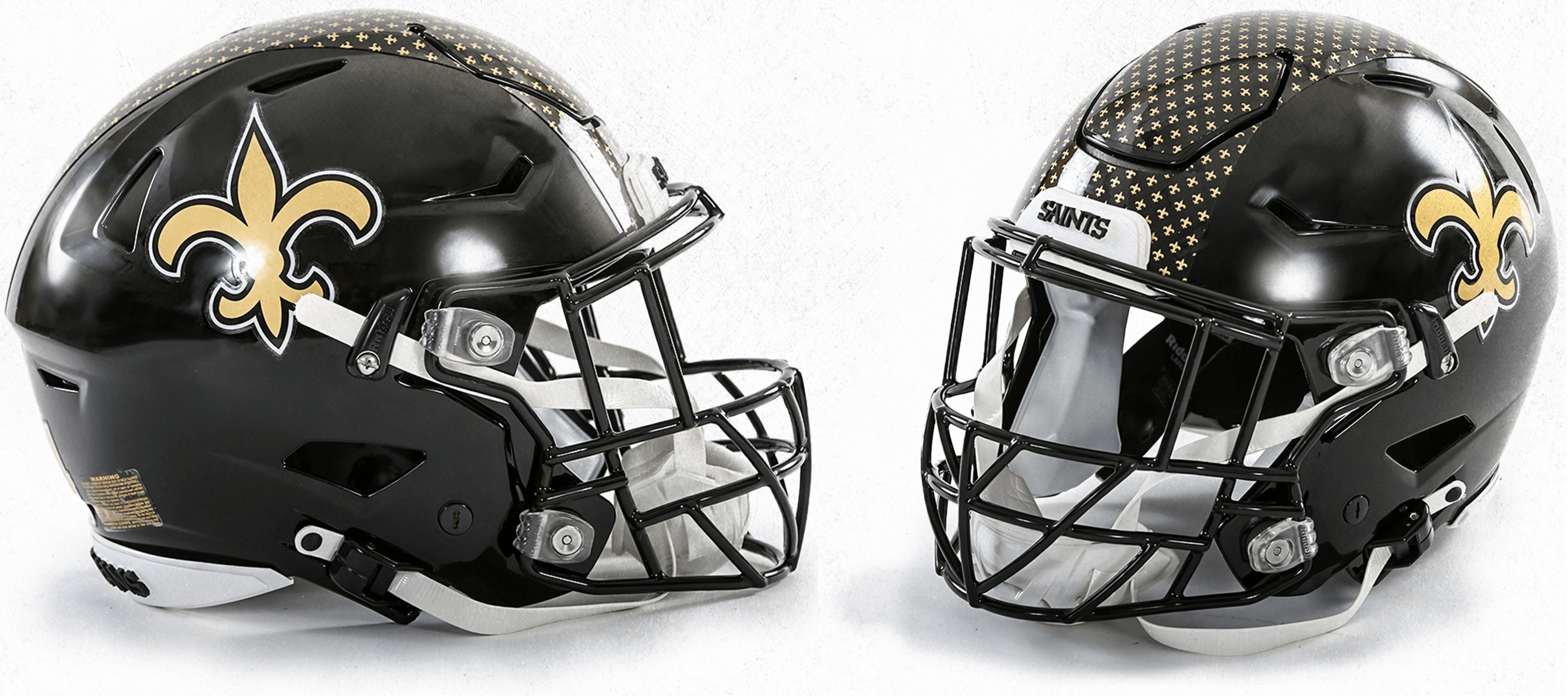
The Saints yesterday became the latest team to take advantage of the lifting of the NFL’s one-shell rule by unveiling a new black alternate helmet. According to the team, it will be worn for at least one game this season, with more details to be announced later.
I had no inkling that this was coming — there were no teasers, no hints (at least not that I was aware of). Kind of refreshing to see an unveiling handled that way.
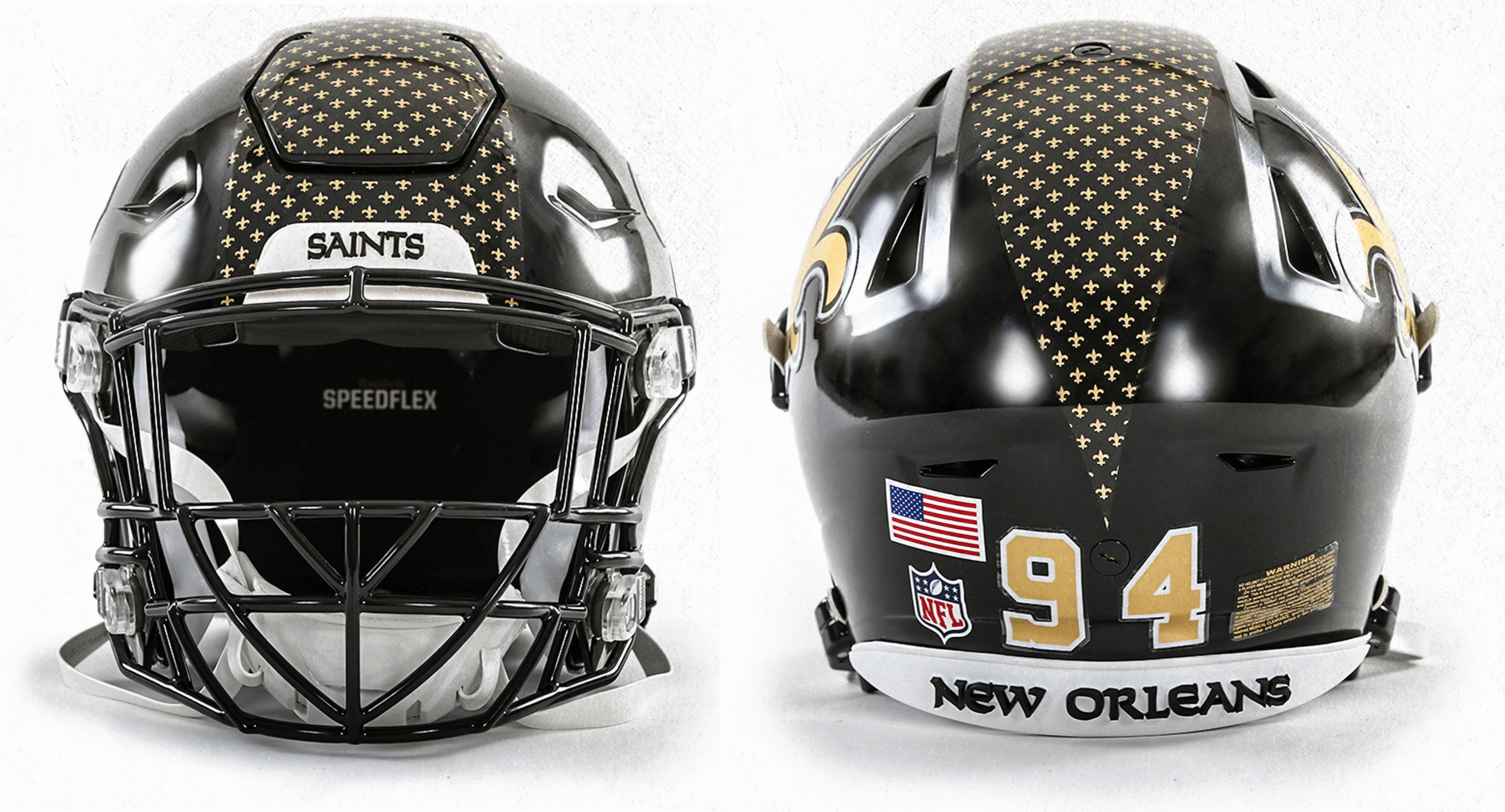
Side and three-quarter views of the helmet are shown above. Here are the front and back views:
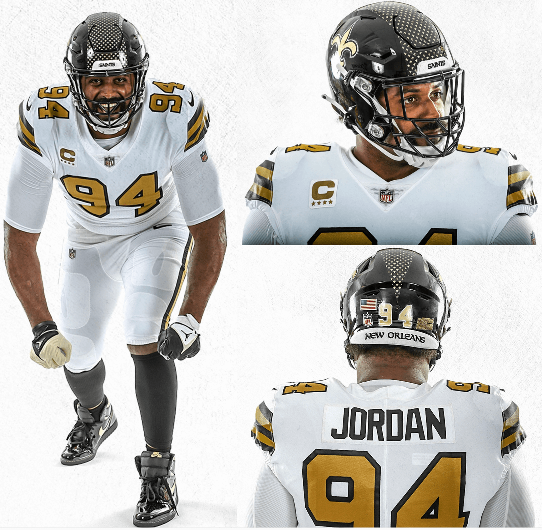
So which uniform(s) will this helmet be worn with? In theory, it would seem to work with any of the Saints’ uni combos, but the team released photos of defensive lineman Cameron Jordan wearing the helmet with the club’s mono-white Color Rash uni, so they apparently plan to wear it with that uniform, at least for starters:
Some quick thoughts:
• I don’t hate the idea of a black helmet for the Saints. Black is one of their team colors, so it’s clearly not BFBS. On the contrary, it totally makes sense.
• I do hate that center stripe/cloud of fleurs de lis, though. Ugh, what a mistake.
• As many of you probably know, the Saints do have some previous history with black helmets. In 1969, they wore black lids for all six of their preseason games (yes, NFL teams actually played six preseason games in those days!) and in practices. But team ownership hadn’t informed the league of its plan to switch from gold helmets to black, so the league pressured the team to switch back to gold for the regular season.
Here’s how those black helmets looked:
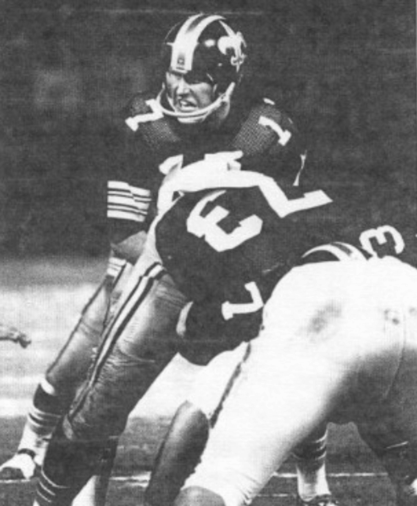
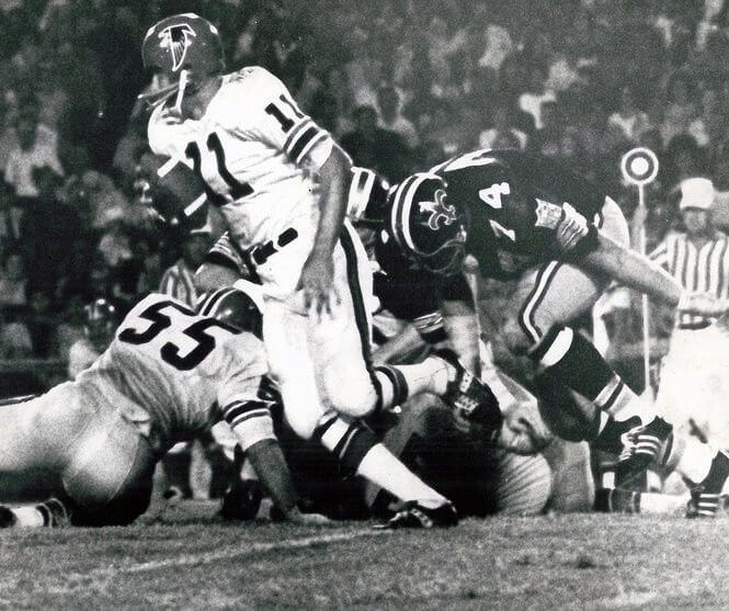
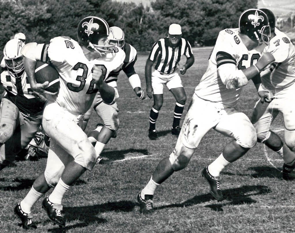
(For that last photo, which shows a Saints/Chargers scrimmage, note the ref wearing shorts!)
I’ve always liked that helmet and have long hoped that the Saints would revive it as a throwback, as a way of spotlighting this odd chapter in team history. I wish they had gone that route instead of going with their new design. But hey, you can always swap out the decals and striping tape on an existing shell color, so maybe they’ll do that someday. Here’s hoping.
Anyway: By my count, this makes five teams that will have two helmet colors this season (the others being the Falcons, Eagles, Pats, and Commies).
Meanwhile, as long as we’re talking about the NFL, the Eagles introduced a new wordmark yesterday:
The #Eagles have tweaked the wordmark for their logo, going with a more modern look. pic.twitter.com/raqORA9dvm
— Ari Meirov (@MySportsUpdate) June 16, 2022
That move has on-field implications, because the Eagles wore the outgoing wordmark on their jersey chests. Check that — reader/commenter Patrick notes that the new wordmark will not appear on the jerseys this season.
Click to enlarge
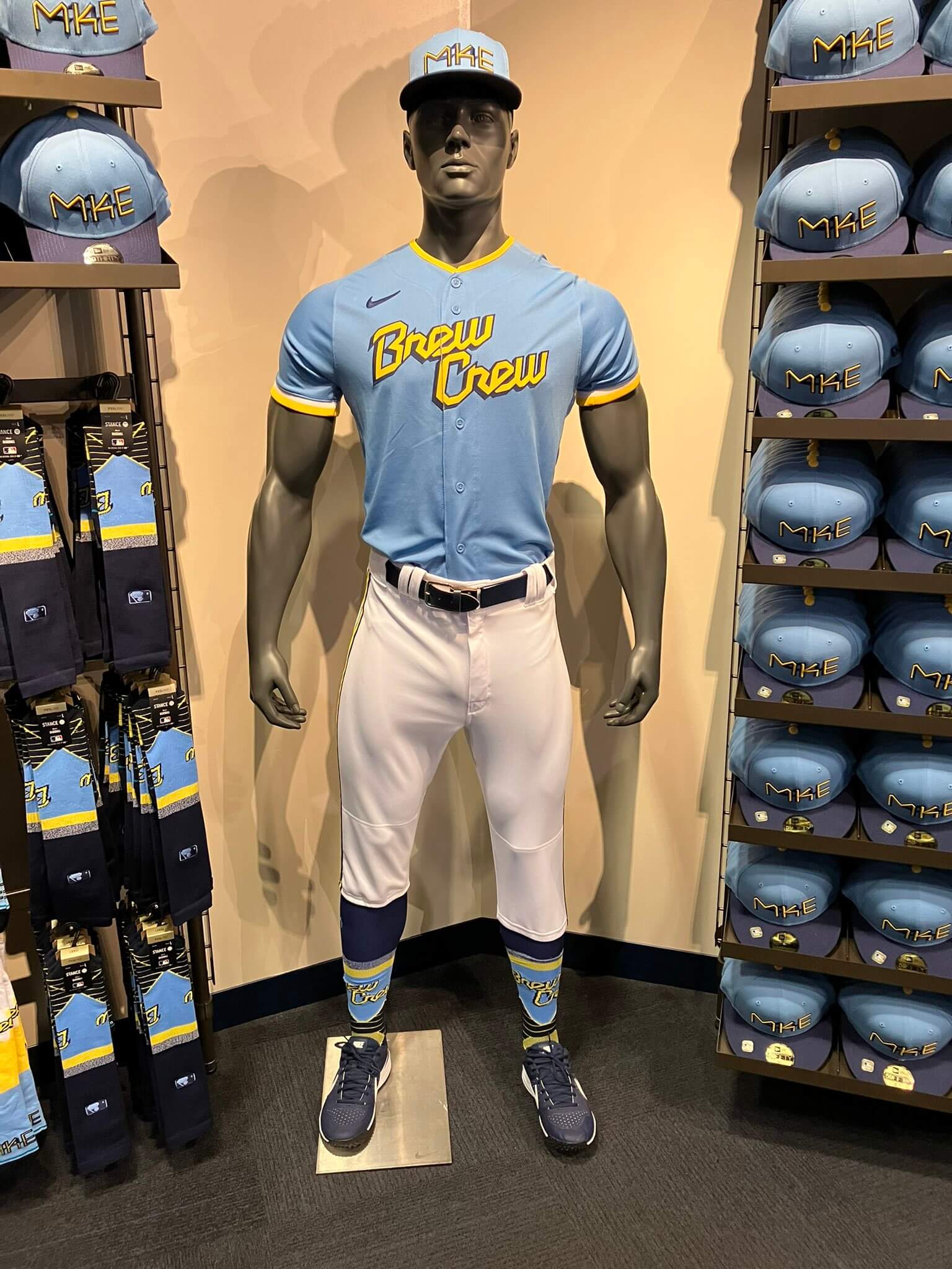
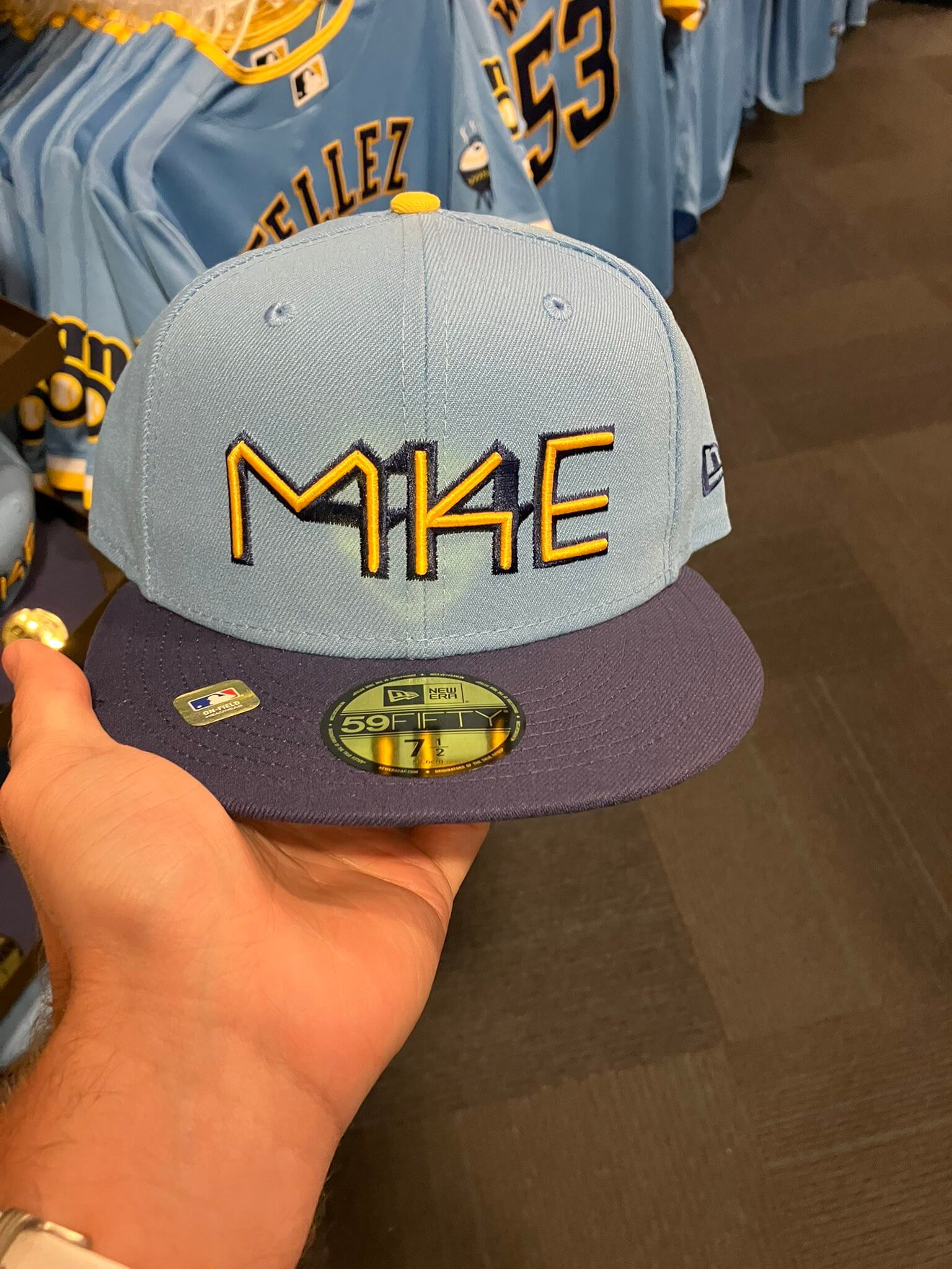
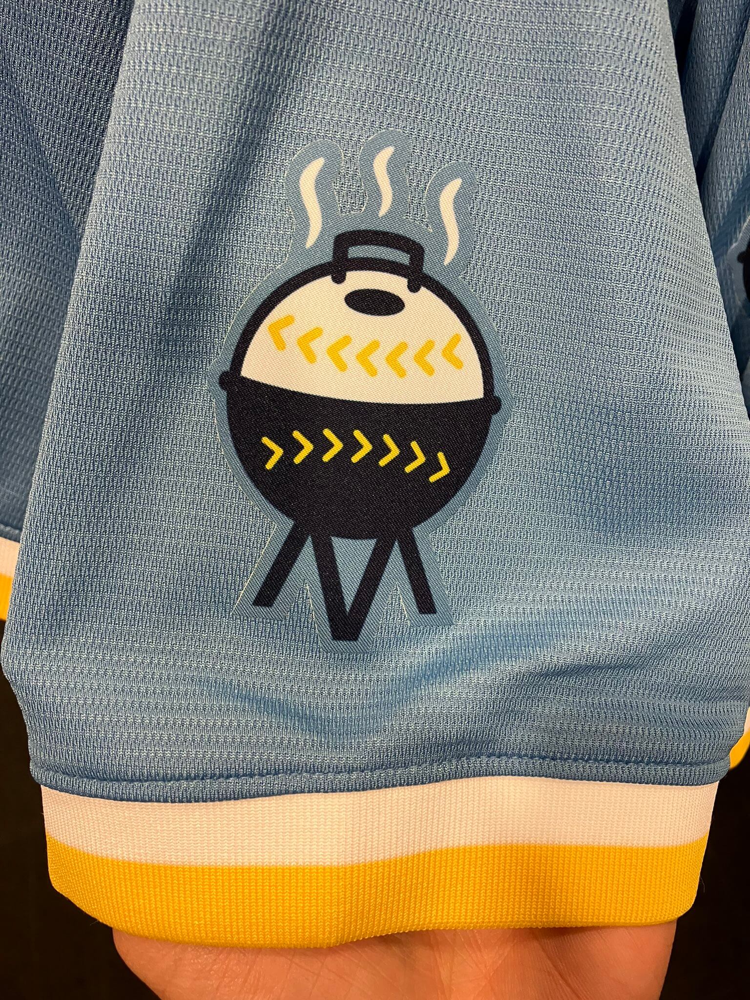
Brewers City Connect unveiling: The Brewers just unveiled their CC uni this morning. It’s consistent with the earlier cap leak and also features MLB’s first-ever grilling-themed sleeve patch:
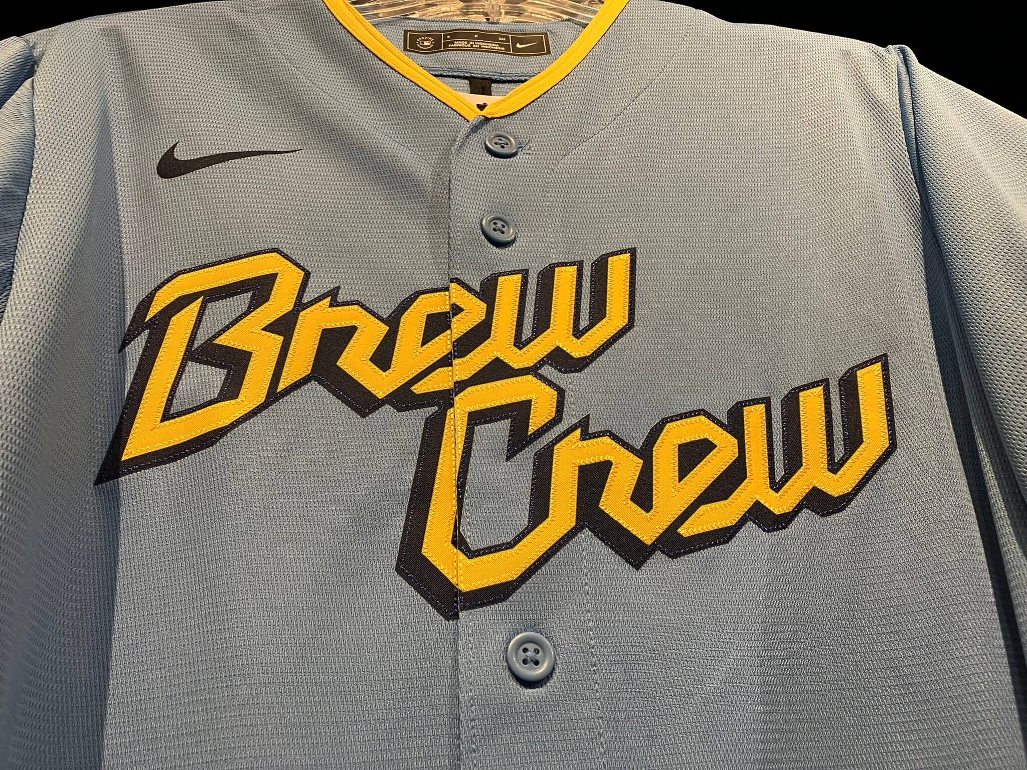
I’ll have more to say about this uniform on Monday.

AMA reminder: My Bulletin article this week is my quarterly “Ask Me Anything” edition, where I answer questions posed by Uni Watch readers. My Premium Subscribers can read the article here. If you haven’t yet subscribed, you can do that here (you’ll need a Facebook account in order to pay). Don’t have or want a Facebook account? Email me for workaround info. Thanks!
The Ticker
By Anthony Emerson

Baseball News: Mariners P George Kirby’s cap’s squatchee was silver instead of navy for his start last night. Honestly, I kinda like the look. … The Orioles are giving away a soccer-style jersey in September (from multiple readers). … The Nationals are using an anachronistic number font on this promotional art for Ryan Zimmerman’s number retirement (from David Raglin). … The San Antonio Missions, Double-A affiliates of the Padres, wore Uvalde jerseys last night (from Ignacio Salazar).

NFL News: All Bears players wore No. 41 yesterday in honor of Brian Piccolo, who died 52 years ago on June 16 (from multiple readers). … Phoebe Bridgers and her backing band wore football uniform versions of their trademark skeleton costumes during a Jimmy Fallon appearance, complete with pads. Bridgers performed her new song, appropriately named “Sidelines” (from Tyler Kepner).

Hockey News: Alpine F1 driver Fernando Alonso was spotted in a Habs jersey ahead of this weekend’s Canadian Grand Prix in Montreal (from Andreas Papadoupolos).

Hoops News: Ahead of today’s uniform reveal, the Jazz’s note logo sculpture outside their arena has been changed to evoke the ’90s uni set. … The Pistons are putting their primary logo on their shorts next season, replacing the interlocking DP logo that had been there (from Kary Klismet). … Also from Kary, the Fraser Valley Bandits of the Canadian Elite Basketball League has a new logo designed by a local British Columbia First Nations artist. … Duke has revealed the uni numbers for its new varsity players.

Soccer News: England’s women’s team wore black armbands for Thursday’s friendly in memory of coach Sarina Wiegman’s sister (thanks, Jamie). … Also from Jamie: New third shirt for Scottish club Kilmarnock. … The following are all from Kary Klismet: new 125th-anniversary kits for Red Star FC of the French third tier, and new kits for Kilmarnock, Middlesbrough, Porto, Arminia Bielefeld, Fortuna Düsseldorf, Tranmere Rovers and Swindon Town. … ESPN broadcaster Derek Rae noted that due to FIFA sponsorship rules, the NFL facilities that will be used for 2026 World Cup matches may have their names changed for the duration of the tournament (from Trevor Williams).

Grab Bag: If you want to celebrate Dickies’ 100th anniversary, you can buy these Dickies logo pants for $85 (from John Cerone). … LGBTQ Ukrainian servicemembers are adding unicorn patches to their uniforms (from Timmy Donahue). … A Japanese low-cost airline, Zipair, is changing its logo due to associations with Russian military units. … Premier Lacrosse League news from Jared Buccola: “Atlas Lacrosse Club unveiled a new cream “special edition” jersey with horned sleeve stripes and new number font. Not sure if these will be worn on the field. Also, Chrome Lacrosse Club has new matte grey helmets.” … A federal court has ruled that a North Carolina charter school violated girls’ Constitutional rights by requiring that they wear skirts.

What Paul did last night: Yesterday was the third Thursday of the month, which means it was time for me to go see the great Pre-War Ponies, a ukulele band specializing in lesser-known songs by famous 1920s and ’30s composers. My friends Matt and Charlotte met me at the club, where we bumped into a few additional friends, and then we all went out for burgers afterward. A swell night!
That’s a wrap for this week. Phil is busy curling at a bonspiel this weekend (good luck, buddy!), but we’ll have a quick pre-Father’s Day post tomorrow and have Phil’s annual “Dads in Uniform” post for Father’s Day on Sunday.
I’ll have a full assessment of the Brewers new CC uni and the Jazz’s new uni set on Monday.
Enjoy your weekend, and please accept my best wishes for a happy Juneteenth and also a happy Father’s Day. I’ll see you back here on Monday. Peace. — Paul
Lots of news today.
Saints: Not awful (aside from the FDL quasi stripe thing). But in general I’m against second helmets unless they are a full throwback, and even then only once a year. Helmets are so tied to NFL teams’ branding that having multiple worn on a regular basis dilutes their identity.
Eagles: The old workmark needed to go, too much going on with it and it was clunky to use as a wordmark, always seemed more like a logo. New one is a meh, I get the notches in the Es tie it to the design of their logo, but they don’t look good.
Brewers: Hat is awful, jersey is mediocre, the grill logo would be good for a team called the Grillers, or as one of those one-day rebrands for a minor league team. But they are the Brewers, couldn’t come up with a beer themed logo? I am sure Nike has some storytelling to explain the logo though.
Love the colors of the Brewers city connect uniforms. I agree the hat is awful. I like the grill logo, even if it feels a bit minor league. Really, the whole set feels minor league, so I guess the grill logo works in that sense. I almost wish they’d have put the grill logo on the hat. For a fun one-off uniform it could be worse.
For a fun one-off uniform it could be worse.
Just to clarify, it’s not a one-off — it’s a full-fledged alternate that will be part of their wardrobe for three seasons.
Agree. I feel like that is the case with all the city connect uniforms. They all have some cool features. But there seems to be an insistence that they all have at too many design features deviating from standard designs, and I don’t think any of the uniforms have managed to get all of them to work. In this case were it not for the hat logo this would be a decent uniform, as you said, with the feel of a fun minor league alt.
Totally agree on the helmet worldview. Adding an alternate, non-throwback helmet is a low self-esteem move, implying that the helmet you’re worn for 50 years and everyone associates with you isn’t good enough.
According to Eagles beat writer Zach Berman- “One note here: The new wordmark will not appear under the collar of the team’s jerseys this season. From my understanding, the 2024 season will be the earliest the wordmark change will be reflected on the jerseys based on the timeframe of uniform changes”
As an Eagles fan, I can say that the old wordmark was extremely dated to the mnid-90s much like their uniforms. However, this new wordmark is terrible. It’s the trend. Much like NE, Washington, Carolina, Atlanta, Detroit, Jacksonville and both LA teams, the Eagles went with minimalistic, one color font with a few modifications to make it “unique”. It’s boring, and in step with not only the NFL but majority of corporate branding right now.
It looks even worse when they match the new wordmark with the Eagles head logo. You have a multi layered, shaded and aggressive Eagle logo with a single color, minimalistic wordmark. Bad.
My only hope, and I say that lightly with what Nike can do, is that this is the beginning of an entire rebrand.
Thanks for that, Patrick — I’ll update the text with that quote from Berman.
Agree. The new Eagles font reminds me of the Lions. Very generic, with just enough modification to not be same as everyone else.
Regarding the change on the uniform, it is interesting because I could have sworn when the Pats changed their wordmark about a decade ago it showed up on the uniforms the next year, but according to the GUD it took two years from the wordmark change for it to be swapped in on the uniform. So there is definitely precedent on the delay in the on the field change. Though I imagine the new wordmark will show up in the endzone this year. That is a major plus since the old wordmark was ill designed to fit in an endzone. Curious if they have Philadelphia also rendered in his font.
That Eagles wordmark is so blah you’d think it came out of the Jaguars design department.
You could render anything in that font. Just pick a basic sans-serif font, italicize it, hit caps lock, and there you go! If you want to be super-unique, arbitrarily cut some of the letters juuuuust enough so that it is definitely kinda sorta modified so you know it’s unique. Voilà!
For the grilling patch, that’s a reference to Brewers fans’ love of tailgating. Both old County Stadium and AmFamFi have lotsa parking spaces and it gets smoky quickly. At least they didn’t throw in unused colors. I actually like the MKE/414 cap. About the only thing I don’t see is some Bob Uecker reference.
As for lack of a Uecker reference, I agree. But he does a LOT of reads for sausage companies during games, and ad-libs in mentions about grilling.
From my experiences attending games in my local metro of Philly, and various other road trips, I’d venture to say grilling is sort of ubiquitous in the tailgating world.
Is there something specific to Brewers’ fan culture that they lay specific claim to it? I’d have thought some sort of brat logo would be more location specific and appropriate.
I would agree it’s not completely unique. But compared to most baseball stadiums (especially those located downtown), there is a lot more tailgating in Milwaukee.
This is part of a larger issue I have with all the gimmicky identity branding going on in major US sports leagues lately. The overarching issue being that in the rush to broaden a team’s identity in a way that is both official (in-game gear) and marketable (bright, unique design, making use of alternative identifiers for the team/location) every market is forcing concepts that make them “special or unique” according to the design house (basically Nike at this point).
Using the brewers for an example: I can infer what MKE is because I’m being told that it is Milwaukee and MKE are letters in that name. However I have no idea what MKE is otherwise and wouldn’t if I wasn’t being told. I also don’t know what area code 414 is without being told. These are not iconic or famous or infamous or even common knowledge locators outside of the Milwaukee area (also they are trying SO HARD with that hat design and for all the muddled up lines it just says “MIKE” to me at first glance).
But beyond “standard abbreviations” (only ten-twenty come to mind as worthy of a jersey front or hat logo) and area codes (there are none famous enough to warrant using as a commonplace locator, are the “iconic city skylines” (NYC, SF, Seattle and Toronto are the iconic skylines in North America, most others look like clip art buildings in a line to anyone outside those areas), “famous city nicknames” (again, ten-twenty are probably famous enough to use in uni branding), and dubious claims to some either ultra obscure/minute/commonplace “quirk” of the area.
Read the storytelling for many MILB alternate identities (and, increasingly, main identities) and your often likely to read something like “no one love donuts as much as the citizens of Joliet, Illinois. There are multiple places to buy donuts in our sleepy little town and most mornings you can see customers in line to purchase these unique and delectable breakfast treats. Yup, you could say our love of donuts is on a “hole” other level here in Joliet. That’s why we chose this iconic local treat as the cornerstone of our new identity, the “J-Town Chocolate Sprinkle Hole Munchers”.”
Long story short: Milwaukee likes tailgating. So does everybody else who attends sporting events.
The number of grills in that parking lot for even a Wednesday afternoon getaway game is staggering.
I’m really surprised the Brewers CC jersey is a button up. This one especially seems like it would’ve been better as a 70’s era pullover.
The center “stripe” is definitely the worst thing about the Saints helmet (and a Seahawks ripoff to boot). Why do teams insist on tacking on “modern” details to helmets/uniforms that aren’t modern? Reminds of me of when the Bills reintroduced the white helmets, but had to use a tapered center stripe rather than just keeping it simple.
I’m probably in the minority, but I think many helmets – dare I say most – look better with no center stripe at all. Strangely, the Saints aren’t one of them. Their helmet (black or gold) looks better with center striping, which makes the weird cloud-of-fleurs-de-lis approach even more puzzling.
Saints fan here. I hate that helmet. Not a great fan of the black helmet concept in general because it will inevitably be paired with the all black leotard look I loathe. But in isolation a 1969-esque black helmet with the traditional stripes particularly paired with the white top and black pants would look pretty good (about the only look I think where the black pants would be superior to the gold pants, but I digress). But the stupid field of fleurs is ridiculous. Looks like the Jags and Seahawks had a one night stand in the Quarter. Leave the field of fleurs for my Saints pajama pants please.
When I noticed George Kirby’s silver squatchee last night, I looked up photos of his prior starts this year, and he had the same cap on. I also think it’s not a bad look.
It’s almost definitely just the metal part of the squatchee that’s under all squatchees. The navy fabric was just taken off to reveal it, either intentionally or unintentionally.
I like the helmet at first glance for 2 reasons: the black looks great paired with the white over white with black socks throwback seen here, and I think the fleur de lis pattern is an effective design gimmick.
That said, the execution has major issues. First the stripe tapers to a point. Even assuming it’s meant to mimic the spire of the fleur, it misses that mark without the rest of the shape for context. Second the fleurs on the stripe are cut off at the edges. This would have been much more effective either painted on the helmet or if they had taken the time to position all the fleurs within the edges of the stripe decal so they are all complete. It would have been a much more effective finish instead of looking cheap and rushed. Third the helmet would look much better with a number, alternate logo, or simply blank sides as the fleur stripe and fleur logos together scream “we have no other ideas”. I like it fine. I just think the execution smacks of rushed gimmickry and undercuts a potentially decent addition to their wardrobe.
Is the Zim retirement logo number font an anachronism? It’s a font that the Nats have never worn, not a font that the Nats wore at a different time than during Zim’s career.
Brewers: I love everything about it other than the cap logo. Put a grilled brat or an open beer can or even the sleeve logo up there and bam! Perfection. But that may be an example of City Connect working as intended: I’m a big fan of the team but indifferent-at-best to Milwaukee. More than the specific design, the cap is just too overtly Milwaukee-ish for my interest.
Thinking the same thing. It isn’t the number font the Expos used, and he never played in Montreal.
Looking further, the “11 in a circle” the Nats have been using to advertise this weekend looks like one of the seat number badges at Nationals Park, including that font. Not sure why this is the way they went but that’s the best I can come up with.
Oddly enough, while not an exact match it’s closer to the classic Expos numbers than anything the Nats have worn.
I like the Saints’ black helmet. One thing about the “stripe” and helmet logos in general – the design of the new, safer helmets will influence helmet art, just like the old leather pattern from back in the day created Michigan’s famous winged style. I would argue the middle-of-the-helmet treatment the Saints are using here works better with the new helmets than some traditional stripes. Also, there is less room now for a tradition logo on the side of a helmet. Look for more teams to do what Oregon has done, which is move the primary logo to the back of the helmet and do some other treatment up front.
This is an excellent point. The helmet shown was the Riddell Speedflex, which has the flex panel towards the front. It remains to be seen on how the design will look on other helmet models. In particular, it looks like the field of fleur-de-lis could work well with the “Tektonic Plates” on the Schutt F7 line of helmets, as well as the ridge on the Vicis 01 helmets.
One reason the center stripes became so popular was the iconic Riddell VSR4 and other helmets had a ridge which went really well with dual center stripes. As helmet technology progresses, helmet design will follow.
Definitely in the minority here, but I actually really like the Saints ‘stripe’. It reminds me a lot of the old French flags, pre-Revolution.
link
I get that it feels like a Seahawks ripoff, but maybe the Seahawks ripped it off France first, and the Saints are just trying to take it back haha
I don’t mind that it’s a Seahawks ripoff (it’s all Nike crap anyway) because the saints’ effort is far easier on the eyes than the Seahawks nonsense (perhaps it’s the high contrast and a logo that actually looks like something?). I have issues with this helmet but generally I’m ok with it as paired with the uni set they used here. The Seahawks need to deal with their garbage on their own and do it like ten seasons ago.
I texted a die-hard Saints fan. His response? “Bit too Falcony to me.” In reality, the stripe is more Seahawky. I don’t mind the modern stripe pattern on the Seahawks, and I like the use of mini fleur-de-lis here. But the wider stripe appears to shrink the “main” fleur-de-lis logo. Also, the full uniform picture looks like a throwback jersey (darker gold numbers), with a very modern helmet, which is an odd choice.
Yes, pairing a helmet that is meant to be “modern” with the throwbacks which use a darker shade of gold is the worst thing about the reveal. It just underlines the stylistic tone-deafness and “rules, we don’t need no steeeking design rules” that are plaguing Uni design at the moment!
“Chrome Lacrosse Club has new matte grey helmets”
Just repeating this to let it sink in.
That jumped out at me too and made me chuckle. Like it’s literally the team name and they do a different direction.
I laughed too, and thought to myself “Was this tweeted out by the club on April 1st??”
Paul, if you dig Pre-War Ponies, you might want to look out for The Bumper Jacksons. They’re a Mid-Atlantic duo that plays a lot of early Americana, think the Appalachian equivalent of the Pre-War Ponies’ songbook, and original songs in that style. Terrific instrumental variety, including period standards like ukulele, washboard, and lap steel, along with handmade recreations of period instruments. They play up in the NY area from time to time, and the following they’ve developed in the DC area is such that they often supplement their stage with terrific musicians.
Thanks for the tip!
For the Piston’s shorts it looks like the ball logo replacing the DP logo on their left leg isn’t the only change. The ball logo is replaced by another logo where a button would go on dress pants. My eyes aren’t wonderful and I can’t zoom in. What is that new logo?
Looks like a new one based on Detroit’s 313 area code.
Did anyone notice, it appears that the Brewers’ jersey is the new Nike template? Please correct me if I’m wrong.
I don’t see that. Which details are you referring to?
Just to refresh your memory (and my own), here’s what we know about the new template:
link
The yellow stripe of color at the top of the collar appears to be an extra piece of material, like on the new template, rather than just a stripe of color attached to the base of the jersey, such as on the Giants’ home jerseys.
Also, at the end of the sleeve, the color bands are a different type of fabric added the end, rather than a ribbon of color stitched onto the the end of the regular, flex base material.
Lots of sleeve cuffs have different trim fabric. Yankees road greys, for example.
Everything I’ve heard is that the new template isn’t coming until 2024.
To me, the template looks old, not new. As in what some Sunday night beer league softball teams would wear. And we’ve seen the light blue/yellow scheme already with Boston’s City Connect jerseys, which I think look one hundred times better than these abominations. It takes a lot of hard work to make a uniform that looks dated before it’s even been worn.
Like I said, I may be wrong. The Phillies road jerseys also have different fabric on the end of the sleeves, but the piece at the top of the neck is what makes me think this may be it. It was the first thought I had when I saw these this morning.
I haven’t seen a rear view of these jerseys though, so I don’t know if they have the mesh numbers or not.
What does Juneteenth mean?
Also a note about the World Cup, stadiums with fake turf will have to switch to grass.
Juneteenth explainer:
link
It became a Federal holiday last year:
link
Interesting to see the comments about how the Saints stripe copies the Seahawks since these are the two teams which have had notable different preseason helmets. I would love to see the Seahawks bring back their 1976 plain silver helmets soon as well.
So much going on in that Phoebe Bridgers clip! The different headwear – and the leg pads! Way to commit to the performance! Gorgeous song certainly.
The thing I dislike most about the Saints’ new helmet is that those little logos in the helmet “stripe” are, essentially, just miniaturized versions of the primary logo that’s already on full display on either side of the helmet. If you’re going to try something unorthrodox like that goofy logo “cloud,” at least create some additional visual interest by using a different logo. As it is, it’s just overkill.
Had to double-take on the Saints helmets. I first though they were Purdue trying another helmet. If they wear them with all black leotard look, vomit-central, but otherwise, I like the idea. I agree with everyone else that the Kilmer era treatment would have been better, but let’s all just keep trying to out-modern each other, shall we?
I know the City Connect BS is supposed to be out there, but my god, those Brewers unis are putrid. Other than the colors, I hate just about everything about them. That hat is beyond stupid looking. Like some creation at a mall hat store for a teenager.
On the Eagles Logo Change, Dan Patrick Show spent 2:45 discussing it this morning.
link
The “stripe” on the Saints helmet, much like the Seahawks, is very disappointing. Whatever happened to the old adage that if a child can’t draw it, it’s bad design?
As someone who drew uniforms religiously whilst growing up (with markers), I am happy that these monstrosities did not yet exist. I guess if I want to get back at it, I better learn how to use this computer thingy.
Spotted this on twitter. Kind of cool.
link
“Per Rick Schlesinger (Brewers’ President of Business Operations) the Brewers will also wear a different “Tavern of the Game” patch every time they wear the City Connect jerseys. First up: In Good Spirits, Sullivan WI”
My problem with the FDL on the black helmet is that they face upwards on the front and the back of the helmet. Which means near the top they have to turn around. How is that good design?