
Click to enlarge
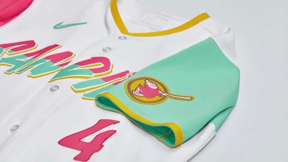
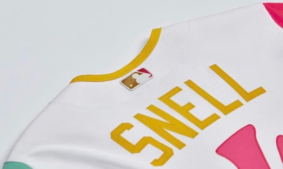
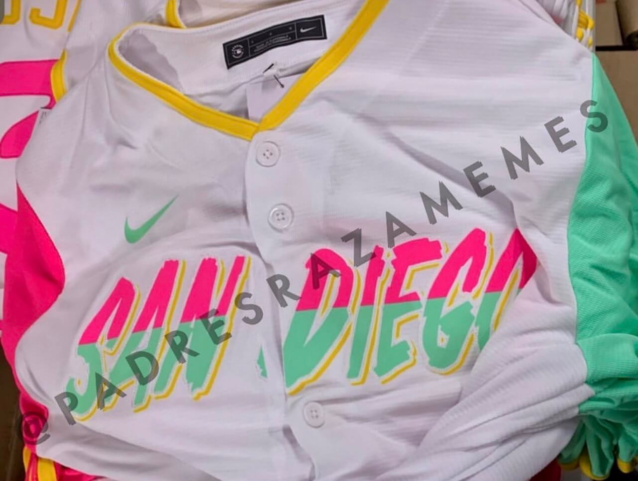
Leaked photos of the Padres’ City Connect design — the final CC uniform of the year, thankfully — began circulating last night. The pics, which match the design of the socks that leaked back in March, were confirmed as legit by multiple sources.
Here are two more images:
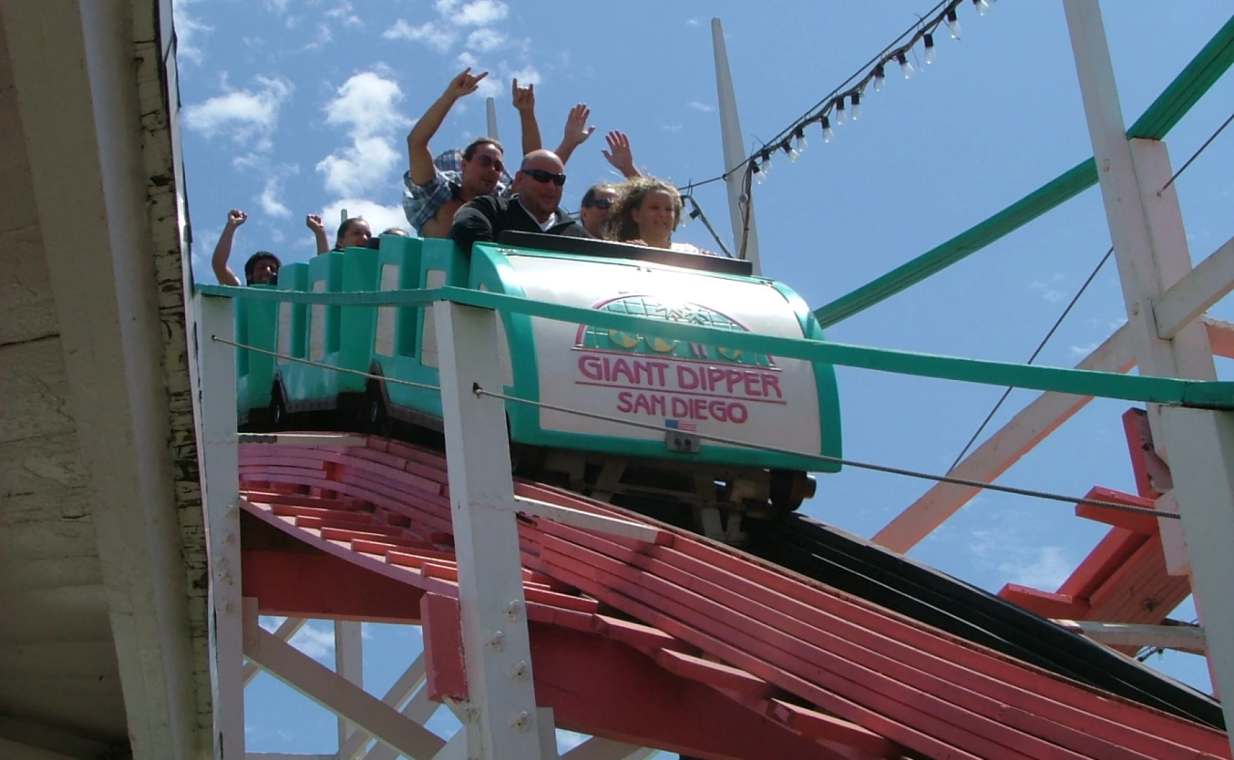
Looks like a pretty swell minor league uni, no? The colors are apparently inspired by San Diego’s Giant Dipper roller coaster:
This uniform is due to make its on-field debut next Friday, July 8. I’m hearing that the full unveiling is likely to be tomorrow. If so, Phil will have full coverage on Saturday.
ITEM! New Bulletin article: When the NFL recently lifted the one-shell rule, a lot of people said, “Great, now we can finally see all those great throwbacks that got blocked by the stupid rule!” But is that really true? Sure, most of us will be happy to see Pat Patriot and Bucco Bruce again, but are there really that many worthwhile NFL throwbacks that were blocked by the one-shell rule? In an attempt to answer that question, I’ve prepared a team-by-team list of my picks for the best available throwback option with a non-primary helmet shell color for each NFL team. It will run on Bulletin in two parts — NFC today and AFC next week.
My premium subscribers can read the NFC article here. If you haven’t yet subscribed, you can do that here (you’ll need a Facebook account in order to pay). Don’t have or want a Facebook account? Email me for workaround info. Thanks!
ITEM! New design contest: Last year’s MLB All-Star Game uniforms were a bad joke, and the early hints are that this year’s won’t be much better. Obviously, the best solution would be to go back to having the All-Stars wear their regular team uniforms. But if MLB and Nike have permanently turned their backs on that option, as appears to be the case, then it shouldn’t be that hard to come up with decent All-Star uniforms, should it?
That’s where you come in. I hereby announce our latest Uni Watch design contest: Come up with some MLB All-Star unis that, you know, don’t suck. Here are the guidelines:
• Your designs should include complete uniforms (caps, jerseys, undershirts, pants, belts, and socks) for both the American and National Leagues. You can either (a) designate one league as home and the other as away, or (b) create separate home and away designs for both leagues. Up to you.
• You should also create an MLB All-Star Game logo. It can either be year-specific for one-season use or all-purpose for long-term use. Up to you.
• Please don’t bother with workout or Home Run Derby designs. This contest is just for the game uniforms.
• If you want any part of the uniform to include some aspect of the player’s regular team branding (like a team-logo sleeve patch, for example), that’s fine. It’s not required, though.
• If you want to include throwback or retro-themed design elements, that’s fine, but it’s not required.
• If you want to base your design around some sort of theme (“From now on, we’re going to call it the Frank Robinson Memorial All-Star Game, so my uni designs are based on elements from Robinson’s career,” or whatever), that’s fine, but it’s not required.
• Even though this year’s All-Star Game is in Los Angeles, please do not make your uni designs Dodgers-themed. (We already saw how that would look back in 2020, before that year’s All-Star Game was canceled due to the pandemic.) If you want to go with a Mariners theme (because Seattle is the host city in 2023) or a Phillies theme (2026), you can do so. But it’s also fine to just come up with an all-purpose design that doesn’t lean on any specific team motif.
• Your designs can be created in any digital or analog medium (Illustrator, Photoshop, crayon, whatever) and submitted in any standard digital format (JPG, PDF, TIFF, etc.). You can also create a video presentation, upload it to YouTube, and submit the YouTube link as your entry.
• The files you submit should be named after yourself (JohnDoe.jpg, for example). If you’re submitting multiple files, please either number them (JohnDoe1.jpg, JohnDoe2.jpg) or use some other designation to make it clear that they’re multiple designs from the same person. Entries that don’t follow this format will not be considered.
• Email your entry to the design contest in-box (please note that this is not the usual Uni Watch email address). If you have more than one design concept, feel free to enter as many times as you like.
• Deadline: Submit all entries by Wednesday, July 13. The best and most interesting entries will be showcased in my Bulletin column on July 19, the date of this year’s All-Star Game.
Okay, people — get crackin’!

“What’s It Worth?” reminder: In case you missed it on Monday, we’re once again partnering with Grey Flannel Auctions to offer free, no-obligations appraisals of your sports memorabilia items. Full details here.
Click to enlarge
Periodic pin-ventory reminder: Remember, all remaining stock of Uni Watch pins has been slashed to a final clearance price of just $3 per pin (with additional discounting for large orders). Full details here.
The Ticker
By Alex Hider

Baseball News: Following up on an item from yesterday’s Ticker, Phillies P Ranger Suárez made good on his promise to wear stirrups during his start last night. Unfortunately, he wore them backwards (from Tim Kelly). … Blue Jays P Alek Manoah tried to field a bunt yesterday by throwing his glove at the out-of-reach ball (from Mike Chamernik). … For all of Rob Manfred’s uni-related sins, here’s one small point in his favor: He is the only MLB commissioner to have played Little League baseball — and did so wearing striped stirrups. … Here’s a great piece about a group of dogs that retrieved home run balls from McCovey Cove for the Giants during their ballpark’s inaugural season (from Brinke). … This Rockies blog is taking a step back and re-examining their opinion of the team’s City Connect uniforms (from Phil). … In 1977 spring training, the Pirates wore ’76 jerseys and non-striped pillbox caps (from @MilwaukeeMauler). … The Las Vegas Aviators, the A’s Triple-A affiliate, will don flight suit-style brown uniforms for “Tom Cruise Top Gun Night” on Friday (from Robert Horne and Scott Rogers). … Guardians 1B Josh Naylor’s base-layer shirt last night had the Indians’ old block-C logo (thanks to all who shared). … Speaking of base layers, Angels P Shohei Ohtani wore blue sleeves, instead of the usual red, with the team’s CC uni last night (from Brinke). … Rockies OF Randal Grichuk faced Dodgers P Julio Urías last night, resulting in a rare goggles-vs.-goggles situation.

Football News: No visuals yet, but the Commanders will wear a 90th-anniversary patch this season (thanks to all who shared). … New helmets for D2 school Central Washington University (from Phil).

Hockey News: Following the Avalanche’s Stanley Cup victory, Coors Light will soon offer a line of limited-edition beer made with ice shavings from the Avs’ arena (thanks to all who shared). … The Gatineau Olympiques of the QMJHL have a new logo to commemorate their 50th anniversary in the league (from Wade Heidt). … New logo for the Rockford IceHogs, the AHL affiliate of the Blackhawks (from Kary Klismet). … The Wild have a new puppy mascot (from Scott Rogers).

Basketball News: Here’s a ranking of the best 76ers uniforms of all time (from Kary Klismet). … With NBA teams announcing which numbers their new draft selections will wear, check out Etienne Catalan’s Twitter feed for the latest on the NBA’s numbers scene. … New number assignments for the Indiana women’s team (from Terry Mark).

Soccer News: German Bundesliga club Eintracht Frankfurt has announced men’s team roster number changes for the upcoming season (from Kenny Ocker). … This Instagram post contains lots of details about what the teams at the upcoming Women’s Euro 2022 will be wearing (from @YoYo_YoYo_Yoo). … The next six items are from Kary Klismet: Earlier this year, Nike severed its contract with Russian club Spartak Moscow amid Russia’s invasion of Ukraine — but not before it had designed the club’s 2022-23 uniforms. Though those kits will never be worn on the field, the designs have leaked. … Puebla of Mexico’s Liga MX have unveiled new uniforms. … New goalkeeper jerseys for German Bundesliga club Werder Bremen. … Staying in the Bundesliga, new third kits for Union Berlin. … Southhampton of the Premier League have new home kits (also from Mike Miller). … Indonesia’s men’s national team has new uniforms. … The next three items are from Ed Żelaski: New home jerseys for Schalke of the German Bundesliga. … New home shirt for top-tier Czech club Viktoria Plzeň. … Scottish Premiership club Motherwell has new uniforms [I don’t usually get excited about soccer kits, but I really like these! — PL]. … Atalanta of Italy’s Serie A has new jerseys (from our own Anthony Emerson). … Fifth tier English club Solihull Moors FC has a new crest (from Trevor Williams). … New jerseys for Liga MX team Club America (from Jorge Luna). … The Seattle Sounders will wear a CONCACAF Champions League winners’ patch on July 9 when they hold a banner-raising ceremony. The club is apparently only allowed to wear the patch for one game (from our own Jamie Rathjen). … One more from Jamie: New shirt for English club Norwich City.

Grab Bag: Tuesday’s Jeopardy! winner, Pete Chattrabhuti, is a University of Virginia grad who says he often wears an orange tie for good luck. After mounting a comeback win, Chattrabhuti returned Wednesday to defend his title wearing a different tie — but he made sure to keep the orange one with him in his pocket (from fellow UVA alum Jamie Rathjen). … Ahead of the Fourth of July weekend, here’s one writer’s list of the most patriotic sports team uniforms (from Kary Klismet). … Also from Kary: Longtime Ferris State athletic director Dean Davenport has donated the original artwork for the athletic department’s bulldog logo back to the school. Davenport’s son, Terry, designed the logo. … This 1925 topographical survey of Duke University shows how the school planned out its campus. It accounts for the school’s future football stadium four years before it was built, and its basketball arena 15 years before it was built (from James Gilbert).
Click to enlarge

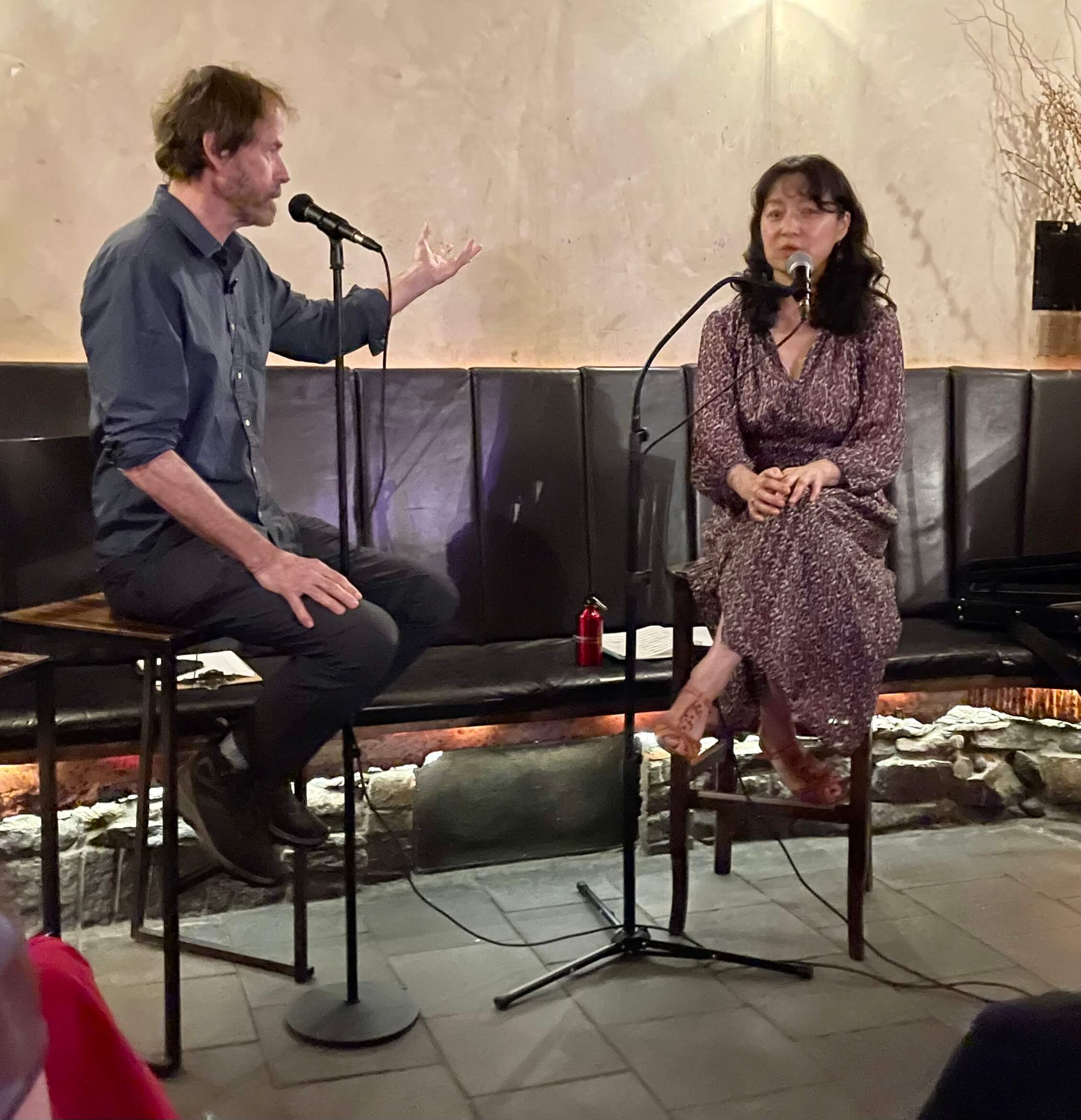
What Paul did last night: If you listen regularly to the radio show This American Life, you may recall a recent segment about a Chinese violinist named Yibin Li, who grew up very poor in the Gobi Desert but then changed her life at age 11 by gaining admission to a prestigious music conservatory after initially failing the audition. Last night I was invited to a gathering in which Li was interviewed by George Dawes Green, founder of the storytelling project The Moth. She was really, really interesting and charming.
At one point, she played us a short Chinese propaganda tune that she said she learned as a little girl:
Not really my kind of music, but it’s always a pleasure to see someone who’s really good at what they do. An interesting evening!
I bought the 1993 Super Bowl phone featured on yesterday’s entry. :D
What a freaking disaster the Padres’ CC unis are! Why would someone design a uni based on something that isn’t even unique to San Diego? 400 or so miles up the California coast sites Santa Cruz and their Beach Boardwalk. And on that Boardwalk, you can ride The Giant Dipper.
There are so many awesome things in San Diego and this is what they went with?
link
I believe you have the wrong Giant Dipper.
This is the one that’s the basis of the uniforms – link
Same roller coaster. Used to have a color scheme that matched the uniforms:
link
When I said yesterday about women’s sports teams “Even when they use bright colors, the uniform doesn’t turn out garish,” something like this CC uniform that is garish is exactly what I was thinking of.
Did you see the footage earlier this week of the Liberty Basketball Association from the early 90s? Garish colors and a bicycling body suit, similar to what Australia’s Opals have worn for years.
The “league” lasted only that one televised exhibition game.
Not to be nitpicky, but you mention the Guardians old team name when referring to the block C, instead of just saying Cleveland, as is normally your protocol when referring to Atlanta’s baseball team, Washington’s football team, or Chicago’s hockey team. I have become much more enlightened on Native American imagery as you are aware, and was just wondering why you used the I word in this instance…Cheers
The Giant Dipper in SD isn’t even teal anymore and hasn’t been for a few years now (I used to work there very recently) so that can’t be the inspiration. Just a really underwhelming uni set.
Strange that there doesn’t seem to be any mention (that I can find in a cursory search, anyway) of the IceHogs’ logo change on their website at all. The new logo is just there. It’s particularly curious, since it’s apparent to me they’re drawing inspiration from their parent club’s older team-name-in-black-circle logo.
Did the Padres recycle a rejected Miami Vice theme?
The depressing thing is how unoriginal they are. Garish neon colors, “Aggro” paint-splash lettering, ’80s Miami vibe. But the target audience ought to be thrilled with them.
Is it too early to anticipate the Yankees having a “Wildstyle” subway art theme to their CC uniforms?
Whoa, what a blast from the past. I knew George like twenty years ago when I lived in NYC, and my good buddy Edgar was, I think, a sort of inspiration for The Moth.
New official Rockford IceHogs logo not completely foreign to fans It appeared at centre ice in their building last. Hog without the stick in mouth.
These City Connect unis are overwhelmingly awful, but I feel like at this point we’re just yelling at the clouds. Nike isn’t getting rid of them, MLB seems to love it. Even the players don’t really seem to care – and why should they, they were forced to wear costumes through the minors. Too bad.
Yeah. Disco Turkeys, Garbage Plates, Pork Roll, Runzas, and Paul’s favorite, The Syracuse Devices.
I have landed somewhere between hate and indifferent dislike for the majority of the City Connect uniforms (with the exceptions of Miami and Anaheim, both of which I really like) but something about this San Diego leak is strangely appealing to me. Im sure that will put me in the minority opinion.
Paul, I must say that soliciting design contest entries from your very broad blog audience and then only showcasing them on your paid Bulletin site seems a little…odd. I would have to assume that the majority of your contest entries will come from people who don’t pay for Bulletin content, so you’re basically asking the general reading population to supply you with content you are then charging for. It also cuts down on the instances of people being able to share with their friends/family/followers that their art is being displayed online since it is behind a paywall.
Just something to think about, I guess.
If people don’t want to submit a design for the reasons you describe, that’s fine. But I see no harm in casting a wide net.
(Incidentally, I also promote the design contests — and everything else Uni Watch-related — on Twitter. I have nearly 140,000 Twitter followers, and most of them don’t even read the blog, much less subscribe to Bulletin. Again, a wide net. People can engage with Uni Watch at whatever level makes sense to them.)
Ahhh yes, another baseball uniform design for people who don’t actually like baseball uniform design.
Lifestyle & internet engagement are now the only considerations for these things.
Enjoy.
Lee
Spot on analysis. Wearing one of these shows you care about what your influencer on insta is wearing. This is designed for people who do not like basebaal at all: too slow, too long,, too many rules, not enough prancing and dancing, no cheerleaders, no jugglers or fire eaters. But I loooooooooove the crazy uniforms…
Padres are now on the clock as the worst CC set. Dodgers, you can stand down.
This one reminds me of one of those Arizona iced tea drinks you get in six packs at Target.
Au contraire, mon frère. The Dodgers don’t even have the worst CC set (that honor belongs to your SFG and their illegible and link ghosted numbers. I’ll wait for the unveil and then on-field to render a verdict on the Pads, but these have potential! The entire program is a joke, and some fun fuchsia and lime sherbet just may provide a bit of an antidote. But from first impressions, these may be top 14 in the CC-ranks, not worst by a long shot.
I hated the look and the idea of the Player’s Weekend uniforms and refused to watch any of those games because of how ugly those costumes were. That being said, those San Diego CC uniforms might have made half-decent Player’s Weekend uniforms because at least the colors are fun and whimsical.
By the way, Milwaukee’s CC uniforms are the absolute worst of the lot (so far.)
I forgot the Gothic White Sox. Awful.
Beer made with ice shavings from a rink where teams have been spitting, sweating and bleeding? Sure, why not? LOL
Thanks for including my Ticker submission!
I should clarify that I should have said it’s NOT the first time the Jays have worn their throwback hat this season.
My bad!
Oh — in that case, it’s not so remarkable, so I’ve removed it from the Ticker. Sorry!
First time they wore the white front panel hat the with the blue jerseys this season though I believe? Love it. Look reminds me of the Blue Jays in spring training or batting practice in 1980s and early 1990s.
As a hockey player, I wouldn’t ingest anything made from ice rink shavings. Do you know how we treat the ice?? I realize they sterilize the shavings (at least I hope they do), but still. And I’m not a germaphobe, I put on stinky hockey equipment on a regular basis.
I really enjoyed today’s Bulletin article, Paul, thanks for posting. In all my years cheering on the Bears, I never realized they once wore an orange helmet! I would love to see it,though I don’t think they can top the stripey throwback they introduced for their 100th anniversary.
Thanks — glad you liked!
I hope that the extra helmet doesn’t just turn into throwbacks for most teams. While the saints extra shell is a failure in terms of execution and finish quality, the general concept and look is great if you ask me. College football has been doing multiple helmets per team per season and it works well for the most part. Use the extra shell to try something new or different. I don’t know why people are so high on pat patriot. I thinks it’s an awful logo. I recently heard someone say (speaking of movies, but it applies) “people don’t want anything new, but if they’ve seen it before they HAVE TO HAVE IT, even if it was terrible the first time.”
I also don’t need to see bucco Bruce again although it’s a better executed design than the sword flag thing. Part of the problem is that there are still strict rules for unis and I’m not sure the buccs can get a creamsicle uni on field this year. Bruce won’t look very good with the pewter and pirate ship unis. Throwback helmets probably also means those teams will have a throwback uni instead of trying something new. Boring.
Not to be nitpicky, but you mention the Guardians old team name when referring to the block C, instead of just saying Cleveland, as is normally your protocol when referring to Atlanta’s baseball team, Washington’s football team, or Chicago’s hockey team. I have become much more enlightened on Native American imagery as you are aware, and was just wondering why you used the I word in this instance…Cheers
I avoid using it when possible, but sometimes it’s hard to avoid. In this case, I wanted to make it clear that I was referring to the “C” from the Indians era.
That San Diego CC uni has me craving cotton candy…and I hate cotton candy.
And while I’m on the subject of CC unis, I wonder what the plans are for Oakland. Will they get one before they (supposedly) move to Las Vegas? It makes me wonder how MLB is scheduling these designs, as in are they taking a wait-and-see attitude concerning the A’s.
In 1977 spring training, the Pirates wore ’76 jerseys and non-striped pillbox caps (from @MilwaukeeMauler).
Wow, those are brutal.
Well, Paul, I think you summed up the entire City Connect uniform program with one line.
“Looks like a pretty swell minor league uni, no?”
I haven’t spent all that much time in or around San Diego – a week once, a couple days another time – but nothing about the Padres CC uniform makes me think of San Diego. I’ll be very curious to see whether the design really connects with local Padres fans. Though I could see this being a mirror-image Brewers case, where the cap is terrific but the rest of the uniform is terrible.
Padres CC Uniform makes me think of Miami.
A bit more detail about the 50th anniversary logo for the Gatineau Olympiques.
The 6 small stars represent the QMJHL championships celebrated by the team.
The 1 large star is the one Memorial Cup championship in team history.
I bet the Padres CC will have story telling about 80’s surf culture and the rise of neon fashion.
I refuse to believe any San Diegans helped with the design of the city connect uni. There are dozens of iconic landmarks and uniquely San Diegan things I can think of off the top of my head before I think of the Belmont park roller coaster or whatever else they want to tie this jersey to. My friends and I all had the same reaction, we’ve all rode that coaster multiple times and completely forgot the color scheme of it. Is it the worst city connect jersey? No. It’s not even the worst in the division. Like it’s a wearable top that works with a few sneakers I have so I will wear it, but it’s not iconic at all and it’s an extreme stretch to say that colorway is definitively and uniquely San Diegan.