Good morning! The Bengals are scheduled to unveil their new uniforms today at 9am Eastern. I’ll add photos and links for the new designs once they’re available, and I’ll have a detailed analysis of the new set tomorrow.
But for today, since the Bengals will likely be the uni-verse’s top topic for the next few days, I thought it would be fun to go over five interesting details from Bengals uni history that you might have forgotten about (or never known about to begin with). In no particular order, here they are (for all photos, you can click to enlarge):
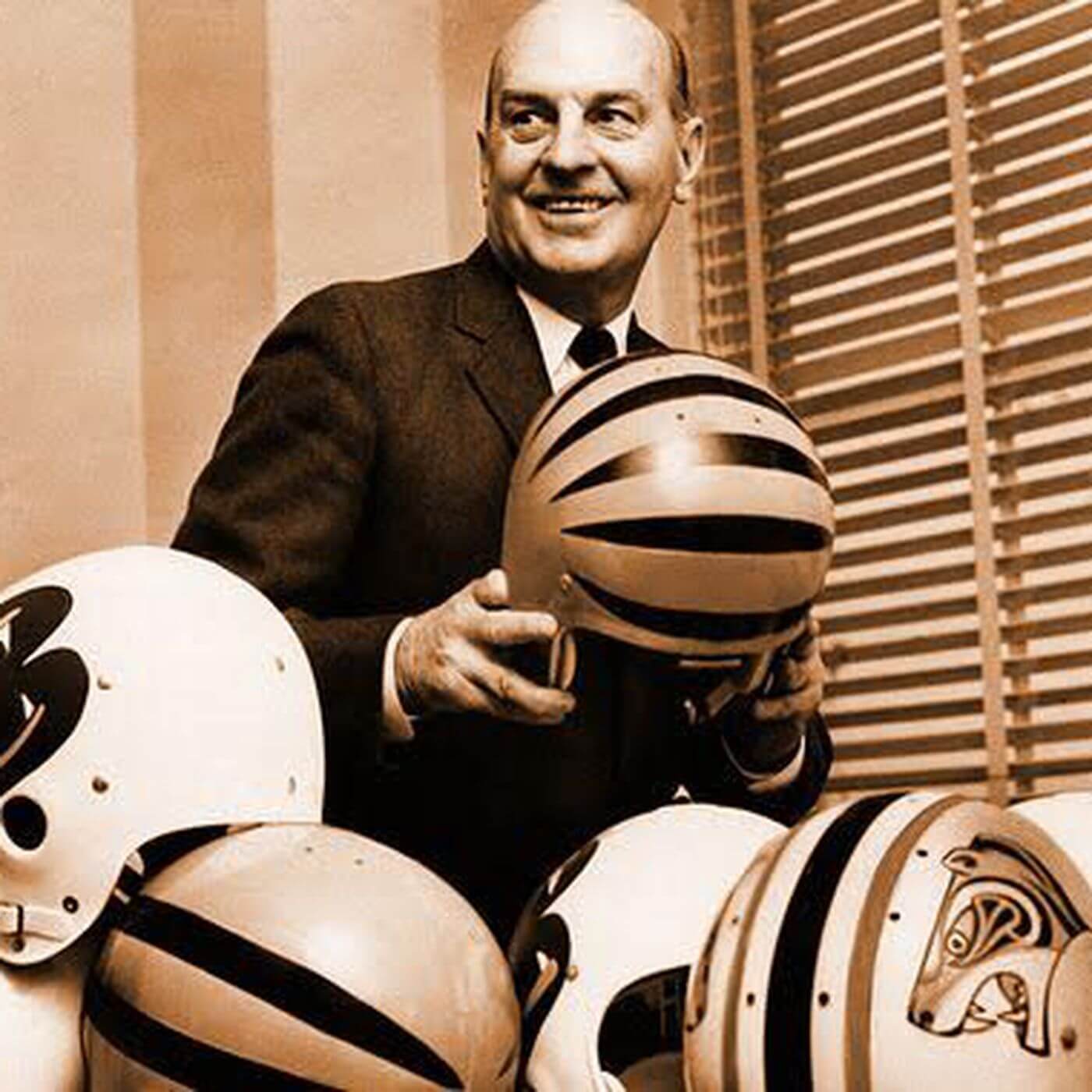
1. The Famous Paul Brown Helmet Photo
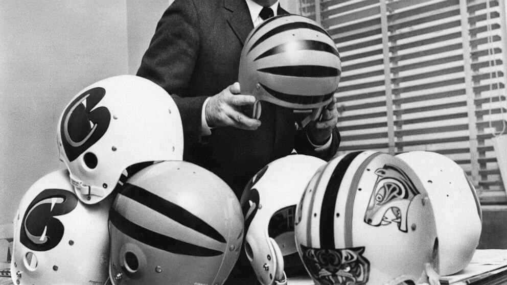
The Bengals were founded by former Cleveland Browns founder/namesake Paul Brown, whose family still owns the franchise. A now-famous photo, taken the winter before the team’s 1968 debut season, shows Brown examining a series of prototype helmet designs. Here’s a broader view of the bottom of the photo, showing a few more of the designs:
The photo’s most intriguing aspect, of course, is that Brown was holding a striped shell similar to the one that the Bengals would eventually start wearing in 1981. The great Helmethut site made a replica of that helmet a few years back. (That page also has lots of great background info on Brown — recommended reading.) But also note the helmet in the foreground that appears to have a bengal’s face on the forehead area — that certainly would have caused a stir in 1968!
With all these interesting-looking options, it’s so confounding that Brown ultimately chose the plain orange shell with the plain “Bengals” lettering. Meanwhile, I’ve never heard anything about what became of the prototypes shown in the photo. Those would be great to see in a museum display, no?
2. History’s Most Passive-Aggressive Unveiling Report
When the Bengals changed from their inaugural uni set to their first tiger-striped design in 1981, a local Cincinnati TV news show covered the unveiling. As was the case in those days, it was a very sedate affair compared to today’s unveilings, but the funniest part is reporter Walt Maher, who makes it hilariously clear that this is about the last story he wants to be covering. A classic video clip!
3. TV Numbers: From Trend-Buckers to Trend-Hoppers
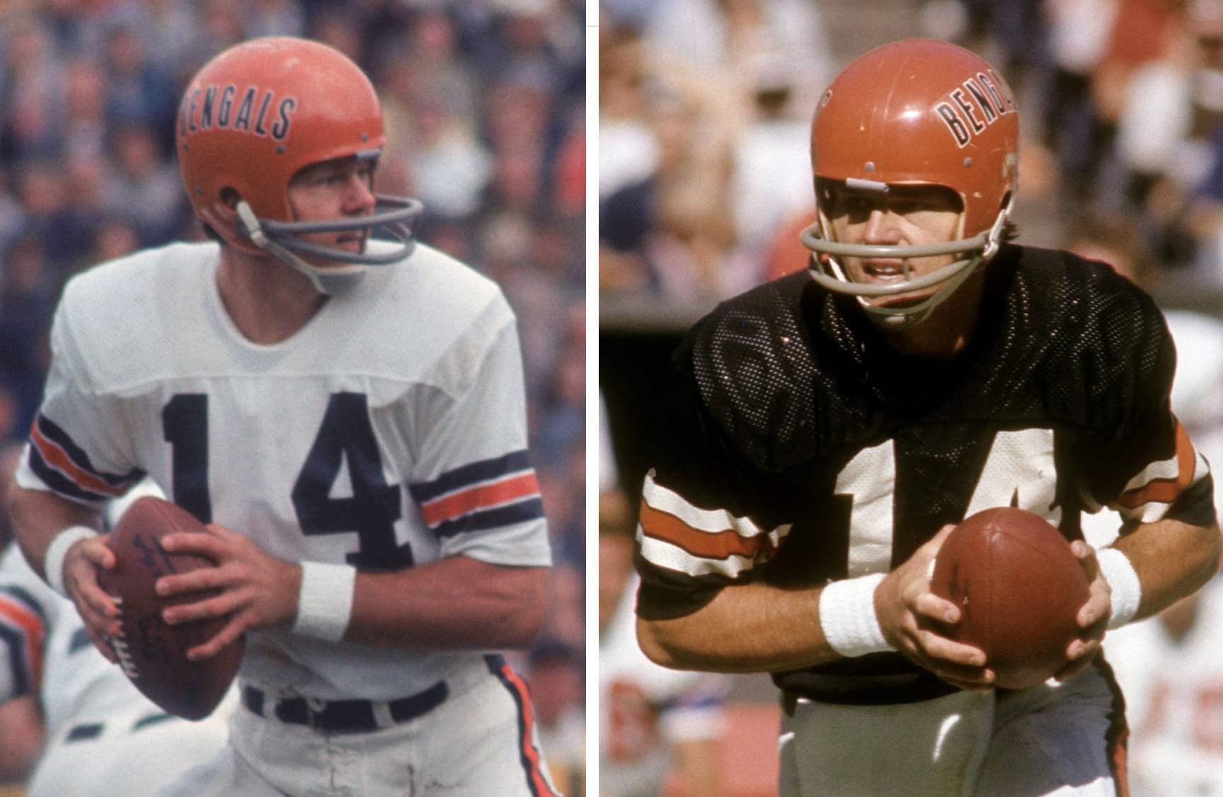
From 1968 through 1979, the Bengals’ jerseys did not have TV numbers. They added them in 1980, becoming the final NFL team to do so.
Eschewing TV numbers is a trend in the NFL at the moment, with the Chargers, Pats, and Rams all going that route. So if the Bengals’ new set skips the TV numbers (as suggested by last month’s leaks), Cincy would be joining the current trend but also coming full-circle and getting back to their roots.
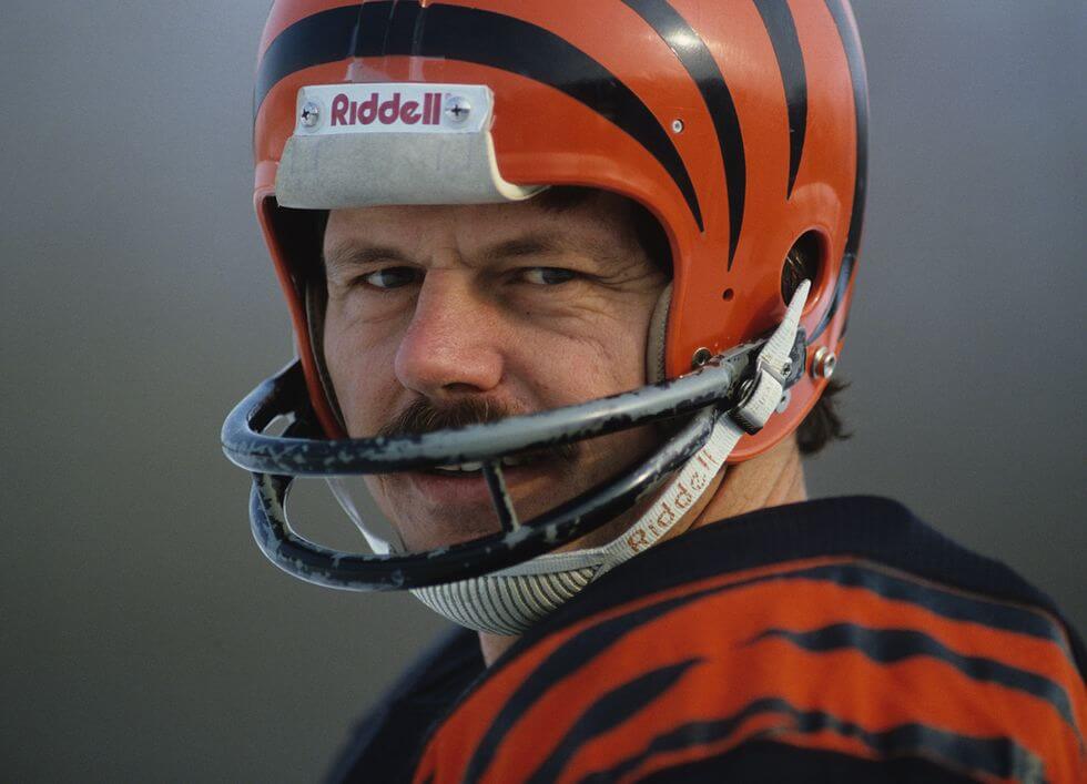
4. Kenny Anderson’s Paint-Chipped Facemask
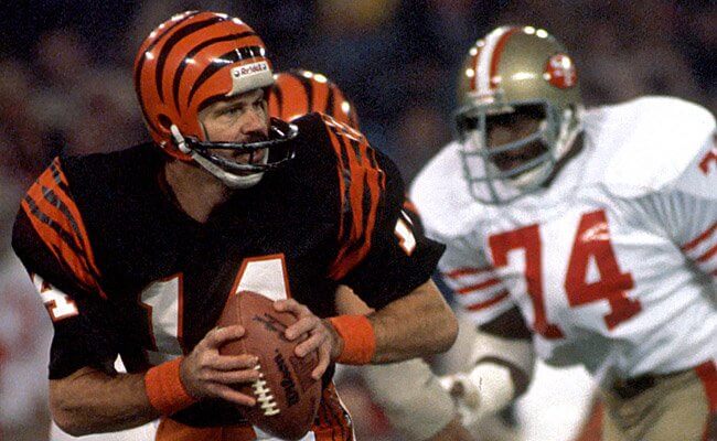
When the Bengals added TV numbers in 1980, they also changed their facemasks from grey to black. But quarterback Ken Anderson must have really loved his old grey two-bar mask, because the team apparently painted it black for him. Unfortunately, the paint routinely chipped off, so the equipment staff would repaint it, and then it would chip off again, ad uni-verseum.
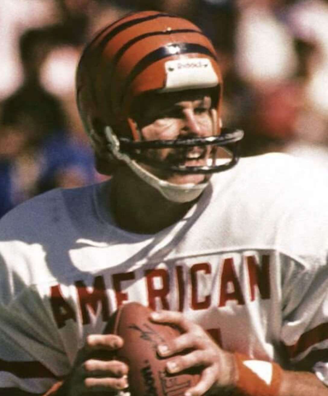
Anderson even wore the chipped mask in Super Bowl XVI and in the Pro Bowl:
5. Chad Johnson’s Velcro Nameplate
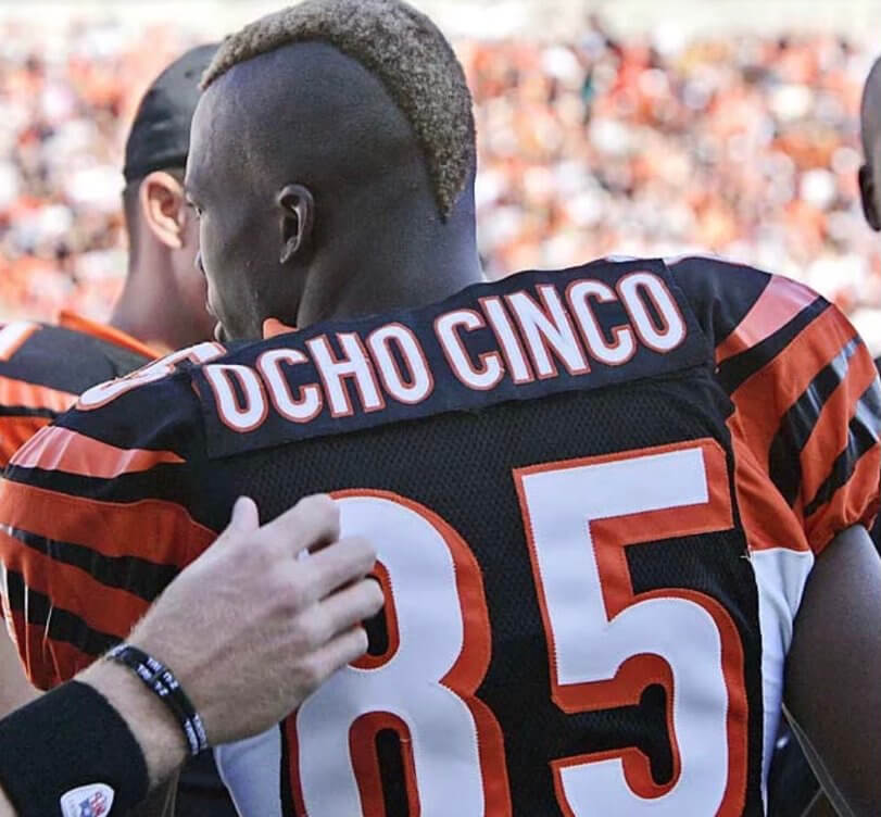
At one point during the 2006 season, Bengals wide receiver Chad Johnson came out for pregame activities wearing a cover-up nameplate that read “Ocho Cinco” (that’s “eight five” in Spanish). Shortly before kickoff, teammate Carson Palmer (that’s his hand in the photo shown above) reached over and removed the cover-up strip, revealing Johnson’s usual “C. Johnson” NOB.
It’s never been clear who made that cover-up nameplate for him. Was it Reebok? The team’s equipment staff? Someone else?
Two years later, Johnson legally changed his surname to Ochocinco, so he was able to wear his nickNOB for real, although this time it was one word, not two:
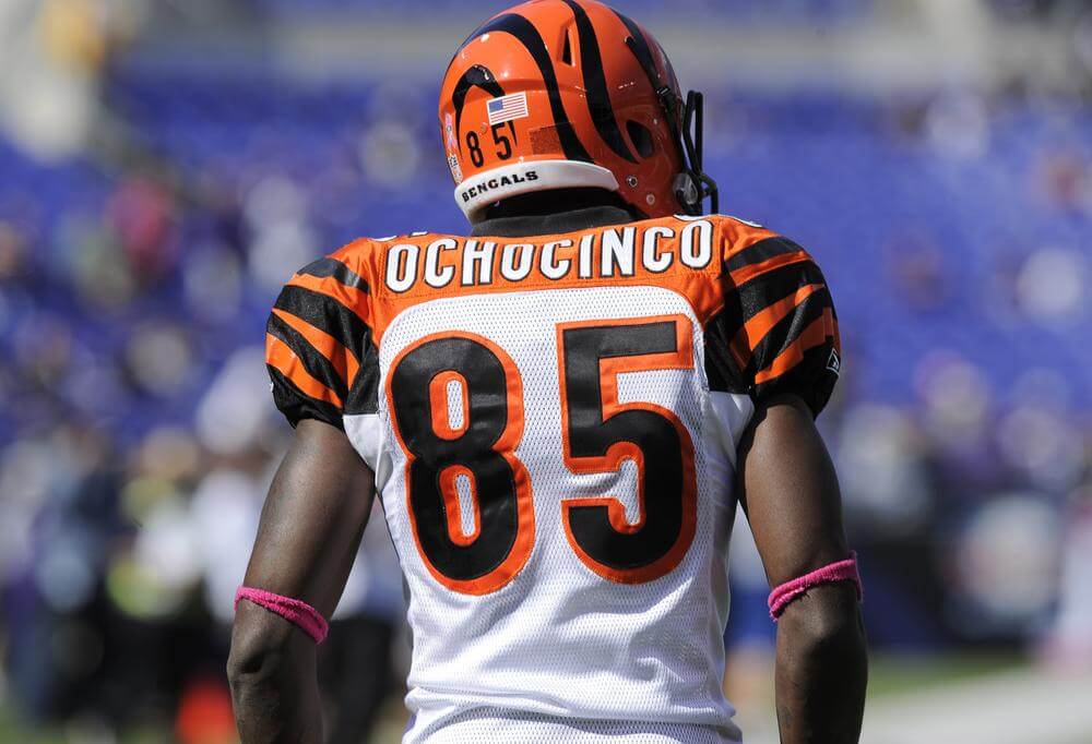
Footnote: After retiring in 2011, he legally changed his name back to Johnson in 2012.
———
If you want to see more about the Bengals’ uniform history, check out this post that Phil did last month.
Update: The new uniforms have now been revealed:
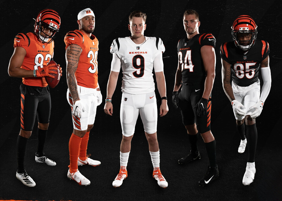
Again, I’ll have a detailed assessment of them tomorrow.
Weekend recap: I know many of you don’t read Uni Watch on the weekends, so here are two developments from the past couple of days that you might have missed.
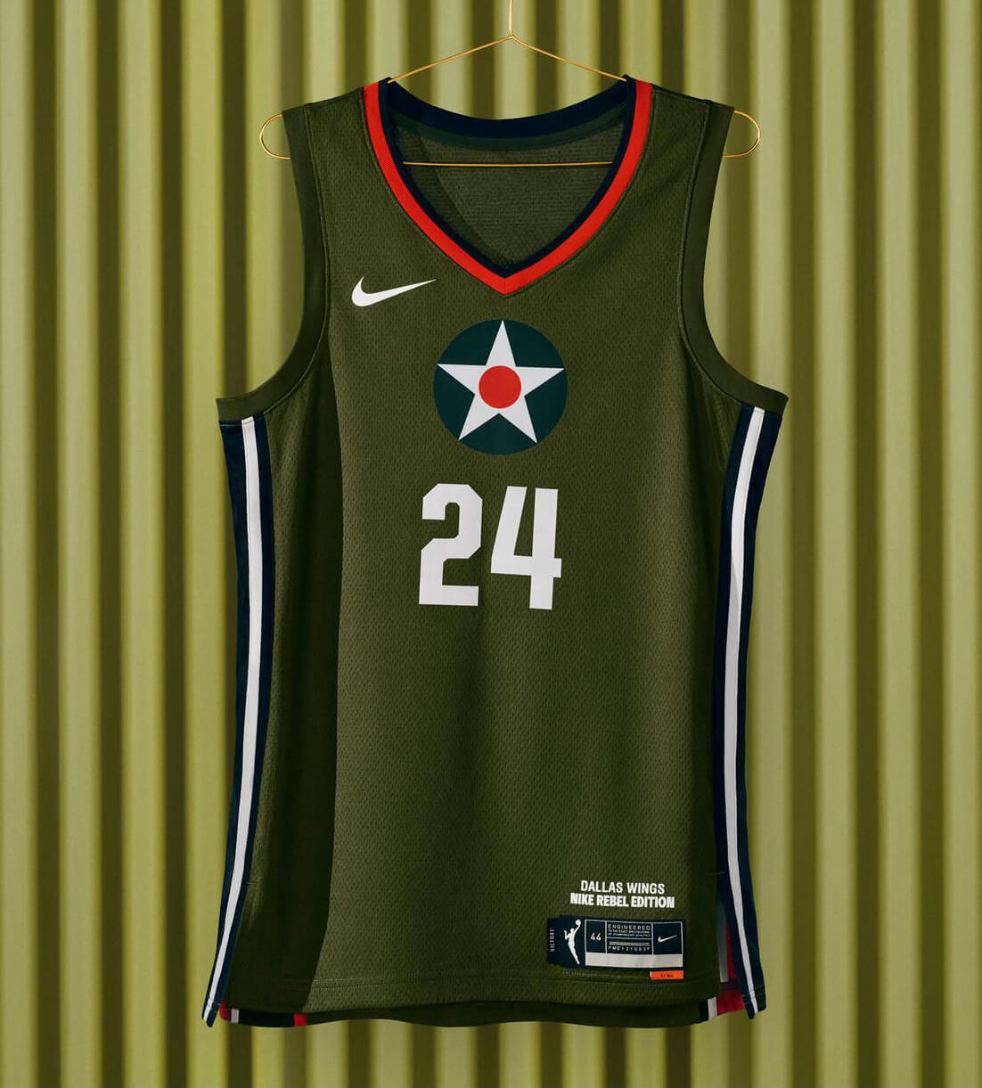
First, the WNBA’s Dallas Wings scrapped their new alternate uniform, which had been revealed just a week earlier. The design, which is shown above, was conceived as a tribute to the Texas-based Women Airforce Service Pilots (WASPs), who tested aircraft during World War II so that male pilots would be free for combat duty.
Sounds like your typical Nike-driven piece of “storytelling”: a military connection, rendered in olive drab with a Captain America-style insignia, described by Nike as being “Inspired by the stealth and ferocity of the World War II P-40 Warhawk — a plane manufactured in Texas and test-flown by Women Airforce Service Pilots (WASPs) — the uniform is set over a military-grade green field.” Checks all the boxes, right? And of course this design was designated as the Wings’ “Rebel Edition,” a category reserved for uniforms with women’s-empowerment themes.
Just one problem: The WASPs excluded Black women from their ranks. Not such a heartwarming story after all, eh? Imagine being a Black player and being told to wear this uniform!
This racist history is not some obscure footnote in WASP history. It comes up in several articles and is even mentioned on the WASP Wikipedia page, which states (citing this book):
While the total number of Black women applicants for WASP training is unknown, several African American pilots made it to the final interview stage, where they were all rejected. Mildred Hemmans Carter, another African American applicant, was asked to withdraw her application because of her race.
It’s hard to fathom how the combined staffs of three large corporate entities — the Wings, the WNBA, and Nike — all managed to miss this, but they did. After the writer Jasmine Baker began raising a stink about it on social media, the uniform was eventually pulled on Friday.
This is what happens when you try to reduce history — history that is often very complicated, messy, and painful — to “inspirational” and “rebel”ious lifestyle branding via “storytelling.” A good reminder that all the bullshit in those uni-unveiling press releases is often just that — bullshit.
The other thing you might have missed over the weekend is the depressing news that the NHL could have jersey advertising by the 2022-23 season, the latest step in a determined march toward Idiocracy that the league has been taking over the past four months. Here’s a handy timeline:
Dec. 22: NHL announces that teams will wear helmet ads for 2021 season as a one-year measure related to the pandemic.
Jan. 5: NHL announces that the league’s four divisions will have corporate-advertised names this season. This too is touted as a one-year thing.
March 11: NHL Commish Gary Bettman says the helmet ads will “more likely than not” be retained beyond this season after all.
April 16: Sports Business Journal, citing multiple sources, reports that NHL jersey ads are a strong possibility for 2022-23.
This latest development feels particularly significant because the NHL, for all its other foibles, has kept the game sweater fairly pure. While other leagues have worn all sorts of camouflage and holiday-related uniforms, the NHL has restricted that stuff to pregame jerseys; while other leagues have put their makers’ marks on the chest or sleeves, the NHL has kept it on the back. So the impending addition of jersey ads for this of all leagues feels extra-momentous — and extra-sad.

Click to enlarge
Blankety-blank: Reader Will Scheibler recently acquired this blank Islanders fisherman jersey on eBay. “The seller says it was obtained by the team’s fabricator and was used to test different pressings, which explains the different sleeve number styles.”


Interesting find! Big thanks to Will for sharing it with us.
For all photos, click to enlarge
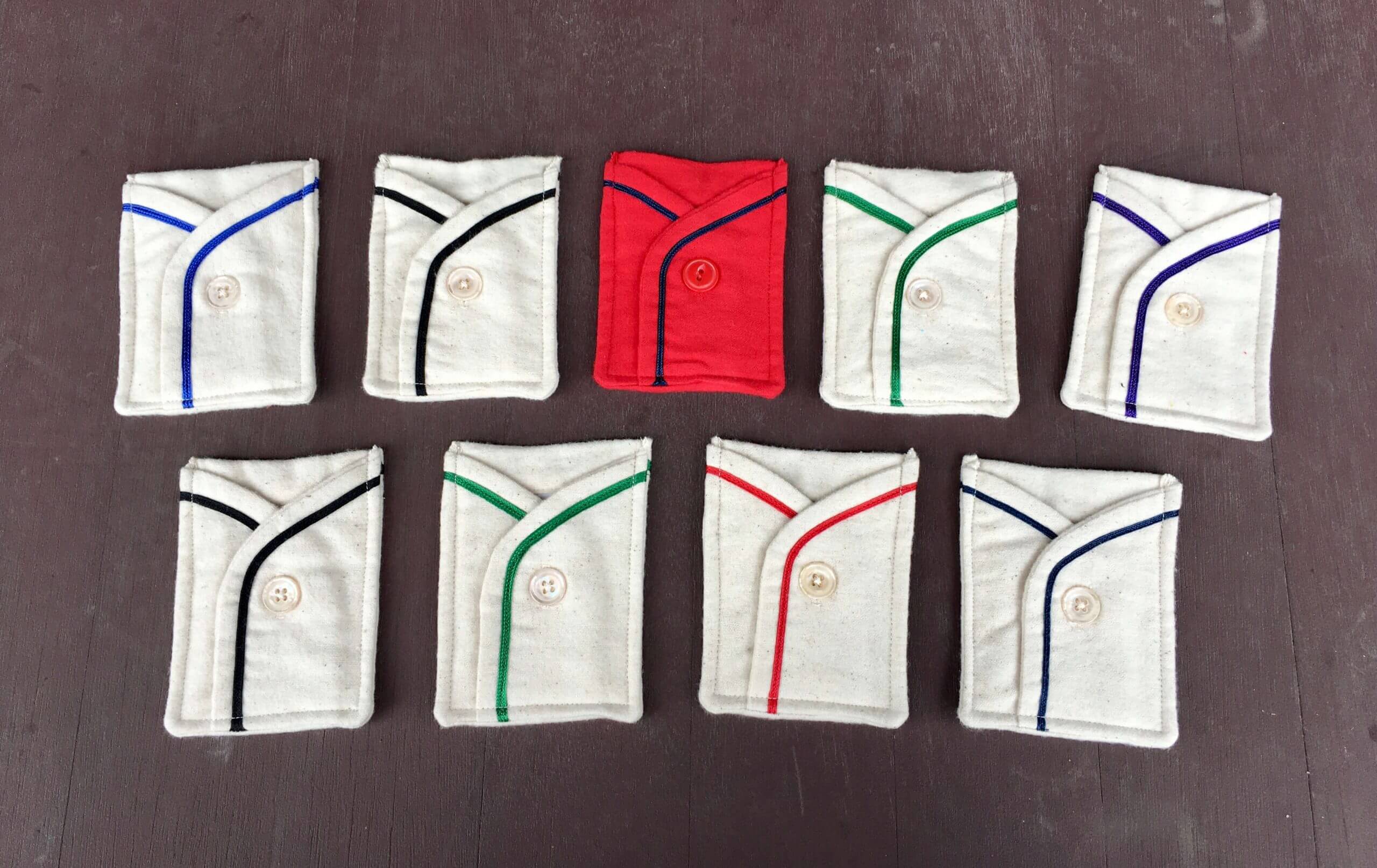
ITEM! April membership drive: Last Friday I showed you these sensational flannel card pockets made by the great Wafflebored. They all have No. 7 on the back, and the buttons are functional:
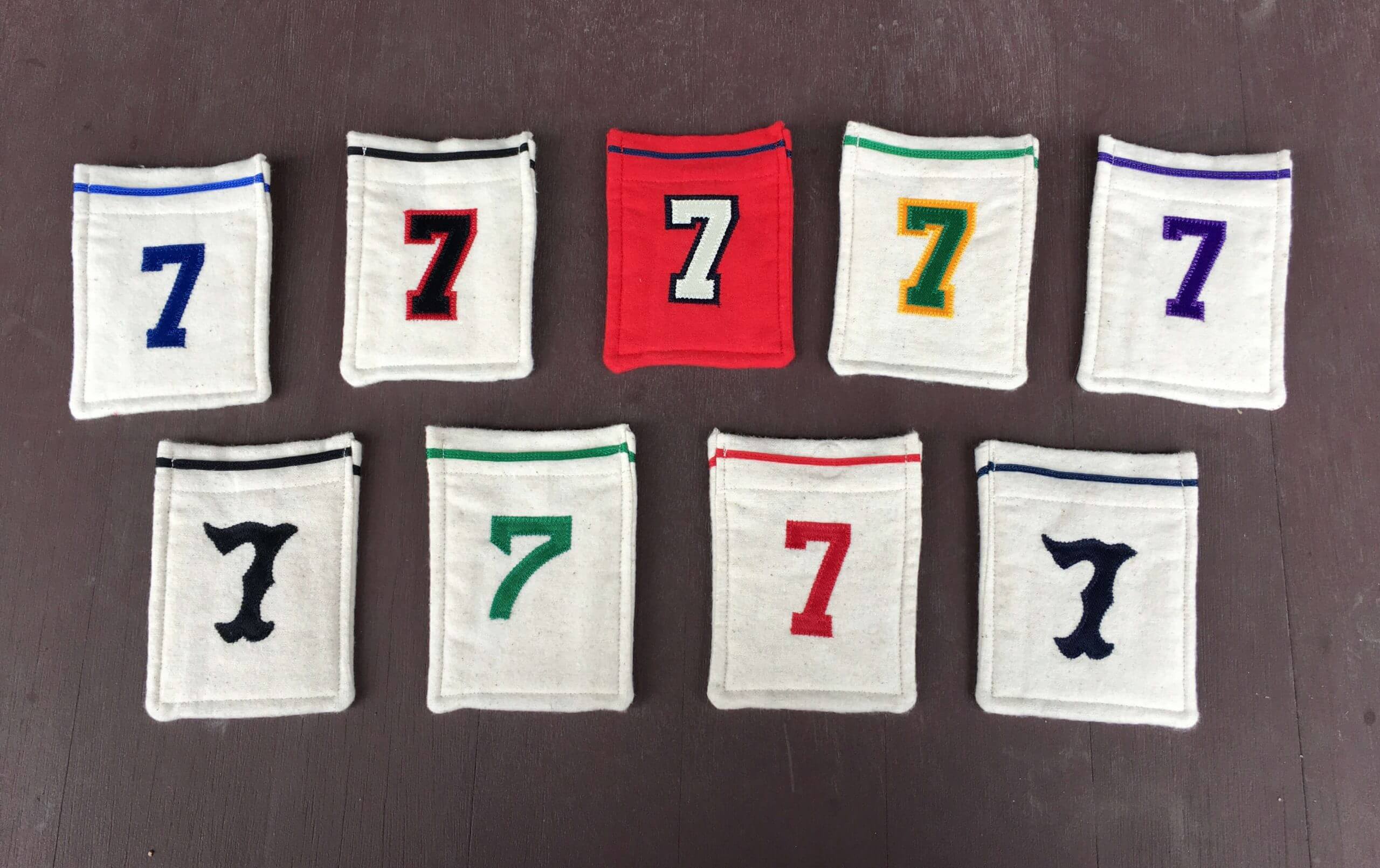
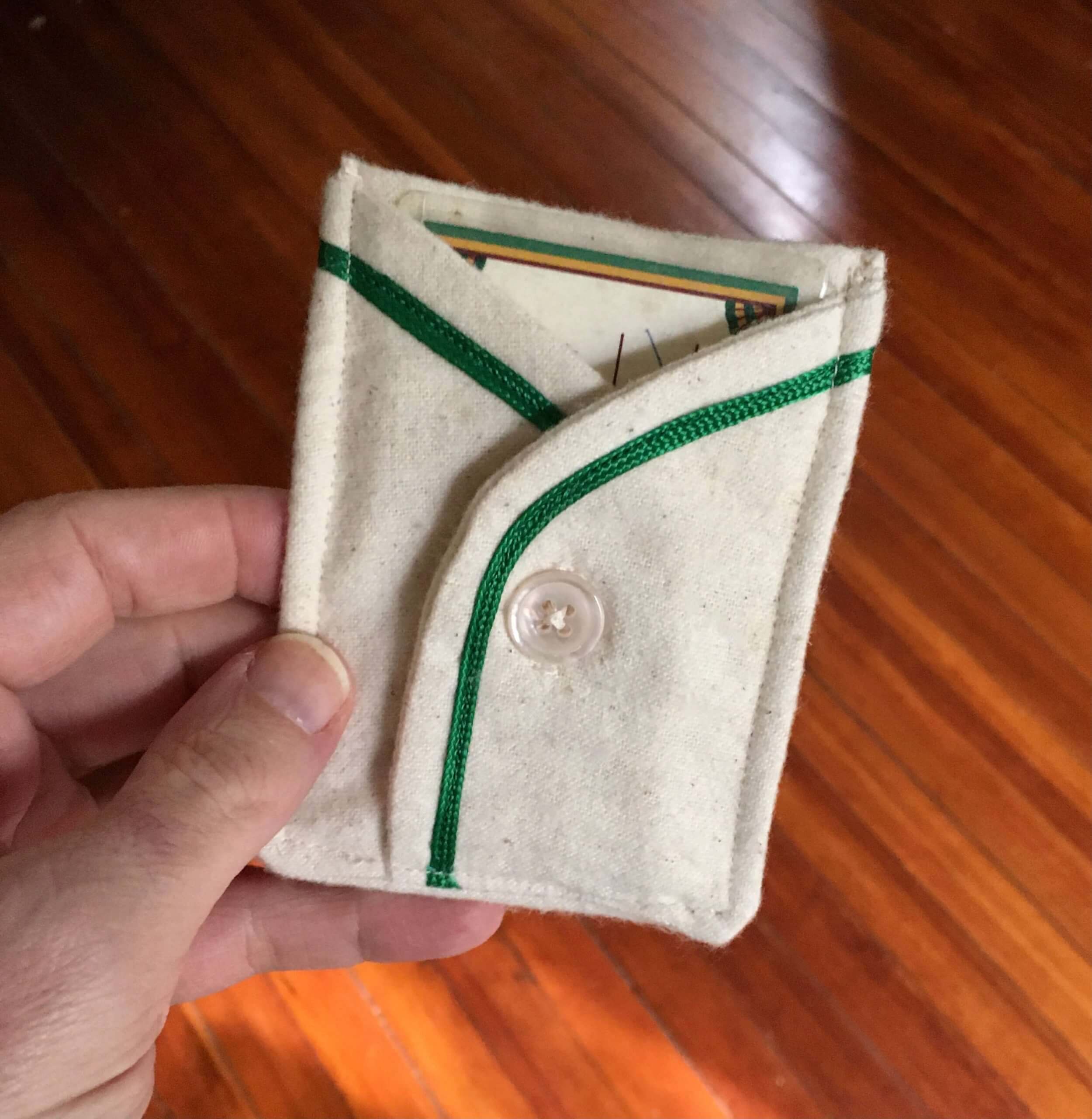
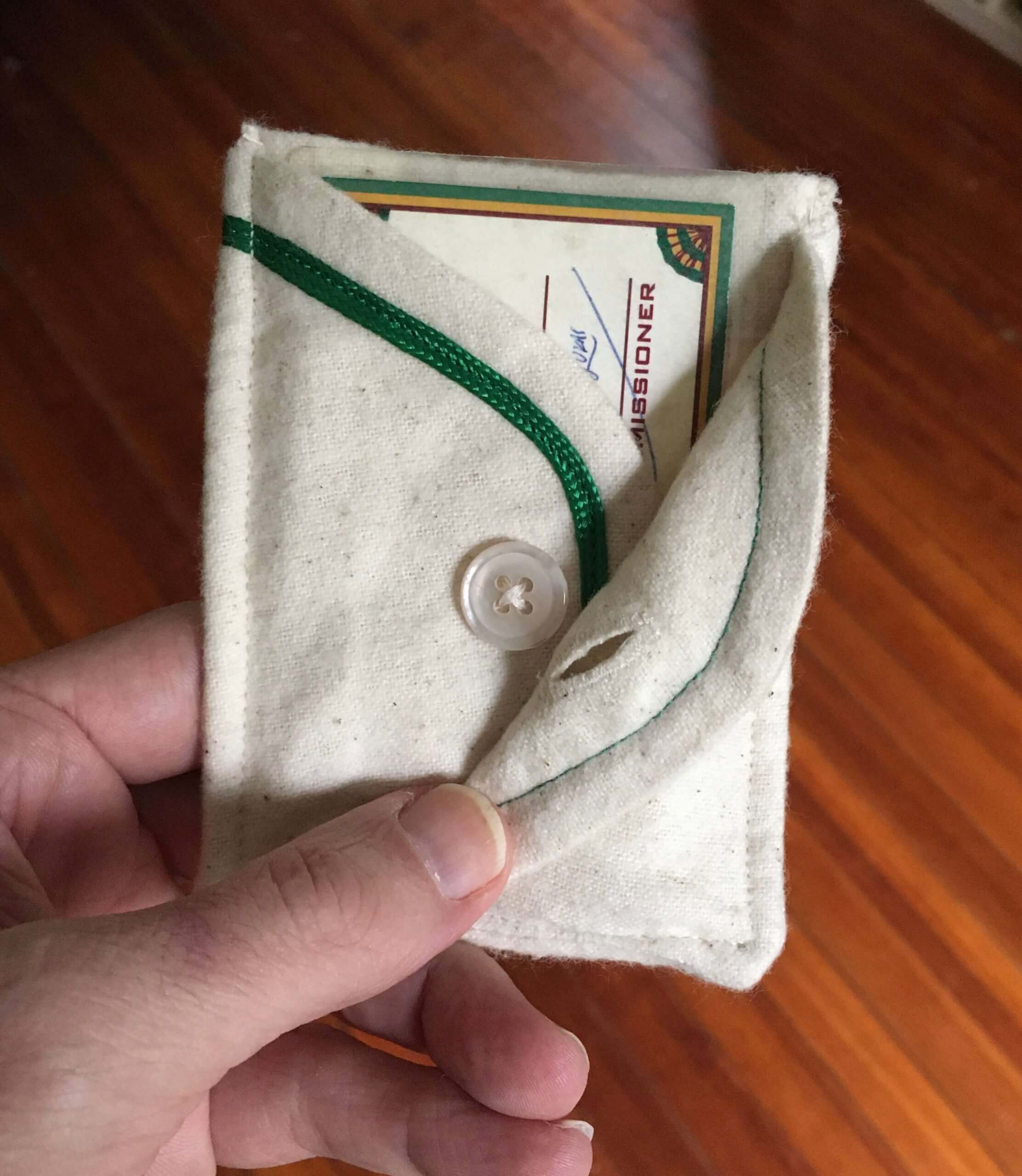
The purple one, obviously, will have a role on Purple Amnesty Day (four weeks from today!). As for the others, here’s what we’re going to do:
Out of all the membership orders that come in this week, I will randomly choose three enrollees to receive once of these pockets. So if you like, when you order a membership card this week, you can specify which pocket you’d prefer if you turn out to be one of the winners. I’ll try to accommodate the winners’ preferences.
That will leave us with five pockets remaining. I’ll announce plans for them later in the year. Meanwhile, thanks in advance to those of you who order membership cards this week, and doubleplusthanks to Wafflebored for the amazing card pockets!

And speaking of membership cards: It’s rare that we get a request for a card based on a uniform worn by a women’s team, but that’s the case with Ben Humphries’s new card, which is based on the UK women’s cricket team Southern Vipers. Awesome job by card designer Scott M.X. Turner to render the snakeskin background pattern!!
Ben’s card is part of a new batch that’s been added to the membership card gallery.
Want to see your own card in the gallery? Ordering a membership card is a good way to support Uni Watch (which, frankly, could use your support these days). And remember, a Uni Watch membership card entitles you to a 15% discount on any of the merchandise in the Uni Watch, Uni Rock, and Naming Wrongs shops, plus the discount also applies to our Uni Watch Classic Cap. (If you’re an existing member and would like to have the discount code, email me and I’ll hook you up.)
As always, you can sign up for your own custom-designed card here, you can see all the cards we’ve designed so far here (now more than 3,100 of them!), and you can see how we produce the cards here.
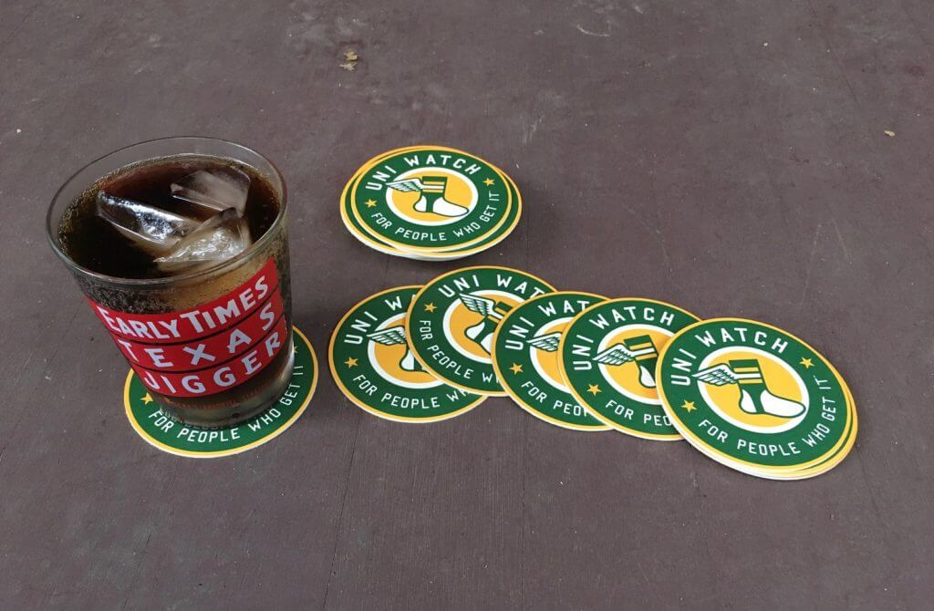
ITEM! Coasters back in stock: I have a few dozen of these great-looking Uni Watch coasters. They’re made in the USA from sturdy pressboard and measure 3.7″ across.
As has been the case in the past, I’m selling these in groups of three coasters for nine bucks, including shipping. USA orders only, sorry.
To order, send me $9 via Venmo (use @Paul-Lukas-2 as the payee), Zelle (plukas64@gmail.com), or Google Pay (plukas64@gmail.com). If you want to use Apple Pay, a paper check, or well-concealed cash, get in touch and I’ll give you the appropriate info.
After paying, email me with your shipping info. Thanks!
If you want to combine a coaster purchase with an order for a Uni Watch koozie, a trading card, a magnet, a seam ripper, or a chain-stitched patch, please email me and I’ll give you a price that includes a combined shipping fee for the whole shebang. (Sorry, these are the only Uni Watch items I can combine into one shipment, because all our other items ship from separate locations.)
Click to enlarge
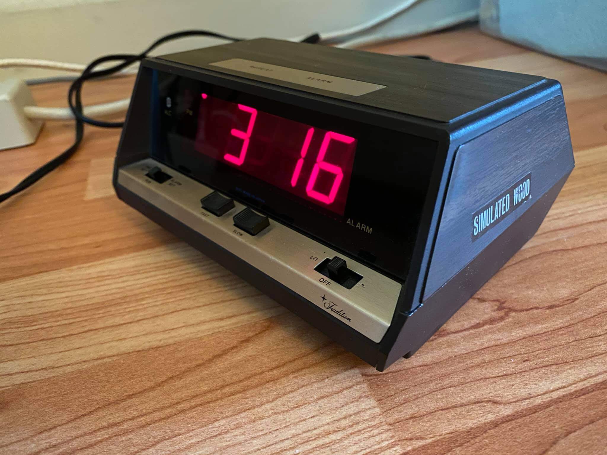
Too good for the Ticker: Our own Brinke Guthrie sent me this photo of a 1972 digital clock he recently scored on eBay. I cracked up when I saw the sticker on the side — and cracked up even more when I then deciphered the little script on the lower-right front panel. That’s just too perfect!
As for the time shown in the photo, Brinke says that just happened to be the time on the clock when he took the pic, but it certainly has a strong sports pedigree. Funny coincidence!
The Ticker
By Jamie Rathjen

Baseball News: Today is Patriots’ Day in Massachusetts. The Red Sox will play their traditional 11am game and wear their “Boston Strong” uniforms. … Speaking of the Sox, OF Alex Verdugo wore the team’s red belt yesterday, instead of the blue alternate belt (from Jeff Wilk). … The Chicago Tribune ran a piece yesterday on the history of the White Sox’s stadium (from Kary Klismet). … Blue Jays P Robbie Ray looks like he wears slimmer-cut pants than he did in 2019 with the Diamondbacks (from @jimr_drumr).

Hockey News: The Flyers held Hockey Fights Cancer Night yesterday for the first time since Oskar Lindblom returned from treatment for Ewing’s sarcoma, so the team’s warm-up jerseys all featured his number and NOB (from @_RF30). … Devils goalies Mackenzie Blackwood and Aaron Dell wore masks designed by essential workers during pregame warm-ups yesterday (from Wade Heidt). … The next two are from Ted Arnold: A Maple Leafs fan/collector devotes about 10% of his collection to late-’40s D Bill Barilko, including equipment and some of the wreckage from the plane crash in which Barilko died in 1951. … A worker helping to clean out Maple Leaf Gardens in 2003 preserved some letters from Leafs owner Harold Ballard. … Cross-posted from Grab Bag: Reader Troy DeCeuster is making NHL horse racing silks concepts, starting with six East Division teams. … The Canucks — back in action after a long Covid-related absence — have tweaked their helmet ad and, although it’s a bit hard to see, added a “Canucks for Kids” telethon rear-helmet decal (from Iain McHugh and Wade Heidt, respectively).

Basketball News: A North Carolina high school renamed its basketball court after its long-serving girls’ coach (from Kary Klismet).

Soccer News: Along with the black armbands for Minnesota United that we mentioned yesterday, both they and Seattle wore patches saying “Equality, Acceptance, Diversity” above the maker’s mark.. … PRO, the officials’ organization for all the North American pro leagues, is now outfitted by Capelli. MLS officials have new shirts with blue shorts instead of the usual black, but the deal only covers MLS even though at least some NWSL officials are PRO members. … In Germany, Borussia Dortmund revealed and wore a ’90s-era fourth kit (from Germán Cabrejo). … Manchester United goalie Dean Henderson wore a cap that was a little small on him yesterday (from Max Weintraub and our own Anthony Emerson). … One of yesterday’s games in England’s Women’s FA Cup featured West Ham United backup goalie Mackenzie Arnold entering as a midfielder and creating the extremely rare sight of an outfield player wearing No. 1. … The USL Championship’s New Mexico United have a new third kit (from Ty Ortega and Phil). … Japan’s Gamba Osaka are to wear a 30th-anniversary shirt. The red version also pictured is the goalie’s shirt (from Jeremy Brahm). … Scottish club Motherwell’s women’s team debuted a new second kit in support of one of their charity advertisers.
Olympics News: Mexico is holding a public vote on its opening ceremony outfit (thanks, Phil).

Grab Bag: Miami is to host a Formula One race starting next year with a track centered on Hard Rock Stadium. … NASCAR Cup driver Denny Hamlin, whose advertiser is FedEx, had a black ribbon decal on his car yesterday in memory of the victims of the shooting at the Indianapolis FedEx building (from Trevor Williams). … English rugby union’s Bath Rugby have blue numbers on blue, white, and black hoops this season which aren’t that visible from distance (from Josh Gardner). … Reader Troy DeCeuster is making NHL horse racing silks concepts, starting with six East Division teams. … A feminist sports podcast, Burn It All Down, did an episode on uniforms. … USC’s baseball team criticized the university for allowing 5,000 fans to attend the spring football game this weekend, but only allowing player guests for a women’s soccer game on Friday also at the L.A. Coliseum. The remaining outdoor spring sports teams, including baseball, all have similar restrictions.

Click to enlarge
What Paul did last night: The Tugboat Captain and I recently got a hankering for jerk chicken, so we decided to make some last night. Jerk really needs to be grilled, not baked or roasted, so I brought our little mini-kettle up from the basement (even though it was too cold for outdoor cooking) and we enjoyed porch cocktails while the coals got hot.
We used this marinade recipe (really good — recommended). Here are some pics:


Nice, right? The Tugger made some collard greens, coconut-milk beans, and mango chutney as side dishes:
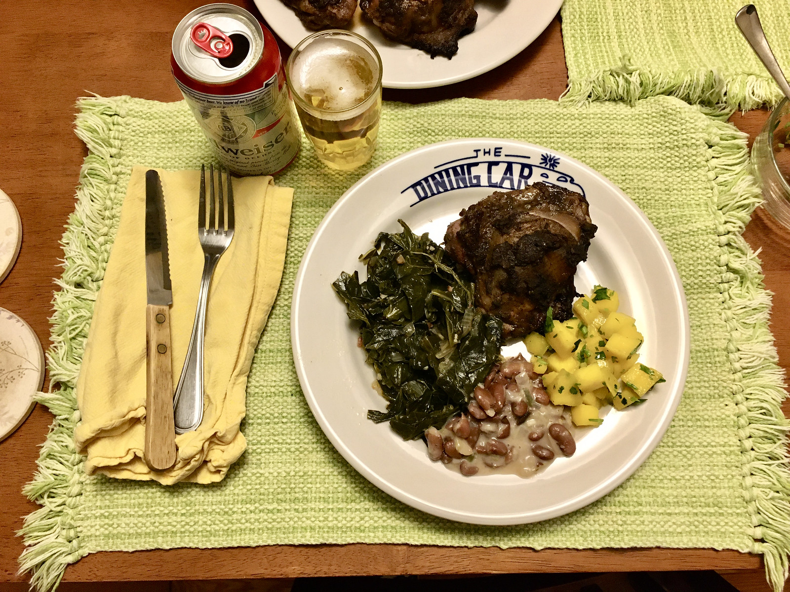
Reeeeeeaaaally good!
As always, you can see the full set of daily Pandemic Porch Cocktails™ photos — now almost 400 of them — here.
Ocho Cinco isn’t 85 in Spanish. It is eight five. The two single-digit numbers, not 85 the two-digit number. Eighty-five is ochenta y cinco in Spanish.
Right. Wording now adjusted.
No worries. I remember some people mocking him for it at the time. Always stuck in my head as kinda silly thing to mock, but Chad Johnson was such an easy target for his antics in those days.
And guess who popped up in today’s uniform unveiling.
The Ochocinco drama was a VERY “cool” move in my high school
I love that Paul’s go-to seems to be a good ‘ol fashioned Budweiser can. I get made fun of in my friend group cause I haven’t jumped on the IPA and craft beer train. But, for my (less) money, nothing beats a cold Bud can.
I wrote about my affection for Budweiser a few years ago here (ignore the mistaken byline — I wrote this piece):
link
Also: We thought about getting Red Stripe for last night’s jerk-fest but were too lazy to go out to the store, so we just stuck with what we had in the house.
If you haven’t watched Kobra Kai (follow up series to Karate Kid), Johny Lawrence exclusively drinks Coors Original. It is a great and funny little bit of characterization for him. I’m definitely a craft beer guy, but if I’m ever at a bar without good craft options, and they did have Coors Original I’d drink that solely based on how well they sell it on the show.
He exclusively drinks Coors Banquet.
I get made fun of in my friend group cause I haven’t jumped on the IPA and craft beer train.
Stand firm, my good man.
I couldn’t even finish the one IPA I tried. And yes, I am swayed by the aesthetics of the labels, so the craft beer trend of stupid classless names and bad art turns me off (as does the price).
Just give me a Blatz, or a PBR or an Iron City. I used to include Stroh’s on my list until they went all minimalist with the label and changed their color scheme.
Like the product but don’t like the label (ala, the redesigned Miller Genuine Draft packaging)?
3 words…Uni Watch Koozie!
;)
In matters of taste, Duke Ellington said it best: “If it sounds good, it is good.” Or, when it comes to beer, If it tastes good, it is good. I’m a bit of a beer snob – well, I’m a bit of a snob, and I drink beer – but I have no tolerance for anybody who looks down on anyone else for what they drink. And, heck, any true snob must recognize American Adjunct Lager as a style of beer; and I submit that among American Adjunct Lager beers, good ol’ Bud is a solid exemplar of the style. Better than most, not as good as some. For my money, I’ll take Narragansett, PBR, or Leinie’s Original ahead of a Bud, but I’ll take a Bud ahead of pretty much any other American Adjunct Lager.
Sorry if this comes across as argumentative, but I always thought that a “snob” by definition is somebody who looks down on people who exhibit “less refined” tastes.
But in general, I agree with you that who cares what other people drink or listen to or whatever.
If you can get your hands on them in your area, the 6 ‘heritage’/non-light offerings by Yuengling are worth sampling(and the money).
I suppose if Teen Vogue publishes it, it must be true…
Ben, do you have a specific critique of that magazine? Some reason to doubt that article’s veracity? Or are you just tossing out an all-purpose insult about something you know nothing about? (Also, that article is just one of several that I cited and linked to, all of which reinforce the same point. Do you have any critiques of those?)
Here’s something you might not know: All Conde Nast magazines, including Teen Vogue, have rigorous fact-checking departments. I know, because I’ve written for several of them. I haven’t written (yet) for Teen Vogue, but I have written for another Conde Nast beauty mag — Glamour — and they’re every bit as professional as the business and news outlets I’ve written for.
Think harder.
Also worth noting that the reporting Teen Vogue has done the last five years has been broadly praised.
Curious. Where does Teen Vogue magazine appear in today’s entry? Scrolled twice. To no avail.
One of the linked articles about the Wings/WASP situation.
Shuffle over to Barstool and Outkick; you’ll feel welcome.
Loved the Bengals Uni History tidbits. Please write the book we all want.
Congratulations, Bengals. You screwed it up. Again.
I guess some cats are just incapable of changing their stripes.
-C.
not that i don’t love a good culinary corner segment, but i think this is the first time where i thought to myself, “I need to make that”. Coconut milk beans? i didn’t know that was a thing. i must have it.
ALL of those sides look delicious! Could you please share all of the recipes? I’d like to duplicate this entire meal!
Pretty sure Mary just winged it on the sides — she’s not big on recipes/measuring/etc.!
I’m not sure I like the Bengals white unis with the orange helmet – there isn’t enough orange in the uni to support the orange helmet. Especially the fact that the black stripes on the uni is on a white background.
Unless there are going to be a number of wears rule surrounding the one-shell rule, if it gets lifted I wouldn’t be surprised if they wore a white helmet on the road. I think we’d see some college-esque changes in the NFL if they don’t limit a 2nd helmet to 2-3 games.
Bengals: I don’t hate them. An improvement on what they had. No gradients, nothing ridiculous. And they left the helmet alone. So, I guess a win. Joe Burrow needs to pull
His socks up, he isn’t in college any more.
NHL: damn you and your slippery slope. Feels like we’re a few steps away from the walking billboards in European hockey.
Membership card: that gives me an idea, if he can pull that off…
Jerk chicken: will try, that looks and sounds awesome.
“Update: The new uniforms have now been revealed: ”
That’s it? That’s what they came up with? Well, whoopdee frickin’ doo!
For me at least, I think they are a slight improvement over what they are replacing, but they could have done SO much better. So yes, an overall disappointment.
This was definitely the most anti-climatic uni reveal in recent memory, as we all pretty much knew (between leaks and Bengals officials descriptions) almost exactly what they were going to look like. I mean, we were told the colors and helmet weren’t going to change and the leaked replica jersey appears to have been legit.
I get that the team wanted to build as much interest and hype as possible, but it was quite unnecessary for what ended up being mostly minor tweaks.
That said: a significant improvement.
I think the new uniforms look pretty solid. I really like the orange jersey with the white pants except for black stroke on the orange pant stripes. Woof! I think the orange would pop enough on it’s own without that. I’m not a fan of the word mark on the chest, but it doesn’t offend me that much either. As a designer, the way the bottom shoulder stripe almost touches the top of the Nike logo drives me crazy. I think these would look great with some TV numbers but that might be a personal preference. I look forward to seeing these on the field when we can really judge them.
About Chad Johnson.
“After retiring in 2011, he legally changed his name back to Johnson in 2012.”
It was retiring from the NFL. Johnson signed to play in the CFL with the Montreal Alouettes. Was a 2-year contract. In 2014, played 5 games but missed many due to injuries and other reasons. Spent 2015 on suspended list.
“Johnson” on the back of his jersey with the Alouettes.
link
link
Proofreading – ‘Blue Rays’ in baseball ticker should be ‘Blue Jays’.
Fixed.
Bengals: Not as good as the Muñoz/Esiason era, but a definite and significant improvement over the crap they’ve been wearing since 2004. Although block numerals would have been better (as always), these are at least less Bears-like. The jersey is much less busy, although it does continue two unfortunate trends: (1) the chest wordmark, and (2) no TV numerals, which I expect will be the norm going forward. I also think the pants stripes are a bit too wide. Best news: No more stupid side panels.
I also like that they have two sets of white pants — one with black stripes, one with orange stripes — rather than a set of orange pants, which means no mono-orange combo. Phew.
I too was dreading an orange pants option when it was announced that they would have 3 sets.
Hate to say it, but the combo that looks the best is the black-over-black. Ugh.
That said, I think the stripe panels on the pants are too wide, and I think the orange-striped white pants would look better if the stripes were orange-and-black rather than orange-and-white.
My first reaction to a detailed viewing of the new Bengals uniforms is Nike’s full tilt push to control the sleeves, or what is left of them, with their swoosh. Look at most of Nike redesigns, they almost always eschew other things on the sleeves, and put the swoosh in a highly contrasting color. In the case of the Bengals, no TV numbers even though they could certainly fit on the sleeves, and the swoosh is white on the black and orange jerseys (no other white nearby) and orange on the white jerseys (no orange nearby). The swoosh isn’t a makers mark, but a element of the jersey designed to stand out. Gross.
When they re-did the Jets jerseys in 2012 they improved on Reebok’s shoulder/sleeve treatment by moving the stripes down, but kept the maker’s mark above the TV numerals, the effect of which (and of sleeves getting shorter and shorter) was to push them so far down as to make the design untenable, which I think is what precipitated the 2019 redesign moving the numerals to the shoulders.
The no-TV-numerals trend doesn’t bode well for a return of the Jets’ classic design, unfortunately.
Oddly enough, my initial reaction to the sleeves was that the Nike swoosh might look sort of cool in the same color as the stripes… it would almost be a subliminal logo disguised as another stripe.
The Bengals prototype with the image of the tiger head on it looks like it was inspired by Charley Harper’s work: link. Harper was a Cincinnati-based artist whose work likely would have been easy to find around town at the time. It would be interesting to know if the resemblance was intentional.
Re the picture of Alex Verdugo in the ticker–those yellow Boston jerseys would be so much more palatable if they had added some red accents. A small thing would’ve made such a difference.
Re: Product placement in Kobra Kai
Get those hard copies of your favorite movies while you can as they have already started digitally altering them for product placements:
link
*Can’t wait to see ads on the ice or uniforms for the Charlestown Chiefs or King Kong climbing the “New York Life” Empire State building
It is product placement to a degree, but it also serves a purpose in the story, not like the article you are referencing going back and adding ads into films.
I think most of us know a guy who always orders the same specific beer, such that it is almost a quirk of their personality. I think that is what they are playing up on the show, he’s a down on his luck every man who orders the same understated, unpopular beer every time.
Sort of an interesting topic that meets at a cross section here at uni watch. We bemoan when teams (who are really brands) sell out their brand to ad space, but simultaneously I think we all appreciate nice branding in the appropriate spaces. Which is to say, that person is super loyal to a beer like Coors Original is not really a sign of product placement. If a person/character is a noted fan of particular sports team, would them always wearing a cap or shirt of said team be considered product placement for that team (brand)?
If its a show on TV or the movies, whether its fictional or reality, its product placement. Period.
Based on the link that Peter provided, that “quick” of the character in Cobra Cai drinking Coors. Well in 10 years, it may be a different beer that a down on his luck every man drinks.
Or nay be a different beer in the Spanish market.
Its all product placement, no matter that character.
Lee
Kudos to the WNBA for stopping the Wings from wearing those racist uniforms.
Not a good week for the league with the racist WASP uniforms and announcing the Slopes as the new SLC team. Seems like they need to spend a bit more time and energy earlier in the process on these things to avoid another embarrassment.
The Slopes aren’t a real team. They were a fictional expansion team for a group of uniform designers. (Can’t tell if you’re serious or not with this.)
You’re replying to someone who calls themselves “Spunkington”. You tell me if they are serious.
Lee
Proofreading – Oskar Lindblom plays forward, not defense.
Just a clarification, the “Captain America-style insignia” is actually the official roundel for US military aircraft from 1919-1942. The red dot was painted out to avoid confusion with Japanese insignias. Wiki’s got more info:
link
Yes, I know. But it presents at retail as CaptAmerica-style.
The armed forces should change the roundel to something less comic book looking.
Being cartoonishly easy to identify is the whole point of a roundel. The USAF roundel originated in a 1917 design, with subsequent evolution. Captain America debuted in 1941, and his original shield was shield-shaped. (link) After threatened legal action from a rival publisher, Cap’s shield was changed to a circular disc, and the design was inspired by the U.S. Army Air Corps roundel. It’s art imitating life.
Why would the Bengals release an official photo depicting every player ignoring the NFL’s uniform rules? Each player could technically be fined for his own appearance. “New uniforms, look at the details” ….unless the detail is wearing the uniform properly.
Miami is to host a Formula One race starting next year with a track centered on
Hard RockJoe Robbie/Dolphins Stadium.Fixed.
I don’t think that F-1 race will last even one year. The track is within 700 feet of a residential neighborhood located just across 199th Avenue of the backstretch where the cars will be able to hit 185 mph.
Compare to the 2002 Cadillac Grand Prix IMSA race weekend in Washington, D.C., where they built a racetrack where the hairpin is about 500 yards from a residential area in Northeast. There had been a 10-year contract for that race, but half of the track has now been taken over by artificial grass soccer pitches.
Paul – you should market those flannel card holders as Covid-vaccine holders. Might work. Rob B
Ah, good ol’ WKRC-TV covering the Bengals 1981 uniform unveiling–in the same era that WKRP in Cincinnati was on the air. (Alas, the now-CBS affiliate WKRC-TV was affiliated with ABC at the time. Current ABC affiliate WCPO-TV aired the series new.) Probably fitting this clip came up seeing that most Bengals games in Cincinnati now air on “Local 12”.
As for the uniforms themselves–BIG upgrade.
I remember this clip well; I worked for Taft Broadcasting’s WKRQ, in the same bldg as WKRC TV and AM, so I knew Walt, AKA The Grand Poobah. This was at the College Football HOF at Kings Island (also owned by Taft- corporate synergy.) Became friends to this day with LB Reggie Williams, who has to be next up for the new Ring of Honor.
This new batch looks fine, contemporary for 2021. I miss the original look they wore when I moved to Terrace Park summer of 72, tho.
I’ve lived in Columbus since 2018, I think Taft used to own WTVN-TV (now WSYX) here. I think Sinclair owns both WSYX and WKRC-TV now. I typically watch their local news here because its one of the better Sinclair news-producing stations. (Despite being owned by Sinclair since 1996, WSYX isn’t political.) WCMH-TV is owned by Nexstar and like any Nexstar station is low-budget. WBNS-TV is owned by Tegna and well…just Google what Tegna has done to local news. Its worse than what Sinclair has done.
That all being said, I still have yet to go to Kings Island. But I have eaten plenty of Cincinnati chili. As a native Yinzer I’m just happy Sheetz is here in CBus now.
Bengals at first glance (and by first glance I mean the photo above)…after hearing that one set of pants was kind of “married” to a uniform combo, I wasn’t surprised to see two different whites. Not blown away by this design, but a HUGE improvement over what it’s replacing.
Paul, we need more details in regards to the van parked in front of your residence! Looks like it’s straight from central casting for a horror movie. ha
I recall Chad OC Johnson would have been required to “buy out” his Reebok merchandise (a disgusting policy, if you ask me; and probably one that was only applied selectively to players who tweaked the NFL’s status-quo), which is why he eventually legally changed his name.
My snap judgement on the Bengals unis: they’re good. As good as we might have wanted? Maybe not. But a big step up from the mess they had.
On the WASP tribute uniforms, I agree that the military porn uniforms are gross (not because military service is gross but because the leagues all monetize these items), and it also amazes me that nobody with Nike or the WNBA knew this history as it’s pretty basic stuff. But I still can’t help but wonder why they just withdrew the uniform. It seems like if you have made and announced the uniform a better route would have been to make clear that we are honoring the women who served in the WASP, not the leadership that made the decision to exclude African Americans. And they could also have made a point of specifically saluting the service of Mildred Carter, who decades later was designated as a WASP (and an Original Tuskegee Airman). As you said, it is a complicated issue, and I realize that my opinion might be way off.
Thanks.
PS – Here is a link with some basic information on Carter. In a just world, hers would be a household name.
link.
So you don’t like the roundel on the Winnipeg Jets sweater? Here’s a comparison of the two. Jets on the left, RCAF on the right.
link
Regarding Bengals’ new uniforms, the best I can say about them is that they’re far better than what they’re replacing. I don’t think they’re terrible, but I think reverting to varsity block numbers like the Browns, Bucs, and Jags did would have made these better. 6/10.
I do think they missed on the white jerseys by not including more orange–should have patterned the shoulder tiger stripes after the ones on the orange-on-white pants. With the orange being limited to the helmet and swooshes, I’m getting a minicamp jersey vibe.
I know folks like the now-old Color Rush jerseys, but that white jersey cries out for a white version of the striped helmet. If the 1 shell rule does get ditched in a season or two as has been rumored, I would have thought Nike would keep its powder dry and keep the new white design for the white helmet while making the regular white jersey more in tune with the orange helmet.
Oh well, it could be worse (cough Rams, cough Falcons)
Overall, I think the Bengals uniforms work pretty well. Addition by subtraction. My only gripe is with the white pants with orange stripes. It looks like those stripes have a black outline for some reason. Kind of a strange choice since there are no outlined stripes anywhere else on the uniform. Not to mention that it looks pretty silly to pair orange stripes on the pants with black stripes on the jersey/helmet. Hopefully those pants don’t get used much. Other than that, I’m pretty satisfied.
Question for Paul or anybody else who might know: I was pretty sure that at least at one point TV numbers were required by the NFL. Was this never the case officially or did that rule get changed or is just no longer enforced?
Given the lack of TV numbers on the Pats, Bengals, Rams, and Chargers recent changes I am wondering if TV numbers are on their way out? Perhaps due to large-screen HD televisions they are no longer needed – I have noticed that a number of college teams don’t use them.
Yes, they were once required. Now they’re not. It’s not clear to me exactly when that change occurred; it was certainly never announced.
Before we pronounce TV numbers dead, it’s worth remembering that three teams last year unveiled new uni sets that *do* include TV numbers: the Falcons, Browns, and Bucs.
Thanks, Paul.
I do wonder if we can count the Chargers’ helmet numbers as “TV numbers” since they perform the same function as sleeve/shoulder numerals? I thought that Washington putting numbers on the helmets and also having them on the sleeves looked kinda redundant and crowded.
That would get really confusing. Chargers have helmet numbers. The term “TV numbers” refers to the numbers on the sleeves or top of the shoulders on the football jersey.
Well, given that the light blue numbers don’t show well on the white background and are therefore barely readable? No.
They need to go with black/dark blue helmet numbers with all their uniform combos. Like it was in the past.
In 1960, 2 NFL teams (Browns, Steelers) wore helmet # but not sleeve #. Everyone else had sleeve #. I suspect the NFL rule was that you had to have TV # in one of those places.
But in the new AFL, 4 teams had helmet # AND all had sleeve # (LA, Den, Bos, Buf). So I suspect the AFL required it on the sleeve.
So the mystery is, why were the Bengals treated uniquely in 1968?
The NHL uniform advertisement developments are also tragic. Absolutely disgraceful.
If the NFL repeals the one shell rule (hopefully) and the Bengals wear white helmets with their all white uni, I propose that we call that the Siegfried and Roy uni.
Paul, do my eyes deceive me, or are you wearing PRO-Keds rather than Chuck Taylors???
Pistol Pete would be proud of you!
Yes, I was wearing Pro Keds yesterday. They have a shade of green that I really like.
The NFL already has no shortage of rules for uniforms, why don’t they have one about how opaque these white pants need to be?
Thrilled Miami is getting an F1 race. I went to the 2006 USGP in Indy but have not been to Austin as it falls during college football season. Sounds like this one will paired with Canada which means June. That could be oppressively hot in Miami, but I hope to be there! Go Seb!
Also, very interesting to read a British article describing American sports! NASCAR has a “round” in Miami and Hard Rock is the Dolphins’ “ground!” Love it! Of course, they should have mentioned the Orange Bowl and the CFP National Championship, hands down the top sporting events at Hard Rock!
Regarding the Bengals’ new uniform reveal…
If the Nike design team took more than 30 minutes to come up with that set, they spent waaaaaaaay too much time on it. Yawn, yawn, yawn.
That orange Bengals jersey is gaudy and hurts my eyes. Orange is a complimentary color, used judiciously. That jersey should only be worn by the quarterback during practice.
A uniform featuring tiger stripes all over the place does not benefit from a goofy looking number font. I was so hoping we would see standard block.
Sure, they cleaned up the look but they didn’t go far enough.