For all photos in this section, click to enlarge
Good morning! Greetings from Uni Watch HQ, where all three inhabitants continue to be safe and well (and where one inhabitant got his first Covid vaccination shot last Friday — more on that later).
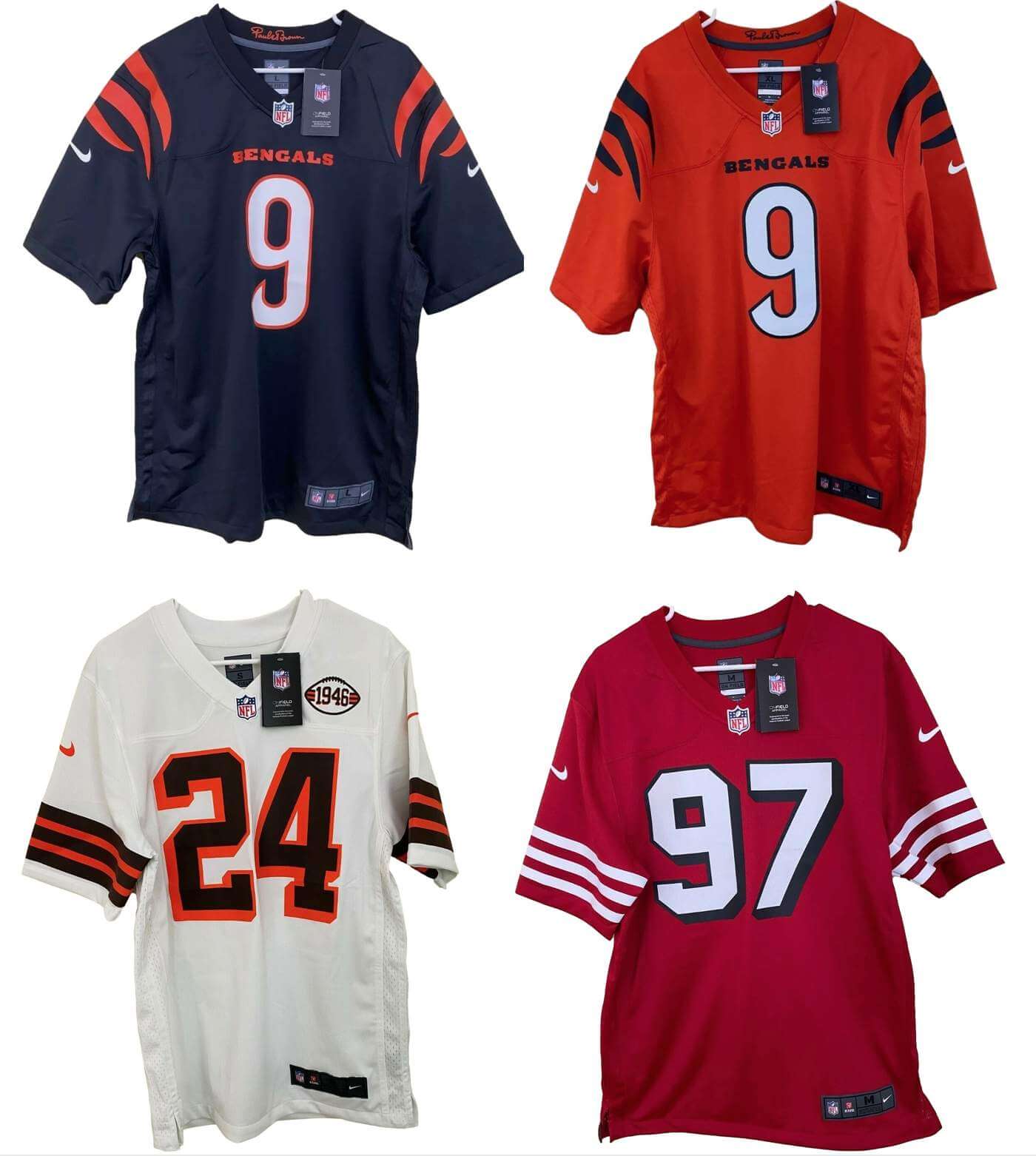
Lots of NFL buzz yesterday, as an eBay seller called originaljersey81 began listing what appear to be the Bengals’ new black and orange jerseys (no sign of the white version), plus new throwbacks for the Browns and 49ers, all of which are shown above. Shortly after photos of the jerseys began circulating — and after I sent the seller a note asking for more information — the seller took those listings down.
Let’s shift into FAQ mode:
Do you know whether these leaks are legitimate?
No.
Then why are you writing about them? I thought you didn’t write about unverified leaks.
While we don’t know for sure whether these leaks are legit, we do know a fair number of things about them:
• First, we know the source — they all came from that one eBay seller. That seller has over 3,500 customer ratings and a 100%-positive rating over the past 12 months. That doesn’t automatically mean that the leaks are accurate, but it at least seems to indicate that the seller isn’t just a bullshit artist. He may be selling Chinese knockoffs or something like that, but a Chinese knock-off of a legit design can still tell us a lot. For the purposes of leak assessment, I don’t really care about whether the seller’s product is authentic or counterfeit; I just care about whether it accurately reflects the real design, and it seems like a seller with a 100%-positive rating probably isn’t selling made-up designs. (As I mentioned above, I’ve also contacted the seller and asked for more info but haven’t yet heard back. I’ll update this post if I get a response.)
• Second, we know that Joe Goodberry, who formerly covered the Bengals for The Athletic, says the Bengals leaks match the new uni designs that have been described to him.
• Third, we know that these designs are plausible. The Bengals said they were getting a redesign but nothing too drastic; the Browns said they would have a new throwback for their 75th anniversary; and while I hadn’t heard anything about the Niners, they’ve had the white throwbacks for three seasons now, so it makes sense that they’d be swapping that out for the red version sometime soon.
Granted, none of that automatically means that these leaks are legit, but I decided it was enough to make them worth reporting on.
These can’t be real because none of them have TV numbers.
Not so fast! For starters, the Niners and Browns throwbacks are both based on designs that didn’t have TV numbers to begin with, so it’s not surprising that the thowbacks wouldn’t have them. Moreover, we can’t take NFL TV numbers for granted anymore. The Chargers and Patriots no longer have them, and neither do the Rams’ blue jerseys. So if the Bengals are scrapping them as well, that would just be the latest example of this trend.
What do you think of them?
Let’s start with the throwbacks, beginning with the Browns. Here’s a look at the front and back:
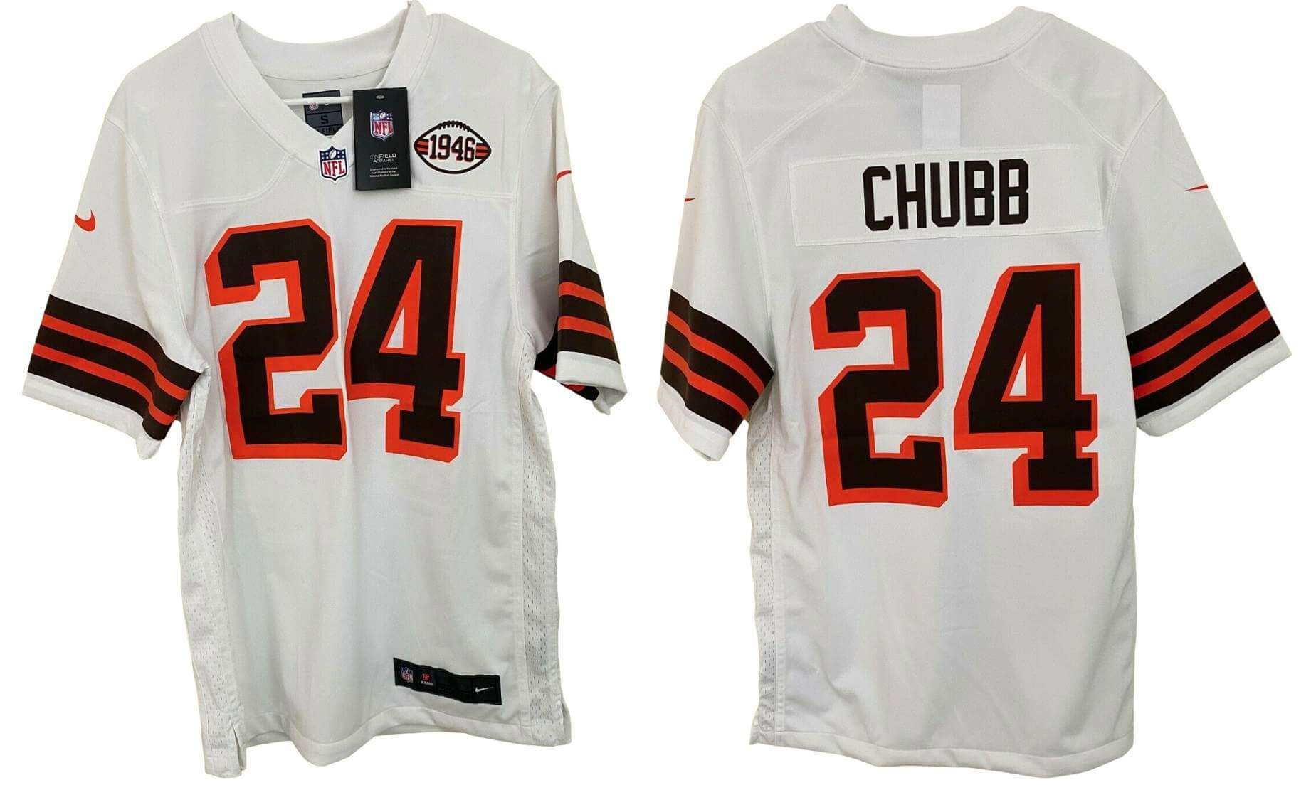
As the chest patch suggests, this design is apparently based on the team’s 1946 uniforms. The sleeve striping, the block-shadowed numbers — what’s not to like? The real question is whether the one-shell rule will be lifted, allowing them to wear a white helmet. But their current helmet will look fine with this too. A winner.
Next up, let’s look at the 49ers throwback:
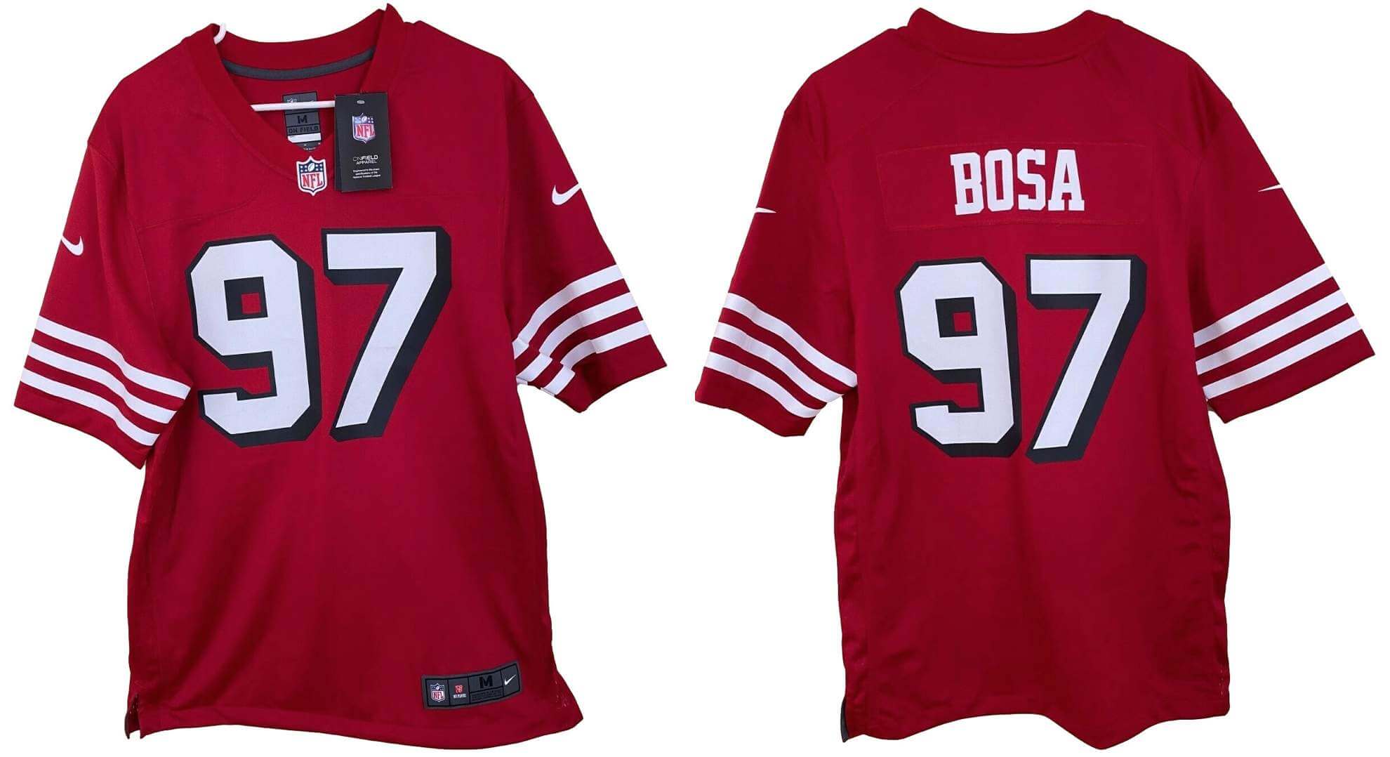
These will presumably be worn with white pants, like throwbacks first worn in 1994 As a Niners fan, I heartily approve.
Now let’s get to the most momentous leak — the Bengals:
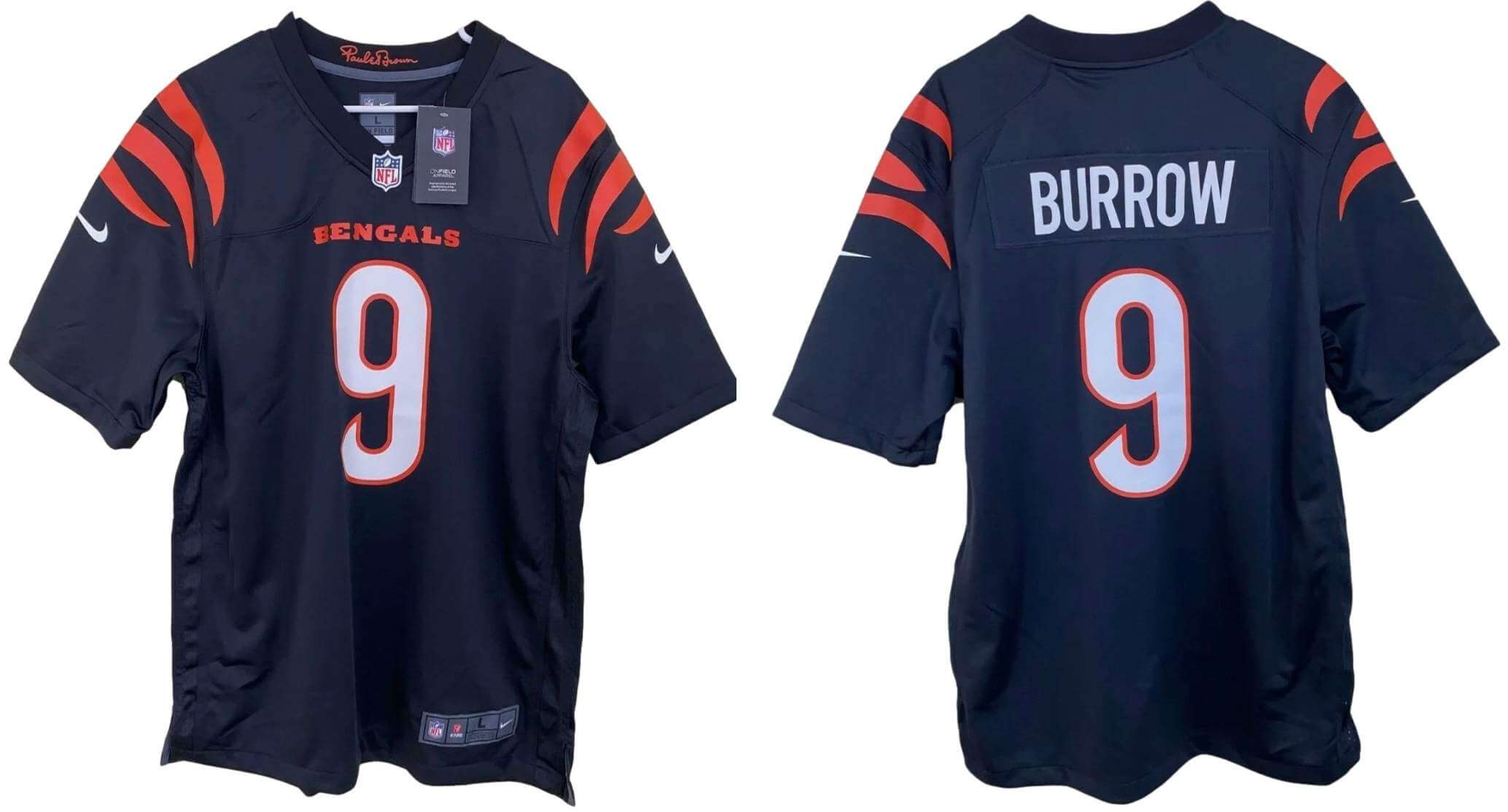
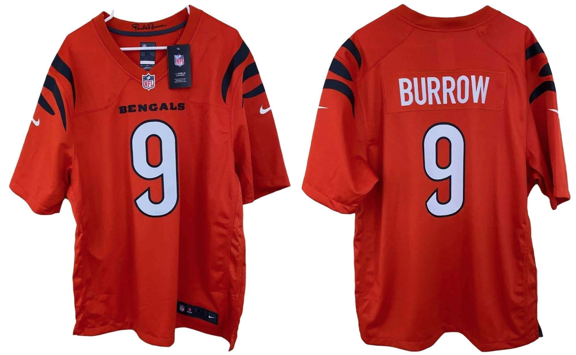
Okay a few thoughts on this one:
• Lack of side panels is an obvious upgrade.
• Tiger striping on the shoulders seems acceptable — like, it’s not excessive or overdone, but it’s enough to communicate what it needs to communicate — although we’ll need to see how it looks over shoulder pads.
• A chest wordmark is always disappointing (at least to me), but that’s where the NFL is at these days.
• The number font isn’t bad per se, but it looks way too Bears-y, especially given the similarity in color schemes:
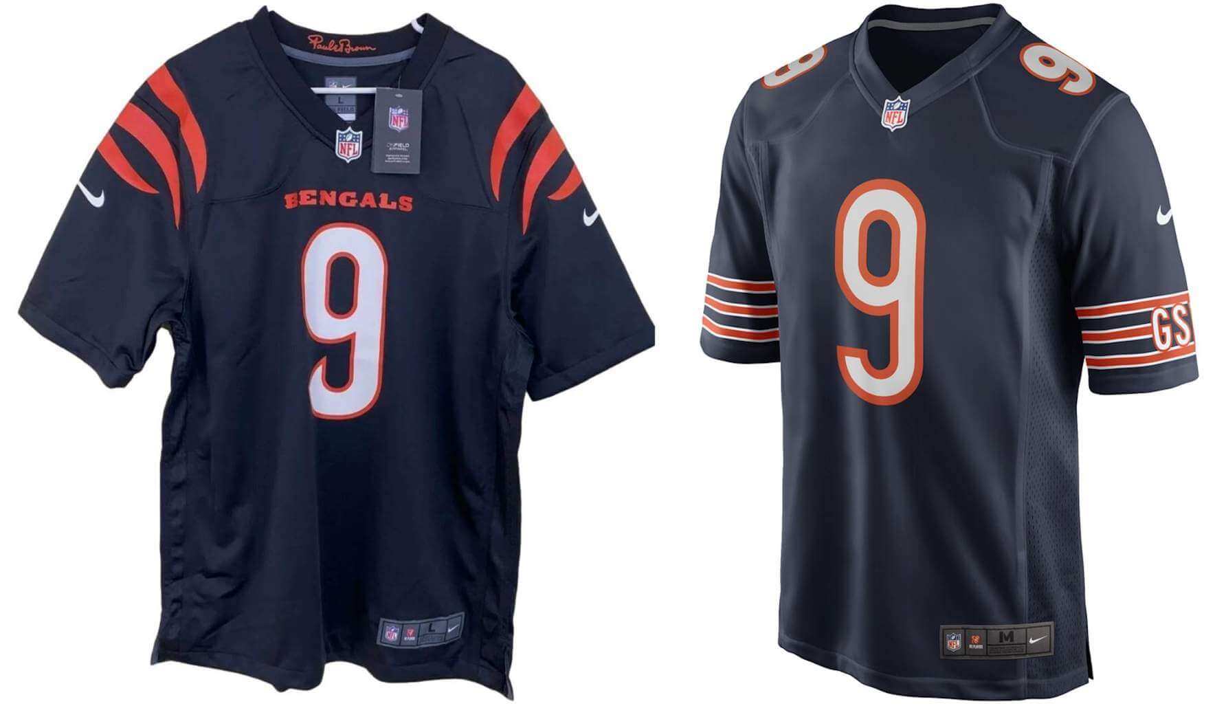
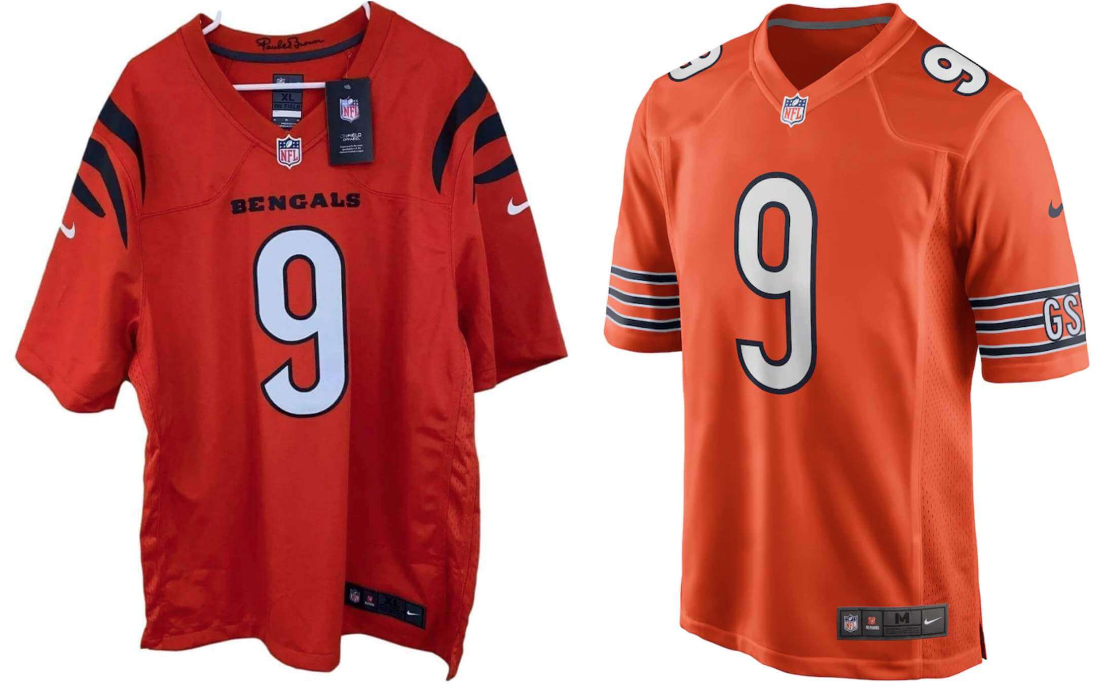
It’s worth noting that the Bengals’ new number font isn’t all that different from their previous one, but that one had block-shadowing, which was enough to differentiate it from the Bears’ number treatment. Without the shadow, though, the Bears similarity really comes through.
• It’s always better to see the pants along with the jersey, but that goes double for the Bengals, since they’ll presumably have tiger striping down the sides, so it’s hard to assess these jerseys without seeing the whole package. For now, I’ll say they appear to have followed the primary rule of any redesign — “First, do no harm” — although the number font is a bit puzzling.
Anything to add?
Just the usual caveat that we still don’t know for sure that these are the real deal. But they’re intriguing to ponder.
For all photos, click to enlarge
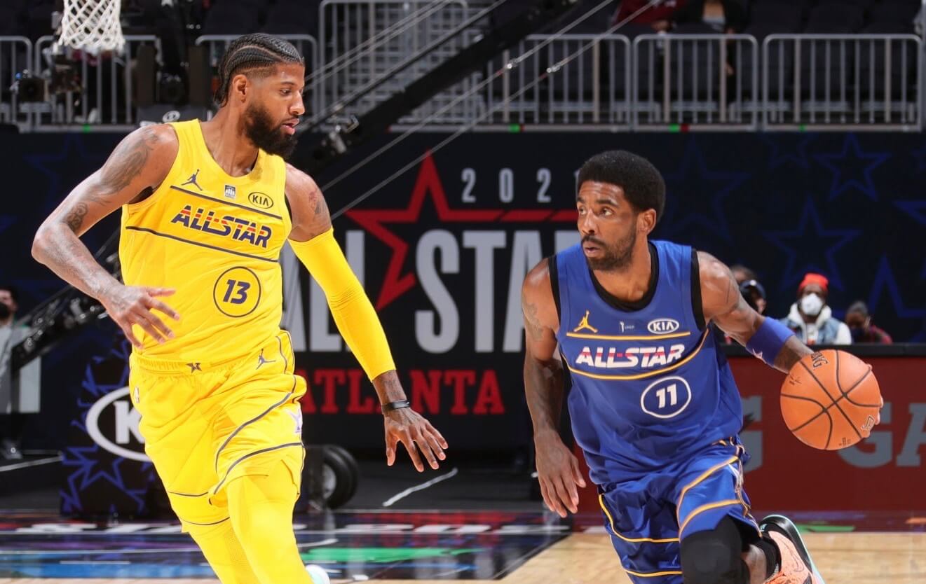
NBA All-Star recap: The off-again/on-again NBA All-Star Game took place last night in Atlanta. As recent leaks had indicated, they went ahead with the Pacers-themed uniforms that had been created for the game when it was originally slated to take place last month in Indianapolis. I heard a lot of negative feedback about these uniforms, but I liked them fine. I just wish they’d let the players wear their regular team uniforms instead, in a color-vs.-white format. (Indianapolis is now slated to host the 2024 All-Star festivities — what design will they come up with for that?)
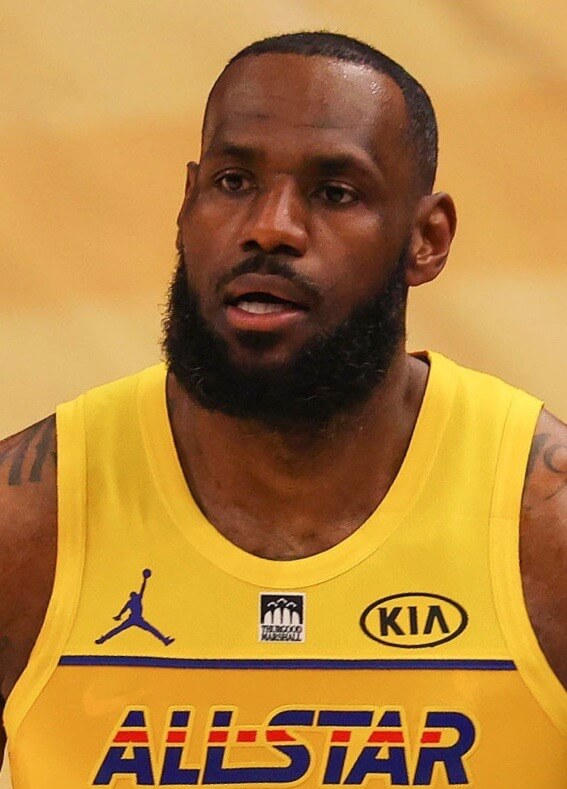
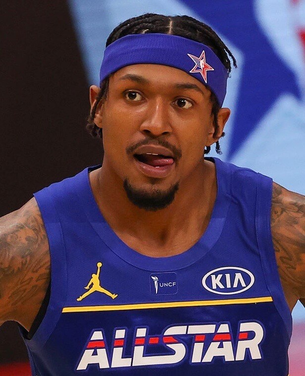
In keeping with recent announcements about the game benefitting historically Black colleges and universities, Team Lebron wore a patch for the Thurgood Marshall College Fund, and Team Durant wore one for the United Negro College Fund:
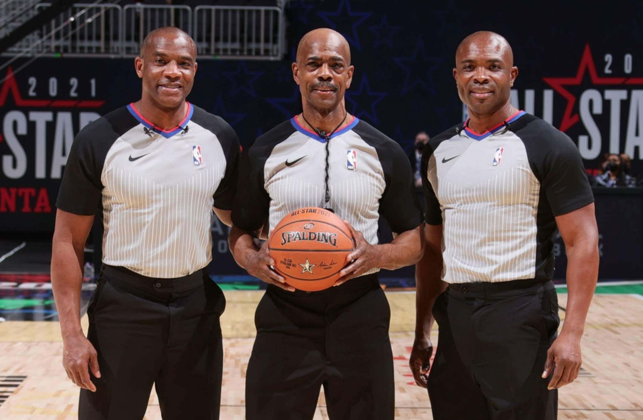
Interestingly, all three refs working the game were HBCU alums, but they did not wear either of the scholarship fund patches:
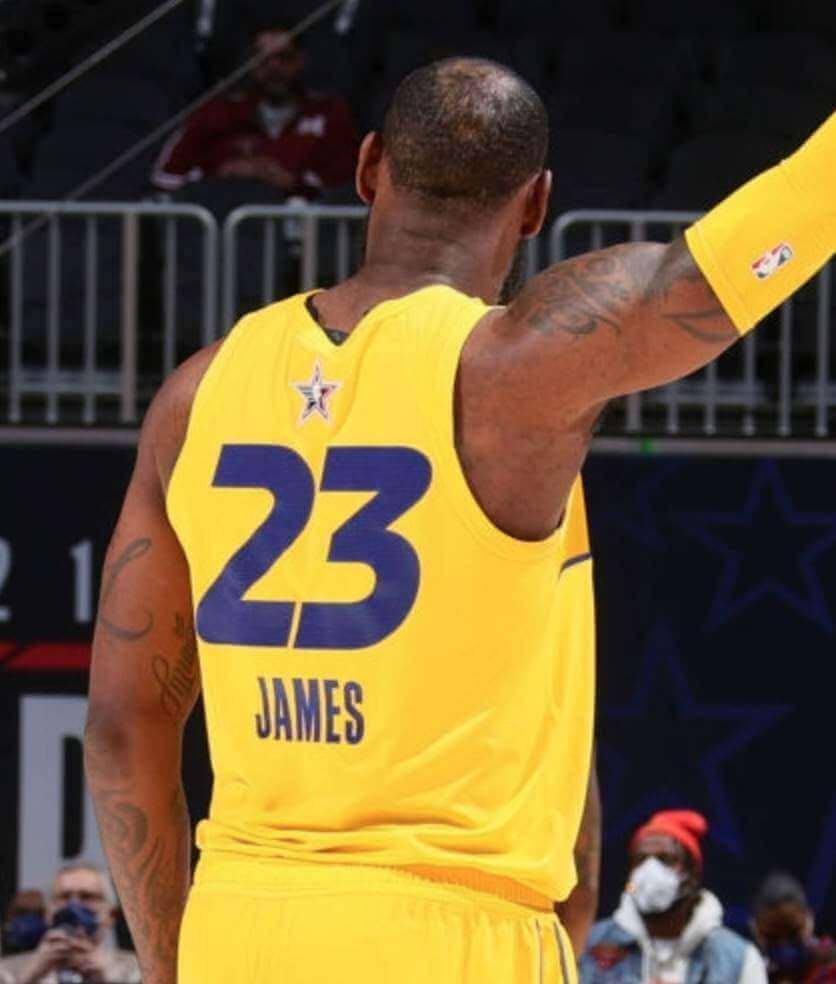
My only real gripe was with the rear view, which was just brutal:
Also: In case you missed it yesterday, Phil had his annual preview of the game’s sneakers.
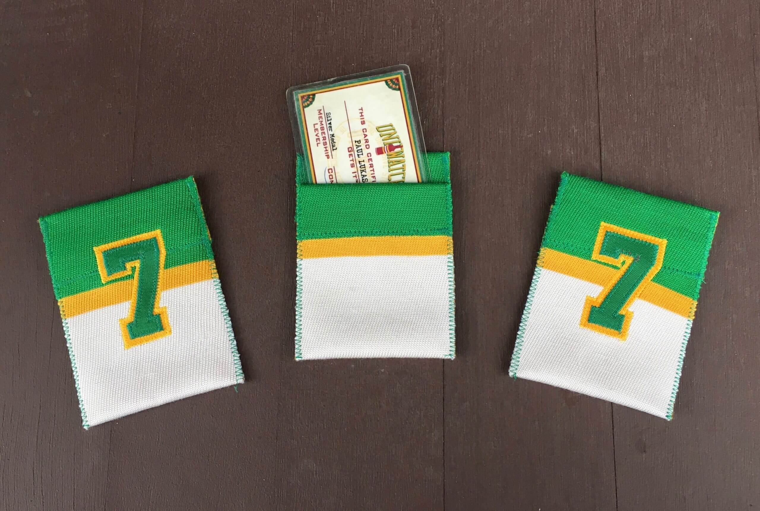
Membership drive update: I’m happy to report that last week’s membership drive was a big success, resulting in a whopping 40 orders — thank you! (A bunch of people also purchased memberships for me to raffle off, which I’ll be doing in the days to come.) Card designer Scott Turner and I are grateful for all the support.
Out of those 46 new members, I chose three at random, who turned out to be Frank Johnson, Norman Valera, and Alex Raridon. Each of them will receive a hand-sewn card-holder pocket, made by ace DIYer Wafflebored, along with a Uni Watch magnet. All of that will ship out once their cards have been produced.
My repeated thanks to Wafflebored for providing these excellent enticements, and to Chris Hickey for sponsoring the magnets.
If you missed out on the membership drive, you can still sign up anytime, but the price has now been restored to its pre-pandemic level of $25.
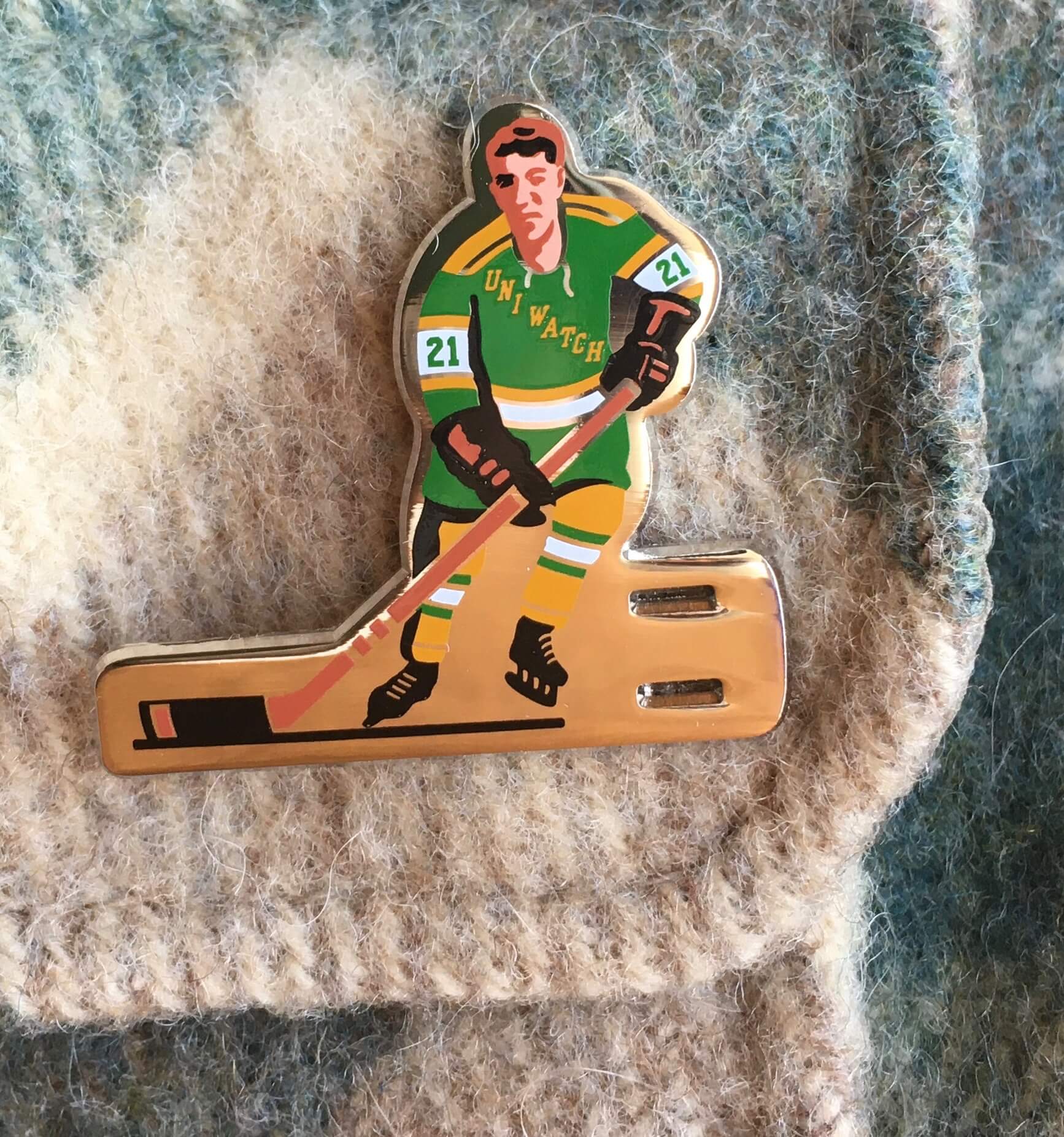
ITEM! March pin now SOLD OUT: When the Uni Watch Pin Club’s March design debuted last Monday, I said it was my favorite pin we’d done so far. Lots of you apparently agreed, because the pin has now sold out. Thanks for all the support and enthusiasm — pin designer Todd Radom and I are very appreciative of your support (and I’m kicking myself a bit for not having done a larger quantity on this one, but whaddaya gonna do).
Our next pin will launch on April 1. I promise that there will not be any April Fool’s Day aspect to it — we’ll play this one straight!
Click to enlarge
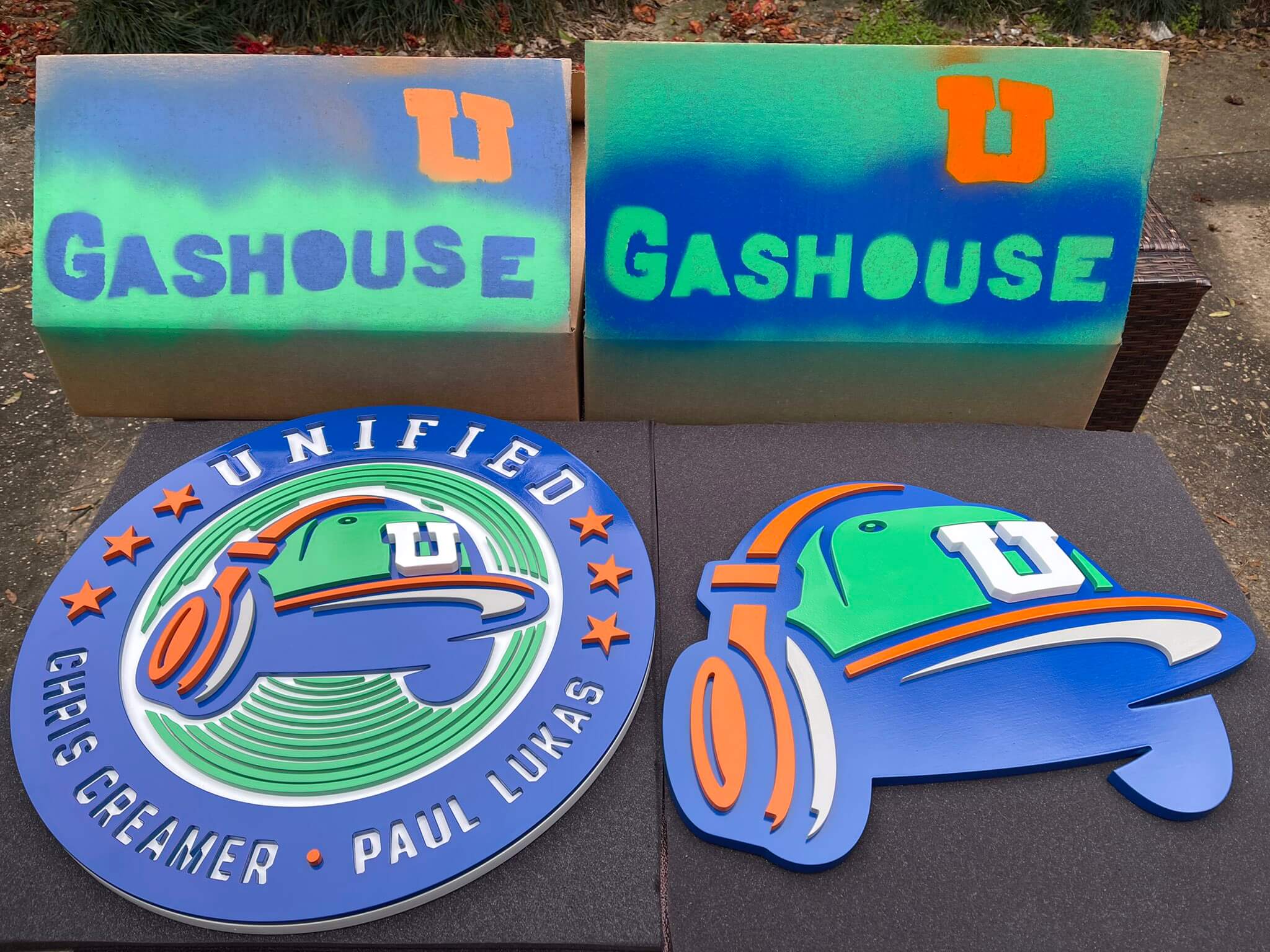
ITEM! Gashouse scores again: I’ve written a few times about Kevin “Gashouse” Cearfoss and the excellent 3D wooden logos that he creates. As you can see, his latest project is a set of Unified podcast logos. Lots of additional photos in this Twitter thread.

A very eventful weekend: My last pre-pandemic haircut was sometime in February of last year. I enjoyed growing my hair long again — it had been pretty damn long in college — but lately it had gotten a bit out of hand. The Tugboat Captain, who’d been supportive and even enthusiastic about the longer locks, started hinting that maybe it was time for a trim. After seeing myself on the video versions of the new podcast, I had to agree.
Unfortunately, my old pre-pandemic barber has now retired, and I wasn’t that comfortable going into a barber shop. But the Captain, who’s pretty handy with a pair of scissors, offered to do the honors herself. And as you can see above, she did a pretty good job!
As it happens, we have a barber chair in our house — a vintage 1940s model that I picked up at an antiques shop as a birthday present to myself in 1994 — so that’s where I sat. In the nearly three decades I’ve owned it, it’s the first time it’s been used for barbering!
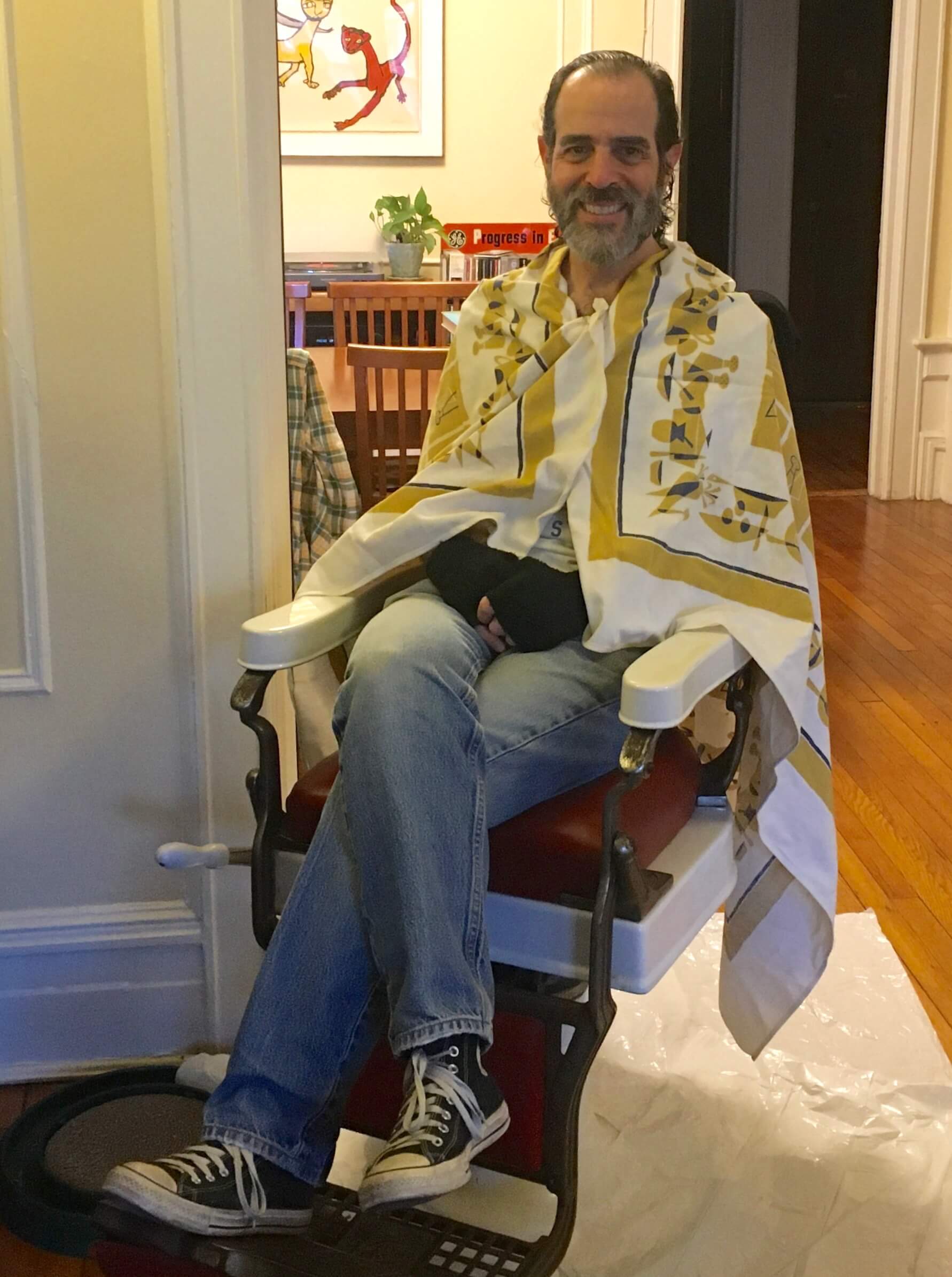
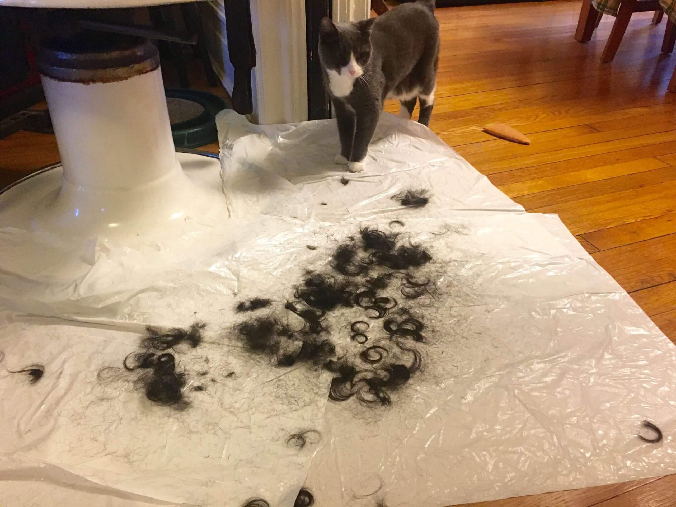
The Captain also had a trusty assistant on hand:
The haircut felt like a milestone of sorts, but the real event of the weekend came late on Friday afternoon, when I biked over to Medgar Evers College and received my first dose of the Pfizer vaccine. (I qualify due to having asthma.) For some reason I was the only person getting vaccinated in a Uni Watch mask (and probably the only one with a Brannock Device tattoo, although I didn’t do a close inspection on that):
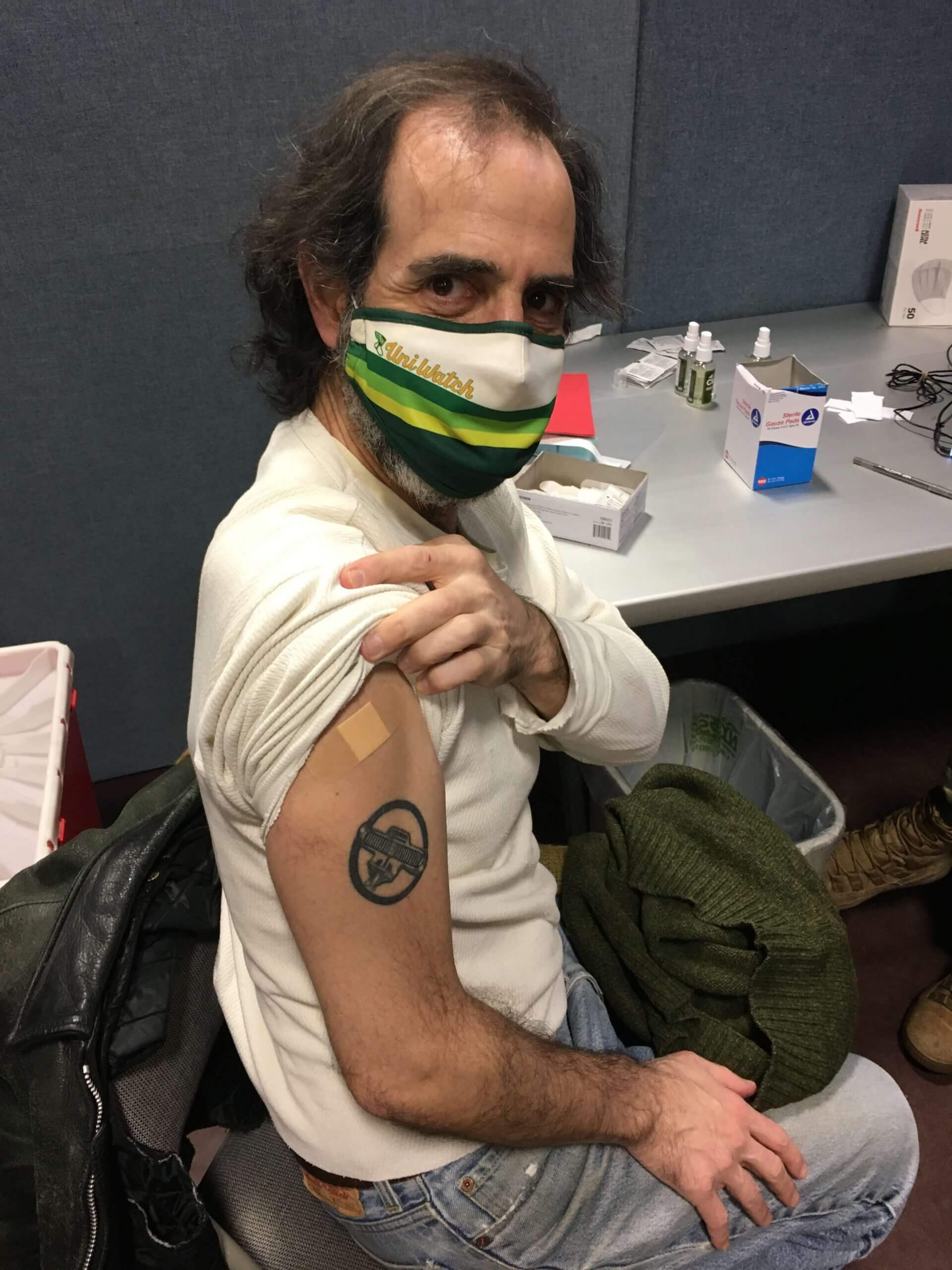
I’ll get the second shot in three weeks.
The vaccination and the haircut both feel like good ways to mark the first anniversary of the pandemic lockdown. I’m definitely not letting my guard down yet, and I know we still have a long way to go before we reach herd immunity — but little by little, we’re getting there.
The Ticker
By Jamie Rathjen

Baseball and Softball News: A White Sox wore a jersey that was blank on the back yesterday (from Chris Rhode). … In a 1941 spring training game, some Dodgers players wore protective inserts in the sides of their caps while batting, one of the earliest instances of that form of head protection (from Bryan Beban). … Louisiana-Monroe baseball has a new warplane-themed alternate — the P-40 Warhawk gives the school its team name, even though it’s not used in their logos (from @tonebone35). … Ole Miss softball has a helmet decal of the new state flag. … The 1972 Cubs’ road jerseys are famously notable for having the front uni number centered instead of offset. That design element was discussed on the air during an NBC Game of the Week broadcast.

Hockey News: The Professional Women’s Hockey Players’ Association, a union whose members don’t play in the NWHL and hope to create their own league, is currently playing a series of exhibition games in NHL cities. The five teams are all named and seem to have color schemes based on participating advertisers, but the jerseys all use the PWHPA logo as the crest.

Basketball News: Shaquille O’Neal brought a literal shoe phone to the 2005 NBA All-Star Game (from Mike Chamernik). … The next three items are from Kary Klismet: The Iowa/Wisconsin men’s game yesterday was color-vs.-color. … After that game, Iowa said they’d retire Luka Garza’s No. 55 (also from Mike Chamernik). … The Iowa departing seniors also got framed alternates from the previous uniform set, which was replaced at the start of last season, but all the seniors would have worn those as none were transfers. … The Japan Women’s Basketball League has its own court for the playoffs (from Jeremy Brahm). …

Soccer News: Both of FC Barcelona’s teams were uni-notable this weekend, as the men’s team wore the annually recurring Catalan flag-themed fourth shirt on Saturday for what appears to be the sixth time this season, but we haven’t mentioned it here yet. Meanwhile, both they and the women’s team wore warm-up shirts celebrating International Women’s Day, which is today. … In Italy, Sampdoria also wore IWD sleeve patches. … Before yesterday’s Brighton and Hove Albion/Tottenham Hotspur Women’s Super League game, both teams wore warm-up shirts supporting Australia’s Leukaemia Foundation, because Brighton’s New Zealand international center-back Rebekah Stott was recently diagnosed with non-Hodgkin’s lymphoma and is raising money for the charity. The shirts also had Stott’s NOB and No. 13. … Elsewhere in England, Sheffield Wednesday center-back Julian Börner tore his shirt after being sent off on Saturday (from Patrick Barnett). … Syracuse’s men’s team debuted dark blue shirts yesterday (from Jakob Fox). … New home, away, and third shirts for third-tier American side New Amsterdam FC (from Ed Zelaski). … The women’s team by Sanfrecce Hiroshima in the WE League will be called Regina (that page translates well). “‘Re’ is respect, ‘Gi’ is Girls and ‘Na’ is Navigation,” explains Jeremy Brahm. … Also from Jeremy: Here’s a look at the history of the Italian Football Federation crest.

Grab Bag: There are now two different Formula One safety cars with red and green liveries, and the former has ads other than on the hood for what I believe is the first time ever. The car was previously the manufacturer Mercedes’s trademark silver (from @_bbbene). … The teams at the Brier, the Canadian men’s curling championship, all wear a reference to the host city on the front of their shirts, which this year is a cowboy hat for Calgary. Additionally, it looks like British Columbia, the team pictured, has more than one cap (from Wade Heidt). … The Korea Rugby Union is choosing from eight designs for a new logo (from Sy Hart). … Two fans at yesterday’s NASCAR Cup Series race in Las Vegas dressed up fairly accurately as Richard Petty and Dale Earnhardt (from Kyle Dawson). … Australian Football League teams sometimes wear experimental designs for preseason games. Adelaide wore one that wasn’t that experimental yesterday, as it was just their normal design in primarily gold instead of blue. … This article looks at how Adidas attempted to enter Gaelic games for more than 20 years starting in the ’70s, primarily through outfitting Kerry’s county teams. Obstacles included, among other things, the Gaelic Athletic Association’s rule that all equipment has to be Irish-made and various times when the maker’s mark was either prevented from appearing or those involved felt compelled to hide it. … Amazon shipping boxes apparently now have ads (from Taylor Lanier).

Click to enlarge

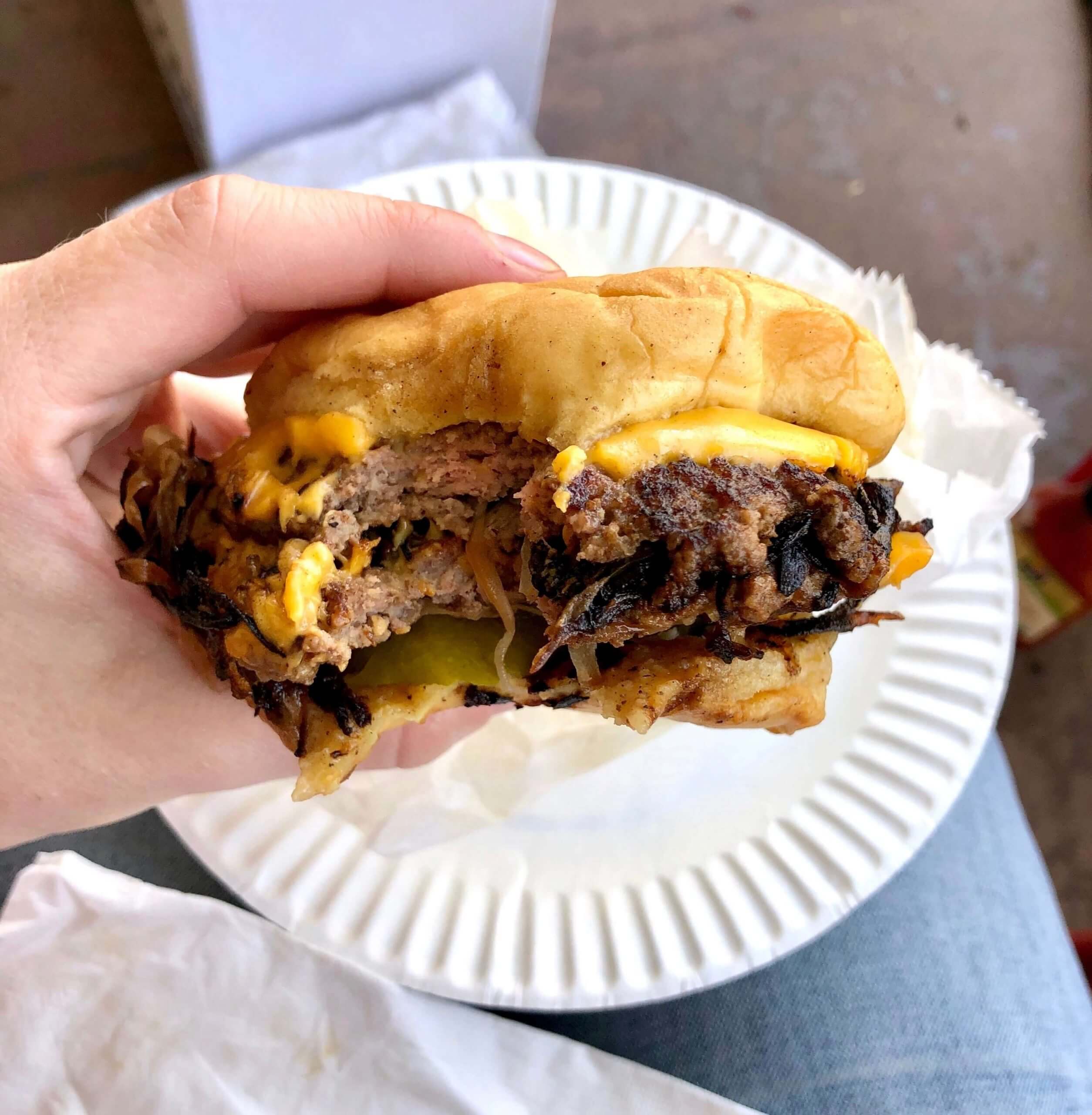
What Paul did last night yesterday afternoon: Fun day yesterday, as the Tugboat Captain and I biked about 20 minutes to another part of Brooklyn, where we met up with our friend Sujan outside of George Motz’s house. Motz is probably America’s foremost scholar of the hamburger — he directed the seminal 2004 documentary Hamburger America, authored its accompanying travel guide, and has cooked his signature smashburgers all over the world.
Throughout the pandemic, Motz has offered a unique eating experience: He cooks burgers for takeout in his home kitchen, and customers can pick them up by coming to his house and having their orders delivered via a slide that runs from one of Motz’s front windows to the sidewalk (so the burgers are literally sliders, get it?). Fun!
We picked up our order and then walked over to Sujan’s nearby house, where we enjoyed the burgers on her porch. It was chilly (about 36º) but tasty!
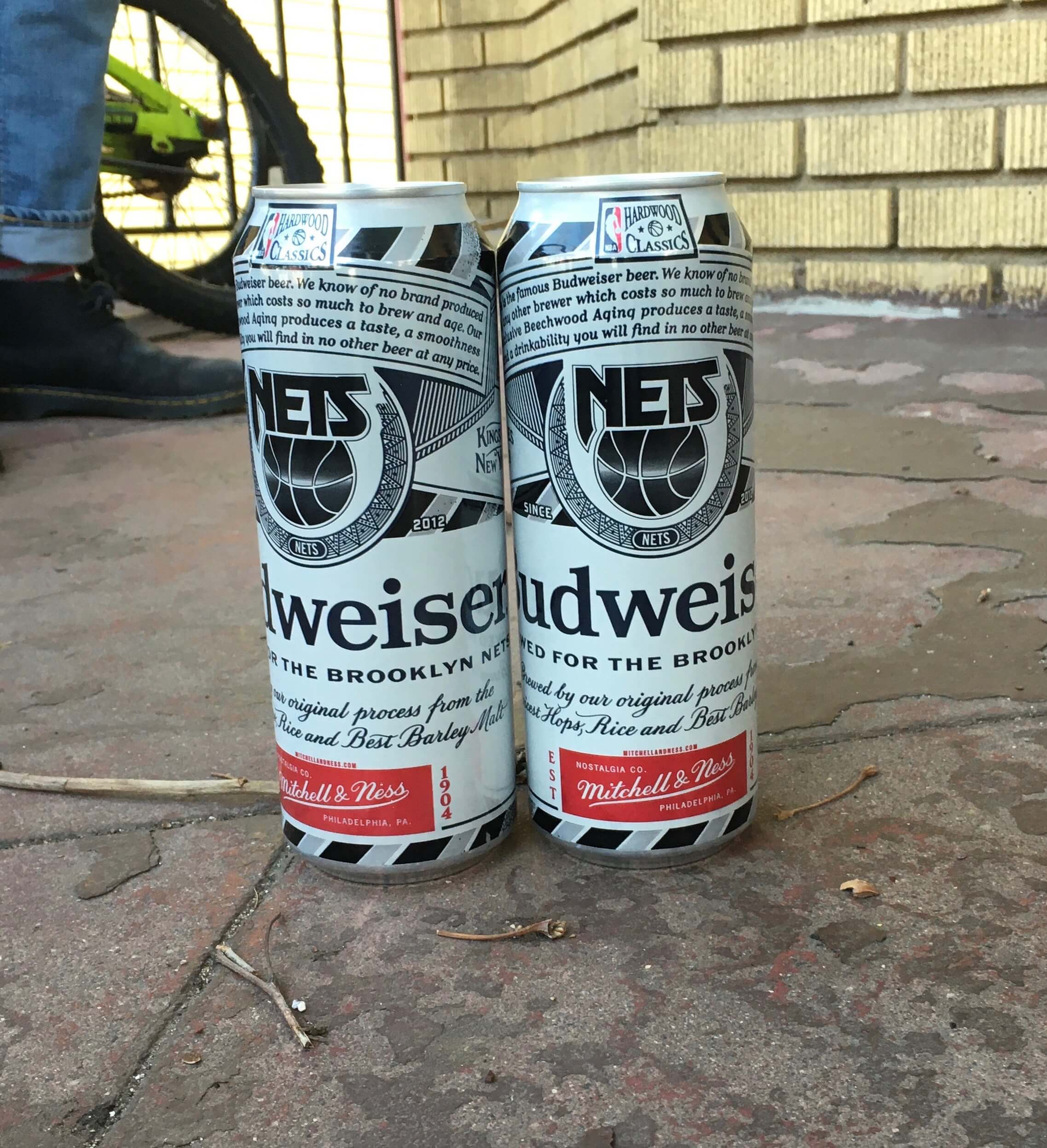
Also: We picked up beers along the way, and I was surprised to see that our local bodega had Bud tall boys in a Nets throwback scheme, complete with Mitchell & Ness logo creep! I assume they have these for most NBA teams, but it was the first time I’d seen it:
We later had Pandemic Porch Cocktails™ on our own porch, so this was actually a double-PPC™ day.
As always, you can see the full set of daily Pandemic Porch Cocktails™ photos — now almost a full year’s worth — here.
So judging by the NFL leaks, are shoulder/sleeve TV numbers being phased out?
That point is addressed in the text, Kyle.
Ah I see it now. Thanks!
How effective are TV numbers nowadays anyway? How effective were they in the olden-days?? Do today’s TV methods (more cameras, closer shots (yet wider field views)) even warrant a need for TV numbers? Can anybody actually see them on a TV?
Just musing.
They come in handy when you’re identifying a player in a photo…it’s not all about TV, even though they’re named after it.
The logo for the next NBA all star game was revealed. From what I’m hearing on local sports radio(and I agree)it’s a relief that Cleveland finally has a logo that doesn’t include a guitar crammed in somewhere.
link
Also a relief that it’s just wine and gold. As it should be.
Heh, didn’t know anyone still used eBay.
As far as the leaks, if the Bengals jerseys are legit its an upgrade. Seeing that I have to see them twice a year as a Steelers fan anyways… I just hope Cincy makes the orange their primaries because, you know, Bengal tigers are orange. But I’d be OK with them sticking with black since they wore black decades before BFBS.
Bengal tigers can be white, too. I thought their all-white color rushes were their best look with that orange lid.
I agree. Judging by the looks they’re heading in that direction but probably more streamlined.
I would’ve actually been OK with the Bengals keeping their Color Rush uniforms as their primary white uniforms, the previous orange design as their primary colored uniforms, and having a throwback as an alt–namely the original black design with “BENGALS” on the helmet.
The Bengals’ (possible) new numbers look more like what the Reds wear than what the Bears do. Are they trying font unity across the Queen City, a version of all the Pittsburgh teams going black and gold?
At first glance I was hoping that the SF jersey was for the Cardinals. I noticed when the Cardinals announced the signing of JJ Watt that their tweet of his number had a different font, so speculation is that they will have new uniforms.
The Cardinals have been using that number font in social media posts for years. I don’t know why they do it, but it doesn’t indicate anything regarding on-field.
That’s disappointing. The Cardinals uniforms are just awful. I actually like their helmet and logo, but a red face mask would be nice.
They are definitely the NFL team most in need of a redesign (well, aside from the Rams and arguably the Falcons, neither of which will be eligible for four more years).
I would put the Jets and maybe even the Seahawks on the list. It’s sort of like a house renovation, as soon as you get rid your biggest eye sore other messes become more noticeable
Those Bengals jerseys are a huge improvement. I saw someone mocked up a photo of Burrow in the black version- it looks good. I might have killed the top stripe on each shoulder and added TV numbers, but that’s just my gut reaction.
Of COURSE you have an old barber’s chair in your house! I’m sure there’s a good deal to write/talk about regarding the quirky/antique/one-of-a-kind things you have around your house.
I love when Paul switches into FAQ mode! My simple morning brain finds the format very consumable.
The Bengals indicated they wanted to come up with a signature look, one that will be timeless, why not get as close to possible to copying the Bears? Hmmm – doesn’t a signature look also have to be original, do the stripes differentiate it enough from the Bears? I guess it will come down to the pants.
I would hope the pants’ stripe would be simple, yet different; say, a Lazy-S split with calligraphic flair, orange on one side, black on the other. Then offer versions in black and orange to change things up from week to week.
Yep, I was thinking completely plain, crisp white – other than the three similar stripes as their jersey appearing somewhere, hopefully white pants with that orange flair. Between the pants and the helmet – maybe that makes them sufficiently different from duh Bears.
If the Bengals leak is legit, guessing it would be black stripes on the shoulders with the white jersey? Potential no orange trim in the white jerseys except for the numbers.
I really don’t like leaks. It is always great when you see the uniform for the first time at a team’s presentation. Rather than just seeing it at the presentation and it just confirms what we have seen in the leak already. Takes away the excitement.
This Bengals uniform is fine but they should just go with a block number font. Should have considered doing something like the Bucs and Browns by going back to a recent old version of a their prior uniform with tweaks. Which is something the Jags and Cardinals should do too.
link
This tweet has a good mock-up of what those stripes would look like on the field with shoulder pads. FWIW, I hope these are the real designs! The only things I was certain needed to happen was the block side panels being cut and the number font being cleaned up. Both happened, so it’s an automatic upgrade in my book. Replacing the “striped B” logo with the word mark is an added bonus, as is the lack of TV Numbers (if they are indeed omitted)!
My wife has cut my pandemic hairstylist for a year now…I have so much more respect for her with a pair of scissors in her hands.
If the Bengals leak is legit, it is certainly an upgrade over the white side panels and just general chaos around the current shoulder stripes. This is much simpler. Agree with others that the block numbers, as used on the popular white color rash jerseys would look better.
As far is the authenticity, something about the Bengals jerseys looks more like the screen printed version you buy at Kohls and less like the real thing. Also, is the “ON FIELD” designation in the tag something that current jerseys have? Lastly, the four leaked jerseys represents one small, one medium, one large and one extra large. That seems a little coincidental to me and a possible signal that these might not be legit.
Every fan rendering I’ve seen of Cincy pants since the leak still shows the older style multi-color “tiger stripes inside a pants stripe”, but it feels like for consistency purposes they would do one-color tiger stripes on the pants without any sort of larger leg stripe as it were (and consistent with both jerseys we’ve seen)..
One big reason why those Bengals leaks look Bears-ish is because the lighting is making them look navy instead of black. Under more normal lighting conditions, I don’t think it would be nearly as big a problem.
I hope that those leaks are fake…my immediate reaction was a bears redesign. maybe its just my partially colorblind eyes but that black looks navy blue
It definitely looks blue. I assume it’s just an artifact of the lighting used for the photography.
In a year where the Maple Leafs came out with blue numbers on blue outlined in grey and the Rangers came out with red numbers on blue outlined in grey, I don’t have any issues with large legible numbers on the back of the All-Star jerseys. Why were they brutal (compared to the front)?
Not to mention the Sharks’ reflective teal numbers on grey.
Bengals’ jerseys look great, but they’d look better with pants, helmet, &c. Addition by subtraction; no shoulder yoke (I hope), no contrasting sleeves, no block-shadowing of numbers, no side panels. Perhaps block numerals are a non-starter since the Browns already have them, and creating more space between Cleveland and Cincinnati, as far as intellectual property is concerned, may be an aim of the NFL.
Maybe unpopular opinion, but that orange Bengals Jersey looks like a Walmart quality knock off. There is just something off about no tv numbers and no contrast. Perhaps it’s because there are no sleeve stripes, just the shoulder “stripes” but I do not like.
As always, the full uniform may shed more light, but when I saw that last night I thought it absolutely had to be a fake, or a practice jersey at best.
And as previously mentioned, the black jersey looks navy which is a whole separate cognitive dissonance.
I agree. Perhaps that why I am so pro-tv numbers. But when I see the recent NFL redesigns without the tv numbers they immediately registers as a fake, bootleg jersey.
It feels like another Nike induced issue. As sleeve space disappears (and their top priority seems to be keeping room for the swoosh to be highly visible) their solution seems to be to simply ditch the tv numbers.
Ironically enough, in attempting to make the design as retail friendly as possible (such that there are obvious team markings wherever possible) they have to remove tv numbers on the limited space of the actual on field cut of jerseys. Then when rendering to retail cut with normal size sleeves it leaves extra space which the numbers (or stripes) can go, and looks like something is missing. I feel like this is a case of form and function not matching up, and the designers not having the right priorities or sensibilities to figure out how to make it all work.
The replica football jerseys I wore as a kid lacked TV numbers. As a result, I need to see the TV numbers or the jerseys don’t look “legit”.
Here’s a link to the video showing how she made the Richard Petty getup, along with some photos of others she’s done. Should be of some interest to some of you DIY types:
link
Sorry if I missed it above: most important question of the day, what’s on that yummy burger/slider Paul? Besides cheese that is!
Onions, pickle, ketchup. That’s it!
Congratulations on a successful membership drive!
Wafflebored’s pouch pattern would make for a great card design, no?
I find it mildly distasteful that somebody would show up at the track dressed up to look like Earnhardt. Standard fan wear(hats, tees)is fine, but that individual crossed my appropriateness line. YMMV.
<"The Iowa departing seniors also got framed alternates from the previous uniform set, which was replaced at the start of last season, but all the seniors would have worn those as none were transfers."
All four of those Iowa seniors have indeed worn that uniform set, but it still strikes me as an odd choice to use as a tribute for this class of players. The current uniform set has been hugely popular with fans. It hearkens back to a couple of historic uniform designs from the program’s “glory years” of the 1980s and has also coincided with a a mini-resurgence that has seen Iowa find some of its greatest success, both as a team (nationally ranked this year and last, and current top 5 national ranking) and individually (Luka Garza working on back-to-back consensus All-American and national player of they year honors). It would seem like a better choice to use as a memento for the success of this era than a uniform set that was… fine, but no one really misses that much.
Iowa has a history of some head-scratching choices with the framed jerseys it gives out to honor departing and former players. Case in point, back in 2012, the athletic department honored Hall of Fame coach (and former Iowa All-American) Don Nelson link when he came back to receive his undergraduate degree fifty years after leaving campus. The jersey they gave him featured script lettering worn by the team link and that looked nothing like link during his playing days.
Interestingly enough, during that 2011-12 season, link to commemorate the 25th anniversary of the 1986-87 team, which became the first in program history to spend time ranked #1 in the national polls and won a school record 30 games. But while most of the players on that ’87 team wore those uniforms with the script wordmark the year before, link, link prior to the start of the season. It looks like Iowa took the template for the throwback uniforms from that 2012 season and decided it was “old-timey” enough to serve as a stand-in for Nelson’s historic jersey. But they rendered it in white rather than gold, so it was historically inaccurate in just about every way it could be.
Perhaps even more egregiously, when faced with calls in 2015 to finally retire the uniform number of Roy Marble, the program’s all-time leading scorer and star player of the ’87 team who was terminally ill with cancer, Iowa AD Gary Barta put together what many fans still consider a bungled response. During a halftime ceremony at that season’s Senior Day, link Marble’s uniform number and gave him a framed jersey link. The jersey was the same type link5, not one that looked like any of the uniforms Marble wore during his playing days. Heck, even a jersey in the style that Iowa had given Nelson three years earlier would have been a better choice since Marble had actually worn uniforms with that script “Iowa” during his freshman year.
What this all adds up to is that it seems like the Iowa athletic department half-asses the way it honors its players – or at the very least intentionally does it on the cheap. This year wasn’t the first time Iowa has given departing players out-of-date commemorative jerseys. They did it last year, too, link. If this doesn’t smack of trying to get rid of old jersey stock, I don’t know what does!
I have vowed to like every post I see on social media that shows someone getting vaccinated. This is not social media, per se, but I still feel the need to keep up the positive reinforcement.
Rare, non-lengthy post from me here, but still, congrats and good job. I’m getting my first shot in about 30 minutes.
Congrats, Dan — good on ya!
I’m scheduled to get my 2nd vaccination on or around March 23.
March 27 will be 1 year since I was furloughed at my job,
which was also the last time I shaved or had a haircut.
By far, it’s the longest my hair has been since college and the first time I’ve had a full beard.
While I’ve enjoyed letting my freak flag fly, I’ll be ready to be neatly groomed on the 27th. (So will my family)
Please, everyone get vaccinated.
I much prefer classic, timeless, good-looking sports uniforms. But I still think there should be one or two teams in each league that go crazy with over-the-top designs. For example the Vegas Golden Knights with the metallic jersey and the chrome helmets.
The Bengals would be my choice for the NFL. I’d like to see a dye sublimated photo-realistic tiger fur print head to toe with matching helmet wrap.
Don’t you think the Falcons (and possibly the Rams) have this covered?
Both had great classic designs that were a shame to lose. Nothing to lose for the Bengals. I still think over-the-top uniforms need to look good, not a collection of tacky gimmicks. Fair point though.
Totally agree on the Rams, IF you don’t include the 2000’s unis with the navy/metallic gold. Those weren’t horrible, but far from “classic” — anything they wore pre-2000 would qualify, including the throwbacks they wore for the past few seasons. Same with Atlanta — I loved their original kits and everything up to and until the Glanville years, but the set they wore from ’03 till last year was one of the worst sets ever in the NFL. So bad that I’m willing to say their new unis are better.
But the Bengals HAD one of the greatest uni sets ever (replacing possibly the most boring unis ever intro’ed) from 82 till 06, when they went off the rails with blockshadow/sidepanels/yokes, etc. So I wouldn’t say “nothing to lose” for the Bengals. The closer they can get to 82-06 the better. That was groundbreaking then, and it would still look good now!
Any Cincinnati uniform worn by Boomer Esiason is a candidate for best-ever Bengals’ look. A little more variety than the Collinsworth years.
Last night, ESPN showed a 3 part doc on sports GOATS. (really getting tired of that acronym)
Most of the show featured the photography of Walter Iooss.
Outstanding pictures with lots of uniform goodness. I especially liked his photo of Joe Montana. (the Wilson logo on his sleeve is quite noticeable)
They showed a picture of Jackie Robinson, wearing what appeared to be the insert mentioned in the ticker under his hat.
There will be other showings. Recommended for uni watchers.
The GOAT acronym makes not sense to me. You can just say they are the greatest. Saying someone is the greatest, without any qualifier thrown in, automatically makes them the greatest of all time. Only by throwing in a qualifier would they not be understood to be the greatest of all time.
I think someone just saw that Greatest Of All Time spelled out GOAT and liked that, then everyone jumped on the slang bandwagon. Hoping it has almost run its course and we can just return to calling the greatest, well, the greatest.
Count me in for disliking the whole G.O.A.T. trend. Make the effort to spell it out or as Greg said just say greatest.
If you want to use goat in sports, go back to just using the meaning illustrated here by Bill Gallo
link
Acronyms are fun!
I will get off you guys’ lawn now ;-)
I am among the ones who believe GOAT may not have necessarily jumped the shark, but has at least hit the ramp and has its skis in the air.
I can understand there being a GOAT in each sport, but I do think the “all-time” bit tends to be ignored far too often, as many people tend to say “all-time” but end up using it as some period much shorter — right now, the last 10 years, their own lifetime, etc.
I don’t hear enough people trying to defend Babe Ruth, Babe Zaharias, Jim Thorpe, Jack Johnson the boxer, Pheidippides the original marathoner, etc., as GOATs.
I often hear those who try to use the term and think, “Oh look, a short-sighted person who doesn’t know history and has a disregard for semantics and factuality.” Those aren’t good traits.
It should be enough to say “great” or “greatest of his/her time/era/epoch/whatever.” That’s still pretty darn great.
The only one who should be called the greatest is Ali.
But then the only Fifth Beatle would be Murray the K.
I fully support the idea of the Bengals scaling back to a more traditional look, but the goofy number font ruins it.
I like the stripes, but please: block numbers, no word mark and no gaudy orange jersey.
If these are the real deal, how do those three thick, well-defined stripes fit on a jersey without sleeves?
Nice work by Mary on the haircut! Lookin’ good, Paul!
Paul,
I’m happy for you and your big weekend! I remember my trip to UniWatch HQ back in 2013 and you allowed me to sit in the barber chair! And as much as I love the Pandemic Porch Cocktails Photos, I’m glad we are a little closer to the end of that project! Stay safe and take care!
The Phillies came out this afternoon and announced, on his birthday, that they will wear a memorial patch for Dick Allen this year.
i’m liking the bungles early on. the overall just might work, and i would be happy for the hudepohl-bengals.
browns are nice enough no matter the shell, but do we really need the 1946 patch? kind of ruins it.
The 49ers posted a few weeks ago they were going back to the pre 1996 logo, no gold ring inside the black so the new red throwbacks are not a surprise. Maybe get something official on draft day or the State of the Franchise event in June.
Really? I totally missed that, Joe. Link..?
Whoa wait, yeah is that true?? Big Niner fan here, along with Paul. I hadn’t heard anything about that. I’ve long wanted them to switch back, I’ve always felt their previous logo was better than the current one. I’ve also noticed their old Quentin Caps saloon-style word mark being used much more frequently, here’s to hoping they use that font full time as well.
Won’t lie, I’m bummed you cut your hair, I thought it looked great!
Ahhh well, moving on.
Lee
Thanks, Lee! Don’t worry — shaggy Paul may be gone for now, but he’ll likely be back!
As per the NFL leaks. Those look like the old nike jersey temple. not the newer Vapor template. I don’t know if that makes a difference, but one would think the newer designs would be based on the new template. They might be also be old prototypes
I hope the Bengals have grey pants. They would make the mediocre jerseys a little more acceptable. Also the placement of the wordmark on the chest makes for numbers that are too low. Part of the reason GB looks so good is their number placement. They’re sufficiently high on the front of the jersey, and they look perfectly balanced. When they play against a wordmark opponent, the numbers look oddly low in comparison.
Mitchell and Ness + Bud Heavy is a match made in purgatory