By Phil Hecken
Follow @PhilHecken
Greetings everyone! Hope you and yours are staying safe.
For those who have been reading Uni Watch for some time, you are aware I’ve run a series of “What’s Your Sign(ature)” articles where I look at a club’s uniform history and attempt to establish what I call a “signature” look. Now, the signature look is not one the team has worn the longest, or the team’s “best” uniform set (although either could qualify). Nay, the team’s “signature” look is one that when you see it, you KNOW the team wearing it. It could be a unique look (usually the case) or even a classic one. But it’s the uniform that most stands out as being the look for that team.
With the leak earlier this week (covered by Paul on Monday) of the likely possible new uniform jersey for the Cincinnati Bengals, we’ll take a look at their uniform eras today, and declare a “signature” uniform for the team.
Despite entering pro football in 1968 as a member of the American Football League, the Bengals have had a fairly stable uniform history, one which can be divided into four eras.
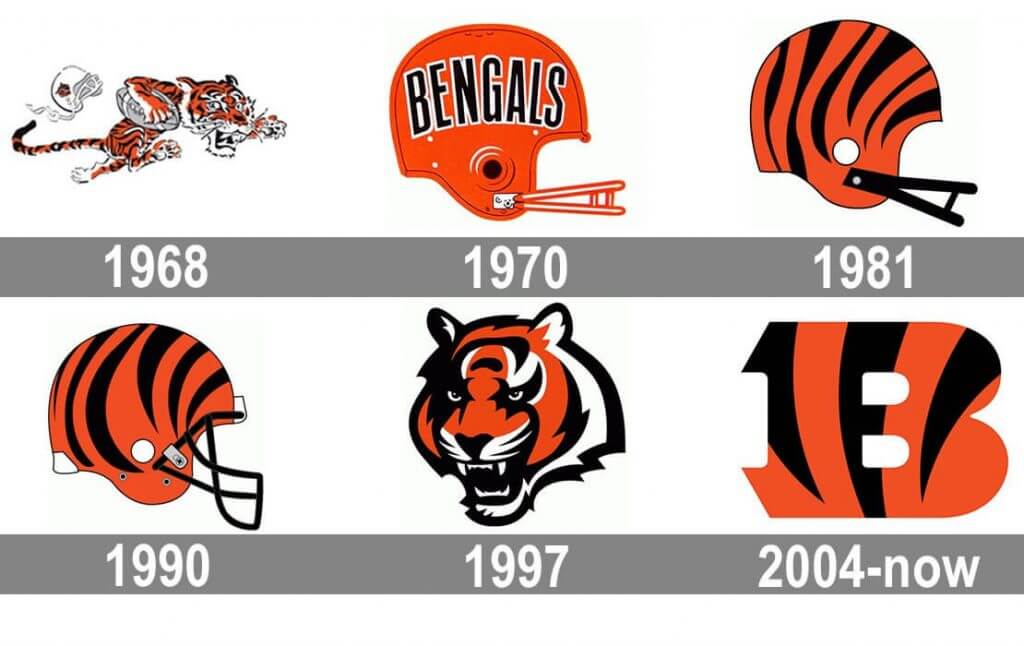
1968-1980
The Cincinnati Bengals were founded in 1967 and began play in 1968 in the American Football League (which was separate from the NFL at the time), coached and run by the legendary Paul Brown, who had been the coach of the Cleveland Browns until 1962. Brown worked with Ohio Governor James Rhodes to bring football to Cincinnati and who was fearful the Reds might leave town — so having two major sports in that city was looked at as a way to keep the Reds as well as to bring pro football to the town. There had been a number of defunct teams from the State of Ohio, and legend has it that Brown called his team “Bengals” because there was once a pro team from Cincy called “Bengals.” Bengal tigers are, of course, orange and black (though not always), so it was logical that the Bengals colors would be black and orange. They also happened to be eerliy similar to colors and style of Brown’s old team.
Indeed, the first Bengals uniforms very closely resembled those of the Cleveland Browns.
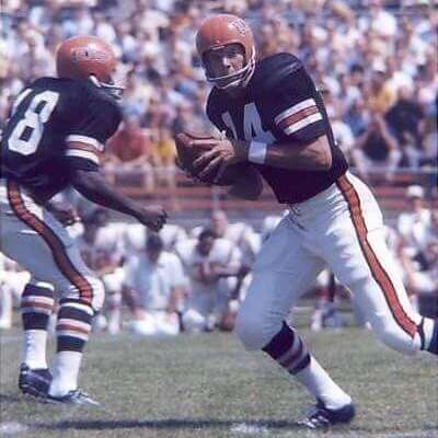
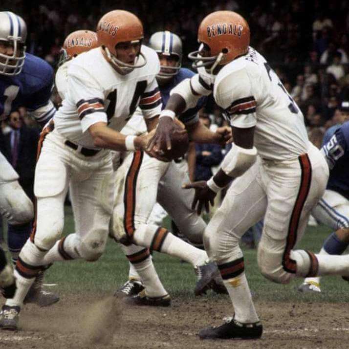
The black home jersey featured white numerals, long sleeves and simple white and orange striping on the sleeves above the elbow. Numbers were white. The pants were white with black/orange/black stripes. The white jersey was basically the inverse: black numbers on a white jersey with black/orange/black stripes, separated by a small white stripe between each color. The white pants were worn with both jerseys.
The helmet was orange (like the Browns’) and featured the word “BENGALS” spelled out in a radial arch.
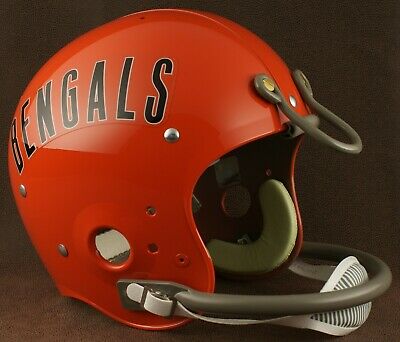
The Bengals would wear this uniform through the NFL merger and until 1980. Interestingly, the Bengals almost wore an orange tiger striped helmet at their beginning. It was one of the options presented to Paul Brown before the team began play. You can read more about the guy who designed the current Bengals helmet here. It’s quite similar to the prototype Brown is holding below.

Although the Bengals wore that uniform until 1980, they made a slight change to the helmet after the 1979 season, switching from a gray facemask to a black one.
Although this uniform was solid and beautiful in its simplicity, it very closely resembled the one worn by the Browns, and would not be considered the team’s “signature” look. That would come very soon.
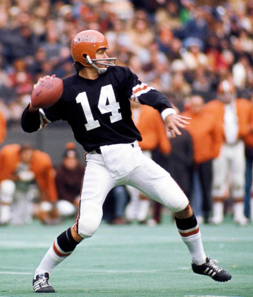
1981-1996
The new uniforms worn by the team in 1981 were nothing short of revolutionary. While the colors remained black and orange, just about every element of the uniform was redesigned. We could almost properly call this a rebranding.
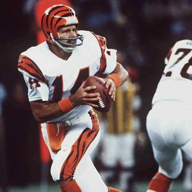
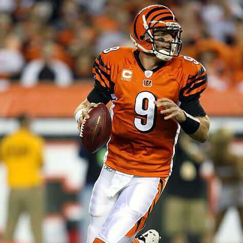
Gone was the plain helmet, replaced by the now familiar orange dome which was now adorned with tiger stripes. While the facemasks were black, superstitious QB Ken Anderson’s was gray painted black, which would often flake off during a season of play, leading to some interesting looks.
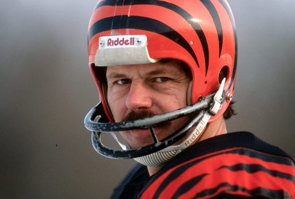
The rest of the uniform would take on a decidedly more “tiger like” look as well, with jerseys adorned with shoulder loops of orange with black striping patterns inside the orange. The pants, which remained white, would also take on the tiger stripe pattern of the shoulder loops. Home jersey remained black while white tops were worn on the road. While the team attempted to keep the striping patters similar, each player had a unique set (helmets, shoulder loops and pants stripes).
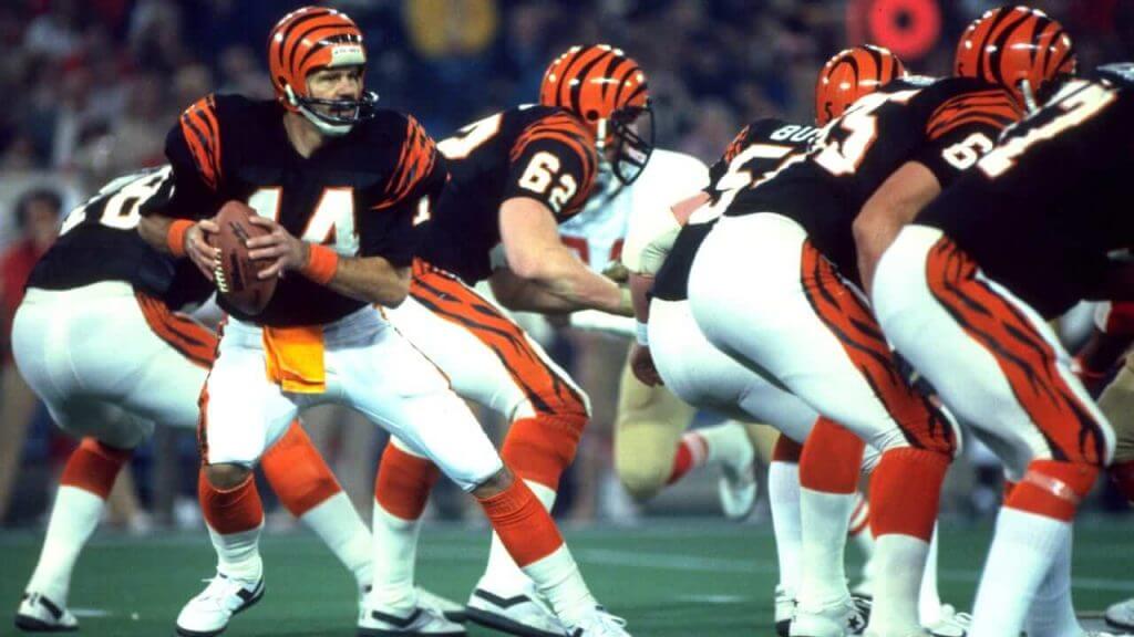
The jerseys still had sleeves, but they were much shorter than the original long-sleeves the team began life with. TV numbers on both white and black jerseys were on the top of the arms, beneath the loops. Black jerseys had white numbers outline in orange, while the white jerseys had black numbers, also outlined in orange. High socks were orange.
It’s hard to say just how new and different these uniforms were when they were introduced — no NFL team had ever been so “adventurous” in uniform design. Perhaps only the Chargers, who also wore shoulder loops and pants stripes (adorned with lightning bolts inside the elements on the jersey, by themselves on the pants), came close to new age design. But the Bengals upped the ante with their tiger-striped helmets. While the team would go through two more uniform updates/redesigns, this look was unique then, and certainly qualifies as the team’s “signature” uniform.
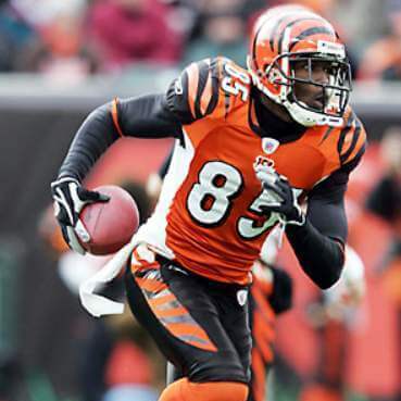
1997-2003
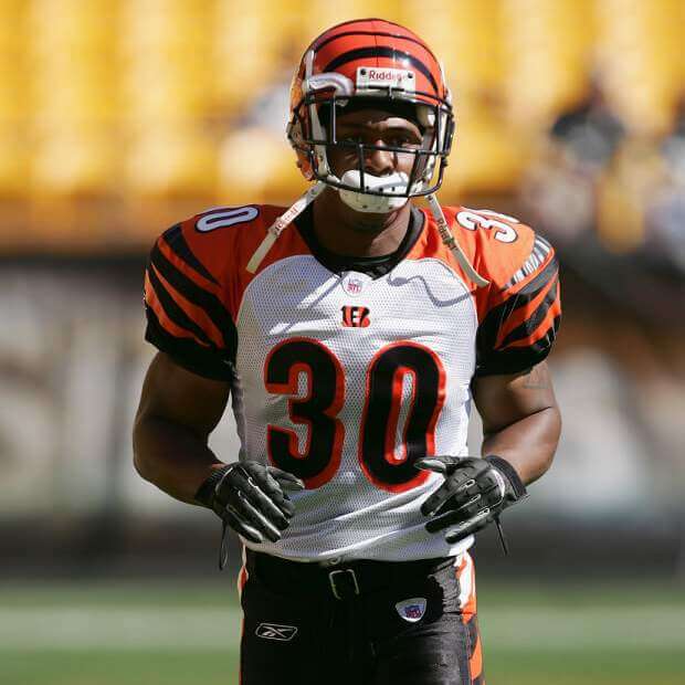
By 1997, sleeves on NFL uniforms were becoming a vestigial piece of apparel, and the Bengals made some adjustments to their uniforms to compensate. The biggest change was the moving of the TV numbers from that sleeves to the shoulders. They would also modify the stripe loops, becoming for of a stripe. The tiger stripes within the orange stripes would also change, becoming thicker and more uniform. The other big change would be the addition of a tiger patch, which was placed on the sleeve where the TV numbers had been.

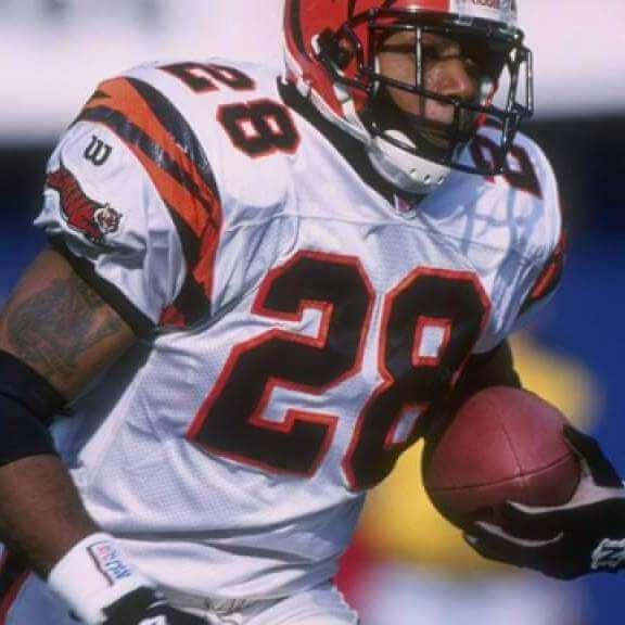
In addition to the more refined stripe pattern, different uni makers seemed to produce different stripe patterns and widths on both pants and jerseys. The team also switched from orange high socks to black ones.
From 1997 through 2002, the team had only two jerseys (black and white) and one set of white pants. In 2003, the team added black pants, which they wore twice (in weeks one and 17), and only paired them with the black jerseys.
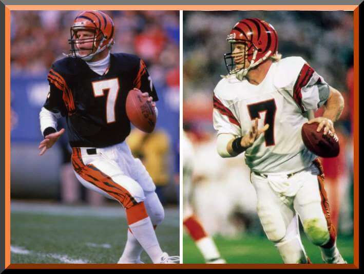
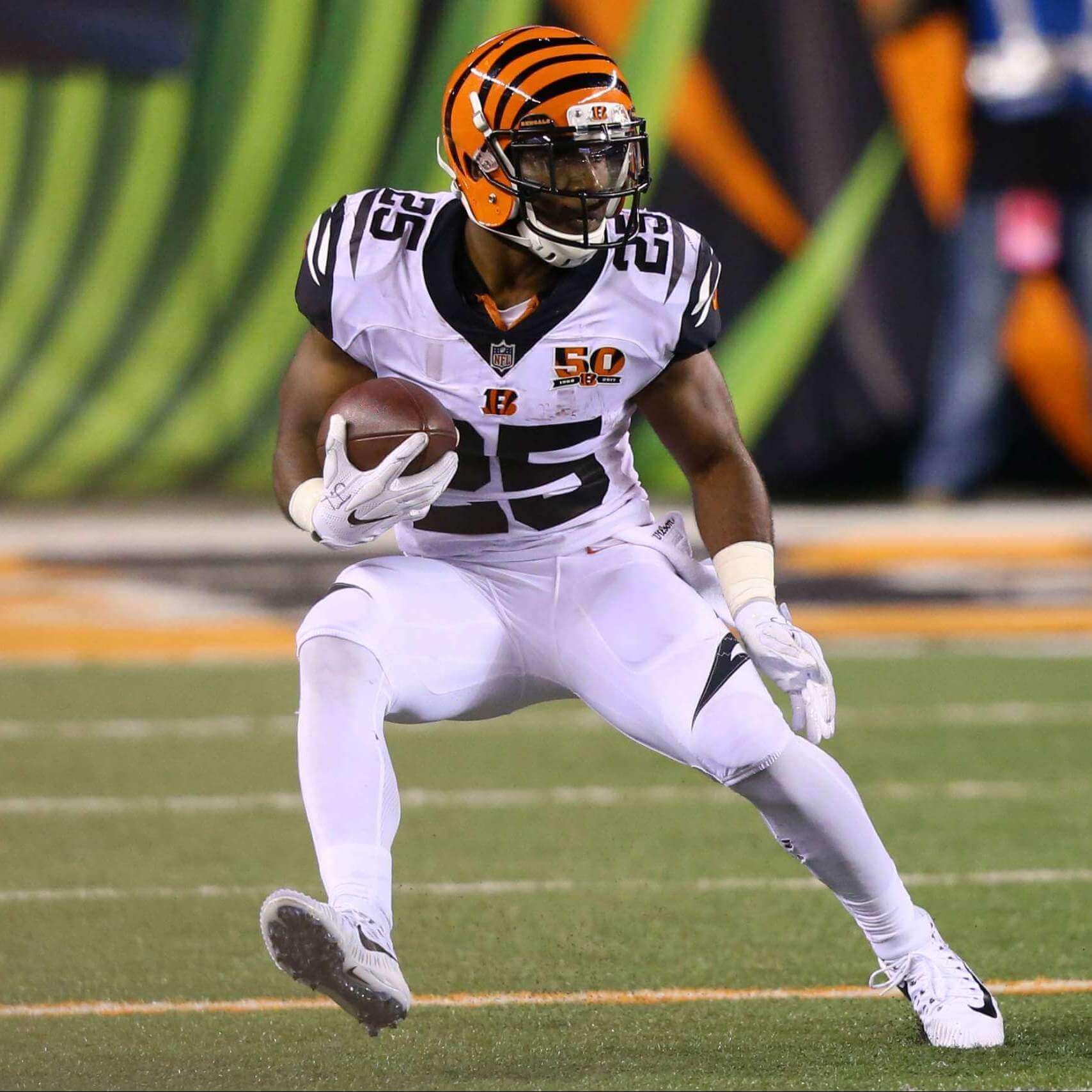
2004-2020
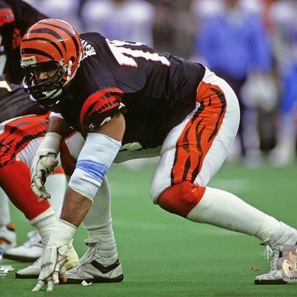
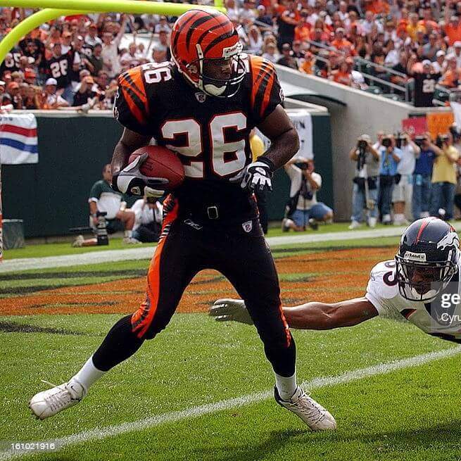
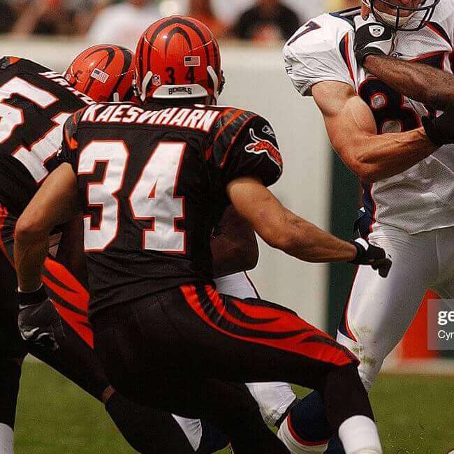
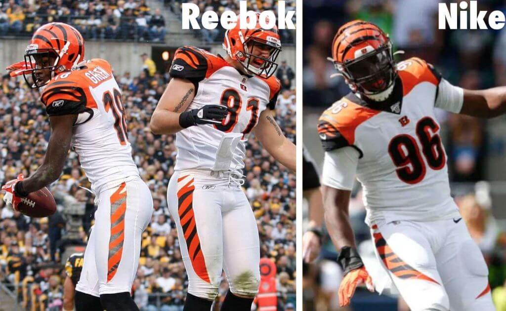
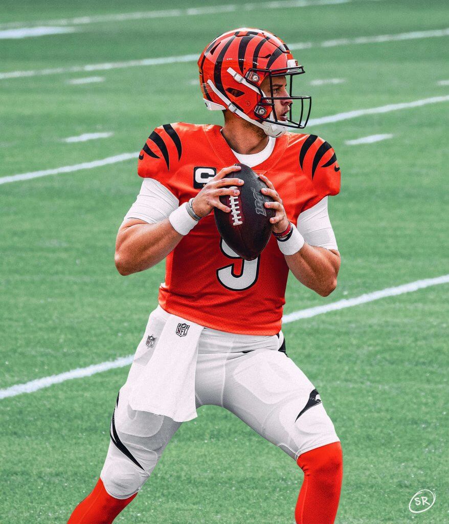
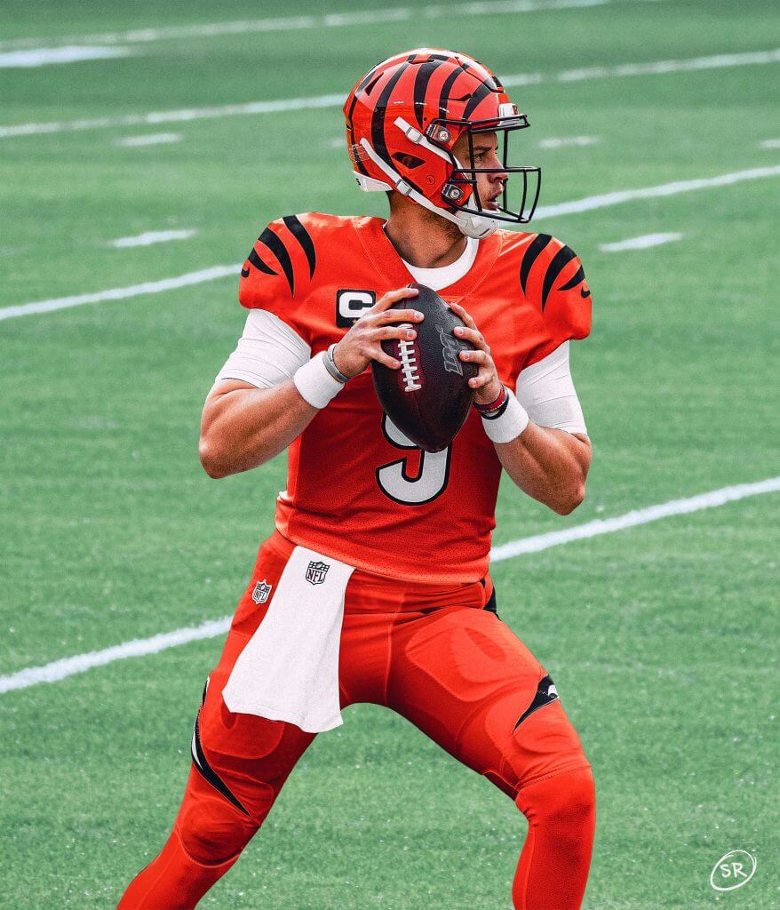
In the early years of Reebok’s 10-year league-wide clothing contract, the Bengals underwent a major uniform redesign for the 2004 season. While their (now) iconic helmets remained unchanged, the jerseys and pants would be redesigned. Not only were black and white jerseys and pants a part of this set, the team would also introduce a new orange jersey, allowing for multiple uniform combinations beginning in 2004. Although the orange jerseys were not worn with white pants that season, that look would soon enter the rotation.
Major changes to the uniforms included a redesign of the number fonts, which went from standard block to a custom rounded font, which also featured a contrasting block shadow. On the orange and black jerseys, a white side panel from armpit to waist. Both the white and black pants had an odd pattern, featuring a white/orange stripe at the hip, with a black/orange stripe cascading down the remainder of the leg. Both orange and black high socks were worn. While unconfirmed by the designers, it was assumed the white/orange stripe transitioning to black/orange was done to mute the visual dissonance of the white side panel on the orange and black jerseys. The tiger logo was removed from the sleeves, and a patterned “B” logo was placed in the center of the jersey, beneath the collar.
Nike would take over the league-wide clothing contract in 2012, which resulted in changes to the pants stripe. Under Reebok, it was basically straight with a taper to a point above the knee, whereas under Nike the stripe would fully curve above the knee.
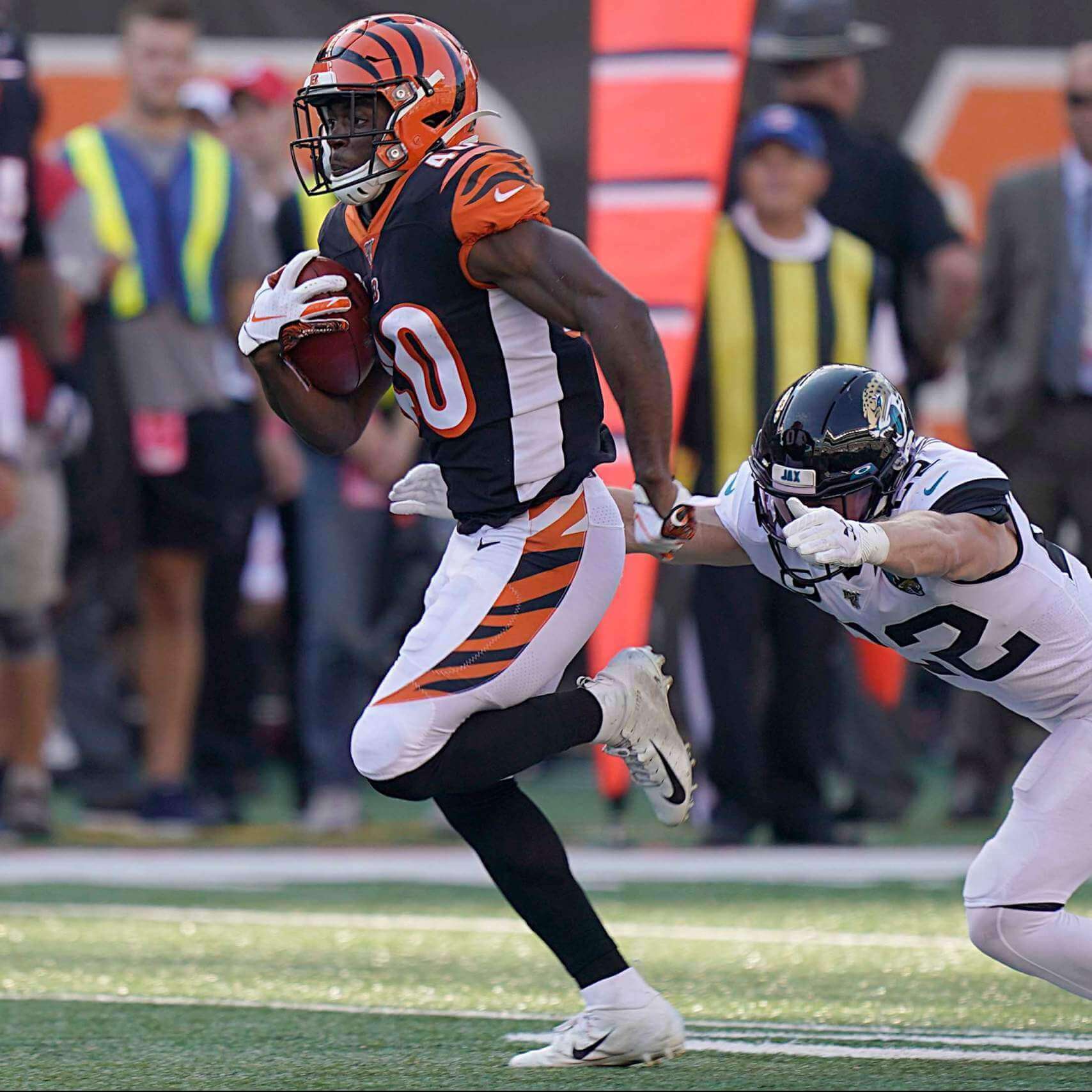
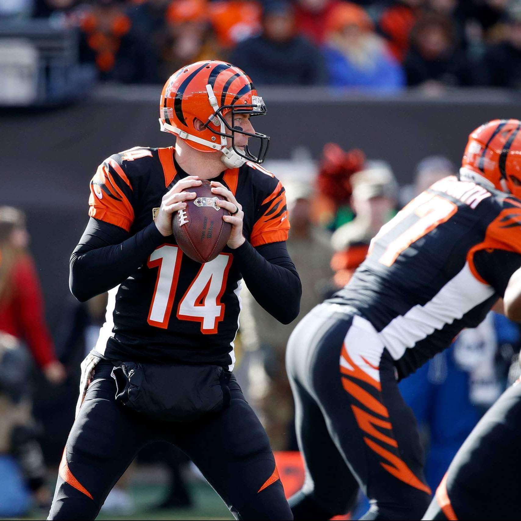
On the black jerseys, the numbers were white with orange block shadow. Shoulders were black, with orange sleeve caps containing the tiger stripe pattern. There would be a single orange stripe above the orange sleeve caps. The orange sleeve caps would have black stripes. All jerseys had contrasting collars (orange on black jerseys, black on white and orange jerseys). All jerseys featured white TV numbers located on the shoulders.
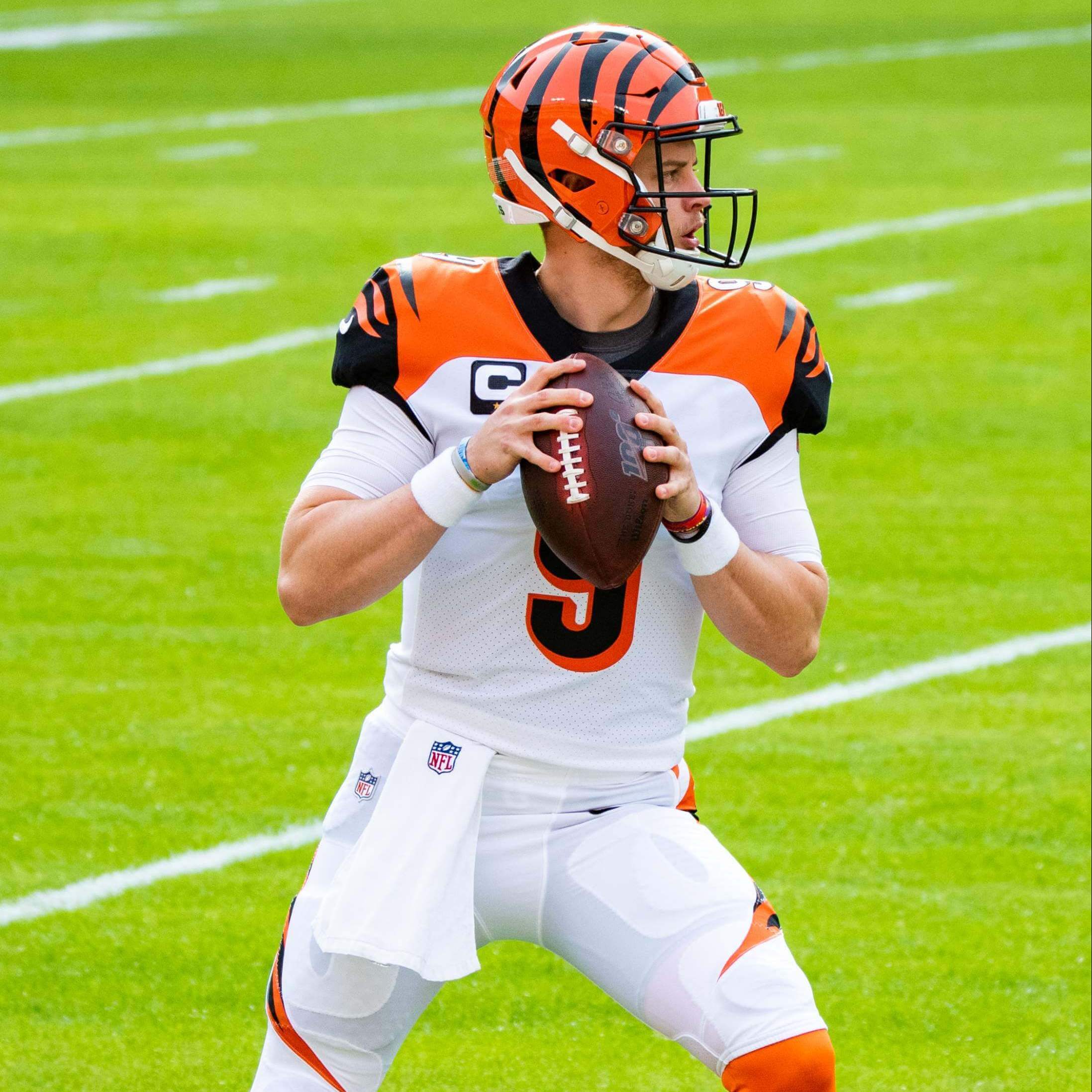
On the white jerseys, there was no side panel (or if there was, it was also white), with orange shoulder yokes and black sleeves with orange tiger stripes. Numbers were black with orange block shadow.
The orange jerseys would also have the white side panel, but unlike the black and white jerseys, were otherwise a solid color with black tiger stripes on the sleeves. These featured white numbers with a black block shadow.
In case it wasn’t readily apparent in the photos above, here’s a comparison of the pants striping under Reebok (left) and Nike (right):
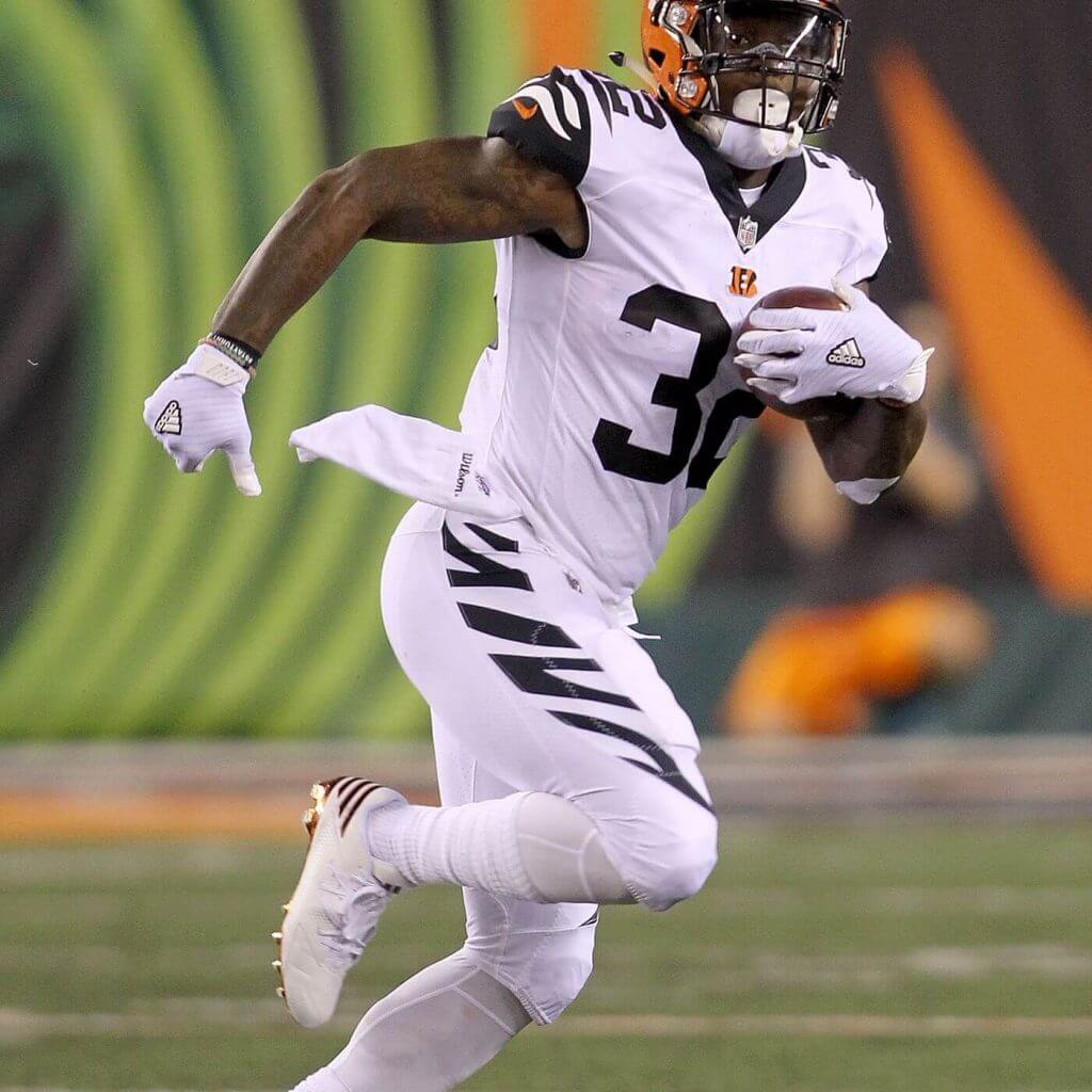
The team would wear these six uniform combos exclusively from 2004 through 2016. In 2017, after the league had introduced the “Color Rush” program, the team received a new set of uniforms. These featured solid white jerseys and pants, completely devoid of color, with black tiger stripes on the pants, and black shoulder caps featuring white tiger stripes. As with their regular white and black jersey, a single contrasting color tiger stripe was above the shoulder cap. While the striping pattern mimicked the regular uniforms, these CR unis also featured a block number font (with no block shadow), rather than the rounded style found on the regular jerseys. Despite the lack of color (save for the swoosh and “B” logo) in the CR uniform, these appear to be mimicking the look of the white bengal tiger.
While it could be argued that the orange over black constitutes the Bengals “signature” uniform (after all, no other team wears anything like it), the 1981-96 set is probably even more iconic.
The Bengals have had (perhaps) surprisingly few logos over the years, and most of the changes have coincided with uniform redesigns. Interestingly, the first tiger stripe helmet logo (1981) never really matched the helmet stripe pattern, and it was subsequently corrected to more appropriately represent the stripe pattern (1990) during the 1981-1996 run.
While the case might be made for the Bengals “signature” uniform to be the 2006-2020 orange/black combo, the 1981-1996 set stands out even more as the signature. It was unique then (and still is now), and one look at a photo from any of those years screams “BENGALS.”
The Bengals will shortly be introducing a new uniform set — they have promised “no wholesale changes,” so the leaked jersey mentioned at the top of this article is likely the retail version of what the team will wear on the field. They will neither confirm nor deny whether the leaks are legit. We know the team has said their helmet will remain unchanged. One thing we do not know is what pants (and in what colors) the team will have. While I don’t like to speculate, I expect there to be (at least) three jerseys: orange, black and white (the leaks have already shown black and orange, and they are required to have a white jersey), and I would not be surprised if they have both black and white pants. Will they also add an orange set, giving them nine different potential jersey/pant combos? Another question is whether the NFL will lift the one shell rule. Before the rule came into existence, teams would only use different color helmets to pair with throwbacks. It will be interesting to see if that stands (if the one shell rule is lifted). I would think the Bengals might be a perfect candidate to wear a white shell with black stripes if they continue to have a white CR set.
Although we don’t know what the pants will look like, designer Seth Reese has mocked up the black and orange jerseys (based on the leaks) with a possible set of black, white and orange (!) pants, which are based on the leaked striping pattern combined with the old template. The full uniforms likely won’t look exactly like this, but it gives one an idea of how the new uniforms might look, once they are released:
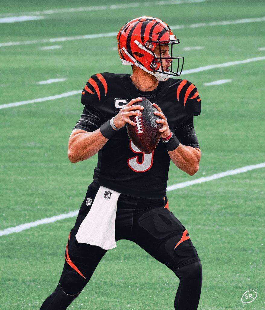
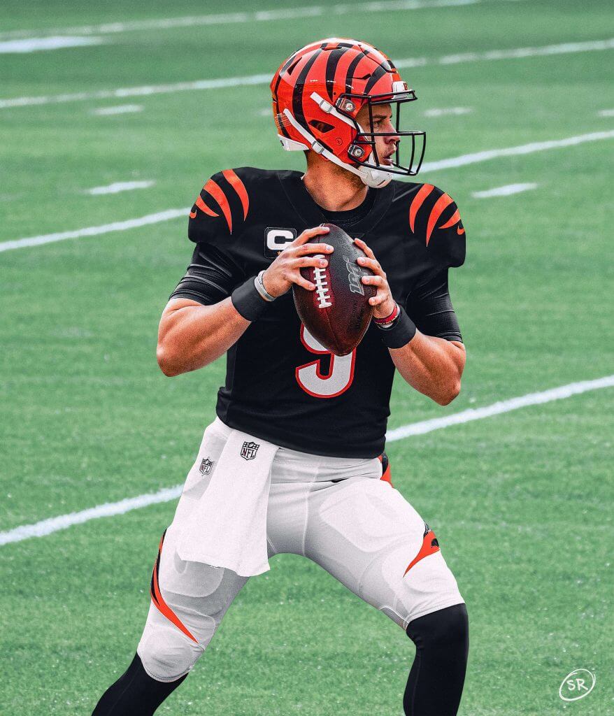

Interesting! Your thoughts? What do you consider the “signature” uniform? And assuming Seth’s mockups are somewhat close to what the team will wear, what do you think of the potential 2021 (and beyond) sets? Would you want to see the addition of orange pants? If the one shell rule is lifted, would you like to see a white shell with black stripes (to be worn only with a potential white CR uni)? What say you all???


Guess The Game…
from the scoreboard
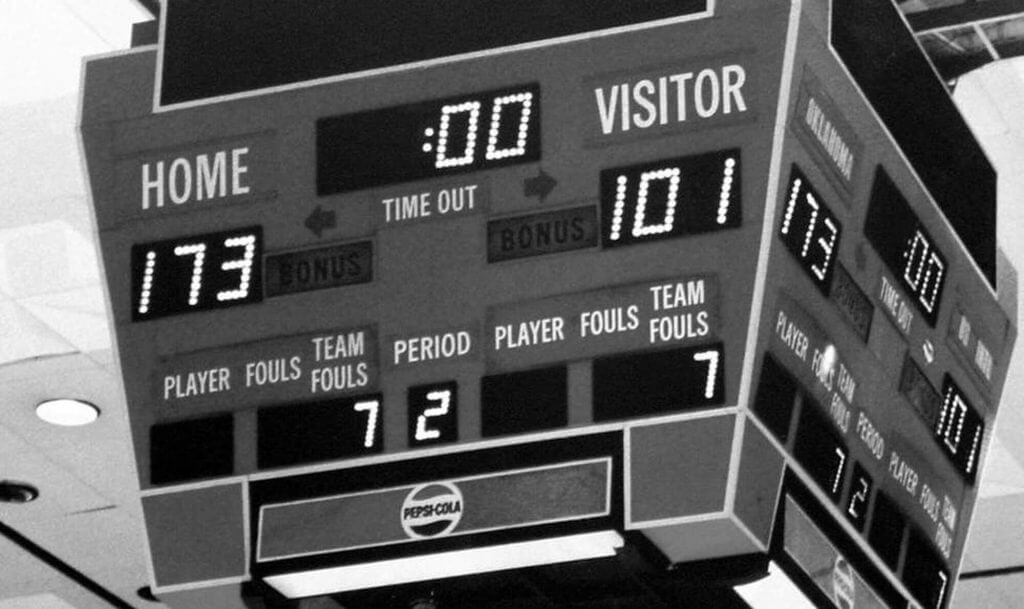
Today’s scoreboard comes from Elihu Smails.
The premise of the game (GTGFTS) is simple: I’ll post a scoreboard and you guys simply identify the game depicted. In the past, I don’t know if I’ve ever completely stumped you (some are easier than others).
Here’s the Scoreboard. In the comments below, try to identify the game (date & location, as well as final score). If anything noteworthy occurred during the game, please add that in (and if you were AT the game, well bonus points for you!):
Please continue sending these in! You’re welcome to send me any scoreboard photos (with answers please), and I’ll keep running them.

Uni Concepts & Tweaks
Time for more Uni Tweaks from the UW readership.
I hope you guys like this feature and will want to continue to submit your concepts and tweaks to me. If you do, Shoot me an E-mail (Phil (dot) Hecken (at) gmail (dot) com).
Today’s concept come from Walter Helfer, who thinks he has a solution to the Saints perpetual uni-transgressions.
He writes…
Dear Phil,
A recurring subject in our NFL discussions is what great raw material New Orleans has to work with and how badly the Saints squander it. Here is my idea of how they should right the ship; you’ll see it draws heavily from their Color Rash uniform, particularly in the color of Old Gold used.
All the best,
Walter Helfer
And here are his designs:

Thanks Walter!
OK readers (and concepters). If you have some tweaks or concepts, shoot ’em my way with a brief description of your creation and I’ll run ’em here.

Podcast reminder: Paul here. For this week’s episode of Unified, Chris and I discuss the ins and outs of retired numbers, along with the recent NFL leaks, the NBA All-Star Game, MLB’s new Lou Gehrig Day, whether team success or failure should dictate uniform choices, and more.
Due to a microphone issue that we weren’t aware of until after we recorded, my voice sounds more echo-y on this episode. Sorry about that, and hope it’s not too distracting.
As always, you can listen to us on Apple, Google, Stitcher, TuneIn, and Spotify, or just use the player below:
The show notes from this episode, which include photos of many of the things we discussed, are here. Those photos (and some additional ones) also appear in the video version of the episode:
Please consider supporting this episode’s advertisers, all of which are offering great deals: Streaker Sports (20% off with checkout code UNIFIED), Homefield Apparel (15% off with checkout code UNIFIED), and Oxford Pennant (20% off with checkout code UNIFIED).
Enjoy the episode, and thanks for listening. Now back to Phil.
Your Friendly Reminder…
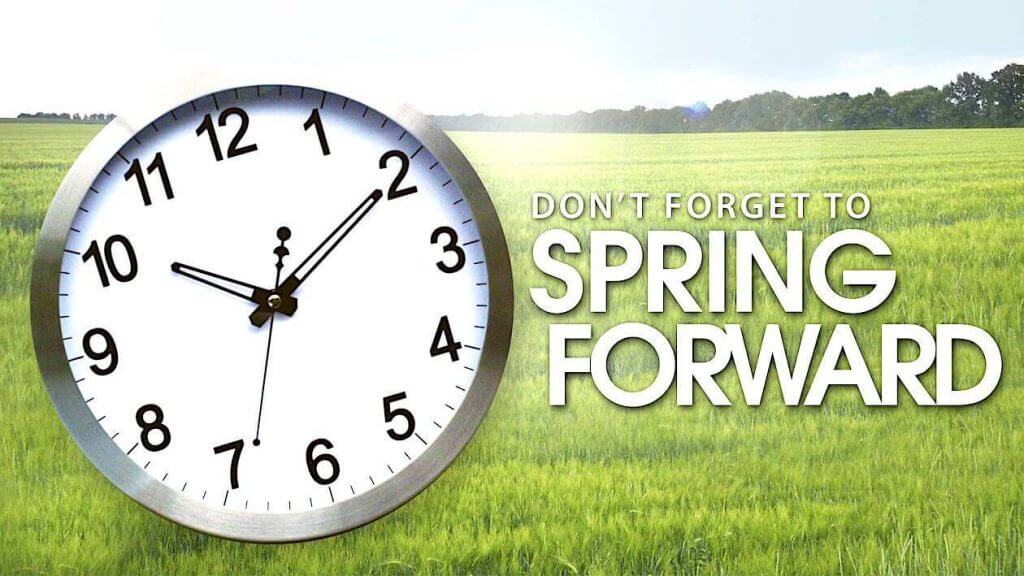
Time for my annual reminder…
Most of you (likely) have devices (phones, clocks, DVR’s, etc.) that will automatically “Spring Forward” for Daylight Saving Time — remember there is no “S” at the end of “saving” — as a local television ad for a mattress company once said, “Leave off the last ‘S’ for saving!”, a good reminder that we’re now in the good time of the year.
Despite the fact that it takes my old bones a good two weeks to make up that hour of “lost” sleep, there is nothing better than DST. Living in the eastern end of my time zone, I greatly appreciate the “extra” hour of daylight we’re afforded for the next six-ish months. Yes, I get that those of you who live in the western end of your time zones probably have no use for it (and yes, if you’re an early riser, you probably will wake up in darkness), but there’s nothing better than being able to do something outdoors after work (or after supper as we hit summer). We can’t really do that in the eastern end of the time zone.
So, in case you own some devices (analog/battery operated clock, watch, car radio, etc.) that don’t automatically “spring” ahead for you — and you haven’t already done it — now’s the time to adjust your time-keeping devices to Daylight Saving Time.
It’s the most wonderful time of the year.
The Ticker
By Anthony Emerson

Baseball News: Several Cubs players appeared to be wearing stirrups during yesterday’s Spring Training game. They seem to be similar to the stirrups worn with their 1953 throwbacks back in 2014 (from Paul DeMay and Phil Santos). … The Frontier League’s Sussex County Miners have new road uniforms (from John Cerone).

NFL News: During a late-80s Seahawks/Oilers game, LB Brian Bosworth had his jersey torn. He switched to a No. 52 NNOB jersey on the sidelines and came back into the game.
.
College/High School Football News: Washington State has sold the naming rights to its field (from Mike Chamernik and Griffin T. Smith). … Albany is going yellow-white-yellow against Maine today (from Evan Drew).

Hockey News: The Coyotes wore their brick red sweaters for the first time last night. Those used to be their primary home sweaters, but have been reduced to third sweater status behind the black Kachina primaries and the purple ЯR Kachinas (from @azbufalo).

Soccer News: VfL Wolfsburg’s kits this weekend will have rainbow accents (from our own Jamie Rathjen). … The UK-based gambling site Football Index has gone into administration and has had its license revoked by the UK Gambling Commission. Why is this relevant? It means both Queens Park Rangers and Nottingham Forest of the English second tier are now without primary shirt ads (from Germán Cabrejo).

Grab Bag: Reader Jonathan Martin has designed the official flag of Utah’s 125th anniversary. The formal adoption is just waiting on Governor Spencer Cox’s signature. … The seasoning brand Mrs. Dash is getting a new name (from Max Weintraub). … The editorial staff of Kenyon College’s student newspaper is calling on the school to change its mascots (from Kary Klismet). … Also from Kary: a former star athlete at William Henry Harrison High in Indiana has asked to be removed from the school’s role of honor due to objections to the school’s mascot and namesake. … Snapple has a new logo (paywalled) and packaging (from John Cerone). … The Supreme Court of Canada will have a new flag and coat of arms unveiled on Monday (from @Minor_Leaguer). … The Women’s AFL match between Collingwood and Western Bulldogs was nearly unwatchable with both teams in white guernseys. Collingwood changed at halftime (from Brian Hattab).
And finally… that’s all for today. Don’t forget to move your clocks (well, the manual ones…) ahead one hour tonight before you go to sleep!
You guys all stay safe and healthy, and I will catch you right back here tomorrow.
Peace,
PH
Guess the Game: The Night the Scoreboard Nearly Broke. Oklahoma Sooners vs US International. Sooners almost had 100 in the first half. Nov 29, 1989. Those Sooners teams were a LOT of fun to watch!
The Women’s AFL match between Collingwood and Western Bulldogs
That’s actually not AFLW, but VFLW, so it’s both of their reserve teams.
Could not disagree more re: DST. Boooo DST! Worst day of the year and an unnecessary disruption to our sleep-wake cycles.
I concur. I’ve said for decades that I’d be more amenable to Daylight Savings Time if there was just some truth in advertising. Call it what it really is: Nine Holes After Work Time.
Amen. Standard Time rules.
Yes! Instead of manipulating the clock arbitrarily, just keep standard time. If it would make things easier, shift schedules an hour later in the day. Noon is when the sun is highest in the sky. So change 9-to-5 to 10-to-6. Let kids start school and hour later. Keep it natural!
It is all arbitrary. It is only ‘Standard Time’ because they came up with it first,
I really hope the bengals ditch the curved “tiger tail” pants stripe look. That pants embellishment shape makes me cringe no matter what team is using it. They don’t have to use straight up and down stripes by any means but the tapered curve over the knee just looks so XFL gimmicky to me. I don’t hate the “natural” shakes of the helmet and sleeve stripes, but I wish that, at least for the jerseys they would use something a little more graphic and less organic. Not completely devoid of movement necessarily but something with a little more purpose or direction. Historically they look more like they bought tiger stripe fabric at Joann and quilted in patches.
Agreed. Curvy stripes scream college, high school, minor league football.
…and one more vote to avoid that “tiger tail” pants stripe. Really distracting and unattractive.
The only transgression of their signature uniform was the obviousness of the black silk-screening on the orange fabric. It would have been more successful if the black and orange were the same texture. Yes, I realize some think this a feature and not a bug.
Walter Helfer‘s sketch model is so well executed-Great Job!
The black helmet is a downgrade, and I’m of the opinion that the Saints…like do many other teams…only ‘need’ 1 set of pants(gold).
Overall, it’s a wonderful concept.
Seconding this in its entirety! Gold pants go with black and white jerseys. More teams need to go back to metallic pants. And since pants aren’t sold like jerseys, I never understood the need for 2 and 3 pairs of pants anyway.
I also think the black helmet is a downgrade.
Totally agree about the metallic pants! The dull surfaces currently in vogue in the NFL look cheap.
Also agree with all of this. I’ve felt like the Saints have never improved on gold helmets / gold pants for both black and white jerseys. Their 1967-69 look is one of my all-time favorites — nothing since then has especially appealed to me. Still, this is a beautifully illustrated concept.
Congratulations, Jonathan, for that Utah anniversary flag! Beautiful design. Utah should adopt it as the state flag permanently.
Orange pants for the Bengals would look great with their white jerseys, good with their black jerseys, and bad with the orange jerseys. And I also hope they don’t have the curved pant stripes.
Are you advocating for the Bengals to adopt orange pants?
The Browns sorta ‘own’ those…hope they don’t copy cat Cleveland again.
That said, it’s a shame the other big cat team in the AFC ‘owns’ the white stripe-less pants look;
The Bengals overuse the tiger trope a bit (I always thought that awesome helmet was enough to convey the message…though the shoulder stripes on the new(?) top are well executed).
Put me in the group who are troubled by the closeness of the Browns/Bengals designs. I would like them to own the orange/orange/white look in the NFL, with black numerals.
Teams matching their helmet color with their pants is common, and I don’t think it’s a Cleveland thing. And when I think of it, it makes more sense for a team named after a tiger to be orange more than a team called the Browns.
Great piece on the history of the Bengals. As a lifelong Eagles fan, I am officially Bengals-neutral but they were always a team I liked purely for their uniforms. One detail that wasn’t mentioned was when the Bengals switched from traditional Block Varsity numbers/NOBs to the Champion font. A few teams (Jets, Bills, Colts) made the change before the league gave a leaguewide deal to Reebok and then Nike, and it was distinctive.
Thanks! Didn’t realize Champion had a proprietary block font!
You knew who was wearing a Champion uniform the moment you laid eyes on it. The 2’s and 7’s were the most distinctive elements. The 2’s were not did not have a straight line in the middle of the 2 but one that was angled “northeast to southwest.” The 7 had a curve in the descending bar rather than a straight one.
An example of the curved 7 (with Boomer Esaiason as Jets QB, oddly enough): link
And the angled 2: link
Agree with you 100% on DST. The day that we fall back is always one of the most depressing days of the year for me with it getting dark so early, I love late June when it stays light until nearly 9 PM. I am a fan of year round DST. It is tough for me too in the morning for a week or two (I am not a morning person in any way) but well worth it for the evening sunlight!
That Utah 125th Anniversary flag needs to become the new state flag immediately. Simple, iconic, can’t be mistaken for anywhere else.
Will always worry about those who don’t like the Bengals post- 1980 helmets.
Great review of the Bengals, Phil.
That photo of Kenny Anderson about to fling the ball features the look that captured my imagination as a 10 year old in 1970. The BENGALS helmet was unique and understated and that black jersey (well before BFBS) was striking. And I’ve never had a problem differentiating the Bengals and Browns looks …I actually thought the similarities were cool and added flavor to the state rivalry. Also, I believe the jersey Kenny is wearing in that photo is the cold weather version which featured no thin black separation between the white and orange stripes.
As for the potential new look…. I really hope they return to block numbers.
No mention of Massillon Tigers where Paul Brown went to high school, was QB, and returned as Head Coach. Their colors are black and orange as well. One of the top HSFB programs in the state/nation, their stadium is named after Paul Brown.
If you want to see how crazy Massillon is about football, check out the documentary film Go Tigers!
link
Yeah, the Bengals had some inconsistencies in the early days- the’d have these longer sleeve version where there was no thin black separation between white and orange stripes, as previously mentioned. They did this with the socks, too.
They were totally wired in then with Kochs Sporting Goods- you could buy ALL this stuff there.
Yeah I should have been a bit more specific about those inconsistencies (but the article was already at 1,600+ words) — the mesh (short sleeve) jerseys had a slightly different striping pattern (no separation vs. separation) on both the black and white tops. However, for the purposes of a “Signature” uni piece, though, I tried to focus more on eras (same basic overall look) than individual differences. Once the Bengals went to tiger stripes, there were many of those (some of which I do mention). Different uni makers had slightly different specs. Thanks everyone for the comments!
I realize I’m sitting ALONE at this table…but I’ll cop to it, anyway: I always liked the radial arc BENGALS helmets. And I never cared much for the tiger stripes. Too ‘on the nose’ for my taste.
[be gentle]
You are not alone. That simple, declarative BENGALS always impressed me. No stripes on the helmet was all I needed to differentiate from the Browns.
I like it too.
I like the signature look better, but yeah, they started out with a good uniform.
I agree. I LOVE the original Bengals helmets.
I pretty much love almost everything from the late 60’s/early 70’s
Same here. Would actually love to see a uniwatcher make a mockup of all nfl teams using the original bengals helmet and uniform
The original Bengals uniforms were either:
agreed upon by the corporate marketing committee after many iterations – OR –
hastily thrown together to meet a deadline. Didn’t even have TV numbers. Looked like our HS practice jerseys!
I customarily have a dislike of wordmarks on the helmet. That being said, the Bengals gave theirs a curved baseline, adding an organic element. The arrangement was evocative of tiger stripes without “shouting” it.
The Bengals didn’t have TV numbers on purpose; Paul Brown hated them and didn’t add them until the NFL actually started enforcing the fine for not having them. He was against the Browns having them – I suppose he was okay with the helmet numbers – but he didn’t own the Browns and the owners added them and dropped the helmet numbers.
Replying about yesterday’s column regarding Mortgage State University, that other school has its head football coach sponsored. link
I’ve heard it said on here (by Paul and probably others) that the Baltimore Ravens’ mono-black unis are acceptable because real ravens are, after all, black. I wonder if the same logic should be applied to a potential mono-orange Bengals uni. Personally, it’s a bit too garish for my taste, but it does look more like a real Bengal Tiger.
Given that the “stripe within a stripe” styling (like their trousers have always had during the stripes era) is no longer anywhere else in the “leaked” uniform, I’m surprised that literally every mockup I’ve seen retains that look. Consistency would dictate one color pants with one color stripes (as it is on the shoulders). Hopefully they will be bright white pants with black stripes. My preference would be the keep white pants for both home and away for a cleaner, consistent look. Orange is hideous and the thought of orange britches making the mix turns my stomach. Though I have a sneaky suspicion that orange over orange will be the new CR. One other opportunity I think they missed is they should have used the 70’s Bengals script on the jersey rather than that sad 90’s block serif logo they continue to use. I mocked one up with this and it really brought out a cool subtle 70’s vibe that I think fans really would have appreciated. Oh well – no matter what this look will be miles above the Halloween barf costume they have worn these last years..
The Bengals should go back to their original classic look, the tiger striped helmet screams “80’s”
I know that game. Oklahoma vs. US International. Oklahoma put up 97 points in the first half let up in the second half and still got heat for running up the score! USIU was a favorite opponent of teams in that era that liked to run and press, primarily Loyola Marymount. Those 2 broke the scoring record with a 181-150 game.