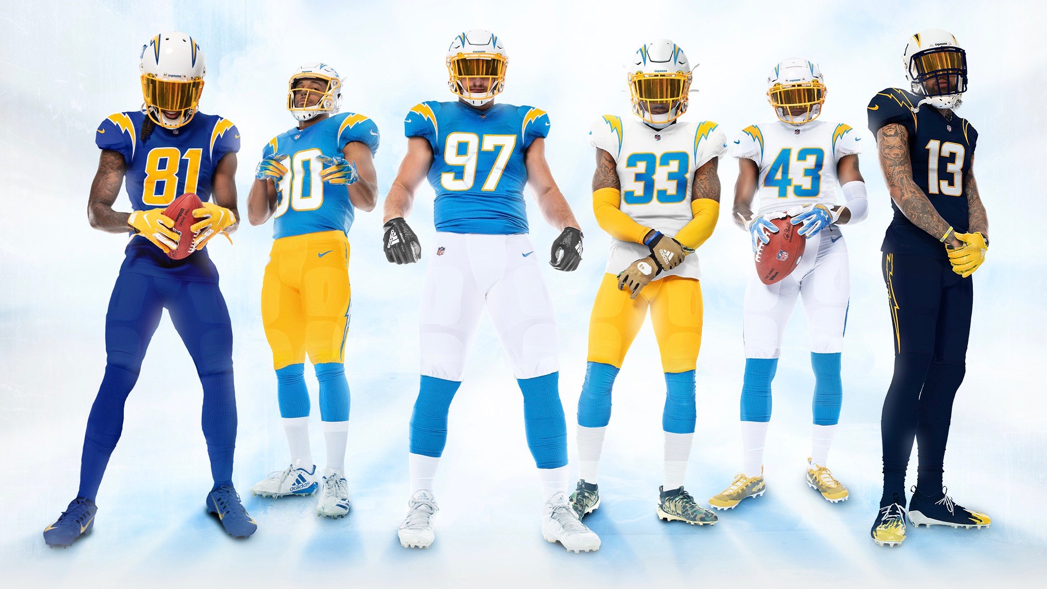
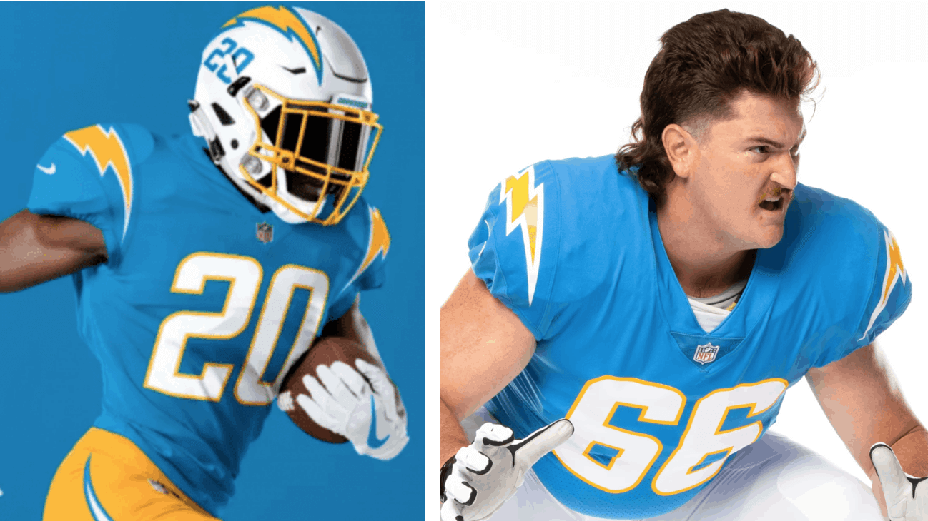
When the Chargers unveiled their new uniform set back in April, all of the “photos” they released were actually Photoshop mock-ups. At the time, I said:
It’s unusual for a team to unveil [a new uni set] with nothing but Photoshopped images instead of real photography. I don’t mean that as a criticism (we all know the world is complicated right now), but I do mean that there could be certain aspects to these designs, and to how they function in real life, that aren’t yet apparent to us. I always say, “Let’s see how it looks on the field,” but that goes double for this set. I’m sure it’ll still look good, but let’s keep in mind that what we’ve seen so far is a simulation, not the real thing.
Three and a half months later, we still haven’t seen these uniforms on the field, but we’ve finally seen real photos of the players wearing them, because the Chargers posted to online photo galleries earlier this week (look here and here). And guess what: The original Photoshop images — the ones that everyone went bonkers over when they were unveiled — aren’t quite an accurate representation of the real thing, at least in one key aspect.
To see what I mean, take a look at this side-by-side comparison. The image on the left is from one of the Photoshop mock-ups the team released back in April, and the one on the right is from the photo galleries posted earlier this week (for all images that follow, click to enlarge):
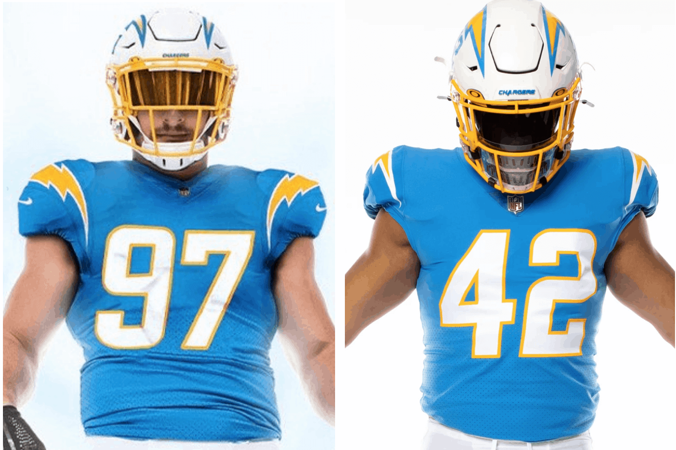
Do you see the big discrepancy? The lightning bolts on the shoulders don’t wrap around as much in real life as they did the Photoshopped image, and the bolts’ white border is also significantly thicker.
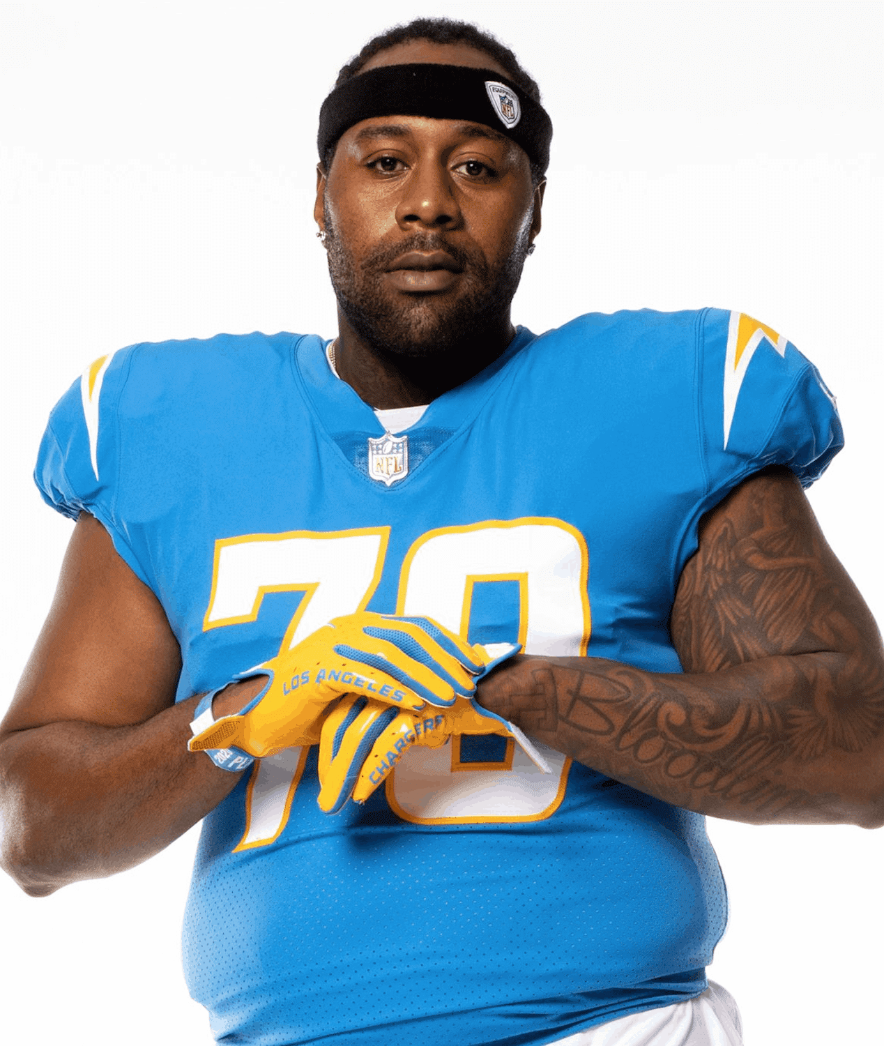
That was a comparison of head-on views. How about a side view? Here — again, it’s Photoshop on the left, real photo on the right:
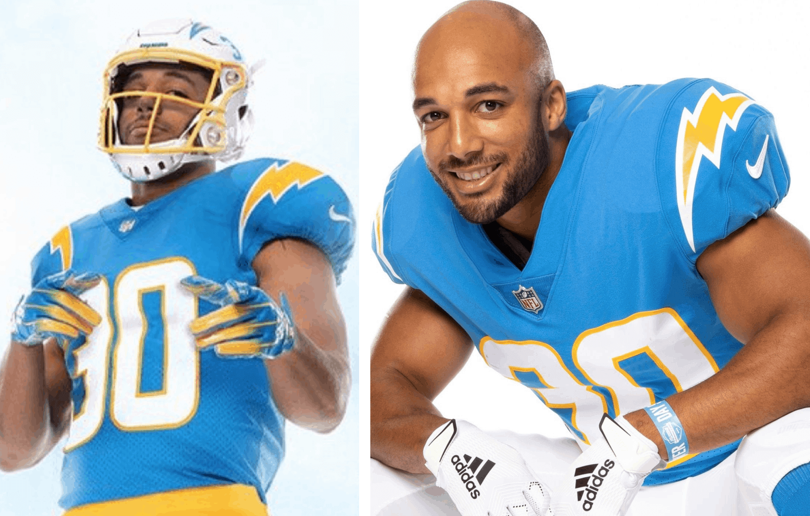
This is a particularly good comparison, because the two models are actually the same player — running back Austin Ekeler. Here you can really see the difference in the bolt’s contours and white-to-yellow ratio. You can also see how the bolt in the real photo is positioned more on the sleeve than on the shoulder, leaving an extremely wide gap between the bolt and the collar. It would be better they moved the bolt over to fill the space better. As it stands now, that empty space feels too big, like it’s begging to be filled by a TV number.
What about a view from the other side? The photo galleries didn’t offer much from that side, but here are the best two comparisons I can provide:
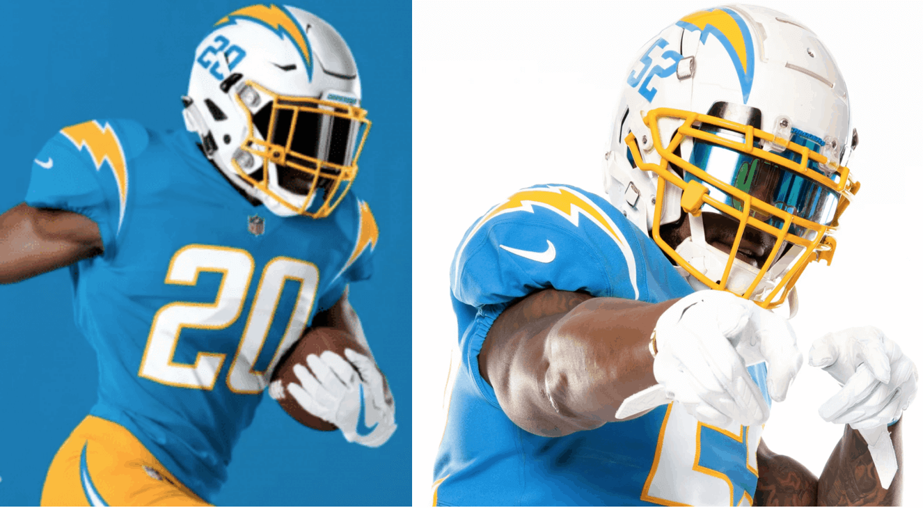
That’s enough to confirm what the other two comparisons showed.
There are several different issues here. Let’s start with the white-to-yellow-ratio: I much prefer the real life version, which seems truer to Chargers history and is also a closer match to the bolts on the helmet. In fact, one of my few misgivings about the April unveiling, although I didn’t fully articulate it at the time, was that the white border on the bolts didn’t feel quite right. It looks much better now.
Then there are the issues of where the bolts are positioned and how far they wrap around. For both of those variables, I’d say the real version isn’t as good as the mock-ups. The real bolts are positioned too far outside, and they don’t wrap around enough. In some of the new photo gallery images, the bolts are barely even visible:
Obviously, I realize there are different tailoring templates for skill position players and linemen, form follows function, blah-blah-blah. But the lightning bolt has been the Chargers’ visual signature for six decades now. It’s disappointing to see its impact diminished on the new jerseys, and all the more so after the initial mock-ups told a different story.
(My thanks to reader Adam Tow, who brought the bolt discrepancy to my attention.)
Dream and Mercury players are wearing “Vote Warnock” shirts to their game today.
Raphael Warnock is running against Kelly Loeffler for Senate. Loeffler is a co-owner of the Dream and said she opposes the Black Lives Matter movement.
(via @sportsiren)pic.twitter.com/w1INikFQPQ
— Bleacher Report (@BleacherReport) August 4, 2020
Campaign message: Two weeks ago, U.S. Sen. Kelly Loeffler, who’s a part-owner of the WNBA’s Atlanta Dream, criticized the league’s support for the Black Lives Matter movement and the larger issue of mixing sports and politics. Last night Dream players, and players throughout the WNBA, responded by arriving to their games wearing “Vote Warnock” T-shirts — a reference to Rev. Raphael Warnock, who’s bidding to unseat Loeffler in this November’s election (lots of additional info here).
The sight of pro athletes publicly repudiating their own team owner through their clothing is rare but not unprecedented. Following racist comments by Los Angeles Clippers owner Donald Sterling in 2014, Clippers players wore their warm-up gear inside-out and also wore black socks and armbands.
Click to enlarge
Card reminder: In case you missed it on Tuesday, I’m now taking pre-orders on the first-ever Uni Watch trading card, featuring illustration work by the incomparable Rob Ullman! The response yesterday was fantastic, with over 100 pre-orders and lots of enthusiastic feedback. Thank you!
Full details, including how you can order, are available in Tuesday’s blog post.
Power Rankings reminder: Also from Tuesday, my latest piece for InsideHook is a new edition of the Uni Watch NFL Power Rankings, with all 32 NFL uni sets ranked and assessed. Check it out here.
Click to enlarge
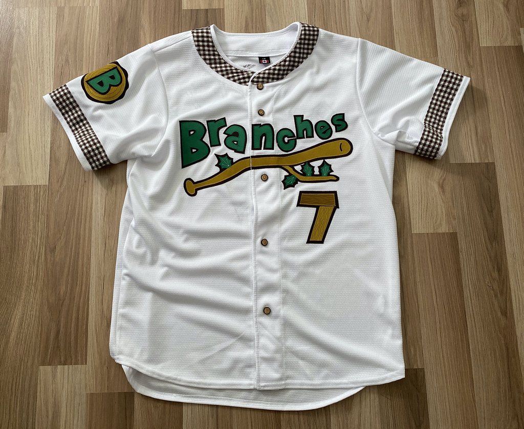
Auction reminder: In case you missed it on Monday, the one-of-a-kind Brooklyn Branches jersey is now complete (and completely amazing!). We’re auctioning it off and donating the proceeds to the Arbor Day Foundation, and today is the next-to-last day to bid. Full details on the jersey, and how you can bid on it, are available here.

Click to enlarge
August Pin Club reminder: Another thing you may have missed on Monday is that the Uni Watch Pin Club’s new design for August — a salute to old-school baseball scoreboards, complete with a few misfiring light bulbs — is now available. (If you want more info on the line score and the 4:07 time on the clock, there’s an explanation here.)
This is a limited/numbered edition of 250. The pin launched a few days ago and as of this morning there are only 85 remaining, so they’re going fast. You can get yours here.
Speaking of inventory levels:
• There are now fewer than 50 of the July bobble-pins remaining. Still available here while supplies last.
• There are also fewer than 50 Uni Watch Key Rings remaining. You can get yours here.
• Blue and green seam rippers are currently out of stock. Plenty of yellow, white, and red. Available here.
• I’m down to my last chain-stitched winged stirrup patch. Who wants it? Now sold out!
Click to enlarge
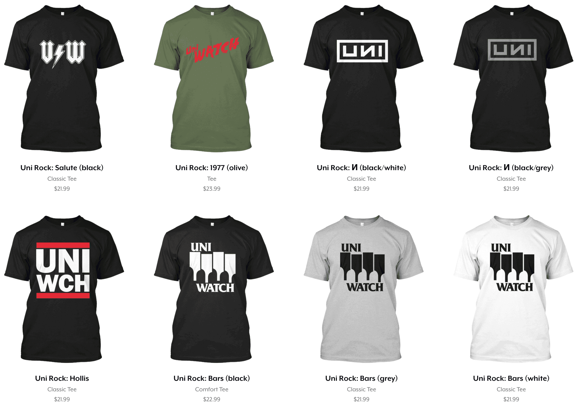
ITEM! Uni Rock update: As you can see above, a bunch of new designs have been added to the Uni Rock Shop (and if you missed the launch of Uni Rock last Friday, here’s an explainer). These designs have been added to the ones we had last week:
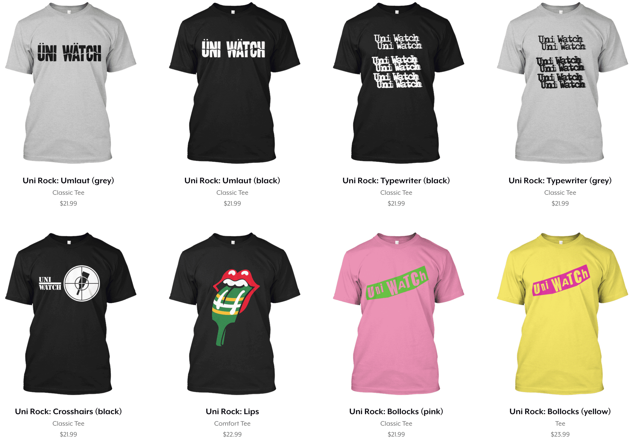
Working on these with designer Scott M.X. Turner has been a hoot. We’ll have more designs at the end of this week. You can see the full collection here.
The Ticker
By Lloyd Alaban

Baseball News: Blue Jays OF Teoscar Hernández recently added a accent over the “A” on his NOB. Apparently. he’s been doing this since the Blue Jays’ home opener (from @jsg15). … The Beloit Snappers of the Single-A Midwest League are soliciting fan submissions for a new team name as they get ready to move into a new stadium for the 2021 season (from multiple readers). … With the Blue Jays getting set to play the remainder of their home games in Buffalo, here are a few photos of the infield at Buffalo’s Sahlen Field being replaced in preparation for the big league games (from multiple readers). … Braves OF Ronald Acuña Jr. has his uni number — and maybe his name? — on his bat handle wrap (from Doug Simpson). … Rare situation in the current National League East standings: The Marlins, at 3-1, have a .750 winning percentage and are in first place. But due to the disparity in games played, they’re actually a full game behind the Braves.

Football News: The Iowa State engineering department designed anti-coronavirus face shields for Iowa State’s helmets (from Sean Jankowski). … Arizona Coyotes G Adin Hill of the NHL wore a Seahawks cap while on the bench yesterday (from Randy Policar). … The striping on UVa’s navy helmet is now painted on, just like on the white helmet. The navy lid’s stripes had previously been applied as tape (from proud UVa alum Jamie Rathjen).

Hockey News: Cross-listed from the football section: Coyotes G Adin Hill wore a Seattle Seahawks cap while on the bench yesterday (from Randy Policar).
.

Basketball News: ESPN’s Zach Lowe spoke to NBA coaches about suits vs. polos (from Mike Chamernik). … Scorebug confusion for the Blazers’ telecast of their color vs. color game against the Rockets (from Lukas Shaw).

Soccer News: New third kit for German side Arminia Bielefeld (from @yff26). … The English second-tier women’s team London City Lionesses have only existed independently for one season after previously being Millwall’s women’s team, but already switched manufacturers to Kappa from Nike and therefore released a new kit (from our own Jamie Rathjen). … Also from Jamie: Scottish League Two team Queen’s Park built and owned Scotland’s national stadium, Hampden Park, but completed its sale to the Scottish Football Association and are moving to Lesser Hampden, which is just outside the stadium, once they build some stands for it. Hampden Park holds several attendance records that are currently impossible to break because they were achieved with a stadium of mostly terraces instead of seats. … Górnik Zabrze have left Adidas for Hummel (from Ed Zelaski). … Fulham F Ivan Cavaleiro had some NOB issues yesterday (from Jeffrey Seals). … New outfitter for Italian side Sampdoria, which has inked a six-year deal with Macron (from Ed Zelaski). … New home shirt for English side Nottingham Forest (from @AndrewNewts).

Grab Bag: UCLA is aggressively seeking a new apparel deal after Under Armour pulled out of its contract with the school (from Kary Klismet). … Also from Kary: The Hail State Unis website, which covers Mississippi State uniforms across a variety of sports, has just launched an interactive uniform tracking database. … The No. 77 Spire Motorsports Cup entry is being renumbered to No. 74 in order to obtain film footage for an upcoming Netflix comedy series (from Christopher Hickey). … Ireland and England’s men’s cricket teams played a One Day International yesterday and wore black armbands in memory of Northern Irish politician John Hume, who passed away recently (from our own Jamie Rathjen).
Click to enlarge

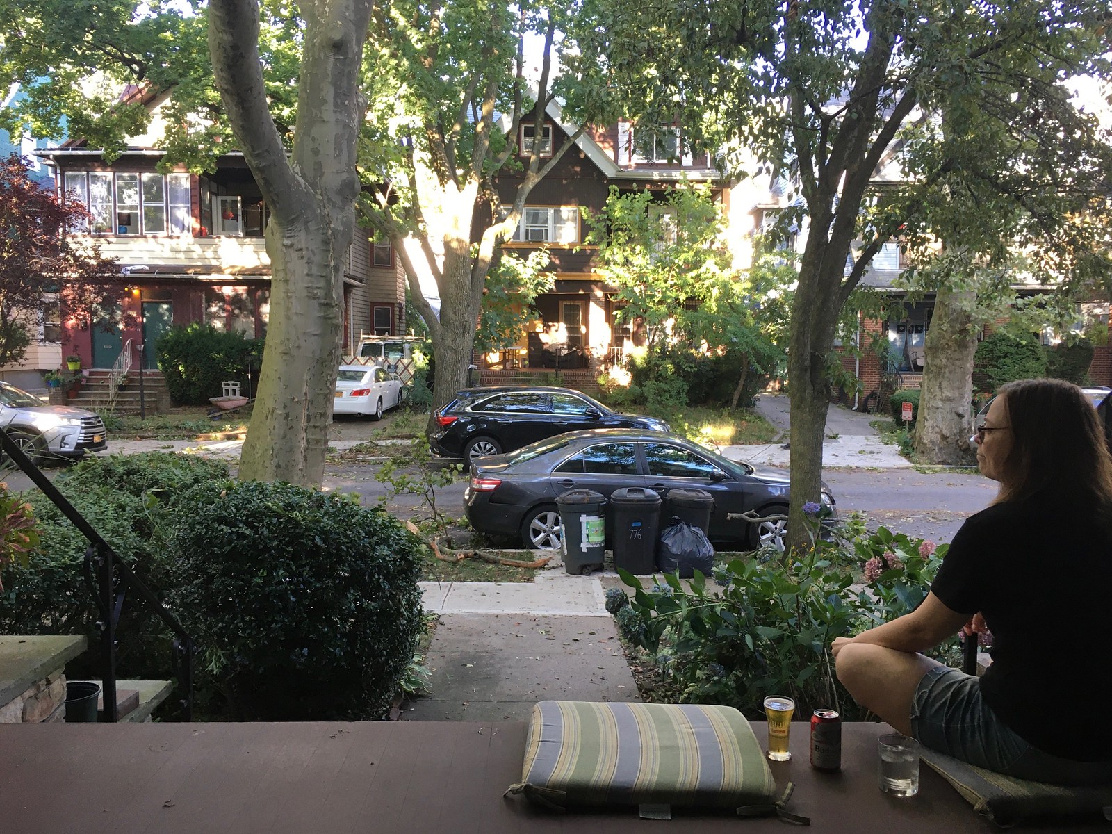
What Paul did last night: Yesterday’s storm didn’t last long — just a few hours — but it was powerful, causing power outages and one death in our city.
Thankfully, our neighborhood was spared the worst of it. We ended up with a lot of scattered debris, but our landlord had already cleared most of it away by the time porch o’clock rolled around. As you can see, some of our flowers got bent out of shape and a few of Branch Rickety’s cousins ended up at the curb, but by that time the storm had passed and it was a beautiful evening, almost like nothing had happened. Weather is so crazy.
As always, you can see the full set of daily Pandemic Porch Cocktails™ photos here.
I’d argue that the numbers look thicker/chunkier on the Chargers “real” jersey too
Sure looks that way to my eye.
Also less extreme slant.
If they put the TV numbers on the shoulders, then they really shouldn’t have them on the helmets. (I HATE them on the helmets FTR.)
I agree that the shoulder-bolts look like they’re too far down, but I’m not sure I agree that the space on top of the shoulder is “begging for TV numbers.” Which is not to say the jerseys don’t need TV numbers, but at least we know now why they don’t have them; there’s just not enough room on the sleeve, under the bolt.
See, I’ve always believed that if a football jersey has shoulder loops, be they “UCLA” style or otherwise, the TV number should be under the stripes, on the sleeve, rather than on the shoulder. One thing we saw in the ’90s was teams like the Bengals, and the Vikings with their road whites, moving the TV numbers from the sleeves (below the stripes) to the upper shoulders and putting logos where the TV numbers had been; the expansion Panthers followed suit. The Colts, thankfully, kept the TV numbers where they belong, and the Jets put them there when they went back to the Namath-era template in 1998.
Of course, one of the reasons the Jets made the change that they made last year (I think) is that with NFL jersey sleeves being essentially nonexistent there just wasn’t enough room for the TV number underneath the shoulder stripes (the insistence on putting the maker’s mark above the numerals only made this worse). Reebok tried to address this by moving the shoulder stripes way up until they were vertical, but that link on the longer sleeves. Nike moved the stripes down but then had trouble fitting the TV numerals in the remaining space, and the retail versions were just link.
What I’d like to see the Chargers do, if anything, is move the bolts up just far enough to fit a TV number underneath, to match their link, but barring that, I’d rather they go without.
To follow on, link is a better look than link, and link is a better look than link.
The Black Stirrups… er, Black Flag shirt is brilliant. I think we had similar music experiences in our youths as I instantly recognize every one of them so far.
Any thought for a Uni-Watch pillbox hat?
Does this revelation knock the Chargers down a peg in your 2020 uniform ratings?
Possibly, yeah.
Given that their are no TV numbers, I’d say the placement of the bolts are less a downgrade than the thicker white outline is an upgrade. Still looks like knock off jersey with the missing TV numbers.
That is the perfect summation of the Chargers jersey to me. I just couldn’t articulate it as well as you did.
Overall, it’s a solid look, but I don’t like that we are now seeing jerseys without TV numbers. Not a trend I’m a fan of.
The AC/DC style shirt looks like V/W with that font. And the Run DMC one makes me think of a sandwich shop. A Uni-wich, if you will!
The Atlanta Dream situation is interesting to me and a perfect example of the inability to have a nuanced conversation about this. Now I haven’t read EVERYTHING the owner said, but I have read her say that she takes issue with the BLM organization, (and by extension the phrase itself since the two have become so tethered) because there is a lot going on with that organization beside just the cause of creating racial equality/equity.
There was nothing in her statement (the one I read) that says she doesn’t support equality and the fight against racism. Just that she has issues with that particular organization. And if you read their mission statement one could certainly understand that. I wounder what sort of dialogue, if any went down between the owner and players.
Well said !
On the Charger’s uniforms, another apparent difference between the actual uniforms and the photo-shopped version – the font used for the player numbers on the side of the helmet no longer matches the font used on the jerseys. For a side-by-side comparison, look at #20 in photo-shopped versus #52 in actual.
This font inconsistency, if genuine, is really inexcusable. In my opinion, more glaring than the width of the outlining. Great uniforms overall, but inconsistent fonts knock them down a peg for me.
The Chargers have numbers on their helmets. Why so much hand-wringing over the lack of them, and/or the theoretical placement of them on their jerseys? How many numbers is enough?
There’s so much blank space on the Chargers Helmet, I think the number provides “filler”.
Speaking of Numbers, the WFT just posted this video of applying numbers to their helmets:
link
Agree with your assessment of the Kansas City football team – a great uni, with great colors (red, yellow and white is my second favorite color scheme) ruined by the arrowhead. Speaking of my favorite color scheme, the A’s have been wearing their Kelly green tops fairly regularly, I like it.
I was thinking they could change the arrowhead to a six-pointed sheriff’s badge.
As in, Chiefs of Police? Somehow I don’t think that would go over well…
…maybe a Fire Department shield (e.g., something like link, as in, Fire Chiefs, would go over better.
The Peoria Chiefs minor league baseball team made the switch to a dalmatian in a fire chief’s hat years ago. No need to change the team name.
Swap out the KC and the arrowhead with a plain white decal in the shape of the state of Missouri, complete with a ‘gold'( cmon…it’s yellow!) star marking the location of Kansas City.
Maybe it is finally time to go Kansas City Chefs like the late 1990s TV commercial :)
link
link
Under Armour, another business going south because of a bad business deal that shows off how truly bad it was as a result of the virus.
The WNBA continues to lead the way in the social justice department. Well done.
Paul, as a fellow lefty I noticed on the back of your card that you bat Right and throw Left.
I know when I was a kid I did the same, because all the older kids batted Right and I didn’t know you could bat “the other way”.
Just curious, is that how you came to bat right handed?
When I went out in the street to play stickball with all the other kids, everyone was batting right-handed and I didn’t know there was any other way to do it. I thought that was just “how you bat,” so I did it too, and it stuck!
There are plenty of “bats left, throws right” players everywhere from t-ball to the Major Leagues. “Bats right, throws left” like Rich and Paul are indeed an oddity, but when my son was playing travel baseball for the mighty Parksville Royals of the British Columbia Premier League, there were five players on the team that batted that way.
Apropos of nothing…I really like the Florida Panthers’ color scheme and logos. There uniform is pleasing, except WHY oh WHY doesn’t the horizontal stripe go completely around the uniform? (On both the white and the red.)
link
The front looks like a game jersey, the back looks like a practice jersey in comparison. And yes, they’d have to do something a little different with their numbers if they did that, but honestly, how hard could it be?
I agree completely. The number would have to change color, but it could either be black with gold outline or gold with black outline — either would really pop. I’ve felt this way in general about jerseys that have striping on the front and not on the back (mostly in the soccer world).
I wonder how many throw L, bat R people are out there for that exact reason. I know when I got a little older and more serious in organized baseball I wasn’t hitting well and a coach suggested I batted left handed and I immediately responded the next game with 2 home runs! I was ~11 at that time and never went back to right. Funny though, my son is 6 and he is a righty but I have only showed him that batting lefty is “the only way possible” lol. (hey-at least he’ll have a shorter distance to first base than a righty batter!
I throw R and bat L, for a rather odd reason. When I first picked up a baseball bat as a kid, I held it right-handed. It just felt more natural that way. But my dad was convinced for some reason that I’d hit better from the left side, so I taught myself how to do it. After a few years, hitting right-handed felt weird, and after a few more years, I could barely even swing correctly from that side anymore.
Truth is, I couldn’t hit worth a crap from either side, but I think the switch did benefit me in one way: When I played Little League ball, I was the only left-hitting player on my team, and and I got walked a lot. The other kids said it was because the pitchers had a hard time adjusting to the one guy on the “wrong” side of the plate.
So I guess it’s OK to put vote for a Democrat on a T shirt but not vote for a Republican. I can image the uproar if some team wore a vote for Trump shirt.
David, everyone else — myself included — managed to discuss this issue without mentioning political parties, the president, or imaginary “uproars” over things that haven’t even taken place.
Please try to follow that example instead of taking needless potshots that add nothing to the discussion. Thanks.
You know what? You’re right. I forgot about the self-policing (I don’t want to say ban) of political postings on this site. But I see so many on others. My bad.
If we had a “Heart” option here, I’d use it. Thanks, David.
Probably “apples and oranges”…
NASCAR driver Corey Lajoie of GoFas Racing has been running a Trump 2020 paint scheme for quite a number of races this season(including last week’s race at New Hampshire) with very little fanfare or ‘uproar’ – or on-track success for that matter ; )
I do not know his or his car owners’ political leanings, though I suspect both would be fine with running any sponsorship, partisan or not, that would help defray the high costs involved for a one-car operation running in the Cup Series.
You didn’t mention the pants on the Chargers unis but it seems the blue outline on the bolt is now thicker as well.
Washington football team helmet “unveiled”
link
Sounds like the city of San Diego has hit the pits, Chargers left and Padres went back to scoop up the old days. Tourism is at an all time low there, such a beautiful city gone to waste.
????
Yes, the Chargers left. But most people think the Padres’ return to brown is a huge upgrade. And in any case, how can you say an entire city has “hit the pits” based on one of its sports team leaving town and another changing its uniforms? Is that really your concept of urban life?
Why did sport see San Diego as a profit, because the rich retired love their live sports. The rich retired are now passing and the young middle income cannot afford rich retired price. Would love to take my family to a ballgame nowadays, have you paid for a family of four to watch a ballgame + parking + food ++ lately? = unaffordable for today…well it could easily be affordable but mortgage, land taxes, electricity, water for home living seems more important.
It’s not rocket science.
I’m not dissing the rich retired, awesome for you all.
But a “regular income household family” has priorities.
OK.
1) This has literally nothing to do with the Padres “scoop[ing] up the old days,” as you put it.
2) Yes, sports are expensive. And you somehow think this is the key metric of urban viability?
3) In case you hadn’t noticed, there’s a pandemic. Nobody’s spending anything for any ticket at any price — no fans. The end.
This is silly. Let’s please move on. Thanks.
Have you ever been to San Diego? The weather forecast is “72 with a mild chance of earthquakes.” It is lovely.
UVA stripes are not new, but painted now instead of decals it seems.
Washington without helmet stripes looks like a generic high school team & doesn’t deserve to be at 12 on that list.
The Dodgers seem to love the script Dodgers roads over script LA. Huge pet peeve of mine!