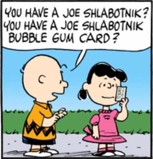
Our story so far: Last December I told you how I was going to be featured on my very own Topps trading card. Exciting! In February I provided an update on how that was coming along. Also exciting! And then in May I shared the news that MLB had put the kibosh on my card because I’ve been such a meanie to them over the years. Kinda sad, but mostly funny!
As I explained in that May post, my plan was to turn the whole experience into a new creative project by collaborating with illustrator/designer extraordinaire Rob Ullman on my own one-off card, with each card coming with a piece of the shirt I wore for my Topps photo session.
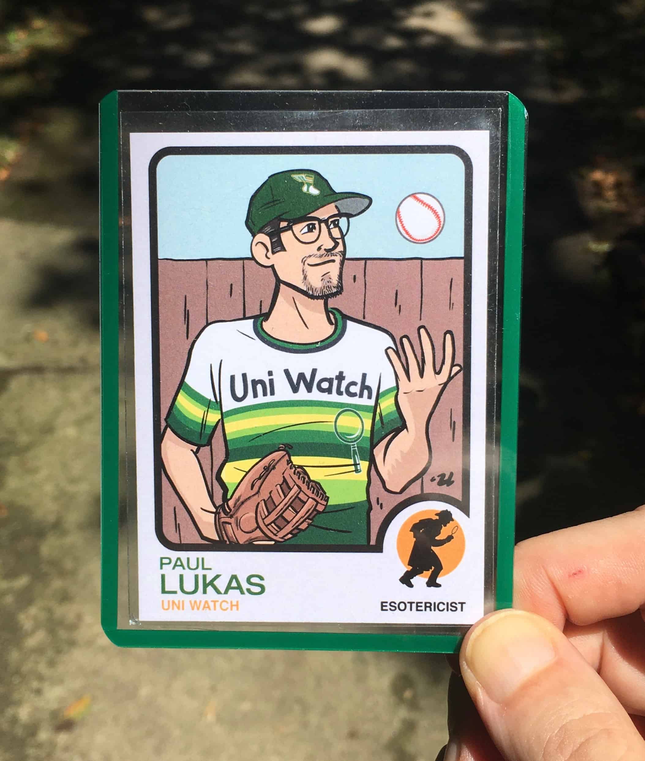
It took a little longer than I expected (Rob and I have both been busy, plus you may have heard that the world has been a little off-kilter lately), but the card is now finished. Take a look (for this and all images that follow, you can click to enlarge):
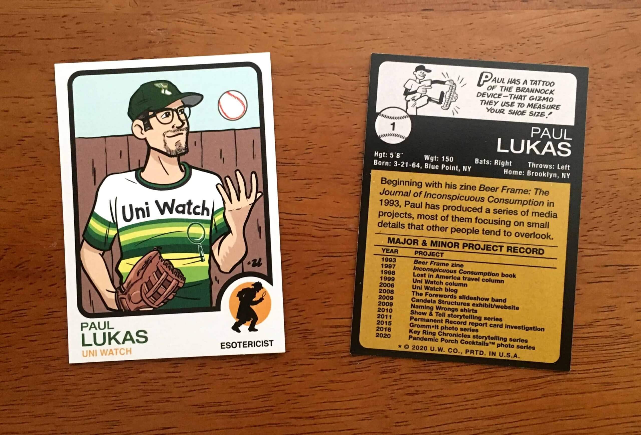
Not bad, right? Those are sample cards from the printer. Here’s a closer look at the design for the front of the card:
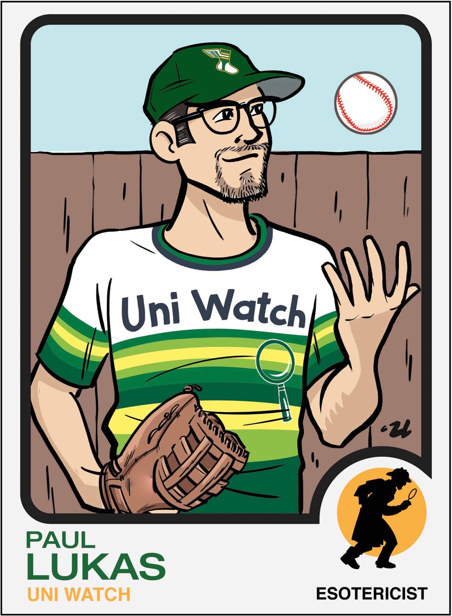
If you’re old enough, and/or if you’re a card aficionado, you’ll recognize that we patterned the design after the 1973 Topps baseball set — one of my favorite card templates. (Uni Watch reader John Okray, who’s a serious card collector and provided invaluable advice throughout this project, tells me the ’73 set is held in low regard by the collecting community, which I was surprised to hear, but whatever — I love it!) The front illustration is based on one of the photos I had submitted to Topps for the card they were going to do of me. As is usually the case with a Rob Ullman illustration, he made the subject — in this case, me — look a lot cooler than the real thing. Thanks, Rob!
For my “position” in the lower-right corner, I chose “Esotericist,” because it sums up my career and my way of looking at the world (and because “Minutiae Fetishist” wouldn’t fit). The little silhouette of the inspector/detective guy with a magnifying glass is perfect.
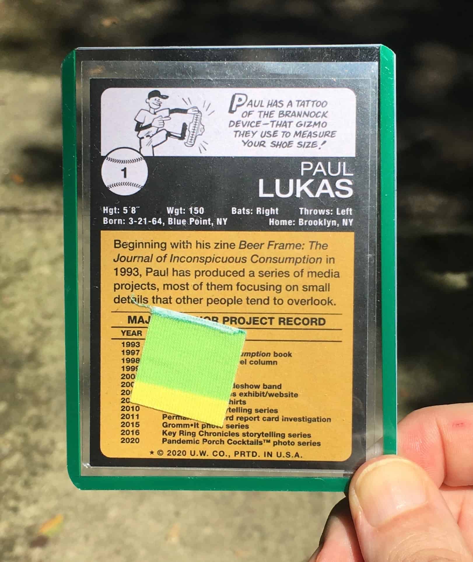
My original plan was to leave the back of the card blank, but Rob convinced me that we should do a back design. Again, we patterned it after the 1973 Topps set:
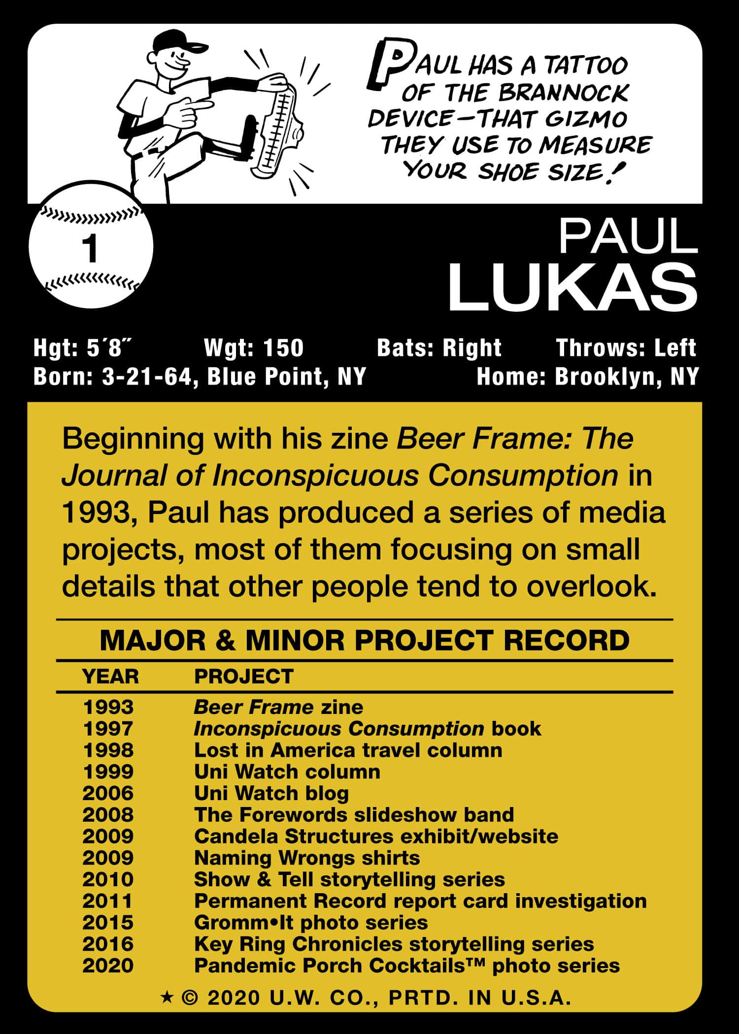
Oh man, I love how Rob perfectly captured the feel and spirit of the little cartoon at the top. Since I didn’t have any statistics to list, we just went with a timeline of my various creative projects (including Uni Watch, obviously). Fun!
Okay, so what’s next? Here’s the deal:
1. I’ve had 500 of these cards printed. They’re on the way and should arrive at Uni Watch HQ in a couple of days.
2. I will sign 10 of the cards in green ink (these will be numbered 1/10, 2/10, etc.) and one in purple ink (1/1). The pens I’ll be using for this will be Staedtler Lumocolors, which John Okray tells me are the same pens Topps has athletes use when signing their cards. The signed cards will go randomly into the set.
3. Each card will be placed in a plastic “penny sleeve” and then in a green-bordered “toploader” (two terms I wasn’t familiar with until working on this project). So if you order a card, it will arrive like this:
4. In addition, I will slip a 7/8″ square piece of my Uni Watch Tequila Sunrise Deluxe shirt — the same one I was wearing for the Topps photo that the card illustration is based on — into the back of each sleeve. So every card will be a relic card, and the relic will represent the overall experience of getting to have my own Topps card, then having that opportunity taken away, and then creating this new card in its place:
Topps relic cards come with the relic pieces sealed into the card. That wasn’t an option for us (too tricky, too expensive), so Rob and I initially planned to have a relic piece affixed to the front of each card with spray-mount adhesive, so it would look something like this. But I ultimately decided that it was better to leave the relics free-floating and loose — that way the card isn’t defaced and you can enjoy the relic on its own. (Of course, if you want to affix the relic to the card, you’re welcome to do so!)
5. Although I don’t yet have the cards on hand (or the sleeves, for that matter, although they too are on the way), I’m ready to start taking pre-orders. Here’s the deal:
• For one card or two cards, the price is $2 per card plus $1 for shipping.
• For more than two cards, the price is $2 per card plus $5 for shipping. (That’s because anything more than two cards will need to be shipped in a bubble mailer at the package rate.)
• If you want to combine a card purchase with a seam ripper and/or a key ring, contact me and I’ll give you a total that includes a combined shipping charge. (Sorry, you can’t combine an order for this card with any other Uni Watch merch except rippers and key rings, because everything else ships from other locations.)
• Tally up the total for your purchase and then send me the proper amount via Venmo (use @Paul-Lukas-2 as the payee), Zelle (plukas64@gmail.com), or PayPal (newcollegeuni@gmail.com). If you’d rather use Apple Pay or a paper check, contact me and I’ll give you the info you need.
• After sending payment, email me with your mailing address.
• If you’re outside of the USA, contact me so I can calculate the shipping charge and arrange an alternate form of payment for you.
———
That’s it. Thanks for indulging me with all of this.
There are so many people I need to thank for their roles in this project, beginning with Topps brand manager Patrick O’Sullivan. If he hadn’t contacted me last winter and invited me to be featured on a card, none of this would have happened. He also turned out to be the World’s Nicest Guy and was incredibly supportive and helpful, even after MLB nixed my card. When the pandemic is finally over, I’ll definitely be taking him out for a beer. Thanks so much, Patrick, and to all your Topps colleagues as well.
I’ve been a Rob Ullman fanboy for more than a dozen years now. It’s always a privilege to get to collaborate with him, and it was a particular treat to do so on this project. He was super-patient with my fine-tuning, always extremely enthusiastic, and a total pleasure to work with. As soon as I conceived of this project, I knew he was the right guy for it, and he proved me right at every turn. Thanks, buddy!
I know almost nothing about the card-collecting world. Fortunately, longtime Uni Watch reader John Okray knows quite a bit. He served as a my unofficial consultant throughout the project, patiently responding to my many questions and giving invaluable advice and info on everything from which pens to use when signing the cards to how the cards can be mailed. I learned a ton from him along the way, and I’m grateful to him for sharing his specialized expertise.
The photo I originally sent to Topps, which then became the basis for the illustration on this card, was taken on a cold December morning by the Tugboat Captain. She’s been super-supportive throughout this whole saga, and has never once said, “Do you think maybe you’re getting a bit full of yourself with this whole trading card thing?” (although I’m sure she was tempted a few times). Thanks, sweetie — you’re the best.
Finally, I also want to thank whoever it was at MLB who blacklisted me from the Topps set and thereby made this project possible. Sure, it was a bit of a drag that the original card didn’t happen, but the larger experience has absolutely been worth it. No hard feelings, guys, and thanks for opening up a new creative outlet for me. Who knows — this might even be the start of a whole Uni Watch card series.
ITEM! New NFL Power Rankings: My latest piece for InsideHook is a new edition of the Uni Watch NFL Power Rankings, with all 32 NFL uni sets ranked and assessed. Check it out here.
Click to enlarge
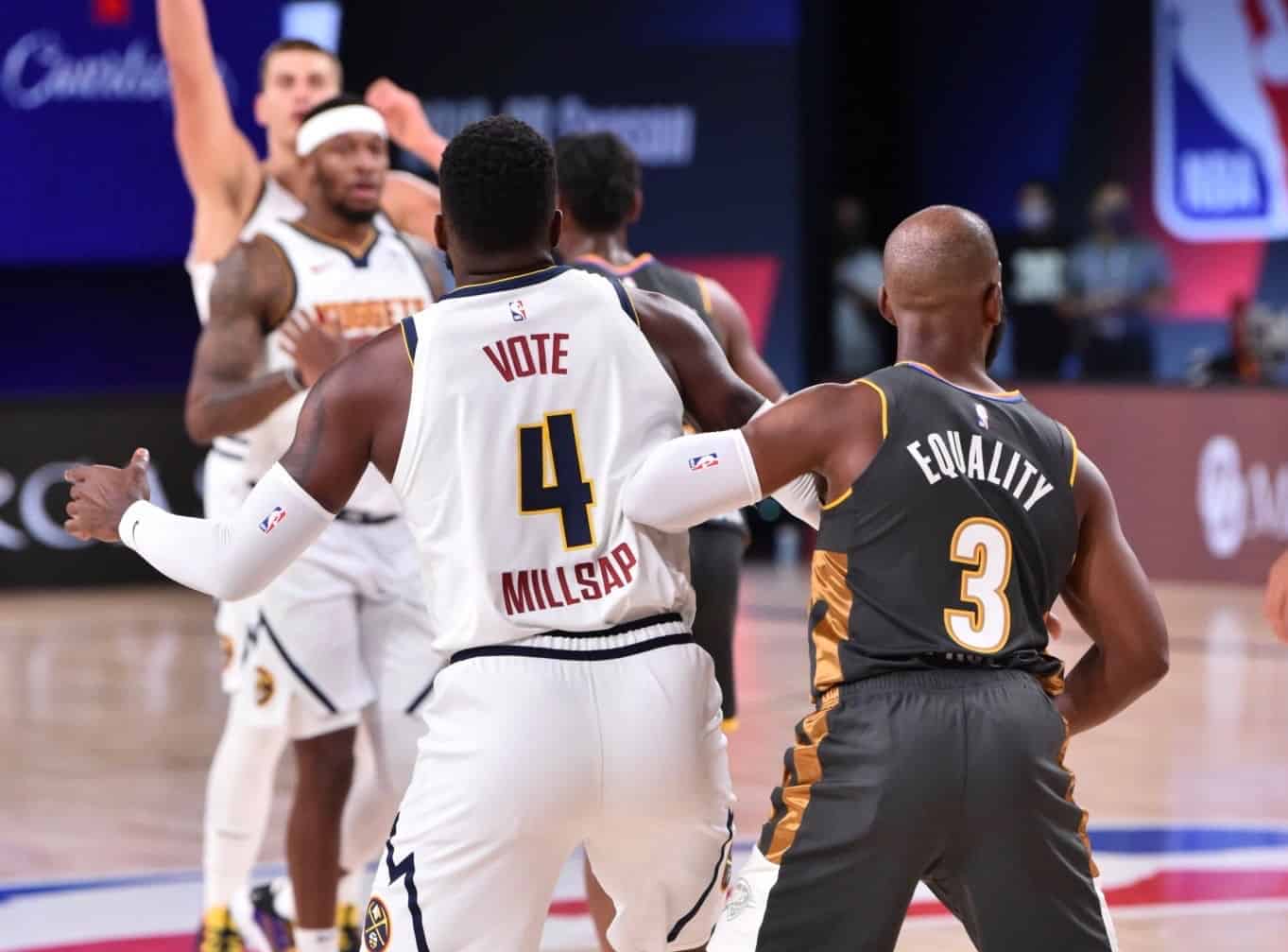
Early and often: Now that we’ve passed the first four days of the NBA’s restarted season, players who’ve chosen to keep the social justice messages above their numbers have had their NOBs added below their numbers. (That plan was originally announced back on July 3, although most fans don’t seem to have been aware of it.) In the case of Nuggets forward Paul Millsap, the combination of his “Vote” message, uni number, and name makes the back of his jersey look like a campaign ad. Vote for Pedro!
And if you think that’s weird, check out Thunder guard Shai Gilgeous-Alexander, whose prodigious surname looks particularly odd when positioned below his number:
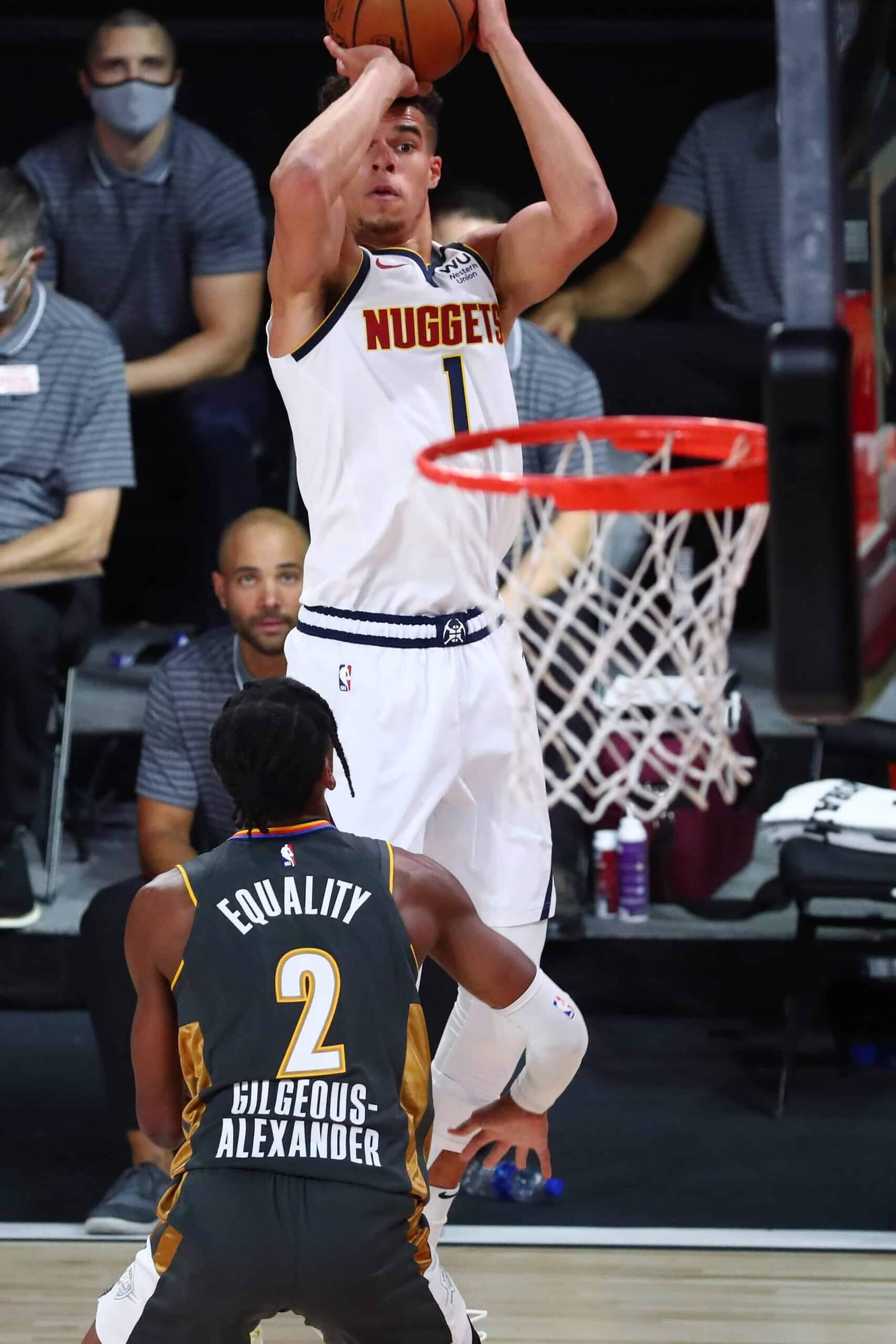
Just more stuff to file in the “Only in 2020” folder.
Click to enlarge
Collector’s Corner
By Brinke Guthrie
Follow @brinkeguthrie
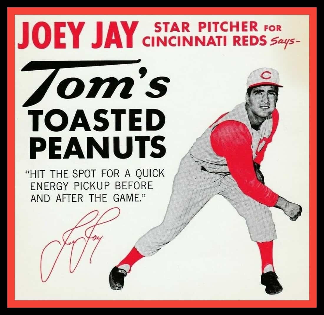
Peanuts! Getcha peanuts heeyah! That’s the time-honored sales pitch heard at baseball parks for decades, but an added bit of promotion from a big-leaguer — like, say, Reds pitcher Joey Jay, as seen on this display card — never hurt. Speaking of Jay, he had a decent 13-year career, including back-to-back 21-win seasons in 1961 and ’62. But he finished with 99 career wins and 999 strikeouts — so close to the big milestone numbers! Maybe a few more peanuts would’ve put him over the top.
Another one from the Reds as long as we’re here: these 1961 N.L. Champions buttons refer to the team in quotation marks — the “Reds.” Weird.
Now for the rest of this week’s picks:
• How about this 1960s Joe Namath thermal cup! Notice the helmet logo is football-shaped, as it should be — but instead of “Jets,” it has Namath’s initials, “JWN” (for, of course, Joe Willie Namath).
• This 1970s plastic Baltimore Colts beer cup says “Council of Colts Corrals” on the side.
• Another cup to check out is this one for the Chicago Cubs. You’ve got a cartoon pitcher and batter, and the interesting thing is a snap-on lid that says “This Is [print your name in Sharpie here] My Mug.” So when it gets stolen from the break room, the thief will know who it belonged to!
• And two more from the drinkware department: This 1983 Roy Rogers promo Philadelphia Phillies glass shows a variety of team logos from their 100-year history up to that time, and this 1980 Phillies decanter celebrates the team’s 1980 World Series win.
• This is a 1952 Brooklyn Dodgers “plastic scraper emblem.” I had no idea what that was until I read the fine print — it’s an ice scraper!
• This Cleveland Browns bumper sticker says, “The Winningest Team in Pro Football.” When was that exactly? (I don’t think it was referencing the Paul Brown/Otto Graham era.) In any event, they were nattily attired back in the day, as QB Brian Sipe shows us on this 1982 Superstar QB Calendar.
• “Talkin’ Baseball” singer Terry Cashman was the fellow singing on this picture disc album of Earl Weaver, called The Earl of Baltimore. You can hear the song here, and no post about Weaver would be complete without this oldie but goodie video clip. Boom! You run yourself, Earl! (NSFW, but everyone is WFH, right?)
• This 1957 baseball board game, Mickey Mantle’s Big League Baseball, has some great cover art, and is “a baseball game for the entire family — authentic, suspenseful, and exciting!” Plus it comes with an autographed photo and playing record!
• This Boston Red Sox lunch box comes with a Thermos inside. The seller makes no reference to its age; I’ll say early 1960s for this one, and it appears to be in perfect shape.
• One more for the Sawx: This 1960s Red Sox/Fenway Pahk snowglobe could use a bit of water, or whatever goes in those.
• Here’s an NFL paper placemat set of unknown vintage. Fifteen to a set. No team logos on the uniforms, unfortunately.
Click to enlarge
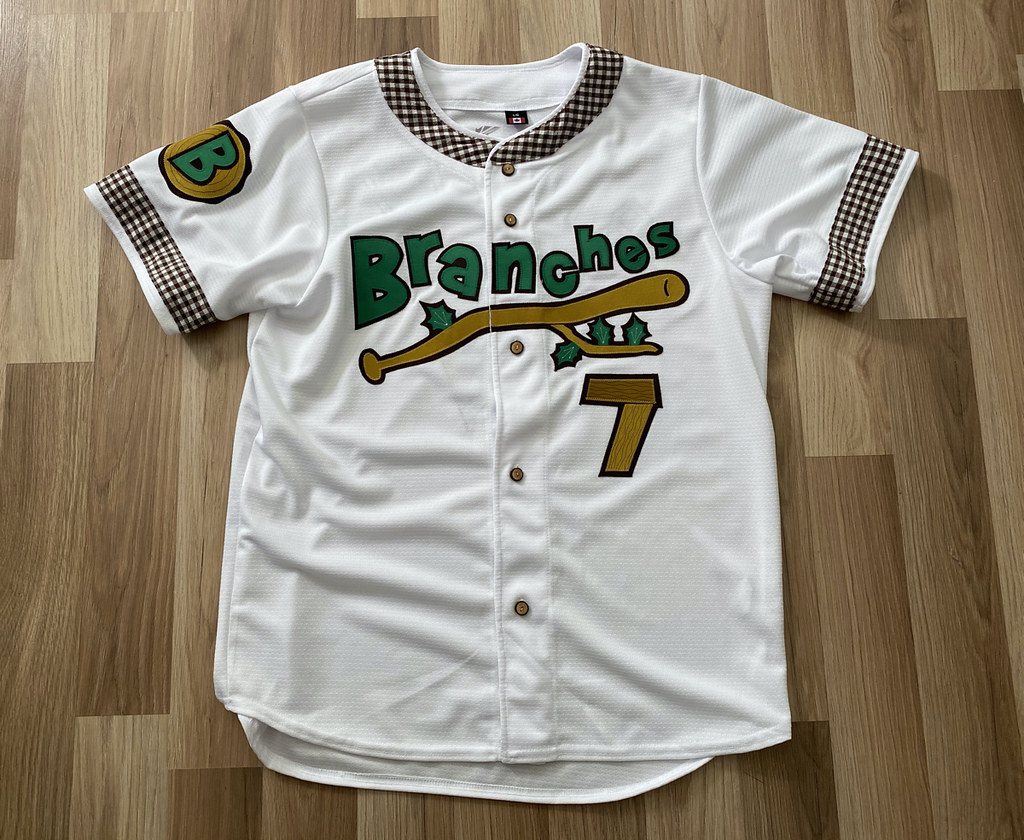
Auction reminder: In case you missed it on Monday, the one-of-a-kind Brooklyn Branches jersey is now complete (and completely amazing!). We’re auctioning it off and donating the proceeds to the Arbor Day Foundation. Full details on the jersey, and how you can bid on it, here.

Click to enlarge
August Pin Club reminder: Another thing you may have missed on Monday is that the Uni Watch Pin Club’s new design for August — a salute to old-school baseball scoreboards, complete with a few misfiring light bulbs — is now available. (If you want more info on the line score and the 4:07 time on the clock, there’s an explanation here.)
This is a limited/numbered edition of 250. As of this morning, there are 102 remaining, so we’ve already sold through more than half of them. You can get yours here.
While we’re at it: There are now fewer than 50 of the July bobble-pins remaining. Still available here while supplies last.
The Ticker
By Paul, pinch-hitting for birthday boy Alex Hider

’Skins Watch: Years after the University of Illinois officially retired its Chief Illiniwek mascot, Native American imagery and costumes stubbornly persist among certain fans (from Kary Klismet). … Good article on how the minor league Spokane Indians have partnered with the local Spokane Tribe (NYT link) for a variety of respectful initiatives. … North Quincy High in Massachusetts is changing its cartoon mascot from a Native savage to a colonial patriot (from Paul Friedmann). … Wisconsin brewery Leinenkugel’s — which I toured in 1999 and quite enjoyed — is retiring its logo featuring a Native American woman.

Working Class Wannabes™: Nebraska defensive line coach Tony Tuioti says freshman Nash Hutmacher “is as blue-collar as it gets.” … Speaking of Nebraska football, an article about their outside linebackers says they “have the blue-collar type of mentality needed to play at Nebraska.” … An article about the upcoming NFL season says the Patriots lost a “a handful of blue-collar defensive starters.” The writer then adds that the team’s defense “is largely a collection of blue-collar guys who thrive in skill-specific roles” and goes on to say that “New England’s collection of fundamentally sound, blue-collar defenders will simply get the job done by flying to the football and making solid tackles.” Get this guy a thesaurus!

Baseball News: Minor league teams are looking to generate much-needed revenue by repurposing their ballparks for golf. … “The Iowa High School State Baseball Tournament, which just concluded this past weekend, always includes several uni-notable moments,” says Kary Klismet. “Among this year’s highlights are Gilbertville Don Bosco’s grey raglan sleeves on blue road jerseys, unconventional faux-headspoons for Council Bluffs St. Albert, and, as always, plenty of teams with great stirrup games.” Lots of additional photos here. … The Mariners have added a cutout of Steve Bartman to their stadium, near the corresponding spot where he infamously sat at Wrigley Field. “Odd case of trolling, since the M’s and Cubs are in different leagues and don’t play each other this year,” notes Mike Chamernik. … The Covid-stricken Marlins announced a flurry of roster moves yesterday, and Shane Bua notes that two of their new pitchers include Josh A. Smith and Josh D. Smith. Could make for some interesting NOBs. … Great observation from Chris Falvey, who notes that the Cardinals’ schedule includes a 25-game stretch against teams with a “C” in their logo. … If you build it, they might not come after all: The Cards/Chisox Field of Dreams game in Iowa, originally scheduled for Aug. 13, has been postponed to 2021 (Mike Chamernik again). … Giants skipper Gabe Kapler wore the wrong hat for last night’s game against the Rockies. … Good eyeglasses vs. eyeglasses matchup during last night’s Cubs/Royals game (from @DTW94).

Football News: The Broncos have an interesting walk-through body sanitizer at their training facility. Does every team have this? (From Mike Chamernik.) … Houston LB Grant Stuard will wear No. 0 this year (from Ignacio Salazar). … New uniforms for Rutgers, and they look pretty solid. … Can’t say the same, alas, for Fresno State (from Phil Neslund).

Hockey News: This is pretty great: At the Edmonton NHL bubble, they’re putting the attendance on the scoreboard (from Alan Kreit). … Hurricanes RW Andrei Svechnikov scored a hat trick yesterday. Since there were no fans on hand to throw hats onto the ice, his teammates left a bunch of hats in his locker (from Mike Chamernik). … New 50th-season center-ice logo for the Prince Albert Raiders (from Kim Johnston).

Basketball News: NBA coaches are enjoying not having to wear suits in Orlando (from Mike Chamernik). … Here’s the story of how “Education Reform” ended up as one of the NBA’s social justice jersey messages. … New court designs for Young Harris College in Georgia and the new Little Rock Southwest High in Arkansas (from Kary Klismet).

Soccer News: New home shirt for Manchester United (thanks, Anthony). … New custom font for German side Hertha (from Ed Zelaski). … Also from Ed: New kits for Polish side Wisla Krakow. … From our own Jamie Rathjen: “There’s a bizarre stat related to English Football League playoff finals that comes into play for Tuesday’s Championship final: Teams that traditionally wear red and white striped shirts and black shorts — irrespective of whether they wore that combo in the playoff final — have never won a playoff final in any of the three EFL tiers, losing all 15. If Brentford loses on Tuesday, the streak will be 16.” … Also from Jamie: The English Football League has a new ball, a yellow version of which debuted last week in the Scottish Premiership. … Portuguese side Santa Clara will now be outfitted by Kelme (Ed Zelaski again). … And yet another from Ed: New home kit for Serbian side Red Star Brigade.

Grab Bag: An electronic system, instead of live line judges, will be used for most tennis matches at this year’s U.S. Open (NYT link). … Did you know chips and pretzels were at one point packaged in soda-style cans so they could be sold in soda vending machines? It’s true! (Thanks, Anthony.). … This story from Nevada Public Radio examines the implications of UNLV’s decision to remove a statue of its “Hey Reb” mascot from campus (from Kary Klismet). … Here are some of the new Mississippi state flag design proposals that people have submitted (thanks again, Anthony). … The Heartland Collegiate Athletic Conference — that’s a D3 conference consisting mostly of schools from Indiana, Ohio, and Kentucky — has a new logo (from Craig McKean). … After her divorce, Princess Diana refused to wear the Chanel logo because it reminded her of Prince Charles and Camilla Parker Bowles. … New logo for fast food chain Bojangles. … New logo and name for South Dakota School of Mines & Technology. … Holy moly, check out this spectacular curling sweater that Wafflebored spotted at a vintage shop! The patches are magnificent, but the buttons really put it over the top.
Click to enlarge

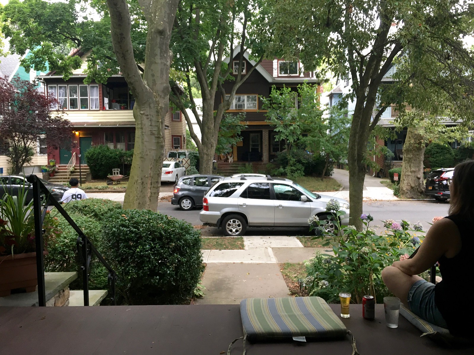
What Paul did last night: Rare bit of uni content in today’s installment of Pandemic Porch Cocktails™, as a guy in an Aaron Judge Yankees jersey passed by yesterday. Hadn’t really occurred to me before that we almost never see people in jerseys while sitting on the porch.
It was very calm outside yesterday evening. It was the calm before the storm, as the Hurricane with the Odd Name is heading our way today. Shouldn’t be too bad by the time it reaches us, but we’re supposed to have a very rainy, windy day.
As always, you can see the full set of daily Pandemic Porch Cocktails™ photos — now 140 of them! — here.
Tomorrow: Some new additions to the Uni Rock Shop. See you back here then. — Paul
Phil Hecken card?
Um… no
Come on Phil. It’d be perfect. You could wear your curling gear and everything!
I had to know if curling cards were a thing…
link
What about some “legends” cards? Ricko? The Jeff?
Collect ’em all!
Oh my God, I would totally make a Ricko card.
I haven’t made it all the way through the Inside Hook Power Rankings article but every clickable link so far goes to Lexus.com.
Hmmmm. All the links are working fine for me.
Typo: “Don Boco” should be “Don Bosco.” (The error appears to have been in my original submission, so my apologies for that!)
Yup, already fixed.
Love the card. I recognize all the other names, but what/who are the Forewords Slideshow Band?
Also, after Powerline’s LI Phil card, can Mary get one with a little ship’s wheel and “Captain” as her position?
Forewords:
link
link
Thanks!
I had to google what “F.T.C.” was on the Rutgers nose bumper.
Family. Trust. Chop.
Oookaaaayy….. It must mean something to them.
Yea that’s really bad.
Mmmmmmm,….. Roy Rogers!!
I used to love me Double-R-Bar burger!!
Double-R-Bar burger was the best!
I’ve always kind of enjoyed “collecting” frustrating MLB statistics in my mind, such as Joey Jay’s 99 career wins and 999 strikeouts. Only ones I remember off the top of my head are Monte Irvin’s 99 career home runs and Al Kaline’s 399 round-trippers.
Not a statistic, but a fun fact. Joey Jay was the first former Little Leaguer to play Major League Baseball.
Ooooh, that *is* a fun fact! Thanks for sharing that, Bob.
What a great card!
Why is the 1973 Topps set hated? As a kid in the ’80s and ’90s, I thought the ’72 set with its gaudy team name font was the hated one. It also didn’t give the player’s position, which was surprising.
The 1973 Topps Baseball design has always been met with mixed reaction by collectors, even to this day. Some prefer the simplicity, while others complain about the lack of color and uninspired photography.
It also has the distinction of being the smallest Topps baseball card set of the 1970’s and the last vintage Topps set to be released in a multiple series format.
As a kid in the 80s and 90s also, I didn’t hate 1973 Topps, but I didn’t care for it all that much either in terms of sets that predated me, but that I was able to get my hands on a few cards from. Now as a much, much older kid in the 2020s (HA!), that design has really grown on me. It’s also one that is used as a basis for many of the creations in the Custom Baseball Cards group on Facebook. I highly recommend that group for anyone who had even a passing interest in sports cards at one time or another in their life. Many talented artists over there, and some great creations that they are kind enough to share.
I think another reason for the “hatred” of 1973 Topps has less to do with the design, and more to do with production problems around trimming, centering, and orientation that seemed to run rampant with that particular year, thus making it hard to find cards in good condition (which is hard enough with many pre-1980s cards). In my personal opinion, design-wise, I think it’s one of the cleaner Topps sets of the 1970s, along with 1977.
I really like the ’73 Topps design. I’d stopped collecting by then (I was in college) but I’d always buy a pack of cards just to see what Topps was up to. I put the set together in the last few years and I’ve really come to enjoy it. It’s not as colorful as some others from that decade but it has its charms…and challenges. Finding a Clemente that’s not badly miscut can be tough. Topps did make some odd photo choices like having Steve Garvey almost hidden behind Wes Parker on his card. Great cards of my guys, Brooks Robinson and Jim Palmer though.
Johnny and Joe, thanks for the info. I didn’t know anything about the production issues; for me it was just another older set of cards, not gaudy like the two-color 1975 which I could see people hating. I really liked the “burlap bag” 1968 and the black-edged 1970 (?) Topps cards.
I liked ’70s cards because the uniforms were more colorful and there seemed to be more of those fun cartoons like the one drawn for Paul. (Baseball cards were also the main place to see players’ stats; I didn’t like the shift to more photos and less stats that came in the ’90s.)
“As is usually the case with a Rob Ullman illustration, he made the subject — in this case, me — look a lot cooler than the real thing.”
I was thinking the same thing. That’s not meant to insult Paul, just the illustration is pretty fantastic. It looks like Paul, but maybe it is the extra square chin, sort of gives him a heroic appearance.
Also I still think the best part of all of this was the MLB actually told Topps Paul couldn’t be in the set. A nice sense of satisfaction that Uni Watch has influence in the world, and the folks at MLB don’t like that Paul calls them out of their crap.
My wife and I commissioned Rob do a caricature of us for our wedding invitations, and it is definitely the coolest either of us have ever looked!
You should see what he does for those schlubs over at DKPS! ;)
Always nice to see my my high school make a UW appearance. While Mason City Newman lost in the finals of the Iowa High School state baseball tournament to Don Bosco, I gotta agree their stirrup game is strong.
Here’s hoping that in their redesign, Leinenkugel doesn’t change their awesome wordmark.
Also, credit to Judge Jersey guy for not getting one of the silly NOB versions.
Do you actually have a tattoo of a Brannock Device (a name I thought was regulated to people who enjoy extremely odd and random bits of trivia like me)? That’s a really unique and cool idea actually
Yes:
link
That led to this:
link
Interesting side note, the “Council of Colts Corrals” is now the Council of Ravens Roosts. My brother in law is a member of Roost 4.
I really enjoyed the NFL uniform preview. I never knew why the Steelers logo was only on one side. I will never unsee the Vikings numbers now. It’s another reason not to like them. Go Bears! (who should hold the top spot in the uniform rankings every year because they are the bestest team ever!)
Well that card is amazing. Time to try to convince the wife to send some venmo $.
Your card is lame but maybe you can get Phil a card with his GPA on it, that would be neato!
I just went through your NFL rankings. I don’t really care about the order of these things, but the reasoning… I always figured you had a keen-enough eye to not use 1:1 design comparisons (for example Jets unis = arena league). That’s just a lazy observation. Why not write about the elements that remind you of the arena league instead?
In that case, I’d think it would be self-evident.
Do you not see more value in discussing design elements rather than the 1:1 comparisons?
I see discussion of the Jets’ uniform set as an exercise in diminishing returns, especially in the context of a lengthy article. Did I dismiss them with shorthand? Yes. And that’s about all that needed to be said.
I think we don’t understand why this article where you rated them a b- is suddenly worse than the Rams who you savaged. What changed so much?
link
As I always say, “Let’s see them on the field first.” And on the field they look like shit.
Gotcha that makes sense thanks for explaining. Its funny I found the BFBS looked much worse on the field, but the green and whites ones were a smidge better than I thought. as I didn’t notice the ridiculous wordmark as much as I thought.
Drives me nuts because they nailed color, it’s there 3/5ths of a decent set there but the last 2/5s are awful
I was actually thinking the same thing, but maybe Paul is right in that the less said about the Jets’ current unis the better. I do agree that there might be some benefit in explaining just what “Arena League” means in the uniform context, viz., what to Arena League uniforms look like, for those who don’t watch the Arena League?
By way of example, Paul used to describe the Patriots’ mid-late 1990s uniforms as “USFL-like,” which might have been fair for its original incarnation in link–link but not its better-known link with the italic numerals (which no USFL uniform had), sublimated vertical striping (ditto), and ginormous shoulder logos (ditto).
In my view the current Jets uniform gets two things right: (1) the shade of green, which is gorgeous; and (2) the numerals that, intentionally or not, look like the link on link. I’d be thrilled if they kept those two things and brought back the old template.
P.S. Paul, if that wasn’t you re: Patriots/USFL, I apologize. I vaguely remember bringing this up on the site years ago. Maybe it was Phil….
I did indeed once (or maybe twice) describe the mid-’90s Pats as USFL-like — and you have (justly) chided me for it ever since!
In the USFL, there was exactly one team with a bad uniform: the 1984 Arizona Wranglers. If any of Paul’s Bottom Ten teams went to “USFL-like” uniforms, it would be a dramatic improvement.
Oh, no, I loved the ’84 Wranglers uniforms; outstanding color scheme that I’ve been vainly hoping the Cardinals would adopt.
If there was a USFL uniform that I didn’t like it’d probably be the 1984 Oklahoma Outlaws’ black-over-black home combo. The 1985 Arizona Outlaws (resulting from a merger of the two aforementioned teams) had a great look. Also, and I hate to say this because they were my favorite team, but the Generals uniforms weren’t that great; I never understood why they had red jerseys with blue trim and a red helmet with a gold logo, but no gold on the jerseys and no blue on the helmet.
The Panthers and Bulls also had great color schemes, and great helmet designs. I thought the Stars and Stallions were too similar, the Bandits were too derivative of Ohio State, and the Express were too derivative of the Dallas Cowboys. The Invaders logo never made sense to me.
I really liked a lot of the old USFL uniforms. One thing for sure. The league had a high per capita usage of silver pants.
The San Antonio Gunslingers had the worst uniform sets and helmet logo in the USFL.
The logo itself wasn’t that bad as a standalone (although the guy looked like he was like 75 years old) but it didn’t work as a logo on a helmet. It looked like a splotch.
Lee
One small nit to pick on the InsideHook NFL Uni article: Reference to the Tampa Bay Bucs’ “Super Bowl glory years” should read “Super Bowl Glory year,” singular. ;)
Fair point!
While they only won one Superbowl, I think you could point to that as an era of sustained success, and certainly the most successful era of the franchise’s history, which has been pretty dismal otherwise. One Superbowl, but the years leading up to that championship were also exciting, successful, and memorable for the franchise and fans. Also consider they finally started be competitive after switching to that uniform, I would say YEARS is appropriate.
As long as he didn’t say “Super Bowls Years” he is fine.
Hoping a ’70s-style PL hockey card is next. With either a poorly hand painted cover up jersey, or a different jersey with the “Now with Canadiens” caption.
Serious question: Do Canadian kids routinely collect hockey cards, the way American kids collect baseball cards? When I was growing up in the 1970s, I was a hockey fan but I don’t recall seeing hockey cards at all. I’m sure they existed, but not at my corner five-and-dime store!
Oh man did we ever. Absolutely huge. Available in every corner store, couldn’t get enough of them. I’m not a collector, but I do have a binder full of ’70s goalie cards.
Of course you do!
’70s goalie cards some of the best to have. Great mask designs in the mid to late ’70s on the face hugging masks.
Had big hockey card collection when I was a youngster through to into high school. Was in high school in early 1990s when a bit of a card craze was happening. Did collect a lot of baseball cards too in the 1980s.
Still have my Mario Lemieux O-Pee-Chee rookie card found in a pack with their stick gum when I was a kid.
I was never a collector – just a kid who bought packs of hockey cards for a few years. I still have the Gretzky rookie card that I got in a pack. It would be worth a lot of money if it didn’t have the hole from being pinned to my wall.
Wade, please tell me the Lemieux card was not actually up against the piece of gum in the pack, thus having a permanent stain! It used to drive me nuts when a star player’s card was damaged by either the gum or the wax seal!
Joe, card does not have a gum stain, but the corners are not sharp. The card spent a few early years being not well protected.
I grew up in Syracuse, NY and had a ton of hockey cards. Also those hockey player stickers you would get at grocery stores every week. Loblaws was the store we had.
Found them! link
Bats Right, Throws Left. The rarest combination in baseball. Paul if you were like me, throwing left-handed came naturally. Then when it came time to bat, I hit right-handed like almost everyone else. Unlike today, back then there were far more right-handed batters than lefties. Besides Paul and me, any other BRTL’s out there?
I Kick Left, Throw Right, does that count?
How about this: I punt left but placekick right!
Makes no sense, but both motions feel natural to me, and I can’t do either one with the other foot/leg!!
I also Kick Left, Throw Right. Steeler QB Ben Roethlisberger is also this combination. A few years back, he did a quick-kick, and that’s when I noticed that he kicked left-footed. Their regular punter (can’t remember at this point who that was) at the time was also left-footed, and sometime that season threw a pass on a fake punt, at which point I noticed that he was also of the Kick Left, Throw Right combination. I think I might have even gotten a Ticker mention for pointing out that the Steelers had two such players that got to both kick and throw in a game that season.
I wonder if this combination is simply due to being taught to bat right. Throwing is something you sort of learn on your own very young, so whatever hand you naturally use takes over. But we are typically instructed by someone else how to bat, so perhaps naturally left handed batters simply learned to bat right and that is what stuck?
In my case, when I went outside to play stickball with the other kids, everyone was batting right-handed and I literally didn’t know there was any other way. So I just batted like everyone else did, even though I was left-handed, and it stuck.
Let’s see.
Bats right/throws left.
Shoot a basketball—left
Throw a football—–left
Play tennis———-right
Kick a ball———-right
Mousing————–right
Using a fork———right but can do left
Phone—————-ALWAYS left
Everything on my desk is situated to the left- I always reach with my left hand!
Golf——————If I played, right handed.
The only thing I can’t figure is how to shoot a gun, which I’ve never done. No idea which hand I’d use!
Here is some trivia as of 2015: Only five non-pitchers since 1900 have played 1,000 games batting right-handed and throwing left-handed: Rickey Henderson, Ryan Ludwick, Cody Ross, Cleon Jones and Hal Chase.
This tidbit is usually used to point out how special and weird Rickey is. Considering his speed, batting left would have been very helpful on infield hits. I was going to say it would get him more doubles, but with Rickey every single was a double anyway.
As for why someone would bat with different handedness than throw, two-handed actions are very different from one-handed. In Hockey I understand stick-handedness is almost uncorrelated from natural hand dominance. In baseball there are tons of B:L T:R, But the opposite is rare because the advantages for non-pitchers are all for Lefty Hitting and Righty Throwing (There is discrimination against lefty throwers at every position but 1B,OF. Also if you are a good lefty thrower, you will be given every incentive to be a pitcher). I Imagine most B:R, T:L position players get turned into switch hitters.
Late to the party here, but FWIW, I kicked footballs of the tee with my right leg, and punted with my left. Don’t know why. -C.
I can understand the rationale, but interesting you chose not to put your tenures at espn and on your card’s CV.
I second the idea of you doing a hockey card, but it should definitely be the OPC version, no5 Topps..
And then maybe a basketball card when Topps did those skinny cards. :)
It’s a timeline of projects, not of employers. The Uni Watch column debuted in 1999 and is listed as such on the card. The column has run in quite a few venues (Village Voice, Slate.com, ESPN, SI, InsideHook), but the timeline isn’t about listing the places I’ve written; it’s about listing the creative projects I’ve done.
The Rutgers football Unis are probably the most unsurprising move in recent memory. It’s the look they had when they had their greatest successes under Schiano’s first tenure, so it should be no shock they’d want to go back to them. It’s just… they look so dated. The return to the giant “RUTGERS” on the front of the jersey? That number font? I know a lot of fans (and boosters, I’m sure) are going to be over the moon for a return to this uni design after some years in the three-stripes wilderness (while I thought last year’s togs could used some touching up, I overall liked the look of the unis. And I adored the long sleeve unis they had for the 150th anniversary of football), but this feels gimmicky and trite. I would love for Rutgers to embrace its role as “The Birthplace” and just adopt a completely clean and classic uni set that would look timeless. I know I’m dreaming on that one though.
I’m befuddled why Rutgers didn’t throw back to the early days? A large R in the center of the chest (and presumably a number somewhere to make it legal like the 1994 Cardinals and Bears retro jerseys).
Oddly enough, the 1882 shirts (google it) have an R which kinda-sorta looks like the current Rutgers word font. It’s a little more squashed like the Purdue P on the helmet.
As a Rutgers alumnus I was hoping for the late ’90s number font (link). Awful team, but awesome uniforms.
After that they went to a shadowed block font that was almost exactly the same as the 49ers’ throwbacks. I like that one too; it’s my second favorite.
Not a fan of the school name above the number on the front (or really of anything that pushes the number downward).
But I can see why they went back to the mid-2000s look; they finally had some good teams wearing them after many years of futility.
Read the NFL Power Rankings. Liked 95% of what’s written. Maybe I need educating, not sure I support the Kansas City Chiefs comments. I supported the change with the Washington football team, I would also support eliminating the degrading chant at Atlanta Braves, Florida Seminoles, KC Chiefs, but not sure what’s offensive about an arrowhead? It comes across as now that we’ve won the Washington battle – we need to pick a new fight. But maybe it’s my ignorance
On the Cowboys, the silver mismatch that I find most bothersome is helmet vs. pants on their white uniforms.
Hi, Laurence. Regarding the Chiefs, I’ve discussed this many, many times, most recently four weeks ago (scroll down a little bit in the lede):
link
I definitely fall into the “get rid of what’s offensive camp”. I will say – not to be argumentative (OK maybe a little) but surfing through past NFL uniform power rankings (2015) on ESPN’s website, the Chiefs were rated #10. (FYI, in the time flies category, shocked to see the 1 to 121 ranking was 2012, I would have guessed no more than 5 years ago). Definitely don’t want to get high and mighty, everyone’s thoughts are allowed to evolve, and maybe overtime my own thinking will to on this.
It’s been quite a while since the last NFL Power Rankings, and my thinking has evolved. I did the same thing with this year’s MLB Power Rankings, where I had the Braves and Indians ranked toward the bottom.
Love the Tequila Sunrise jersey on your card, Paul! Maybe a purple one for next Amnesty Day?
I think there was a purple one!
funny about the hat trick. last night, McDavid scored a hat trick against Chicago and they had … stadium people (?) throw the hats onto the ice like fans would.
link
Sort of off topic but the ticket item about minor league stadiums reminded me of a game I went to in Syracuse when they had Willie Mays Aikens try and hit a golf ball out of the stadium using an iron (I assume). He did and the crowd cheered. Took me a few minutes before I did the math on 420 feet and said to my friend that we could both have easily done it. Unless I am remembering things incorrectly, that’s a weird promotion to have.
Btw it’s Red Star Belgrade, really that name is now archaic and English broadcasters prefer to now call them by the latin script verison of their Serbian name – Crvena zvezda
Observation from today’s EPL Championship promotional final between Fulham and Brentford.
Before every name on back of every jersey, there was a little logo that looked like some kind of stylized star or insect. I don’t think it was a hashtag.
Anyone know what this was about?