Click to enlarge
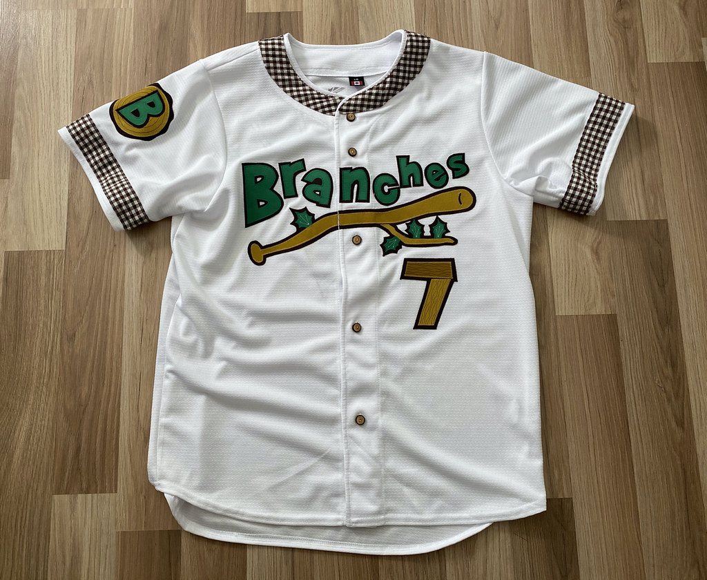
Our story so far: For several months there was a large, dangling branch hanging precariously from a tree across the street from Uni Watch HQ. It became sort of a running character here on Uni Watch, and some readers took to calling it Branch Rickety (a name originally coined by reader Andrew Hoenig). When it crashed to the ground during a storm on June 30, reader Ron Ruelle memorialized it by imagining a baseball team called the Brooklyn Branches, along with a Nike-style brand description. It was such a fun idea that I arranged for DIYer Waffleboard to make a real version of Ron’s jersey concept, complete with wood buttons made from salvaged pieces of the actual branch.
That jersey is now finished. And as you can see above, it looks completely amazing! Wafflebored really outdid himself on this one. Allow me to take you on a guided tour of the jersey’s details:
• Wafflebored started with a plain white jersey and then sourced all of the fabric for the letters, numbers, and graphics, all of which he cut by hand:
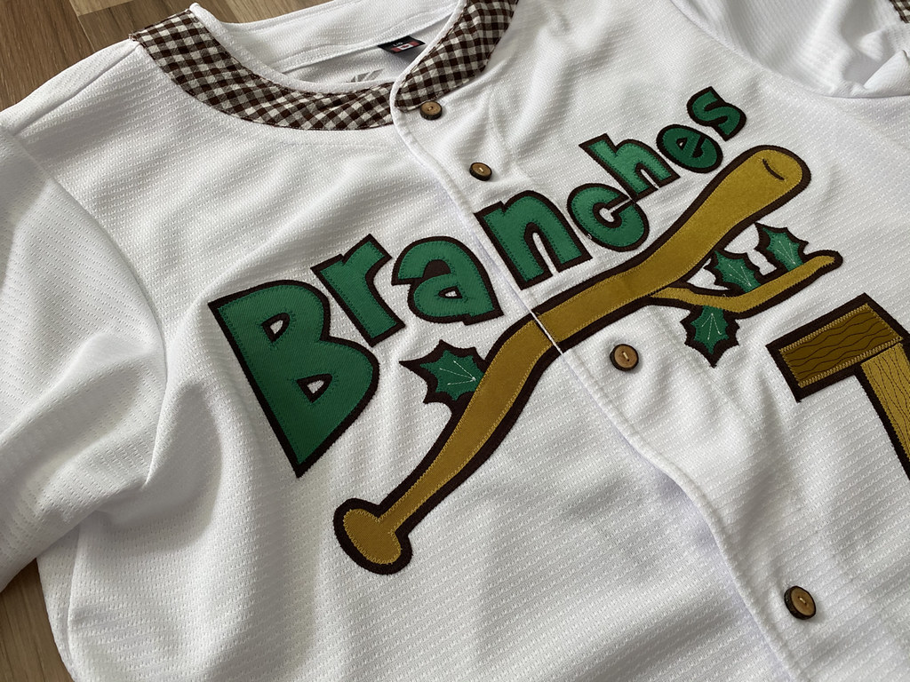
• Ron’s concept called for wood buttons. It was my idea to use wood from the original branch, so I gathered several pieces of it after it fell and sent them to Wafflebored, who did a tremendous job of fashioning the branch pieces into buttons (including bark!):


• Wafflebored sewed everything himself and did an absolutely spectacular job of using stitches to simulate the grain in the wood and the veins in the leaves. Check this out:

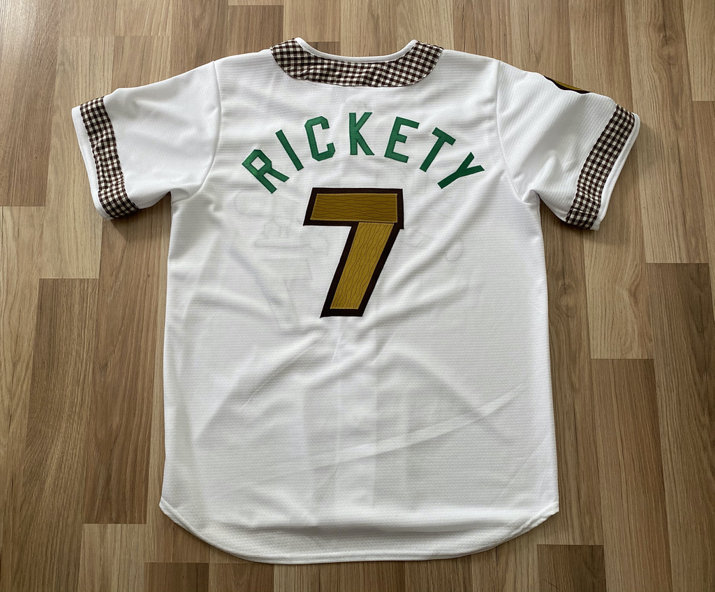
• Ron’s original concept for a Wonderboy mascot sleeve patch (referencing The Natural, of course) was too tricky to execute, but Wafflebored came up with a different patch design that works just as well:

• As for the back, Branch Rickety will live on, at least as an NOB:
———
Is that all amazing of what? Please join me in thanking Ron for coming up with this concept and to the amazing Wafflebored for executing it so painstakingly and brilliantly. What a project!
And there’s more: Wafflebored used some leftover pieces of the branch to make lapel pins! Dig:

So what’s going to happen to this one-of-a-kind jersey? We’re going to auction it off and donate the proceeds to the Arbor Day Foundation, so Branch Rickety’s demise will help grow new trees.
That auction begins now. Here’s what you need to know:
1. The jersey measures 23″ pit-to-pit across the chest and 31″ from top to bottom — about halfway between Large and XL. (Of course, even if it doesn’t fit you, it would still be a cool thing to own.)
2. The auction winner will also get one of the lapel pins. (Ron, Wafflebored, and I will also be keeping one lapel pin apiece, which will leave 11 pins remaining. I’ll probably raffle those off at a later date.)
3. This will be a blind auction, with the bidding starting at $200. To participate, email your bid to me by 8pm Eastern this Thursday, Aug. 6. High bid wins. Simple as that.
Can’t afford to get in on the bidding for the jersey? We will also have some Brooklyn Branches T-shirts (probably this week) and cap (next month), so stay tuned for that.
I cannot even begin to express how much fun it is to collaborate with talented people like Ron and Wafflebored. Guys, it’s a privilege to have had a role in this with you — thank you, thank you, thank you.

Click to enlarge
ITEM: August Pin Club launch: The Uni Watch Pin Club’s design for August is now available. As you can see above, it’s a tribute to old-time baseball scoreboards, complete with a few misfiring lightbulbs.
Like all of our Pin Club releases, this one is a collaboration between myself and the great Todd Radom. It’s been produced in a numbered edition of 250 (click to enlarge):

As you might suspect, the line score and the 4:07 time on the clock are not random or arbitrary. If you know who I root for and who Todd roots for, you may be able to figure it out. Guess the scoreboard!
I soft-launched this pin on social media over the weekend. As of this morning, 84 had sold, so there are still plenty of them remaining. Again, they’re available here.
Speaking of pins: There are about 50 of the July bobble-pins remaining. Those are avaialble here. And while we’re at it, you can also get the January (pennant), February (Presidents), March (March Madness and St. Paddy’s Day), May (Indy car), and June (uni-ty and solidarity) pins. (Sorry, April sold out!)
Looking ahead: The September pins are in and October is currently in production. Both look tremendous — you’re gonna like, I’m fairly certain!
The Ticker
By Jamie Rathjen

Baseball News: The Braves are keeping things simpler this season by not wearing their weekend cream alternates, and are sticking to two jerseys each for home and away games (from multiple readers). … Orioles P Tommy Milone is apparently the first player for the team to wear No. 69 (from Bryan Duklewski). … Reader Rodney Meyer has now made two pairs of Royals/Chiefs cornhole boards. “Just completed a set for my niece,” he says. … The Taiwanese team Uni-Lions have unveiled the uniforms for their upcoming Kamen Rider theme nights (from Jeremy Brahm). … Before Mets DH Yoenis Céspedes opted out of the remainder of the 2020 season yesterday, reader Austin Gillis noticed that the Braves’ organist played the song “Greensleeves” when Céspedes came up to bat — an apparent reference to his neon compression sleeve.

Football News: Rutgers has new uniforms coming today (from multiple readers). … Cross-posted from the baseball section: Rodney Meyer has now made two pairs of Royals/Chiefs cornhole boards. “Just completed a set for my niece,” he says. … The Navy SEALs are investigating after a demonstration of working dogs at the SEAL museum in Florida had the dogs attack a man wearing a Colin Kaepernick jersey over his protective suit (from Timmy Donahue). … A CBS Sports columnist thinks he may have spotted a hint of of what the Washington Football Team’s new name will be (from Andrew Cosentino).

Hockey News: Predators C Matt Duchene has something probably known only to him written on the shaft of his stick (from @the_casserole).
.

Soccer News: Here are some items from the opening weekend of the Scottish Premiership, one of the only leagues to begin its 2020-21 season on time, starting with its new number/NOB font. … Players wore Show Racism the Red Card warm-up shirts, and each one had different quotations and phrases on the back. … Aberdeen’s “sleeve ad” recognizes the club charity’s coronavirus response. … The league’s title advertiser pulled out last season, so the logo on its sleeve patch is now in team colors, instead of the previous black and red. … Two new shirts for German team VfB Stuttgart. … Also in Germany, Werder Bremen had their women’s team reveal their new first kit, which is the second time I’ve seen a club fielding both men’s and women’s teams do that. There are also second and third shirts, the latter of which is the city-themed shirt worn at the end of last season. … English League Two team Southend United released a new first shirt. They were one of the teams that was paid to go without a front-of-shirt ad last season. … New shirts also for Russian club Lokomotiv Moscow (from Ed Żelaski) and for the top-tier Spanish futsal team ElPozo Murcia (from Jeremy Brahm). … Some big teams have their outfitter’s logo as a pattern of seats in their stands, which means it has to change sometimes. Liverpool changed theirs to Nike from New Balance yesterday (from Moe Khan). … Moe also points out that Liverpool’s new shirt was revealed without a sleeve ad; the men’s team had one but the women’s team didn’t last season.

Grab Bag: The NPR show Wait Wait… Don’t Tell Me! this weekend asked comedian Ramy Youssef three questions about unusual uniform ads or team names for the segment “Not My Job,” in which a celebrity guest is quizzed on something not related to what they do. Youssef is from New Jersey, so they asked him about jerseys (from my brother Nate Rathjen). … Australia’s National Rugby League held its Indigenous round this weekend. You can see the teams’ shirt designs here. … Staying in Australia, Super Netball started this weekend, and some teams stood together in a circle before their games, much like what some NHL teams have been doing. … The Japanese men’s volleyball team Saitama Azalea has a new logo (from Jeremy Brahm). … Also from Jeremy: A Formula One YouTuber ranked the drivers’ helmets for this season. … Fox Sports Wisconsin is holding a “jersey tournament” featuring various men’s and women’s college and pro teams in the state (from @mikeobs). … The Waterloo, Iowa, police department wants suggestions for a new “secondary patch” (from Timmy Donahue).
Click to enlarge

What Paul did last night: As we sit on the porch each evening, we’ve become oddly fixated on car door handles. There seem to be two primary types, which we refer to as lifters and pullers.
See the car parked right in from of Uni Watch HQ? Its door handles are pullers, because you have to pull on them to open the door. For that car, the puller handles are chrome, which is a common design trope:

But sometimes the puller handle is the same color as the car, so it blends in instead of contrasting:

Then there are lifter handles, which you use by lifting them up. They tend to appear more often on older cars, and they too can be either contrasting or the same color as the car:


I’m sure the industry has more specific terms for these handle designs (anyone care to enlighten us?), but we like lifter and puller (maybe because it reminds us of the 1990s indie band Lifter Puller). Sometimes we’ll be sitting on the porch, watching cars drive by and noting the handle styles: “Puller … puller … whoa, lifter on a new car!”
I had never really thought about car door handles before. Now I’m mildly obsessed with them, although I’m sure this too shall pass.
As always, you can see the full set of daily Pandemic Porch Cocktails™ photos here.
Tomorrow: My long-promised trading card — the one originally planned by Topps but then nixed by MLB and ultimately turned into a new creative project — finally comes to fruition. You’re gonna like it, I promise! See you back here then. — Paul
Jason Torchinsky put together a comprehensive taxonomy of door handles:
link
Oooh, that’s excellent. And his lists our lifter and puller as “lift-up” and “pull-out” — we were close!!
Didn’t expect to see Lifter Puller mentioned on the blog today!
Time to go spin some Hold Steady!
Fiestas and Fiascos…what a great album title! For those readers not familiar with Lifter Puller and The Hold Steady, get Kraken!
Dang! Art beat me to the link from Jalopnik!
Interesting how the Washington article very subtly suggests, without suggesting, that the name could be link or maybe even link.
As a Marvel reader, Thunderbolts strikes me as kind of perfect given that this was the name of a new team of super-heroes that turned out to be villains in disguise.
Dan Snyder is a bigger supervillain than Baron Zemo.
Great job Wafflebored! I’ve enjoyed watching this project come together and can’t wait for what comes next!
Paul, with all your porch sitting I just realized it is likely a prime time to play “My Car, Your Car”.
How do you play? Well, you simply decide who “goes” first start the game. Then as cars pass, the first car goes to the first person (imaginarily, of course), the next car to the next person. Who had the best/coolest car that round? That’s it. That’s the game. You just keep doing that as cars go by.
My Dad taught me this game when I was a kid. Simple.
It’s always fun to see who gets a real klunker!
Do you get a lot of traffic on your street?
It’s not a *lot* of traffic, but it’s sort of steadily intermittent, if that makes sense. We’ll have a few minutes with nothing, then a couple of cars, then another car-free minute, then three cars, etc. Plenty of speed bumps, so nobody’s going too fast.
Digging the August pin.
Great craftsmanship on the branches jersey by Waffleboard.
The door handles on my first car (a 1980s Volkswagen) were squeezers. You gripped the door handle and used your fingers to pull a smaller lever toward you to open it. Not sure if Volkswagens use the same door handles today. I think that design dates back to the original Beetles.
I had a 93 Geo Storm that was similar. The openings were on the seam of the door and you simply put your hand into the opening and squeezed the mechanism to open the door.
That’s crazy about the car handles. I has this exact conversation with my friend at college. She had a lifter handle on her car and I’d always comment on how I didnt like opening it. She, of course, jokingly made fun of me and said something along the lines of “Andrew, you are the only person who would comment on that sort of thing.”
Guessing the game from the scoreboard in the pin is driving me nuts.
I cannot find any Notable Mets game That ended 5-4, less so one that ended at 4:07 PM.
Any hints maybe?
You’re using some of the clues I provided, but not all of them!
I feel like it’s something Mets and Nationals based.
I can think of a Mets-Braves game that ended at 4:07 *AM*, but the line score isn’t right for that one!
Re: the Wait Wait Don’t Tell Me quiz:
There was also a baseball team with the name of That Peace Symbol whose replica cap used to be sold by the Cooperstown Ballcap Company. I do not remember the city, though.
Wafflebored is simply amazing.
Right? Leaving aside the jersey itself, the buttons and lapel pins alone are so cool!
Does anyone remember push button door handles?
Oh, man, yeah! Haven’t thought of those in decades. When I was a kid, my mom drove a yellow Volkswagon beetle that had push-button handles.
Re: Guess the Scoreboard…
Looks like 8/30/15 per the ultimate Mets database.
Ding-ding-ding! Rodney has correctly guessed the scoreboard!!
My favorite team is the Mets; Todd’s is the Red Sox. Since this is the August pin, we wanted the line score to be a Mets/Bosox game that took place in August. I pulled rank and said it had to be Mets victory. The one game in history that fits that description is this one: link
The time on the clock is when the game ended, based on the starting time plus the listed game length.
Good sleuthing, Rodney!!
Your clue above about knowing Todd’s team is what did it. Found an old Page 2 article where you interviewed him, and then it was just a matter of finding the game on the database.
That was fun!
As an aside, that Wafflebored jersey is amazing.
I was thinking Mets-Red Sox too, but went right to the 1986 World Series, looking for a game that took 4 hours and 7 minutes. Thought it might be Game 7 (which it wasn’t); I would never have looked for a regular-season interleague game!
Thank you. Was driving me nuts!
Well I guess that I was wrong. Darn Twitter sleuthing leading me down the wrong path! Oh well, great job, Rodney!
Thanks for solving that. I too didn’t consider Todd’s favorite team, and was looking for a legendary Mets game without success.
that’s just part of being a Mets fan.
*sigh*
Me too. I thought Todd liked the Mets, silly me.
So excited for the release of your card, Paul.
Can. Not. Wait.
I truly believe I was more upset you weren’t getting an official Topps card than you were. I am very excited to see them!
What a tremendous project. Fantastic concept by Ron Ruelle, magnificent execution by the great Wafflebored.
Great job Wafflebored! This is next level stuff with the numbers looking like wood and the carpentry that went into creating the buttons. What really blows me away is how quickly your projects get done. We hear about something in the works and it is completed with quality before I ever would expect it to have been done.
The downside of this: please refer to the comment regarding this upside down S.
Is the “S” on the Branches jersey upside down?
Yes it is. I was hoping no one would notice. Good eye!
Hey Wafflebored-is there a reason the houndstooth/check pattern was added as an accent?
Part of the original sketch as designed by Ron. In his description, he describes it as a lumberjack pattern to tie into the overall theme.
Imagine how great that pattern would look on the pants stripes.
It is super creative Monday. The pin and the jersey are awesome! Love it.
Aside from the general awesomeness of Waffleboard’s work on the jersey, the project also demonstrates what an excellent color scheme green and brown is.
The awesomeness of green and brown: also one of my conclusions in doing this project.
One of several criminally underutilized color schemes in sports!
Not many uniforms using green and brown colour scheme. All I can think of:
-Toronto Maple Leafs when they dressed as the Toronto St. Patricks over a decade ago. However, they were not really trying to dress like a green and brown tea. The brown was there to represent leather that was not coloured for this throwback.
link
-Gary Gait era Victoria Shamrocks in Senior “A” Western Lacrosse Association. Not sure if it was intended to be bronze, but looked like brown trim for a short period on the Shamrocks uniform.
link
Love the Branches jersey, great number choice!
“what an excellent color scheme green and brown is.” Agreed. As if nature knew what it was doing.
Another addition to handles, “push buttons”. My Jeep wrangler’s handle is fixed but the thumb button depresses to open the door.
Absolutely stunning work by Wafflebored on that Branches jersey! Kudos to him on great execution and Ron for a great concept. And to Paul for… contributing the branch! :-D
Even the tag has a maple leaf.
GREAT job on the jersey! Love the wood-grain numbers.
Paul, I believe you are correct about older vehicles having lifters. I read somewhere that style fell out of favor because those among us with decorated or enhanced fingernails were breaking them on lifters. Pullers don’t create a situation where you might jam your nails against a hard stop.
Very late to the party today, but I couldn’t let today’s post go without recognizing the incredibly detailed work done by Waffleboard on that jersey. The whole execution of the project – from the initial description by Ron to the materialization of the jersey – just puts a huge smile on my face.
Long live the branch.
Lift-up car door handles are definitely passe. I’ve hated them since I broke the driver-side handle off on my old ’01 Camry on a brutally cold NJ January morning. The replacement I got wasn’t nearly as good as the original.
Another entry to the door handle weirdness: The Lexus LC500 has recessed handles that only pop out after pushing a button (seen on this Youtube review: link)