For all photos, click to enlarge
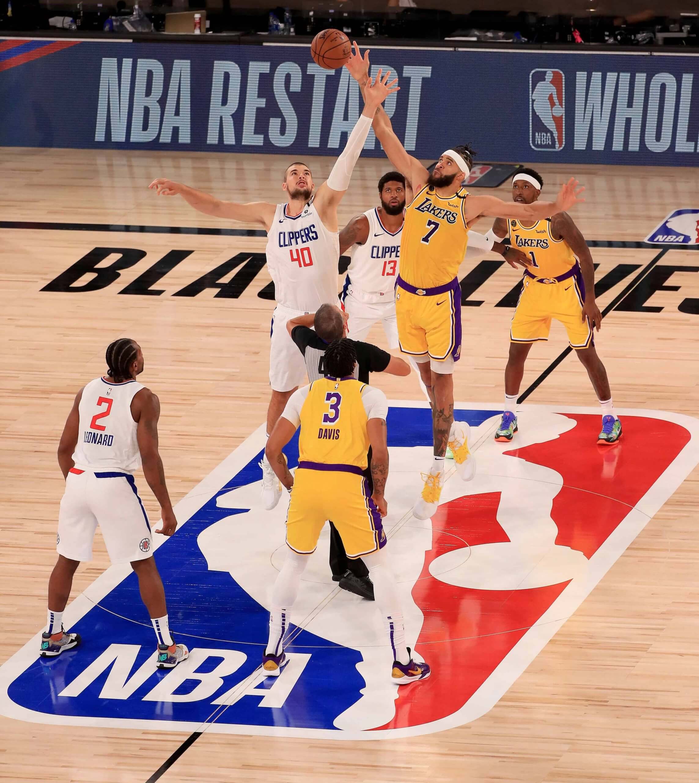
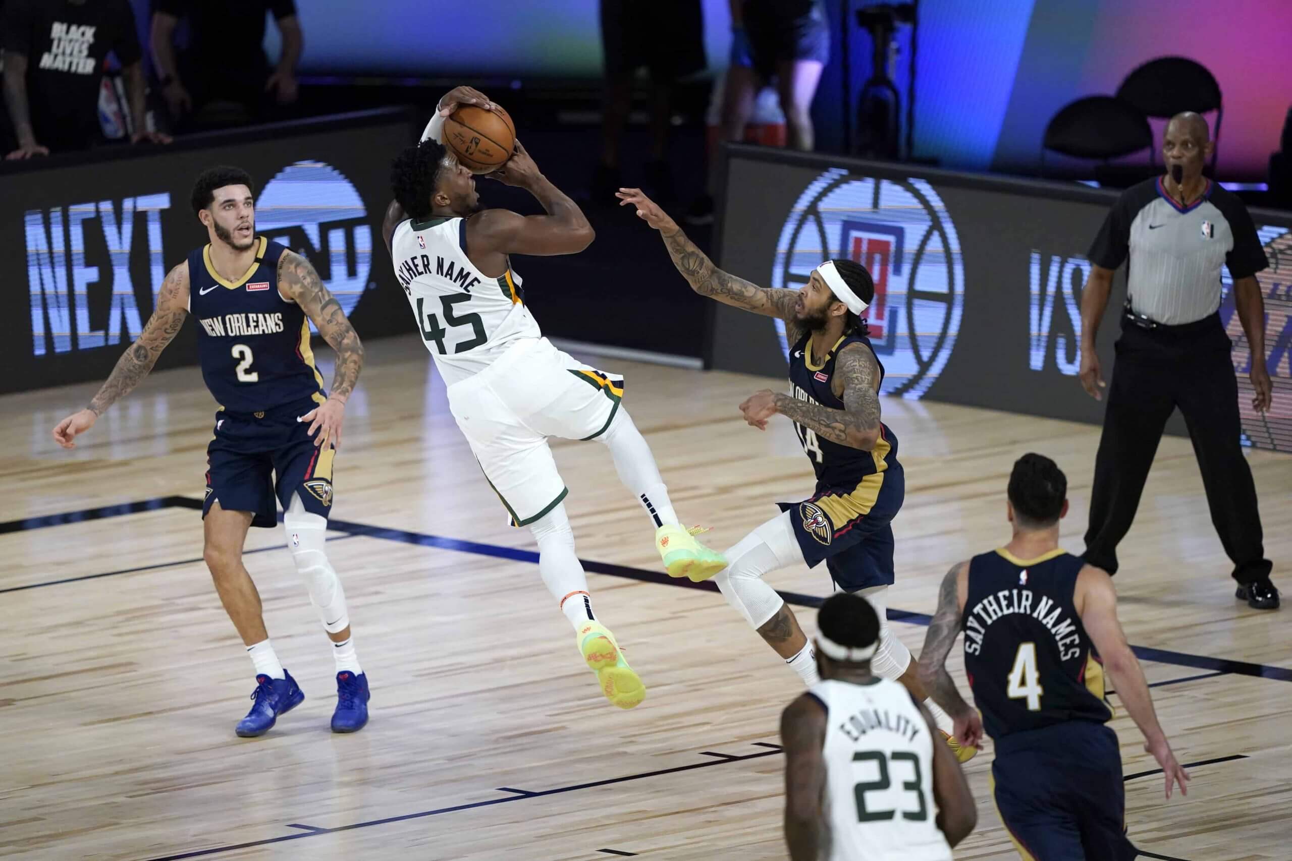
Some surprising developments during last night’s NBA restart. As expected, many players opted to wear social justice messages in place of their NOBs. But players who chose to wear their surnames instead of the messages ended up wearing them below their numbers, instead of above.
This created an odd visual jumble — both for the individual teams and for the game as a whole — with some players having lettering above the number and some below:
To my knowledge, this inconsistent format — message above or name below — was not announced in advance. What was announced, back on July 3, was this:
The messages will be displayed above the number during the first four days of the season restart, a source told The Undefeated. Players can have a first and second choice, but they do not have to use the space for a social message, the source said. If they do not, the player’s last name would appear in that space.
After the first four nights, a player can simply go back to their last name. If they choose to continue showing a social message, their name would go below the number.
In other words, the initial plan was for standard NOBs to appear above the number, same as always. Player names were only slated to go below the number in addition to to social justice messages (and only after the first four days of the resumed schedule), not instead of them.
Obviously, some changes were made — and were not announced or reported — in the intervening four weeks.
None of this was apparent during the Jazz/Pelicans game that preceded the Lakers/Clippers game. That’s because, as far as I could tell, every Utah and New Orleans player wore a social justice message, so all the lettering was above the numbers:
Prior to both games players from both teams wore “Black Lives Matter” T-shirts, stood along a “Black Lives Matter” slogan printed on the court, and kneeled during the national anthem. Coaches and officials joined them:
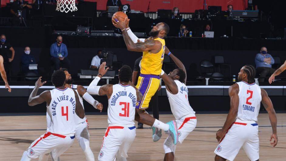
Just about everything else looked the same as it usually does. The Lakers still have their Kobe Bryant memorial patch, and all teams are still wearing the black memorial band for former commish David Stern.
One uniform change, however, is likely to come tonight, when the Rockets play the Mavs. If Houston’s preseason scrimmages are any indication, they will no longer be wearing their uniform ad, which will make them, by definition, the best-looking NBA team.
Footnote: If you care about corporate theater, then you’ll be interested to know that current commish Adam Silver was wearing the wrong lifestyle conglomerate’s cap last night:
@UniWatch a uniform foul by @NBA commissioner, Adam Silver.
He’s wearing an old @adidas #NBA hat than a current @Nike league hat. pic.twitter.com/3Uk4h8Ur3I
— Moe Khan (@MoeKhan19) July 31, 2020
Maybe someone at Nike could send him a Uni Watch seam ripper..?

Click to enlarge
Brooklyn Branches update: What you see above are buttons made from Branch Rickety (the long-hanging branch across the street from Uni Watch HQ that finally crashed to the ground about a month ago). DIYer Wafflebored made them from pieces of the branch that I salvaged and mailed to him, and they’ll be used on the one-of-a-kind Brooklyn Branches jersey that he’s basing on reader Ron Ruelle’s concept.
But buttons aren’t the only part of the jersey that Wafflebored’s been working on. Here’s a teaser:

Does that look amazing or what? It’s a sleeve patch! Ron’s original “Wonderboy” mascot patch was too tricky to execute, so Wafflebored came up with this, based on Ron’s cap logo concept. Looks sensational, no?
When the jersey is finished, we’ll auction it off and donate the proceeds to the Arbor Day Foundation, so Branch Rickety’s demise will help bring new trees to life. More updates soon — stay tuned.

ITEM! New project: Back when it was safe to go to a movie theater, I often found myself at the IFC Center in Manhattan. They sold a fun line of T-shirts called Cinemetal, which featured the names of famous film directors rendered in the style of heavy metal band logos. The designs were clever, and I never got tired of seeing the promo for them that would run prior to every movie.
That recently got me thinking. Rock bands have often saluted sports design by mimicking it. The Replacements, for example, created a great 2014 gig poster patterned after the Minnesota Twins’ logo; Pearl Jam has done countless similar posters (including this one, saluting their hometown Seattle Mariners); and the Rolling Stones announced a 2015 stadium tour by applying team graphics to their famous lips/tongue logo.
So if movie theaters can mix film directors and rock design, and rock bands can mix sports design and music design, why not mix music design with a blog devoted to sports design?
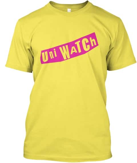
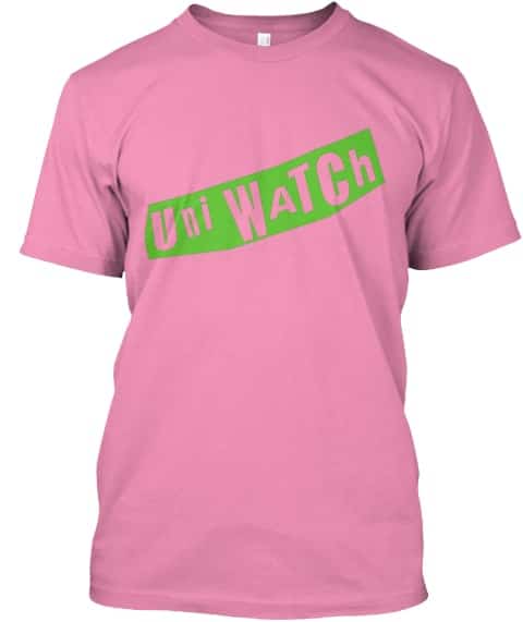
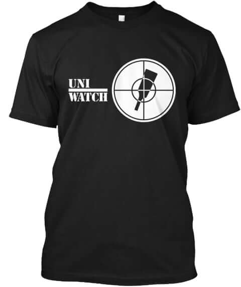
The result is Uni Rock, a new line of T-shirts I’ve worked on with designer and longtime Uni Watch collaborator Scott M.X. Turner. I’m a former rock critic, Scott’s a longtime active musician, and we both love music design as much as sports design, so this was a particularly fun project for us. Here’s what we have so far:
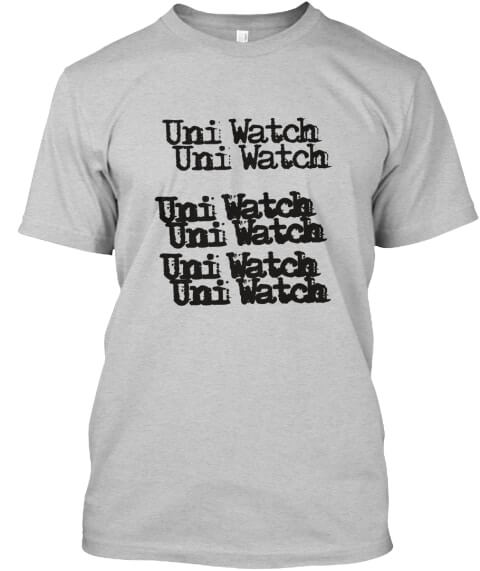
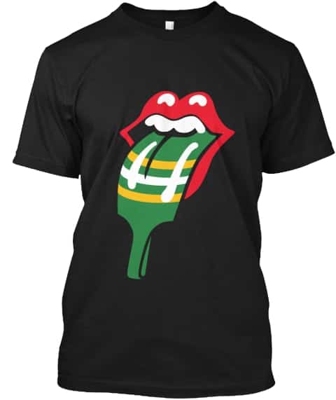
My favorite, by far, is the first one. As a huge Hüsker Dü fan going back to 1983, I love seeing “Uni Watch” rendered in the style of their logo.
The rest of the project is gravy. I realize we’re taking some liberties here, but so are the Cinemetal T-shirts and all those other examples I cited, so Uni Rock is following in some fun footsteps of logo take-offs and mash-ups. If it all gets shut down tomorrow, eh, whatever — it’s still been a fun project. (And if it doesn’t all get shut down, we’ll add some more designs next week.)
All of these are now available in our new Uni Rock Shop. Enjoy!
A few merchandise updates: After four days, we’ve sold through nearly 160 of the 200 Uni Watch Key Rings. They’re available here while supplies last.
While we’re at it:
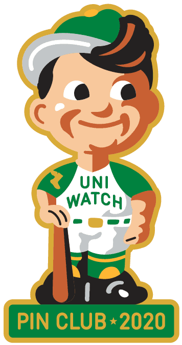
• As of the morning, there are fewer than 60 Uni Watch Pin Club bobble-pins remaining. Those are available here. (The August pin will soft-launch either tomorrow or Sunday on my Twitter feed, and then I’ll give it the full showcase treatment here on the blog on Monday.)
• Blue seam rippers are currently out of stock. I have ample supplies of red, yellow, and white, and just a few green. They’re available here.
• For the Uni Watch Classic Cap, most fitted sizes are available, and we have plenty of adjustables. Get yours here.
• And remember that Uni Watch cufflinks, which normally sell for $26.99, are still on sale for $16.99.
My thanks, as always, for your consideration.

Membership update: Some number fonts are so closely associated with their teams that the resulting membership cards look particularly satisfying. Case in point: Jack Gallaher’s new card. It just screams, “Pirates!” I love that.
Jack’s card is part of a new batch that’s been added to the membership card gallery, as we continue to work our way toward our 3,000th card. (We’re now at 2,959.)
Ordering a membership card is a good way to support Uni Watch (which, frankly, could use your support these days). And remember, as a gesture of comm-uni-ty solidarity, the price of a membership has been reduced from $25 to $20 until further notice.
As always, you can sign up for your own custom-designed card here, you can see all the cards we’ve designed so far here, and you can see how we produce the cards here.
The Ticker
By Anthony Emerson

Baseball News: Old habits die hard: During last night’s game against the Twins, Cleveland SS Francisco Lindor covered his mouth with his glove while strategizing with C Sandy León and P Shane Bieber — even though he was already wearing a mask. Lots of players and coaches have been doing this (from @TheProhmKing). … During the same game, Fox had some issues with their CGI fans (from Ben Teaford). … The Big Lead has written a scathing critique of the quality of Nike’s MLB uniforms (from Kary Klismet). … Orioles manager Brandon Hyde is letting starting pitchers decide which jersey the team will wear that night, which is why their black jersey keeps getting trotted out (from Michael L. Hayden). … The Twins have another excellent social distancing logo featuring Minnie and Paul (from Caleb Jenkins). … Nicklaus Wallmeyer sends along this YouTube video of MLB players coming into games wearing incorrect uniforms or caps. The video is three years old, so don’t expect Nathan Eovaldi’s 17-7-17 mishap from last week. … Wondering how MLB teams are making those cardboard cutouts of fans? Wonder no further (from Mike Chamernik).

NFL News: According to RB Antonio Gibson’s Instagram, it appears Washington will have “TEAM” as the NOB on their practice jerseys (from Preston Penn).
.

Hockey News: The Bruins have added a memorial decal for Oilers C Colby Cave, who died at the age of 25 back in April. Cave began his professional career in the Bruins’ system and played 23 games for Boston from 2017 to 2019 (from Brandon Weir and Kevin Rice). … NHL arena workers are using pool skimmers to collect pucks that fly out of the rink in the bubble cities (from Mike Chamernik and Wade Heidt).

NBA News: The NBA has added a cloth covering to refs’ whistles to “prevent the spread of spittle” (from Jeremy Brahm and Mike Chamernik). … Robert Bacon was watching some 1978 New Orleans Jazz highlights on YouTube when he noticed G Slick Watts was wearing a uniform with a wordmark worn by the team only in 1974. Every other player had the correct wordmark for 1978. “Watts was traded to the Jazz midway through that season,” he notes, “so maybe they just grabbed an old jersey that was laying around.”

College/High School Hoops News: In 1991, when most ACC teams were adding American flag patches to their jerseys to support the Gulf War effort, UNC coach Dean Smith resisted adding the flag patches. He said, “Why don’t we sew flag patches on college uniforms to support the homeless or social causes besides war?” But public reaction to his stance was largely negative, and he eventually had the flag patches added (from James Gilbert).

Soccer News: The Canadian Premier Leauge has unveiled the away kits for all eight of their clubs. You can watch the 45-minute unveiling here (from Wade Heidt). … Roma officially launched their stunning new away kits during Wednesday’s match against Torino (from Brad Cavallo). … Arsenal’s new cup font will be basically illegible from a distance of more than a few feet (from Kim Kolb). … Liverpool’s new away kit has leaked, their first with their new Nike contract (from @sheds88). … Bury AFC, a club founded by supporters of Bury FC fed up with years of mismanagement that resulted in Bury FC’s expulsion from the English Football League, are allowing fans to pay to have their names printed on the new club’s first kits (from David Tra and Germán Cabrejo). … Celtic’s new away kit has leaked. “I doubt [it] will be used much because it doesn’t differentiate itself enough from the home shirt’s green and white hoops. The third shirt will be black,” says @texastrevor. … The following are all from Josh Hinton: Spurs have launched their new home and away kits (also from James Beattie). … Leicester City’s new away kit has leaked. … English Championship side Middlesbrough have unveiled their new kits. … Juventus’s new kits have been officially launched, confirming countless leaks. … Lazio released their home and away kits. … Portuguese giants Benfica also unveiled their new home and away kits. Anyone else getting 2019-20 Manchester United vibes with that home kit, especially the gold-and-black badge? … The Luxembourg national football team has some gorgeous new kits. “They are made by Macron, as part of a kit-assistance program UEFA put together for smaller nations,” says Josh. … You can catch the rest of Josh’s daily download on his Twitter page. … Forward Madison’s new training top was designed by the club’s African American supporters’ group and features several Black Lives Matter-inspired designs. Proceeds from sales of the top will go to the local YWCA (from Scott Rogers). … Richmond Kickers of USL League One have unveiled renderings of their planned stadium upgrades (from Kary Klismet).

Grab Bag: The NCAA will allow players in all sports to add social justice statements to their uniforms, including replacing NOBs to celebrate or memorialize people and causes (from multiple readers). … Australian Football League team Gold Coast Suns have unveiled their Indigenous guernsey for 2020 (thanks, Jamie). … A group trying to bring a second National Rugby League franchise to Brisbane, Australia, has unveiled a logo and a name for the team: Brisbane Firehawks (from Timmy Donahue). … Also from Timmy: the NAACP branch in Arlington Co., Va., is calling on the county to drop its logo, which depicts the Curtis-Lee Mansion, the onetime home of Robert E. Lee. … McLaren F1 driver Lando Norris will wear a helmet designed by a six-year-old during the British Grand Prix (from @nomuskles).
Click to enlarge

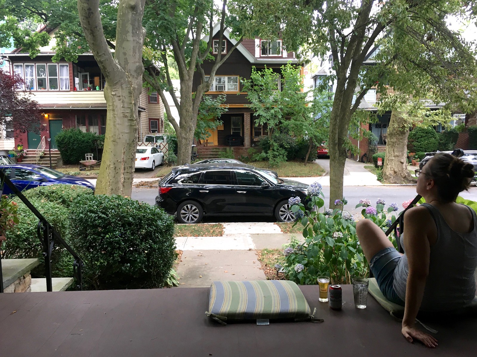
What Paul did last night: As we sit on the porch each evening, there’s a cast of characters we frequently see as they go by. There are the Two Old Russian Ladies with the Three Very Small Dogs; the Couple Who Are Always Arm-in-Arm; the Jogger Who Always Looks Like She’s About to Collapse; the Blonde Woman and Her Impossibly Cute Blonde Daughter; the Woman Who Has Very Good Posture; and so on. We don’t see these people every day, but we see them often enough that they’ve become familiar to us, just as we’ve presumably become familiar to them. We don’t know their names, but we nod and sometimes wave as they go by.
And then there’s Guy with the Green Bandana. He has a particularly interesting ritual: Most days he walks past us and meets up with his friend (or maybe boyfriend..?) the Guy with the Greyhound, who’s usually just coming around the corner from an adjacent street. And then they both walk back past us. We learned months ago that the greyhound’s name is Baz, but we never learned either guy’s name.
Yesterday the Guy with the Green Bandana walked by on the sidewalk, gave us a perfunctory wave, and then stopped. He turned and said, “I feel like I’ve known you for months, but we don’t even know each other’s names. I’m Gabe.”
It was a really nice moment. We introduced ourselves and learned that the Guy with the Greyhound is named Dan.
The pandemic: bringing people together (eventually).
As always, you can see the full set of daily Pandemic Porch Cocktails™ photos here.
If you’re a longtime reader, you know I usually turn the site over to Phil for the month of August. But things will be a little different this year. I will be running the show as usual next week, Phil will run the site the week after that, and we’re still figuring out how the rest of the month will play out. We’ll keep you posted. Have a great weekend, and I’ll see you back here on Monday. — Paul
the Cheap Trick/U-W shirt is the best thing I have seen in months!
I’d agree, except for me the Hüsker Dü version is even better. The whole project is such a fun idea, so well executed.
The Never Mind the Bollocks-era Sex Pistols shirts are awesome, but I’d be much more down for a Clash version.
If record labels are fair game alongside bands, I’d love to see a Uni Watch version of 2 Tone Records’ famous logo link
The Never Mind the Bollocks-era Sex Pistols shirts are awesome, but I’d be much more down for a Clash version.
Like I said, we’ll have more designs next week. Stay tuned!
Glad you like the project (esp. the HüDü design!).
How about some Led Zeppelin?
link
Love the Stones’ logo, except the fact that it’s on a black shirt.
Which color would you prefer?
Maybe yellow…
It would look good as a patch and pin, too.
Too bad Kyle Koster of The Big Lead didn’t do his homework to find out that Nike isn’t making the new jerseys, just adding their logo to the old Majestic uniforms. Pretty half-assed journalism.
As per Paul himself on the InsideHook season preview: “Also, this season’s jerseys are being made with the exact same fabrics and tailoring that Majestic used. They are literally the same product except for the Nike logo replacing the Majestic logo.”
I was just going to say the same thing. I like Nike, BUT, the front swoosh has to go. It belongs on the sleeve, just like NFL.
The stories of the Pandemic Porch Cocktails remind me the Billy Joel song “Captain Jack”. Obviously not in the same context, but Joel got his inspiration looking out his window in Long Island, watching kids go into a drug dealer’s house name Captain Jack. He wondered what their stories were. Why they were doing drugs, and why choosing to go to the dilapidated projects of this drug dealer.
It seems you and Mary are doing the same for the individuals that go past your house. Wondering “what their deal is” and maybe even creating backgrounds for them. If I am assuming this, and it offends you, I sincerely apologize. But I find myself doing this exact thing. Giving familiar passer-bys a name and a story. I see them almost every single day, and don’t know anything personal about them, so I make something up.
That’s what kind of makes the story with Gabe so great. He “broke the wall” by introducing himself to you. I love that. Maybe I will take that as inspiration and do the same.
Absolutely no offense taken, John. And no, we haven’t projected any storylines onto any of these characters. Perhaps that’s a failure of imagination on our part, or maybe I just prefer the mystery, the sense of not knowing and not *needing* to know. But yes, Gabe’s move yesterday was really wonderful!
On a similar note, I’ve been going on a morning bike ride a few times a week lately, and without fail, I see the same older gentleman out for a walk on the same stretch of sidewalk, wearing the same clothes every time I see him. (I’m also wearing the same clothes every time we cross paths.) We’ve started saying good morning to each other as I ride past. And I have to say how charming I find the whole thing. It’s nice to feel neighborly in a time of isolation.
It’s funny: while reading today’s Pandemic Porch Cocktails entry the styling of the “characters” struck me as Pythonesque. As in “The Very Big Corporation” or “The Ministry of Silly Walks”, “The Machine That Goes Bing” and so on. I think “The Jogger Who Always Looks Like She’s About to Collapse” and “the Woman Who Has Very Good Posture” in particular sounded that way in my head. Great stuff Paul!
As one of the two resident Tottenham fans here, just a quick word on those new Spurs kits. The forest green away kit is, to my knowledge, not a color Spurs have ever worn before. I think it looks really sharp as a second kit!
I’m less happy with the white home kit, which looks like it was designed by a designer who just woke up from a Rip Van Winkle style nap that started in 1993.
There have been some leaks of an all yellow third kit, which I’ve liked, and a gray fourth kit, which is confounding, completely unnecessary, and very, very, ugly.
Isn’t the fourth kit based on some shoe or something? That makes it even more unnecessary.
Yeah I believe it’s based on a Nike Air Max, which is a cool shoe, but has nothing to do with Spurs.
What do you think of the home, away, and third shirts?
I like the first shirt more since I’ve seen the back, where the shoulder stripes aren’t obviously shoulder stripes because they join up with some extra blue accent below the collar. Not sure why that couldn’t have also been done on the front.
But I still like the second shirt more than that one, since green is always a good color choice, and the third shirt too if it’s yellow.
AJ – you are correct. Historical Football Kits shows that Spurs have never worn green. link
The singer of the Cleveland band Ringworm did metal logo riipoffs for the Indians team in 2018 and redid Chief Wahoo as Motorheads Snaggletooth logo.
link
Was not expecting to see Uni Watch rock t-shirts today!!!
As much as I love that Hüsker Dü mashup shirt, I have to take issue with one thing – that’s the band’s wordmark, not their logo. The actual logo was a vertical line with 3 horizontal lines crossing it, inside a circle: link
Sorry to be pedantic, but the Dü are one of my favourite bands…
A wordmark is a type of logo. They’re both logos.
If Hüsker Dü had decided to change the name of their band, most of the media would have commented that they were changing their nickname.
RE: article on the Nike baseball uniforms. Used to be a time when heavier jerseys with thick tackle twill lettering was the ideal, at least to me as a youth athlete and then as collector – “authentic” or game jerseys were called “pro weight” for a reason. I don’t think that term is sued much any more. If you got to a level of playing where your team wore those higher-quality jerseys, it felt like you really earned it. The new style jerseys are so flimsy and unappealing to me.
I totally agree with this. I really love heavyweight uniforms that were made to last, maybe even several seasons. I have a small collection of older game worn jerseys for the reason. I don’t care who the player was or any of that, but I love the heavy materials and built-to-last construction techniques.
Agree. I understand that performance materials are important, but the degree to which baseball and football have morphed makes ‘game used’ stuff really goofy to wear as a fan. And related to baseball, the shapes are getting strange and the fabric so thin that undershirts are bleeding through in a big way.
As an Oakland A’s and Rolling Stones fan, I think I’ve found my next purchase.
Typo alert:
The Canadian Premier Leauge
Re: Nike MLB jerseys. Isn’t this year’s uniforms using the old template just with a swoosh? May not be a Nike issue then
Can Fox PLEASE stop with the Fake CGI fans? The cardboard cutouts are bad enough…being supplemented by fake crowd noise. Crowd noise we know has been being pumped into stadia for YEARS.
Repurposing an old or classic logo for a new band or favorite pastime is one of my favorite hobbies. Some of my favorite artists have made a career of it. I find it helpful when something benign has a scary name, like “Moratorium”, “Similac”, or “Exterminator”.
I love the Uni Rock project! I can’t wait to see the next group of designs.
I’d like to suggest a Uni Rock mashup based on the Beatles classic drum head logo.
Love these uni rock designs.
MLB did something similar five or seven years back. Somewhere I have a black t-shirt with “Brewers” written in white on the front in link.
Watching Celtics/Bucks and was so happy to see the minimalist court with no ads. Then at the end of the first, digital ads appeared. They look terrible. Then I see why they were missing. The Ads are writing over the players. It isn’t just the Buck’s cream unis, the ads are writing over Player Skin too (All skin types). I hate the on-court digital ads. Maybe contracts require them, but get rid of the “home” team logos. They look awful and don’t add anything.
Thanks for tipping us to the Cinemetal shirts. I especially love the Ingmar Bergman one as I am a huge Iron Maiden fan. That font was also used in the David Bowie movie “The Man Who Fell to Earth”. link
I can’t wait to see which company will be the official pool skimmer of the NHL.
Not too much to add, but Minor Threat for Uni Rock please!
I don’t care what anyone says, that Public Enemy and The Rolling Stones uni-rock t shirts are CLEARLY… the best… no convincing me otherwise .