Honoring our past. Always evolving. pic.twitter.com/BBWqIG7p6p
— Indianapolis Colts (@Colts) April 13, 2020
With no advance warning, the Colts announced their uniform and logo changes yesterday. The video shown above isn’t bad (although I’d recommend muting the sound, which is annoying), so that’s a decent place to start.
Let’s take a closer look at the four five uniform changes (for all of the visuals, you can click to enlarge):
1. The New Helmet Logo
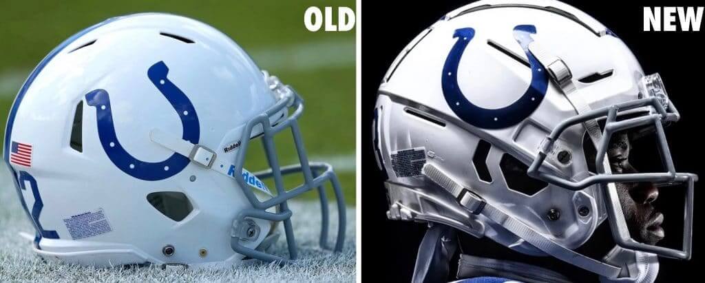
As you may recall, there was speculation that the Colts were going to tweak their helmet logo by making the horseshoe a bit more open, more rounded. That appears to have been confirmed by the photos that were released yesterday. My understanding is that the more open version is what’s shown in the NFL Style Guide, and somehow the shape of the on-field horseshoe morphed a bit over the years, so now they’re going back to the official specs.
The weird thing is that this change was not mentioned in any of yesterday’s announcements by the team. They did mention the horseshoe itself (“The horseshoe remains our most iconic and timeless mark, worn by some of the greatest players in NFL history and loved by some of football’s greatest fans, Colts Nation”), but they didn’t say anything about it being tweaked. I happened to be looking for it, due to the earlier speculation, or otherwise I wouldn’t have noticed. I asked a team spokesman for confirmation, and he said he couldn’t get an answer from the team’s equipment staff because nobody’s on-site due to the pandemic. I expect we’ll hear more about this later on.
As for the change: It’s fine. I like both versions and don’t have a strong preference. Here’s a comparison of the logos themselves, without the helmets:
@UniWatch @PhilHecken @sportslogosnet I didn't know (or forgot) until PL pointed it out today Colts had a different helmet logo. To compare I traced old helmet logo (from picture) and primary logo from Colts website and overlaid them (same width for comparison only). pic.twitter.com/BY5kaQKICP
— James Gilbert (@jamesleegilbert) April 14, 2020
———
2. The New Number Font
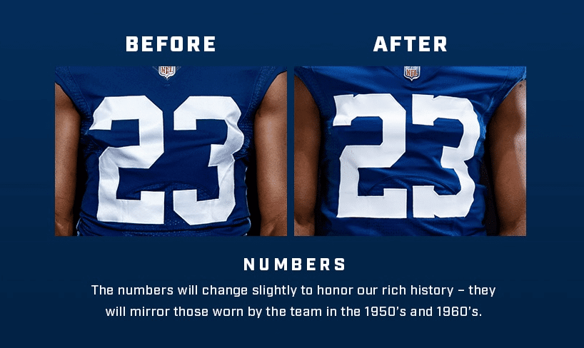
Probably the most significant change out of everything the Colts unveiled yesterday. Interestingly, they didn’t mention that the new font is the same one they’ve been using on their Color Rash jerseys. (It’s also what they used to wear back in the Unitas era. It’s not clear to me when they moved away from it. Unfortunately, all of the mockups on the mighty Gridiron Uniform Database use No. 11, which is the worst possible number for showing typefaces. Does anyone out there know when the Colts changed number fonts?)
But here’s another wrinkle: In recent years, they haven’t swapped out the helmet numbers to match the Color Rash jersey font. Now that they’re making that the primary jersey number font, however, they’re changing the helmet numbers to match:
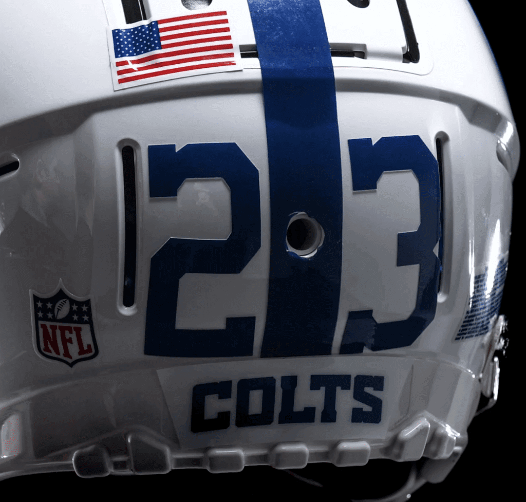
Personally, I love this font on the jersey and am less fond of it on the helmet. But jersey numbers are way more important than helmet numbers, obviously, so it’s a net plus in my book.
———
3. The New Maker’s Mark
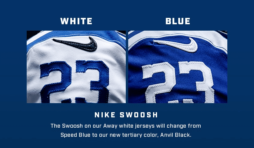
In a move that makes exactly zero sense and may hint at some seriously awful things to come, they’re changing the maker’s mark on the white jersey from blue to black. Technically speaking, it’s not BFBS, because they’ve also added black as a new team color, but that itself is a BFBS move, of course. In any case, however you choose to categorize it, it looks absurd, since there’s no other black anywhere on the uniform.
(I’m assuming the Nike logo on the white pants will also be changing to black, but that logo isn’t visible in any of the photos the Colts released yesterday. I asked a team spokesman about this and, again, was told that he doesn’t currently have access to the team’s equipment staff.)
You have to wonder what this addition of black to the team’s color palette could portend. A black alternate jersey? A mono-black uni with a black helmet if the one-shell rule is lifted? Let’s hope not.
———
4. The New Bumper Logo
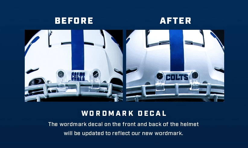
The Colts have a new primary wordmark (we’ll get to that in a second), so they’re putting it on their nose bumper. If you scroll back up a bit and look at the photo I posted of the new helmet numbers, you can see that the same change has been made to the rear bumper.
The new mark lacks the charm of the old one, but whatever — it’s not a big deal either way.
———
5. The New Inner-Collar Logo
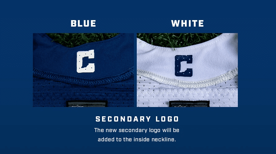
The Colts also have a new “C” logo (again, we’ll get to that in a sec), which they’re putting on the inner collar. This isn’t really a uniform change, since it won’t be visible on the field. It’s just a cynical merch move — something to make people more willing to spend a few hundred bucks on a polyester shirt. Pfeh.
———
You can see lots of photos here. The reality is that most fans won’t even notice any of these changes (which I don’t mean as a criticism of the team — there’s nothing wrong with tinkering with the details). Arguably the biggest news here is what hasn’t changed: They appear to be sticking with the old jersey template (but have ditched the Flywire collar). With the Bucs and, presumably, the Browns both transitioning to the new template with their new uniform sets, I think that leaves the Colts and Ravens as the last holdouts (and of course the Packers still wear the old Reebok template, but that’s a whole separate category).
Okay, so those are the uniform changes. Now let’s look at the logo changes:
1. The New Primary Wordmark
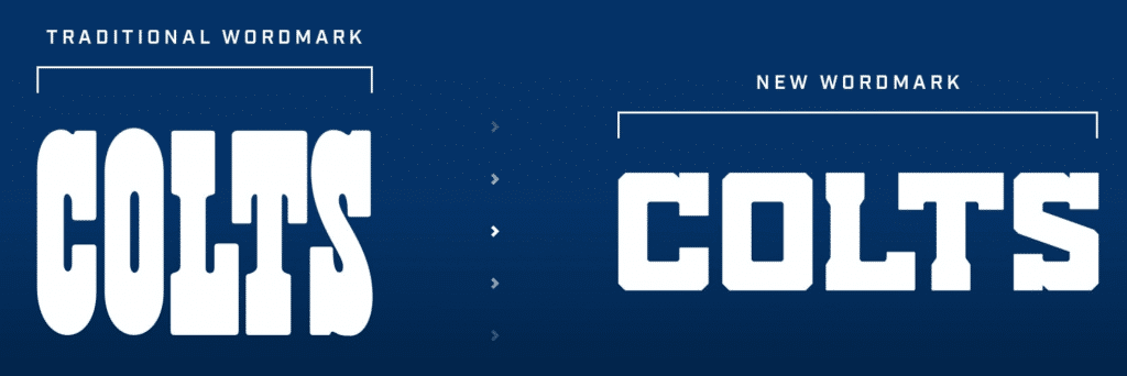
According to the team, “With this new design, our traditional wordmark becomes a classic mark and will be used primarily for historical or throwback campaigns and gear.”
This new mark feels completely characterless to me, but I don’t really care that much because its only on-field presence will be on the bumpers (and I suppose maybe in the end zones, but that’s not a huge deal to me either).
———
2. The New Secondary Logo
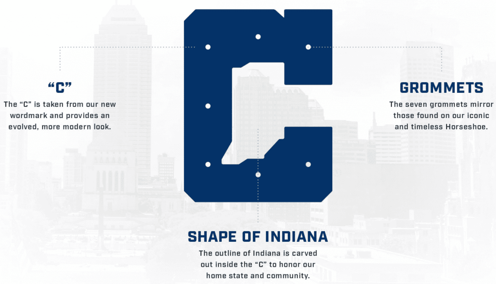
Before I say anything else, I want to mention that I have never seen the nail holes in a horseshoe referred to as grommets (granted, I’m not a horseshoe expert, but I do know a thing or two about grommets). Can someone with some horse knowledge tell us more about this?
As for the logo: I think this looks really forced. Again, it’s not a big deal because it’s not part of the uniform (cynical inner-collar retail ploy notwithstanding), but it doesn’t feel like a good piece of NFL design. Longtime reader/pal Jay Braiman points out that it looks a lot like the old Houston Gamblers logo (which also felt forced). Moreover, it appears to be very similar to the logo used by Cathedral High School, which happens to be in Indianapolis, so you’d think the Colts would be aware of it:
Congratulations to all those seniors out there making a commitment to continue their football careers at the collegiate level. #NSD17 pic.twitter.com/Ffz1hWVM4Y
— Cathedral Football (@CathedralFBall) February 1, 2017
I actually prefer the Cathedral version to the Colts version, because at least Cathedral didn’t include grommets nail holes in their design.
This is the second time in three weeks that an NFL team has released a logo with a troubling similarity to a pre-existing logo. The first instance, as you may recall, involved the Rams:
Who did it better, the Rams or Angelo State University? pic.twitter.com/EtPa3mBTN8
— Taylor Jenkins (@TJenkinsTampa) March 23, 2020
Do I think NFL teams are deliberately poaching high school and D2 logos? No. Still, while I don’t much care for the phrase, “Not a good look,” it would seem to apply here.
———
3. The Bucking Colt
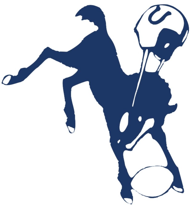
Aw, who doesn’t love the old bucking horsey? It’s sort of floated on the perimeter of the team’s visual program for the past few decades, but now they say it will be officially “tied to historical or throwback campaigns.” Good! I’m a little surprised they didn’t clean it up a bit, but I’ll take it however I can get it!
———
And there we are. When I sat down to write this, I thought, “Oh, this’ll be quick — it’s just a few tweaks that most fans won’t even notice.” Turned out to be a surprisingly lengthy assessment!
Next up: The Browns will unveil their new set tomorrow at noon Eastern. In case you missed it yesterday, I had an exclusive look at what they were planning for this set as of 18 months ago. Have they made any changes since then? We’ll find out tomorrow.
Uni Watch Haiku: Here’s another Uni Watch haiku, one of several that I’ve been writing in my head while out for my daily exercise bike ride:
Strasburg and Thome
Great players? Sure, but also
All-time great blousers
I’ll keep doing these every day or two until I either run out of ideas or get bored with the project.
Click to enlarge
Collector’s Corner
By Brinke Guthrie
Follow @brinkeguthrie
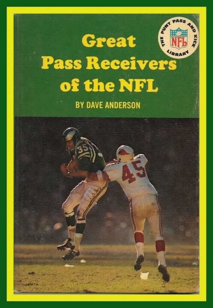
Growing up, I loved the books from the terrific NFL Punt, Pass & Kick Library. I don’t know when I started reading them, I do know I bought and read ’em all. And when I came across the 1966 title Great Pass Receivers of the NFL, something clicked. I loved that Eagles green/silver color combo and the wings on the helmet, but what really caught my eye were the double stripe sets on the sleeves. It was a key moment in my Getting It™.
Incidentally, the Eagle shown on the cover is Ray Poage. Not exactly a household name, but hey — he got to be on the cover of a book!
Now for the rest of this week’s picks:
• Speaking of the Eagles, here’s a 1963 drinking glass with green/white team logo, and gold leaf league shield.
• In almost 10 years of Collector’s Corner, I have never seen this NFL thermal mug before. It was for the league’s 50th anniversary in 1969 and includes the black Saints helmet and an orange bucking bronco for Denver.
• Couple more NFL/50 items for you, including this golden anniversary medal, a membership card for the Campbell (soup) Grid Kid Club, and this San Francisco “Forty-Niners” 1949-1969 20th-anniversary ashtray.
• Here’s an entry form for a Tang/NFL Sweepstakes from 1966. Twenty-five winners each get a pair of seats to their favorite team’s 1967 games. If you miss out on those, no problem; there are also 225 valuable NFL-approved prizes.
• Never seen these before, either: This is a set of MLB mini-batting helmets and they come with a green/brown playing field. Has to be 1960s-1970s for these.
• Curve, fastball, slider, knuckler: Chicago White Sox fans will be able to throw any type of pitch with this 1970s Soapy Slider.
• This set of 1970s MLB pencils is still in the package!
• Here’s a really nice-looking cream-colored NFL Alumni sweater for the Green Bay Packers.
• This 1970s Seattle Seahawks scarf and stocking cap set is made of “Hi-Bulk Orlon®!”
• And from reader Paul Ricciardi, here’s something you don’t often see: a game-used 1986 Philadelphia Phillies St. Patrick’s Day uniform!

Click to enlarge
Meet the Uni Watch Team
By Alex Hider
Each Tuesday, including today, your Uni Watch Ticker is compiled from Uni Watch’s Cincinnati bureau — aka the living room of my apartment, which I share with my fiancée, Libby.
I’ve been putting together Tickers for about four years now, so my routine is pretty set. After sifting through emails and tweets throughout the day, I put together the Ticker from my couch. If it’s spring or summer, I’ll likely be doing this while Libby and I watch our beloved Redlegs (although we’ve been reduced to 2019 reruns for now — sigh). If it’s autumn, we’ll probably be watching Monday Night Football.

My Ticker work station looks a lot different than my temporary work-from-home station for my day job (I’m a national digital producer for Scripps National News), which is in our spare bedroom (see below). I don’t know if I’d be able to put together the Ticker in that space — I find Tickering an escape from my day job and the news world.

I don’t consider myself an apparel collector — I’m more of a hoarder. So, while I’m here, I figured I’d share a few of my favorite jerseys and caps from my closet. Libby got me this 1997 Deion Sanders road jersey (the same one I wore to the Cincinnati Uni Warch Party two winters ago) for my birthday a few years back — the best birthday present I’ve ever gotten:

I got the jacket at a Redsfest over a decade ago for, like, $5. I grew out of it a long time ago, but it fits Libby — so I guess you could say I traded the jersey for the jacket.
My Dad is from Akron, so he raised me to be a Browns fan. Because the team is an endless carousel of silliness and shit draft picks, any Brownsaholic like me probably has the jersey of at least one stinker in their closet. Here’s my collection — at least there’s one future Hall of Famer in there:

I also have waaaaay too many baseball caps, most of which I don’t wear often enough. Here are a few of the best, my favorite being the early 2000s A’s spring training cap I found on eBay:

———
Paul here. Alex is our longest-tenured Ticker assistant, with his fourth uni-versary coming up next month. In that time, he’s become a good friend. After finally meeting him in person in Cincinnati two Decembers ago, I also had the pleasure of hosting him and Libby here at Uni Watch HQ when they visited NYC last fall. Wonderful people!
In addition to doing the Tuesday Tickers, Alex has also done several “Gone Too Soon” entries. He’s also volunteered countless times when I or anyone else needs to swap Ticker days due to a schedule conflict, and is generally super-reliable and positive. He’s a major asset to Uni Watch — thanks, Alex!

Click to enlarge
Looks great with a cloth mask: We’ve sold so many Uni Watch Classic Caps during the pandemic (thank you!) that I’m almost ready to name it the Official Cap of the Pandemic™. We still have all fitted sizes in stock, but we’re running low on 7-1/8, 7-3/8, 7-5/8, and 7-3/4, and Ebbets Field Flannels’ production is currently shut down (apparently making Uni Watch caps is not an “essential business,” go figure), so it might be a while until we’re restocked. In short: If you want a cap, these’s no time like the present. And remember, the price has been reduced to a very pandemic-friendly $35.99 (down from our usual $39.99).
While we’re at it:
• You can save 15% on everything in the Uni Watch Shop and the Naming Wrongs Shop by using the checkout code COMMUNITY.
• Uni Watch seam rippers are now only $4 (down from $6). At present, the only colors I have in stock are red and white — and red is almost gone. I ordered new inventory nearly a month ago, but it’s coming from China, so who knows when it’ll arrive.
• A custom-designed Uni Watch membership card is now only $20 (down from $25). Happily, there’s no way for us to run out of these!
Finally, if you want to help support Uni Watch via a donation instead of a merch purch, here’s how you can do that.
My thanks, as always, for your consideration. We’re all in this together, and together we’ll get through it!
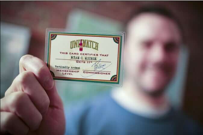

ITEM! More memberships to raffle off: Readers Matt Kirby, Lindsay Resnick, and Steve Fidrych all recently purchased Uni Watch memberships for me to raffle off, so we’re going to give away all of those today.
To enter, send an email to the raffle address by 8pm Eastern tonight. One entry per person. I’ll announce the three winners tomorrw. Thanks to Matt, Lindsay, and Steve for sponsoring this one!

Speaking of the membership program, six new designs have been added to the membership card gallery, including Carl Hacker’s. He had a brilliant request: As longtime readers may recall, when Yankees reliever David Robertson appeared in Game Three of the 2010 ALCS, his jersey had the wrong number font. Carl asked for that one-of-a-kind Yankees motif for his membership card — genius! Even better, he owns Robertson’s game-used jersey from that game (!), so this was the obvious membership card request for him. I really love this one!
Ordering a membership card is a good way to support Uni Watch (which, frankly, could use your support these days). And remember, as a gesture of comm-uni-ty solidarity, the price of a membership has been reduced from $25 to $20 until further notice.
As always, you can sign up for your own custom-designed card here, you can see all the cards we’ve designed so far here (now more than 2,500 of them!), and you can see how we produce the cards here.
Language is a (corona)virus: One of the interesting things about coverage of the pandemic is that different media outlets have different ways of styling the term “Covid-19.” I’ve seen at least four different versions: initial cap (which is the format I’ve used here on Uni Watch), all caps, all lowercase, and small caps. Here’s an example of each (click to enlarge):
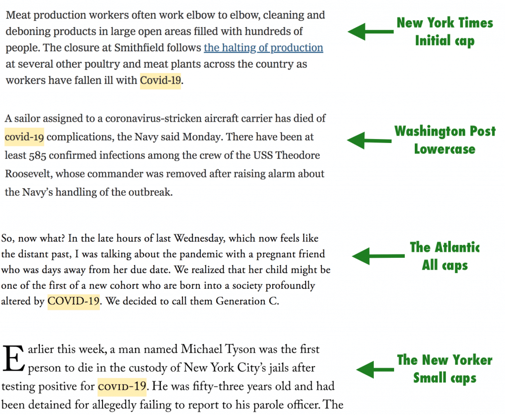
The AP, whose style guide is used by most newspapers, is going with all caps. But some newspapers and most magazines have their own style guides. So do most book publishers, so we may see a similar lack of uniformity when books about the pandemic begin appearing.
Over time, perhaps a consensus styling of the term will emerge. Until then, it’s interesting to see how a brand-new newsworthy term can be interpreted in different ways by various media outlets.
The Ticker
By Alex Hider

Baseball News: MLB published a new video that explains how ballparks evolved to have different dimensions (from Andrew Cosentino). … Tomorrow would have been Jackie Robinson Day. In MLB: The Show’s Jackie Day, all players wear high cuffs and blue socks emblazoned with Jackie’s signature, so maybe that was the plan for on-field hose this year (from Mikhail Herrera). … The Taiwan Baseball Summer League is playing games without fans, but the stands aren’t empty — they’ve been replaced with cardboard cutouts (from Germán Cabrejo). … Jerry Wolper found a 1950 story in The Pittsburgh Post-Gazette about baseball players wearing shorts. … It’s easy to hate the Mets’ old black jerseys. But Mets Police blogger Shannon Shark thinks the team’s dreaded black drop shadow was even worse. … This is great: Clay Billman spotted a cardinal in his backyard that looked awfully familiar.

Football News: Noah Hallet, a DB for McMaster University in Hamilton, Ontario, arranged his merit decals in the shape of a cross on the front of his helmet (from Wade Heidt). … The XFL has filed for bankruptcy. … During a 1992 tour stop in Dallas, the band Genesis received a set of Cowboys jerseys from the team (from John Chapman). … Thomas Stavely was watching the TV show JAG and noticed that they showed a televised football with college players but an NFL scorebug. … Minnesota published an interview with their Director of Equipment Operations, which discusses, among other things, the 12 helmet designs the team wore in 2019.

Hockey News: CCM is repurposing its factories to make protective hoods for health care workers treating Covid-19 patients (from @OlegKvasha). … Matthew Algeo found this photo of Chicago guitarist Terry Kath wearing a Chicago Cougars WHA jersey in 1977.

NBA News: Designer Peter Rogers gave every NBA team a makeover (from Antonio Losada). …. Good catch by @coachmays: In an episode of Parks and Recreation, disciplinarian Ron and burnout Andy coach competing basketball teams. The numbers on Team Ron would all be legal by college basketball standards, Team Andy includes a No. 8 and a No. 9. “Perfect for the two teams’ approaches to the game!”

Soccer News: Scottish League One team East Fife released their first shirt for next season (from our own Jamie Rathjen). … Also from Jamie: Two members of England’s National League North, Altrincham and Alfreton Town, were to wear memorial shirts on March 28 in memory of Jordan Sinnott, the midfielder at Matlock Town who died in January and received several hundred shirt-based tributes from around the world. Sinnott previously played for both teams. … New goalkeeper shirts for Forward Madison FC of USL League One (from Josh Hinton). … Also from Josh: New 2020-2021 home jerseys for French club Olympique de Marseille. … New home uniform for Belarusian second division club FC Krumkachy (from Ed Zelaski).

Grab Bag: The Athletic has a story about how college sports’ live animal mascots are handling social distancing during the pandemic (from Kary Klismet). … New uniforms for the Japanese men’s volleyball team (from Jeremy Brahm). … Here’s a top 10 list of designer Marc Blanchard’s best motocross uniforms (from John Flory). … The reception desk at the headquarters for pet supply delivery service Chewy is shaped like the company’s iconic boxes (from Jason Hillyer). … The New York Times published a piece on the history of the Rolling Stones’ tongue logo, which debuted 50 years ago (from Kary Klismet). … Here’s how you know the pandemic is serious: The Unicode Consortium, which oversees standards for emojis, has decided that there will be no new emojis in 2020 (from our own Brinke Guthrie). … Possibly the most Florida thing ever (at least until the next most Florida thing ever comes along, probably by this afternoon): WWE has been deemed an “essential business” in the state and is resuming live shows.

Click to enlarge
What Paul did last night: One of my favorite things about the front porch, oddly enough, is being out there when it’s raining, as was the case yesterday. There’s something nice about feeling sheltered and safe while the weather huffs and puffs and does its worst to be unpleasant.
Bud Copper for me, seltzer for the Tugboat Captain (she had a class right after our porch session), smoked almonds for both of us.
Just as we were wrapping up, the rain stopped and the sun suddenly came out. I was sure there would be a rainbow, so I walked down to the corner, where the view is less tree-obstructed, to take a look. What could be better, I thought, than a pandemic rainbow?
But there was no rainbow. Dang.
If the Colts are bringing their uniform into the 50s and 60s, I would imagine they intend to make a big deal of wearing black shoes. That, to me, is the most likely use of black.
There are no more official team shoe colors. Players can wear any mix of black, white, or team colors.
Paul, have you heard the statement that “every song has already been written?” Have we reached that point with uniforms and logos? It sure seems that way.
Please, don’t challenge the brains at Nike.
No ear hole on the bucking colt helmet??
link
That version looks much better than the one they used yesterday!
No pupil in the eye, either. That’s a major downgrade, IMO.
Ain’t no “grommets” on this page.
link
The Colts wordmark change bugs me. Very few NFL teams (anymore) have their own font that is instantly recognizable. They might not literally have created that font, but it’s become all theirs. For example in this image look at the Packers, Steelers, Giants, Buccaneers and Colts. All very distinct fonts.
link
I’m aware it’s just the nostalgia in me talking, but still!
Agreed. Looks like just change for change’s sake. I see the old word mark and I think “Colts.” I see the new one and think, “meh.”
I basically agree, but the old wordmark is basically illegible at small scale, so it can’t be used as the basis for type in team printed or online materials. I would assume that’s a major reason for the new wordmark: The team can actually use the new lettering as the basis for an alphabet to use in print and online. Plus, it has the advantage of communicating the word “Colts” to people who don’t already recognize the old, illegible wordmark as a Colts logo.
Also agreed. Though the original wordmark was too tall and condensed to stretch across an end zone five times wider than it is deep. This is… OK.
Lucas Oil Stadium wasn’t even using that wordmark for the end zone. If they did, it would barely be wider than the goal posts. They were using an expanded version, and even with that, they needed NFL and AFC logos in white circles on either side to fill out the space. With the new wordmark, “COLTS” should fit just fine on its own at one end, but they’ll need one hell of a condensed variant for “INDIANAPOLIS” in the other end zone.
Agreed. As a Colts follower (not an NFL fan in general, but when you grow up in Kokomo, you follow the Colts, and they’re still stuck in my brain bucket) I’m disappointed by all of it. The wordmark especially rankles me.
Why bring back the funky bucking colt to get rid of your unique funky font?
Also, Anvil Black? I know that around these parts we do our best not to acknowledge the goofiness of marketing speak like renaming colors, but that one seems SO egregious. You seriously renamed BLACK, and for a black that is just on the swoosh and fan gear?
I would add the old 49’ers font to that list as well, if they still used it. I never owned one, but the gold Starter Jacket with “49ers” in the old font on the back was a thing of beauty.
I don’t know why, but I can never read a haiku without counting the syllables.
21
17. 5-7-5.
First, five syllables
Second line, fill with seven
Then five to end with
Five, seven, and five
Not too assiduously
Reeds bend in brisk breeze
Colts have re-adopted the number font I’ve been begging the Cowboys to revive for years.
Seconding this. And they kept their unique NOB font.
Always thought of it as the Cowboys font.
I think the Colts used it before the Cowboys…
Alex may be my new favorite contributor to Uni Watch! (I never had a favorite before so none of you guys got replaced.) I’m also a Reds fan and a Browns fan. That’s a bit of an oddity in Ohio so it’s always fun to see another one in the wild. Alex, that’s a cool Deion jersey but that jacket is where it’s at! And somehow I had the foresight to not buy a Browns jersey – ever – and I’m thankful for that. But you do have one the one that I am still seriously considering. Future HOFer #73.
I had the same thought as Brian above about the Colts black being a tie-in to their black cleats. And I learned that that’s not a thing anymore after Paul pointed that out. I don’t know why I thought that was still a thing! Again, always learning something new on this site.
Paul – I was thinking the other day how nice a rainbow would be in this time of uneasiness but it never showed here either. But if you’re even remotely into Biblical stories, you know the rainbow won’t come until this storm is over. I guess we’re just not there yet. I worry about my friends and family and just all of my fellow humans in NYC and larger cities. We’re not immune out here in BFE but it’s defintely more to worry about in more heavily populated cities. Stay safe, man.
I’ll defer to local Ohio knowledge, but it’s easy to imagine an old-stock Cincinnati family that rooted for the Reds and Browns since well before the American Football League ever existed (and the Bengals aren’t even charter members there). The opposite, Indians and Bengals, would be much more exceptional in my mind.
I live in DC, and even though the Nationals are very popular, Orioles/Redskins fans are fairly common. If you’re from DC but you grew up after Robert Short took the Senators to Texas, then those were your local teams. Doubly-so if you grew up in DC or Maryland after the Mayflower moving trucks left for Indy. Nowadays, a Nationals/Ravens fan is…either a young kid who likes winners, or a DC local that just can’t give Dan Snyder any more money. And quite the exception.
Mike – you’re 100% accurate.
I don’t know if I know a single Bengals/Indians fan. Now I’m going to go through everyone in my head to find out!
And the only reason I’m a Browns fan is because my dad is. But being closer to Cincy (2 hours away compared to 4), more and more younger fans are Bengals fans in my area, including 4 of my brothers. Not everyone roots for their Dads team anymore and the Bengals Super Bowl appearance in ’80 helped their case a lot. So while there were more Browns/Reds fans in the past, that has changed a lot over the past 40 years.
I forget how good the early 90’s road uniform was for the Reds. As a lifelong Reds fan I loved the change to pins in the early 90’s (as much as I love the sansabelt pullovers worn by the BRM, it was time for them to go), but HATED the pinstriped hat for the home set. If they would’ve paired the plain red cap with the home pins it would’ve been darn near perfect. In fact, Rob Dibble insisted that they do that for one home game because he said he felt like an ice cream man wearing the pinstriped hat, to show ownership how good it would look. They were not impressed (gotta sell merchandise!) and as far as I know it was the only time the solid red cap was paired with the home pins.
The serifs on the Baltimore Colts font seemed to be slightly lessened in the early 60s, but were still very much present in 1967. They were completely gone for the 1968 season.
I mean, of course, the uniform number font.
Thanks, Mike!
Thats what I found as well… 1967 was the final season the Colts wore the serifed (is that a word?) font.
Thats actually much earlier than I expected.
Lee
Helmets these days are getting so busy that the logos and even stripes get quite messed up. Used to be the helmet was almost a smooth sphere (as you can see in those old pics) and now there are so many vents and openings and even edges.
The jersey sleeve stripes were casualties a while ago, socks now as well. Seems that many elements in an NFL uniform that were iconic places for team marks are now gone so its difficult to display those marks. Looking forward to the Browns today, hoping that there are still plenty of stripes in evidence.
I don’t know if it was just the lighting for the shot of the new helmet logo, but it looks like that helmet has even more sharp lines and angles than the one from the “BEFORE” logo shot.
Two different helmet models. Riddell Speed on the left, Schutt F7 on the right.
Totally agree with Matthew’s comments.
Is there a functional purpose to all the edges, divots and indentations? I doubt it. Seems like just another way for the equipment makers to get their “brand” seen.
Yes, a few vents makes sense. And I can accept the panels on the crown of the Schutt as having a safety purpose. But so much of the customization of the outer shells that we see these days smacks of “look at how different our helmet is from every other helmet on the market!”
Now, interestingly, we think of that as a western font, but the number font of the Colts’ predecessors, the 1952 Dallas Texans, had no such serifs. The Colts did not adopt them until 1957.
Love how they blustered on about the tradition, history etc. of the Colts and went out of their way to not mention Baltimore or even the fact that they ever played anywhere other than Indiana. I was born a Dolphins fan after my folks moved down from the Chesapeake Bay Area, which happened just before the Colts stole away in the night, but that still pisses me off. Taking a name/colors with you if you move should be against the law – if not real actual laws than in the bylaws/rules of any sports league. If you don’t care enough about a community to stay there, then you don’t get to take any of the history and memories you made there with you when you jet.
Side note: nice to see NFL teams striking back and poaching high school and college logos after the opposite happening for so may years haha!
They’ve been playing in Indy for longer at this point, and Baltimore was made whole with the Ravens.
“Matthew Algeo found this photo of Chicago guitarist Terry Kath wearing a Chicago Cougars WHA jersey in 1977.”
Kath is wearing a #12 Pat Stapleton sweater. Stapleton, who was also a Chicago Black Hawk, passed away last week.
That new logo for the Colts looks like the “C” had a stroke.
Forced negative space design is never a good thing.
Can’t wait to see it on a baseball cap, coming to a Lids or kiosk in a mall near you.
The sales won’t be near what the hat’s with the horseshoe are. There’s nothing wrong with wanting to sell hats by the way. I just don’t think this crappy 2ndary C will sell much.
There will be a new era/lids warehouse full of them somewhere for a while.
The new Colts secondary logo is the stupidest thing I have ever seen.
My first thought was Sloth, from the Goonies. Absolutely terrible.
It looks like that Cathedral HS logo may have only been used for National Signing Day 2017, it isn’t in their official logo guide: link
That doesn’t absolve the relative laziness of Colts’ secondary logo, and the fact that it doesn’t really look like a Colts logo to me for some reason. If they really wanted a secondary logo that incorporated the shape of Indiana, placing the horseshoe in the outline of the state would have worked, or something along those lines.
As always, thank you for the work and analysis, Paul! Stay safe!
AFAIC, Indianapolis’ secondary logo is the capital “I” with the sideways horseshoe developed at the same time as the Patriots’ “NE”.
I wonder if the Colts didn’t mention the number fonts being the same as the Color Rash jerseys so people would buy new merch instead of realizing they basically have the new jersey already (if they bought a CR jersey in the last couple years).
Also, from the ticker, should be noted Ron’s basketball team specifically looks like IU’s unis.
Sorry for thw double Indiaba comment. I’m one bored, quarantined Hoosier.
I wonder if that’s why the went with the black swoosh – to differentiate it from the Color Rash.
The Black Swoosh is only on the white jersey.
Yup – brain fart.
Thanks for the correction.
Duh, I mean obviously it’s the logo inside the collar that nobody will ever see that differentiates it.
Another example of “COVID-19” (all caps): today’s Uni Watch ticker.
I missed that while editing the Ticker. Now fixed.
Dang. I actually thought when you said “which is the format I’ve used here on Uni Watch” you meant the stuff attributed to you and that the ticker’s format could be different.
Reasons for GUD using 11…
1) In the early days of the NFL and APFA most players had jersey numbers in the single digits and the teens (rarely the twenties). To provide consistency, we chose to use the number that would be the most likely to be uncovered considering how rare photos of those early days were. Rather than just using 1, we went with 11. We saw no reason to change the numbering we used at some random point in time and chose to stick with continuity. Additionally, at the time of GUD’s creation, “Football Uniforms: Past and Present” by Craig Wheeler covered the modern era (post-1960 or was it post-50s?), our site was originally designed to cover the pre-Wheeler years.
2) Spacing. Using double-numbers makes front and rear spacing easier. But more importantly it makes spacing for TV numbers easier, especially on the Rams’ jerseys where a number needs ‘squeezed’ into a limited space inside the ‘horn’ while still appearing to be the correct size.
Thanks for the explainer, Bill. But I gotta tell ya, if you’re looking to impart visual information, the numeral 1 is the least informative number. It tells us very little about the font.
Huge fan of the GUD, of course. This is literally my only gripe about it!
What about the sound in the Colts video is annoying?
Faux-dramatic nonsense. Basically the audio version of corporate marketingspeak clichés.
Just for those keeping score at home, when is and isn’t dramatic music allowed?
Further, what music would you have preferred? Or should we go back to the silent film era?
It’s not about what’s “allowed.” I just happened to find it annoying and thought others might as well, so I suggested muting it. YMMV.
Yea I played the audio after seeing the comment and thought it was fine. Certainly better than the Falcons video which plays crappy music that is trying soooo hard to be cool and hip with the youth of Atlanta.
Pure speculation but I’m guessing that the Patriots will release their uniform changes on Monday. Monday is Patriots Day in Massachusetts and is typically Marathon Monday.
And in Maine. They are the New England Patriots after all.
As a guy who grew up with Johnny Unitas as my god and the BALTIMORE Colts as my religion, it tears a piece of my soul out every time I see them use the bucking colt logo. Bleep the Irsays.
Yes, I’m still somewhat bitter. LOL
Also… I just happened to be wearing my classic UW cap when I read this entry. It’s very comfy.
The secondary logo may be fine for folks in Indiana. Indiana’s state outline is not in my memory bank, and my mind wanders when I look at it. First the negative space looked like a sideways USA, without Florida. But then why would the US be stuck on a fat pole? Then it hit me.
link
It looked better as the Capital “I” on Larry Bird’s ISU jersey.
link
Zubaz: The chic ‘90s trend Buffalo claimed as a defining fashion
link
I’ve always maintained that black infecting the rest of the uniform was more bothersome than the black jerseys themselves. Putting Mets colors — blue, orange and white — against a black ‘canvas’ is one thing; mixing black in with blue and orange is something else entirely. The former was an OK look in and of itself, but the latter ruined a perfectly-good existing look. Not to mention the needless and inexplicable use of the two-tone cap — the worst-looking of the three cap options — as the de facto primary cap, home and away, throughout the link.
The Mets black jerseys were slightly more tolerable when they originally paired them with blue accessories (blue undershirt, belt and socks). When the team started wearing the black accessories more with the home pinstripes, white alt and roads, that’s when it just got to be way too much black for me.
Cincinatti Reds uniform / logo was also much better without the black drop-shadow.
I saw pictures of a double rainbow from a friend in East Village!
Yeah, we saw photos later. Apparently missed it in our neck of Brooklyn.
Colts uniform and logo changes are the equivalent of driving through a rural Indiana town with one traffic light. So subtle you’ll miss it.
I say it’s a fail on the basis they made an announcement about it. They shouldn’t have said a word then there would be zero let down when you look and go, “that’s it?”
I’m with Paul. I really with they would’ve cleaned up the Bucking Colt logo. It could still retain the classic look and feel and not look so primitive. It looks like a copy of a copy of a copy.
The more I look at the two horseshoe logos, the less I like the one they’ll be wearing from now on. I mean, it’s fine, but the old helmet logo is just so much better. For one, it’s shaped more like a real actual horseshoe. For another, the larger nail holes give it a stronger visual presence. The new helmet logo looks less like a horseshoe, more like a weird uncial letter U. Not an upgrade. I mean, it’s still fine! But it’s a less-good version of fine.
The old Colts wordmark reminds me of a font that would have been used on a matchbook cover from a 3rd rate casino in Reno in the ‘70s. In other words, I should really like it. But the new one looks better to me, which is weird.
Also, one of my pet theories seems to have been blown, which was any use of negative space seemed to generate a bunch of “great use of negative space!” comments. But this clunker of a logo seems to disprove this.
Overall I love almost all of the changes, especially the rounder horseshoe. Colts are gonna look great.
I’ve always been surprised the Colts don’t just turn the horseshoe sideways so it can double as a ‘C’, especially now that it’s been corrected to a more rounded shape. Seems like a missed opportunity with the tweaks they made. Thoughts?
What happened to the Blue Car? I think I have been in this house a bit too long.
On the horseshoe logo (and the secondary C logo, meh), those are HOLES, not grommets. Holes are, well, holes; grommets are something that go into holes – brass grommets on a flag, or rubber grommets on metal, to reduce wear and tear, etc.. Just a bunch of marketing hooey.
There apparently is something called a “horseshoe grommet” link but it is a rubber grommet shaped like a horseshoe. So, unless there also is a grommet that goes in the holes in horseshoes, someone needs to tell the Colts marketing department that, to paraphrase Inigo Montoya, it doesn’t mean what they think it means.
Re horseshoe “grommets”: while I am not an equestrian expert, I have family who owned a horse ranch for decades. I participated in the shoeing of horses on several occasions, mostly in my youth. (Granted, my assistance was mostly of the “Here, kid – hold these shoes and nails and try not to get kicked” variety.)
I never once heard horseshoe holes referred to as “grommets.” They were nail holes or holes and those are the only terms I ever heard. Take that for what it’s worth…
All I’ve been thinking this whole morning is: how to these people not get kicked while showing horses? So your comment made me laugh.
Shoeing not showing, sorry on my phone.
Thanks, Pedro! Glad I could provide you with a laugh today! With my (obviously) limited expertise in shoeing horses, I can tell you the key to not getting kicked (other than standing back far enough) appears to be:
1) experienced horse handlers
2) horses that are well-acclimated to people
3) keeping calm around the horse
I’m sure there are plenty of other nuances that I’ve since forgotten, but that’s what stuck out to me!
It looks like the Colts have “flattened the curve” like the Chargers did… is this a response to the location of vent holes on modern helmets, in that these flatter logos can avoid them better? Contrast that with the giant Flacon logo, which sticks its beak into one of the vents.
As someone who works in infection disease, I can also add that coronavirus is usually shortened to CoV. I think I saw a few places use CoVID-19 when it was still an epidemic, but looks like most use the AP style now, even scientific journals.
Alex, what part of town do you live in?
Someone did a nice job parking that car so it was centered between the trees (or is it just the camera angle?)!
So has the world just given up and accepted truncated UCLA stripes? This needle to the eye is now so rarely even discussed.
Enjoy seeing Tugboat’s daily peek back.
I was sure hoping the Colts would have UCLA stripes that looped all the way around.
The style choices of COVID-19 remind me of how AIDS has evolved in the media.
I liked the Colts “C” with the Indiana State in the negative space until I saw it was pretty much poached from a HS! So we hear stories of colleges and pro teams sending cease and desists to little high schools but a pro team ripping off is no problem?!
That rear Colts bumper looks curved in the wrong direction.
Confirming what was pointed out earlier – 1967 was the last season the Colts wore the serifed number font. That font was worn by the Colts, Eagles, Cowboys and Saints in the past with a modified version worn by the Packers in the late 50s – early 60s.
Looking at the pictures of Kenny Moore, it looks like the Colts are sticking with the current NOB font. The “color rash’ jerseys had a standard block font for NOBs while the Colts’ regular NOB font seems to be custom.
I guess you consider all those COVID capital versions incorrect, and correct me if I’m wrong (and I hate to use that term because I like to at least take a few minutes to look things up as I did here) but if COVID (or however it is capitalized) stands for coronavirus disease, shouldn’t the proper capitalization of it be CoviD-19?, or CoViD-19? (Realizing that one looks like a logo where the first and last letters are big, and the second one WhErE tHe KiDs TyPe LiKe ThIs.)
Whoops first line should be “I guess I’d consider…”
I don’t consider any version incorrect. Editorial style is more a matter of preference.
Speaking of this: COVID, in the context of COVID-19, means “coronavirus disease, the novel one of 2019.” It’s not an acronym–that’s the first letter of every word, like NATO (North Atlantic Treaty Organization). It’s arguably not even a collection of first letters, like ANOVA (analysis of variance). Is there a separate term for something that feels like an acronym but technically isn’t? There are a bunch of smart people here who I bet could kick ass in trivia, I bet somebody knows. Thanks for humoring my non-uni curiosity!
“Acronym” is usually defined as a word formed from the initial letter or letters of the words that make up a longer phrase. Sonar, for example, is an acronym for Sound Navigation and Ranging; both the S and the O come from “sound.” “Radar” is sometimes cited as a similar acronym for Radio Detection and Ranging, but it’s really just a word formed from making the start of “sonar” sound like “radio” so that people would understand the new technology in terms of the old. Anyway, both NATO and COVID are acronyms, even though COVID contains a couple of second as well as first letters.
Hate the black Maker’s Mark on the white jersey. They should have made it gray to match the facemask. Could have made them gray on the home and away jerseys as a suttle way to incorporate a third color in a balanced way without making them the only thing black in the whole set (aside from on the shoes).
For the Colts new look.
Pluses:
-Like the number font change and new wordmark
-Like the bucking colt
Minuses:
-Secondary logo meh
-Black Nike logo (and any use of black with the Colts)
————————–
If any team can pull off a grey facemask, this is the team. Although I would have thrown high fives (to myself in social distancing) if they had a white facemask on the helmet.
Gray fits the Colts, but the blue looked good too.
Replying to Wade’s comment above!
The LA Rams/Angelo State University misstep reminds me greatly of NBC’s hapless foray into logo modernism. They ditched the Peacock and interlocking ‘NBC’ (sometimes referred to as ‘the Snake’) in favor of two matching geometric shapes that formed an ‘N.’ Was launched to great fanfare on New Year’s Day 1976, and reportedly cost the network $750k in research/marketing/rebranding costs. Problem was that the very same logo had been worked up prior by a Nebraska Educational TV staffer – for about $100!
Egg on face, NBC paid about half a mil to NETV a few months later to make the whole thing go away. The ‘geometric N’ never took hold, and was put out to pasture a few years later…
link
Cautionary tale for the Rams?
OK – I love that Chewy desk.
I also love Chewy. Seriously. I rarely love companies. I lost my 19 year old guy in early February. I had forgotten to update my recurring order from Chewy which shipped 10 days after I lost Jake. I had too much food and litter. I called the company to see what/how to return what I could no longer use. They refunded me over $200 worth of product and told me to donate everything I didn’t need to a local pet rescue, etc. To top it off, they sent me a card within a couple days of my calling and a few days after that, they sent me a bouquet of cat-friendly flowers in a glass vase. It was amazing.
The headline on the Browns web page reads:
“Browns Unveil New Uniforms”
Shouldn’t it read:
“Browns Unveil Old Uniforms”
I have two initial thoughts about the Colts’ new secondary logo.
1.) It definitely feels forced. A month or so ago, there was a discussion on here about whether or not all use of negative space was a good use of negative space? As I recall, the prevailing opinion was no, and I agree with that view. This is a good example of that principle.
2.) This looks to me like a midfield logo. I know that yesterday they were talking about it as a secondary logo, but they made an awfully big deal for a logo that’s going to be hidden in the collar of a game jersey. There’s no way they would’ve done that. This is going to replace their helmet at midfield, I believe.
3.) Also, I am very much in favor of getting rid of the midfield helmet logo. I have always thought that looked bad in the past when teams like the Browns, Bengals, Rams, Chargers and Colts have done it and I still hold that view. It just seems antiquated. However, I think I would prefer the new horseshoe at midfield over the “Hoosier C“ or whatever they are going to call it.
4.) Speaking of the on-field design, they are also going to be forced into making some changes in the north end zone. The new wordmark is not going to permit the word Indianapolis to be spelled in the end zone. I would imagine it’s just going to read “COLTS” in both end zones going forward.
5.) I must also say that I think the Colts have largely nailed this uniform refresh. This set looks great! I have no problems with it whatsoever. Honestly, the only bad one I’ve seen so far was Atlanta. i’m worried about the Rams, but I’m trying to keep an open mind there. Cleveland‘s new uniforms look terrific and Tampa’s were fine too. Tampa definitely missed an amazing opportunity by not going back to the Creamsicles – which were one of the most beautiful uniforms in NFL history. However, their uniforms are still going to be significantly improved over what they had been wearing for the past five years. The only uniform that is definitely going to be completely overhauled in five years is Atlanta’s new uniforms. They really made a ham sandwich out of those.
As you can see, math was never my thing. LOL!