Click to enlarge
[Editor’s Note: Today Alex Hider is back with the second installment of his “Gone Too Soon” series. The first one was about the early-’80s Cavs; this one’s about another Ohio team. Enjoy. — PL]
By Alex Hider
As a 26-year-old Cincinnati native, I can’t really remember a time when the Reds didn’t wear black.
To many of you, I’m sure that sounds insane. But we are now an entire generation removed from a Reds uniform without black trim.
Since I’ve been cheering for the Reds, it’s all been BFBS, vest-style uniforms, softball alts, headspoons, custom number fonts, and drop shadows. In other words, it’s been one trend after another.
As a Uni Watcher and a fan, it’s always bothered me that the team that claims to be the oldest in the league hasn’t been able to keep a more consistent look over the years. This isn’t a modern problem, either. Black, blue, sleeves, no sleeves, pinstripes, new nicknames and mascots — if it was trendy at some point in baseball history, the Reds probably wore it (well, except for powder blue road uniforms and zippered jerseys — they didn’t try those).
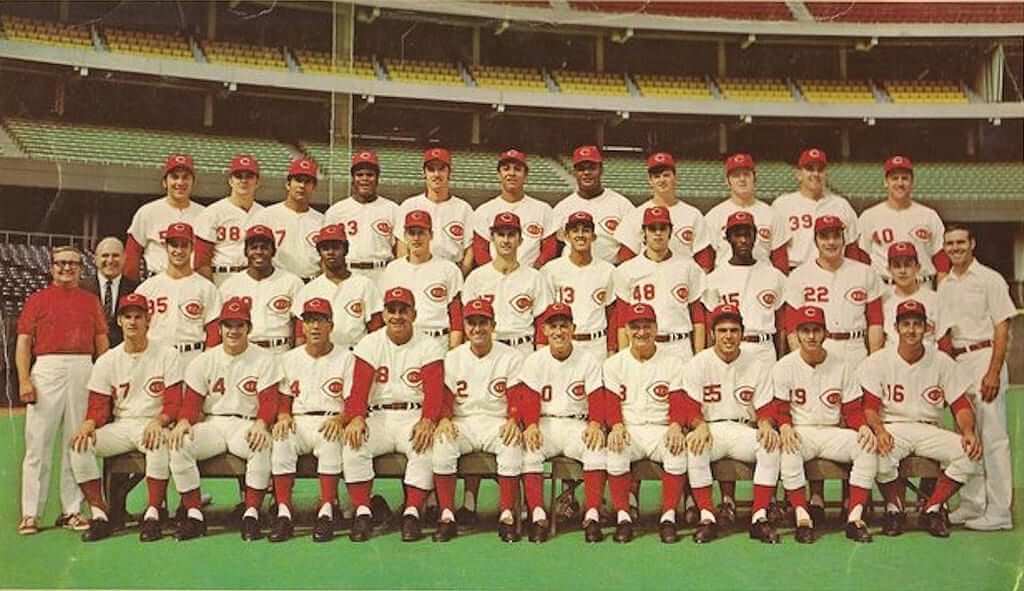
If there was ever a Reds uniform that could truly be considered iconic, it would be hard to argue against the Big Red Machine-era pullovers the team wore from the ’70s to the ’90s — where the Reds won three of their five World Series titles.
It’s also perhaps the only time in team history where the Reds kept their uniforms consistent. The pullover unis remained largely the same from 1972 to 1992, save for a pants stripe that added in 1988.
Of course, bringing back pullovers and sansabelts probably isn’t an option for the modern Reds — but there is a roadmap to getting back to the essence of those Big Red Machine classics.
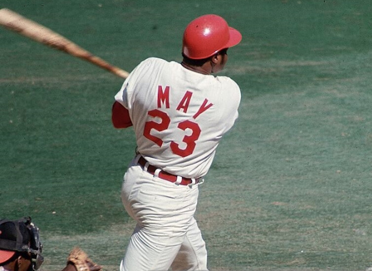
Our own Phil Hecken has called the 1968-71 set “the quintessential Reds uniform,” and it’s easy to see why. It featured nearly all of the elements of the Big Red Machine pullovers, but on a traditional button-front, belted uniform. That includes all-red caps with a white wishbone-C, the iconic “C-Reds” logo on the home jersey, and the vertically arched “Cincinnati” wordmark on the road jersey (which, as Paul pointed out earlier this year, still has some mysteries surrounding it).
The 1968-71 set even included the oversized block NOB lettering that became a Reds staple for decades (no exceptions, not even for Dave Concepcion).
So, what happened to these beauties? As is often the case with the Reds, the trends changed. Cincinnati dropped the buttons and belt to join the sansabelt revolution in 1972.
But instead of picking up were they left off after the pullover trend died in the late ’80s, the Reds rode the wave of nostalgia that was surging throughout the MLB when they overhauled their uniforms in 1993. That meant pinstripes, a sleeveless jersey and a white home cap inspired by the Ted Kluszewski years of the 1950s.
Since then, the Reds have lost their visual identity by jumping from trend to trend. It’d be nice to see them return to something timeless, like that 1968-71 set, but I’m not holding my breath.
Too Good for the Ticker: Did you know “hurdling” used to be penalized as a personal foul in the NFL? I didn’t, until reader Scott Mason pointed me to this 1973 highlight video, which shows the penalty and the ref’s absolutely priceless signal for it. Dig:
How awesome is that? They should make hurdling a penalty again, just so we can see the refs pull that little maneuver.
Hurdling is apparently still disallowed in high school (more info here). Does anyone know if the high school refs use the same physical signal that the NFL ref used in that video?
And that brings up an interesting discussion point: I’m old enough to remember when NFL refs didn’t have microphones. Their penalty signals were important, because they told the live crowd (and also the people watching on TV) what the penalty was. When they got mic’d up, it was a big deal and changed the whole tenor of the game. And it raises a point worth asking: If the ref is connected to the P.A. system, does he really need to give the physical signals? We already know the call is for holding, or offsides, or whatever — he just told us. Why bother with the signals?
I’m not saying I want the penalty signals to disappear (on the contrary, I enjoy the sense of ceremony and official-ness they provide), but they do seem a bit redundant for a ref with a microphone.

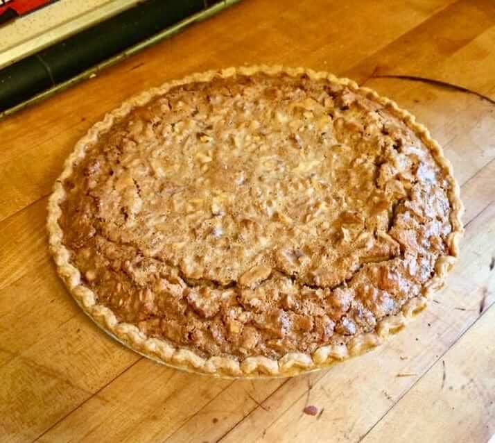
Culinary Corner: The day after tomorrow is the first Saturday of May, which means it’s time for the Kentucky Derby. And that means I’ll be making the dish I always make for the Derby: a derby pie, which is a lot like a pecan pie but made with walnuts and chocolate chips.
Technically speaking, you’re not supposed to use the term “derby pie,” because that’s a registered trademark of some annoying people in Kentucky who insist that they own the name and love to send their lawyers after anyone who thinks otherwise. (They even sued their own chocolate chip supplier, Nestlé, for printing a “Tollhouse Derby Pie” recipe on the chip package.) So you’ll often see wink-wink names like Triple Crown pie, race day pie, winner’s circle pie, and so on. But screw all of that — derby pie belongs to the people. It’s also really easy to make. Here’s how to do it:
1. If you know how to make pie crust, make some dough and position it in a 9-inch pie pan; if you don’t know how or just can’t be bothered, get yourself a frozen 9-inch pie shell.
2. Set your oven to 350º. While it’s heating up, get a big mixing bowl and beat together four eggs, a cup of light corn syrup, 3/4 cup of light brown sugar, and 1/3 cup of melted butter. Then add 3 tablespoons of decent bourbon (or maybe a smidge more than that, if you’re so inclined), a tablespoon of vanilla extract, a tablespoon of flour, 6 ounces of chocolate chips, and a cup of chopped walnuts.
3. Mix all of that together, pour it into the pie dough or frozen shell, and pop it into the oven for an hour. It’ll puff up high like a soufflé, but it’ll settle back down while it cools, which you should allow it to do for an hour or so. This up/down motion usually results in some cracks in the top of the pie, which used to annoy me, but now I’ve grown to like it:
For reasons that aren’t entirely clear to me, the chocolate chips always sink to the bottom (I guess they’re less buoyant than the walnuts), resulting in a nice two-tone effect:
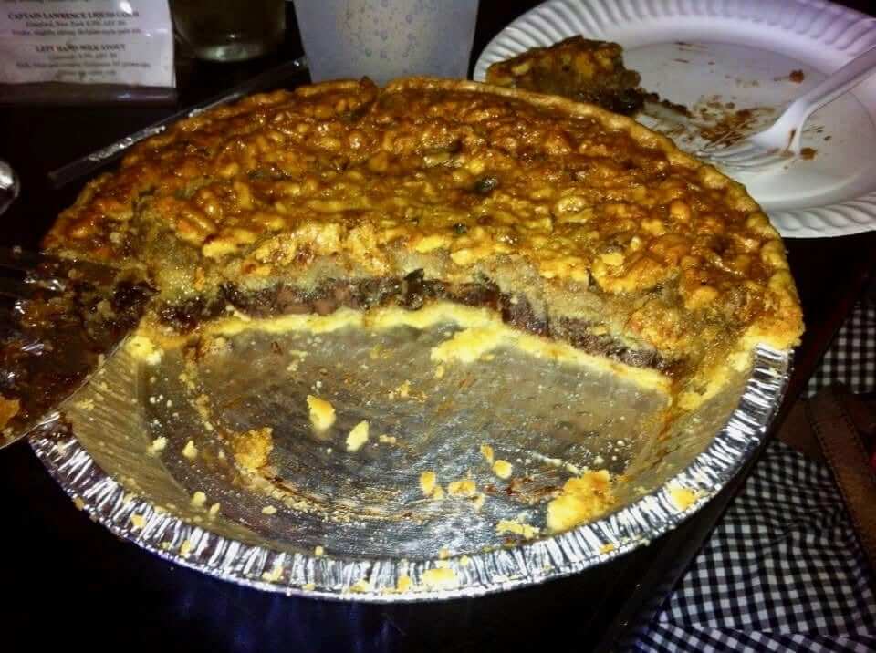
It’s traditional to serve each slice with a dollop of whipped cream, although I don’t bother with that — the pie is rich enough on its own. Less traditional and even less necessary, but nonetheless delicious: this bourbon sauce, which is pretty much the bomb.
Trust me, there won’t be any leftovers.
Assorted reminders: In case you haven’t been keeping up with Uni Watch, here are some things you should be aware of:
• Our friends at Ebbets Field Flannels are currently raffling off a very cool-looking Fort Worth Cats T-shirt. Full details here.
• You can help to support Uni Watch by entering the auction for a full set of 2015 Uni Watch T-Shirt Club shirts in a custom-made pine box. The auction runs through this Friday evening. Full details here.
• Bobblehead doll restoration artist extraordinaire Chris Callan is willing to make custom Uni Watch bobbles for up to three customers. One customer has already placed an order, which leaves two slots remaining. Full details here.
The Ticker
By Paul

’Skins Watch: Local residents have been debating what to do about a Cincinnati high school that uses “Redskins” as the name for its sports teams. Given that we’re talking about Cincy, why not just change it to “Reds” and call it a day? (From David Sonny.)

Baseball News: Here’s a podcast that discusses Ole Miss’s grey uniforms. … Ray Hund sent along some 1950s magazine covers with great baseball-themed artwork. … Back in 1964, the Seattle Rainiers didn’t want players to throw their batting helmets in frustration because they might break them, so they put a boxing speed bag in the dugout as an alternative method of letting the players vent (from BSmile). … Here are some photos of the New Orleans Baby Cakes’ one-game stint as the CrawDaddy’s — which for some reason included that apostrophe (from Joseph Adams). … The Rockies sent rookie OF Noel Cuevas on a coffee run in full uniform. … Former Red Sox P Pedro Martinez attended last night’s Boston Bruins playoff game and wore a Bruins jersey with numbers in the Red Sox’s color and font (from Chris Giorgio and @bdh_photos). … The Aberdeen IronBirds will become the Harford County Anglers of Aberdeen for a weekend series in late July. … Following up on an item from yesterday’s Ticker, here’s more on the Nationals wearing Washington Capitals caps (WaPo link) (from @bryanwdc). … Mets OF Yoenis Céspedes broke one of his necklaces during a slide into second base last night. … The Diamondbacks will be wearing these throwbacks for this afternoon’s game against the Dodgers. … Gorgeous striped stirrups for the U.S. Merchant Marine Academy (from proud USMMA alum John Kimmerlein).

NFL News: The NFL’s new helmet-contact rule might not be that big a deal. … With Pats QB Tom Brady’s helmet set to be banned from the game after the 2018 season, Brady is resigned to using a new helmet model in 2019. … The latest NFL cheerleading scandal: Washington cheerleaders were forced to pose topless for photo shoots while male spectators watched (NYT link) and also had to serve as personal escorts. This all happened during a trip to Costa Rica for which the cheerleaders were not paid, and during which their passports were confiscated so they couldn’t leave. Pull the plug on NFL cheerleading squads already — the whole thing is an embarrassment.
College Football News: Virginia Tech has released its annual safety rankings of college and high school football helmets. The Vicis Zero1 ranked at the top, just as it did in the NFL’s recent rankings.

Hockey News: Reader/researcher Jerry Wolper found the following item in the April 21, 1968, edition of The Pittsburgh Press: “The St. Louis Blues are offering a reward for the return of Glenn Hall’s goalie pads and the pads and mask of Hall’s backup man, Seth Martin. The equipment was missing after the Blues’ last playoff game Thursday in Philadelphia. St. Louis won 3-1 to move into Stanley Cup semi-finals against Minnesota. The Blues said they will give the person who returns the equipment two tickets to each game of the Minnesota series in St. Louis plus transportation for two from Philadelphia. The Minnesota series opens today.” … A Tampa writer doesn’t like it when out-of-towners complain about the absurd policy of fans not being allowed fans to wear opposing teams’ jerseys at the Lightning’s arena. … Cross-listed from the baseball section: Former Boston Red Sox pitcher Pedro Martinez attended last night’s Bruins playoff game and wore a Bruins jersey with numbers in the Red Sox’s color and font (from Chris Giorgio and @bdh_photos). … Cross-listed from the baseball section: Following up on an item from yesterday’s Ticker, here’s more on MLB’s Washington Nationals wearing Capitals caps (WaPo link) (from @bryanwdc).

Soccer News: New kits for Vasco da Gama (from Ed Zelaski). … Liverpool showed support for an injured fan by hanging his jersey in their dressing room. … New home kit for Lansing United. … New kits for Burton Albion (from Ed Zelaski).

Grab Bag: Very sad to hear that Hy-Way Bowl, the excellent New Jersey pin-bashing venue that I wrote about last September will be closing later this month. I hope to make one more visit soon, maybe this weekend. … Good story on the Greater Buffalo Sports Hall of Fame (from Joseph Pitirri). … With the Boy Scouts set to begin accepting girls soon, the organization is changing its name. … Nebraska volleyball is asking people to vote on their new floor design (from Kyle Yackley). … Throwbacks on tap for the New Zealand rugby team Green Island. … Under Armour continues to have financial difficulties (thanks, Brinke). … Here’s a good article on the designer who created the mascots for the 2020 Tokyo Olympics.

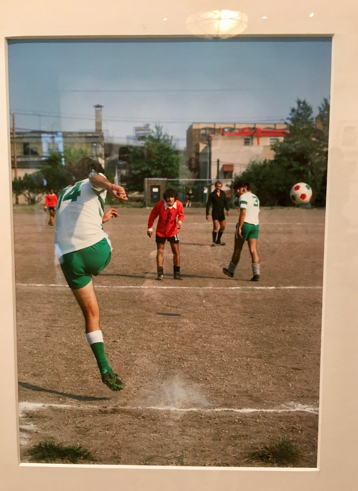
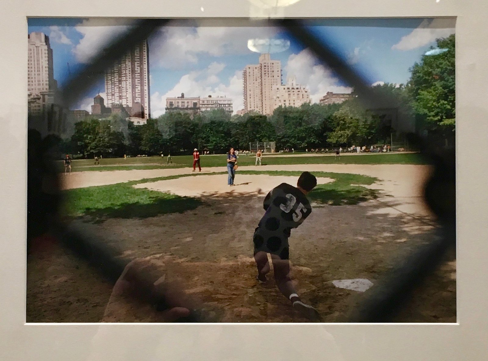
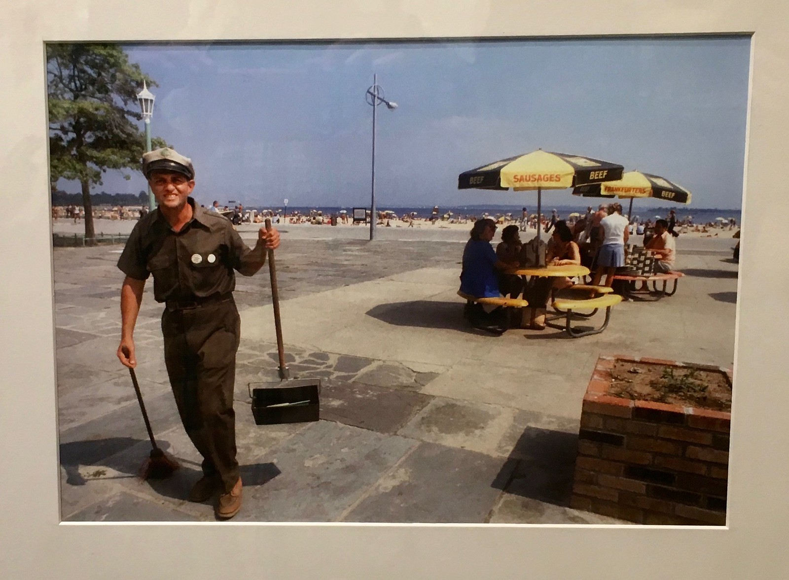
What Paul did last night: During the summer and fall of 1978, workers at all three New York City newspapers went on strike (which among other things is credited for contributing to the Yankees’ miracle comeback in the standings, because they didn’t have to deal with the media for the last two months of the season). Shortly after the strike began, eight New York Times photographers were hired by the NYC Parks Department to wander the city and take photos of people in the city’s parks. Over the next several weeks, they took almost 3,000 slides of people playing softball, people at the beach, people eating, laughing, sleeping, smoking — and then the photos languished in two cardboard boxes for nearly 40 years.
The photos were recently rediscovered. Forty-two of them were featured a few days ago in this spectacular Times interactive spread, and 65 of them are now being exhibited at the Arsenal Gallery in Central Park. The opening reception for the show was last night, and the Tugboat Captain and I went to check it out.
The photos are extraordinary. Some of them show people participating in various sports, so I took pics of those pics, beginning with this shot of a soccer game in Brooklyn — I love how the colors of the ball match the colors of the uniforms (sorry about the glare on some of these shots; click to enlarge):
Here’s a softball game in Central Park. The fields are in much better shape these days than they were in 1978:
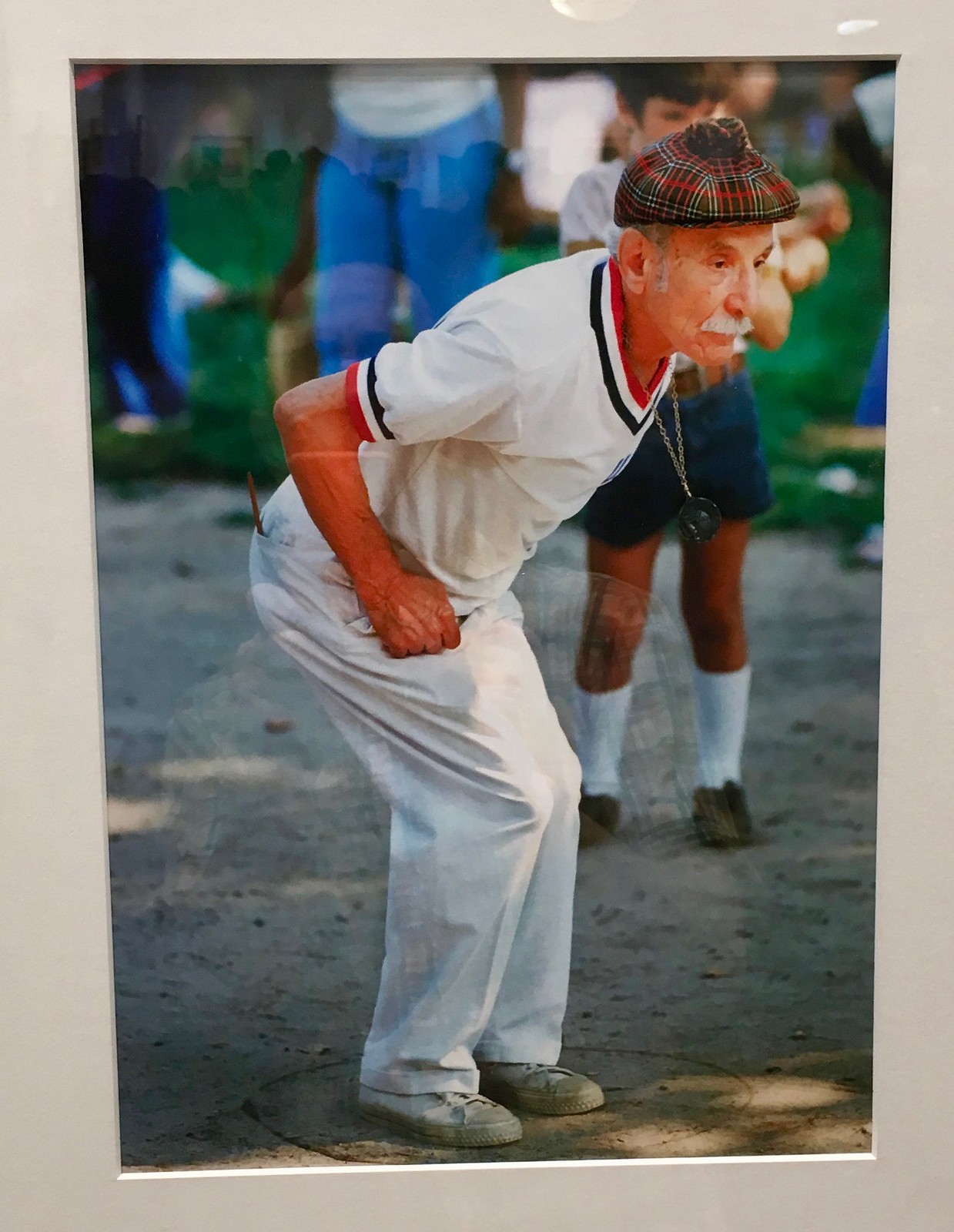
Here’s one of my favorite photos in the exhibition — the look on the guy’s face, his cap, his white attire, the little hand-drawn circle in which he’s standing. The caption says he’s a “boules player.” I didn’t know what boules was, so I looked it up and learned that it’s basically the French term for bocce.
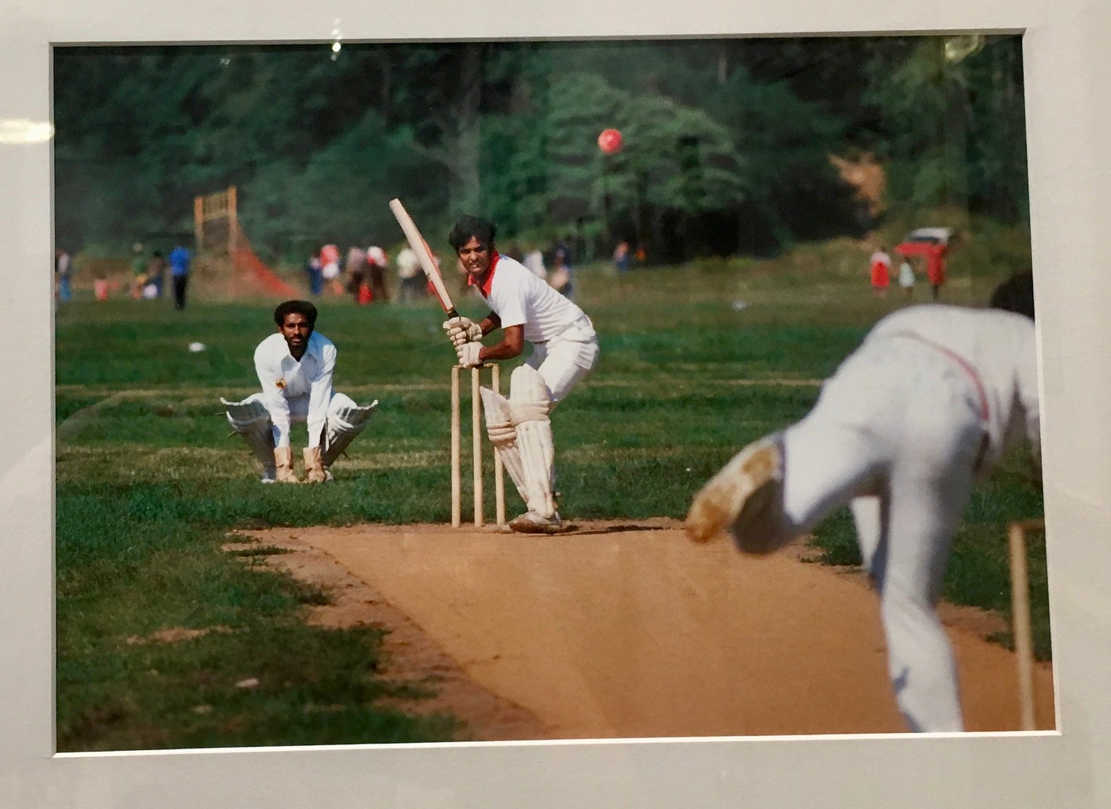
Back when I moved to NYC in 1987 (nine years after the photos in this exhibit were taken), I’d see a fair number of people playing cricket. Not so much anymore. Here are some guys playing in the Bronx:
Love this shot of guys waiting to play golf at a municipal course in Queens:

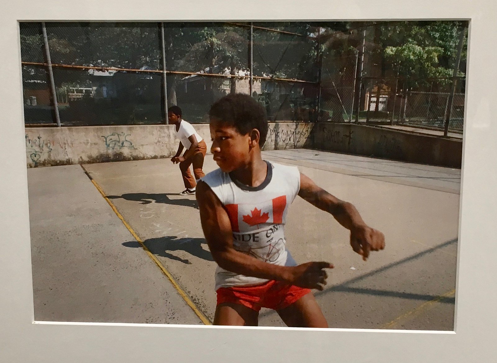
Really like the intensity on the face of this kid playing handball:
One last shot, this one of a maintenance worker. Not sports-related, but I do like the uniform:
One thing I found interesting in all of the photos (not just the sports shots): No sports team caps, jerseys, or other apparel — that market didn’t yet exist. No T-shirts with big Nike or Under Armour logos, either. All very refreshing.
A few of the original photographers were on hand at the reception last night. At one point, the Parks Dept. commissioner made a speech and asked, “How many of you are looking through these photos to see if you can find a shot of yourself?” Several hands went up. But I’m more interested in how many people successfully find themselves in these shots. That would be an interesting follow-up project.
The exhibit is open to the public — and free! — at the Arsenal Gallery in Central Park. Highly recommended.
Those Reds uniforms are so iconic. Yankees, Red Sox type of iconic. It’s a shame they haven’t embraced them back. We should get #returntotheBRM going.
Important detail: The pants need to have belt loops, like the Tigers, and not belt tunnels.
I agree 100%. Those classic Big Red Machine unis of the Rose, Bench, Morgan era were perfect.
Clean, classy and iconic like the Yanks, Dodgers and Bosox.
As a kid – my grandmother gave me my first clock radio from which I listened to Marty Brennaman and Joe Nuxall broadcast the Reds games while laying in bed on hot summer nights. 100% agree the Reds need to ditch the black and revert back to something resembling the BRM Unis of the early & mid 1970s.
Oh thanks for the derby pie recipe!!
Brooklyn soccer photo is from the Red Hook recreational park complex. I recognize it from the power box (?) behind the goal; I also remember the goals resembling cages, as fence metal was used for the nets. This field now has an artificial turf surface.
“If the ref is connected to the P.A. system, does he really need to give the physical signals? We already know the call is for holding, or offsides, or whatever — he just told us. Why bother with the signals?”
It’s not like the crowd goes silent, so it’s helpful in-stadium. (It’s also useful to see when the line judge is signalling her call to the referee.)
It’s also useful to see when the line judge is signalling her call to the referee.
I wasn’t suggesting that *all* officials’ signals are redundant — just the ref’s penalty calls.
Paul, wouldn’t deaf fans appreciate them? That’s how baseball umpire hand signals got started: in the 1890s “Dummy” Hoy of Cincinnati was deaf and needed them.
i was just gonna point this out. I’m deaf and being at the game, seeing the signals helps me follow the game easier. Even on TV where captioning can be super slow or glitchy, seeing the signals gives me a better sense of what went wrong (or right, depending on the penalty ;) )
But I think the point is that its way louder in the stadium than it sounds like on TV. On TV we hear the referee on the mic because the referee is tied into the TV audio, in the stadium the referee’s mic may not be audible to a loud crowd.
Tagging along with this, if the microphone stops working and the ref doesn’t realize it, then scorekeepers would have to guess what the calls were and that would be bad.
In high school basketball (which I officiate) we report fouls to the scorer’s table visually and verbally, because many times, the crowd noise is too loud to hear the official even though we are only a few feet away. Last season I reffed a high school game in front of 8,100 fans and I couldn’t even hear the coaches calling for timeout when they were right next to me.
They are helpful when the transmitter to the PA system is not working.
Mic-ed up refs in hockey is a relatively new thing (granted, they started it over 10 years ago) and hilarious stuff happens when they leave their mics on.
link
Also, lots of people go out to watch football games, like at a bar… Sometimes the sound is turned on for a particular game, but not always for the one you happen to be watching.
Another good reason to keep the hand signals.
Lee
“Also, lots of people go out to watch football games, like at a bar…”
Exactly This.
Interesting signal story: When I was playing football in high school our team played a school for the hard of hearing. The opposing players could read lips, but many had difficulty speaking. The all knew every ref/penalty signal, and used them to communicate with officials. If a player missed a penalty announcement, they would do the signal they thought had been called towards a referee then shrug. The ref’s picked up quickly and would nod yes or no, or re-signal for the player’s benefit. Players used penalty signals if they thought held, and one pass rusher asked pleaded for holding by point at the blcoker and using the holding signal after a play. Ref shook his head “No” and then pointed toward the defensive huddle, indicating “No, now go play the game.”
Important correction: the Boy Scouts of America is NOT changing the organization name, that is remaining the same.
What is changing is the name of the scouting program for older youth (ages 11 to 17 years old) to “Scouts BSA” from “Boy Scouts”.
Full release here >> link
Am I the only that really likes the Reds current set? The have a flair of their own and are not over the top. Sure they have not had success but they do look good.
I like the current set, but there’s no need for a black-trimmed cap on the road. I would argue to get rid of the black completely, but you almost have to have it for the drop shadows. If you got rid of the drop shadows, could you then keep the turn-of-the-20th century style script for letters and numbers and have it still work? I’m not sure.
And, yes, as an older fan, I don’t like the current set nearly as much as the 1968-71 uniforms. Even the Big Red Machine pullover uniforms were great, but they started to go downhill once they add the white outline to the letterrs and numbers on the road set.
I like the Reds current set, and I actually really liked the last iteration of the vests that they wore, with the red under-sleeves. The Reds are the one team I think that could make the vests a signature look.
The Pirates could, as well.
I think current set is perfectly average. The current number/name font without the drop shadow would actually look pretty good! But why create a font to look old-school or nostalgic when you can just wear a better-looking classic set?
That Pandora’s box is opened…new custom fonts are harder to replicate by counterfeit makers and are also copyright protected. Wilson, block athletic, and McAuliffe are in the public domain. So that’s why everybody gets a custom font. I’m not the biggest fan…I say, if everybody has a special font, then nobody’s is special. But back to the Reds, no it does not need any black or drop shadow at all! The Expos had a single layer curly twirly font, and so could the Reds in their current setup. It would look fine. I won’t quibble with a white typography base on the gray roads, but Cincinnati is a tweak away from being modern perfect. On condition that the black brim disappears, of course.
Funny you should mention that, Mike… as I just happened to spend the last little bit taking a stab at excising the black drop shadows from the Reds’ unis! Here’s a look. (Edited from images from Sportslogos.net)
I think they would look just fine like that.
link
That’s prime!
That’s great!
Rob…those are incredible.
It really wasn’t much effort, and it’s not like I “designed” anything, I just tweaked things a bit.
I think the physical signals still serve a useful purpose. Often times at a game you may not hear the entire vocal explanation due to crowd noise. This is especiallly true if the call is against the home team and the crowd is reacting accordingly (something that unfortunately happens all too often at Lions games).
“Why bother with the signals?”
Maybe so the hearing impaired can know what’s going on… why make things even harder for them?
I thought about this, too.
Watching from home, the networks indicate what the penalty call is somewhere on the score bug, so it would really be for the benefit of hearing-impaired fans at the game.
Two points on that:
(1) I’ve sat in the nosebleeds before, and sometimes it’s difficult to tell what the ref is indicating with hand signals.
(2) are the signals used recognized as legit ASL? Like, is there an ASL equivalent for “holding” other than a vertical forearm clasped by the other hand at the wrist?
I’ve reffed deaf teams in rugby and they just convert their signal reading to rugby mode. They know what signals to expect from me and read what I’m doing that way.
I’ve never noticed broadcasters putting the name up of the penalty on the screen. Of course I’m not hearing impaired so it’s not something I would look for. From my experience deaf people tend to really focus on the communicator of information it’s probably preferable to look at the ref than to look around the screen.
As a fan of one team living in the city of another team, I often need to go to a sports bar showing all the games. Only one of those games gets sound. They also typically don’t have the closed captioning on because it blocks too much of the screen.
It drives me fucking nuts when a network doesn’t show the refs signal on a penalty. I know everyone with the sound on can hear it, but I don’t have that option!
I don’t know about the NFL, but I think referees’ signals would be more crucial for Canadian football, especially in Montreal. It reminds me of the TV prank show “Just For Laughs”, where the prank actors would “talk” with their hands as they talked to their victims. Of course, we would never hear their dialogue, as it would be overlaid with upbeat music. With most segments being filmed in Montreal, they could take no chance of French or English dialogue being lost to viewers.
I like the red-and-white-only Reds uniforms, but I really hate NOBs and absolutely detest the gigantic ones the Reds wore in the ’70s. They look so terrible on players with long names.
BAD LINKS –
“sleeves” leads to a Bullet player; “pinstripes” leads to a soccer picture; “mascot” lead to a NOT FOUND MESSAGE.
All fixed.
The #’s on Pedro’s B’s sweater aren’t in the Sox typical font. Just saying. Also the red #’s irked me seeing that last night. Just give him a sweater w/ proper uni colors for the B’s.
Exactly; the Sawks use the McAuliffe font on all of their numbers. That doesn’t even look like they used the Bruins’ letter and number fonts.
On cheerleading, SI’s Rick Reilly said it best: “Look, I married a cheerleader. My sisters were cheerleaders. I could see it then: Cheerleading was just about the only way a girl could be a part of sports. Not now. Not in the age of Mia Hamm and Marion Jones and the Williams sisters. Not when most high schools offer as many girls’ sports as boys’.”
And by “Not now,” he meant 1999 – the year he wrote the column.
link
One thing I found interesting in all of the photos (not just the sports shots): No sports team caps, jerseys, or other apparel — that market didn’t yet exist.
Have you not seen my childhood pictures? ;)
Adults, you’re right…there wasn’t much of a market if any. But kids were wearing that stuff. Maybe not as much as I did but they were wearing it.
Great article, Alex.
If the ’68-’71 jersey had a headspoon, that would’ve been my favorite Reds era.
Please note the date stamp on the caption of the speed bag photo from 54 years ago. The player is Earl Averill JR., not his Hall of Fame father, who played from 1929-1941.
From Wikipedia: “After 47 games with the Phillies [in 1963], Averill was sent back to the minors, and spent two more seasons in the minor leagues before retiring.”
One my favorite memories so far of my oldest son was the time I was demonstrating referee signals. I don’t remember what started it, but he thought it was the funniest thing and he just kept laughing at them. I had to switch to other sports and it went on and on. 15 minutes of a baby laughing non-stop is really special. I think he slept through the night too, a big win for all involved.
One my favorite memories so far of my oldest son was the time I was demonstrating referee signals. I don’t remember what started it, but he thought it was the funniest thing and he just kept laughing at them. I had to switch to other sports and it went on and on. 15 minutes of a baby laughing non-stop is really special. I think he slept through the night too, a big win for all involved.
Also, that Derby Pie looks outstanding!
Paul, I still see cricket players in Queens on the weekends; usually they’re in Kissena Park and also in Flushing Meadows. The NYPD also has a cricket team.
We now have a dedicated cricket pitch in Akron. There are a large number of Nepali refugees who have come here and brought their great sport with them. Didn’t get to see them play last year but I’m hoping to this summer.
Bernie Stowe, Reds equipment manager with the red top white pants at middle row left in the ’72 Reds team picture, lookin’ sharp.
link
If you go to the 9:15 mark in the TWIPF video in the Ticker, you’ll see Flip Wilson dressed as Geraldine wearing a cheerleaders outfit with the words “Ram Me” on her/his sweater. Also, that’s Redd Foxx driving the golf cart. Made my day.
As a high school official here in Florida (which follows NFHS rules) and the signal for hurdling is nondescript. Hurdling is still a personal foul in NFHS so it is just signal 38 (the personal foul arm chop signal).
Paul that exhibit is absolutely fascinating. I love the history of New York in the 1970’s (even though sadly for most of it the city was a toilet, THANKS ABE BEAME) but to see a beat down softball field, a beach shot with actual Parks uniforms, and those schlubs sitting in their golf cart just reminds me of my childhood in Connecticut.
Just curious, what could have Abe Beam done differently?
NYC’s downward spiral started well before Beame and continued into the early 90s but Abe was there for its lowest point. The hIgh crime rates, a heroin epidemic, the 1975 fiscal crisis, 1977 blackout and Son of Sam were some of the highlights oh 1970s New York. The 1977 “Bronx is Burning” World Series gave the rest of the country a snapshot. That said, I was young, single and had some great times so if there was a time machine, I would go back in a minute.
John, I agree wholeheartedly about going back to NYC in 1977; of course, I was 19 then, so that probably has something to do with it!
Looking at the 1978 pictures, one item really stood out to me – the boombox! An essential part of the NY street scene back then.
The Too Good for the Ticker item regarding that hurdling signal just reminded me of link from Necessary Roughness.
“lllegal contact, Number 51! Zenkutsu elbow thrust to the halfback. Oi-mawashi roundhouse kick to the quarterback. Tegatana sword block to… shit, never mind. Fifteen yards, first down!”
Just the occasional reminder (that’ll be ignored) that “kit” is a British colloquialism for “uniform”. The term is interchangeable with “uniform” and in the UK, it’s used for many sports and activities.
It is NOT NOT NOT a soccer term. It’s common British vernacular, just like “nil” means “zero” or “none” in a wide variety of contexts–and also isn’t a soccer term.
Using the word “uniform” to describe what soccer players wear, especially if the writer ISN’T BRITISH, is 100% accurate. Need a synonym now and then? “Kit” is fine–for any sport. But on this site, it’s become an absurd affectation.
No matter what I do, I seem to stumble when it comes to soccer, because (as I freely admit) I don’t know what I’m talking about.
Some people (but not you, obviously) seem to prefer “kit.” I’ve also noticed that soccer people tend to say “shirt” rather than “jersey.”
Calling any of this an “affectation” is inaccurate, because an affectation is, by definition, an intentional bit of stylistic misdirection. When it comes to soccer, I’m not intentionally trying to do anything; I’m just trying to muddle through.
Thanks for the reply Paul. You remind us constantly you don’t know soccer. I work in soccer and have traveled across the world working in soccer. So, please take my word for it.
If you don’t say “loo” or “knackered”–if you don’t call potato chips “crisps”–you don’t have to say “kit”. It’s a British synonym for “uniform”, and that’s all it’s ever been. It is NOT sport-specific. Hockey and basketball players also wear kits! In the UK!
For those who prefer the term, it IS an affectation because they think it makes them sound authentic. It doesn’t. It makes them sound like poseurs. Whether that applies to your writers, or whether they simply don’t understand the difference between vernacular and sport-specific terminology, beating “kit” to death doesn’t flatter you. I’m trying to do you a favor. Or favour, if you will.
“Kit” has become common in many soccer circles in the US. My kids use kit and uniform interchangeably without any affectation or irony. It’s what they have picked up in everyday conversations.
If uniform and kit are used on Uni-Watch interchangeably, that’s in line with the times and the place.
I love football (soccer) but being from the US I feel like I sound fake when I use terms like “kit”, after reading your comment I think I’ll stick to uniform. Would the same apply to “pitch”? Can I use “field” and not sound like I don’t know what I’m talking about?
….wait, so you’re saying not to use the term “kit” if the wearers of said uniform are not based in the UK?
I’m assuming this is in reference to the Vasco da Gama item in soccer, so in that case, other websites that report on soccer uniforms use “kit” for every team, including in that example, so I think we’re justified.
Ya know, in MLB we have special uni days for this and that. I hereby declare a new day to be established. On this specific and special day all teams will wear pullover jerseys. No buttons. No zippers. Pullover Day. Thank you.
Well, they did all wear pullovers for the Players’ Weekend last year, so it is possible.
Ugh. I spotted two apostrophe catastrophes in that link.
1. An “it’s” where “its” should have been used. This is one that’s becoming increasingly common and it still irritates me.
2. “two Lombardi Trophy’s”. Really?
So why was hurdling a penalty then and not now? Or is it still a penalty, just uncalled?
There’s a word for what the Washington football team did – human trafficking.
When you’re taking your “staff” to a foreign country, making them perform for your monied clients, taking their passports away so they can’t leave – this isn’t sleazy, its criminal.
Agreed!!
Hopefully criminal charges are forthcoming.
Precisely – would you expect anything less from Dan Snyder?
If it’s so obvious that this Reds uniform is fantastic and iconic, why don’t the Reds see this? Absolutely they should not have black in their uniform. I grew up watching my Dodgers “Big Blue Wrecking Crew” go up against “The Big Red Machine”. Never liked the pullovers and sansabelts, but otherwise it was a great look. So this earlier uniform is a great option.
RE: the Reds. I think they got it right in 93, when they went to the pinstriped, sleeveless vests, and pinstriped caps with red bill. If they had left it alone, that look could have been iconic by now.
So “Derby Pie” is a name for the people?… Wonder how the German family feels about their famous chocolate cake (which is not German at all – it was German’s Chocolate Cake) being used by every bakery in America as a German Chocolate Cake. BTW, I’m going to have New York Pizza tonight outside the city of New York.
How about a Philly Cheesesteak?
Reds short for Redskins is somehow better?
That doesn’t compute at all.
Especially when the school colors are orange and black.
Paul – with respect to the Under Armor article on them having financial dificulties, do you think that will have any impact on their transition to being the uniform supplier to MLB in 2020? I know it may be difficult, but do you think that MLB may back out (assuming a clause is in their agreement allowing them to do so)?
I’m not privy to the particulars of the agreement, so I can’t speculate on that.
I agree that the 1968-71 Reds uniforms were a great, classic look. I’ve always thought there was one flaw, however. On the 1967 red-pinstriped home uniform, the C-Reds logo displayed much better on the pinstriped background than on the plain-white background of succeeding years. I never knew why they dropped the pinstripes in ‘68, but the white C (outlined in red) tended to be somewhat camouflaged against the plain-white shirts of 1968-92. It’s a bit like that on today’s shirts, although the outline I believe may be thicker.
I know it’s a minor detail, and it shouldn’t bother me so much, but it just gets under my skin when the Reds claim to be the oldest team in baseball.
They aren’t.
The Braves & Cubs are both older.
And it’s the Boston/Milwaukee/Atlanta Braves who have a direct lineage to the 1869-70 Cincinnati Red Stockings, not the current incarnation of the Cincinnati Reds.
Since we are talking about football referees, gone too soon, and the Uni Watch love of the stirrup – I have a thought that touches on all these.
I miss the traditional, “official” look of football referees wearing stirrup socks. Rather than the long pants of today.
Of note, the refs wearing the stirrups hung around longer in the Canadian game compared to the NFL. Officials were last wearing stirrup socks in 2007 before switching to just the black top socks the next season. Last appearance as seen here in the 2007 Grey Cup (best ref photo with stirrups I could find):
link
I miss football zebras wearing white knickers — but I actually preferred them wearing striped socks over stirrups. Stirrups are a baseball thing; I prefer to leave it that way.
I rember the 1978 newspaper strike. The only paper you could get in NYC was Unification Church founder Sun Myung Moon’s “News World” or something like that. There is a pic of Southside Johnny reading it on the back of the Hearts of Stone album.
The Crawdaddys are the New Orleans team that BROCKMIRE announces for in the IFC show. Wonder if they were shooting B-Roll of game action for the series?