Click to enlarge
With leaks and rumors piling up, the Chargers shifted into “Ah, fuck it” mode yesterday and went ahead with the unveiling of their new logo — no buildup, no drumroll, no teaser video, just a surprise announcement. They also said that their new uniforms will be released in “less than a month” (i.e., before the draft, which was already the presumptive time frame).
The most obvious thing here is that they’ve removed navy from their color scheme and are going exclusively with powder blue — a big change from the days when ownership stubbornly refused to embrace the lighter shade. Less immediately obvious is the new curvature of the lightning bolt, which is less severe than before. Here’s a comparison — old version on top, new version on the bottom (click to enlarge):
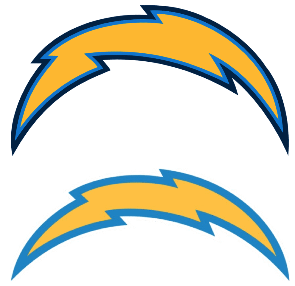
They’ve literally flattened the curve! I see that as a big upgrade. I’ve always thought the now-outgoing version of the lightning bolt looked a bit too exaggerated, too cartoonish. The gentler curvature of the new version feels a bit more dignified and stately. (No word on whether the new arc is related to Fibonacci.) And removing the navy layer is addition by subtraction.
Interestingly, after the new logo began circulating online yesterday afternoon, several people on social media asked me, “So does this mean they’ll go with powder blue as their primary jerseys?” As I had to remind those people, the Chargers already did that last season. According to the mighty Gridiron Uniform Database, they wore the powder blues six times in 2019. Interesting that that didn’t quite register, at least with some fans.
As for the new wordmark: Eh, whatever. The font feels like boilerplate Nike typography, and the little lightning bolt coming off of the “A” is fine, but this is another team whose de facto logo is the helmet. Everything else is superfluous. I suppose we could see a small rendition of that “Chargers” lettering on the jersey chest, but it doesn’t feel like a bit deal either way. The lightning bolt, and its application on the helmet, is all that really matters.
As an aside: I really dislike this trendlet of teams revealing their logos ahead of the uniforms. For certain kinds of businesses, the logo is the most important aspect of the visual brand. But for a sports team, the logos mainly serve to support the uniform program, which is the team’s chief visual signifier. Showing us a logo (or even several logos) without showing us the full context of how the logo functions on the uniform is mostly just marketing hype (as the Rams basically admitted yesterday, when they told me that revealing the logos ahead of the uniforms was “a chance to get multiple bites of the apple”). It’s a bullshit trend, and here’s hoping it doesn’t become more the rule than the exception.
Click to enlarge
ITEM! Classic Cap back in business: After a brief hiatus due to cap fulfillment manager Mark LaFountain being indisposed, I’m happy to announce that the Uni Watch Classic Cap is once again available, with all fitted sizes plus the adjustable version in stock. And until further notice, the usual price of $39.99 is now cut to $35.99.
And that’s not the only discount currently available on Uni Watch merch:
• You can save 15% on everything in the Uni Watch Shop and the Naming Wrongs Shop by using the checkout code COMMUNITY.
• A custom-designed Uni Watch membership card, which usually costs $25, is now $20.
• A Uni Watch seam ripper — perfect for those shelter-in-place logo-removal projects — which usually costs, $6, is now $4.
If you’d rather support Uni Watch via a donation, instead of a merch purch, here’s how you can do that.
My thanks, as always, for your support and consideration.

Membership update: Ten more designs have been added to the membership card gallery, including Myles Gallagher’s Portland Timbers treatment, which I believe is our first card with the new MLS font!
Ordering a membership card is a good way to support Uni Watch (which, frankly, could use your support these days). And remember, as a gesture of comm-uni-ty solidarity, the price of a membership has been reduced from $25 to $20 until further notice.
As always, you can sign up for your own custom-designed card here, you can see all the cards we’ve designed so far here (now more than 2,500 of them!), and you can see how we produce the cards here.

Click to enlarge
Wearin’ of the green, non-St. Paddy’s version: Got a note yesterday from reader Greg Mitchell, who said, “On Sunday My wife Denise and I drove down to one of my favorite places on Earth: Nobska Lighthouse in Falmouth, Mass., and also strolled Woods Hole (while fastidiously maintaining our distance from others) to enjoy the sunshine and in anticipation of more restrictions to come.”
I’m intrigued by Denise’s green-lensed sunglasses — haven’t seen anything quite like that before. And such a nice match for her Uni Watch hoodie:

The Ticker
By Lloyd Alaban

Baseball News: The Red Sox have released a social distancing logo (from Sara Klein). … John, who didn’t give his last name, received this mini-helmet standings display. … MLB and the players’ union are close to determining how the rest of the season might shape up. Key quotes: “Multiple players told ESPN they are willing to play a significant number of doubleheaders — as many as two a week — to make up for lost games and try to get as close to a full 162-game schedule as possible” and “[B]oth [sides] agree that if necessary, regular-season games could stretch into October and playoff games could be played at neutral sites in November, either in warm-weather cities or, if government officials allow indoor events, domed stadiums.” … The Cardinals’ birds on the bat are already socially distant, but here’s a logo redesign that puts them at an even safer distance (from Duke Ezeamil). … A recent article in The Athletic (paywalled) about former Orioles 1B Eddie Murray says he used to wear a necklace with the words “Just Regular” (from Joanna Zweip).

Football News: Good shelter-at-home pandemic project: Reader Timmy Donahue created an uni- and aesthetic-based assessment of the football game in the film Monsters University.

NBA News: Dennis Johnson wore No. 24 during his time with the Suns, but he did wear No. 3 for one game. Some internet sleuths tried to figure out why (from Richard Catalano).

Hockey News: The Hurricanes have released a social distancing logo. … Check out this 1970s-era photo of the Canucks practicing with the Ice Capades (from Wade Heidt). … Former Islanders F John Tonelli received a painting of himself in uniform during his number retirement ceremony last month. The painting had different number fonts, which is accurate since the Islanders changed number fonts on several occasions (from Brooks D. Simpson).

Soccer News: New first shirt for Derry City, the only Northern Irish team that plays in the League of Ireland (from our own Jamie Rathjen). … New home shirt for Ayr United (from Ed Zelaski). … Slovenia’s new home and away kits have leaked (from Josh Hinton). … For the latest on kit-related news from around the world, check out Josh‘s Twitter feed. … Reader Ed Martinez‘s daughter’s soccer team has placed their NOBs on their team bows since the back of the team’s shirts are plastered with ads. An NOBow, perhaps?

Grab Bag: A Pittsburgh-based shed company is poaching logo elements from the NFL’s Pittsburgh Steelers and MLB’s Pittsburgh Pirates (from Gordon Blau). … How well do you know your athlete personal logos? ESPN has a quiz for you to find out (from our own Brinke Guthrie). … Reader Daniel Kilgore got a push notification for a US Open (golf) update with the US Open (tennis) logo. … New red uniforms for the Japanese women’s volleyball team. “Mizuno has not had a press release for these uniforms yet, so we don’t know of other colors, but probably a blue and a white one,” says Jeremy Brahm.

Click to enlarge
What Paul did last night : Our friend and neighbor Sridhar — author of the excellent baseball book Year of the Pitcher — stopped by yesterday evening to join us for cocktails (from a safe distance, of course). It’s a little hard to see, but he brought his own bottle of bourbon and a glass. He mentioned that he just finished a really interesting-sounding article for The Atlantic about Reds first baseman Joey Votto, so that’s something to look forward to.
Sridhar also took a photo of us, so I hereby present the Paul-inclusive pandemic porch cocktail photo:

Uni Watch girl mascot President Caitlin was watching us through the window. But she got plenty of loving yesterday:
Daily cat break: basking in the sun together (then her claw got stuck in my sweater) pic.twitter.com/OdNkOjrxR5
— Mary Bakija (@mabatron) March 24, 2020
Our latest raffle winner is Kevin Cearfoss, who’s won himself a Uni Watch winged stirrup pin. Congrats to him, and big thanks to Brandon Lenk for sponsoring this one.
Tomorrow: The 22nd annual Uni Watch MLB Season Preview! Until then, everyone stay healthy, safe, and sane. Peace. — Paul
Surprised you didn’t mention the new powder blue is quite a bit different than the powder blue used in recent years. It’s more true to the classic shade now.
The Rams gave me the Pantone info for their colors. I don’t have that for the Chargers’ new blue — is it available anywhere that you’re aware of?
You can tell just by looking at it it’s quite muted compared to last year’s logo. Assuming the new solid-color jersey is the same color, a side-by-side with last season’s home jersey will show the difference.
I should have the Pantone info later today and will run a side-by-side color comparison on the site tomorrow.
Here’s a quick comparison using the two logos you posted as the lede. Old on left, new on right: link
Wow…my two new membership cards are up already…that was fast! They look fantastic and thanks again Paul!!
Paul, thanks so much for the long posts this week. It definitely helps escape reality for a few minutes.
You’re welcome, Dave. Has the same effect for me!
One of the Chargers games they didn’t wear powder blue was against Green Bay. Went mono navy, and was-besides not showing up in the NFC championship- the biggest disappointment of the 2019 season for me. Could have been a gorgeous game, even with the same result (Chargers ha don’t no problem winning that game).
I am with others in saying you provide a great site to escape current events, if but for a brief moment. Thanks to all involved at Uni Watch HQ.
As much as I love their powder blue unis, I actually like the darker shade of blue the Chargers use and I think the contrast between the two help increase the popularity of the powder blues. I didn’t notice the increase use of the powder blues last year, but I’ll keep an eye out for it this year and see if my enjoyment of that color decreases over the course of the season…that is if there is one.
Odd that the Canucks are wearing their home whites in that Ice Capades photo, which was taken at the Met Center in Bloomington.
Yep – that was the other interesting uni watching layer to the photo.
Quite likely has to do with the NHL Canucks first owner Tom Scallen, who lived in Minnesota. Scallen also ran Ice Capades along with other subsidiaries. Unfortunately, then Scallen went to jail.
link
link
That’s a whole new mystery; the NHL wore dark uniforms at home, through the 69-70 season. The Canucks’ first season in the NHL was 70-71. Maybe it was training camp or preseason?
It is a bit of a mystery. I do know 1970 training camp for the Canucks was in Calgary.
There is a 1970-71 team photo of the Canucks in their white uniforms at the Met Center. You can see the Met Center seats in the background.
link
Glad they are ditching navy and just going full powder blue. But yet another slap in the face by Spanos to SD fans who were clamoring for that for years.
” ‘So does this mean they’ll go with powder blue as their primary jerseys?’ As I had to remind those people, the Chargers already did that last season… Interesting that that didn’t quite register, at least with some fans.”
The reason for that is probably that they still wore navy alternates, and their white uniforms featured navy numbers, navy socks, navy pants, etc. Even though they wore the powder blues as their primary dark jersey, it appeared to be an alternate design as compared to their overall uniform program. Sort of the same conflicting uniform program the Rams have had the past few years.
Glad they are ditching navy and just going full powder blue. But yet another slap in the face by Spanos to SD fans who were clamoring for that for years.
Does seem that way. Guess it took moving to a largely-indifferent market to convince the Spanos family that they need to listen to those fans they have.
Evening from Australia, peeps. Thought this would be the best place to ask – does anyone know where I could find a template/design/instructions on how to create or knit one of those old fashioned baseball wool sweaters? Seeing as though I am possibly looking at some time up my sleeve I had the idea to have a go at one.
I’ve had a precursory look online but they are hard to find (pics are plentiful however) so I thought you wonderful people might know.
If the search for baseball wool sweaters doesn’t pan out, try searching for old curling sweater/jacket/cardigan patterns or even cowichan sweater for something similar looking:
link
link
Thumbs up for TTC’s sock game.
In true Charger fashion, they switched to the light blue as primary and then proceeded to wear white over white (with the navy accents) for the first two home games. Then in one of their marquee national games went mono navy. Played a majority of their road games in white over navy, and wore the royal blue color rush at least once. Talk about identity crisis! Glad to see the navy go. I also think this is a new shade of light blue, closer to the original. Their FB page also features a teaser video which hints at a return to the classic look. Maybe even helmet numbers and gold pants! I hope they get it right.
link
Gold pants – at a minimum with the White jerseys, would be a great improvement. Also glad to see them ditch the 17 layer/color numerals and trim. Good Heavens those recent unis were way too busy.
So I must ask: has Paul ever liked a new wordmark that a team or college introduced? He doesn’t seem to like new “custom” fonts but now he isn’t a fan of “boilerplate” fonts either.
And while of course I’m kind of just giving him a hard time here, it really is hard to remember him giving strong praise to any new wordmark over the years.
Actually, Dan, I had some positive things to say about some new wordmarks all the way back … in yesterday’s post about the Rams.
Okay…I went back to check…and basically you said a couple of times that they “seem fine”. Which more or less translates to…”they didn’t totally screw it up”.
Not exactly “strong praise”.
Dan, Dan, Dan… Why do you say things that so easily refuted? And why do you mischaracterize my positions when you know I’m not going to let you do that? It’s like you’re not even trying.
Here’s what I said about the “lock-up logo”: “I like the primary logo a lot more in this context, when it’s combined with the word “Rams.” There’s more sense of flow, and the things I don’t like about the primary design don’t stand out as much. This should be fine as an end zone mark.”
Honestly, Dan — it gets tiresome.
My first thought when I saw the lightning bolt attached to the A in the wordmark was that they were trying to make the A look like LA.
Putting the bolt on the “A” means it will appear in all mutations of the wordmark, because there’s no “L” in “Chargers”.
Rams make big changes, and produce a perfectly OK visual identity.
Chargers make minor changes, and produce an excellent visual identity.
There’s a lesson there and for not just sports teams.
I think the Bucs redesign is another good example of minor changes making a big boost.
One thing I love doing when I see pictures is to zoom in an look around. I noticed, Paul, that (what I presume is)your garbage can has something taped on it. Is that something to give it some flair? Something with directions / or identification on it? Very bored, oddly curious about this!
Nah, it’s just the city’s recycling program info.
Paul…
Look, we want you to express yourself, okay? Now if you feel that the bare minimum is enough, then okay. But some people choose to tape more to their garbage can and we encourage that, okay? You do want to express yourself, don’t you?
Lee
Funny, I just watched that a few nights ago, for the first time in years.
I guess powder blue is better than navy for the Chargers. It is “their” color, especially with the Oilers gone and the Titans going navy as primary. But lightning rarely comes from clear blue skies.
Overall, I like the new wordmark, even though it is predictable and almost boilerplate. The new bolt is a definite improvement. I have maintained that the Fouts Era royal/gold yellow was their best look and I don’t get the fetishization of the powder blues, but the train has left the station.
But lightning rarely comes from clear blue skies.
Should they go gray, then? It would be better than the navy blue, I’m thinking.
Speaking for myself, I can’t wait to see the white uniforms that have powder blue numerals with yellow outlines: Unique!
Count me as a fan of the Fouts era look, as well. The White or Royal Blue with gold pants, paired with the navy helmet with Gold Bolt and Facemask IMHO was their best look. Thanks to the one shell rule, they can’t even throw back to this look. I credit Mitchell & Ness’ release of the Alworth #19 for the rise in popularity of the Powder Blue.
As others have stated here, because the Chargers white uniforms had navy numbers and trim, it could be said that they wore navy more than light blue if you count the road whites. Looking forward to seeing what their new white uniforms will look like using light blue. I like that it appears they have lighted the blue. I wish that UCLA would do the same, with their light blue getting darker over the years.
They only wore the light blue at home 4 times, and not at all until their 3rd home game. It was really odd for them to hype the decision to make it the primary and then only wear it at home half the time.
Chargers routinely wear white for their home opener, routinely wear the Rash at home, plus they had the navy alternate. So four or five times wearing powder blue is about right.
Great Hamm’s beer glass Paul!
I have the same one.
Glad the Chargers dumped the dark blue and light blue double out line on the bolt. On TV, that sort of melted into a lime green transition that looked weird.
Happy to have Uni-Watch as part of my daily routine. Thanks Paul and team U-W.
As someone who generally dislikes navy blue as a color to wear and still harbors great hatred for the Rays redesign, I still have to admit that navy blue/powder blue/yellow is a great three-color combination. I don’t think the new Chargers logo is addition by subtraction personally, I think it’s subtraction by subtraction. Maybe I’m only realizing it now that it’s “gone,” but the old one is kind of perfect to me. I like how “tight” it is – it seems taut, powerful, strong. The flatter one feels weaker and more noodly to me, evoking the Sabres Buffaslug a little bit.
I can get behind navy/powder blue/yellow when the navy is the almost-black Yankees’ shade. Even better would be black/powder blue/yellow.
Stoked that my membership card got a feature! Can’t wait to receive it and represent!
Seeing that feature on Dennis Johnson reminds me what a great uniform the Phoenix Suns had. An odd case of the team getting it right following the first tune-up, ditching the art-deco font for Tuscan, and changing the numerals from Varsity Block to Helvetica.
I just remembered that the Chargers’ last uniform overhaul is how I found Uni-Watch (through a routine Yahoo search). This makes this almost an anniversary of sorts for me.
I love the photos of Greg and Denise Mitchell. They look like lovely people.
And few things reinforce my faith in humanity quite like the sight of a robust man in a hockey sweater.
I never ceases to amaze me that the Chargers have only worn gold pants in 19 of their 59 seasons, and not once since 1984.
Anyone under 36 has never seen them in gold pants live in their lives!
Lee
Kind of sad, really.
Those 80’s uniforms, especially with the white jerseys, are among my all-time favorites.
Paul,
Have not had a chance to chime in on the site coverage during the pandemic. It’s all been great. As someone completely thrown off of my daily routine, I find myself not reading the site in the morning as I usually do but, instead, remembering randomly at some point in the day to do so. I’ve appreciated the few minutes of joy that have followed that remembering as I spend some time with the day’s content. Have not missed a day yet, now in Day 13 of my house isolation. You’re doing a great job mixing standard content with material from our current moment, working in whatever is available to share with the rest of us. Much appreciated. Cheers.
Thanks, Matt — much appreciated.
Nice addition by subtraction for Les Chargers. Still can’t forgive them for leaving San Diego, though.
One-helmet rule may be changed in the NFL:
link
Has ANYBODY ever provided any Science as to the NFL’s One-Shell Rule” actually increasing Player Safety? or is it all simply theory? I find it incredibly difficult to believe that any helmet worn in 20 games and 150 practice sessions (including camp) is somehow SAFER than a properly fitted NEW helmet without pressed down and used inner padding. ANYONE have ANY info on this?
Thanks. Please.
No science has been “provided,” but that doesn’t mean it’s “simply theory.”
Two NFL advisory committees, filled with people who know more about neuroscience than either you or I, came up with it, based on evidence and data that they reviewed. That doesn’t automatically mean they were right, but I’ve grown really tired of armchair experts who don’t know anything about neuroscience or football helmets but who nonetheless think they know better than those two committees. How about we all agree that most of us are in no position to judge this rule on its actual merits (as opposed to judging it because you want to see Pat Patriot back on the field again) because we don’t have the knowledge or skill sets to do so?
Awesome color-on-color footage posted to YouTube today. A’s vs. Rangers, June 1975. The home Rangers wear their powder blue TEXAS tops with white pants, while the visiting A’s don their gold(?) tops with white pants. Dig those umpire blazers!
link
Beautiful find!
The channel is definitely worth a follow:
link
The SMU library has been in the process of digitizing old news films from the ABC affiliate in Dallas. A search of the YouTube channel results in lots of awesome Cowboys, Rangers, SMU, Chaparral (ABA), and Dallas Blackhawks hockey footage.
Why is there little mention of the new alternate Chargers smiley face logo,as featured in the team’s intro video, anywhere, including Uni Watch?
link
I know I’m surprised that Paul didn’t mention it. There seems to be confusion as to whether or not it’s an official mark . If it is I like it, very fun and original in my opinion. Although I doubt it would be anywhere on the uniforms. People seem to like it, it looks like quite a few people have made it their social media profile pic.
Would like to see chargers in yellow/gold pants with blue bolt. One of my favorites.