The new chapter begins https://t.co/D9h8D1R4li
— Los Angeles Rams (@RamsNFL) March 23, 2020
Hello there! The Rams finally revealed their long-awaited color scheme and logo set yesterday. The unveiling took place via the video shown above, and there’s lots of additional info on this website devoted to the new identity. I recommend that you check out that site before reading further.
In addition, I had a video conference with three members of the Rams’ front office, including their creative director, a few hours before the unveiling, so I got some additional insights into the team’s thinking (which I’ll try to sprinkle into the text that follows) and was also able to ask them some questions (which I’ll save for the end of this post).
Before I get to the various elements, it’s worth noting that this was, in some ways, an extremely boilerplate brand presentation, complete with endless references to “storytelling,” cringe-inducing color names (the new shade of yellow is called “Sol,” but come on — it’s just yellow), and the umpteenth repetition of “Respect the past, represent the future.” All of that said, there’s also an intriguing design reference that they’ve chosen to draw upon — a reference I’ve definitely never seen before in a sports branding context — which I’ll explain shortly.
Okay, one element at a time:
The New Colors
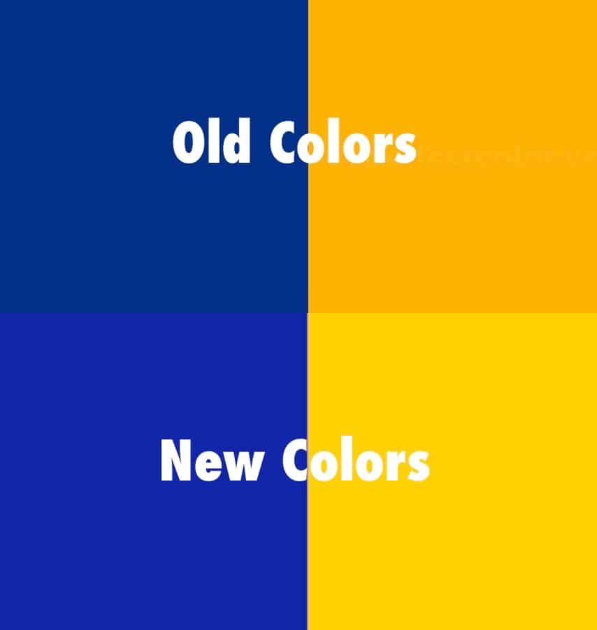
As you can see above, they’ve basically taken their throwback colors and made them pop a bit more. I’m fine with that — it’s a good color scheme.
Incidentally, one good reason to refer to the new shade of yellow as, um, “yellow” is that it is literally almost pure yellow, at least on the CMYK scale. Its components are 100% yellow, 9% magenta, and zero black or cyan. In other words: yellow.
The New Primary Logo
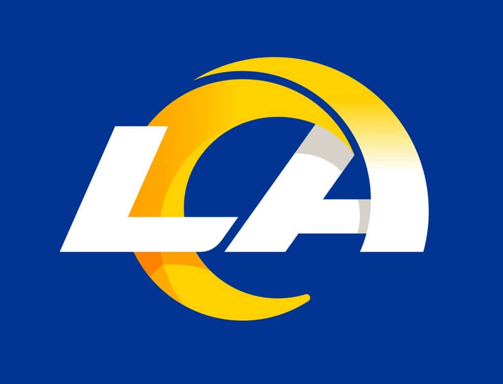
There’s a lot to cover here. One thing at a time:
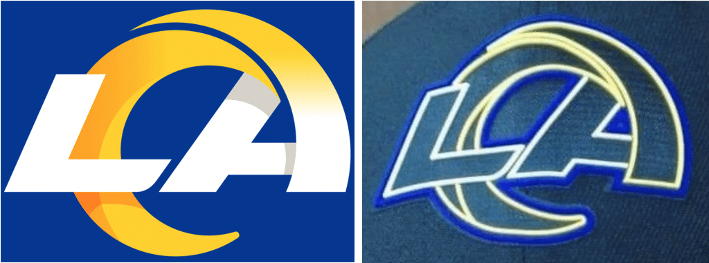
• We all knew that the logo on the leaked draft cap wasn’t going to match the colors or the format of the actual logo. How close was it? Here’s a side-by-side comparison:
• The logo has two gradients. I don’t necessarily see that as a good thing or a bad thing — it’s just a thing. But the Rams are apparently very proud of the gradient. During yesterday’s video conference, they repeatedly mentioned that they believed no other major-level pro team currently uses a gradient. They also stressed that this new brand identity is geared for gradient-friendly digital presentation, including social media and their new stadium’s high-def video boards. The flip side of that, as several observers pointed out to me yesterday afternoon, is that gradients can be difficult to reproduce in analog formats, like embroidery.
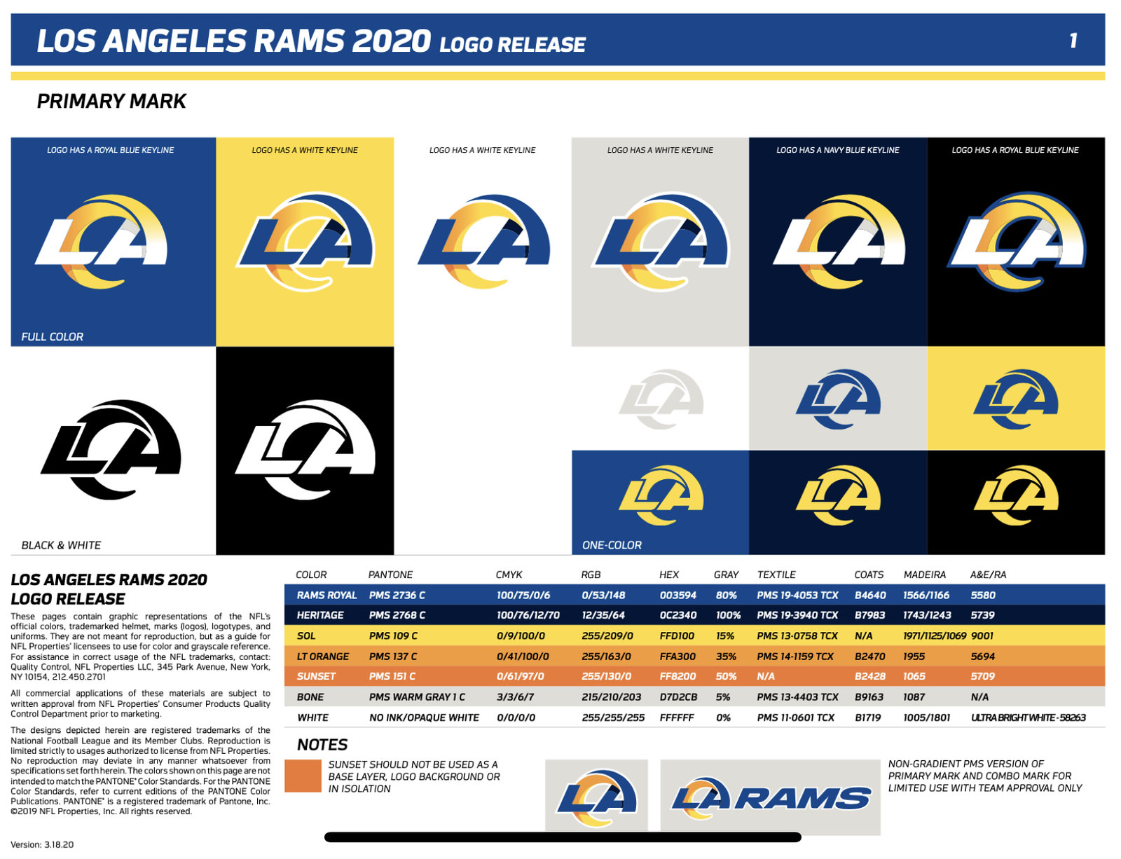
• There are additional versions of the logo, as well as additional info about the various shades of orange and grey, on this logo slick, which was tweeted yesterday by @MakersofSport:
• The intriguing design reference I mentioned earlier is the Fibonacci spiral, also known as the golden spiral, or the golden ratio (which once came up here on Uni Watch as a way of deconstructing the most famous photo of “The Catch”). Here’s how the logo fits into this iconic spiral pattern:
The idea is that the spiral represents many things: a ram’s horn, sure, but also a southern California ocean wave, the spiral of a passed football, the shape of their new stadium, and more. (At one point, as a way of playing along, I said, “Oh, and the left segment of the horn is also a crescent moon,” a seemingly obvious observation that the Rams folks appeared to be a bit surprised by.) It’s an interesting approach — I think we can safely say that no previous NFL team has ever referenced a 13th-century mathematician in its logo unveiling — although it’s not exactly the most straightforward thing on which to base a brand identity.
I wondered if the Rams planned to make Fibonacci a household name, which would be pretty great on several levels (among other things, “Fibonacci” is just a cool-sounding word — say it out loud and see for yourself), but they said no. I think maybe the rest of us should make it a thing. Let’s call it the Fibonacci logo!
• Fibonacci notwithstanding, the idea is that the segmented horn will become sufficiently familiar and iconic to function in multiple contexts, including just by itself:

Is that terrible? No. But is it better than their current horns? Also no. I’m hoping they stick with the existing helmet design, but that seems unlikely.
• So does that mean that the Rams’ new helmet will feature this new segmented horn? They’re not saying. But here’s a rough sense of how that might look:
quick mockup of how the new Rams logo could look on the helmet pic.twitter.com/T54lNk85Jq
— MadeByTim (@MadeByTim) March 23, 2020
• After the draft cap leaked, there were lots of jokes about the logo: It looked like the Rams’ and Chargers’ logos had a baby, it looked like the Firefox logo, it looked like Donald Trump’s hair, blah-blah-blah. But after yesterday’s unveiling, several folks pointed out a more serious problem, namely that the new logo appears to owe a heavy stylistic debt to Angelo State University:
Who did it better, the Rams or Angelo State University? pic.twitter.com/EtPa3mBTN8
— Taylor Jenkins (@TJenkinsTampa) March 23, 2020
Obviously, I don’t think the Rams intended to rip off a D2 school in Texas. But it’s a bit embarrassing that they came up with something so similar, even if only inadvertently. I’ve asked Angelo State for comment and will report back if/when I hear from them.
• Overall: I don’t much care for it. The “A” feels really forced, the segmentation seems unnecessary, I can’t un-see the crescent moon, it bugs me that the bottom of the crescent has a rounded tip while the top of the crescent and the top of the other segment both have pointed tips, and whole thing feels very 1980s to me.
Still, as I said when the draft cap leaked, the Rams’ primary logo doesn’t matter as much as most other teams’ logos, because they’re not going to wear this logo on their helmet (presumably). If this logo is just something we see as their Twitter avatar or their midfield logo, it’s not really that big a deal.
• Oh, speaking of which: It looks like it will be their midfield logo, at least based on some renderings now scattered around their website, like this one:
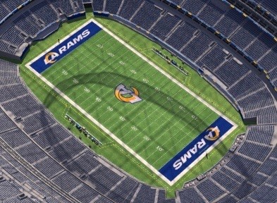
As you can see, there’s also a new wordmark in the end zones, which leads us to…
The New “Lockup” Wordmark
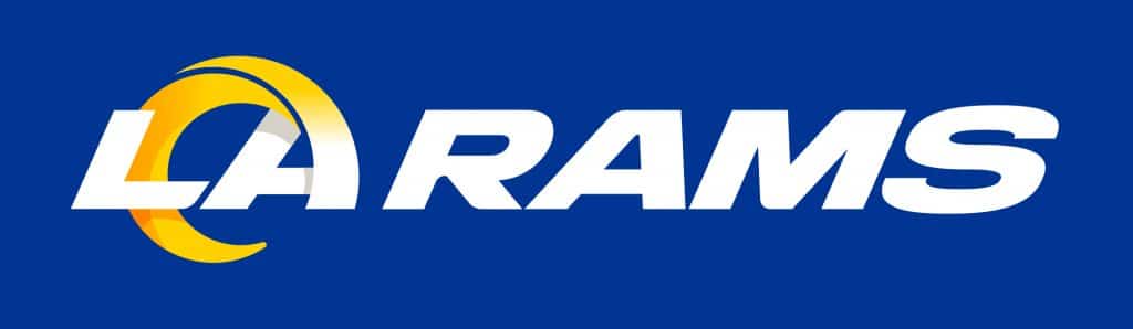
I like the primary logo a lot more in this context, when it’s combined with the word “Rams.” There’s more sense of flow, and the things I don’t like about the primary design don’t stand out as much. This should be fine as an end zone mark.
The New Full Team Wordmark
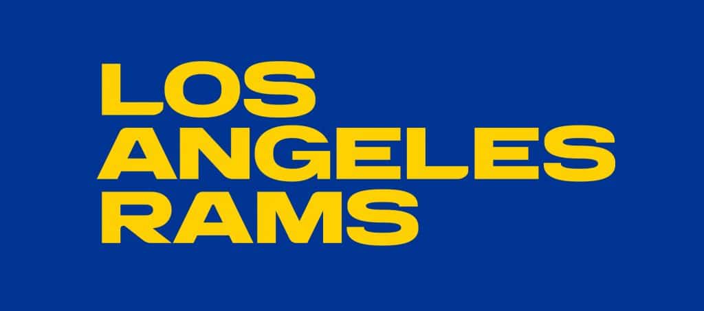
Unlike all the other typography, this mark is not italic. It seems fine (I especially like the “S”), but it’s hard to assess it without knowing how it’s going to be used. I asked which contexts this logo — and all of the logos — would likely be appearing in but was told I’d have to wait and see.
The New Ram’s Head Logo
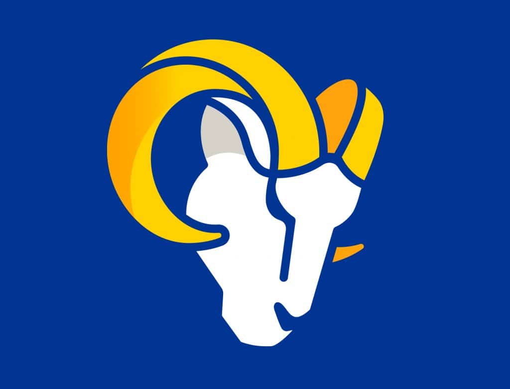
This is the latest variation of a logo that the Rams have used since 1946:
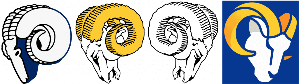
I like the colors, and even the segmented horn looks better in this context. But I really wish there were more detail and definition in the face. It feels unfinished. One observer has already improved it:
Now this….is awesome. Made by @NFL_Memes! pic.twitter.com/vvDgP4bUJj
— (@Jim_Everett) March 23, 2020
But again, logos don’t matter so much for the Rams, because their helmet is really their de facto logo. So we’ll get a better sense of how this new identity works when we see the uniforms.
And that brings us to the questions that I asked the Rams people at the end of their presentation to me. Here’s how that went:
Uni Watch: Will the primary logo be appearing on the new helmet?
Cory Befort, Rams Creative Director: We really can’t talk yet about the uniforms.
UW: Were the logos designed by Nike, or by your in-house design staff, or by an outside agency?
Befort: It was a collaboration between the NFL, Nike, and our in-house design team.
UW: When the draft cap leaked, a lot of the reaction I saw — and I’m sure you did as well — was that having the horn separated into sections made it look somewhat reminiscent of the Chargers’ lightning bolts. You’re sharing similar colors, you’re sharing a stadium, you’re sharing a city — was that a consideration, that the sectioned horn created a visual effect similar to the Chargers’ brand?
Befort: I don’t want to talk about the hat specifically, because that’s an NFL thing. In our brand guidelines, you are not allowed to make a ghosted or inverted version of our logo [like the one that appeared on the draft cap]. The NFL wanted to go with this neon look for the draft, and that breaks our internal brand guidelines. So that mark should never be utilized that way, it should never be seen that way, and it doesn’t exist in our identity system at all.
UW: But even the actual version of your logo, the official version, you’re not concerned that it could be perceived that way?
Befort: No, I don’t think so. I think the fact that we’re leveraging the shape of that horn, and when you see it across the board, in its totality — I think there was just a circumstance where a version leaked out that created a perception that we didn’t get to tell our narrative the way we wanted. And that’s just the way the world works sometimes. It’s disappointing that we weren’t able to tell our story the way we wanted to, but we still feel really confident and really good about the entire system in its totality.
UW: When will the uniforms be unveiled?
Joanna Hunter, Senior Director, Corporate Communications: Considering the state of the world, we can’t commit to a date right now.
UW: Even before the world turned upside-down, your stated plan was to unveil the the logos and colors before the draft and the uniforms after the draft. What was the thinking behind that? Why not unveil all of it at once?
Befort: From a brand perspective, the idea that you could have multiple splashes over the course of a year, it gives you a better opportunity to reach the masses. And especially with us being relatively new and back in the [L.A.] market, I think that just makes sense, from a brand perspective.
Tyrel Kirkham, VP of Merchandise: To build on that, based on my experience in Brooklyn [Kirkham previously worked for the Nets — PL], it’s good to have a chance to get multiple bites of the apple and give people time to digest what just launched. In this instance, given the complexity associated with our new identity system, we felt it was of the utmost importance to really leverage that moment, allow people to get familiar with what we launched, and then have another moment later on that would connect the dots.
UW: Is there anything you can tell me — anything at all — about the uniforms?
Hunter: No.
Befort [laughing]: They will match.
UW: Okay, here’s a question that sort of straddles the logo and uniform situations: I’m assuming there will be an inaugural-season patch for your new stadium?
Hunter [smiling and shaking her head “No”]: I’m going to keep shaking my head.
UW: Okay, okay. I know you guys don’t currently have a first-round draft pick, but it’s possible that you could trade up, and then you’d have a situation where your first-rounder could be photographed at the draft posing with your current or outgoing jersey.
Hunter: Paul, I don’t know if you know [Rams GM] Les Snead, but it’s very unlikely that we will trade up for a first-rounder. Also, given how the NFL has changed the draft this year, we’re not sure how they’re going about featuring which players, or getting hats or jerseys to them.
———
And there you have it. I’m not really sold on this package, but assessing the logos without seeing the uniforms is like assessing an appetizer without knowing what the entrée will be. I look forward to sitting down to the full meal sometime after the draft.
Meanwhile, an interesting loose end: In that unveiling video at the top of this entry, there’s a scene set at the Riddell helmet factory. As many observers quickly noted, the footage appears to show a batch of Patriots throwback helmets (click to enlarge):
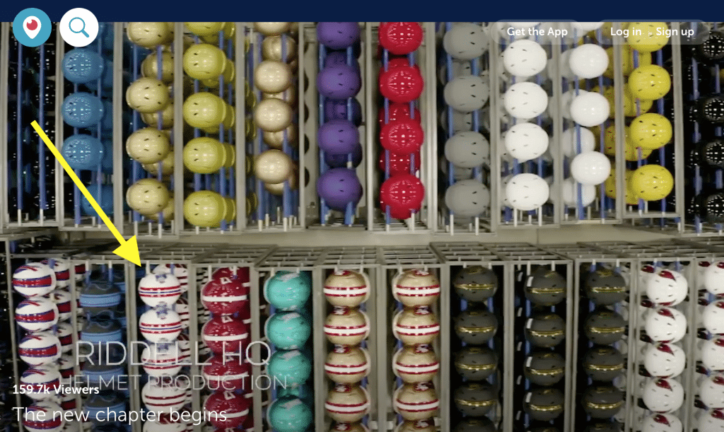
Some people have seized upon this as evidence that New England is bringing back Pat Patriot. Personally, I don’t buy it. For one thing, that could be old B-roll footage, and/or those could be souvenir helmets or mini-helmets, and/or a few other things. Which leads us to the next section of today’s post — see below.
(My thanks to Donovan Moore for pointing me toward that logo slick.)
And hey, speaking of the NFL…: We’ve known for a long time now that the Rams, Bucs, Browns, and Falcons would be unveiling new uniforms this spring. But there have also been rumors swirling about three other teams: the Chargers, Patriots, and Colts.
I’ve been unable to confirm those rumors, but they now appear to be true. Associated Press writer Joe Reedy — a reputable source — confirmed the news yesterday with this tweet:
Logo and uniform changes: #Rams, #Chargers
Uniform changes: #Falcons, #Bucs, #Patriots, #Browns
Logo/uniform tweaks: #Colts
Usually you get only 2 or 3 per season. Seven is unheard of https://t.co/Kwxri6b8fN— Joe Reedy (@joereedy) March 23, 2020
So what can we tell from these tea leaves? Let’s go team by team:
• Rams: Nothing new to learn here, obviously.
• Bucs: This confirms what I’ve already reported, namely that their new uni set is keeping the current logo.
• Browns: Nothing we didn’t already know.
• Falcons: The news here is that they’re changing their uniforms but not their logo (which had been hinted at but not confirmed until now).
• Chargers: It’s hard to know what to make of this, since a “new logo” could be just a new secondary mark, and a “uniform change” could just be a new alternate uni. In any case, it’s surprising. But on the other hand, the Chargers, like the Rams, are moving into a new stadium (the same stadium), so maybe it’s not so surprising after all. Anyway, maybe the new Rams logo won’t look so Chargers-like after all once this is over!
• Patriots: Again, “uniform change” could simply mean a new alternate — like, say, the long-rumored throwback. That’s what I’m expecting, especially since they’re apparently not getting a new logo (which means no Pat Patriot, despite the glimpse of him in that Rams video).
• Colts: Just “tweaks.” A team spokesman has already told me that they’re not changing their pants striping. Maybe they’re finally ditching the Flywire and graduating to the new tailoring template? That would be my guess for the uni tweak, although it doesn’t address the logo tweak. Hmmmm.
In any case, it looks like I’ll have plenty to write about in the weeks to come, despite the sports world’s shutdown.
Click to enlarge
Collector’s Corner
By Brinke Guthrie
Follow @brinkeguthrie
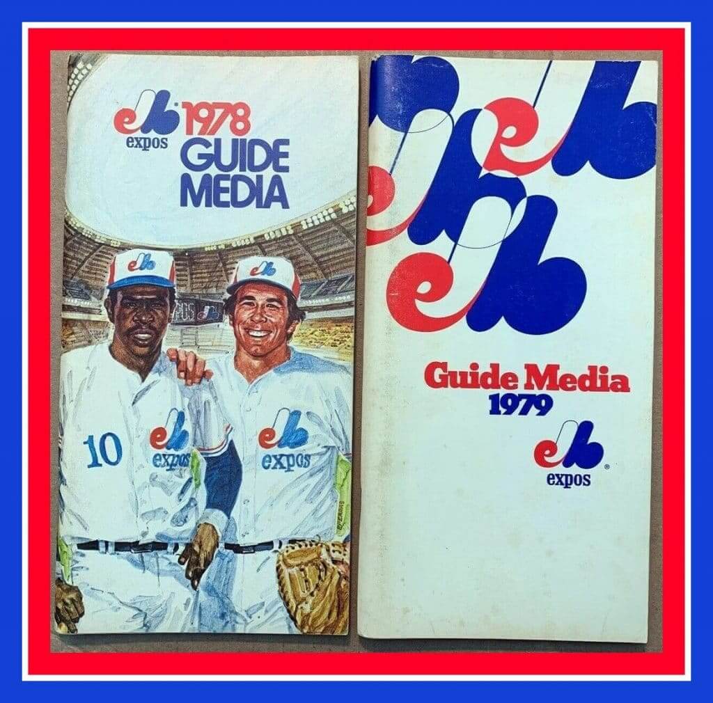
This week was supposed to be opening week for the National Pastime, but we all know how that worked out. (And yes, baseball will always be the National Pastime, no matter what Roger Goodell says.) But while we may not have the games, we still have our love for the game, so let’s get started with a team whose logo we all know and love, the Montreal Expos. These two media guides from 1978 and 1979 look great. On the left we’ve got the Hawk and the Kid; on the right, a series of team logos. (Cue Todd Radom for his treatise on just what that logo means.) So why does it say “Guide Media”? Is that a French language quirk written en anglais?
Now for the rest of this week’s picks:
• Candy bar, anyone? We’ve got ’em for Cal Ripken, Jr. and Isiah Thomas. (“Slam Dunked in Milk Chocolate.”)
• Mets catcher Mike Piazza gets the “pop art” treatment on this stylish poster.
• This sticker says “’70 Belongs to the Senators.” Just two seasons later, they’d be in Arlington as the Rangers. (And for those scoring at home, 1970 ended up not belonging to the Senators. They went 70-92 and finished in sixth place.)
• This promo belt buckle from NBC says “AFC on NBC 20th Anniversary 1984.” Hmmm, were they also taking into account the AFL, since the AFC didn’t exist until 1970?
• Staying with the Peacock network, I think this NBC polo shirt is a bit of an attention-grabber given the garish color scheme. The tag says “In the Paint, For the Player On and Off the Court.”
• The Phillie Phanatic stars on this 1979 Phillies season schedule poster.
• Going back even further for the Phillies, admire the simplicity of this 1942 media guide.
• This San Francisco Giants ticket brochure artwork plays up the fact that you’ve gotta be a hardy soul (or slightly crazed, as the illustration suggests) to catch a game at the ’Stick.
• The New York Daily News printed up this Keith Hernandez poster sometime in the 1980s.
• Dig the totally 1970s font on the front of this Bobby Orr puzzle.
• Sportscaster Brent Musburger signed this copy of the Broward Dolphins Booster Club program for Earl Morrall Night at the Inverrary Country Club on Nov. 16, 1976. Notice the helmet drawing has the Griese-style facemask.

Membership update: Most people ordering a membership card use their own surname as the NOB. A few use a favorite athlete’s surname. And then there are the people who use the NOB for a slogan or message. That’s the case with Ryan Smith’s new Nationals-themed card. The Nats’ postseason slogan in 2019 was “Finish the Fight,” and of course that’s just what they did — hence Ryan’s “Finished 19” design. Nicely done.
Ryan’s card is part of a new batch that’s been added to the membership card gallery, as we continue to work our way through the huge surge of March orders (thank you!).
Ordering a membership card is a good way to support Uni Watch (which, frankly, could use your support these days). And remember, as a gesture of comm-uni-ty solidarity, the price of a membership has been reduced from $25 to $20 until further notice.
As always, you can sign up for your own custom-designed card here, you can see all the cards we’ve designed so far here (now more than 2,400 of them!), and you can see how we produce the cards here.


ITEM! Pin raffle: Last week we raffled off a hoodie that was generously donated by reader Brandon Lenk. He also has an extra winged stirrup pin, so we’re going to raffle that off today.
This will be a one-day raffle. To enter, send an email with your mailing address to the raffle address by 8pm Eastern tonight. One entry per person. I’ll announce the winner tomorrow. Big thanks to Brandon for sponsoring this one!
The Ticker
By Alex Hider

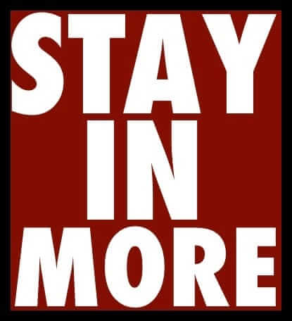
Baseball News: Reds beat writer and longtime friend of Uni Watch C. Trent Rosecrans shared the story of his favorite piece of memorabilia — a jersey worn by former Reds pitching coach Dick Pole, who kept his jersey hemmed high so he could wear a pullover above it and keep it untucked (from Quentin Tingle). … Someone made an impressive paper model of old Yankee Stadium (from James Burke). … The Toledo Mud Hens are asking kids to design a new team jersey (from Matt Rashford). … The Amarillo Sod Poodles, the Padres’ Double-A affiliate, will wear gold-accented caps every Monday in honor of their 2019 Texas League championship (from Ignacio). … Kansas City is urging people to stay home during the coronavirus pandemic with a logo that became popular as a T-shirt during the Royals’ World Series runs in 2014 and 2015. Speaking of the Royals, that’s longtime 2B and current Jackson County Executive Frank White standing behind the podium and to the left (from Ron Baker). … The Korean team Lotte Giants held an intrasquad scrimmage in an empty ballpark yesterday, with most of the players wearing surgical masks. “Interestingly enough, the pitcher was still allowed to lick his fingers (while off the rubber) before pitching the ball — um,” says John Exby. You can see video of the entire game here.

Football News: A huge Twitter thread broke out yesterday that shows the helmets of high school teams from across the country (from Steve Bradley). … Here’s a history of Florida’s mascots — Albert and Alberta Alligator (from Kary Klismet).

NBA News: The rock band Wilco is selling a T-shirt based on the Raptors’ “Earned” jersey (from Roy Weiss). … A designer has mocked up dozens of NBA jerseys to represent neighborhoods in the Dallas area (from Chris Mycoskie). … Reader Derek Linn was watching Indiana Gov. Eric Holcomb give an update about his state’s response to the pandemic and spotted what appears to be the layout of a basketball floor on an easel behind him. It appears the floor has a Pacers logo in the left lane, an Indiana Fever logo in the right lane, the Indiana state flag in the center circle, a high school three-point line, and a restricted area arc in both lanes which appears in every level except high school.

College Hoops News: Reader Daniel O’Hara’s mom was cleaning out some boxes and came across this button from Seton Hall’s 1989 Final Four run (and while not hoops-related, she also found this 1984 Olympics patch).

Soccer News: Inter Miami FC is promoting social distancing by separating the herons in their crest. Their legs are usually interlocked (thanks to all who shared). … La Liga has finally suspended its season. … Lots of kit leaks from Josh Hinton: RB Leipzig of the Bundesliga’s 2020-2021 third jerseys, Tottenham’s 2020-2021 third jersey, and PSG’s 2020-2021 third jersey. See more kit leaks over at Football Kit Watch. … The Australian A-League’s Newcastle Jets have been wearing a hashtag on the front of their jerseys in support of the victims of the country’s bushfires (from our own Jamie Rathjen). … Scottish side Ayr United will now be outfitted by Hummel. “New shirt coming later today as well,” says Ed Zelaski.

Grab Bag: With no sports going on, a British rugby broadcaster is staying sane by doing hilarious play-by-play of his everyday life (NYT link) and sharing it on Twitter. … Speaking of, Fox’s Joe Buck is offering to do play-by-play for other people’s lives (from Ignacio Salazar). … Santini, an Italian cycling apparel company that’s the outfitter for the sport’s governing body, the UCI, has converted its factory to making surgical masks (from our own Jamie Rathjen). … Golf Digest is running a March Madness-style bracket to determine the greatest golf course architect of all time (from Kary Klismet). … Speaking of brackets, here’s one to determine the best Italian pro volleyball logo (from Guy Fish). … One more: This bracket looks to determine the most stylish tennis outfit (from Bastien Fachan). … The U.S. Navy has updated its religious accommodations policy and will allow Sikh sailors to wear turbans for the first time (from Timmy Donahue). … Also from Timmy, the Park Forest (Ill.) Police Department has retired badge No. 204 in honor of an officer who was critically wounded on the job in 2016. … It seems inevitable that the Olympics will be cancelled, but for now the torch relay is still set to start on Thursday — but with a lantern being carried by a vehicle on empty streets. Check that: The Olympics are now officially postponed.

Click to enlarge
What Paul did last night : Although you can’t really see it in the photo (which is just one of the problems with the truly terrible photo I took), it rained all day yesterday in Brooklyn, so the front section of our porch got wet and we had to bring out the deck chairs instead of just sitting on the top step like we usually do. Budweiser for me, white wine for the Tugboat Captain.
Since it was cold and rainy, there were no dogs for us to say hi to as they walked by, and none of our neighbors were on their respective porches. It felt like we were the only people in the world who were (stupid enough to be) outside. It’s supposed to be sunny and warmer today.
All of the porch cocktail photos can be found here. Everyone out there stay healthy, safe, and sane — we’re all in this together. — Paul
Someone with more helmet knowledge than I have should take a close look at that Riddle factory photo. I’m seeing what looks like Alabama helmets that all have #17, seeming to point to them being souvenirs, not game helmets. It’s also an odd mix, as it looks like the lower 2 helmets in the Patriots row are Wisconsin helmets. However of note is the row of matte grey Lions helmets between the Billd and Pats, the Teal between the Pats and 49ers (maybe this is a college team), and the 3 rows of matte grey/black with gold (maybe another college?)between the 49ers and Cardinals. Maybe these are long used alternates for promotional use, but worth a note.
These are definitely commemorative. Looks like Bills, Lions, Pats/Badgers, Super Bowl commemorative (link), Arizona St? (couldn’t find one with the stripe, could be wrong. Could also be Vanderbilt or Army), Cardinals
Riddell doesn’t decal team helmets anyways, so anything with a decal in their shop is simply for retail purposes. Teams order a blank shell from the manufacturer and decal them in-house.
Depends which teams/decals to which you’re referring. If it’s NFL/major college, you’re right. But for other helmets, they do plenty of decal application.
Agreed; these are commemorative helmets. Don’t forget that the Patriots didn’t have the center blue stripe on the helmets until 1964 – so 1961-63 had only the 2 red stripes and the Pat Patriot logo (1960 had only the 2 red stripes but the blue tricorner hat and red player numbers
My thought on the Rams using Fibonacci was that they just recently watched the episode of Criminal Minds with Jason Alexander in it when they came up with explanations.
Whenever Fibonacci comes up, I thin of this three-part math video from Vi Hart: link
If the Rams can get their helmet blue to match their jersey blue, we can at least call this overall a partial success.
Now, if we could just get the Saints to do the same with their gold…
Chargers. Do not screw this up. Your last complete overhaul managed to do “modern” right (mostly). The tweaks you have made in the ensuing years have been mostly upgrades (addition of yellow trim to socks and NOB’s, the Royal Blue Color Rush is one of the best of that group, the change to the Light Blue for the primary, and yellow facemark). I hope you haven’t succumbed to Nike’s suggestion to “establish a ‘new identity’ in LA” which will no doubt include Navy Unitards and helmets, or BFBS, or realistic lightning bolts, etc. Uniform changes for you should be limited to a return to past sets (royal is probably out since the Rams have claimed it), numbers on the helmets, and/or gold pants. That’s it. That’s the list. I fear that’s it’s already too late.
*facemasks
If you’re the Chargers, why not go royal/gold too? The Fouts Era Chargers’ uniforms are their best look IMO (shut it, Chris Berman). Yellow pants, yellow bolts on the helmets, royal jerseys, yellow facemasks. Heck, bring back Chuck Muncie glasses for everyone.
That is my favorite era of Charger uniform as well. The Royal with the gold pants. I am a little optimistic after seeing the video the Chargers released today that they are going more traditional (albeit with powder and not royal) It harkened back to past Powder Blue sets and seemed to hint at helmet numbers and gold pants.
Didn’t the Rams design the new stadium to look like their (now defunct) logo? Seems like bad planning, if that’s the case.
I thought I had read that (Possible even here on UniWatch.)
That was never explicitly stated by the team. People just noted that it seemed to match the old logo shape.
Ahh, okay – that makes more sense, thanks for the clarification.
That Wilco shirt was first sold at their Toronto show last October which featured this poster link with the Raptors jersey on it.
I both agree and disagree. On one hand, my OCD makes me want to agree, that uniforms have to be uniform. However, some of the quirks that evolved over decades (Tigers and Yankees using different logos on the same uniform, Saints and Cowboys with mismatched colors) have become almost endearing traditions.
Uni-watchers might find this thread about the Rams’ new logos from Pro Football Talk interesting:
link
Or at least I found the comment section kind of funny, just because nearly everybody appeared to thing that these were among the worst logos ever designed in the history of sports…
Did anyone else get the impression that the Rams people Paul talked to hadn’t even thought about the resemblance to the Chargers lightning bolt? They seemed to be ducking the question but at first, I don’t think he knew what was being asked!
FWIW, I think the new logo is a total downgrade.
I don’t know how you can look at the LA logo and not see LAC and instantly think Chargers, also considering they are also a blue and yellow team. But I suppose designers aren’t immune to not being able to see the forest.
Wow, the ram head logo looks so much better with a yellow eye in that mock up design (I could do without LA being included in the ram).
The ram head is kind of meh, a downgrade from a royal and yellow version of their past logo, but it isn’t awful. One can only hope given all of the negative feedback on the LA logo that it quickly becomes a secondary logo and the ram head the primary.
Completely agree with Paul that the LA logo looks much better in the context of the full LA RAMS wordmark. I have a bad feeling that is going to be on the chest in big honking letters (like CLEVELAND, on the Browns’ jersey) to ruin their new uniforms.
The new ram’s head is evocative of the Texans’ steer head. Copying is weak sauce.
Isn’t Green Bay supposed to get new throwbacks this year? Interesting that it wasn’t mentioned in that tweet. Maybe something bigger for the Pats?
The Packers are getting a new throwback. I guess that they don’t count since they will only get worn once a year.
The Rams are bragging about the fact that no other Big 4 North American team has a gradient in their logo. Did they stop to wonder why nobody else uses a gradient? The Tampa Bay Devil Rays are calling from 20 years back to discuss…
As for the merits of the new logo set, they’re OK. Probably unnecessary and certainly not groundbreaking, gradients aside. I hope they keep the helmets perfect like they are. When I was a kid, I had those sweet NFL logo sheets (it was the 1970s). I didn’t realize the ram’s head was facing straight down. I always thought that it was a man with ram horns (think Tim the Wizard from Monty Python and the Holy Grail) – the tilde shape was the eye, the ram’s eye was a very self-assured, smirky mouth. I still can’t unsee it.
Sheesh, I learned why not to have gradients in logos back in 1998 or so. Yes, maybe things have changed a bit with digital being the way most assets are consumed.
But, in the end, these things are going to get a lot of representation in the analog world.
Not smart.
Although I remember having to design fax-friendly alternate versions of logos…
That gradient. Woof.
Re: Guide Media. The french word for “guide” is “guide” and the french word for “media” is “media”. French also puts the noun first in many (most?) noun phrases. So a direct translation for the English “media guide” is “guide media” (geed mehdiah).
I’ve always loved the “Get Out More” segments, but really enjoying Get In More. I’m originally from Brooklyn, but moved out in 1985. The pics look like many streets in Brooklyn, including my old one. Bringing back great memories of stickball, punch ball, and stoop ball…
logo: a graphic representation or symbol of a company name, trademark, abbreviation, etc., often uniquely designed for ready recognition.
Kudos to Paul for asking the tough question about the logo. The Rams answer, that the logo was leaked in an unusual format before they got to explain it, shows that they do not understand the “ready recognition” role of a logo.
I’m in the minority but I like the Fibonacci logo and I really like the concept helmet with the new horns. The Fibonacci logo feels compact and the horns immediately read as stylized horns to me. I could also imagine kids trying to doodle that logo on their school notebooks. I don’t actually see the lightning bolt similarity so I don’t have a problem with that aspect of the logo. The ram head logo is meh For me. It looks asleep but not every mascot logo has to look menacing. That being said, I would prefer that as the midfield logo. The Fibonacci logo feels unbalanced on the field because it’s not balanced but feels like it should be. Just putting the horns without the LA would also work. That would be slick. I think the new logos are visually interesting, have a clear identity, Work together, and connect to past logos. Something that strikes me about this is that the majority of complaints levied on Twitter feels like people wanting to be negative just for the sake of feeling superior. So many logos we see as iconic wouldn’t pass the same tests people seem to have for teams today. People would complain about Green Bay’s G as being too simple, “my 6-year old could have done that.” They would wonder why there’s no B for the Bay in Green Bay. They would mock the Steelers for stealing a logo “you couldn’t come up with your own design so you stole it from industry”, using non-team colors in the logo “make it make sense,” and using a logo only on one side of the helmet, “in an attempt to be edgy you just look unfinished.” The KC Chiefs logo is kind of childish and still iconic. The Pittsburgh Penguins have a cartoon penguin in Ice skates, gloves, a scarf, and it looks like ac twelve year old drew it doing a figure skating pose. My favorite team is the Lakers. If they released their current primarily logo (the yellow Basketball with people Lakers on top) people would hate it today. But no one says anything because it’s classic. But nothing can become old and classic unless you give it a chance. The actual brand is the team and it’s success. If the team wins, people will like the logo more. If the rams were to win the super bowls in the next ten years, the logo would become iconic and there would be a complete inversion of the ratio of the likes to dislikes. It’s not rocket science.
The new Rams logo looks like it was inspired by the newest version of the Microsoft Edge logo. Look it up.
Is that an actual Fibonacci spiral, though? Here’s an image of one: link
The box contains a true spiral whrere the curve continues to have a decreasing radius at every single point as it moves from the outside corner to the center. Notice also that the spiral is completely contained withing the rectangle. The Rams’ diagram above isntead shows several circles of different sizes nested in such a way they meet at one point. If you lay their diagram over the one I reference, they do not match the original spiral. Also those circles travel well outside the box.
On another note, as further evidence they would never use this whole design on a helmet, the logo on the left side of the helmet would have the horn facing backwards.
I like the LA logo. There, I said it. No apologies.
Yeah, it’s better than I expected.
I like it.
feels very 1980s to me.
You say that as if it’s a bad thing, Paul…
The full team wordmark looks like the title screen of a late ’60s/early ’70s NFL Films video. Wonder if that was on purpose.
It’s very, very, even extremely OK to me. Like the platonic ideal of the concept of “not bad.” The adequacy on display asymptotically nears perfection. Which by Nike-era NFL standards is amazingly good. It’s fine. It’ll do. I sort of feel like any dissing of it below that level is just everyone always hates new things and we’re looking for nits to pick, but any praise above that level is basically just team boosterism. (Which is fine! If you’re a Rams fan and you think this is a great logo because you love the Rams, good on ya!)
The more I see it, the more I like the segmentation of the horn, and the typography feels very Los Angeles-y to me. As do the vivid colors. Well chosen, nicely balanced with each other. The Rams could do worse than a uniform number font in line with the non-italicized wordmark.
The graphic showing the LA logo, then just the horn, then the ram logo has me very worried we are going to get not only the segmented horn on the helmet, but also a horn that goes from white to yellow in gradient.
Maybe the Patriots are just simply removing the silver and modifying uniform elements? That was a pretty common theme in your Patriots re-design contest. It would allow for the throwback uniforms while still keeping with current helmet rules. FWIW, the Patriots success pretty much marries them to this design, and they should probably keep the silver, even if it doesn’t look as good. Would you rather throw back to a 6-time champion or a laughingstock?
If fans have only been around for the past 20 years or so, it’s doubtful they’re going to look back on Pat Patriot as a laughingstock. All they’ve known is success. Fans of a certain vintage (like me) can certainly remember it as a laughingstock logo, albeit a really cool one.
Colors are great, logo is bad. Sadly I believe the mock up of the helmet is pretty close to what the Rams will do. However I won’t be surprised if the horns use the gradient colors going from white to yellow. Let’s hope they aren’t stupid enough to completely lose the horns and just put this new LA logo on the helmet.
Concerning the new uniforms, after reading the Rams comments yesterday I have major concerns. When a NFL team mentions modern, progressive, pushing boundaries, taking risks, and especially Nike, it usually turns out to be a friggin disaster!
“sun bleached cattle skull” image comes to mind when I see the secondary logo. Too much white on it. I think its obvious we can say goodbye to the old helmet color of navy & old decal logo and hello to the segmented horn. Sort of what the Vikings did to their helmet horns, gives depth to the helmet decals. No navy included on the logo slick so all the blues should match now. Solid color helmet shells seem passe now so perhaps a matte, metallic or candy helmet shell?? Dying to hear the answer to that Angelo State question though.
Man, I REALLY REALLY hope they don’t do the split horn on the helmet. On the mock-up, I see a crescent around the ear hole, and then either goat horns or devil horns up top.
Old Devil Moon. Good jazz tune, bad helmet look.
The shape of the horn on the LA logo doesn’t match the shape of the horn on the ram head logo. Maybe it shouldn’t bother me but it does. I’m not picking up the depth of the LA logo horn either. It looks like a flat elevation view instead of 3D. Does Nike go through any public test groups or just their internal staff (and NFL and Rams staff) critiques before calling it done?
Paul, why does the concrete pad between your curb and sidewalk not line up with the walk to your front steps? I’m guessing there is a meter or clean-out in the grass…
NYC sidewalks and walkways are a patchwork of repairs and rarely align, Ben!
I have often wondered how much input they get from the public or focus groups. I imagine there has to be some testing. But then I wonder when they do their testing what sort of sample audience do they go for? My guess is they specifically try to find whatever the target audience is for buying gear. I am guessing that target audience is probably much different and has much different tastes than that of the majority of uni watch or sportslogos.net readers.
Perhaps given merchandising being what it is they do not have a goal of creating something that stands for a long time, but rather something they redo every so often to sell more gear. So in that regard they don’t even care about input from people who would prefer those kind of designs. In the are of merch, the goal isn’t making something really good, but making something really trending that will sell, and then rebrand when a new trend comes along.
Rams royal sounds like they’ll have a navy helmet and royal blue uniforms. The more things change…
Re: Inter Miami FC “separating the flamingos” in their crest–they are not flamingos, they are great white herons:
[i]Let’s get the most important thing out of the way first: They’re herons, not flamingos.
We’re referring here to the crest for David Beckham’s new MLS franchise, Club Internacional de Fútbol Miami, which is set to begin play in 2020. The crest, which was released earlier this month, features the color pink and a pair of aquatic birds. But they’re not pink flamingos.
“They’re great white herons,” says Pete Macia, a creative director at the branding firm Doubleday & Cartwright, which created the crest design. “They’re common in Miami, and if you watch video of them hunting, they’re psychotic! They fight snakes, they fight bigger birds — really insane hunters. That’s what we wanted to capture.”[/i]
link:link
Thanks, Bruce — now fixed. Hope you’re staying safe down there!
I’ll add a nitpick. The Fibonacci spiral is fine, but the thing I can’t unsee is the design implies a pronounced helical spiral around the axis of the Fibonacci spiral. The transition to the crescent moon softens it a bit, but it is still there. I presume this is a wild sheep horn, which do not have that characteristic. E.g compare the new logo to the older one’s which are truer to an actual horn. Hope they leave it off the helmet.
Good stuff, Paul. I saw the team had lots of conference calls with reporters. Did they send you and materials digitally? I’m assuming you shared what you have. And I guessing they’d guard anything that revealed anything about the uniform. Have you seen any other logo slicks?
I shared everything I have.
I don’t mind it but in the course of looking at the logo for something hidden in the negative space (an LA, perhaps?) I just couldn’t unsee the rather phallic shape between the eyes and creating the nose (pointing down). I really hope they don’t come to be known as the “horny d**kheads.”
That said, glad to see (hopefully) a consistent blue from helmet to uniform.
I don’t mind that helmet mockup as long as they hook the tail end of the horn up around the helmet ear hole.
It cannot just be hangin’ out there in the open.
Oh, and yellow, not navy blue facemasks.
EDIT: make that “sol.”
yellow, not navy blue facemasks.
I think that would be a disastrous move. The horns don’t read as well when they’re against a facemask of the same color. link.
I think the horns look their best when <a href="linkthey’re the only gold element on the helmet. Helps them stand out, read loud and clear. Especially since the horns are invariably <a href="link or outright link by chinstraps and facemask clips and other elements. Best way to combat the inevitable visual clutter is to make the horns their own bright color.
Paul, do people in your neighbourhood not walk their dogs in the rain? My dogs would go berserk if I missed walk time – rain or shine, summer or -40.
Well, I’d say they don’t walk them *as far* in the rain. And if the forecast calls for the rain to stop in 90 mins, they’ll wait.
I think the color rush and white jersey only have one bolt outline, so I’d love to see them all go that route and do the same with the numbers. Yellow outline on all 3 and go white on the color rush, sticking with same number colors.
I wouldn’t be mad if the chargers only change is to remove the double outline on the numbers and bolts. Either that, or go full time royal blue with a white version.
You are right. That dark blue/light blue/yellow transition becomes sort of a glowing lime green from certain distances. It’s terrible.
My outsider perspective on the Rams logos.
The little town in British Columbia that I spend a bunch of time in is overrun with bighorn sheep. Especially in the fall you see hundreds of them walking around and eating the lawns and flowers. They’re really a lot of fun and when they do start to fight its unbelievably loud.
The horns do have a unique shape. First, they have the fibonacci shape as described – its really obvious from the side.
Second, and this is the important part, the cross-section is almost triangular, with the “corners” of the triangle spiralling a bit as it goes along the horn.
link
link
I’m sorry – its hard to describe in words.
Anyway, it seems to me that with the gradient, the “corner” and the spiral they’ve more closely reproduced the 3d look of an actual horn. Its not quite “1989 Baltimore Orioles lets do an ornithologically correct bird” but I like that they’ve gone in the direction of making the horn look more like an actual rams horn.
The Rams logo is a step down in my opinion (like everyone says, the helmet is the defacto logo), but when you look at the site that Paul mentions in the beginning, it shows the logo in motion a lot. When you see it move, it’s a really good piece. Stagnant, not so much. I find that interesting that I’m liking the logo moving to come together but not when it’s presented without motion.
You absolutely nailed it. I watched the intro videos and came away thinking how much I really enjoyed this new logo and identity (even if they are simply swiping from other teams) for LA. Then I read the piece here, and was frustrated that I couldn’t nail down what bothered me, until I read your comment. Thank you!
Could this be a “4th dimensional” aspect to the logo? LA Rams the first team who’s designed beyond 3 dimensions? Should I get a jobn as a Nike copywriter? ;-)
“I think there was just a circumstance where a version leaked out that created a perception that we didn’t get to tell our narrative the way we wanted. And that’s just the way the world works sometimes. It’s disappointing that we weren’t able to tell our story the way we wanted to, but we still feel really confident and really good about the entire system in its totality.”
All the “tell our narrative” stuff makes me exhausted. Have a good logo. Just have a good logo and stop worrying about being “able to tell our story.” Ugh.
Also, I think everything about this except the colors is a fail.
Paul, do you get the sense that orange is now a (minor) team color, as in we may see it on a jersey? Two different shades, with their Pantone numbers, are shown in the release. Or do you think the color is simply used for effect in the primary logo?
Just to be clear, I have no inside info on this, but my strong sense is that it’s just an accent color.
According to the slick:
“Sunset (the darker orange) should not be used as a base layer, logo background or in isolation”
Does that mean that light orange can be? It’ll be interesting to see.
I’m happy the Rams are going back to royal blue and yellow. I was worried they would be navy blue and yellow from some earlier rumours.
I am fine with these logos. I like the secondary one more than the primary. Really hope they do the right thing though and don’t mess with how the Rams horns look on the helmet. That is a tradition that should not be messed with.
Reader Daniel O’Hara’s mom was cleaning out some boxes and came across this button from Seton Hall’s 1989 Final Four run (and while not hoops-related, she also found this 1984 Olympics patch).
Since she’s cleaning out, I’d be happy to take that patch off her hands!
Kansas City is urging people to stay home during the coronavirus pandemic with a link that became popular as a link during the Royals’ World Series runs in 2014 and 2015.
That KC heart logo actually originated with the Negro League’s link in the 1940s. The Royals were tipping their caps to the city’s baseball history.
I love that logo, and am glad to see it used by the city itself. Have long wondered about the symbolism – why a heart? – but nobody, not even those who currently run the Negro Leagues Museum, are aware of why it was chosen.
Is there any particular reason for the flip of the ram head logo to face the opposite way? Any other broader reason why most logos tend to face to the right in most cases?
Other than to give the logo the appearance of “looking forward” when viewed from the side, I suppose.
In general, our culture tends to favor moving left to right, because that’s the direction in which we read.
Have you gotten any requests for membership cards with COVID and 19 on the back yet?
No.
The one-color Rams Royal/Sol versions are actually not that bad.
The shading and gradients is just too much junk.
Let me just say again Paul, thanks for keeping the site running through all this.
Today is a great example of what makes the site great. Actual analysis and thoughtful criticism of the Rams new look, rather than internet hot takes, gifs, and insults. Thoughtful commentary is getting rarer and I appreciate it a lot.
Thanks, Mike — that means a lot, especially from a longtime reader like yourself. Much appreciated!
Regarding the title “Guide Media” on the Expos publications. I do not speak French, but after reading all of the bilingual packaging, etc., up here in Canada for more years than I care to think about, the title seemed correct to me. Google translate confirms that “Guide Média” in French translate to “Media Guide” in English.