
Photo by Mike Nowak/Los Angeles Chargers; click to enlarge
In a total surprise move that I hadn’t heard even a whisper about, the Chargers announced yesterday that they’re redesignating their powder-blue alternate uniform as their primary colored uni. Fans have been clamoring for this move literally for decades, and now the team has finally responded.
Even better, as you can see above, they’re going with a yellow facemask. In recent years, they’ve worn their usual navy masks with the powder blues, but the yellow mask on the white helmet shell nicely echoes the yellow shoulder bolts on the white background — a big improvement. (As an aside, you may recall that the 1974 Chargers were the first team ever to have a colored facemask. I told the behind-the-scenes story of that move for ESPN two years ago.)
A few thoughts:
• While I heartily approve of this move — who wouldn’t? — I’d love it even more if the Chargers ditched their current jersey template and number font and went back to this version.
• I’d also like to see the Chargers bring back the yellow pants, which pair quite nicely with the powder blues. We’ve seen teams occasionally add new pant options without any warning (the Ravens, e.g.), so maybe the Chargers will do that at some point this season. Or at least that’s what I’m hoping for.
• The announcement didn’t mention if the navy uni, which had been the primary, will now become the alternate. I asked a team source about that and was told, “I’m not sure. I think there will be more info on our full slate of unis like we usually put out sometime shortly before training camp.”
• This announcement provides us with another view of the NFL 100 logo on the collar. I’ll say it again: While I didn’t like the logo design itself when it was unveiled, I think it works surprisingly well on the collar.
• Another image from this same photo shoot indicates that Chargers safety Derwin James is going with JrOB this season. He had previously worn just his surname.
One final thought: I imagine the elevation of the powder blues is a bit of salt in the wound for fans in San Diego who are still smarting from the loss of their team. If you’re one of those fans, I feel for ya. Hang in there.
Click to enlarge
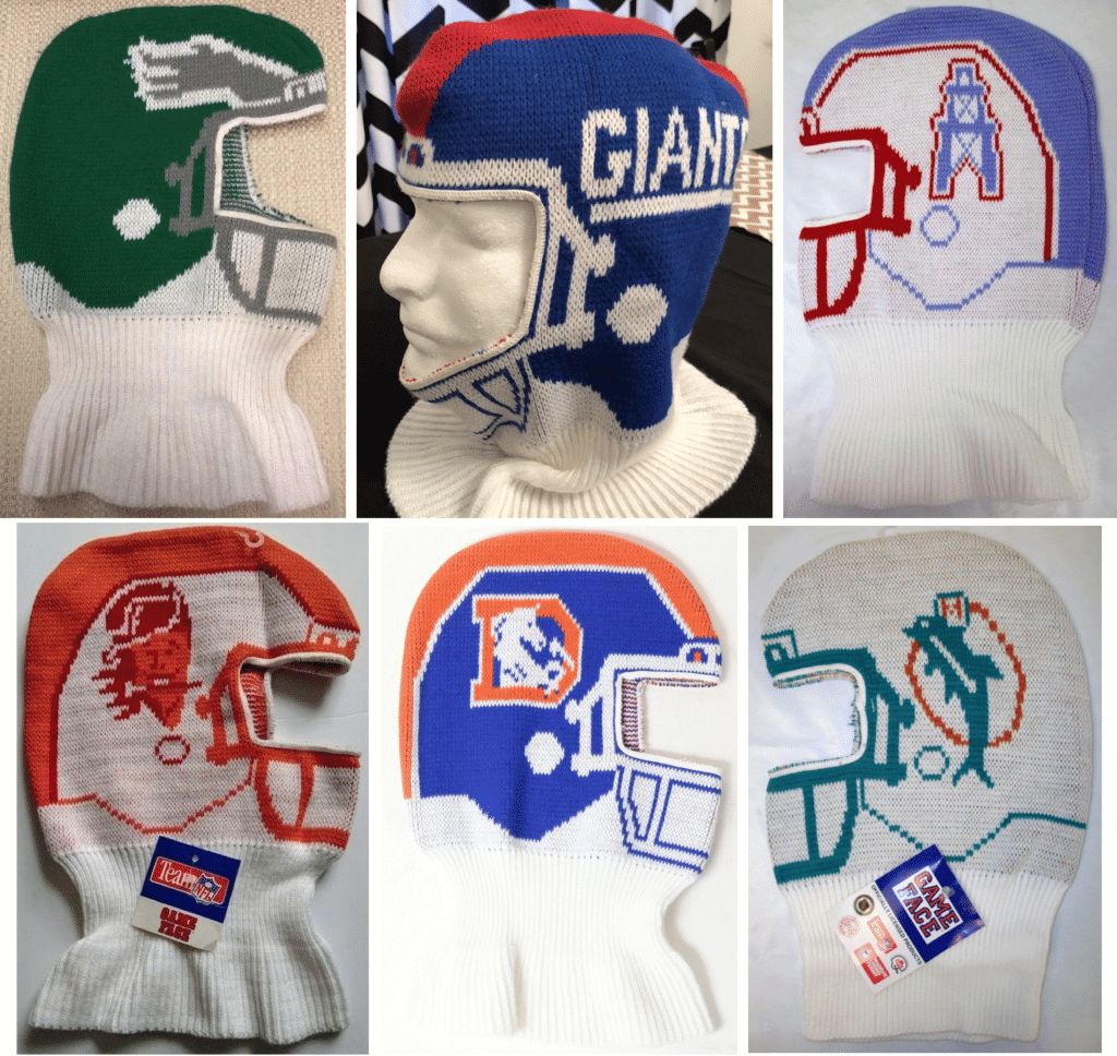
Saving face: Remember these? Ski masks that looked like NFL helmets — they were called Game Faces, and they were sold in the early 1990s.
If you ever wore one of these — or if you still wear one now, for that matter — I’d like to talk to you for a story I’m working on. Thanks.

ITEM! Important dates approaching: Two big dates on the Uni Watch calendar will soon be upon us. One at a time:
• Friday, May 17 — exactly one month from today — will be the 13th anniversary of the first post that ever appeared on this website. That means it will also be our annual Purple Amnesty Day — the one day of the year when I accept purple-inclusive membership card orders. So if you’re a Vikings, Rockies, Hornets, or Northwestern fan, get set to place your order! Once those 24 hours elapse, the purple window will slam shut and you’ll have to wait until next year.
As has been the case for the past few years, designer Bryan Molloy and I have been working on a special piece of purple Uni Watch apparel, which will likewise be available for only 24 hours (here’s what we offered in 2015, 2016, 2017, and 2018). I don’t mind saying that what we have planned for this year is very, very good. It is brilliantly, deliciously hideous, and I think you’re really going to like it. A lot!
• Nine days after that, on May 26, is an even more important date: the 20th anniversary of the very first Uni Watch column being published in The Village Voice in 1999. In other words, May 26 will be Uni Watch’s 20th birthday.
I have some things in the works for that, but the calendar is working against us this year, because May 26 falls on the Sunday of Memorial Day weekend. So what should I do — should I do a big celebratory anniversary post on the actual date (I’m sure Phil would gladly cede the Sunday to me), even though our readership is usually lower on weekends and lower still on holiday weekends? Should I do the celebratory post on the preceding Friday, even though that will actually be two days before the official anniversary? Should I do it on the Tuesday after the holiday, even though that will be two days after the anniversary?
Hmmmm. If it were a less momentous anniversary, I’d just push the announcement to Tuesday. And that’s probably what I should do this time as well — but there’s something about the 20th anniversary that brings out the literalist in me.
What do you folks think?
The Ticker
By Lloyd Alaban

Baseball News: Angels C Jonathan Lucroy, who wears No. 20, wore a No. 21 belt last night (from Andrew Hallonquist). … The Yankees weren’t home on Sunday, so yesterday was their Jackie Robinson Day game. Although every player on both the Red Sox and Yankees wore Robinson’s No. 42, the Yankee Stadium scoreboard listed each player with their regular numbers (from Alan Kreit). … Umpire Tony Randazzo’s No. 42 patch honoring Jackie Robinson was peeling off as he officiated last night’s Giants/Nationals game (from Tim Haller). … Majestic has fixed the Brewers’ “ball-in-glove” logo on their alternate jersey sleeve patch to add the white spot in the webbing of the logo, matching what New Era did with the new cap (from Chance Michaels). … More Brewers news: OF Christian Yelich wore a California Strong logo on his right batting glove last night. You may recall our recent Uni Watch entry about Yelich’s connection to that charity (from Jakob Fox). … The Trenton Thunder, Double-A affiliate of the Yankees, will be the Pork Rolls for a handful of nights this season. Here’s a Frankenhat they’ll be giving away for one of those nights (from John Cerone). … The Cedar Rapids Kernels, Single-A affiliate of the Twins, wore their road greys at home again last night (from Josh Claywell). … No pictures yet, but the Wisconsin Timber Rattlers, Single-A affiliate of the Brewers, will be the Brats for two games this season (from Brian Kerhin). … The Lakewood BlueClaws, Single-A affiliate of the Phillies, are letting fans choose the team’s caps for a game in August. Fans will have to choose between a pork roll-themed cap, an egg-themed cap, or a cheese-themed cap (from @NachoScout). … The Salem Red Sox will become the Beer Mongers for Thursday home games (from Clark Ruhland). … The Toledo Mud Hens, Triple-A affiliate of the Tigers, will become the Toledo Stingers to celebrate the Toledo-based Ohio National Guard’s 180th Fighter Wing during Military Appreciation Weekend (from Patrick Horne). … The Round Rock Express, Triple-A affiliate of the Astros, have released six tequila sunrise-themed caps to celebrate their 20th anniversary (from Ignacio Salazar). … Singer-songwriter Prince Buster is seen here wearing a Reds cap in the 1964 BBC documentary This Is Ska. Note the white outline, which was only worn by the Reds in 1955 (from Scott Rogers). … This sportswriter picked the best and worst designs from MLB’s most recent holiday merch dump (from our own Phil Hecken). … The University of Central Arkansas will be auctioning off the cancer awareness jerseys they will be wearing this weekend. Proceeds from the auction will go to a fund for a local high school student who is battling ovarian cancer (from David M. Kuhn). … Philadelphia will host the 2026 MLB All-Star Game. Former Phillies skipper Charlie Manuel was on hand for the announcement and wore a jacket with a patch from the 2009 ASG. He managed the NL squad in that game (from @HOF_for_Charlie). … This is interesting: We all know how players will sometimes wear an influential player’s number as a way of honoring him, but many Hispanic players avoid wearing No. 21 (NYT link) as a way of honoring Roberto Clemente, creating a sort of de facto number retirement.

Football News: Dolphins TE Mike Gesicki, who wore No. 86 last season, will be wearing No. 88 for this season, a number he wore at Penn State (from Blake Fox). … Like many of us, some Michigan State football fans aren’t too pleased with the team’s new alternate uniforms (from our own Phil Hecken).

Hockey News: @juicegriffey found these Foodland Coupons from 1992 with Topps hockey card stickers on the back. … From the “How is this possible?” category: The Golden Knights misspell G Marc-André Fleury’s surname during pregame introductions (from Jack Wade and AJ Strong).

Basketball News: From Magic reporter John Denton: “A member of the @OrlandoMagic bought several of the headbands that tie in the back and PG DJ Augustin is debuting one of them in the morning shootaround. ‘You look like you work at Bennihana,’ a teammate said to DJ. Augustin said he would not wear the headband in tonight’s game” (from Mike Chamernik). … Here are the uniforms for the Saskatchewan Rattlers of the new Canadian Elite Basketball League (from Raul Garcia). … Former NBAer Shaquille O’Neal was quizzed on his old uni numbers (from Mike Chamernik).

Soccer News: Paris Saint Germain’s team store has a €5 option to add a Notre-Dame de Paris cathedral patch upon purchase of any shirt. The €5 will go to the funds to restore the cathedral (from Mike D.). … Mexican League club Club America wore mismatched socks on Sunday in support of diversity and inclusion (from John Flory).

Grab Bag: Hockey One, a new Australian field hockey league, has released the kits for all seven of its clubs (from EP Conrad). … The State of Michigan has released new license plates featuring the logos of Detroit’s Big Four sports teams (from Mike Cole). … The University of Washington Hand Center has a really clever Washington Huskies-inspired logo (from Matthew Spencer). … Here’s a Time article on how the Champion brand became popular again. … New logo for IKEA. … The logo for the DC Comics movie Birds of Prey has leaked. … Stade Toulousain, a rugby union team in France’s Top 14, will wear shirts featuring an outline of the Notre-Dame on Sunday (from @Stumpy7780).
Our latest raffle winner is reader Scott Curl, who’s won himself a free Uni Watch membership card. Congrats to him, and big thanks to reader Blair Hough for purchasing and donating the membership. We’ll have another raffle (not for a membership this time) tomorrow. — Paul
Thanks to the Chargers for doing the right thing.
Yup – this is a surprise I like! Great choice to go with the yellow mask.
So glad they didn’t opt for gray!
The right thing for the Chargers would include returning to the Fouts Era set, yellow pants and all. But I like the yellow face mask.
What of their road/white uniforms? I am assuming they’ll still have the navy numbers, but will they go with navy pants and white top, effectively looking like a completely different team? Will they go with the white pants that have navy stripes to match the navy numbers, still also looking like a navy team rather than powder blue? Will they go with the white pants with powder blue stripe, creating a mismatch with navy numbers on the jersey?
Would make sense for them to slightly change the road jersey. Switch the navy and the powder blue on the white jersey, so that the shoulder stripes are primarily powder blue and the numbers would be too. Only need white pants as primary road look.
Hopefully, it is in the works before the season starts, but no announcement yet.
I suspect they’ll keep the navy numbers on the whites, as the Broncos did when they flipped their primary/alternate color jerseys. Perhaps we’ll see less of the navy pants. If they can change the jerseys on such short notice, then maybe they will.
Yeah, though in the Broncos case they had blue numbers on their white jerseys even back when they were in the early Elway days / orange crush. When they switched back to orange as the primary they basically recreated that look. Likewise they have a helmet that matches the numbers. They have always been orange and blue/navy.
The Chargers are going to look odd because they’ll be a powder blue and yellow team with navy accents in their color uniform, and a navy and yellow team with powder blue accents in their white uniform(s). Something about LA football teams, no consistency in their uniform colors.
Potentially unpopular opinion: I really like it when a team’s road uniform is noticeably different from the home uniform, while still falling within the general theme of the franchise’s aesthetics. Essentially any team that doesn’t just make a white-flip or color-flip of their main jersey while still looking like the team they’re supposed to be. Teams that currently fall into this category include the Cowboys, Canadiens, even the Yankees, etc.
The Chargers I think now a part of this category if they keep the navy numbers/stripes on their shoulders and pants on the road, and I honestly think it’s an excellent decision. In fact, I’d even be in favor of going navy mask whenever they wear the white jerseys, but I’d imagine that’d be a lot of extra work for the equipment staff to keep swapping them out between home and road games.
I think it looks good if theres one plain and one not as plain. But it also looks dumb sometimes like the Giants with strictly white and red for away jerseys while the home are blue and white.
Do the anniversary post on Sunday and link to it on Monday and Tuesday as an ICYMI.
Agreed. Either observe the actual anniversary or do nothing.
As a big fan of Purple Amnesty Day I’m very excited for the offering this year!
That stinks the 20th anniversary will occur over a holiday weekend. While I think running it the day of and including links to it throughout the following week would help it be seen by those Who Get It, I think it deserves as large an audience as possible and would be fine with it running Friday, though who knows how many people will take off that day too and wouldn’t check it out until the following week too….whatever you decide will be fine with this 10 year reader!
The only complaint i have about the chargers uniforms is the color behind the bolt changes. On the colored jerseys it is white and matches the helmet. On the white jerseys and pants it is either navy or powder blue. Just have the backing be white on those (i.e. no backing) and it would match everywhere and you could interchange everything. I also prefer the current template over the throwback one a lot, it is a good design.
Might Prince Buster be wearing a Cleveland Indians cap in that 1964 documentary? Navy cap/red wishbone C was their then-current cap. Seems more likely than a 9 year-old cap.
Great point – that is much more likely! I’d forgotten about the Indians’ era of wearing navy with the red C, white outline, and no red bill. Thanks for catching that!
But it’s still odd to see a Jamaican performer from that era in an American ballcap. American ballcaps weren’t even common in the United States, and Prince Buster helped formulate the porkpie/trilby aesthetic of rocksteady and ska, and he had no personal connection to baseball or to the United States that I’m aware of at that point in his career. And as popular as baseball is in much of the Caribbean, it’s really not in Jamaica.
When the Phillies made the 2026 ASG announcement, every ex-Phillie on the stage had a jacket with a patch over the breast pocket; each patch was from an ASG that player played in. John Kruk has the 1993 ASG patch on, and Jimmy Rollins had a different ASG patch. This announcement was the worst-kept secret in sports.
Misspelling alert: The “u” is missing from Shaquille O’Neal’s name in the basketball ticker.
Thanks. Fixed.
I always hated the dark blue middle outline color in the Chargers numbers. Especially on the baby blues.
They should switch to this – link
Misspelling alert: Cedar Rapids … not Ceder … I proofread the internet. It’s what I do.
Fixed.
The grateful citizens of Cedar Rapids thank you.
Is there some sort of rule in the NFL about uniform numbers on non-throwback helmets? The white Chargers helmets look almost blank without them and adding numbers seems like the obvious thing to do.
No rule that I’m aware of.
This Chargers uniform is my favorite NFL uniform. I greatly prefer the white pants over the yellow. The only improvement for me would be a better number font, but I actually like the navy trim on these. I know they will probably wear the road whites, but this light blue could be worn practically every game with both teams wearing their colored jerseys like the USC/UCLA game. In their division the Raiders black, Chiefs red, and Broncos navy, would all look great against the Chargers light blue. I wouldn’t like it against the Broncos if they wore their orange jerseys. I’d pass on wearing the light blue against teams with royal blue like the Bills, and the aqua or teal of the Dolphins or Jags. The Lions Honolulu Blue would also not be enough contrast. And of course the Titans light blue wouldn’t work.
The Chargers wore their powder blues when the Cowboys wore their navy jerseys Thanksgiving 2018 and it didn’t look bad (I was surprised). Though admittedly those two uniform sets might be my favorite in all pro sports.
Awesome move by the Chargers! If only the Jags and Titans would follow their lead *sigh*
i understand all the jersey rules because of merchandise sales and
how they can’t change up for 5 years, but mini helmets and full size
helmets are a retail thing too, and we now have 2 examples of a
change really late in the game. a couple years back the rams
suddenly added white horns to their repertoire, and then even had a
fan vote for white or navy masks, completely changing their look
unexpectedly. now the chargers decide to go yellow completely out of
the blue. that means manufacturers have to switch out masks on
everything they have in the warehouses, and possibly clearance items
already in stores to make room for the new merch. they also need to
get plenty of yellow masks ordered from a manufacturer. i guess it’s
lucky every other team wears navy so they can just put the old masks
towards those teams.
i know there used to be guidelines for merch, and how everything was
presented for purchase or advertisement… PMS colors, how a one
color version of the logo has to appear etc…. with these late
switch-ups, AND the random pants creations we’ve seen the past couple
years, i’m just wondering if they don’t have those little guide books
anymore or what.
That’s a good point Gene & one that Ive thought about too
There’s something about the phrase “going yellow out of the blue” that seems almost appropriate to this particular uni announcement, and it kind of made me laugh. It was a nice – if probably unintentional – turn of phrase.
I don’t know the actual numbers, and anyone who does is free to correct me on this, but I would venture to guess that the retail market for helmets and mini-helmets (particularly the former) is infinitesimally small compared to the market for jerseys. And the market for pants is, to my knowledge, non-existent.
Granted, graphical representations of helmets on t-shirts, hoodies, caps and the like are affected by these kinds of changes, and I was rather surprised that the NFL let the Rams do that on short notice, although they were well past the five-year window. But again, *jerseys* are the real cash cow; the profit margin on jerseys has to be a lot higher than it is on t-shirts and caps.
Yeah I do completely understand that part of it, although I’d buy 10 mini helmets before I’d bother buying even 1jersey, but that’s just me… And I know pants have absolutely nothing to do with it, but yeah, the guidelines used to be pretty hard set… Now it seems like everything is fast and loose. I think it’s because everything is so rigid with the jersey rules now, that the switching up of the helmet (which is represented on more than just minis -pennants, notebooks, tee shirts, pencils, on and on and on) seems like anybody can do whatever they want now and it’s just odd to me that they aren’t more strict on that. I think it’s also that I came from an era where merch was really just starting to get fired up, and the helmet was king… Jerseys were only just kind of getting started with the jc Penney catalog ones.
I’d be wary of reading too much into that Birds of Prey director’s chair; the chairbacks are usually designed by the film’s art department, not the marketing team. Often times the link bears little resemblance to the link.
Then again, this is a big film, and sometimes they create the marketing campaign before filming. I love link – the first film was a relatively low-budget film, and the logo they used was different from the eventual marketing campaign. The two sequels were increasingly big-budget affairs and they had the marketing down before the chairbacks were printed.
Don’t forget the Purple Aces of the University of Evansville.
The powder blue on white is great, but the all-navy the Chargers were increasingly using last year was really nice, too. Maybe they’ll keep that as an alternate? Curious to see whether they go with powder blue pants for the road uniform.
Do the big celebratory post on Sunday and then re-run it on Tuesday. That way you catch you’re non-regular readers and also celebrate on the actual day. I’m sure most of the regulars would be ok having the same post twice especially for a big celebration.
Drop the 20th anniversary post on Sunday, do it right! Then maybe take Monday or Tuesday off and let that post sit at the top for a few days. You certainly deserve a moment to sit back and take in all that you’ve created with this community.
Cheers to 20 years!
*take Monday AND Tuesday off
I second Riff’s motions.
My vote is to have something on Sunday as well as Tuesday. Personally I like to have any acknowledgment (like a birthday dinner) to come after, if not exactly on the date. In my mind it provides for a better sense of accomplishment and genuineness.
Regardless of how it is celebrated, congratulations and here’s to many more – clink!
I’m not sure it’s actually PSG that’s selling the jerseys with the cathedral patch, I think it’s a french retail operation that sells multiple teams kits, and they can be added to any jersey. I don’t see them on the official PSG website and the trail on how to get one ran cold because of my lack of knowing French.
You are correct:
link
This is not PSG but a retail store in France.
Re: those Foodland stickers, is that the Foodland markets in Hawaii? Hawaii doesn’t strike as a hockey hot bed.
That would be the Foodland that was (still is?) in Western PA, and probably also had stores in the tri-state area. Hence why all the stickers feature Penguins players. They were one of the advertisers on the boards at the Civic Arena back then, and might even have been the “official” grocery store of the Penguins.
The Chargers change is good, but it could be better if they color-swapped the away jersey in favor of powder. Their 2009 throwback away unis are among my favorite of all time.
Great move by the Chargers.
Paul, I like the idea of posting on Sunday. Then you can link or repost on Tuesday for greater readership. Come on, this is a big anniversary and you deserve to have it celebrated on multiple days. We all appreciate everything you have done and want to join the party with you.
Also, it would be nice if the post was baseball-centric as another nod to the anniversary.
So the Chargers throwbacks are widely considered the best in the NFL, and the Padres’ browns, though while not the best looking, are certainly the most “classic” of the MLB throwbacks. Now both teams are making the classic colors permanent. Too bad the Chargers couldn’t have stayed in San Diego for a true win-win for fans.
Can we see what the Chargers uni looks like with the jersey TUCKED IN???!!
Slopjockey!
Love and appreciate the move by the chargers. Would love an alt pair of gold pants thrown in the mix as well. Also, forget the navy, make the color rush jersey the alt (gold pants actually pop better on that one anyway).
Paul, congratulations! I’ve enjoyed Uni-Watch for perhaps its whole existence and look forward to another 20 years, at least!
Can I suggest a piece on the “death”
of black? The Mets have thankfully dropped it, as have the Detroit
Lions, Royals, and a certainly more than a few other teams I am not thinking of at the moment. It would be a good birthday piece!
Congratulations, again!
Can I suggest a piece on the “death” of black?
Sure, I’ll get someone from the Jets to write it!
;)
Yeah exactly Paul…more like the endless life cycle of black, ask the Jets, my Clippers, Lakers, Bucks, Celtics, Marlins, Reds, etc, etc
link
Well played, gentlemen. Well played.
I was thinking more of the Astros’, Blue Jays’, Rays’, Royals’, and Mets’ forays with the late 90s and early 00’s trends and their subsequent recoveries.
But, yeah, here’s hoping those “stealth” Jets unis make the rarest of rare appearances.
If BFBS is not dead let’s hope it’s on its way out.
Good move for the Chargers; that is one sharp uni. Back in the late 70s-early 80s was when I first discovered football and the Charger unis were my absolute favorite making me a long distance fan in Michigan. I think if they had added yellow pants it would be too Rams-like. This way they have their own identity. Now we just need a “I still call them the San Diego Chargers” t-shirt.
Unpopular Opinion: I hate the Chargers powder blue and yellow jerseys. If you want to paint a baby boy’s room, those are some fine colors to use, but creating an NFL uniform? The worst colors ever, even worse than Miami. I’ve hated them since I became old enough to know what sports were and will continue to hate them for as long as I live. Changing to the much more aggressive and intimidating navy blue was one of the best color upgrades in sports history.
Definitely agree with Paul that the bolts need to be back over the top of the shoulders like they originally were, and not sideways like they’ve been since the Chargers “modernized” over a decade ago. I hate hate HATE the sideways bolts!
I also agree with going for Sunday for the 20th post and re-linking it. Mainly because I can’t hardly visit the site anymore on weekdays, since starting a new job last fall.
Rob! Happy for your new job but sad to hear you can’t stop by on weekdays. We miss you!
NOW I feel special, I share my birthday with Uni Watch.
Giddy up!