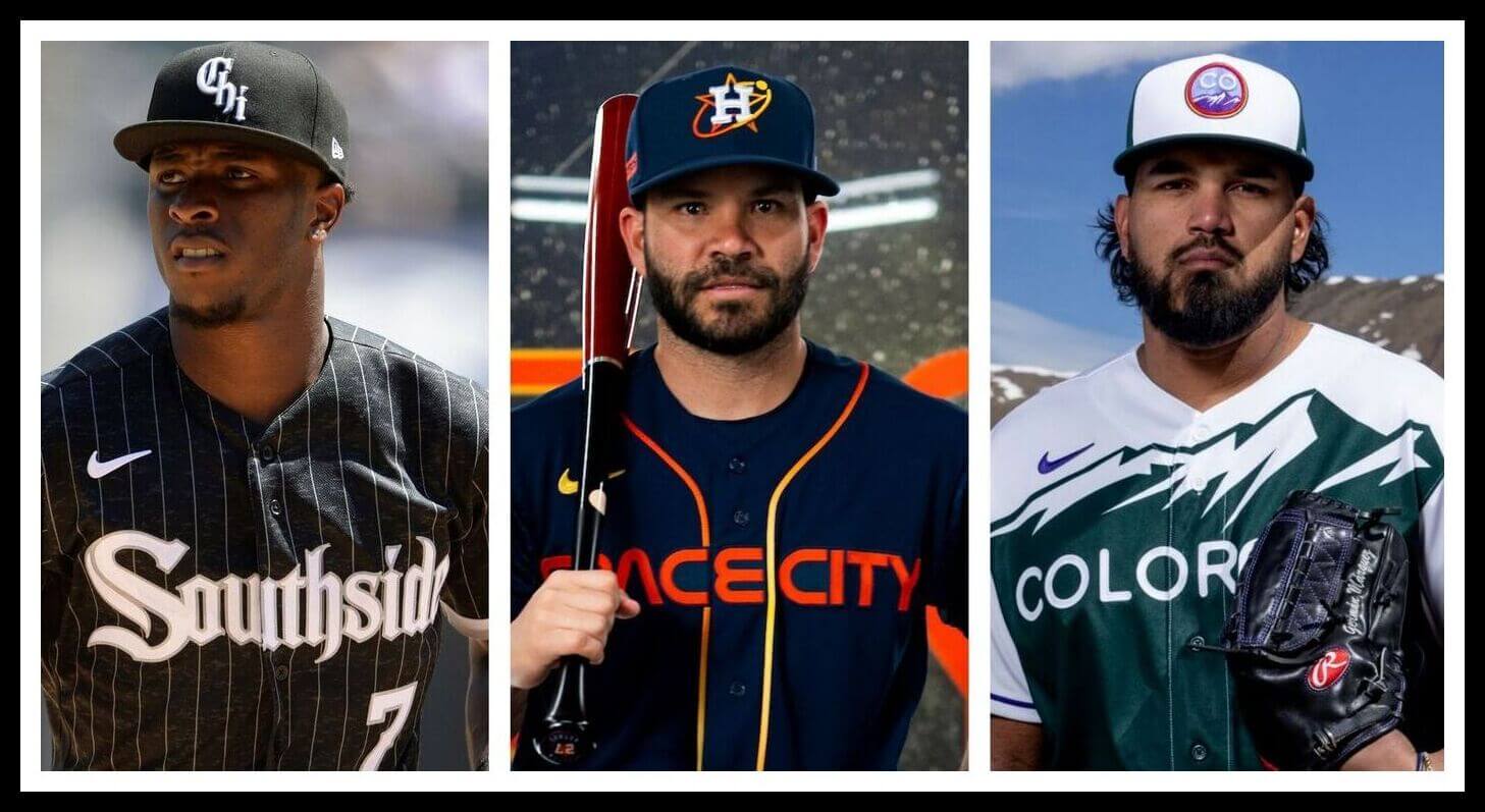
A good Saturday morning everyone — I hope you’ve all had a pleasant week.
As you guys are no doubt aware, once the full set of seven MLB “City Connect” (CC) uniforms were unveiled in 2021, I ranked them, and then I followed that up with a new ranking for the 2022 CC uniforms. I never did do a combined ranking for all fourteen…until now. But I’m getting a bit ahead of myself.
Back in early August, reader Michael Cooperman approached me with this:
Wanted to get your thoughts on something — I don’t have a fully formed idea yet, but aside from running a marketing and PR firm, I also teach a couple marketing classes at Cal Lutheran University here in the LA area, as does my business partner. As a result, we have access to the opinions of 50-75 marketing students, maybe more depending on if I want to reach out to a few other professors or even past students.
I was trying to think about how to incorporate Uni Watch into my classes — I actually had Nick Francona speak last year, so I thought about inviting you or Paul as guest speakers to talk about sports marketing (successful and not).
I was ALSO trying to think if there’s a way we could use these 20-year-old marketing students from an opinion perspective — for instance, you have YOUR rankings of the city connect uniforms — here’s how they compare to our marketing student panel – or something like that.
A few e-mails later and Mike decided he’d get the opinions of around 100 of his students, and more specifically, their rankings of the fourteen CC unis released to date, and hoped to compare those rankings to mine. Fast forward a few weeks, and what I have for you today is, I think, one of the more fun articles I’ve done in a while. After conversing with Mike, I did end up ranking the full fourteen uniforms (and you can see those below), and you can see how those compare to the rankings of his students. But there’s more…much more. After reading Mike’s piece, I’ll include the survey he gave to his students (and which I took as well), so that you can add your own rankings of the CC uniforms — and hopefully we can do a follow-up at some point to see how Uni Watchers of all ages rank the unis.
I’ve gone on long enough, so I’m going to turn this over to Michael right now. Enjoy!
California Lutheran University Students Rank City Connect Uniforms
by Michael Cooperman
Like many of you, I love talking logos and uniforms. As a marketing and market research practitioner my favorite days are the days where we get to talk design. And as an adjunct professor at California Lutheran University, my favorite class of the year (I teach two marketing courses) is the one where we talk about design principles and branding, including discussing good and bad logos and logos with easter eggs.
So, when I saw Phil’s rankings of the 2021 and, more recently, the 2022 MLB City Connect uniforms, I poured through the listicles! And, like you, while I invariably find joy in a few of these uniform marketing programs (thank you to the death of the 1-shell rule for bringing back Pat Patriot), most of them feel unnecessary, like the jingoistic July 4th caps or the Memorial Day uniforms which just feel like an annual money grab. In fact, we had Nick Francona speak in one of my classes last year about this very topic (thank you Uni Watch!).
However, as someone who makes a living analyzing and building marketing programs, I had to step back and ask myself a simple question.
Why?
Why does this program exist? MLB needs younger fans.
We’ve all heard baseball called slow, traditional, and stodgy. As baseball fans, we love the sport’s quirks and traditions, from stirrups and catcher’s gear to the 7th inning stretch and ballparks with weird juts and giant walls. It doesn’t fit our frenetic, overstimulated culture.
MLB recently approved changes to speed up the game, but they want to attract younger fans, and City Connect is an approach to do so.
Forgive me if I’m mansplaining MLB’s challenges, but as much as we may love to hate the 800-lb gorilla of sports uniforms that is Nike, I give them credit for developing a strategic program to attempt to cure what ails MLB.
So, I reached out to Phil and Paul with a simple thought. We should gather the opinions of a young, diverse set of consumers — like those students in my class.
We surveyed students to understand how they felt about the City Connect uniforms. Were they aware of the program? Did they like the unis? And to MLB’s unstated goals, would they buy the merch? 78 people responded to the survey (minus Phil), and the results were quite interesting. Dr. John Garcia, our colleague, helped us generate and validate the insights. Full disclosure, there are biases with college students in Southern California at a small, private university, so these respondents don’t reflect a national population, which is fine.
Here are 5 compelling things we learned:
There was Agreement at the Top AND Near the Bottom of the Uni Rankings
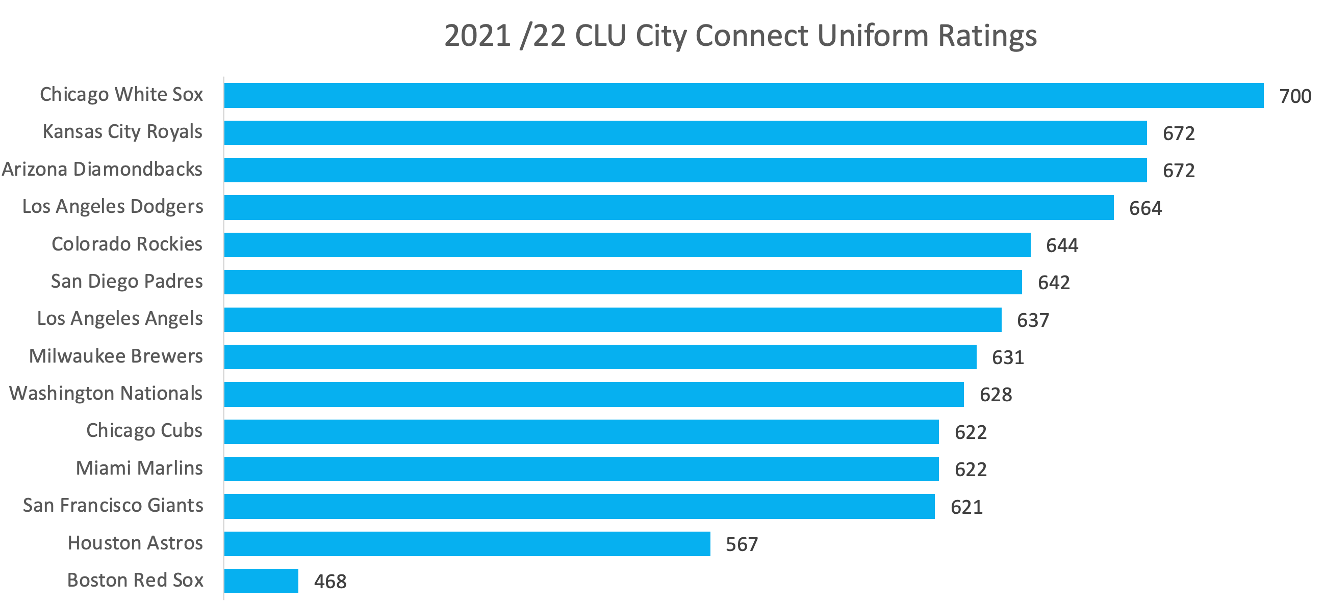
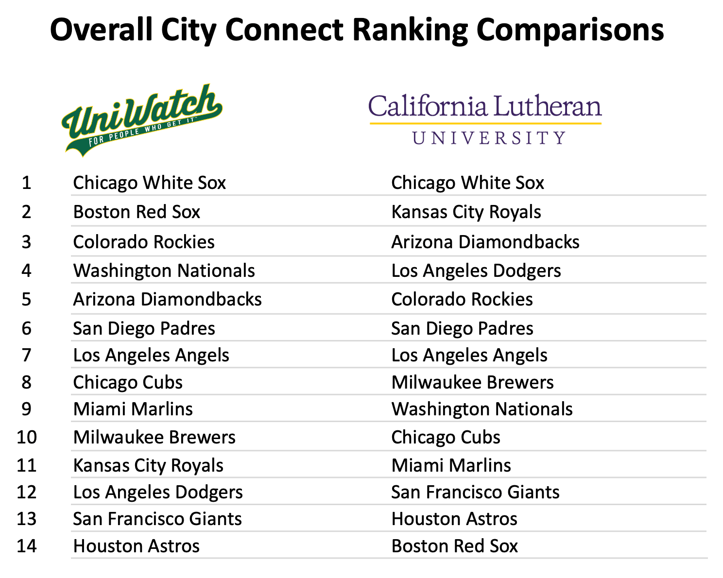
The White Sox uniforms were overwhelmingly the favorite City Connect uniforms, with the highest overall rating of 700 (on a scale of 1000) in City Connect Uni Ranking Index. On a 1 – 10 scale, with 10 being highest, 41% of respondents rated the ChiSox uniform a 9 or 10. The next highest total? The San Diego Padres at 28%, followed by the Diamondbacks at 24%. Who else liked the White Sox unis? The men in the survey rated the White Sox unis very highly. “Super Fans” (respondents who rated themselves a 5 on a 1-to-5 scale of baseball fandom) rated the White Sox unis a 9 out of 10 (vs a 6 for non-fans). And perhaps most importantly, the students and Phil were aligned in ranking the White Sox the #1 City Connect uniform for the combined 2021/22 rankings.
Interestingly, students and Phil have some agreement on the worst uniforms, the Giants and Astros.
Violent Disagreement on One Team…
…and it was my beloved Red Sox. No team got more hate and less love from the students than the Red Sox. The students ranked the Red Sox uniforms dead last by a mile. I chalk it up to the fact that most of them didn’t know the inspiration for the uniform, but hey, that’s a communication problem! And while the students hated the BoSox unis, Phil loved them, ranking them second in his combined rankings only to the South Siders. Though not to the same degree, there was also disagreement on the Royals, who ranked second in the student rankings, while Phil had them ranked 11th out of 14.
Polarizing Padres
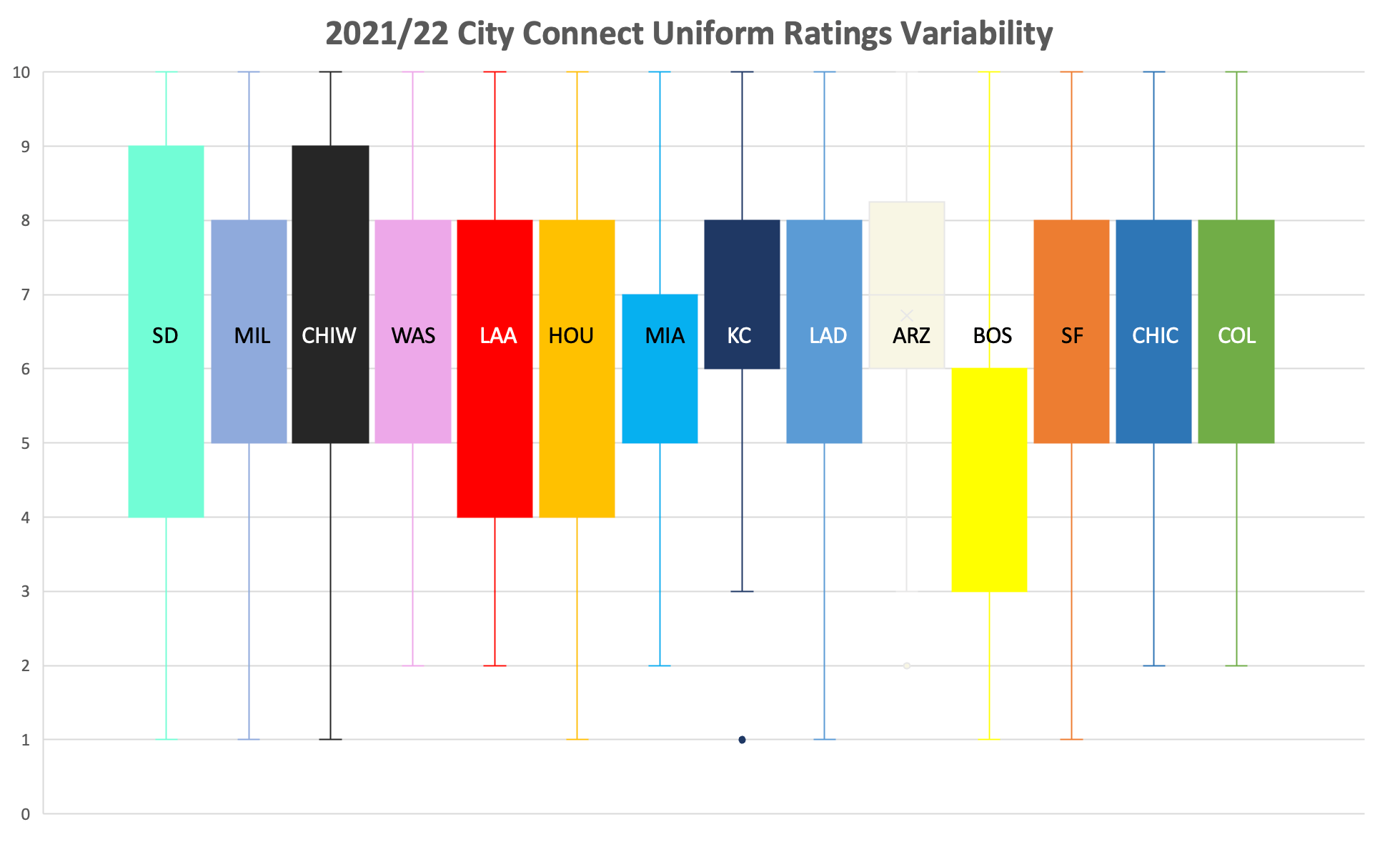
No team had higher variability in their ratings than the Padres. Those students who liked them cherished them, and they rated them especially high among those who play a sport in college. However, the Friars also got an above-average amount of “hate” (which we defined as a rating of 1, 2, or 3). The only teams that got more hate than the Padres were the Red Sox and Astros.
One student commented, “The color change of the Padres uniforms is amazing.” While there were clearly others who agreed, the polarized opinion had a major impact on their overall ranking.
Is Polarization Bad?
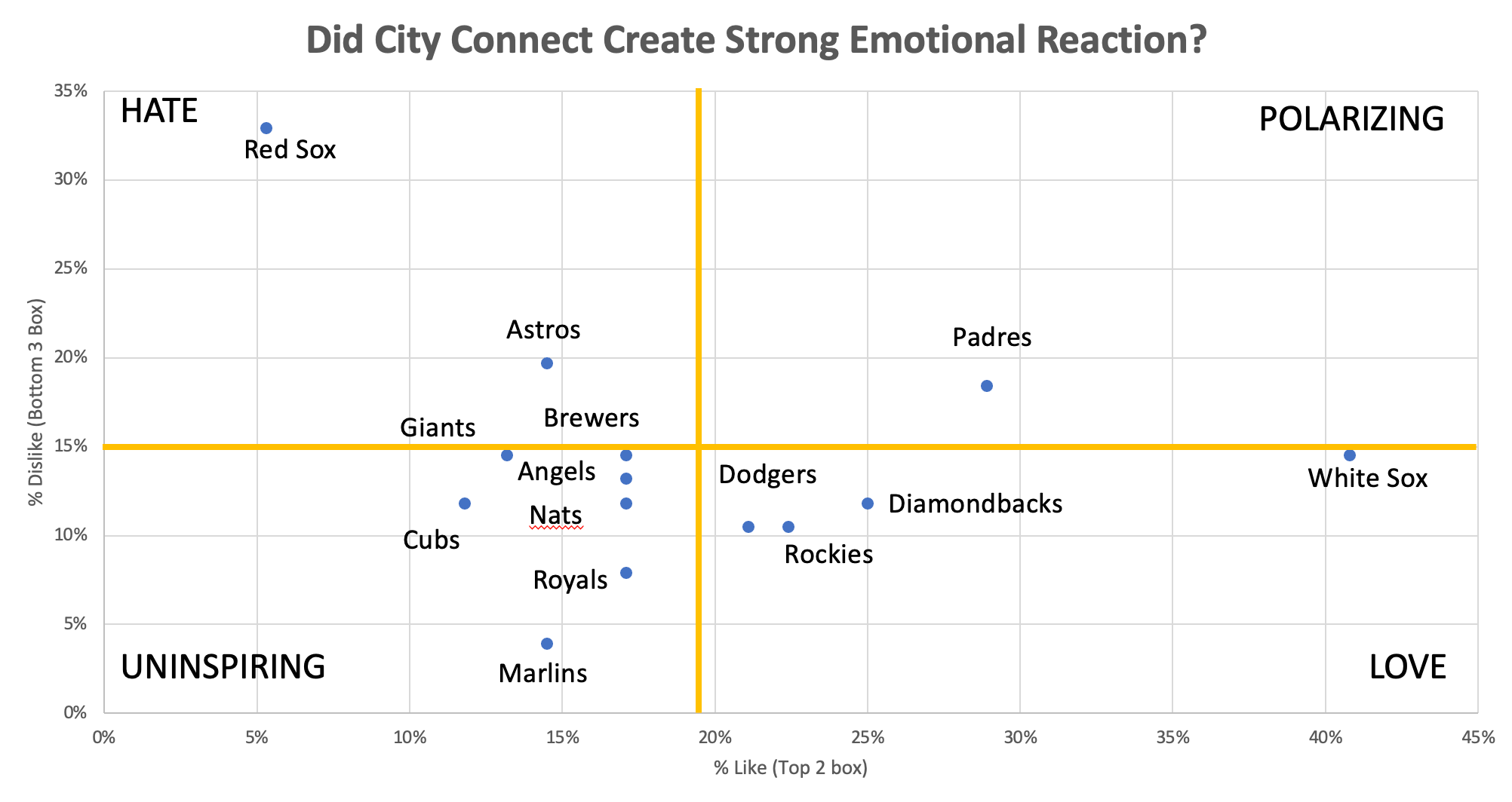
City Connect can’t achieve universal love. When we compare “love” (a rating of 9 or 10) to “hate” (1, 2, or 3), the White Sox rank in the “Love” quartile (above average love, below average hate). Padres are the only team with above-average love and hate, which would categorize them as Polarizing. Is Padres’ performance bad?
The Padres uniforms create an emotional response, which is what marketers strive for. What do you not want? You don’t want the Red Sox result, which is mostly hate. You DEFINITELY don’t want indifference (below average love and hate), because at least when they hate you, they feel SOMETHING.
So, Who are the “Winners” and “Losers” from the First Two Years of City Connect?
Winner — MLB: So, says this survey. Only 37% of respondents knew about City Connect uniforms before the survey, and 3 own one. Depending on consumers’ awareness of these uniforms, this could be good or bad for MLB. Nearly 40% said they’d buy a jersey after seeing these uniforms. Thus, City Connect jerseys increase the likelihood of buying merchandise.
Loser — MLB Marketing Department: Less than 40% awareness among the consumers you want to court? That’s not great. Put more marketing dollars behind this program!
Winners — White Sox and Padres: Both teams are competitive this year and they have a lot of love for their new threads. That’s double good news for fans.
Losers — Red Sox, Marlins and Cubs: It’s great to be loved. It’s not great to be hated. It’s REALLY not great to be invisible. And the students think they are boring.
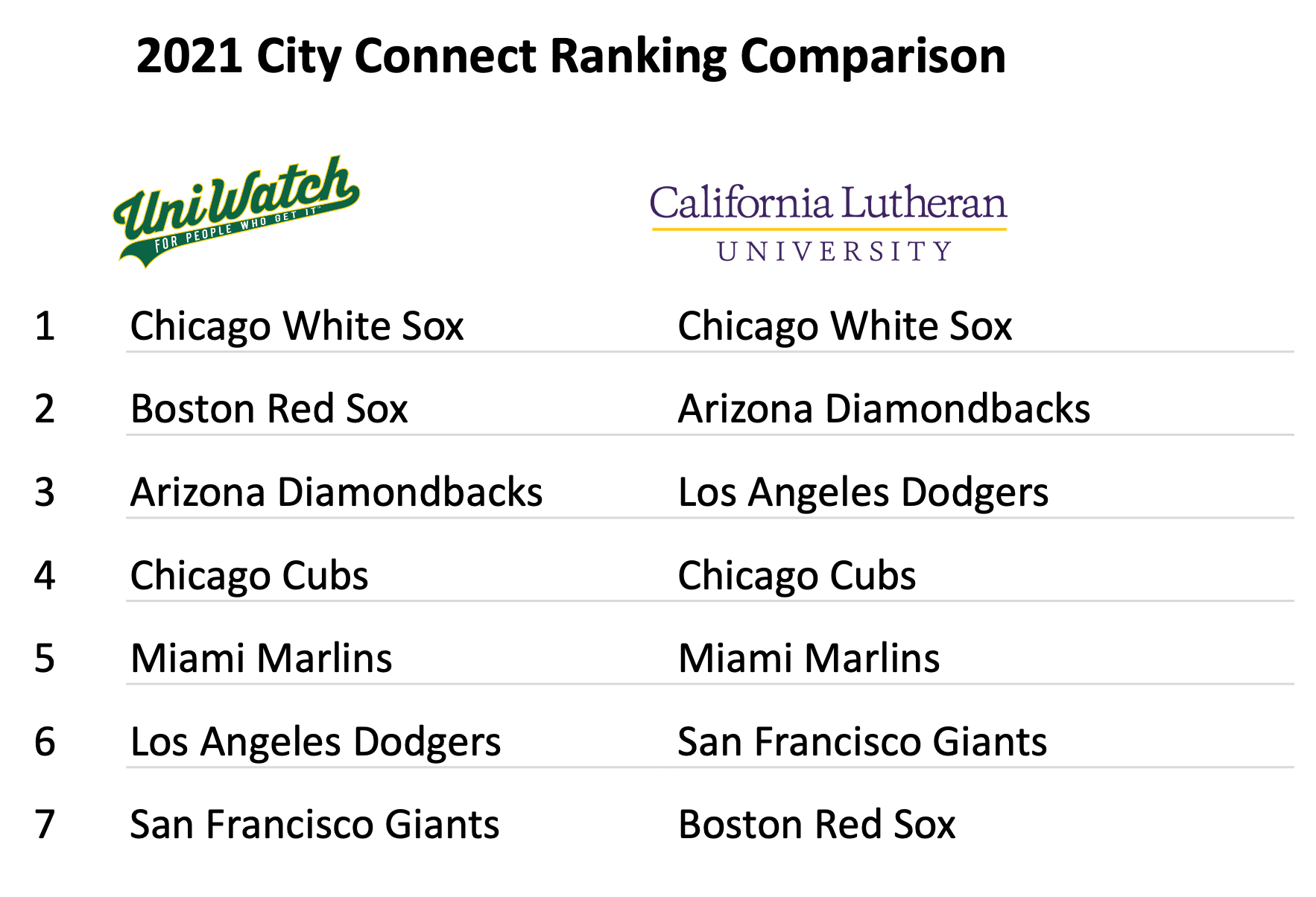
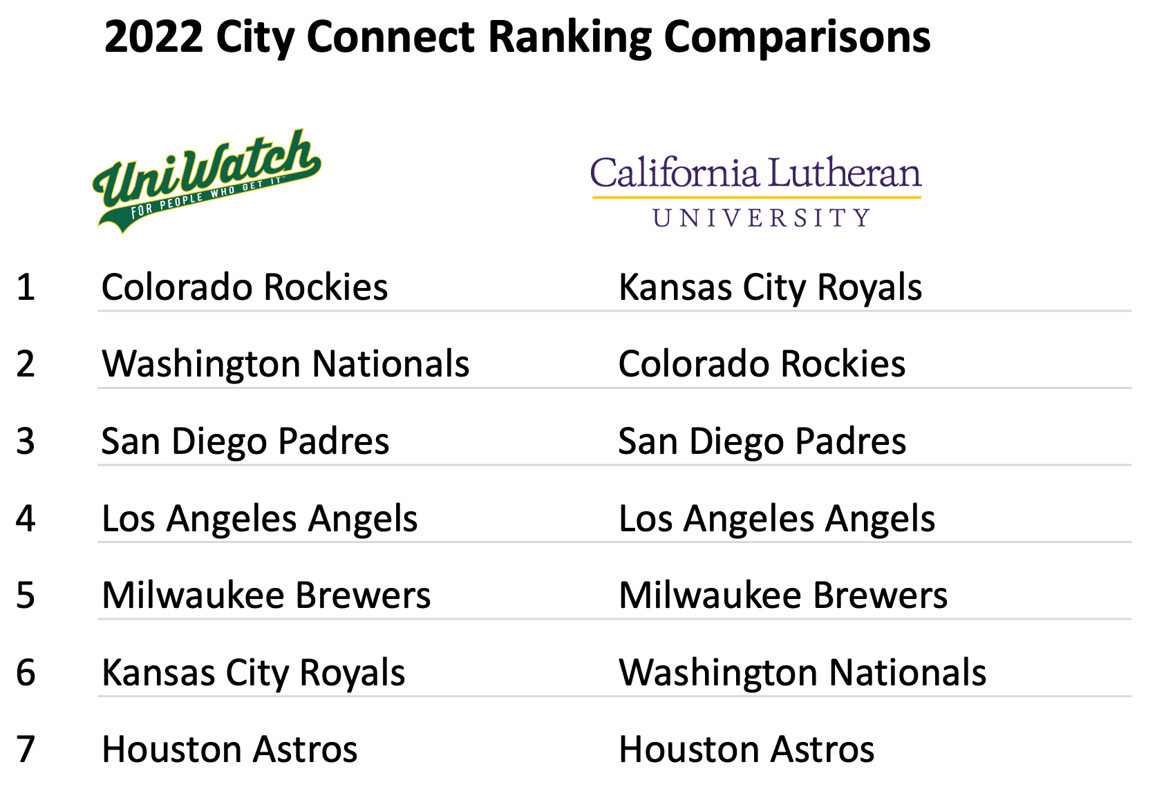
The Final Tally: Uni Watch vs. CLU Rankings Comparison
Ultimately, we see that while hard core fans may appreciate some of the nuances and inspirations of the jerseys, the younger demographic is really looking for something cool and fun. What will be REALLY interesting is when we do this again next year when all 30 MLB teams have revealed their City Connect jerseys.
One Last Thing
Last weekend, I attended a Padres game where they sported their City Connect gear. The Padres REALLY leaned in on these uniforms. Their helmets. Their cleats. The tape around their wrists. Even their digital displays. I observed plenty of fans wearing the classic Padre brown.
The second most common uniforms? Not the blue and orange. Not the blue and white. The City Connect unis. The mint and pink. Considering the Padres history of uninspiring uniforms (post-80’s through pre-20’s), maybe this shouldn’t be a surprise. Padre fans have embraced ONE non-traditional color — why not another?
Thanks Mike! I’m glad this proved to be a great experiment for you and your students, and I’m actually quite surprised at how closely (and not) their opinions of the CC unis matched up with mine. Great stuff and hopefully enough Uni Watchers will take the survey to have a follow-up on this down the road.
So — if you made it this far, you’re ready to give your own CC rankings!
Take The CC Ranking Survey Here
I’d love to hear your thoughts (and also get your own rankings) in the comments below.


I’ve seen a few of the Royals CC hats around town and that logo grows on me every time.
Great great piece! I really enjoyed this.
As with the NBA alts (or are they all alts now?) I find these mostly either bad/unnecessary or something that should be refined as a new standard set. The exception being the BoSox who have an excellent CC uni that is very much a Boston uni but in no way a Red Sox uni. No need to scrap it but it’s something that would be nice to see once a year (like the maple leafs’ green uni). Of course that’s dependent on the date of the marathon and the start of MLB season and all that.
This leads me down a tangent that I will try to keep short: I love baseball for its quirks and traditions (and its meditative pace) and the giants had a deal when their current stadium opened that their home opener and home closer series would be against LA for so many years (this gave the season some exciting bookends regardless of the teams’ performances that season). I think it would be a cool quirk if the Sox first homestand against the Yankees each year coincided with the Boston Marathon and they could wear the CCs on the day of the race. (then shelve them for the remainder of the season).
All this to say I appreciate the effort Nike is making, but not every team fits the same mold.
The Red Sox don’t wear the CC unit’s on the day of the race (Patriots’ Day). They wear it the weekend leading up to the race.
On Patriots’ Day they wear their Boston Strong alternates.
Not sure how or if you could pull it from this study, but I wonder what their opinions were on which uniforms were “too much”? By that I mean almost all of these designs had some good elements, but as Nike is prone to do, instead of just having one or two nice non-traditional design features, they go overboard which usually creates a visual mess. Did these students pick up on that too? They may not be uni-watchers, but I have to imagine even the casual eye knows what a baseball uniform is supposed to look like, and would then notice when an alternate design strays too far from that convention.
I find the Boston result the most satisfying, more than any of these other alternates, regardless of the story telling explanation and how good it looks in a vacuum, noting about it says Red Sox. That is a design failure.
Hi All,
Long time lurker, first time commenter. Uni Watch is now a daily “must” for me, I definitely lime this new site design. Bravo!
The uniform has “Boston” on it and not “Red Sox.” It is a tribute in particular to the Boston Marathon that is especially poignant in light of the terrorist attack, but it is a tribute to much more than that. It celebrates the special connection between the Red Sox, the Marathon, Boston, and Patriots Day. There may be other special scheduling for other teams and their locales, I am not familiar with those, but certainly the Red Sox’ 10:00 AM game every Patriots Day which is arranged specifically for people to go from the game to watching the runners is quite distinct if not unique.
Baseball may or may not still be considered “the national pastime” but it is still an important element of our national identity. Patriots Day commemorates the first actual battle of the American Revolution, which created or at least cemented that national identity. I like most of the designs and appreciate the sentiments behind most if not all of thr designs, but I think the “storyline” for the Red Sox design is far superior to those others and agree that when one considers the storyline as an appropriate basis for deviating from their normal palette, their design is extremely nice.
Perhaps the Professor can seize this moment as an opportunity to teach the kids about this particular storyline.
Great comments! I do not love the uniforms as a stand alone, but I do love what they are about.
Many people outside the region just don’t understand the true backstory & all that you shared here.
This set was not marketing speak, it is actually a true city connection: Patriots Day / Marathon Monday is a wonderful, unique Boston experience. It is so much more than a race. The dawn re-enactments at Lexington & Concord, the Sox, the marathon, the post race celebrations.
From a Red Sox standpoint the Patriots day game is second only to the home opener in specialness and ticket demand. Marathon Monday was always one of my favorite days of the entire year (it is on par, perhaps better than the fourth & St Patrick’s day)
Terrific article, and great insights on the survey. Thanks! I think the Red Sox illustrate something important about the CC program. I agree that, as a fan of the game but not the Red Sox, Boston’s CC uniforms are at or near the bottom for me. But Boston fans seem to have embraced the CC thing pretty hard. It does seem to speak to something that Boston fans value. Same for my own rooting interests, Washington and Milwaukee. The Nats CC embraces something that, as a fan of the team from the jump and as a DC-area resident for a quarter century, I’ve wanted to see them do the whole time. I don’t expect fan who aren’t in the Nats fan community to care about or even like the Nats CC uniforms. But for me, they’re perfect and maybe the only thing I’m really happy about in an otherwise dismal season. Similarly with the Brewers. For a non-fan, the survey rating of dead middle seems about right to me. But Brewers fans have really embraced the CC look. It says something about the team that fans want to embrace. Where I am in south-central Wisconsin, when I see a child wearing a Brewers cap, it’s usually the CC cap.
That would have been great in the days when the only people who saw the games were the ones at the park. If the local fans embraced a particular uniform that meant nothing to folks outside the city, it would be fine.
But, of course, in those days uniforms were equipment that teams paid for, not part of a larger sportswear-industrial complex.
Now, when games (and highlights) are available to everyone everywhere, it really does help to not have to remember which Valley is being referenced, or which non-Oakland baseball team might be wearing green, or that the Red Sox are wearing the colors of an event with which most of us don’t associate colors.
It’s nice that you appreciate the Nats’ CC uniforms. But for me, gray and pink with WSH really doesn’t work. Give me something that looks like a Nationals uniform.
Gen Z doesn’t watch baseball because it’s too traditional? At least that’s the supposed premise behind the City Connect program.
And yet which uniform does this group of young adults rank dead last? The Red Sox. As Phil points out, the uniform in a vacuum looks good – but as others have mentioned, it *doesn’t look like a Red Sox uniform*. One of the most traditional teams with traditional uniforms.
Who takes first? The White Sox. And guess what? Their CC uniform *looks like a White Sox uniform*. Basically the same colors and style they’ve been using for 30 years, with main elements that are decades older than that.
Yes, the Padres rank in the middle of the pack. Is that uniform so outlandish that it’s interesting on its own? Or do the Padres get a pass because they’re not one of the Classic 16 franchises?
But the overall results of this survey seem to cast doubt on whether deviating from traditional colors and style is the key to attracting younger fans.
Sure the White Sox look like a White Sox uniform, but I find mono black pinstripes to be a terrible look. Maybe I would like them better if they wore them with white pants, but I find the look terrible.
The Marlins on the other hand look refreshing. I love the red jersey over white pants and the powder blue/red cap adds nice contrast. I find it to be so much better than any of their regular uniforms and I am surprised they don’t rank higher. I have a large jersey collection and of all the city connects the Marlins is the only one that I have purchased. And I do not like the team at all.
Their CC uniform *looks like a White Sox uniform*.
Speaking as a fan of the crosstown team, this is a great point. The things I like about the Cubs’ CC uniform are things that either look like elements of previous Cubs uniforms (all-navy 1880s-1910s look; a star inside the C where an equipment manager had once put the player’s number) or connect to the city of Chicago (elements of the city flag). The thing I dislike is the weird and unexpected number font coming out of nowhere. Put a less flashy number font on the back (link from the ’97 interleague series) and you’ve got something great.
Huh, I just sort of figured City Disconnect was about selling more merchandise, not reaching a new demographic or “younger fans.” Just more junk for people to buy…
There is a lot of crossover in that venn diagram. Of course this isn’t a factual comment on all young people but from a marketing perspective, if you get them young enough they can ask their parents to buy them merch, next age bracket up and they are willing to spend all their money on frivolous things that help them form an identity (team merch), next age bracket up and they have disposable income but no major expenditures like kids, mortgage, etc.
Again, not a blanket truth about youth, but marketing departments don’t prioritize people who won’t prioritize their products, they focus on people who are potentially swayed into buying their goods and services. They’ve already got most of the older people on the hook, they are always worried about hooking in the younger audience.
Not only have I aged out of the target demographic for baseball’s youth initiatives and Nike’s ideas about teams and their images, I have always had very outré tastes even among fans my own age. I tend to gravitate toward teams with loud, garish uniforms, and teams with bad records who don’t appear much on television. So baseball probably shouldn’t market to me. It will be telling to see how the Yankees’ uniforms will be done. They represent so much more than simply baseball or even the city of New York. They are an icon of sports, itself, in much the way Marilyn Monroe, the Eiffel Tower, and the Christian cross stand for more than only what they depict.
Great job, and lots of fun to read. The issue for me is less about how the City Connect uniforms compare to each other, and more about where they fit in the big picture of uniforms overall. In fact, it’s the same for any sport: are they good uniforms or not? I’m intrigued to see where they rank compared to all uniforms, not just themselves.
They all look awful. Get off my lawn.
I did know the inspiration for the Red Sox CC uniform and I still hate them. Is there a fan base more apt to make excuses about their team than Boston? Even extends to their uniforms.
excellent article today.
I feel like part of the problem with the city connect jerseys is the fact that the culture around baseball is so traditional, and there’s a whole list of unwritten rule about how players should act if they don’t want a 90 mph ball at their face. Compared to the NBA, which has a lot less of a culture of tradition surrounding it, players who are loud and outspoken are celebrated, having a bunch of interesting (being nice here) jerseys fits the culture a lot more. Wacky alternates are not the way to save baseball. Getting rid of the stupid unwritten rules and letting players be individuals is how you save baseball
“Violent Disagreement About One Team…”
This is a pet peeve of mine; you probably should use the word “virulent”. Violent means characterized by physical punishment. Virulent means acrimonious.
I am a Gen-Zer, and here are my rankings. Things to note: Firstly, I’m a big baseball fan (rare for someone my age, I know). Secondly, I was objective in my rankings. I’m a big Mariners fan and I overcame my immense hatred for the Astros in this ranking, as you will see.
1: Miami Marlins. Love the uniforms, love the story behind them, I love it all.
2: Houston Astros. Objectively speaking, these uniforms are great. The mono-blue with orange-to-yellow highlights looks amazing, and those socks complete the look.
3: Chicago White Sox. The ChiSox and Houston could have tied, but I avoid ties when possible. These Goth uniforms are a close, close third.
4: Washington Nationals. Keeping in mind the purpose of the CC uniforms, the Nats’ cherry blossom uniforms capture the beauty of DC’s spring weather. If I wasn’t a broke college student this would probably be the jersey or cap that I would buy.
5: Los Angeles Angles. These surfing throwbacks immediately bring to mind summer nights and Beach Boy tunes. Put that into a baseball uniform, and one can’t help but surf the wave of summer vibes.
6: Colorado Rockies. I love how they based these off of Colorado’s license plates. The Purple highlights complete the look, incorporating the original team colors very well.
7: Kansas City Royals. They would have been higher than halfway, but the powder blue sleeves put them lower. The logo is absolutely amazing though.
8: Arizona Diamondbacks. I love how this uniform ties into the deserts of Arizona. They would have been lower if they didn’t get matching pants,
9: Boston Red Sox. I think Paul put it perfectly. Great baseball uniform, but I struggle to wrap my head around the fact that it is a Red Sox uniform. Cudos to Boston though for being brave enough to be the first team to unveil this radically new uniform concept with arguably the most radical CC uniform.
10: Milwaukee Brewers. The Brew Crew script is cool, the baseball grill is cool, the colors are cool, but the MKE caps kill the uniform.
11: San Diego Padres. I don’t like this uniform if I am being honest. But the way it links to the culture of its fans boosts its rank.
12: San Francisco Giants. I like the concept, but the fade-to-fog on the logo and the numbers is kinda weird. If they would have kept it to the G on the front of the jersey it wouldn’t have been so bad. Plus, not sure if you want to brag about the fog/smog of a city like that.
13: Los Angeles Dodgers. The mono-blue doesn’t look bad, but the uniform just feels lazy.
14: Chicago Cubs. In my opinion, these uniforms feel just as lazy as the Dodgers. If I was a Cubbies fan I’m sure I would feel differently about it, but still not a fan
I mentioned this in the comments field in the survey, but the survey is flawed because it doesn’t show all of the CC uniforms, in their entirety, on players. For instance, we only see an image of the Dodgers jersey and cap, but not an image of the entire uniform (including the blue pants). The jersey and hat, by themselves, are inoffensive, but the entire Dodger CC uniform is an abomination. For consistency and full information, the survey needed to show images of all of the CC uniforms, in their entirety, on players, so that survey-takers could rate them with full information.