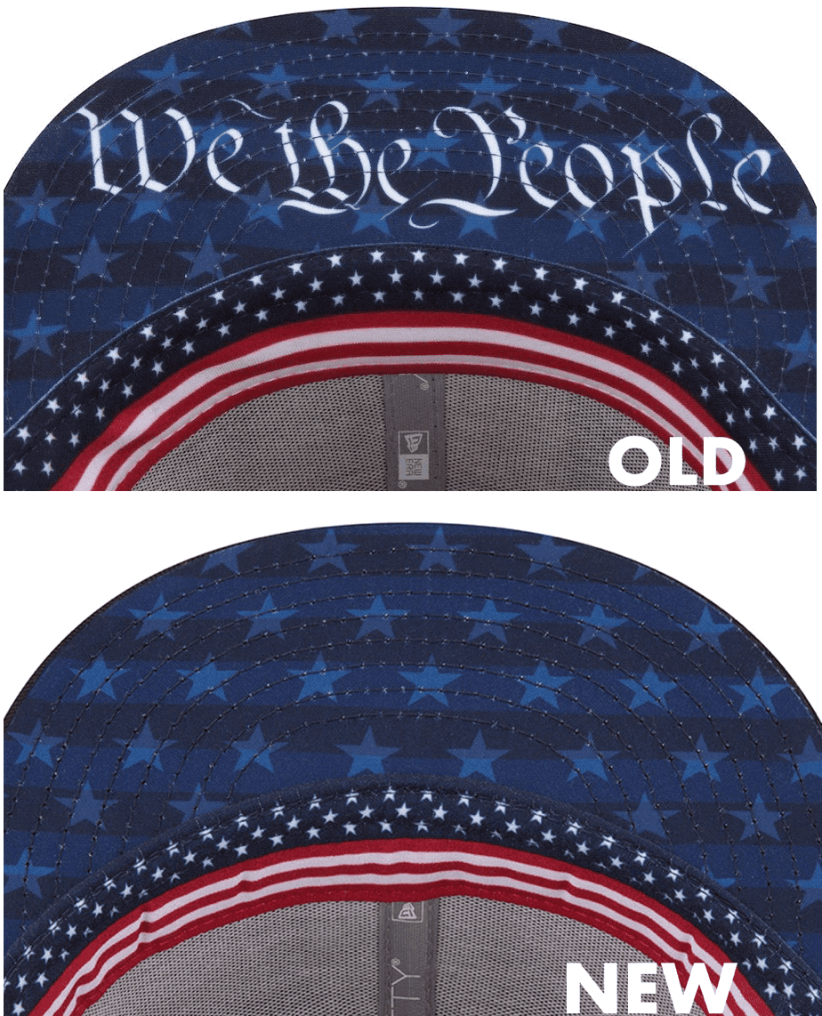
Interesting MLB development yesterday, as follows: As you may recall, when this season’s holiday merch — er, uniform designs — were announced back in March, the Independence Day caps had “We the People” printed on the underbrims. As I pointed out at the time, that’s bad civics and bad history, because Independence Day celebrates the ratification of the Declaration of Independence, while “We the People” is from the preamble to the Constitution (which was ratified 12 years after Declaration). But hey, who cares about historical accuracy or our nation’s founding documents when you have a merchandise program to run, right?
Now it turns out that they’ve done an about-face. The caps are now available for retail sale, and as you can see above (and can click to enlarge), the wording has been removed from the underbrim. Kudos to MLB for listening to the feedback and making this change. Of course, a better solution would be to scrap the holiday gear altogether, but at least this year’s caps will serve as a monument only to bad design, not bad history.
A few additional notes:
• The Blue Jays’ version of this cap was originally slated to have a maple leaf and the word “Canada,” but both of those elements now appear to have been scrapped.
• At least some of the non-authentic retail caps, like these flex-fits, still have “We the People” on the underbrim. Those won’t be worn on-field, and I generally don’t care about retail merch, but it’s disappointing to see that MLB is still willing to spread bad history and bad civics on the retail level.
• It’s interesting to see that they were able to make this change in two and a half months. We’re always hearing that things have to be set up way in advance because of supply chain issues and so on, but in this case they changed the design fairly quickly. Hmmmm.
(My thanks to @racerx8579 and Matt West for their contributions to this section.)
Click to enlarge
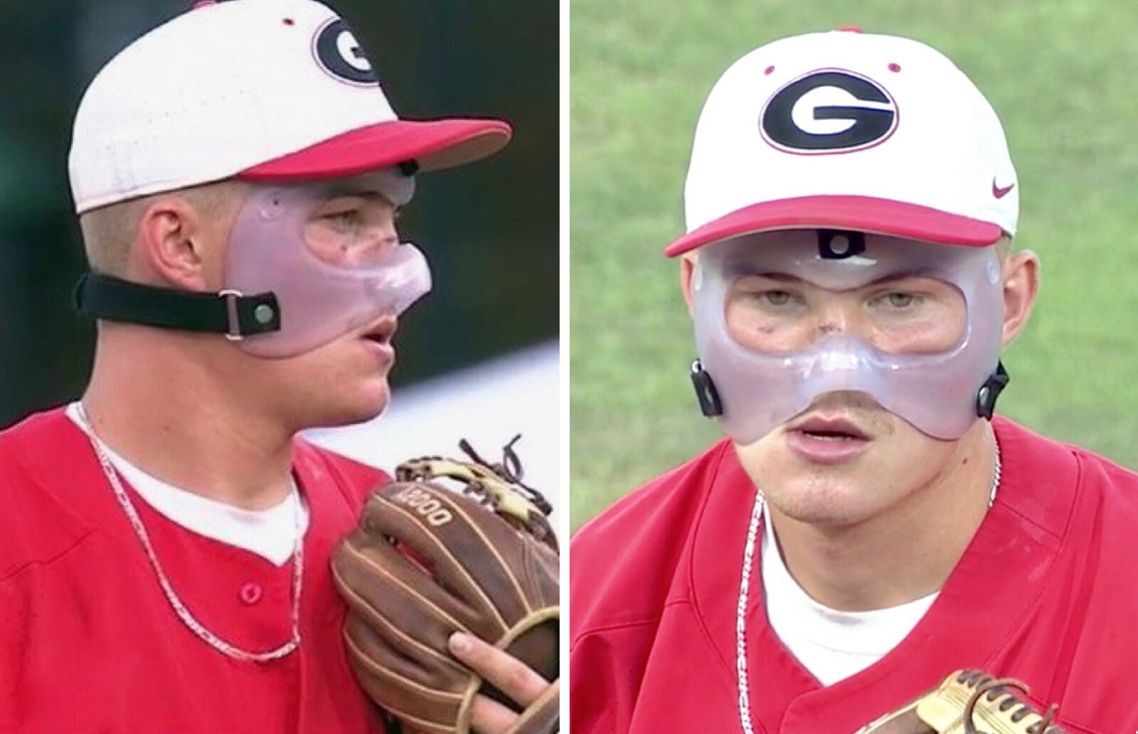
Who is that masked man? Georgia third baseman Aaron Schunk broke his nose after colliding with a guardrail while chasing a foul pop on Sunday. Not only was Schunk back on the field for yesterday’s game, but he was pitching. (In addition to being the starting third baseman, he’s also one of the team’s top relievers.) UGA trainers rigged up a protective mask for him, and good for them for not putting a swoosh on it.
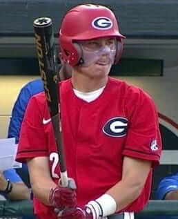
Schunk also wore the mask while batting. Here’s how it looked with his batting helmet:
(My thanks to Chris Mycoskie for letting me know about this one.)
Click to enlarge
Collector’s Corner
By Brinke Guthrie
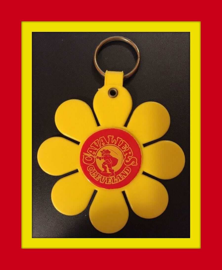
After a brief two-week stay on the Uni Watch Facebook page, Collector’s Corner is back in action on the Mothership. The Warriors and the Cavs are battling (again) for the NBA title, so get your groove on (if you’re a Cavs fan, anyway) with this flower power key ring! The Cavs started with this logo in their first year, 1970-71.
Now for the rest of this week’s picks:
• Paul, are you required by law to have a front plate on your cars in New York? If not, this 1960s “Mets and Me” license plate might be just the thing for you! (Unfortunately, New York does require a front plate. Too bad. — PL)
• This glossy, enameled San Diego Chargers belt buckle says “1971” on the item itself, which must have been when NFL Properties licensed them, since the Chargers weren’t wearing blue hats yet in ’71.
• We have here an early-1970s Phillies desk plaque, made by Kentucky Art Plaques of Morehead, Ky.
• From the 1970s, this Dolphins serving tray looks to be in perfect shape.
• This Minnesota Vikings pennant was part of a mail-in promotion from Coca-Cola. The seller says 1960s but the NFL shield had pinstripes during that decade.
• Balitmore Colts fans will want to add this button to their memorabilia collection.
• Plenty of vintage NFL logos to be seen on this 23-pin set.
• Speaking of pins, is this Los Angeles Angels logo a classic or what.
• This 1960s Pittsburgh Steelers bobblehead is in great shape (and also has helmet logos on both sides, oops).
• Ah, another one of those cool Sears bulletin boards from the 1970s, this time for the Chicago Bears.
Seen an item on eBay that would be good for Collector’s Corner? Send any submissions here.
Click to enlarge
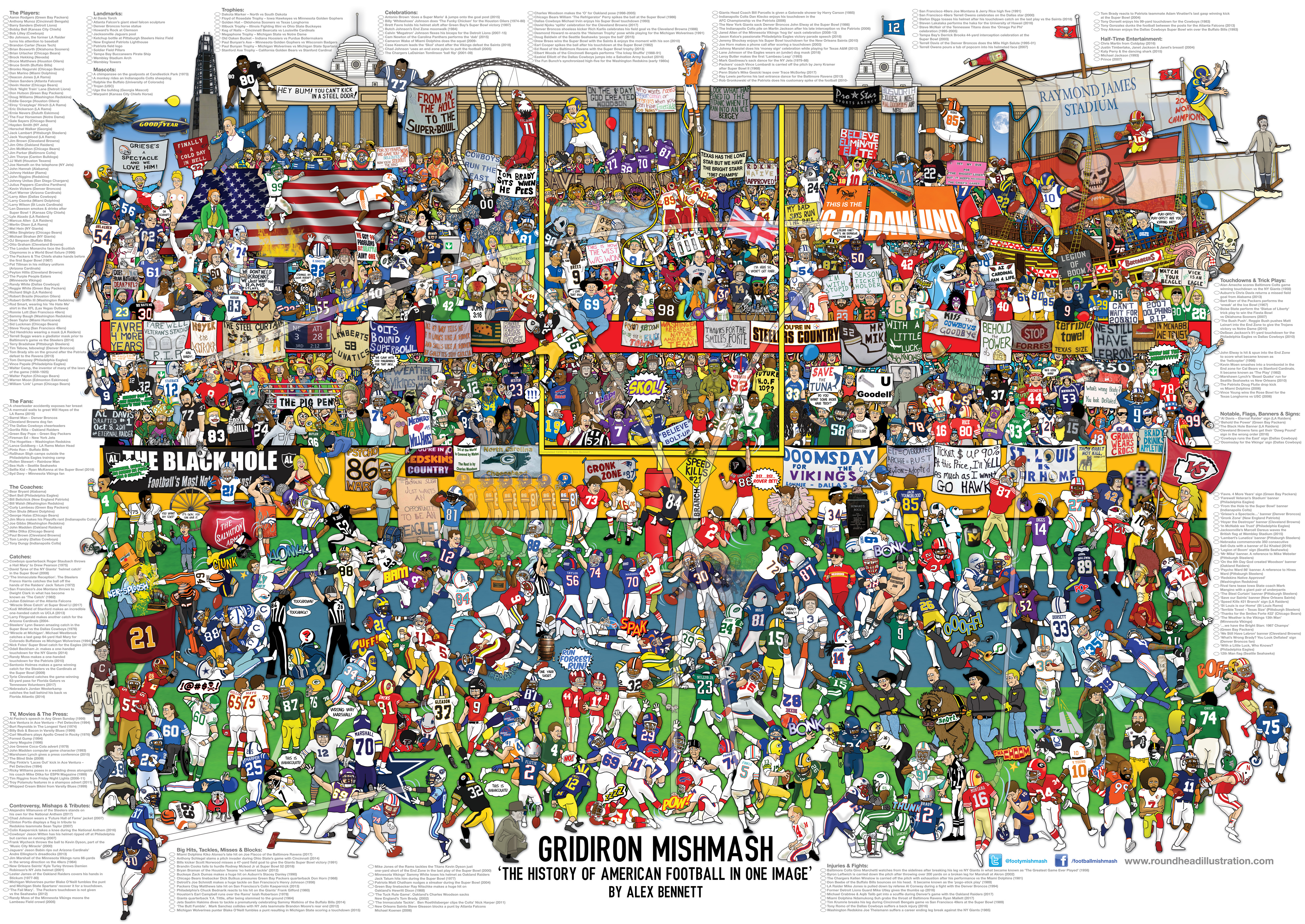
Raffle reminder: Illustrator Alex Bennett is currently raffling off two of his new “Football Mishmash” posters (shown above) to a pair of lucky Uni Watch readers. Full details here.
Click to enlarge
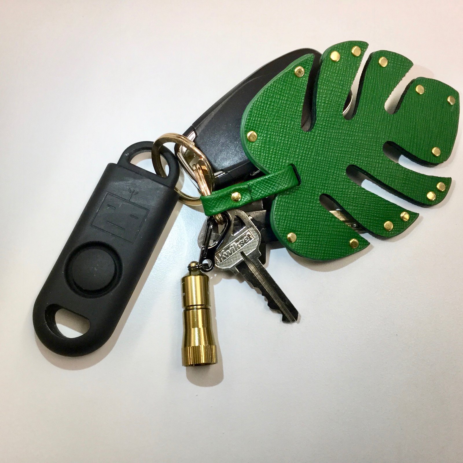
KRC update: The latest installment of Key Ring Chronicles is about a personal alarm device (the black thingie on the left side of the photo). Check it out here.
The Ticker
By Alex Hider

Baseball News: The Yanks and Tigers played their Jackie Robinson Day make-up game last night, with all players wearing No. 42 (from @Fantasy_Lens, photo credit Jeff J. Snider). … Rays draft pick Matthew Liberatore was wearing the team’s new fauxback cap after he was drafted last night (from Eric Wright). … Here’s another story about Brewers fans not finding the “mb” in the ball-in-glove logo, because ya gotta keep that content churnin’ (from Phil). … The Rochester Red Wings will be wearing 1980s throwbacks on Sunday. … USA Baseball recently changed its regulation for youth baseball bats (NYT link) — a change that has left parents footing the bill for new bats. … Birmingham High School (California) wears some slick stirrups (from Matt Shevin). … The Niagara Expos, a youth team in the Buffalo area, has their own take on Montreal’s old logo (from @Milpool______). … The logo for the MLB draft has an apostrophe catastrophe. They apparently had the same problem last year (from Phil). … MiLB.com’s Ben Hill, who specializes in writing about eccentric minor league promotions, has written a good piece about last week’s Brannock Device Night promotion in Syracuse. It includes another photo of Paul throwing out the first pitch (from Phil).

NFL News: The Jaguars’ stadium has a new corporate name (from Brinke). … The Broncos will wear their Color Rash uniforms at home — on a Sunday — for the first time this upcoming season (from Phil). … The Rams will wear their throwbacks and Color Rash uniforms a total of three times this season, with the goal of avoiding their navy blues completely (from Chris Cruz). … The Packers have posted an interactive uniform timeline on their website in honor of their 100th anniversary. … Reader Luca Capparucci from Rome, Italy, recently bought this 49ers shirt and wants to know if it’s a knockoff. Can anyone help him out? … RIP Dwight Clark. A while back, we had a great breakdown of the famous photo of Clark making The Catch.

Basketball News: Do the Knicks have a blue jersey in the works? Check out the jersey that they recently gave to singer Khalid — white numbers instead of orange. … Friend of the site Todd Radom has identified the designer of one of the NBA’s best jerseys of all time: the Warriors’ “The City” look. … ICYMI, the NBA has released its Draft Day caps (from Colin). … The Sarpy County Swim Team in Nebraska is using a version of the old Timberwolves logo (from Andrew Cinnamon). … The official NCAA March Madness Twitter account shared an awesome evolution video of every Final Four logo (from Hayden Kay).

Grab Bag: Rep The Squad, the “Netflix for jerseys” company that has advertised here on Uni Watch, is shutting down after less than a year in business (from Al N. Kreit). … Earl Campbell, Nolan Ryan, and Hakeem Olajuwon all wore No. 34, and all were inducted into the Houston Sports Hall of Fame last night. Each received his own ring with No. 34 (from Ignacio Salazar). … It may not be a helmet cart or a bullpen cart, but we can all get behind muffin cars (from Max Weintraub). … A company in Cincinnati repurposes old basketball courts into keepsakes. … The University of Chicago track team, which is outfitted by Adidas, includes a freshman sprinter named Nike Reid (from Tris Wykes).
Happy birthday to our own Jamie Rathjen, who compiles the Tickers that run on Mondays. Enjoy your day, Jamie!
The Cavaliers threw those key rings to the crowd as freebies!
“…last week’s Brannock Device Night promotion in Syracuse. It includes another photo of Paul throwing out the first pitch ”
Bringin’ the heat!!
Hey Paul, I know you made a great pitch. Did you practice at all beforehand (either well before, or even right before you had to throw)? Or did just go in cold?
Just wondering.
Prior to the Brannock promotion, I hadn’t thrown a baseball (as opposed to a softball) in more than a decade, and I hadn’t even thrown a softball in a few years. So the Tugboat Captain and I tossed a baseball around quite a bit in the weeks leading up to the event. That included the afternoon of the event, at a park in Syracuse. I had been told that I’d also get to loosen up on the field just prior to the first pitch, but that turned out not to happen. Fortunately, I did alright anyway.
Todd Random is a friend of the site? Does he know Todd Radom? Maybe he can answer why the cavalier is facing away from us in that old logo…
I’m still calling it “The Bank” I mean “Municipal Stadium” I mean “Alltell” I mean “The Gator Bowl”
Real question is how soon will it change again?
My guess would be about five to eight years. I have no data to support but it seems like most naming rights change fairly often.
This would make a good research project for someone in the Uni Watch community. Someone?…anyone??
Those NBA Draft hats are awful. And here I thought nothing could be worse than this year’s NFL hats!
Given how it was oriented on the underbrim anyway, the “We the People” might as well have been “Ee’d Plebnista” anyway.
Nice reference, and a great episode.
Didn’t the Independence Day caps have an interleague patch on them for some reason when they were first announced? Looks like they have regular NL or AL patches now.
Or you could simply click on the link in the first graf to see what they looked like originally.
;)
Actually I’d have to click through two links. ;)
Anyhoo, looks like I had it wrong. I swear I remember seeing a patch with the two eagles grappling. But then my memory ain’t what it used to be.
Those Independence Day caps are awful and I don’t support their existence at all as a piece of on-field equipment, but I have to say I personally don’t agree that including the “We The People” image constitutes historical inaccuracy or bad civics. While it’s of course true that July 4 was selected as Independence Day due to its connection to the Declaration of Independence (even though it was not actually signed on that day), I think it’s pretty clear that the holiday is meant not to celebrate just the Declaration but the country overall, like most national holidays; it doesn’t seem wrong or inappropriate to me to utilize any important national symbol, which the Constitution surely is. Otherwise, shouldn’t it be considered similarly inaccurate to have the caps have a “stars and stripes” theme at all considering the U.S. flag (with any number of stars and stripes, let alone the current configuration) did not exist on July 4, 1776 either?
Look: We have two primary founding documents in this country. An appalling number of our citizens don’t even know the difference between them. We happen to have a national holiday that celebrates the ratification of one of them. If we’re going to quote one of the documents on that holiday, I think it should be the document that is the basis for the holiday. Quoting from the other document just perpetuates the ignorance of our citizenry. The end.
It’d be like putting a picture of Amerigo Vespucci on the Columbus Day caps!
“I personally don’t agree that including the “We The People” image constitutes historical inaccuracy or bad civics.”
And yet, that’s exactly what it does.
Phil: I offered my opinion and explained my reasoning behind it. You don’t have to agree. You also don’t get to tell me I’m wrong just because.
The Date “July 4, 1776” wasn’t simply selected as you state — link. No where in that document does it say “We The People” — it does that link as the first words to the preamble to the Constitution.
These are facts. It’s an historical inaccuracy to portray the words of the preamble to the Constitution on the date we celebrate our Declaration of Independence from Britain, which was dated July 4, 1776.
You can argue all you want what “Independence Day” celebrates, but it’s pretty clear that MLB fucked up here and had to backtrack. This is not a small detail.
Apologies if you took my original comment the wrong way. You can feel however you want about what Independence Day celebrates.
However, if MLB wanted to use the opening words to the Preamble to celebrate link (yes, there is such a thing and it’s celebrated, if you will, during baseball season) on that date — September 17th — I’d have much less of a problem with this.
The quote is historically inaccurate. Period.
Somebody is a bit mad. lol
Except you are wrong. This isn’t a difference of opinion when multiple things could be a possibility. If I say 2+2=5 I open myself up to being told I’m wrong.
That is what you have done. So defending your “opinion” is not justified in this instance.
Too often in this country we think of a national holiday as a day off of work and not about what that day should mean. It’s very sad, really.
My response was not to Phil.
Saying 2+2=5 in this case would be arguing that “We The People” does in fact appear in the Declaration of Independence. I’m not arguing that. I’m saying that it is acceptable to commemorate Independence Day, despite the date itself deriving from the Declaration, with celebration of symbols, imagery, and ideas separate from the Declaration that did not exist at the time the Declaration was signed, such as the Star-Spangled Banner, the bald eagle, the presidency, Washington D.C., and above all, the flag – the latter one of which MLB itself clearly agrees with as evidenced by the very example that’s being discussed. All I am arguing is that it is reasonable to include the U.S. Constitution within this group of important U.S. things that can be celebrated on America’s national day. A key argument against this as explained by Paul above seems to be that it should be avoided so as not to foment confusion between the two founding documents of the Declaration and the Constitution, which is a perfectly valid viewpoint, but I don’t see how it is an issue of “historical accuracy” – again, unless you’re going to also argue that it is totally unacceptable to incorporate other post-1776 things like the flag or the anthem into July 4 celebrations too.
If one is teaching basic American history or civics to young children, then it’s important to keep the stories one tells about abstract concepts simple and direct. So it’s appropriate to separate the stories of the Declaration and the Constitution.
But if one is speaking as an adult, to adults, then exactly the contrary is true. The strict separation of the two bookends of the revolutionary era is either a childish simplification of complex reality or it is an adoption of a radical ideology conceived in the 1840s and perpetuated to this very day in order to deny civil rights to minorities, women, and poor men.
Maybe in the Trump era it is appropriate or necessary to treat all adults as if we’re ten years old and simplify all abstract concepts to the level of Aesop’s fables. In which case, absolutely, MLB was wrong to use symbols of the revolutionary era from beyond the year 1776. If it is not necessary to speak among ourselves only as we would speak to a fourth-grader, then the Constitution is in fact an integral part of any honest understanding of America’s revolution and independence, and to assert otherwise is nigh-criminally bad civics.
If one is teaching basic American history or civics to young children, then it’s important to keep the stories one tells about abstract concepts simple and direct. So it’s appropriate to separate the stories of the Declaration and the Constitution. But if one is speaking as an adult, to adults, then exactly the contrary is true.
Scott, I’m not sure on what basis you think MLB is speaking exclusively to adults rather than children here. In fact, children are a huge part of MLB’s audience. Didn’t nearly every single person reading this site become hooked on sports during childhood? Aren’t uniform details like flashy underbrims precisely the sorts of things that are geared to appeal to kids?
So, yeah, putting “We the People” on an Independence Day cap sends a terribly ahistorical message to kids. (And to adults.)
Maybe in the Trump era it is appropriate or necessary to treat all adults as if we’re ten years old and simplify all abstract concepts to the level of Aesop’s fables. In which case, absolutely, MLB was wrong to use symbols of the revolutionary era from beyond the year 1776. If it is not necessary to speak among ourselves only as we would speak to a fourth-grader, then the Constitution is in fact an integral part of any honest understanding of America’s revolution and independence, and to assert otherwise is nigh-criminally bad civics.
Scotty, I’m pretty sure you’re not playing devil’s advocate here (tho I wish you were). And I’m in agreement with you 99% of the time and about 50% here. But on this point I will not budge.
We didn’t arbitrarily choose July 4th as “Independence Day,” — it’s the “date” the document was dated (finalized, as it were, even if perhaps only Mr. Hancock put his signature on it that day); Independence Day, as the name both implies and states, is the day the Declaration of Independence was … well, declared. The day may mean more than just simply the day we told the Redcoats to Fuck Off, Eh?, and I won’t argue that over the years, conflation of US History has indeed made this so. But one thing the day is NOT is the day we celebrate the Constitution. That has an actual date (even if no one knows when it is — and I admit, I knew the day existed by had to look it up). So, putting the words to the Preamble under the brim on Independence Day is historically wrong, and this error should not be perpetuated. It’s lazy. As others have suggested, there are several great and juicy phrases from the Declaration that could have been used under the brim. “We The People” ain’t one of them.
Two interesting things about this discussion:
1) MLB, which normally doesn’t care what I think, apparently cared enough about the distinction between the two documents to change the cap design once the inconsistency was pointed out to them.
2) When I tweet things, most of my tweets get a few dozen likes and a few dozen retweets. But when I pointed out the underbrim issue back in March, look at the numbers that piled up:
link
That doesn’t automatically mean I’m right, of course (as I always point out, Twitter stats don’t measure anything except people who self-selectedly engage on Twitter). But it does mean that a large number of people — more than I would have guessed — care about the distinction between the Declaration and the Constitution.
In short, this is not just a pedantic nitpick. It’s a real issue that lots of people (including, apparently, MLB execs) care about. All very interesting.
Forced acts and promotions of patriotism, whether historically correct or incorrect go against the tennents of which this nation was founded.
“The Constitution is in fact an integral part of any honest understanding of America’s revolution and independence, and to assert otherwise is nigh-criminally bad civics.”
This is as historically inaccurate as claiming “We the People” is found in the Constitution. With a nod to the limits of a comments section of a uniform blog for reasoned analysis of the causes and outcomes of the American Revolution, the creation/ratification Constitution was the direct result of the deficiencies of the Articles of Confederation and the inability of the central government to establish a unified monetary policy and the necessity of unanimous approval of most legislation by all thirteen states. It was only after the realization that the limits of the Articles of Confederation were recognized that the Constitutional Convention was called and the ultimate terms of the Constitution were negotiated and ratified.
Many revolutionaries who were members of the Second Continental Congress and otherwise were abhorred by the idea of the Constitution at its creation 13 years after the Declaration of Independence. See, Henry, Patrick. These “dissenters” feared a strong central government would impose the same “tyranny” from which they had just won their independence. No one in 1776 had any thought or inkling of the document we now know as the United States Constitution.
I hate to add to this issue, but there is also one other thing Martina mentioned in her original post…
“…I think it’s pretty clear that the holiday is meant not to celebrate just the Declaration but the country overall, like most national holidays; it doesn’t seem wrong or inappropriate to me to utilize any important national symbol, which the Constitution surely is…”
This is basically akin to thanking our veterans on Memorial Day. Suddenly every holiday is a national/military/gov’t holiday no matter what’s celebrated or remembered, and accuracy doesn’t matter. I (sickly?) enjoy looking through papers and social media posts to see who is remembering those who died in war and those who are thanking policemen for their service on Memorial Day.
It would have been nice if they put a line from the Declaration of Independence on the caps instead. Something like “All men are created equal,” “Life, liberty, and the pursuit of happiness,” or “Free and independent states.”
What about simply having a Button Gwinnett day?
Wholeheartedly agree with this. But to be down with the Latin crowd while still expressing our founding sentiment, I was hoping it’d say something like “Todos gentes somos igualmentes creaba.”
“Endowed by their Creator” would probably cause some controversy.
Other options include:
– In Congress, July 4, 1776
– When in the Course of human events…
– We hold these truths to be self-evident…
– These United Colonies are, and of Right ought to be Free
– We mutually pledge to each other our Lives, our Fortunes and our sacred Honor
While there are many great sentences, they don’t all break down very well into a short phrase that is meaningful on its own.
Honestly, MLB just needs to stick w/ what works…holiday jerseys don’t work. Save em for the minor league teams!
Matthew Liberatore looks like Elmer Fudd or SuperMario in that gigantic Rays throwback cap. YUCK
love Love LOVE that Rochester Red Wings 80s jersey. what a BEAUT!
Paul, you had a lot of KENT TEKULVE FACE going on on that first pitch. Nicely done!
Luca Capparucci, that is an official gameworn Joe Montana 49ers jersey you got. would love to know what you paid for it. I have matched it up with Super Bowl XXVII pics and it is authentic for sure!
and finally from our “For What it’s worth” dept. — I usually look at Uniwatch via my ipad with zero issues nor pop-ups. Today I hit it via GoogleChrome and lord almighty that CoolByConsumable pop-up is a NIGHTMARE! I switched to FireFoxMozilla and it was able to remove the CoolByConsumable pop-up. Holy shit that is a BAD ONE
Matthew Liberatore looks like Elmer Fudd or SuperMario in that gigantic Rays throwback cap. YUCK
love Love LOVE that Rochester Red Wings 80s jersey. what a BEAUT!
Paul, you had a lot of KENT TEKULVE FACE going on on that first pitch. Nicely done!
Luca Capparucci, that is an official gameworn Joe Montana 49ers jersey you got. would love to know what you paid for it. I have matched it up with Super Bowl XXVII pics and it is authentic for sure!
and finally from our “For What it’s worth” dept. — I usually look at Uniwatch via my ipad but today I hit it via GoogleChrome and lord almighty that CoolByConsumable pop-up is a NIGHTMARE! I switched to FireFoxMozilla and it was able to remove the CoolByConsumable pop-up. Holy shit that is a BAD ONE
Thanks, Paul!
I find it interesting that MLB feels it must wear these costumes on the field. I am guessing that they’ve done studies showing they’ll sell X number more if they advertise them on the field one day (or three days). Though, and especially with loudly patriotic team merchandise, it seems that sells itself among the fans that like it. Perhaps it is just me, but I’ve never been swayed into buying any of these one off designs because they happen to be worn on the field. If I like the way a cap or shirt of my favorite teams looks I’ll get it, plain and simple.
Interesting that the California NBA teams have the state flag on their draft caps while other teams (Detroit, Chicago, Philadelphia, etc.) have city flags.
It’s hit or miss. Phoenix and OKC have the state flag as well, while Toronto has the Canadian flag. Seems to be no hard rule.
Maybe the LA teams chose the state flag because the City of Los Angeles flag is pretty ugly in my opinion. Plus I would think not a lot of people would even recognize to begin with.
link
I’m thinking most city flags aren’t recognized by many outside said metro area.
And while LA’s flag isn’t particularly great, I will give them points for have a unique color scheme among all the blue flags out there.
Niagara Expos, not Niagra
Got it.
Proofreading. Also should say from the Buffalo area and not era.
The ticker item about the “hidden” M+B reminds me of an ongoing social experiment I am conducting to see what percentage of people perceive the arrow in the FedEx logo whitespace. Even today, at least a quarter of the populace has never noticed (until you see it, and then you can’t unsee it, ever…)
Mind-blowing sock stripeage vs. sock stripeage action in this 1941 Brooklyn Americans vs. Toronto Maple Leafs pic:
link
-Jet
Ooooh, nice!!
Someone needs to colorize that.
link
Some good pictures as this is a site run by the NHL.
Luciano Pavarotti being presented with a Toronto Maple Leafs jersey?! Which looks about 10 sizes too small for him…
link
-Jet
Looks like they’re tying a bib on him.
In addition to the University of Chicago track athlete, Miami University (Miami of Ohio for those who don’t know) has a basketball player named Nike Sibande who just happened to be the freshman of the year in the MAC this year. Miami is also an Adidas school.
Here’s his link.
link
U of Chicago runner in that photo is wearing an Asics headband.
Most schools don’t have exclusive deals for Olympic or non-revenue and besides the uniform can wear whatever they want. When I ran track in college we were sponsored by Asics but my racing shoes were by Nike. My second college had an exclusive deal with New Balance so we had to wear their shoes.
The removal of the “Canada” from the Jays hat tells me that maybe something went wrong in production, so the words were scrapped from both brims.
That seems like a fairly broad assertion.
I could just as easily say that the Jays cap “tells me” that they wanted an even-handed treatment for both countries, with nothing written on the underbrims in either case.
More importantly: USA underbrims still have stars/stripes pattern. So no, there was no production problem.
Fair enough. Good point.
Ah, another one of those cool Sears bulletin boards from the 1970s, this time for the Chicago Bears.
A rare error by Guthrie…link is actually to a bulletin board for the Baltimore Colts.
I clicked on the link and the Baltimore Colts’ bulletin board showed up too. However, if you look near the top of the page, you see the following displayed in a blue banner:
“The listing you’re looking for is no longer available. Check out this similar item we found for you.”
So the Bears’ bulletin board was there at one time, but it must have been sold, resulting in the Colts’ bulletin board replacing it.
No error by Brinke.
Very cool picture, I’m not sure I’ve seen a picture of the Americans before. Note the 1941-42 was their last season. Obviously hockey was struggling (WW2) – as I found this blurb
“Frank Patrick suffered a heart attack and had to sell his interest in the Montreal Canadiens, and the Habs almost had to move to Cleveland. But Tommy Gorman kept the team alive.”
Sorry, this is replying to Jet’s picture
Re the Brewers logo, I always saw the M and B—it was the ball and glove that I didn’t notice until afterwards
Looks like they’re tying a bib on him.
Anyone else having issues with:
Their name and email disappearing every time they try to post,
and/or
a Consumable ad banner taking up the bottom of the page?
The consumable cool ad appears on chrome and ie on my home pc but not on my ipad. It is an eyesore.
si senor- at the office at least
adblocker still works at the house
Yep
Would have been nice if the fine folks at Fanatics had taken a second look at the item description for the Jays’ version of the cap to which you linked:
“…This New Era cap is perfect for a major Toronto Blue Jays fan like you who loves rocking the red, white and blue. The patriotic design matched with bold Toronto Blue Jays graphics make this your go-to gear for game day…”
I mean, I suppose you’d be rocking the red, white and blue in so far as the cap is red and the Jays’ uniform is white and blue. And I’m not sure what’s patriotic about a gold maple leaf, or what happened to the bold Toronto Blue Jays graphics. But otherwise, it doesn’t look at all like a {replace team name here} version of the description they used for all the other caps.
Sorry if posted before, but Delta’s new safety video shows the various flight attendant uniforms throughout the years. Pretty neat.
link
As a fan of a red, white, and blue team (the Chicago Cubs, who have worn this cap’s shade of blue over the years also) for whom this hat could look really nice, I find myself wanting one of them now.
But I wish they had found a nice quote from the Declaration of Independence to put on the underbrim instead.