[Editor’s Note: Paul is on his annual August break from site (although he’s still writing his weekly Bulletin column and may pop up here on the blog occasionally). Deputy editor Phil Hecken is in charge from now through the end of the month.]
Hi, everybody, and a very pleasant good morning to you wherever you might be.
Back in August of last year, I ranked the 2021 City Connect uniforms, and I used the following criteria:
I’m going to simply rank the uniforms from best to worst. I’ve mentioned one cannot really “judge” the uniform without the stupid word salads rationales behind the uniforms — and that’s true to an extent — but today they’ll be ranked solely as on field uniforms. In other words, if you’d never seen a baseball game before and simply saw these uniforms in game play, which team had the best and which team had the worst?
I’ll apply those same simple rules to this year’s batch of CC unis as well. Like last year, I’ll rank them from best to worst. Here we go:
#1: Colorado Rockies
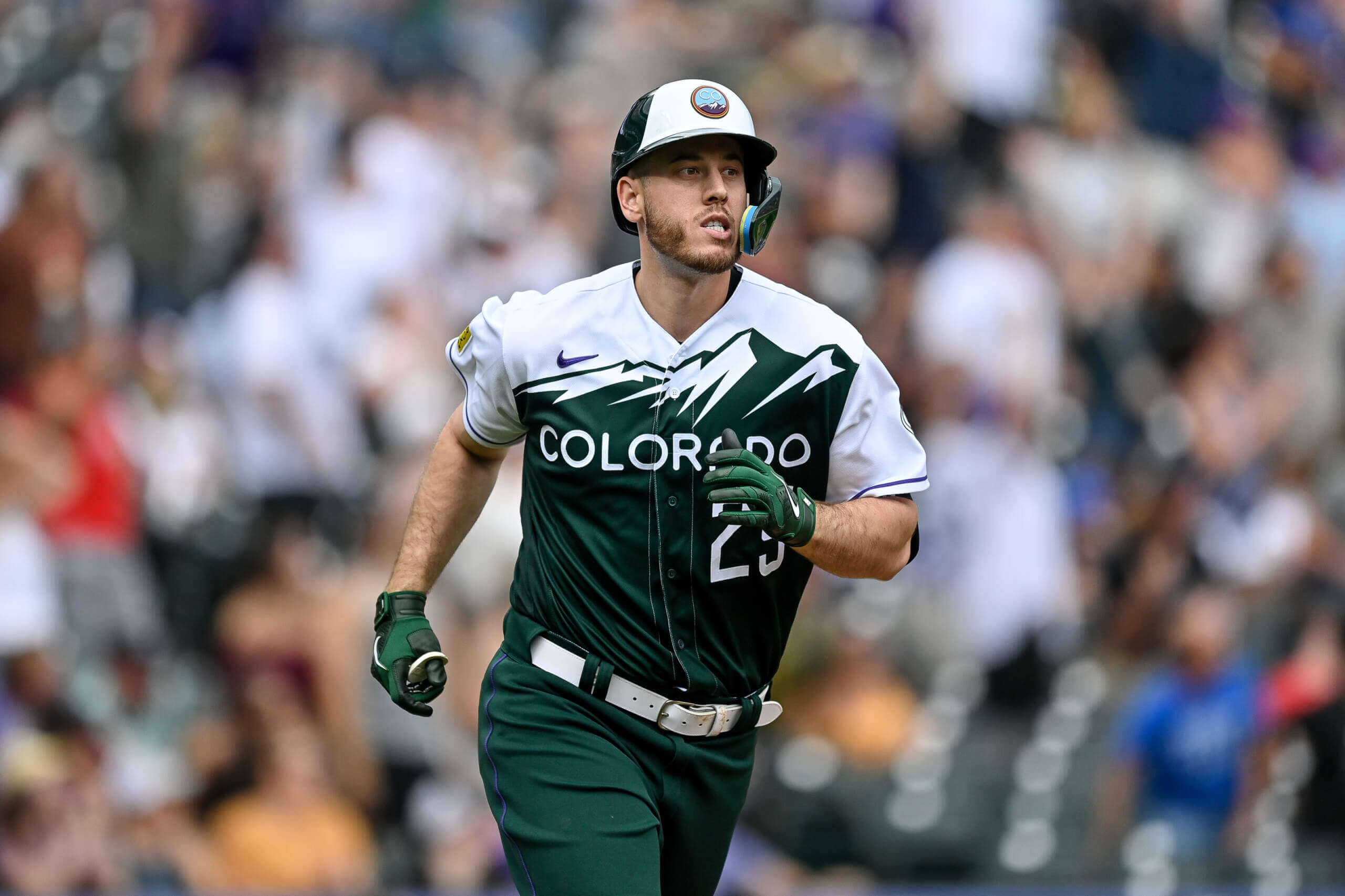
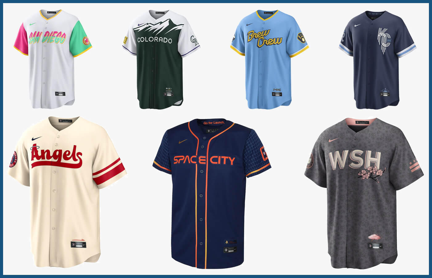
The fact that this ranks as the best of the 2022 CC uniforms should tell you something. For the most part, I don’t love any of them (and some I really don’t like). There’s just a bit too much going on here, but in general it’s a solid uniform and definitely one of the best overall. I don’t like guys who wear pajama-style pants, and the semi-ghosted numbers can be a bit of an issue, but visible socks really help, and there’s definitely a place in MLB for a green uni! Although they haven’t (yet) worn white pants with the green jerseys, even that looks good.
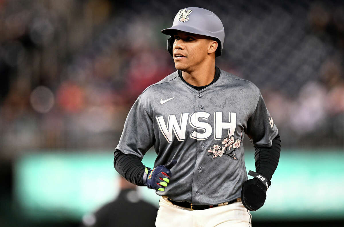
This one has grown on me as I’ve seen it worn more often — originally I wasn’t a fan of pairing the heather gray jersey with cream colored pants, but it actually looks pretty sharp. I didn’t like (and still don’t) the giant “WSH” wordmark, but the pink block shadows and cherry blossom motif actually work well. Light pink and darker gray go very well together, and it’s a unique combination for a baseball jersey. The sublimated flower pattern on the jersey is nigh invisible from any distance (thankfully). I’d be curious to see how this would look with matching gray pants (but in that case they’d need to wear a different color cap and socks), and some day I’d like to see a team try a darker gray roadie (the D-bax had the right idea, but that uniform was just a trainwreck).
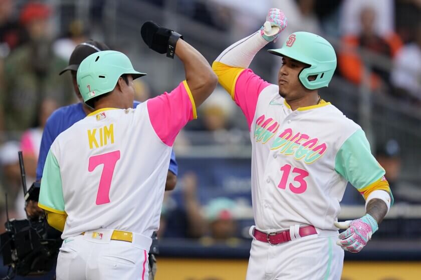
I had my worries about these, until I saw them on the field. They’re fine. The issues I originally had — especially with the wordmark and legibility issues — didn’t vanish, but the fuchsia and seafoam, combined with gold, make for a really fun-looking uniform. No, I don’t love them. The wordmark is still hard to read, as is the NOB, but it’s a nice departure from a league that’s heavy with navy and red and other dark colors.
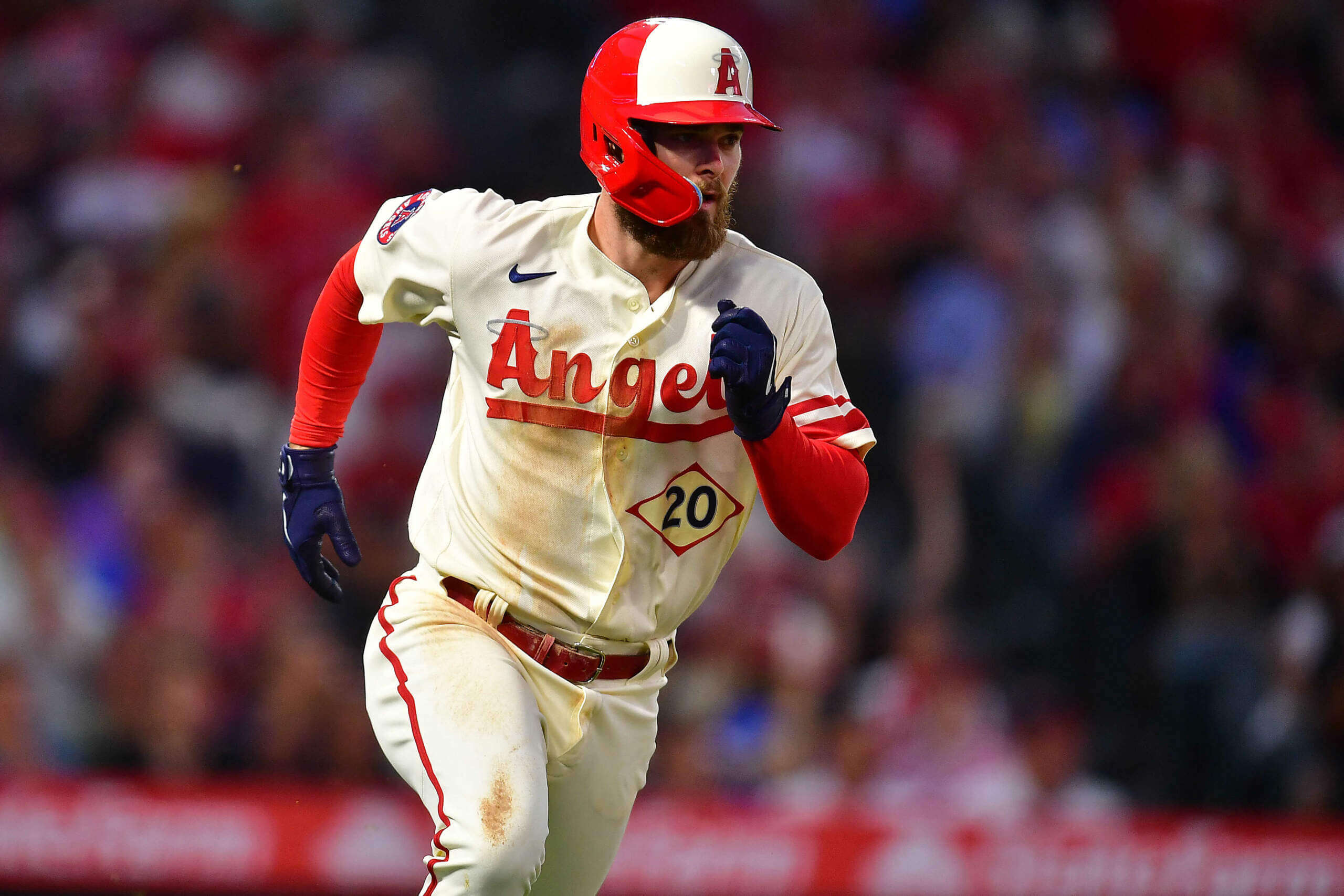
Like the Padres, this one is light-hearted and whimsical. What it lacks in doo-dads (a good thing), it makes up for with one of the best front number treatments I’ve seen on a baseball uniform. While whimsical though, I wasn’t a fan of the script Angels wordmark, but the cap “A” not matching the uniform “A” was surprisingly not a deal-breaker. Even the asymmetrical sleeve design and blue numbers seemed to work.
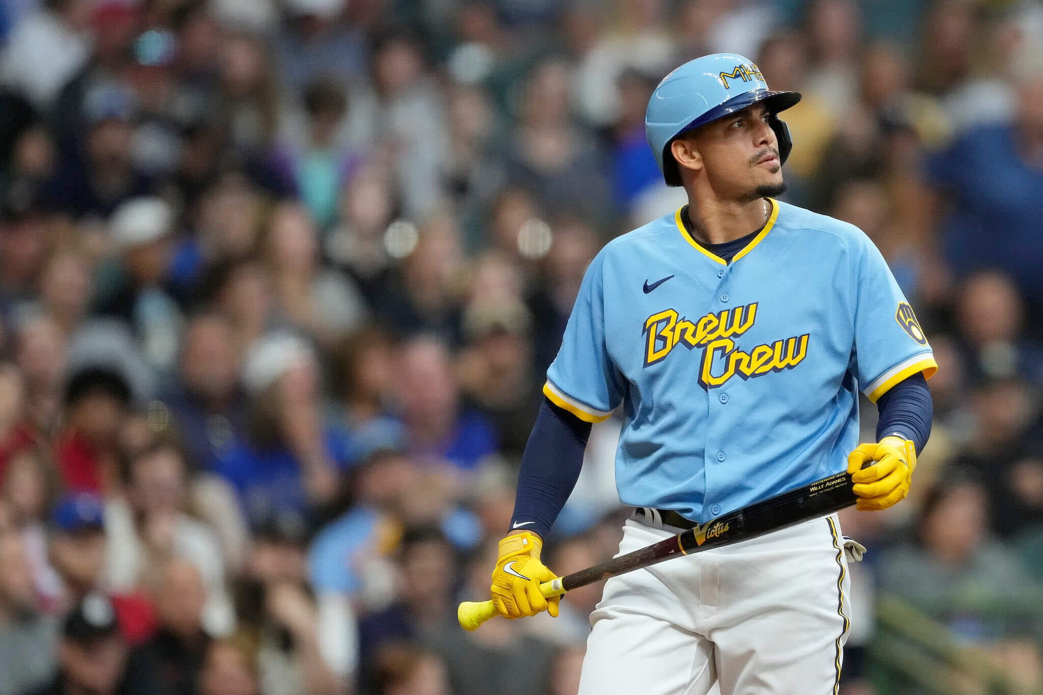
What I like about this uniform (the powder blue jersey with athletic gold wordmark) unfortunately can’t overcome what I don’t — from the ridiculous forced “414” area code on the cap to the chunky, weird font of “Brew Crew”. This one definitely had potential, especially if the team paired the powder blue jersey with matching pants, which would have provided for a great fauxback opportunity. Instead, it became just another excuse to sell jerseys.
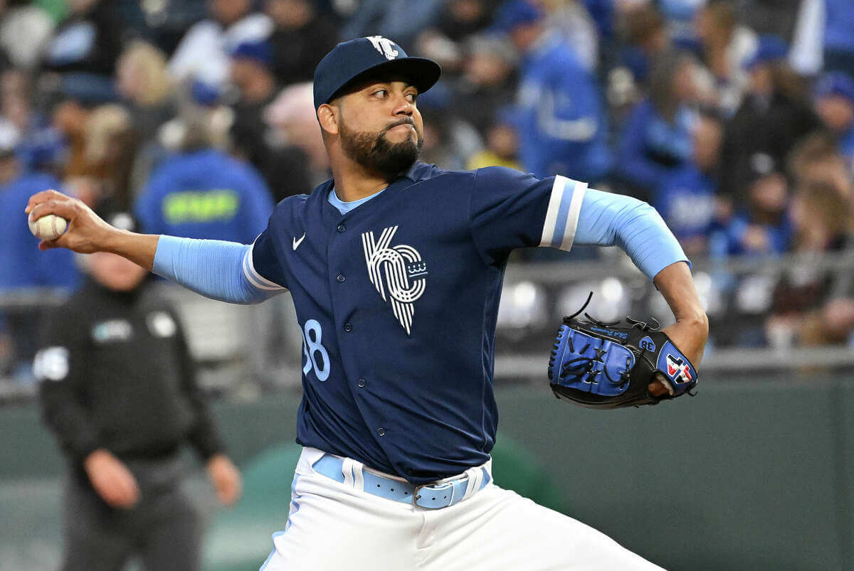
Yes, I know the team wasn’t named for the color royal. But, c’mon — this team has featured royal elements throughout its entire existence. To have a uniform bereft of that color borders on malpractice. But even putting that aside, I do like navy and powder blue together. Unfortunately, the jersey’s just not that attractive — even with the powder blue accessories, there’s just not enough of it to counteract the preponderance of navy. I don’t hate the “fountain inspired” logo, but the stylized sleeve “R” insignia is too cute by half. I’m guessing the powder numbers seen on the jersey front didn’t provide enough contrast, as the rear uni numbers were rendered in white. The best thing that could be said about this one is they didn’t go mono-navy, since the Cubs already checked that box, and the Dodgers already have the royal blue covered.
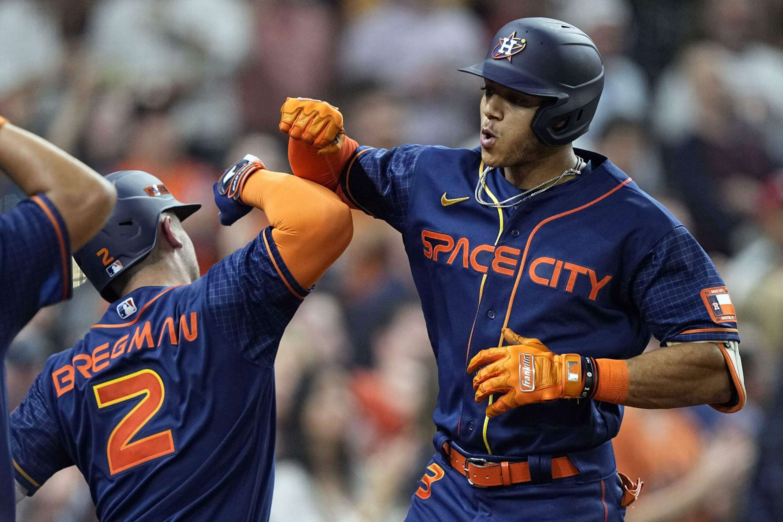
I guess the CC designers didn’t think there were enough mono-navy/blue uniforms already, so they gave the Astros another one. Honestly, about the best thing about the Astros mono-blue tilt is the cap and the socks. Yes. The cap is the best part of the uniform. That’s a cool design I wouldn’t mind seeing on the field all the time (save for the orange “ASTROS” patch on the side). But the jersey and pants? Woof. The “Space City” wordmark is both stupid and terrible, and did anyone really think replicating that font for NOB was a good idea?
I was going to rank all 14 uniforms at the end of this piece (2021 & 2022), but I’ll save that for another time. Suffice it to say, I think both years have had some good and more bad unis, so any full ranking of all 14 would be a mix of 2021 and 2022.
I’d love to know how you guys rank this years CC unis. Fire away. The good thing is we’re done with CC unveilings for 2022. The bad news is next year we will have sixteen new ones. I can hardly wait.

I’d flip the Royals and Astros at the bottom but it is really an argument of which is worse between them.
I don’t share the love for the Angels but I guess with the dreck behind them, they’re either the least bad of the worst of the least good of the good.
Borrowing from what was said about the Warriors’ latest set, one of the downsides of the Nikefaction of sports uniforms is that there is no coherent visual identity anymore. For years, the Yankees were navy pinstripes and the “NY”. The Dodgers were crisp white jerseys, royal blue trim and red front numbers. The Cardinals, Pirates, Red Sox, Tigers kept a consistent visual identity, along with many other teams. If you heard a game on the radio or on TV in another room, you could picture the game in your head. Now, you often can’t tell who’s playing if you’re watching the game live.
The only common thread are the needless quirks in Nike’s templates and the ubiquitous swoosh.
Based off you’re criteria for judging, I’d go…..
Angels, Rockies, Nationals, Astros, Royals, Padres(great hat!), Brewers.
From a uni-nerd standpoint it’d be different….Brewers still last though!
I’ll get my nerd on: Rockies, Angels, Astros, Royals, Nationals, Padres, Brewers.
It may be a color-blindness issue, but I’m really having trouble seeing the pink on the Nats’ uniform.
I think there’s just one or two elements on most of these keeping them from being what I’d consider good uniforms.
Rankings and buggery:
1. Angels – The “g” and one sleeve stripe
2. Rockies – Numbers on back, and don’t care for green pants
3. Royals – Stripes too thick
4. Padres – Legibility of SAN DIEGO
5. Brewers – I hate the font choice for the chest
6. Astros – Too dark, and I hate gradations
7. Nationals – I really hate the big ol’ WSH, the grey is dull, and I hate sublimated patterns
What kills me about the Royals CC is how easy it would be to make it better. That fountain logo in royal blue on a white jersey? It would totally work. It would look good, even.
Watched a bit of the Astros game the other night. They were wearing CC. Thought the “7” on the back looks like a ? without the dot.
Paused from my activities the other day to watch when I heard Padres highlights coming on TV. Chance to watch glorious brown and yellow uniforms. Turned away in disappointment when I saw they were wearing CC uniforms.
I was watching the Padres game the other day when they were wearing their CC unis. My wife, who is neither a baseball fan nor a uni watcher, validated the concerns we keep hearing here. In just a few minutes of her coming in the room I heard “I can’t read the players’ names, “I can’t tell that the front is supposed to say “San Diego,” and “I don’t even know who’s playing.” Then the ultimate “Why do they need special uniforms anyway?” I explained the CC program – her response: “That’s dumb.”
I’m someone who typically wants a team’s visual identity to be consistent across home, away, and alternate uniforms, but perhaps the fact that I’ve been watching so much soccer the last few years has influenced me a bit: quite a few of these alternates don’t really bother me at all. Rather than rank them 1-7, I put them in tiers:
Good: Rockies, Angels, Royals–these straddle the line between unique design elements and connection to the standard uniforms in interesting ways.
OK: Washington, San Diego–I like the Nats concept but the execution doesn’t quite work for me, mostly because it’s odd to see that much gray on a home uniform. For the Padres, my sense is that those colors are meaningful to the region, but it looks and feels a little TOO much early 90s for me.
Bad: Brewers, Astros–I like the Astros caps but the uniform is bland. The Brewers colors are good but that doesn’t make up for the confusing logo and ugly wordmark.
Requiescat In Pace Vin Scully.
I’d rate them: Royals, Brewers, Angels, Astros, Rockies, Nationals, Padres.
The first 3 are OK. The last 4 are just a joke. Look like members of a beer-league softball team or a 4th grad art class designed them. The Padres especially. It has 4 colors that have no business being on a professional sports team’s uniform.
How does one judge piles of crap? Size? Consistency? Color? Odor?
No matter the criteria, it’s still a pile of crap.
The City Connect program is for people who don’t actually like baseball uniform design, and Nike is laughing at a blog like this paying them any attention.
Lee
PS – kind of a lame move putting your “tribute” to Vin Scully tacked on at the end of this blog entry.
Hey Lee, guess what? You don’t get to gatekeep a sport simply because you were born first! Your opinions are not fact!
Don’t worry though, you’re far from the only UW community member who espouses such opinions :)
This seems unnecessarily antagonistic. Assessing logos, uniforms, design in general is subjective, and people are certainly allowed to have an opinion different than yours.
Really antagonistic and I don’t have a horse in this race. Enough that I felt moved to comment.
Lee…the very first sentence of the post is in tribute to Vin Scully. Not lame.
I’m a lifelong Padres fan and ours are the worst. Just a hodgepodge of colors, and seriously, those colors have nothing to do with San Diego or Tijuana. I also hate that here we finally have Brought Back the Brown, and so when you go to a game now, it’s a sea of brown and gold…..until now you see these mint and pink monstrosities breaking up the vibe. Oh well. We got Soto….
GABBO: (Singing) I can do the hully-gully! (does the hully-gully) I can imitate Vin Scully! (Scully voice) “Let’s take time out from this triple-play, to talk about Farmer Dan’s Pure Pork Sausage! Mm-mmmm!”
Like button? Thumbs up button please!
The frustrating thing for some of the City Connect uniforms is that they’re so close to great. The Astros with white pants would be great. The Royals with the fountain in blue instead of white. The Brewers with a better font. As you pointed out, Rockies with white pants.
They’re fun and they’re creative. They’re not dark and dreary (like the ASG uniforms or the “spy vs spy” Players Weekend a couple of years ago). I’ll never not cheer for something fun.
Curious to hear how you’d rank the D-Backs uniforms now that they have the sand colored pants to go with it. I really like the look now.
I was going to mention the two *tweaks* made to last year’s CC unis, but the article was long enough. Yes, the Serpientes added the tan/sand pants and it looks MUCH better. With a better wordmark, this could easily be their full time road uni. The other, of course, was the Dodgers who now wear black accents (sleeves, etc) and changed the cap (link). Both are improvements, especially for the D-bax. I’m not sure it would necessarily change the rankings (and the 2021 rankings were based on their 2021 unis), but it might move Arizona up a spot or two.
I’ll take the Angels uniform as a rotating alternate, everything is a one-year throwaway that should not stick around.
*everything else
(Is there really no edit feature on the site?)
Legitimately do not understand the hatred for the Brewers’ unis. Personally they are my favorite of the CCs so far, just above the White Sox. I’ll admit the area code forced onto the hat serves no great purpose, but they do light blue with yellow (that’s right, it’s yellow, not gold; let’s please stop playing pretend) way better than the Chargers, who you all want me to believe is great (sorry, it’s not).
Phil…Thank you for your opening comment in tribute to Vin Scully.
You’re welcome Dan. Glad somebody noticed!
I agree. It was hard to miss, being his trademark line for 67 years.
I think the City Connect series was spawned when they realized people would actually spend money on stuff like this.
link
link
Can’t wait to see what Nike rolls out for the Pirates next season. If it doesn’t take inspiration from the city’s many bridges they’re missing an opportunity. Would love to see the golden triangle (a Pittsburgh staple and the backdrop behind the penguin in the NHL team’s logo) either be used on the cap with an inset black P or on the uni with the number font inset. Would be great to feature a side silouhette of the Clemente bridge on a white jersey with Steel City in black above the bridge, the golden triangle below the left chest with the number font inset in black, and a cap with the front two panels black with golden triangle and black inset P and Pittsburgh gold (yellow) brim and back panels.
Sometimes I feel some of the trolling hecklers from the sportslogos site by Chris Creamer moved over here when he shut down the comments section. But anyway, for what it is worth, this year’s CC crop comes in fractures for me as I only like parts of these uniforms: The Colorado green, the Angels wordmark and number font, the Brewers powder blue with dark royal blue and gold, the KC logo, the Astros hat, the Padres…well, they did try something original but it failed and maybe the Washington hat.