By Phil Hecken
Follow @PhilHecken
A Good Saturday morning, Uni Watchers. I hope everyone has had a good week!
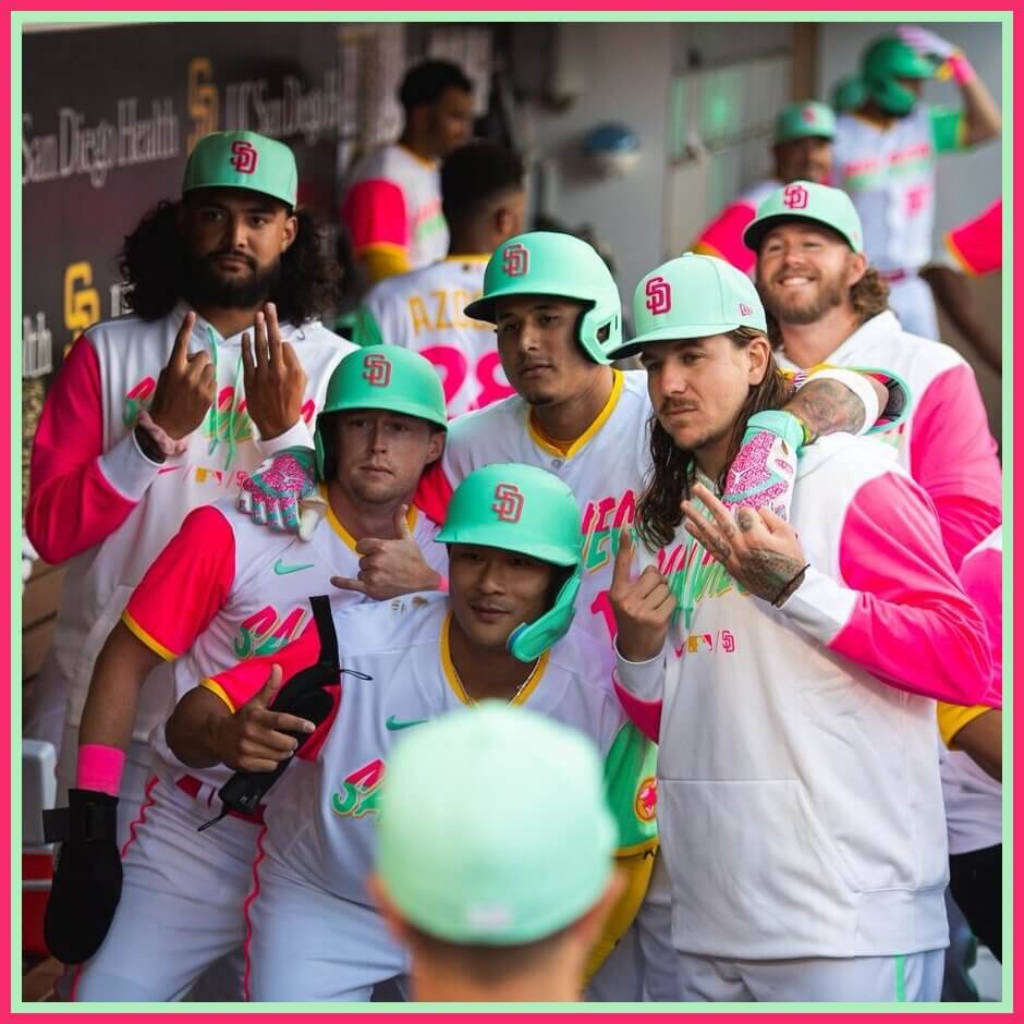
Last evening, the San Diego Padres became the seventh, and last. team to debut their City Connect (CC) uniforms for 2022. Our long national nightmare is over. Of course, if everything goes according to MLB and Nike’s plan, the remaining sixteen teams who did not receive CC unis in 2021 or 2022 will be getting theirs next year. So we’ve got that to look forward to.
Anyway, last week, the Padres unveiled their CC’s (all the info you need to know is there), and last night they busted them out for the first time. Before I show any more still photos (other than today’s splash), I want you to look at this short video which basically shows the uniforms in all their “glory” … then I want you to get a first impression … and then let’s look at them in photo-form.
Things Manny Machado is:
⚪️ An All-Star
⚪️ A Padre
⚪️ Good at baseball
🔘 All of the above pic.twitter.com/p6LRTf39bh— San Diego Padres (@Padres) July 9, 2022
OK — so what do you think? Obviously, they look nothing like the Padres ever have (and that’s the point), so throwing out our preconceived notions of a Padres uniform, how do they stand up just “as a uniform” for a Major League team?
In my review of the unveiling, I mentioned (as I always do) that we’d need to see the uniforms on the field of play. Well. We have. I liked them in the unveiling, and now that I’ve seen them on the field, I again say I like (but certainly don’t love) them.
As expected, the team sported a seafoam cap with a fuchsia “SD” logo, and the jerseys featured asymmetrical sleeve (and pants stripe) colors (fuchsia on the right side, seafoam green on the left). Anyone who wore full sleeves (as seen on pitcher Blake Snell above) or compression sleeves wore them in gold — which matches the collar and NOB — creating a three-color look for the team.
You’ll note that some players wore seafoam cleats, others had fuchsia, and some had both(!)
While I loved the colors, as I said in my review of the unveiling, I had a couple problems too — I don’t like the “San Diego” font face, and the two colors (fuchsia on top, seafoam on the bottom) made the wordmark almost unreadable at any distance. NOBs (not nearly as important, but still an element) were also very hard to read.
We knew the team would have custom helmets in seafoam green, but the team went the extra yard by adding a raised “SD” logo to the helmets.
It’s cool for one team to wear (sparingly) seafoam green helmets — but it’s not something I’d ever want to see as an everyday look.
But back to the look solely as a uniform:
It’s fun … whimsical even. I love the colors, and I wish at least one team would actually try using fuchsia as a base color (maybe the Marlins, since they’re pretty close already with what they call “caliente red”), and the seafoam and gold were interesting complements. Is it something I want to see every day? Of course not — no one with eyes would — but it’s fun and whimsical to have as a sparingly-used alternate.
My biggest complaint is the too-clever-by-half bi-color wordmark, which comes off as unreadable in most viewings.
I realize they were trying to replicate the asymmetrical colors on the uniform, but the seafoam green lower half of the word is impossible to discern. That the entire “San Diego” wordmark is in gold blockshadow doesn’t do it any favors. Perhaps they should have made it entirely fuchsia bordered in seafoam? But other than that (and the gold NOB, which doesn’t bother me that much), I enjoyed these.
You can see lots more photos here.
What did you guys think?

ASG Unis Leaked (?)
Yesterday evening, I noticed this tweet…
A look at the All-Star Game uniforms pic.twitter.com/YWH4sIZX2B
— Blake Harris (@BlakeHarrisTBLA) July 8, 2022
…which appears to show the home and road jerseys for the MLB All Star Game. While I cannot 100% guarantee its authenticity, it would sure appear these are the jerseys (we already knew about caps, and the style of the white [home — NL] jersey leak Paul wrote about earlier this week) that the NL and AL squads will wear in the game.
Note that, like the Marlins leak, both teams’ wordmarks are rendered in gold in the teams’ current jersey scripts. Here we see “NEW YORK” (mimicking the Yankees road jersey) and “Dodgers” (home script).
If accurate, the American League will be wearing an anthracite jersey (and I’d be willing to bet anthracite pants) with gold lettering outlined in black. If they do indeed go mono-anthracite, it won’t be quite as bad as this, but it could be a brutal looking game. Even if they don’t go mono-anthracite, I’d expect as the road team, the pants will be some shade of gray (road teams can no longer wear white pants as normal road pants, at least during games that count, so I don’t expect we’ll see anthracite over white regardless). This is NOT how we should remember Dodgers vs. Yankees, but this ASG matchup won’t look much better.

Guess The Game…
from the scoreboard
Today’s scoreboard comes from Christoper Snizik.
The premise of the game (GTGFTS) is simple: I’ll post a scoreboard and you guys simply identify the game depicted. In the past, I don’t know if I’ve ever completely stumped you (some are easier than others).
Here’s the Scoreboard. In the comments below, try to identify the game (date & location, as well as final score). If anything noteworthy occurred during the game, please add that in (and if you were AT the game, well bonus points for you!):
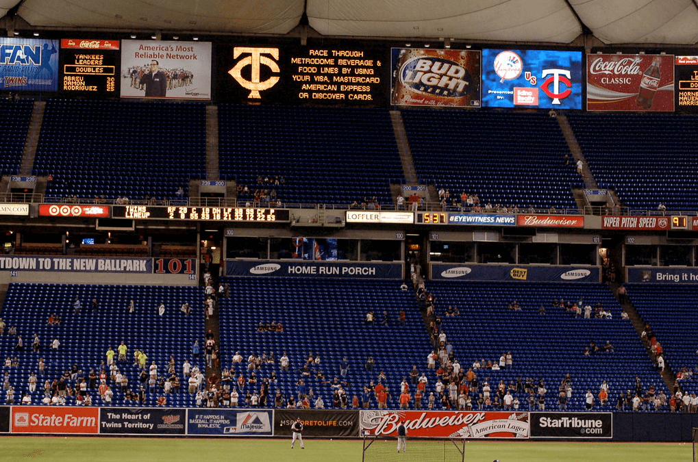
Please continue sending these in! You’re welcome to send me any scoreboard photos (with answers please), and I’ll keep running them.

Uni Concepts & Tweaks
Time for more Uni Tweaks from the UW readership.
I hope you guys like this feature and will want to continue to submit your concepts and tweaks to me. If you do, Shoot me an E-mail (Phil (dot) Hecken (at) gmail (dot) com).
Today’s concepts come from Johnny Woods:
Phil,
Nordiques logo is a quickly-drawn N — which is the upper left quarter of a fleur-de-lis. Drop shadow on the italicized N gives you a hockey stick. Secondary is the top half of that fleur-de-lis, not italicized, with the Q and C in the curves (no accent mark needed). Only use of gold is in this logo. For traditionalists, a version of the primary with a red puck.
Home and road jerseys are standard but the black alternate is the key. Drop shadow replaced with horizontal red shadow on the right and lighter blue on the left. Same shadows with numbers, letters and new fleurs-de-lis in old school positions. 3D glasses not needed.
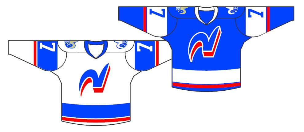
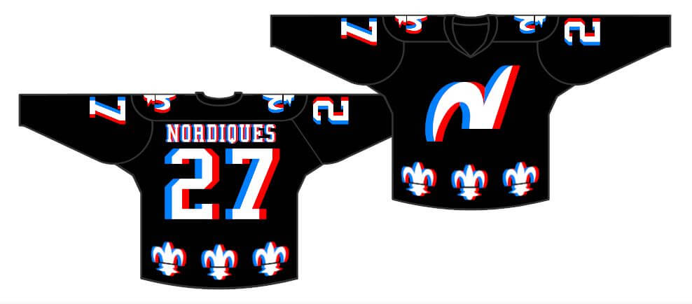
As different and as obnoxious as the Canucks’ Flying V jerseys? Burger Kings? Canadiens’ Barbershops? Are they that bad that they’re good? I’ve been using this design with Winnipeg Jets, Capitals and Blue Jackets concepts. I like it here.
–Johnny Woods
OK readers (and concepters). If you have some tweaks or concepts, shoot ’em my way with a brief description of your creation and I’ll run ’em here.
Design contest countdown: Paul here, reminding you that the deadline for our latest design challenge — which is to create a set of MLB All-Star uniforms — is this Wednesday, July 13. Full details here.
Okay, now back to Phil with the rest of today’s content.
Uni Watch News Ticker
By Anthony Emerson

Baseball News: The Jersey Shore Blue Claws, High-A affiliates of the Phillies, wore a jersey depicting the flag raising on Iwo Jima for Military Appreciation night on Thursday. The only team identifying mark on the jersey is a logo sleeve patch (from John Cerone). … Also from John, the Sussex County Miners will wear breast cancer awareness jerseys tonight.

NFL News: If Twitter comments are anything to go by, this is a very, very controversial ranking of NFL Color Rush unis (thanks, Phil).

Hockey News: The Islanders gave their draft picks jerseys with the N0. ’22 — with the apostrophe (from multiple readers). Reader Austin Lambert notes that adding the apostrophe was likely a mark of respect to Mike Bossy, whose No. 22 is retired by the franchise. … Oh man, check out this awesome retro binder with NHL logos! I place it at vintage 1994, post-Mighty Ducks and Panthers expansion but pre-Nordiques and Jets relocation. Trevor notes that some logos are repeated and others (Whalers, Stars) are absent completely. Great find. … On Thursday night, the Canucks drafted Elias Pettersson. This may confuse you, seeing as they already had Elias Pettersson on their roster. The Canucks now have two players with identical names. What does this mean for NOBs? “We’ll do whatever he wants,” Pettersson the younger says (from @fram0m).

NBA News: Yesterday, we saw a blurry picture from behind of Nick Kyrgios in a Jayson Tatum Celtics jersey. Today we got the HD front shot.

Soccer News: New home kit for Manchester United (from multiple readers). … Argentina have launched their World Cup kit (thanks, Phil). … Which team does German midfielder Fabian Nürnberger play for? You guessed it, 1. FC Nürnberg! Nürnberger was born in Hamburg, however, so unfortunately the Nürnberg inception ends there (from Timmy Steffes). … The following are all from Ed Zelaski: Sticking in the Bundesliga, new home kit for VfB Stuttgart. … New home kits for Hertha Berlin. Note the absence of a sleeve advert, instead going with a patch depicting the Berlin coat of arms. … New home kit for Aston Villa. … New kits for Greek side Asteras Tripoli.

Grab Bag: An ESPN radio affiliate has asked if you “love or hate” these 10 “special jerseys” — by which they exclusively mean alternates and one-offs (thanks, Phil). … Krispy Kreme is celebrating its 85th anniversary, and has unveiled a logo for the occasion (from John Cerone). … An Australian journalist thinks that Wimbledon should drop the all-white dress code (thanks, Phil).
Uni Tweet of the Day
If you’re going full blood-clot, for the love of God, go high cuffed and wear contrasting socks!
Tonight we honor the storied Mavericks franchise by donning the classic red uniforms! pic.twitter.com/804DNfpV68
— Portland Pickles (@picklesbaseball) July 9, 2022
And finally… that’s it for today. Everyone have a great Saturday and I’ll catch you back here tomorrow.
Peace,
PH
I’d love for a MLB team to have seafoam green hats. MLB is very boring, with practically all teams but the A’s and Padres having either black, blue, or red, as their primary hat color. I loved the Florida Marlins teal, though IMHO it was aqua, hats.
Agreed
GTGFTS:
NYY @ MIN
August 12, 2008
Yankees win in 12 innings 9-6.
Notable that Mariano Rivera blew a 3-run lead.
GTGFTS: There are nearly as many advertisements in that photo as there are fans.
That Nordiques concept is a cool idea, however it definitely has a vibrating effect when its scaled the way it is in the photos.
Also, it would be the only hockey uniform you could wear with the red/blue 3D glasses.
My guess is the Yankees are wearing “New York” because they don’t have a wordmark on sny of their uniforms that says “Yankees” (they do have one, of course)
Either that or all the AL teams will wear the city name due to them being the “road” team.
Perhaps I didn’t articulate it well, but assuming the anthracite jersey is legit, it would follow that all AL teams will wear an anthracite version of their standard (gray) road jersey. Of course, the Marlins leak shows the team wearing a “Marlins” wordmark, but their standard home (white) jersey link not “Marlins” (as shown in link). So, who knows what the actual protocol will be.
I wanted to like SD’s uniforms because I think there’s a place for both colors if used well but to me it’s one big design mess when seen on the field. Fun and whimsical is one way to describe them, garish and clownish is another.
I like ’em. I’ve always liked seafoam green (though I think those could be a little more saturated), I think teams are too afraid to use pink, and yellow is also underrepresented. I think they go well as a combo (yellow, hot pink, and orange has always been a favorite of mine, swapping the green in for the orange works too). Only complaint might be that the yellow on white for NOB might be a little hard to pick up, and to some extend the same might be true of the bottom half of the front wordmark.
The padre uniforms look like they are escapes from an ice cream shop. I’m absolutely awful look.
All that talk early in the season about supply chain issues…unfortunately it couldn’t stop the CC and All-Star unis.
Any word on if the ASG jerseys will have the teams’ actual number styles or generic block numbers?
Liked the Nordique concept. Would be worn if they were playing today. Padres CC…its different. I’d say a whimsical clown outfit with a touch of minor league promo night with $1 beer.
I hope the Padres’ bright colors don’t run in the wash. That was an issue early in the Phil Knight tenure of U. of Oregon football.
I love all the Nordiques’ combos. The 3D approach is brilliant, but probably too eye-punishing for extended viewing.
Those BlueClaws jerseys are horrendous even for the usual flag desecration that we normally see.
I get that teams and companies want to honor the military and veterans, but, come on. These uniforms are bordering on flag desecration. Anymore it is just overplayed, and overdone. Being a veteran, I am appreciative but its just time to mellow out.
Nice work on that Nordiques concept, Johnny!
Is that the same shade of blue they used to wear or something more ‘electric’?
The Padres look like the uniform version of joking around, aka it’s impossible to take them seriously when wearing it. They appear clownish to my eye. Another way of thinking of it: Would this uni ever look right in a high-pressure playoff situation? No way. Or what if a player got hurt badly in this uni, wouldn’t that appear…awkward, like if a clown was injured on the job?
It’s a lazy day summer uniform, with the colors of watermelon slices and pool toys. I can appreciate that they tried something different and not serious, but it can only be used very selectively, and even then I don’t think it’s really adding much.
I agree. I really wanted to like them because I’m a big fan of more colors, not less. But the contrast when a Giants player was in the frame was striking. I thought that the Pirates uniforms in the 70s or the Astros tequila sunrise uniforms were shocking at the time, but in a good way. The Padres CC uniforms are just not a good look for a ML uniform. I appreciate the effort and I wish that more ML teams would try to think outside the box because too many of them look the same.
I realize that it’s difficult to do, but the Padres didn’t even make the “it’s so bad it’s good” category.
The NHL binder would definitely be from the 93-94 season, as mentioned it has the Mighty Ducks and Panthers logos (they joined that year) but the Flames logo is also without the black outline, which they introduced following that season.
Life long Padres fan, born in SD, lived here for 42 of my 50 years on this planet…
THESE ARE HORRIFIC!!
It looks like a Piñata threw up on them.
Nothing about these uniforms says “beach” or “waves”…unless it was a beach from the early 80s in MIAMI.
If they wanted to incorporate a Mexican theme, how about a Day of the Dead sugar skull in Brown and Yellow on one side of the jersey?
Something like this:
link
“Life long Padres fan, born in SD, lived here for 42 of my 50 years on this planet…
I am listening…
“THESE ARE HORRIFIC!!”
Please continue if you can…
“It looks like a Piñata threw up on them.”
And there it is.