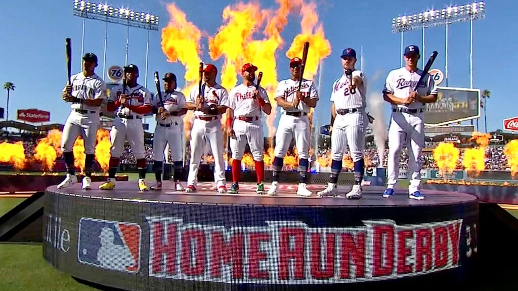
Good morning! MLB’s Home Run Derby — which is now a better-looking event than the All-Star Game that it’s supposed to be promoting — was last night, so I thought we’d start today by taking a look at that.
As has been the case for several years now, the Derby contestants wore their regular team uniforms (which they should be doing tonight in the All-Star Game, but that’s another issue for another day). Home whites for all participants, regardless of league. As you may recall, last year they wore No. 44 (for Henry Aaron) and Rocky Mountains-themed belts (because the Rockies were the hosts). This year they wore their regular uni numbers and regular belts.
Here are some additional notes from the event:
- All participants wore those team trucker caps with the asterisks:

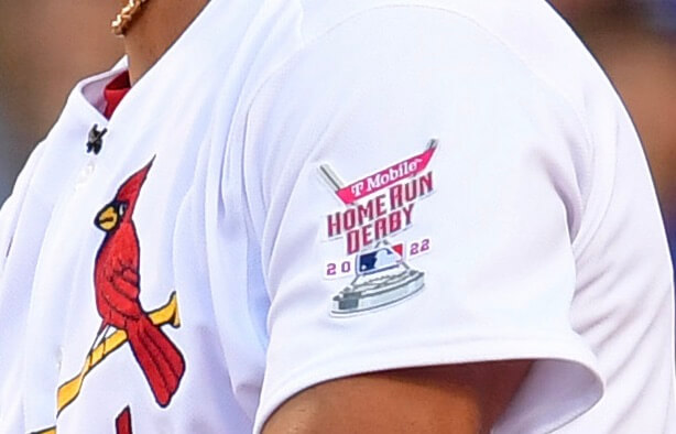
- The jerseys had an All-Star Game patch on the right sleeve and a Home Run Derby patch (which doubled as a uni ad) on the left sleeve.

- One exception to the patch protocol: The Phillies put uni numbers on the left sleeve, so Kyle Schwarber wore the Derby/ad patch on the right sleeve and skipped the All-Star patch.
- The pitchers wore a variety of different jersey styles. Some had rear numbers and NOBs; others were blank on the back; and Cardinals bullpen catcher Kleininger Teran, who pitched to Albert Pujols, wore a jersey with Pujols’s number and NOB!

- Here’s something I’m not sure I’ve seen before: Mariners outfielder Julio Rodríguez sprayed his bat with sticky stuff — I’m told it was something called Cramer Firm Grip — prior to the second round.
- As you’d expect, there was lots of custom footwear, like these designs worn by Mets first baseman Pete Alonso and Phillies outfielder Kyle Schwarber:


- Angels outfielder Mike Trout didn’t participate in the Derby but was among the spectators. So was his son Beckham, who was in full uniform — pinstriped pants and a non-pinstriped jersey:
Mike Trout definitely brought the best BAT to the #HomeRunDerby 🥹@MikeTrout pic.twitter.com/EQYd4xuBe1
— Los Angeles Angels (@Angels) July 19, 2022
(My thanks to Trevor Williams for the Julio Rodríguez item.)


Is your gizmo a live spider trap?
Not a bad guess!
picking up hot mason jar lids during the home canning process
One organizational change I would suggest for the new site… Can you put today’s ticker directly under today’s stories? It took me a while to find it yesterday since there were the new stories up top, and then a bunch of stuff I already read, so I almost didn’t scroll down to the bottom. Otherwise, so far, so good.
Good call, I didn’t see the Ticker at all until I just read your post. I would suggest moving it just above the Recent Posts, but anywhere than where it is now…
I think the gizmo is a scalp massager.
link
Alonso’s batting gloves matched his custom spikes.
Just a heads-up, the linked post in “What the Hell is This?” doesn’t appear to work at all if you’re not logged in to Facebook.
The Braves’ reps (including Ronald Acuna Jr., who hit in the derby) appeared to be wearing all navy all-star caps with their home jerseys. The Braves always pair their home jerseys with their red-billed caps.
If the teams are wearing their regular jerseys it would have been a lot better if they wore their regular hats. Players participating in an All-Star event and get to wear cheap-looking trucker hat versions of their usual hats?
Cheap looking, but sold at a higher price point of course.
Alonso’s cleats look very homemade…as if he did it himself or had a close friend do it. Anyone know more?
Congrats on the new design Paul. It is great now and I am sure will be tweaked even better. One suggestion…for me it really bugs me that the headline for each post or section is under the photo that introduces the section. My mind expects the headline to be above the photo, like Uni Watch always had it.
I found this on Alonso’s cleats:
link
You mean on the home page, right?
Exactly…because even on this page, which is specific to this post only, the headline is on top and for me anyway that’s what my mind now expects.
Will consider!
It really muddles it for me as I scroll down the homepage as to which story is with which photo…they all flow into the next.
Great feedback, Steve. I was planning on sending it too, that’s causes it to be hard to read for me and is my only main feedback for an otherwise great shift in UW design history.
Thanks!
There’s a subreddit dedicated to figuring out things like this: link
I think it an a head massager.