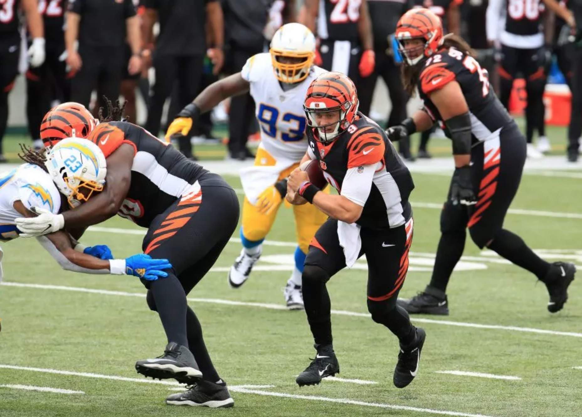
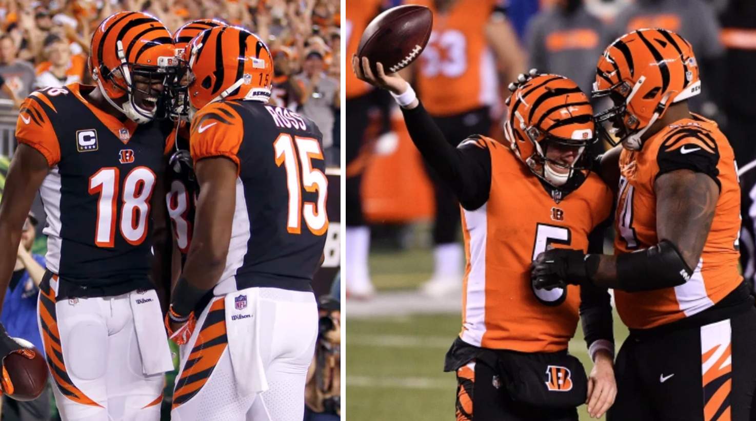
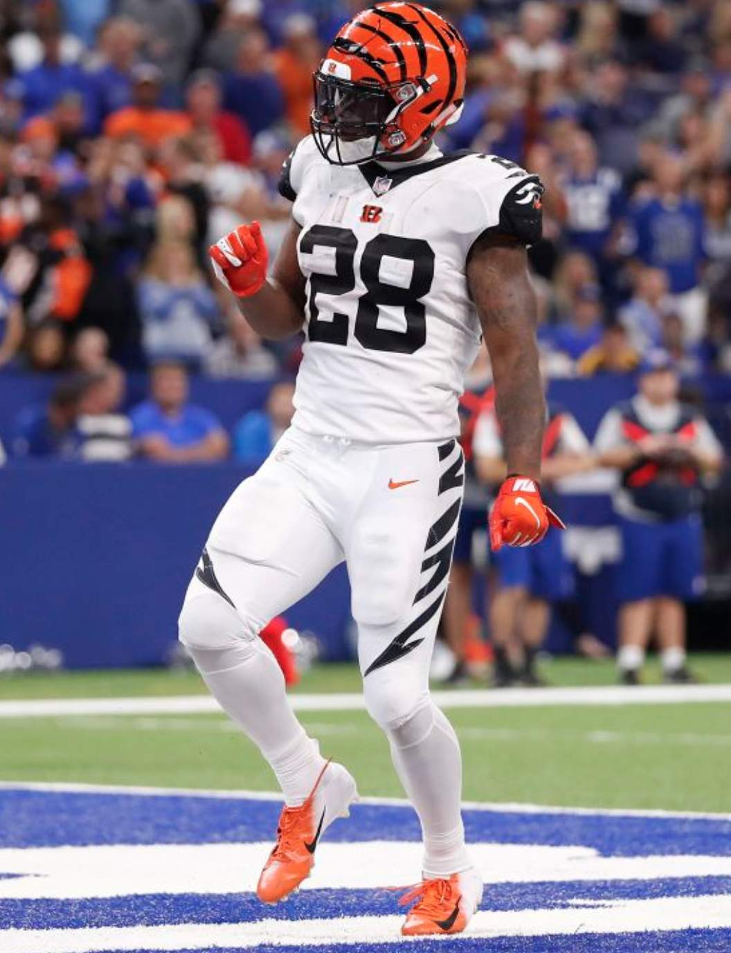
Click to enlarge
In a long-overdue move that practically qualifies as a public service, the Bengals yesterday announced that they’ll have new uniforms for the 2021 season — their first new set since 2004.
Here’s the announcement, which provides a decent overview of the team’s uniform history:
#NewStripes pic.twitter.com/toKSCxQfyG
— Cincinnati Bengals (@Bengals) January 21, 2021
Let’s shift into FAQ mode:
Have you seen the new designs?
No, I haven’t. So everything I’m writing here today is based on what’s been reported elsewhere and on my own analysis of the situation, not on any inside knowledge.
Are they changing the helmet?
Apparently not. Multiple reports have indicated that the helmet will be remaining the same. Personally, I’m disappointed, because I’m in the camp that has never liked the striped design, but I know it’s popular with many fans, so they should be happy that the design is being retained.
Aside from the helmet, will it be a major makeover?
Again, apparently not. Bengals beat writer Joe Goodberry says he’s been told that the changes will be “mostly minor.”
What might that entail?
The most obvious candidates for revision are the white side panels on the black and orange jerseys, which have never made sense and have always looked awful:
I am reasonably certain that the side panels will be scrapped.
Anything else?
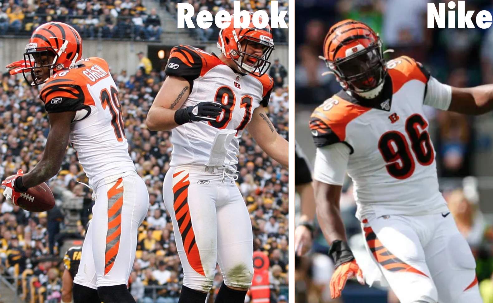
I haven’t heard anyone talk about this, but I’m reallyreallyreally hoping that they scale back the striping on the pants. That element has looked particularly clownish since 2012, because the “tail” of the striping wraps around more to the front of the pant leg on the Nike pants than it did on the Reebok pants:
Anything else?
Two other items that seem ripe for reconsideration are the contrasting yoke on the white jerseys and the number font. Personally, I’m fine with both of those elements, but they seem like the kind of things that would probably be targeted for change, especially considering the apparent popularity of the white alternate uniform, which has block numbers and no contrasting yoke:
When will the new designs be unveiled?
The Bengals are saying “in the spring.” We all know the drill by now — they want to have the new set available for the first round of the draft, which is currently slated to take place on April 29, so we’ll definitely see it by then.
But it’ll leak before then, right?
That’s certainly a possibility, but far from a certainty. Of the six NFL teams that released significant redesigns last season (I’m not including the Colts, since their changes were so minor, or Washington, since their changes took place on the fly), three of them had significant leaks: the Bucs, Browns, and Falcons (I broke two of those leaks myself). But there were no uni leaks for the Chargers, Pats, or Rams. So we’ll see.
Does the end of the one-shell rule mean they’ll be able to have an alternate helmet?
First, it’s important to note here that there has been no official confirmation that the league is ending the one-shell rule. Several coaches and other sources have hinted about it, and the league has said that the rule is under review, but we don’t yet know for sure that it’s a done deal.
If they do scrap the rule, it would be interesting to see if that’s announced prior to the draft, in order to provide more unveiling options for the Bengals and any other teams that are getting new uniforms this season.
Speaking of which: Which other NFL teams are getting new uniforms this season?
The Rams have indicated that they plan to add a new alternate design for 2021. Aside from that, I’m not aware of any team that has officially announced plans for new uniforms, although history tells us that another couple of teams will probably make such announcements shortly.
———
And there you have it. As long as we’re talking about the Bengals, it’s always fun to revisit their 1981 unveiling, when the striped helmet was bestowed upon an unsuspecting world:
One of the two players who modeled that new uni — linebacker Reggie Williams — gave a first-hand account of the unveiling to our own Brinke Guthrie a few years ago. You can check that out here.
Also worth revisiting: I did a Bengals-redesign contest in 2019. You can see that here.
Okay, Cardinals: You’re on the clock now.
Click to enlarge
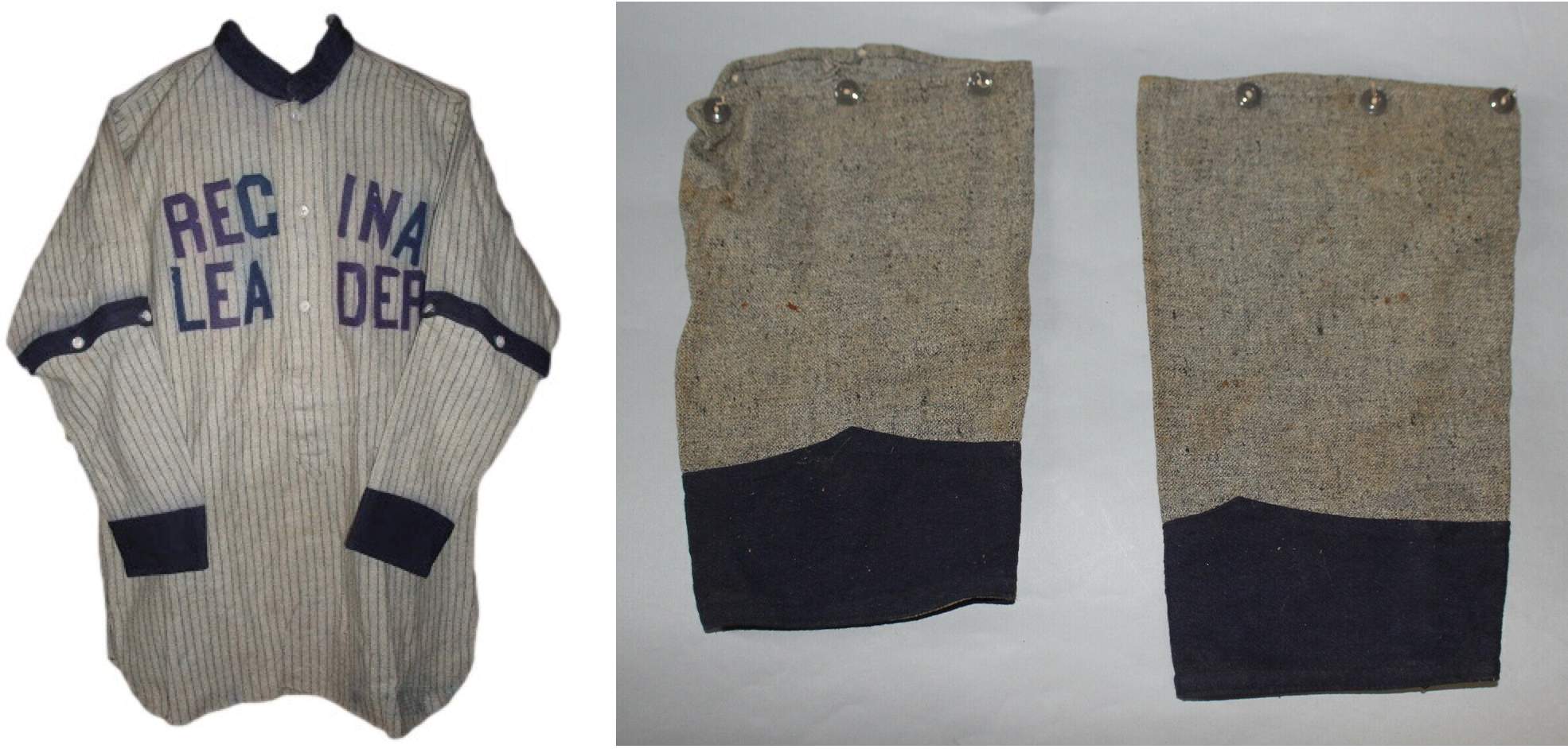
Something up his sleeve: Fun fact: Back in the early 1900s, baseball jerseys sometimes had detachable button-on sleeve extensions, in case a game was played in cold weather. You can see an example in the photo on the left above, and there’s an additional example here.
I occasionally see jerseys like this on eBay, but yesterday I spotted something I don’t think I’ve seen before: Someone is selling a pair of detachable sleeve extensions all by themselves — without the accompanying jersey! — as seen in the photo on the right.
It’s definitely an unusual piece (or pair of pieces) of uniform history. If you’re interested, the eBay auction can be found here.
Click to enlarge
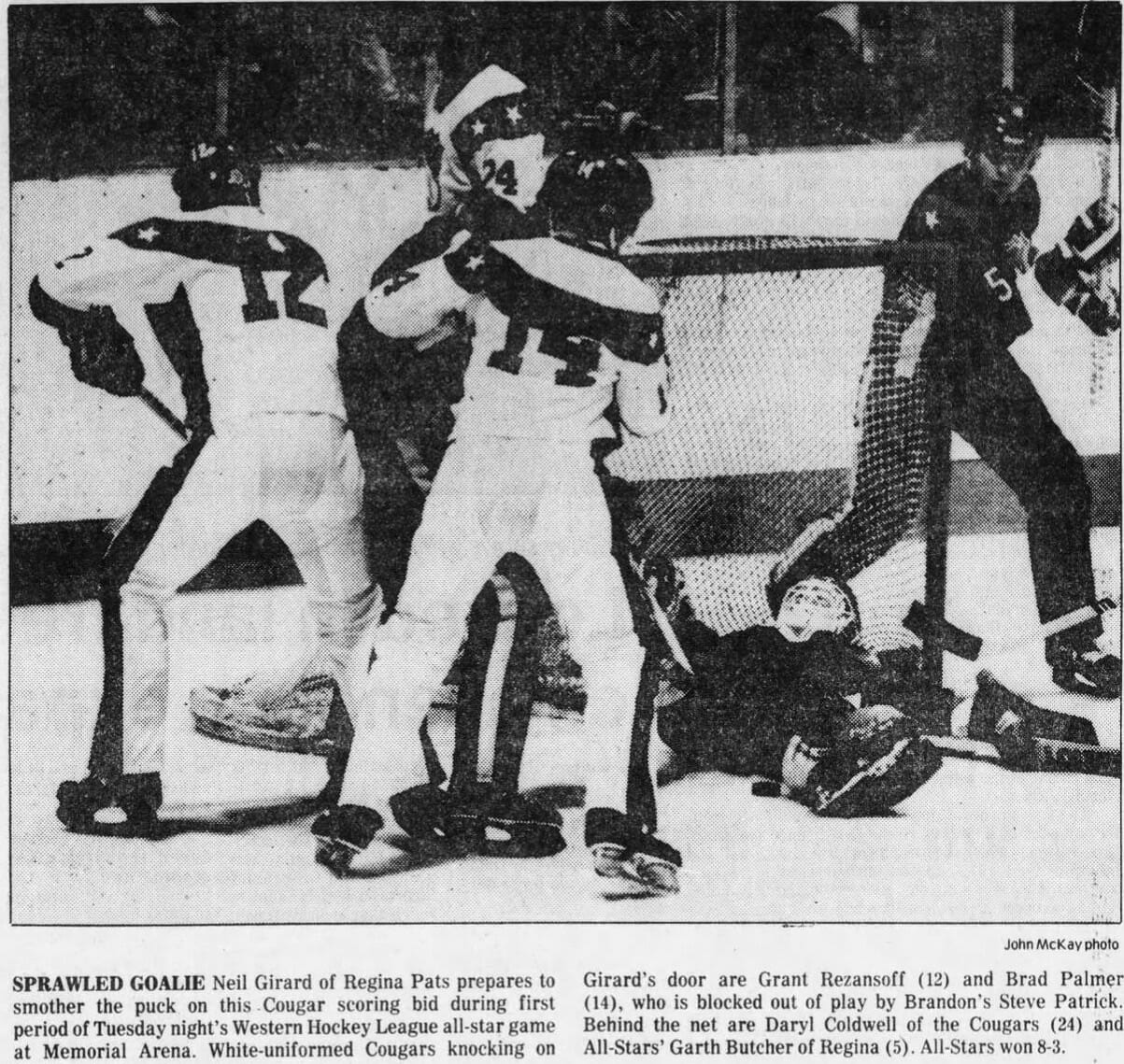
Too good for the Ticker: Reader Wade Heidt found a photo showing something neither he nor I had ever seen before: a hockey team wearing white Cooperalls! Finally, a uniform that earns the term “icy whites”!
That’s the Victoria Cougars, who were playing against the WHL All-Stars in 1981. If you can tear your eyeballs away from the white Coops, you can see that the Cougars were also wearing very odd jerseys, with some sort of curved striping wrapping around the upper part of the rear uni numbers. Bizarre!
(Big thanks to Wade for this great find.)
I beg your pardon: In case you missed it, yesterday’s post included a section about how an old friend of mine received a presidential pardon, and the complicated feelings I have about the whole thing.
That missive prompted a lot of interesting and thoughtful responses, which I very much appreciated. If you haven’t already read it, you can check it out here.
Click to enlarge
ITEM! Magnets back in stock: I’ve procured another small supply of winged stirrup magnets (but not the round ones, sorry). They measure about 3″ x 3″, and they’re thin and flexible, so they’ll conform to curved surfaces as well as flat ones.
I have only 50 of these. If you’re interested, here’s the deal:
1. Price: $3 plus $1 for shipping. Limit two per person. (Shipping price is the same whether you buy one magnet or two.)
2. Send me the proper amount via Venmo (use @Paul-Lukas-2 as the payee), Zelle (plukas64@gmail.com), or Google Pay (plukas64@gmail.com). If you’d rather use Apple Pay or a paper check, contact me and I’ll give you the info you need. Sorry, no PayPal.
3. After sending payment, email me with your mailing address.
4. If you’re outside of the USA, contact me so I can calculate the shipping charge and arrange an alternate form of payment for you.
5. If you want to combine your purchase with an order for a Uni Watch trading card, a seam ripper, a koozie, or a chain-stitched patch, please email me and I’ll give you a price that includes a combined shipping fee for the whole shebang. (Sorry, these are the only Uni Watch items I can combine into one shipment, because our other items ship from separate locations, not from Uni Watch HQ.)
That’s it. Thanks!
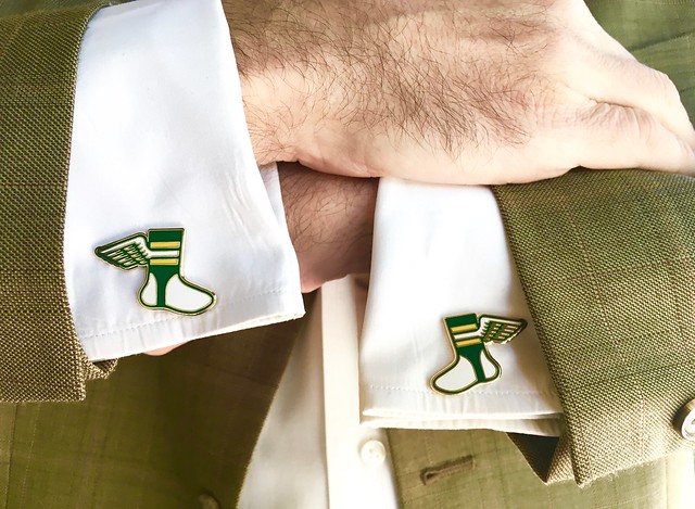
Click to enlarge
Almost gone: In case you missed it on Thursday, our Uni Watch Cufflinks, which were originally priced at $26.99 and then reduced to $16.99, are now available at a bargain basement price of $9.99. Granted, you probably don’t have many formal events on your socially distanced calendar, but we’ll all be vaccinated soon enough, right? As of this morning, there are only Update: The cufflinks are now sold out. Thanks for the great response to the clearance sale!eight seven six five four three pairs of cufflinks remaining, so move fast!
Click to enlarge
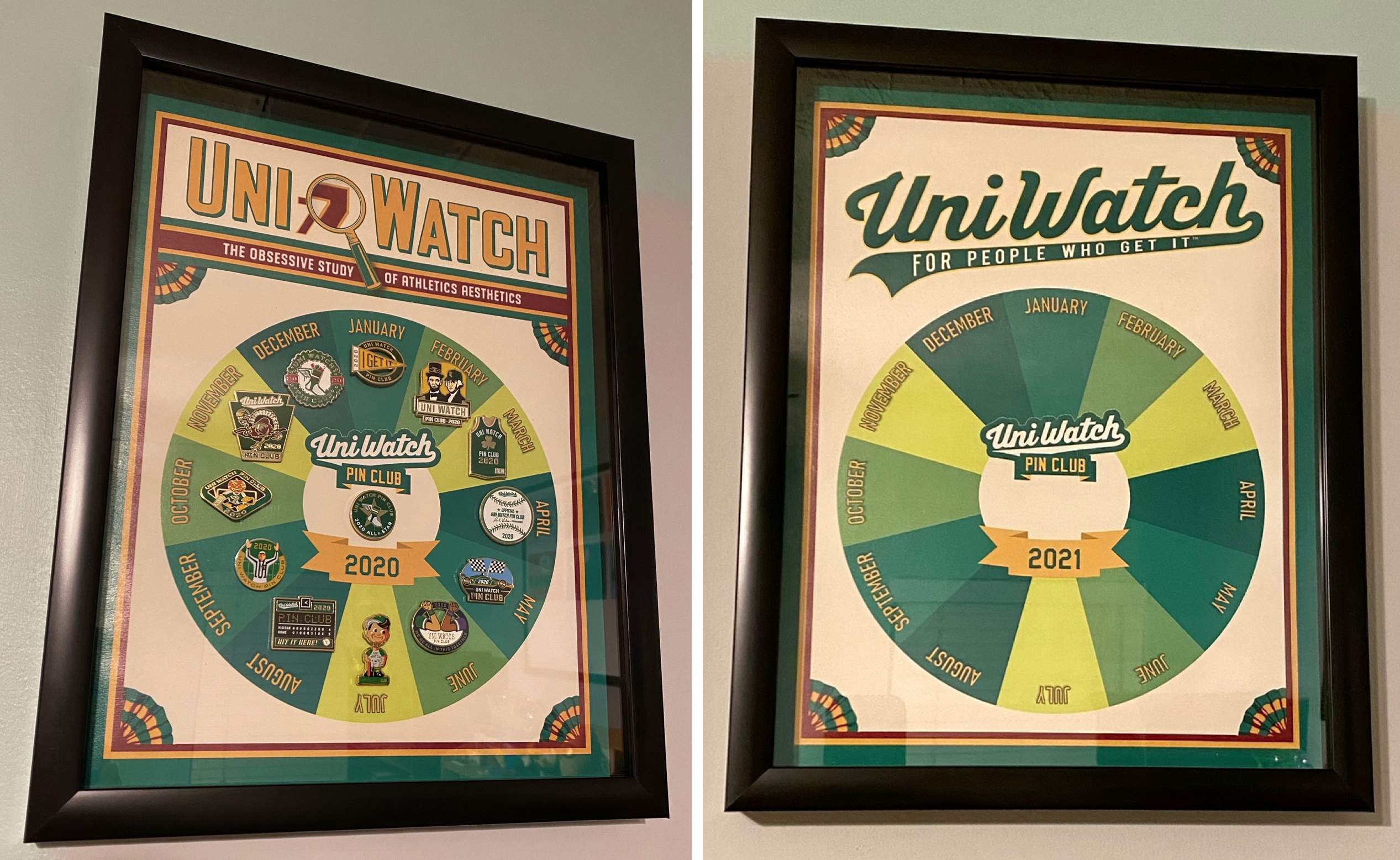
ITEM! Pin Club update: Oh man, check out these awesome displays created by reader Michael Rich for his Uni Watch Pin Club pins. As you can see, 2020 is filled up (including his All-Star pin for collecting ’em all), and 2021 is ready to go. Nicely done, Michael!
Speaking of the Pin Club: We have about 45 January 2021 pins remaining, and all of our remaining 2020 pins have been reduced to $9.99 — you can find those in the Uni Watch Shop.
The Ticker
By Anthony Emerson

Baseball News: The American Association’s Kansas City T-Bones will now be known as the Kansas City Monarchs, paying homage to the old Negro Leagues team (from multiple readers). … Did you know Johnny Bench had a restaurant in Cincinnati in the ’70s? It’s true, and here’s the gorgeous menu to prove it (from Griffin T. Smith). … The town of Richmond, Ind., has installed a monument at the site where the stadium for the Richmond Giants, a Negro Leagues team, stood (from Kary Klismet).

NFL News: Once upon a time, The Buffalo News included rally signs for Bills games. … A Twitter user linked the monochromatic inaugural outfits of First Lady Jill Biden, former First Lady Michelle Obama, Poet Laureate Amanda Gorman, and Vice President Kamala Harris to NFL Color Rush unis (from Glenn Riley). … After previously coming under scrutiny for their Oilers-knockoff helmet logo, the XFL’s Houston Roughnecks are now at odds with the Patriots, with New England alleging that the Roughnecks’ oil worker profile logo looks too similar to Flying Elvis (from Kary Klismet).

Hockey News: Reader Jakob Fox has spotted a small adjustment to the Kings’ uniforms that Paul didn’t catch for his NHL Season Preview. … Someone on eBay is selling a baseball cap designed to look like Ed Belfour’s eagle mask from the ’90s. This begs several questions — was this part of a line of caps designed to look like goalies’ masks, or just a Belfour thing? Was it officially licensed by the NHLPA or NHL? And who is the “Greg Harrison” from the seller’s listing? (From Michael Pisano Jr..) … Former NFL player Marshawn Lynch donned a grey Avalanche practice jersey while skating around with former NHL player Akim Aliu. Aliu never played for the Avalanche, so maybe Lynch is just an Avs fan? (from Kary Klismet). … A Michigan man has been arrested for beating a police officer with a hockey stick during the Jan. 6 insurrection at the Capitol.

NBA News: A baggie of marijuana from the Seattle growers Cookies depicts former SuperSonics player Gary Payton in a classic Sonics-style uni. The strain is named after Payton.

Soccer News: Fresno Fuego FC, a USL League One team that will begin play in 2022, have unveiled their logo (from Aaron Wiens).

Grab Bag: Forty years ago, the PGA was looking at adopting a new logo. Here are the ones that didn’t make the cut. … UNLV is dropping its “Hey Reb” mascot, but keeping the “Rebels” team name (from Mike Chamernik and Kary Klismet). … Also from Kary: Indiana State University has updated the university’s logo, but not the athletics logo. … Topps is selling a nine-card Presidential inauguration card set for a cool $55. Worth it just for the Bernie card! (From @bryanwdc.)

Click to enlarge

What Paul did last night: Yesterday was the first day of the year for which the official sunset time was 5pm — a sign that the days are getting longer, bit by bit. Mary and I are both looking forward to porch o’clock routinely taking place in sunlight again — in part because we feel more connected to our neighborhood when we’re out there during daylight, and in part because I hate taking photos in the dark. (Of course, what we’re really looking forward to is not having to convene on the porch every day, but we’re committed to doing that until we can safely and comfortably sit at the bar at one of our local watering holes, an eventuality that is still several months away.)
Meanwhile: I suppose it was just a matter of time before someone did this, and the someone turned out to be Uni Watch reader Michael Davie (click to enlarge):
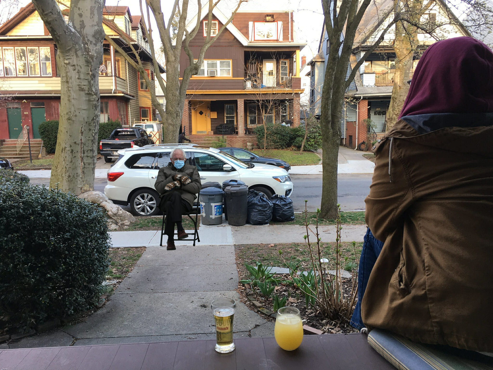
Thanks, Michael — you made both of us laugh out loud (and probably lots of other people, too).
As always, you can see the full set of Pandemic Porch Cocktails™ photos — now more than 310 of them — here.
That’s a wrap for this week. I don’t mind saying that I was really happy with all of this week’s content — hope you liked reading it as much as I liked producing it. Stay safe, enjoy Phil’s weekend posts, and I’ll see you back here on Monday. Peace. — Paul
Hey Paul, the Bengals unveiling video is the LT wearing 98 from yesterday.
FYI
FYI, you can purchase the Bernie card (or any of the 9) separately at Topps.com.
RE: Which other NFL teams are getting new uniforms this season?
according to the Browns official radio show, they will be getting a “throwback” uniform for their 75 anniversary this upcoming season. they mentioned it a few times over the past year starting when Cleveland was announced as the host for this year’s NFL Draft
What about Washington being in the mix to get new uniforms next season? Will we have a new name and a logo for the team for the fall of 2021?
Not yet settled. They’ve left open the possibility of sticking with the existing identity.
Why did Washington remove the helmet stripes?
Good question.
Just for another year, or permanently? I thought I read, probably here, that renaming the team could take some time. Thank.
It would be an enormous mistake for them to keep the WFT identity in my opinion. Establishing an obviously placeholder-like identity permanently calls attention to the idea that there was another previous identity at best, and subtly protests the change at worst. It would do a grave disservice to the goal of making a clean and definitive statement that the old name is/was not appropriate.
I’m afraid I disagree: Rushing out a new identity could result in a regrettable choice (“RedHawks”,”Geldings”,”Snuggles”). I like the Teachable Moment tack. Washington has to own their history, and the possibility of tender-eared children learning the old name of Washington NFL Football doesn’t fill me with horror. Even Paul seems okay with calling his weekly feature “Skins Watch”. Finally, I have no problem with DC football fans registering their protest. Even though I expect them to move along with the times, I think it’s asking too much of them to be happy about it.
The Arizona Cardinals need to be the next team announcing uniform changes.
I really hope the Bengals/Nike does this right. Be more like the Bucs/Browns than the Rams. Do something simple, classic, and true to their history.
When the bengals went to this current set in 04, it actually looked really good on the Reebok template. The side panels didn’t stick out and the pants weren’t as bad. Nike’s tailoring/template really hurt the design overall, IMO. Hopefully the Front office/Nike decide to keep it classic and simple.
(typo under the video of Reggie Williams – “fist-hand”)
Fixed.
The Porch Cocktail photo made me really laugh out loud this morning. Fantastic end to a great week of Uni Watch.
The Houston Roughnecks are getting hit from all angles. I’m not surprised that the Titans (former Oilers) came for them, but the Patriots going after them caught me by surprise.
Do you think it’s just semantics when the bengals and writers are referring to this as a “jersey” redesign as opposed to a uniform redesign? It seems they are going out of their way to use the term “jersey” as opposed to “uniform”. i.e. will they keep the weird white block thing at the top of the pants stripe? are they really only redesigning the jerseys? I know you don’t know the answers to my two rhetorical questions, but I find it odd how specific some of these articles seem to be…
It seems they are going out of their way to use the term “jersey” as opposed to “uniform”.
I don’t think they’re going out of their way. As I’ve been noting for years now, one of the worst aspects of uni-illiteracy is the growing tendency by fans, teams, and media outlets to use “uniform” and “jersey” interchangeably.
As far as the Belfour mask hat, I’ve seen other similar.
After a quick Ebay search here’s one of them:
link
And to answer Paul’s question Greg Harrison is the one who designed the mask. And about a bazillion other goalie masks over the years.
Wow – Harrison has been very productive over the years! Nice two-part interview begins here:
link
Not my question (Anthony did today’s Ticker), but thanks!
Love the Pin Club displays, Michael Rich!
“That’s the Victoria Cougars…..”
It looks like Evel Knievel had a hockey team!
“The town of Richmond, Ind.”
You mean Richmond, IN. Right?
USPS state abbreviations aren’t the only ones that exist.
What’s a UNLV “masco”?
Sounds like wine…
Ha! Fixed.
Paul, do you get your magnets (and stickers and coasters) from Sticker Mule? If not, it must be purely coincidental that you post that items are back in stock a little bit after I receive a Sticker Mule promo email about those very items.
Yes, they’re my source for magnets and coasters. I only order them when they’re on sale, so I can offer them here at a low price.
Good news about the Bengals. The current set is, of course, hideous.
Each year in training camp, the Bengals wear what should rightly be their regular uniform: The striped helmet and a simple black jersey with block numbers bordered in orange. Or, conversely, a white jersey with orange trimmed numbers.
Exactly
I’ve never understood the love for the striped helmet. The tiger stripes I think work as a innovative alternative to traditional sleeve stripes, but not on the helmet.
I’ve also thought the Bengals should be an orange team rather than a black team. I get they originally looked that way to intentionally copy the Browns, but 50+ years later I think we can let that go. Orange helmet, orange jersey, white pants. They’d have a pretty solid and distinct identity there. However I am not holding out much hope for this new set, I have no faith in Nike.
WHO DEY! Cut the side panels, update the cartoonish number font, and you’ve already made it so much better!
I agree. Just going back to the Boomer Esiason / Ickey Woods era version would be a HUGE improvement. However, I’m sure they’ll go with another idiotic looking number font. Possibly even those horrific gradient number the Rams ruined their look with.
I’m not so sure … the 2016 color rush uniform has a very traditional font and has been very well-received by fans (presumably, it has been the highest retail seller as well).
Of course, maybe I’m blinded by my fandom, but I’m thinking we clean up the number font as one of the changes.
Paul,
Thank you for a fantastic week of content. Your column continues to be one of the things I look forward to every morning. Normalcy in a bizarre world.
Thanks,
It will be unfortunate if the Bengals uniform change is minor, it really needs to be taken down to the studs and rebuilt.
If I was to guess what they’ll do, they’ll go the Tampa Bay route and throw back to the early 80’s Super Bowl (against SF) look
For some reason all of the text on the site currently appears to have the strike through feature applied to it, including the comments.
Speaking of NFL uniforms, I’m pretty excited about this weekend! Bills at Chiefs will be downright gorgeous as will Bucs at Packers.
Sadly, Hank Aaron has now passed. An incredibly horrible streak of deaths of Hall of Famers.
Rest in peace, Mr. Aaron.
Everything from the ticker down has a strike through.
Fixed.
RE: the Gary Payton item – he’s not the only ex-Sonic with marijuana-related news. This Washington Post article is entitled “Shawn Kemp is lighting up Seattle again.”
link
With the way Nike NFL redesigns have trended as of late, I would expect Bengals new uniforms to mirror the elements of the color rush design or semi-throwbacks, while changing to the number font to something more along the lines of the team wordmark (unless that is changing too, obviously). That seems to be Nike’s formula anyway (ex. Browns, Falcons, Titans, and Colts).
So are the LA Kings going to add an additional border every year?
I think Indiana State didn’t update its athletics logo because it did so last March.
You beat me to it, Lindsay! I was just about to mention the same thing. Here’s a link to the Sycamores’ new athletics logo:
link
It was mentioned at Uni Watch shortly after it was unveiled last year:
link
Before the one-shell rule, were there ever any teams that had more than one shell as a regular uniform option, not including alternate? For instance, have there ever been teams that may have worn helmets to match their jerseys? Say the Cardinals would wear red helmets with red jerseys, and white helmets with white jerseys. If so, this would have to be a long time ago, before the Super Bowl era.
Not that I can think of.
1969 Philiadelphia Eagles?
Yes, I think the 1969 Eagles are the only modern era team to have two different helmet colors as part of their regular uniform. Prior to that when uniforms weren’t well, uniform, it was somewhat more common. The Lions for example had a few seasons in the 40s and 50s where they had a variety of helmets.
Aside from that one Eagles season I think different color helmets have been relegated to throwbacks only.
I prefer that teams keep the same helmet color/design, rather than having multiple options to wear. The football helmet is the signature part of the uniform, once that goes the NFL will end up like the NBA, where you can’t tell who is playing simply by looking at the uniforms.
“Former NFL player Marshawn Lynch donned a grey Avalanche practice jersey while skating around with former NHL player Akim Aliu. Aliu never played for the Avalanche, so maybe Lynch is just an Avs fan?”
Aliu did play briefly with the Colorado Eagles during the 2011-12 season. The Eagles are a minor league affiliate of the Avalanche, so I wonder if he might have picked up some apparel from the parent club during his stint there.
Re: Johnny Bench’s restaurant, I was surprised to see snails on the menu. I wasn’t around for the ’70s – were snails popular restaurant fare at the time?
Snails – ahem, escargot – and frog legs and such were indeed briefly trendy at the time, which was sort of the dawn of the gourmet era in American cooking. Lotta folks were still making savory jello salads and hot-dog-based casseroles at home, so anything seemingly French had an air of exotic. I’m just old enough to remember four generations of my Midwestern family traveling together to take in a fancy meal at a destination restaurant with snails and frog’s legs on the menu. Circa 1978.
Basically, if you wanted a restaurant to look/feel/seem classy, you added a few classic French dishes. Escargot and frogs’ legs were two of the simpler options.
Good to know! Thank you guys.
So THAT’S why that corrupt businessman was trying to force Kermit the Frog into being the spokesfrog for his chain of frog legs restaurants in 1979’s The Muppet Movie! It all makes sense to me now!
Bengals uniforms have always seemed to me an object lesson in bad uniform conceptualization…so literal in their Tiger-theme they were doomed to be campy, cluttered, and downright ugly [LSU and Clemson, by example, never went that asinine direction].
Hearing the striped helmet is beloved by the fan-base gives me little hope for what’s to come…and Nike…well…
I couldn’t disagree more. I consider the Bengals’ 1981 iteration of the uniforms a classic. (At 40 years old now, it probably doesn’t qualify any longer as a “modern classic”).
The tiger-stripe helmet is one of the most innovative designs seen on the helmet since the Rams first painted horns on theirs back in the late ’40s. LSU and Clemson have decent enough helmets, but neither really moved helmet design forward in any meaningful way. Frankly, I’ve always thought LSU’s helmet was overrated because the lettering and the tiger head compete for space, and the details in the tiger head are so fine that they get lost when viewed from any sort of a distance.
As for the Bengals’ original jersey and pants from that 1981 uniform set, they had just the right amount of tiger stripe pattern on them to unify the theme without putting it over the top. The problems arose when the team couldn’t leave well enough alone and kept missing with the other details. The uniform didn’t need additional logos like the leaping tiger on the sleeve, and it definitely didn’t need side panels, contrasting shoulder yokes, or more white in the color scheme.
In case you didn’t see it, Bernie also showed up as a former Indy 500 winner yesterday…
link
As long as we’re talking about the Bengals, it’s always fun to revisit their 1981 unveiling, when the striped helmet was bestowed upon an unsuspecting world:
That Walt Maher was cranky, huh? If he were still around today I’m guessing he wouldn’t be an avid Uni Watch reader…
“As Paul Brown just finished saying, it doesn’t matter what you wear as long as you win.” Um, no, it doesmatter!
Just ask this Cavs fan who took almost no joy whatsoever in the 2016 Finals. Bad basketball from both teams, terrible BFBS unis…just the thought of it is making *me* cranky all over again.
Anyone who lacks joy in a finals (being a fan of franchises who haven’t won in over 50 years and 26+ years respectively), I don’t care what they wear…win, please…
To paraphrase: I rather look bad and win than look good and lose…
Paul, if you need more working class hero fodder (there’s no shortage of it!) check out Dan Campbell’s Detroit Lions intro press conference. Local sports radio here in Boston was having a fun time breaking down all the nuggets from that one
I’ve stopped compiling Working Class Wannabes™ content — figured my point has been made. But yes, Campbell’s presser did get my attention:
link
anyone mention before that Baker Mayfield has his hand warmer built into his jersey
link
Nice spot! I’ve always thought built-in handwarmers in jerseys were cool since I noticed that another storied Cleveland Browns quarterback – Bernie Kosar – had them put into his jersey back in the late ’80s. Here’s a photo that shows it:
link
Bernie with Minor Threat on the Discord porch is still my favorite.
Bit more about the white Cooperalls in 1981 WHL All-Star game.
1980-81 WHL season saw Cooper first introduce Cooperalls for some games. They were quite experimental in that season compared to later on.
I will give you the Regina Pats as an example. Started 1980-81 wearing short pants and socks:
link
Later in 1981, the Pats and other teams experimented with a new uniform. Featuring Cooperalls that tried to mimic short pants and socks and different jerseys. This Pats uniform worn for only a few games in 1981 no doubt the worst in their long team history. Cooperalls made to somewhat look like short pants and white socks:
link
When 1981-82 rolled around, all WHL teams were in Cooperalls permanently (until 1987-88). However, the uniforms not as experimental. As you can see the Pats went back to their more traditional normal jersey with solid blue Cooperalls:
link
In addition to Gary Payton, there’s also a Scottie Pippen strain
Agreed. Cardinals need a complete uniform change. That has been long overdue.