By Phil Hecken
Follow @PhilHecken
Hey everyone. Happy Halloween to all! I hope all is well with you and yours and you get more treats than tricks today.
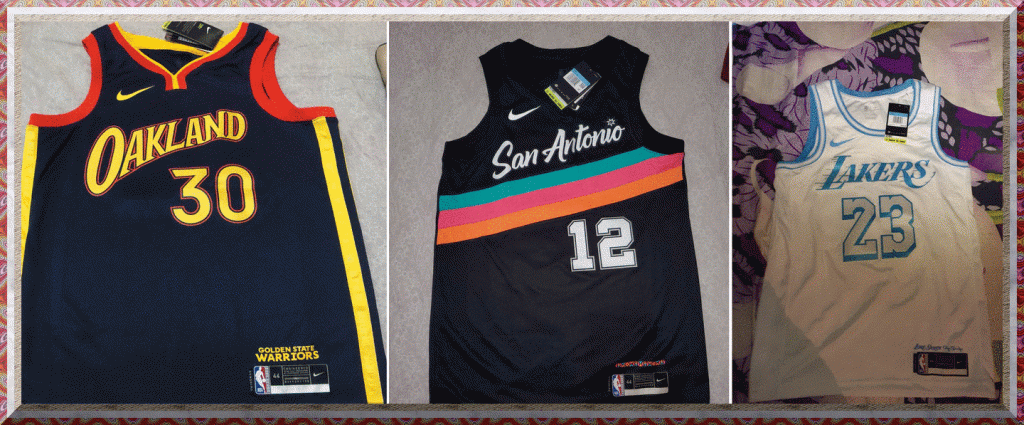
I’d planned on sharing with you a great kinda-Halloneen-related lede with you today (it’s the second story, just after this), but the NBA leak-a-palooza continued at full steam yesterday, so we’ll start off with that. We had more (unconfirmed but likely) leaks for three SIX of the NBA’s new City alternate jerseys yesterday; who knows, by today they may all be confirmed as legit. These leaks have all come from Camisas da NBA, a Brasilian-based Twitter account, and again, we cannot confirm their legitimacy, but other leaks posted from this account have indeed turned out to be confirmed as legitimate.
You can see other leaks that Paul first reported on Thursday (Pelicans and Blazers) and Friday (Blazers confirmed, Suns and Heat) by clicking on those links. Yesterday we got three SIX more, three of which came fairly late in the evening, which is why today’s splash photo only shows three (plus we also got a leak of a new court):
First up, the Lakers
🚨 CITY EDITION DOS LAKERS
A “Lore Series” continua. Agora o homenageado é Elgin Baylor.
O uniforme City Edition do Los Angeles Lakers traz algumas das cores usadas logo após a realocação de Minneapolis. pic.twitter.com/ohUxIkfO9d
— Camisas da NBA (@camisasdanba) October 30, 2020
This one has actually been floating around for a while, and was in fact noted back on October 22, only that was as a “t-shirt”. The pic above shows the actual jersey with a jock tag and an apparent Nike garment tag. This is apparently part of the “Lakers Lore” series and will honor Elgin Baylor; it combines the blue color originally worn by the Lakers with the wordmark worn when the team moved to forum blue and gold (purple and yellow for you kids).
Next, we have the Spurs:
🚨 FIESTA COLORS!
O uniforme City Edition do San Antonio Spurs trouxe as clássicas “Fiesta Colors”!
É a primeira vez que essas cores serão usadas em uniforme de jogo dos Spurs. pic.twitter.com/QLghSOfAYM
— Camisas da NBA (@camisasdanba) October 30, 2020
This one seems to have been a long time coming — everyone seems to love the “Fiesta Colors” the team has had for decades, but which for some reason they’ve never really worked onto a jersey. Well, that time is now. Or at least, we have people purporting to the legitimacy of the leak. For a team that has always pretty much been black and white, this is a nice color splash. Here’s hoping this one is for real.
And the third leak yesterday came for the Warriors:
🚨 MAIS UMA CITY EDITION
O uniforme City Edition do Golden State Warriors fará uma referência à um clássico dos anos 90 e 2000, nos tempos de Oakland. pic.twitter.com/QzTjAf4717
— Camisas da NBA (@camisasdanba) October 30, 2020
This one, other than the “Oakland” shoutout, seems to be Nike saying, “we’ve done so many alts for this team, what else can we do?” Yes, the Golden State team did play in Oakland from 1971 through 2019 (during which time the team never wore “Oakland” on their uniform), so it’s nice they’re recognizing their history/past, but this one feels a bit forced. It’s like they just took an old Warriors jersey and slapped “Oakland” on it. It’s not a bad looking jersey, per se, but it’s just flooding the market with yet another identity. The team really should just wear those gorgeous gold and blue “The City” unis and be done with it!
The Lakers and Warriors leaks do seem to be confirmed from a Chinese website. Our pal Chris Creamer has a bit more on that.
After those three (mid-day) leaks, three more came out yesterday evening. I’ll be brief with those:
Bucks:
🚨 RUMOR
O desenho dessa tshirt nos ajuda a estimar como será o uniforme City Edition do Milwaukee Bucks.
Notem a textura ousada sobre os números. Talvez seja uma referência aos grandes lagos da região, especialmente o Lago Michigan.
📸 via @design_NBA, via @swishtheworld pic.twitter.com/1dxNdJM0kP
— Camisas da NBA (@camisasdanba) October 30, 2020
Translated, that tweet reads, “The design of this t-shirt helps us estimate what the City Edition uniform of Milwaukee Bucks will look like.
Notice the bold texture on the numbers. Perhaps it’s a reference to the region’s great lakes, especially Lake Michigan”
You’ll note that one (like the Lakers original leak) is just a shooting shirt, but it stands to reason this one will, if confirmed, be a new alternate for Milwaukee.
Wizards:
🚨 CITY EDITION DOS WIZARDS
Temos aqui a primeira imagem do novo uniforme do Washington Wizards.
Cinza como cor predominante, bonitos detalhes da bandeira dos EUA 🇺🇸 nas laterais, mas nada além do que a franquia já vem praticando. pic.twitter.com/j18vHp6kC0
— Camisas da NBA (@camisasdanba) October 31, 2020
This is a gray jersey/uni, apparently, done in familiar style. The tweet reads, “Gray as the predominant color, beautiful details of the USA flag of United States on the sides, but nothing more than what the franchise has already been practicing.” So, not too much originality there other than to make a GFGS jersey. Sigh.
Knicks:
🚨 NEW YORK KNICKS!
O time da cidade que nunca dorme vai deixar isso escrito no seu uniforme City Edition.
Desenho muito incomum para a franquia!
Notem a ousadia das letras NYC por trás do logotipo da Nike. pic.twitter.com/FS2iZaw8ax
— Camisas da NBA (@camisasdanba) October 31, 2020
OK. I really hope this one isn’t true. I say that both as a long-suffering Knicks fan and as someone who possesses eyes. Everything about this one is awful — the NYC/Nike kitch, the pseudo-subway token design (we haven’t used tokens in like, decades), the gradient blue>orange side panels, and of course the base color of black. It’s all awful. According to the tweet, “The city team that never sleeps will write this on their City Edition uniform. Very unusual design for the franchise! Note the boldness of the NYC letters behind the Nike logo.” No. Just no.
(Interestingly, that account also tweeted this, but unless I’m missing something, it seems that was already revealed a year ago. Am I missing something???)
And also in a bit of non-jersey/uni news, the Mavericks yesterday unveiled their new Throwback Court:
👀👀👀👀👀👀 pic.twitter.com/Ll2h7hH8Uo
— Dallas Mavericks (@dallasmavs) October 30, 2020
Of course, we’ve already seen the throwback jersey a while ago (which Paul reported on). So now we have the court they’ll play on when wearing those beautiful unis.
By the time you read this, there may be even more leaks revealed from that account. If you’re into these leaks and alternates, it’s probably a good account to follow!
So…What do you guys think of these leaks?

The Diablo Is In The Details…
With today being, Halloween, I had intended to run this as today’s lede — but the NBA jersey/uni leaks take precedence, so what follows is another fantastic piece by Alan Filipczak, who you may recall penned an August story on the Utica Blue Sox. We’d kinda/sorta planned on this article earlier, and when Alan sent it to me, he acknowledged, “if there’s no breaking uni-news for Halloween, I think it would be a serendipitous fit. I don’t know if people still associate devils with Halloween, but I sure did as a kid. I dressed up as a devil for a school Halloween party (a Catholic school, mind you) in 3rd grade.”
Well, the leaked jerseys were certainly of greater import, but this is a great story for Halloween! Enjoy!
The Diablo is in the Details
By Alan Filipczak
The Encyclopedia of Minor League Baseball describes the time period of minor league history from 1963-1977 as “the Subsistence Years.” Whether due to the ubiquity of televised major league baseball, the rise of interest in football, or societal changes writ large, the minors had fallen precipitously from their post-WWII peak. After the 1962 season, dozens of teams and a few whole leagues were removed from the system and the classification system that we more or less see today was put into place. Affiliation with a major league parent club became all but a prerequisite for team survival, and on the aesthetic side, it came at a price.
MLB teams routinely supplied their affiliates with hand-me-down or surplus uniforms from the big club, whether from previous years or leftover from spring training. In some cases, these repurposed uniforms would have their logos or lettering replaced with those of the minor league club. In many others, the stitching remained in place. By the mid-seventies, about two-thirds of all minor league teams took their nicknames and branding from their parent club, subjecting their entire identity to the whims of their overlords. Tacoma Cubs today, Tacoma Twins tomorrow.
Despite all this, the minors never fully succumbed to the practical efficiency of a developmental system existing solely for the purposes of MLB player development. Excluding some short fallow periods, teams like the Asheville Tourists, Chattanooga Lookouts, and Toledo Mud Hens carried the torch for the wacky and hyper-regional minor league identities that have been a fundamental part of the bush leagues since the 19th Century. Even in the blandest of times, rogue clubs from all corners of the continent experimented with new promotional ideas and building a local fanbase around a unique identity.
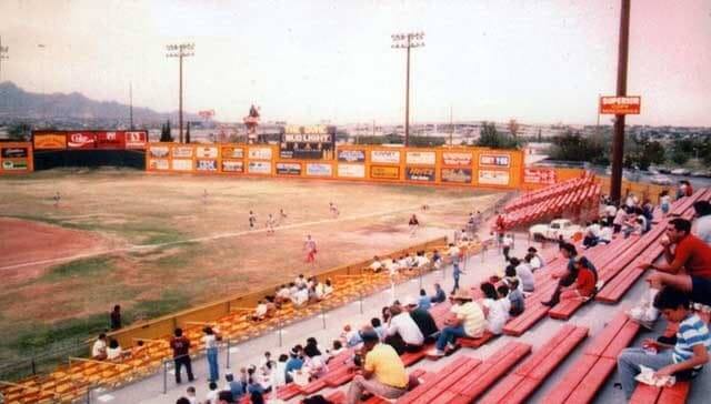
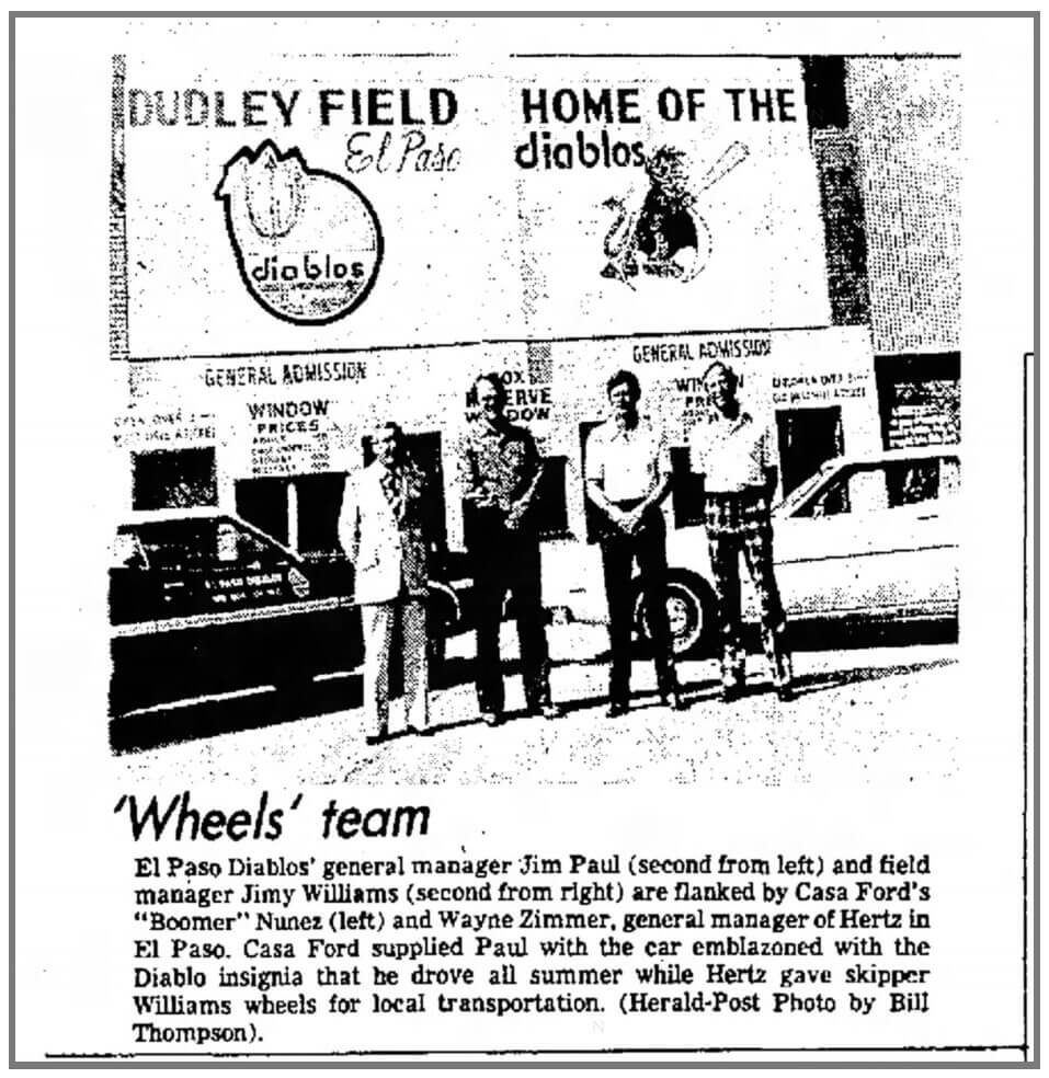
One of these was in El Paso, where the Sun Kings had toiled in the Texas League throughout the sixties under the distant ownership of Gene Autry, who was running the California Angels at the time. (Incidentally, El Paso was one of the stops in actor Kurt Russell’s baseball career. He suited up for the Sun Kings in ’73 before tearing his rotator cuff.) In the early seventies, Autry lost interest and the franchise was tossed around like a hot tamale for a few years before landing in the steady hands of a visionary Vietnam vet named Jim Paul.
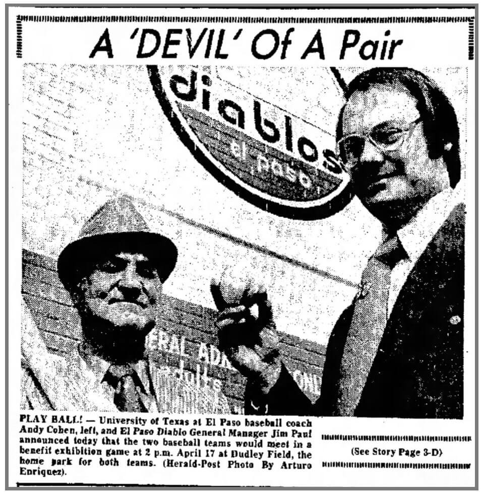
Paul and his crew brought a sort of Boomer passion to baseball, blasting Creedence and Janis Joplin during games, ponying up for Famous Chicken visits, selling cheap beer and hot dogs and generally doing whatever he could to pack old Dudley Field and pay off the debts he inherited from the Sun Kings. Paul’s innovations proved very influential, helping to pave the way for the revitalization and boom of the minors in ensuing decades. He started the El Paso Seminar in 1977, which eventually became the Minor League Baseball Promotional Seminar and Innovators Summit. For better or worse, the promotional homogeneity (Star Wars day for everyone!) that we see in today’s cross-pollinated minor leagues–now exposed via social media–owes a lot to Jim Paul.
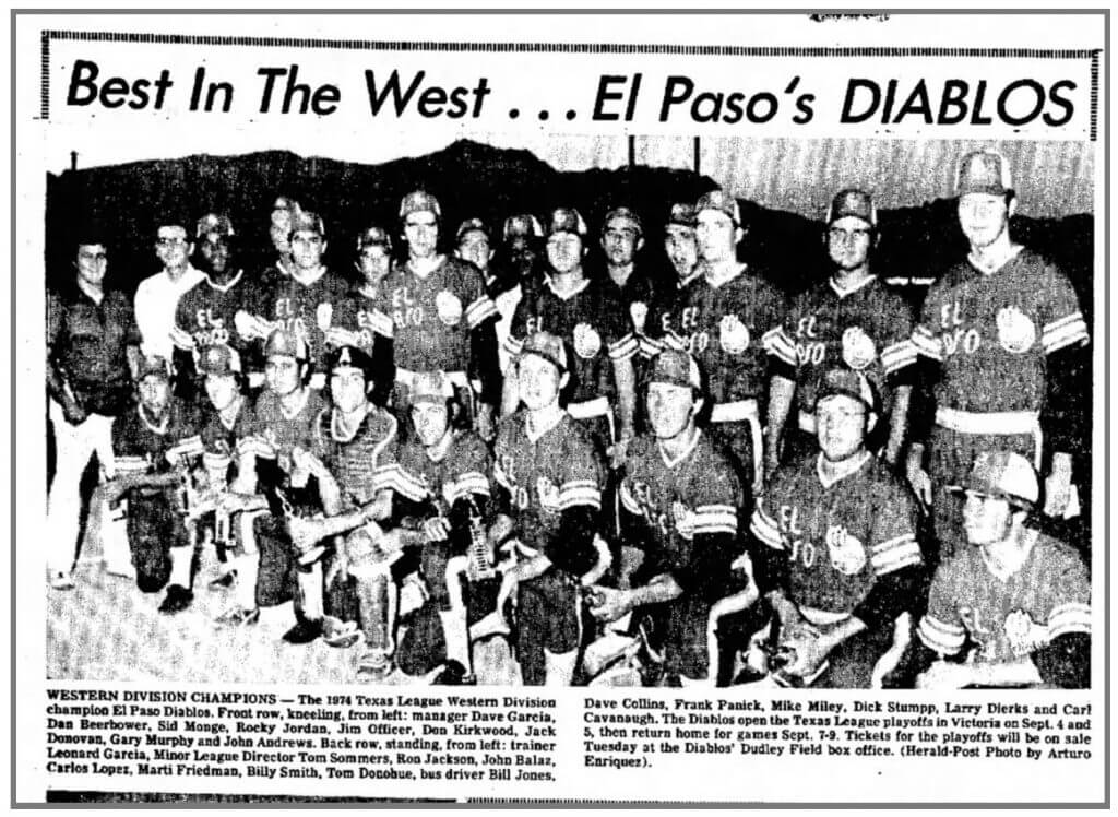
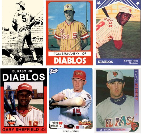
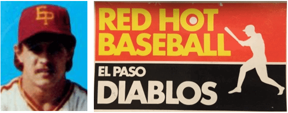
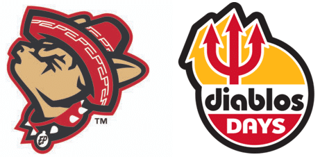
For my money, Paul’s most inspired idea was immediately changing El Paso’s team nickname to one that crackled with originality and rebelliousness. The first El Paso Diablos ran out of the dugout and into the blazing sunlight in 1974. These players were still Angels prospects, and I’m not sure if naming the the team after the Spanish word for “devils” was an intentionally cheeky reference or mere coincidence. Either way, the moniker was one for the ages. Using a non-English word for a team nickname is a rarity in minor league baseball. The San Diego Padres, who booted up in the Pacific Coast League in the thirties, are a prominent example. Beyond that there are only a handful of instances, such as the Eastern League’s 1970s-vintage Trois-Rivières Aigles or the Florida State League’s current (for now) Daytona Tortugas. El Paso is a decent-sized Texan city in its own right, but it’s also a bilingual border town in the shadow of the much larger Ciudad Juárez, Chihuahua. In branding the team, Paul tapped into a sense of place and created a unified aesthetic with southwestern hues of red and gold.
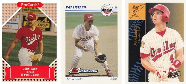
One of the archive-diggers that I collaborate with (shout out to Leo!) came across some great newspaper clippings from the earliest days of the Diablos. These shots, as well as a few color images from the later seventies, give us a glimpse of the uniforms and logos that Paul had commissioned for his club. Although it’s hard to be 100% sure when looking at black and white photos, it appears that there was a light and dark uniform, presumably for home and road. The light-colored double-knit uni was gold with red trim, and I suspect the dark-colored one was the reverse. In both versions, the jerseys had the city name rendered in a very Me Decade typeface on the chest alongside a distinct logo patch.
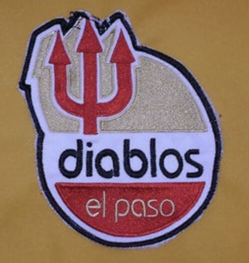
That rounded logo, one with strong staying power, had a three-pronged devil’s trident rising menacingly above the team name. Another early Diablo logo, painted on Dudley Field’s entrance façade, appears to have been a cartoon devil–possibly winged or wearing a cape–in a left-handed batting stance. This is the only place I’ve yet to see this hellish character, and the painting could have been a one-off.
Early Diablo caps were two-tone beauties, possibly mesh-backed, with the loopy letters E and P linked together in golden stitching. The primary source of this information comes courtesy of a commemorative trading card set released years later that used cut-and-pasted color images of some 1970s Diablos. A shot of pre-stache Carney Lansford, who manned the hot corner for the 1977 squad, shows the EP logo surrounded by a golden ring. Another photo of Floyd Rayford, who was on both the ’77 and ’78 Diablos rosters, also has the encircled EP cap. The angle of Rayford’s picture confirms that it was gold on the side of the cap and also reveals some red and white shoulder stripes on the jersey. El Paso was skippered by future MLB manager Buck Rodgers for only one season–1977–but for whatever reason, Rodgers was sporting the old-style EP cap sans golden ring. It’s anyone’s guess when the ringed EP was introduced and for how long it was around.
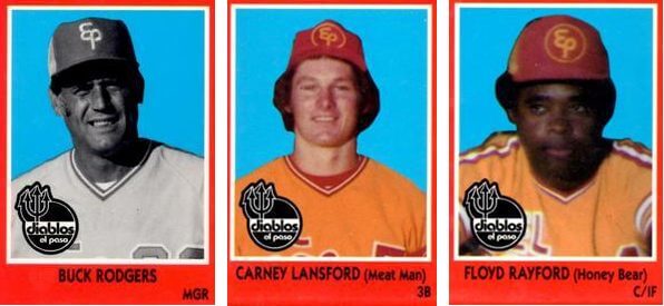
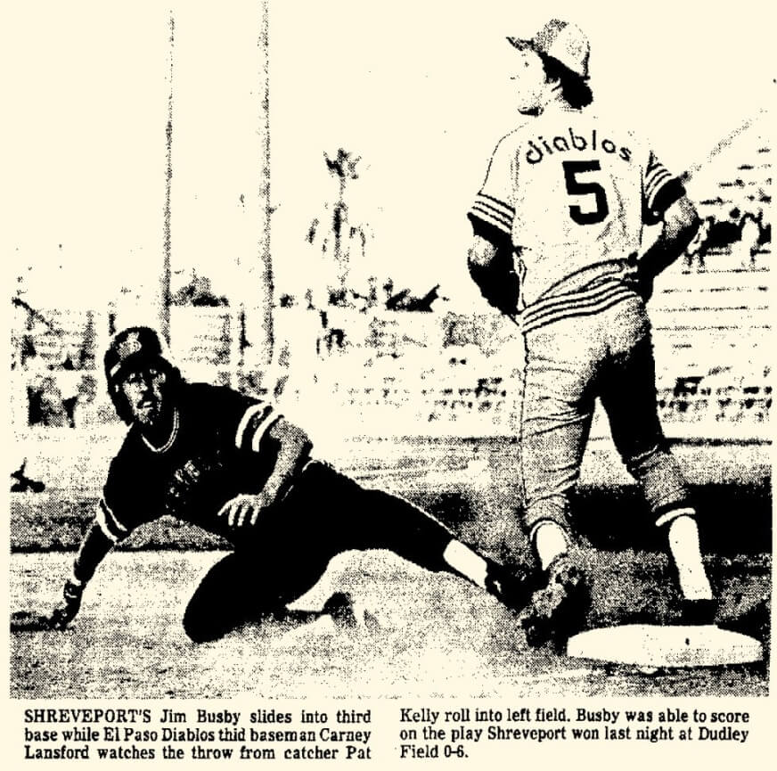
The most striking uniform detail from the late-seventies Diablos comes courtesy of a 1977 El Paso Herald Post clipping of Lansford playing third base with his back turned to the flashbulbs. I believe the Uni Watch term for this is “TNOB.” At least on the home jersey, the all-lowercase team name was applied above the numbers in the space typically occupied by the player’s name.
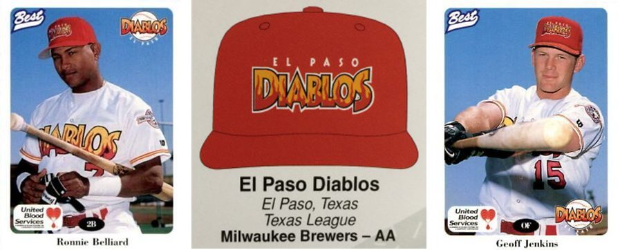
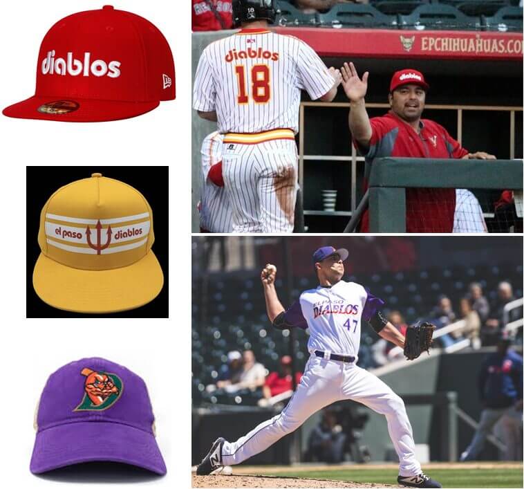
In the eighties, the Diablos were about as mercurial with uniform changes as minor league teams are today. At the start of the decade, some thick, brick-red pinstripes were added the gold uniforms, which retained the same letter and number styles of the late seventies. New caps had white horizontal stripes that blended awkwardly and brought out the yellow side of “athletic gold.” Within the broadest of these white stripes was fine print–city name on one end, nickname on the other–bookending a simplified version of the trident logo in red.
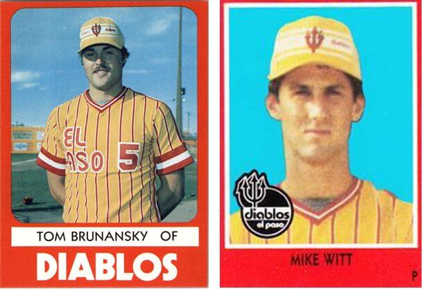
The Milwaukee Brewers became the new parent club in ’81, and though the jerseys remained the same, the white-stripe caps were swapped out in favor of zeitgeisty pillbox-style lids that retained the trident but dropped the words. The first pillbox cap was gold with horizontal red stripes that matched the rest of the uni.
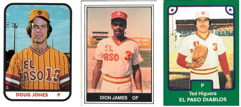
As the years advanced, so did the variations. A red cap with white stripes and trident was used for much of the eighties, trading time with an all white (including cap!) home set with thin pinstripes and red/gold racing stripes on the shoulders. A closer look at the pinstripes shows that they were red with a subtle yellow accent stripe. These white jerseys continued the TNOB tradition.
By ’86, the Diablos still had the red pillbox, but they also used another standard cap with the letters E and P fused together. Unlike they had been a decade earlier, this time the letters were a basic uppercase block-style font.
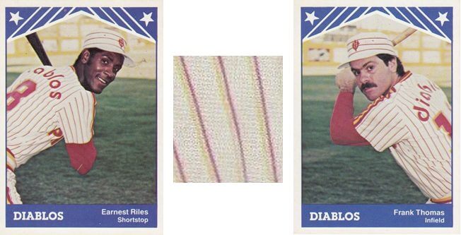
Change came to the headwear again in the late eighties, with the Diablos winding down their time at Dudley. In contrast to some of the more experimental minor league uniform styles of the Bull Durham years (the Charlotte Knights come to mind) El Paso swerved in a more conservative direction. For whatever reason, the more overtly devilish imagery was gradually phased out of the branding. The team nickname–in that same old font–took the place of the trident on standard red caps, and the pronged circle on the primary logo was reconfigured into a baseball.
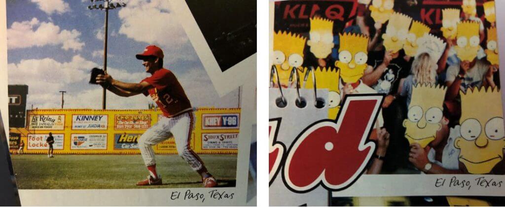
Whether it was the excitement of brand new Cohen Stadium’s opening in 1990, the sweeping influence of Jim Paul, or simply having the coolest name in the minors, the El Paso Diablos were showered with national attention around this time. Sports Illustrated ran an extensive cover feature on the minor leagues in 1990, something that wouldn’t happen again until thirty years later. The Diablos were one of dozens of minor league clubs that pop up in the issue, and some wonderful El Paso snapshots appeared in SI, including one of fans holding up promotional giveaway Bart Simpson masks.
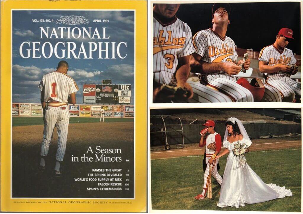
Most memorably, the Diablos and their pinstriped uniforms were immortalized on the cover of National Geographic for David Lamb’s 1991 “A Season in the Minors” piece. The cover shot is of a player named Greg Edge (he never got above Triple-A) standing with head bowed as he listens to the Star-Spangled Banner ring through the partly cloudy El Paso sky. Some other great shots are in those pages, such as players counting money donated by fans and one of current Toronto Blue Jays manager Charlie Montoyo chugging a Coke during his on-field marriage ceremony.
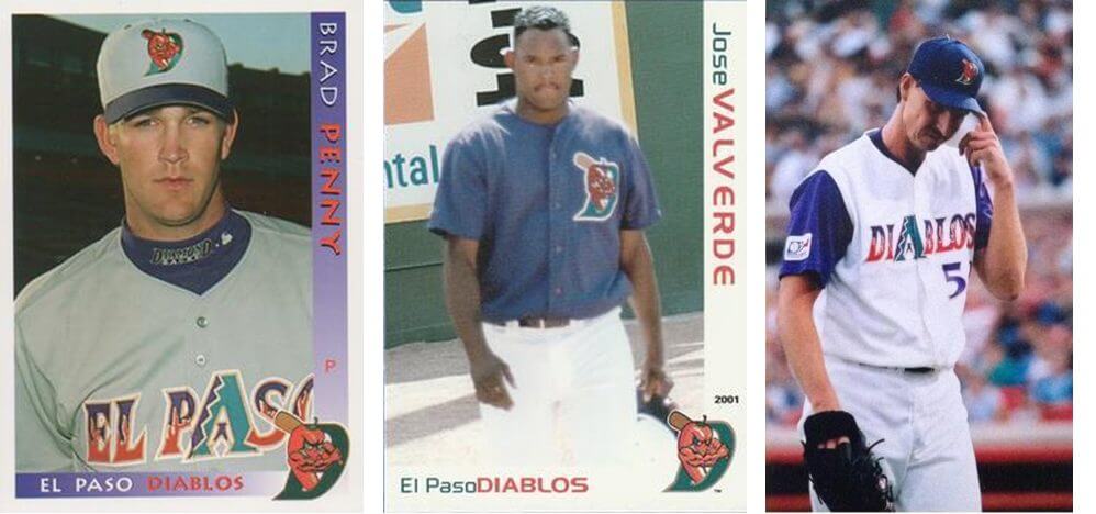
Shortly after the magazine shoots, gold all but disappeared from the uniforms, with bright red, white, and black becoming the new combo. The new button-down jerseys had the team name spelled out diagonally above a broad underline.
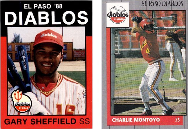
By the mid-nineties, digitally reproduced logos emblazoned on New Era caps became a lucrative side-income for minor league teams, and maintaining a leftover eighties look was effectively leaving cash on the table. The Diablos held off on introducing a cartoon character or resurrecting the trident. Instead, they rolled out a new wordmark logo, going from all-lowercase to all-caps, with sharp-pointed typeface composed of burning golden hellfire. El Paso continued their tradition of having lots of fine-print lettering right on the baseball caps.
As the new millennium loomed on the horizon, some big changes came to the Diablos. The nascent Arizona Diamondbacks signed on to have El Paso serve as their first Double-A affiliate. To go along with this change, the Diablos dramatically overhauled the old brand and adopted several elements of Arizona’s aesthetic. The purple, copper, and teal-ish southwestern motif dovetailed nicely with both parent club and affiliate, and El Paso cleverly used the snake-tongue A to serve double-duty where the letter appeared in both city name and nickname.
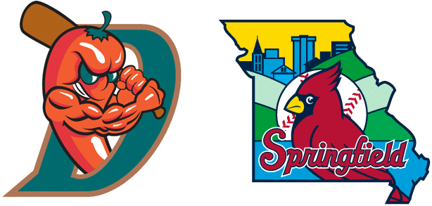
The new uniform package also included a cartoon logo of a red-orange, ornery-looking chili pepper with bat cocked back in a left-handed stance. As this was in the thick of the steroids era, the vegetable’s anthropomorphic arms had muscles on top of muscles. Young future D’Backs wore the different iterations of El Paso’s new threads–white home, gray road, alternate purple–as did the Big Unit in a rehab stint.
Another dramatic change right around this time was that Jim Paul sold the Diablos to Brett Sports & Entertainment, a group backed by George Brett. Brett was on a bit of a victory lap around the time of his Hall of Fame induction, and his group stayed busy buying and selling minor league teams. After the 2004 season, the Diablos found themselves in the latter category. The old Texas League franchise was bought up by the St. Louis Cardinals, who moved it into southwest Missouri and dubbed it the Springfield Cardinals.
The Cardinals didn’t take the old trademarks along for the ride, however, and an independent/non-affiliated team called the El Paso Diablos dusted off the chili-D caps and competed in the now-defunct Central Baseball League in 2005. They later joined the American Association of Independent Professional Baseball and existed up until 2014, when El Paso got a new stadium and a new affiliated Triple-A team in the Chihuahuas.
In sort of postscript to this saga, well-chronicled here, the Chihuahuas front office waited three years for the Diablos trademarks to expire, and then began using the old identity for salable merch and “Diablos Days” promotions complete with a variety of old throwback unis. Lord knows that they have a deep fiery pool to draw from.
Today, the El Paso Diablos are best remembered as a team that brought spice and fire to the minor leagues at a time when it was needed the most. It is also a testament to how one hard-working guy with a bucket of red paint and good taste in uniforms can change an entire sports institution.
If you would like to read more about the Diablos, with a bit less emphasis on uniforms and a bit more on players, check out the page I made for them on the perpetually under-construction Minor League Geek website. Don’t hesitate to reach out with any questions or comments. Many thanks to Phil & the Uni Watch crew and all of you for reading!
Thanks, Alan! Sorry this didn’t quite make the Halloween lede, but I wanted to make sure it ran on October 31 regardless. Readers? What say you? Please let Alan know in the comments below.
MLB Playoff Uni Tracking
The World Series is now over and for the past month Alex Rocklein has been tracking the jerseys of all the teams involved in the MLB Post Season. Here’s the full Wild Card round jersey matchups (click to enlarge):
Here’s your final 2020 MLB Playoff Uni Tracking
I hope you guys enjoyed this annual feature, and Alex will return in 2021 (hopefully following a full, COVID-free season…fingers crossed) with his tracker, in whatever format the MLB decides upon for the playoffs (and I wouldn’t be surprised if they go with this format, perhaps with a tweak or two, going forward). Please give Alex a quick “Thanks” in the comments below!

Guess The Game…
from the scoreboard
Today’s scoreboard comes from Michael Emody.
The premise of the game (GTGFTS) is simple: I’ll post a scoreboard and you guys simply identify the game depicted. In the past, I don’t know if I’ve ever completely stumped you (some are easier than others).
Here’s the Scoreboard. In the comments below, try to identify the game (date & location, as well as final score). If anything noteworthy occurred during the game, please add that in (and if you were AT the game, well bonus points for you!):
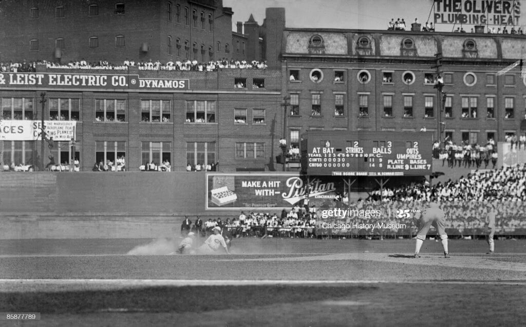
Please continue sending these in! You’re welcome to send me any scoreboard photos (with answers please), and I’ll keep running them.
The “BEST OF” Kreindler’s Korner
Hey guys & gals. You’ve enjoyed Kreindler’s Korner for several years now, mostly on the weekends, on Uni Watch, but with the recent coronavirus outbreak, Graig’s time is just too precious and he needs to tend to other things besides coming up with a new writeup each weekend.
So, going forward, for as long as the COVID-19 situation is bad in New York, I’m going to run a few “Best of’s” until Graig returns.
Here’s today’s offering:
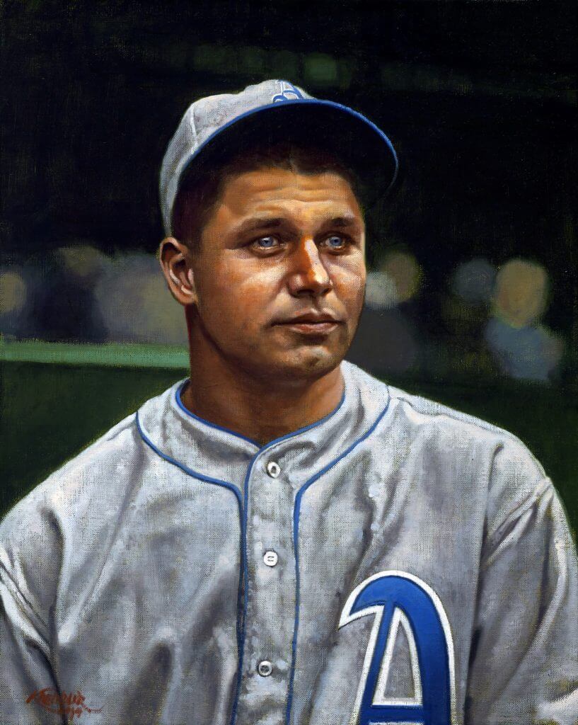
Title: “A Breakthrough”
Subject: Jimmie Foxx, 1929
Medium: Oil on linen
Size: 16″ x 20″My favorite anecdote about Jimmie Foxx comes from Yankee pitcher Lefty Gomez. Apparently in 1937, Foxx hit a home run off of Gomez at Yankee Stadium that landed in the upper deck of the leftfield stands – something that was very much a rare feat accomplished by precious few. When asked how far the ball traveled, Lefty answered, “I don’t know, but I do know it took somebody 45 minutes to go up there and get it back.”
I’ve only been able to paint Foxx a handful of times, as for whatever reason, he’s not the most popular player with my clients. I never knew why, as he always was super fascinating to me – especially considering how much of a monstrous physical specimen he was, yet supposedly also rather gentle and even-tempered.
When I was given the chance to depict him on canvas for one of my favorite collectors, I was given carte blanche, image-wise. I had always been (and still am) in love with the photography of Charles Conlon, so it was his work I gravitated towards. I wanted an image of him early on in his career, as I love imagining him with Philadelphia as opposed to Boston (not to mention Philadelphia or Chicago). So, here he is, pictured in his first big year with the Athletics. 1929 saw the 21-year-old bat .328 and hit 29 home runs. He also helped lead his club to a World Series victory against the Cubs that year, cementing the team’s legacy as one of the greatest ever assembled.
And still, when I look at this painting, I can only think of him gazing away from the camera, perhaps to the deep leftfield stands in Yankee Stadium that he would someday make Lefty Gomez wax poetic about.
Thanks, Graig! You can (and should!) follow Graig on Twitter.
Your Annual Fall Back Reminder…
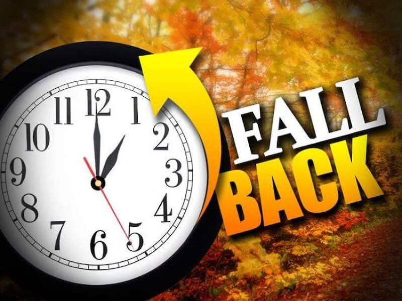
Don’t forget to turn your clocks BACK one hour tonight. Daylight Saving Time comes to an end at 2:00 am. There’s good news and bad news. The good news is that we get an “extra” hour of sleep. The bad news is that the sun now sets an hour earlier than it did the day before (actually it’s more like an hour and 2 minutes, give or take). I know some of you, particularly in the western ends of the time zones, probably welcome the switch (yeah, I know, it’s dark when most of us wake up), but I hate it. Official sunset where I live tomorrow will be 4:50 pm. Ugh.
Anyway, don’t forget to adjust your clocks (if you still have clocks that actually need to be manually set, anyway) tonight. I’ll remind you again next spring to push them ahead again.
The Ticker
By Anthony Emerson

Baseball News: When IF Yolmer Sánchez was traded from the White Sox to the Orioles yesterday, ESPN accidentally photoshopped him into a Giants uni. At least both the Giants and O’s are black-and-orange teams, right? (from Andrew Cosentino). … Los Angeles continues its sports-themed ‘I Voted’ stickers, with voters at the Dodger Stadium precinct getting stickers with the Dodgers’ cap logo (from Patrick Maher). … Alert, New England YouTube TV subscribers or potential subscribers: NESN, the broadcast home of the Red Sox and Bruins, will be dropped by YouTube TV after today.

NFL News: The Giants will wear throwback helmets on Monday night (from Ursus Maije). … Former Packers beat writer Vic Ketchman maintains a personal blog in his retirement. In the last section of this piece, Ketchman says that he hasn’t liked a single new uniform Nike has released in their now eight years with the NFL contract, calling their uniforms “overstated and undignified.” (from Michael Mather).
College/High School Football News: In 1986, rocker David Lee Roth joined the Iowa State marching band for one game. Legendary (from Matthew McLaughlin). … The logo for the Montgomery Bowl, a one-off replacement for the Fenway Bowl, has been revealed. … Mizzou is going mono-white, which they’re calling a “ghost” uniform (from Kary Klismet). … Southern Miss is going mono-black. … UNLV is going mono-grey (from Mark Wallington). … Houston was already going red-black-black, but yesterday they announced their endzones will have black lettering, black out of bounds territory, and spiderwebs (from Ignacio Salazar and Chris Salley). … Kentucky is going blue-blue-white today (from @BigBlueNat1on). … No pants visible, but Hawai’i will wear white jerseys and black helmets today (from Kevin W.).

Hockey News: The Albany Times Union has an article about the minor league sweater’s in Doc Emrick’s home office that were visible while he was calling the Stanley Cup Playoffs (from Joe Makowiec). … New Capitals G Henrik Lundqvist practiced in his Rangers pants yesterday. I guess old habits die hard (from Wade Heidt). … Ontario’s sports minister wants the OHL to eliminate body checks during the pandemic (from Timmy Donahue). … Alert, New England YouTube TV subscribers or potential subscribers: NESN, the broadcast home of the Red Sox and Bruins, will be dropped by YouTube TV after today.

NBA News: In yesterday’s coverage of the Blazers’ alternate uni reveal, Paul mentioned that he couldn’t think of a brown uni before in NBA history. That led Kenny Kaplan to dig up pictures of the 1974-75 Virginia Squires of the ABA, who wore brown and orange away unis! … The G-League’s Northern Arizona Suns will be rebranded as the ‘Motor City Cruise‘ for their 2021 relocation to Detroit. The Pistons had purchased the Suns from the NBA’s Suns in July after their affiliation agreement with the Grand Rapids Drive entered its final year (from Kary Klismet).

College/High School Hoops News: Alabama A&M has unveiled renderings of its new on-campus arena (from Kary Klismet). … Looks like yesterday’s blue Virginia jersey leak is confirmed (thanks, Jamie).

Soccer News: Gorgeous 120th anniversary kits on tap for German side Borussia Mönchengladbach. The kits will be worn for today’s match against RB Leipzig. More details here (from Ed Żelaski and @FTCUTD). … Scottish side Heart of Midlothian are wearing shirts supporting the charity Tiny Changes as warm-up shirts before today’s semi-final of last season’s Scottish Cup. Tiny Changes was founded by Frightened Rabbit frontman Scott Hutchinson, so naturally the club is wearing Bands FC’s Hearts/Frightened Rabbit crossover shirt as well (thanks, Jamie). … Staying in Scotland, Rangers have unveiled some very nice retro-inspired kits. Unclear if they’ll be worn on the pitch, though (thanks, Paul). … ESPN FC has gathered all of Liga MX’s Día de Muertos kits in one tweet (from Jakob Fox).

Grab Bag: Feeling spooky? ESPN has a list of the most haunted venues in sports (from Kary Klismet). … Also from Kary, here’s a really good piece on the adaptive nature of Atlanta’s Center Parc Stadium, formerly Turner Field, formerly Olympic Stadium. A graphic in the article shows you how much — or how little, depending on your perspective — the layout has changed, overlaying the Olympic track and baseball diamond over the modern football field. … One more from Kary: here’s a highly enjoyable analysis of the uniforms and equipment worn by the Ghostbusters in the movie Ghostbusters. … F1 driver Pierre Gasly will wear a helmet in honor of legendary F1 driver Ayrton Senna during Monday’s Emilia Romagna Grand Prix. Senna was killed in a 1994 crash at the same track (from Omar Jalife). … As part of their Election Distractor series, The New York Times posted a short video of Simone Rocha hand chain-stitching (from Paul Friedmann).
And finally… We had some issues with the back end of the blog last night, so apologies in advance if anything above is “off” — several of the pieces I had edited to today had somehow not saved and reverted to the template I used last weekend. They should all have been fixed, but if anything is “off” I’m sorry.
Thanks to Alan for that fun Diablos article and everyone have a safe and happy Halloween. I’ll be back tomorrow with a special Halloween-esque edition of the SMUW. Till then!
Peace,
PH
Hi,
I think the Emilia Romagna Grand Prix is Sunday.
LI Phil, why on earth would you put boring NBA leaks ahead of that fantastic write up on the Diablos? Makes no sense. Alan, thanks for the great southwest deep dive.
Seconded; that Diablos story was a lot of fun!
Thirded. In my opinion you buried the lede today.
Diablos was a better story by a huge magnitude – fascinating, a visual journey, and done in depth.
An unconfirmed leak of some uninspiring looking alternate NBA jerseys is a distant second – at best.
Hey Guys,
I don’t disagree — I wanted to make the Diablos the lede, but the policy at UW is to have breaking uni news (even if tis *just* NBA jersey leaks) be the lede story. That’s why I alluded to it in the hed and opening graf. Were it entirely up to me, the leaks would have been subledes, and not the first story.
The Spurs all but confirmed their leaked jersey is real after a tweet last night. It’s a picture of one of those job sites where you can find someone to do most anything you need and they have typed “leak specialist” in the search bar of the database.
link
The GTGFTSB is from the link, and has the oddity of the Cincinnati scoreboard showing the home team on the top, filling in the “tops” of the innings (the bottom row) before the “bottoms”.
Regarding the Knicks jersey, there is also a home grown designer from queens that owns one of the biggest urban brands in the market. He is releasing/released a pair of Nike sneakers with the same gradient design. I think the design is poor. But, for some strange reason people who are 1 year younger than I am seem to love the BFBS Mets jerseys.
Gotta say, that Knicks jersey is a total dog, even in the pantheon of fourth-tier NBA jerseys.
I’m confused – Portland says, “OK, for no reason let’s make ours say Oregon instead of Portland” then Golden State says “Let’s ignore the fact that we’re actually the nickname of the entire state and throw Oakland on there.” 1) It’s like rubbing salt in the wound of Oaklanders after the move and 2) missing a golden opportunity to get a “California” word mark (pun intended).
That El Paso story was FANTASTIC!! Some of those uniforms were brutal! Wonderful read. Thank you for sharing that!
Is there a picture to go along with the “David Lee Roth joined the Iowa State marching band” snippet?
That Washington Wizards logo sure looks like a . . .
October 2 1919 at Redland Field in Cincinnati.Game 2 of World Series. Reds win 4-1 over White Sox.
Last year’s Raptors jersey had black collars and armhole trim. The apparent leak for this year has gold trim with some black markings.
Wow… I tweeted the Oakland Warriors jersey leak to you and 6 hours later you had retweeted everything from that same page (except the Warriors one) and then went and wrote this whole article up without ever acknowledging my assist on giving you this source.
Cmon man!
Hi, Greg. A few things:
1) Yesterday afternoon a Twitter-er named @sga4mvp, aka “Jersey Leaks Guy,” DM’d me to show me a photo of the Spurs leak.
2) First I downloaded the photo and then link.
3) After looking more at his feed, I realized that he had gotten the photo from @camisasdanba (which he didn’t tell me when DMing me). So I link.
4) Since @camisasdanba seemed to be the real source for all this stuff, I began following him and retweeting his subsequent leaks. Contrary to your assertion, link.
5) Since this was breaking news that happened yesterday, Phil (not me) wrote about it today.
———
That’s what happened at my end. If you tweeted the Warriors leak at me around that same time (or earlier, or whenever), I didn’t see it. Or at least I don’t *recall* seeing it — busy, complicated day yesterday.
But if you want credit for tweeting something at me, sure: Ladies and gentlemen, Greg apparently tweeted a leak at me yesterday, which was very nice of him, even though I don’t remember seeing it. He had his ear to the street, for sure!
Hope that clears things up.
Well… that shows that I have misplaced my jersey related ire indeed.
Right on.
Thanks for the snarky shout out as well, I’m going to print it out and put in my wallet to show my grandchildren :)
You are indeed missing something on the raptors jersey. First of all the Toronto text is slanted, with a big slash beneath it. Additionally this jersey has gold sleeves and collar, with anther slash inside them. The jock tag says “welcome toronto”. One last difference is that this one appears much more grey than last years black one.
THANK YOU for the Diablos article! My dad, Joe Weir, was the official scorekeeper and sat next to Paul Strelzen who did the PA at the Dudley Dome back in those first years! (The “dome” nickname was because it could be pour rain in monsoon season elsewhere in EP and dry as a bone at Dudley.) Just to add a bit of the (many) fond memories I have sitting with my dad in the booth, not only was it Janis Joplin’s “Bye Bye, Baby” but everyone got a kleenex tissue out and waved it when the visiting pitcher was pulled. That or “When Will I Be Loved” by Linda Ronstadt blaring as the poor schmuck walked off the mound. The cash in the helmet thing was after every Diablo homer and the guy would hand his helmet into the crowd. Everybody who wanted would put in a buck or so (MiLB players still aren’t paid much). I could go on but one of the best things to come out of our time in El Paso was my family would feed the umpires at our house before the games quite often. I got to know a bunch of them (Dana DeMuth for one) and worked games for 30 years (not pro but youth, HS and college) from their influence and from my dad. Thank you, Alan and Phil, for bringing back some great childhood memories of El Paso!
Sorry Kevin. I guess I should have read the comments before posting. I remember as a kid holding that Kleenex tight in my hands waiting for it to be used. So many memories.
Hey Diablo fan! Glad to hear/read about a fellow EP Texan! Sent my Dad the story and comments. He replied (and I thought you might like this): “Brings back memories. Jimmy (Jim Paul)( knew nothing about baseball but he knew how to get fannies in seats. Scorecards sold for 50 cents. Gave away tickets thru 7-11 guarantee win. He provided concessions for the first couple years then partnered with Jack n box for a percentages of concessions. Jim bought the team for $2500.00 and assumed all the debts and he sold the franchise for a million.” For my sake, the team shot with Mike Miley in it is worth a mint! Midnight Mike was my first baseball hero. Dad and I both remembered him reading the paper to me the day after Miley was killed in a car crash. — So good that you remember the hankies and the “dome” being closed, too! Was a fun dump (the zoo smell when the wind blew in) at Dudley but a good fun dump!
I am curious what the Celtics alt uniform will be. They’ve already done the gold and the athletic gold on the previous alternates from the last few years.
Yolmer Sanchez started the year with the Giants. He didn’t sign with the White Sox until the end of August.
link
I became a baseball fan because of the Diablos. So many memories. One of my best is when there was a possibility of rain, The “Dome” would get closed. They played a sound bite of a creaky rusty door closing. And wouldn’t you know the rain would stop.
I don’t think that ESPN Yolmer Sánchez pic is a photoshop. Sánchez was signed to the Giants from January to August, although he didn’t actually play for them. In fact, it seems to be the same picture as on his baseball-reference page. link Probably a Giants team promo.
Also, if the David Lee Roth item is supposed to have a link, it does not.
Enjoyable article about the Diablos. No idea that they were affiliated with the Angels when the name was chosen. Interesting info I did not know about.
I remember a lot of minor league teams wearing red and yellow but that did not seem to be a colour scheme used in the majors. Remember the Diablos, Albuquerque Dukes, Hawaii Islanders and Calgary Cannons all sporting the red and yellow around the same time.
Honestly, El Paso would be on my short list of cities for potential MLB expansion. Their current AAA team – the Chihuahuas – has an enormous fan base for a minor-league team, and an MLB team would be the only major-league game in town.
Daniel, baseball is undergoing its biggest restructuring since 1962. The minor leagues are now under the full governance of the major-league owners, and have even pulled in a couple of the independent minor leagues under the umbrella.
Too, MLB was able to develop the concept of the “alterate training site” similar to what the Japanese leagues do.
Entire leagues are going away; the Appalachian League is now a wooden-bat collegiate league, and we’re losing the entire short-season single-A level and the rookie leagues that play at spring training sites.
I would not be surprised to see the number of major-league teams double in a promotion/relegation scheme that you see in other locales around the world. I can see Columbus, Buffalo, Indianapolis, Portland, Sacramento, Salt Lake City, New Orleans, and other major metropolitan areas become new MLB teams in the 60-team, two-division setup.
El Paso? Maybe.
Relegation is absurd and will never happen in the United States. There’s also not a shred of a chance of MLB doubling the number of teams. And El Paso, no matter its size, has zero possibility of becoming an MLB town.
I bow to your greater understanding of the USA.
But are you saying relegation is absurd in all cases.
because the most successful leagues in the world’s most successful sport seem to make it work.
Why do you think it’s absurd?
Odd to see the old NikeTown NYC logo on the Knicks Jersey
Guess it’s irrelevant that Elgin Baylor wore number 22…..
I assume you’re referring to the fact that the *leaked* jersey is 23? I’m sure you’re aware #22 is already retired for Elgin. I’m not 100% sure who wears #23 for the Lakers ;), so maybe they just randomly picked a number? Seriously, I’m sure they’re planning on moving a LOT more 23’s than Elgin’s retired number.
The scoreboard shot is from Game 2 of the 1919 World Series at Crosley Field in Cincinnati (the home team is listed first on the scoreboard!) on October 2, 1919.
The Reds won the game 4-2 and the series 5 games to 3.