Click to enlarge
Another day, another pair of purported NBA “City” alternate jersey leaks. Yesterday we had leaks for the Mavs and Nets (both of which were quickly confirmed as legitimate). Today we have the Pelicans and Trail Blazers.
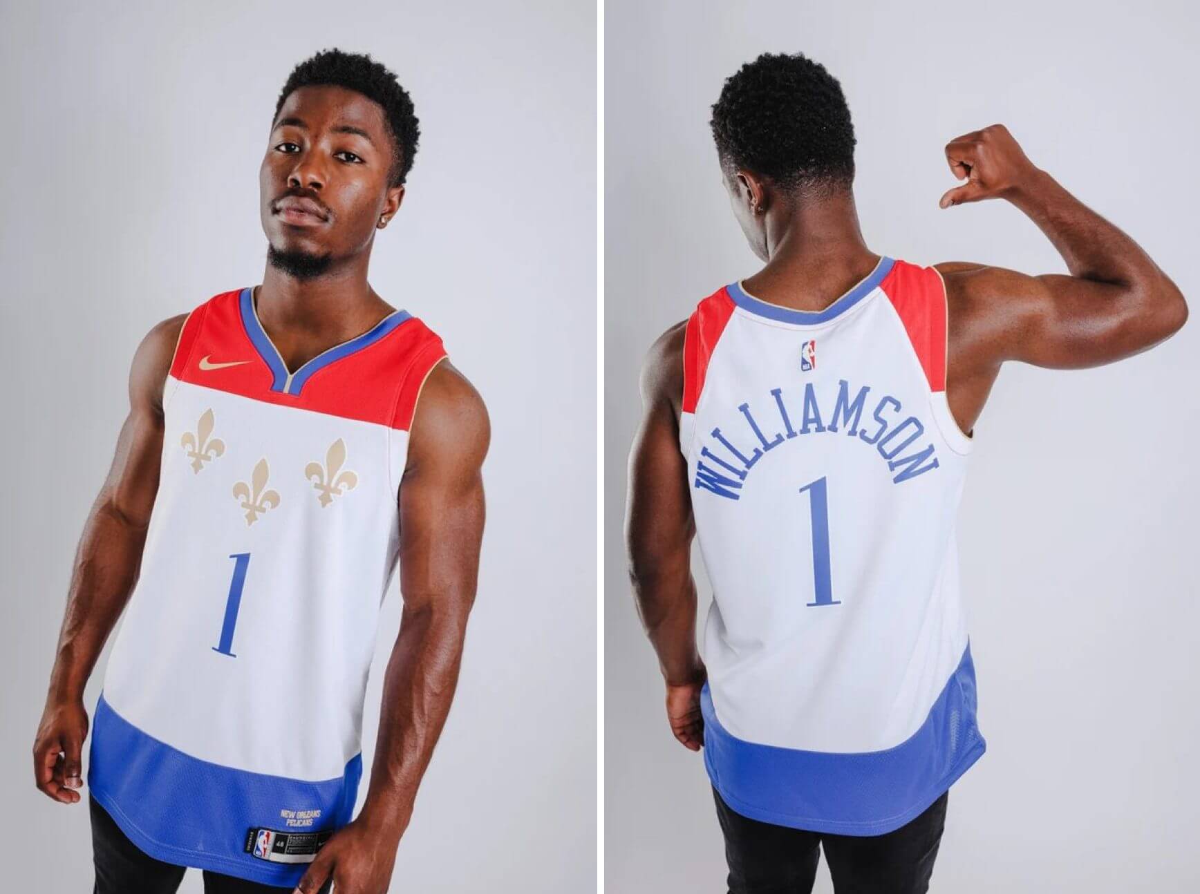
The Pelicans leak, shown above, comes from an Australian retail site. At first I wasn’t sure what the design was based on, but then I thought, “Hmmm, could that be the New Orleans city flag?” Sure enough, it is! Not a great jersey, obviously, but an interesting design concept.
Also interesting: There’s really no need for the blue section at the bottom of the jersey, since that will be tucked in. The shorts will presumably be blue, so that will complete the flag effect. The bottom of the jersey could have remained white, but they made it blue for retail customers who’ll wear the jersey untucked. Another case of the merch tail wagging the on-court dog.
As for the Blazers, here’s their leaked design, which began circulating after Twitter-er @officialnbabuzz posted it last night:
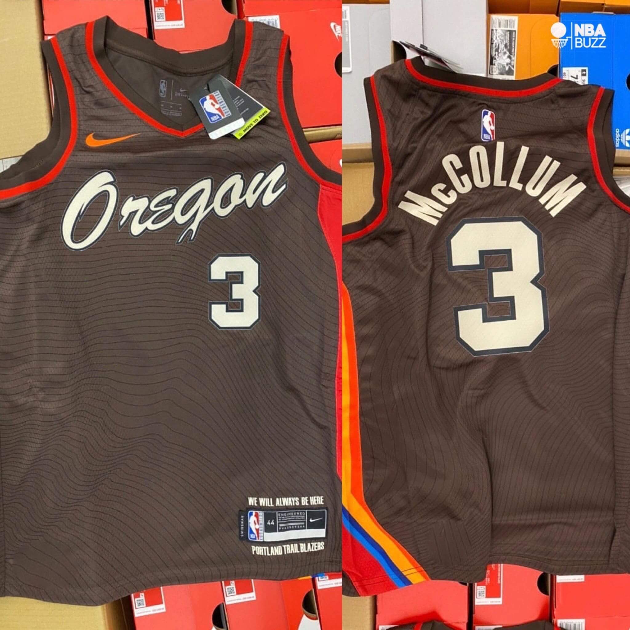
This one I recognized right away. The chest script is based on the magnificent White Stag neon sign in downtown Portland. Not sure about the multi-colored striping down the side, but I’m sure we’ll be hearing about that soon enough.
Obligatory reminder: These leaks are not yet confirmed as legitimate. But I suspect they won’t retain that status for long.
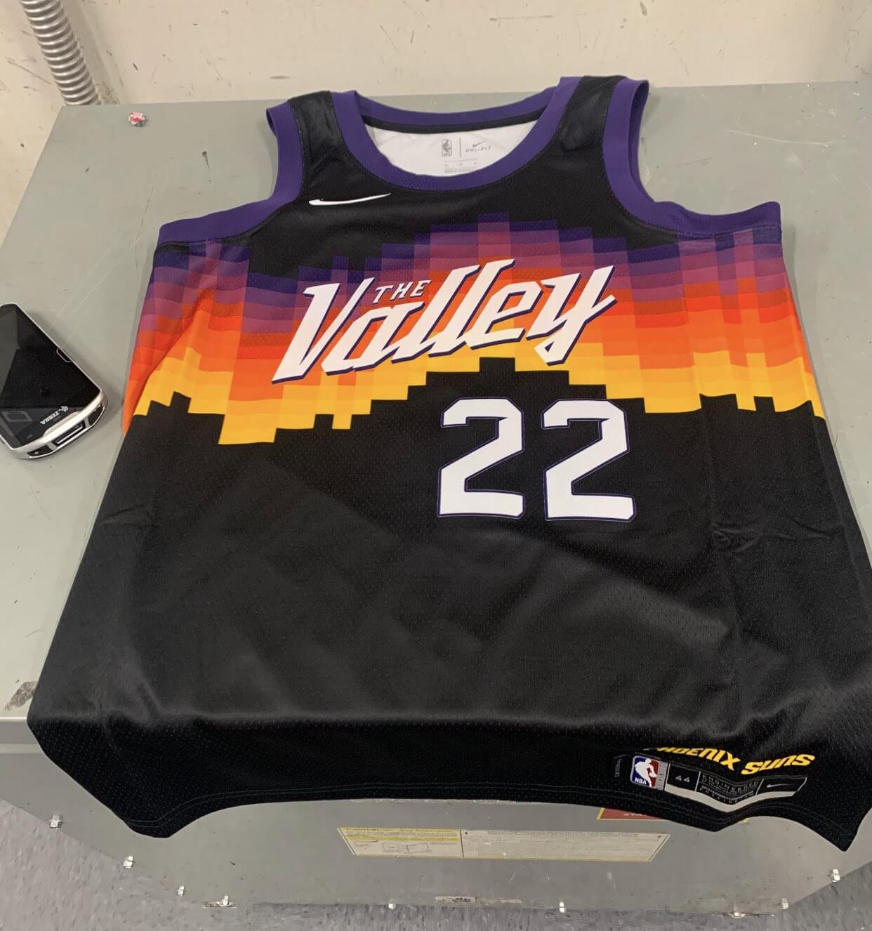
Update: Apparently this purported Suns leak is also circulating:
Click to enlarge
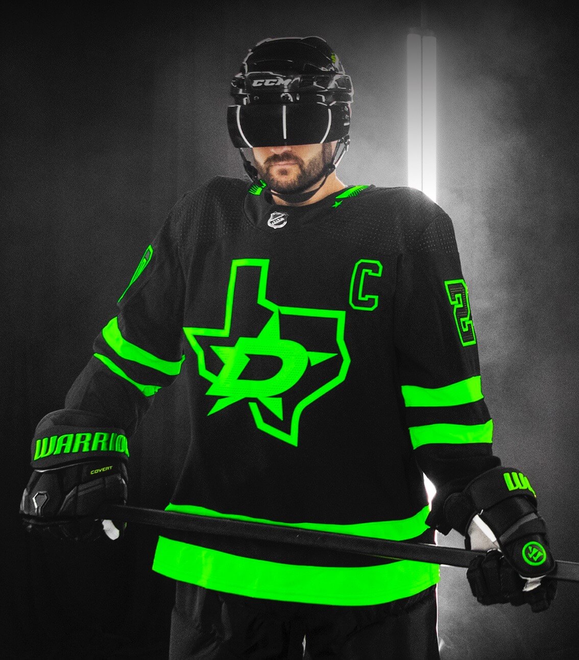
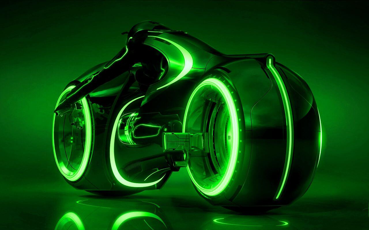
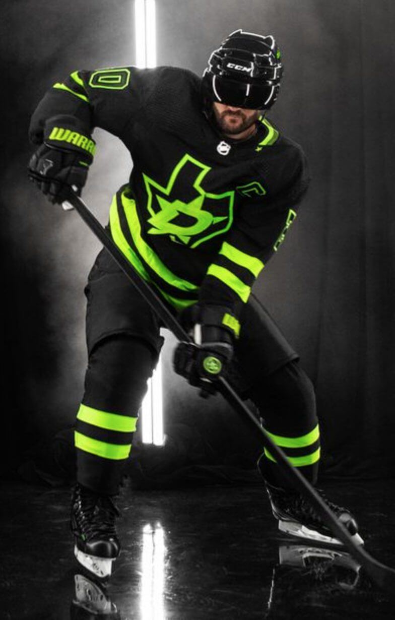
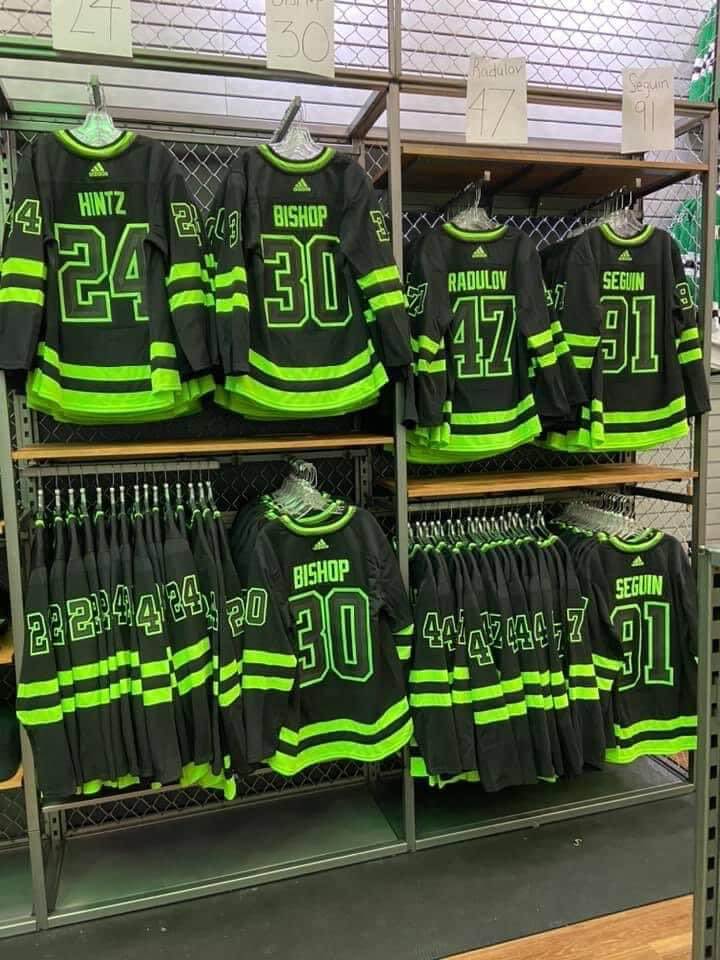
2020 keeps getting better and better: The Stars, who had teased a new black alternate uniform over the previous two days, went ahead and unveiled the uni yesterday. They’re referring to it as the “Back in Black” design (a reference to the team’s history of wearing black jerseys from 1993 through 2013), but the operative color, as you can see above, is not black — it’s a neon/highlighter shade of green. And as you can also see, they gave their uniform model a black visor to enhance the cyborg/Tron effect. Ooooh, edgy.
So let’s get the easy, obvious stuff out of the way first:
Okay, now that that’s out of the way, let’s go over a few of the design details (additional info here):
• To their credit, the team has provided a full-length shot of the entire uniform instead of just selling the jersey:
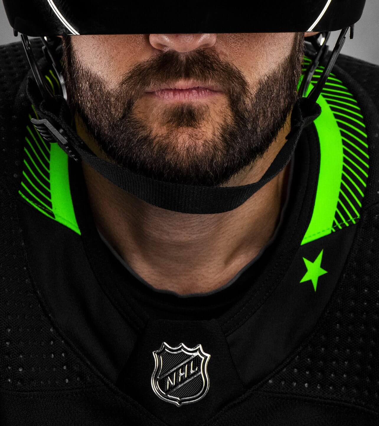
• The collar includes a single star because, you know, Texas:
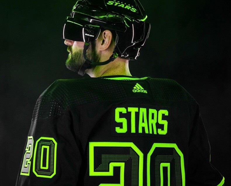
• The numbers have an LED-ish effect that creates a bevel-ish effect:
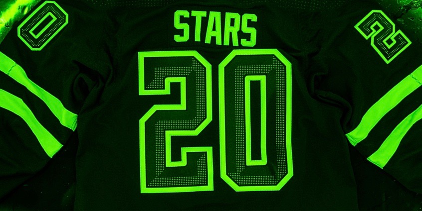
• You may be thinking, “The highlighter color probably doesn’t look as bad under normal lighting, instead of that silly black-light treatment they used in the promo photos.” Think again:
• Speaking of the highlighter color, the press release has this to say about it:
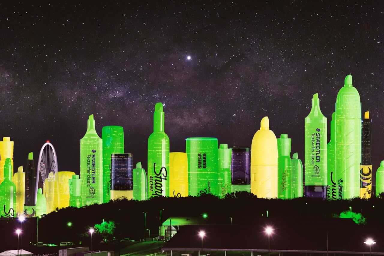
[The jerseys] also feature the introduction of a bold new color in Skyline Green. Inspired by one of the most iconic skylines in the world, Skyline Green is synonymous with the city of Dallas.
It’s been nearly 20 years since I was last in Dallas. So when I read that passage in the press release, I couldn’t recall exactly what the Dallas skyline looked like, or how it might be synonymous with a neon/highlighter shade of green. Then I thought to myself, “Hey, don’t the Dallas Mavericks have a skyline jersey?” But when I looked at that jersey, there was no sign of neon/highlighter green. I figured I must be missing something, so I looked up a photo of the Dallas skyline, and suddenly it all made sense (click to enlarge):
———
The reality, of course, is that the Dallas skyline includes the Bank of America Plaza, which is lit up at night with green LED tubing. According to Wikipedia (and many other sources), the green lighting has led many Dallas residents refer to the building as The Pickle. I’m sure it was a tough call about whether the uniform color should be called Skyline Green or Pickle Green. Good thing they didn’t choose Pickle — you wouldn’t want to do anything silly or else people might not take your new uni design seriously.
(Neon-accented thanks to Nic Schultz for his highlighter-skyline Photoshoppery, and to R. Scott Rogers and Jeremy Bearimy for their contributions.)
Click to enlarge
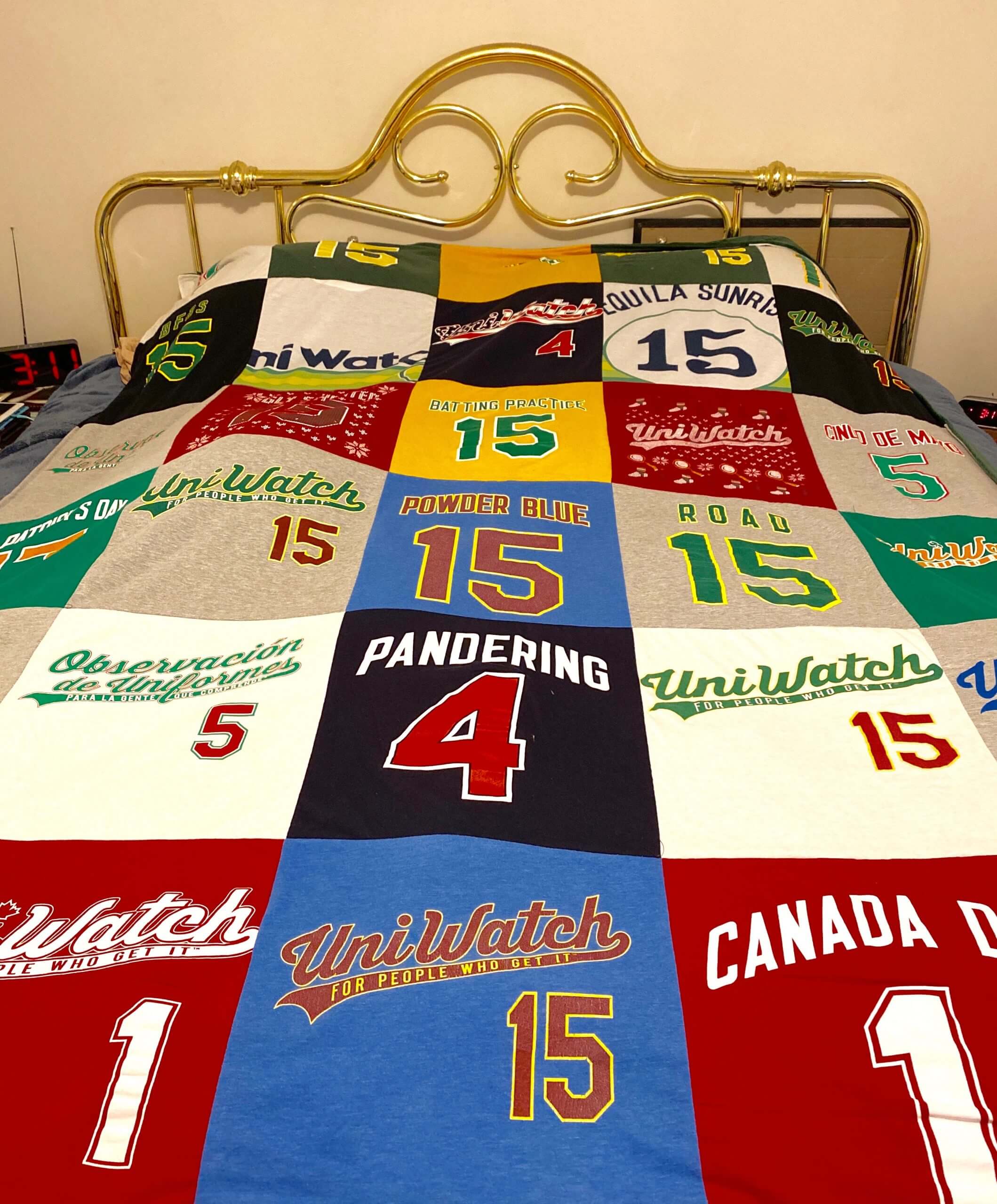
ITEM! Uni Watch T-shirts get new life: Remember the Uni Watch T-Shirt Club from 2015? I got a note the other day from reader Joel Ford, as follows:
I ordered all of the 2015 shirts — even the extras for April, May, and July — and received the “collect ’em all” patch (which is currently is attached to my bulletin board in my office at school). Some of the shirts I wore religiously, while others I did not wear as much, due to either user ordering error or picking up a few pounds over the years.
Rather than discarding the shirts, which I couldn’t bear to do, I decided to send them away and have them repurposed as a blanket. I ordered it as a belated birthday present from my family. Today, after about three weeks of waiting, I received my blanket in the mail. You cannot see every panel in the photo, but the bottom corners have Jackie Robinson panels from the April shirts.
I picked green for the blanket backing. Though I personally like many other colors more than green, it seemed like the only choice for this blanket.
How great is that? Have fun sleeping under the Uni Watch covers this winter, Joel (and happy belated birthday!).


ITEM! Another membership raffle: The winner of yesterday’s membership raffle was Matt Cann, who immediately paid it forward by purchasing another membership for me to raffle off, so that’s what we’re going to do today.
This will be a one-day raffle. No entry restrictions. To enter, send an email to the raffle address by 8pm Eastern tonight. I’ll announce the winner tomorrow. Big thanks to Matt for sponsoring this one, and to Randy Spivey for sponsoring the one that Matt won.
The Ticker
By Paul

’Skins Watch: A local nonprofit is petitioning the Portland Winterhawks — that’s a junior hockey team that uses Blackhawks-style branding — to change their logo. … Not sports-related, but an Illinois candy manufacturer is changing its Native-themed logo.

Working Class Wannabes™: New York Giants coach Joe Judge, who deserves a gold-plated hard hat for all the times he’s appeared in this section, recently said Giants/Eagles games when he was growing up “were always tough games, blue-collar type games.” … In what may be our first Aussie rules football item in this section, a coach says player Daniel Rioli’s game “is based on the ability to work hard and up and down the ground. I think Daniel is a little bit more blue-collar if you want to call it that.” No, actually, I don’t want to call it that. … An article about 1991 Cal QB Mike Pawliski says, “He was the blue-collar signal-caller.” … A high school football coach in Texas, talking about his school’s upcoming rivalry game, said, “It’s just a matchup of two blue-collar teams and they work extremely hard. Both teams may not have the best athletes in the area but they have some of the hardest-working kids in the area. It’s just that kind of game where you roll up your sleeves and go to work.” Bingo! … Pro soccer player Ali Krieger says that playing college soccer at Penn State gave her “this blue collar mentality that you can’t replicate anywhere else” and “that experience of rolling my sleeves up and really getting after things.” … A high school soccer coach in Michigan says, “[W]e’re becoming a blue-collar, work-hard team.” … An editorial about the new coach of an Australian pro basketball team says the coach “has made his name on playing a tough, physical brand of basketball. A brand of basketball the people of the Illawarra will welcome. Blue-collar basketball.” … The very first sentence of an article about a high school girls’ soccer team in Utah refers to to the team’s “blue-collar, underrated defense.” … An article looking back at a Massachusetts high school’s 1988 basketball team quotes one of the players recalling, “We were a blue collar, hard working kind of a basketball team.” … The first sentence of an article about a high school football team in Indiana refers to its “black- and blue-collar football program.” … NC State football coach Dave Doeren says, “I know what our culture is. It’s blue collar. I’ve said it many times, I came to NC State because I felt like I fit in. It’s a bunch of people that work hard and like to have a good time together — very intelligent people, but very hard-working people. The blue collar, hands in your dirt program, that’s what we’re all about here.” … An article about former Indianapolis Colts RB Edgerrin James says he knew he “didn’t fit into some people’s preconceived notions of what a blue-collar football player looked like.” … An article about last Saturday’s Notre Dame/Pitt football game says, “Pittsburgh’s a tough town. A blue-collar, roll-up-your-sleeves and go to work, then relax with a couple Iron City Lights or Rolling Rocks town. The Irish were fully prepared to win a game with a blue-collar, go-to-work effort. Win a barroom brawl kind of contest.” Bingo! … A high school hockey coach in Pennsylvania says, “We’re a blue-collar team. We’re going to have to work hard and work together as a whole unit.” … A high school baseball coach in Virginia described another school’s coach as a “blue collar coach.” … An article about the Duke basketball team says that “it’s exceedingly rare for [AAU] players to be championed in the world of star ratings for blue collar contributions such as tough defense, rebounding, and similar.” … An obituary for David Braley — a man wealthy enough to have owned three different CFL teams during his life — says he “had a blue-collar feel.” By way of example, the obit says Braley would bring a pitchfork along with him to training camp to show that “it’s time to get to work.” Sounds like a real man of the people.

NFL News: Two new Ravens made their debuts at yesterday’s practice. WR Dez Bryant wore No. 11 and LB Yannick Ngakoue wore No. 91 (thanks to all who shared). … Speaking of the Ravens, someone decided to rank their uniforms. … Washington team prexy Jason Wright posted an interesting piece about the situation surrounding the team’s name (from Roger Phillips). … If this season’s Super Bowl takes place in Tampa as scheduled, the stadium will be limited to 20% capacity and masks will be required.
College Football News: BYU is going white-white-white with pink trim for Halloween. … Red-white-white for Iowa State (from Chad Lehman). … Looks like Arkansas is teasing a BFBS alternate for Halloween. … New uniforms for Central Michigan. “Numbers are no longer slanted, now have serifs, and are much wider and taller than in 2019, and looks like there are white outlines on the collar and sleeves, too,” says @AVKingJames).

Hockey News: New centennial logo for Michigan Tech (from proud alum David Raglin). … New jerseys for the ECHL’s Allen Americans (from Alex Jones). … New uniforms for the John Carroll University club team (from Chris Ostrander).

NBA News: A moving company in the Charlotte area is called Hornet Moving and uses Hornets colors. … Gross: The name of the Mavs’ practice facility will now be an ad for some beverage with an embarrassing name that doesn’t even make sense (from Timmy Donahue).

College Hoops News: All teams in the Big East will wear a “BLM” jersey patch this season. The patch design is based on the conference logo (from @Starkman55). … The name of Texas Tech’s arena will continue to be an ad for a supermarket chain at least through 2035 (from Timmy Donahue).

Soccer News: Gross: The EFL Trophy — a knockout cup for third- and fourth-tier English teams, as well as some Premier League Academies — will now be named after a “pizza” chain (from Germán Cabrejo). … Interesting story about how Leicester City G Kirstie Levell wears No. 28 in memory of her brother (thanks, Jamie). … Also from Jamie: New shirts for Ireland’s men’s and women’s national teams, which have switched from New Balance to Umbro. … New shirt advertiser for Everton’s women’s team (from Ed Zelaski).

Grab Bag: Fort Sill in Oklahoma is the first Army training base to use the new Army greens uniform. … Auto maker Kia will have a new logo next year. … Officials in Reading, Pa., are inviting residents to enter a contest to design a logo for the city. … Google’s new logos are good. No, wait, they’re bad. … A police officer in Reykjavík, Iceland, is under scrutiny for wearing symbols associated with hate groups on her uniform vest (from Timmy Donahue). … Great 1974 shot of rock star Elton John and tennis great Billie Jean King wearing jackets from World Team Tennis’s Philadelphia Freedoms (from Matthew Algeo). … “The final 17 minutes of Tuesday’s episode of the podcast Hot Takedown was a deep-dive into championship patch design for most of the U.S. pro sports leagues,” says Michael Rich. “Probably not much that Uni Watch readers don’t already know, but it was a good overview and there were a few good tidbits. For example, not sure if this has been covered on the blog, but apparently every time the World Series patch features the AL/NL flags, the Red Sox win the World Series.” … New logo for the National Lacrosse League’s 2021 season-opening weekend (from Michael Hochman). … Tommy Baldwin Racing’s entry in the NASCAR Cup Series will feature a salute to fallen police officers (from Chris Hickey). … Also from Chris: “The No. 88 Hendrick Motorsports entry will be renumbered as the No. 5 for next season, with Kyle Larson behind the wheel.” … New 25th-anniversary logo for the restaurant chain Tijuana Flats (from John Cerone). … After this year’s Boston Marathon was cancelled, next year’s has already been pushed back to at least the fall. … Gross: The University of Louisville is discussing a new residence hall and may sell the naming rights to the various floors. Fortunately, there’s still a chance that an asteroid could plow into Earth before that happens (from @DJinLou). … The city of Ontario, Ore., has a new logo.

I didn’t have time to write a proper obit, but R.I.P., Billy Joe. — Paul
The hanger effect of the Stars jersey reads “come get some” and I swear it looks like an illustration of a trojan product…(some say it looks like a 80% charged battery, it doesnt look like a cankn)
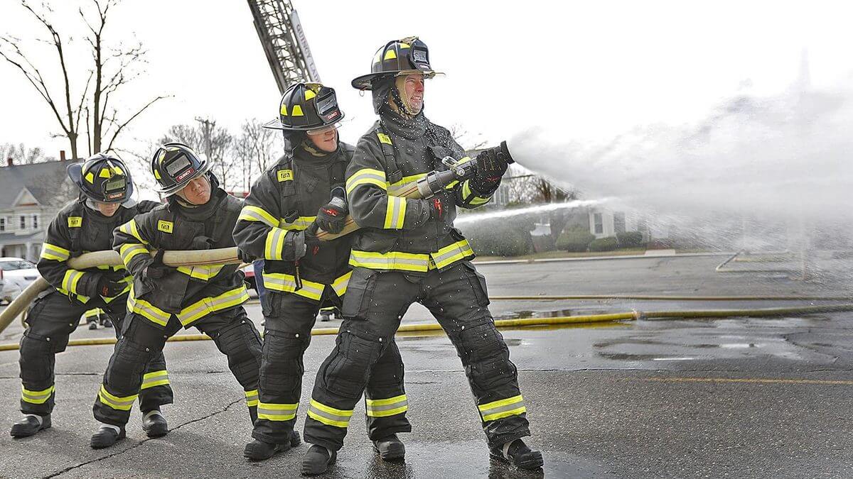
I feel like anyone who dons that Stars jersey should immediately slide down a pole, board a truck, and race to the scene of a raging fire. Such a disappointment, since these new NHL alternatives are so consistently terrible, whereas for more than a decade now the league has mostly produced excellent special event and alternate uniforms. For most of this century, the NHL has been the best-uniformed league in North America.
As for Dallas, it doesn’t even have the most iconic skyline in Texas!
Good one! Firefighters photo now added!!
Why does the Michigan State basketball team need new hockey jerseys?
Pelicans jersey leaks when almost all of the city is without power (and will be maybe for a week.) If no one can see the leak, does it count as a leak? Ha!
What a fantastic quilt!!! What a great idea Joel!
Maybe it’s because I’m a 90’s child, but there’s something I’ve liked about the highlighter green and black look.
Yeah, I’m with you. I don’t have any issue with the color. Plus the base design of the jersey is nice – I really like the halftone effect on the numbers.
Its the 1990’s all over again with these disgusting NBA jerseys. Who OKs these horrible designs?
Maybe it’s just how my eyes are reacting to the Stars uniforms, or a crappy computer screen – but the group shot, of the different player jerseys – the highlighter green is so bright, it looks to me like the black is turning green.
Did Jason Wright really use the word “shittiest” in his President’s Weekly Brief? Classy!
“the merch tail wagging the on-court dog”
Obviously this happens, but in this case, it seems like an overly cynical way of looking at something that could also be phrased as “doing something for the benefit of the team’s fans”.
What benefit is that?
Parting fools from their money
Legitimate, non-snarky question(s): does the highlighter green color get a blanket poo-poo’ing because of the color itself? Or because of external factors? Like I know it’s a fad right now and lots of people/things are using it, and mostly using it poorly, but is the color itself the issue with the uniform, or is it the trend that’s the bigger issue?
Put another way: this site’s aversion to purple is well-documented, but so is its opinion that teams like the Vikings should never stop wearing it because it’d be weird if they ever did.
I know it’s not a perfect comparison because the Stars up until yesterday WEREN’T highlighter green at all, but if a team ever came along and tried to really own it as part of their aesthetic, as a primary or secondary color to their scheme, would they automatically be better off with standard kelly green because it’s less silly? Or is it better to try not to pigeon-hole every single sports team into only a handful of colors because those are the colors we’re conditioned to seeing in uniforms? Does this site ever see itself praising the design of a new uniform that contains neon, because of the rest of the uniform’s design and how it incorporates neon?
Some things just don’t look good on the field/court/ice. Neon colors are among them.
Does this also include purple? haha
I like it.The Seahawks are an example where the neon green is now a part of their identity. I like it more in small doses as trim, and hate their all neon color rash look. Actually thought the Krakens should have used neon green in place of the red.
Also it’s cool that neon colors actually glow. “Fluorescent colors are ultraviolet reactive and convert light to a dominant wavelength or color.” I was skiing with a friend in the trees in deep powder when she fell and lost a ski. After digging around for about 5 minutes I spotted glowing fluorescent snow that was lit up by the fluorescent bottom of the ski.
Dallas Stars.
I don’t like neon green on its face. In practice, it’s quite trendy, so double yuck. And I despise uniforms where the jersey and the numbers are basically the same color and you need outlines. So tripe yuck!
But I have two small good things to say about the new black and neon uniform.
(1) That there is literally no other color. Just neon green on black. Anything else would muddle it up and make it less visible.
(2) I kind of like the Stars’ use of perforation patterns to get the bevel look. I find the bevel look to be about ten years dated, but the Stars need as much definition in the monochrome numbers as they can get (see above, they’re pigeon-holed, no extra colors!), and these bevels are a creative way to get a little bit of texture on the jersey. And I don’t know how often I can cogently say “texture” and “polyester jersey” in the same sentence!
Clarification on the EFL Cup note in the ticker. (I’m not going to mention the pizza chain for all sorts of reasons.)
The Cup is considered a lesser trophy in English soccer, but it’s not just for third and fourth tier clubs. Premier League and Championship League clubs compete along with League One and League Two clubs. (The confusing thing about all of this is that League One is actually the third tier league in England, and League Two is the fourth tier. Because why call things what they actually are, right?)
AJ, You haven’t got this quite right.
The EFL *Cup* is the third most prestigious competition in English football, but it *isn’t* being named after a pizza chain. It is I’m afraid already named after a Thai energy drink. (Google EFL Cup to find out more)
The EFL *Trophy* is now the Pizza Chain Trophy and it is the competition for the two lower leagues (League 1 and League 2 and some U21s teams)
Just to confuse there is also the FA Trophy which is for non-league clubs that pay their players and cannot therefore enter the Amateur Cup.
And of course, the FA Cup, the oldest domestic club cup competition in all of football/soccer.
HTH
Aled you’re totally right–thanks for clarifying my clarification.
I was thinking the sponsorship was changing from the energy drink to the pizza. Yeesh, too many trophies!
New Orleans Pelicans city flag uniform. I’m from New Orleans, born and raised, so I got it right away. Kind of cute and clever. But a candidate for an instant tweak. I would flip the numbers and the fleurs de lis, so that the number is nested inside and on top.
Then I would consider more red (bring the bottom end of the red down) and more blue (bring the top end of the blue up), at the expense of the white field. I think the Pelicans did it this way to have an objectively white jersey for the other team to contrast against. If you have a uniform that’s literally too red and too blue, you’re cramping the style of the whole damn league. Or, since it’s Nike-ville and everybody has eight uniforms for each week, maybe they manage. Anyway, yeah, maybe a “not as white” jersey would make the flag pop more, but the white version is good too. Regardless, number on top of the fleurs, that would have made it great!
I’m on a phone, can somebody mock that up?
I would center both the numbers and fleurs-de-lis vertically on the jersey so that the two outer fleurs-de-lis are essentially superimposed onto the upper portions of 2-digit numbers and the center one is superimposed onto the lower portions of single-digit numbers.
Count me in as somewhat relieved about the new Dallas Stars jersey. I was ready for worse. With all the hints about the Dallas skyline, I was concerned they might have a skyline in the waist striping. Glad it is regular hockey jersey striping. Primary crest looks good.
I am fine with this as a third because you can be a bit outside the box and take chances with the shade of green and the numbers. If this were the primary jersey then I would be upset.
Was hoping that the Stars went with a black jersey with kelly green trim. Maybe even have kelly green pants with the black jersey and socks (with green or black helmet). That may have looked fantastic.
Call me crazy, but I actually like the Stars’ unis. I mean…. it’s nowhere near as good as their green or white sets, which are amazing…. but I get the use of a brighter green if you’re going to be using black; better contrast. And I actually like the look. The logo is kind of weird, but as an “outrageous” alternative it works.
I don’t know if it is just the camera angle? But, Ngakoue appears to have the largest football helmet I have ever seen!!!!!
Slightly Less Gross: I’m not an Ireland soccer fan, so no real dog in the fight, but reason to be cheerful.
While international soccer teams don’t carry adverts on them in matches (maker’s mark aside, which is bad enough, imho) the FA of Ireland decided that retail versions of the previous New Balance shirt would carry the logo of sponsor telecomms company 3.
It’s a big 3, and it was placed where a player’s number would be.
The new jersey do not appear to have the add on the retail versions, so if they remain unsullied, at least an improvement for the fans
“Not a great jersey, obviously, but an interesting design concept.”
I think the Pelicans and Suns jerseys are obviously great. I don’t think the Blazers or Stars are obviously good, though. Obviously, I’ll have to wait and see how they look on the court/ice.
Obviously.
The jersey that the Ravens gave Dez was from 2012… can clearly see the black collar, the Nike-lace, and the darker purple on the back was the old nameplate was.
Nothing against Dallas, but “one of the most iconic skylines in the world”? I doubt most people in the U.S. would be able to identify the city if shown just its skyline.
There was an article that came out a few years ago in USA Today that claimed it.
link
I live in Dallas and let me tell you, the response to this was “Of course it is.” To be fair, about the time this poll was done, many of the buildings changed to LED lighting that could change colors. So on nights they can coordinate to have the whole downtown match. It really does look awesome.
The comment about Joe Judge and the gold plated hard-hat gave me quite the chuckle. Thanks for that!
In what may be our first Aussie rules football item in this section…
It’s the second; I sent one in. It is the first one that uses “blue collar,” though.
Chiming in from Dallas to say that nobody has ever called Bank of America Plaza ‘the pickle.’
The internet begs to differ:
link
Lived in Dallas for 30 years, never heard it referred to as “the pickle” by anyone in person. Most people refer to it as the Bank of America building or plaza.
Not saying you’re wrong (you’re the one who lives there, not me!). Just explaining my sourcing.
green weenie..
I just call it “the green building”
I’ve also never heard the pickle term until here
Paul, the Uni Watch archives show there was a Dallas Uni Watch gathering 13 years ago in 2007! Must have been your last time in the city. (I only know this because I was in attendance)
link
(I don’t live there anymore, but yeah I wouldn’t call it an iconic skyline either)
Indeed. Haven’t been back since then.
Paul, what’s your opinion on the Jazz jersey patch being for a charity? Does that make it better in your eyes or is it just as bad? They also change the colors to match the jersey so it matches. I think it’s better but still would rather have nothing there.
I have said all along that it’s the only acceptable entry in the NBA’s ad patch program. I too would prefer that it would not be there, mainly because it piggybacked on an unacceptable program. But I find the patch itself largely unobjectionable.
That’s what I think. Thanks!
Among all of my family and friends, we have always called the neon green building in Dallas the green weenie. Just sayin’…
I have a feeling that those Stars uniforms are going to look great in action against the white ice.
I don’t usually have strong feelings about basketball uniforms, but I really like the purported Suns jersey.
BioSteel used to pay for the rights to the Raptors ‘ practice facility. (Now it’s known as the OVO Athletic Centre.) And yes, it’s kind of a silly product name.
I too have been in Dallas for thirty years and have never heard anyone refer to the Bank of America building as The Pickle. I mostly hear it called The Big Green Building. I wonder where the internet picked up the pickle thing.
Paul, you mentioned that the collar of the Stars jersey has a star on it, because Texas. I’m a bit surprised that no one has mentioned this yet, but that’s not just a star. The whole collar is a wrap-a-round green/black Texas flag, rendered in green and black.
It is?
I confess that the symbolism eludes me.
The star itself is green and the top bar of the “flag” is green. So the green is in the place of white on the flag. The black background is in the place of the blue, and the striped bar of the collar is the “red”. Much like the beveling on the numbers, it’s how the flag would look if rendered on an old LED screen.
Finally, if you look at the way the star is positioned relative to the stripes, it makes the flag.
They did a similar thing on the inside collar of the Winter Classic jersey. You can see that here: link
Winter Classic uniform with some tinkering and matched with green gloves and green pants would have been an excellent regular alternate.
I think you mean an old green-phosphor monochrome CRT screen, e.g. the old Apple II series monochrome monitors. Unless you’re thinking of an original Game Boy screen…
The current Stars logo I do not like, maybe a cursive D would look better. The logo on the recently released jerseys look slightly better but the D still sucks, maybe having the Star & D WITHIN the state outline would be an improvement.
Or how about using the state outline with a star placement for where Dallas in located. Creating a logo seems to be rocket science for these companies..
I agree, the logo is not well executed.
“Or how about using the state outline with a star placement for where Dallas in located.”
Kansas City Chiefs may have a problem with that idea.
Why?
That was their logo when they were the Dallas Texans.
I associate the italicized star with Minnesota, and think it ought to be left behind, to be worked into the Wild’s iconography. A six-pointed star makes more sense for Texas because it would resemble an old sheriff’s badge. In fact, the overlapping rendering of a six-pointed badge with a snowflake is such a natural double meaning, I’m surprised nobody in hockey uses it.
Re: Suns jersey.
I think it’s interesting how many different regions call their area “The Valley”. Among NBA teams, the Salt Lake City region often uses this, as does the San Fernando Valley in LA.
I also found a Wikipedia page…luckily not all these places have NBA teams!
link
I’ve lived in Utah for more than half my life, and have never heard anyone here refer to Salt Lake City as “the valley.” I have heard people refer to the “Salt Lake Valley.”
Ah, alright I’m probably mistaken. I thought I recall seeing this when visiting the region.
In Phoenix’s case “The Valley” is not a new thing. It is nicknamed “The Valley of the Sun” and my whole life I’ve heard the whole metro area referred to as “The Valley”.
Please NBA, just stop with this.
Miss the days of home, road, and one alternate uniform. So the new Portland Trail Blazers uniform is brown with red, orange, yellow, double blue and black trim? And oh yeah, crooked striping down the side. And it says Oregon on the front instead of Portland or Blazers. Getting ridiculous, though it always has been with some of these NBA uniforms recently.
While the Mavericks’ skyline uniform doesn’t include neon green, their City Edition uniforms from a few years ago did:
link
(Note: they were also terrible uniforms)
That Suns jersey looks like a mashup of elements from the Jazz’ Red Rocks unis and the Nuggets’ Skyline jerseys. Boo!
What’s the point of having a color television when the NFL’s prime time game is dressed with the home in all black, and the visitors in black and white. Duh.
I know covid has changed the world dramatically but black and white football on HDTV? Meh, sure why the heck not. Snoozers.
Trying hard to write an antidote for all the blue-collar heartburn being shoved down our collective throats, but it’s hard to find a witty way to describe a coach who loves his players “because they’re so naturally gifted, they never need to practice.” Maybe if they came through the tunnel on gameday wearing ermine robes and gold crowns?