Good morning! Greetings from Uni Watch HQ, where all three inhabitants continue to be healthy and safe. Hope things are also well at your home.
The Chargers finally debuted their new powder blue jerseys yesterday in Tampa, as the Bucs once again opted to wear white at home (additional photos here). It’s a good look for the Chargers, but I’m pretty sure it would be even better with the yellow pants. Maybe we’ll get to see that combo on Oct. 18, which is the next time they’re slated to wear the powder blue tops.
One thing that’s been bugging me a bit about the Chargers’ new set, though: As you can see in the photo shown above, the lightning bolts on the pants are a bit underwhelming compared to previous versions. I’d like to see the bolt be a bit longer, and/or with more points. This is, admittedly a nitpick, but the bolts on the pants can look sooooo good when they’re rendered properly. The current version isn’t quite doing it for me.
In other news from around the league yesterday:
• Speaking of teams debuting new uni combos, the Rams wore blue over yellow for the first time (for this and most subsequent other photos in today’s post, you can click to enlarge; lots of additional Rams game photos here and here):
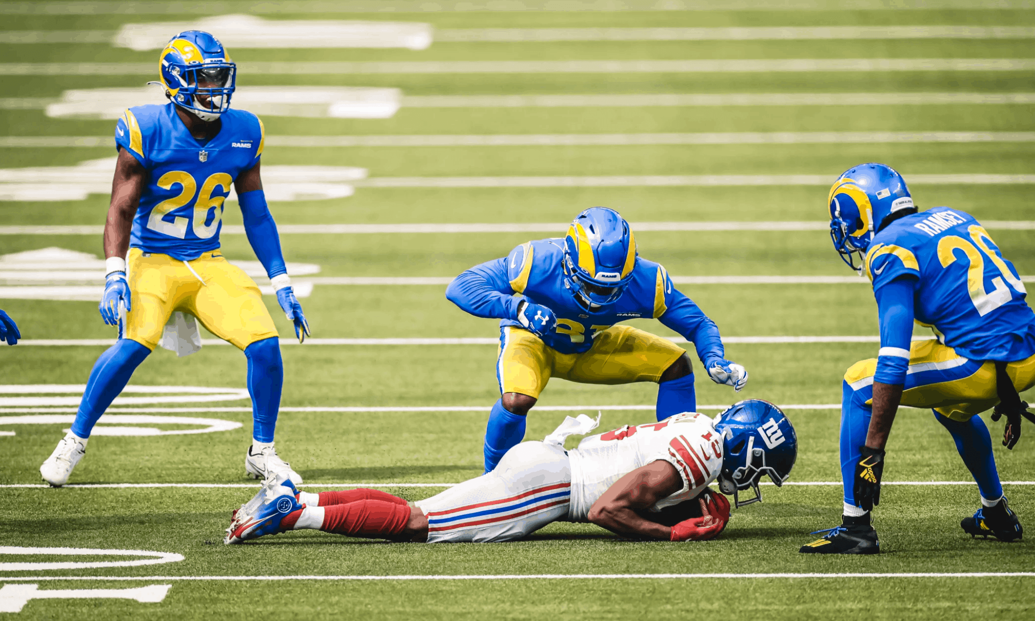
It looked okay — certainly better than the dishwater look — but there are still so many things I dislike about this uni set (the helmet horns, the gradient numbers, the pants striping, the chest patch, etc.). Also, the colors look almost too vibrant, if that makes sense — it’s like they feel synthetic, plastic, oversaturated. Overall, this set just doesn’t work for me.
• Speaking of the Rams: For their first home game, they had their ram’s-head logo at midfield. But for yesterday’s game, they used their “LA” logo:
ICYMI @jalenramsey got his first career sack 😈
📺: FOX pic.twitter.com/CTpT7sxWBj
— Los Angeles Rams (@RamsNFL) October 4, 2020
• Astonishingly, the Bears still haven’t added a memorial patch or decal for Gale Sayers. When they didn’t do it last week for a road game in Atlanta, I thought maybe they were waiting to debut it at home. But they were home yesterday, and still no patch or decal, so it appears that they’re simply not going to do it. Very, very surprising.
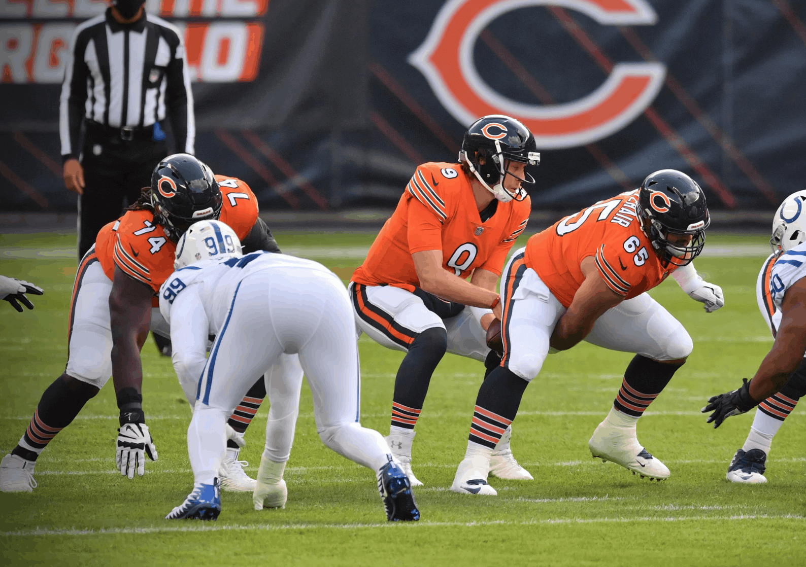
• In other Bears news, they wore their orange alternates:
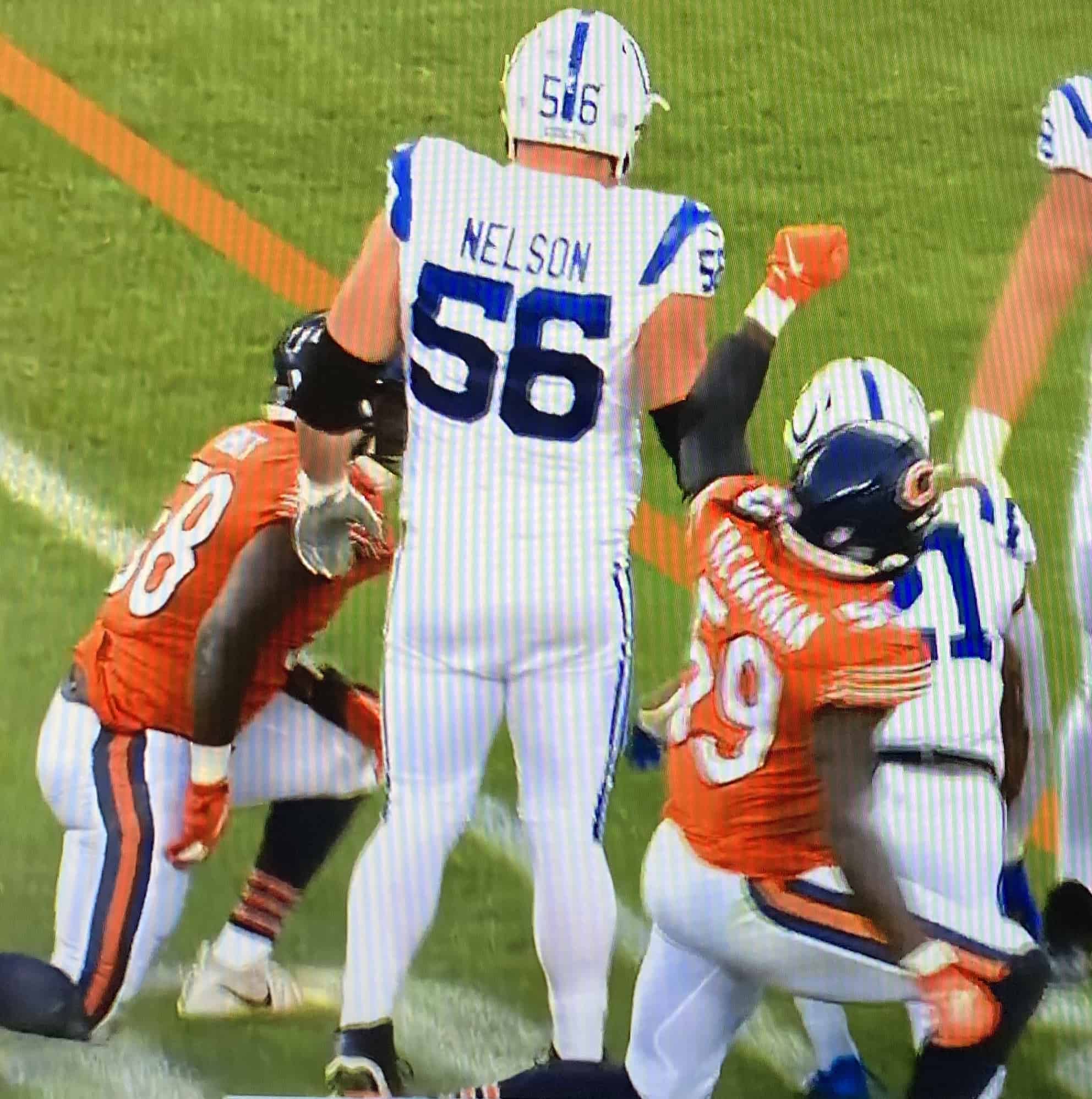
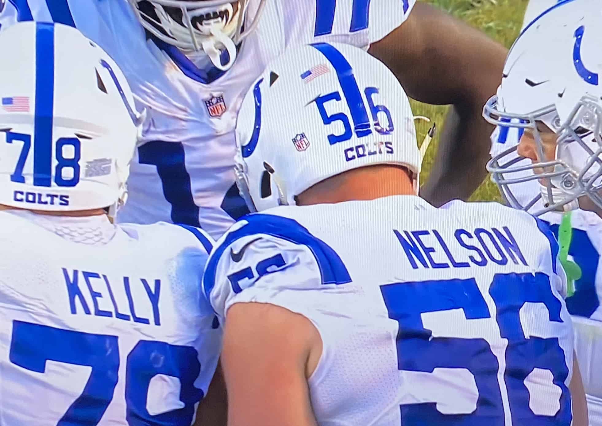
• In that same game, Colts offensive lineman Quenton Nelson’s shoulder stripes tapered to a point in the back:
• Since the season has now moved into October, there were lots of rainbow-themed accessories to promote the league’s “Crucial Catch” cancer-awareness initiative. In addition to the usual assortment of rainbow-patterned captaincy patches, waistband towels, and so on, there was a new element — visor tabs:
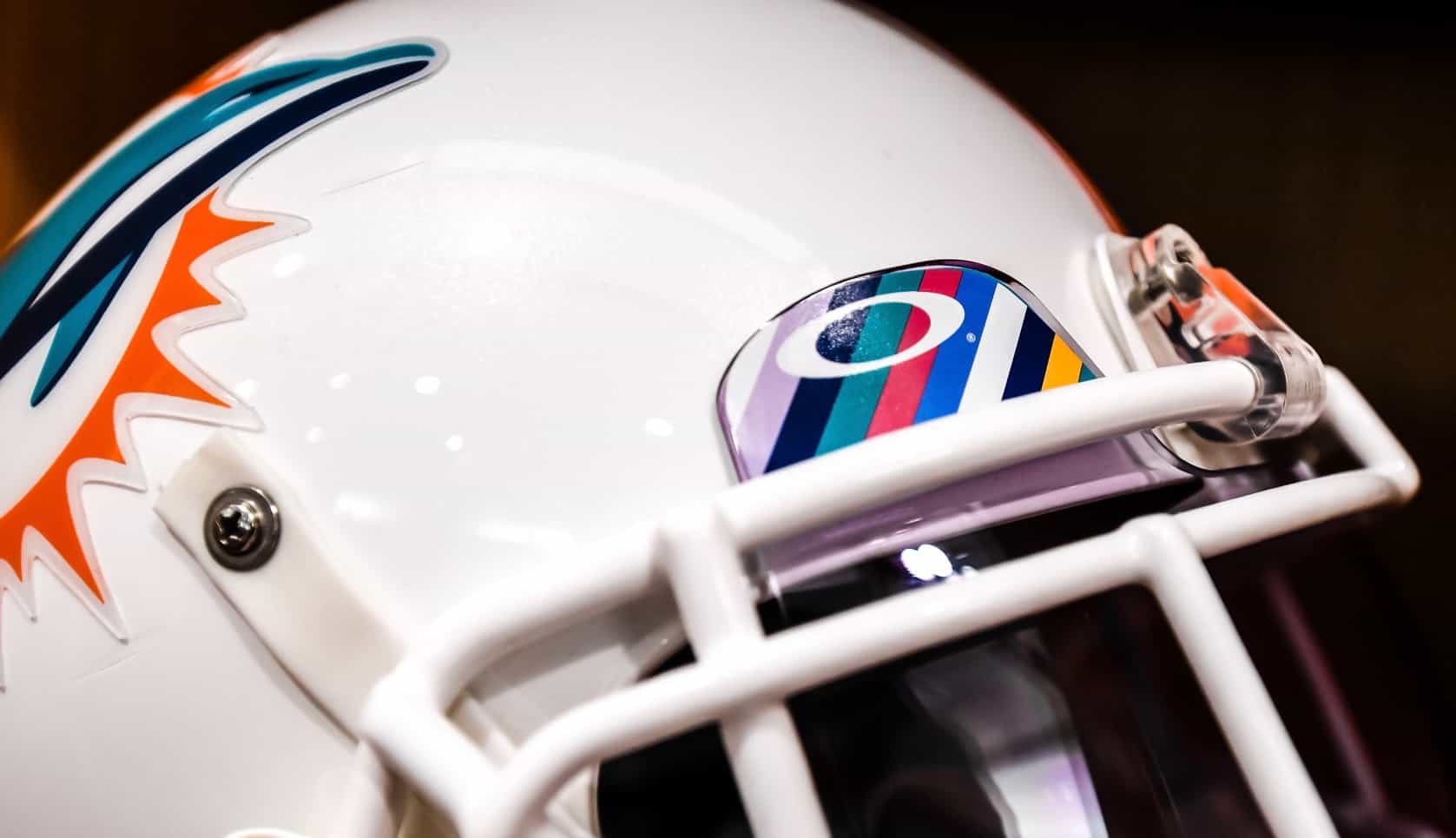
The rainbow tabs weren’t universal across the league, or even within individual teams. During the 49ers/Eagles game, for example, I saw some Niners players with the rainbow tabs and others with the standard Oakley logo creep.
• In what I assume was also a cancer-awareness move, Saints running back Alvin Kamara had — get this — pink hardware on his helmet, instead of the usual silver:
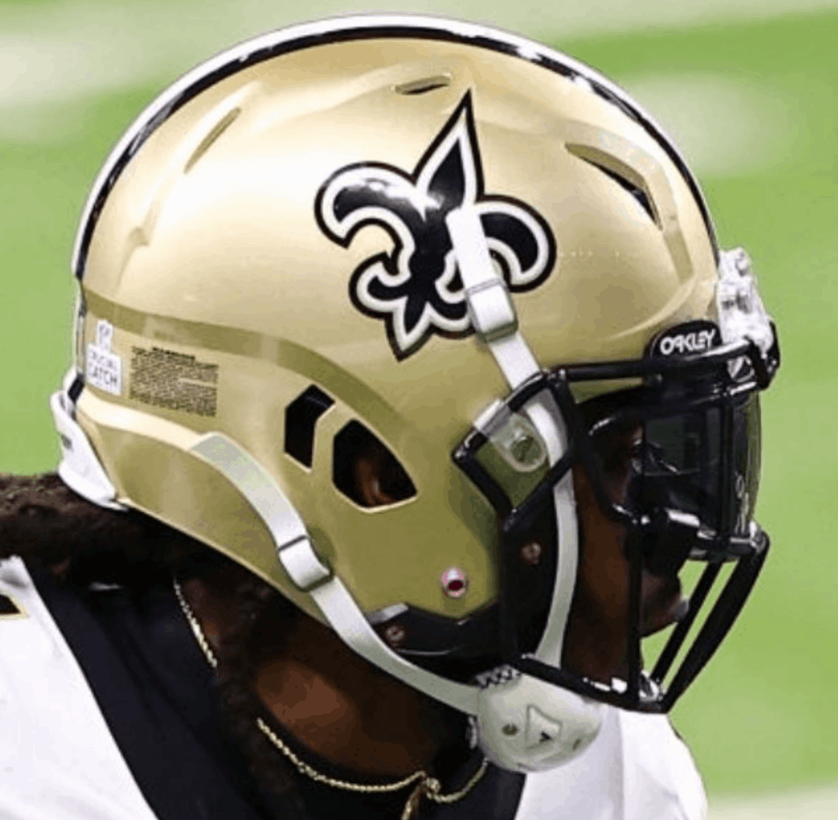
Two other things you can see in that photo: First, the NFL logo rear-helmet decal was replaced yesterday by the “Crucial Catch” logo decal. And second, not only did Kamara not have rainbow-themed visor tabs, but his tabs carried the Oakley wordmark instead of the Oakley “O” logo. Not sure I’ve ever seen that before.
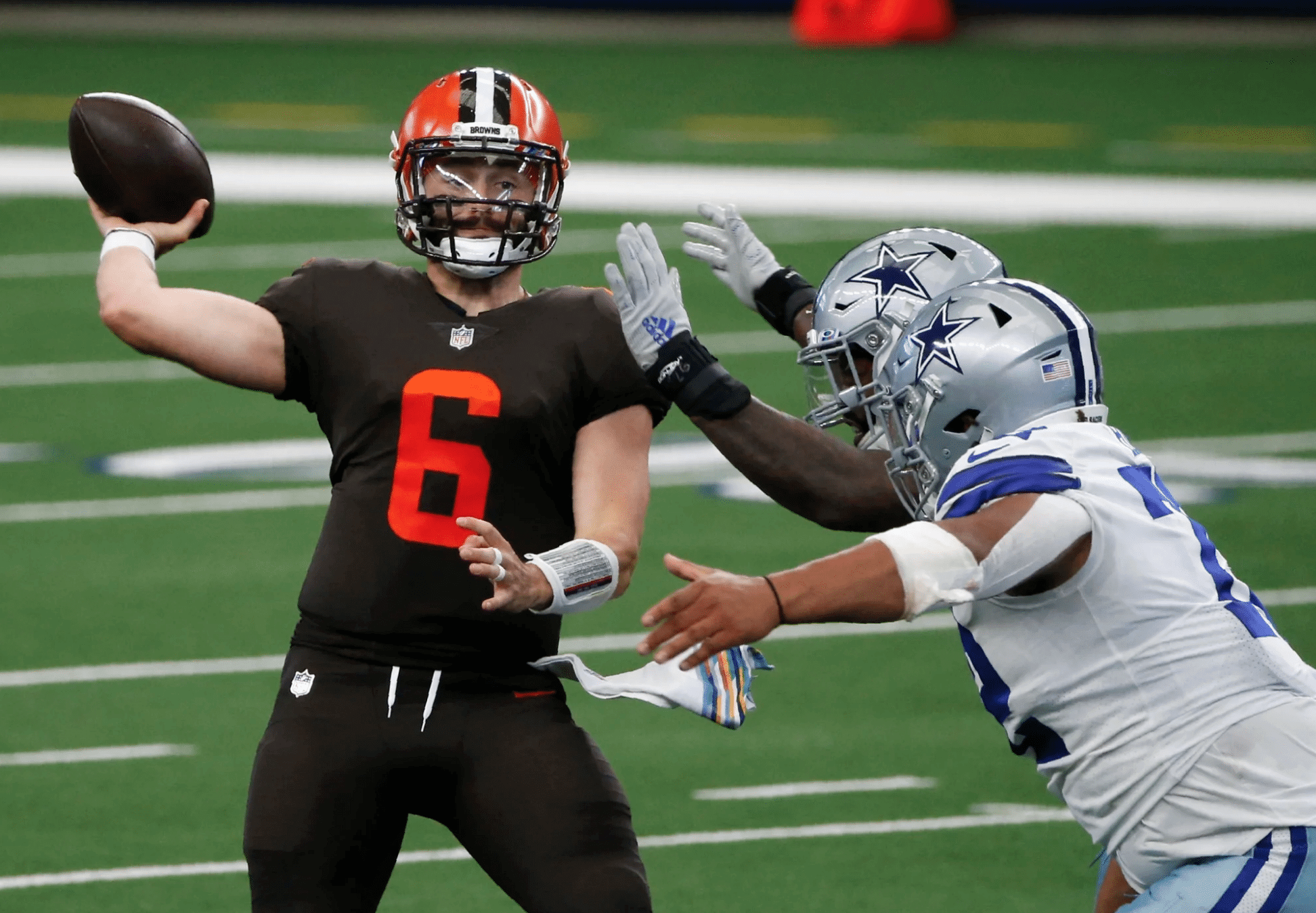
• The Browns went mono-turd:
• With the Dolphins wearing white at home, the Seahawks paired their navy jerseys with their grey pants (additional photos here):
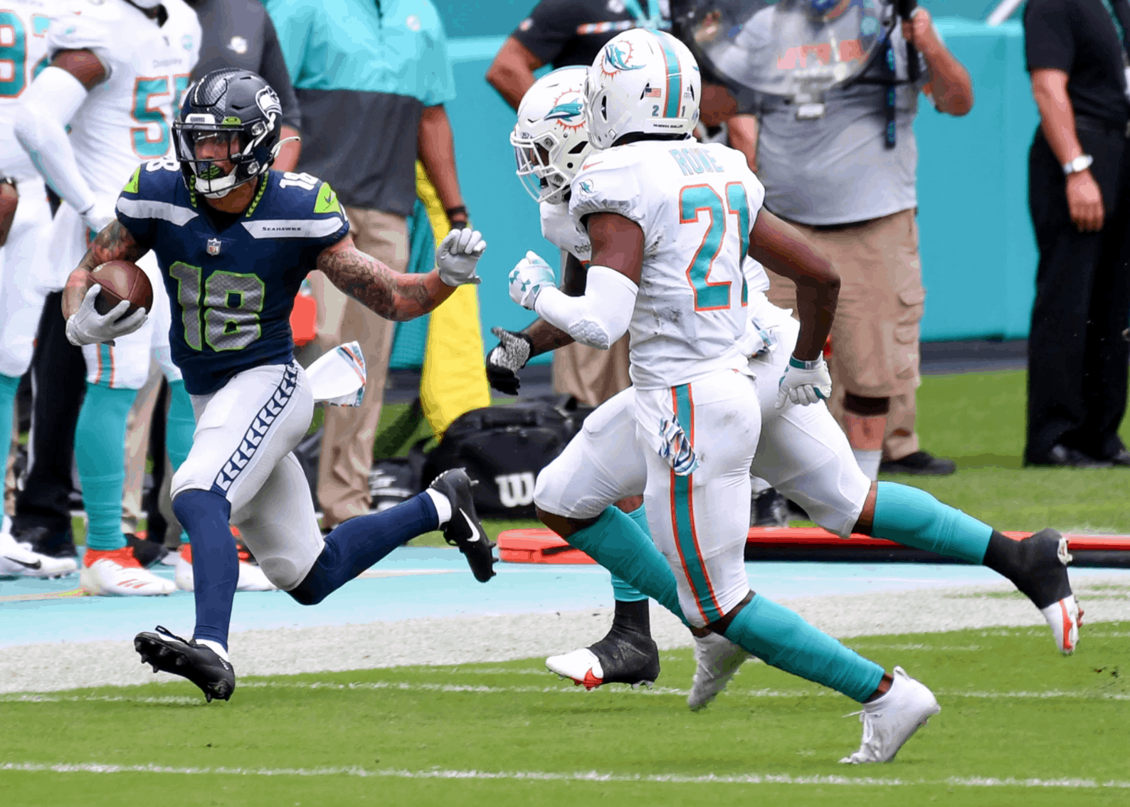
According to the Gridiron Uniform Database, the last two times Seattle wore navy over grey were in playoff losses to the Cowboys in January of 2019 and to the Panthers in January of 2016. The last time they wore navy/grey in a regular season game was way back in Week Two of 2014. So yesterday’s combo was a rare event!
• Ravens coach John Harbaugh was wearing a gaiter with an old Ravens logo that’s rarely seen these days:
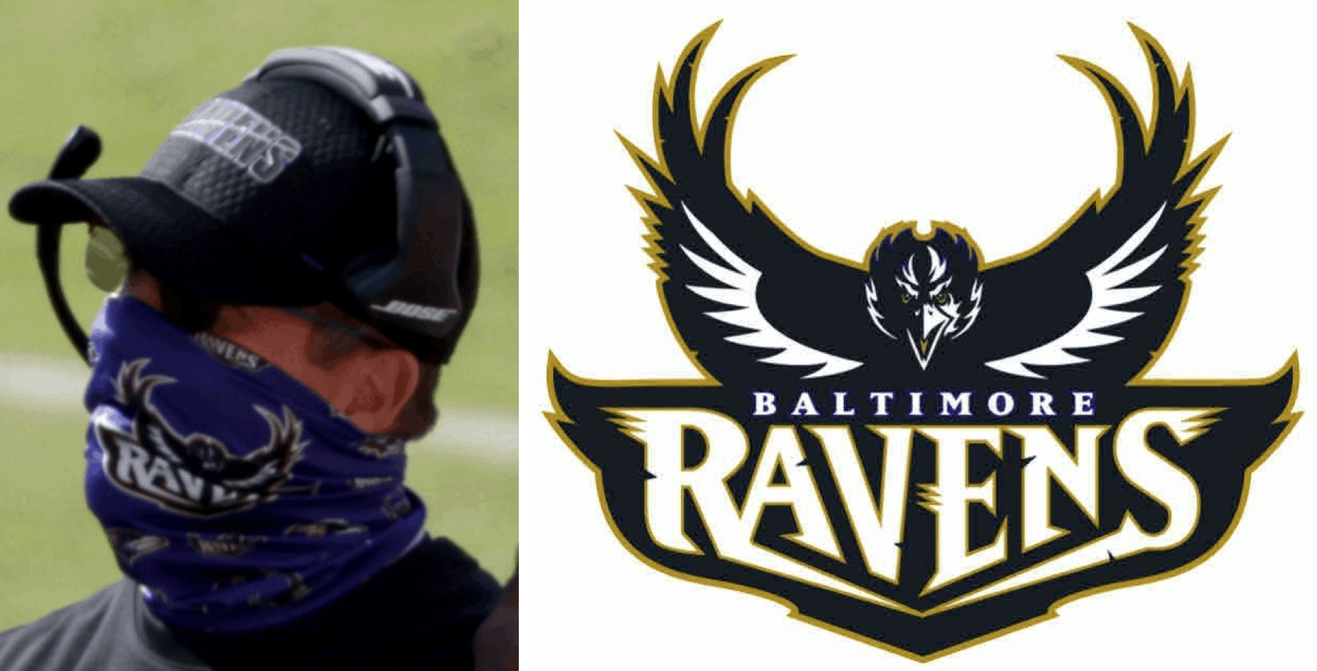
According to SportsLogos.net’s database, that logo was used from 1996-98. (And just to be clear, it is not the original helmet logo that was scrapped due to a copyright dispute. That was a completely different design.)
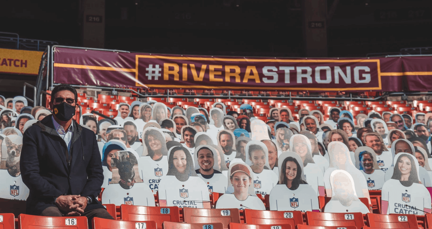
• In that same game, which was hosted by Washington, Washington coach Ron Rivera, who’s receiving treatment for squamous cell cancer, was surprised to find that the team had set up a stadium seating section with about 400 cutouts depicting his friends and family members, all of whom are offering their support (additional info here):
• Remember last week’s blog post about Oxford Pennant creating banners for Bills victories? Buffalo won again yesterday, so the latest banner was on display after the game:
Successful business trip to Vegas! ✈️ pic.twitter.com/fFRInZIEfb
— Buffalo Bills (@BuffaloBills) October 5, 2020
• In addition to the aforementioned Dolphins and Bucs, two teams wore white at home: the Panthers and, of course, the Cowboys.
(My thanks to all contributors, including Nick Allen, Cory Estrain, Jakob Fox, Kurt Rozek, and @TheWEAG, plus a special shout-out to @HelmetStalker for catching Alvin Kamara’s pink helmet hardware — a Hall of Fame-worthy spot!)
Click to enlarge
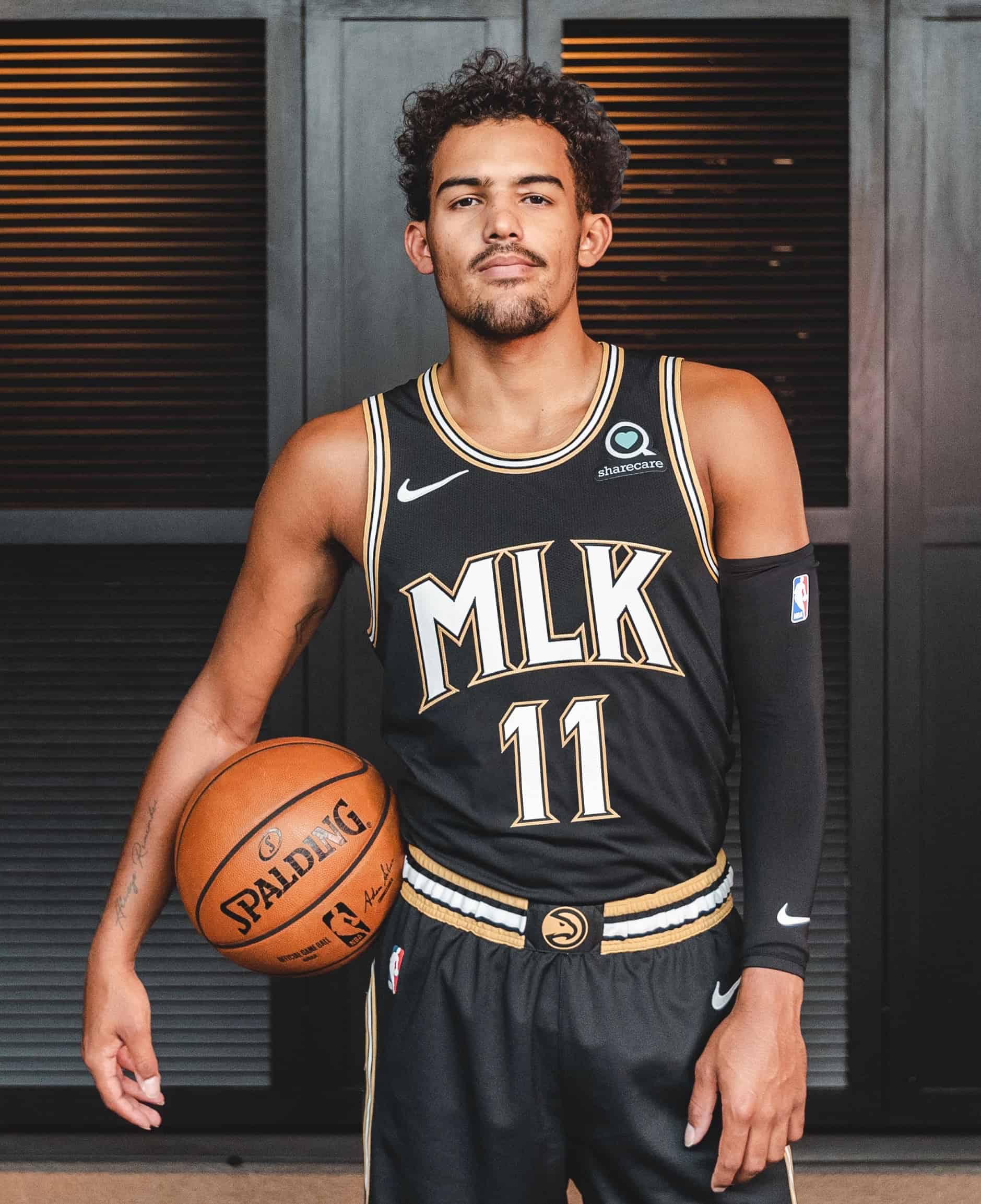
More NBA news: The Hawks last night unveiled their new City alternate, which is a tribute to Atlanta native Martin Luther King Jr. The uniform, which was produced in conjunction with the King estate, will be part of the team’s new uni set, the other components of which were unveiled back in July.
Here’s an infographic that breaks down the uniform’s various elements (click to enlarge; additional info and photos are available here, and still more info is available here and here):
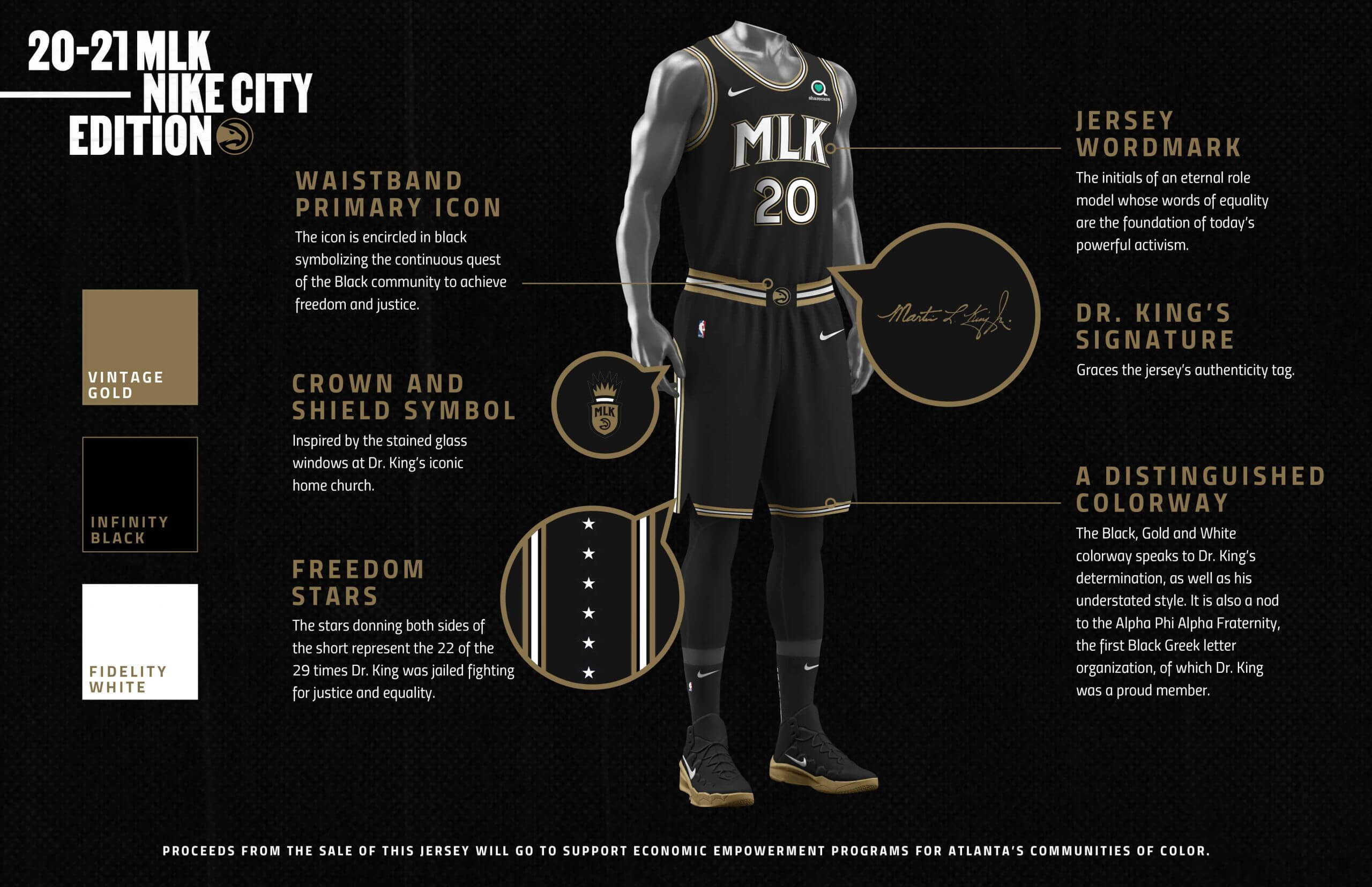
Proceeds from retail jersey sales will be donated to support economic empowerment for Atlanta’s communities of color.
The Hawks are the second NBA team to have an MLK-themed uniform. In 2016-17, the Grizzlies had an alternate uni based on the Lorraine Hotel in Memphis, where King was assassinated and which was later converted into the National Civil Rights Museum. The following year, they had another King-based uni, this one based on signage from the 1968 Memphis Sanitation Workers’ strike, which King organized.
Meanwhile, as long as we’re talking about the NBA: Last Thursday we saw a shirsey showing the 1990s tie-dye throwback that the Nets will be adding to their uniform rotation next season. Now, thanks a new retail leak, we can see the actual jersey.
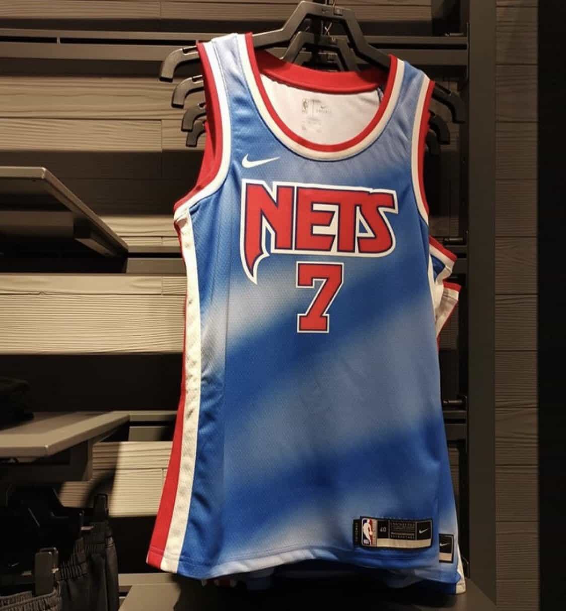
Can’t say I was ever a fan of this design, but I understand why some people feel a certain “so bad, it’s good” nostalgia for it.
(My thanks to Mike King for the Nets item.)
Photos by Tom Wolper; click to enlarge
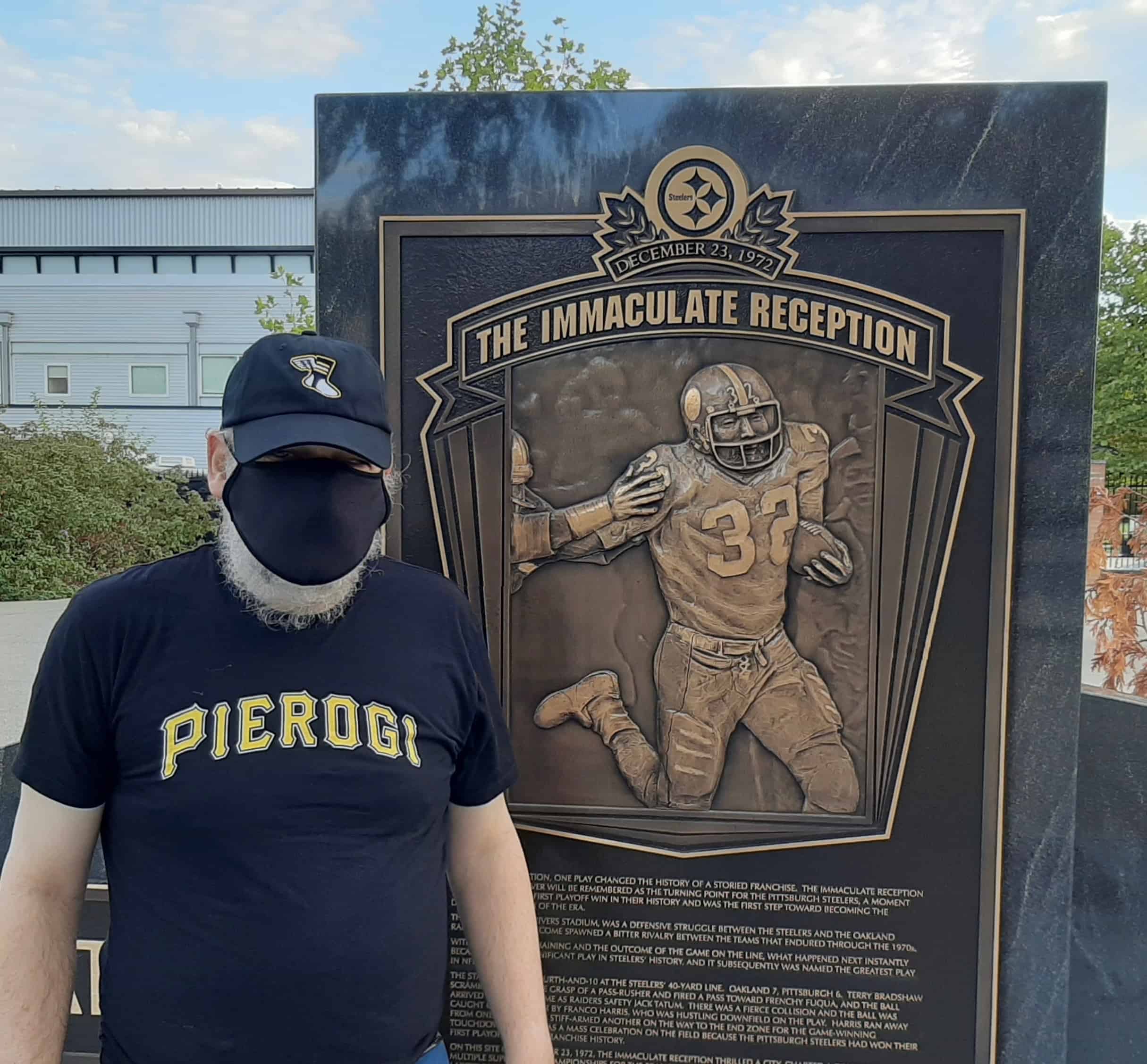
ITEM! Meet the Uni Watch Team — Jerry Wolper: Most of you don’t know this, but Uni Watch has a proofreader (and definitely needs one, given all the typos I make!). That person is longtime reader Jerry Wolper. After each weekday entry is posted, Jerry reads through it and emails me with the mistakes he’s found. I never asked him to do this — he took it upon himself to start doing it several years ago, free of charge. Every now and then I stump him with a clean post, but that’s rare, so I’m grateful for his eagle eye.
Jerry lives in Pittsburgh, so I recently sent him one of our new black/yellow Color Remix caps. He had his brother Tom shoot a few shots of him wearing it at various Pittsburgh sports spots, like the one shown above. Here’s one more:
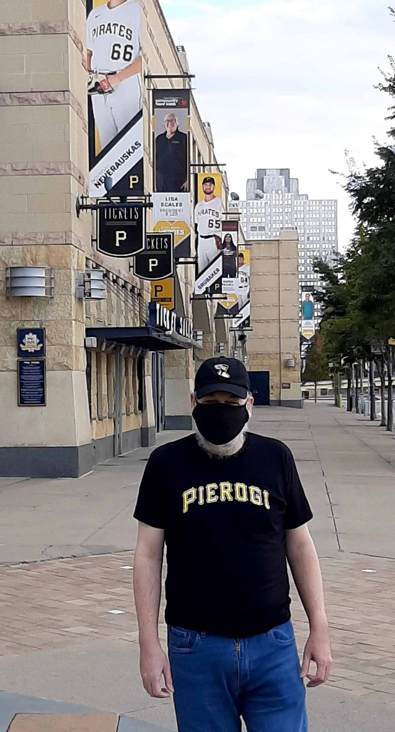
That hat fits right in, no? Nice!
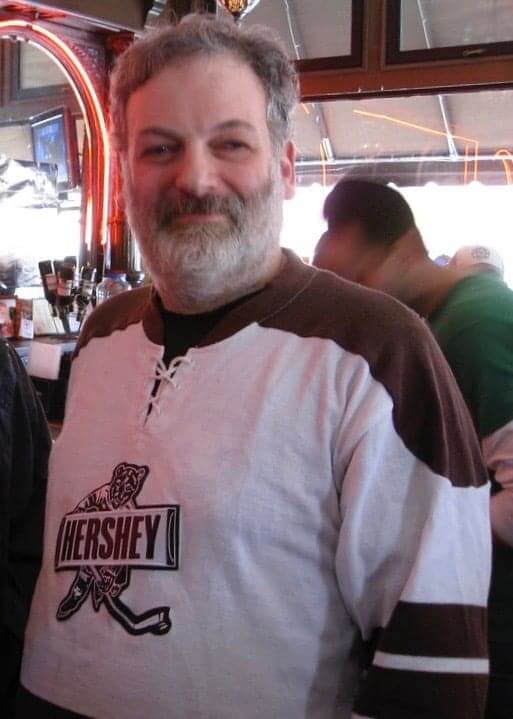
Wondering what Jerry looks like under that mask? Here’s a shot of him in an old Hershey Bears jersey, taken at a Uni Watch party in Pittsburgh back in 2009:
Hope to see you in person again when circumstances allow, Jerry. Thanks again for all your friendship and assistance — next round’s on me.
(Incidentally, I’m not sure if Jerry’s T-shirt choice was influenced by this, but Oct. 8 — that’s this Thursday — is National Pierogi Day!)


ITEM! New membership raffle: Longtime reader/pal Mike Engle has generously donated funds to cover a membership card, with the stipulation that it should go to a first-time membership enrollee. So if you’re already a card-carrying member, please sit this one out.
This will be a one-day raffle. No entry restrictions other than the first-timer stipulation. To enter, send an email to the raffle address by 8pm Eastern tonight. I’ll announce the winner tomorrow. Big thanks to Mike for sponsoring this one!
Click to enlarge
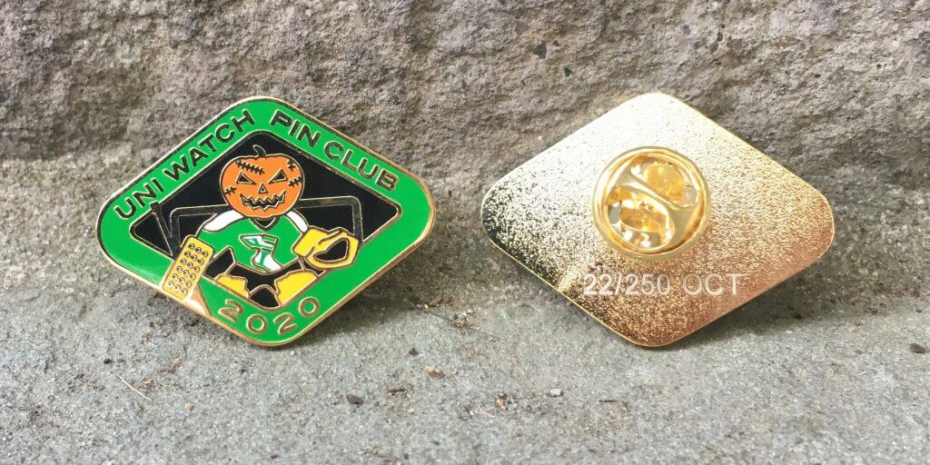
October Pin Club reminder: In case you missed it late last week, the Uni Watch Pin Club’s October design is now available. As you can see above, it features a jack-o’-goalie (complete with Gerry Cheevers-style stitch marks on his face!). It was produced in a limited/numbered edition of 250 pins; as of this morning, only 77 are remaining. You can order yours here while supplies last.
Need to get caught up? Here are our January, February, March, May, June, July, August, and September pins. (Sorry, April sold out!)
The Ticker
By Jamie Rathjen

Football News: The Bears may not have any sort of uni-memorial for RB Gale Sayers, but his alma mater, Kansas, picked up the slack over the weekend with a No. 48 on the field and a new statue (from Ryan Grimes). … The FCS’s Dayton has new uniforms, though they’re not playing this fall (from Nick Gregor). … UNC appears to have had a gingham check pattern on its uni numbers in 1955. “Yearbook photos confirm this on all jerseys, front and back,” says James Gilbert.

Hockey News: The Junior A British Columbia Hockey League’s Prince George Spruce Kings added a memorial helmet decal for former captain Chad Staley, who passed away earlier this year (from Wade Heidt).

Basketball News: The jersey patch for the WNBA Finals, which began on Friday, goes above the NOB, just like its NBA counterpart does.

Soccer News: English Championship club Derby County revealed and wore a pink and black third kit which is breast cancer-related, but presumably is to be worn throughout the entire season. … Meanwhile, West Ham United’s Women’s Super League team wore their pink shirts for the first time. … French club Montpellier is another one that annually does pink shirts in October. … New shirts or kits for Australia’s Adelaide United, Brisbane Roar, and Newcastle Jets. … Scottish Premiership team Livingston wore a black-gold-gold mashup of their two kits to solve several color clashes, including that opponents Dundee United apparently didn’t want to change at home to help them out. New signing Jay Emmanuel-Thomas and his possible “JET” NOB, which we mentioned here last week, wasn’t in the squad. … Queensboro, an expansion USL Championship team to start playing in Queens in 2022, apparently is to reveal something, like colors or a logo, on Tuesday (from Alexander Ganias). … A 12-year-old English boy has been making Bundesliga stadiums out of Lego (from Jeremy Brahm).

Grab Bag: Cycling team EF Pro Cycling revealed an intentionally bizarre jersey for the Giro d’Italia, which started on Saturday, since their normal jersey is pink and would be the same color as the leader’s jersey. There is also an accompanying time trial helmet, and the team cars carry on the theme. … Brazilian men’s national volleyball team player Lucas Saatkamp has been wearing a mask on the court while playing with his club team, Taubate Funvic, after teammate Bruno Rezende tested positive for Covid on Friday (from Jeremy Brahm). … Speaking of masks, NYC police officers have been warned by higher-ups that they’ll be disciplined if they don’t mask up. Many officers have ignored the mask regulations so far.

Good day for injections last Friday, as I got my annual flu shot in one arm and a shingles vaccination in the other. A win-win!
I’ve said this before but it’s worth repeating: Getting a flu shot is always a good idea — not just because it helps to protect you, but also because it helps build herd immunity that protects all of us. In my case, I happen to have asthma, so the flu could literally kill me. Getting your flu shot helps lower the risk for me, and for others with chronic respiratory disorders. If you’ve already gotten your shot, thank you!
Looking forward to a Covid shot once it becomes available. Vaccines work! — Paul
I wish NIKE would make a uniform that “honors somebody” without accompanying it with a cringe inducing write up.
At this point it’s almost as if they’re trying to tarnish the uniforms by making every single element symbolic of something that it’s not.
The 22 stars on the shorts represent 22 of the 29 times he was arrested?! Why not all 29? Or is it that they just wanted stars so they made something up on the spot?
Also, if you click the link to the NIKE infographic, the first two things you can click on are the NIKE logo and the advertising patch. Just disgusting when they’re allegedly honoring a great American icon.
That bothered me too. Is there some symbolism to 22/29 that I can’t figure out? Seems entirely arbitrary for any part of the uniform, especially one as trivial as stars on this set.
I’ll try to get an answer on that.
Update: “Dr. King was arrested a total of 29 times. 22 were directly related to his fight for social justice for all.”
Thanks for looking.
Those Cleveland Browns Unis are even worse because you can’t make out the numbers. What ever happened to the color WHITE? The more games I watch, the more I’m convinced that all dark colored jerseys should have white numbers.
Browns’ fan here. I actually love the jerseys. Love the way the orange numbers pop in combination with the helmet. Wouldn’t mind some striping on the pants and orange socks with stripes, but the jerseys are clean and have some pop. Nice change of pace jersey.
The jerseys are fine. But they should never be worn with brown pants.
If the Browns had a few Super Bowls under their belt, we’d say “mono-chocolate”.
Rams uni’s would be so good if they would just ditch the gradient numbers and make them yellow. Even if they had that same texture in them. They would be good with the new horns and the patch (which i think is pretty cool) and the pant striping. The gradient numbers are just dumb. Such a simple fix that would be a HUGE upgrade.
I wish the Bears would go white-over-white on the road as a tribute to Sayers.
That said, I love Sayers as much as the next Bears fan, but I have to say their restraint is refreshing; almost stoic in this day and age (It can’t just be ignorance, can it?). I’m old enough to remember when teams didn’t knee-jerk react to an older player’s death; even an iconic one.
(Now watch them get league clearance to all wear #40 next week, or something similarly over-the-top).
This said about a franchise which still wears the initials of a coach who passed away almost 40 years ago…
I agree that there’s something refreshing about a team not doing the reflexive, almost prescripted-seeming thing. I’m just very, very surprised by it.
I wish the Bears would go white-over-white on the road…period.
as a bears jersey, i find this weekends orange top combo sort of out of place and amateur looking. now if this same jersey was a broncos set, it’d be quite nice. of course anything simpler than what they have now would be nice. the broncos are top of the heap of teams whose 90s not-so-distant-future redesign has overstayed its welcome.
Sayers died more than TWO weeks ago and the Bears STILL don’t have ANY memorial patch or sticker or even a black strip SOMEWHERE on their uniforms?
This is beyond vile and repulsive.
Literally EVERY other team on the goddamn planet gets a patch or sticker out or sometimes with baseball everyone on the team has the players number on their jersey within 3 days of the announcement of the players death.
Kansas had an AWESOME helmet sticker honoring Sayers that Saturday but no, not the Monsters of the Midway.
When Ditka dies I PROMISE you the Bears will have a sticker AND a jersey patch out within 12 hours.
So repulsive.
Is it repulsive or is it beyond repulsive? You don’t make it clear.
In your write-up on Jerry, your “corrections guy” you misspelled hat as hit.
Not only that, but Jerry missed that typo when proofing today’s post!
The irony is not lost on me.
There is a typo in the Hockey Ticker item. The man’s name is Chad Staley rather than Chad Spruce.
Fixed.
I get what you mean about the Rams’ uni colors being almost too vibrant. That said, I have been surprised to find I don’t hate the gradient numbers like I thought I would. They do seem kinda SoCal-y and don’t look bad, IMO. Gimmicky but not bad. I’ve watched the Rams carefully because for me they were the worst of all the new uni opportunities lost (Patriots were second – they’re hopeless but not as overall shocking as the Rams). Dishwater is the worst. Yesterday’s combo has been the best. I don’t usually like any mono unis, so the all blue is bad too, except for the gradient numbers.
Agreed. I find that I prefer the Rams to the Chargers most weeks so far, largely due to the numbers. The Rams numbers are kind of dumb, but entirely legible. The Chargers’ numbers are italic, which reduces legibility on the field of play. For jersey numbers, looking good is the second priority; being legible is the first priority. Better an ugly but readable earns a C-minus; being less legible but looking good earns a D-minus.
As much as I like a Royal and Yellow look, I wish the Rams would have gone Navy Blue/White. Maybe we can get that as a throwback look when the single shell rule is shelved.
One other thing from the Kamara photo. The crescent-shaped piece near the ear hole and the bottom of the face mask is black (on an otherwise gold helmet). The only other team I have seen to have this in a contrasting color is Washington (yellow on burgundy).
I keep wondering if the reason the Bears haven’t done a Sayers tribute yet is due to the wearing of their orange alts this weekend — Basically, thinking that they are waiting until the next time they wear one of their regular sets to unveil it.
I’d like to see the Bears do a throwback to the Sayers era — just the plain white wishbone C with no orange outline.
I wonder if the bolt looks underwhelming because the length of the pants themselves have shrunk?
Got our flu shots last week, I echo your sentiment of their importance!
I’ve gotta call BS on the Hawks use of “vintage gold” in that uni as an ode to MLK’s fraternity. A Phi A uses a true yellow (like the new Pitt color, not the just retired Pitt color).
link
The weirdest part is the Hawks’ new uniform actually features a yellow as well. This uniform doesn’t have much character, but had they swapped it in for this old gold, it would pop so much more.
Also: why not just give the proceeds directly to the King Center, which has been struggling financially for years instead of “to support economic empowerment for Atlanta’s communities of color”?
Either way, as someone who’s long called for the NBA to embrace the black community more directly in its uniforms, this is a welcome move. Black History Month uniforms should be a think, just like Chinese New Year and Hispanic Heritage are.
Re: the Nets.
I remember years of frustration waiting for Medalist/Sand Knit or Champion to make pro-grade replicas of the Nets 1990 road jersey. All we got were the screen-printed replicas. Yeah, I could have gotten a game-worn but that runs into money.
It’s been three decades, but the Grateful Dead Nets jersey is coming back! Happy!
“Also, the colors look almost too vibrant, if that makes sense — it’s like they feel synthetic, plastic, oversaturated.”
You mean, like Los Angeles? :-)
Anyone else read Atlanta’s MLK jersey as an abbreviation for “Milwaukee” at first glance? The colors look more in line with the Bucks’ current set than with whatever the Hawks wear these days.
I did, and I also saw “Milk.” I only read it correctly after I noticed the Hawks logo on the shorts. Then it clicked as Martin Luther King, Jr.’s initials. A white dude in Wisconsin might not be among the core target audience for this uni, though. It might be that folks in Georgia, given the context of their location, will understand the initials as intended on first glance in a way that I did not.
Navy over grey is a nice look for the Seahawks. Maybe their best current combination.
The Rams are a mess, but I like the helmet color in isolation.
If the Seahawks would wear Blue over Gray for home and White over Blue for road, they would actually have a decent set. I think that unlike some of Nike’s other attempts at “edgy” the Seahawks’ set has aged very well.
I wish their decorative pant stripes had a little neon green in them. One-color looks kinda cheap.
I love the navy over gray too. Nice to see a contrast.
When the home team is wearing White, Seahawks usually go Blue over White. The Blue over Grey was indeed a rarity. I don’t believe the Seahawks have ever gone Blue over Blue on the road, reserving that as their default home look.
Week 16 at Dallas in 2017 they went blue over blue.
I don’t believe the Seahawks have worn blue jersey over white pants since they switched to this navy uniform in 2012. They used to when it was the slate blue unis.
The rare times it is not blue over blue with this uniform, they go blue over grey.
link
Blue over white would look strange as a combo considering there is no white in the current navy blue jersey.
They wore the blue jersey/white pants combo in the 2013 season opener at Carolina
link
Aren’t those the grey pants? They look darker than the Panthers’ white.
link^1
“I don’t believe the Seahawks have ever gone Blue over Blue on the road,…”
The Seahawks did this a few times with the 2002-2011 ‘scuba gear’ set:
2003 at AZ, 2004 at TB, AZ and DAL, 2005 at WAS 2008 at MIA and DAL, 2009 at DAL, 2011 at CLE and DAL.
What happened to the striptes on the Browns’ pants for the “Color Rush” uniforms? They had them last year.
They lost the stripes for the color rush with the redesign. Downgrade IMHO (of an already bad set).
The color rush pants from last year with the orange stripes are now their new “road pants” that are to be paired with the white jersey. they haven’t had a chance to wear them yet because in both of their away games the home team chose to wear white. Their next road game is in two weeks at Pittsburgh it’s likely you’ll see them then.
That was pretty much my only gripe when the Chargers released their new set. The BOLT just seems “weak”. I was hoping that it might look better on the field, but sadly it looks worse in action than it did in stills. Yesterday, they looked the best they’ve looked all year, but I’m really looking forward to the blue over gold. To me, that will be their best look.
The brightness or over-saturation of the Rams’ colors start with the helmet. The “candy-apple blue” look is a distraction to me.
Flames “full retro”
link
I suspect I’m alone on this, but i thought their early 2000s was their best look. Prior to the Reebok redesign. I know how much we don’t love black for blacks sake, but I thought they got the amount of black right.
link
The overall design was fairly decent but the black C was not a good idea. If that was white with black & yellow trim (or yellow with black & white), that would have been a pretty good look. The flaming horse head logo was flat-out laughable.
What a massive upgrade! The white version of these is maybe my favorite hockey uniform ever, back to when it had a stylized A logo.
Hopefully when they inevitably roll out a 3rd jersey, it will be a fresh take on this classic look and not just a color-swap.
They had the red jersey with the black C shown on the website in-between the retro jerseys, so it looks like that will be the new alternate, hopefully they drop the flags in doing so. Although this picture looks like the flags are still there.
link
Also there’s apparently a new “fourth jersey” program the NHL will be starting next season, and there’s a rumour around town of the Flames going with a newly designed jersey but with the flaming horse head in a prominent role for that fourth jersey.
I thought the Chargers-Bucs game looked great, but would have looked even better with the Chargers in yellow pants and the Bucs in pewter pants.
The Chargers’ current pant-bolts are vastly better than the last ones, but they do need more points at the top and bottom so the color is not all concentrated at mid-thigh.
Tampa Bay needs to use pre-Nike shimmery fabric for pewter britches. Without it, they are just brown.
BTW, I totally dug the Bucco Bruce sign in the crowd which swapped in Tom Brady’s face.
Woof! That old Ravens’ logo is brutal.
Love the Serif Gothic on the Bills’ banner. A thoroughly ’70s typeface, with a distinct Seattle Mariners’ accent.
I had the distinct pleasure of catching a few innings of a Pirates game with the Wolper boys last season. Jerry’s memories of Pittsburgh sports teams, particularly the Penguins, are as genuine as they are encyclopedic. I cherish the memory!
If the Bears aren’t going to wear a decal or a patch to honor Gale Sayers, how about going with a white C and gray face mask to honor the Kansas Comet for a game?