For all photos, click to enlarge
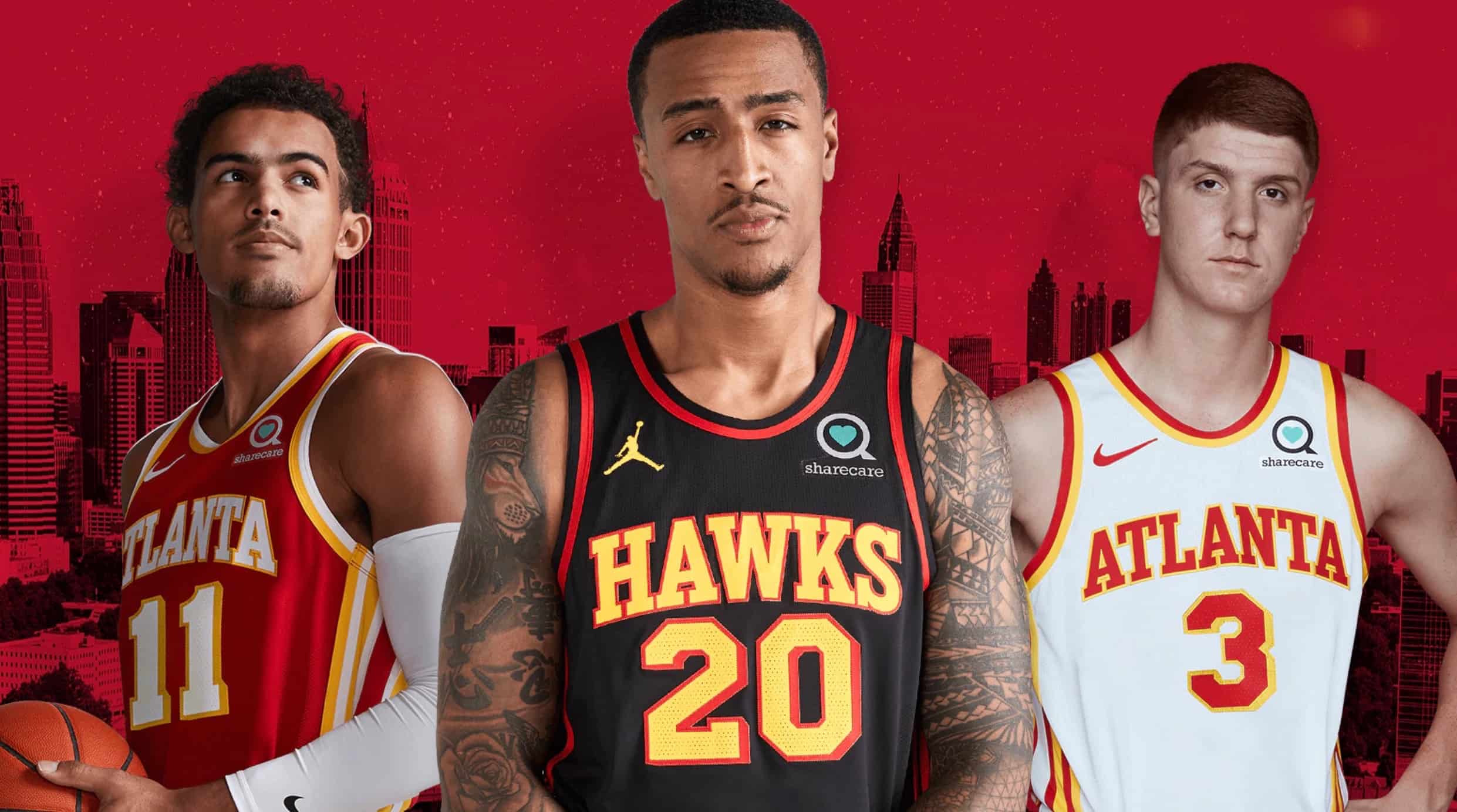
Following a leak of one of their upcoming designs, the Hawks shifted into “Ah, fuck it” mode yesterday and went ahead with the unveiling of their new uniform set, which they’ll start wearing for the 2020-21 season. The move comes almost exactly five years after the team’s previous redesign, a sorry mix of faux-quilted textures and neon firefly tones that instantly made Atlanta the NBA’s worst-dressed team. Yesterday’s unveiling, happily, marks a return to aesthetic respectability.
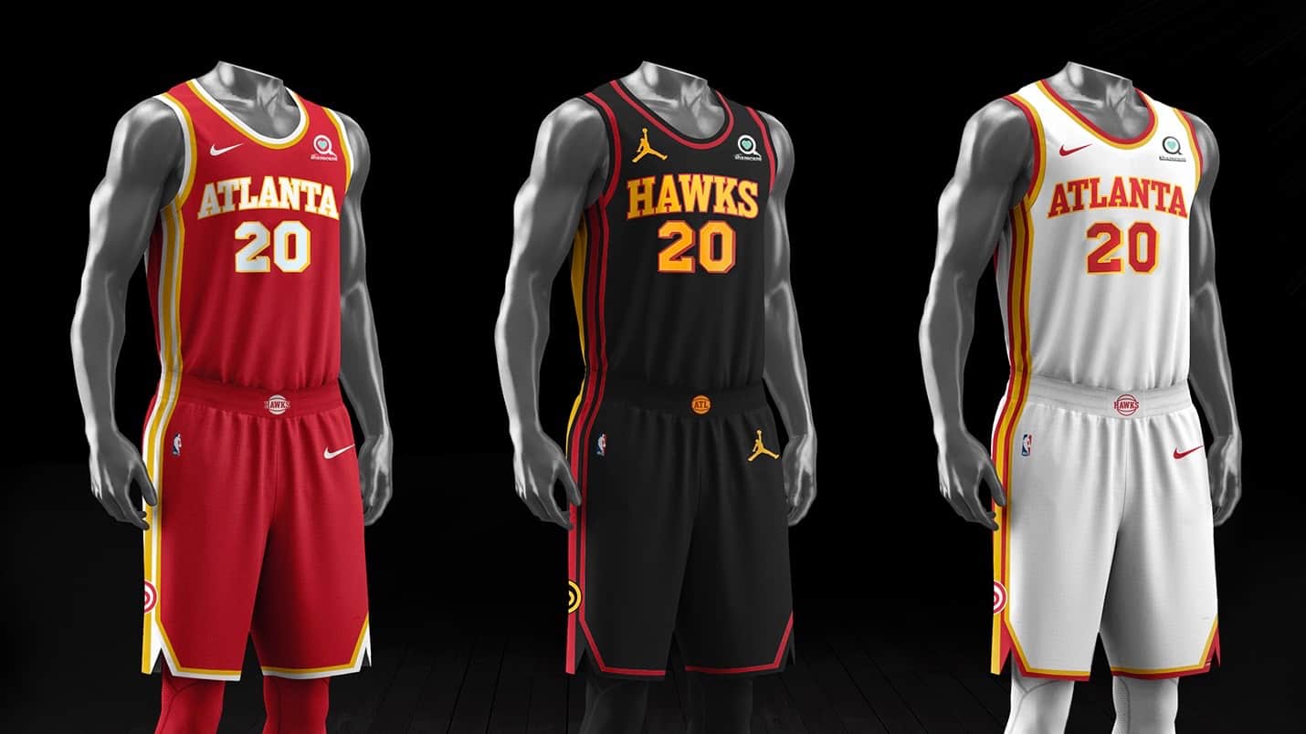
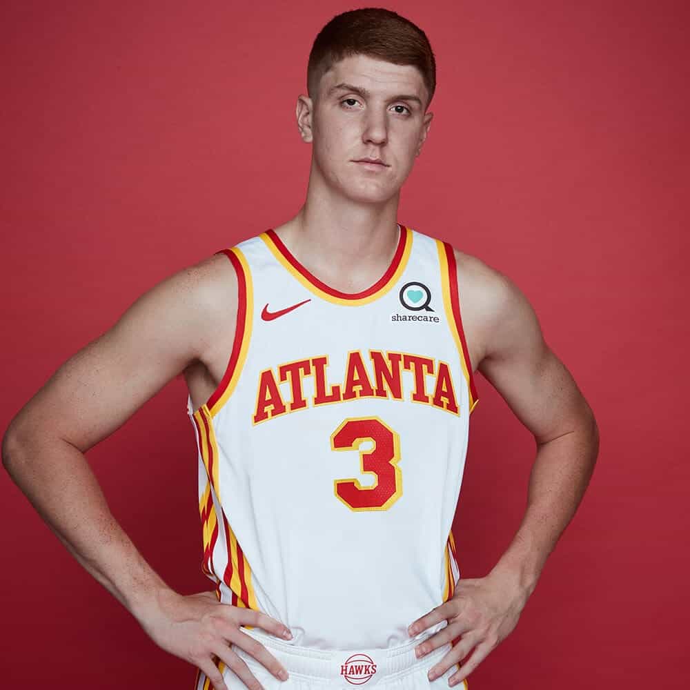
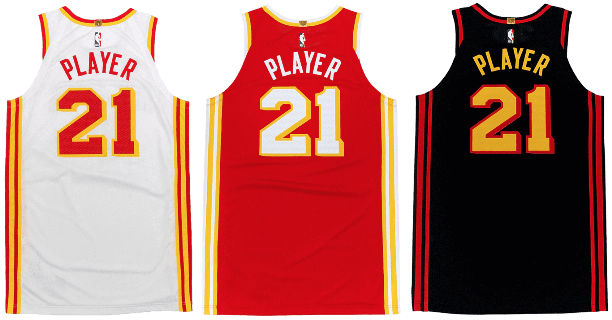
You can see the new jersey designs (from left to right: primary colored, black alternate, and primary white) above. Here’s a view that includes the shorts:
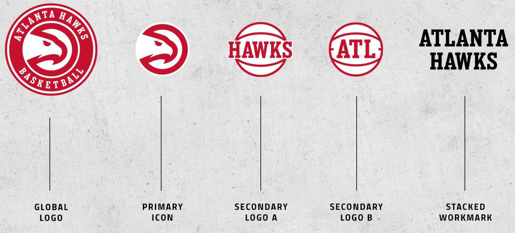
And here’s the newly updated logo set (note that the primary logo, which is unchanged, does not include a depiction of a basketball — an NBA rarity):
Let’s look at the three designs one at a time, beginning with…
The Primary White Uni
Wow. It’s hard to overstate what a quantum shift this is from the outgoing look, from the colors and the typography to the fabric pattern and the collar style. Here’s a side-by-side comparison — old version on the left, new on the right”
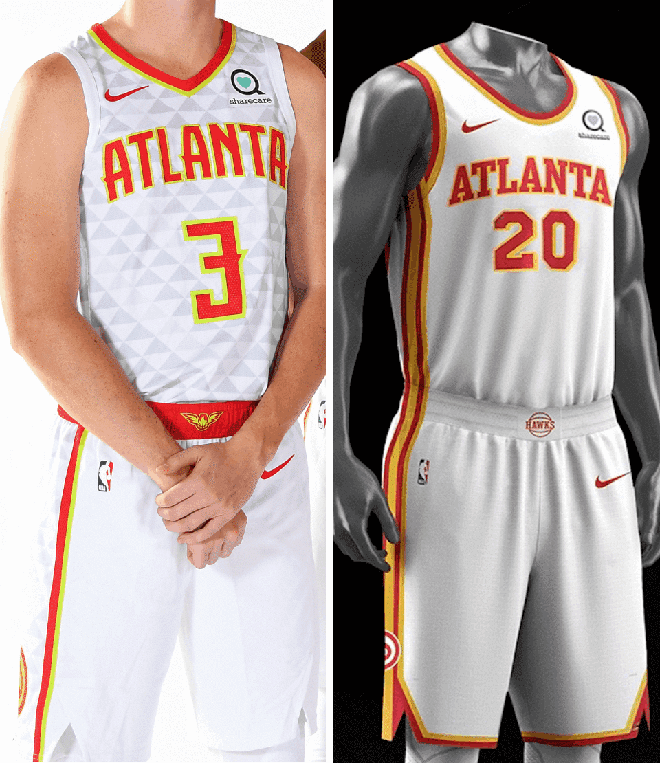
Basically, they’ve gone from Pepsi to Coke (much like the Bucs and Browns in the NFL). A bit whiplash-inducing, but it’s clearly an upgrade.
The Primary Red Uni
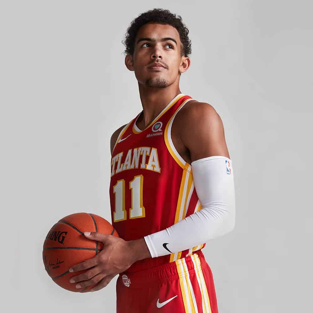
Aside from the design changes, this is a color-designation switcheroo, because the Hawks had been using black for their primary colored uniform and red for their alternate — now it’s the other way around. In order to keep things at least somewhat apples to apples, let’s compare the old red alt to the new red primary — again, old on the left, new on the right:
Again, an obvious upgrade. And I have to say, I really like the two sets of side piping on these new designs.
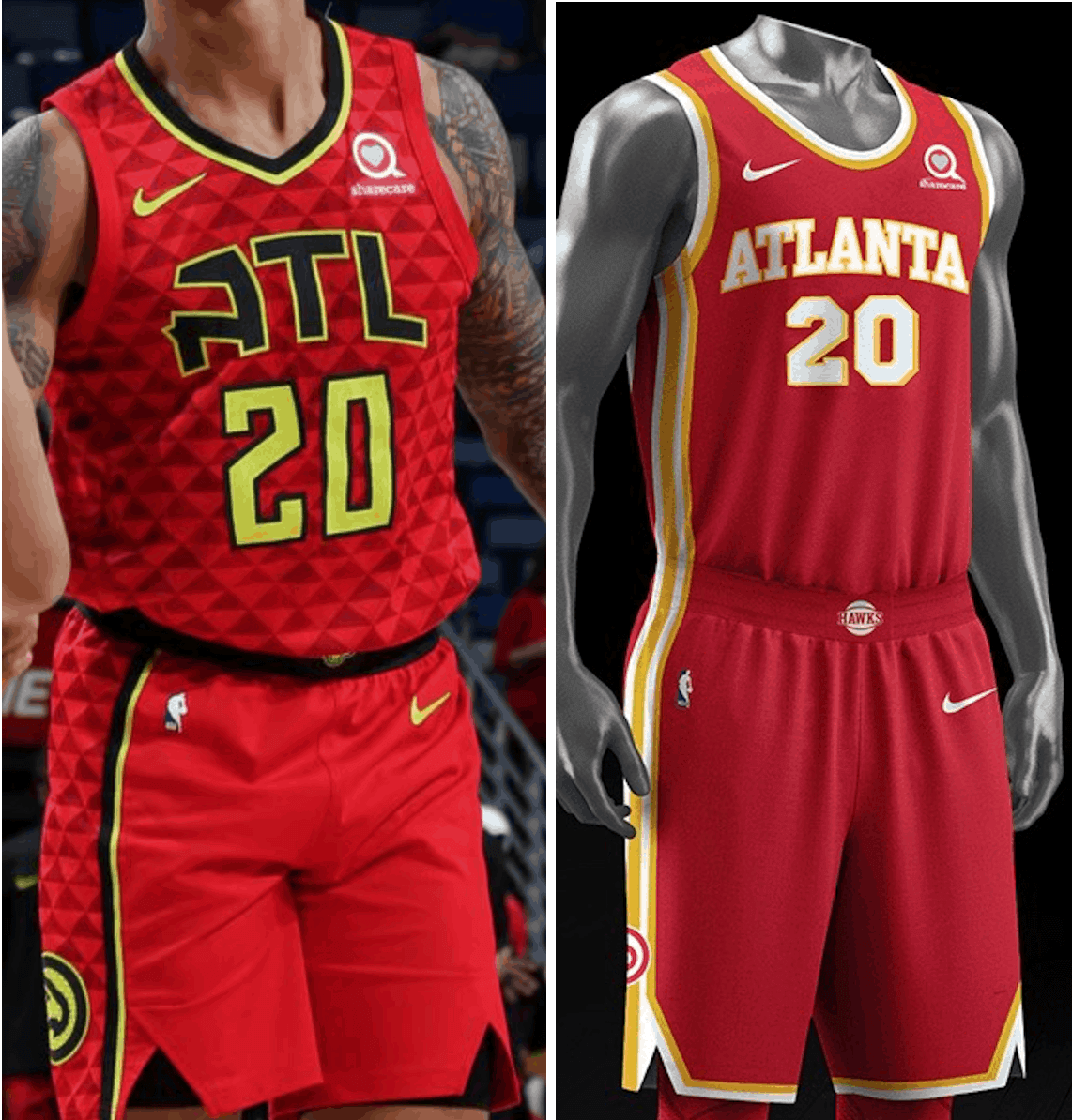
The Black Alternate
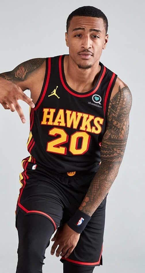
As you can see, there’s something different here — they’re using the Jordan maker’s mark instead of the standard Nike logo. That will be an NBA-wide change next season, as all “Statement” alternates will carry this logo. That’s just meaningless corporate theater, of course — Jordan, Nike, it’s all the same thing. (Shortly after the Hawks’ unveiling, other NBA teams, including the Pistons and Bulls, started sharing photos of their own Jordan-ified Statement alts. As you might expect, Piston fans weren’t too happy about it.)
Here’s how the new black alternate compares with the outgoing black primary — old on the left, new on the right:
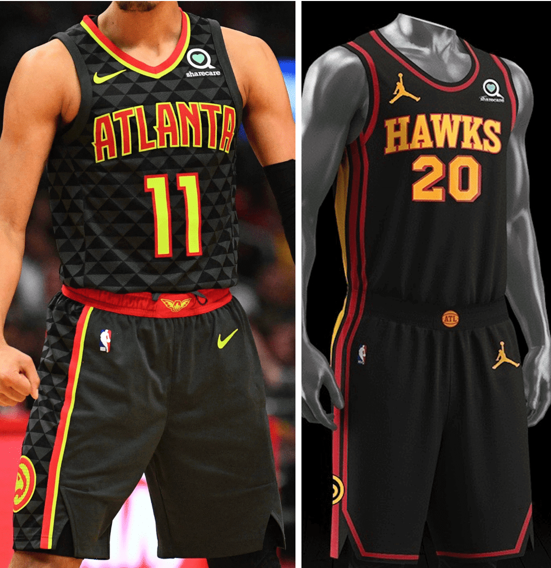
One small detail of note: The two new uniforms featuring an “Atlanta” chest insignia use the “Hawks” waistband logo, while the one with the “Hawks” chest mark is paired with the “ATL” waistband logo.
———
There will also be a new City-themed alternate, which will presumably be revealed later in the year.
As for the number and NOB treatments, they’re as straightforward as the other elements:
So to sum up: They looked like clowns, but now they look like a normal basketball team. There’s nothing particularly remarkable about the new set (you could swap nearly any team identity into this design), but that itself is somewhat remarkable in today’s NBA. Sure, it’s a bit plain, especially for a franchise whose visual history includes racing stripes, diagonal typography, and gradations, but it’s still an upgrade. Let’s be thankful for that and assume they’ll get more “innovative” again in a few years.
I mentioned earlier that the Hawks’ redesign mirrors the recent back-to-basics moves from the Buccaneers and Browns. Could the pendulum be swinging back toward classicism throughout the wider uni-verse?
If you’d like to learn more about this uniform set, there’s more info and photos — along with some truly epic color-name nonsense and other cringe-inducing corporatespeak — here.
(My thanks to Twitter-er @Nicholoff for the Pistons item.)
Native/Indigenous update: Lots of developments in the past few days on the Native/Indigenous front, where things continue to be extremely fluid. Here’s the latest news regarding top-level pro teams:
• Cleveland Indians players, along with manager Terry Francona, met yesterday with team owner Paul Dolan to discuss a possible change to the team’s name.
• The Atlanta Braves have removed a “Chop On” sign from in front of their ballpark and are still “considering their stance” regarding the tomahawk chop. Since there will be no fans in attendance this year anyway, there will obviously be no chop, so I suspect they’re just waiting until next year to officially ask their fans to stop engaging in it.
• The CFL’s Edmonton Eskimos made it official yesterday: They are no longer the Eskimos. The team will be known as the Edmonton Football Team or the EE Football Team while a new name is being chosen. It’s not clear how long that process will take.
Additional news regarding the use of Native American iconography (by high schools, by towns, etc.) can be found in the ’Skins Watch section of today’s Ticker.
Click to enlarge
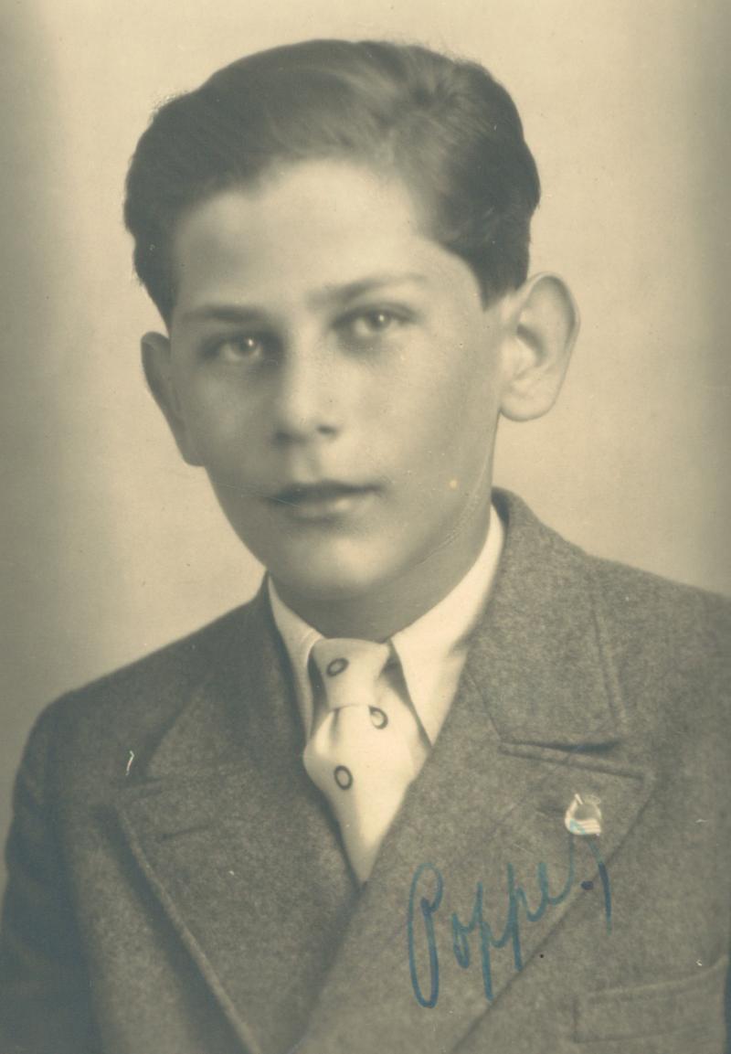
A soccer history mystery: Received a note yesterday from our own Jamie Rathjen, as follows:
The Auschwitz Memorial Twitter account often posts the pictures of victims who died there, and one they posted on Tuesday is of a young Czech man named Jiří Popper [shown above] who’s wearing what really looks like a pin of Spanish soccer team Real Sociedad’s crest. It’s unclear how the pin would have gotten there or what connection the club would have with Czechoslovakia.
Here’s the crest and the pin side by side, so you can see what Jamie’s getting at:
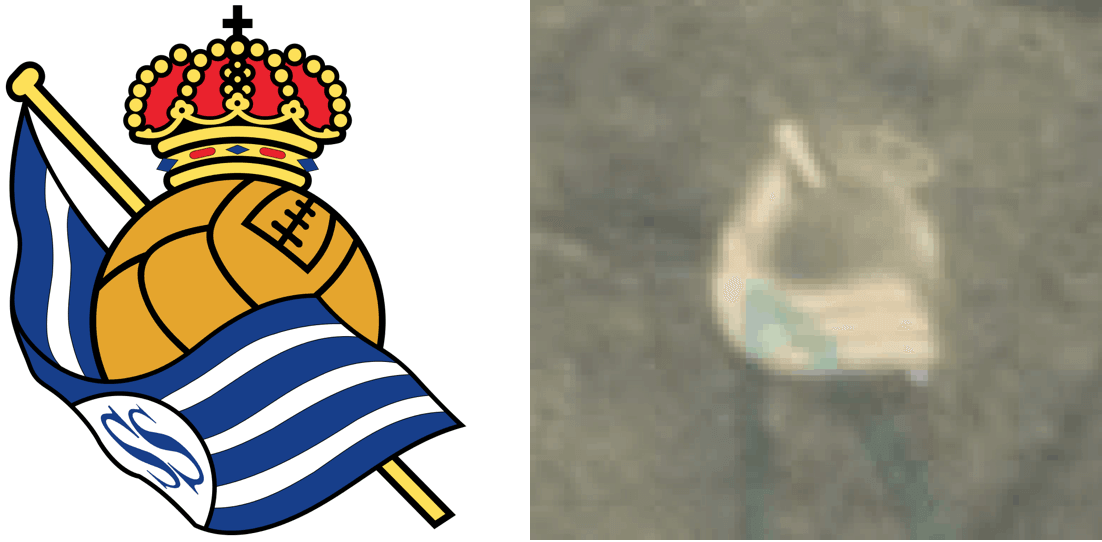
After a bit more digging, Jamie checked back in:
Small update: Real Sociedad played two games at home in 1923 against a team from Prague simply known as “Deutscher Fußball-Club,” founded by German Jews, and went to Prague in 1924 to play Slavia Prague. So I guess that’s the possible connection.
Fascinating! What an odd context for uni-watching to come into play! Thanks, Jamie — and R.I.P., Jiří.
The @UniWatch Pin Club just went next level. If this isn’t the coolest pin I’ve ever seen I can’t recall what would top it. #GetsIt pic.twitter.com/0Zt3NimlP3
— Brett Baker (@BrettSBaker) July 16, 2020
Slowly but surely: As of this morning, there are 110 Uni Watch Pin Club bobble-pins remaining from our numbered run of 500, so we’ve sold through more than three-quarters of them — not bad!
But I’d like to do better. If you don’t already have one of these excellent pins, you can get one here while supplies last. Need to get caught up? Here are the January, February, March, May, and June pins (sorry, April is sold out), along with our basic winged stirrup pin.
And remember, if you order multiple pins and/or Uni Watch cufflinks and get hit with multiple shipping charges, give me a shout and I can get you a partial refund on the shipping.
My thanks, as always, for your consideration.

Click to enlarge
Going, going…: Today is the next-to-next-to-last day to get in on our new line of Tour de France-inspired Uni Watch cycling jerseys: yellow (for the overall leader), green (Points Classification leader), and polka dot (King of the Mountains).
Each jersey can be customized with your choice of number (there’s a bib-style panel on the back for that) and/or NOB — or you can skip those elements and leave the back blank. Up to you!
You must place your order by this Friday, July 24, which should allow us to get the finished jerseys to you by Aug. 29 — the first day of the Tour de France.
Full details, including rear views, a sizing chart, and more, here.
The Ticker
By Paul

’Skins Watch: More than 80 Ohio schools that use Native American-based team names may face pressure to change them (from Jason Hillyer). … A new bill in the Massachusetts state legislature would ban schools from using Native American mascots (from Timmy Donahue). … The city of Indianola, Iowa, is removing Native American imagery from city property, including the police department’s logo. … The insurance company Mutual of Omaha is removing the Indian head from its logo. … Clinton Community Schools in Michigan will no longer call its teams the Redskins. Three schools in the state still use that team name (from Burrill Strong). … Ketcham High School in Wappingers Falls, N.Y., is reassessing its “Indians” team name and associated imagery (from Kary Klismet).

Working Class Wannabes™: An article about an MLS game says FC Cincinnati player Adrien Regattin “is a blue-collar athlete who will work his butt off to support his team.” … An article about the NHL’s St. Louis Blues says the team could repeat as Stanley Cup champions because of their “blue-collar magic.” … An article about Dobyns-Bennett High School in Tennessee begins, “Dobyns-Bennett’s colors may be maroon and gray, but the Indians take a blue-collar approach with their football program.” … An NBC-TV broadcaster reportedly described a beach volleyball player as a “blue collar athlete with white collar skills.” … A new transfer to the U. of Montana football team says he likes “the team’s blue-collar mentality.” … The Ferris State women’s soccer coach says one of his players “gives us that hard-working blue-collar type of mentality and is willing to get in and do the dirty work.” … The U. of Minnesota’s new assistant women’s soccer coach says she took the job in part because she was impressed by the team’s “blue-collar mentality.”

Baseball News: You know those ads we’ve been seeing on the mound and outside the baselines during summer camp games? Looks like they’ll be carrying over to the regular season. Sigh. … Although there’s been no official announcement yet, reports indicate that the Blue Jays will be playing their home games in Pittsburgh. … The Ernie Banks statue at Wrigley Field is now wearing a mask (from Phillip Santos). … Check out the unusual number placement on this old jersey from Chemeketa Community College in Salem, Ore. (from Casey Lute). … Interesting 1985 shot of Pirates OF George Hendrick apparently trying to wear a batting helmet over a pillbox cap! (From @polyesterunis.) … Did you know Astros manager Dusty Baker is a partner in a winery? He promoted it yesterday on his mask (from Ignacio Salazar). … The Brewers wore T-shirts that read, “Justice Equality Now” prior to yesterday’s intrasquad game (from Chris Rucinski). … Holy moly: Dodgers P Brusdar Graterol’s necklace came loose during a pitch the other night, and he caught it during his follow-through (from Mike Chamernik). … Longtime Uni Watch reader/pal and former Pirates P Jerry Reuss has been chosen by The Tribune-Review as the best Pittsburgh athlete to wear No. 41 (from Joe Werner). … Fox Sports’s broadcast of yesterday’s Astros/Royals game featured a graphic that apparently showed where a digital ad was supposed to go on the mound. “Your ad here,” says Seth Kincaid. … Meanwhile, the Braves/Marlins broadcast had rotating mound ads. Gross. … Rare shot of Ted Simmons wearing a pillbox-themed Cardinals batting helmet while playing third base. It seems particularly odd given that Simmons wore a backwards cap, not a helmet, while catching (good find by Scott Unes). … When games resume tomorrow, a new interactive feature on the MLB app and website will allow fans to cheer and boo remotely. … Several Reds players, including 1B Joey Votto, kneeled during the national anthem prior to last night’s game against the A’s. … In a related item, Yankees RF Aaron Judge says the team is discussing whether to make some sort of racial justice statement for tomorrow’s season opener in Washington. … Despite the pandemic and all the other hassle, Giants OF Hunter Pence is in midseason form. … Atlanta used a mix of home and road batting helmets last night (from Mitch Barbee). … A little hard to see, but Dodgers OF Terrance Gore had his old Royals bat knob decal on his lumber last night. He wore No. 0 with KC (good spot by Tyler Kading).

NFL News: The sports business site Front Office Sports broke the news yesterday that NFL players will likely have the option of wearing helmet decals with the names or initials of victims of police brutality or systemic racism. The news was soon confirmed by The Undefeated’s Jason Reid. Unlike the NBA’s NOB program, it appears that the NFL’s initiative will not involve statements or messages — just names or initials. The plan is similar to what reader Garrett Beatty proposed in my recent InsideHook piece. … Longtime NFL DL Michael Bennett announced his retirement yesterday. He’ll be remembered for his minimalist shoulder pad style. … The Rams announced yesterday that their new stadium will be open with limited or no capacity for fans this season. If fans are allowed at all, masks will be required.
College Football News: Alabama has a fancy new locker room (from Wade Heidt). … Whoa, check out this awesome Disney-themed ticket stub from the 1939 USC/UCLA game! (From the great Russ Havens, whose ticket stub site is always worth a look.) … College football games in New York State — and all other college sports — will not be permitted to have fans in attendance this fall. … UNC’s coaching staff will wear face shields when enhanced workouts begin on Friday. They’ll also use sticks to make sure they stay six feet from their players.

Hockey News: New jerseys, with the now-obligatory Maryland flag pattern, for the Maryland Black Bears (from Adam Marcus).
.
.

Basketball News: Thirty NBA players want to go NNOB when the season resumes. … Here’s a look at the new NBA court in Orlando, with the league logo at center court, “Black Lives Matter” printed on the hardwood, and chairs spaced on the bench for social distancing. Also: “The entire court is surrounded by large video screens, where virtual fans and signage like ‘make noise’ — which is usually on a JumboTron — could pop up.” … The Jazz are memorializing former coach Jerry Sloan, who died of Parkinson’s Disease in May, by adding a “1223” jersey patch. The number refers to Sloan’s 1,223 Jazz coaching wins. Fans can purchase the patch for $12.23, with proceeds going to the Michael J. Fox Foundation, a leading Parkinson’s charity. Additional info here. … Fun story about the guys behind the @NBABubbleLife Twitter account (NYT link). … The Clippers have moved one step closer to getting their own arena. … A coach has created a new shooting aid: a hoop with no backboard (from Mike Chamernik).

Soccer News: New away shirt for Portuguese side Sporting CP (from Ed Zelaski). … New 50th-anniversary home and away shirts for Paris St. Germain (from @jayappletree). … New away shirt, as chosen by fans, for Polish side Polonia Warszawa (from Ed Zelaski). … The NWSL is adding a team in Los Angeles for 2022 (thanks, Jamie). … New home kit for Mexican side Club América. … New outfitter for Leeds United, which is switching from Kappa to Adidas (from Germán Cabrejo). … Here’s a video showing one guy’s pick for the best shirt at every World Cup since 1994 (from Jeremy Brahm). … Atlanta United added a black armband with the initials “J.L.” yesterday for civil rights hero Rep. John Lewis. … New away and third shirts for German side TSV 1860 München (from Ed Zelaski). … Also from Ed: New third kit for Argentine side Newell’s Old Boys. … New logo for Greek team Asteras Tripolis (from @kvnblu).

Grab Bag: Cartoon characters Tom & Jerry have a new logo. … A new Dept. of Defense directive effectively bans military personnel from displaying sports banners or pennants on bases (from Timmy Donahue). … Here’s a good podcast interview with longtime Uni Watch pal/ally Todd Radom. … Fun article on the history of ice tray design (from Ron Meyers). … Secretary of Defense Mike Esper is concerned about federal law-enforcement personnel — essentially federal cops — dressing like military personnel in Portland and potentially in other U.S. cities (from Timmy Donahue). … Strange sight last night at Fenway, where the Red Sox wore NOBs at home. … Lots of new seating-tarp ad banners in Cleveland (from Bernie Eddy). … Mask up, up, and away: Thousands of face masks have been made from upcycled United Airlines uniforms. … New uniforms for Japanese women’s volleyball team Toray Arrows (from Jeremy Brahm). … “Cycling’s Team Ineos is being renamed Ineos Grenadiers starting with this year’s Tour de France, with a new logo and color scheme,” says our own Jamie Rathjen. “It basically turns them into a giant ad for a car that Ineos is somehow making (they’re a chemical company).”

Click to enlarge

What Paul did last night: The house across the street from us is owned by the Russian Guy. The Russian Guy has a dog — a magnificently beautiful collie named Marlie (or maybe Marley, we’re not sure).
In my experience, most dogs love going for a ride in the car, but not Marlie. Whenever the Russian Guy brings him out of the house and around to the driveway, Marlie starts resisting, straining, whimpering, and so on. Sometimes he’ll just lie down on his side and refuse to budge. I’m not sure if he hates the car, is afraid that any car ride could result in a trip to the vet, or what, but we’ve watched this drama play out several times now, and it’s always a bit upsetting. (Marlie seems happy the rest of the time, as long as no car is involved.)
Yesterday the Russian Guy tried something new. After he and his wife made several failed attempts to get Marlie to go up the driveway toward the back of the house, where the car was parked, he tied Marlie to a tree in the front yard and then backed the car toward the street. When he got to where Marlie was tied up, he got out of the car and coaxed Marlie into the back seat. Marlie put up a bit of resistance (see above), but not too much. The deed was done. There was a bit of additional drama when Marlie apparently jumped into the front seat (we saw his head sticking out the driver’s window, and then another relative had to come out of the house and help get him back into the back of the car), but then they were finally off. It all made me appreciate being a cat owner.
As always, you can see the full set of daily Pandemic Porch Cocktails™ photos here.
Raffle results: The three winners of the raffle for the Uni Watch masks are Taylor Warntjes, Peter Scharl, and Matthew Algeo. Congrats to them, and my repeated thanks to Jon Eidukas for sponsoring this one. — Paul
Where is Mr. Yuk?
Only used when a new uni advertiser is announced.
I thought I would see Mr. Yuk as well being that the Jordan logo is just as big as the ad on the other side. In the event of any tribute/anniversary decals, the statement jerseys can get cluttered.
I’m not sure why you would think that. We have never used Mr. Yuk in place of a maker’s mark.
I would have bet money someone would ask about Mr. Yuk and sure enough, first question. Just like every time you mention Mary by name someone asks if you slipped.
The new Hawks set is understated and beautiful! All of the gimmickry is gone – neon colors, overwrought bespoke fonts, patterns within the fabric. Atlanta is rapidly rising from the worst-dressed sports city toward respectability. The number/letter font is a little plain but the drop shadow is nice. And the side striping is classy.
Does anyone know why Nike made the notch cut in the hemline of the shorts deliberately off-center toward the front? Is it another “look at me, I’m Nike!” feature, like the tank strap striping that doesn’t completely go around the armhole?
The number font (especially the 2) looks like a local sporting goods shop supplied the uniforms. Otherwise, these uni’s are sweet.
Agreed that the new Hawks uniforms are beautiful. Nothing wrong with simple and “plain.”
When is Nike going to fix the weird loops that “end” on the back of the jersey? It looks awful and ridiculous. Why can’t the stripes go all the way around the arm holes?
“Eskimos” is gone.
“Oilers” are still around.
So how about Edmonton Drillers?
Hey, gotta start somewhere.
:)
I wonder how long it will take before they rip out the end zone turf at Commonwealth Stadium. Seems like something they should do immediately.
link
Easiest thing to do is make sure the nickname starts with an F. That way you remove the lower bar of the second E.
Edmonton Flyers
Edmonton Freeze
Edmonton Fog
Edmonton Frontiers (my favorite)
“A coach has created a new shooting aid: a hoop with no backboard”
…you mean a netball hoop? He invented a netball hoop (well, it’s called a “goal ring”).
Further to Popper, he was born in 1923, so while those games seem to represent the most likely connection between Real Sociedad and Prague in his lifetime it’s still a mystery as to how he actually got the pin.
link In case anyone hasn’t heard of net ball.
Small error…the Reds’ opponent last night was the Tigers (not the A’s).
Fixed.
The font used on the “not a mascot” logo is interesting, in that I have seen it used a lot in various Washington alternate names, concepts, etc. The A and T appear to be what people assume those letters would look like, but if you just google Washington Redskins font, the A and T in Washington look much different, and better match the font type. Wondering if the look of E causes everyone to propagate the triangle feature to other letters.
It would be a tragedy if the renaming of the Washington team resulted in the loss of that excellent alphabet.
Agreed, my hope is they keep much of their existing visual identity, including the font. Just a new logo to with their new name. If there is any other change perhaps just going to metallic gold like their 75th anniversary set, rather than yellow-gold.
“He promoted it yesterday on his mask”
Advertising on masks. Coming next??
How many times can one team change their brand? So in another 5 years they should be going back to the navy blue, red and white?
Or even lime, royal and white?
No, wait, Timberwolves kinda doing that.
I really like the double striping on the sides for the Hawks. 5 years really flew by while I attempted to pretend their previous unis didn’t exist.
I’m happy to see Ketcham High mentioned, my mother went there and I grew up nearby, and I’ve been waiting for it to get attention for decades.
I swear the people who decided putting ads on the pitcher’s mound was a good idea are not, and never have been, sports fans. Assholes.
As a lesser of two evils, I’d rather see the Jordan logo, which at least is a basketball aesthetic, over the swoosh.
The side striping for the Hawks looks awesome. The block shadow numbers seem half-hearted…if you are going to do it, go more like the Showtime Lakers.
Why ya gotta go and insult Pepsi for? Millions of people love the taste of Pepsi.
Actually, I’ve never said anything about the taste of Pepsi (nor am I equipped to do so, because I haven’t consumed Pepsi in several decades). My only comments about Pepsi have been about the company’s marketing approach.
Pretty sure that reference is less about the product itself and more about their approach to marketing.
Really beautiful work of micro-history on Jiří Popper’s Sociedad pin. Brings this boy to life — sports fan, citizen of a wider Europe, perhaps even a uni-watcher … may his memory be a blessing. Bravo Jamie Rathjen.
Seconded. I love these stories.
Is it just me, or is “Blue collar athlete with white collar skills” especially offensive? Unless they mean that she is also an accountant or something…
Not just you!
I would have bet money someone would ask about Mr. Yuk and sure enough, first question. Just like every time you mention Mary by name someone asks if you slipped.
I’ll be the contrarian. The new Hawks look is So. Boring. They look like a high school team in a district that had it’s budget cut. You said it yourself, you could replace Hawks with any other team name and it would look normal.
Of course the new Hawks uniforms are huge upgrades. But I do miss the old type. The new uniforms with the old type rendered in the new colors (white on red, yellow on black), would be the perfect Atlanta basketball uniforms to me.
The Hawks have had several run-ins with wonky type: The only font I would consider an improvement was the Tuscan font from 1976.
“A coach has created a new shooting aid: a hoop with no backboard”
Just like when Naismith invented the game!
link
Mr. Popper’s photo reminds me of this great story. Never forget.
link
For some reason the yellow on the Hawks black uniform looks different to me, darker and a different shade of yellow, even though on the official Hawks website it’s listed as the same yellow.
I learned a lot of things from my first college choir director; one of them was the word for next-to-next-to-last: antepenultimate.
Paul, it is enjoyable to get a tiny slice of real life in your porch pictures. I think most of your pictures of neighbors are of them near you and, often, talking with you. Today’s is, maybe, the first, that I recall, distant, candid shot. So, it started me wondering if you get the permission of the subjects to post on the blog and, if you do, if you suffice with a verbal content or if you ask them to sign something. And since I was wondering, I thought I may as well ask. Thanks.
Heres on article on Jiri Popper and Real Sociedad link
Interesting 1985 shot of Pirates OF George Hendrick apparently trying to wear a batting helmet over a pillbox cap!
Willie Stargell did it all the time.
link
link
link
I can sympathize with The Russian Guy. I have a 110lb chocolate lab that WILL NOT get in the truck. It is absolute Hell when I have to take him to the vet. HAHA
Strange sight last night at Fenway, where the Red Sox wore NOBs at home. … Lots of new seating-tarp ad banners in Cleveland (from Bernie Eddy).
Should be in the baseball section of the ticker…not the grab bag.
So 30 NBA players want to go NNOB? Let’s hope that trend catches on!
Great job, Atlanta. While I didn’t dislike the old unis, I do love these new ones.
Something to watch for on Friday (sorry if it’s been mentioned before): White Sox Radio Broadcaster Ed Farmer died while baseball was off. They haven’t been wearing a patch on their Spring (Summer) uniforms, but they did post a black diamond with his nickname ‘FARMIO’ on the broadcast booth, looking much like the format the White Sox usually use for memorial patches (see here: link:format(webp)/cdn.vox-cdn.com/assets/1134833/hickeypatch.jpg). So I expect to probably see this on the uniforms on Opening Day…
Typo in the grab bag: Today Arrows should be Toray Arrows.
Really thought I already fixed that! But now fixed for sure.
Am I the only one having difficulty deciphering the stripes on these Hawks uni’s? I think I see what’s going on with the double stripe action, but not completely. They really need to do more symmetrical revealing. The forward stripe looks awfully far back in some images (with a logo to boot), and there appears to by a yellow stripe on black jersey worn by models but not on the back template.
Never mind. Just looked up some other images. And why did “template” highlight a link? Weird
I thought each NBA team in the bubble was going to ship their own courts down to use during games or did that stupid idea get scrapped?
Too bad they already made a movie called ‘Marley (marlie) and Me’?!?
Can’t find human companionship substitute it with an animal, preferably one that you don’t consume : )
Some Possible EE mascots
Elephants
Emu (great cross marketing opportunity with Liberty Mutual…I want to cook up that Lemu Emu in a nice gravy)
Eagle
Earwig
Evergreens
While I’m displeased with the decision to scrap the Eskimos name, I do like Evergreens…green is already a team color and colorful team names abound in the CFL(Blue Bombers, RedBlacks).
I’m on teal Elks, but Evergreens is a terrific idea!
“team” Elks. Though teal elks would be fine too.
Edmonton Eh’s? They already have the green and yellow team colors, plus they wouldn’t have to scrap the logo. It’s all too perfect.
Kudos for returning to basics Hawks, but I think it’s great when a team can have a custom typography. There is a middle ground, looking at you Astros.
Still waiting for that asterisk
Not a fan of the new Hawks uniforms. It’s funny how you say they no longer look like clowns, when now, they look like the McDonald’s corporate basketball team.
I always thought the Hawks had a great fashion forward look in a world that’s always looking backwards
seeing that photo of “marllie” and the “russian guy” boils me a bit…….
i cant help think ‘damn forward parker’ …i encounterd too many clowns trying to reverse out of parking spots or driveways without the abillity to be able to do so in a timely matter
argh
Still waiting for that asterisk
oh…