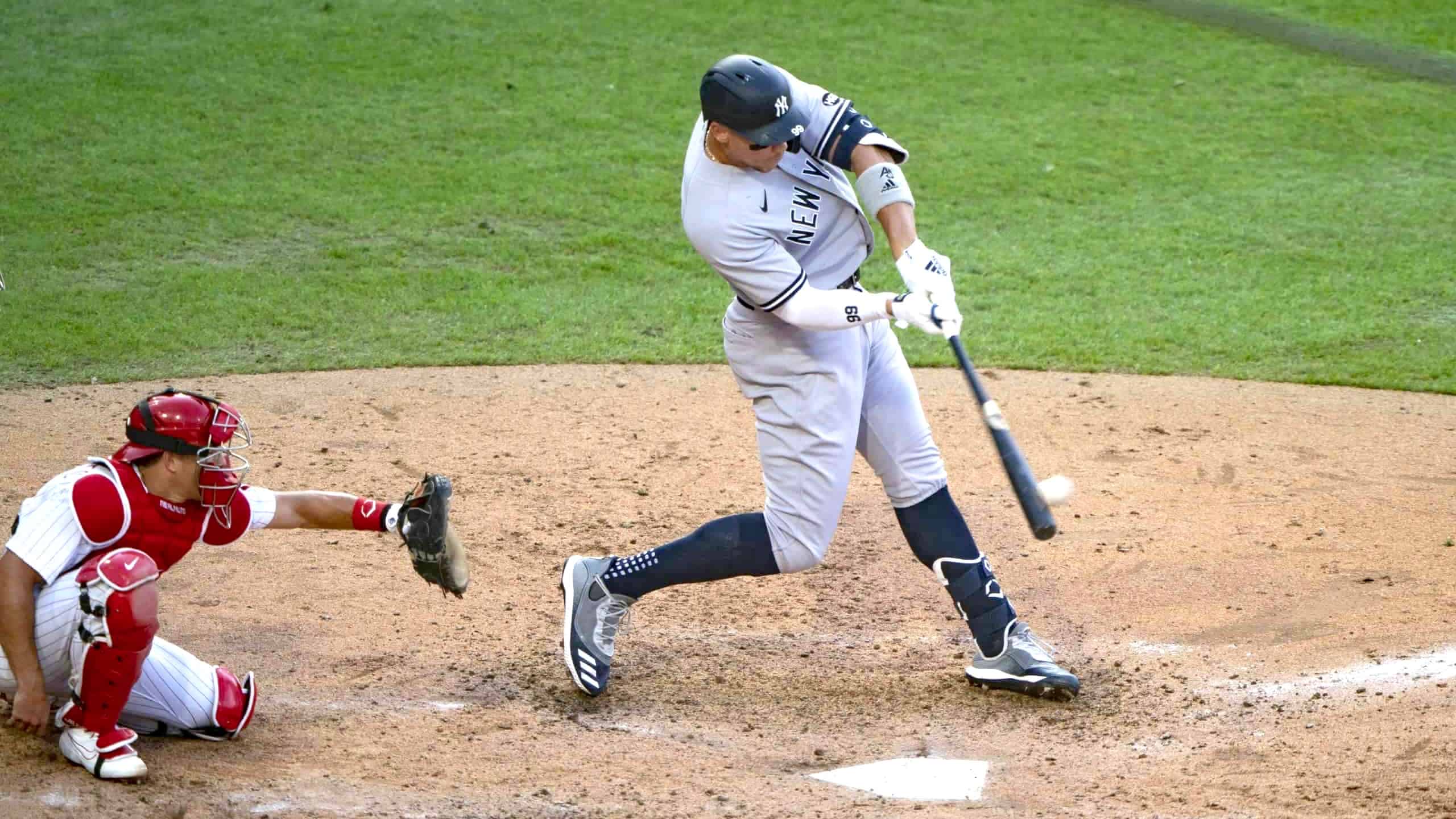
It turns out that even the mighty Yankee pinstripes are no match for the coronavirus.
Here’s the deal: The Yanks and Phils played a doubleheader yesterday in Philadelphia. Game One was a rescheduled game that had previously been postponed. Nothing unusual about that — pretty much every doubleheader in recent years has been the result of a postponement. The difference this time around is that the postponed/rescheduled game was originally supposed to take place in Yankee Stadium, not in Philly. So the Yankees were the designated home team for the opener, even though they were playing on the road.
Since the Yanks were the home team, they presumably wore their famous pinstripes, right? Wrong. In an understandable attempt to keep things logistically simple, the Yanks requested and received permission to bring just one set of uniforms with them — their road greys:
The Yankees requested to only bring one jersey to Philadelphia, so even though the Phillies are the road team in the first game of the doubleheader, Joe Girardi says that the Phillies will wear their pinstriped jerseys in the first game today.
— Tim Kelly (@TimKellySports) August 5, 2020
So for the first game, the Yanks wore their road uniforms despite being the home team, despite being on the road.
And that wasn’t the only weird thing about that game. The first game of the doubleheader started at 4pm, and the Phils usually wear their cream alternates for daytime home games. But instead — I guess because they were actually the road team..? — they wore their home-night pinstripes:
And wait, it gets better: Although the Yanks were the home team and the Phils were the road team, the stats will count torward the Yanks’ road stats and the Phils’ home stats because the rulebook states that the “home team is the team on whose grounds the game is played.”
This marks the second consecutive season that the Yankees have worn a uniform contrary to their home/road designation. For last year’s two-game Yanks/Bosox series in London, the Sox were the designated home team for both games. But the powers that be decided that they needed to showcase those famous Yankee pinstripes to the overseas audience, so both teams wore home uniforms, even though the Yanks were the road team.
Getting back to last night’s twinbill: The Phils were the home team for the nightcap, so both teams wore the same uniforms they wore in the first game — grey for the Yanks, pinstriped whites for the Phils. But just to make things more confusing, Yankees catcher Gary Sanchez (who didn’t play in the first game) wore the team’s glossy home batting helmet, instead of the matte road helmet:
Gary Sanchez wearing the home (wrong) helmet. Gio Urshela wearing the road (correct) helmet in the background. @UniWatch pic.twitter.com/X1Butb4NIL
— Scotty 🏴🇮🇱 (@Scott________) August 6, 2020
That concludes this installment of “Only in 2020.” I’m sure the next installment is being written as we speak.
Click to enlarge
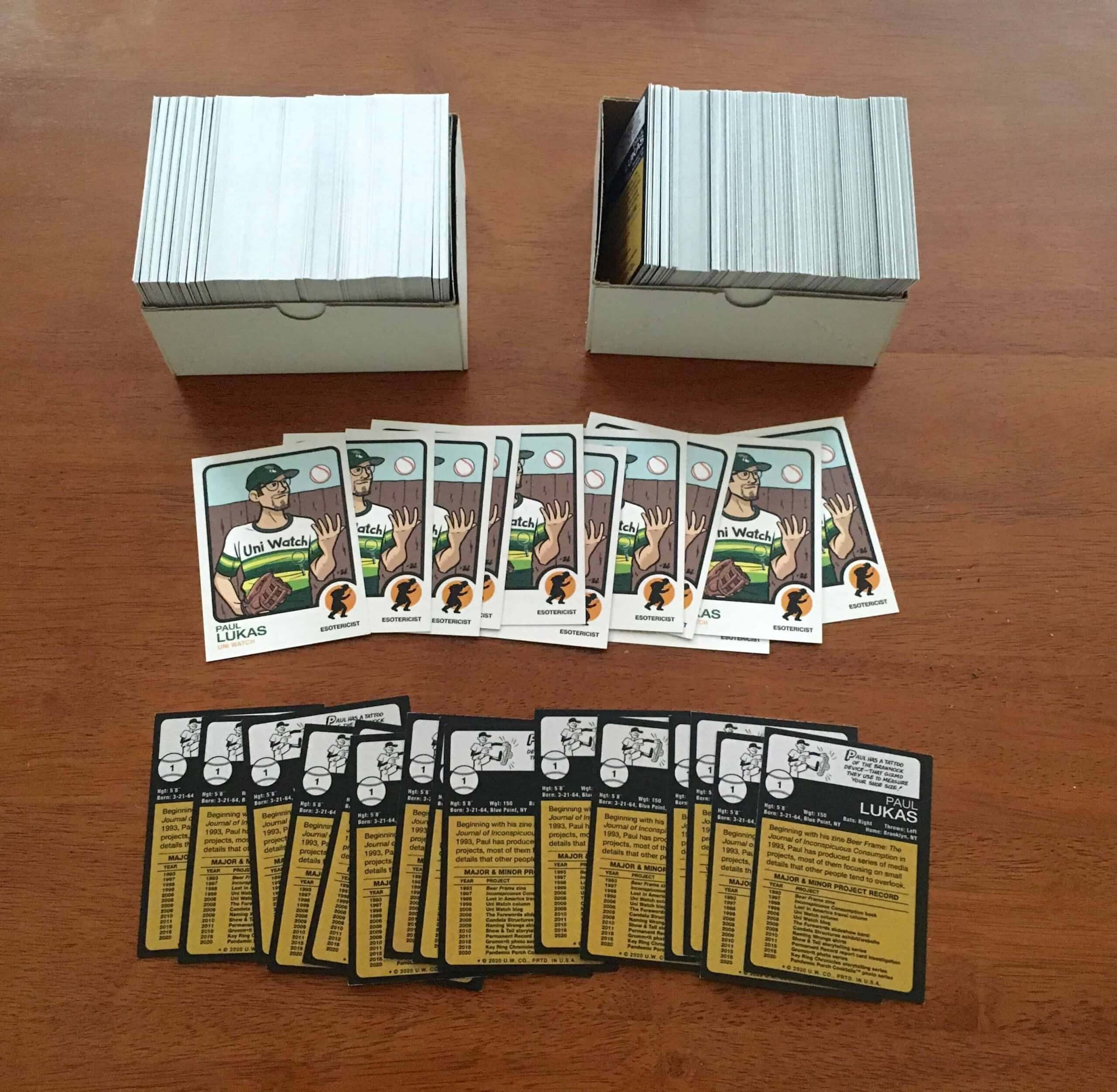
Trading card update: The full set of 500 Uni Watch trading cards arrived in the mail yesterday (the ones I showed you earlier were printer’s samples). Exciting!
Shortly after the cards arrived, I sat down to sign 11 of them — 10 in green ink, one in purple. It was a bit trickier than I’d anticipated, because the card doesn’t have much white or light-colored space, plus it has a lot of green, so I had to pick a spot where the signature wouldn’t be swallowed up by the background colors. After practicing a bit on the printer’s samples, I went ahead with the real cards, and also numbered each signed card in the top-left corner:
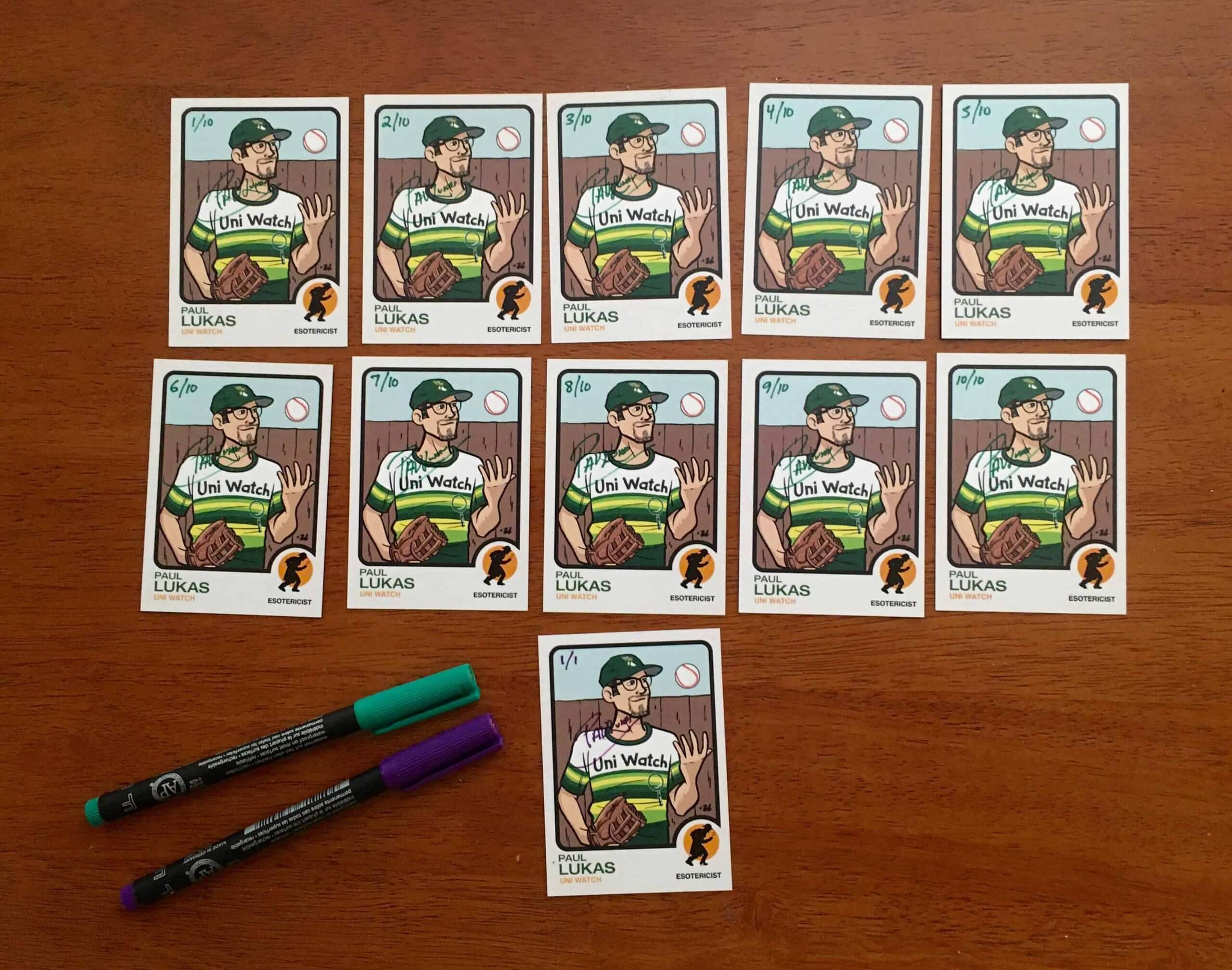
And then I put the signed cards in random spots in the set. Whoever gets them, gets them!
I can’t mail out the cards yet because I still don’t have the plastic sleeves for them, but those are due to arrive in a few more days, so I should get all the pre-ordered cards out the door by the middle of next week.
Speaking of which: Full details on how to pre-order your own card, along with the backstory on this saga, are available here.
Click to enlarge
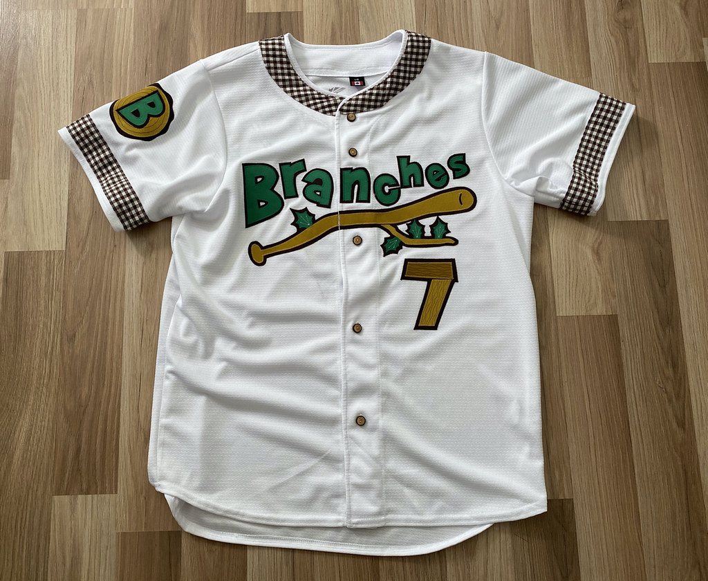
LAST CALL for the Branches auction: Today is the final day to submit a bid for the one-of-a-kind Brooklyn Branches jersey, with proceeds going to the Arbor Day Foundation. Full details on the jersey, and how you can bid on it, are available here. I’ll announce the auction winner tomorrow.
But wait, there’s more. If you can’t afford to bid on the jersey, we now have Brooklyn Branches T-shirts available — including a road grey version with a “Brooklyn” insignia (click to enlarge):
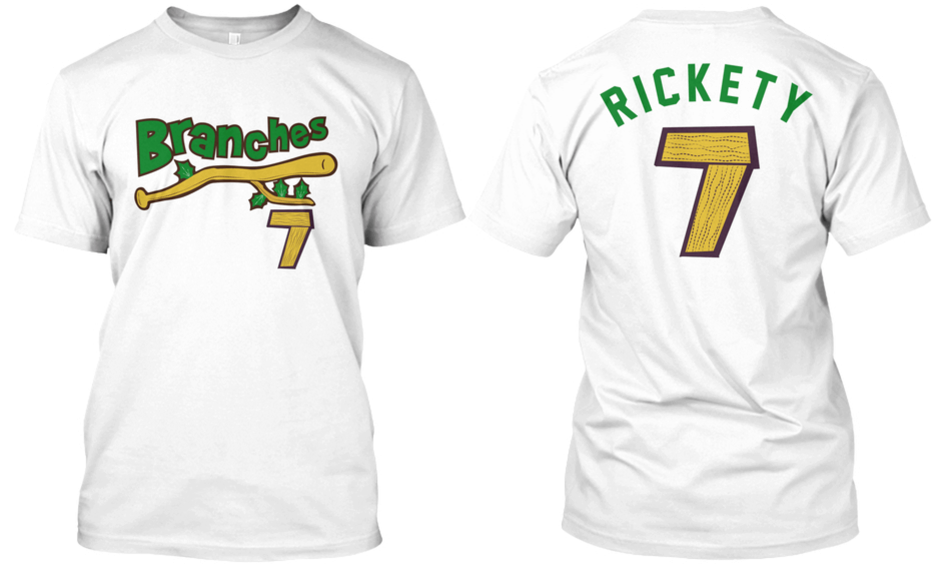
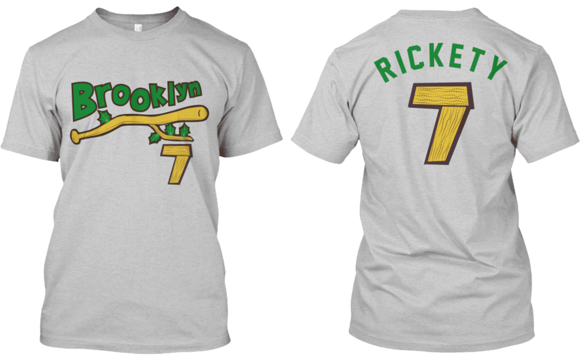
Here’s where you can get the home white and road grey versions.
We may also have green and brown alternates — possibly as soon as tomorrow — so stay tuned.

Click to enlarge
August Pin Club update: The Uni Watch Pin Club’s new design for August — a salute to old-school baseball scoreboards, complete with a few misfiring light bulbs — is now available. (If you want more info on the line score and the 4:07 time on the clock, there’s an explanation here.)
This is a limited/numbered edition of 250. The pin launched a few days ago and as of this morning there are only 73 remaining, so they’re going fast. You can get yours here.
Speaking of inventory levels:
• There are now about 45 of the July bobble-pins remaining. Still available here while supplies last.
• There are about 40 Uni Watch Key Rings remaining. You can get yours here.
My thanks, as always, for your consideration.
Click to enlarge
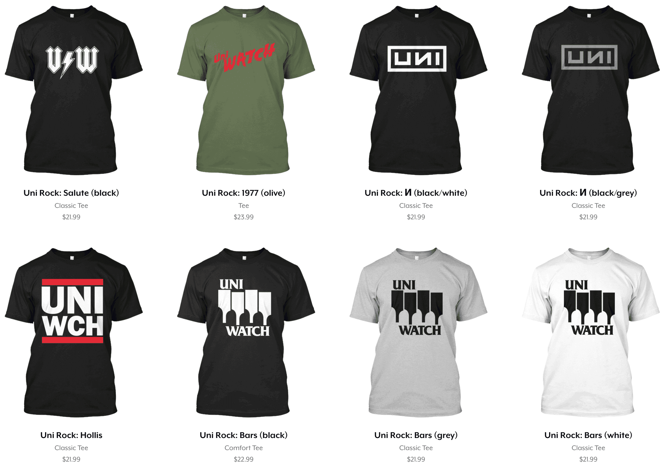
Uni Rock reminder: In yet another ICYMI item, a bunch of new designs have been added to the Uni Rock Shop (and if you missed the launch of Uni Rock last Friday, here’s an explainer). We’ll have more designs tomorrow. You can see the full collection here.
The Ticker
By Paul

’Skins Watch: Lane Tech, a high school in Chicago, is dropping its Native American logo (from Kenneth Traisman). … Cincinnati Country Day School will no longer call its teams the Indians (from Kary Klismet). … Also from Kary: A Pennsylvania attorney has filed a lawsuit seeking to postpone a vote by Unionville High School officials on a measure to stop calling its teams the Indians. … One more from Kary: A descendant of the Wappinger Native American Tribe is urging Ketcham High School in upstate New York to keep its “Indians” team name, conflicting with an earlier call from other Wappinger descendants for the school to retire it.

Working Class Wannabes™: An article by ESPN NHL writer Greg Wyshynski — a smart guy who really ought to know better — said the Blue Jackets have a “blue-collar defense.”

Baseball News: An artist named Carl Skanberg has been creating “Scorecard Sketchcards” for White Sox games this season, including some excellent retro-style faux program covers. “He’s been doing baseball (mostly White Sox-related) artwork for years, and his Twitter feed is a heck of a rabbit hole,” says Eriq Jaffe. Indeed — recommended. … In 1964, KC A’s owner Charles Finley challenged the White Sox to make the teams’ upcoming doubleheader into a “style show,” and urged local newspapers to send their society editors to cover it (from Bob Gassel). … The Phillies have added cutouts of some of their players, in the spots where their home runs landed (from @kodywiddak). … The Nationals have continued to wear their gold-trimmed championship uniforms for all of their home games so far. I haven’t confirmed this myself, but @sports_fashion1 says that if they wear their three other white jerseys, they’d be the first team ever to wear four different white jerseys in one season. … Tough night for the Twins batting helmet logos: 2B Luis Arraez’s was badly askew and 1B Marwin Gonzalez’s was missing altogether (thanks to all who shared). … Anyone else notice that the only distinct or even visible detail on the Marlins’ black jerseys is the new maker’s mark? (From Bud Parks.) … The collegiate wood bat Souris Valley Sabre Dogs played last night in jorts! (From Seth Hagen.) … We’ve seen lots of MLBers wearing their uni numbers on their belts, but D-backs 1B Christian Walker’s belt has the team’s logo on it, and teammate Ketel Marte appears to have some lettering printed on his (good spots by Joanna Zwiep).

NFL News: Raiders QB Derek Carr will wear a compression sleeve this season as a tribute to Kobe Bryant (from Nicklaus Wallmeyer). … Washington posted a video of the new helmet numbers being applied to the shells, along with photos of the new helmet design from various angles (from many readers).
College Football News: UCF’s stadium has long been nicknamed the Bounce House. Now that is its official name (from Colin Dilworth).
.

Hockey News: The Coyotes have released a video hyping their Kachina uniform, which they’re wearing throughout the current postseason. Incidentally, the jerseys still have the mismatched skate blade colors, a glitch I wrote about back in May (from Alfonso Ferrari). … New logo for the Gillette (Wyo.) Wild, a junior team in the North American 3 Hockey League (from Kary Klismet). … New jerseys for the FPHL’s Columbus River Dragons (from Jack Patterson). … Canadiens LW Jonathan Drouin got a pretty serious haircut between Monday’s and Wednesday’s games. I haven’t had a haircut since February, so I’m envious.

Basketball News: Cross-listed from the NFL section: QB Derek Carr of the NFL’s Las Vegas Raiders will wear a compression sleeve this season as a tribute to Kobe Bryant (from Nicklaus Wallmeyer).

Soccer News: Wisła Kraków F Rafał Boguski appeared to have a wristwatch on his left arm during yesterday’s friendly (good spot by Ed Zelaski). … English club Bristol City’s Women’s Super League team has moved their home games to Twerton Park in Bath. “That feels kind of weird because they were the only women’s soccer team in the U.K. that built their own stadium, although it was smaller,” says our own Jamie Rathjen. “Now they share with a local lower-level men’s team (in this case, sixth-tier Bath City), like most of the other women’s teams do.” … Also from Jamie: “Nike’s apparently been making more accessible shoes/cleats/boots/etc. for different sports, and just released the soccer version. This story includes an interview with Orlando Pride left-back Carson Pickett, who was born without the lower part of her left arm, so she’d especially benefit from these boots because they’re easier to put on.” … Interesting piece on three proposed number fonts that were rejected by Serie A (from Ryan Maquiñana). … Here’s a list of the most creative team names in American soccer. “It serves as a repudiation of the trend toward simply using ‘United’ or ‘FC,'” says Kary Klismet. … Two more from Ed Zelaski, both about Polish teams: New home kit for Jagiellonia Białystok and Kappa is the new outfitter for Widzew Łódź. … And yet another one from Ed: New kits for French side Red Star.

Grab Bag: Women in the U.S. Air Force can now wear pants, instead of floor-length skirts, as part of their “mess dress” uniforms. … After a wave of criticism, the Dept. of Homeland Security plans to replace the military-style uniforms worn by federal police personnel. … Here’s a peek at the new uniforms for the upcoming season of Star Trek: Discovery. … Someone on eBay is selling a bunch of very nice vintage Durene tees, if you’re into that kinda thing. … Here’s the logo for the NLL’s 2020 draft, plus lots of team-specific versions (from @PhillyPartTwo). … “For anyone interested in the history of military uniforms, the Uniform History YouTube channel is a phenomenal resource,” says Kary Klismet. “Their most recent video is a deep dive into the story behind the U.S. Army’s three-color desert camouflage (aka “coffee stain”) uniform.” … Also from Kary: Kern High School in Bakersfield, Calif., is soliciting community feedback on whether it should keep calling its teams the Rebels. … The Fort Worth police dept. has suspended “themed dress days” after several 911 employees wore Black Lives Matter-themed attire.

Click to enlarge

What Paul did last night: Usually I have beer on the porch and Mary has something else. But yesterday she was in the mood for beer, so she ran around the corner to grab a 40 for us to share. And goddamn if it didn’t taste better out of that big bottle than it usually does. Sometimes bringing a little festiveness to the occasion makes a difference.
As always, you can see the full set of daily Pandemic Porch Cocktails™ photos here.
Signal flare: Reader Tom Dennis, are you out there? I received you email about shipping a card and key ring to the UK, but when I responded to your Outlook.com email address, it repeatedly bounced. Please give me a shout from a different email address, or DM me on Twitter. Thanks! — Paul
The Washington FT helmet is too collegiate looking for my taste (hello USC?)
I don’t like that the stripes are gone, and I think the (temporary?, please) numbers could an outline–or something.
Oh, and of course they need to wear yellow pants also.
I miss the stripes too. I’d like to see those stay.
Don’t like the team no matter what they’re called but I loved the helmet stripes and I love the yellow gold pants.
What is the odd yellow plastic piece on the “jaw” portion of the Washington helmet? Is it something new? I’ve never seen it before, but perhaps it’s normally the same color as the helmet and doesn’t stand out. Might look weird if it’s unique to this model of helmet, so we end up with some players wearing not and some not wearing it.
That piece is specific to that helmet model (I forget which brand/model it is). Most teams just make the same color as the shell, but Washington has it done in yellow.
The Phils missed a great opportunity to wear their blue throwbacks in the first game.
You don’t often refer to the Tugboat Captain as “Mary”.
Sometimes.
I noticed that too. You’ve probably done it before, but it immediately caught my eye today.
Hey Paul, typo is Skinswatch. Opstate instead of upstate. Cheers!
Thanks, Jason. Fixed.
Exact same situation last night occurred in Baltimore. Doubleheader, Marlins are home team for 2nd game, played in Baltimore, Marlins wore gray (pants), O’s wore white (tops and pants).
O’s were home team for 1st game, wore their black alts with white pants, Marlins wore all gray.
Wow — I didn’t even realize! Thanks for that, Bud.
I’ve had a hanging branch since like January or February, and we’ve a had windy year here in the northeast. With the hurricane coming in and knocking down trees all over the place, to the point that like 200,000 homes were without power at one point in my service territory, I was shocked to see the branch still hanging on there the day after the storm. At this point I have no clue what will take it down.
Hi Paul, I have a suggestion but I don’t want to leave it publicly. My email is provided if you are interested.
So, did the White Sox comply with Finley’s request to wear their “baby blue” road unis in Chicago?
I’d never heard of the Kansas City “misty green” unis…were they the nominally grey roads?
On the first point – I don’t know. The Sox powder blues were new that year, so it wouldn’t be long before the White Sox were wearing them in KC and the A’s could come out in gold. If only fashion designers could find Kansas City!
Regarding the A’s road uni’s: yeah, they were. The grey flannel back then had a lot of variances. Most teams grey flannel included a fair amount of blue in the weave, causing road jerseys to seem to be different colors depending on the lighting conditions that photos were taken. The White Sox road uni’s, starting in 64 really were baby blue – much darker than the blue-ish tint that other teams road uni’s had in their flannel weave.
The A’s had a flannel weave that had more green wool thread. So even though it appears as grey in many photos we have today, there’s a distinct light green tint to them that became more apparent under certain lighting conditions.
In regards to schools getting rid of the name/imagery of “Rebels”, do you think it would make sense if they keep “Rebels” but made it from the American Revolution time, more in line with Patriots than the Civil War and the Confederacy?
That is exactly what my high school, Great Neck South (Long Island NY) did. This is after a short lived, failed rebrand as Penguins, to try to get away from (South) Rebels. Kudos to them for recognizing decades ago that a stars and bars in the basketball gymnasium was a bad look. I’ve never heard any new calls to rename the school teams of late.
Wait why was a school on Long Island named after the Confederacy in the first place?
A good idea, but the way things are going at some point I imagine that will become troublesome as well…
Another Long Island High School that tried to rebrand was Syosset.
In 2002, we went from the Braves (link) to the Redhwawks.
Now, it’s back to the Braves. I have no idea when or why it returned, but it strikes me as particularly tone deaf to have made the right decision and then rescinded it. I’d love to learn more about the ‘why’ if anyone has additional details.
And, if anyone is interested, there is a link to change the name again.
It could simply be Syosset realized they should have picked a better name than “Redhawks”. No team called the Redhawks chose that name without some arm-twisting, and the impression I get is programs are bitter and unhappy about having an obvious compromise thrust on them. Changes in team iconography should be better thought-out and schools need to avail themselves to the universe of unused mascots. There are plenty of good ones!
the impression I get is programs are bitter and unhappy about having an obvious compromise thrust on them.
Basis for that impression?
Well, you know me well enough to remember that I dislike cookie-cutter names, and Redhawks certainly qualifies as one. I see “Redhawks” and I think, “There goes a team that wishes it was still called the Redskins (or Braves or Indians) but, y’know, pressure. So, fastest method is use old name, take “-skins” out, throw “-hawks” in, and congratulations! You’ve made your detractors happy. And as I said about the Washington NFL Squad, even if the time for change is here, the ground is moving under the fans’ feet, and it’s too much to ask them to be happy about it
Nobody takes my advice and calls their team the “Meteors”, or the “Thunderbolts”, or the “Skylarks”, or the “Robins”, or the “Magpies”, and perhaps that’s another subject for another day, but the landscape is lousy with “-hawk” teams.
walter, I agree that rebrands to remove Native American names and imagery are often clumsy, rushed affairs. But I’m not sure that going back to a former problematic Native-themed identify is a better choice. Maybe just go with no name for a while until you can get community buy-in on something less cringe-inducing than “Redhawks”? Just a thought…
and it’s your Rookie card too Paul…. :)
A signed 1/10 rookie auto at that!!!!
In the background of the Washington F.T. pictures, you can see that they have bins of clear and yellow facemask clips, along with white, and silver chinstrap snaps.
On the helmet, the yellow clips are used on the side attachments for the facemask with the clear on the front. The white chinstrap snaps are used up top, with the silver on the bottom/back.
I just did a google search, and apparently they’ve been doing this for at least a year now. Interestingly, on the Speedflex helmet, which has only side attachments for the facemask, they use yellow clips for all attachments. Now that’s some cool uni minutiae!
Card 9/10 presents an interesting dilemma–are you happy with a signed limited-edition card or bummed that it has 70-30 L-R centering?
Jeremy, are you referring to the signature not being centered?
I was actually concerned about that and sought out advice from Uni Watch reader and serious card collector John Okray. He said there’s no wrong place to sign, so I went ahead and did all the sigs off-center because that was the best light-colored spot.
I think the signatures are great. I was referring to the centering of the image on the card. Some OCD-types struggle when the borders of the card aren’t even on all sides (not that I have any experience with that!).
Generally modern cards have excellent centering but vintage cards can be terrible. I like to think the less-than-perfect centering is nod to the 1973 Topps set.
Oh, interesting! I hadn’t even noticed that that card was printed off-center. Thanks for schooling me on that!!
“Although the Yanks were the home team and the Phils were the road team, the stats will count ^torward^ the Yanks’ road stats and the Phils’ home stats…”
I actually like Washington’s new helmets. Hopefully they don’t go with some cheesy corporate name next year and mess the uniforms and helmets up.
Washington Express with purple and orange? *ducks*
Question for anyone who served in the military- how often do you actually get a chance to wear the “mess dress” uniform?
Mess dress is usually for senior enlisted & the officer ranks. Worn approximately 1-2 times a year for either Mess Nights or possibly service birthday (USMC, etc.)
Thanks
Since Washington is changing its name is it time to “cancel” skins watch? Or will it stay up until every Native American nickname is eradicated?
’Skins Watch has always been, and will continue to be, about coverage of Native American iconography in sports (including the many high schools that still call their teams the Redskins).
Astros played a couple ‘home’ game v. Cubs in Milwaukee (2008), they wore the alternate red tops with gray pants, Cubs wore road gray pants as well, with blue tops for first game (Zambrano no-hitter)
Marlins played ‘home series’ v. Brewers in Milwaukee and wore gray pants/alternate tops while Brewers wore home whites.
Am aware Nationals wore road grays in their home park as a visiting team v. Toronto.
Great stuff, Kurt — thanks!
The high school dropping its logo, Lane Tech, while technically a college prep school, is a Chicago public high school, not a “prep school” in the colloquial/more commonly-used sense.
Gotcha. Changed it to “high school.”
The school’s website literally calls it “Lane Tech College Prep.” In one banner it references Lane Tech – College Prep High School,” but throughout the page and on its school seal says “Lane Tech College Prep.”
link
On the other hand, the Chicago Public Schools page for Lane Tech calls it “Lane Tech HS” and its longer name “Albert G Lane Technical High School.” No mention of “college prep” on the page.
link
Interesting.
What kind of collar should the Blue Jackets have if not Blue? It’s a jacket not a ringer tee.
I could be wrong, but I think the Phillies wear their creams during the weekend day games. Weekday day games they wear their blue alternates.
Jagiellonia Białystok needs to have a picture of Zero Mostel or Nathan Lane on its uniforms.
Ditching the helmet stripe, even temporarily, is the most baffling decision the WFT has made in this…the one design element universally held in a positive light, and they nix it. WTF?
Yes, that was a bad move on the part of the DC Squad. Sort of like donning the sackcloth and ashes. The helmet stripe was one of the uniform’s nicest details,
Here’s to hoping that there is a Paul “Lucas” error card hiding somewhere in that stack…
D’oh! Wish I had thought of that!!
What’s with the glasses on the porch? It’s a 40! You should’ve kept it in the brown bag and passed it back and forth like a couple of hobos! :)
Bobby D…
Let’s drink together, you obviously know what you’re doing!
Lee
Paul:
Since you usually like to correct typos when they happen, the Diamondbacks player is Ketel Marte (with two E’s). Cheers!
Thanks!
I’d very much like to see your thoughts about the DHS item in today’s Ticker. Having Federal agents of any kind snatching people, citizens or not, off the street, firing weapons at them, or performing any duty in an Army uniform, or near uniform since the army employs patches that further ID their folks by name, unit and rank is so pernicious. The central point of uniforms, why they were ever created in the first place was to identify the wearer as being on a team or squad. Wearing someone else’s uni subverts the whole purpose. In wartime it makes the wearer a spy.
I wonder how a spox at DHS would respond to a journalist asking questions about this subject?
A pedantic question about the courts in the Orlando bubble.
The out-of-bounds line around the court appears to be twice the width of the center stripe and other court markings.
Obviously, a player who steps on the wide line, or any part of it, loses the ball.
But when a team inbounds the ball after a made basket or a timeout, is it permissible for the player to have a foot somewhere on the wide line as long as it is no closer than what the usual width of the sideline/baseline is?
And how does that jibe with the official NBA website which has a picture saying that “All Markings Shall Be Two Inches Wide”?
It’s only a matter of time until the UCF football stadium becomes the Bounce House brought to you by Bounce fabric softener sheets.