Click to enlarge
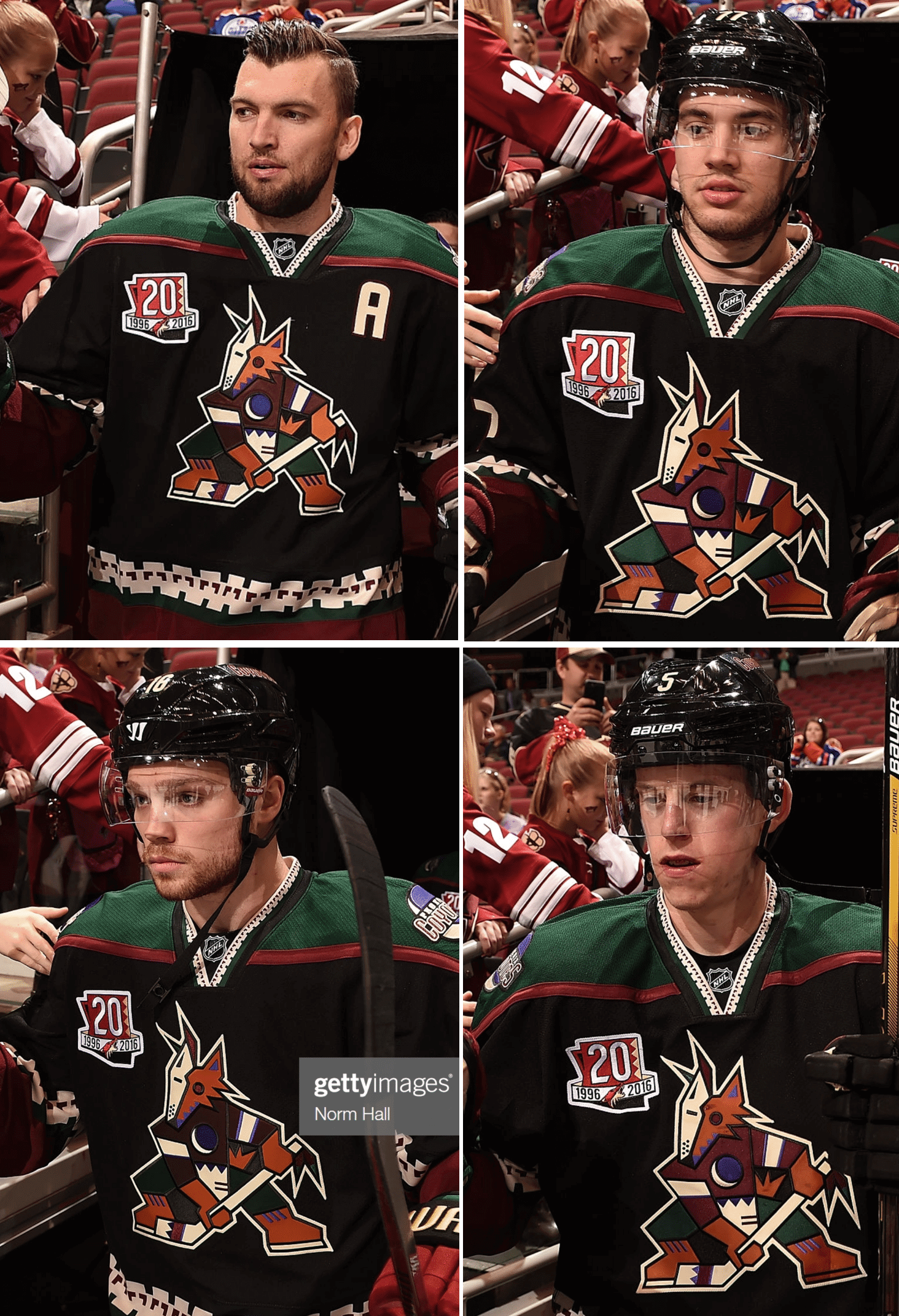
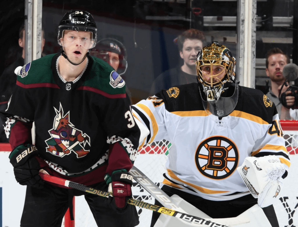
On Nov. 25, 2016, the Arizona Coyotes wore their Kachina throwbacks as part of their season-long 20th-anniversary celebration. It turns out that there was an interesting inconsistency in their uniforms that night. Can you spot it in photos shown above?
Here’s the deal: The coyote mascot crest for the two players on the left (centers Martin Hanzal and Max Domi) shows the coyote wearing two beige skate blades. But the two players on the right (defensemen Anthony DeAngelo and Connor Murphy) have one beige blade and one brown blade. Photos from the game show that this inconsistency ran throughout the team that night. And therein lies the start of a very interesting rabbit hole.
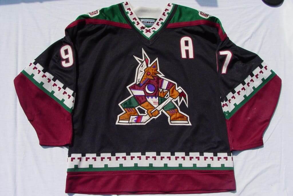
Some background: The Coyotes began play in the 1996-97 season. Their original uniforms, which were made by Starter, featured the two matching beige blades, as you can see in these two game photos:
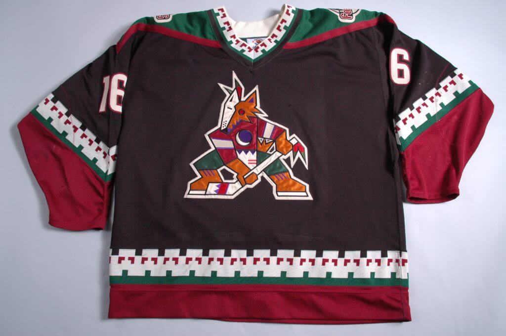
The two beige blades also appear on these two game-used 1997-98 jerseys:
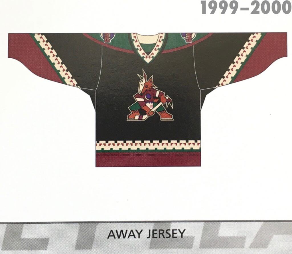
I have copies of the official NHL Style Guide for the 1999-2000, 2000-01, and 2001-02 seasons. All of them show the two beige skate blades (click to enlarge):
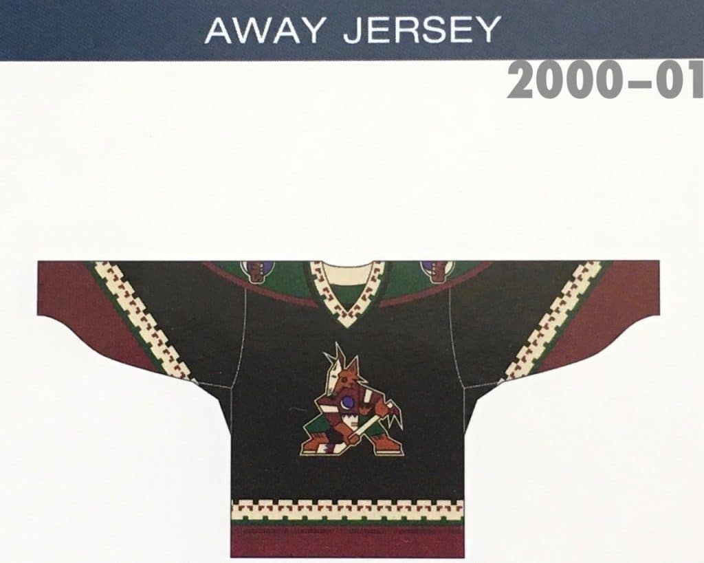
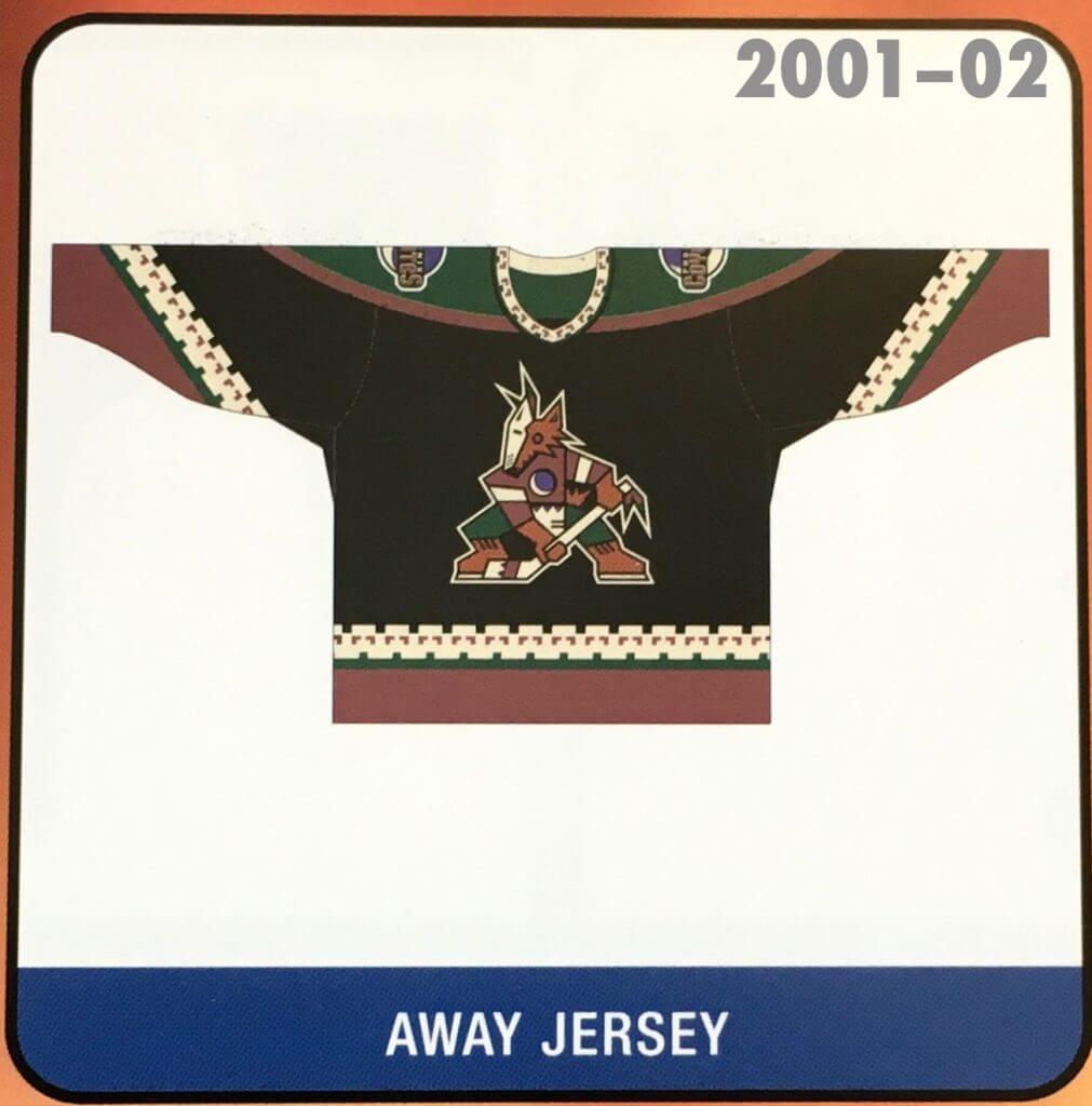
So the original version clearly had the two beige blades. And then Reebok (which still had the NHL uniform contract in 2016) apparently introduced the brown blade, presumably by accident, on some of the jerseys worn for that November 2016 throwback game.
And what has happened since then?
On June 22, 2018, the Coyotes announced that they’d be reviving the Kachina design as their third/alternate uniform for Saturday home games (“Kachina Saturdays”) during the 2018-19 season. As far as I can tell, all of the photos and graphics that accompanied the announcement showed the two beige blades. So the Reebok glitch appeared to have been fixed by Adidas.
But when the new Adidas throwbacks made their debut on Oct. 13, 2018, here’s what happened:
The brown blade was back! Based on my admittedly cursory photo research, it appears that the brown blade was worn by all players for all of the Coyotes’ throwback games in 2018-19.
So was the problem fixed for 2019-20? The Coyotes’ first throwback game of that season (i.e., the current season that’s been interrupted by the pandemic) was on Oct. 5. Here are some pics from that game (click to enlarge):
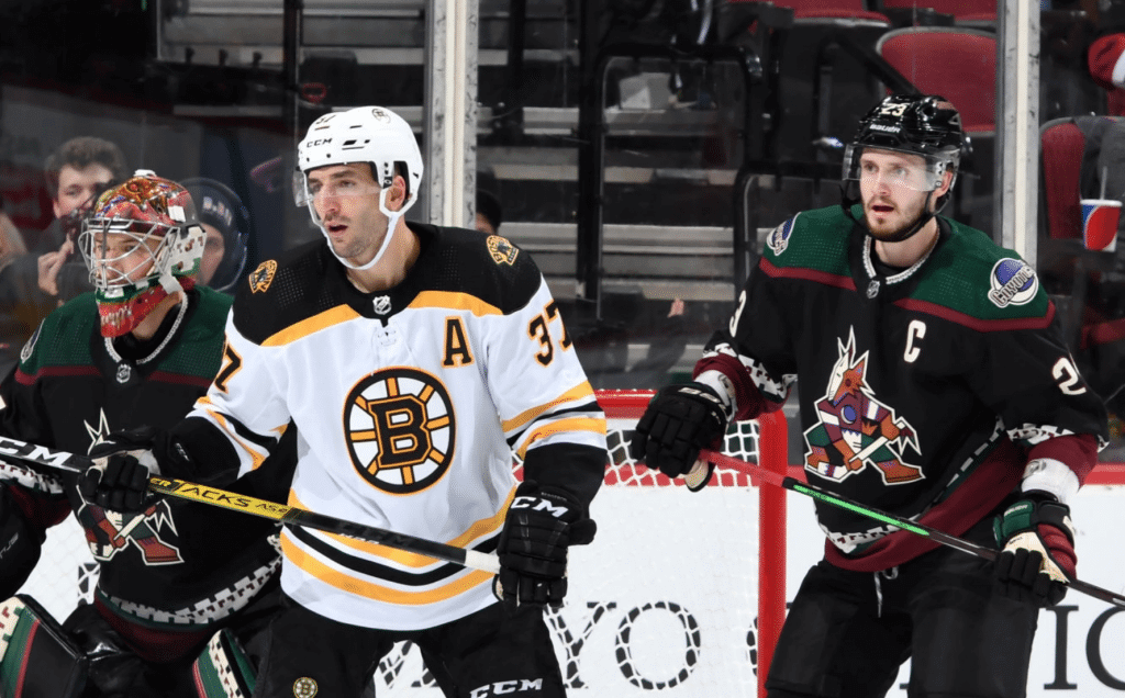
Still with the brown blade! Again, based on my admittedly incomplete research, it appears to have been worn by all players throughout the 2019-20 season. In fact, earlier this month the Coyotes’ official Twitter account tweeted that the team was “missin’ Kachina Saturdays” and used a photo clearly showing the brown blade:
Missin' Kachina Saturdays. pic.twitter.com/0IWKTJC5KH
— Arizona Coyotes (@ArizonaCoyotes) May 16, 2020
But wait — it gets weirder! If you go to the Coyotes’ online shop, the authentic jerseys do not have the brown skate blade, even though the on-ice jerseys clearly do have it. So the game jerseys and retail jerseys don’t match (not that I care about retail jerseys, but the inconsistency is nonetheless interesting).
How did Reebok introduce this glitch into the Coyotes’ visual program? How did Adidas initially fix it and then reintroduce it? It’s all very bizarre.
By coincidence, this all came to my attention just as the Kachina logo and its designer, Greg Fisher, were the subject of two feature articles — one on NHL.com and another on AZcentral.com. Both articles were accompanied by photos that showed the brown blade, even though Fisher’s original design did not include the brown blade.
I emailed Fisher on Tuesday to ask him about all of this — no response yet, unfortunately. I’ll post an update if I hear back from him.
(This entry would not have been possible without eagle-eyed reader Jordan Lacoste, who recently brought the brown blade to my attention.)
Solving a history mystery: The MLB Network recently used the graphic shown above to promote some of its pandemic filler programming. Do you notice anything surprising about it?
Eagle-eyed Padres radio broadcaster and longtime Uni Watch reader/pal Jesse Agler did. I’ll let him explain:
Gary Carter was my childhood hero, so my eyes went right to him [in the bottom-left corner of the graphic, representing the 1986 Mets]. My immediate thought was “I’m guessing that picture’s not from ’86 — the uniform is too baggy and he looks a bit older.”
Then I noticed the helmet. I never remembered him wearing one with an earflap.
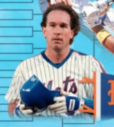
I can see him standing on second base in his final game as an Expo before retiring — no flap. Thinking of images of him as a Giant and Dodger, I didn’t recall a flap.
I’m going to break into Jesse’s story here to say I completely agree with him. I watched a lot of Gary Carter (especially when he was with the Mets, but also before and after his stint in New York), and I definitely think of him as a flapless player.
But! Jesse did a bit of digging and discovered that Carter wore an earflap early in the 1988 season, as seen in this clip from an April 7 game — the third game of that season — in Montreal:
I have no memory of Carter going earflapped that season, but apparently he also did it at least once at home (I say “apparently” there because the photo is undated, which is unusual for AP pics) and apparently as late as June 12 (I say “apparently” in that case because Getty captions are notoriously unreliable, plus that’s a pregame photo, so it’s not clear he was going flapped in the actual game). That was the year Carter spent nearly three months stuck on 299 career homers, so Jesse theorizes that the flap may have been an early-season thing and then he may have scrapped it as a slumpbuster move.
In any case, bad move by the MLB Network (for using an ’88 photo to depict the ’86 Mets) but great spot by Jesse!
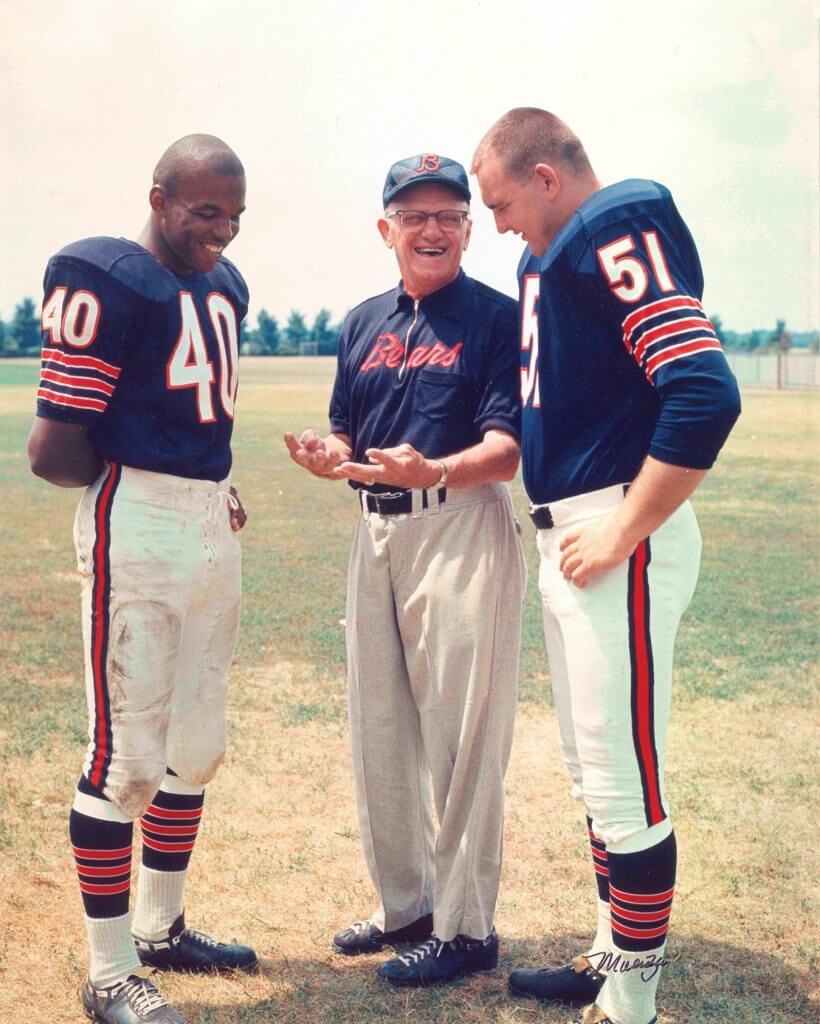
Click to enlarge
Worth 1,000 words: So much to like in this photo of George Halas with Gale Sayers and Dick Butkus — and so many uni-centric details! For example:
• I particularly like Papa Bear’s zippered shirt with the script insignia — but it’s odd that it includes a pocket.
• It’s hard to be sure, but it appears that Halas may also be wearing cleats (which was not uncommon for NFL coaches at the time).
• Sayers has short sleeves while Butkus has long sleeves.
• Butkus’s pants have belt tunnels and maybe a zipper; Sayers’s pants have neither.
• Both players are using athletic tape to keep their socks up.
(Big thanks to Brian Wulff for sharing this one.)

ITEM! Yet another membership raffle: Reader Frank Seitz recently donated two memberships for me to raffle off, so that’s what we’re going to do today.
This will be a one-day raffle. To enter, send an email to the raffle address by 8pm Eastern tonight. One entry per person. I’ll announce the two winners tomorrow.
Speaking of raffles, the two winners of yesterday’s membership raffle are Marc Bronitt and Aaron Telecky. Congrats to them, and big thanks to the anonymous reader who sponsored that one.
The Ticker
By Paul

’Skins Watch: In 1998, the school district in Auburndale, Wis., complied with a request from the Apache Nation to stop calling its teams the Apaches. Since then, the district has used an “A” logo but has had no official mascot or team name. That is now changing: They will henceforth be known as the Eagles (from Timmy Donahue). … The Newmarket Redmen, a youth hockey team in Ontario, will now be known as the Newmarket Renegades. The team had been urged to make the change by the Ontario Human Rights Commission, which determined that the old name was insensitive to indigenous people.

Working Class Wannabes™: According to an article about former Detroit Lions player Chris Spielman, he was popular with fans because of his “blue collar work ethic.” … The father of new Wisconsin football commit Jack Pugh says his son chose Wisconsin because it “comes across as a blue-collar type of program.” … Speaking of Wisconsin, Miami Dolphins LB Vince Biegel, who played for the Badgers in college, says, “When people draft Wisconsin guys, they know they’re getting coachable guys who are going to bring their lunch pail” (from Kyle Speicher). … An article about pro golfer Hale Irwin says he was a “blue-collar athlete” when Colorado football coach Eddie Crowder recruited him. … An article about the Cleveland Browns says highly paid star players are nice, but what teams really need are “these blue-collar players [who] come through for them.” … Former NFL player Chad Cascadden, who’s getting ready to transition into the financial world, says his high school team was “a close-knit, tight, hard-working, blue collar, no-nonsense team.” Even better, his college team — Wisconsin again! — played “a blue collar, lunch pail, no-frills, let’s-get-after-it kind of football.”

Baseball News: Everyone knows the A’s are famous for wearing white shoes. But according to a quote attributed to former A’s P Vida Blue, they would take BP in black shoes and then change to white for the game. I hadn’t been aware of that. … Gross: The Cardinals invited fans to design their own uniforms — and gave them a template with a Nike maker’s mark (from many readers).

Football News: Bucs QB Tom Brady learned a lot about golf attire during last weekend’s celebrity match. … Meanwhile, Peyton Manning’s golf cart had lots of visual references to his football career (from Kary Klismet). … Former NFL WR Antonio Brown was seen practicing in a Raiders practice jersey and helmet and Steelers pants (from our own Anthony Emerson). … Tons of awesome stuff from a 1981 NFL merch catalog. That sound you just heard in the background was Brinke Guthrie drooling. … College football bowl game naming sponsors advertisers are absurd enough as it is, but they take things to a new face-palm level when they play musical chairs with the various games.

Hockey News: “This is quite rare, and I’ve never seen it before,” says Johnny Garfield. “It’s a photo of Mark Messier, shortly after he was acquired by the Canucks during the team’s 1997 training camp, by which time the team had changed its logo to the first-generation orca design. But he’s wearing the team’s ‘flying skate’ practice jersey, part of an identity system that he’d never wear in game action.”

Basketball News: Spurs fans want the team to bring back the fiesta-themed uniforms. … Dan Kennedy put together a fun Pistons redesign concept. … The 76ers held a fan contest to design a new shooting shirt. Here’s the winning design. … The Basketball Hall of Fame is pushing back its induction for the class of 2020 to 2021.

Soccer News: FC Cincinnati fans have chosen the logo that will be created by the color pattern in the seats of the team’s stadium (from Wade Heidt). … Also from Wade: LAFC is seeking a new stadium name advertiser after their existing advertiser pulled out. It’ll be interesting to see if there are similar developments elsewhere, since naming advertisers are presumably feeling the financial pinch from the pandemic (just like potential uniform advertisers). … From our own Jamie Rathjen: “English club Reading’s women’s team are to be the first team in the Women’s Super League to play all their home games at the same stadium as their men’s team, Madejski Stadium. The other WSL teams all use smaller stadiums in their local areas, although most have played at least once at their men’s team’s stadium.”

Grab Bag: The astronaut suits that were going to be used for yesterday’s now-postponed SpaceX launch had some massive side panels. Here’s more on how they were made, a design assessment (NYT), and info on how these space suits are the first in many decades not to include patches (from Don Silsby, James Gilbert, and Blaise Lucas). … The Canadian rugby union team will now be outfitted by Macron (from Ed Zelaski). … From our own Jamie Rathjen: “Australia’s Seven Network, which shows the Australian Football League, is saying that AFL teams are now permitted to put ads above their numbers because of the shortened season this year. For what it’s worth, there’s not much room there and some teams have the initials of their former identities in that space.” … I can’t say for sure how legit all of this is, but here’s a faaaaascinating thread that purports to explain — with some evidentiary/sourcing backup — why right-wing protesters often wear aloha (i.e., Hawaiian-style) shirts. The explanation appears to be backed up — at least broadly, if not in every specific detail — by this short piece in The Economist, which is a reputable source. Bizarre (from the Tugboat Captain). … With Pride Month about to begin in June, New Orleans police officers have the option of wearing a rainbow-striped badge (from Timmy Donahue). … We’ve often run Ticker items about the the latest projects showcased on the @PaperStadiums Twitter account. Here’s a whole article about the guy who makes the the amazing paper sculpture (from Chris Weber).
Click to enlarge

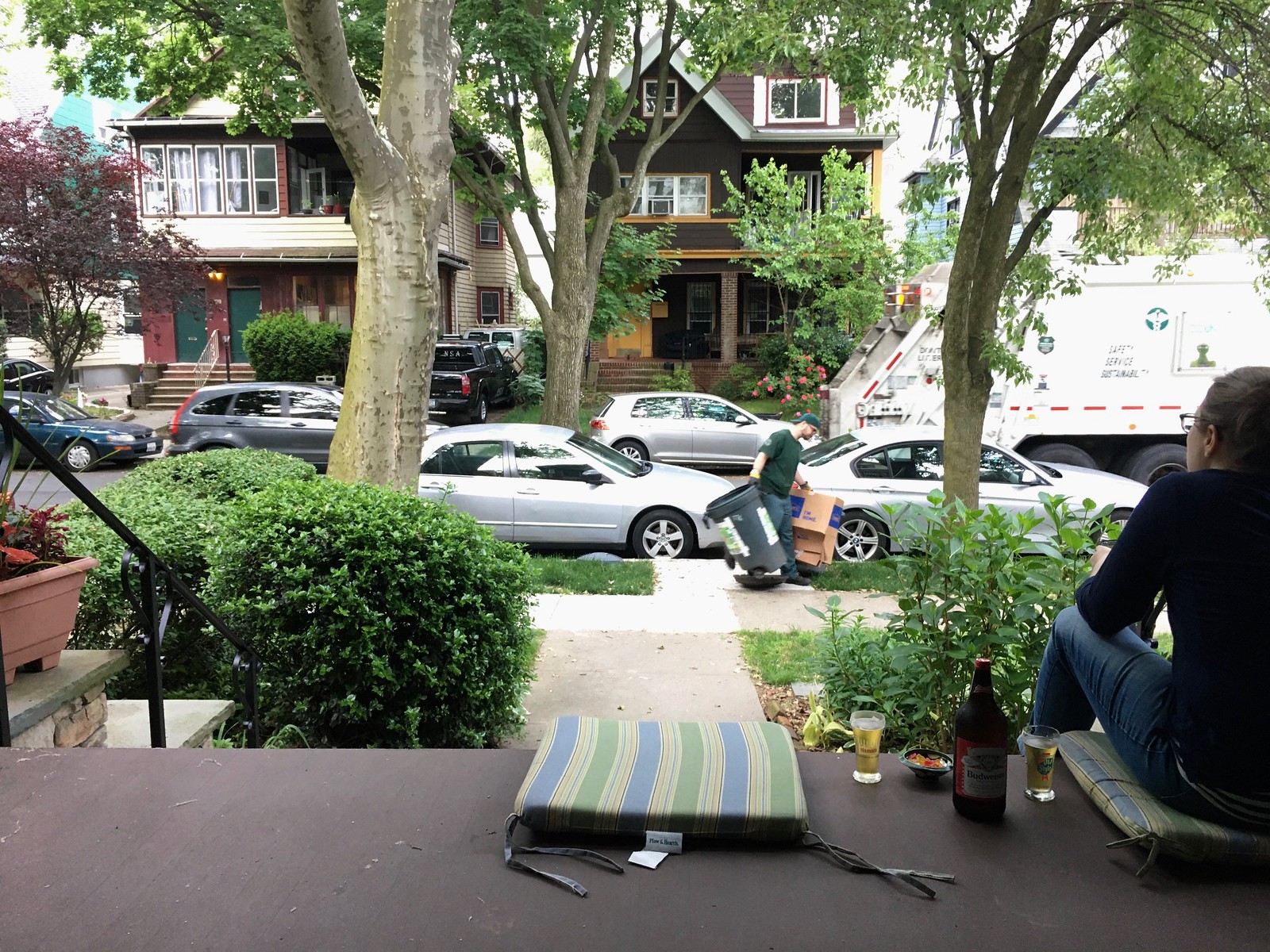
What Paul did last night: Being a garbage man is a tough, underappreciated job under the best of circumstances. I can’t even conceive of what it’s been like during the pandemic.
So as we hit the porch yesterday evening and I heard the rumble of the garbage truck a few houses down, I wanted to be sure to include that in the daily photo, as a way of acknowledging the essential work that continues to take place during this difficult time.
As it turned out, I got a nice shot, with the garbage truck nicely juxtaposed against the roses across the stret.
The branch is still there.
As always, you can see the full set of Pandemic Porch Cocktails™ photos here.
If you notice the blue in the remaining portion of the crescent moon on the jerseys in the lead 4-pack photo, they are different shades of blue/purple.
Pretty sure that’s just the lighting.
Good possibility of that.
The the two triangles on the hockey stick appear to be different for the players on the left (black triangles) versus the players on the right (purple triangles). Again, could simply be a lighting thing.
Butkus’ jersey points out a detail I hadn’t considered when we often discuss why football teams with striped sleeves look “wrong” because they screw up the sleeve patterns today:
Football jerseys were originally long sleeved.
I’d forgotten that. I have an old jersey somewhere – probably the first Steelers merch I ever picked up – that has three-quarter sleeves.
Antonio Brown story has his name as “Anthony”.
Fixed.
To my eyes, it appears Halas is also wearing unhemmed flannel baseball pants.
That’s what I noticed. If they were double knit they’d look exactly like today’s baseball pants.
They look like Dockers to me.
Lee
Re: Vida Blue, I can remember going to Shea in the mid 70s and before the game we would go see the Mets take batting practice. I can remember Dave Kingman and Mike Phillips coming out for BP wearing bright blue Puma cleats, but when the game started they were back wearing their normal plain black cleats.
That glitch is terribly frustrating. How was it missed to begin with? How did the equipment manager not pick up on it and not have the vendor replace it with a sweater the correct logo as soon as possible? If you are familiar with the logo it is obvious as soon as you see it. Presumably those in the Coyotes organization are familiar with their own branding.
The Coyotes are three or four owners removed from the original branding. Including an insolvency and a period of league ownership. Its not been an organization with much continuity. I’d be surprised if there’s anyone around from those days.
But surely somewhere in the offices are multiple old jerseys. I’ve been inside several pro hockey management offices, and every single one has had framed jerseys on the walls and boxes of old equipment piled in closets or corners. That’s just the normal around-the-office detritus of any business. And the primary money-making business of a hockey team isn’t actually putting pucks into goals, it’s branding and marketing. Winning hockey games doesn’t make a hockey team money; selling advertisers and fans on the team’s brand identity makes a hockey team money.
Even with a presumable >400% turnover in staff, this really is an instance of You Had One Job.
That said, I’d be curious whether the NHL league folks had any hand in the Coyotes’ rusty skate disaster. I’ve been quite impressed with the league’s marketing and design work in recent years, but even the best organizations commit a few goofs.
“Rusty skate” — yes! An excellent term. Should have thought of it myself!
You’re right about most teams, but the Coyotes were extraordinarily chaotic. I’ve heard stories about all of the around-the-office detritus going into dumpsters.
Its not what a team should do, I agree with you on branding and marketing, but it is the sort of thing that happens in chaos.
Agree, and beyond the Coyotes themselves one assumes those in the uniform industry are fans of uniforms and logos. I’m not a Coyotes fan at all, but their kachina logo has always been a memorable design, surely people involved with making those jerseys outside the organization should have picked up on that too. The people actually sewing them, presumably in China would have no idea, but whoever sent the design specs over there ought to have noticed something was off.
I believe they just used pictures that looked good. The Mike Schmidt picture isn’t from 1980. The hair is the give away. 1980 mike had more side hair. And around 85-86 he changed his hair slightly. Little longer in the back cleaner on the sides.
“Former NFL WR Anthony Brown was seen practicing in a Raiders practice jersey and helmet and Steelers pants…”
I actually like that Yellow/Silver/White/Black color combo!
Sayers’s pants are dirty, Butkus’s are pristine!
Maybe Butkus got the best of Sayers that day in practice?
I had a serious case of déjà vu reading the text of today’s What Paul Did Last Night entry…it’s extremely similar to your May 22nd entry.
Whoa — I thought I tore that out and published something else that day. Didn’t remember that I actually went ahead and posted it.
The description of what we did each day was accurate. But yesterday was really the *second* time we’ve been apart for much of the day, not the first. I’ll change today’s text to avoid the redundancy!
I had the same feeling!
How can the Spurs bring back a uniform that never existed? The Fiesta colours were only ever used for the logo, court and warmups.
I was thinking the same thing lol
Very true.
And it’s nothing new, the Spurs subreddit and other fan groups have been pushing for a Fiesta colorway for a long time, and yet the team keeps pushing out new camo unis every season.
We get it, Peter Holt (team owner) was in the military. We appreciate it and San Antonio is a military city.
Those camo unis are awful.
Regarding that MLB Network graphic, the Oriole cartoon bird logo pictured in the 1970 pennant is the current cartoon bird logo and not the cartoon bird that was in use in 1970.
Thanks for the shoutout, Paul!
That Detroit D logo is the business. Totally dig it.
As a Jets fan, the Coyotes jersey makes me irrationally angry. Its an emotional response, not a rational one. I can’t look at that thing.
I was a (partial) season ticket holder for the Jets when the team left, I was at the last game and the last playoff game (both Detroit). Losing the team was hard and it left a scar. Seeing “our” team on the ice hurt like hell and even though we got our team back I’m not over hating the Coyotes.
Those of you who’ve lost a team – does anyone else feel the same way about the new team.
The Oilers. Especially when people say their history and colors belong to the Adams family. I don’t hate the Titans and Nashville though. I don’t like when they wear Oiler throwbacks. Those mean nothing to Titan fans.
link
i like this “ranking” video for NFL jerseys instead of doing 32-1 they did it by tiers afwful, bad, close, good, great, grand, and wonderful)
he also mentions Uni Watch at the 22:20 mark
This was my favorite of the Cardinals jerseys:
link
Definitely a late-career photo of Schmidt.
Looks like he is wearing a jersey with buttons, not one of the zip-up models the Phils wore ‘til the late 1980’s.
Man, I really disliked those home pinstripes!
Misplaced comment!
The astronaut suits that were going to be used for yesterday’s now-postponed SpaceX launch had some massive side panels…
…these space suits are the first in many decades not to include patches
Suit design is OK. Definitely not my favorite (Project Gemini is, but no, I’m not going to rank all the different suits). The lack of mission patch saddens me a bit. Even though I think the self-expression ratchet has turned way too much these days, I always love a good mission patch.
here’s a faaaaascinating thread that purports to explain — with some evidentiary/sourcing backup — why right-wing protesters often wear aloha (i.e., Hawaiian-style) shirts.
As an independent (and a Magnum PI fan), I’m not getting rid of my aloha shirts, so if you see me in one, don’t be quick to judge. I like one of the responses in the Twitter thread, which basically suggested that *everyone* wear aloha shirts so you can’t tell who’s who.
I tried to take that approach when the “Tea Party” folks made the Gadsden Flag their symbol, but eventually I had to give up. Aloha shirts are basically my warm-weather uniform, so I’ll try to hold out, but if the right succeeds in politicizing that too, I guess I’ll have to switch to soccer jerseys.
Big Magnum fan, too! “I know what you’re thinking, and you’re right …”
Halas and Sayers are wearing Riddell cleats. Those were the bomb back in the day.
Yep. And it looks like Papa Bear tried to shoe polish out the tell tale white belt at the ankle.
Coach Halas might have been trying to disguise the fact that he didn’t have Wilson cleats from his own sporting goods store: link (Mentioned here in 2008)
I like the editorial position that Uni-Watch takes on retail jersey’s. If they were given another inch they could take over the conversation. But … the fact that the “authentic jerseys” that are being sold are not actually the authentic jerseys seems like a reallllly big deal to me. Is there precedent for the misuse of the word “authentic”? Is it akin to the word “literally”, which now somehow means the exact opposite of what it is supposed to mean?
If an “authentic” retail jersey for Player X is not the same size as the real Player X wears, is it really authentic?
If Player X has some small tailoring customizations made to his jersey (as many players do regarding sleeve length, hem length, etc.), is the “authentic” retail jersey truly authentic?
If NFL players’ jerseys don’t have sleeves, but the “authentic” retail versions do have sleeves, are the retail versions truly authentic?
If the “authentic” retail jersey and the players’ jerseys are made in completely different factories/countries (which is often the case), are the retail versions truly authentic?
If the players’ jerseys have “2019 Season, Set One” (or something along those lines) sewn into them, as is often the case, but the “authentic” retail versions don’t, are the retail versions truly authentic?
And so on. As used in a retail setting, “authentic” is just more marketing bullshit and a mis-colored skate blade is just one more inconsistency, among many, from the real thing.
You want really authentic? Get game-used.
If the base jerseys, retail and game-used, are all coming off the same assembly line, I’d be comfortable calling them “authentic”. Tailoring and add-ons (including the player’s name on a size they don’t actually wear) wouldn’t be deal breakers for me. I’d want to be able to think that the thickness of the fabric and the quality of the stitching are the same for me as they are for Player X. But that’s just my personal semantics opinion on the word “authentic”.
I’ve never actually considered buying a jersey, so haven’t given too much thought to “authenticity” before, but yeah marketing bullshit.
Totally agree with Paul here. When it comes to retail jerseys they are simply that now, retail. They might have different levels of detail and quality, but it doesn’t seem like you are getting anything close to what is worn by the players. A lot of that probably has to do with how the jerseys are custom tailored, and I don’t just mean for a particular player, but for athletic use in general, where retail stuff is designed for people sitting around watching a game.
I remember as a kid getting an “authentic” Marshall Faulk rookie jersey, so were talking 1994. Back then you could tell authentic was built the same way the game jerseys were, fabric stitching, etc. I can look at a game photo and tell they are the same thing. But even then it was only authentic in that sense, the custom tailoring each player gets from the equipment manager is never there. And this was also before jerseys became such a big business, and before Nike and such added all of the gimmicky performance design and material nonsense.
On the Halas, Sayers, Butkus picture, one non uniform comment, how less than pristine the field looks, i.e. they’re standing on dead grass. It was an era that not everything had to be perfect for the NFL.
On the porch photo, sad to see the revenge of the metallics, I’m rooting for the bright red car to re-appear.
Typo: Gale Sayers (not Gayle)
Indeed. Fixed.
I’ve never seen this before, and I don’t know if it’s been mentioned on Uni-Watch previously, but I’m digging the field logos from this 1967 Browns-Cowboys game. Fast-forward to the 2:30 mark.
link
The 1967 Cowboy-Brown game is fantastic for uniforms but also amazing for the 60s Dallas Cowboy stars. What a game for Bob Hayes (#22). Don Meredith at QB, Bob Lilly with the quickness and strength for a sack, Cornell Green with a pick six, Don Perkins with hard running. Great clip.
Thats some good stuff.
Lee
another tidbit…is this was the first year they used the “slingshot” style goal post
Good find, I’ve never seen that logo either. This has previously mentioned, but still interesting to see each team be designated an end zone, despite the game being played in Dallas. Probably just the deterioration of the quality of the film, but the Cowboys end zone looks yellow to me.
my guess on the coyote logo is the manufacturer didn’t stitch the white thread on the the brown backing to match the other blade. the whole run was probably finished before it was noticed and then economics took over.
Am I only one who thinks that maybe the cardinals need to be flooded with entries that contain their current jersey design with the mark of the beast whited out?
Paging Mr Yuck.
A big issue with me is the NHL template disallowing the traditional v-neck pattern. I feel safe in saying most pro hockey teams were whelped in the expansion era, after the lace-up collar had been temporarily retired. But each time a big-named athletic apparel maker wins the league contract, they feel justified in tweaking a feature that really ought to be left up to the teams. (Nike also does this to the NBA, using those silly diagonal shoulder straps on the backs of the jerseys). A vital detail of the original Coyote sweater was the fat elastic webbing on the collar, carefully mitered to make a mirror image at the “widow’s peak”. I don’t think anyone would be surprised to find that the inspiration for the Coyotes’ jersey was Clint Eastwood’s serape, and the collar trim really iced it. But the Reebok (tiny pattern, squared peak) and Adidas (honking huge NHL shield) template have bolloxed the detail on everyone’s uniform, it’s just more conspicuous on Arizona’s sweater.
That sanitation engineer is taking that blue collar wearing, lunch pail taking, garbage can lifting, cardboard box folding, heavy lifting wannabe crap from the curb to the garbage truck where it belongs. He wears a green collar.
Gents. If you ever want pictures of a Game Issued 1999-2000 Coyotes jersey just let me know. I have one in my collection – so I can zoom in or isolate any part of it you want to see. Instead of just looking at the published style guide for that year.