As you may have seen in yesterday’s entry, Branch Rickety — the informal name for the wayward branch that was hanging from the tree across the street from Uni Watch HQ and had become a key part of our daily Pandemic Porch Cocktails™ ritual — finally crashed to the ground on Monday evening.
The virtual ink on yesterday’s post had barely dried when reader Ron Ruelle, who’s a professional illustrator and cartoonist (more on that later), sent me this jersey concept for a team called the Brooklyn Branches (click to enlarge):

The wooden buttons are a nice touch, right? Here’s a closer look at the sleeve patch (click to enlarge):

I love that — straight out of The Natural!
And here’s the cap, which has a wooden squatchee:

You might think this is something Ron dashed off as a lark, without much thought. Au contraire, mon frère! Here’s his detailed explanation of the design’s “storytelling” elements:
Jersey
The wordmark “Branches” is a verbal cue signifying the team name and complements the nonverbal representation of the illustrated branch that underlines it. The road jersey, not pictured, substitutes the word “Brooklyn” with a similar purpose.The illustrated branch on the front of the jersey depicts the actual Brooklyn Branch™ that gave its life so the new team could sprout like a sapling from the pavement where it landed. It also underlines the name, bringing a unity to the wordmark, symbolizing the solidarity required for teamwork. Also, it’s a bat, which represents one of the tools required to play the sport of baseball, similar to the way a branch is one of the important parts of a tree.
The numbers are rendered in a wooden font, honoring the dedication to craftsmanship a baseball player must have in order to succeed. The proximity of the digits to the branch illustration is a reminder that a good craftsman never blames his tools.
The collar is lumberjack plaid, to honor the blue collar nature of the team’s grit. The sleeve stripes are also plaid, to symbolize the unity between these various elements. The lack of any blue tones in these features shows respect to the blue collar workers who may be humbled or embarrassed by such fanfare.
The buttons are of course crafted from actual wood, representing actual wood.
The sleeve logo depicts WonderBoy™, the mascot of the team. Despite their male-seeming name, WonderBoy™ is a genderless, ageless, raceless humanoid who represents all of humankind. The name is symbolic of Roy Hobbs’s bat in the movie The Natural, which, in the film, was forged from the branches of a tree felled by lightning. The player is swinging a bat formed from a branch, which hearkens back to the days when the original Brooklyn Branch swung in the trees above a street. Neither the bat nor the character can succeed without the other, much in the way humans and trees form a symbiotic relationship to survive.
Cap
The cap represents the historical style of cap worn throughout the history of baseball, which also provides soothing, cooling shade to the player, much the same way that the leaves of a tree might do. The rings in the cross-section of the branch in the logo represent the number of years the team has existed, and will be updated with an additional ring for each season. The fact that the branch has been cut is a nod to the fleeting nature of life and to the sacrifice trees make to inspire us (as well as to provide the materials for bats).The B represents Brooklyn as well as Branches, and is in fact a pair of interlocking and overlapping “B” characters that cling together in such precise unity that they become one single letter, thus symbolizing the solidarity of the people of Brooklyn with their tree branches, as immortalized in the famous novel A Tree Grows in Brooklyn.
The squatchee is made of wood to match the buttons on the jersey, symbolizing further unity between the parts of the uniform.
Stirrups
The stirrups represent the roots of the tree, as well as the roots of the organization, and also the team being rooted in a solid foundation of hard work. Also, stirrups are a good look.Colors
Each color tells a story:Photosynthesis™ is a hue of green representing the life-creating force that sustains the existence of trees as well as humans, including the Brooklyn Branches’ players, staff, and fans.
Solar™ is a shade of yellow representing Sol (also known as the Sun), which is one of the key requirements for photosynthesis to occur.
Xylem™ is a tone of light brown representing the flow of nutrients from the roots of the tree to the branches, symbolizing the rise of our players to the very heights of success.
Phloem™ is a darker shade of brown representing the flow of the food produced by photosynthesis downward to the roots and all other parts of the tree, symbolizing how a team can be a source of sustenance and pride for a community.
Dihydrogen Monoxide™ is a proprietary shade of blue that represents water, the other key ingredient in photosynthesis. This color does not appear in this current uniform set but will appear in future uniform designs.
Oxide™ is a variant of white that represents the very oxygen the players breathe in to sustain their success. It serves as the basis for the home uniforms as well for all life on Earth.
Hydrogen™ is a light shade of black, similar to grey. It represents the material that fills zeppelins and blimps, which can carry people great distances, hence its use as the base color for the road uniforms (not shown in this presentation).
Carbon for Carbon’s Sake™ is a very dark shade of black that is reserved for potential alternate uniforms. It represents the material from which all life is formed and also serves as a cautionary tale about the effects of pollution.
That’s some good stuff there from Ron. I liked it so much that I showed it to DIY genius Wafflebored, who readily agreed to make a prototype jersey based on Ron’s design. I’ll even send Wafflebored pieces of the actual branch (which I harvested off the street after it came down) so he can use them to create the jersey’s buttons. Then we’ll auction off the jersey and donate the proceeds to some sort of arboreal/environmental group that plants trees or something like that. (If anyone can recommend such a group, I’m all ears.)
How else should we pay tribute to the branch — Brooklyn Branches T-shirts? Caps? Something else? And what should I do with the rest of the branch — should it have its own trading card, with pieces of its bark and wood serving as relics? Should we have Wafflebored turn it into some sort of creative project, like his awesome puck bags and squatchee lapel pins?
You know, when the Tugboat Captain started our Pandemic Porch Cocktails™ ritual back in March, I mentioned it here on the site but didn’t expect to keep posting photos every day. But a bunch of readers liked it and encouraged me to keep sharing the daily pics, so I did. Similarly, when I first mentioned the branch two months ago, I didn’t expect that to become a daily thing either, but a bunch of you folks immediately embraced it. Who’da thunk?
Finally: If you like Ron Ruelle’s work here, you’ll probably like his books, comics, and other stuff, all of which you can check out on his website.
Too good for the Ticker: Check this out — a family in Illinois created a Wrigley-themed Wiffle ball field in their backyard, complete with a scoreboard and faux-ivy walls! It’s pretty awesome — definitely worth the two minutes it takes to watch the video embedded above.
(Big thanks to Steve Holley for pointing me toward this one.)
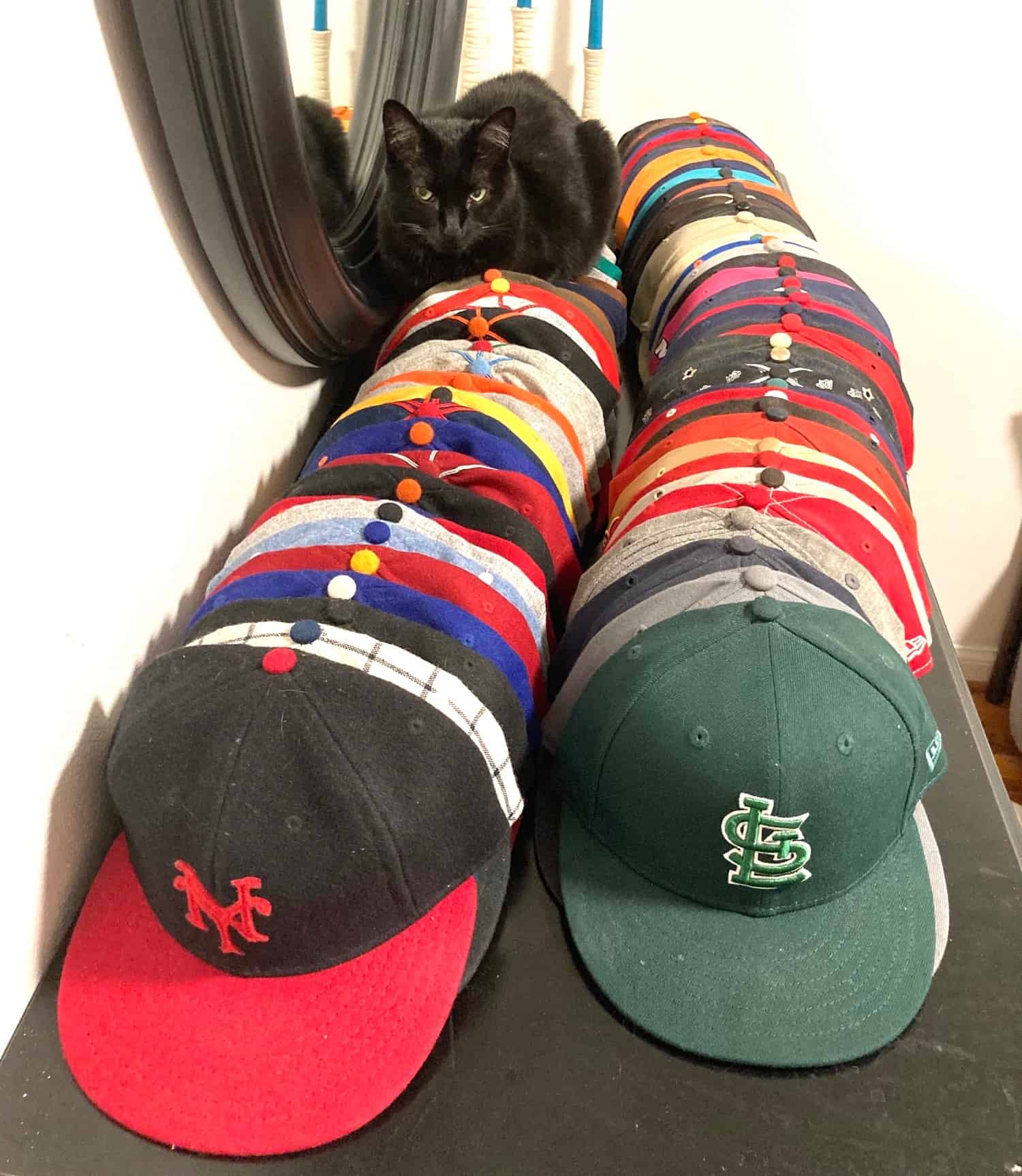
Click to enlarge
Cat on hats: Longtime Uni Watch reader/pal Marty Hick has his caps arranged in two rows: Ebbets Field Flannels caps on the left, New Era and other brands on the right.
That’s Gloria, Marty’s kitty, perched atop the headwear. “She always chooses the Ebbets collection over the New Era/etc. caps,” he says. “That tells you all you need to know about comfort.” Indeed.
The Ticker
By Lloyd Alaban

Baseball News: MLB umpires might have to work entire homestands, instead of rotating after each series, to cut down on travel when MLB’s season finally starts. There’s also discussion about how umps will wear face coverings. … The A’s are the latest team to let fans pay to have a cardboard cutout of themselves installed in the stands. But there’s an added wrinkle: If a fan’s cutout is hit by a foul ball, the A’s will mail the ball to them (from multiple readers). … Several former MLB league MVPs are calling for former commissioner Kenesaw Mountain Landis’s name to be removed from the MVP awards. Landis has been criticized by baseball historians for supporting policies that delayed baseball’s racial integration. … Dr. Anthony Fauci once again wore a Nationals-themed face covering while testifying before Congress yesterday. … Here’s a look at the new bullpens at the Giants’ ballpark. The bullpens were previously in foul territory along the first- and third-base lines (from Andrew Cosentino). … Speaking of the Giants’ stadium, a fan made a a Lego model of it (from our own Brinke Guthrie). … Reader Evan Livingston found an MLB enamel pin set, circa 1989. … In the wake of actor/comedian Carl Reiner’s death yesterday, BSmile found this great photo of Reiner and his son, actor/director Rob Reiner, wearing baseball uniforms for a 1972 celebrity softball game at Dodger Stadium. … No surprise here, but the minor league season has now been officially cancelled.

NFL News: The NFL has awarded four new grants to support the development of safer helmet designs. … LB Patrick Onwuasor announced he was signing with the Jets by posting a photo of himself in his high school football uniform. Onwuasor went to Inglewood High School (Calif.), where the teams were called the Jets. Their helmet logo when he played there poached the Namath-era Jets logo with an “IW” in place of the “NY” (from Alexander Ganias). … Speaking of the Jets: In the 1986 Jets/Browns playoff game, Jets DL Derland Moore’s NOB appears to have been heat-pressed directly onto his jersey, instead of being on a nameplate (great spot by Matt Barnett).

Basketball News: Blazers PG Damian Lillard has been named the cover athlete for the upcoming NBA 2K21 video game. … The Basketball Tournament has unveiled its tourney court (from Jakob Fox).

Soccer News: A bunch of stuff from Josh Hinton: Another photo of Real Madrid’s new home kit has leaked. … Wolverhampton Wanderers’ new home shirt has leaked, and it appears to indicate the club will sign a new shirt advertiser. … Inter has officially released its new home kit, confirming previous leaks. … FC Barcelona has draped the seats of their stadium with shirts featuring fans’ NOBs. … Torpedo Moscow has “STOP COVID-19” across the front of their shirts (from Ed Zelaski). … Also from Ed: New home kit for Ipswich Town. The badge on the shirt celebrates the 40th anniversary of their UEFA Cup win. Here’s a better look. … One more from Ed: New home kit for Portuguese side Sporting Clube. … FC Buffalo has released an “Against Racism” kit (from Joseph Pitirri). … ESPN has ranked its 101 favorite kits (from Nicklaus Wallmeyer). … Here’s something you don’t often see a team doing: Manchester City retweeted a concept shirt made by a fan. The club has no plans for making the shirt, however (from @TexasTrevor). … Also from Trevor: German club Hamburg has lost its shirt advertiser.

Grab Bag: Under Armour, having already attempted to get out of its contracts with UCLA and Cal, is now trying the same thing with Boston College. In case you’re wondering who might be next, here’s a list of UA-outfitted schools (from our own Brinke Guthrie). … Formula One drivers are mulling over whether or not to take a knee at the opening race of the season on Sunday. … The ACC released a gif featuring facemasks with the logos of all the conference’s schools on them (from James Gilbert). … Peter Aksamit has compiled a (probably not exhaustive) list of mascots in team logos that wear uniforms that have never been worn by the actual players. … New athletics logo for D’Youville College in Buffalo (from @tyBuffalo). … A sportswriter has ranked the top 25 uniforms across the North American “Big Four” leagues (from Kary Klismet). … Former vice president and presumptive Democratic presidential nominee Joe Biden held a campaign rally this week inside a middle school gym that is poaching Mizzou’s logo (from Zach Barnett). … With Mississippi’s old state flag now retired, the state has unveiled its interim flag. A permanent replacement will be chosen later this year (from Anthony Emerson). … Here’s a look at some of the background and issues raised by right-wing extremist groups wearing Hawaiian shirts as a de facto uniform. … Patience and Fortitude — those are the two lion statues that stand vigil at the entrance to the New York Public Library’s main branch on Fifth Ave. in Manhattan — are now wearing masks. … PETA is calling on the Air Force Academy to stop using live falcon mascots. PETA calls it the “the ultimate irony … [that] USAF pilots get to fly, USAF Academy live-bird mascots are denied that same freedom.” (from Timmy Donahue). … It was so hot at a 1990 Darlington Raceway event that sweat-soaked drivers’ suits had to be hung out on a clothesline to dry (from Robert Erdtmann). … Now that the calendar has turned to July, Temple’s deal with Nike has officially kicked in. The school was previously outfitted by Under Armour.

Click to enlarge

What Paul did last night: If you look in front of my cushion, you can see Tom, one of our neighborhood strays. He came peeking out of the flower bed just as I was snapping yesterday’s photo and then scampered into the next yard. We were worried about him and the other strays in the aftermath of Monday’s storm, but yesterday we saw two of the others besides Tom, so they appear to be okay.
It’s not quite the same without the branch.
As always, you can see the full set of Pandemic Porch Cocktails™ photos here.
Happy Canada Day to all our Canadian readers, especially prolific contributors Wade Heidt and Wafflebored. Stay safe, have some butter tarts, and enjoy the holiday!
The winner of yesterday’s Naming Wrongs raffle is Blake Pass, who’s chosen this “I Miss The Omni” shirt. Congrats to him, and thanks again to Jon Eidukas for sponsoring this one.
And if you’re wondering about the July pin, check back tomorrow. — Paul
Running a bit low on content, Paul? Tree Branches?
Actually, Hank, I have a bunch of content in the hopper. But if you read yesterday’s comments, then you know that lots of people care about the branch. If you find that surprising, well, so do I (as I stated quite explicitly in today’s post). But it’s fun!
Also, Ron’s “storytelling” breakdown is a pretty effective and entertaining satire/critique of the usual Nike nonsense, wouldn’t you agree?
Also, Ron’s “storytelling” breakdown is a pretty effective and entertaining satire/critique of the usual Nike nonsense, wouldn’t you agree?
I agree! I was just coming to the comments to make this very point! I laughed out loud at several points ready the “storytelling,” especially Ron’s descriptions of the colors(TM) and his explanation of how “actual wood” represents “actual wood.” Fantastic stuff!
I agree. It made me laugh out loud as well. I guess some folks just don’t have a good sarcasm meter. I though the whole entry today was spot on, especially with the branch gone only a day. Well done!
This post represents my appreciation for Ron’s explanation of the Branches uniform.
I see what you did there! Thanks!
No July pin?
Happy America’s Hat day I guess.
Pin update tomorrow.
Happy Canada Day from America, AKA “Canada’s Shorts” link
Thanks to Paul for hosting the raffles, and BIG thanks to Jon for sponsoring this one!
Hamburger SV didn’t actually get relegated. That article’s brutal English meant to say that by losing their last match of the season – and losing ugly – they fell to fourth place in 2.Bundesliga, missing out on a home-and-home promotion-playoff tie against the 17th-place Bundesliga finisher (Werder Bremen), which allowed Emirates to trigger their escape clause and terminate their sponsorship deal with the club.
Yup, text already updated.
My favorite false friend! The perils of machine translation; the word “die Relegation” is used in German to specifically refer to the 16 v 3 playoff. The actual word used in equivalence to English “relegation” is “der Abstieg” which also has the more general sense of dismounting or climbing down.
Derland Moore actually played link with the Jets in 1986; the regular-season finale at Cincinnati, the wild-card win over the Chiefs, and the divisional loss at Cleveland.
Ah, thanks! The Ticker contributor said it was his only game but I didn’t fact-check that when adding the item to Ticker as part of this morning’s edit. Will adjust text!
Great Branches concept, just missing one thing. There’s no memorial patch, ala GSH and the Bears, for the late team owner Branch Rickey.
You make an excellent point. Perhaps a sleeve band in Carbon for Carbon’s Sake™?
Not only a great uni, but this team can have its own drink with another tie to Brooklyn baseball. It’s a version of the lime rickey.
I thought you’d never ask.
Have a Branch Rickey.
Paul, are you down with this aspect of the Branches jersey? “The collar is lumberjack plaid, to honor the blue collar nature of the team’s grit.”
The whole thing is a parody.
Thanks for sharing Peter Aksamit’s faux-uniform compilation. I’ve long been kind of obsessed with a subset: Baseball mascots who wear a cap the team doesn’t wear. In many cases, the mascot’s faux chapeaux is better than what the team actually wears, especially when this phenomenon occurs in the minor leagues.
Although Mississippi’s interim flag is just the state seal on a sheet, the bold stripes of the sheet make it just distinctive enough to stand out from the rest of the state-flag cohort. It wouldn’t be a terrible permanent choice, especially given the requirements the Legislature placed on the competition for a permanent replacement.
I suppose “distinctive enough” is a relative thing. I think it’s just the Missouri flag turned upside down with the state seals swapped. As a life long Missourian, I’ve never cared for ours. I think the seal just makes it unnecessarily busy:
link
The interim flag is good enough, but that doesn’t mean it’s great, or even particularly good. A permanent flag that follows the Legislature’s design guidelines probably won’t be better than the interim flag.
And yeah, it’s similar to Missouri, but it’s still above the average of seal on a blue sheet. If I told you that I grew up in a state whose flag was a blue field with the state seal, and the seal had two people on it, could you name the state by the flag? Whereas if you describe Mississippi’s interim flag to me, I’d have a 50/50 chance of knowing the state. 100% if you get the order of the stripes right. By the (admittedly poor) standards of American state flaggery, that’s pretty good!
Given that the “In God We Trust” motto (a requirement to be on the new flag) is fairly well subdued by the rest of the elements of the state seal, I agree that it might be about as good of a design as we could hope for.
I love the idea of a branch relic card! When there is a relic or autograph on a card, there is almost an authentication stating, “All signatures are witnessed by a Topps employee” or “The relic contained in this card is game-used material. Enjoy your piece of history”. Something like that would be cool.
What about embedding a price of the branch in a monthly pin? Embed it in the pin, and then glass over it to make it smooth? Something needs to be done! :)
The uniform breakdown by design element was fantastic! That the kind of content I didn’t know I needed. Reminded me of the old days of ESPN page 2, when they run satire pieces. Every new real uniform should have the real press release garbage, Paul’s opinion on both, and then Ron’s version of what each color and stripe means.
Paul, thank you for your best wishes for a happy Canada Day! Much appreciated. I will make sure it is indeed a good one. Already in my Canada Day uniform featuring my Canada t-shirt and Canada cap goes on when I leave the apartment today.
Hope the upcoming Independence Day holiday is a good one for you and all the U.S. contributors and readers!
Speaking of caps, I could always find room for a green and yellow Brooklyn Branches cap in my cap rotation.
You’re very welcome, Wade. I always appreciate how you keep us up to date on Canadian uniform news. You’re a good ambassador for your country!
I wouldn’t say no to a Branches cap, nice work Ron!
I had a comment on the espn 101 soccer kit rankings yesterday, but considering it’s in the ticker, I’ll add it here if anyone wants to talk about kits. I was a little disappointed they left off this alternate kit used by FC Porto (link). I actually still have this shirt, which I got in 99.
The collar is lumberjack plaid, to honor the blue collar nature of the team’s grit.
This whole thing is magnificent. And this line is just glorious. Fantastic work, Mr. Ruelle!
New Look for the Southeast Missouri State Redhawks
link
Kenesaw Mountain Landis was a terrible judge, an awful Commissioner and his father couldn’t even spell “Kennesaw” right.
Great point I’ve never noticed before!
Love the Branches write up! Very entertaining all around!
I think today’s lede and the pandemic porch cocktails are what makes this truly feel like a comm-uni-ty. Yes, we can all debate the good and bad elements of uniform designs and all of the minutia that lives on the fringes of that topic. It is when we enjoy and discuss the little things that are truly “ours” (like a branch hanging from a tree in Brooklyn), that we really connect. I appreciate the fact that you (Paul) let us into your and Mary’s lives. Others do this as well when they share hobbies, projects, or special memento’s that break from the national uni conversation. It helps me feel connected to you all and like you are connected to me. It gets personal, special, and reminds me why this site is a part of my morning routine.
Thanks, Dustin. I agree, it’s all very special!
When the branch came down, I told Mary, “Oh-oh, my readers aren’t going to like that one bit.” But I didn’t expect someone like Ron to create a whole project around it within a few hours of yesterday’s entry being posted!
That write up was amazing satire. Nike might actually hire him to come up with the nonsense they spew out for every new uniform.
“I didn’t expect that to become a daily thing either, but a bunch of you folks immediately embraced it.”
Well, of course. We can be sports lovers AND tree huggers.
I don’t like the Brooklyn Branches concept……I LOVE IT. Another “Seasonal” thing that can be done with the colors/logo is the change the foliage in it. Spring can be sans-leaves, fall can introduce red and orange as alternates!
Whoa, that is beyond brilliant. I didn’t even consider that possibility.
Cool idea! Now you’ll need to come up with some new storytelling elements for the seasonal colors, Ron! :-)
Thanks! All brilliance here is you and your concept in the first place though. I would think that the little leaves on the “branch/bat” on the jersey can be like little buds in the Spring, and one yellow one orange in the fall. Maybe introduce an alternate jersey then too, where it’s yellow…errr…”solar” with an orange cap, etc. Love the idea can’t wait to see where this all goes!
Happy Canada Day! Especially to Wade Heidt and all the other Uni Watchers who played along with link. That was a fun collaboration. If I go outside today, I’ll be wearing a Hockey Hall of Fame t-shirt and a Habs logo face mask.
Happy Canada Day as well Mike! Fun to look through Canadian Cities’ Power Rankings again.
Many of the uniforms have changed since then. Noticed that the complaints I had in the rankings about the uniforms of the Canucks and the Alouettes have been addressed with their uniform changes.
The BC Lions uniform back in 2015 better than the uniforms that team has worn since 2016 to present. The Lions should not have messed with a good thing.
Meanwhile, the OHL Hamilton Bulldogs also got new uniforms. OK, they opened the sporting goods catalog and slapped their logo on the Pittsburgh Penguins template, but they are new uniforms! With the black and gold matching the CFL Tiger-Cats (and hey, Hamilton is the Canadian Pittsburgh, for the steel industry), I’d be curious to see how much better Hamilton, Ontario would do if we redid it today.
Yep – even if it was the same participants with the same tastes this whole thing might have turned out different today due to uniform changes. Thinking Winnipeg might rank higher as the Blue Bombers wear much better uniforms now and Winnipeg also has a WHL team now which would factor in.
I loved keeping up with the going ons in the uni-verse, but it’s great, creative ideas like the Brooklyn Branches that keep me eagerly checking in every day! I enjoyed everything about it and am shivering with anticipation at what Wafflebored might produce.
That Wrigley back yard fence is something special too. I love seeing people transform their yards into a sports theme.
I actually think that green shade – used in the Branches uniform – and the brown could work quite well as a unique – “make it your own” color combination. Distinctiveness I think helps make a team stand out. I’ve watched maybe 10 minutes of the WNBA in my life – 9 of those minutes was probably watching the New York Liberty – because of the distinctive green they use.
“Carbon for Carbon’s Sake” made me laugh out loud!
I don’t think Inglewood High School’s nickname was ever the Jets, they are and have been the Sentinels. I think that photo of Patrick Onwuasor is from a youth or Pop Warner team. Although I will say the Jets nickname would make some sense, that school is very close to LAX.
Inglewood High School’s teams are known as the Sentinels. I expect that Onwuasor simply posted a picture from one of his youth teams as it is quite common for youth football teams to be named after NFL teams.
Here’s a pic of the Inglewood High gym showing the Sentinels name listed on the wall and the football players all holding up Sentinels jerseys.
link
If you make a BR jersey or T avail, gotta have a discreet UW winged foot on the sleeve. Or below the back collar.
My only nitpick on the Branches jersey is that the number should be “20” instead of “34,” to represent the year the team was created.
As if I need a reason to buy another cap, I would SO buy a Branches cap.
Could you call the car that narrowly missed hitting The Branch a Brooklyn dodger?
This is PERFECT quarantine content, complete with the BS storytelling. Love it, well done Ron!
Maybe The Branch should have it’s own Twitter account. Or maybe you could somehow put it back up there.
Ron, wildly entertaining write up.
This may be asking a lot but is there any way to incorporate pieces of the branch into a special edition pin?
If there was a Branches football uni mockup, it could include those terrible gloves that have a logo/image sublimated onto them, so that it looks like two handsful of twigs.
Great stuff today. I laughed through it all but was still really impressed with how it all came together. Brilliant. Great stuff!
Minor League team would be called the Twigs, right? At least, that wood seem like a poplar choice.
Brilliant stuff, Ron! “Carbon for Carbon’s sake” lol!
Hey, Ron.
Are those jerseys NNOB? NOB? GSOB (genus and species on back)?
Ron is so good at that Nikespeak, he really ought to have his own company.
“It’s not quite the same without the branch.”
Not even gonna lie. That made me a little sad.
Branch’s gear – you bet. Cap, home jersey, road jersey, t-shirt. Where do I sign up. Although the branch’s demise made me sad, the above would make me feel better. I had my morning coffee with the usual group of friends, but since I’m not really feeling as patriotic about Canada as I used to, I wore my purple Uni Watch cap and t-shirt to perk me up.
I didn’t dress up in anything with the “red, white and leaf” today either, and I usually do on Canada Day.
Oddly enough I did wear something with purple – my teal & purple Thunder Bay Whiskey Jacks cap along with a teal football jersey and plaid shorts.
Jacks cap is like this version:
link
Although I am not up to speed with the history of the branch, I am up completely familiar with Mr. Ruelle’s work. I have each of his books and would stump for more of his contributions in this space!
Ahh…NASCAR in the ’90s, when Darlington had 2 dates, no lights, and a solar-powered clothes dryer.
Some of those suits had me guessing who their wearer was that day. 4 Hall of Famers, 1 who deserves consideration, and Morgan Shepherd!
Happy Canada Day to all.
Golf attire today:
Maple Leaf hat, red polo, white shorts, and, a salute to our neighbors with a Canadian Club. Had my best round of the year!
Perfect way to start the second half of the year. Has to be better than the first part.