
[Editor’s Note: Today we have a guest entry from Keith Dussell, who’s created a very special uni-related project. Enjoy. — PL]
By Keith Dussell
In the summer of 2018, my cousin’s eight-year-old son, Jack, came to Seattle for a visit. The Vegas Golden Knights were making their Stanley Cup run at the time, and Jack spent the entire trip decked out in Golden Knights apparel.
Being the kind of “uncle” that I am, I started talking smack and trying to get Jack’s goat: “Oh sure, the Knights are pretty good, but not as good as the Rangers…” Or: “I think the Penguins are definitely better…”
Jack would quickly defend the Knights, and we’d go back and forth. Finally, he turned to me in frustration and said, “Well who’s your favorite?!”
I’m not much of a hockey fan and had already mentioned most of the teams I knew of. So I said, “The…uh…Barcelona SugarCats.” Completely pulled out of thin air, total BS.
Jack was immediately suspicious and didn’t believe the team existed. We went back and forth all weekend, and at the end of the trip he was unconvinced. But Jack didn’t have ready access to the internet, so he couldn’t really validate it or disprove it, and his parents were playing along.
Still, I was worried that Jack would eventually figure it out. But since I am a grown adult, I refused to lose. So I hired a professional artist to create a team logo, proceeded to get all kinds of swag made (including shirts with a Spanish phrase that roughly translates to, “A Totally Real Team, Established in 1975”), and went about creating the backstory of Barcelona’s great European league hockey team.


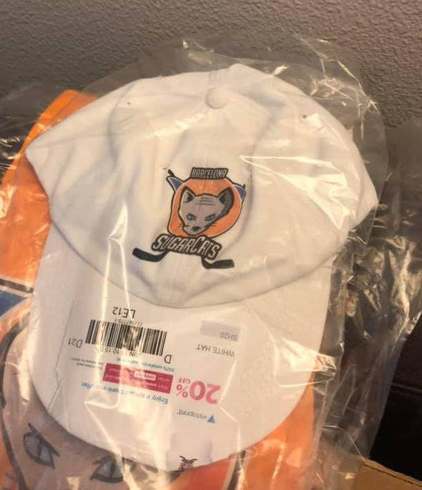


This has been going on for two years now. Jack just turned 10 and somehow is still in the dark about it. There have been a couple of close calls, but he hasn’t pursued additional information on Google. Each year at Christmas I make sure he gets some new SugarCats gear. Having now presented him with a SugarCats hat, two different shirts, a poster for his room, and shirts for his family and friends, I think I’ve convinced him. (That’s Jack’s dad siting behind him in that photo, giving the thumbs-up, so he’s still okay with all of this.)
Meanwhile, I sell the shirts on Etsy. SugarCats gear now stretches from of Hawaii and Alaska to the east coast. The profits go to the St. Baldrick’s Foundation, an amazing group that supports childhood cancer victims. It’s a fun way to raise money for them, and also for an “apology scholarship” fund for Jack.
Along the way, this has become sort of an open source art project, with people making their own contributions, like this “classic” SugarCats team photo:

———
Paul here. How awesome is that? I do feel a bit bad for Jack, but it seems like a harmless and ultimately affectionate form of deception, and I love the idea of the “apology scholarship.” Well done, Keith — and Go SugarCats!

Photos courtesy of the St. Louis Cardinals Hall of Fame & Museum; click to enlarge
History mystery update: Remember yesterday’s item about Cardinals third baseman Ken Reitz wearing huge uni numbers on the side and back of his batting helmet in 1978? I asked Cardinals historian Brian Finch about that. He didn’t know anything about the number on the side of Reitz’s lid, but he shared several photos (including the one of outfielder Tony Scott diving back to first base, shown above) indicating that the large back numbers were standard — or at least common — for the Cards that season.
Catcher Steve Swisher even had the outsized number on his catching helmet:

I’m trying to get in touch with Reitz himself so I can ask him about the side number. Stay tuned.
Time machine: Longtime Uni Watch reader/pal David Scherzer has created a very cool “time machine” version of This Week in Baseball by matching old Mel Allen TWIB audio footage to 2019 highlight sequences. Fun stuff, and a good distraction — enjoy.
Unity is strength #BlackLivesMatter pic.twitter.com/BLsTHfOnPT
— James Milner (@JamesMilner) June 1, 2020
Meanwhile, over on the pitch: The soccer world has continued its support for the George Floyd protests in uni-related and visual ways yesterday. As you can see above, EPL club Liverpool kneeled to show solidarity with protesters. Newcastle United and Chelsea did likewise today:
#UnitedAsOne pic.twitter.com/G79rrXcx3a
— Newcastle United FC (@NUFC) June 2, 2020
Enough is enough. We are all HUMANS. Together we are stronger. #BlackLivesMatter ✊✊🏻✊🏼✊🏽✊🏾✊🏿 pic.twitter.com/EwAQe4QQsW
— kepa Arrizabalaga (@kepa_46) June 2, 2020
In addition:
• The NWSL’s Orlando Pride postponed a uniform unveiling that had been scheduled for today, as a gesture of respect and solidarity with protesters.
• In the German Bundesliga, Cologne forward Anthony Modeste celebrated a goal by holding up his light-colored right palm and darker left hand side by side:
🖐🏻🖐🏿 A clear signal from @amodeste27.#saynotoracism #effzeh pic.twitter.com/BXcrDkuiNn
— 1. FC Cologne (@fckoeln_en) June 1, 2020
• Yesterday I mentioned that Borussia Dortmund winger Jadon Sancho, celebrated a goal on Sunday by removing his jersey to reveal a “Justice for George Floyd” undershirt. I didn’t realize that his teammate Achraf Hakimi had lifted up his jersey to reveal the same message:
Achraf Hakimi also displayed a "Justice for George Floyd" shirt after scoring for Borussia Dortmund. pic.twitter.com/J0MEv2d9z2
— ESPN FC (@ESPNFC) May 31, 2020
Hakimi, unlike Sancho, did not receive a yellow card because he did not remove his jersey — he just lifted it up to expose the message.
• Speaking of, the executive director of soccer’s anti-discrimination Fare Network has criticized the ref who gave Sancho that yellow card, and FIFA said leagues and federations should consider waiving sanctions on players who engage in Floyd-related protests, citing “common sense.”
(My thanks to @haymarketzecken and our own Anthony Emerson and Jamie Rathjen for their contributions to this section.)
Collector’s Corner
By Brinke Guthrie
Follow @brinkeguthrie
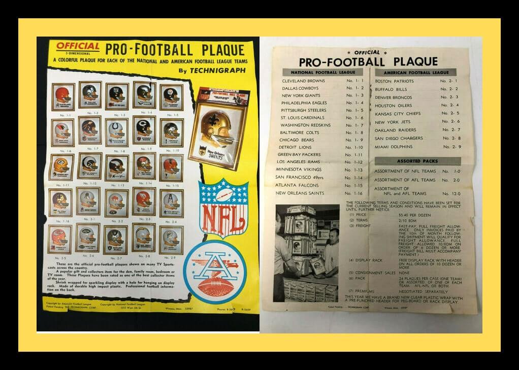
I don’t normally list items on Collector’s Corner that won’t be active by our weekly Tuesday publication date, because I want Uni Watch readers to have the chance to bid on the items if they want. Gonna make two exceptions today, though, beginning with this Technigraph “Official Pro-Football Plaque” ad (shown above), which is so great I can’t stand it. The images themselves are terrific on their own, but what really got me was the ad copy:
These are the official pro-football plaques shown on many TV Sportscasts across the country.
A popular gift and collectors item for den, family room, bedroom, or TV room. These Plaques have been rated as one of the best collector items of the year.
Shrink wrapped for a sparkling display with a hole for hanging on display rack. Made of durable high-impact plastic. Professional football information on the back.
This feels like it’s a trade ad — especially the page on the right with all the shipping and financial terms. But I wanted to see what that “professional football information on the back” was all about, so I found this one from 1965 for the 49ers, which lists 14 NFL teams/stadiums (only one of which, Lambeau, remains home for an NFL team). There’s also a spot for “autographs of all your favorite NFL players.” As if you’re gonna lug this thing to the game and try to get close enough to a player to shove it in his face, right? The packaging also says “collect them all for an exciting colorful display that sizzles pro football. Arrange them according to standing in the league.” Sure, I can see that. “Honey? Will you please quit rearranging those things?”
You can find more Technigraph NFL plaques here. Now for the rest of this week’s picks:
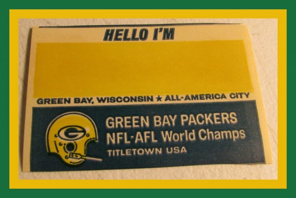
• This little gem’s eBay run was up late Monday afternoon, but I love it, so here it is: a “Hello, I’m…” Packers name tag.” Anyone know what event this might have been used for? Here it is in case you can’t access the auction any longer:
• One more from the Frozen Tundra: Someone decided to crochet a DIY Packers beer can hat! Can’t say I’ve seen that before. But hey, they wear cheeseheads, so why not this too?
• Moving on … got some cover art to look at today! Let’s start with the olde-tyme cover art on this 8mm film from the 1947 World Series between the Yankees and Dodgers. “See the Pennant Winners Fight for the World’s Championship!”
• More nice cover art on this album called Yankee Stadium: The Sounds of a Half Century, narrated by the incomparable Mel Allen. Ruth, Mantle, Gehrig, DiMaggio and Y.A. Tittle on the cover.
• Continuing our cover art lineup today with this game called Foto-Electric Football, made by Cadaco in 1956. Comes with “12 offensive plays, six defensive formations,” and I don’t know if it comes with the light bulb or not!
• And we wrap things up box art-wise with this Tudor football game called NFL Quarterback, where you get to “call the same plays pros do every week in the NFL.” Nice-looking watercolor art of a Cowboys QB — can’t read the artist’s name, though.
• WHK Radio 14 was the sponsor for this 1970s Cleveland Browns fan flag.
• And what do we have here? Why, a Cleveland Browns gumball helmet with the ill-fated CB logo!
• Big League Chew was the sponsor for this 1980s Chicago Cubs youth batting glove.
• Back around 1989, someone apparently thought there was a need for a Montreal Expos Punching Puppet.
• In 1975, Sunbeam Bread offered this Team Helmet Sticker Savers Book. Sunbeam must not have been sold in my area, otherwise there’s no way I would’ve missed this. The very next year, they offered team cards, like this one for the Kansas City Chiefs, making use of the “repeating team name” design motif that was so popular back then.
Click to enlarge
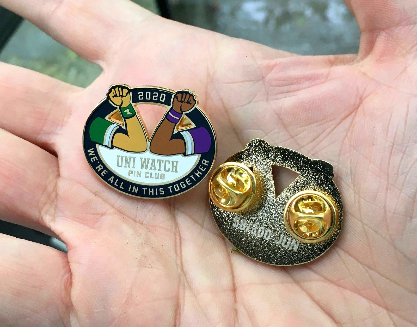
Pin Club reminder/update: The Uni Watch Pin Club’s June design — featuring an elbow bump because fist bumps and high-fives will likely be banished from the sports landscape for the foreseeable future — sold a whopping 164 units in its first day of release yesterday. Since this is a numbered/limited edition of 300 (10 of which were set aside for Todd Radom and myself), that means we sold well over half of the pins on the very first day — wow. Thanks so much, people! Todd and I are gratified by the response.
In response to a few questions I received yesterday:
• We designed this pin way back in late March — long before the murder of George Floyd. Our intent was to acknowledge the pandemic and to show uni-ty by depicting athletes of different races and even one wearing purple. We didn’t mean for the two upraised fists to make a statement of racial solidarity during a period of race-driven civil unrest — that’s just how it ended up working out.
• A few people asked me (I’m paraphrasing here), “The pin shows the black player wearing purple, and we all know you hate purple, so isn’t this design basically an insult to black people?” My thinking was, “Here I am — the white Uni Watch guy, wearing green — making an outreach to find common cause with everyone, even people wearing purple!” That was the intended symbolism. If that messaging doesn’t come across, it’s on me. I appreciate all the feedback.
Anyway: The pin is available here. If you need to get caught up, we still have some of the May pins left, along with the March, February, and January pins. (Sorry, April is sold out.)
Speaking of which: If you order multiple pins and find yourself getting hit with multiple shipping charges on the one order, go ahead and place the order and then email me with your order number — I can arrange for the extra shipping charges to be refunded.
And remember that you can save a 15% on all of the pins, and on everything else in the Uni Watch Shop and the Naming Wrongs Shop, by using the checkout code COMMUNITY.
Meanwhile, reader David Cline has decided that his Purple Amnesty Day cap is the perfect item for displaying his pins:

Nicely done, David.
AWESOME Bengals History 101 with Greg Koch from @KochSports this clip from last nights show. He talks about 1988 season and the jersey change from Russell to Champion. VERY INTERESTING! #bengals
Watch rest of interview on our Youtube Page – click here
https://t.co/cHpA1U96EH pic.twitter.com/BOLhd35JNA— Bengal Jim’s BTR (@bengaljims_BTR) June 1, 2020
Too good for the Ticker: The video above shows Greg Koch from the longtime Cincinnati sporting goods outlet Koch Sports talking about the Bengals’ 1988 jerseys. Lots of fascinating info packed into two minutes — well worth your time.
(Big thanks to @bengaljims_BTR both for recording this segment and for alerting me to its existence.)

Hypothetically speaking: I don’t know about you, but I love Detroit’s signature rectangular pizza, which inspired the T-shirt concept shown above. Would it be fun, just theoretically, if that design actually existed? Let me know what you think.

Membership update: We continue to add purple designs to the membership card gallery (including Jonny Rockford’s Denver Nuggets treatment — a real beauty).
Ordering a membership card is a good way to support Uni Watch (which, frankly, could use your support these days). And remember, as a gesture of comm-uni-ty solidarity, the price of a membership has been reduced from $25 to $20 until further notice.
As always, you can sign up for your own custom-designed card here, you can see all the cards we’ve designed so far here (now more than 2,700 of them!), and you can see how we produce the cards here.
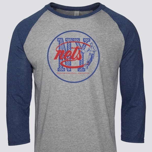

Raffle reminder: In case you missed it on Monday, our longtime advertiser Vintage Brand is generously running another raffle. The lucky winner will get to choose any item from the Vintage Brand website (including the Nets shirt shown above).
This raffle is open only to people with American shipping addresses. To enter, send an email to the raffle address by 8pm Eastern tomorrow, June 3. One entry per person. Again, USA shipping addresses only. I’ll announce the winner on Thursday.
The Ticker
By Alex Hider

Baseball News: A cool feature of the Rangers’ new ballpark: Shadowbox displays of all the jerseys the team has retired. The team also published a video tour of the new digs yesterday (from Chris Mycoskie). … Speaking of the Rangers’ new stadium: Mike Duchock toured the ballpark in person and wore a mask bearing the stadium’s logo. … Max Levy notes that Three Rivers Stadium in Pittsburgh was outfitted with black and yellow bunting, instead of the more common red-white-blue, during the 1979 postseason. … Rangers P Kevin Brown had an ill-fitting batting helmet during his at-bat during the 1992 All-Star Game in San Diego (from @thepoisonpilson). … Remember Paul’s discussion of Expos third baseman Tim Wallach’s backwards pants striping from last Friday? That topic — and the Uni Watch website — is addressed for about seven minutes, beginning at the 5:10 mark, in this podcast. … Good catch by Jeffrey Moulden, who notes that the makers of Little Big League repurposed a Yankees helmet as a Twins helmet — you can tell by the shadows under the “M.”

Pro Football News: Pittsburgh Mayor Bill Peduto wore a Steelers cap at a press conference yesterday (from Jerry Wolper). … Cleveland.com is ranking the best Browns player to wear each number. They published Nos. 1-5 yesterday (from Jason Hillyer). … Bob Gassel sends along a newspaper photo from the Dolphins’ first-ever preseason game in 1966. The Dolphins wore jerseys without sleeve striping — though they would wear stripes during the regular season. Also notable: The Chargers wore white at home. … Matt Fedorka built himself a replica of Rob Gronkowski’s Super Bowl XLIX helmet. … The Cardinals had some NOB font inconsistencies in the 1970s (from Pro Football Journal). … The man on the cover of Devo’s debut album Q: Are We Not Men? A: We Are Devo! was famously based on an image of golfer Chi Chi Rodriguez. But Rand Martin points out that the man on the cover also bears a striking resemblance to Bucs QB Tom Brady — and I have to agree. … Drivers in Manitoba, Canada, can now get specialty license plates commemorating the Winnipeg Blue Bombers’ 2019 Grey Cup championship (from Wade Heidt). … I love that the old Ottawa Rough Riders wore their helmet logo as a sleeve patch back in the day. Don’t think I’ve seen that on a football jersey before (from Moe Khan).
College Football News: Fresno State is switching uniform manufacturers to Adidas and will be unveiling new uniforms later this summer (from Jon Rango). … Maine really went for it on its 2020 schedule poster. Incredible stuff (thanks to all who shared).

Hockey News: Diane Bibaud, the Canadiens’ organist at the Bell Centre, has a sweater with treble clefs instead of numbers (from @TeebzHBIC). … The Quebec Major Junior Hockey League has a new logo (from Moe Khan and @Dante_X). … Designer Lucas Daitchman is mocking really good jersey concepts for several NHL teams. Here are his concepts for the Golden Knights. Scroll through his feed to see his designs for other NHL teams. … Has anyone seen this Whalers coin before? It’s dated Jan. 3, 1990. @CuseAz found it while exploring old boxes.

Soccer News: Liverpool was set to drop New Balance for Nike this month — which was supposed to be after the 2019-2020 EPL season. But because of the pandemic, Liverpool will finish out the season in their New Balance uniforms and postpone the Nike takeover until August (from Moe Khan). … The Houston Dash of the NWSL have new alternate uniforms inspired by the Houston Oilers’ color scheme (from several readers). … New logo for Italian Serie A club Hellas Verona F.C. (from Ed Żelaski). … New uniforms for F.C. United of Manchester, a club started by Man U fans opposed to the club’s American owners. They compete in the seventh tier of the English football system (from Germán Cabrejo).

Grab Bag: Reader Bowen Hobbs whipped up this awesome rainbow-clad illustration of Denver Nuggets great Alex English. … New athletics logos for Stephen F. Austin (from Al Gruwell). … We’ve got a couple of items from Timmy Donahue: The Southwest Montana Veterans Home has a new logo which was designed by Lindsay Alt, a Marine veteran. Also, Subway India has launched a new safety-focused ad campaign that features a mask over the logo. … Miraitowa, one of the Tokyo Olympics mascots, donned a yukata — a traditional summer robe (from Jeremy Brahm).
Click to enlarge

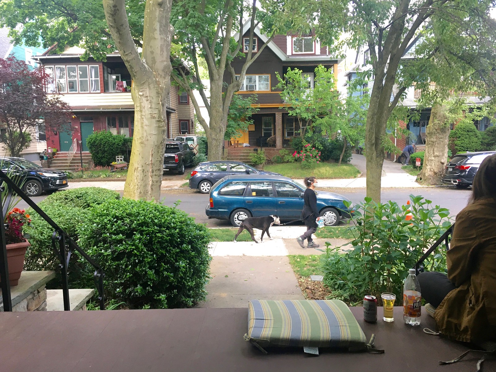
What Paul did last night: NYC was under a curfew last night. It was our city’s first curfew since 1943. You know why they imposed that one? Because of protests after a white police officer killed a black soldier.
Ever get the feeling that we need a new script, because you’ve already seen the old one way too many times?
So we talked about that, and a few other things. On the plus side, several excellent dogs went by, one of which (not the one in today’s photo) was named Taquito — “you know, little taco,” his person explained. We liked that a lot.
The branch is still there.
As always, you can see the full set of Pandemic Porch Cocktails™ photos here.
Paul, it is pretty clear that “we’re all in this together” with purple on it means you are calling for unity no matter your favorite uniform color, any regular reader would get this. Given the current events it serves as an excellent metaphor for us to stand together to oppose discrimination based on skin color.
It is a great pin. I love it. And it has become so much better as a sign of solidarity for racial equality.
I am guessing those who accuse you of using purple to insult black people are the same people who would accuse you of not being inclusive enough if it were two white arms on there instead. Trolls are always going to troll.
Thanks, Greg. Just to be clear, nobody accused me of anything — they just asked some questions. I think those questions were perfectly reasonable, and the people asking them seemed satisfied with my answers.
Just saw my card in the gallery! Great job Scott! Thank you for executing my vision perfectly! Also, thanks again to Munch Suchland for being an incredible person through it all.
Just spreading the love, man. Turns out we all need it more now than we did a few weeks ago. Enjoy it and good luck with the rest of your college work!
I’m sorry, but purple on a dark skinned person as a subtle hint of racism is some serious mental gymnastics. That’s trying to go out of your way to see racism.
I think the pin is great.
Thanks, Jon. Just to be clear, nobody accused me of racism — they just asked some questions. I think those questions were perfectly reasonable, and the people asking them seemed satisfied with my answers.
That’s certainly good to hear. I can’t imagine anyone accusing you of racism especially how this website covers uniforms and news from all over the globe.
This is a good time to mention that FC Barcelona actually runs link.
Indeed, I think many folks are familiar with the basketball side of things, but so many European clubs really do a whole variety of sports (makes more sense when clubs use the Sporting Club or Athletic Club designation vs. Football Club). In Portugal, for example, the big 3 soccer clubs also have pro cycling teams (unfortunately the FC Porto kit at the moment doesn’t mirror their football kit like it traditionally has link)
Those are sweet, sweet jerseys. . . erm. . . sweaters.
As an uncle who has called his nephew “George Lazenbee” (*never just George, always George Lazenbee*) ever since he knew his own name, I thoroughly enjoyed everything about your project Keith! Great job and great cause!
And why George Lazenbee? Because it just so happened to pop out of my mouth one time when we were playing.
Bond. James Bond. IMO best movie of the series: OHMSS ’69
The best Browns player to wear Nos. 1-5 is kinda sad.
“Max Levy notes that Three Rivers Stadium in Pittsburgh was outfitted with black and yellow bunting, instead of the more common red-white-blue, during the 1979 All-Star Game.”
The ’79 ASG was in Seattle. The video you link to is from Game 3 of the ’79 NLCS. The Pirates also used black and yellow bunting for the ’79 World Series.
Fixed.
Now that we’ve seen someone with a purple amnesty hat, have the purple amnesty shirts been shipped? I haven’t gotten mine yet.
Yes, shipped yesterday.
I kind of like the over-sized numbers on the Cardinals batting helmet. It kind of has a “jai alai” look to it.
In regard to the porch photos, the white van parked in the driveway of the maroon, green, and cream house, has been in every shot.
The Tony Scott picture features the Atlanta Braves from the era when they couldn’t get out of their own way. Kind of funny to look at it now, after several decades as a model franchise. I thought, “why didn’t they go with a red, white & blue sansabelt? Or pastel blue road uniforms?” They did both of these things when they redesigned their look in the ’80s. But I don’t think they’ve ever used their red pinstriped home uniforms as a throwback.
Is there a gallery somewhere of all your hypothetical food/sport mashup t-shirts?
There is now:
link
Thanks for the suggestion!
Keith!
What an amazing project. I love everything about it… from the corruption of young minds, the creative and caring quality and the thoughtful donations. Go SugarCats!
My Spanish is no better than transactional, but ‘un equipo totalmente real’ is of course ”a totally *royal* team”.
Exactly! I just posted something similar below (having not seen your comment when I started composing my own). “Real” as in “actual,” ‘true,” or “legitimate” would more likely be “autentico” or “verdadero,” I believe.
Why would there be a Montreal team in a European hockey league though?
Well, Montreal does have a more European feel to it than most other North American cities… :-)
England’s rugby league premiership has a team in Toronto.
link
The Super League isn’t just an English league. It includes Rugby league teams (not rugby union) from England, France, and Canda (the primary Northern Hemisphere playing countries). Unlike rugby union which also has teams in Ireland, Scotland, Wales, and Italy, rugby union isn’t as widespread.
A Montreal hockey team in a European league feels more out of place for me than does a Montreal rugby league team.
I think my favorite thing about the SugarCats logo is the Spanish-language slogan “Un Equipo Totalmente Real.” My Spanish is rudimentary at best, but it’s good enough to know that “real” in Spanish means “royal” and rarely translates to “real” as in “actual,” “true,” or “legitmate.”
It looks like this phrase was pulled straight from Google Translate, with its notoriously sketchy ability to translate for context. And that’s ultimately another fun clue for Jack, when he finally figures out the ruse, about how much Keith just winged this whole thing!
Well, lots of Spanish sports teams have royal patronage (there’s several where ‘Real’ features in the commonly used name: Sociedad, Madrid, Betis, but there’s plenty who are RCD Something: Espanyol, Mallorca etc where the R=Real).
Just say the King’s a fan of the Sugarcats (Los Gatos de Azucar?) and has given his seal of approval.
The double-entendre (“real” as both “real” in English and “royal” in Spanish) does add some fun to it, doesn’t it?
Els Gats de Sucre! Has a nice ring to it.
Because the local fans in Barcelona would of course use Catalan to refer to their totally absolutely very real hockey team
Now he’s gotta whip together a Twitter and Facebook account so Jack will get sucked in even deeper. What a great idea. Go SugarCats!
I’ll post my comment just as soon as I finish buying some SugarCats gear…
On the one hand, I love a good scam like this. I’m impressed by the lengths that Keith has gone to in order to keep this going. On the other hand, that better be one hell of an apology scholarship when Jack finally does get wise to this.
The SugarCats thing is incredibly clever but also pretty messed up. Even as a joke with a kid, this crosses the line between friendly jokes and straight-out dishonesty in my mind.
Anyway, sorry to be the fly in the ointment. Just felt like somebody needed to say it.
I was just telling my wife and son, “This is on a Santa Claus level of deception.”
Yes, my kids grew up knowing exactly who gave them their presents.
I understand the Screaming Viking is a popular drink among SugarCats’ fans.
Do they like the cucumber bruised?
Paul, did you delete your “Kap Kops” tweet? I saw it right after you posted it this morning, and just now went back to see responses…but I can no longer find it. I only ask because a childhood friend of mine was in one of the photos (the African American man in the American flag bandana face covering, who also happens to be the current mayor of Santa Cruz, CA), and I wanted to see the reaction to it. If you deleted it, I can only assume the reaction was overwhelmingly negative, but I don’t think it should have been deleted.
Reaction was mild, but a few very angry people. Didn’t seem worth keeping up. Sorry.
Packers name tag: if I had to guess, its the name tag from the annual shareholders meeting. I’ve seen a couple others around, from the annual meeting at Lambeau
When I see the Ottawa Rough Riders’ helmet with the classic single “R” on the helmet, makes me think we need to add that to the list of throwbacks we’d like to see that have not been done yet.
Ottawa was absent from the league when all CFL teams did 1960s throwbacks in 2009 and 1970s throwbacks in 2010. Would love the see the Redblacks run onto the gridiron wearing circa 1976 Grey Cup champs uniforms of the Rough Riders.
link
Where does the Rough Riders helmet-on-the-jersey iconography fit into the meta-world of the Miami Dolphins helmet-on-a-dolphin-on a helmet?
Paul, apologies if you’ve already seen these, but it seems the Secret Service detail assigned to Jack Kemp during the 1996 campaign had their own pins and patches made…just thought I would share, very cool.
link
link
I had never seen that — fascinating! Thanks so much for sharing.
Surprised you went with Detroit pizza instead of coneys, although both are great. I suppose it was easier to work in pizza as a Detroit logo too. To top it off (ha!), the pizza joint nearest to me has Coney dog pizza.
“Detroit Pizza” is lot closer to “Detroit Pistons.” The idea is to mimic the original design!
best story ever…..go sweet kitties!
Did a Roughriders fan choose the letter/number combination in that Winnipeg Grey Cup licence plate?
The Swisher Cardinals photo can most likely be dated to 7/20/78. Obviously they are playing a day game against the Padres. Only 2 times that happened was on May 7 and July 20. Padres #12 in the background is Tucker Ashford. He seems to be walking back to 2nd base after a foul ball. He was on 2nd base after hitting a double in the 7th inning of the 7/20 game. He did not play on 5/7.
link
Good sleuthing!
Doing research on the Tony Scott photo makes me think that that photo is not from 1978.
Cards played Braves at home 6 times in 1978 (June 7-8, August 17-20).
Scott did not play in either June game according to the box scores.
Scott did not get on base on August 20. He did the other 3 August games.
Braves 1st baseman is wearing #12 (you can see the 1 on the back and the 2 on the front).
Bob Beall was the 1st baseman for the Braves on August 17 and 18. According to baseball reference, he never wore #12 while with the Braves. link
Dale Murphy was the 1st baseman on August 19. He only wore #3. link
Craig W. that could be Tom Paciorek playing first base for Atlanta. He was with the Braves for 5 games in 1978, according to Baseball Reference. Could the Cardinals have worn those numbers in 1977 as well? Scott was with St. Louis that year, and Paciorek the Braves. I know the Cardinals had a set of large numbers on their helmet in 1979, photos of Lou Brock’s 3000th hit show a set of large numbers on the back of the helmet, although perhaps not quite as large as we see in 1978. Also, that’s the year I got my souvenir plastic Cardinals batting helmet, and remember applying large “37” stickers to the back, to emulate what I was seeing on the field that year.
No on Paciorek in 1978. He was released by the Braves on 5/23 then was signed by the Mariners on 5/31. I’ll need to do work on the 1977 games.
I believe the Tony Scott photo is from May 1, 1977. It the only game of the 6 ATL@STL games that year (4/29-5/1 and 7/26-28) where Scott was starting and Paciorek played at 1B. Scott was on base 4 times that day (2 singles, 2 walks). Baseball Reference says the weather that day was cloudy with drizzle. For a day game that picture looks very gloomy. The 1B umpire was Satch Davidson. He looks similar to a 1979 photo of him I found on ebay even though the jacket numbers don’t match.
link
link
Craig W. impressive work!