All sorts of people read Uni Watch. One of them happens to be a corporate CEO, who emailed me a nice fan letter a few years ago and has sporadically stayed in touch since then.
The CEO recently informed me of an interesting development: A bunch of NBA teams have been trying to convince him to become their new uniform advertiser.
This sounded like a great opportunity to learn more about the advertising/sponsorship side of things, so I asked the CEO if he’d be willing to talk to me about it. He agreed, on the condition that I not identify him or his company.
We spoke yesterday morning. Here’s a condensed transcript of our conversation:
Uni Watch: Just for some quick background on you, when did you first get into sports and into uniforms?
CEO: Oh, my gosh, since I was a kid. I’ve always been into uniforms, stadiums, that kind of thing. And I’ve been reading Uni Watch since pretty much the beginning, religiously.
UW: Thank you! Of course, we’re trying to keep you and your company anonymous. But would it be fair to say that you’re the CEO of a major lifestyle brand?
CEO: Yeah.
UW: I know your company is privately held, but just to give people a ballpark sense of how big your operation is, I’ve seen estimates that your company’s annual revenue exceeds $100 million. Is that accurate?
CEO: Yes.
UW: What are your principal forms of advertising and marketing?
CEO: Pretty much as you’d expect in any retail business. A lot of digital and social. A lot of television now, actually. But but still, you know, primarily Instagram, Facebook, Google AdWords, that kind of thing in recent years.
UW: To what extent, if any, has your company advertised in the sports realm? Like, have you run ads during game broadcasts, or had ads had posted in stadiums or on team websites, anything along those lines?
CEO: We’ve done a lot of in-broadcast television and radio. And then we’ve also advertised quite a bit on sports talk radio.
UW: Let’s talk a little about the NBA uniform advertising program. When it was first announced in 2016, did you consider partnering with a team? Or did any teams approach you?
CEO: I wasn’t approached, I didn’t consider it, and I probably wouldn’t have at the time. As much as I understand European soccer and the way uniform advertising is integrated, it just never made that much sense in the NBA to me, to be perfectly honest.
UW: Why did it not make sense to you?
CEO: Just how small [the ad patch] was. And and the fact that, you know, it’s fairly controversial. And I think oftentimes, you have to think of the fact that if you’re if you’re sponsoring something that has never been sponsored before, is there going to be blowback. And I think if you look at the advertisers that jumped in early, my guess is that there were a lot of companies feeling that way. You know, Chase has an unbelievably deep relationship with Madison Square Garden and the Knicks, and I’m sure they had the first look, yet they elected not to advertise on the Knicks’ jersey.
UW: The NBA program was originally announced as a three-season pilot program. And then at some point, they decided it was a success, so they made it permanent. If the season hadn’t been suspended, we’d now be nearing the end of that original three-season commitment. What, if anything, have you been hearing regarding how satisfied the teams are, how satisfied the advertisers are, and so on?
CEO: One of the things is that you’re seeing a lot of turnover in the advertisers. And I’m basing that on how many teams are now fairly aggressively in the market for new uniform sponsors — not just approaching me, but I know it’s also similar-sized and larger companies. The first lesson in sponsorship is trying to figure out why someone’s not renewing. If it’s working, you don’t walk away from it.
UW: So does that tell you that the sponsors were not satisfied, or thought that the deals were too expensive, or what?
CEO: It’s hard to say. I mean, to be honest, they’re very expensive. I was floored by the expense and the cost. And if you look at that, you have to compare this with any type of media sponsorship, which is really what it is. I think there are a lot of factors to think about, like how many national broadcasts does a team get? What sort of visibility do they have? How many replica jerseys are they selling?
So a few years ago you might have sponsored a team and you look at their three-year forecast and you say to yourself, “Yeah, I don’t know, it doesn’t look that great for them.” They don’t have a big player or they lost their big players and suddenly the value drops. Again, using European soccer as an example, especially with the bigger teams, the turnover is generally not that great, and the terms of the deals are much longer.
UW: Based on what you’ve previously told me, at least five NBA teams have approached you recently. Is that right?
CEO: It’s now up to six.
UW: Wow. And I was interested to hear that most of those teams were not located anywhere near where your company is headquartered, which was surprising, because most of these NBA deals have had some sort of local or regional connection.
CEO: That’s true.
UW: How many of those overtures were made to you before mid-March, when the country basically shut down?
CEO: All except one were before.
UW: Okay, so these teams didn’t reach out to you because the deck has been reshuffled by the pandemic or anything like that — they contacted you when everything was still business as usual.
CEO: Correct.
UW: And how have you responded to these overtures?
CEO: You’d be foolish not to at least have the conversation and hear about the offer, right? What’s been surprising is the remarkable amount of consistency from team to team in terms of their asking prices. And again, I don’t know if that is because they’re getting guidance from the league, or they’re, you know, in terms of some sort of price control. Like, if all of a sudden the Brooklyn Nets say, “Listen, we’ve just got to get someone on here and we’ll do it for a third of what everybody else is charging,” what does that do to the market? I have to imagine there’s some discussion. Obviously, the Warriors and Lakers are asking for an order of magnitude more, and then everybody else seems to be kind of in the same ballpark.
[In a separate communiqué, the CEO told me that most of the teams were asking for something in the $10-$13 million range. For context, he said being “the official ‘x’ of the NBA or NFL” is more in the $2-$5 million range, or possibly a broader range than that. — PL]
UW: Have these discussions been in person, over the phone, or just by email? And have you handled the discussions yourself, or have you had surrogates handling it?
CEO: I’ve done it myself because, honestly, I think my marketing team would laugh at me if I took this as a serious opportunity. I was more curious than anything else. I’ve had a few Skype calls or Zoom calls. But initially, there were a couple of in-person meetings where they actually came out to meet with us, take us through the opportunity.
UW: Did they have mock-ups of how their uniform would look with your logo on it?
CEO: Yeah. But they actually used an old logo that we haven’t used for four years. So real good-quality work there.
UW [laughing]: Aside from that, did you get a little rush of excitement seeing your logo on an NBA uniform?
CEO: Sure. I mean, the concept is really cool, right? As a fan of sports and especially as an entrepreneur — I mean, you’re an entrepreneur yourself, so you know how you’re constantly hoping that one day you “arrive,” but inevitably, we’ll never be satisfied with where we are, so we never actually arrive. But it’s that glimpse of, like, wow, I could have my logo on there and then, you know, then I’m really going to be justified in my life.
UW: Have you given serious consideration to going ahead with it?
CEO: No, not at those prices.
UW: What sorts of things does a sponsor get besides having its logo worn on the uniform? Like what sorts of perks or things that go beyond the on-court presence were discussed or offered?
CEO: They start with the things that are obviously more or less free to them. And you understand that a lot of sponsorships, especially with sports teams, are driven less by the media value and more by the ego value, right? So they’re offering suites, front-row tickets to all the games, and that kind of stuff that they can sort of give away. Also in-arena programming and signage, and so they try to put it together as part of an overall media package.
UW: If half a dozen teams are approaching a company like yours, do you think that indicates anything in particular from a trend-analysis standpoint? Or does it just mean everybody’s passing around the same list of potential corporate partners, and you happen to be on the list?
CEO: When you’re trying to sell sponsorships, you start with the biggest companies, especially in your own market, right? So when you get down to companies that are are doing $100 million, $200 million in revenue, that means you’ve already burned through pretty much everybody logical that’s larger.
UW: So you’re not quite saying your company is the bottom of the barrel, but you’re saying that if the sponsorship program was going well, you wouldn’t have been the first name at the top of the list either.
CEO: Look, if you’re in Detroit, and you’re calling me before you called Ford, somebody should get fired.
UW: I’ve heard a lot of people say that the pandemic will lead to more uniform advertising and other new forms of corporate sponsors, because teams will be desperate to make up for lost revenue. But it seems to me that all the potential advertisers and sponsors will be facing financial challenges of their own, and will probably be cutting back on their own marketing budgets, especially since so many consumers are out of work or at least cutting down on spending because the future is so uncertain, which means advertising probably won’t provide the same kind of ROI that it did in the past, so we could actually see a decrease in sports sponsorships. What’s your take on that? How the pandemic will affect this aspect of sports?
CEO: Well, I think you have to look at it in the total context of advertising. One of the things you’ll see anytime there’s an economic pullback is that the price of advertising goes down. You’ve probably seen that yourself in digital publishing. So unless you start seeing major price elasticity or movement on the sponsorship deals, invariably those will tend to go unsold or struggle. But the teams may be thinking, “Alright, things might not be good this year, but they’ll be better next year, so we’ll hold the price and just ride it out.”
From an advertiser standpoint, or from a brand standpoint, when times get tough, your level of scrutiny on every dollar out the door gets more and more focused. You get super, super-tight on it. So if I know that my TV commercial is going to cost me X and make me Y, then that’s a very certain thing. But when you start thinking about a patch on a uniform, that’s much more about keeping your brand top-of-mind for people. It’s a high-level awareness, but it’s harder to quantify. So when you’re a business, in a climate like this, you need to see performance right away.
Budweiser, Pepsi, Coke, those kinds of brands, they may need to just maintain top-of-mind awareness. But when you start thinking about brands that are in the business of retailing things — and that could be everything from a car down to a T-shirt — the further you get away from sales performance, the harder it is to justify.
———
Well. Obviously, this is only one CEO, but the takeaway from his commentary is that things don’t necessarily look too good for the NBA’s uni advertising program. Here’s hoping he’s right.

Click to enlarge
Chalk talk, continued: Remember how Dodgers design director Ross Yoshida and his kids did such a great job drawing all of the National League cap logos? Now they’ve added the American League logos! You can see a bunch of in-progress photos by scrolling through Ross’s Twitter feed.
Click to enlarge
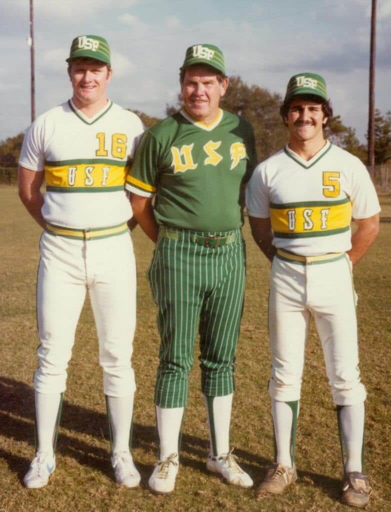
Too good for the Ticker: One nice thing about the pandemic is that teams and schools are digging into their archives and coming up with all sorts of fun photos. Case in point: this completely amazing USF baseball photo from 1982.
Obviously, I love the color scheme. But I also love the white jersey designs, the absurd green-over-pinstriped-green uni in the middle, and of course the PILLBOX CAPS! My compliments to the chef.
Incidentally, that gent in the center is former Phillies pitcher Robin Roberts, who was USF’s coach at the time.
(Major thanks to Josh Sandin for bringing this one to my attention.)


Culinary Corner: Yesterday’s entry about Hal the Hot Dog Guy got me hankerin’ for a frank. But instead of my usual caper dog, I decided to try something different: scallions and toasted panko breadcrumbs (and mustard, of course). So good!
The toasted breadcrumbs, incidentally, are a new obsession of mine. They’re good on almost anything! I’ll have more to say about that soon.

Membership update: Eight more designs have been added to the membership card gallery. That includes Craig Sinclair’s card, which is based on the 1970s Harlequin rugby union jersey — a brilliant request!
Ordering a membership card is a good way to support Uni Watch (which, frankly, could use your support these days). And remember, as a gesture of comm-uni-ty solidarity, the price of a membership has been reduced from $25 to $20 until further notice.
As always, you can sign up for your own custom-designed card here, you can see all the cards we’ve designed so far here (now more than 2,600 of them!), and you can see how we produce the cards here.
The Ticker
By Anthony Emerson

Baseball News: Here is a fantastic 1992 video of Expos P Dennis Martínez and OF Larry Walker at the unveiling ceremony for the team’s then-new uniforms. Still some of my favorite unis in MLB history. The voice-over refers to the famous Expos tri-color hat as “hideous,” to which we at Uni Watch say, “Agree to disagree.” … Yesterday marked the 25th anniversary of the one time the Tigers wore an alternate jersey, outside of special events mandated by the league (from Jerry Nitzh). … Andrew Hoenig’s wife is sewing baseball-themed masks for the use of their family and friends. … Rick Dalton sends along a ton of shots of his MLB-licensed childhood bedsheets, c. 1969. They even had matching curtains. … “According to a couple of different articles, KBO teams’ over-the-top, flamboyant mascots are creating a stir on social media among new American fans,” writes Kary Klismet.

Football News: As many readers pointed out, ESPN’s Adam Schefter tweeted a doodle featuring Bucs QB Tom Brady and TE Rob Gronkowski — wow, that sentence hurts — in unis they’ll never wear. ESPN did the same thing with a different graphic, but later posted a corrected version of the Schefter graphic. This could’ve been forgivable if this tweet was from like a month or so ago, but the Bucs unis were launched on April 9. They’ve been out for a month! … On a similar note, ESPN Photoshopped Tom Brady into his new duds pretty well, but did a half-assed job on Gronk — that’s clearly a Pats helmet and an old Bucs practice jersey (from Timmy Donahue). … The graphic mishaps continued with the NFL tweeting a Thanksgiving Day schedule featuring a Steelers helmet with the logo on the left side, which is blank in real life (from Brian Cox). … The Bengals tweeted a graphic of their 2020 schedule featuring DE Sam Hubbard in a 2019 jersey, featuring the NFL100 collar patch (from @wilysnowpena). … Apparently Jets QB Sam Darnold plays better when his team goes mono. Darnold, of course, had mono last season, so there you go (from Jaden Daly). … Also posted in the soccer section: The CFL’s Hamilton Tiger-Cats have teamed up with the Canadian Premier League’s Hamilton Forge FC to sell “Hamilton Proud” masks with proceeds going to Food4Kids Hamilton (from Wade Heidt and @robfromsasky).

Hockey News: Penguins G Michel Dion, who played for the Pens from 1981-1985, had a very unique and slightly unnerving mask. “The Penguin appears to be hand-painted,” writes Brandon Weir. “I’m not sure what this ‘beak’ is for, perhaps to deflect the impact of a puck away from the face?” A nice theory, but my first instinct was it might be to improve his breathing. Either way, it reminds me of a plague doctor mask. … The Ducks tweeted a series of pictures of a 2006 game against the Avalanche featuring Joe DiPenta and Ilya Bryzgalov in Reebok jerseys and Scott Niedermayer in a Koho jersey (from Louis, who didn’t give his last name). … Tom V. sent us this picture of ELO drummer Bev Bevan wearing a Sabres sweater. “If the album on Jeff Lynne’s shirt was current, this would be from around ’77 or ’78,” writes Tom. … The NAHL’s St. Cloud Blizzard are now the St. Cloud Norsemen (from Timmy Donahue).

NBA News: Grizzlies PF/C Jaren Jackson Jr. is calling for his team to bring back the white Vancouver Grizzlies unis, having already brought back the teal version this past season (from Wade Heidt). … A graphic designer has mashed up Australian Football League logos and NBA logos (from Kary Klismet). … A Chris Paul superfan made a happy birthday message for the Thunder PG out of Paul’s own jerseys (from Derek House). … The Sixers are polling fans on their next shooting shirt.

Soccer News: Tottenham Hotspur have written about the “untold story” behind their green 2018-19 Champions League kit. The kit was worn only eight times but became iconic as Spurs made the Champions League Final (from Mike Horowitz). … USL Championship side El Paso Locomotive FC have revealed their 2020 Noche de Locos kit (from Josh Hinton). … Cross-listed from the football section: The CFL’s Hamilton Tiger-Cats have teamed up with the Canadian Premier League’s Hamilton Forge FC to sell “Hamilton Proud” masks with proceeds going to Food4Kids Hamilton (from Wade Heidt and @robfromsasky). … FIFA 20’s Ultimate Team mode, which Jamie wrote about a few days ago, is launching a series of retro kits (from Steve Kriske).

Grab Bag: Truman State University in Missouri has unveiled new athletics logos. Here’s the launch video (from multiple readers). … The Sporting News has done a retrospective on five former Canadian mascots (from Kary Klismet). … Also from Kary, the Scott Sports Racing Team has unveiled new mountain bike cycling uniforms made of 100% recycled materials. … Ohio’s official “reopening” logo is completely atrocious. Does the economic reopening even need a logo? (From David Sonny.) … Alabama has a new license plate design, paying homage to the state’s fishers (from Timmy Donahue).

Click to enlarge

What Paul did last night: Warm-ish and sunny yesterday, so it was really pleasant out on the porch. While we were out there, our UPS guy showed up with a big Boxed order that the Tugboat Captain had made — lots of seltzer for her (she’s a seltzer addict the way I’m a Diet Coke addict) and also lots of snacks and treats for the house.
We love our UPS guy, who has remained his unfailingly cheerful self throughout the pandemic. When the Captain saw his truck pulling up, she ran inside and came back with one of the cloth masks she’s been sewing for friends and family. “Here,” she said as he brought over the Boxed boxes on his hand truck, “for you. Or if you have enough of them, give it to someone else who needs it.”
The branch is still there.
As always, you can see the full set of Pandemic Porch Cocktails™ photos here.
The “beak” on Michel Dion’s mask was for function. The extension was to protect his throat while upright, the elongation of it was so he could still look down for the puck without stabbing himself in the chest with his mask.
The new license plate is from Alabama, not Alaska.
You might mention that the middle person in the 1970s baseball photo is HOF er Robin Roberts
I thought the same thing. Saying he’s simply a “Phillies pitcher” seems a bit matter-of-fact.
Correction: The new fishing license plate is for Alabama, not Alaska.
Thanks. Fixed.
As a lifelong Phillies fan, I thought the gentleman in the middle of that USF picture looked familiar. Sure enough, it was Robin Roberts–HoF pitcher for the Phils–and at the time of the picture, he was coach of the Bulls mens baseball team.
I’ll add that to the text.
And you may want to identify which USF is represented. Out west, we think of USF as University of San Francisco, alma mater of Bill Russell (the good) and Quintin Dailey (the bad and the ugly). To add to the confusion, the University of San Francisco Dons’ colors are green and yellow, as are the University of South Florida Bulls’ colors.
@Chris- I live in Georgia and am much more familiar with South Florida and yet somehow I automatically assumed it was San Francisco in green and yellow. I think probably because I feel like they are better-known for their baseball than South Florida is.
The sheets and curtains are later than 1969. The Phillies didn’t switch to the curly “P” until 1970, and the Angels didn’t go to the California state logo until 1971. Given the fact the Senators are on those sheets, I’d peg them at 1971 because the Senators became the Rangers in 1972.
Also the Milwaukee Brewers were the Seattle Pilots in 1969, they moved to Milwaukee just before the 1970 season started.
The only time I eat Fritos is as a hot dog topping.
Really fascinating piece, Paul–I’ve been so impressed by the blog these last two months. Despite no sports, the stories keep coming, and are riveting just about every day.
Regarding the deep dive into Tottenham’s green jerseys, some really great notes about the early release of the uniform as necessitated by the schedule, as well as the two sets of socks the team wore with them, depending on their opponents socks. Of course, the whole piece is basically one long announcement that the team is selling a limited run of the jerseys again in the team store, but I’m willing to let that slide!
Agreed completely with today’s piece… great job on the content!
Thanks, AJ!
Did the Knicks not do a 50th anniversary logo of their 1970 championship? Seems like something obvious they would have done. Regardless, I’ll be watching the game tonight.
Tried capers on the hot dog yesterday…and it was pretty good. I don’t know if I’ll seek out doing it again, but it was better than I thought it would be and that’s worth noting.
It added a good texture with the toasted bun, onions, diced green peppers, and mustard.
I eat my dogs and pizza the same way; the more stuff on it the better so it was a nice little dinner (i chopped up some potatoes and used my air fryer to make french fries).
Fascinating Expos video. My least favorite of all Expos uniforms, but still a serviceable B-minus uni. Anyway, the fan who described the pinstripes as like the Yankees as praise was interesting. I encounter that sentiment a fair bit from non-uni-obsessing sports fans, but personally, there is literally no worse criticism of a uniform for me than that it makes me think of another team. The first and most important job of a team uniform is not to look good, it is to look different.
Besides, with the royal blue caps, the Expos didn’t look like the Yankees, they looked like the Cubs.
Wow. We were typing the same sentiment at the same time. “Lets look like another team”. Awful.
Claude Brochu in the video. The man who sold off all the Expos good talent in 1994, then tried to get Quebec to fund a new stadium and failed, and then sold to Jeffrey Loria, who sold the Expos to the Commissioner’s Office (Selig) who unloaded them to DC.
Selig’s history in MLB is rife with controversy. Way too many things to list here…
I’m at a loss to understand the fan in the Expos ‘92 uni piece who says “It gets away from the pajama look” of past seasons….but Montreal had always worn belts and buttons. Had he actually seen an Expos game?
I never liked that “we can’t decide if we want to look like the Dodgers or Cubs….how about both?” Look. No pride.
Yeah, the last Expos unis weren’t bad on their own, but in the context of MLB, even just the NL, they were the height of generic. Might as well have been a white box with black stencil lettering reading “Baseball Uniform.”
Wasn’t the early 90s a ‘return to normalcy’ throughout MLB, initiated by the White Sox and Braves retro uniforms and many other teams (including the Expos)adopting the swoosh-tail, reverting to road grays, and such?
I agree, Nestor, that “pajama” comment caught my attention right away. If those Expos unis were “pajamas,” then so was every other MLB uniform.
Like most, I thought the script “Expos” uniforms were nice in a vacuum, but the change took away what made the Expos the Expos. It was an instantly identifiable look similar to the Yankees pinstripes, the Dodgers script or the Tigers old English “D.” The uniform change took a lot of that away.
I interpret the “pajama” comment as having to do with the previous plain shirt with racing stripes and the aforementioned “clown” hat, and not regarding belts and buttons, in comparison with the newly introduced Yankees-esque pinstripes as the interviewee mentioned.
The fan describing the “pajama” look may also have been referencing the Expos’ long use of powder blue road jerseys and pants, though I usually think of “pajamas” as uniforms with pullover shirts and elastic waistbands.
Holy crap those USF unis!!!!!
Also, loved seeing Michel Dion, the first goalie I remember from my Penguins’ fandom. My dad was a pretty good artist and he fashioned me a street hockey mask out of cardboard and construction paper that was based on Dion’s design!
Dion did wear different models for a mask, but this signature one from him is definitely memorable. Did wear this similar style he had with the Penguins with other teams, including WHA Racers and Nordiques:
link
Dion also loved to wear the headband:
link
It was nice of Phil Knight to give you an interview.
Not Gonna Lie, I thought that was Bill Belechick in the middle of the USF photo.
It’s good to hear that the NBA advertising patch program doesn’t exactly seem to be thriving, but I feel like it would irresponsible of me to let myself hope that this could actually lead to its downfall. Seems one way or another that the powers that be wouldn’t want to admit failure on this. It hasn’t ruined basketball for me but it’s still just so incredibly gross. I will absolutely never forgive Adam Silver for this. I hate that the general consensus amongst NBA fans about him seems to be positive in spite of the fact that he’s responsible for this.
One can hope their lack of success will have the other 3 leagues rethinking any moves to get into uniform ads. But I agree that the NBA will probably not go away from it, they’ll simply settle for less revenue from it, as opposed to giving up the revenue stream all together.
Plus I’ve always gotten the sense that NBA small market teams, especially without the presence of a superstar player, tend to really struggle with revenues. No way those teams are going to walk away from potential money.
Speaking Brady and Gronk being depicted in unis they will never wear – I get a lot of ads in my FB/IG stream selling knock off unis for $30 to $40 and the main jersey the ads focus on is the Brady Clock number jersey that he will never wear.
Great feature today Paul. Not only was it good to hear this program might not be going as well as the NBA wanted it to, but you also asked great questions. Also not something you’d get from major sports outlets as they don’t want upset the NBA.
Very good insight from a potential uniform advertiser how they view all of this. Glad to see their opinion on the concept was low. As the CEO of a pretty successful company I can assume that they objectively evaluated it, and is not simply down on it because they Gets It.
That the marketing folks seemed to also brush it off so easily speaks volumes as well.
Thanks, Greg. I really enjoyed this one myself — educational for me, as well as for all of you!
Love the shots of the early 70’s MLB logo sheets. Made me sad, because I used to have this set of NFL curtains hanging in my room:
link
And that link says 80’s, but I believe they are actually more late 70’s vintage.
Kinda wish I still had them…I’d find some use for them if I did.
The most interesting thing to me about the ’92 Expos unveiling is that the fleur de lis being used as the accent mark in Montreal was considered controversial.
Being American, just seemed like a cool, unique cultural uni detail to me. Was never aware this was a controversy, though i knew there was a movement for Quebec to secede from Canada, eventually leading to a 1995 independence referendum.
Serendipitous that you have the Truman State University entry on Harry S. Truman’s birthday.
Great stuff today. Big ups to Tim Cook for being so magnanimous!
But seriously, thanks to the “CEO” for sharing his time with you/us.
I wonder what the overhead is on the patch program. As in, can they not make it less expensive to participate, or would they then start losing money??
And am I reading it right, being the “official ‘x’ of the league” is 20-50% the cost of getting the ad patch on a team? Does that go back to overhead costs, or is there really that much of a difference in exposure?
Huge difference in exposure. Being the official “X” just gets you some on-air mentions and media buys; the patch puts you in the fans’ line of sight throughout the game, every game.
And on every replica jersey sold.
Actually, most retail jerseys have *not* had the ad patches. Only the jerseys sold in the team’s home arena.
Paul, you might have done this already, but if not: panko bread crumbs on top of baked mac & cheese. It is phenomenal!
Oh, for sure. That’s breadcrumbs 101!
Agreed, homemade mac & cheese simply requires breadcrumbs on top.
Paul, what brand hot dogs do you usually go with? And any particular reasoning for it, outside of the obvious answer of flavor?
Boar’s Head all-beef natural casing.
I’m open to other brands, as long as they have a natural casing — that’s my non-negotiable element.
Nathan’s or Sabrett natural casing for me…now I gotta fire up the grill!
Fantastic entry today. Thanks Paul.
btw……toasted bread crumbs are killer on chocolate ice cream.
Spotted on eBay: a circa-1950s link that mimics the unique style the Cubs had at the time, with both CHICAGO radially arched above a straight CUBS below it; this jersey does the same thing with ILLINOIS and CHICAGO.
Colors look like those of the Bears. The number on the back is in a block font that doesn’t look like the Cubs or the Bears. But the jersey itself looks amazing!
Vertically arched, not radially!
It can’t be 50s era. UIC didn’t adopt the name until 1982, nor did they adopt the navy and red colors until then.
I suspect it’s an early 80s UIC Jersey, inspired by Okkonen’s book for its design.
Great piece today Paul and super big thanks to unnamed CEO for revealing so much.
As a fan of soccer I do wonder how much jersey ads really help companies. Take Manchester United and Chevy, for example, has Chevy been able to measure any appreciable difference in car sales in places where Man U jerseys sell well? I am curious whether jersey advertisers even push for that type of data or are simply happy with the nebulous idea of “brand exposure”
I assume this sort of thing is determined less in how much more is sold, but the numbers of eyes seeing the ads on the uniforms as compared to the number of eyes seeing other forms of advertising. And also taking into account how many of those eyes are their target demographic of customers or likely customers.
I’m thinking they just look at it like, well with jersey ads we can reach this many people for X dollars. If we took X dollars and applied it to other marketing avenues would we reach the same amount of eyes?
What I found particularly funny about Chevy sponsoring them is it was pretty blatant advertising aimed at North America & Asia. Chevy took over as the shirt sponsor in the fall of 2014, but had shuttered their European operations a year prior (with the exception of the Corvette & Camaro). Some quick research on Wikipedia reveals that sales numbers in China seem to be dropping over the past few years. I’ve also read that, at least before covid hit, United were probably going to go with a Chinese company when the deal with GM is up after next season–not that they’re backing off there because of nationality, but simply because the global economy might not get them the amount of money they want right so close to coming out of the pandemic.
Ross Yoshida is misspelled “Rosh” in the sidewalk chalk item.
Yikes! Fixed.
Great piece today on the NBA’s (almost despearate-sounding) attempts to drum up inerest in jersey advertising, Paul! Let’s hope the logical conclusion is not lowered ad prices, but scrapping the program altogether because it’s not worth it economically. I can dream, right? #NoUniAds
Rick Dalton’s childhood MLB bedsheets were the eye candy I needed today. Thanks for sharing them!
Seeing the two A’s and the C and the D near the top left of the MLB chalk logo display makes me feel that the display would be more pleasing in alphabetical order!
Any reason why the AL Central is not in alphabetical order like the other division?
From that Tigers article:
“The home uniform and the Olde English D, that’s always been a classic,” Hall of Famer Alan Trammell said last week. “Even when I see it today, I smile, and I hope they never change it.”
Who’s going to break it to Alan?
10 to 13 million to put a tiny patch on a uniform for three years. What a joke.
I love Ross’ chalk drawings. When the NL cap logos were originally posted, I really appreciated how he drew them by division and in alphabetical order by city. Now side by side, the fact that the AL logos are not in alphabetical order makes my brain hurt. :)
Terrific interview with the CEO. Very interesting
Absolutely LOVE the ‘Quins membership card…
That Harlequins card is amazing, and I love that old school rugby number font so much- does anybody know the name of it?
Really happy to see that Carhartt’s CEO is an avid uni watcher (awesome interview).