The Buccaneers will finally reveal their new uniforms today at 1pm Eastern (although Uni Watch readers already know what they’ll look like). While we wait for that, let’s go over the status of the other NFL unveilings that are expected to take place over the next month, especially because I have new info on two of them:
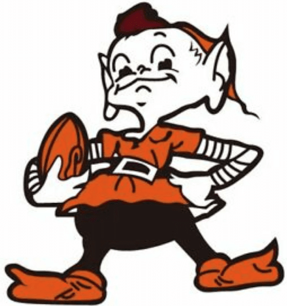
The Browns
Unveiling date: Not yet announced. Update: Beat writer Tom Withers is reporting that the Browns will unveil on April 15.
The latest news: I heard yesterday from a trusted source who said he was talking with a decal manufacturer. The manufacturer told him that he was working on “tweaks” to the decals they produce for the Browns. The manufacturer did not give any additional details, and my source declined to identify the manufacturer.
Paul’s take: Of course, Browns don’t have any helmet decals, at least not in the traditional sense of the term. The manufacturer could have been referring to the nose and neck bumpers, but I think the more likely scenario involves the team’s helmet striping, which since 2015 has featured a faux carbon fiber pattern:
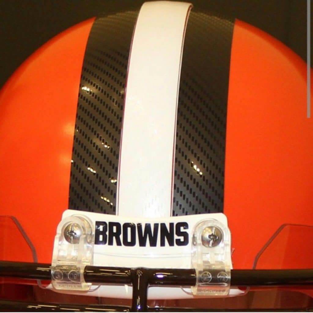
Ownership has already given multiple signals that the team is going back to old-school basics, so eliminating the pattern from the stripes would seem to fit that agenda.
———
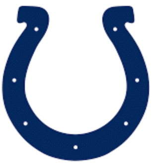
The Colts
Unveiling date: Not yet announced.
The latest news: My source said the decal manufacturer also talked about making “tweaks” to the decals they produce for the Colts. Again, the manufacturer declined to specify what the tweaks will be, and my source declined to identify the manufacturer.
Paul’s take: A logo “tweak” would be consistent with what AP sportswriter Joe Reedy reported about two weeks ago. What would the tweak be? Reader Phil Rossi may have spotted it in a public service video that team owner Jim Irsay recently made. Compare the logo on the helmet on Irsay’s desk to a standard Colts helmet:
Is this the new logo for the Indianapolis Colts? Owner Jim Irsay made a video promoting social distancing and one of the helmets on his desk appeared to have a logo that was a bit larger and possibly more rounded. @UniWatch @PhilHecken @sportslogosnet
(https://t.co/sA04xD9ItS) pic.twitter.com/LmK7vnsH8i
— Phil Rossi (@Phil_Rossi) April 3, 2020
It looks like the Irsay helmet’s horseshoe is wider, rounder. Could that be the tweak? We’ll see.
———
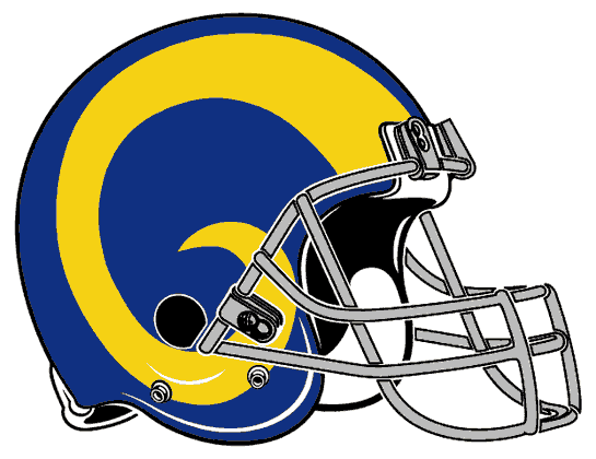
The Rams
Unveiling date: Sometime in May; exact date not yet announced.
The latest news: As noted in yesterday’s Ticker, the Rams are sticking with their new logos and colors, even though fan reaction to the logos has been decidedly negative.
Paul’s take: I know some fans were hoping the Rams would take after the 1991 49ers and walk back the new logo design, but that was never in the cards. The way sports branding and merchandising works these days, there’s no way to rescind a new design once it’s been announced, because too much has already been invested, too many products are already in the manufacturing pipeline, and so on.
I still think it was a mistake for them to unveil the logos and uniforms separately. The fans’ reaction would likely be a lot different if they could see how the new marks fit into the larger on-field scheme.
———
The Falcons
Unveiling date: Not yet announced. However…
Latest news: … a business associate of team owner Arthur Blank has said that the unveiling date will be April 14 — one week from today. Also, yesterday they changed their social media avatar to their throwback logo (although they’ve now changed it back). Hmmmm.
Paul’s take: The Falcons have done a good job of keeping everything under wraps. Whatever they’re working on, and whenever they plan to reveal it, it’ll be a surprise.
———
The Chargers
Unveiling date: Not yet announced, but prior to April 25.
Latest news: The Chargers revealed their new logos nearly two weeks ago, with the promise of unveiling the uniforms in “less than a month.” There hasn’t been any news since then.
Paul’s take: Again, I wish they had unveiled the new uniforms along with the new logos. But whatever they end up doing, I’m sure everyone will love it — this is a franchise that would have to work really hard to mess up all the uni-related goodwill they’ve built up over the years.
———
The Patriots
Unveiling date: Not yet announced, although presumably prior to the draft.
Latest news: The Reedy tweet says they’re getting a uni change but not a logo change.
Paul’s take: I got nothin’. Wait and see.
———
That’s it. I’ll have full coverage of the Bucs’ new uniforms tomorrow, of course.
Click to enlarge
Collector’s Corner
By Brinke Guthrie
Follow @brinkeguthrie
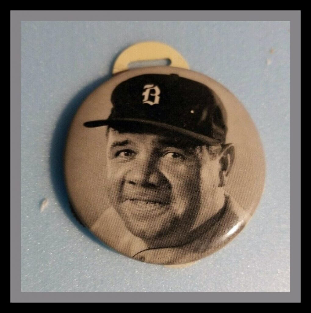
Goin’ back 85 years for our first item today. Have you ever heard of a watch fob? I looked it up: “The purpose of a watch fob was to make the pocket watch more accessible, giving the user something to grab on to when pulling a pocket watch out of a vest or pants pocket.” I think it’s one of things I’ve heard of but never really given much thought — until I came across this 1935 Quaker Oats Babe Ruth Premium Watch Fob Scorer.
The seller says:
Between 1934 to 1935, the Quaker Oats Company offered Babe Ruth-endorsed premiums that were available through mail order with redemption of box tops from its cereal. The offered item is one of those goodies, the watch fob scorer. Measuring 2” in height, this handheld scorer allowed the fan to keep score of a baseball game by turning the dials on the edge as shown.
Also of note: See the B on his cap? In 1935, the Bambino was wrapping up his legendary career by playing for the Boston Braves — but that isn’t their cap logo. Maybe it stood for Babe?
Now for the rest of this week’s picks:
• Here’s another one for the Babe, and it’s even older! This is a Bambino Baseball Game made for the 1933 Chicago World’s Fair. That is one big slab of wood.
• With the Tampa Bay Bucs unveiling their new look today, let’s take a fond look back to their original Bucco Bruce days with this 1970s mini-calculator. Yes kids, people carried these around!
• I know we’ve featured 1970s NFL Goalpost Kits before, but I had to include this one for the amazing box art alone. (However: It’s missing the goalpost, which is a key component to any goalpost kit!)
• Now that is one good-looking 1970s Colorado Rockies (NHL) knit ski cap, made by CCM!
• This 1960s button says “I Belong to the Quarterback Club.”
• Will you look at this! Here’s a little 1970s mail order flyer from the Philadelphia Flyers (a flyer from the Flyers!), where you order all sorts of cool merch, including a “Flyers Digital Clock,” which is really a wristwatch with the little Flyers wings sticking out. Make sure to scroll through all the photos — good stuff!
• This is a 1970s Rally Bobby Orr MVP Sweatshirt. Now, I figured Rally had to be a sporting goods maker from that time frame, and sure enough, they were. More info on that from a blog called, er, Collector’s Corner.
• This 1970s NHL bedding set is adorned with some great-looking artwork.
• How about this 1970s New York Islanders hockey puck bank!
• If you ever wanted to see the Great One, Wayne Gretzky, wearing a Chunky Soup hockey jersey, now is your chance. There he is on the order form for an Easton Gretzky hockey stick — half-price! Just $45 and seven Chunky labels. The soup that eats like a meal!
For all photos, click to enlarge
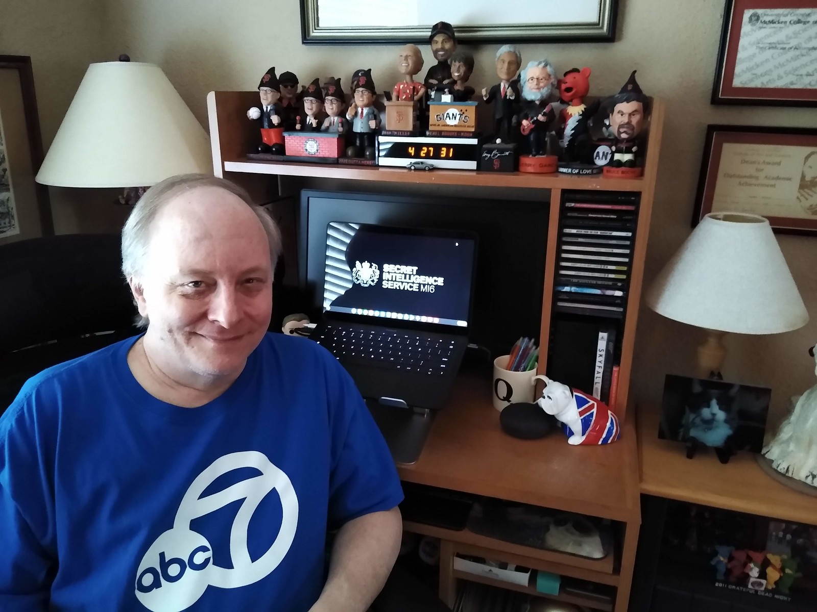
ITEM! Meet the Uni Watch Team — Brinke Guthrie: With most of us stuck at home and craving some sort of connection, I decided it would be fun to provide a behind-the-scenes look at various members of the Uni Watch. And since today is Tuesday — “Collector’s Corner” day — I thought we’d start with longtime CC contributor Brinke Guthrie, who lives in the Bay Area.
Brinke says:
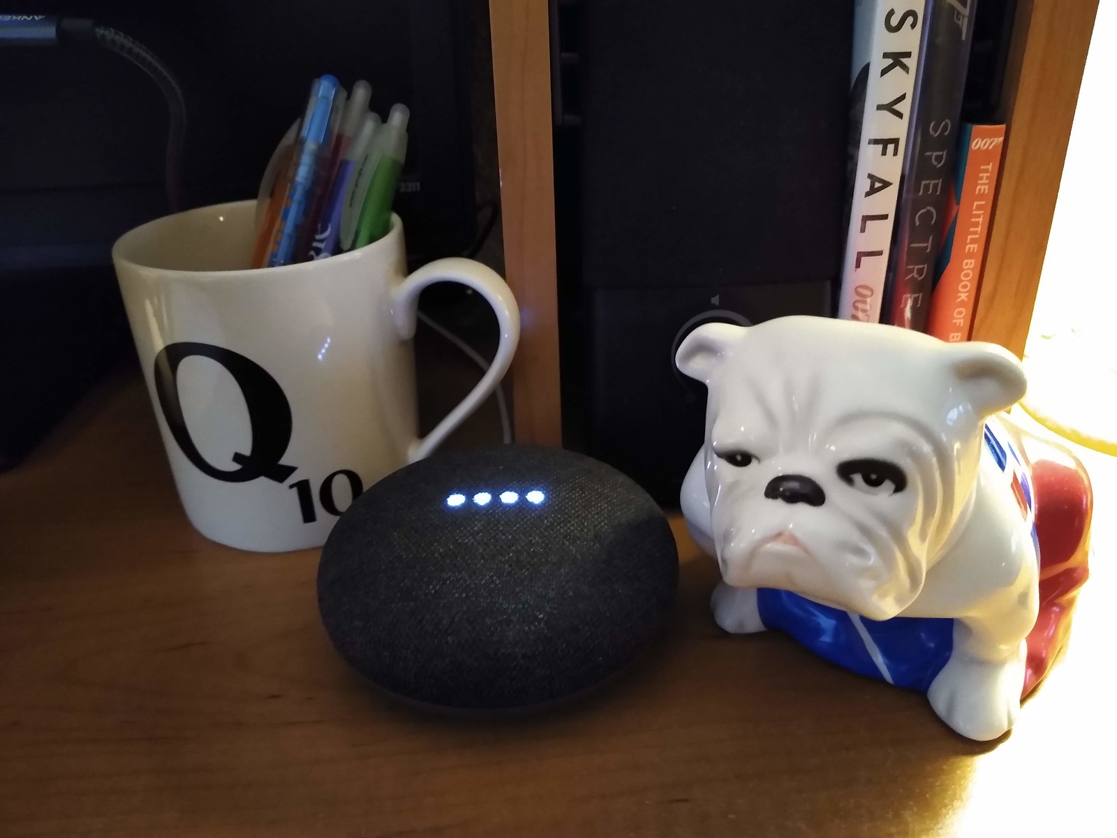
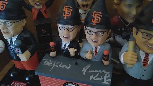
Greetings from my Command Centre (I use the British spelling, thanks). Working from home these days for ABC7 in San Francisco, as opposed to my daily BART commute. Among the highlights in my work space here are my new Pixelbook Go (visible behind me in the photo shown above); Jack the bulldog from M’s desk, and Q’s mug (both from Skyfall — I’m a big 007 fan); and my favorite Giants bobbles, including the signed Kruk & Kuip gnome set, my signed Bochy gnome, and the ultimate Giants bobble — Jerry Garcia.
Here are the items Brinke referred to:

I’ll continue to run “Meet the Uni Watch Team” as an occasional feature in the days and weeks to come. I hope it helps put a bit more of a human face on the site during this time when we could all use a bit more humanity.
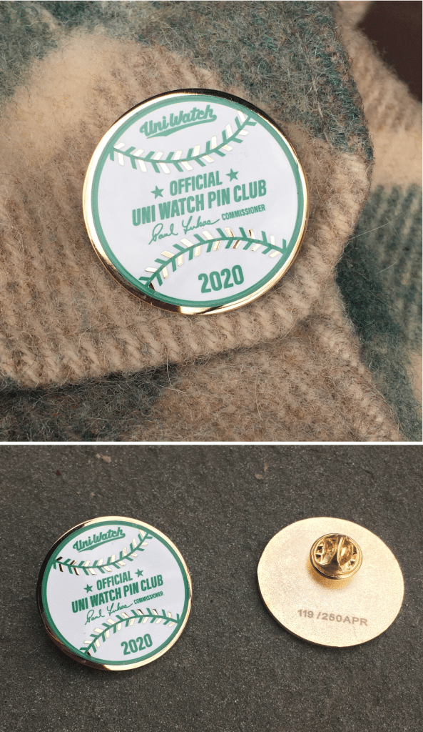
GOING FAST: In case you missed it last week, the Uni Watch Pin Club’s April design is now available. As you can see, it’s based on an official Rawlings/MLB baseball, complete with my signature as the “Commissioner.”
This is a numbered edition of 250 pins. As of this morning, there were only 11 remaining. This one will definitely sell out today, so if you want one, I suggest that you move quickly. (Also: Congrats to Mike Franzosa, who got pin No. 1!) Now sold out!
If you need to get caught up, here are the January, February, and March designs, all of which will remain available until they sell out (no reprints!). You can get a 15% on all of these pins, and on everything in the Uni Watch Shop and the Naming Wrongs Shop, by using the checkout code COMMUNITY.
And while we’re at it, several other discounts are in effect until further notice:
• The Uni Watch Classic Cap, usually priced at $39.99, is now $35.99.
• Uni Watch seam rippers, usually $6, are now $4.
• And custom-designed Uni Watch membership cards, usually $25, are now $20.
If you’d rather support Uni Watch via a donation, here’s now to do that.
My thanks, as always, for your consideration and support.
Click to enlarge
More mask musings: All this talk about masks has reminded me of when I watched the TV show M*A*SH while growing up. I always noticed how most of the characters tied their masks with the top strap on top, bottom on bottom — but Maj. Houlihan (and maybe the other nurses..?) did it with an an “X” pattern. Even back then, I was uni-watching!
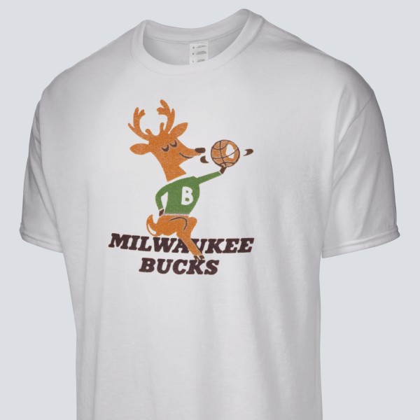
Raffle reminder: Our longtime advertiser Vintage Brand is back with this month’s raffle. The lucky winner will be able to choose any item from the Vintage Brand site (including this Bucks T-shirt with history’s greatest NBA logo).
To enter, send an email to the raffle address by 8pm tomorrow, April 8. One entry per person. I’ll announce the winner on Thursday.
And speaking of T-shirts, Vintage Brand is currently running a sale — for today only, all tees are 20 bucks!

Membership update: Eight new designs have been added to the membership card gallery. That includes Marcus Hall’s card — the rare (but not unprecedented) Baltimore Stallions-based card.
Ordering a membership card is a good way to support Uni Watch (which, frankly, could use your support these days). And remember, as a gesture of comm-uni-ty solidarity, the price of a membership has been reduced from $25 to $20 until further notice.
As always, you can sign up for your own custom-designed card here, you can see all the cards we’ve designed so far here (now more than 2,500 of them!), and you can see how we produce the cards here.
The Ticker
By Alex Hider

Baseball News: MLB and the players’ union are considering an ambitious and improbable-seeming plan that would have the season start as early as May, with all games taking place at empty fields in the greater Phoenix area, primarily at spring training facilities. Social distancing measures could possibly include using a digital strike zone so the plate ump wouldn’t have to crouch close to the catcher and having players sit six feet apart in the empty stands instead of in the dugout. … Tigers great Al Kaline died yesterday, so Will Shoken sent along this photo of “Mr. Tiger” from 1951 in his Baltimore-area youth baseball uniform. … Reader Ben Zoss’s mother, Julie, is a talented seamstress (she’s even made The Ticker before!). She sewed Ben this Cubs-themed face mask to help protect against COVID-19. … Speaking of baseball and coronavirus: The Brewers shared a graphic of a separated version of the ball-and-glove logo to encourage social distancing (from Chris Rucinski and Ray Barrington). … We have a single-digit pitcher sighting — from the ’70s! In 1970, P George Brunet made his debut for the Pirates wearing No. 4 after he was acquired from Montreal. Gary Olson says that an Expos announcer said he thought the Pirates would “change that number when they get back to Pittsburgh.” He was right! Brunet switched to No. 20 upon their return. … MiLB has a nice piece on the nickname history of the Rochester Red Wings — one of the longest-running nicknames in the minors. It even features some quotes from reader Paul Bielewicz, vice president and co-founder of the Rochester Baseball Historical Society. … Here’s a piece of good merch: The Baseball Hall of Fame gifts this beautiful cardigan — based on the old baseball sweaters of the 1900s — to benefactors who donate $200 for a membership to the museum (from Doug Brei). … Someone made an illustration based on the infamous Billy Ripken “Fuck Face” card to encourage social distancing (from Andrew Cosentino). … Over on the SportsLogos.net message boards, there’s a great concept for a potential Marlins rebrand as the South Florida Flamingos (from Chris). … The rest of these are from Kary Klismet: The Rangers released drone footage showing some never-before seen angles of their new ballpark. … An MLB: The Show player is using the game’s custom uniform feature to recreate defunct major- and minor-league teams. … A youth baseball organization in Missouri called American Made Baseball is recognizing their players whose seasons have been canceled due to the coronavirus by posting their photos in uniform on their Facebook page.

NFL News: We’ve got some new uni number assignments for the Giants (from Neil Vendetti). … The Ravens published a video about the franchise’s first-ever game that includes a great look at the team’s old uniforms and their old home, Memorial Stadium (from Andrew Cosentino). … Someone put a mask (with a buffalo wing pattern!) on the statue of former Bills owner Ralph Wilson outside of the team’s stadium. … Former Pats QB Tom Brady once dissed his own Pro Bowl uni on the field (from Ray Ellingsen). … Dan B. was going through his grandfather’s stuff and found this amazing set of 1970s NFL matchbooks.

Hockey News: Former Flyers LW Scott Hartnell tweeted a photo of himself wearing an awesome Gritty mask (from Jeff Czuba). … We all miss hockey — but at least one person went through the trouble to let everyone know via a nameplate ransom note with his jersey collection (from Brandon Weir). … Lots of good bits from this late-’90s clip from ESPN’s Pro Beach Hockey — asphalt surface, rollerblades, sloped end-lines, and bright colored unis (from Johnny). … The rest of these are from Canada’s finest, Wade Heidt: Prime Minister Justin Trudeau placed a hockey stick outside of the door of his house during a daily Covid-19 briefing to honor the victims of the Humboldt Broncos bus crash on the two-year anniversary of the tragedy … Mark Donnelly, the Canucks’ anthem singer, dressed in his gameday tuxedo and sang “O Canada” in support of healthcare workers at a local Vancouver apartment complex. … An article on BarDown takes a look back at hockey skates that changed the game. … Local chain Panago Pizza is still celebrating the Canucks’ 50th anniversary with green and blue boxes with the team’s logo.

NBA News: The Wizards edited their “DC” logo to encourage proper hand washing amid the coronavirus pandemic (from Robert Kahn). … During Magic Johnson’s first game with the Lakers in 1979, Jim Chones’s jersey had gold numbers while his teammates had white (from Jamie Hall). … Pistons PG Vinnie Johnson, who normally wore No. 15, wore a No. 52 NNOB jersey for a 1985 game after his jersey was misplaced in transit.

Soccer News: Yesterday marked the 24th anniversary of the first MLS game, so the league changed its website layout to include its old logos and color schemes. They’ve also launched an Instagram account dedicated to their inaugural season (from John Flory). … Staying on the MLS website, they’re running a fan vote to determine the best uniform from that inaugural season (from Phil). … Speaking of 1996, Timmy the Cop was watching a replay of a game from 1996 that featured giant NOBs and way too many uni ads. … If you’re a soccer fan looking for something to watch during quarantine, Callum Newton has a suggestion: The English Game on Netflix, which tells the story of the professionalization of soccer in England. It has plenty of good shots of old soccer kits, including the light blue of Old Etonians. … Speaking of early English soccer, Kary Klismet suggests following Historic Football Grounds on Instagram.

Grab Bag: New athletic logos for Montclair State (from Kary Klismet). … Following yesterday’s discussion about “maskots,” David Robins found someone who made a maskot out of the Natty Boh logo. … Munster — an Irish Pro14 rugby team — published a uniform evolution piece on their website (from Michael Vasinko). … Speaking of rugby, a Twitter-er has redesigned some top teams’ crests to encourage social distancing (from Andrew M. and Tony Aggie). … The BBC accidentally used a U.S. Open tennis logo in connection with a story about golf yesterday (from Kevin O’Connor). … You’ll be seeing a lot more military personnel wearing masks in the coming days, as Sec. of Defense Mark Esper has issued new guidelines about masks among military members (from Timmy Donahue).
Click to enlarge
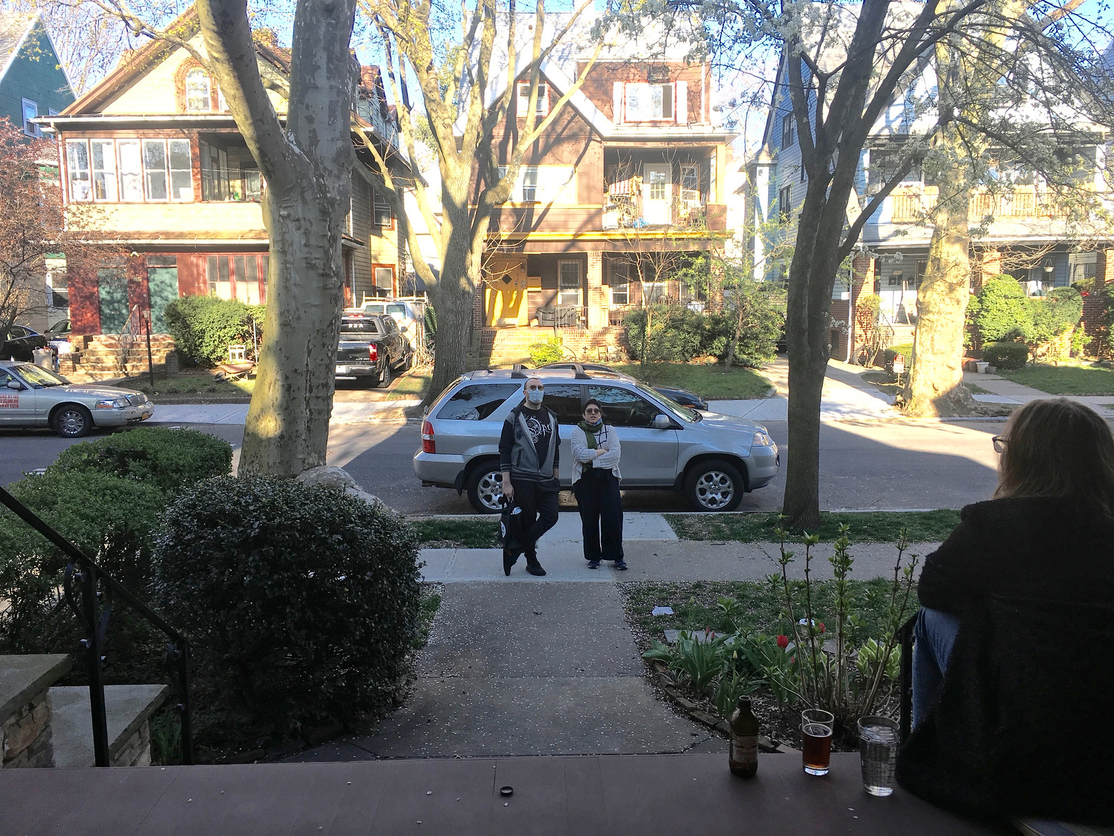
What Paul did last night: Our neighbors Greg and Val strolled by while we were cocktailing yesterday. Val was diagnosed with breast cancer two years ago, which paradoxically has made her rather chipper about the pandemic. “This is basically just a continuation of the past two years,” she said. “By this point, I’ve got the survival thing down pat.” Greg, an audiologist who’s been furloughed, has his own survival strategy: “Lots and lots of video games.”
And now, by popular demand, the return of Uni Watch girl mascot President Caitlin, whose birthday is fast approaching:
Daily cat break pic.twitter.com/HaB2e1vmpv
— Mary Bakija (@mabatron) April 6, 2020
Stay safe, people. We’re all in this together, and together we will all get through this. — Paul
Paul,
Enjoyed reading about Brinke as I always look forward to Tuesday’s Collectors Corner.
How did you and Brinke initially connect?
He was a reader who submitted a lot of eBay listings for the Ticker, so I suggested that we turn that into a column. The 10th anniversary of CC is next month, in fact!
Yes it is! CC|X
Based on their Twitter feed, looks like the Falcons did a re-watch of the 1998 NFC championship yesterday. That could be the reason for the avatar change to the old logo.
The Falcons Twitter avatar is their current logo for me. Did it get switched back after Paul pointed it out?
Yes. I’ll update the text.
That’s a sharp looking membership card :-)
Thanks a bunch!!
I’m trying to find a rear view of a jersey for the proposed Baltimore Bombers expansion team, but I doubt if they ever made one. I saw link in a forum on Chris Creamer’s site, but I don’t ever remember seeing something like this in the news back in ’93.
The Falcons logo change yesterday was because they were Livestreaming (and LiveTweeting) the 1998 NFC Championship Game. Most likely has nothing to do with the Uniforms.
I had to search to see if you were THE “Mr. Marcus”
HAHAHA! Nope, but it has been a running joke among my friends and me for years because we share a first name LOL. It’s been my nickname for years now.
If you go to 503-sports.com they have a Baltimore Bombers jersey featured, along with Stallions merch.
Matchbook helmets…WOW! Just when you think you’ve seen it all…
Did you make 2 Montreal Expos #27 membership cards for different people this week?
Yes. Just an odd coincidence!
The feature today got me thinking about the period of logo change from mid 1990s to mid 2000s. The obvious trend seemed to be a move away from more analog, hand drawn style logos (Pat Patriot, Bucco Bruce, original Dolphin, etc) to simpler, digital style. Some were simply modernizing the existing logo, others a complete redesign. What I think worked and didn’t work (just the logos, not the uniforms):
Arizona (2005): Simple update. Definitely works, the logo is basically the same, a bit more aggressive, but doesn’t change too much.
Atlanta (2003): An update, but I think one that fails. Unlike some of the updates I think were successful, this one does too much and rather than doing things like making it sleeker, etc, throwing in extra elements like the red stripes feel more like a trendy move than simple forward progression of the logo. I think there is a happy medium between the two logos that could be great.
Cincinnati (1997): They introduced their tiger head and full body tiger logos. Certainly an upgrade as they had no logo before and just used their helmet. Personally I think the tiger stripe helmet is awful (I know some love it) so that made me love these logos even more, and I’d love if they put the tiger head on the helmet. Never understood them transitioning to the striped B as the primary in 2004.
Denver (1997): Rather than update they went full redesign. I remember at the time as a kid I thought it was great, but it hasn’t aged well at all and the old D logo looks better as the year progress. Switching from royal to navy blue does help either. I think they’d benefit from going back to a updated version of the D logo, perhaps with a slightly sleeker bronco inside.
Miami (1997): Simple update. This was a big upgrade in my opinion, and though I could do without the navy accents, it kept the basic design of the logo, just modernized it. This is also a great example of what is just the right amount of tweaking a logo, as compared to too much, which you see in their 2013 update.
New England (1993): Obviously a big change, but unlike the Broncos’ makeover, this one works a little better simply because I am not sure you could just modernize Pat Patriot and make it work still. And I think my reaction to it now is more positive than at first, so to me that means it wasn’t just a product of it’s era.
Philadelphia (1996): A drastic change, and perhaps an instance where they could have just done an update of the old winged logo. However this one works, its not a great logo, but not a bad logo either, and has aged well the last 20+ years. I’d say the only thing that hasn’t aged well is the very 90s midnight green as opposed to keeping it kelly green.
San Francisco (1996): While it includes BFBS, and has an association with the uniform redesign that accompanied it, if you look at it now, placed on the classic uniforms they wear currently, it definitely works. The black outline is a minor tweak, but makes an old and simple logo feel modern.
Seattle (2002): I think this falls in with the Dolphins and Cardinals as an update that works perfectly. The same great design of the logo, just modernized a bit. The only downside in this, and the subsequent recoloring in 2012, is the relegation of green to an accent color. Make the bottom stripe green and it would be perfect.
St Louis (200): Kind of like with the Bengals the Rams made an upgrade just by adopting a logo. If I was grading it would get a solid B, nothing remarkable but it is good, and given their helmet design it doesn’t necessarily need to be as great. The downside of this logo, much like the Eagles and Broncos updates, was that it also followed the trend of dropping the vibrant color schemes for darker and more muted tones.
Tampa Bay (1997): A full makeover that works. You could have just updated Bucco Bruce, but my guess is that all the futility associated with that design sparked the full makeover, and also is part of the reason why the change was successful. I actually like the orange, white, and red colors of the past, as I think they have a more tropical feel to associate with Tampa, but the red and pewter colors work well anyway.
So there were 4 logo changes that I would say were updates, 4 that were full redesigns, and another 2 that just added logos for teams that only used their helmet design. I’d say only two of them weren’t an upgrade, Denver and Atlanta. Given that one was a full makeover and one just an update, the commonality is that they both seem very era specific. The other takeaway I think is that the shift by many of the teams (Pats, Eagles, Broncos, Hawks, Rams) to a darker color set was an overall downgrade, and using the old colors would make the new logos even better. (I know I didn’t include the Giants and Jets, but that was intentional as both simply reverted to past logos). Just my two cents during these slow times.
The overall impression I’m getting with the Browns uniform redesign is that they are going back to their more classical look (circa prior to 2015). However, the Browns have never really been known or recognized for their alternate uniforms. What route will they take in the upcoming redesign? Mono-brown color rush again? Orange tops? Some sort of a throwback? What are your thoughts?
Hey Brinke, love your Jack the Bulldog piece. I have the rugged, cracked, and re-glued version from Spectre.
Yes when they originally released Jack he was $125 or so and I said no can do, but then they dropped it to $65 or $70 for some reason and me and a friend from LA both pounced on it at the same time. This was Jan of 13 and he has never moved from my desktop.
I suppose there’s only a few ways to depict a descending hawk, but Montclair’s new branding reminds me of the seldom-used Seattle Seahawks alternate logo:
link
Wow, I’ve never seen that Seahawks logo. Both have a bit in common with Crystal Place F.C.
link
I’m hoping the Colts “tweak” might be in the horseshoe decal application. NFL decals are, by and large, reverse printed on a thick, CLEAR, vinyl that conforms to the shape of the helmet. The Colts horseshoe is made of this same vinyl (but in blue) and stamped out in the exact shape. When applied to the helmet though, you often get inconsistencies in the width of the horseshoe at the top. I’m hoping they go to the process that the teams that have more elaborate designs use.
BTW, Irsay’s more rounded horseshoe helmet looks awful.
Also of note: See the B on his cap? In 1935, the Bambino was wrapping up his legendary career by playing for the Boston Braves — but that isn’t their cap logo. Maybe it stood for Babe?
True enough; when Babe played for them, the Braves wore link. But the year before, the Braves were sporting a Old English cap logo, similar to the one on that fob.
I wonder if the picture doesn’t date to the time between Babe’s signing and the start of the season, when they could have snapped a picture of him in his new cap. Kind of how in early 1953 we saw link about what the Braves would wear in Milwaukee.
Random question that comes about because of Brinke’s shirt: does ABC have channel 7 in lots of markets? They use the same logo here in Chicago as well, and I think I’ve seen it in other places too.
ABC is also 7 here in NYC.
The strangest thing to me is when one of the large 4 networks has a channel that’s really high in the double digits. Like Fox 32 or something.
Anyways, ABC is 8 in Dallas.
Fox 4
NBC 5
CBS 11
Until FOX obtained the NFL, the Dallas market was different.
CBS 4
NBC 5
ABC 8
FOX 33
(11 was an independent station)
Ah, someone too young to remember the beginnings of the Fox broadcast network. A lot of the independent channels that were around then to form a new network were in the upper UHF band.
CBS Detroit is 62. I believe this is the highest number for a TV station in the USA.
Yes, in Chicago it is:
CBS 2
NBC 5
ABC 7
WGN 9
FOX 32
ABC is also 7 in Buffalo and Detroit.
Makes me wonder – it seems like fewer and fewer TV stations are maintaining their “channel number” branding now that channel numbers are largely irrelevant. Our local stations mostly brand by network now and not by by “channel”.
ABC is channel 7 in Omaha, Nebraska. The Lincoln ABC affiliate (which came later) is channel 8
Channel 7 in Dayton, WHIO, has the same logo. Oddly thought, they’re a CBS affiliate.
*though
Ooh, a thread I can contribute to. The distribution of full-powered stations using virtual channel 7 according to my rough count are: ABC 17, CBS 12, NBC 8, PBS 8, Fox 6, others/independent 6.
ABC stations use virtual channel 7 in Albuquerque, N.M.; Amarillo, Tex.; Bangor, Maine; Buffalo; Chicago; Chico-Redding, Calif.; Denver; Detroit; El Paso, Tex.; Jackson, Tenn.; Lawton, Okla.-Wichita Falls, Tex.; Little Rock, Ark.; Los Angeles; New York; Omaha; San Francisco; Washington.
So why is it channel 7 in a bunch of large cities? I think it was because it was the 4th broadcast network to air, and in most of these cities whatever low-VHF channels were available (channels 2-6) were in use already. 7 was largely free and the next best choice.
Did you know there is a Wikipedia page for the Circle 7 logo and the stations allowed to use it and why?
link
That Baseball Hall of Fame logo patch on their cardigan has the laces on the baseball facing the wrong way. They’ve used this logo for decades, so maybe they’re sticking with it because of tradition, but I wish they’d correct it.
link
According to Baseball Reference, George Brunet switched to 22 from 4, not 20. link
This caught my attention because I know that the Pirates have retired number 20 and Richie Hebner was the last Pirate to wear it before it was retired in 1972.
Loving the daily porch photos and great idea on #WFH pics of the staffers.
It looks like creator of the Billy Ripken card is Gummy Arts on Twitter:
link
Thinking white pants will be a must for the new Los Angeles Chargers uniforms, but really hoping for a set of alternate yellow pants.
Looks like the new Bucs unis do have the orange accents after all.
The oversized helmet decal is still terrible, but overall I think they look great. End of an error.
Seconded. I was pulling for creamsicles and Captain Blood, but hey; Baby steps. It’s a good look for them. One thing I didn’t expect was the absence of a bespoke font in favor of good old Varsity Block, definitely a hopeful move.
About the M*A*S*H surgical masks, maybe the nurses used the “X” tie to make masks sized to men fit?
Also, Rochester Hop Bitters would make an excellent team name.
Still haven’t embraced the new Rams logo? Me either
Paul, love the daily pic from your porch. Can you specify each day what you two are drinking?
Thanks.
Lee
Have noticed that The English Game seems to be taking liberties with the team colors it uses, because a few weeks ago I sent in a Ticker item about how it seemed to have made up a Blackburn team that is a combination of two others and dressed it in maroon and black (instead of varying combos of blue and white). Now, with Old Etonians, if we look at Historical Football Kits (link), that tells us that they only wore grey, white, or grey and white quarters in FA Cup finals, not the light blue shown. Obviously it’s hard to know for sure.
Also, re: Historical Football Grounds, it’s interesting when watching old soccer games, especially from the ’80s and ’90s, to see what’s changed about a stadium and what’s stayed the same in the intervening years.
“although Uni Watch readers already know what they’ll look like”
Actually they didn’t…not even the black sleeve trim was on yours. So perhaps next time you get infro, you don’t act so cocky saying “There’s no need to see the new uni’s we know what they look like!”
And don’t say they’re close enough because the WHOLE POINT of people who are interested in uniforms is the small details.
I am glad I don’t get it™
Actually, Steve, I never said there was no need to see the real uniforms.
It’s true, I missed the black trim. That’s on me.
I’ll let others decide if our mock-ups from last month were “close enough.” I made it clear that I wasn’t 100% sure about the lack of orange (and I’m glad it turned out to be included). I also made it clear that I hadn’t seen the helmet or the mono-pewter design, but they both turned out to be exactly what I said they’d be.
I’ll have full coverage tomorrow, of course. I’m sure you’ll be here to read it, even if you Don’t Get It™. Take care, and stay safe.
Well, that seemed uncalled-for…
If you Don’t Get It™……why would you be here?
The baseball scheme is doable. There’s 17 ballparks available that could host pro ball(Cactus Fields has fields based on dimensions of Fenway, Wrigley, Chase Field & Yankee Stadium; the would need to sod the infields) There’s more than a few resorts that are up to MLB standards that are headed towards their down season so rooms are available. The hard part is that only Chase Field can host a noon time start as the sun is too much even now. Come May, it would be interminable. By June, you would have a hard time having games start at 7 Eastern time.
Dumb question: assuming that a big part of the plan to play games sooner rather than later is to provide TV product, are the Cactus League parks capable of hosting a modern TV broadcast? Eg. the right number of HD cameras in the right places.
Its been a while since I watched a spring training game, but it felt like most of them had the production values of a high school game.
They run everything through remote trucks, so production values are a function of the budget. Can’t be more than 6 units in the valley, so they’d have to bring em in from out of town to have the capacity. Same would go for the crews working it, so that’s another 300 people to isolate.
i hope the one change that is made to the Browns helmets is that no matter the vendor they all have the same shine and hue to them. right now some look like they have a satin finish while other look more matte…
Creamer’s site is reporting a possible leak of new Falcons uniforms link
I have an official Pro Beach Hockey ball! I remember watching in the 90s. There was a 2-goal line and a team called the Dog Pac .
Gold Lakers numbers on purple jersey? How come nobody caught this before? Nice find!