
By Phil Hecken
Follow @PhilHecken
A couple weeks ago, down in the “Tweaks” section, I featured several concepts from Gus O’Keefe, and I mentioned Gus had many college uniform concepts. We had hoped to run those last week, but alas, that didn’t happen, but I’m happy to say I am back with him today. As you can see from today’s splash, Gus has uni tweaks for several college teams. Before we get to those, I was able to interview Gus earlier this week and we did a Q&A sesh. So, without further ado, let’s meet him!
Uni Watch: First question I ask of everyone: how and when did you “discover” Uni Watch, and how long have you been a reader?
Gus O’Keefe: I can’t remember the exact moment I discovered Uni Watch, I just know it has been ever-present in my life for the past 10 years or so. It’s the same story that most of us probably have: Somehow I stumbled upon the site and thought “Wow! I thought I was the only one!”
UW: How old are you and where do you live?
GO: I am 31 years old, and live in Bozeman, Montana.
UW: As readers know, I’ve always loved uniform concepts, and feature them often. When did you first begin designing unis?
GO: Not until fairly recently. Three years ago, I had a helmet concept for Montana State University (go Cats!) that I wanted to see actualized. I didn’t want to pay an artist to create it for me, so I decided to teach myself how to do it. The initial attempts were expectedly terrible, but it sparked a passion.
UW: Did you do “refrigerator art” (as we call them) — basically drawings of unis — as a kid?
GO: Not of modern sports uniforms, no. But I did have a keen interest in heraldry. In a way, I guess knights and their shining armor were the oldest-school sports uniforms. I recently tried merging the two, editing medieval paintings of knights so that their heraldry represented different NFL teams. Not my most successful artistic venture!
UW: When did you start designing unis on a computer?
GO: From the start, three years ago. Initially I used some free photoshop-like programs online, and quickly realized I needed to invest in the real thing. Not a slam against mockup artists who do more artistic work, I love what they do, but for some reason I feel a really strong desire to make things as realistic as possible when I’m working. For the pieces below I used a template that is pretty solid and lets me work fairly quickly and easily, but my true passion is trying to get things as close to photo-realistic as possible. The only way I have found to do that is with a computer.
UW: Two weeks ago, I teased several of your concepts, including a couple “Uni Watch” unis (you know the baseball player needs stirrups!). What attracted you to uniform design? Do you do all the major sports, and soccer?
GO: Uniform design was just a lightbulb moment. As a young kid I was passionate about art. As I grew up, that passion transitioned into sports, and my artistic impulses laid dormant for about 15 years. When I realized I could combine the two, it was a no-brainer.
I have tried my hand at all the major sports. My first big project was actually featured here on Uni Watch, which was a “NFL teams as premier league soccer kits” concept. After that I got to help Paul with a hydrodipped batting helmet project.
For the most part I stick to football, that is the sport whose design language I am most fluent in I think. When I venture into other sports, it is often for a UW contest or project. I just don’t feel I know enough about the uniform aesthetics of, say, the NBA to really dive in.
UW: Is this a hobby or do you do any of this professionally? If not professionally, would you like to try to turn it into a money making venture?
GO: This is entirely a self-taught hobby. I get to use some of the tricks I’ve learned at my day job as a Content Editor for an online journal, doing simple graphics and photo editing, but it isn’t related to sports in any way. I am not sure uniform mockups would ever be a true money-maker, but I have certainly been tempted to go back to school and take some graphic design courses, if only to improve my abilities. Maybe some day I could make content creation at least a part-time gig.
UW: How long does an “average” design set take? What took you the longest?
GO: It really depends on if the concept is there in my head. When I saw the old Arizona logo, I knew exactly what I wanted to do. I had the entire uniform mocked up in less than half an hour and then probably spent another hour adding detail work to it. On some of the other stuff I have worked on, particularly when I am not using a template and going for maximum realism, I can spend hours on a single helmet. Recently someone asked me to do a jersey swap, putting Justin Herbert in a full Bucs uni. That was probably 6+ hours.
UW: Looking at the designs we’re about to see below, I note you’re pretty “traditional” in your designs, but with a “modern” touch. Have you ever done anything really crazy, or do you prefer to go with the “classics”?
GO: I think that is just my aesthetic. Uni Watch and their affection for traditional design is partly to blame, I’m sure! I think it is also indicative of the trends in sports in general, particularly college football. It seems we are seeing more and more schools look towards their history when designing uniforms, and I really hope that trend continues. It probably helps that arguably 22 out of the 24 teams that have made the CFB playoffs have had fairly traditional uniforms. I think the idea that you need to be crazy with your uniforms to recruit young athletes is looking more and more like a myth.
That being said, it wouldn’t be creative on my end to just go “here is a straight throwback, here is a straight throwback, here is a…” The challenge of trying to create something new forces me to implement that modern touch, and I think that balancing act is fun to play with. I have certainly gotten way out over my skis with some designs in terms of their craziness, but I usually manage to dial them back in towards something that at least has a touch of familiarity to it.
UW: Where can we see more of your work? Do you have a website or blog? We can obviously follow you on twitter @sportsPSD but do you have any other social media presence(s)?
GO: No sir, just Twitter!
UW: Great! Thanks, Gus — let’s take a look at some of your work and your descriptions! (You can click on the images below to enlarge.)
Arizona:


This one started the retro/80’s feel of a lot of these concepts. I saw that terrific Arizona logo, and putting the uniform together took me about 20 minutes. It was in my head immediately before I could even put it down in photoshop. Went with the old school Nike logo to fit the era of the logo. Once I was done with this one, I started searching for more logos from that era.
Oregon:


This was a collaboration with Ray Haener (@rayhaener). He reached out asking what I could do for an Oregon Rose Bowl concept, and this is what we came up with after a bit of back and forth. He really liked the throwbacks Oregon wore a few years ago, so I took that as my basic inspiration for the color scheme. I created a new interlocking UO logo based off of their current jersey number font (the only logo I actually created for this project) and stuck to their current uni design for the body. Threw a subtle rose pattern on the sleeve caps, and called it a day.
Washington:


Another that was inspired from the logo. They used this W with a husky on top from 79-94. I started out with an LSU-type color scheme, Green Bay gold helmet and pants, purple jersey, but looking back at that time frame realized they have never really worn GB Gold in football. Instead I decided to give them a classic stripe pattern and gold numbers with white outline mirroring the W from the logo. I think the heavy metallic sheen of the gold accents throughout help it pop. Sticking with the retro logo theme, I went with the old-school Adidas logo.
Florida:


A design based off their severely underutilized 1979-1984 UF logo. Initially this was a much wilder design, with orange numbers, blue pants and an orange facemask. Talking with @GatorsUnis on twitter, he helped walk me back a bit into color schemes that the Gators have traditionally worn, but with a modern twist. The helmet logo was an easy transition into shoulder caps, and other than that, kept it pretty clean. Old-school Jordan wing logo to throw it back to the correct era.
Memphis:


[You can see the helmets in action here — PH]
I can’t decide if I love or hate this design. @Chiefsums asked me on Twitter what I would do for a fauxback utilizing the Tigers’ 1988-1989 helmet decal, which connected in the back a la the Seahawks, on a matte gray helmet. Those two stripes formed the basis of the entire design. The unique shoulder striping came out of a lot of failed efforts to get an M design from the stripes. If you look at the bottom of the stripes, you can see there is a slight M effect, which I think is a kind of cool subtle touch. It ended up having kind of an 80’s blocky graphic vibe, which fits what I was going for as well. The jersey number font is what Memphis currently utilizes now, I thought it was a simple way to maintain a connection to present day. Throwback Nike to top it off.
Wisconsin:


This was actually the first college fauxback I created. It came about from a simple request on Twitter from @grnbaybadger, asking for a Wisconsin alternate, design entirely up to me. I went through and found a beautiful old script logo and used that as my inspiration. In addition, I used the center cross from the flag of Madison, Wisconsin as an accent motif. I went cream instead of white, as a tribute to Wisconsin being “America’s Dairyland”.
Montana State:


This one is the closest to home for me. I live in Bozeman, Montana and am a massive Bobcats fan. I originally came up with this concept a couple years ago, but dusted it off for this Uni Watch submission. With the exception of West Point and Annapolis, no football team incurred more casualties than Montana State during WWII, despite our relatively small size. Fourteen players lost their lives, the Bobcats’ “Golden Ghosts”. Thought I would try a throwback/tribute uni recognizing them.
Went as close as I could to a true throwback. Each position group would wear the WWII patch of a fallen player.
Purdue:


This was by request of Kevin Bomberger (@bombschnizzle). We tried countless tweaks to this uniform, and in the end, realized that we shouldn’t mess with what works. Therefore, it leans heavily on the Saints’ color rush/throwback uniforms. The white top is nearly identical to the Saints color rush, but we went with old gold pants and entirely black shoulder numbers. Kevin and I disagreed with our favorite away uniform pants/socks combo, he preferred keeping the pants and black socks identical to the home set. I thought the white balanced it out a bit better. The home uni is essentially the away uni, stripped of white, except the shoulder numbers, which I think would really make them pop on an actual uniform. The helmet logo is an old school seal that Kevin passed along to me.
Wow! Great stuff, Gus, and thanks not only for sharing the concepts but also the interview. I’ll say this: the Saints need to use your Boilermaker designs IMMEDIATELY. How great would that look both on Purdue AND New Orleans????
OK, readers, what say you?

The Natty

Earlier in the week, a guy by the name of Austin Pendergist (@apthirteen) tweeted at me several awesome info-graphics on the Twitter concerning Monday night’s National Championship game between the Tigers (LSU Tigers vs. Clemson Tigers). It’s great stuff, so I’m going to repost his tweets here in order. Dig:
🔍Uniform Investigation🔍
We might have some uniform history on Monday when LSU takes on Clemson. Since the first CFP #NationalChampionship, every team that has played in the game has worn the title game patch on the left chest. LSU may be the first school to wear it on the right pic.twitter.com/hX5esG1GkK— Austin Pendergist (@apthirteen) January 8, 2020
It’s safe to assume that Clemson will follow the trend of CFP #NationalChampionship teams wearing the championship game patch on the left chest, as the Tigers have done so in every bowl game they’ve played in since 2010, including 3 previous appearances in the CFP title game. pic.twitter.com/EeHyCBZU1h
— Austin Pendergist (@apthirteen) January 8, 2020
However, LSU has worn their bowl patches on the right chest of their jerseys in their last 8 bowl games, including this season’s #CFBPlayoff Semifinal. It’s likely they will continue to do so and become the first team to wear the patch on the right in a CFP #NationalChampionship. pic.twitter.com/Ax057y6nDR
— Austin Pendergist (@apthirteen) January 8, 2020
This year, LSU became only the second team ever to wear a bowl patch on the right chest in a #CFBPlayoff game, joining Oklahoma, who did so in the 2015 Orange Bowl. The Sooners have switched their patches to the left chest in their 3 CFP appearances since. pic.twitter.com/gOTzAlfn8Z
— Austin Pendergist (@apthirteen) January 8, 2020
Of the 5 teams that have played in a CFP #NationalChampionship, 4 of them came into the game as historical left patch teams. Before their title game appearances the last time teams had worn patches on the right were: Ohio State 2012, Clemson 2009, Alabama 2006, and Georgia 2006. pic.twitter.com/ty5dVIpyJ5
— Austin Pendergist (@apthirteen) January 8, 2020
The lone exception was Oregon, who had worn bowl patches on the right chest in every bowl game since their patchless 2002 Seattle Bowl before breaking tradition and switching to the left chest for the 2015 Rose Bowl and CFP #NationalChampionship. pic.twitter.com/cnMX71e07K
— Austin Pendergist (@apthirteen) January 8, 2020
The last time LSU wore a bowl patch on the left chest was for their disastrous 2012 BCS National Championship Game in New Orleans, so it seems unlikely that the Tigers would go back to that Monday in the same stadium. pic.twitter.com/L5Se8reCxQ
— Austin Pendergist (@apthirteen) January 8, 2020
So expect to see some uniform history when LSU takes the field on Monday night, as all signs point to them becoming the first team to ever wear the CFP #NationalChampionship patch on the right chest of their jerseys. pic.twitter.com/fEMMv165Fc
— Austin Pendergist (@apthirteen) January 8, 2020
Pretty great stuff, right? Thanks, Austin!

Kreindler’s Korner
I had the distinct pleasure of featuring the wonderful artwork of artist Graig Kriendler on two occasions over the summer and fall of 2017, and more recently, in August of 2018.
For those who don’t wish to click the links, Graig paints baseball heroes (and regular guys) from the past, and is an immense talent.
Occasionally, I will be featuring his work on Uni Watch.
Here’s today’s offering (click to enlarge):

Title: “El Matty Negro”
Subject: José Méndez, 1910
Medium: Oil on linen mounted to board
Size: 9″ x 12″This painting of the great José Méndez is based off of his 1910 Punch Cigarro baseball card, which is quite a rare treasure. I believe only two examples are known to have survived the last 100 years, which is a miracle considering how condition sensitive it is. Being a Cuban-only issue only complicates matters, as the weather and tiny creatures are both known to wreak havoc on things made out of paper. The set as a whole is an absolute beauty with its photography, and interestingly enough, relatively unknown to most baseball card collectors. To learn more about it, my buddy Al made a video showcasing some of the top cards from the set (all of which he owns), as well as giving an explanation as to its genesis.
The image of the Méndez is without a doubt my favorite, both of the set and of him. There’s something in his eyes here – something intangible – that just has a presence. If you’ve ever heard the notion that good portraits will look at you from every angle of the room they’re in, this particular image is a prime example. I’ve heard the same said about da Vinci’s Mona Lisa, and call me a heretic, but I’d put this one in her company.
I had already painted it once, as a small color study for the show at the Negro Leagues Baseball Museum (opening February 13, 2020), but late last year I felt it was time to do a fully realized version. With that, I was able to get into the expression on his face so much more than I had in the study. The texture of his jersey, too – all stuff I could do now that I was working on a canvas twice the size as the prior piece. And it was no easy feat to pull all of the visual information out of the image on the card, as it only measure about 1.5″ x 2″ or so.
But in the end, I think I was pretty successful in creating something that has a soul to it. And I really don’t often say stuff like this, but I think this painting just works.
Thanks, Graig! You can (and should!) follow Graig on Twitter.

Guess The Game…
from the scoreboard
Today’s scoreboard comes from tweeter Jason Axel Bowman.
The premise of the game (GTGFTS) is simple: I’ll post a scoreboard and you guys simply identify the game depicted. In the past, I don’t know if I’ve ever completely stumped you (some are easier than others).
Here’s the Scoreboard. In the comments below, try to identify the game (date & location, as well as final score). If anything noteworthy occurred during the game, please add that in (and if you were AT the game, well bonus points for you!):

Please continue sending these in! You’re welcome to send me any scoreboard photos (with answers please), and I’ll keep running them.
And now a few words from Paul: Hi there. Here are a few reminders and announcements:
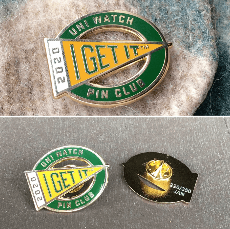
• In case you missed it on Wednesday, I’ve partnered with the great Todd Radom to create the Uni Watch Pin Club, which will feature a new limited-edition enamel pin design for each month of 2020. The January pin — a numbered edition of 350, about 115 of which have been sold so far — is now available, and you can get the full scoop on all the Pin Club particulars here.
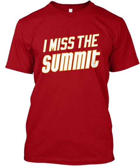
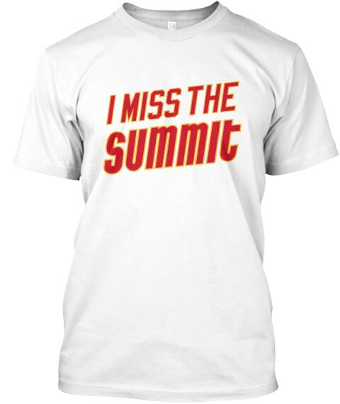
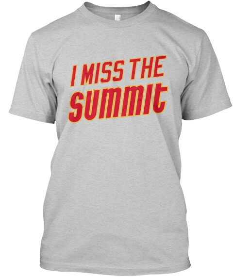
• On Friday I announced the launch of some new Naming Wrongs shirts for the Summit in Houston. It’s available in red, white, and grey:
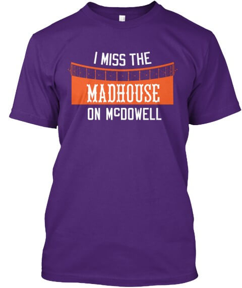
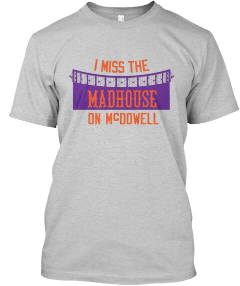
• In addition, today I’m happy to announce the launch of an additional pair of Naming Wrongs shirts, this time for the Madhouse on McDowell in Phoenix. This one’s available in purple and grey:
That’s it. Now back to Phil!
The Ticker
By Anthony Emerson

NFL News: You think the owner of this trailer spotted in Linden, N.J., is a big 49ers fan? (spotted by Greg Winson). … Speaking of the Niners, San Francisco’s Boudin Bakery made a delicious-looking, edible 49ers logo. … You’ve probably never seen the Texans’ helmet rendered with an old two-bar, but that’s what the Chiefs’ social media team did ahead of their Divisional Round game (from Andrew Julian).
College Football News: The Washington Post has a nice article about why both Clemson and LSU have “Tiger” mascots (from Tom Turner). … Baylor Watts notes that LSU and Clemson use the exact same Pantone shade of purple — Pantone 268 C. According to Baylor, this is the first time the National Championship Game featured two teams with an identical shade of a color since 2005, when USC and Oklahoma each had Pantone 201 C.

Hockey News: Charles Noerenberg remembered more blue collar bullshit (BCBS?), this Blackhawks pregame hype video from a few years ago. “I remember finding it laughable at the time,” he says. … Yesterday, Rush drummer Neil Peart died at 67. Reader Andy Zare sent along this blog post about one of Peart’s drum kits, covered in NHL team logos (also from Kurt Blumenau). … The Sabres honored their “expansion sib” the Canucks with a beautiful program cover featuring many of each team’s sweaters (from Steve May). … Speaking of the Canucks: they’re raffling off a gorgeous Year of the Rat sweater to celebrate the Lunar New Year. It even features the Cancuks’ famous skate logo, with the skate transformed into a rat! (from @Wafflebored). … Still more Canucks: the team still has fan mail slots for D Alex Biega and D Ben Hutton — both Biega and Hutton departed in the offseason (from James E. Siddall). … Denver wore throwbacks against St. Cloud State last night (from Oleg Kvasha). … Also from Oleg: Snoop Dogg got a Golden Knights sweater, and instead of a captain’s C on the upper chest, he got a gangsta’s G. Perfect. … The FPHL Columbus RiverDragons have unveiled their “Hometown Heroes” sweaters (from John Cerone).

NBA News: The All-Star Game jerseys may have leaked yesterday. I do love the six-pointed Chicago star as the primary mark if these are legit. … The Timberwolves shot T-shirts with this logo into the stands during Thursday night’s game. Anyone ever seen that before? (from @_hoot).

College/High School Hoops News: Colorado has revealed their throwbacks, based on their 1967 designs (from Kary Klismet). … Derek Linn has a couple of Indiana high school basketball updates: new center court logo for Kokomo High and Roncali High has built a new gym, and the local broadcasters wore vintage blazers for the last game in the old one.

Soccer News: Boca Juniors long-leaked new kits have finally been officially unveiled (from Ed Żelaski). … Also from Ed: Cagliari Calcio have a new centenary kit. … Everton are dumping Umbro as their kit supplier for Hummel (from Josh Hinton). … The rest of Josh’s daily download can be found on his Twitter feed. … The University of Maryland is getting a new soccer stadium (from Kary Klismet).

Grab Bag: The Atlantic has an article about a trend I noticed when I was in school — why some kids wear shorts all winter (from Jason Hillyer). … Walker Valley High School in Tennessee will unveil its new logo on Monday (after previously teasing a partial version) to replace current logo sets that closely resemble those of college teams (from Kary Klismet). … New logos for The Jimmy Fund and Dana Farber Cancer Center. … Golfer Michelle Wie announced she was pregnant by posting a Nike onesie to social media. Sigh (from Chris Perrentot).

And Finally…
Earlier this week, my mom, who is almost eighty-six years young, fell in her home and broke her hip (this comes just three months after she had [scheduled] knee surgery), so I’ve spent much of the past three days at the hospital. The good news is the surgery to put a rod in her hip was successful, and her surgically repaired knee was unaffected by the fall. The bad news, of course, is that she is 85 and she fell and broke her hip. After three days in the hospital, she’s scheduled to be moved to a rehabilitation facility later today. So I ask you guys to say a little prayer for her if you can.
Paul has been great and offered to let me take the weekend off, but I’d already had this post pretty much planned out, so I crammed as much as I could into it — I will be taking tomorrow (Sunday) off, however — I’m not sure if Paul, who’s down in Florida with the Tugboat Captain, will be able to pinch hit for me or if we’ll just end up with a “snow day.” Hopefully there was enough content today to hold you over till the Natty on Monday ;).
Sorry about this.
ON ANOTHER NOTE: Jimmer Vilk — who once again offered up some sweet swag during this past Very Merry Vilkmas – 2019, informed me that all of the prizes were mailed out yesterday, so the lucky winners should watch their mailboxes next week! Thanks again, Jim.
That’s all for this weekend for me, folks. Everyone have a good weekend — enjoy the NFL games today and tomorrow and of course, the National Championship game Monday night — I GUARANTEE A WIN BY THE TIGERS. Take it to the bank. Catch you guys next weekend.
Peace,
PH
Hope your mom is ok. And those concepts are great – like his designs.
Looks like the scoreboard is April 12, 2006.
And all the best to your Mom, Phil.
Best wishes for your mom, Phil.
From yesterday (and my local news): Total ugh for Killingly, here in my home state of CT, for their pretending “Redmen” is a no-problem nickname.
In addition, I used the center cross from the flag of Madison, Wisconsin as an accent motif.
As the university’s team should represent the entire state, using such a localized symbol is not a good idea.
The team is from the University of Wisconsin–Madison. Other UW universities also field football teams. Why is using a localized symbol not a good idea?
I hear ya for sure. What I forgot to mention in the Q & A is that most of these I envisioned as one off, alternate uniforms. I think in that sense, doing more specific tribute stuff feels more appropriate.
Not only is UW-Madison located in, deep breath, Madison, but the cross symbol from the flag represents the state capitol building. So one can either regard it as a local symbol for a local institution, which is fine, or one can regard it as a statewide symbol for a statewide institution, which is also fine. Either way, it’s a terrific bit of uniform design.
Saying a little prayer for your mother, much love Phil.
Gus has some serious talent! I really enjoyed several of the uniform designs. Excellent work!
Best of luck to you and your mom, Phil. Be well.
I hope your mom makes a fast and full recovery!
Great designs, Gus. Good to see some Big Sky Conference representation. Go Griz!
Best to your Mom.
Hope all is well Phil. Wishing your Mom a speedy recovery!
link
Not sure if this has been featured here , Winnipeg Jets with indigenous jerseys
Very cool
Prayin for your mama!! Big time. Quirky useless info I had thought of….its funny how the Chiefs are playing the Texans today. First if football geeks out there remember the Chiefs original incarnation were the Dallas Texans….and the game is being played on the 50th anniversary of the Chiefs Super Bowl win over Minnesota….AND it would be a hoot if the Titans and Texans both won the weekend. The Texans would be playing the franchise they replaced when the Oilers went to Nashville!!!!
GTGFTS Entry: White Sox @ Tigers, April 12, 2006. Final score 4-3 in favor of the Sox.
link
Nice job. This game was a buy 2, get 1 free kind of deal. Went down and being it was April and a Wednesday and still April weather, there was no one there. It absolutely poured in the top of the 9th and the umps gave the Tigers the chance to bat. It was a pretty wild early season game, but always a fun time. Also, that attendance number of 12k is so laughable, maybe 1,200. lol
This was also Jim Leylands first season as manager, and they were coming off of Over a decade of losing seasons (including the 119 loss season a few years before). I’m sure that contributed to the low attendance, lol. A pretty amazing turnaround to going to the World Series that same season!
I am pretty sure that the adult version of the kid who wears shorts all winter is a distance runner. Same reasoning too – “running hot”, being tougher than the rest, and ultimately being over committed to a cause when it’s just too damn cold out. The parallels are strong.
All the best for your mom, Phil.
Those uni concepts are awesome, Gus!
Get well soon, Ma Hecken!
Wishing a speedy recovery for your mom. Joel I. Frank
So to hear about your mom. Will be praying for her.
“All the major sports, and soccer?”
Jesus. Join the 21st century.
Love those concepts, Gus! And I particularly like hoe you avoided the recent trend to shove the front numbers downward to the players’ stomachs, with patches and other garbage in the way. The numbers look so much better on their chests, where they belong.