[Editor’s Note: Paul is on his annual August break from site. Deputy editor Phil Hecken is in charge from now through the end of the month, although Paul is still on the clock over at ESPN and may be popping up here occasionally.]
By Phil Hecken
Follow @PhilHecken
Weekend readers (and now daily readers as well) know that I had the distinct pleasure of featuring the wonderful artwork of artist Graig Kriendler on two occasions over the summer and fall of 2017. Since then, I have been running individual paintings Graig has done on weekends, and also during the week while I’ve filled in for Paul this month. If you were not aware, Graig paints a LOT of old baseball players, but it’s not all he does.
In just over a year, Graig will have 200 or so of his portraits displayed at the Negro League Baseball Museum, located in Kansas City. These portraits are not as large as most of his paintings, but the sheer number that he has already completed is staggering. I spoke with Graig about this and some other stuff, and asked if he’d be kind enough to share with you 10 of the portraits he’ll be showing at the NLBM. Enjoy!
Uni Watch: Let’s get straight into this. You’ve been commissioned to show your portraits, or color studies, on Negro League ballplayers at the Negro League Baseball Museum (NLBM) in 2020. How did that come about?
Graig Kreindler: My involvement with the Negro Leagues Baseball Museum is really a product of the relationship I have with the fella who commissioned all of these portraits. The collector, Jay Caldwell, is very much a student of the game (as I suppose we all are), and a lover of the stories behind the Negro and Latin American Leagues. Over the years, he’s accumulated a large amount of items relating to those players and teams, as well as pieces that reflect the broader civil rights struggles we’ve had here in the United States. With the addition of my portraits, as well as pieces from other artists, he’s putting together an exhibition at the Negro Leagues Baseball Museum, which will coincide with the centennial celebration of the formation of the Negro National League.
UW: What size(s) are these portraits? Are they all the same size, or close to it?
GK: Each portrait is 5″ x 7″ – a really nice size, especially when you get a bunch together. They’re painted on linen which is mounted to board, which kind of gives it a card-like feel (for what it’s worth, I paint most of my smaller pieces on the same board surface, while larger ones are on stretched linen). All of the images are pretty much the same motif: a head facing the viewer and the team logo being visible, even if only partial. The goal was to keep a similar format throughout the collection, both to further the idea of them being part of a single series, and to also show the wide array of teams and flavors that were found in these baseball leagues.
UW: Approximately how long does one of these portraits take to paint?
GK: It all depends on the complexity of the portrait. For the most part, when we’re talking about actual drawing and painting time, each one will usually take about 5 to 6 hours from start to finish. That’s usually over the course of a few days because of how and when I’m able to work, but doesn’t include the research that goes into trying to make them historically accurate, especially when it comes to the uniforms.
UW: When will the exhibition start and how long will it last?
GK: As of now, the exhibit is slated to open February 1st of 2020 and run through May 31st of that year. The opening reception will be on February 13th.
UW: You know I’m going to be there for that! Is this your biggest exhibition to date? What others have you done?
GK: This is absolutely the biggest exhibition of my work that’s ever been assembled. And that even counts for all of the stuff that’s currently sitting in my studio, be it finished or not. Otherwise, I’ve had my work featured in other shows in New York mostly, but those have only included one or two pieces each.
UW: Where can we see your work (aside from your studio)?
GK: Aside from coming to Brooklyn, you can see a lot of my inventory at my agent’s gallery in Bronxville, NY – Objects & Images Fine Art. You can also see a painting at the Yogi Museum and Learning Center in Little Falls, NJ, as well as a piece at the Terrace Club inside of Progressive Field in Cleveland, OH.
UW: If I wanted to commission a Kreindler, how would I go about that? Is there a long turn-around time involved? Do you have lots of work (hopefully) already lined up?
GK: Thankfully, I do have a lot of work lined up for myself, as I’m pretty booked solid for the next year and a half. But, there are some pockets every now and again where I can fit stuff in depending on the size and complexity. If anyone was interested in chatting about the process of commissioning a piece for their home, they’re encouraged to get in touch with me personally via Facebook, Twitter or Instagram. For corporations and institutional work, my agent can be reached through my website, www.graigkreindler.com.
UW: Do you do sports besides baseball?
GK: I do, indeed! Baseball is my main focus, but occasionally I’ll tackle other sports with the same fervor. I’ve done a few football paintings here and there, as well as golf and hockey pieces. I’m slated to do another football one in the future, which will probably be something related to the first Army/Navy game in 1890. I’m also excited to say that I’m going to be trying my hands at a basketball piece soon, something I’ve been hoping for over the past few years.
UW: Is all your work based off of photographs?
GK: The majority of the work I do is based off of photography, and in most of those cases, one single image. There are some works that have me combining sources in order to construct exactly what I envision, but I’m not doing those as often these days. Either way, the materials I use as reference vary widely, from photographs and DVD screencaps to personal accounts and newspaper articles. It all helps form the big picture, if you’ll excuse the pun.
UW: What else to you have going on? Any other exhibitions or showings in the future?
GK: Outside of the show at the Negro Leagues Baseball Museum, I don’t have much else planned. For the most part, it’s all about my commission work. And there are some really interesting pieces happening there, too. For instance, I have two team paintings I’ll be working on over the next year, one of the 1923-24 Leopardos de Santa Clara and the 1869 Cincinnati Red Stockings. I’ll also be working on pieces depicting players I’ve never done before, including the likes of George Brett and Thurman Munson,
UW: Anything else the readers should know before we look at your NLB portraits?
GK: Well, back to some details regarding the centennial celebration, the show will be pretty epic in scale, as it’ll feature 200 of my portraits alone, and that’s just a fraction of what he’s offering to display. Additionally, Jay has secured the rights to the majority of the players and teams represented in the exhibit, so he’s been able to offer products to the public, while donating a portion of the proceeds to the museum itself. As of now, my artwork for him can be seen on such items as t-shirts, posters, giclées, coffee mugs, bobbleheads and even a set of magnets. He’s also in talk with a few companies to offer trading card sets and a book. And to keep updated on the happenings of the exhibit or take a look at what’s for sale, readers can go to Negro Leagues History for more information.
But one of the main things I’d love to express to UW readers is that I’m eternally grateful for all of the support they’ve shown me over the years, as well as how much of an honor it’s been to paint these ballplayers who have mostly been forgotten only on account of the color of their skin. It’s my hope that through my and Jay’s efforts that some light can finally be shed on their lives and careers, as well as give them the attention they so well deserve.
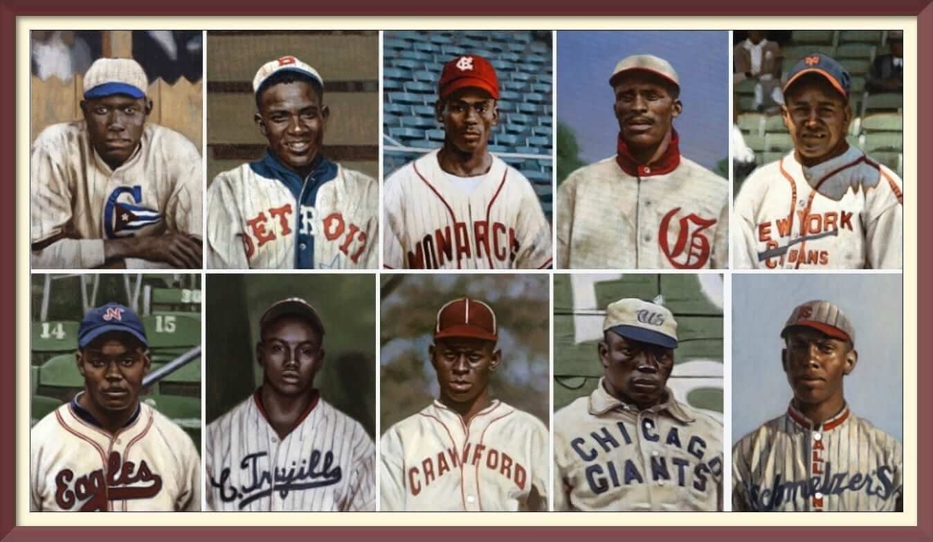
UW: Awesome. Thanks Graig. OK, let’s take a look at 10 of your NLB portraits and if you could give us just a quick description of each.
Ernie Banks
Kansas City Monarchs, 1953

It’s rare to find images of Ernie from his stint in the Negro Leagues, especially since he was with the Monarchs for only part of the season. This particular painting was done from a team shot, mere months before he was called up for the Cubs. The whole photograph was pretty overexposed, so there was a lot of information I had to pull out with the magic of Photoshop – especially those pinstripes!
Francisco “Pancho” Coimbre
New York Cubans, 1944

The uniforms for the New York Cubans were really something else in the mid-to-late 1940s. Their vibe wasn’t unlike the classic Cardinals aesthetic that we all know and love, especially with that bat across the chest. Coimbre, himself, was one of the most important figures in the history of baseball in Puerto Rico. When thinking of stars from the island, certainly names like Clemente, Cepeda and Alomar come to mind, but “Pancho” helped pave the way for those giants.
Andy Cooper
Detroit Stars, 1920

One of the greatest pitchers in Negro Leagues history wearing one of the greatest jerseys in baseball history. Cooper was a durable lefthander who spent half of his long career in Detroit and half in Kansas City. A master of control, Andy had a 43-inning stretch in which he didn’t issue a single walk. After his early years as a starter, he turned to relief pitching and managing towards the end of his career. He led his Monarchs to three pennants between 1937 and 1940.
Grant “Home Run” Johnson
Cuban X-Giants, 1904

In 1894, Grant Johnson supposedly hit an astounding 60 home runs for the semi-pro Findlay Sluggers. And from then on, it is said that he was known as ‘Home Run” Johnson. Captaining some of the greatest Negro League teams of the Deadball Era, Johnson played professional ball until retiring in 1932 at the age of 58.
John Donaldson
All Nations, 1917

Ever hear of John Donaldson? Well, researchers claim that in the almost 700 games he pitched, he accumulated 400 wins and over 5,000 strikeouts. He’s also been credited with 13 no-hitters and two 30 strikeout games. His mastery on the mound not being enough, he also hit .334 in over 1,400 at bats. And if that’s not enough to convince you of his greatness, those All Nations jerseys were on point.
Josh Gibson
Dragones de Ciudad Trujillo, 1937

The stories of the Dragones de Ciudad Trujillo are legendary. When you look at that lineup, perhaps the first thing you notice is that it was absolutely STACKED. Behind the 1923-24 Leopardos de Santa Clara, this Dominican League ballclub had no equal. Satchel Paige, Cool Papa Bell, Silvio Garcia, Lázaro Salazar, Sam Bankhead and this guy, one of the greatest sluggers to ever live.
Bill Foster
Cuba Baseball Club, 1928

The younger half-brother of Andrew, Bill Foster is best remembered for his time with the Chicago American Giants. During that stint, he helped the Giants win the ’26, ’27 and ’33 pennants. Despite his success with Chicago, I chose to depict him with the Cuba Baseball Club during the 1927/28 Cuban Winter League season – I just couldn’t ignore those amazing threads. Despite that club’s great lineup including Oscar Charleston and Judy Johnson, they ended up in the cellar with a 12-21-1 record.
Monte Irvin
Newark Eagles, 1939

It was thought by many Negro League and American League clubs that Monte Irvin would be the man to integrate the majors. When he finally did arrive to the Polo Grounds in 1949, he was certainly not the first to make the jump, but many consider him to be the best all-around player from his era to do so. Starring with the Newark Eagles before and after World War II, I was super pleased to paint him with the club when their jerseys still had a lot of flair to them.
Andrew “Rube” Foster
Chicago Union Giants, 1902

One of my absolute favorite images of the bunch. Pictured in his Chicago Union Giants togs, it’s important to note that before “Rube” Foster was the great impresario of the Negro National Leagues, he had been a fantastic pitcher throughout the first decade of the 20th century. Nevertheless, he’s best remembered as the disciplinarian manager of the Chicago American Giants during the 1910s, and the man who later became recognized as the “father of black baseball” after his role in developing the first successful Negro league.
Leroy “Satchel” Paige
Piitsburgh Crawfords, 1932

When most people think of the Negro Leagues, the name “Satchel Paige” reigns paramount. With a career stretching from the mid-1920s to the mid-1940s, he had seen action with so may teams, the true number is most likely lost to history – I’ve painted about 15 of him in different uniforms for this project alone. The stories about the Negro Leagues’ biggest drawing card still managed to keep Satchel VERY much alive, and it’s my hope that these portraits do too.
Wow! Thanks, Graig. Incredible work as always. I’m very much looking forward to seeing these at exhibition at the NLB Museum in February of 2020. It can’t come soon enough.
You can see more of Graig’s work on his website, and you can follow & friend Graig on Twitter and on Facebook too.
Readers? What say you?
Over the past several years, Air Force has introduced a series of alternate uniforms that have really been (for the most part) outstanding. Yesterday, they unveiled another of what they call their “Air Power Legacy Series” uniforms. This year, the program is honoring the AC-130 gunship, which includes a special helmet design showing the aircraft on one side, and patches that go with “spooky” (briefly seen below in the hype video) on the back bumper.
Let’s start with the hype video and then look at the helmets (and unis) up close:
This years Air Power Legacy Series alternate uniform is here. This year we honor the AC-130! #LetsFly pic.twitter.com/QiVFj8IrEl
— Air Force Football (@AF_Football) August 13, 2018
And now, the unis/helmets:


According to this article,
“The uniforms honor the AC-130 gunship, which according to the Air Force, has primary missions of close air support, air interdiction and force protection and armed reconnaissance. Close air support missions include troops in contact, convoy escort and point air defense. Air interdiction missions are conducted against preplanned targets or targets of opportunity and include strike coordination, reconnaissance, and armed overwatch mission sets.”

If that uniform looks somewhat familiar, it’s because they’ve worn a similar version in the past — the new one features full dark gray jerseys and pants with the specialty helmet, whereas the prior uni had light gray sleeve caps and pants:

The team has also had some awesome special uniforms, such as this “Thunderbirds” outfit from a few years back:

And then they’ve also sported some more questionable alternates:

Nicely done. As far as I can tell, no date(s) to wear this uniform have been announced.

Collectors Corner
By Brinke Guthrie
So much great stuff on the cover of this November 1964 game program for the Cardinals at Eagles. First, it was at Franklin Field, an old-school throwback field (opened 1895) if there ever was one. Two, the kicker (Sam Baker) is straight-ahead with the high-top kicking shoe. Third, kelly green, baby. Now for the rest of the week:
• Fascinating — never seen one of these before. This late 1970s San Francisco Giants notebook is full of defensive assignments for different scenarios. Example: Situation #21: Double, possible triple to right center field. OK, so who does what? First, the right fielder and center fielder- go after ball. (If you needed a notebook to tell you that one, perhaps you were called up to the Giants too early.) Other assignments; Catcher- cover home. First baseman- cutoff. Second baseman- relay, etc.
• Despite what the eBay seller says, these are the colors and logo of the San Francisco (not New York) Giants on this 1992 Chevy Corvette Matchbox car.
• IMO, one of the truly great logos ever- the 1970s WHA Cincinnati Stingers. (The only thing that bothered me- and still does- is the fact that the tail end of the C is open- no closed border or outline or anything. Me and the Stingers go way back.) Check out this long sleeve Stingers T-shirt here. And this eBay seller has Stingers t-shirts in various colors including the core team colors of black, white and yellow with embroidered Stingers and WHA logos.
• One more dugout jacket, this time for the Texas Rangers. Nice looking script on the front, and while the seller doesn’t notate the year of this jacket, the Diamond Collection tag makes me think mid 1990s for this look.
• San Diego Padres fans! If you’ve ever wanted a 1975 Wham-O® Frisbee® with the Swinging Friar logo- now is your chance.
• Clean, sleek look for this 1970s Detroit Red Wings poster that was part of a Wheaties promotion.
• Here’s a “NFL Training Table” booklet from 1969- not sure why it has a specific date of September 19, 1969 on it, though.
• This 1970s NFL gumball helmet display card looks a tad cheesy, no?
• This post-1976 (includes Seattle and Tampa Bay) NFL seat cushion includes helmets for the AFC on one side and the NFC on the other.
• Reader Jim Marcello sent in this 1982 Bengals helmet clock.

Griffins Design Contest
In case you missed it, I’m running the third annual “Grand Rapids Griffins Jersey Design Contest,” in which readers are asked to submit jersey design concepts for a third (or alternate) jersey for the team.
Like past years, the team is asking for a jersey (only) design, but other than that, it’s pretty wide open.
All of the details are here in this post, but the important big detail is the contest submission deadline, which is Tuesday, August 21st, 2018 (by 11:00 pm E.D.T.). Everything else you need to know is in that post.
OK? OK!
The Ticker
By Alex Hider

Baseball News: Indians OF Leonys Martin is recovering from a “life-threatening” bacterial infection, and a bunch of Tribe players wore tributes to him on their caps yesterday. … Marlins first base coach Perry Hill wore a piece of lettuce under his helmet to keep cool during a recent game (from Mike Chamernik). … Ryan Bower noticed that the White Sox base coaches have slightly lighter blue throwback batting helmets than the players. … One of the fire stations near Nationals Park in Washington has Nats-themed T-shirts (from Max Weintraub). … The Charleston RiverDogs wore Charleston Rainbows throwbacks for Pride Night last night (from Daren Stoltzfus). … The Class-A South Bend Cubs wore “cardigan” jerseys for “Mr. Rogers Day” the recently (from @reimero). … The Jacksonville Jumbo Shrimp now sell commemorative cups in the shape of their logo (from Conrad Burry). … Wow, check out the threads USF sported in 1981. Those green pinstripe pants are somethin’! (From Ed Nick).

NFL News: A few Packers players wore green sleeves under their jerseys during their preseason game against the Titans last week. As Dan Ullsperger notes, the Pack usually wear contrasting sleeves — white under green jerseys, and green under white jerseys. … Here’s another story on Tom Brady’s new helmet (from Matt Fedorka). … Steelers WR Mark Malone was an early adopter of a wideout wearing a “teens” number in 1981 (from Adam Thacker).
College Football News: West Virginia has added a 3D “Country Roads” wordmark to the rear bumpers on their helmets (from Wes Wilson). … A Georgia fan repurposed an ambulance into a tailgate machine (from James Gilbert). … New uniforms for D-II Millersville University in Pennsylvania

Hockey News: Canucks fans have spoken, and they’ve chosen the “Flying Skate” sweaters to be the team’s 2019-20 throwback uniforms. … Another day, another story speculating what Seattle’s NHL team will be called (from Brinke). … Vegas goalies Marc-André Fleury and Malcolm Subban wore Sharks and Bruins uniforms, respectively, at a charity game earlier this summer (from The Goal Net). … Frank Alvarez spotted this classic NHL calendar in the 1971 film Little Murders.

College Hoops News: Duke basketball players got new gear before taking a preseason trip through Canada (from Moe Khan). … Weber State’s 1942 jerseys had some interesting number placement. Those are practically in the shoulder straps! (From Sean L.).

Soccer News: Couple of notes from soccer superfan Josh Hinton: Toronto FC II F Jordan Hamilton has some kerning issues on his NOB, and Watford FC of the Premier League has a new ad on their sleeves. … Someone designed basketball jerseys for some Liga MX teams (from @bryant_rf).

Grab Bag: Northeastern is expected to unveil new athletic logos at some point this evening (from Paul). … Designer Virgil Abloh designed Serena Williams’ getup for the U.S. Open (from Phil). … Kary Klismet spotted this X-ray Buffalo logo on the door of an office for residents at the University of Colorado Hospital.
“Steelers WR Mark Malone was an early adopter of a wideout wearing a “teens” number in 1981”
He was actually a quarterback who also ran some plays as a receiver early in his career. Malone was always listed as a QB.
Mark Malone may have lined up at WR a few (or even several) times for the Steelers, but he was never a “Wide Receiver”.
Even in high school he played QB, was recruited by Arizona State as a QB, and played QB there.
He has 1 reception in college, and 1 in the NFL.
He was not a WR.
Lee
IIRC, Jeff Hostetler did that a few times early in his career with the Giants, when he was third-string behind Phil Simms and Jeff Rutledge.
In 1981, Malone would have been third-string behind Bradshaw and Cliff Stoudt. I think.
I was going to say the same thing about Mark Malone. He was the precursor to “Slash” Kordell Stewart as a backup QB who saw time at WR. In Malone’s case he was an all around super athlete. Almost make the Olympic team in the Triathlon.
Wasn’t Mark Malone the backup QB?
Date on NFL training table booklet may indicate that it was an insert for the issue of Life magazine for that date.
Typo: “NORTHEASTERN is expected to unveil new athletic logos”
link
Wasn’t Mark Malone a quarterback? Maybe he did some plays as a WR in Bradshaw’s last couple of years…
Also typos: In the lede: “200 or so if his portraits”. (The art is fantastic, BTW.) In the soccer section, “kearning issues” rather than “kerning”.
Thanks – fixed
Mark Malone was a QB and the reception in that video was the only catch of his career
Since so many others mentioned Malone being a QB, I will add that he was noted for his resemblance to Tom Selleck
link
He was also an exceptional NFL analyst/host on ESPN in the late-80’s
Hi – Mark Malone’s position was backup quarterback for the Steelers, wasn’t he? Not a WR.
Mark Malone was primarily a QB hence the number 16.
6 Mark Malone comments in 15 minutes. I think Malone has gotten more recognition here today than he got during his entire NFL career.
The Wheaties Red Wings poster looks to me to be Henry Boucha, but where’s his collar? That Wings jersey should have a red crew neck collar!
Also- Henry Boucha was probably the only player i can remember back in the day who wore a color co-ordinated headband/sweatband while playing
link
Boucha did so with a number of teams. Also went as far as white headband at home with dark headband on the road.
link
The Kriendler Negro League portraits are outstanding. It is so interesting seeing Ernie Banks with such a serious expression. I also found the Josh Gibson portrait to have a haunting quality, in a good way, of course.
Well done!
Agreed! Today’s lead was a real treat. I look forward to reading more about the exhibit when it’s on display in 2020. Might even be a good excuse to plan a trip to KC.
I plan to be there for the opening reception — granted it’s still like a year and a half out — but for planning purposes, Scott, hope to see you there!
“Marlins first base coach Perry Hill wore a piece of lettuce under his helmet…”
Hasn’t anyone hipped him to the fact that Kale is the new lettuce???
The lettuce thing is old school. In my ’90s high school days, it was something that was seen infrequently being done by professionals, and was an occasional mention on Sportscenter. It’s a technique that has been passed down over the generations.
Right you are. I read that Babe Ruth wore a lettuce leaf under his cap on hot days.
Love the helmets in the middle of the NFL Training Table booklet!
Air Force should make the Thunderbirds uniforms their primary look. Fantastic.
Thunderbirds look is cool. Unique helmet look.
Feel this Air Force logo is excessively violent for a sports uniform.
link
Looks like an ’80s heavy metal album cover.
Just saw an item on TV about Serena’s outfit for the U.S. Open. It’ll be a limited edition if she loses her first match.
Figures that the new AF unis would be the worst of the series. The Air Force hates close air support, and has been trying to rid itself of that mission for five decades now.
The uni needs more contrast and brighter flashes of color. I get that stealth was the aesthetic they were going for, but the AC-130 is about surprise, not stealth. And when it actually performs its mission, it’s overwhelmingly bright and loud, as seen in the hype video. Bright orange or yellow numbers, or thin, non-parallel bright stripes, would be more on theme than all the dark on black and muted gray.
Re: USF baseball unis.
The all-green guy in the middle is Hall Of Famer, USF Coach Robin Roberts.
I knew he looked familiar! Nice spot!
Re: Charleston Rainbows
Oh, how I wish the team had gone Astros Rainbow Guts. That would have been fantastic!
No one has said Mark Malone was a QB in a while, so here it goes.
Mark Malone was a back-up QB.
Not only that, but…..
“USA TODAY Sports wanted to talk about the worst quarterbacks in NFL history for each franchise. and for the Steelers, they went with Mark Malone.”
So he’s got that going.
Hey, at least I was typing as the same time as the first poster, and didn’t just skip reading the comments…
From this day forward, whenever a comment has reached a redundancy of ludicrous proportions SOMEONE MUST invoke “Mark Malone was a Quarterback” and end it.
Let us remember this when the next sandwich/not a sandwich debate breaks out.
“Malone, WR” should definitely be a code hereabouts.
Speaking of sandwiches, Mr. Malone doesn’t put ketchup on his, according to the Urban Dictionary.
link
Piece on Derek Jeter on ESPN.com today included…
“Among the big-picture items on his agenda: negotiating new TV and stadium naming rights deals, “rebranding” the team uniform and colors”
Charity or not, there is something seriously wrong seeing Marc Andre-Fleury in a San Jose Sharks sweater. Gotta try to erase that image from my Pens-loving brain.
Josh Gibson was known as “the Babe Ruth of the Negro Leagues”. Arguably the greatest home run hitter of all time, and the greatest hitting catcher.
I heard Babe Ruth was “the Josh Gibson of the Major Leagues”.
Ruth was definitely the Gibson of white baseball. The thing is, we’ll never know how good Ruth or any pre-integration white player was, since they didn’t compete against all the best players.
I wonder whether the stat-inflation effect of segregation for good white ballplayers is larger or smaller than the stat-inflation effect of doping for good players during the steriods era. I mean, no way does Barry Bonds pass 715 home runs without doping. But also, no way does Babe Ruth hit 714 if he has to face Smokey Joe Williams or Bullet Rogan or John Donaldson on a regular basis.
Assuming that there were some great pre-integration white players, couldn’t the same argument be made for pre-integration black players not competing against the best?
Regarding the eBay listing for the SF Giants defensive positioning book. It’s actually from the 1960s as it was put together by my grandfather, Butch Evans, who was a spring training instructor at the time.
Any reason why for the SF giants he used what appears to be a field diagram of Wrigley Field? That outfield wall is pretty iconic.
No idea
Stellar work, Mr. Kreindler!
I thought ball players used to use cabbage leaves under their caps. Wonder which leaf would work better.
Thinking $40 for the Pads frisbee a bit much. Love the USF pillbox.
Malcolm Subban was claimed by the Knights after the Bruins put him on waivers so he probably had that jersey in his closet
The Rangers jacket has to be from 1993 or earlier. In 1994, the Rangers moved in to their new stadium and changed logos and colors. After 1994, any jacket would be red, not blue. I’m guessing 1993, since that was the peak time for Starter.
Not that anyone’s asked me, but if the Canucks insist on doing a throwback alternate, my choice would be the yellow flying-skate jersey. Always loved that design.
The Canucks were the last NHL team to not have a white jersey. Last holdout to just wear yellow at home in 1988-89. Pretty bad teams, but the good memories with that jersey include their almost upset of the eventual Stanley Cups Champion Calgary Flames in the first round in ’89.
link
Disappointed Flying V did not win. Maybe the fitting, proper way to bring the Flying V back would be much in the same fashion as when they were first unveiled in 1978 – by surprise.
Yesterday media design school in duesseldorf published their Bundesliga 1 Ranking for this season starting in 9 days. Wolfsburg won, hoffenheim became last – both teams not known for tradition
More here: link