
By Phil Hecken
Follow @PhilHecken
You fine readers may recall that back in August, while Paul was on his well-deserved uni-sabbatical, I ran an interview with Graig Kreindler, a tremendous artist who specializes in old-time baseball paintings, based off of photographs. If you’ll scroll down to the end of that article, you’ll notice I said, “Graig has actually sent me many more images of his work, but for now, we’ll start with these. I will be back with more of his paintings later this month — I hope you’ve enjoyed this sampling so far!” Unfortunately, August just happened to be the month in which Nike and the NBA decided to slow-bleed out their new uniform releases, so several of the pieces I’d planned were back-burnered.
With the World Series now underway, this weekend is a great time to run that second batch of his beautiful artwork. If you didn’t see the original article, I hope you’ll give it a look-see (it includes a fairly in-depth interview with the man himself); since the publication of that piece, I had the pleasure of meeting Graig in person (we joined Paul, Todd Radom and some gents from the Baseball Hall of Fame at a Mets game in September), and he’s as great a guy in person as he is in cyberspace.
OK — here’s a look at some more of Graig’s amazing artistry (and in all but two cases, I’ve included the original photograph from which he worked). Please click to enlarge.

Honus Wagner, 1912 – “Old and in the Grey” – 30″ x 24″ – oil on linen
This classic image of Wagner always appealed to me because of the possibilities of juxtaposing the amazing fabric of his sweater to the wooden bats and dugout area. Even if that sweater obviously had to be the star of the show, there’s also more to it, especially in way of the diagonal thrusts in the design of the thing, most noticeably in the bat he’s holding, the angle of the stands at Washington Park, and even the leg of his teammate that’s propped against the dugout post. All of it working together just leads the viewer’s eyes around so nicely.
Here’s the original photograph.

Josh Gibson, 1935 – “Quiet Confidence” – 22″ x 28″ – oil on linen
Aside from jumping at the chance to paint one of the most well-known Negro Leaguers of all time, the photograph it came from happened to be very visually appealing in terms of light. The first thing I thought of was how all of the color in his skin and the ground could be reflected back into his Crawfords jersey. Also, when painting African American skin, you get to see a lot of sky-tones reflected back into it, making for some really nice diversity in color temperatures – all fun stuff to play with on canvas.
Here’s the original photograph.

Ken Williams, 1922 – “A Rival for Ruth” – 20″ x 28″ – oil on linen
When I go back to this painting of Williams, I just love the whole design of it. It just screams ‘baseball’ to me, and was extremely evocative of a certain era of the game. It could have been any player in his place, but I was thrilled to be able to paint somebody who’s relatively unknown to a lot of baseball fans. After Ruth, Ken was the premier slugger in the American League during the early 1920s – back when the St. Louis ballclub was actually somewhat of a powerhouse! But aside from the cool content, all of the differing textures of the jersey, concrete, wooden bats and the advertisements in the back made for an especially fun painting to construct. This one is definitely a favorite.
Here’s the original photograph.

Roberto Clemente, 1955 – “Steam” – 24″ x 18″ – oil on linen
There are few things as cool the 1956 Topps baseball set. The mixture of those portraits with the little action vignettes make those cards favorites among collectors of post-war cards. Clemente’s is one of the jewels of the set for sure. When I ran across the original photograph used for the action shot on the card, it was impossible to not jump right into a canvas. In my eyes, as cool as Roberto looks in the photograph, the point of interest for me was actually behind him – the rightfield wall of Ebbets Field. In addition to all of the cool angles in which it used to jut out, it was also made of concrete. And since that wall had been there as long as it had, you had to imagine that it was going to be pretty weathered down in places, either by the elements or the baseballs that were constantly careening off of it. It was also nice to use a lot of purplish tones in Clemente’s away togs, as well as his skin – all of which was set off quite nicely by the yellows around it, which acted as their complements, thereby creating even more visual interest.
Here’s the original photograph.

Willie Keeler, 1898 – “Wee Willie” – 12″ x 18″ – oil on linen
I was always fascinated by the Baltimore Oriole clubs of the 1890s, especially with the likes of John McGraw, Hughie Jennings, Joe Kelley, Wilbert Robinson and Willie Keeler. When I ran across this image of Keeler, I just had to paint the thing. Immediately. Most of the photographs we see of him are from the early 20th century, mainly when he was past his prime. But this one was from 1898, towards the end of Baltimore’s dynasty, and at 26 years old, he still seemed like such a kid. I just needed to try and articulate what he might have looked like in living flesh.
Here’s the original photograph.

Willie Keeler 1912 – “Reunited” – 20″ x 16″ – oil on linen
In keeping with that love for Keeler, I wanted to paint him later on in his career, almost as a study in contrast. Here he’s a coach with Brooklyn in 1912, reunited with his former teammate Wilbert Robinson. At 40, he’d seen much on the ballfields. The quality of his skin only echoes that sentiment. You can’t go wrong with that Dodgers uniform, either.
Here’s the original photograph.

Johnny Vander Meer, 1938 – “The Dutch Master” – 20″ x 28″ – oil on linen
The client who commissioned this painting had always been a big fan of the pitchers who threw no-hitters, with Vandy holding a special place in his heart. He obtained the photograph at some point in his collecting adventures, and when he did, he thought that I would be able to make a really nice painting out of it, especially because of the light pattern. He couldn’t have picked a nicer piece to work from, as I relished in the chance to have all of that light from the field bounce back into Johnny’s body and the dugout itself. It was a challenge modulating all of the different temperatures throughout, as one doesn’t normally work on human figures with that kind of light presenting itself. But man, it was fun – especially playing with the reds and deep blues of the Cincinnati uniform.
Here’s the original photograph.

Rube Waddell, 1902 – “Athletic Aider” – 26″ x 30″ – oil on linen
I’ve always been fascinated by Rube Waddell’s career and persona. Before Babe Ruth came along, he was one of the game’s biggest drawing cards, be it for his dominance on the mound or his antics. I’d also been a bit frustrated with the lack of imagery of the man in action. For the most part, it’s not terribly tough to find photographs of him posing for the camera in some way, be it a portrait or some full-bodied depiction, but when I saw this one of him warming up, I had to jump on it. I also loved that un-manicured grass of the Huntington Avenue Grounds in Boston. Combine that with the baggy uniform, tiny glove and small brimmed hat, it’s pretty darn clear that this image depicts subject matter that just is NOT current. And I couldn’t be more attracted to that.
Here’s the original photograph.

Eiji Sawamura, 1936 – “Schoolboy No More” – 20″ x 32″ – oil on linen
Ever since seeing Ken Burn’s Baseball, I was pretty fascinated by Eiji Sawamura. The idea that this gawky teenager came from (seemingly) out of nowhere to strike out Charlie Gehringer, Babe Ruth, Lou Gehrig, and Jimmie Foxx in succession was pretty amazing, especially considering the reason for that American All-Star team coming to Japan in the first place. The fact that his life ended during World War II was perhaps an even more interesting bookend to the tale. Imagery-wise, there’s not much of Eiji out there. The client who commissioned it is very big into Japanese baseball, and was actually able to do a lot of research for me while in Japan. He came home with a couple of images I could work from, as well as notes on the uniform that he was wearing during a tour his Tokyo Giants took of America in 1936. The end result was a painting I was – and still am – very proud of. It was really the first time I had ventured outside of an American baseball subject, thereby cementing that although its our national pastime, it really is a global game.

Hank Aaron, 1956 – “Henry (#2)” – 16″ x 24″ – oil on linen
There are few jerseys that look cooler than the old Milwaukee Braves togs from the 1950s. When you mix that with beautiful light, an engaging composition, and one of the greatest ballplayers of all time, you get a special piece. There’s just something about having that warm light hit that cream home uniform with the red and navy trim – man, it just flat out works. I even did a somewhat similar version of this painting (from a photograph taken moments before or after this one) for another client, who had seen the first and had fallen in love with the same stuff I did.
Wow! Another tremendous set of prints, Graig! Thanks again for sharing and for the great descriptions. I’m sure we’ll hit you up again for another batch!

.

XFL Redesign Contest Reminder
In case you missed it, last weekend I announced our latest jersey design contest, this time to reimagine a team from the XFL if the league were still operational in 2017.
All the deets are here.
Deadline for submissions is October 31 at 11:59 EDT.
Good luck!
.
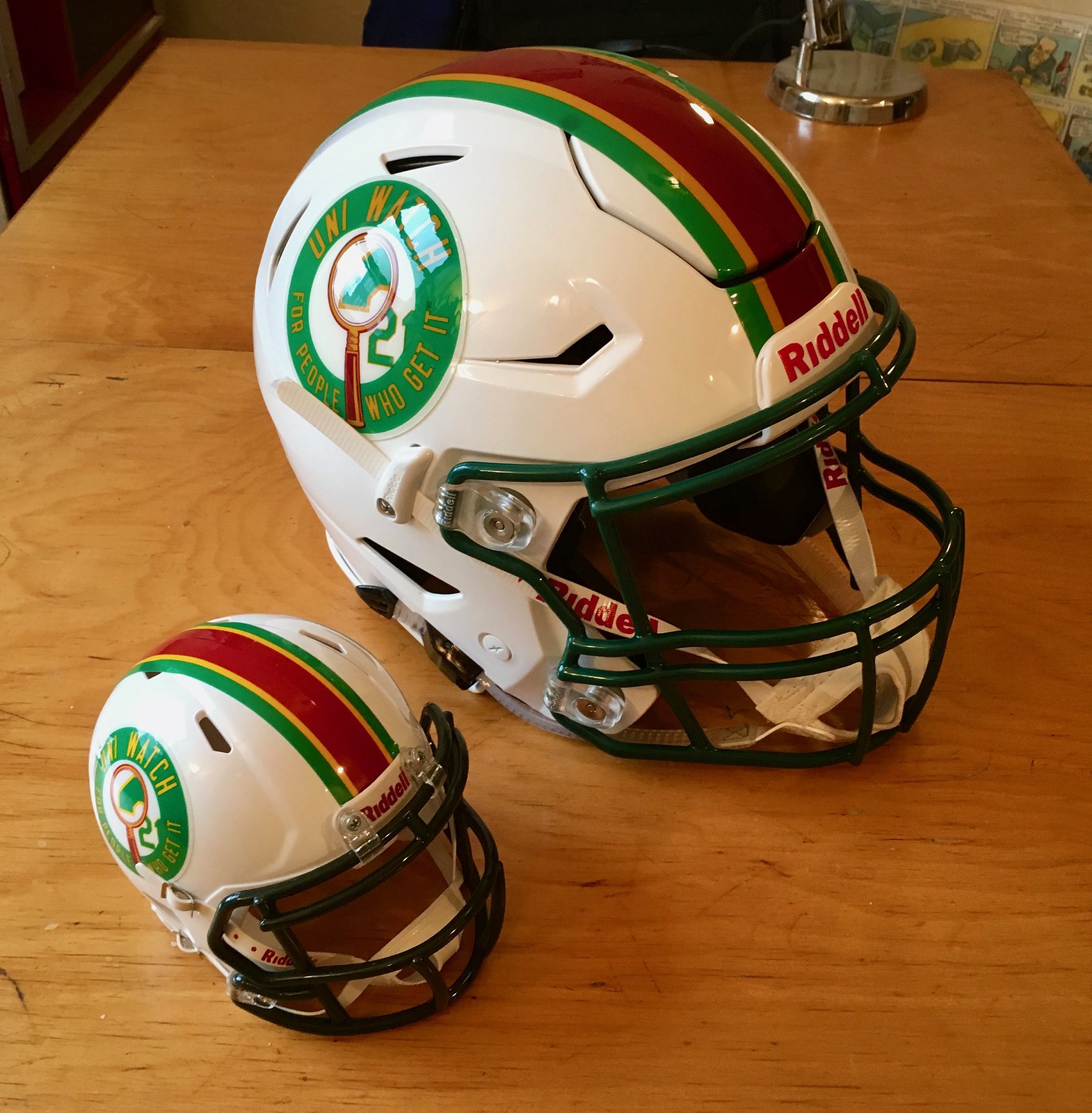
And now a few words from Paul: Hi there. In case you missed it Friday, I had a prototype Uni Watch mini-helmet made (shown at right; click to enlarge), to go along with the full-size helmet that Riddell made for me. If there’s enough interest from you folks, we’ll make them available for sale. Full details here.
Also from Friday, we have a bunch of new Naming Wrongs shirts for the Hive, Nassau Coliseum (don’t scoff, at least not until you see the awesome designs!), the Hartford Civic Center (now available in UConn colors), Reunion Arena, and Brendan Byrne Arena.
And from earlier in the week, in case you missed it, we also launched new shirts for the L.A. Forum, the Hoosier Dome, the Salt Palace, and RFK Stadium (now in DC United colors).
Okay, end of sales pitch. Thanks, as always, for your consideration.
.
The Ticker
By Anthony Emerson

Baseball News: The Dodgers wore their alternate road uniforms last evening in World Series game 3, as they have for the entire postseason. … A Royals-ish logo for a cleaning company was spotted yesterday in Colorado. Perhaps just different enough to avoid a cease and desist letter from Kansas City (from Perry Sailor). … Dave LaBossierre apparently wore cut-off baseball pants as shorts in the Astros team photos as trainer from 2004 to 2007 (thanks, Phil). … Speaking of the ‘Stros: The Astros’ success has spurred a new appreciation of the Tequila Sunrise jerseys (thanks, Phil). … By the same token, a writer with Racked believes the Astros’ Tequila Sunrise uniforms were “the most polarizing in baseball history.” … More Astros: here’s a video retrospective of their uniform history (thanks, Phil). … Even more AL Champs: here’s a great piece on the team’s in-house graphic designer Joe Smaldone, with some examples of his work (thanks again, Phil). … But wait, there’s more Astros: there was a guy in a Kate Upton Astros jersey at last night’s game. … Okay, just one more Astros thing: here’s an Astros-branded space suit (last two both from @igTXSalazar).

NFL News: Ray Hund since along this gorgeous Schoenhut “manikin” 19-inch wooden football player that appears to be at least 80 years old. Schoenhut, a wooden toy company out of Philadelphia, stopped making these and other dolls in 1935. Great find. … The Browns are wearing all white against the Vikings this Sunday (thanks, Phil). … Mosaic Stadium in Regina, Sask., the hold home of the Saskatchewan Roughridgers, is being demolished (from Wade Heidt). … Here’s an interesting take: to make football safer, get rid of helmets (thanks, Phil). … William F. Yurasko sends along these clippings from a North Carolina newspaper from when the Panthers were formally founded. One of the clippings includes a picture of some prototype Panthers unis, including the electric blue primary jersey. Great find. The rest of the clippings can be viewed here.
College Football News: The Big East hasn’t had football since 2013, but UConn’s jerseys still carry the Big East patch, crudely obscured with an AAC patch (from @_footballunis). … USF will wear an all-green uniform modeled after WWII-era aircraft camouflage today against Houston (thanks, Phil). … Here are other uniforms for today’s NCAA football games: Maryland will wear black and yellow today against Indiana (from @DHamptonEqMgr). … Miami is throwing it back today against UNC (from Adam Apatoff). … Texas A&M will wear their new “Bright Lights” uniforms today against Mississippi State. … Florida will wear blue over white against Georgia. … Ole Miss will wear their blue jerseys for the first time the season today against Arkansas … Arizona will wear all red against Washington State. … Arizona State will wear maroon jerseys and pants and gold helmets against USC. … Youngstown State will wear red jerseys and white pants against Illinois State. … Trinity will go all maroon against Hendrix (the last handful are all from Phil). … Ohio University will wear all black on Halloween against Miami of Ohio (from our own Alex Hider). … Columbia will go all-white against Yale (from Alex Oberwerger). … New uni combo today for Houston (from @igTXSalazar).

Hockey News: Boston University wore something other than white at home for the first time ever last evening against Denver, wearing their red sweaters at Agganis Arena (from María Canales). … Love love love these University of Florida fauxbacks. The design appears to be based on the Montreal Canadiens 100th anniversary jerseys from a few years ago (from Cody Wolfe). … The Golden Knights went white at home vs the Avs last night (from @Nas_160). … Union College wore pink jerseys against Rennselaer last evening (from @molemanfilms). … Carlos Santana played Amalie Arena in a Reebok Lightning jersey (from @KyleThomasCoons). … Minnesota State debuted their new third jerseys last evening against Michigan Tech (from @OlegKvasha).

NBA News: Great shot of Randy Smith’s “RA Smith” NOB here (from Eric Griffith). … The Celtics’ Kyrie Irving enjoyed playing on the Bucks’ special throwback court on Thursday evening. … You can apparently buy Goodyear branded gear at the Cavs’ megastore. But why would you want to? (from Josh Berger). … In addition to throwback jerseys, the Warriors also went with a throwback court at Oracle Arena (from Michael Marconi). … With the Lakers wearing gold at home, the Raptors opted for white on the road (from Spooky Enrique). … In that same game, Serge Ibaka’s jersey featured no ad patch (good spot by @taquito420_) and also Anuj Dhir. … Not sure what caused this, but there was another ripped Nike jersey in last night’s Golden State/Washington game (pic by CJ Fogler sent by @datdamndj ).

Soccer News: New York Red Bulls’ playoff T-shirts are a disaster (from Ted Kerwin). … Footy Headlines got their hands on Juventus’ 120th Anniversary kit, and it will evidently carry no advertisers, makers marks, or even the club’s crest. Other than the traditional black and white stripes, the only other element on the front of the shirt are the three stars, each representing ten Serie A titles (Juve has 33 official titles, and claims 35). It’s an absolutely gorgeous kit, well done Juve and Adidas, who didn’t even add their traditional three shoulder stripes. … Spain’s 2018 World Cup kit has been leaked, drawing inspiration from their 1994 World Cup design. Whether there still will be a Spain by the time the 2018 World Cup kicks off remains to be seen. … Manchester City’s manager Pep Guardiola complained about the Mitre-manufactured ball used in the EFL Cup (from Josh Hinton). … Also from Josh Hinton: the ball for the 2018 World Cup has been leaked, evoking the iconic Adidas Telstar from the 1974 World Cup.

Grab Bag: Robert Blakeley, the man who designed the ubiquitous “Fallout Shelter” signs, has died at age 95 (from Tom Turner). … An Icelandic politician, Páll Valur Björnsson, recently defected from the Bright Future Party to the Social Democratic Alliance and got his new party’s logo tattooed on his arm. Björnsson also has the Bright Future logo tattooed on his arm, so the SDA shouldn’t take this as any sign of loyalty. … The largest sportswear company in Ireland, O’Neills, is changing their logo. Old one here. Apologies for the microscopic first image (from @gabehurl). … Don’t you miss the old Pittsburgh SteelersTigers logo? (bizarre find by @ajenkinsCLE). … Arizona State wrestling coach Chris Pendleton posted pictures of all the gear given to ASU wrestlers by Adidas (from Dan Hillery).
.
Typo: “Mosaic Stadium in Regina, Sask., the OLD home of the Saskatchewan ROUGHRIDERS, is being demolished”
“Here’s an interesting take: to make football safer, get rid of helmets.”
From the link:
“Realistically, such a drastic change would cause plenty of controversy and anger many who like the game the way it is.
When asked if he would want to watch football without pads, Hughes said, ‘Well, that’s rugby. Probably not.'”
Can’t say I’m real concerned about angering someone who enjoys seeing other people’s brains scrambled.
If those people wouldn’t watch the type of football played by the American 7s Football League, they are out if their minds.
Here is the A7FL’s 2017 championship game between the New Jersey Chiefs and the Pennsylvania Immortalz:
link
No kicking game? I’m out…
The Warriors’ throwback court is not a true throwback court, like the one in Milwaukee. Didn’t the center circle contain the logo of the facility, which I sometimes used to hear being called the Oakland Coliseum, like the outdoor stadium nearby?
IIRC, the arena logo was in the center of the center circle, with “Warriors” in the team font on the top and bottom (as you would see it on TV)
Draymond Green’s jersey rip was caused by a fight with Brad Beal
Wow. Captain Nut Puncher in yet another fight…
Even still, professional jerseys used to be known for their durability (well, except for Greg Pruitt’s). How long is Nike’s contract?
Graig Kreindler is a true master! Beyond outstanding.
I would love to own every one of his paintings. Absolutely beautiful work.
I loved these paintings too. They truly display the essence of the athletes and the sport, far more so than the original photos.
You sure that Clemente one isn’t a photo? Man, that’s some stellar art. Great job on all the paintings!
“Dave LaBossierre apparently wore cut-off baseball pants as shorts in the Astros team photos as trainer from 2004 to 2007 (thanks, Phil)”
Wrong guy. The guy in shorts is Gene Coleman. He was their strength and conditioning coach.
link
Love all of Graig Kreindler’s work – that 1922 Ken Williams piece is a real standout, such depth!
The Graig Kreindler paintings are awesome. Seeing Honus Wagner in a sweater reminded me its usually cold for the World Series! I’d much rather see players in dugout sweaters than motto themed hoodies and assume the uni-verse agrees. A cool design contest would be to create dugout sweaters for major league teams.
The uniforms in this weeks college football game have gotten mixed reviews on numerous fronts. 1 detail you can’t predict yet is if the team wins in the uniform. I think this has an underlying determination as to whether people look back and think they are cool or not. The dirty Terps will be wearing black & gold today. People are split on the look going into the game but if they win today, the rock! If they lose, they get thrown in the pile with the all crimson Oklahoma uniforms never to be worn again…
That Miami uniform isn’t a throwback. That’s the standard road uniform now for The U.
“Mosaic Stadium in Regina, Sask.”
I still call it Taylor Field.
We knew it was coming, but hard to believe the old girl has now been taken down. Seen many games at Taylor Field when I lived in Regina. Some of the sunniest, hottest games in July on the east side to the windiest, coldest games in November. A great Canadian football experience which needed to be witnessed in person to understand why it was special. I am grateful to have been a part of it.
Depending on how old you were, you may have still called Taylor Field something else. The Riders had made the stadium their permanent home from 1936 to 2016. It was renamed Taylor Field in 1947. Previously known as Park de Young.
link
I’ve never been there, but I’ve been a Roughriders fan since the circle-S was the logo, not a throwback.
I still call it Taylor Field, too!
Graig’s stuff is flat out beautiful. I love the contrasting images of Wee Willie Keeler & the Clemente action shot but my favorite has to be the Henry Aaron. One of my favorite baseball eras & players. He even managed to capture Aaron’s strength of character. Amazing stuff!
There’s no doubt that helmets have become more of a weapon than they are a piece of protective equipment. I would suggest going back to leather.
The problem is that the players have a lifetime’s worth of training to lead with their heads, which would be difficult to forget overnight. Combine better, safer teaching at the Pop Warner level and moving upward, with strict player-safety rules in the here and now (perhaps a bright-line targeting rule), and it might work
Helmets have become like SUVs. They give people an inflated sense of safety and therefore they are more aggressive and less careful.
With respect to the Naming Wrongs shirts… for the Forum, it should’ve been the Fabulous Forum. That is how us Angelenos would call it, especially Chick Hearn.
Thanks for putting the previously embedded college football previews into the football section where they belong.
Those beautiful baseball paintings were deserving of being scrolled through and each of them were well worth the time spent scrolling through them.
Great job, UniWatch!
Those Ohio State helmets look amazing…too bad the rest of the uniform looks like shit. Why would you go all-gray against a team wearing all-white? Horrible game to watch on TV for sure. STUPID.
On the plus side, Michigan State looks AWESOME going white-over-green. No idea why they haven’t done that in so long. Such a great look. Northwestern, not so much, but kudos to Sparty for breaking out the green pants on the road for a change. Definitely do it more often.
Anyone else expecting something like the old “Steagles” or “Card-Pitt” for that grab bag Steelers-Tigers photo?