[Editor’s Note: Today we have a guest entry from Angus O’Keefe, who recently tried his hand at one of those “What if NFL teams were actually soccer teams?” projects. I was impressed by the results, and I think you will be too. Enjoy. ”” PL]
By Angus O’Keefe
I recently sat down and redesigned all 32 NFL franchises as soccer teams. I took my time and tried to incorporate elements of their NFL uniforms, nods to the city/state, and the actual naming rights advertisers of each team’s stadium (or a primary advertiser if they have haven’t sold off the naming rights). I also used accurate starting quarterback numbers and fonts on the leg. In a few instances I also incorporated some classic designs from the world of soccer kits, if I felt it was appropriate and matched well with the NFL team.
Here we go, one division at a time [for all images, you can click to enlarge]:
NFC East
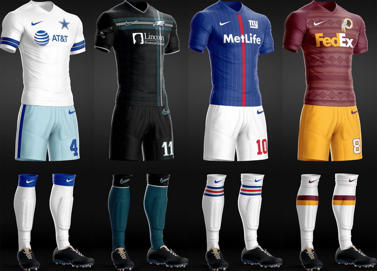
Cowboys: In keeping with their preferred look, I let them wear their home whites.
Eagles: Went with a very subtle tartan on the chest as a bit of an homage to Irish descendants being the largest ethnic group in the city. Added their original logo to the sleeve because I hope they change back someday.
Giants: Solid blue with a single red stripe, echoing their helmets. Subtle pinstriping as an homage to the Yankees. Was a bit odd having to make their home pants white instead of gray. Added the home pants striping to the socks.
Washington: Native American pattern for the body of the jersey. Simple, accurate socks.
NFC North
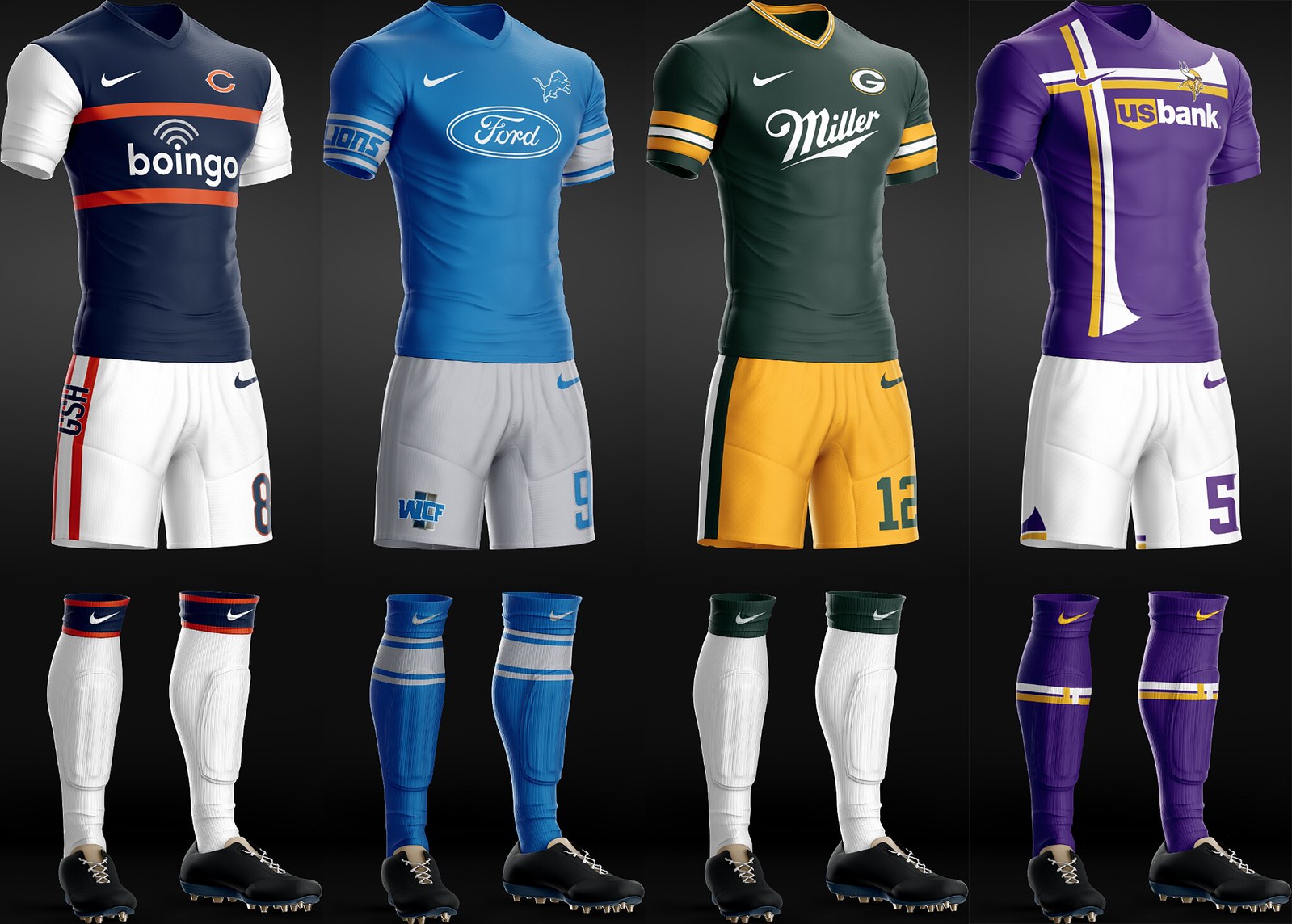
Bears: Went for the Ditka sweater vest look. “GSH” tribute down the pant stripe.
Lions: Figured that if they just went through the trouble of redesigning their uniforms, I should honor them with a pretty straightforward rendition of the new design.
Packers: Can’t mess with tradition.
Vikings: One of my favorites. Incorporated their Viking boat sleeve stripes and emulated a classic Sweden international kit (to honor the Scandinavian influence in Minnesota).
NFC South
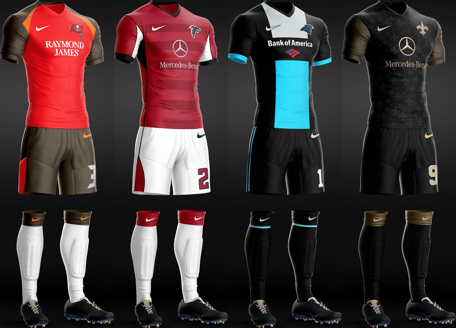
Buccaneers: Went literal with theirs. Tried to emulate the jersey as much as I could.
Falcons: Again, tried to emulate their actual jersey. Added striping to the chest, with a very subtle wing pattern.
Panthers: One of the few that does not incorporate much from the NFL uniform. Modeled after a PSG kit from a few years ago that is one of my all-time favorites. Just felt that the colors would really stand out in this design.
Saints: Fleur-de-lis! Kept in the team’s theme of black on black. A subtle fleur-de-lis pattern to the kit with gold accents popping off. Not every uniform needs white!
NFC West
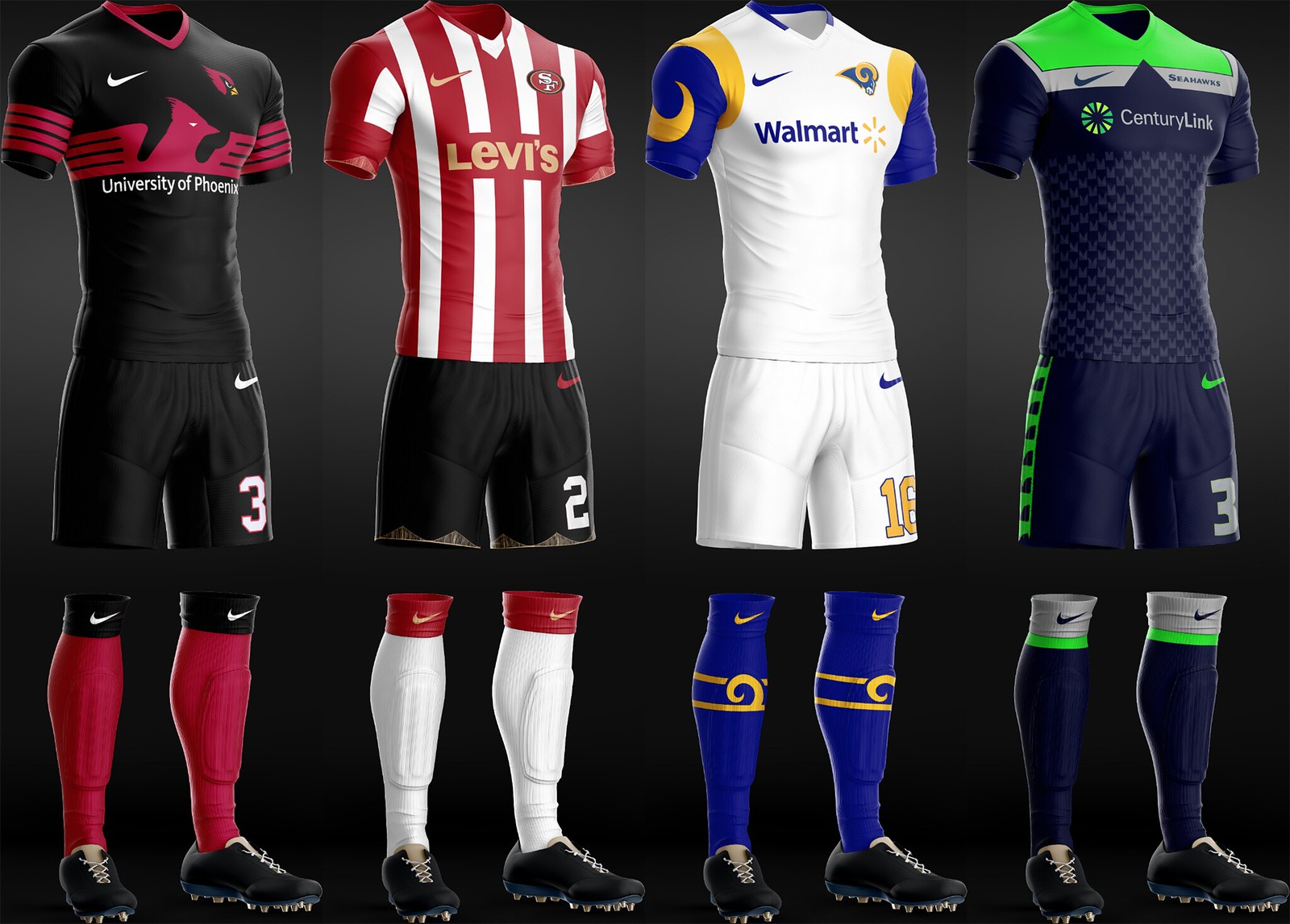
Cardinals: Adapted a killer Lazio kit from a few years ago to have a cardinal’s head. Went black-heavy, in part because I felt like it was necessary to distinguish this one from the Niners.
49ers: Went with a traditional vertical-stripe kit to match the Niners’ traditional unis. Started out using their three sleeve stripes, but felt like it was sacrilege to put three white stripes on a Nike kit — it just screamed Adidas. Subtle Golden Gate Bridge trim on the shorts, and sleeves in gold.
Rams: Adapted my favorite of their great old jerseys to fit a soccer kit. Think the horns really hold their own on this. A beautiful sock stripe was adapted from another designer’s pant stripe concept. Added Wal-Mart as the advertiser because of Kroenke’s marriage to a Walton heiress.
Seahawks: Figured I could really get after this one. Only time I didn’t use the team’s primary logo as a badge. Modified their current jerseys’ silver panels and let myself get a little creative with it. Helmet stripe pattern on the lower third of the jersey, standard stripe from their football pants on the shorts.
AFC East
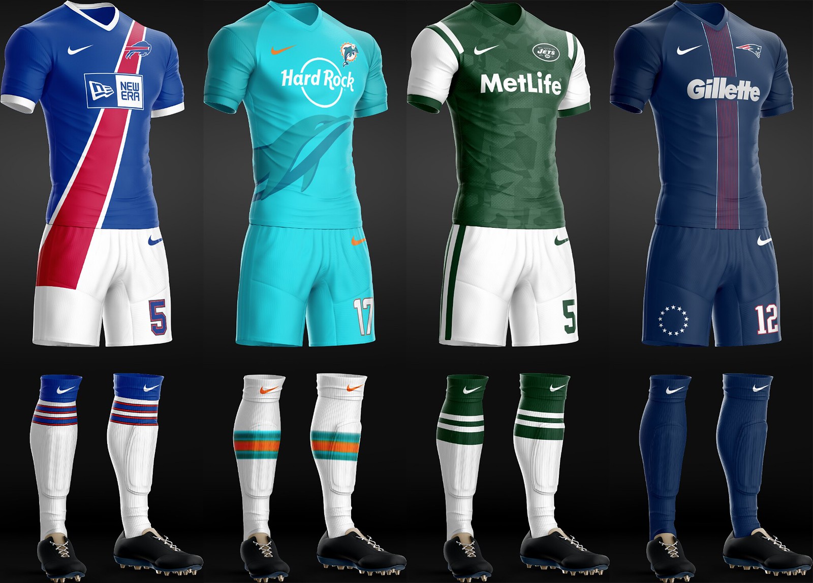
Bills: One of my riskier designs. I incorporated the red stripe from the Bills logo all the way down onto the shorts. Felt like it was a nice shout-out to how their logo has the red extending past the blue buffalo. A real hit or miss amongst my friends. Accurate socks.
Dolphins: One of the teams that really gave me trouble. In the end I went with an overlaid graphic (like Man U is incorporating into their third kit this coming season). Felt like the pure aqua gives a greater sense of the dolphin swimming underwater.
Jets: Went with a fairly accurate representation of their uniform, with the addition of a Nike camo pattern that they are rumored to be rolling out to all the major European clubs this coming season. “Jets” to me always gives off a military feel, so I felt it was appropriate.
Patriots: The Pats remind me a lot of PSG these days. No nonsense, consistently dominant. With Belichick in charge of everything, I can’t imagine it would be any frillier than this. I adapted the current PSG kit for the Patriots with a very subtle difference: Instead of 14 thin red stripes down the chest, there are 13, for the original colonies. Added the original 13 stars to the thigh for continuity and didn’t overthink it.
AFC North
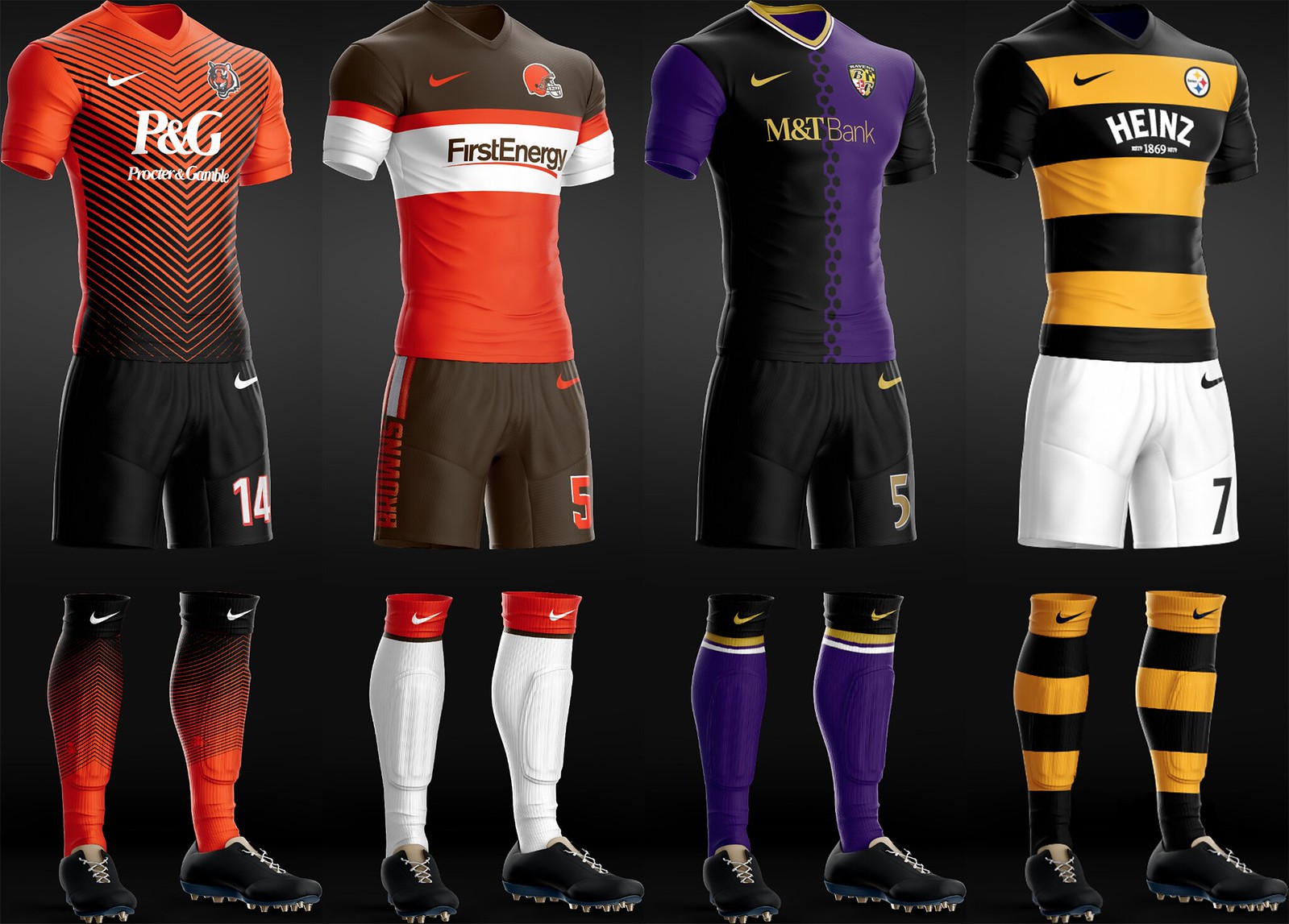
Bengals: I adapted an old Werder Bremen kit that I love for this one. I almost added the Bengals’ traditional stripes but felt like that would be too obvious. This gives them the striped feel, but in a more cosmetically pleasing way.
Browns: Shockingly, I really like this one. Modified their sleeve stripes to create a pretty cool shirt design. After that went standard with their pants stripe.
Ravens: This is a team that always seems dignified to me. Modified a Man U kit with alternating sleeves as a subtle nod to the Maryland state flag’s four quadrants.
Pittsburgh: Bumblebee! One of the teams had to get a Celtic-style full hoop design. Who better than the Steelers, who’ve used a similar look for their throwback.
AFC South
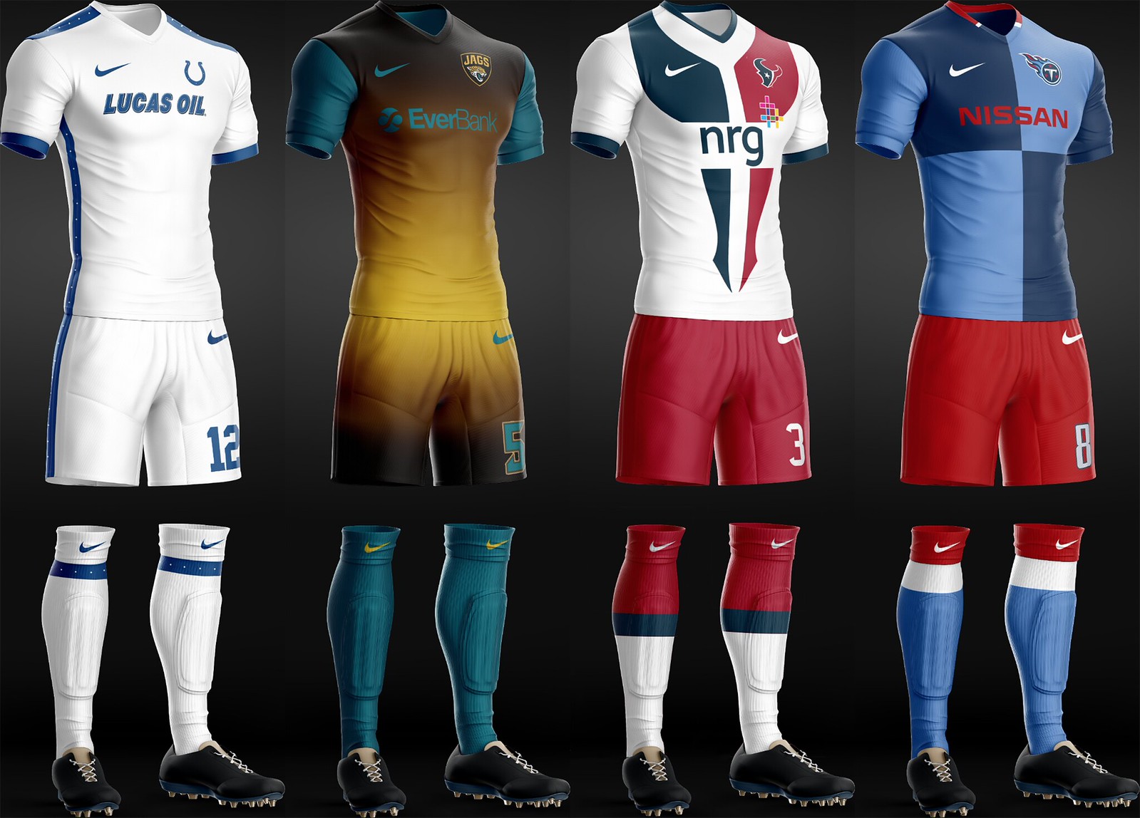
Colts: A no-nonsense football uni leads to a no-nonsense soccer kit. Incorporated their horseshoe logo’s white dots on blue background into all the trim pieces. Other than that, not much to it.
Jaguars: Had to incorporate their awful helmet gradient into the full kit. I couldn’t bring myself to make it as jarringly abrupt as their actual helmet is, though.
Texans: Went with a stylized steer’s head as a chest graphic. I think it turned out pretty cool. A friend said the bottom looked like two legs kicking, which I guess is appropriate for soccer.
Titans: A tough color combo. I used the two blues in a quadrant pattern as a nod to the Volunteers.
AFC West
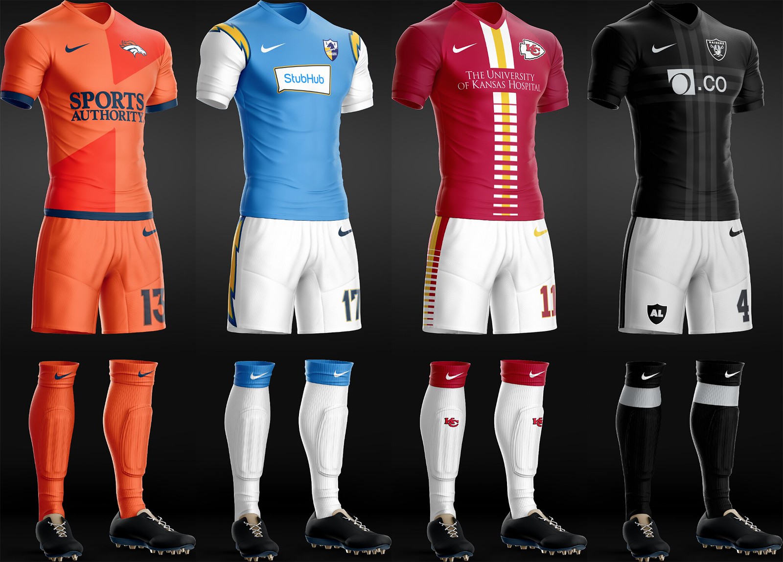
Broncos: Another rare instance of not using any details from the team’s football uniform. This was a bit of a nod to a friend, who is a massive Broncos and Netherlands fan. I used one of my favorite Netherlands kits and tweaked it for the Broncos.
Chargers: Bolt up. Pretty basic influence from the powder blue throwbacks. Used the original LA Chargers badge, which I would love to see them revert to. Interesting to note their advertiser is StubHub, because they will actually be playing in a soccer arena next year.
Chiefs: Took their sleeve stripes to make a center strip. Added a bit of a gradient pattern for interest’s sake. Pants stripe is accurate with added gradient as well. Chose the University of Kansas Hospital as an advertiser because that’s who has the naming rights to their training facilities.
Raiders: It killed me to even add the subtle pattern in the background, but a solid black shirt just didn’t feel like I was working hard enough. And of course, “AL” on the leg.
———
Paul here. Let’s have a round of applause for Angus — not just for his designs, but for the informative text. Nice to have insights into a designer’s creative process.
New T-shirt reminder: In case you missed it yesterday, our latest T-shirt in the Uni Watch Artist’s Series, designed by the great Scott M.X. Turner, is now available, and it’s a doozy.
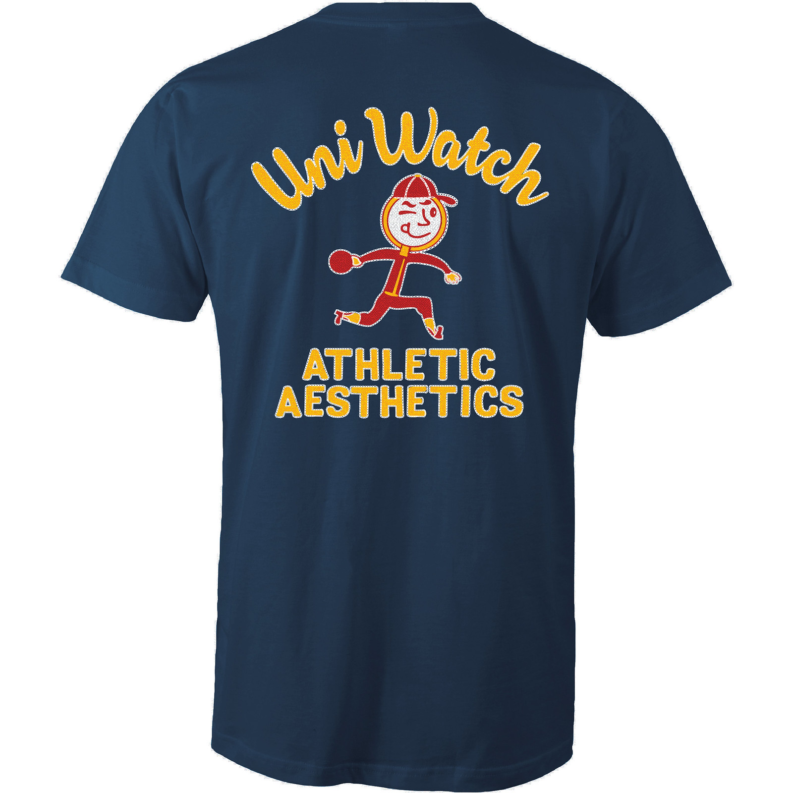
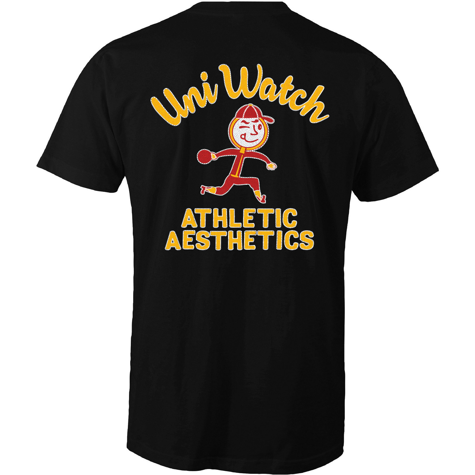
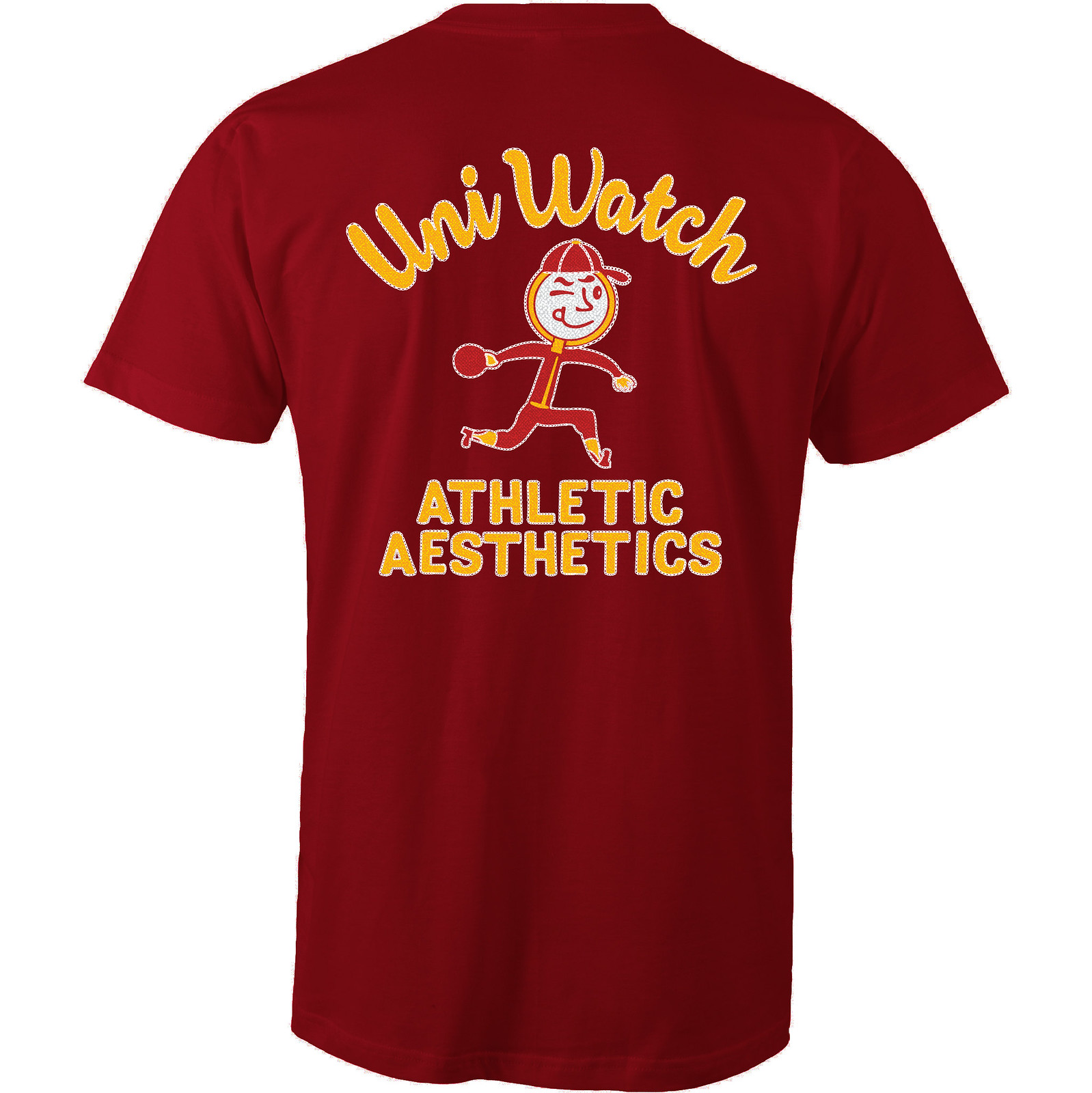
Here’s the concept: If Uni Watch had a bowling team, what would the team be called? The Athletic Aesthetics, of course! And what would the team wear? A classic bowling shirt with chain-stitched embroidery, of course!
Scott’s T-shirt is based on that idea, with a simple “Uni Watch” insignia faux-chain-stitched on the front-left chest and a spectacular design faux-chain-stitched on the back. First let’s look at the front (for all of these images, you can click to enlarge):
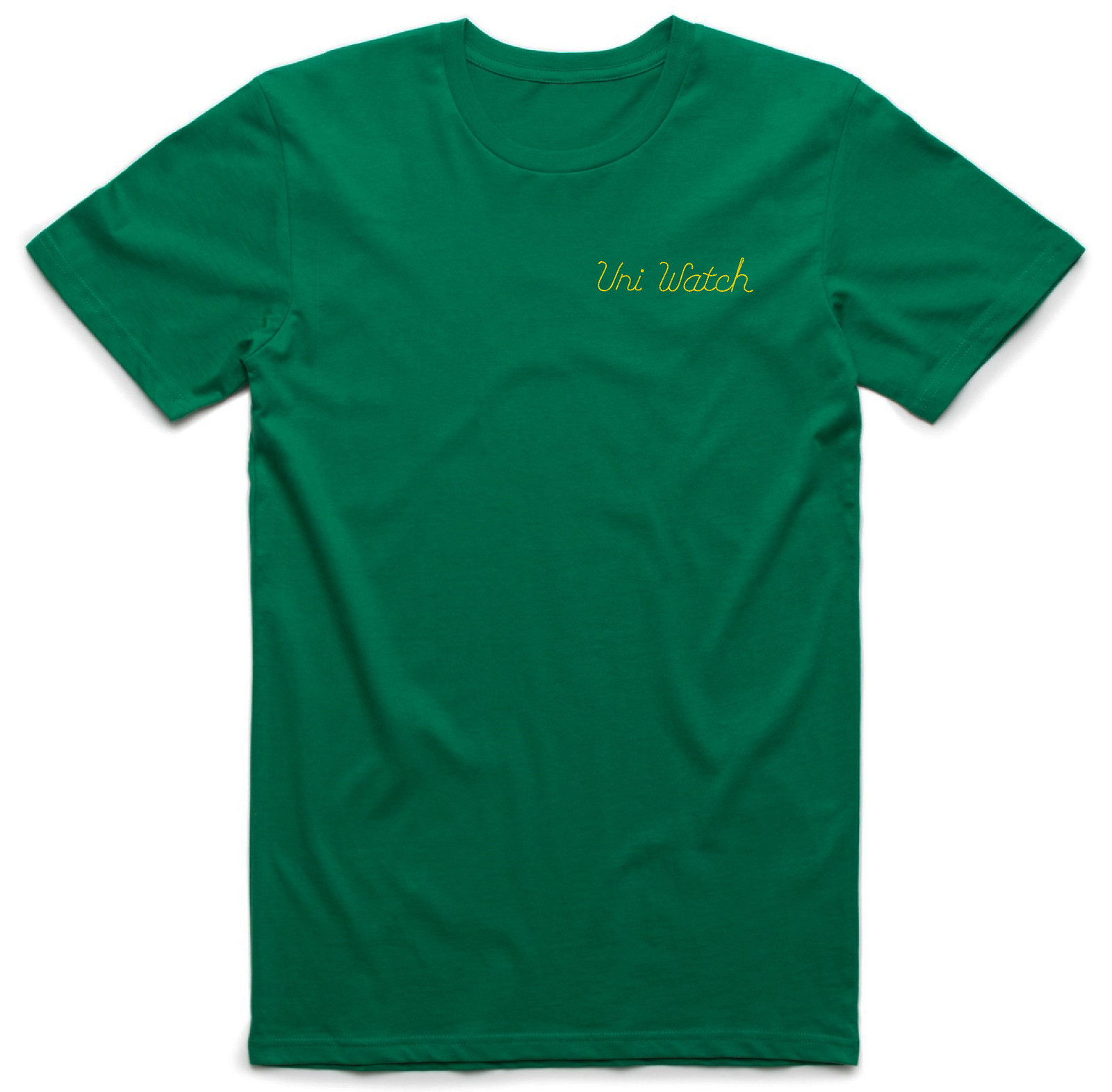
Pretty cool, right? Scott originally wanted to just draw the lettering, but I encouraged him to make it look chain-stitched (much like our 2015 “ugly sweater” T-shirt looked knitted), and I love how it turned out. But that’s nothing compared to the design on the back. Dig:
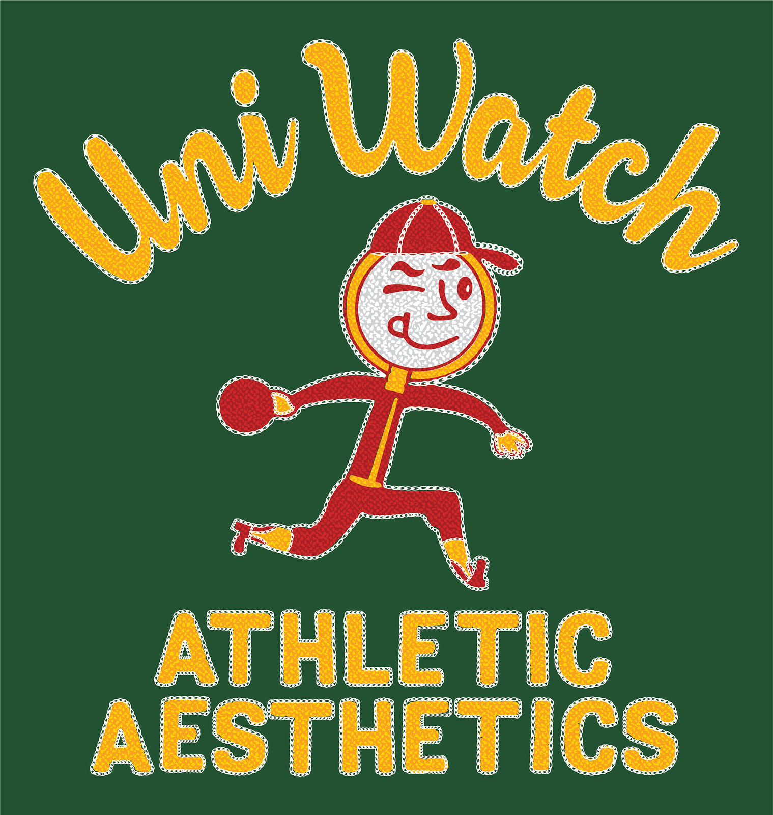
How great is that?! An anthropomorphized magnifying glass wearing a ballcap and stirrups — tremendous! The graphics really capture that old-school bowling shirt style, too. As a collector of vintage bowling shirts myself, I can’t say enough about how awesome this is. I’m super-proud to have the Uni Watch name on it.
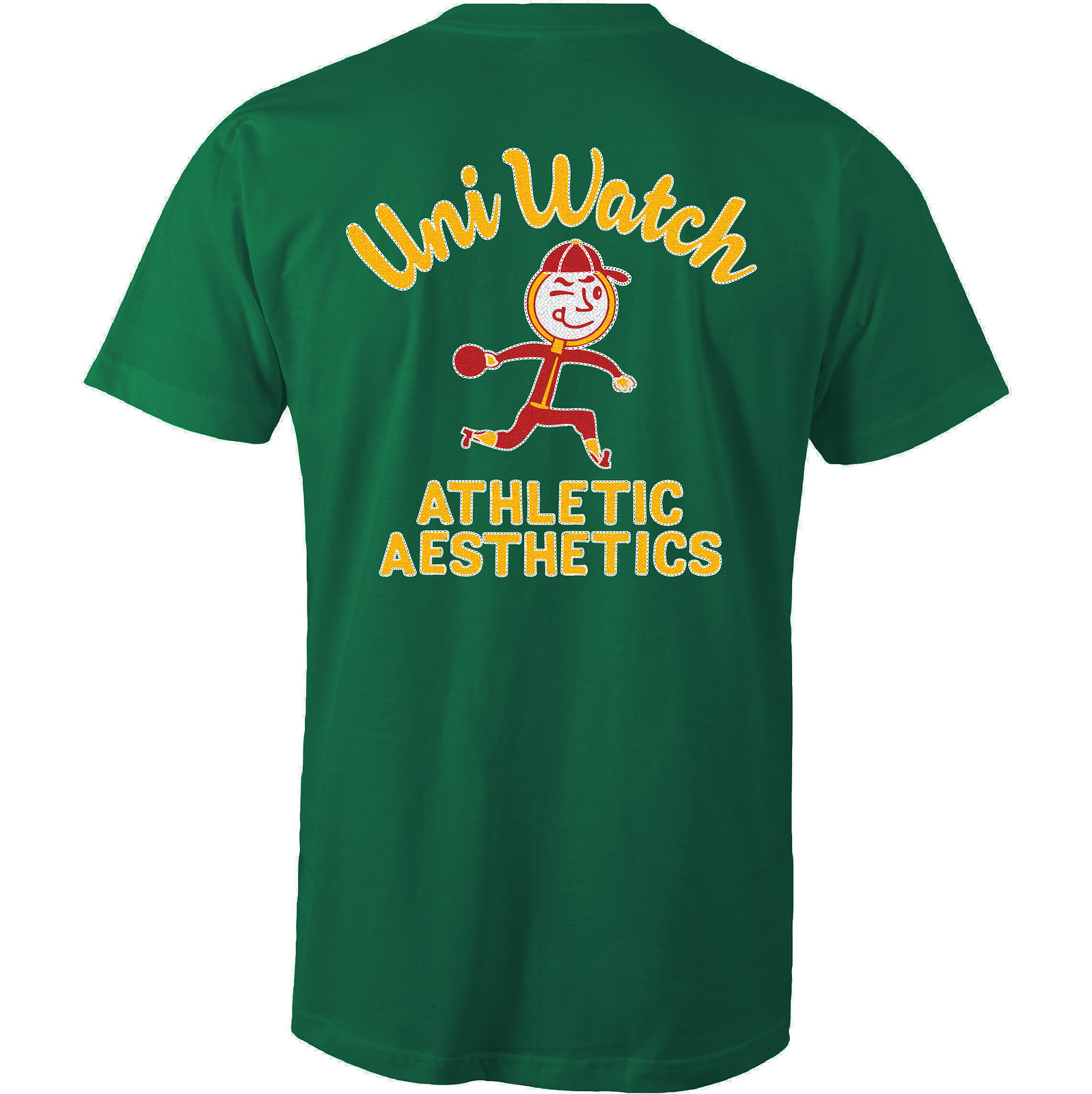
Even better, the design works well in a wide variety of shirt colors. Here are some of the ones we’re offering (there are several more on the sales listing page), just to show how flexible the design is:
Creating all of that chain-stitching texture on the back took a lot of work, and at one point Scott thought it might not be feasible. I was prepared to do the back design without the stitching effect (plenty of bowling shirts have silk-screened graphics on the back, so we could have said we were matching the silk-screened style), but Scott got some crucial assistance from the great Larry Torrez, who helped with crucial advice regarding faux-stitching techniques and then actually did a lot of the work on the back design. Thanks so much, Larry — this one wouldn’t have reached its full potential without your midwifery.
Okay, enough of my gushing. Like all of our Artist’s Series shirts, this one is a limited edition, available for nine more days. You can order it here. My thanks, as always, for your consideration.
The Ticker
By Alex Hider

Baseball News: There are two Turners playing on the Nationals right now ”” Jacob and Trea ”” but neither is wearing a FIOB (from Bob Berman). … Donruss baseball cards are licensed by the MLBPA, but not by MLB itself. That means all of their cards are void of any team or MLB logos (from @KUKCSGF). … Jorge Cruz spotted a cesspool pumping truck on the field at Yankee Stadium yesterday. Definitely not something you see every day. … It’s weird seeing Johnny Bench wearing anything other than his iconic No. 5, but here he is wearing No. 53. The caption on the photo says it’s from a 1969 Topps card, but it would appear the photo was taken no later than 1966 (from Brice Wallace). … The Frisco RoughRiders will become Los Jinetes and wear special jerseys on Cinco de Mayo (from Phil). … Quite a nickname matchup in NCAA DII softball between the Southern Arkansas Muleriders and the Arkansas Monticello Cotton Blossoms. Monticello was also sporting some nice tequila sunrise unis (from loyal and longtime reader ThresherK). … The Busch Stadium scoreboard couldn’t fit Salty’s surname last night (from Erik Spoonmore).

NFL News: Once again, Cris Routh has reimagined this season’s Color Rash matchups as “Throwback Thursday.” Much, much, much better that what we’ll actually see on the field. … Some Giants showed up at a “Play60” event recently and wore jerseys that didn’t have the little “ny” chest logo (from Jamie Burditt). … Friend of the site David Firestone discussed the Eli Manning memorabilia scandal over on his blog.
College Football News: Interesting quote from new Oregon head coach Willie Taggert: “I think a lot of the young men that were here, they came here for the uniforms, not to be a great football player. That fell by the wayside” (from Jon V. Buerstatte).

NBA News: Short-sleeved suits? Belly-button v-necks? Matching dinosaur sweaters? Players always seem to take their post-game outfits to the next level during the NBA playoffs (from Andrew Cosentino). … Check out the jersey on Big Bird. Perhaps a tribute to Larry Legend? (From Jamie Burditt.)

Soccer News: Liverpool’s kit for its upcoming 125th-anniversary season has reportedly leaked (from Mikey Traynor). … Flamengo has released its home kit for next season (from Patrick Thomas). … Sporting Kansas City’s kitman had some fun with the Daniel Salloi’s askew NOB that he wore in Monday night’s game (from Todd Engle).

Grab Bag: Nordstrom is selling ridiculous faux-mud-splattered jeans for more than $400. The mud supposedly “shows you’re not afraid to get down and dirty” (from Mary Bakija). … John Lesnik played in a “Draft Hockey” tournament in Nashville a few weeks ago. The company that put on the event provides teams with jerseys with some pretty wild designs . … Longtime funny car driver Bob Tasca III will be making a return to competition racing a with new paint scheme that has an annoyingly slanted logo (from David Firestone).
Something funny in the sentence about the Frisco RoughRiders, but a snappy special jersey.
Fixed.
Love the soccer unis, but I notice he used the old Dolphins logo with the current number font. Was that a conscious choice?
Honestly, I did the Dolphins early in the process. I would love to say that I did it to not have the new logo repeated on the graphic and the chest logo, but I honestly think I just missed it. Good eye!
Those soccer jerseys are fantastic! Not a NYG fan, but that one is my fav! I appreciate his descriptions as well. Would’ve been cool to incorporate SB Victories into the applicable one’s somewhere (i.e. 6 stars around the Steelers chest logo).
Not thrilled with the “As a tribute to the Yankee” thing. Why would they do that? Technically they compete for market share.
The Giants played at Yankee Stadium for some time after they left their original home at Polo Grounds.
Teams in the same market but different sports (particularly those whose seasons don’t overlap much) have done this, e.g. the Cards/Blues in St. Louis. Blues have skated warmups in cards themed warmup jerseys on several occasions, and if memory serves the Cardinals have also had Blues themed BP jerseys during hockey playoffs.
Separately I’d also add I love the kits, especially the Vikes one!
Let me add my voice to the praise on those NFL “football” kits. Just wonderfully done, great small touches. Bravo!
The three Garcias, well two since one is back in Triple A, on the White Sox don’t have FIOB as well.
Somebody make those NFL kits. They would sell.
Are you serious? There is no team name on them… it is a fucking commercial! Not to diminish his effort, but surprised it was even a lead story.
There are, however, team logos. Can I assume your objection would be voided if the advertisingbwere removed?
Ever look at the Colts’ jersey. No “COLTS” or “INDIANAPOLIS” wordmark. Most teams have a very small logo or wordmark if anything at all.
Don’t for a second think the lack of trademarks on the Colts’ (or Bears’ or Packers’) jersey doesn’t frost the NFL. To my way of thinking, the league wants a proprietary item.
Which would be why most new jerseys have wordmarks somewhere on the front.
See Colts, Indianapolis’ jerseys. Let me know where the wordmark or horseshoe is. I’ll wait.
SWC Susan: nearly every pro club team has a sponsor on their jersey, and the national team jerseys look a bit blank with the numbers on the front and the back. These teams have done it for years and while I understand your complaint, soccer isn’t a traditional American sport, so the jerseys will look different.
Oh yeah, they’d sell.
sharp looking soccer strips. I would like to see an attempt at creating new crests rather than using the football logos.
There are a few great kits in there. Many of them, however, are cluttered with little devices and look over-designed as a result.
The soccer unis are really good except one I would complain about and that’s the 49ers. The striped shirt doesn’t work for me in this regard. Should have been all red with sublimated Golden Gate and Trolley cars. The pants MUST be gold. Gold pants are the 49ers as is the side striping. Nitpicking to be sure but that’s the only real complaint.
The lack of gold on the Niners kit has been noted in a couple different comments. Honestly, you guys are right. I don’t necessarily agree that I needed to identically re-create San Fran’s jerseys (like I did with some teams), but the lack of gold, particularly on the shorts, was a mistake.
Cris Routh has reimagined this season’s Color Rash matchups as “Throwback Thursday.”
No “one helmet” rule! I like it!
The ‘Skins repeat is a bummer, but oh well.
Yeah, I debated that one. From what I could tell, it looks like the Redskins wore their burgundy unis for home games in the 60’s and most if not all of the 70’s. My other choice for Washington were the Lombardi-themed unis of the early 70’s with the yellow helmets. Not really sure why I stayed with the uni combination but I would be open to either one.
would it be in poor taste to have the Redskins with some sort of Thanksgiving theme?
You’re not allowed to use the R-word on this site, citizen! Report to your nearest deprogramming center immediately!
Well done on the soccer kit concepts, like them a lot. Haha If it was real life though Nike would just have the same template for all the kits like they usually do.
As for the Liverpool kit it was rumored they would be using the original crest for the 125yr anniversary like this
link
But that photo and a photo of Jordan Henderson came out with the logo in the article.
link
Also in soccer news Indy Eleven unveiled their new home kit yesterday
link
It is made by Adidas which is a plus. It has pinstripes on the front but not on the back(some are saying “racing stripes” but no) Turkish Airlines logo on lower back.
Some push back from supporters because the checkers on the kit are now gone. The original kits and also the logo have checkers in the background. A little nod to the racing history of Indianapolis.
Pinstripes remind me of 90’s NBA Pacers/Hornets/Magic jerseys.
Downgrade for Indy. Not just for adding another sponsor logo on the back, but because I liked the subtle checker effect on link.
…this is where I get a little confused. What would have really impressed me if no ads were prevalent on the jerseys (or have done the advertiser in a small patch-like fashion). In fact, as much as this community has put its voice forward about the NBA & NHL not putting ads on its uniforms, it seems to swing in the complete opposite direction with soccer uniforms.
The inconsistencies of having ads on professional sports attire shouldn’t be based on the sport itself, but on the whole (if you’re going to accept it for one, you shouldn’t have a problem with it going on all and the other way around).
Personally, I would rather have ads on the boards / fields than on the uniforms.
Fair point. To be clear: I didn’t give this project to Angus as an assignment; he did it on his own, and this is how he presented it to me. Given the quality of the work, I feel that rejecting it simply because he included jersey ads (which soccer teams tend to have) would have been churlish. Indeed, if he had created a set of soccer uniforms *without* ads, many readers would probably object to them as being unrealistic, or not-official-looking, or something along those lines.
Then again, maybe it’s simply because I don’t follow soccer myself, so I have less of an emotional stake in whether they go with uniform ads.
now i have to google “churlish”.
now i have to google “churlish”.
A great old word that somehow seems as though it was designed for the Internet age.
I always thought it was how Charles Barkley pronounced “childish”
I completely understand the “realistic” take on these uniforms, and he did an excellent job. That said, you’ve had other features demonstrate the same thing, but presented them as “mock-ups”, which comes off as selective, but choice language in the presentation. An example being when you were first showing how a NBA jersey could look with an ad (which in many cases were surprisingly accurate).
In the end, it’s all fiction and I would love to see some outside the box creativity with some elements removed and possibly challenge what is seen as “realistic”. This community has some outstanding talent and I know with these soccer kits / uniforms, the logo’s are almost non-existent and take a back seat to the ads. Maybe it’s time to switch it up…
I can’t get over the ads front and center on soccer jerseys. Every time I see one it stands out and feels wrong. Like a giant ketchup stain in the middle of a white shirt. “You got a little something on there”
National soccer team uniforms don’t have ads. And they look great. Do soccer fans feel like those uniforms are less than the league ones because of a lack of advertising?
I just want one team to come out and say “Were dumping our uniform ads because they look like crap. We’ll eat the few millions we may lose, because we will look better” Bet they sell more jerseys than before.
“Sell[ing] more jerseys than before” is not the reason to do this. In fact, it is the reason that has driven almost everything that’s currently wrong with the uni-verse.
The reason to do it is that it’s the right thing to do, period.
Football fans do actually feel like national team shirts are plain; that is why there are a boatload of unnecessary striping patterns on the national team kits.
The few million as you put it is sometimes the difference between a clubs life and death, and in the upper echelon it’s in the tens of millions that even big clubs can’t afford to eat for the sake of a clean canvas. Soccer fans around the world are used to it, and will boycott anything to do with a rivals sponsor if need be.
Chelsea just signed a 1.1 billion dollar Nike deal over the next 15 years. Thats tough money to pass up, even for a Russian oligarch. Plus, with financial fair play rules, that money allows them to spend more on transfers without being penalized (I believe).
Soccer fans around the world are used to it, and will boycott anything to do with a rivals sponsor if need be.
What does “if need be” mean here? How would a fan “need” to boycott a rival’s
sponsoradvertiser?“Started out using their three sleeve stripes, but felt like it was sacrilege to put three white stripes on a Nike kit – it just screamed Adidas.”
No, the three stripes scream 49ers. Avoiding them in the name of Big Uni for a project that will, by definition, never see the field is the wrong way to approach it.
Perhaps by similar reasoning, the designer went away from the Bears’ three-stripe design. Unfortunate, in my opinion, as it is a more timeless, authentic look for the Bears than the “Ditka sweater vest” look, which in reality was a template used on those sweaters and vests by all the teams at the time (and they had three stripes on the sleeves; the two chest stripes enabled the team wordmark to be on the front).
As for the Bills look — I’m afraid it’s also a “miss.” In this case, it’s more of a miss not so much on paper, but when the realities of manufacture and wear come into play. I can see it being really difficult for the manufacturer to put such an irregular stripe on those shorts. As to wearing it, thatbstripe onlybworks if the shorts and shirt are worn precisely, which is almost impossible for a sports uniform.
You are obviously not a soccer guy; any team outfitted by adidas has three stripes on their shirt and no Nike kit ever does. In the world’s game, three stripes doesn’t mean any team. And the red and white striped kit is iconic and symbolic of tradition.
And the red and white striped kit is iconic and symbolic of tradition.
Marketing buzzwords without any substance. Symbolic of whose tradition? The 49ers? Better to say “striped soccer shirts look cool, so I just decided to go with one for the 49ers.”
The red and white tradition is an honor owned by many English clubs; notably Sunderland and Stoke and Southampton. It may have looked better on, say, Arizona, but that is beside the point.
I would like to have gold in the red-white stripe of the
49ers, I don´t know, white did never look well when combining with red (even that the Niners their last super bowl with that uniform). And gold will give a more sofisticated look to your idea.
You are correct, that was phrased incorrectly. I should have said it is a traditional design template in soccer kits, and I felt like the Niners needed a traditional feel to theirs. As someone who watches a lot of soccer, seeing the three stripes on Nike just felt wrong. I know this is a fantasy concept, but I went into it with a mindset of trying to at least be somewhat realistic. If you look at the Niners actual football jerseys, you will see Nike won’t even give them the full three stripes all the way around the sleeve. They have them cut off by the red cuff and it ends up looking like one or two stripes depending on the player.
Also, I agree- Needed more gold!
The Giants’ socks look like Adidas-style soccer socks with the 3 stripes positioned how they are.
Really, I care very little about the “manufacturer” on an imaginary design. Were the three stripes really an issue, couldn’t the 49ers jersey just have been “made” by Adidas? Really, should we care about the hurt feelings of these companies?
Beyond that, while I liked a few of the designs, I felt there was a lot of BFBS. Not my cup of tea, though I appreciate that a lot of work was put into this.
I don’t want any input from the manufacturer on the branding present on my team’s kit. If three stripes don’t belong in my team’s iconography, Adidas better not put them there!
Those Donruss baseball cards look ridiculous without team logos and only city names, not team names. If you did not know baseball well, you’d think Molina plays for Team Donruss….
Beyond that those are just horrible looking cards.
Donruss still makes cards?
Also want to voice how good and soccer-esque these were. Love the Lazio reference and the PSG ones, too.
I’m surprised that NRG and A+E haven’t sued each other.
Their logos are nearly identical
Really good job on the soccer kits. I think the 2 best were the Saints fleur-de-lis pattern and the Rams horns on the shoulders. Curious how the Rams jerseys would look if they had the horns on the shoulders.
The LA/St. Louis Rams’ uniforms had the horns on the shoulders from 1973 through 1999.
This site states that some pictures from previous years were used for the 1969 Topps set: link
So the link is correct that it was the 1969 Johnny Bench card, but the picture was taken in 1966. link
Love the NFL/soccer project and the thought that went into it. All except for my beloved Eagles. Ugh! The black as primary, the tartan (makes me think Scottish, not Irish… and while there is a huge Irish community here in Philadelphia – my family included – we’re not Boston, and it ignores the large Italian, German and Slavic communities, to say nothing of more recent arrivals).
I would also say the Cardinals should be… ya know, red. Even if a division rival wears similar colors, so be it – and the Niners could make much better use of gold, what with the team named for the Gold Rush and all.
The Eagles were a killer for me, because they are my team too. Only team that I completely scratched and started over (believe it or not the first attempt was way worse). Never quite got that one dialed in. I admit, the tartan was a bit of a selfish play, as I am Irish and Scottish and my dad’s whole side of the family is in Philly. I agree though, the “Irish descendants” angle was a streeeeetch :)
Fly Eagles fly, man.
Funny how the guy who created the soccer jerseys said that the Pats have a PS feel to them… The New England Revolution (who also play at Gillette and are also owned by Robert Kraft) already have a kit that has some PSG influence… link
Has anyone reached a point of tolerating the MLB’s new Stance socks? If so, what methods do you use to find happiness?
I am still not over them, they make me want to vomit…and break something… bust mostly cry.
Love the football as football ideas, only thing I have against it is Nike would never put their logo in the NFL style hip position, it’s always the lower leg area, usually opposite side of team badge (or numbers in this case). I also wonder how Buffalo would look in the tucked vs untucked variants
Love these NFL soccer kits. I might have liked to see other sponsors for the Cardinals and Broncos, since University of Phoenix is opting out for Arizona and Sports Authority is out of business. Also not a fan of black for the Cardinals. Their black alternate uniform is a great example of a team using black for no apparent reason. I’d rather see them in cardinal red or better yet, white with cardinal red ascents.
I am not a big fan of reimagining one sports uniforms as another, and soccer is not high up on my list of sports that I follow. I was surprised at how much I enjoyed Angus’ work, both the designs and descriptions. Well done, and thank you for making me a little less curmudgeonly this morning.
Are the UniWatch T-shirts 100% cotton or 50/50 poly/cotton?
-Jet
They’re all 100% cotton.
I really enjoyed the soccer kits and the tremendous amount of work put into it. The only thing I would change is on the Packers shirt. It would be great if the advertiser was ACME instead of Miller.
ACME is the name of a chain of supermarkets in the Tri-State area. Whenever I pass the one in New Rochelle, I say to myself, “…purveyor of fine anvils and rocket-powered sneakers.”
Funny thing… there’s actually a “Green Bay Packaging” company based in Cincinnati of all places.
Clever – I like that. Just like the old days of the Packers:
link
NFL as soccer kits:
Only one sash, one vertical “half-block”, and one “quarters”. And two of the off-center cross (is there a name for that?)
I know this is silly, but I wish there were backsides shown, because of the number fonts, and contrast treatments like “bibs” and such.
Plenty of striped socks, as I would hope.
And two of the off-center cross (is there a name for that?)
In vexilology, I believe it’s called a Scandinavian or Nordic Cross.
It strikes me as funny that the two teams with crosses on the jerseys are owned by men who are Jewish. I doubt that was intentional on the designer’s part and I do enjoy the designs (although too many white socks for real matchups).
Lol it was not intentional!!!
Kudos to Angus – Really well done! I’m not much of a soccer fan, but can appreciate this effort. Also, the Walmart Rams gave me a chuckle for some reason. Nicely done.
Great work on the NFL as soccer uniforms project!
Question for Angus or anybody else who is a designer or has done uni mock-ups…what program(s) do you use to create the designs? I assume some use Photoshop, but are there applications specifically for fashion design? And do you create your own templates or are there some out there for free use?
Thanks. Would love to try some myself but have no idea where to start.
Same question.
I know some people do design their own templates. I am nowhere near that advanced, I am self-taught with photoshop and just do it as a hobby. I used a template from sportstemplates.net. It wasn’t free though. Really helpful so you don’t have to worry about shading and lighting and all that. It is fairly intuitive to create basic designs with what is included, and allows for a lot of customization on top of their base template, like I did.
Noting all the comments disliking the ads on soccer jerseys has me wondering how significant the jersey sponsorship (or whatever the proper term for that is) actually is to the financial viability of the various clubs, not meaning the $559 million Chevy/ManU deal, but the smaller ones. Would the MLS not survive without Bimbo on the front of Philadelphia Union jerseys? Obviously, more money helps, but I’m unclear on if they see themselves as having an option.
I don’t think they really see it as an option, since the league’s margins are pretty thin.
Not that I think they should be squeezing every possible revenue source, but you were asking about their perception.
Even the Chevy/Man U deal is about keeping up with the Joneses, and I’m pretty sure that Man U sees it as essential. Not in terms of them going under without it, but being able to spend as much on players as other big clubs do.
They Chevy Man Utd deal is important to them as they are still saddled with heavy debt from the Glazer takeover 10+ years ago. Chevy and Adidas go a long way to paying that down as well as pay for players like Pogba and Zlatans wages
I’m totally ignorant on this, but from the perspective of a fan of the big U.S. sports, the idea of thin profit margins for the big clubs is unimaginable, considering how much money our lousy and incompetently-run teams rake in. Do the taxpayers not subsidize their facilities? Do they not get paid big bucks to prop up the cable TV operations there?
Not a fan of the Eagles BFBS uniforms. When a team has a unique color like midnight green, it should be the primary, IMO.
Great work, Angus!
liked the Throwback Thursday matchups (instead of color rush). A couple I’d change: Washington with the “feather” helmet, Jets as NY Titans, but otherwise very nice.
I pay very little attention to soccer, but I really enjoyed the reimagined jerseys. The description/reasoning that was included with each one is what made the whole thing stand out. The Vikings (sorry Paul) and the Dolphins (with the dolphin swimming through the shirt) are my favorites.
My compliments to the chef.
Paul the “leaked” kit was confirmed as a hoax
link
No, one particular picture was Photoshopped. That doesn’t mean the leak was a hoax.
Footyheadlines.com has a pretty good track record.
Maybe next we can look at how a football uniform looks as a women’s field hockey uniform? Because that’s what I think about with NFL uniforms designed for Soccer kit…better comparison would be to show it as Rugby kit.
Hey…not sure if you’re affected by what’s going on at the Worldwide leader today, but sending good thoughts your way.
I was just about to leave the same comment
I was in college when I discovered uni watch on espn in ’04 – time flies!
Same here Paul. Tough day for a lot of your colleagues. I hope you survived. Thinking of you all.
Amen.
Paul is safe, everyone: link
He’s been out and about this afternoon, so that’s why he’s been silent on Twitter and in the comment section.
To the guys that posted about the events at ESPN, thank you. Paul, sorry hear about some of your colleagues, but grateful you’re not affected.
Hi everyone, these were my mock-ups. I want to thank all of you for the comments and feedback on the uniforms. I will try to directly reply to some of them, but appreciate all the feedback, both negative and positive! I understand this is a site where uniforms are inspected down to the smallest detail, so I knew there would be issues found! This is my first time having my work shown on a website, so I am just appreciative of the experience. Thanks again!
Pittsburgh soccer uniform is the winner
Great stuff, but the University of Phoenix is no longer the stadium sponsor and so the Cardinals jersey will need a new sponsor logo.
Thanks! Using my memory too much and not doing enough research lol. Did not know that. Any idea who is replacing them?
Really enjoyed the NFL soccer concepts. Tennessee looks like a combination of two of my favorite Chievo Verona kits, their old blue-white quarters, and their classic sky blue (both throwbacks to their history before adopting the city colors of Verona — yellow and royal blue — when they made it to the top-tier leagues).
link
Great job on those NFL soccer kits.
Should do away jersey next, almost all of them are fantastic, maybe if the NFL wears it ina game or sells it, would promote more and recognition to soccer in the states since we are a related sport in my opinion
Awesome work! Pittsburgh wins!