For all photos, click to enlarge
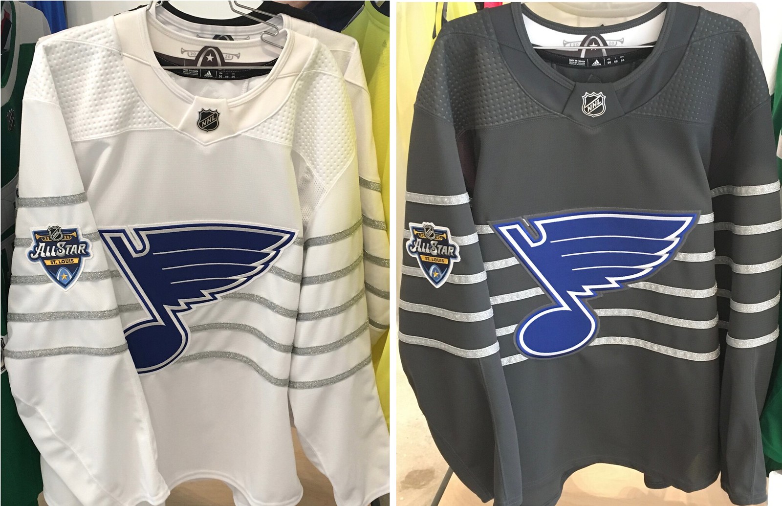
The NHL yesterday released the uniforms jerseys for this year’s All-Star Game, which will be played on Jan. 25 in St. Louis. I’ve known about these designs for a while, because Phil and I got to see them during an Adidas media event back in October (which is where I took the two photos shown above), but I wasn’t allowed to talk about them until now.
Let’s handle this one FAQ-style:
Don’t NHL All-Star jerseys usually feature the NHL logo on the chest?
They did until last year, when they went with team logos rendered in black and white. This year they’re adding color.
So players will wear their regular team crests?
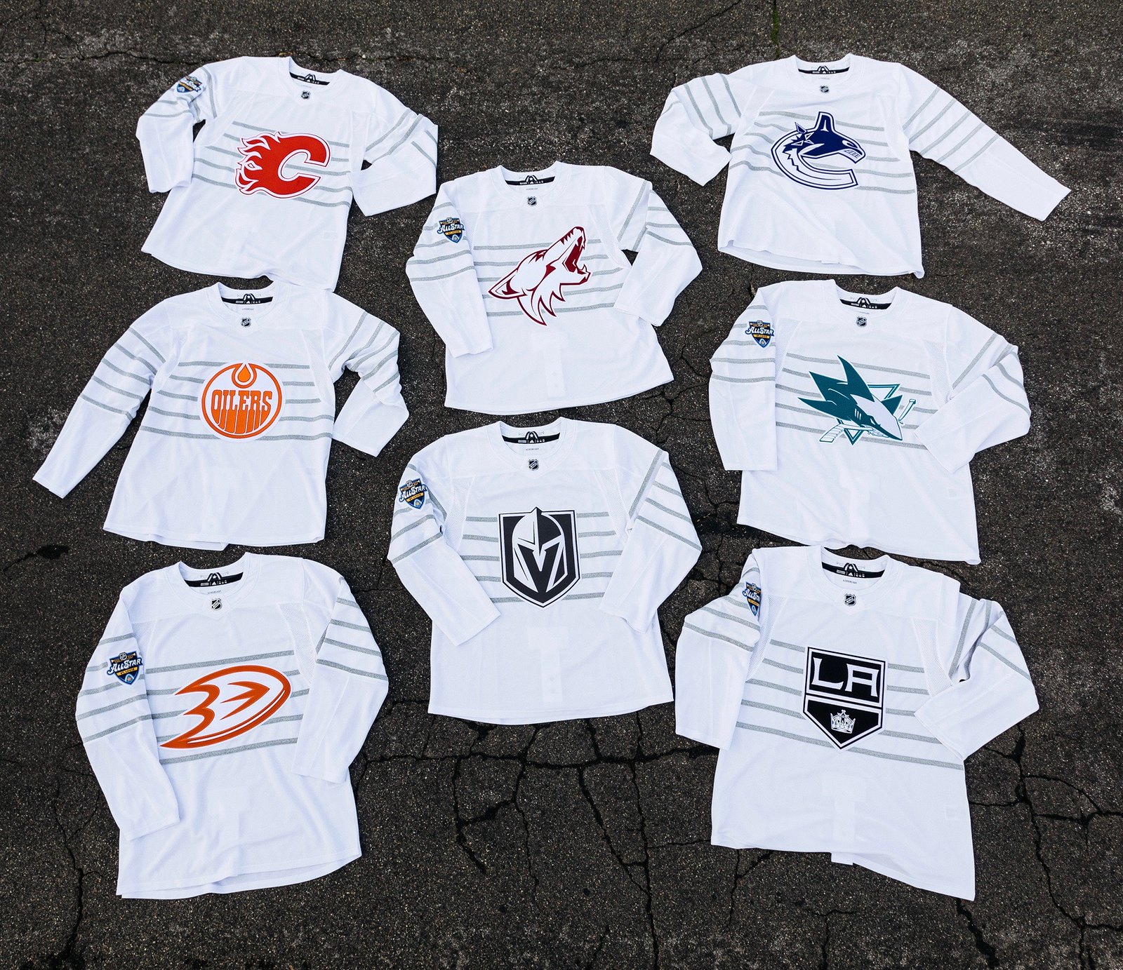
Not exactly. They’re rendering the team logos in one color plus white. Here, for example, are the home and away jerseys for the Atlantic Division teams:

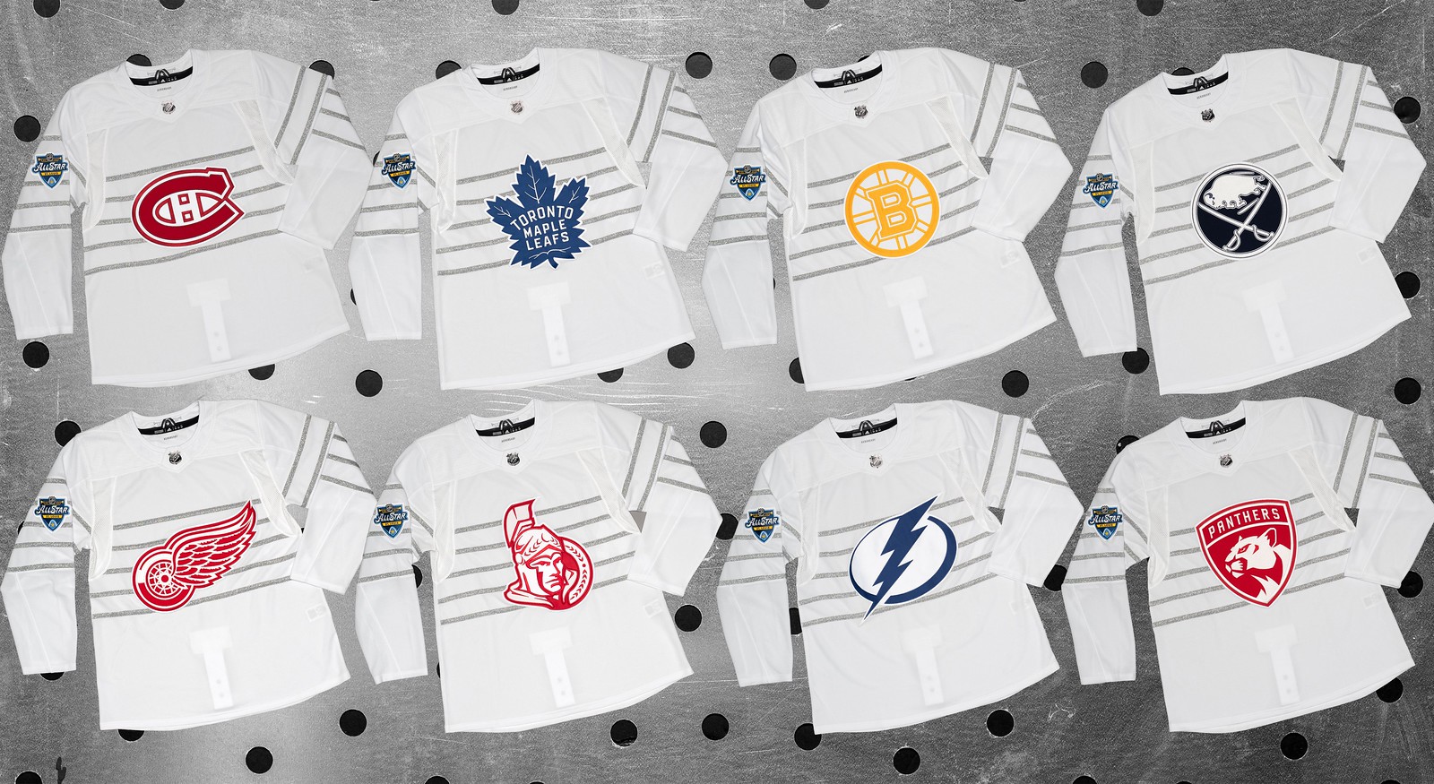
As you can see, some crests have handled this treatment a lot better than others.
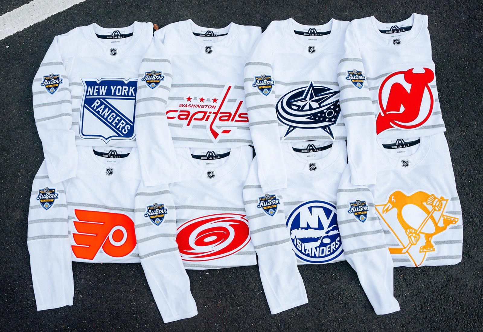
While we’re at it, let’s look at the Metropolitan Division jerseys:

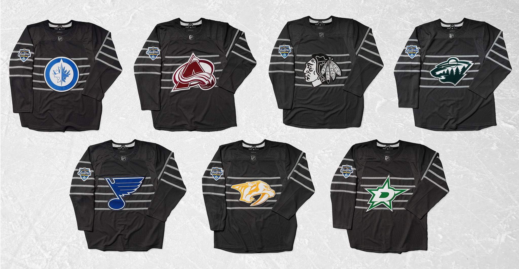
And the Central Division:

And, finally, the Pacific Division:

Wait, why are there two versions of each team’s jersey?
Remember, for the past few years the NHL All-Star Game has been a single-elimination tournament, so a player may have to wear a dark jersey in one game and then switch to a white jersey in the next game.
Isn’t it also so they can trick gullible fans into buying two jerseys?
I imagine that also has something to do with it, yes.
What’s with the stripes?
They supposedly reference the staff, or lines, on sheet music, because the Blues are the host team (read: the usual “storytelling” silliness). Although it’s hard to tell in the photos, they’re silver.
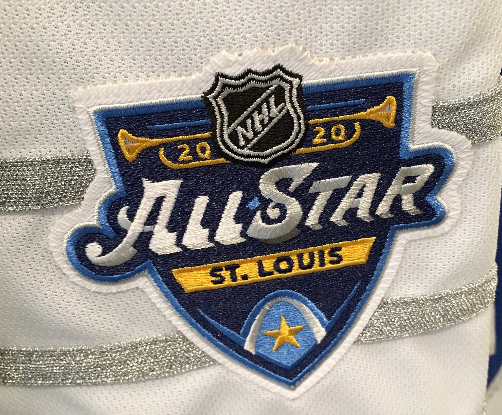
Can we get a closer look at the sleeve patch?
You betcha. I took this shot back in October (and this pic also gives a better sense of the silver stripes):
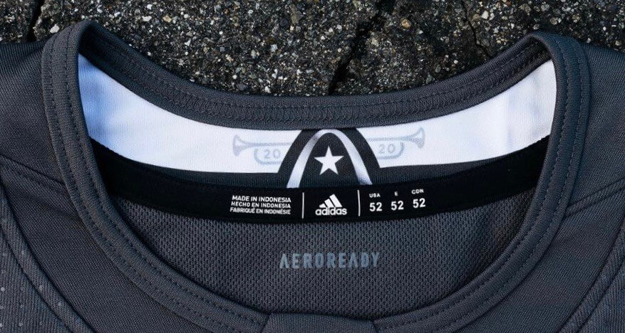
It looks like there’s some sort of design on the inner collar. Can we get a closer look at that?
Can do. Here you go:
What do the jerseys look like on the back?
Beats me! The samples I saw in October were blank on the back, and the NHL and Adidas didn’t bother to release any rear-view photos yesterday. Even the NHL’s online shop shows them with blank backs.
What do the pants, socks, helmets, and gloves look like?
Beats me! During that October media event, I practically begged my Adidas contact to showcase full uniforms, not just jerseys, when they unveil stuff. I guess I didn’t beg hard enough.
Why did they show the Metropolitan Division jerseys all folded up, instead of showing the full design?
Beats me! The original versions of those two Metropolitan photos were even worse, because they were oriented diagonally, but I rotated them for today’s entry. The things I do for you people!
Why did they show the Central Division away jerseys, which are white, on a white background?
Beats me!
Why did they show the Pacific Division jerseys on cracked, beat-up blacktop?
Beats me!
Is there a press release or any other official info?
Yup — look here.
What do you think of the designs?
It’s hard to give a proper assessment without seeing the full uniforms (grrrr). Based on the limited info we have, I’d say they’re not completely awful, but the one-color logo treatment feels cheap and the overall feel is more akin to practice or fashion jerseys than anything else.
Giants naming names? The Giants are one of two MLB teams that use NOBs on the road but go NNOB at home (the other is the Red Sox). They’ve used that format since they switched to their current uni set in 2000. So I was surprised to receive this email from a reader back in November:
Giants season ticket holder here. I have been surveyed many times in the last year about the Giants adding last names to their home. It appears to be happening. I voted against it. … Heard ownership wants fans to easily learn new young players’ names. … Would like to know if you have heard or seen anything similar.
I hadn’t heard anything about that, and the MLB Style Guide still showed the Giants going NNOB at home for 2020, so I figured the guy was simply mistaken. I told him I hadn’t heard anything and then pretty much forgot about it.
But then, a week or so ago, a few people started tweeting retail listings for authentic Nikefied Giants home jerseys with NOBs. Hmmmm. So I emailed a source with the Giants — but their offices were closed for the holidays. And then my source was sick for a few days.
But now I can confirm that the Giants are not adding NOBs to their home jerseys this season. So why are they selling NOB-inclusive home jerseys? Beats me!
Click to enlarge
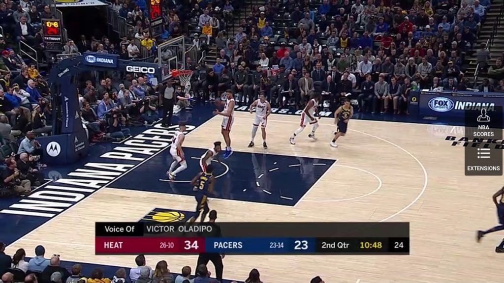
Free throw circle update: It’s been a while since we last discussed the subject of NBA free throw circle dashes, but Twitter-er @nomuskies, who got us started on this topic a few months ago, noticed last night that the Pacers’ court uses seven dashes — a configuration that I don’t think we’ve seen before.
When I first wrote about this topic, I mistakenly had the Pacers listed as a six-dash team. Some additional photo research reveals that they’ve actually been using seven dashes since the start of the 2017-18 season. (Prior to that, they had six.)
So now we’ve seen NBA courts with five, six (the most common number), seven, and 10 dashes. Crazy!

Click to enlarge
Too good for the Ticker: Oh baby, how awesome is this circa-1900 shot of the Cal-Berkeley baseball squad! The sweaters, the lace-up collars, the “California” script — magnificent!
The one guy in the “New York” uniform is New York Giants outfielder George Van Haltren, who was hired to coach Cal in 1900. So enderingly weird that he chose to wear his big league uni for the team photo!
(Big thanks to Hall of Fame curator Tom Shieber for tweeting this photo, and to Bob Andrews for bringing it to my attention.)

ITEM! Membership raffle: Last month reader Tyler Haney won a Uni Watch membership that was donated by reader David Cline. Now Tyler is paying it forward by providing another membership to raffle off, which we’ll do today.
This will be a one-day raffle. To enter, send an email to the raffle address by 8pm Eastern tonight. I’ll announce the winner tomorrow.
And speaking of raffles, congrats to Mike Lucia, who’s the winner of this month’s Vintage Brand raffle. He’s a Florida State alum, so he’s chosen this FSU canvas as his prize. Big thanks to Vintage Brand for sponsoring these giveaways each month!
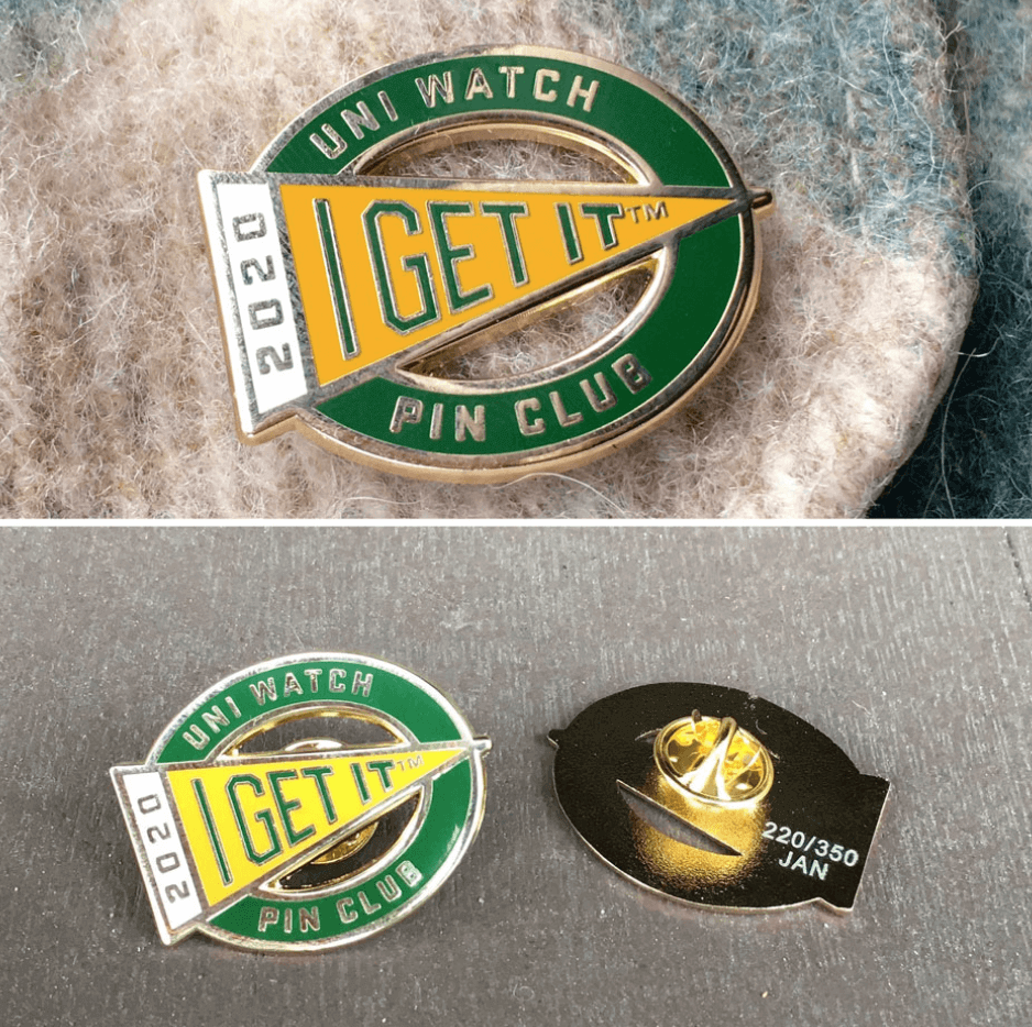
Pin Club reminder: In case you missed it on Wednesday, I’ve partnered with the great Todd Radom to create the Uni Watch Pin Club, which will feature a new limited-edition enamel pin design for each month of 2020. It’s a really fun project, and I’m super-excited to be collaborating with Todd on it.
The January pin is now available (we sold 82 of the 340 available pins yesterday — not bad! — so 258 are remaining), and you can get the full scoop on all the Pin Club particulars here.
The Ticker
By Paul

’Skins Watch: Killingly High School in Connecticut changed the name of its sports teams from Redmen to Red Hawks over the summer, but now the school board has voted to change it back. It’s the first time I’m aware of that a Native-based team name has been restored after having been eliminated (from @mikeDfromCT).

Baseball News: New softball uniforms for UW-Green Bay (from @The_Real_Kub). … Check out the amazing brown/yellow tequila sunrise design that a Canadian team was wearing back in 1981. Interesting to see that that template had already caught on by then (from Wade Heidt). … The bank that turned the name of the Braves’ ballpark into an ad recently changed its name, so the ballpark is getting a new name to match. “Still gross either way,” says Griffin Smith, accurately. … Spectacular photos from the Pirates’ 1904 home opener here (from @MrBudziszewski). … New 100th-anniversary uniforms for UCLA. Love how they used gradient-patterned lettering — just like 100 years ago! (From M.E. Marrone.) … The Japanese Baseball Hall of Fame has a very cool bullpen buggy.

Pro Football News: The Vikings will be wearing white over purple for their upcoming playoff game against the 49ers — and as you can see from the headline on that page, they don’t seem to realize that the game is taking place on Saturday, not Sunday (from Matt Snyder and Ryan Murphy). … Here’s a weird one: For the 1983 Cards/Packers playoff game in Green Bay, one end zone had a Packers helmet while the other one had a blank, Browns-esque helmet (from Cork Gaines). … Columbus’s new arena football team are holding a “name the team” contest (from Kary Klismet). … George Perles, who was an assistant head coach with the Steelers and then became the head coach at Michigan State, died yesterday. According to a quote from this remembrance, “George Perles modeled Michigan State after Chuck Noll and the Pittsburgh Steelers. … Our uniforms were even modeled after the Steelers, down to the stickered emblem only on one side of the helmet” (from Jerry Wolper). … You know how NFL teams like to use helmets as desk props at press conferences? It looks like the Cowboys may have used two banned helmet models for yesterday’s Mike McCarthy presser. … Vikings TE Kyle Rudolph says he gave his gloves from last Sunday’s game to a media member who said he was going to use them for a charity benefit — and now the gloves have ended up on eBay. … I’ve seen lots of modified facemasks over the years, but I’d never seen this one worn by Rams RB Les Josephson in 1970 until Pro Football Journal tweeted it yesterday. … Rams RB Todd Gurley attended last night’s L.A. Kings hockey game and wore a Tyler Toffoli Kings jersey. … A player shown in the background of this photo from a recent Ravens practice was wearing a jersey with the Nikelace and the neck roll. The Ravens haven’t worn a jersey like that since 2012, so that jersey must be pretty old! Interesting that they’re still using it. Also, the hoodie worn by coach John Harbaugh in that shot is from the merch line of WR Marquise “Hollywood” Brown (from Mike Strittmatter).
College Football News: Here’s our first look at the national championship patch on LSU’s jerseys. This marks the first time a team has worn the patch on that side (from many readers). … Lots to like in this photo of the 1896 Santa Clara football team. “Sweaters with lace-up fronts, turtleneck shawl/cape collars, large chest logos, and striped socks to boot!” says Kary Klismet. … Blaise D’Sylva wrapped up his team-by-team survey of college football helmet history yesterday with Vanderbilt. … As we noted last week, the Orange Bowl trophy had “2020” on it, even though the game was played in 2019. But the trophy delivered to the winning team has “2019.” Hmmmm (from @dddaveee). … Cross-listed from the pro football section: George Perles, who was an assistant head coach with the NFL’s Pittsburgh Steelers and then became the head coach at Michigan State, died yesterday. According to a quote from this remembrance, “George Perles modeled Michigan State after Chuck Noll and the Pittsburgh Steelers. … Our uniforms were even modeled after the Steelers, down to the stickered emblem only on one side of the helmet” (from Jerry Wolper).

Hockey News: New military cosplay jersey for the WHL’s Spokane Chiefs (from robfromsasky). … Reprinted from yesterday’s comments: After a mic failure in Detroit, Red Wings fans sang the Canadian national anthem on their own prior to Tuesday night’s Wings/Habs game (from Derek Yoder). … Here’s a look at the Capitals’ uni and logo history (from Kary Klismet). … Cross-listed from the pro football section: Todd Gurley, who plays for the NFL’s L.A. Rams, attended last night’s Kings game and wore a Tyler Toffoli Kings jersey.

NBA News: Disappointing news out of Dallas, where a little birdie tells me that the Mavs, who’ve been the NBA’s only ad-free team this season, will likely have a new ad patch soon. Sigh. … An NBC Sports article about how the Warriors are hoping to acquire Bucks F Giannis Antetokounmpo shows him Photoshopped into a Warriors uni that hasn’t been worn in a decade. Odd choice (from Pedro Naranjo).

College and High School Hoops News: Interesting argyle trim and even more interesting white-on-white block-shadowing for Murphysboro High School in Illinois (from Reid Cure). … Purdue will wear uniforms honoring former superfan and cancer player Tyler Trent on Jan. 24 (thanks, Phil). … Nevada PG Jazz Johnson (now there’s a name) blew out a shoe in the first half of last night’s game and had to wear mismatched shoes for the rest of the game.

Soccer News: MLS is planning lots of initiatives, including a new NOB and number font, for the league’s 25th anniversary (from our own Jamie Rathjen). … New away kit for Boca Juniors. … New details are emerging regarding Arsenal’s three new kits (from @rileycakes08). … New rear-shirt advertiser for Pumas (from Ed Zelaski). … Aston Villa wore their claret change shorts at Leicester yesterday, to avoid a kit clash. … As if soccer jerseys didn’t already have enough advertising, Manchester City further debased itself by using an NOB as an advertising prop. … New kits for Brazilian side Figueirense. … New kits for Japanese side Sanfrecce Hiroshima (from Jeremy Brahm). … Joe Mansueto, owner of MLS’s Chicago Fire, says fans should give the team’s much-maligned new logo a bit of time for people to get used to it.

Grab Bag: New logo for the toy manufacturer Fisher-Price. … A video making fun of the new PlayStation 5 logo has gone viral. … The police department in Riley, Kan., is field-testing some new uniforms. “The potential uniform change is the result of suppliers carrying fewer French blue uniform shirts, as demand for the traditional color among police departments decreases in favor of darker hues,” says Kary Klismet. … New 50th-anniversary logo for Long Beach State volleyball (from Jeremy Brahm). … Some parents in Texas were showing support for LGBT students by posting a rainbow-striped version of the local school district’s logo on social media. Now the school district is threatening them with legal action for altering the logo. … No photo, but I had a routine dental cleaning yesterday and was surprised to see my dentist wearing French cuffs and cufflinks! I appreciated the nod to classic menswear style, but if you’re poking around in people’s mouths all day, wouldn’t you want to be able to roll up your sleeves? Weird.
The Giants have sold “authentic” home jerseys with NOB for years! I can’t tell you how much it bothers me to see it. It’s almost as jarring as seeing Yankee pinstripes with names.
This is the first I’ve seen that the club is considering adding names to the home jerseys. I hope that they don’t.
I really hope they do!
I thought we saw a seven-dash circle before, because I remember liking the symmetry. Either way, if we’re going to vote, I vote for seven. But it isn’t, of course, a vote.
I think we saw seven in an old NCAA photo, not NBA..? But maybe I’m misremembering.
Oh, most likely NCAA… I’ll try to look in a bit. I thought you were speaking generally, but now I realize you specified NBA.
” Spectacular photos from the Pirates’ 1904 home opener”
Love the scalloped(?) infield and cloverleaf(?) mound!
And the clean, 1904 Pittsburgh air.
Yeah, those pictures gave me lung cancer by just looking at them!
*coughcoughcough*
Lee
“that a Canadian was wearing”… While that’s probably an accurate statement, I think you’re missing the word “team” in there.
Indeed. Fixed!
RE: Les Josephson facemask….. Another zoomable pic on this page. I still can’t figure out what’s going on. Must’ve been to protect a broken jaw or something. A cage mask on a running back was very rare back then.
link
1. I never understood why the Giants (or Yankees or Red Sox) would put more elements on the Jersey than should actually be there. Embroidery and sewing costs materials and money! Never mind that it looks inaccurate and sloppy.
2. The Kyle Rudolph gloves story will hopefully have a happy ending. The guy who bought the gloves on eBay is willing to donate them to the children’s hospital in Minnesota where Rudolph does a lot of charity work. If he does not get the gloves sent to him, he will donate the amount of the winning bid instead.
3. Didn’t MLS just change their number font to something decent a few years ago? Why change? They finally got something that worked…
4. The new Chicago Fire logo is hot garbage. And a major step back.
My understanding for why the Yankees have names on the back of retail jerseys is to better differentiate authentic ($$$$$$) and replica ($$$) retail products. For example, the Phillies replica jerseys had sown on numbers that were either simple block font or a red number with simulated white outlines, as opposed to individually stitched red number on top of white to create the outlines. Additionally the name was also done in simple red block font rather than their custom font (ditto for the outlines). Given that the Yankees uniforms are incredibly simple in their design, to make it apparent the cheaper replica jerseys were in fact replica, and to entice you to pay more for the real thing, they added the names on the back.
Hey, Paul!
Just noticed that the email link for the membership raffle goes to link, but I don’t think that’s the raffle email if I’m correct.
Fixed, and all entries now forwarded to the proper address. Thanks!
“Here’s a weird one: For the 1983 Cards/Packers playoff game in Green Bay, one end zone had a Packers helmet while the other one had a blank, Browns-esque helmet (from Cork Gaines).”
Packers did this as far back as 1977 for games at Lambeau (but not the three games a year they played in Milwaukee). This video below is from This Week in Pro Football for Week 2 of the ’77 season. See the Packer helmet in one end zone, then stay with it for a minute to see an Oiler fumble return for a TD and the blank white helmet in the other end zone.
link
This carried on until at least 1983 because the Redskins and Packers played a 1983 MNF game where the end zones had the different helmets (see the clip below).
link
That “Skins game also has Joe Washington and his 2-bar facemask. the last in the league?
Mark Duper wore one into the early 90s. Not sure if he was the last one or not though. Interesting thing with Duper is that when he started his career in 1982, that style of mask was already on its way out.
So not only was Joe Washington known for his 2-bar facemask, but he was also the only Redskins player that did not wear the one-year, “tucked feathers” logo that they wore in 1982. Presumably this was because he wore a clear shell helmet that was decorated from the inside out, and it was too much work to redo his helmet. Actually, the helmet manufacturer made him a helmet with the tucked feathers for 1983, but it was never worn, since Washington switched back to the straight feathers that year.
I found this info from this article on Helmet Hut, which portrays Joe Washington as someone who Gets It™.
link
Is anyone surprised by the NHL AS costumes anymore or any AS jersey from any of the big 4 leagues at this point? Brutal
Not MLB! Thankfully, players still wear their regular team uniforms for the MLB ASG (well, except for the caps).
Yep – they don’t look as good as they used to. Having trouble deciding what was my favourite NHL All-Star uni from the past.
I loved these when they wore black with orange trim:
link
However, when it is an All-Star game, can’t go wrong with a lot of stars:
link:no_upscale()/cdn.vox-cdn.com/uploads/chorus_asset/file/13711255/GettyImages_53120870.jpg
link
The Red Sox have sold NOB home white jerseys for as long as I’ve been a fan. Even the “authentic” versions. Same for Yankees. Its an abomination but people don’t seem to care.
I’ve never seen an authentic Yanks jersey for sale with a NOB. Definitely seen the ubiquitous replicas, of course. Do you have a link for an authentic Yanks jersey with NOB? (Of course, if it exists, the argument can then be made that the jersey is NOT authentic, regardless of how it’s labeled by the seller).
With the personalized NOB jerseys, I wonder how many people who buy them actually know the teams themselves don’t wear NOBs on the home jerseys (Red Sox, Giants) or any jerseys (Yankees)? They may not know or care, and if they’re willing to buy them then MLB is more than happy to sell them!
The one color treatment on the crests of those NHL gamers is hideous. Even the practice ones have full color crests. Make the rest of it as ugly as you want, but at least make the crest full color.
The reason the NOB jerseys exist is the players get royalties from merch with their names on it. I have a feeling it was the MLBPA’s idea to sell them, as guys on NNOB teams were getting less money.
None of my Giants cream/orange jerseys of the current era have NOB. White jerseys from the ’80s and ’90s era? Yup.
My assumption is, that because MOST fans don’t actually care about uniforms too much, the ones with NOBs actually WANT the name to be there. They are supporting the player, not the uniform integrity.
Lee
I’d much prefer a NNOB vs the NOB especially for such an expensive jersey. A home Giants jersey with 17 can be anyone and never goes out of style while if you got a NOB of say Joe Panik then it feels silly to have when he’s gone. Like nonlegendary players example being seeing Cliff Lee or Hunter Pence Phillies jerseys.
That article on the Caps’ logos and uniforms begs the obvious question I frequently ask: why do the Capitals use lower case (rather than capital) letters to spell “capitals” or “caps” on their sweaters?
Presumably, you’ll have to ask the guy who also did the Bullets’ and the Capital Centre’s logos with the lowercase letters.
those never bothered me, but the team wordmark “capitals” … seems to invite using capital letters, in my mind, at least
I mean a team called the giants wouldn’t use a teeny tiny font for it, I shouldn’t think
*checks NY Giants helmet logo*
Uh, ‘scuse me sir…
I always thought “Capitals” referred to the fact DC is the capital of the US? Or is it supposed to mean capital letters?
Why oh why are they using the Rangers’ logo and not the traditional wordmark? They’ve worn the logo on the jersey for all of two out of 90+ seasons.
And for the second straight year they are the ONLY team not wearing a logo from at least one of their current jerseys.
As a kid growing up in Michigan during the George Perles days at MSU, I couldn’t stand how the football team only had the block “S” on one side of the helmets. With the Steelers, it looked somehow more traditional and industrial. With the Spartans, it just looked cheap.
Example photo: link
Exactly until today, I had no idea those Michigan State uniforms were supposed to modeled after the Steelers.
Huh.
And that one S was dumb, no matter what the reason. The Spartan logo was so much better, and should have been on both sides of the helmet.
Lee
That Murphysboro High School jersey is GORGEOUS. I usually hate drop shadows too; honestly reading about the argyle sides and odd drop shadow had me cringing right up until I opened the link.
Also, I’m the type of hypocrite that hates watching All-Star games with city/game specific uniforms, and bitches about how it’s way more visually appealing to see each player in their regular uniform. BUUUUUT, after the fact I love going back and looking at photos and videos of these designs as they become more and more dated looking.
The Pacers 7 Dashes was already mentioned on the November 4 blog post. :)
link
Ah, thank you! It’s all begun to blur together in my mind.
Great picture from the 1900 Cal baseball team. Besides the “New York” jersey of the coach, I wonder why one of the players is wearing a “Riverside” jersey. University of California Riverside didn’t start until 1954. There are a lot of Riverside High Schools from around the country, but none in Riverside, CA. Also wonder who the guy was with the suit and Bowler Hat?
Riverside Polytechnic High School was founded in 1887 as Riverside High School. It was renamed to its’ current name in 1911ish.
I noticed that inside the collar, the Adidas brand text no longer says “Adizero” but instead “Aeroready.” Is this a new jersey template or construction format or something else?
Strangely, the NHL press releases doesn’t say a word about it and still refers to them as “Adizero Authentic.” Weird.
I saw someone on Twitter say that it’s just a new name for the same template. But I don’t know if that’s accurate.
Can’t wait to get my pin! My wife may hate you for giving me something else to collect, but small price to pay, haha. Looking forward to seeing the rest of the designs.
You are right that cuff links, while a nice sartorial touch, are not the best look for a dentist. In fact, the reason many doctors wore bow ties in the old days is to avoid their tie interfering with a patient’s examination!
French cuffs on a dentist says, “You know I already make a lot of money, but want to show you I REALLY make a lot of money and rub it–almost literally–in your face”.
My kids pediatrician wears exclusively very expensive custom painted Jordan’s(my oldest son asked where he got them as if we cloud afford them) with color matching watches that easily cost more than my car. But, I mostly care about the fact that he’s smart and good with my kids.
maybe he was subtly hoping/suggesting that Paul would give him a free set of Uni Watch cuff links. They’re awfully sharp looking, and I’ve loved wearing mine, so I wouldn’t blame him.
As a doctor who wears a (non-bow tie) tie every day, you can keep your tie tucked against your body during an exam. Or today, when most hospitalized patients are dealing with some sort of resistant pathogen, we wear disposable barrier gowns. Never hit a patient with my tie in almost 20 years.
The NHL allstar game jerseys if you were to remove the crests remind me of sweaters that you’d find at Old Navy.
Last year if you wanted a black Stars All-Star jersey you had to go to the fake Chinese sellers to get one, so don’t give the NHL too much credit.
“They supposedly reference the staff, or lines, on sheet music, because the Blues are the host team”
For what it’s worth, I’ve paid no attention to the NHL this season, did not know where the game was being held, and my first wonderings when seeing the jerseys were “Are those musical staffs?* Is the game in St. Louis?** (Which team is the treble clef?).” So I guess at least the design is somewhat working as intended.
* Apparently the correct pluralization is “staves”
** Duh, self — the jerseys in the title image feature the Blues logo
New 100th-anniversary uniforms for UCLA. Love how they used gradient-patterned lettering — just like 100 years ago!
Not just gradient, but DIGITIZED gradient! That just screams “1920,” doesn’t it?
RE: NHL All Stars tops: what’s that distinctive “T” that’s just visible on the white jerseys? are they loops to attach to their pants?
Yep, those are the “fight straps” showing through.
1. The Wimberyly, TX school district sure is showing its ass. America in 2020 on full display.
2. Regarding the Riley County Police Department uniforms, I’m sure the color change all comes down to wanting better performance (colors = performance!) and showing “less dirt, grime and wear” and not at all to do with wanting to look more authoritarian and militant. No sir. Definitely not the latter. Nope.
3. The NHL All-Star jerseys stink out loud.
Since the all star uniforms in recent years seem to be resoundingly hated in all 4 major sports leagues…5 if you add in MLS…maybe there could be a series of design/redesign contests over the course of a year to redo (or, in the case of MLB, do) the all star uniforms for each league. (Hoping that I haven’t forgotten any previous design contests that might have been for this purpose.)
Who hates MLB’s ASG uniforms??
The hats, man, the hats. They had to ruin something akin to perfection with those fugly hats.
Surprised it was an Indonesia made jersey they showed you and not the Canadian made jerseys the players wear. If you want inspiration for what this year’s should of been just look at what the sabres wore for their skills competition.
link
RIP, George Perles. I remember some epic battles between his Spartans and Hayden Fry’s Iowa Hawkeyes in the ’80s, when both programs helped break Ohio State and Michigan’s “Big Two and Little Eight” stranglehold on the Big Ten title.
This image:
link
…does a pretty good job of demonstrating how Michigan State’s uniforms under Perles were meant to mimic the Steelers’:
link
…with the block athletic font numbers, the Northwestern stripes on the sleeves, and the wide single-color stripe on the pants (not to mention the thin single-color stripe on the helmet and the log on just one side).
I found it curious how both Iowa and Michigan State intentionally copied the Steelers’ look simultaneously:
link
Iowa was much more successful at it, in my opinion, but they did have the built-in advantage of an identical color scheme. Frankly, Michigan State should have never gone away from the Spartan helmet logo on their helmets. The block “S” made the desing much plainer and less interesting than it could have been.
Sadly, we won’t be seeing these jerseys at the NHL ASG…
link
First time the team in white will wear the National championship patch with a black football
Re: Giannas photo-shopped in the Warriors “We Believe” Uniforms, the Warriors did wear them in their final regular season game at Oracle in Oakland.
link
Re: Team Manitoba.
I’ve taken a look through the Canadian baseball website and I actually don’t see a record of a competition called Canadian Bison Championship, though I understand such a competition occurred through the 1980s.
That being said, this is the first instance of Rainbow Guts that I have seen where the wordmark is on a nameplate affixed to the front of the jersey. Most of the rest are either sewn on or silkscreened.
Also, in terms of timing: in 1981, a certain U.S. college baseball team won the College World Series wearing this.
link
The template was being used in the early 80s by a number of U.S. college baseball teams such as South Alabama, Tulane, UNC, and (we think) Louisiana State, though we haven’t seen proof of the latter.
One other thing: no maker’s marks on these, but I know Cooper made these for Canadian consumption. I wonder if these were made in the U.S. by Medalist/SandKnit and imported.
I always assumed the sleeve stripes were printed, like most other jerseys. Was surprised to see they were actually sewn on. Think this is the first time I have seen a jersey that this has happened.
I got really excited when I read new 100th anniversary uniforms for UCLA. Then, I clicked the link and saw them. Blech.
They did a great job with the 1940 uni in ~2015 and totally missed the opportunity this year.
You sure that Cal baseball photo isn’t just a bunch of hipsters in Berkeley that gathered in a park the other day?