Click to enlarge
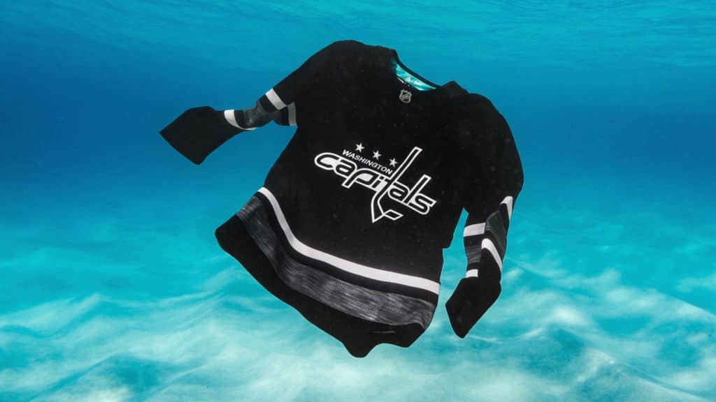
The NHL unveiled its All-Star jerseys yesterday. The good news is that, for the first time, players will wear jerseys with their regular team crests — much better than wearing league or conference logos. The bad news is that the color palette will consist exclusively of black and white. If this sounds familiar, it’s because it’s exactly what the NBA did last year for its All-Star Game. Innovative!
An Adidas press release takes the embarrassing route of claiming that the colors are “inspired by the colors of the game — crisp white, like a fresh sheet ice [sic], and contrasting black, like a brand-new puck.” Of course, you could make the same ridiculous claim if the uniforms were red and blue (“inspired by the red line and the blue line!”) or red and white (“inspired by the colors of the goalposts and the net!”) or any number of other tortured rationales.
The other notable storyline here is that the uniforms are made of upcycled plastic marine debris (part of Adidas’s collaboration with the environmental group Parley for the Oceans, which in recent years has also generated a footwear line). If this sounds familiar, it’s because it’s exactly what MLS did last year for Earth Day. Innovative!
The ocean plastic thing is commendable, but Adidas decided to emphasize the oceanic aspect by setting up a bizarre photo shoot in which all of the jerseys were photographed underwater. You can see the photos — nearly 200 of them — here.
Leaving aside the logistical and budgetary issues that these photos must have entailed, didn’t it occur to anyone that it’s more than a little incongruous to do an underwater shoot for a sport played on frozen water? Seeing hockey jerseys underwater just makes me think of that time I fell through the thin ice while playing pond hockey as a kid.
Anyway. The NHL All-Star Game will take place on Jan. 26, but I have a friend’s birthday party to attend that day and you’ll probably find something else to do too because who has time for pointless round-robin three-on-three exhibitions, right?
Can’t wait for those Pro Bowl uniforms!
And another thing: It’s pretty incredible that the NHL and Adidas managed to present nearly 200 photos of the All-Star jerseys yesterday without providing a single photo of the pants, socks, helmets, or gloves. It’s like the rest of the uniform doesn’t even exist — all that matters is the jersey.
This fits into a worrisome trend that’s begun to affect the way people talk about uniforms — a trend in which the word “jerseys” has begun to supplant the word “uniforms.” For example, it’s becoming increasingly common for a team to unveil an alternate uniform and announce it simply as a new “jersey.” In many cases, as with yesterday’s NHL All-Star news, they don’t even bother to show photos of the full uniform — only the jersey.
This jersey-centric approach has spread to fans. People will ask me if I’ve seen “any leaks of the NY Jets’ new jerseys,” for example, or they’ll say, “The Heat’s new ‘Miami Vice’ jersey looks great on the court.” No mention of the rest of the uniform — just the jersey.
This is yet another negative outgrowth of jersey retailing. Teams focus on presenting and talking about the jersey because that’s the uni element that’s for sale. Fans focus on the jersey because it’s the uni element they get to buy. So the rise of “jersey” as a catch-all term both reflects and reinforces the merch-industrial complex. It feeds and sustains the notion that a uniform isn’t something a player wears; it’s just something a consumer buys.
Over the last year or two, I’ve noticed media outlets being infected by this same pathogen. Articles that used to have a headline touting a team’s “new uniform” will now often just refer to the “new jersey,” as if the rest of the uniform were just an afterthought.
That trend reached a new low yesterday. It began when Ohio State quarterback Dwayne Haskins, who’s headed for the NFL draft, posted some Instagram images that showed him Photoshopped into various NFL uniforms. Here’s one showing him as a Bengal:
As you can see, most of Haskins’s jersey was not Photoshopped — it’s just his regular Ohio State jersey. So how did USA Today’s Bengals blog write about this? With the following headline: “Ohio State QB Dwayne Haskins posts picture of himself wearing Bengals jersey.”
This headline shows the absurdity of conflating the jersey with the rest of the uniform. The headline doesn’t just ignore the rest of the uni — it’s objectively inaccurate.
Sigh.
Click to enlarge
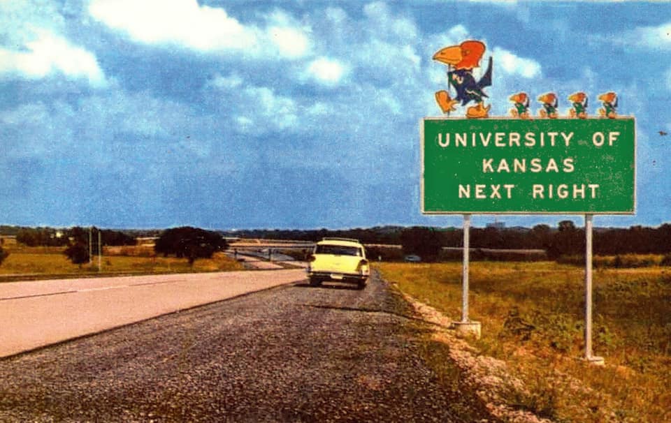
Too good for the Ticker: I don’t know how old this photo of I-70 is — 1960s, I’d say, judging by the car by the side of the road — but it sure is a beauty. “That’s certainly a Manual on Uniform Traffic Control Devices violation,” notes reader William Yurasko, who spotted the photo on the AA Roads Facebook page. “I wonder how long it lasted.”
The Ticker
By Paul

’Skins Watch: A state commission is considering whether a Pennsylvania school district should stop calling its teams the Redskins (from Mike Driscoll). … Dozens of residents packed a middle school gymnasium in Maine to discuss whether the local high school should keep calling its teams the Indians. Supporters of the name were outnumbered by those who think it should be changed (from John Dankosky).

Baseball News: The Triple-A New Orleans Baby Cakes are moving to Wichita, and fans there are being invited to submit ideas for the team’s name. As we’ve seen in other cities, the naming contest may be little more than a sham exercise, so participate at your own risk. (As an aside, several people have already suggested “Linemen,” which absolutely should be the name, but it doesn’t seem sufficiently Brandiose-friendly to have a chance.) … The A’s apparently have a new logo marking the 30th anniversary of the 1989 “Battle of the Bay” World Series. I’m not aware of any plans for it to be worn as a patch or anything like that, but maybe they’ll use it during interleague games against the Giants. … Speaking of the Giants, their ballpark is getting a new corporate name (from Jordan Jakobsen). … The Padres’ 50th-anniversary logo, which is set to be officially unveiled on Saturday, has leaked. I can confirm that the leak is legitimate (from HJ Preller).

NFL News: Here’s Eagles QB Nick Foles’s career record broken down by uni combo (from CJ Fleck). … In the middle of the 1990 playoff game between the Bengals and Oilers, Houston’s equipment staff had to break out the needle and thread to repair WR Bernard Ford’s jersey (from Brice Wallace). … For reasons that aren’t clear, at least to me, Giants RB Saquon Barkley wore an Oklahoma State jersey for an interview with a Philly-area TV station (from Ty Schwab). .. New Packers HC Matt LaFleur must have read Uni Watch on Tuesday, because he wore a green tie to his introductory presser yesterday (from Ryan Wing and Scott Hurley). … Here’s a piece on the cleaners that clean the Eagles’ uniform (from @PhillyPartTwo).
College Football News: The guy who drove Ole Miss’s equipment truck for many years recently died. The truck led his funeral procession (from Adam Apatoff). … Cross-listed from the NFL section: For reasons that aren’t clear, at least to me, New York Giants RB Saquon Barkley wore an Oklahoma State jersey for an interview with Philly-area TV station (from Ty Schwab).

Hockey News: The Wallaceberg Lakers, a Canadian junior team, have some really nice retro sweaters for an upcoming outdoor game. … New alternate jersey uniform for Penn State (from Chris Grosse). … G Liam Hughes was traded from the WHL’s Seattle Thunderbirds to the Lethbridge Hurricanes at the start of January but is still wearing his Thunderbirds mask (from Wade Heidt). … Great old shot of Bobby Orr — or at least I think that’s who it is — wearing a Bruins championship T-shirt (from Greg Gangemi). … The Golden Knights are wearing white at home for tonight’s game against the Sharks (from Zeke Perez Jr.). … Officials in the German Ice Hockey League are wearing panda-themed uniforms as part of an initiative with the World Wildlife Fund to protect endangered species. … This must really be necktie awareness week or something: NBC analyst Pierre McGuire wore a red tie while interviewing Predators coach Peter Laviolette during last night’s Preds/Blackhawks game, and Laviolette called him out for it. McGuire promised to wear a gold tie the next time he’s working a Preds game (from our own Alex Hider). … Here’s an interview with Michigan’s equipment manager (from Steve Ceruolo).

NBA News: Heat G Dwyane Wade and Nuggets G Isaiah Thomas exchanged jerseys on Tuesday night. … New 76ers F Haywood Highsmith will wear No. 7.

College Hoops News: Check it out: Legendary coach John Wooden wearing John Wooden! (From Matt Shevin.) … New uniforms for Wabash College (from Derek Bailey). … Throwbacks last night for Nevada (from Walker Hilton).

Soccer News: New uniforms for Gamba Osaka (from Ed Zelaski). … This is pretty cool: Brazilian airports now have soccer jersey-themed vending machines (from @tedkerwin). … Argentinian club Rosario Central has produced an in-house kit because its new Under Armour uniforms aren’t available yet (from Josh Hinton).

Grab Bag: Here’s a look at how Sue Storm Richards of the Fantastic Four designed the superhero group’s costumes. … The site Abandoned Southeast is exactly what it sounds like: photos of abandoned sites around the southeastern United States. Really great stuff (big thanks to my pal Rob Walker). … New logo marking the 50th anniversary of Mario Andretti’s 1969 Indy 500 win. Additional info here (from @ImMrNice_guy). … Here’s a look at the history and evolution of the Adidas logo (from Josh Hinton). … Whoa, check out this artist who makes collages out of pencil-sharpener shavings (from the Tugboat Captain). … The U. of South Carolina is getting a brand redesign, but the athletics dept.’s familiar block-C is being retained. … A small entertainment company in San Antonio is involved in a logo dispute with Monster Energy. … The Aussie Football League is going with a pink ball for this year’s AFLX preseason matches (from Jeremy Brahm).
Considering the solely black or white kits worn by all MLS teams during the
Adidas x Parley week, and a very similar color scheme for the NHL All-Star uniforms, I wonder if it is simply easier for Adidas to make the recycled plastic jerseys in those two colors. Here’s what the MLS kits looked like for 2018 as a comparison: link
They made the Miami Hurricanes football team an entire uniform out of recycled materials. Cleats too so that isn’t the issue.
Regarding Barkley in the OSU jersey my only conclusion is that it could be a tribute to Barry Sanders #21 even though it’s the modern day template and not the one Barry wore when he played.
Barkley has said he models his game after Barry Sanders, whose No. 21 is retired at Oklahoma State. Although it’s the wrong OSU template (and I only recall Sanders wearing orange or white jerseys), it shows Barkley is a student of the game.
Is Barry Sanders #21 retired by Oklahoma State? If it is, then that’s the only way I will give Barkley “student of the game” points. (And frankly, those would be the easiest of all points that one could acquire).
Lee
I guess he could have bought this: link
Let me make another point about the jersey/uniform distinction using something from the Ticker:
“Argentinian club Rosario Central has produced an in-house kit”
Both the team and Footy Headlines called it a “kit,” but that properly means “uniform.” The guy is wearing the shirt over jeans, so they didn’t reveal the entire kit, did they? It’s just the shirt.
So often teams will reveal only the shirt and call it the kit. They’re just revealing the jersey, like the NHL did, except taking the jersey and calling it a uniform, which is exactly the opposite of the trend that Paul is identifying. However, it looks to me like that has the same result of emphasizing the jersey.
And yes, the shorts and socks are often for sale, but they’re not usually part of reveals; only the shirt is.
I have to say that I appreciate that the A’s used the period appropriate Giants logo on the 30th anniversary patch. That’s the attention to detail we like here. I hope we do get to see it on the field.
if the “thing 2” trend continues, how long until people say that famous hot dog joint Rutt’s Hut in in the hinterlands of New Uni?
Are you the one that wrote that bit on “jersey”/”uniform”? I only ask because the language repetitiveness is very unlike you. “All that matters” shows up in both the 1st and 2nd paragraphs, “doesn’t exist” in the 1st and 3rd paragraphs, a re-wording of a similar point about the NHL’s specific photoshoot in the 1st and 2nd paragraphs…if you wrote it early before your coffee I totally understand, it’s not like we all haven’t done the same at some point(s) in our lives haha, it was just surprising is all
Also, while rendered in the modern style so it still doesn’t make a TON of sense, the OK State jersey Saquon is wearing is almost definitely a Barry Sanders jersey, his idol growing up. Barry wore 21 at OK State
Ah, thanks for the explainer!
Came to post the same point. A personal pet-peeve, I see alot of Barry Sanders jerseys in the contemporary Lions template, here in Detroit.
These are fans who, eveidently, want to fondly remember a man who paid millions of dollars to leave the city, on the eve of the season, in the prime of his career. OK, then…
Yes, that was me. I’ll take another look and see if it needs cleaning up.
Interesting to see the 1989 World Series patch. The first thing I ever think about with this World Series is the Loma Prieta earthquake, which saw widespread damage (but surprisingly few casualties, partly thanks to people getting ready to watch the game instead of driving). You don’t want to diminish a team’s accomplishment, but do you acknowledge its association with a disaster?
Hey, if the university is on the right, aren’t the jayhawks marching AWAY from campus?
Out to conquer the world? (Also, most freeway exits are to the right no matter which direction the city/campus/whatever is.)
“Wichita Corn Rows”
“Wichita Trolls”
“Wichita Eagles”
“Kansas Bleeders of Wichita”
Barry Sanders wore # 21 at Oklahoma State. Could Saquon Barkley’s jersey be an homage to Barry Sanders?
I just noticed the comment explaining Barry Sanders from earlier this morning. The jersey is available from OKU’s team store: link
Haha we had similar trains of thought there
link
The one-off nature of the recycled plastic jerseys/uniforms is peak absurdity. We have all of this plastic litter because our society is so entrenched in the material throw away culture, one use items rather than reusable. So here we have a one use jersey made of plastic that is the result of one use products.
How about make all uniforms out of the recycled plastic? I love the idea of using recycled materials, but clearly that all of these recycled material jerseys are one-use special items goes over the head of whoever is marketing the sustainability of said items.
Great Point.
Great Point.
Paul,
Have you ever written about how you and most of your readers, including myself, seem to be fans of tradition, however you have a career writing about all these uniforms, and we love reading about them? Or am I misunderstanding your feelings about this? I’m sure interest in your site is higher when more changes in uniforms happen, and obviously gives you more things to write about. Would love your take on this. Thanks.
I’m not a traditionalist. I’m a *classicist.*
A traditionalist says, “I don’t like change.”
A classicist says, “If it ain’t broke, don’t fix it. But if change can improve things, then go for it.”
I’m very open to change, but I don’t like change for change’s sake. A change for the better is great! A change for the worse is, well, worse.
I do occasionally hear people saying things like, “You should embrace uniform changes because it gives you more to write about!” But that’s silly. It’s like telling a news reporter that she should be rooting for earthquakes or revolution to happen because they’re newsworthy. I’m interested in the *quality* of what I cover, not the *quantity.* I’d much rather cover a world in which there are only three awesome uniform changes per year than a world in which there are dozens of shitty uniform changes.
I’m not sure if that answers your question. Does it?
Absolutely. I love this explanation, since it pretty much puts into words how I feel. I guess there might be a few “traditional” uniforms I might be opposed to changing, even if improved, because of history, but who knows until I see it. I’m a USC alum, and most will say that we should never change our football uniform. They fail to remember that the uniform was changed in 2001 or 2002, going back to the shoulder stripe instead of the arm stripes. Also I’m old enough to remember no Trojan helmet decal, which I doubt anyone would want to go back to. I fluctuate about having a once a year alternate, but now I’m back to no with the “slippery slope” argument after seeing some of the awful Notre Dame choices. I am one of the few who would’ve fine with NOB. Thanks
I think even a great design can grow stale over time. For example, the Chicago Blackhawks have very nice uniforms, but they’ve been wearing them for a long time, and they’re starting to get a little boring for me. I wouldn’t mind seeing them make some changes just to freshen things up a bit. That would certainly be an example of change for change’s sake, but I think it could also be a positive thing, as long as the unis still looked good with the changes.
Actually, what you’re describing is *not* an example of change for change’s sake. It’s an example of change to alleviate staleness (as you perceive it).
Actually, I would argue all uniform changes are change for change’s sake. Uniforms distinguish one group of players as a team. And if you can look at two different teams and identify the different members of each team, then you’d have to say the uniforms are working. So to change the uniform would be simply for change’s sake. Now, of course, we all enjoy discussing whether we feel uniforms are good looking or not, but that’s all in the eye of the beholder and isn’t really about the uniform working or not. I will also add that I understand elements of some uniforms are for safety and such. But We are talking about outward appearance here.
Re: Wichita Linemen
A Cardinals-style jersey logo with a power line and poles at either end replacing the bat (and requisite lineman replacing the birds, of course) would be fantastic. Which is why they won’t do it.
Sorry — make that telephone line.
“or red and black (“inspired by the colors of the goalposts and the net!”)”
Wouldn’t that be red and white?
Yes, ugh. Fixed.
I’m not sure if this was mentioned the other day, but I just finished the Netflix doc, “Sunderland til I die” and I loved how not only did the players show up to games in suits, they all wear the exact same tie in their colors. They also appear to wear the same tie for any Sunderland functions. It just looks awesome. Here is an example.
link
There was a lot in that doc uni-wise. For example, the coaching staff in their team apparel, and they all have their initials embroidered on the chest, centered.
Yeah it was awesome. Highly recommend even if just for the uniform (kit) tracking. I loved when they wore the road kits to try to mix it up.
The Padres 50th patch is just okay. While it has the Swing’n Friar, wish it had a bit more “hidden” symbolism. Maybe an Easter egg that showed their 2 NL pennants would have nice.
Thought on jerseys being seen as uniforms: when playing sports as a kid, especially casual or pickup games, our uniform was a matching top with whatever sport-appropriate bottoms we had at home. The only uniformed aspect of the outfit was the top.
I appreciate a full uniform and that’s why I read Uni-Watch, but I do also understand why people focus their excitement on jerseys – it’s relatable. Retail certainly has an affect on it, like you point out often!
Paul and I have argued about this in the comments before, so I may just be opening a repeat of Round 1 of this discussion, but…
When a team introduces a new uniform, I do ultimately want to see the entire uniform, but in hockey specifically I’m OK with teams unveiling the jersey first and then the rest of the uniform later because, in hockey, the jersey really is the focal point of the uniform, more so than in other sports. That’s not to say that the rest of the uni doesn’t matter (for example, I think the ridiculous striping on the Penguins’ pants almost ruins an otherwise good uniform), but hockey jerseys are much more prominent relative to the rest of the uniform than jerseys in other sports, so I don’t have a problem with the NHL taking this approach.
in hockey specifically I’m OK with teams unveiling the jersey first and then the rest of the uniform later because, in hockey, the jersey really is the focal point of the uniform, more so than in other sports.
1) I think that’s a bit of mythologizing. Hockey people love to say that the sweater is extra-special, but soccer fans could say the same thing. And baseball fans. And so on.
2) More importantly, what exactly is the *problem* with showing the entire uniform? Why not show all of it along with the jersey? What is the conceivable rationale for NOT showing all of it? (Answer: There is none.)
3) It’s also worth noting that hockey pants and socks are unlike anything worn in any other sport. They are very interesting uniform elements. And a great jersey can look like shit if it’s paired with shitty pants and socks. Show the whole thing.
And with this particular uniform the socks and pants will have to work with both the white and the black jersey. Conceivably a team would wear the dark sweater, win their game and then have to change to white at the intermission to play the second game. Changing jerseys isn’t a big thing but changing socks would be a pain.
It would not surprise me if the divisions wear black, white, teal, and orange socks, in some order. Tip of the cap to host San Jose, contrast all around, and won’t look like total shit in context. But I hear that…socks are a pain to switch out but need to contrast. The only other things that need to contrast are helmets and jerseys, but that’s fairly easy. Gloves and pants/breezers are of no concern.
I’m not referring to the “specialness” of hockey jerseys in some kind of emotional/psychological sense. I’m referring to the fact that they are objectively more prominent in hockey than in other sports, if for no other reason than because they’re larger and cover more of the wearer’s body. Plus, the large focal object in the center of a hockey jersey is typically a (potentially artistically complex) team logo, rather than numbers (football), and advertiser logo (soccer), or some kind of wordmark (baseball). So that also gives the jersey more importance.
Othewise…
I agree (for what it is worth)
we cannot say with authority if the ensemble is UNI form in the presentation. All we can really divine is that they are throwing another Jersey in the Sales tank.
Coincidentally, I was watching the Winnipeg – Edmonton game on New Years Eve and the Jets were wearing their gorgeous Heritage uniforms which are very close to what they wore in the WHA. The play by play announcer mentioned their beautiful throwback jerseys several times but never once mentioned the equally beautiful red pants. I kept waiting for him to refer to the uniform as a whole but he never did.
Regarding the NHL All-Star jerseys themselves…
As ugly as these are, they are a trend in the right direction IMO. I’ve always thought it would be cool for the All-Star festivities to have the players’ team logos front and center, and that almost necessitates a black-vs.-white matchup. So far, so good. But there’s no reason why the trim on the unis can’t be in team colors. For example, Alex Ovechkin could wear a black jersey with the Caps’ logo (in its proper coloration) on the front and maybe a few red and blue stripes on the sleeve and waist. Pants and socks could be designed similarly. I think that kind of arrangement would look pretty cool.
Kansas/Car pic could be from the 1950’s… That’s a 1957 Oldsmobile station wagon in the photo.
…and to be even more specific, it’s the base “Golden Rocket” trim level.
…although they were definitely still there in the late ‘60s. I was born in Kansas in ‘65 and we moved to Massachusetts in the spring of ‘69, and remember seeing them driving my dad back & forth to the KC airport. That section of highway is considered the first actual Interstate in the country and opened in 1956.
I watched a video on the Jets’ website in their “One Jets Drive” series about their visit to Nike, and they talked about the new uniforms being a “dramatic change”.
I’m really hoping that’s just marketing jargon and it’s not something that substantial, like changing their colors.
That Bengals-Oilers WC game was technically 1991 – January 6, 1991.
The day I was born, and the last day the Bengals have won a playoff game.
So *thats* why we can’t win a playoff game.
Johnny, as a bengals fan, I might need you to make a sacrifice for the greater good. ;) who dey!
My barber is a Bengals fan, has his shop painted orange and helmets everywhere. Pretty uncommon in New York.
I’ve told him many times about my coincidental birth date, and he has yet to cut my head off.
1990 *season* playoffs.
Lee
Correct.
“Giants RB Saquon Barkley wore an Oklahoma State jersey for an interview with a Philly-area TV station“.
69News is not a Philly area TV station.
What area is it?
I think it’s Lehigh Valley…close enough.
Their twitter bio says they serve eastern PA and western NJ, that’s Philly no?
That’s exactly what I based “Philly-area” on.
WFMZ’s studios and transmitter are located in Allentown.
WFMZ mainly serves the Lehigh Valley region (including Warren County, New Jersey in the New York City market) and Berks County. Because the Lehigh Valley is part of the Philadelphia television market, it also has significant cable coverage in much of the Philadelphia area.
Lee
Interesting the excellent Kansas Car pic is as much about the car on the shoulder as the cute birds atop the sign. Super photo.
So South Carolina finally gave up on the USC thing, very interesting.
Using “jersey” to mean “uniform” seems a type of absent-minded synecdoche. I do wish they’d use “sweater” for Hockey (which might make the misuse to represent the full uniform more obvious).
The All-Star jersey reveal left me scratching my head.. So, those sweaters are made up of recycled plastic, right? The point of the exercise is to keep that material out of the ocean, right? Follow me here..
Then why are they depicting the friggen jerseys FLOATING LIKE TRASH IN THE OCEAN!?
Relevant.
link
Same reason why SpongeBob SquarePants is a dish sponge but somehow doesn’t float to the top of the ocean.
Are the game made in Canada ones made of plastic as well as the Indonesian made “authentics” or even the fanatic branded jerseys?
Is it the retail ones too or just gamers? I would like to know.
All star uniforms all seem to suck now in some way or another.
Miss the good old days. NHL needs to think about going throwback again for all star uniforms. I could tune into a few minutes of an all star game back when these beauties were skating around the ice:
link
If I recall correctly, Adidas bought that iconic trefoil logo from another company.
While we all hate corporate stadium/arena names, the ticker item about how AT&T Park in San Francisco is now Oracle Park did make me consider that some corporate names are much more tolerable than others. In this case, you can’t really hear the phrase “AT&T Park” without thinking of the phone company. But “Oracle Park” actually sounds kind of cool and mysterious, and even if you know that Oracle is a database systems company it probably won’t enter your mind when you hear or read about it.
Similar situation here in Charlotte, the Hornets used to play in Time Warner Cable Arena, which is a terrible name. Then the company changed names and now we see them in the Spectrum Center, which doesn’t sound bad at all. On the other side of the coin, the Panthers used to play in Ericsson Stadium (named for a cell phone maker) which didn’t sound bad at all, almost as if it was named for a great leader from the past. But now it’s Bank of America Stadium which is horrible.
Other really bad ones that come to mind:
Sleep Train Arena (Sacramento)
Smoothie King Center (New Orleans)
KFC Yum! Center (Louisville)
Guaranteed Rate Field (Chicago)
Some of the better sounding ones:
Barclays Center (Brooklyn)
United Center (Chicago)
Heinz Field (Pittsburgh)
Ford Field (Detroit)
Hard Rock Stadium (Miami)
Maybe I’m the only one who notices this, but since it looks like we’re stuck with corporate arena names we as fans can only pray that our cities don’t get stuck with undignified ones.
Very much agreed that some corporate names sound better than others. I’m a Mariners fan, and I’m devastated with the change from “Safeco Field” (which even sounds baseball related), to “T-Mobile Park.”
Yeah, that sucks. And I must admit that I have no idea what “Safeco” is.
As a Twins fan, I was excited when there were signs that the local dairy company Land O’Lakes might be the title sponsor of the then-new Minneapolis baseball stadium. Alas, it was not to be. Still, “Target Field” (paired with the adjacent “Target Center” and just blocks from a “Target” [store]) could be worse.
The pro football team’s “U.S. Bank” and college football “TCF Bank” are less deniable. If only TCF had never shortened “Twin Cities Federal”, it could be shortened to “Federal Stadium”, which sounds timeless.
Not sure new Packers coach Matt LaFleur’s tie was the proper shade of green — seemed more kelly green than forest green — but whatever.
Hockey jersey under water…and no one mentioned the Christopher Walken movie, The Dead Zone? Man, I’m getting old.