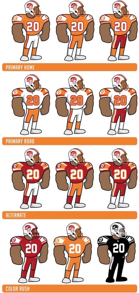
Click to enlarge
Good morning! Today I have the results of our “Redesign the Bucs” contest over on InsideHook. Lots of good entries, including Tim Fesmire’s (shown above), which I’m showcasing here not because it was the best entry but because I love his cartoon template. Good one, Tim!
Meanwhile, you can see all the entries we received here.

Membership update: Another eight designs have been added to the membership card gallery, including Steve Hartsock’s, which is our first card to be based on the Padres’ new look. Looks nice on a card, no? (And if you want to be the first to get a card based on the Brewers’ new set, you’re too late! Alex Poterack already snagged that distinction, although we haven’t yet designed his card.)
Ordering a membership card is a good way to support Uni Watch (which, frankly, could use your support these days). And remember, a Uni Watch membership card entitles you to a 15% discount on any of the merchandise in our Teespring shop and our Naming Wrongs shop. (If you’re an existing member and would like to have the discount code, email me and I’ll hook you up.) As always, you can sign up for your own custom-designed card here, you can see all the cards we’ve designed so far here (more than 2,300 of them!), and you can see how we produce the cards here.
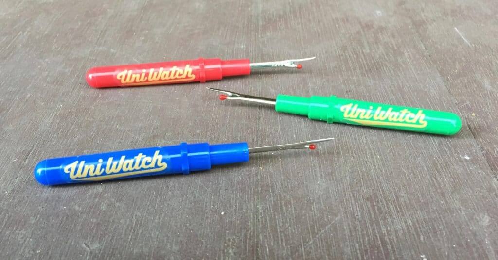
IMPORTANT seam ripper update: Okay, one thing at a time:
• The good news is that I got some new seam rippers in stock and also got some small bubble mailers (no more paper envelopes, since that didn’t work out too well). If you previously notified me that your ripper order either didn’t arrive or arrived damaged, a replacement is already on its way to you. You should have it in a day or two at the most. (If you didn’t receive your original ripper order and haven’t yet told me, please do so now.)
• The bad news is that replacing all the mangled original orders means that I’m already out of stock (again) on green rippers. I have more coming from Asia and should be restocked (again) in a week or two.
• The good news is that I do have a decent new supply of blue and red rippers. You can order them here.
• The bad news is that the shipping charge has jumped from $1 to $5. That’s because the USPS classifies the bubble mailers as packages and charges me the package rate. I had hoped to avoid this, but there seems to be no way around it.
• The good news is that I’ll soon be adding two new colors to the mix: yellow rippers and white rippers. These will have a green script (instead of the gold script I’ve been using) and should be ready to go in about a week — either just before or just after Thanksgiving.
I think that’s everything. Thanks for your interest in (and patience with!) this project.
Click to enlarge
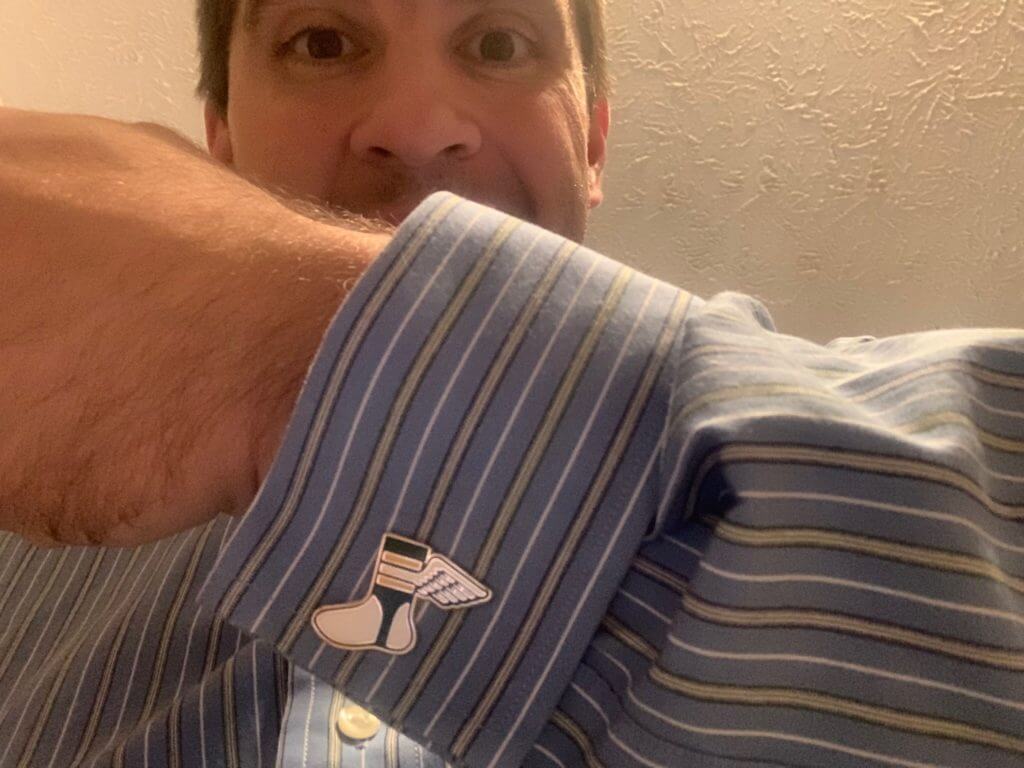
Lookin’ sharp: People are starting to receive their Uni Watch cufflinks — including longtime reader Mario Fontana (shown above), who wore them while teaching yesterday at SUNY-Brockport. Very nice!
If you want to look as sharp as Mario, Uni Watch cufflinks are available here.
The Ticker
By Paul

’Skins Watch: Carthage College, a D-III school whose teams are called the Red Men, is considering a name change for its athletics department. “To be honest, I’m surprised that name has remained for as long as it has,” says Geoff Poole. … Division II UNC Pembroke, which was originally opened for Native Americans and did not admit other races until 1953, wore a medicine wheel patch last weekend for an annual American Indian Heritage Day (from Brian Simpkins).

Baseball News: In the aftermath of the Brewers’ recent unveiling, here’s an article about the BiG logo designer’s widow (from Miles Cliatt). … New 10th-season logo for the Rockland Boulders (from John Cerone). … A group hoping to lure an MLB team to Orlando is calling its prospective team, rather appropriately, the Orlando Dreamers. … New baseball and softball uniforms next spring for Auburn.

Football News: The Texans will go mono-blue tonight (from Ignacio Salazar). … Here’s a lot of info on the “heritage” uniforms that Notre Dame will be wearing this weekend. … Speaking of the Irish, check out this communiqué from Kary Klismet: “I recently came across this amazing color footage of Iowa’s 7-6 upset victory over Notre Dame in November 1939. The game is uni-notable because the Fighting Irish famously switched from navy blue jerseys to green jerseys with white shoulders at halftime, likely to provide better contrast to Iowa’s black jerseys. This game was the subject of an extensive discussion at Uni Watch five years ago. At the time, evidence suggested that color footage of the game existed, but we could find only black-and-white footage until now.” … Here’s this week’s uni combo for Iowa State and Georgia Tech (from Chad Lehman and @GTThrashFan). … Good story about the guy who does program art for Illinois (from @mrmichael21). … Blaise D’Sylva’s latest helmet collection is for Toledo. … This week’s No. 25 for Virginia Tech is TE James Mitchell (from Andrew Cosentino).

Hockey News: New grey uniforms for Purdue’s club team. … We’ve seen skylines depicted on jerseys and basketball courts before, but Blue Jackets G Elvis Merzļikins has what might be the first skyline-themed blocker (from Kellen Dargle). … Canucks fans love the “flying skate” throwback that the team is wearing a handful of times this season. (from Vancouver’s own Wade Heidt). … Speaking of the Canucks, and of Wade, G Jacob Markstrom has a new mask. “It’s the fourth design he’s used this season,” says Wade.

Basketball News: In addition to all of the new uniforms we covered in yesterday’s lede, we now have new uniforms from the Kings. … The NBA is reportedly considering a shorter regular season with a later starting date, which could have some interesting implications for uni-reveal schedules. … The Lakers plan go to back to wearing yellow and white at home for the postseason. … Raptors F Ogugua Anunoby wore protective goggles last night. “He was poked in the eye a few nights ago,” explains Mike Chamernik. … New black uniforms last night for San Diego State (from Nathan Clark). … Huge uni numbers — not just on the jersey but also on the shorts — for the French team Nanterre 92.

Soccer News: A trademark application indicates a new logo and name tweak are coming for the Chicago Fire (from many readers). … Puma chose Helvetica as the font for Switzerland’s new shirt (from James Gilbert). … New away kit for USL Championship side Indy Eleven (from Josh Hinton). … Fashion designer Thom Browne has unveiled “official off-pitch away uniforms” — in other words, what the team wears while traveling to away games — for FC Barcelona (from Kary Klismet and our own Jamie Rathjen).

Grab Bag: Sports Illustrated’s print edition will be reduced to a monthly pub schedule in 2020. One of the new owners said this week, “They’ve got a 1986 business model. We’re bringing in specialists — team, fantasy, gambling, backpacking. That’s the model of the future.” … More on impeachment witness Lt. Col. Alexander Vindman’s military uniform: President Trump questioned why he wore the uniform while testifying, even though he’s actually required to do so. More analysis of the significance of wearing a military uniform in a political setting here and here. … Officials in Fairfax County, Va., are pushing back against the DC Metro’s plans to bypass usual station-naming rules and unilaterally selling off the naming rights to a Fairfax-area station. Good (from Ted Bloss).

What Paul did last night last Saturday: The video above shows my friend Tim using something called a Minimum Wage Machine. You turn a crank and every few seconds it spits out a penny, at a rate that adds up to the hourly minimum wage — interesting and thought-provoking.
The machine is part of an exhibit currently at the Parsons School of Design, called The Museum of Capitalism, which is a series of clever critiques of capitalism (additional info here, here, and here [NYT link]).
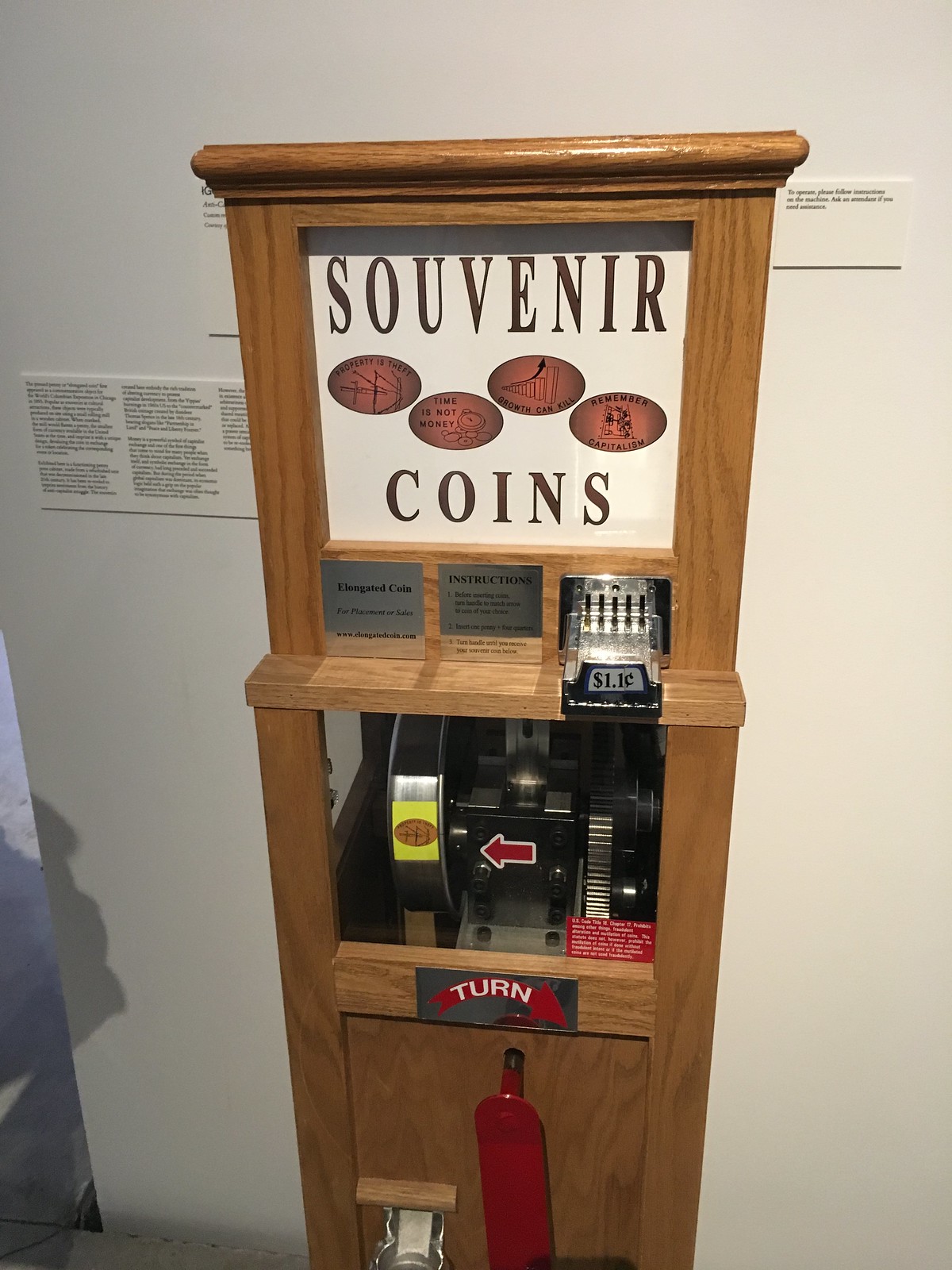
It’s a super-cool exhibit. After Tim cranked out a bunch of pennies, we took a few of them to the exhibit’s souvenir penny crusher, which is just like the ones you see at tourist attractions, except this imprints radical slogans onto the pennies. I chose “Property Is Theft” (for all photos, you can click to enlarge):


There were sooooo many other good pieces in the exhibit. My favorite was this spectacularly gorgeous arrangement of universal handcuff keys, by the Center for Tactical Magic (additional info here):


Visitors are encouraged to take a key right off the wall (the gallery staff replenishes them at the end of each day), in case they ever find themselves handcuffed and need to escape.
I also liked a piece by Michael Mandiberg called “FDIC Insured,” a big display of investment guide books — all purchased for a dollar at used book store — with their covers burn-imprinted with the logos of banks that were closed by the FDIC during the Great Recession (additional info here):


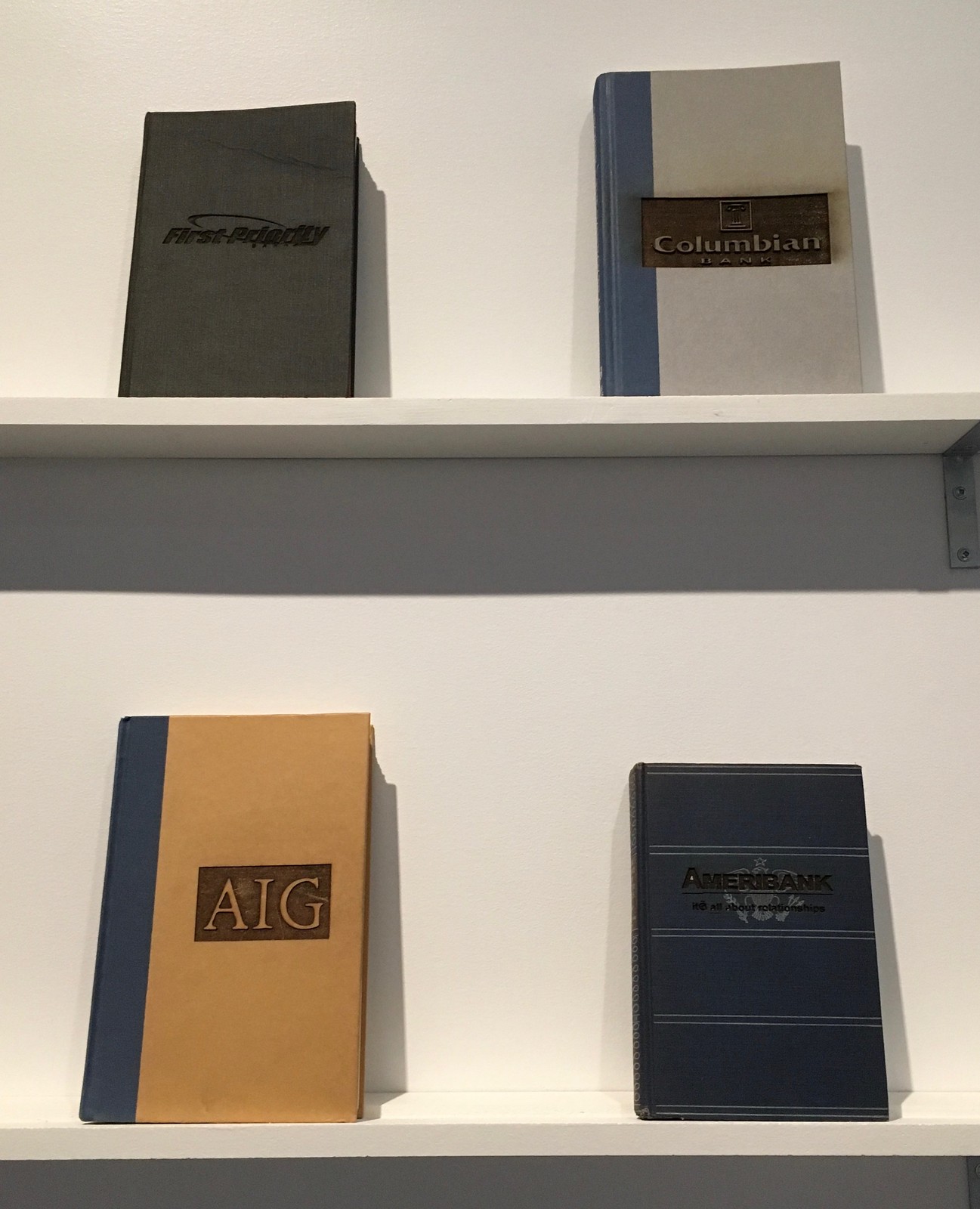
And there’s so much more (including the world’s largest collection of promotional pharmaceutical pens!). The exhibit is on view at 66 Fifth Ave. in Manhattan from now through Dec. 10. Recommended.
Raffle results: The winner of the free New York Times digital access is Jake Yergert. Congrats to him, and thanks to all who entered. More raffles coming soon.
The Carthage College link in Skins Watch is directing to the UNC Pembroke medicine wheel image.
Thanks. Fixed.
Lots of cool/clever designs in the Bucs contest.
Lots of orange.
Lots of hats at rakish angles.
Well done to all submitters (I was not one).
Buccaneers are one of those teams that nailed it right out of the box in 1976 with a clean, interesting design that was instantly recognizable and a fantastic logo.
The 1997 look wasn’t bad, either. The redesigns seem to reach this consensus.
Agreed. Kudos to everyone who submitted Bucs redesigns. This might be the strongest redesign contest in Uni-Watch history. I didn’t mind the Bucs 97 redesign but the last revamp was terrible. I particularly liked the skull/Buccaneer Bruce. As a Browns fan, I’d be happy letting any of these entrants do the redesign. They certainly have a better understanding of a team’s uniform history than Nike appears to.
Every entry is better than what the Bucs wear now, but none of them quite reached perfection for me. In almost every case, I either loved loved loved the uniforms but not the white helmet, or I loved the pewter/orange/red helmet but the uniforms didn’t quite click for me, or I dug everything but the helmet logo. If one could mix and match among the various concepts, one could assemble at least a half-dozen sets that would be among the best uniforms in the NFL.
Which probably sounds way more critical than I intend. Most of the entries are like A-minus uniforms for me, but I can see how they’d easily be A-plus is all I’m saying. Bottom line: Great work, and I dearly wish the real-life Bucs would look even half as good as any of these designs!
@Football news in the ticker:
The Texans play on TNF, so it should say “tonight” instead of “Sunday”.
Got it.
Would you please include a link to the Bucs redesign results?
As noted near the top of today’s entry, link coming soon.
My wife used to collect pharmaceutical pens when she worked at Kinko’s. Pharma reps would always come in to copy stuff and they had great pens. One for a fertility treatment had a little barrel attached with”sperm” floating in it. She loved to show that one off.
The Bucs contest piece is now live:
link
I hadn’t thought of it before, but had Lamar Sparkman put a skull under that feathered hat in 1976 instead of the winking/sneering Bucco Bruce, that would have been a masterful logo.
In the article, you say “in part because no NFL team had worn orange before”. The Denver Broncos had been wearing orange for over 10 years at that point.
Right. Let me rephrase.
The Museum of Capitalism? Can I look forward to a write up different Antifa uniforms in the future too?
It’s always so interesting to see how some people get upset over any critique of capitalism.
To answer your question: If there were a good exhibit of Antifa uniforms, I’d happily write about that. Back in 2013, I wrote about an old Klan uniform catalog:
link
I thought this was a column about sports uniforms, not visits to the Museum of (Anti) Capitalism. Of course, there would be no pro sports without capitalism. Probably not college sports either. So no need for sports uniform writing without capitalism.
I think that is thought-provoking and maybe upsetting if you are a sports uniform writer.
I thought this was a column about sports uniforms, not visits to the Museum of (Anti) Capitalism.
Actually, the site has always been about things that interest me. The “What Paul Did Last Night” section has been a feature of the site for many years.
Of course, there would be no pro sports without capitalism.
You say that like it’s a bad thing.
(Kidding.) (Mostly.)
Again, it’s fascinating to see how people respond to any critique of capitalism. A critique, incidentally, is not the same as advocacy for elimination — it’s just a critique, a way of pointing out flaws, showing areas that have room for improvement, etc. I’ve never understood why that freaks some people out, but it clearly does.
As I’ve said many times: I think capitalism has its uses, but I’m also on guard against its excesses. I view it as a tool, not as a religion. And like any tool, its function should be to improve people’s lives. What I increasingly see is people being used as tools to improve capitalists’ lives. Much of the exhibit is based on that perspective. If you disagree, that’s fine, but I’ll keep posting things on my website that interest me. If those parts of the site don’t interest you, feel free to scroll past them. Thanks.
Have you never read Uni Watch before? Paul often talks about the things he did on a given night or weekend and most of the time they have nothing to do with sports. Give me a break.
Been reading Uni-Watch for about 13 years.
Paul wrote: “It’s always so interesting to see how some people get upset over any critique of capitalism.”
My response was why Paul might be upset if capitalism were gone. And usually efforts to “improve” capitalism are disguises for eliminating capitalism. History is filled with stories of countries that replaced capitalism with something else. You might want to review Venezuela for a recent example.
To address Paul’s comment, this is why people get upset. Thanks.
Doug, for some reason you (a) don’t understand what a “critique” is, and (b) apparently think ideas expressed in an art gallery exhibit, and/or posting about that exhibit on this website, are tantamount to turning our society into Venezuela. I’ll let those two things speak for themselves. Let’s please move on. Thanks.
A sad result of how dug in, and polarized society has become. A critique on the flaws of capitalism is now automatically seen as an argument for socialism (or something else). There exists no room for compromise or acknowledgement that your side has flaws.
I always appreciate that Paul tries his hardest to keep discussions adult and civil, and when sharing his opinion does so in a way where he isn’t admonishing the other side nor criticizing them for thinking differently. Except when it comes to uniform ads and Nike, but obviously they are objectively evil ;)
Long Fast Company article on both neo-Nazi and Antifa approaches to dress and uniforms: link
And from Vice an article specifically on the Antifa uniform, or rather the lack of one: link
If one is interested in the actual century-old antifascist movement, instead of in the word “Antifa” as a far-right propaganda bogeyman, there’s actually a lot of interesting literature out there.
Angus O’Keefe gets my vote for the creamsicle update. Only change I’d want is some version of Bucco Bruce rather than the flag, but if that’s a nod to the Mike Allstott days, I’m okay with that.
Some of my favorite football memories involve Lee Roy Selmon, James Wilder, Doug Williams and Jimmie Giles in the orange. It’s hard to feel a continuity between those days and the current uniform.
Some of my least favorite football memories involve Ronde Barber and Joe Jurevicius in the pewter.
Bring Back the Creamsicles (and send forth Bucco Bird)!
Thanks Winter, I appreciate that!
I usually hate non-white mono uniforms, especially when paired with a white shell but your orange mono looks terrific. Great job!!
Interestingly that Iowa/Notre Dame footage was posted a month after the initial discussion on this site.
Is it just me or are a lot of sites going away from comment sections? I noticed that SI’s website didn’t have comments and neither does Inside Hook.
It’s really unfortunate if the policing of comments section outweighs their utility, because often the comments are where you can find the best discussion on a particular topic. I’m looking at you, NYT.
It depends on the site. CNN got rid of their comment sections a while ago because it became a cesspool of vitriolic nonsense. A site like this has (mostly) respectful, constructive comments so it wouldn’t be necessary to do away with them. I also remember the espn.com comment section being awful.
Actually for a long time the ESPN comments were in an anonymous format where you just had to type in your name (or whatever you wanted to), registering was optional.
The comment section during that period was pretty rough.
Later on they went to a format where you’d log in with your facebook info, and with a real person to match to a comment, the comment section became much more civil, but much more seldomly used.
In any case I was always amused by the creative descriptions and names the folks in the comments sections came up with for Paul.
I subscribe to the Boston Globe and while they have comments, they end up blocking the same few folks (generally in political articles where among those is a troll who goes by the handle “Trump Just Always Wins”). I don’t know why I wade into comment sections, many are truly cesspools.
Not uni-watch, it’s great here (mostly, occasionally there are a couple like above who come out of nowhere with a grievance that is really non-constructive).
Speaking of the Chicago Fire, I know someone that works closely with the team. They have been giving away old logo gear for months during this transition. I hadn’t seen the new logo, but that matches what I was told, except I was told the colors are light blue and red, from the Chicago flag. Also, they said basically every that had seen the changes hated them, as well as the name. But, this is a big re-branding on the part of the new owner, and moving back to Solider Field.
It’s been officially released. The disc is navy, the interior design is red and yellow.
An utterly shameful downgrade from a badge with character and history to…that. Start the clock as to how quickly they join Leeds, Everton, and other clubs who had misbegotten badge changes only to quickly revert to a more traditional one.
The new badge is so sad. The Maltese cross was such a distinctive shape and immediately connotes fire (well, firefighters).
The new one is so boring. Not fitting for their return to Soldier Field.
This is such a massive downgrade for the Fire. What a HUGE mistake by that organization. Orange, yellow and navy? Logo that shares a similarity to a Chicago gang?
Very bad move by the Fire. Tell them to take a look at the Red Stars and just follow their lead. They need pull a ‘Sonic the Hedgehog’ and listen to the feedback from the public and redo this ASAP.
It’s red, not orange. Still terrible
The new Fire logo looks like something RSL discarded. I have never seen the MLS community so universally opposed to anything.
I just took a quick look at the proposed redesigns for the Buccaneers – I’ll look more closely later. Wow! Uni Watch readers are incredibly talented. Any one of the highlighted designs would be a major improvement over the current unis. Huge applause to all of the contributors!
I’m bummed that my design didn’t even make it into the flickr album. Maybe it got lost in cyberspace.
Jack, I’m not sure how that happened, and I apologize. I just found your entry and will add your designs to the Flickr set in a few minutes.
Awesome, thanks!
Milwaukee Admirals AHL jersey. link
Regarding Carthage College, you’d think that that name would give them some great history to draw from. How about calling the team the Elephants? The original Carthage had Hannibal leading his elephants in the Punic War. Or something related to Hanno the Navigator, who sailed to all kinds of places. There’s also plenty of northern African desert imagery to use. I’d love to see them do something based on their already-excellent college name.
It was very obvious and expected that we would see 1) lots of orange and 2) lots of Bucco Bruce versioning.
I hope the Buccaneers are paying attention. People have been clamouring for both for years now.
Good job, entrants!
When the Bucs rebooted their look back in ‘97, they should have gone with Red and Silver (a’la Ohio State). It’s not only a great color combo, but one that hasn’t been worn since the 49ers switch to Red and Gold in 1963.
Angus’Uniform set is top notch! I’m all for Bucco Bruce returning but that flag in origin colors is great! Biggest thing for me is getting rid of the pewter/black. Great touch on those alternates too!
I think the Broncos should do the same thing. Return the “D” and place the current Bronco inside it (same old pose). Someone made an image of that and it looked fantastic. I’d like the return of their light blue but for some reason teams have gotten away from light/royal blues and have stuck with Navy-ish hues.
Forgot to add:
Shout out to Tim Fesmire’s color combos & design as well!
@Paul, in the ticker it would be better to call it the “DC area Metro” instead of “DC Metro” because DC doesn’t run Metro. At least, not by itself.
Metro or formally the “Washington Metropolitan Area Transit Authority (WMATA)” is a tri-jurisdictional government agency created by Congress through an interstate compact between the District of Columbia, the State of Maryland, and the Commonwealth of Virginia.
Metro Board members are appointed by the governments of DC, MD, VA, and the U.S. Federal government.
That said, naming rights for stations is a BAD idea!