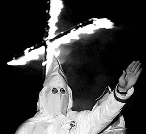
I’ve written many times about the assorted vintage uniform catalogs that I collect. But Kirsten recently pointed me toward a post on the history site Retronaut, which featured something I’d never seen before: a Ku Klux Klan uniform catalog from 1925, produced by a Klan robe manufacturer in Atlanta.
Leaving aside the Klan’s incredibly toxic role in American history, the catalog is fascinating. In many ways, it’s similar to the sports uniform catalogs that I collect. Here are some things that caught my eye while scrolling through its pages:
• All of the catalog illustrations feature a model (or mannequin?) in the same pose. What I find surprising is the depiction of the feet, which seem unusually small and dainty, almost ladylike. Not the pose you’d expect from a domestic terrorist.
• Much like the Nazis (who were just getting started in Germany around the time this catalog was printed), the Klan had a strong sense of design. That’s part of what made them so dangerous — they had the capacity to be visually seductive. It’s hard to deny, for example, that this is a powerful uniform. So is this.
• Some of the robe descriptions use the same terminology commonly found in sports uniform catalogs, like soutache and braid. But there are also terms that I’d never encountered before, like Duretta cloth. I googled it and found a 1922 ad that states, “Its primary use is for the uniform type of dress which must stand hard wear.” I guess that includes lynchings and cross-burnings, or maybe watching Birth of a Nation.
• The oddest description is for a basic robe “Made of cotton Jeans.” Does that mean white denim? Seems like that would be way too heavy, right? Did “Jeans” mean something else in 1925?
• The Klan’s nomenclature has always been a fascinating mix of horror and kitsch — “Grand Exalted Cyclops,” “Imperial Dragon,” and so on. I especially like that there are separate robe designs for the Special Terror and the regular old Terror. (But what’s the deal with the National Lecturer? Doesn’t sound very Klan-ish. Maybe the local Klan nerd got stuck with that title.)
• I love that they offered this little “Robe and Helmet Bag” — just the thing for the busy Klansman! But it’s a bit of a stretch to refer to the Klan’s pointed mask as a “helmet,” no?
• Many uniform catalogs in my collection include a page that has photos of the factory and/or staff, so you can “meet the people behind the uniforms,” or something along those lines. The Klan catalog follows this same protocol. Not a non-white face in the bunch, natch (although, to be fair, I’m not sure any kind of factory in the South in the 1920s was hiring blacks).
There’s more, but you can scroll through the Retronaut post to see for yourself. Meanwhile, just to give this a sports tie-in, it’s worth noting that the Klan has also been known to suit up in baseball uniforms. I’m guessing they won’t all be wearing No. 42 on April 15.
A new design contest: My recent ESPN contest to redesign the Browns was a lot of fun, so I’ve decided to do a similar contest for the Dolphins, who are expected to unveil a new logo at the NFL Draft in April. Full details on the contest are spelled out here.
Uni Watch News Ticker: The Vikings have made some extremely minor tweaks to their primary logo. Further info here. … Latest sportswriter to call for the ’Skins to change their name: my ESPN.com colleague L.Z. Granderson. … In a related item, Richard King, who was one of the participants in last week’s symposium on Indian imagery in sports, has written a strong article about the event. ”¦ Meanwhile, ’Skins GM Bruce Allen says the team has no plans to change its name. … Earlier this week I mentioned that the NBA had once considered letting players wear undershirts for an outdoor preseason game, “but nothing ever came of it.” Turns out I was wrong about that, as you can see in this 2009 video clip (big thanks to Ian Stewart for setting me straight). … Check this out: the Oregon duck as Jumpman (from Jay Sullivan). ”¦ As you know, I don’t follow the retail/merch world that closely, so maybe this isn’t a new thing, but what’s the deal with the word “replithentic”? “I’ve seen it used on Reebok, Nike, and Mitchell and Ness listings,” says Jon Solomonson. ”¦ Some Yankees uni number news here. … “I was at the Indiana/Nebraska game on Wednesday and couldn’t help but notice (somewhat thanks to Uni Watch) that nearly every Nebraska player was wearing a different combination of shoes/socks,” writes Joel Dale. … Reprinted from yesterday’s comments: Illinois State once again wore those crazy throwbacks on Wednesday night (from Matthew Sherry). … One of Jack Benny’s shticks was that he was eternally 39 years old. So the sports teams at the high school in his hometown of Waukegan, Illinois, are called the 39ers (great tidbit from Max Weintraub). … Maryland has new baseball uniforms, and they’re about as crazy as you’d expect. … Weird look for Jason Heyward, who was wearing a BP cap, a home jersey, and road pants for a TV shoot yesterday (from Mitch Barbee). … Missouri State handily summed up the state of American education by misspelling its own name on book bags given out to students. … “Our family recently moved into a new house,” says Jason Hillyer. “My wife, Alison, chose all of the furniture, paint colors, décor, etc., and I have (essentially) free reign in the basement. I went with battleship gray for the walls with a red/white or green/white stripe all the way around. Wall hangings representing our respective alma maters cover the point at which the two colors originate. On the wall without a stripe, I hung some autographed Browns prints and arranged nine pennants in a half-circle to show the evolution of the Browns’ facemask. A plaque with the seldom seen ‘CB’ logo covers where all of the pennant points come together.” … Erik Karlsson of the Senators had his Achilles tendon cut by a skate blade two nights ago. He must not have been wearing these protective socks, which can supposedly prevent that injury (from Matthew Austin). … A Maple Leafs jersey that was apparently intended for this year’s Winter Classic — or maybe just a good counterfeit — has surfaced (from Luke Rosnick). … No idea how legit this is, but someone on eBay is selling what he claims to be an early-’90s Nuggets prototype (from Robert Beau Schott). … Here are this year’s McDonald’s All American uniforms. … Great step-by-step photos showing how to build a DIY food stadium (from Chris LaHaye). ”¦ Two seasons and two teams after leaving the Mets, it looks like Jose Reyes is still using his Mets bat bag, at least judging by that blue and orange “7” tag (good spot by Nick Schiavo). ”¦ New lacrosse helmets for Wesleyan and Oregon. ”¦ New football helmets apparently in the works for Wake Forest (from Duncan Wilson). ”¦ Texas baseball caps have a Darrell Royal memorial this season (Jay Sullivan again). ”¦ Yale women’s hockey goaltender Jaimie Leonoff has Wayne Gretzky on one side of her mask and Superman on the other. “Interesting that she would have one of her position’s greatest tormentors emblazoned on her headgear,” says Tris Wykes.
Holiday schedule: Phil will have his usual content tomorrow and Sunday. My Monday post will likely be somewhat abbreviated, in observance of Presidents Day. See you next week.
It was actually Illinois State who wore the crazy throwbacks, not the Illini…
Right. Now fixed. Thanks.
It was actually Illinois State University that wore the throwbacks, not Illinois. Love the Redbirds
The KKK catalog is fascinating! And sort of terrifying. It’s strange to think of that group spending that much time on design.
I’m amazed at the visceral reaction I’m having to these. I know exactly what I’m going to see when I click the link yet it still hits home.
Was in Spain once, where they have Easter parades full of people wearing similar robes/hoods. Entirely different context but it still made me feel way too uncomfortable to be around.
+1
Interesting that they would still use them, given what they became here. It’s similar to the swastika being a benign symbol until the Nazi’s attached so much hatred to it. Now, almost no one in the western world uses it. In fact, a local Catholic church recently removed a bunch of swastikas that were installed long before Hitler rose to prominence.
The SS had uniforms designed by Hugo Boss. Weird, I know.
The KKK “fashionista” post is simultaneously fascinating and sickening. There is a display of this vile Ignorance Protection Program clothing at the National Civil Rights Museum in Memphis (the former Lorraine Motel where Martin Luther King, Jr. was assassinated). Looking at the robes in person was nauseating and this post brought back that same stomach-turning ache. For the 99% of us who don’t harken back to the “good ol’ days” when armies of racist isolationists were welcomed as heroes as they paraded down Pennsylvania Avenue carrying the stars-and-bars, this post is a good reminder of the horror small groups of domestic terrorists inflicted and, to a lesser but growing extent, still inflict on our society today.
Probably not the best Uni Watch post to be checking out at the office… Methinks a call from HR may not be far behind.
I had similar thoughts. LOL!
My guess on “replithentic” in the context in which it’s shown is that it means: “more expensive, kinda looks more real than the screen-printed low end gear, but not actually what your team wears.”
Incidentally, in a less cynical take, I would classify all of the old CCM NHL replicas as “replithentic”, in that they were pretty hard to differentiate from the real deal unless you checked for a fight strap. Alas, Reebok came along and slapped the scarlet letter, err… rectangular label on the bottom front of the replicas, marking the wearer as a uni cheapskate.
And before someone writes it, I AM aware that, particularly in the NFL, the authentic jerseys of many teams WERE screen printed. Doesn’t change the fact that retail manufacturers know fans will pay more for “sewn on.”
I bought a replica Seahawks jersey and had the local sporting good store sew #8’s over the screenprinted #8’s, and I hand sewed elastics on the inside of the sleeves. It saved me $75-100 and it looks pretty good.
CWac19, the NHL authentic jerseys also had the small NHL logo sewn on next to the CCM on the bottom back right of the jersey and the replicas didn’t.
It seems like a word some company would have trademarked (or copyrighted (whichever is correct)), but several companies use the term.
???
Reebok was the only company to use the word replithentic, but I don’t think they invented it (I know I’ve seen it used online on message boards prior to them using it for marketing purposes; no idea about trademarking the word).
What’s funnier than the word replithentic is nike calling their lowest-tier nfl jersey “game”. On nflshop, there are hordes of people writing bad reviews and/or returning jerseys because they thought “game jersey” meant authentic. “I received my jersey and it had cheap plastic numbers!” is the usual statement (even though the product description clearly states screen printed…).
Yes, I just admitted to be bored enough to read product reviews!
RBK created the box + the material is noticeably cheaper and the patches were purposely made to look cheaper in order to create a visual dinstinction between the different price-points. Then, of course, there is the fit.
I know that they even toyed with doing all of the main uniform logos the same way as the patches, but they abandoned the idea. The bruins 3rd jersey with the big bear is an example of them carrying through the idea…imo it looks like shit.
What I liked about the old CCM replicas is that they were functional. I’ve only ever worn my jerseys at sporting events or to play hockey, the CCM jerseys served both purposes fine. The Reebok replicas fit like garbage and are completely useless to wear while playing (even without pads). The pro jerseys though, are alot better now than they were. I have to admit that the pro fit and the stretch on the material make them alot more comfy…but the price is insane. I only have some because I got them for free.
and with regards to the cheap primary logos, I think Reebok produces a batch for Canadian tire at a cheaper price point. They look awful.
“‘Its primary use is for the uniform type of dress which must stand hard wear.’ I guess that includes lynchings and cross-burnings.”
~~~
I’m not 100% sure, but I think the Klan refers to those as “cross lightings,” not “burnings.”
Here’s a lighter Klan related anecdote from my personal files:
Having recently moved to Virginia from the NYC area in the mid 90’s, I was using the fast Internet computers available at a local JuCo for a job search. After a couple of months I’d become friendly with a young, well-spoken guy who worked for the school PR staff. I noticed a small but really striking sword pin on his collar. I asked him what it was. He told me –
“That’s my Klan[sic] pin!” Frozen in my Yankee Liberal tracks, I admit I just nodded dumbfounded. Once my brain started working again – I realized his name was 100% Scots! It was “clan,” as in Scottish Highlander. Whew, jumped to the wrong conclusion in the heart of Dixie. Luckily. . ..
*klanecdote
I sure hope Wake goes with something other than a matte black helmet and the crappy WF typewriter font they have had since 2001 . That’ll blow everyone away.
I always liked the old “flying WF” logo that Wake Forest used in the late 70’s early 80’s. I hate the current WF.
EXACTLY!
In my grad student days, I came across a story in an old newspaper promoting a 1920s picnic/baseball game with the local Klan’s “fast” team and an opponent. It should be remembered (not fondly) that the Klan was far more public in its dealings during that era.
The Jack Benny 39ers is perhaps one of the best things I have ever heard in my life!
Me, too!
I love it, too! I don’t know if Paul timed this to come so near to Jack’s birthday, which was yesterday, or if it was a coincidence. Either way, I as a huge Jack Benny fan am thrilled to read this.
I wonder how old Jack Benny would be now …
Just a day under 40.
I find catalogs** fascinating in general. So many niches and worlds I know virtually nothing about. Equipment and needed attire I never knew existed. Sort of like a peek behind the curtain.
**not Lillian Vernon and other trinket catalogs (though they have their place in my sad life also!)
Looking at that pic of Reyes’s bag, it’s not clear that it’s from his Mets days. The 7 appears to have a line inside of it, and it’s doesn’t necessarily look orange to me. It kind of looks like the numbers on the Jays’ blue alts – white with the blue line in the center.
Hate to disagree with you, but even with my eyes in somewhat disabled mode due to surgery, I believe I see a drop shadow on the diagonal of the 7, like the Mutts have used in the past. Not being a big fan of New York teams in general, I wouldn’t know exactly when they last used drop shadow numbers, but that bag could be even older than two years.
So the sports teams at the high school in his hometown of Waukegan, Illinois, are called the 39ers
It’s not a high school, it’s a middle school (7th and 8th grade, possibly 6th grade, depending on the school district).
Slightly of topic.
I went to a school (back in the beginning of the 1980s) with just grades 7 & 8. Was referred to everyone as a junior high; locally i have never heard anyone use the term middle school.
Is it a regional, national (Canada), or generational difference in terminology?
P.S. I am pretty sure the grade __ instead of __th grade is a national thing.
We call them Middle Schools here in VA. At one time they were grades 5th through 8th, now they start at 6th grade, I believe.
At least in the county I live in.
And just to be confusing, Prince William County, VA is in the process of building a couple of new schools that will be K-8. What do you call a single school with every grade below high school? Low school?
Here in the central part of the U.S. I have found that middle schools are typically grades 6-8 and high schools grades 9-12. When I grew up in Wichita, KS we had junior high at grades 7-9 and high school at 10-12. Years after I left they went to 4 year high schools and changed to middle schools with grades 6-8.
At least in New York, the school between elementary and high school was called Junior High and comprised grades 7 through 9. Sometime in the 1980s it was changed to Middle School and the grade range shifted to 6-8. I couldn’t see the wisdom of the change in New Rochelle; our High School went from three thousand to four thousand students.
Those robes are so reasonably priced! Who knew being a racist could be so affordable?
I thought the same thing. But $7.00 back in 1925, according to the inflation calculator I use, is about $90.00…which still isn’t “bad” for US made products.
I know not the job function of “National Lecturer” in the KKK, nor can I be sussed to look it up, but the fact that its uniform cost even more than a Kleagle’s suggests it being a position of some prominence within the organization.
“Fresh Air” had on the author of a book about the Klan in NC yesterday and today UniWatch Klans it up. Is there some big Klan anniversary on the horizon or is this just a coincidence?
I think you mean “klaniversary” and “koincidence.”
-1
Two of my favorite Kinks’ albums:)
Too soon.
With all the rules regarding what pitchers can and cannot wear on the mound (glove color, sleeve designs, etc), I wonder how long it will take for pitchers to complain about those Maryland helmets being distracting.
My thoughts exactly.
Ref: the white jeans cotton… I think the fabric in question could be best described as jean cloth. Jean cloth was the primary material used to make the uniforms for the Confederate Army in the Civil War and has a weight and texture similar to good quality thick flannel, but almost with a canvas like quality to it. Not quite denim though. Hope that helps. I am a living historian specialising on the Civil War, with a special obsession not only with Civil War uniforms, but military uniforms in general.
Excellent info — thank you!
Looks like there’s further info here:
link
And it was cotton as well (jean cloth)
What’s up with the faux leopard spots/striping on the Adidas McDonald’s All American uniforms? Is the game being played at the Jersey Shore?
The Louisiana Tech Lady Techsters wore pink uniforms last night for Valentine’s Day:
link
Oklahoma Sooners women’s team also wore pink last night against Iowa State, but it was a breast cancer awareness promotion. Iowa State’s white uniforms appeared to have pink accents.
link
Right, the Techsters pink unis were also for Breast Cancer Awareness, but the promo they ran had hearts all over it. :)
Sally Jenkins (another Washington Post columnist) absolutely slammed the Skins and their High Schools are using it defense yesterday as well: link
Whatever you think of the merits of keeping or changing the name, hiding behind schoolchildren is a reprehensible way to go about one’s PR campaign. Par for the course for the Redskins front office, alas.
Hey, Redskins, if you’re so concerned about America’s schoolchildren, why didn’t you join the rest of the league to wear Sandy Hook memorial patches?
I am not surprised by Bruce Allen’s attitude. His brother, former Senator George Allen, was comfortable using the term “Macaca” on the campaign trail.
Much as I don’t like the whole Allen dynasty or public worship thereof, if we could find a way to suggest a new name for the Redskins based on George Allen, it might just catch on with even the most hardline Redskins-clinging fans. (Ramskins? Hilltoppers? Seniors?)
Sort of like the idea I used to pitch to some of the leaders of the DC statehood movement that I know: Amend the statehood constitution to say that DC will enter the union as the state of Reagan and resubmit it. Then dare Congress to vote against that bill.
If only Dan Snyder took PEDs, then Sally Jenkins would write books with him.
Paul, funny you should mention robes to go watch Birth of a Nation as it was that movie that created the style of costumes/uniforms the KKK wore after they re-formed. Before DW Griffith, the KKK did have their own style of robes, but they were not uniform across the whole movement. The KKK was refounded after BoaN, and they took the white robes, hoods, and use of crosses directly from DW Griffith’s vision.
That is sort of like The Godfather, as the ‘Italian Social Clubs’ NEVER used that term before the movie came out.
Sure they did, if they were an actual godfather (the male sponsor of an infant receiving the sacrament of Baptism). After the movie, the term gained an expanded meaning beyond its religious one.
The Maryland helmets are as outrageous as I would have expected to see … the jerseys, however … actually very tasteful and well designed. I think. Unfortunately, they were barely even in the pictures.
Yep.
“Much like the Nazis (who were just getting started in Germany around the time this catalog was printed), the Klan had a strong sense of design.”
I’m not sure if this is known around these parts but the all black, menacing uniform – including the Totenkopf (skull)- of the NAZI SS was designed by Hugo Boss.
And now to think the company makes golf shirts.
The Nazis lost the war, but they invented rock concerts.
And I currently drive a Mitsubishi – the same people who made the planes that bombed Pearl Harbor – 70+ years ago.
The list is literally endless – I believe that is what they call progress?
Just think of all the work Siemens and Bayer do nowadays, and both of them worked with the Nazis as well.
Many think the KKK was relegated to the south, but in “KING KLEAGLE’s” picture, he’s representing New Jersey. (NJ on his hood).
No idea how legit this is, but someone on eBay is selling what he claims to be an early-’90s Nuggets prototype
Not legit at all. That seller is notorious for selling custom-made jerseys as “game worn” or “prototype”, and has a habit of taking game-worn jerseys of no-name players and replacing the name & numbers with those of more famous players. He does sell some legit stuff, but be wary before buying any of his stuff…
/rant over
replithentic is the term used for jerseys between replicas and authentics.
nike’s “swingman” jerseys were the first to really venture into this territory. instead of the thin mesh with screened on numbers, the fabric was upgraded to a thicker mesh and screen print numbers and graphics were stitched down to the jersey.
reebok did the same for the NBA, then they brought that into football for the NFL. adidas continued the tradition for the NBA when they picked up the contract. then after the ’04-’05 lock out, the new edge replicas were now available in “premiere” style (a downgrade if you ask me, since the old CCM and KOHO replicas used to be available in real, heavy-duty sewn down material). then in ’09, when majestic changed their replica jerseys, they too went with the replithentic feel.
it’s interesting, because i think knock offs have eaten into this level of jersey the most. people who want authentics sell out the money for them. people who are looking for a stitched down feel without the full authentic cost usually turn to counterfeits instead of the replithentic level.
Replithentics is nothing more than weak game playing by the manufacturers. I guess if I take a t-shirt, sew an authentic reebok label (like on a pro uniform) onto it it’s suddenly a replithentic. Is there a certain level of authentic details that constitute a replithentic? Would you not roll your eyes if you were talking to someone about their uniform and they said it was a replithentic?
Whoops meant that as a main thread post, not in reply to Brian E.
In the actual English language, there is no such thing as “between replicas and authentics.” An authentic jersey is an authentic jersey. Any jersey that is not authentic, but that is intended to resemble an actual on-field jersey, is a replica. That is what the word “replica” means. In the English language, if one wants to distinguish between two instances of the same noun, one ads an adjective. Not a new noun whose definition is identical to the old noun.
So selling “fan replica” and “pro replica” jerseys would be fine. Selling “replica” and “replithentic” is a crime against the language.
If they ever succeed in amending the Constitution to make English the official language, I’m petitioning to have anyone who approved using “replithentic” and “colorway” in marketing materials deported.
Spiffy Catch of the Day. I’ve always admired tombstone-shaped windows, the kind found on Second Empire houses.
There was a unicentric site before this one, one that long ago went the way of all the Internet. It was more along the lines of Phil’s weekend entries, with a lot of design submissions.
I remember a kid who said he was a graphic design student submitted a series of hockey uniforms, based on the iconography of the Third Reich. “Sure, they were bad,” he reasoned, “but their design elements were so strong!” He had a hard time understanding why many of us objected to his work (which was well executed, just creepy).
Paul is right: this Klan stuff, like the Nazi stuff, is powerful, because it was meant to give a sense of authority to people who felt threatened, disenfranchised, and weak. If you’re a day laborer with a 3rd grade education, you can pull on that Special Terror ensemble, and feel like the King of the World. (I think that’s part of the dainty feet thing, too — ditch diggers wear clodhoppers; bankers and politicians wear fine, upscale footwear. This movement, like Nazism, entices by convincing its prospects that they are elevated, elect, chosen, better than those fancy lads down at First National, holding the mortgage to the family farm.)
It’s important that we see this stuff, and remember it, but we have to remember it in context. This catalog represents the regulation of Hate, the elevation of Ignorance, and the justification of Intolerance. Those things never go away; they just periodically change their clothes.
One of the big problems I have with Nike is that they constantly appropriate cultural imagery, absent of any context, solely to move product. They rarely get called on it. (The LeBron as Christ billboard that graced Cleveland for many years is one example. Calling a pair of women’s sneakers “Incubus” is another, one of the rare times the Swoosh got tripped up.) Another 50 or 60 years, and you’ll probably get away with Third Reich sportswear.
Context matters.
Good post, Cort. I think George Lucas was thinking the same thing when he designed the Star Wars costumes. Making the Empire’s unis “elegant” and calling them storm troopers, as opposed to the “Rebel Alliance’s” rag tag wardrobe.
Makes sense, since George Lucas took shots from Triumph of the Will (including the medal ceremony) for Star Wars.
The Imperial uniforms were straight out of Nazi Germany updated to a space aesthetic.
Also, do keep in mind that the term “storm troopers” originated in WWI.
Interesting points, especially this:
One of the big problems I have with Nike is that they constantly appropriate cultural imagery, absent of any context, solely to move product.
The word for that is syncretism, and in his famous 1995 essay “Eternal Fascism,” Umberto Eco identified syncretism as a necessary component of fascism. Not just a necessary component, but the first prerequisite of creating a fascist culture or politics.
Somewhat different versions of Eco’s essay can be read at these links:
link
link [PDF]
Enlighting material…thanks!
Arr, we think alike, if I were urbane, erudite and educated.
Thanks for the Eco link!
” Another 50 or 60 years, and you’ll probably get away with Third Reich sportswear.”
~~~
Shit. That’s probably true.
And scary.
Let’s hope that never happens tho.
“Much like the Nazis (who were just getting started in Germany around the time this catalog was printed), the Klan had a strong sense of design.”
There’s a lot involved here with the psychology of visual displays and power. We talk about here with respect to athletics where its mostly harmless. For example, there is just something about Yankee pinstripes that lends authority. We talked about the changes to the Jaguars logo that make it more “fierce” or “intimidating.” In short the way that the emblem itself carries power.
Today’s post has reminded me of the motivation of the Nazis for choosing the swastika as their emblem. Hitler wanted an emblem capable of instilling the same type of fear as the Soviet hammer and sickle.
Oddly enough, the swastika (reversed I believe) had been a religious symbol for hundreds if not thousands of years before the Nazis appropriated it. I seem to remember beign told it was for good luck. So the “fear” element was given to it by the Nazis.
I’ve actually had the use of the swastika in my head in relation to a lot of the “it’s tradition” arguments that have been popping up re: the Washington Football Team.
I once spent a weekend at the French Lick Resort in southern Indiana which was built long before the Nazis’ rise to power in Germany and the railing on the veranda included a swastika detail which was obviously disconcerting but explainded by strategically placed explanations. link
Same deal at the Corn Palace in Mitchell, SD. It’s decorated anew each year, and prior to WWII, swastikas were often used as design motifs. Going there as a kid was the first time I’d ever encountered a non-Nazi swastika. Very educational to encounter all the old photos and the little taped-on, typed explanations that it’s not that kind of swastika. First time I can remember thinking about symbols as symbols. Yay grade-school semiotics!
Ah, the Corn Palace. Such an amazing place. Stopped there in ’97 while driving x-country with the then-galpal. Have lots of snapshots of it…. somewhere.
As I both Tim O’brien and i have mentioned in the past, the HPER on the IU campus has swastikas as part of the mosiac tiles in its lobby.
Paul had a column a ways back on the use of the Swastika on a women’s hockey team.
Jarring now, but yes, it wasn’t always the symbol of the ultimate evil.
There have been some enlightening swastika discussions on these boards. I wouldn’t go around making them now, but it’s a common motif on old architecture and should probably be accepted in the spirit it was placed there. It’s not reasonable to expect the New York State Board of Education to sand a thousand swastikas off its building in Albany.
Earlier this week I mentioned that the NBA had once considered letting players wear undershirts for an outdoor preseason game, “but nothing ever came of it.” Turns out I was wrong about that, as you can see in this 2009 video clip (big thanks to Ian Stewart for setting me straight).
I saw it mentioned the other day re: the Golden State new short sleeve shirt, that the NBA doesn’t permit undershirts, and back when Patrick Ewing was coming out of Georgetown, because of that rule the Knicks or somebody was thinking about designing a short-sleeved shirt but could never get it to look right.
Your quote today leads me to believe that it is still a rule that the NBA doesn’t allow undershirts, but if that’s the case, then how does Dwight Howard get away with it?
link
Granted that’s just a recent picture and most Google image search results show him with undershirt. Does he have special permission to wear undershirt because of his shoulder injury?
I meant to say… “most Google image search results show him without an undershirt”
Yes, he has permission to wear that thing because of his injured shoulder.
Ah, thank you. That’s what I figured.
On the upside to GS’s new sleeves … it’d be hard for Kobe to do that in one of the new unis.
Paul, very interesting post today.
Hey Paul,
It seems that most of the discussion on Native American imagery has focused on the Redskins name, but not as much has been written about the other teams associated with the issue. As a Cleveland Indians fan, I understand and support the need to retire Chief Wahoo (and his ancestors), but I’m curious about whether the team name is also deemed in need of change. “Indians” does not seem to me to be offensive, but I don’t know if that is the standard around which the debate revolves.
link
I was wondering how much one of those uniforms would have been back in the mid 1920’s and found that about $10 of 1925 dollars is worth about $128 these days based on the increase in CPI since 1925.
Isn’t the new Dolphins logo the image next to your contest? That’s the image that was leaked a while ago
It is indeed the image that leaked and ciruclated, but it’s legitimacy has never been confirmed.
Do we have to come up with a *new* logo for the contest? I’ve already made a uniform concept around the leaked one.
Yes, new.
That’s why I wrote, “Think you can do better?”
Has any UWer turned that into a vector file at all? If so, care to post?
‘….took my baby away. They took her away–away from me.”
link
I clicked on the COTD and loved it. I investigated the author’s website. He’s a graphic designer named Jose Guizar. It’s artists like this who should be designing sports logos.
I feel stupid asking, but what is COTD? I’ve seen in the comment section for the past couple days, but I have no clue what it refers to.
Refers to the Catch of the Day. Look on the right hand sidebar for the picture of “The Catch.” Click on “What is This?” under the picture for an explanation.
Almost forgot…and click on the picture of “The Catch” to go see what Paul’s catch of the day is.
Aha! Thank you! There’s something I would have missed otherwise!
No one cares about the Vikings logo, but…does this qualify as a different logo now? Because fifty-plus years is an incredible run for a team to go without changing its logo. I think the Yankees are the only team that comes close, with the Browns as sort of a sidebar (for one thing, they were out of business for a few years).
Just as far as sheer rip-off factor, the Vikings logo was one of the most successful in American sports. Seriously, you see Blondie in half the high school parent’s windshields in the country, and it’s almost never because they were big Matt Blair fans.
Bulls are up there
For someone who is distantly related to Nathan Bedford Forrest (FYI, my family has NO ties to the KKK today), this is rather interesting. With how you phrased the following “Leaving aside the Klan’s incredibly toxic role in American history, the catalog is fascinating.”, it sounds similar to what many consider about the film link. We watched that in my History of Motion Pictures class when I was at YSU. WOW! Talk about propaganda.
As for the Vikings, looks like they may’ve streamlined the viking horns. Wonder if that is signifying a switch back to the “clasic” 1969-1995 Vikings uniforms.
Well, one thing to remember about The Birth of a Nation is that Griffith didn’t intend for the film to come across as a promotion of the Klan’s racist activities and was horrified that people took it that way. His next film was intended to fix that.
I know the hats have been reported, but I’m not sure about the full uniforms, so here’s the new WVU baseball uniforms.
link
Those non-matching “WV’s” on caps and jerseys being worn at the same time look horrendous.
Oregon doesn’t have a varsity men’s lacrosse team and the women’s lacrosse team generally wears link.
But that looks like it’s the real deal, given the green one they wore last year.
Not to nitpick, but I went to Waukegan High School, and we are the Bulldogs. The 39ers must be the nickname of Waukegan’s Jack Benny Middle School.
But with two other schools in our county nicknamed the Bulldogs, I would gladly switch to the 39ers!
If you click on the link, it is the middle school. I see what you’re saying on nicknames, though. I went to Rochester Area High School in Rochester, PA, where we are the Rams. The nearby South Side Beaver School District is also the Rams. Not only are both in Beaver County, both are in the SAME WPIAL CLASS A DIVISION! (Big Seven/Big Eight, depending on how many schools are in the division at that time, the PIAA realigns the schools about every two years.) Another Big Seven/Eight school, Western Beaver, is the Golden Beavers, the only school district in Beaver County that uses the beaver as a mascot, even though FOUR of them use “beaver” somewhere in their school district name–the aforementioned South Side Beaver and Western Beaver, as well as Beaver (borough) Bobcats and Big Beaver Falls Tigers. Beaver Falls, of course, is the alma mater of link, while Beaver Area School District is the alma mater of link
The militant part of me would rather name waukegan high’s teams the 86ers. Im surprised no schools in South Florida are named the 59ers.
Michigan now selling adidas practice jerseys for basketball. Don’t like it. Worst part is they have already sold out of several sizes which means people are actually buying them.
link
“Skins GM Bruce Allen says the team has no plans to change its name.”
And that is wonderful news.
It is, after all, driven by the market. At some point there will be more money in changing the name, and that’s when it will happen.
Why would they say anything else before they’re ready to announce a new nickname? I doubt they’re actually considering anything behind the scenes, but if they were, they’re not going to announce that until they’ve got a new identity chosen.
Hey Paul, what’s the “no pistols” logo on the right side of the site for? I just noticed it and was curious. Are you saying we can’t bring our weapons to your blog?
It’s been there for nearly two months. It’s an ad from a advertiser who prefers to remain anonymous.
Not much of an ad then, is it?
Not sure what you mean by that. It’s communicating a message, which is what the advertiser wanted.
He means he thinks responsible enforcement of gun laws and restrictions on high caliber magazines and automatic weapons is bad. He’s afraid our socialist, communist, black, Kenyan President is going to take away his guns. Because of this, he no longer understands how ads work.
Paul, why are you using your socialist, liberal construct of taking money at market price and – in turn – advertising the person who payed you’s message. Commie.
___
Hey, TIm:
“Advertising is a form of communication for marketing and used to encourage, persuade, or manipulate an audience to continue or take some new action.”
People are allowed to have different opinions than you.
Easy, Tim. Maybe TIm just meant that if the ad had been up there for nearly two months without him noticing it until now, then by definition it wasn’t much of an ad.
Let’s not have a gun control debate. Thanks.
“Let’s not have a gun control debate. Thanks.”
~~~
Aw, man.
Why the ad homimem attack on TIm? And how does Tim E. O’B know that the adversisement calls for “responsible enforcement of gun laws and restrictions on high caliber magazines and weapons”? If anything, the ad is ambigous, execpt to the extent the advertiser apparently does not like pistols.
could we have a debate about not being able to have gun control debates?
No matter your stance on gun control, it’s an ad.
You ok tim e o’b?
Does that include the colt .45s?
Tough to tell. The handgun in silhouette appears to be a Beretta 92fs (or similar), which is a .32 caliber — so it would seem that a Colt .45s throwback jersey would likely be OK.
Or more simply, the Colts jersey featured a revolver, while the ad on this page is a pistol.
This may be old, but the History League makes shirts based on historical events. Pretty cool.
link
I’m OK with the idea; I don’t really care for the designs.
It’s my personal dream to live long enough to see an expansion MLB team in Havana, and for it to be named the Cuba Missiles / Misiles de Cuba, so this makes my day:
link
No excuse for “Meteors” to be an unused nickname, by the way.
I myself liked the Carthage Elephants
What would be even better would be a team in Alabama called The Elephants, based in the same town as the Univ. of Alabama. Of course the elephant in the logo would have no tusks – why?
Because in Alabama the Tuscaloosa
Thank you ladies and germs…
To that Trustbusters shirt I say “Bully!”
link
Ohhhh…well played, sir.
After seeing the Klan in their baseball uniform, this post from the National Baseball Hall of Fame and Museum helps cleanse the palate: “Today’s Date in History: 1956 – The Pittsburgh Pirates and the Kansas City (Oakland Athletics) cancel an exhibition game in Birmingham, AL, because of a local ordinance barring black players from playing against white players.”
Does the Viking logo change mean a Viking uniform change is coming this year ala Jacksonville?
I might have to have a go on the Dolphins redesign. I did like Charles Noerenberg’s Browns Alt: link
Hey Jason, go Bobcats! Future alumni here. As for that other school in OUr fair state…well…
Seeing the Red Bank N.J. Klan banners, the town I lived in for my high school years, is rather disconcerting.
:-(
Hey Traxel,
I worked at that bookstore in 1993.
Here’s a precarious situation that involves TWO of your recently covered topics: changing deeply-rooted racist team names and the KKK.
I grew up in Jacksonville, FL and many of the public middle and high schools are named after Confederate generals. J.E.B. Stuart, Jefferson Davis and Robert E. Lee all have schools named after them. I attended…wait for it…Nathan Bedford Forrest High School. Home of the Rebels. The mascot is Colonel Reb.
While Forrest was indeed a successful Confederate general, he is also widely known for being one of the founding members of the KKK.
This has always been a sore subject because of a: the obvious, honoring a confirmed racist, and b: the school is very racially diverse, with over 50% of the student body being african american.
As recently as 2008 the topic of renaming the school has been revisited, but the old guard remains.
link
Any Google search on the school name will yield more information, but I wanted to at least bring the topic to light.
Pretty interesting situation. Thought I’d share. Thanks!