NBA silly season is upon us, as teams rush to release the new retail slop in time for the holidays their latest alternate uniforms. Here’s what’s gone down in the past 24 hours (for most of these photos, you can click to enlarge):
• The Mavericks officially released their garish graffiti-styled design, confirming previous retail leaks (additional info, uni schedule, and matching court design here):

As awful as this uniform is, it’s still better than any non-Mavs uni in the league, because Dallas is currently the NBA’s only ad-free team. Go Mavs!
• The Trail Blazers released their latest “rip city” alternate (additional info and photos here and here):

For those keeping score at home, this is the sixth “rip city” design the Blazers have worn, following the red, black/grey, black plaid, original white and white sleeved versions, wheee!
• 76ers prexy Chris Heck revealed the team’s latest alternate:
#OnBrand x @StubHub x @UniWatch x #76ersCrossover pic.twitter.com/yvXWI6QPTt
— Chris Heck (@chrisheck76) November 19, 2019
A more formal unveiling is expected sometime today.
• The Nuggets released their latest rainbow-themed design, confirming a leak from earlier this week (additional info, photos, and uni schedule here):
Introducing the best uniforms in the league! 🔥🔥🔥#RiseOfTheRainbow pic.twitter.com/1nOn6nkpRU
— Denver Nuggets (@nuggets) November 20, 2019
• Mere hours after I said that the Brewers’ use of Cream City references was fast becoming a Milwaukee sports cliché, this Bucks leak began circulating:
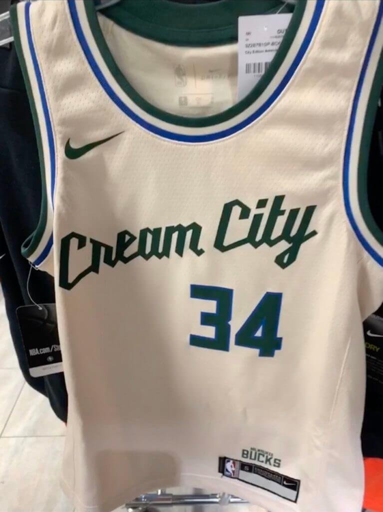
The script appears to be based on the Milwaukee power tools logo. I strongly suspect that the blue piping on the collar and armholes will be cited as a salute to Milwaukee’s “blue collar” work ethic (why stop at one cliché when you can invoke another one?), but I’d love to be proven wrong.
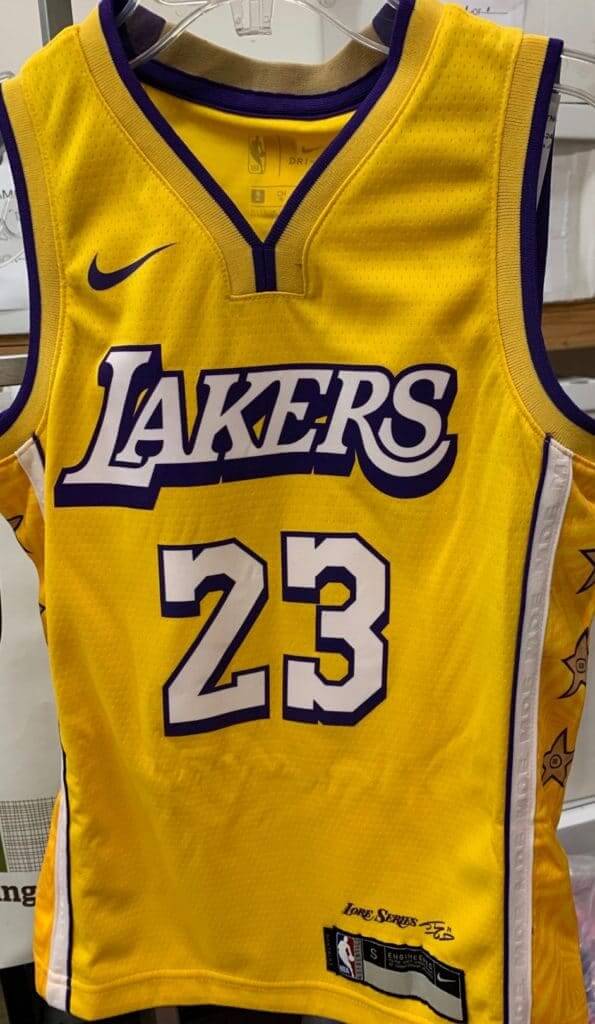
• The latest “Lakers Lore” design leaked. This one is for Shaq — that’s his signature at the bottom, and I’m told that the “M.D.E.” stamped into the white side trim is for “Most Dominant Ever”:
Leak of @lakers the city Jersey via Ig @Oclv21 👀@uniwatch shaq Tribute -> M. D. A. – >most dominant ever #jerseyheadPL pic.twitter.com/snWNyZKZll
— Rafal Niewiadomski (@niewiadomski51) November 20, 2019
• A new Raptors design leaked:
Leaked Toronto Raptors City Edition Jerseys 🔥🔥 pic.twitter.com/Vk5b6jIVv2
— clear eyes, bad takes (@bobbyboxscore) November 20, 2019
• The Cavs are supposed to unveil their latest alternate tomorrow, but something appears to have leaked:
— Grant Puskar (@grantpuskar_) November 19, 2019
• The Kings posted a teaser for their new alternate. Look like it’ll be red:
While the sleeps… pic.twitter.com/Dbcokmaenk
— Sacramento Kings (@SacramentoKings) November 20, 2019
• The Timberwolves announced that they’ll be unveiling their latest alternate this morning. I’ll add it to this post once it’s been revealed. And here it is:

The Timberwolves City Edition uniforms are here. pic.twitter.com/PQGriRr0KP
— Danny Cunningham (@RealDCunningham) November 20, 2019
• The Wizards will also unveil today. Again, I’ll add the design to this post once it goes public. And here it is:
@UniWatch pic.twitter.com/SNOWBVYYAO
— Auztin Rozebeezy (@realRosebud) November 20, 2019
———
Most of these designs are empty calories — the uniform equivalent of junk food. But if you want something more substantive, two very interesting articles on NBA uniforms were published in the past couple of days. The first one is about why the Lakers keep wearing purple instead of yellow at home. The short version: Other teams are wearing their dark colors at home, which is forcing the Lakers to wear yellow on the road, so they have to wear purple at home or else the league will get upset with them.
Key passage: “The only requirement is that teams wear their Icon and Association Edition uniforms 10 times each, their Statement Edition uniforms six times and their City or Classic Edition uniforms three times. … Teams and the league would like to see all four uniforms get exposure so fans will go out and purchase them.”
The other interesting article is about how the Pistons may bring back their teal uniforms as a throwback design — but not until 2022. Why the long wait? Get this:
In looking at the Pistons’ available options, the NBA mandates that they could use teal as a Hardwood Classics [uniform], which can be in five-year intervals of a franchise anniversary. The next one is three years away, so fans will have to wait for the 80th anniversary of the Fort Wayne Zollner Pistons’ start in the National Basketball League.
“Our first opportunity would be the 2022-2023 season, because it would be the 80th anniversary of 1941. If we wanted to bring back some variation of the teal as a city edition, the league doesn’t let you do that,” [Pistons exec Jason] George said. “You can’t bring back portions of a retro uniform; you can only bring it back in its original form as part of Hardwood Classics.
“You have to apply. When it’s an anniversary year, if the league accepts your application, you can pretty much use any uniform from your history that you want to honor.”
I was not aware of this rule restricting throwbacks to five-year-increment anniversaries. Seems absurd, no? (I also was not aware that 2022-23 will somehow be the 80th anniversary of 1941, but maybe it involves a time-warp or a wormhole or something.)
Anyway: Both of those articles are definitely worth reading — recommended.
(My thanks to Etienne Catalan, Aaron Cohn, Mario Garcia, Andrew Lacy, Mina Mikhael, Tim Myer, @huskiesNBA, @SacKings_Unis, and @tacojayfor3 for their contributions to this section.)

ITEM! NYT raffle: My New York Times account comes with a bonus digital subscription, which the Tugboat Captain uses. But I’ve just learned that it also comes with a second bonus digital subscription (it’s not clear to me if this is a new thing or if it’s always been the case and I just didn’t realize it), and I’ve decided to raffle off the second one to a Uni Watch reader — a way to give the gift of journalism. My thought is that I’ll give it to someone for six months, then raffle it off to someone else for another six months, and so on.
Obviously, I can’t control who enters this raffle. But if possible, I’d like the digital access to go to someone who wants to read the Times but doesn’t have the financial resources to do so. Please take that into account when deciding whether you’ll enter.
This will be a one-day raffle. To enter, send an email to the raffle address by 8pm Eastern tonight. One entry per person. I’ll announce the winner tomorrow.
Meanwhile, speaking of raffles, the two winners of yesterday’s membership raffle are Mike Rosenberg and Bryan Stroud. Congrats to them, and big thanks to reader David Cline for sponsoring their memberships. We’ll have more raffles coming soon.
LAST CALL for the hoops gear: Today is the final day for you to get your order in for Uni Watch basketball jerseys and shorts (which I’m sure is a relief to everyone who’s sick of these daily reminders). As always, you can customize the number and NOB on the jerseys. Full details here.
The Ticker
By Lloyd Alaban

Baseball News: Here are one writer’s picks for 12 MLB uniforms that need to come back. Fair warning, there’s a Turn Ahead the Clock entry in there (from our own Brinke Guthrie). … The Swift Current Broncos — that’s a major junior hockey team in the WHL — will wear uniforms this week honoring the Swift Current 57’s, a member of the collegiate summer Western Canadian Baseball League (from Wade Heidt).

NFL News: It looks like Saturday Night Live outfitted cast member Kenan Thompson in a Browns jersey to spoof DE Myles Garrett that had an incorrect No. 5 on it (from Jeff Moulden). … NHRA Top Alcohol driver Chris Demke uses a Chargers-themed racing helmet (from David Firestone).
College Football News: New unis for NIU. Here’s a closer view (from Andrew Quinn and Joe Duider) … Those new NIU unis looked particularly brutal — and illegible — in last night’s game against EMU. Here are more pics (from Burrill Strong). … The helmet history tour with Blaise D’Sylva continues in the MAC with Ohio University. … Colorado is retiring and replacing Ralphie V, its current live buffalo mascot, because she’s too fast for her handlers when leading the football team onto the field (from Kary Klismet).

Hockey News: Hockey Canada is dropping “midget” and other traditional minor hockey group names (from Wade Heidt). … Also from Wade (and cross-listed from the baseball section): The Swift Current Broncos of the WHL will wear uniforms this week honoring the Swift Current 57’s, a member of the collegiate summer Western Canadian Baseball League. … Camo-themed unis for Georgia men’s club team this week.

NBA News: F Carmelo Anthony will wear No. 00 with the Blazers, who already had PG Damian Lillard wearing No. 0. Yes, that’s allowed, and no, it’s not the first time it’s happened, as Paul broke down earlier this year. … The rock band Tool’s drummer wore a custom Sixers jersey when they played in Philadelphia this week (from Michael Barkann). … The Wisconsin Herd, D-League affiliate of the Bucks, will wear four different uniforms based on four different old Bucks uniforms (from Norb Rozek). … Celtics G Jayson Tatum has consistently been wearing his socks inside-out (from @mt_vern).

College and High School Hoops News: Here’s an oddity: Nicholls State’s front numbers are significantly larger than their back numbers (from @cbatz2). … New throwbacks for GCU men’s. … Sleeves last night for Detroit Mercy men’s (from Jacob Johnston). … The players for Jonesboro High School in Georgia all wear “Family” as their NOB. Fern Creek High in Louisville, Ky., does the same thing, but a bit more flamboyantly (from Mike Raymer and Matt Fowler, respectively).

Soccer News: FC Cincinnati released a teaser for their home kit (from Ben Field). … An Irish boys and girls soccer club is poaching the MLS’s old logo (from John Flory). … Real Monarchs SLC of the USL Championship, the reserve team of Real Salt Lake, has added a star to their logo to reflect their recent title (from Josh Hinton). … As always, you can follow the latest kit news by following Josh’s Twitter feed. … Coventry City has received permission to wear their “2 Tone” third kit a few more times (from @karateboogaloo).

Grab Bag: The NASCAR Truck series is getting a new logo next season (from @waynetm41). … Cross-listed from the NFL section: NHRA Top Alcohol driver Chris Demke uses a Chargers-themed racing helmet (from David Firestone). … Interesting cultural analysis of the uniform (WaPo link) worn at yesterday’s House impeachment hearings by witness Lt. Col. Alexander Vindman (from our own Anthony Emerson). … Tokyo’s National Stadium, the venue that will host the Opening and Closing Ceremonies (among other events) for next year’s Olympics, has finished construction (from Kary Klismet). … FedEx is taking one of the National Zoo’s pandas back to China in a plane with a panda-themed livery. If you’re super curious, you can track the flight (from our own Jamie Rathjen). … New kit for Carlton of the Australian Football League (from Ewan Williams). … Military veteran Timmy Donahue says a recent episode of the TV show Chicago P.D. showed police officers wearing military ribbons instead of Chicago police ribbons.
Tomorrow (I hope): The Bucs-redesign contest results. See you then. — Paul
1) The NIU/Eastern Michigan game last night was brutal, especially from normal viewing distance. I don’t know how anyone could read the numbers. link
2) Doesn’t Gary Harris just look thrilled to be modeling that Nuggets uni?
3) Eagerly awaiting the Bucs’ results.
I stumbled across that NIU/EMU game last nite as well. It was about as ugly a college match up as I’ve ever seen.
as an NIU alum, ’96 and ’01, I’m more embarrassed by the uniforms than the lousy performance last night.
RE: Harris- I’m just waiting for the Slapshot moment:
Johnny Upton: I’m gonna walk down that stinkin’ aisle, I’m gonna open up this $*&$ bathrobe and wiggle my dick at ’em!
Joe McGrath: You will not.
Johhny Upton: Yes I am, Joe, and you know why? Because I want you to have a heart attack and die so that we never have to do this shit again. You and your fucking fashion shows
PL: what kind of terms did you leave ESPN with? I ask only because they did cover the Brewers’ uni reveal yesterday. So they’re still covering uniforms as an aspect of sports but it felt wrong. Like they think anybody can report on a team’s new sets. But it lacked the something extra that you always brought to the uniform-related news and they are worse for it. They need someone who Gets It™️. Was wondering if there was an opportunity for something, even periodic guest-starring roles.
Left on good terms but company policy prohibits me from freelancing for them until 18 months after my departure, which would be September of next year.
“So they’re (ESPN) still covering uniforms as an aspect of sports but it felt wrong. Like they think anybody can report on a team’s new sets…They need someone who Gets It.”
So, this post is a goof, right?
Like, you can’t possibly be in ANY way serious about this.
ESPN occasionally covered unis LONG before this blog existed. The Big Show with Dan and Keith used to do brief segments on the latest unis, with Keith taking “GET OFF MY LAWN!!!!” cranky old man approach.
But there’s actually something quite disturbing in your post, this:
“Like they think anybody can report on a teams new sets.”
Actually ANYBODY and EVERYBODY can and does do just that.
What the hell do you think the majority of comments on this blog are about, how to make the best banana flavored frosting?
Paul doesn’t have a degree in fashion design, he just has an interest in a particular aspect of sports and managed to get people to pay him to write it about for a number of years and started this blog where he can post SCALDING HAWT UNI TAKES!!!!
None of that makes him unique or special or gives him ANY sort of monopoly on being allowed to comment on sports uniforms.
I’m sure Chris Creamer just adores how you diss him, although with that website it’s more logo related and it is the commenters who get into HAWT TAKE making.
And you apparently don’t watch ESPN enough because for several years now on Saturday mornings during college football season they have a brief segment on Sportscenter showing off some of the uniforms special and otherwise that will be worn that weekend.
“…and they are worse for it.”
You are WRONG.
With all due respect, Ben, it’s you who’s wrong. Sure, anybody is free to express their opinions on sports uniforms in any forum that will accept them – including the Uni Watch comments section. But not everybody has the critical thinking skills and talent as a writer to turn those opinions into something that’s worth others’ time to read.
Whenever a media organization thinks it can cut costs by generating content with less-talented writers, journalism suffers, and by extension we, as the readership, suffer, too. So I vote with my feet (or my mouse) and go where I can find the best content. Paul, as a writer, critic, and a curator of the Uni Watch community’s submissions, provides the exceptional content I’m looking for on the subject of sports uniforms and design.
If you think ESPN’s Lukas-less uni-coverage also meets that standard, by all means, enjoy! But I’ll stick with Uni Watch because I’m confident in the quality of the content based on Paul’s past work product. That’s not a monopoly. That’s how the market – and the marketplace of ideas – is supposed to work.
I mean, by all means get your HAWT UNI TAKES from wherever you please, but in what’s no doubt becoming a more crowded market all the time, there’s still nobody who can really compete with the one guy who has been on this beat nearly every day for twenty years. It stands to reason that with that comes a wealth of contacts, insights, experience and general understanding of that world that gives what he has to say more weight than pretty much anybody else on the planet. It helps that he’s a pretty good writer and communicator as well.
So basically, nobody’s gatekeeping the uni-verse here. It’s just that when it comes to deciding who is worth listening to, Paul just so happens to be a damn sight better qualified than most.
Paul is the Roger Ebert of sports uniform writing. Sure, anybody could give their opinion on a movie, but Ebert’s writing was a class above everyone else.
Mr. Hartsock’s name is either misspelled in the text or on the rendering of his membership card. I’m not sure which spelling is correct.
Yup, you’re right — card was misspelled. Have removed from today’s entry; will fix and run it tomorrow.
Pistons should bring back the 80s Bad Boys jerseys as a Classic jersey. They haven’t worn them in ages. The teal jerseys may be brought back too, but I’d rather have them wear the 80s jerseys first because it was miles better.
I think they’re too similar to the current set. The font is different and PISTONS would replace DETROIT on the blue set but all else besides the cut/fit is the same. And it’s doubtful Nike would revert to 80s style of cut/fit for a classic uniform.
Have they ever brought back the silver home unis they wore a little before the Bad Boys era?
They have not. Those were identical to the Bad Boys whites but instead in silver paying homage to the Silverdome.
I thought they were worn for a season to mark the silver anniversary of moving to Detroit.
I thought they were worn to look like actual pistons!
The Utah Jazz announced that they’d wear their “red rocks” alternate one more year.
link
Great move to raffle your digital NY Times subscription. FYI to anyone who can’t afford to subscribe. The public library where I live has a digital subscription to the NY Times (and other online media) that is available to anyone with a library card. I assume other public libraries (or college libraries if you are a student) offer the same.
Typo in the soccer section. Should be 2 Tone (not Tones)
Fixed.
There are just sooooooo many NBA versions at this point. Why can’t there just be one home, one road, and OK, it’s 2019- one alt?
Oh I know.
merchandising.
This, 100%.
And the thing is, most people do not look good in tank tops. Most guys can rock MLB, NFL, NHL or soccer tops. But you don’t see as many adults in jerseys. And it is getting away from the eye test – “if I turn on the TV, can I figure out who is playing with a minimal amount of effort?”
Hey, is that THE Michael Barkann, CSN Philly legend I see submitting on the ticker today?
You’re missing the original, sleeveless white Rip City design.
link
Thanks! I’ll add that to the text.
Forgive me if I’m wrong, but isn’t the current Los Angeles Angels logo the very “A” with a halo on it that the “12 Uniforms That Need To Come Back” writer wants brought back?
Perhaps he wants the old navy and red *caps* brought back, but he blurs the line between logo and uniform with that entry.
Nestor Chylak –
(Helluva moniker of a great American ump, war hero and all around good B&S’s guy from PA.)
Lifelong Angels fan (born and raised in the OC) and I totally agree with you on this point, the current Logo and Letterforms (designed by the great Todd of Radom) IMHO are a solid, textbook example of what good logo work is all about.
Yeah I know, they put that “A” in every available spot on the Jersey, which is unnecessary, but they are owned by a former sign company owner, so subtle is not in Mr. Moreno’s playbook.
The whole point is that the author of the “12 Uniforms that need to comeback” can be summed up in one word – filler.
Eastern Michigan…Northern Illinois….noted.
Based on the Celtics social media this last week, I’m guessing we’ll see a new C’s uniform tomorrow as well.
Timberwolves design is now live:
link
Looks like the 5 on the SNL Browns jersey used to be a 9. You can see on the top right where it looks like a piece was added and then obviously some had to be removed to make the 5.
same with the shoulder number… looks like a piece added to make the 5 (doesn’t even match the chest 5)
Of course, the Browns were wearing their Color Rash unis last week, not their regular brown jerseys. And there’s no number on the front of the Steelers helmet.
That said, SNL was on the air 48 hours after the incident, so there wasn’t a lot of time to get all that together. No doubt wardrobe and props did the best they could under the circumstances, and I haven’t seen much in the way of complaint from non-uni watchers.
So, are the T-Wolves now the Members of the Scottish Parliament or what?
I thought they were missing a letter and following the lead of automobile advertisements – MSRP (Manufacturer’s Suggested Retail Price); they just forgot to put on the price – stick a dollar sign on the number below and they are set.
A laugh here from me as a British Columbia resident when I saw those unis. Public health insurance here in this province is called Medical Services Plan. Just commonly known as MSP. MSP now has its own jersey!
I guess TIL that the spirit of the Twin Cities is, um, light blue and generic.
Also, I spent half a minute looking at the new Wizards design wondering what the heck “clc” stood for before I got it.
Actually MSP is a widely established moniker for the Twin Cities of Minneapolis and St. Paul. It’s the airport code, the Fox station is KMSP, etc.
Now the uniforms, ick…
On a NYT-related note, is anyone else bothered by how their social media presence has taken on a rather clickbait-y vibe in the last year or so?
In the related article highlighting old MLB uniforms, specifically the picture of Richie Allen in his red Sox livery, I notice that he can he juggle three baseballs at once and smoke a cigarette at the same time. In the dugout. Have times changed or what?
Baseball is the only sport I can recall players smoking _during_ a game.
It wasn’t unusual to see Billy Williams or Fergie Jenkins grabbing a smoke in the Wrigley Field dugout between innings.
Sports I think you could add To that list:
Golf, bowling, darts, curling.
Basketball and Hockey players routinely smoked in the locker room at halftime/between periods into the 80’s. Not visible like Mr. Allen, but still during the game.
If the Buck’s new jerseys have the same explanation as the previous ones and as the court design the blue is a reference to Lake Michigan.
Ohio based Lakers fan here….I had been curious as to why the Lakers have been wearing purple at Staples Center this season. Thanks for the update on this story…I’m not a huge fan of the Sunday home white jerseys for the Lakers….I’d prefer the traditional gold at home and purple on the road…
How close are we to each NBA team having 82 different uniforms? No one has a color scheme anymore. It’s absurd. I would relegate NBA uni watching below MLS at this point. From a Uni perspective, can it even be considered a Big Four sport anymore? Throw in the ads and…ugh…make it stop!
The NBA has become such a cluster. You don’t even know what teams look like anymore because there are so many variations. Does this ever swing back? I feel that it is destroying the brands for the sake of short term gain. I turn on the TV now and can’t even figure out which teams are playing.
I honestly think fans are following individual players now. Not teams.
It’s like the red carpet on Oscar night. People want to see what the stars are going to wear next.
Have to agree here, perhaps I am an old curmudgeon (at 37) but so many things about the NBA in the last 2 decades have ruined the experience for what was in my youth, my second favorite sport to watch. In general the style of play just seems incredibly sloppy now. And I find the 20-somethings in my office to be the only ones who talk about the NBA, and it usually isn’t from a game they watched but rather a highlight they saw on the social media account of a player. Players have become their own brand, and seem to, more than other pro athletes, embrace the “social media influencer” role their celebrity now grants them, as much as they embrace being an actual NBA player.
And of course, as a uni enthusiast, the NBA is now a pointless gimmick to me. The brand recognition is gone, to see classic teams like the Knicks, Lakers, Celtics, Bulls, etc embrace this means it has gone completely off the rails. It makes the one-off uniforms and mixed match combos of NCAA football seem quaint.
UTEP MBB with a new GFGS uniform
link
The unis are actually their Noche Latino set with the word “MINEROS” (Spanish for Miners) on the front.
“The NASCAR Truck series is getting a new logo next season”
Same ‘sponsor’, just a longer name indicating an addition to their product line? Ugh. Looks and sounds terrible.
I’m glad that the top-tier division is being renamed simply the NASCAR Cup Series next year (new logo in the works?), though I’d like to see that change reflected in the lower tiers as well.
Just use the NASCAR Next moniker as the name for the ‘I Still Call It The Busch’ Series since it’s a proving ground/developmental circuit anyway, and just call the Truck series, gee, I dunno,…The NASCAR Truck Series.
Nice to see that Mavs remove the Dirk image from the alternate court. I’m sure the Tall Baller from the G didn’t want any part of that noise.
Does the NBA exist for any other reason than to sell clothing and shoes?
This is all part of the NBA’s long transition into a culture/celebrity/fashion/merch platform that happens to involve sports (instead of the other way around), which has been ongoing, I’d say, for about a generation now.
It’s worth noting that this is what all the other leagues aspire to but haven’t yet done quite as successfully.
I believe the blue in the Bucks color scheme is supposed to “represent” the city’s proximity to Lake Michigan. Not much better than blue collar, but still.
Also nice to see the Raptors finally put Toronto on a jersey, and not that tired North nonsense.
The Bucks state logo has the blue representing the bodies of water surrounding Wisconsin for sure. Who knows on this new uni
What in the world is the NBA thinking with these dollar store tank tops? If I turned on the television to check the score I would be confused, MSP vs Cream City? Come on man.!
Is there any city that doesn’t espouse the “blue collar” line? It’s so overdone, and I say that as a Cleveland sports fan and a blue collar tradesman.
Which is exactly why it’s such a tired, pathetic trope/cliché/fetish.
It’s all nonsense. I’m pretty sure you won’t see NYC and LA, for example, invoking the blue collar thing, because their images are based on other things. But of course there’s tons of blue collar work in NYC and LA — it’s just not a big part of those cities’ mythmaking.
All of this is about nostalgia for America’s hugely diminished production economy. Today we have a service economy, but it’s harder to create myths around home health services and Amazon Prime shipping.
I regularly encounter NYC touted as an especially or uniquely blue-collar, working-class burg, especially in the context of sports fandom. One encounters that rhetoric regularly right here and on the Creamer boards. There seems to be a cohort of New Yorkers who believe that other cities do not have police officers or firefighters.
“it’s harder to create myths around home health services and Amazon Prime shipping.”
Just wait, Paul. Around 2050, when we’re 3-D printing all the goods we could ever need right inside our homes, some sports team — in Seattle, maybe — will look back nostalgically at things like Amazon boxes and design a uniform around them, “telling a story” about the hard-working warehouse staffers and how they still represent the city.
Silver lining: that shade of brown isn’t used much in sports; it’ll be fun to see.
It does seem that the NBA has completely lost what it means to have a visual identity. I don’t connect with the NBA and have a hard time watching it both for the visual aesthetics of the uniforms and for the style of play. What a waste. All this to sell more tank tops?
Any idea when Bucs redesign results will be posted?
Someone didn’t read to the end of today’s blog post. ;)
Ha I literally made it to the grab bag, clicked on the Chargers NASCAR helmet and then got called away! Thanks!
USA Hockey dropped Midget about 2 years ago. They dropped all the names for the divisions, such as Peewee, Squirt, Bantam, Etc. Now they are all known by ages, 18u, 12u, etc.
I really love that Timberwolves number font; the Raptors have one that looks like it (and decades ago, before it evolved into what we have now, the Shepard font for the Cubs looked similar). So clean and easy to read.
If I may elaborate about the Swift Current Broncos jersey set to be worn Friday night. The Broncos primary logo on the shoulder has a small detail difference compared to the usual. The interlocking “SC” in the logo is changed to look like the “SC” of the 57’s that they wear on their hats.
Will be fun as there are not many hockey uniforms that are forest green with orange trim. The Broncos are royal blue and kelly green trim normally. I am betting they will wear their alternate black set of helmets, pants, gloves with this uniform on Friday night. They have the black set of equipment as they still wear their modern retro third uniforms, which is green with yellow and black trim.
link
No screen grab, but Georgia men’s hoops broke out the retro unis tonight versus Georgia Tech. Georgia across the chest and NNOB.
Knicks city leak via dave east instagram :
link