Click to enlarge
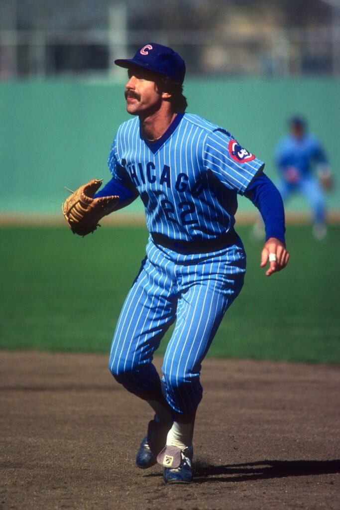
Bill Buckner died yesterday. He wore several classic uniforms during his career (including the Cubs’ beautiful reverse-pinstriped road uniform, shown above), but of course he’ll always be remembered for making one of the more famous errors in baseball history during the 1986 World Series, when he played for the Red Sox. Twenty years later, that error led to a discovery that has forever tied him to Uni Watch.
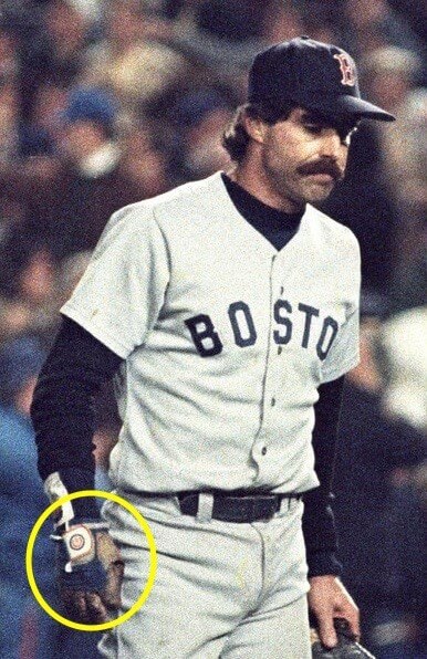
Here’s the backstory: In the fall of 2006, one of ESPN.com’s photo editors, Sean Hintz, was looking through old wire photos for a story on the 20th anniversary of the Buckner error. Most photos of the Buckner play showed, you know, the play, but Sean found a photo that showed Buckner walking dejectedly off the field after the Mets won the game. He had removed his first baseman’s mitt and, like many first basemen, wore a batting glove underneath his mitt to provide an additional layer of padding. The interesting thing was that this batting glove had a Cubs logo. Buckner hadn’t played for the Cubs since 1984, so he had clearly kept this batting glove around for a while.
Most photo editors wouldn’t have noticed this detail (or, having noticed it, wouldn’t have cared). But Sean Hintz was a Uni Watch fan — he had helped me out with a few projects during the two years or so that I’d been writing for ESPN at that time, and he definitely Got It™. So he got in touch with me to let me know what he’d found.
Nowadays, both the Cubs and, especially, the Red Sox have emerged as powerhouse teams. But in 1986, when Buckner made that error, they were still saddled with their respective curses, and it’s hard to overstate how hopeless both franchises seemed. (Even two decades later, when Sean discovered the photo, the Cubs were still mired in their own voodoo. The Steve Bartman incident had taken place just three years earlier.) By wearing Cubs and Sox logos simultaneously, Buckner had unwittingly commingled the two most storied hexes in sports lore. No wonder he made that error — he never had a chance.
It’s not often that you get to discover something new about a famous incident two decades after the fact. The Buckner error was one of the most scrutinized and replayed incidents in MLB history — who’d have thought there was more to be learned about it 20 years later?
I wrote a column about all of this for ESPN. It became the first Really Big Story I did for them, doing monster traffic, generating lots of attention, getting featured on the site’s home page for days, blah-blah-blah. When I recently listed up my favorite ESPN pieces for my final column, I put the Buckner piece at No. 1.
I tried to contact Buckner for that piece, but he declined to talk with me. That’s understandable — he’d made it pretty clear by that point that he hated how that one play had come to define his life, and I felt pretty bad just for asking. I didn’t realize that he had been battling Lewy body dementia recently until I heard the news of his death yesterday. That’s a cruel disease and seems like a particularly nasty way to go. I hope he found some peace in recent years before the disease began taking its toll on him.
Shortly after the news broke yesterday, I received a text from Sean Hintz, my old ESPN photo editor (he’s still with the company):
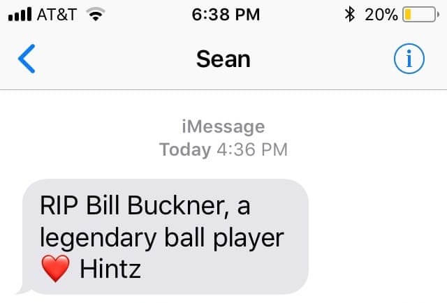
Legendary indeed — including here on Uni Watch.
Meanwhile, here’s an amazing statistic — not uni-related but still fascinating — from longtime Uni Watch pal Tyler Kepner:
On Sunday, the last full day of Bill Buckner's life, 16 major leaguers struck out at least three times. Buckner played 22 seasons and never did it once.
— Tyler Kepner (@TylerKepner) May 27, 2019
That’s something, eh? R.I.P.
Memorial Day roundup: For the first time ever, MLB teams wore remembrance poppies on their jerseys yesterday, along with Memorial Day cap patches. Here’s a peek at how the poppies looked on several teams’ uniforms (for all of these, you can click to enlarge):


We’ve often said that the Rangers can’t decide if they’re a blue team with red trim or a red team with blue trim. That identity crisis was never more apparent than yesterday:
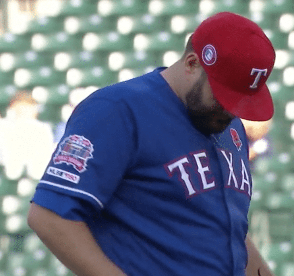
Just to make the red caps more confusing, they wore blue batting helmets. Oh, and let’s not forget the red socks. Yikes!
Fun fact: Because of make-up game that was played prior to the regularly scheduled game, the Pirates and Reds both wore the poppy on two different jerseys yesterday:
Because of a postponed make up game from March, the Pirates have two uniform combinations feat. the #MemorialDay cap patch and poppy patch on the uniform in Cincinnati today. @UniWatch @PhilHecken
📷 courtesy: @pirates/@mlb pic.twitter.com/PmiCkPScYP
— Noah Kastroll (@NRKastroll) May 28, 2019
Yep, Reds too pic.twitter.com/bBDHYcQgjY
— Erik (@eousley) May 28, 2019
The umpires wore the same jersey and cap patches that the players did:

All in all, the poppies were much better than the boilerplate camouflage treatment. Unfortunately, some players ruined it by wearing camouflage socks and accessories:


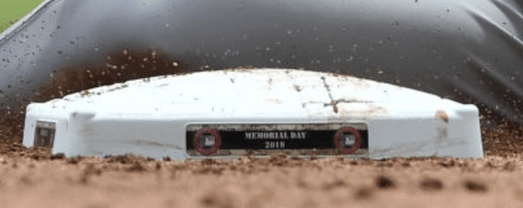
Also, while it’s a little hard to see, the little placards on the bases were trimmed in digital camouflage. Why not use the poppies? Sigh:
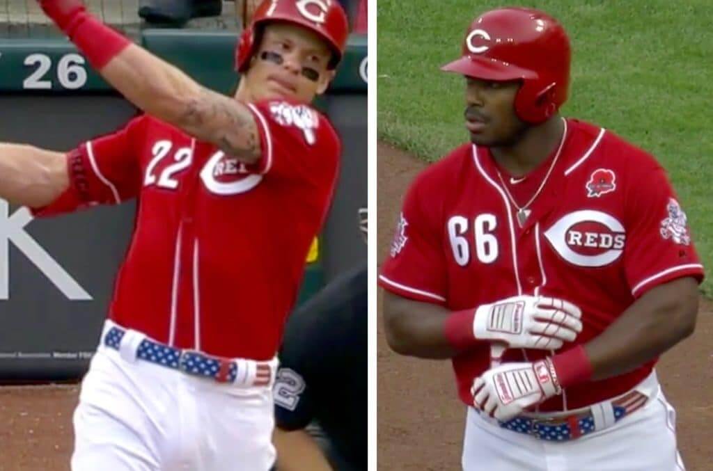
In addition, at least two Reds players — first baseman Derek Dietrich and outfielder Yasiel Puig — wore stars/stripes belts, which seems a bit rah-rah for this particular holiday:
Meanwhile, Cleveland manager Terry Francona wore the poppy on his pullover and also added a patch for an Ohio soldier who was killed in action:
In addition to the poppy patch with the words "Lest We Forget" across the flower, Tito is wearing a patch to commemorate the life of U.S. Army Captain Michael Medders Jr. from Avon Lake who was killed in action in 2008. pic.twitter.com/oYb9j6N6sL
— Cleveland Indians (@Indians) May 27, 2019
Speaking of Francona and Memorial Day uniforms: In case you missed it last Thursday, I had an in-depth interview with Francona’s son, U.S. Marine veteran and former MLB front office employee Nick Francona, who has some strong feelings about MLB’s handling of this holiday. It’s powerful stuff, and it has prompted a lot of reaction and response — if you haven’t read it yet, I encourage you to do so now.
(My thanks to our own Brinke Guthrie for letting me know about the Francona patch, to Phil for letting me know about the bases, and to @shmistertug for tipping me off about the Reds’ belts.)
@PhilHecken @UniWatch Jeffress has to change his compression sleeves in the Brewers Vs Twins Game because they were lighter than his teammates’. pic.twitter.com/bK8HxKfsd4
— Tony T (@Tinger_3) May 28, 2019
Some weird shit going on out there: There were two very odd scenes on MLB mounds yesterday. Let’s start in Minnesota, where Brewers pitcher Jeremy Jeffress was called out by the umps for having light-blue undersleeves, instead of the Brewers’ standard navy. Pitchers aren’t allowed to wear white or grey sleeves, because the batter could lose sight of the ball, so that was apparently the issue.
So did Jeffress change his undershirt? No — because he was already wearing a navy base-layer shirt. As you can see in the video above, his sleeves turned out to be stand-alone compression sleeves! So he just peeled them off and replaced them with navy sleeves.
Meanwhile, over at Fenway, Cleveland pitcher Oliver Pérez had a problem with his shoes, so he took them off and stood around on the mound in his socks while waiting for someone to bring him a fresh pair of spikes from the clubhouse (in the video that follows, the broadcasters say that the umpires had a problem with Pérez’s footwear, but Pérez said after the game that he actually broke a cleat):
OP had a shoe dilemma and we had to stop play momentarily 😂 pic.twitter.com/weciqZsOKm
— SportsTime Ohio (@SportsTimeOhio) May 27, 2019
And wait — there’s more! It turns out that Pérez (and maybe other players as well?) has his uni number on the bottom of his socks:
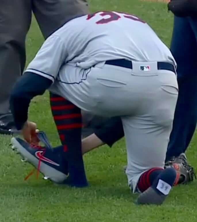
According to former MLB pitcher Brandon McCarthy, this is standard procedure. Who knew?
Meanwhile, there was a very interesting detail lurking in that Pérez video. Take a look at this:
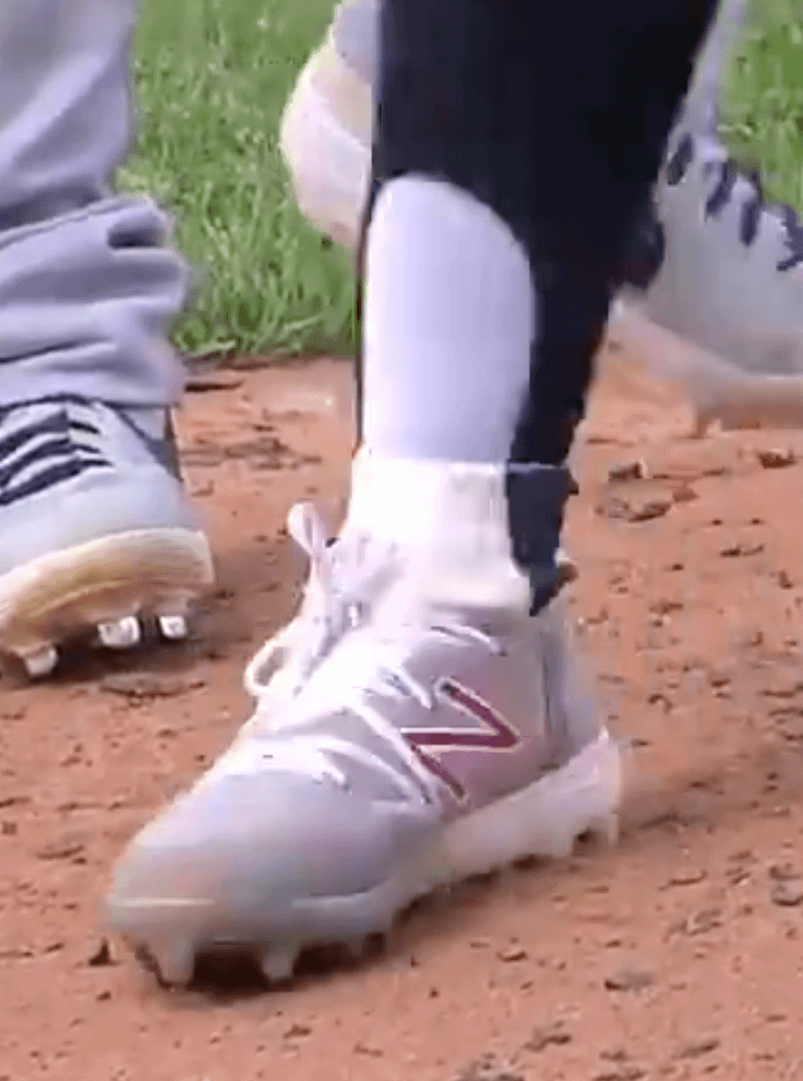
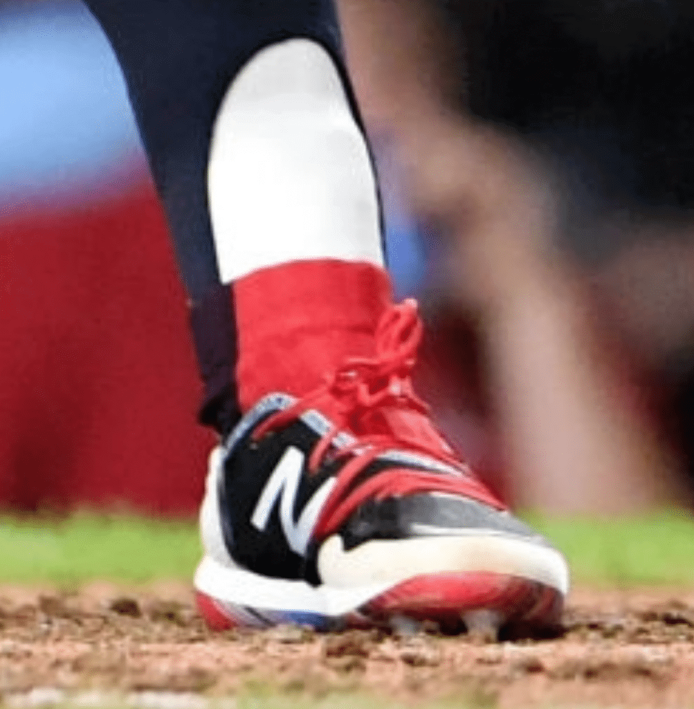
That’s Cleveland shortstop Francisco Lindor. He’s been wearing stirrups for several years now, and it looks like he’s added a truncated two-in-one to his hosiery arsenal. He’s apparently been doing this for week or two, and even has a red version to match his red cleats:
As you may recall, Lindor has used Trusox, with their telltale dot pattern, as his sanitaries, so I initially thought the shortened two-in-one was to cover up the Trusox dots, but that doesn’t seem to be the case:
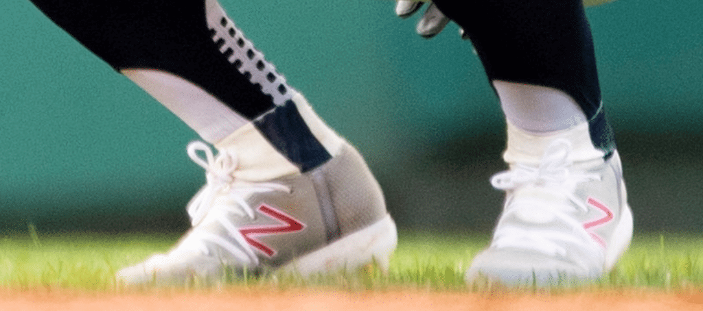
It almost looks like those short over-the-stirrup socks might be sewn into his shoes! Very strange. I’ll try to find out more about this — stay tuned.
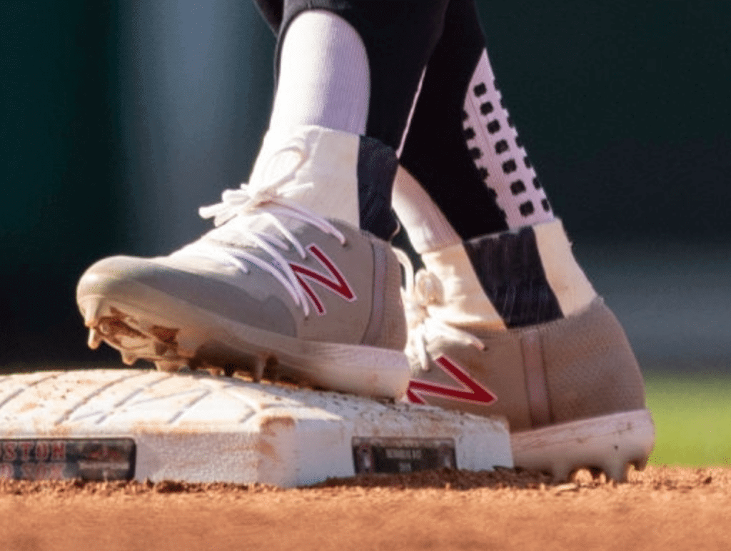
Update: Reader/commenter Tim Feren has confirmed that the short over-the-stirrup socks are indeed sewn into the shoes. New Balance apparently did this for him as a custom job:
The question remains: Why? I’ve asked a team spokesman — stay tuned.
(My thanks to the many readers who mentioned the Pérez and Jeffress situations, to Mike Chamernik for the photo of Perez’s sock number, and to David Chisholm for spotting Lindor’s odd sockwear.)
Click to enlarge
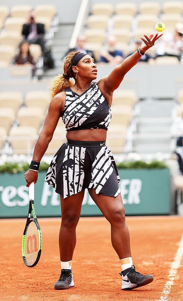
At least they downplayed the swoosh: After being told that the catsuit she wore in last year’s French Open would no longer be allowed, Serena Williams responded yesterday with the outfit you see above. It came with a jacket that had, in French, the words ““Mother, Champion, Queen, Goddess.” (They must not have had enough room to include “Diva.”) Additional info here.
(Another tip of the cap to Brinke, who was the first to bring this one to my attention.)
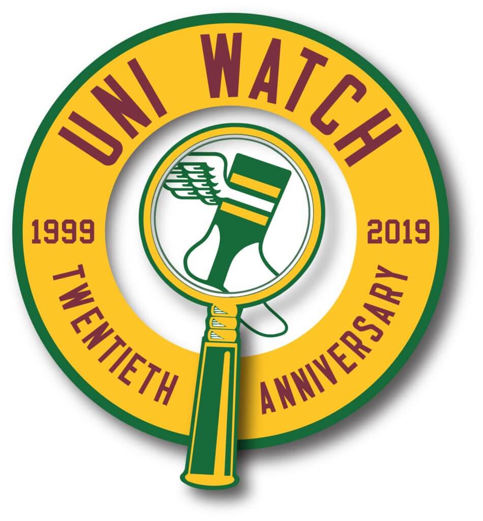
Anniversary roundup: Sunday was Uni Watch’s 20th anniversary. I realize many of you were busy with various holiday-weekend activities, so here’s a quick roundup:
1. Anniversary logo: That’s our new 20th-anniversary logo shown at right (or shown above, if you’re reading this on your phone). The concept was mine, the execution was by Scott M.X. Turner. I love how it shows the progression from our old visual icon (the magnifying glass) to our newer icon (the winged stirrup), and also provides some continuity from the 15th-anniversary logo we used five years ago.
The anniversary logo will be appearing here and there on the site, and will also be featured on a few bits of merchandise, including embroidered patches (these are already in production and should be available in about two weeks), stickers (I hope to have these available by tomorrow), and T-shirts (again, aiming for tomorrow).
I’ve also had a couple of people ask about mini-helmets (which would probably be similar to the basic Uni Watch mini-helmets that we sold a few winters ago), and Casey Tierney from Rocker-T Collectibles says he’d love to make them again, just like he made the previous batch. Hmmm — I really like the white shell we used last time, so we could stick with that, swap out the side decal, and change the center striping. Or we could go with a green shell or a yellow shell. Price would still be about $40. Is there any appetite or demand for this? Please email me if this is a product you’d be willing to purchase, and feel free to let me know how you’d feel about the shell color.
2. Anniversary post: I wrote a post on Sunday about how Uni Watch came to into existence (including some details from my uni-obsessed childhood), how it has developed over the past two decades, and how it has just earned me an official citation from the Brooklyn borough president (!). It’s long, but people seemed to like it. I encourage you to check it out here.
The response to that piece was tremendous. Amidst all of the congratulations and kind words of support, reader Andy Moeschberger, posted a comment on Sunday that included the following passage (boldface emphasis added):
Your criticism has changed the way I look at the world. You have never been “This sucks,” but always “This sucks because,” which is a refreshing change from so much of what we read on a daily basis. Your willingness to engage your community in the comments, and to force them to also give more than just “This sucks” is one of the reasons this community is a community. Your obsessive observations have changed the way I look at the world. It has definitely changed the way I think about design and consumption.
Oh, man — that is pretty much the greatest compliment any cultural critic could ever hope to receive. And by the same token: Andy, if you’re reading this, thanks so much for taking the time to say not just “Congrats,” but “Congrats because.”
3. Anniversary party in Brooklyn: As I’ve previously announced, we’ll celebrate 20 years of Uni Watch on June 29, 2-6pm, at the 773 Lounge. If you’re reading this, consider yourself invited!
4. Anniversary parties elsewhere: I asked longtime reader/pal Marty Hick, who lives in St. Louis, if he’d come out to Brooklyn for the party. He said he couldn’t justify the expense, but then he came up with a brilliant idea: He asked if I’d be okay with him arranging a satellite Uni Watch party in St. Looey on the same afternoon as the party here in Brooklyn.
I love this idea — not just for St. Louis but for any other cities where people want to gather on June 29. We could have a whole network of anniversary parties taking place at once (and maybe link them up via Facebook Live or Skype or something like that). I mentioned this possibility in Sunday’s post, and since then I’ve already received notes from people who are interesting in doing parties in Atlanta and — get this — Paris!
I’d love to see this happen, but I’d like to enlist some help. Ideally, I’d like to have a Satellite Party Coordinator who would keep a spreadsheet showing all of the party cities, venues, organizers, etc. The spreadsheet could be shared on Google Drive, or something similar, so everyone could see what’s going on in their city. People who wanted to organize or host a party could get in touch with this coordinator, who’d then update the spreadsheet and so on.
If you’d like to volunteer to be the satellite party coordinator, please email me and we can talk about that.
If you would like to organize a party in your city on the afternoon of June 29, please stand by for now. Once we have a party coordinator in place, you can get in touch with that person. Thanks.
———
That’s enough for now. But I’ll have more anniversary-related announcements in the days and weeks to come. Thanks again to everyone for all the kind words, and for helping to make Uni Watch such a special community.

Click to enlarge
Membership update: The first batch of 2019 Purp Walk membership cards mailed out on Friday, and it was be fair to say I washed my hands very, very hard after processing them. We still have a bunch more purple cards still to go, which we’ll be getting to in the next two weeks or so.
Also: Remember last week when I mentioned that card designer Scott M.X. Turner was able to include the tiny lettering in in the pinstripes on Mark Malazarte’s Lakers-themed card? The lettering was visible in the digital files that Scott prepared, at least when I blew it up to 400%, but I wasn’t sure it would be visible in the final printed card. But sure enough, it printed just fine. Check this out (click to enlarge, it’s worth it):

Ordering a membership card is a good way to support Uni Watch (which, quite frankly, could use your support these days). And remember, a Uni Watch membership card entitles you to a 15% discount on any of the merchandise in our Teespring shop and our Naming Wrongs shop. (If you’re an existing member and would like to have the discount code, email me.) As always, you can sign up for your own custom-designed card here, you can see all the cards we’ve designed so far here, and you can see how we produce the cards here.
Sorry, no Ticker today, because the whole Uni Watch team had the day off. The Ticker will return tomorrow. See you then. — Paul
I could be wrong but I believe those cleats Lindor is wearing actually have that “stirrup” section as part of the cleat. It’s attached (I think soccer features this detail often).
Happy Birthday Johnny Ek!
I was thinking same thing, that it’s a “bootie” attached to the cleat. But I looked the New Balance web site and don’t see a model like that. Perhaps they’re something New Balance hasn’t released yet.
In some of the photos it looks like it, but I don’t think New Balance makes that style. My first thought was that it was athletic tape
This is true, they are a part of the cleat. They seem to be a custom model only, based on the photo on the New Balance baseball Instagram page:
link
This is true, they are a part of the cleat. They seem to be a custom model only, based on the photo on the New Balance baseball Instagram page:
link
Great find, Tim! I’ll add this to the text.
I see Lindor is wearing MDS spikes vs metal, which seems a lot more players are doing. Any thoughts on why they have become more prevalent in MLB? I feel like it used to be all metal at the pro level.
Not heard of a thing as described happening in soccer, but what some players do is cut off the bottoms of their socks and wear their own socks underneath. No sewing involved (that I’m aware of).
Both Nike & Adidas both make “leg sleeves” now so players don’t have to cut the feet off their socks.
as to Serena Williams’ caption, she may want to consider the French crowds’ response to royalty when such crowd gathers at a tennis court. just sayin’
Très bien, monsieur.
Eh no one was watching her match anyways.
I like the red cap/blue jersey look on the Texas Rangers.
Me too Wade. Always thought red is best as an accent color. Phillies, Reds, and Angels have too much red. Too bold of a color to feature so heavily, especially paired with red shoes. Boston, Cubs, Twins, Indians, Braves, etc. all handle red much better as an accent with contrast.
Read that back slowly about the Reds having too much RED in their uniforms…
The Reds have too much Black in their uniform.
It’s not that the Rangers have failed to decide whether they’re a red team or a blue team; the Rangers have decided that they’re a red-and-blue team. The club has been giving the two colors roughly equal treatment in its uniforms for many years now. And that’s a perfectly valid choice. I mean, I pity any team that has to compete with the current Houston Astros in terms of uniforms and branding. Personally, I wish the Rangers would be more consistent, less mix-and-match, but they’ve made red-and-blue mix-and-match their identity.
Fully agree. It’s never bothered me as a fan the way they use both colors. Having said that, yesterday’s look—which I think is a first for them—was too much for me. Even while mixing and matching each game’s choice was either mostly red or mostly blue and not a mishmash of both.
Still, I’ve grown to like the blue much better and would prefer less red in the new set I’m sure they’ll have next season in the new park. Hopefully they keep the regular blue and don’t change it to ubiquitous navy.
Getty didn’t get a picture of the Rangers First Baseman who was wearing a 1/2 red 1/2 blue sock.
Proofreading:
“I didn’t realize that he had battling…”
Missing ‘been’?
Yes, thanks. Fixed.
Some interesting uniforms in this piece about a group trying to set the baseball marathon record…
link
Watching the Red Sox & Cleveland game last night when the whole cleat/spikes debacle happed with Oliver Perez. I noticed that on the bottom of his socks he had his number written in the middle of his socks. Also you have to have a quick eye but at the 29-30 second mark of the video at the bottom of the page you can see number 55 on the back of his new cleats which happens to be catcher Roberto Perez who is seen in a couple of different shots just standing their patiently waiting on the game to resume.
link
New Uniforms for 2019-2020 for the Oakville Blades of the OJHL
link
I’m liking those. The jerseys with the blue/red and the shoulder yokes remind me of the old Regina Pats jerseys I thought were some of that team’s best.
link
interesting link. since the new owner has pr interest in various athletes, what will that mean for covering scandals involving any of their clients?
Excellent question.
From the WaPo article: “Meredith [Corporation] will continue to print the magazine and manage the editorial side of Sports Illustrated for at least two years as part of the deal, people with knowledge of the agreement told The Washington Post, while Authentic Brands will license the magazine’s brand and all of its content.”
As for what that means in practice though…
Just F everyone’s I, in case this hasn’t been mentioned, the 773 Lounge’s website weirdly lists its address as “773 Coney Island Avenue, New York, NY” when in fact it’s in Brooklyn. Unless there’s a Coney Island Avenue in Manhattan that I’m not aware of. :)
I’ve seen that on a few places’ websites and, more often, on venues’ Facebook pages. I saw it for 773 Lounge a few months ago when I was looking at a best wings in New York list somewhere on the web and was puzzled by the address format. Buffalo’s Famous, which runs the kitchen there, has the correct address on their website.
It can be confusing where there is an overlap of street names between Manhattan and Brooklyn, though the Brooklyn zip code on Facebook addresses is usually the clue of the actual location.
I’ve asked this question here before, I notice people from NYC love to claim their Burroughs, not the city they are a part of. So in thus case I’m assuming you consider Manhattan to be New York, and Brooklyn is Brooklyn right? but all five Burroughs are officially New York City, so it’s not wrong. Opposite problem here out west, Everyone in Southern California claim Los Angeles, even if they live somewhere not within the city limits.
It’s also when someone from upstate or within the Hudson Valley wants to claim the region as the whole “Hudson Valley, NY” instead of their smaller, lesser known city / village.
There is no “Hudson Valley, NY” and is really only used by people moving to the area who want to sound local and are not.
The proper term if you are local is “The Hudson Valley” and attach “mid-upper-lower” pending on your actual location
Technically speaking, Manhattan is New York County (Brooklyn is Kings County), but all five boroughs are NYC.
I am a Brooklynite, and I am also a New Yorker.
Some people who live in the outer boroughs will refer to Manhattan as “the city,” or even refer to Manhattan as “New York.” Personally, I would never do either of those things. I live in New York City! I just happen to live in the part of New York City that is Brooklyn.
Hope that helps!
Thanks that does help I also learned something, didn’t know same city different counties. Very interesting.
What “[I] consider” what is irrelevant. “New York, NY” is the postal address for Manhattan. “Brooklyn, NY” is the postal address for Brooklyn.
L.A. is rather like Queens; you can send mail to “Inglewood, CA” or “Los Angeles, CA” just like you can send mail to “Flushing, NY” or “Queens, NY” and it’ll get where it’s going as long as the ZIP code is right. I’m sure it also works if you send mail to “New York, NY” that’s going to one of the outer boroughs, but generally speaking, “New York, NY” is for Manhattan postal addresses.
So, using “New York, NY” for a Brooklyn location is not so much “wrong” as it is confusing, and inexplicably so since it’s hard to fathom why a restaurant would want to make itself harder to find, even if only slightly.
I’m such a nerd when it comes to this stuff (I find it so interesting), thanks for the responses, I get it now. “Addresswatch”
Pedro N,
Although there are most certainly valid historical reasons, the way postal addresses are handled in the five boroughs of New York City really has no logic to it.
“Manhattan” is the name of the borough only; the island itself is New York County, and mail goes to “New York, NY.”
“Brooklyn” (which was a separate, independent city until 1898) is the name of the borough and the mailing address, but sits in Kings County which is geographically located on the southwestern tip of Long Island.
“Queens” is the name of the borough and the county in which it sits, north and east of Brooklyn, and although mail can be delivered to “Queens, NY” at any of its various ZIP codes, unlike Brooklyn (which has distinct neighborhoods like Red Hook, Williamsburg and Prospect Heights) mail is typically addressed to a distinct neighborhood, such as “Flushing, NY”, “Astoria, NY” and “Rego Park, NY.”
“Bronx” is the name of the county and mailing address, but the borough is actually officially called (and commonly referred to as) “The Bronx”. It’s also the only part of NYC on the mainland of New York State.
Then there’s “Staten Island,” which is the name of the borough and the mailing address; it’s in Richmond County (it was the Borough of Richmond until 1975), on an island between Brooklyn and New Jersey.
Let me just clarify: “Manhattan” is the name of the borough and the name of the island on which it sits (Manhattan Island), but the municipal county that is coterminous with the borough/island is New York County (State of New York, County of New York; City of New York, Borough of Manhattan).
L.A. (where I lived for ~2 years) is different in that Los Angeles County encompasses the entire metro and suburban area, in which most of the neighborhoods have “Los Angeles, CA” mailing addresses, with the exception of separate incorporated cities within L.A. County such as Pasadena and Long Beach.
But in LA, you’ll see addresses listed as Hollywood, CA or Valley Village, CA, both of which are actually in Los Angeles proper
Yes, that’s right; as is the case with Queens, a letter will get where it’s going whether it’s addressed to “Hollywood, CA” or “Los Angeles, CA” as long as the ZIP code is correct. In many cases (such as Hollywood, Burbank and Glendale) the local address is preferred; others (like Century City, Eagle Rock and Koreatown) use “Los Angeles.”
I was born in Brooklyn, live on Staten Island and work in Manhattan but still refer to Manhattan as “the city” and everyone I grew up with did the same. I wonder if it’s a generational thing.
I saw a side-by-side of the 15th and 20th anniversary logos on Facebook. It looks like there are two very different shades of yellow (the 20th is much lighter). Was this intentional, or something that just happened that way?
It has sort of migrated in that direction over the years. The gradual migration wasn’t intentional, but the execution on this logo was.
Buckner had a fine career with a .289 BA, hit over .300 seven times. Oddly, the one time he led the NL in BA, he stole one base but in other seasons he stole as many as 28 and 31.
I also don’t recall him being on the Royals near the end of his career but it’s a good candidate for the “what are you doing in that uniform?” game (players wearing uniforms they’re not usually associated with)
-Jet
“(players wearing uniforms they’re not usually associated with)”
Paul coined the term ‘Uniform Cameo’ to address those:
link
A bit late with this comment – but congrats Paul on the 20th. I got a kick out of you mentioning during your childhood your attempts at perfecting the Flyers logo. I’m a few years older (58 now), but for me, it was the Flyers, the Blues and the North Stars, I spent hours drawing them. I find it interesting, that despite the much lower profile on design back then – that IMO those three teams came up with great/timeless logos. The North Stars IMO would hold up today quite fine. FYI – I had the table top hockey without the masks – my friend – who was more artistically inclined, put masks on them.
Congrats to the MLB for at long last showing some restraint and capturing the proper spirit of Memorial Day
I totally agree with Andy’s “this sucks because” comment. I’m not as articulate as you Paul, and your writing and explanations help me out a lot when it comes to dissecting what I think sucks.
As somebody who was always told by their parents growing up that I was too opinionated and negative, I grew up to not share my thoughts. Your opinion formula has rubbed off on me and has given me confidence in owning my opinions and how to be constructive with my negativity.
Regarding the 20th Anniversary Logo, which I think is quite excellent so Kudos to Paul and Scott M.X. Turner I have a question. Paul you mentioned Sunday, and alluded today, to the fact that Scott was suggesting a different direction but you made the call for what the logo became. Will you ever share sketches from the vault of what could have been? Was it playing on the same themes of the winged stirrup and magnifying glass, or a completely new visual element?
If we’re going to obsess about details here, well, I’d love to obsess about these details. I wouldn’t want it to become a “well I like this better about that one….” type thing though, so I totally can understand why you wouldn’t want to open up that can of worms.
It was a completely different direction. Basically, Scott thinks it’s lame (or at least borderline-lame) to just repeat the same theme as the 15th-anni logo.
But I don’t see it as a lame-o repeat. I see it as a progression, a way to maintain a sense of continuity, a way to reference our past while moving toward our future. (And now I better stop, before I sound like a fucking Nike press conference!)
Some elements from the other design are being redirected toward another anniversary-related project. More on that soon.
A Uni Watch party in Paris would be awesome! Can’t wait to see how many people will show up.
It’s funny how subjective tastes can be. For example, I probably agree with Paul 80% of the time when it comes to his opinions on whether a uniform looks good or not, or whether a tweak is an improvement or not…
But then he calls that light-blue reverse pinstripe monstrosity that Buckner was forced to wear by the Cubs as “beautiful”…and I’m thinking, “man, that was one of the worst uniforms in baseball history”.
Goes to show you never can tell…
I was pleasantly surprised that Mr. L liked it. It’s the only baseball uniform I like that includes a pullover. the early position of WGN on cable gave them good exposure when pretty few other options existed to see big league games. can’t beat the “angry cub” sleeve patch either
They look like kid’s pajamas.
No need to call Serena a diva for giving a good ole finger to the arbitrary rules of tennis fashion, even on a website where we celebrate those arbitrary rules.
I think anyone who refers to herself a “goddess,” whatever the context, can justly be called a diva. (To say nothing of her many other diva-like moves, which I won’t bother to recount here.)
The costume she’s wearing is hideous.
I see the Reds covered up Frank Robinson’s memorial patch for the Memorial Day poppy patch.
Serena’s earned the right to wear whatever she wants. She looks great.
You’re joking right?
I agree. I’m not a Nike fan, and I think Serena has definitely made moves that could be described, as Paul did, as “diva-like,” but think about how much of that, including the “goddess” part, is part of how someone confronts the type of racial and gender invective she gets more than just about any other athlete. I think we need to take a bit more of a nuanced and charitable view of Serena in light of that. Fussing over her like this and calling her a diva sounds very dog whistley. Also, I think she looks awesome. Tennis gear doesn’t usually look good anyway, so I’m all for her wearing something different.