
Click to enlarge — it’s worth it!
When the Chargers announced their new primary jersey and new facemask color last week, most fans were happy. But Charles Wagner, a longtime card-carrying Uni Watch member, was annoyed. The new facemask meant he’d have to go back and revise a spectacular DIY project he’d just completed.
As you can see above, Charles’s project — one of the best ever featured here on Uni Watch — is a Tecmo Super Bowl-inspired cross-stitch, which is a genuinely brilliant idea. Although Tecmo Bowl is a digital video game from a few decades ago and cross-stitch is an analog form of embroidery that dates back at least to the Middle Ages (you can learn more about cross-stitch here and here), the two are actually quite similar, because they’re both based on pixel/raster-style points of color that form low-resolution images. So depicting Tecmo Bowl graphics in cross-stitch is a natural pairing, if a somewhat counterintuitive one.
How did he do it? I hereby hand the mic to Charles.
My Tecmo Super Bowl Cross-Stitch
By Charles Wagner
I started this project around the beginning of March, because I was going stir crazy with the bad winter we had in Kansas City. I got the idea based on other video game cross-stitch projects I’ve seen (8-bit graphics and their big pixels lend themselves well to being replicated via cross-stitch). Tecmo Super Bowl was one of my favorite games as a little kid, I’m a big football fan, and it just seemed like a fun project.
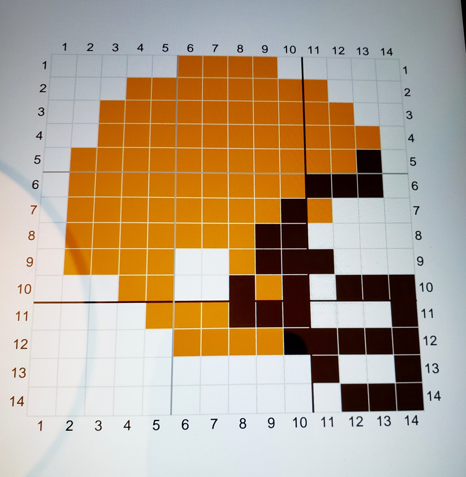
I began by firing up the game on my NES [Nintendo Entertainment System] and taking photos of the game’s team-select screen from my TV. Then I used an online cross-stitch pattern making website to transcribe the game graphics to font and helmet templates. The same online pattern maker was used to make the layout (for all of these photos, you can click to enlarge):

The game was released in 1991 and only nine of the 28 helmets in the game have stayed unchanged then. For those nine, I tried to keep everything pixel-perfect so my cross-stitch helmets matched the game helmets. For the remaining 19 teams — plus the Jaguars, Panthers, Texans, and Ravens, all of which have joined the league since 1991 — I either made the new pattern myself or tweaked a version from user-updated versions of Tecmo Super Bowl via TecmoBowl.org
.

Once the patterns were done, I got my embroidery hoop and began stitching the helmets and lettering:

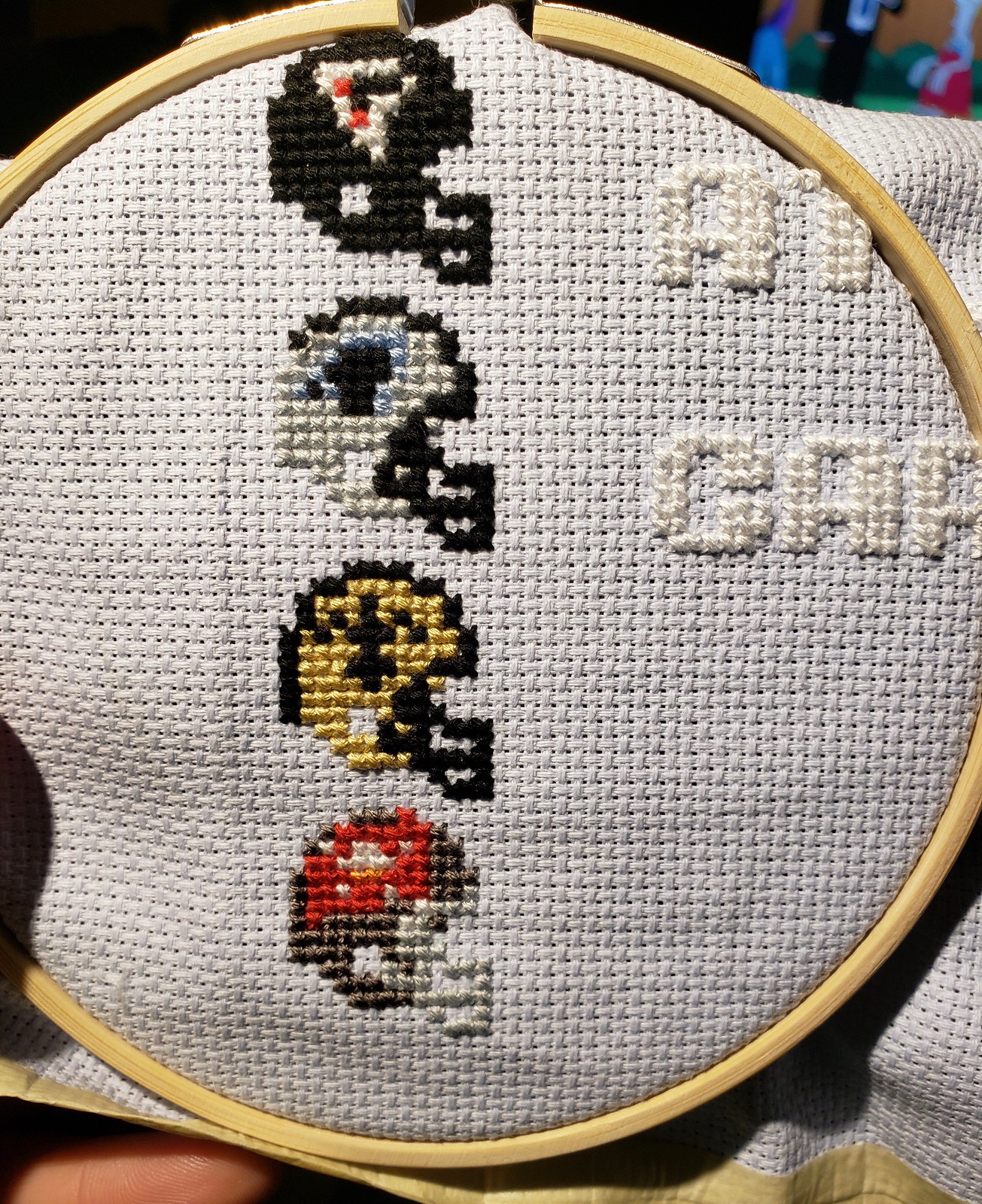
Fortunately, I didn’t go left to right (I went division by division: south → west → north → east), so I hadn’t gotten to the AFC East yet when the Jets released their new uniform set. Otherwise, I would have done their old helmet design.


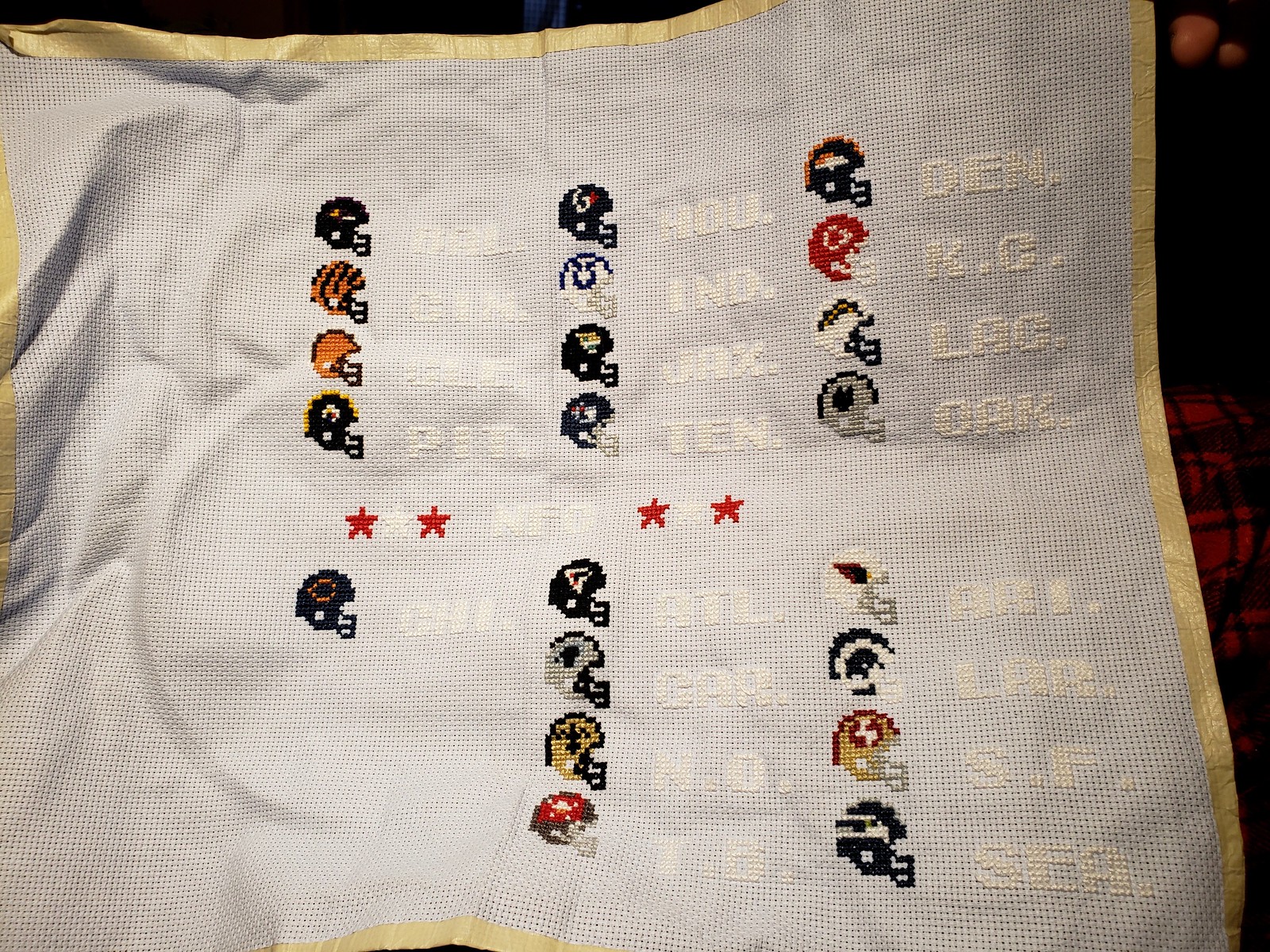
Unfortunately, I wasn’t so lucky with the Chargers. I had already stitched their helmet with a blue facemask when they announced that they’d be changing the mask to yellow. So first I had to go back and use a seam ripper to remove the mask:

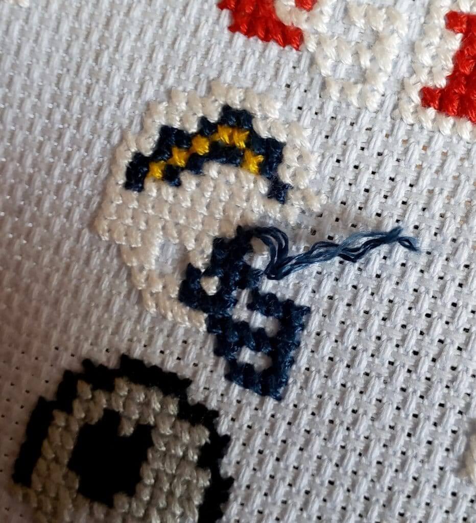

Fortunately, the facemask was a different color than the rest of the helmet, so I only had to rip out the blue floss. If, say, the Falcons had gone with a different facemask, I would have had to rip out the black from the entire facemask/helmet and redo it. But for the Chargers, it was just a matter of cutting some of the stitches, pulling all of the floss out, and restitching the mask with the new color:


For the record, I think the cross-stitch version looked way better with blue facemask. We’ll see which will look better on the field.
I think a few helmets look especially good in cross stitch Tecmo form: Cincinnati, Tampa, Jacksonville are my favorites. This is in spite of how bad I think the Cincinnati and Tampa helmets look in real life.


As you can probably tell from the little Player 1 arrow icon next to the Chiefs helmet, I’m a Kansas City fan. If they make it to the Super Bowl this season, I can add another selector arrow to make the NFC team Player 2.
———
Paul here. Is that awesome or what? I reallyreallyreally love this one.
One thing was bugging me, though. Take a look at this stitch I’ve highlighted on the Vikings helmet depiction:

That stitch should be yellow, not purple, right? It was driving me nuts (and not just because it’s purple), so I asked Charles about it. His response: “When I was designing the pattern for that helmet, I initially had that stitch yellow. But when I zoomed out and looked at it from a distance, having that stitch yellow really threw off the balance of the colors. The helmet overall just looked too yellow. Making that stitch purple helped with that. Similarly, with the Steelers helmet, it would technically be more correct if the bottom-left stitch on the logo was white, but that would make it look too white overall.”

Click to enlarge
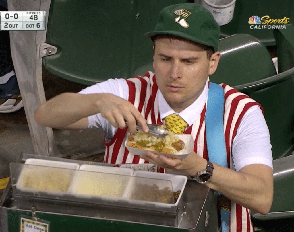
All hail Hal: Woke up this morning to find that there was major news out of Oakland, where last night’s A’s broadcast spent the better part of a minute in the bottom of the sixth showing a hot dog vendor wearing a Uni Watch cap! (And yes, also a necktie.) It is in A’s colors, after all. Now we just have to get him to add capers to his toppings.
The broadcasters said the vendor’s name is Hal the Hot Dog Guy (he even has a cool little green/gold name tag). Some quick Googling reveals that he’s been featured on A’s telecasts many times before, although probably not with a Uni Watch cap.
Hal, if you’re reading this, I’d love to hear from you. In any case, thanks for wearing our cap!
If you’d like to be like Hal (at least in terms of his taste in headwear), the Uni Watch Classic Cap is once again ready for ordering after a brief hiatus — and at a lower price! This is the same cap we’ve had available all along, made by Ebbets Field Flannels, but now we’re selling and shipping it ourselves instead of having Ebbets do it for us.
Here’s the deal:
• The price is $42.99 ($6 less than Ebbets was charging!). Shipping is $5 for one cap and $7 for two caps. (For more than two caps, or for non-USA orders, check with me to get the shipping charge.)
• As of now, all sizes from 7 to 8, in 1/8 increments, are in stock. But we only have one 7-3/8 remaining, so that will probably go almost immediately. (I’ve already ordered new inventory, so we should be restocked on that size by about the end of May.)
• Not sure of your size? We also offer the adjustable version with a handsome leather strap and burnished metal buckle.
• To order, start by sending the appropriate amount to me by one of the following methods:
a) The best ways to pay are via Venmo (use @Paul-Lukas-2 as the payee) or Zelle (plukas64@gmail.com) or Apple Pay (718-915-4943), because they don’t impose any fees. If you’re not familiar with Zelle, it’s the system most banks now use for free cash transfers to other banks. If you use your bank’s website, click on the “Transfers” or “Send Money” tab — you’ll probably see an option for Zelle. It’s free and easy to use.
b) You can also use the Cash App, although they skim a bit off the top. Use plukas64@gmail.com as the payee.
c) If you don’t like electronic payments, get in touch and I’ll tell you where you can send a paper check or well-concealed cash.
Unfortunately, I can’t accept PayPal (a long, extremely frustrating story). But if you live overseas and PayPal is the only feasible option for you, get in touch and I’ll explain how we can come up with a workaround.
Important: After paying, email me with your desired cap size and shipping address.
(My thanks to Zach Matthews, Chris Harris, @shtc10, Brock Towler, and Russell Ebright, all of whom sent screen shots of Hal my way while I was sleeping last night.)

ITEM! Yet another one-day membership raffle: Our most recent membership raffle winner was Scott Curl, who has paid it forward by purchasing another membership that we’re going to raffle off today.
To enter, send an email to the raffle address by 8pm Eastern tonight. One entry per person. I’ll announce the winner tomorrow.
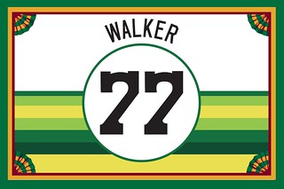
Speaking of membership cards, I’ve just added a bunch of new designs to the membership card gallery. This batch includes Pete Walker’s card (shown at right), which is based based on our Uni Watch Tequila Sunrise Deluxe shirt — a brilliant request!
Ordering a membership card is a good way to support Uni Watch (which, quite frankly, could use your support these days). And remember, a Uni Watch membership card entitles you to a 15% discount on any of the merchandise in our Teespring shop and our Naming Wrongs shop. (If you’re an existing member and would like to have the discount code, email me.) As always, you can sign up for your own custom-designed card here, you can see all the cards we’ve designed so far here, and you can see how we produce the cards here.

A different kind of face guard: Yesterday I donated blood for the first time in about a year (I had to stop after getting my Brannock tattoo re-inked last spring, because New York State imposes a one-year post-tat donation ban). As usual, the technician pricked my finger so she could check my blood’s iron level. And as usual, she shielded herself from any inadvertent blood spurts with a little plastic splatter-guard thingie, which she positioned in front of my hand as she drew my blood.
But here’s the thing: The plastic thingie is not meant to be a splatter guard. It’s actually a placard holder — an office-supply item, not a medical-supply item.
They use these at every blood donation center I’ve ever been to in NYC. It’s a clever repurposing of a simple item, I suppose, but is there really no item available that’s intended to be a blood splatter guard? (Update: Yes, there is. But it’s just a wee bit pricier than the placard holder. Yikes.)
Design contest reminder: In case you missed it on Monday, Uni Watch is teaming up with the Portland Pickles — that’s a college wood bat summer team — for a contest to design the Pickles’ “Future Baseball Night” jersey, which will be worn on July 4. There’s a $150 cash prize for the winning designer, along with a free futuristic jersey.
Entry deadline is Friday, May 3. Full details on the contest rules and entry requirements, along with the full scoop on what “Future Baseball Night” will entail, can be found here.
By Lloyd Alaban

Baseball News: Nobody noticed until now, and apparently there was no announcement, but MLB has darkened the colors of its silhouetted-batter logo. … Reds RF Yasiel Puig wore Jackie Robinson gloves last night (from @Coach_KT). … What does Mr. Met look like without his hat? @michebag22 shows us. … Star Wars Night uniforms for the Carolina Mudcats, Single-A affiliate of the Brewers. … The Twins confusingly tweeted a furry version of their cap logo. … Twitter was advertising the Marlins/Indians game last night and inexplicably used a picture of Mariners SS Tim Beckham, who obviously doesn’t play for either the Marlins or Indians (from @djpremis). … A baseball from the first victory in Mets history, way back in 1962, has finally come back to Queens. … A DC-area Dick’s Sporting Goods is carrying a cap that mistakenly has the Cardinals script logo on a Nationals cap (from @The_VZA). … A web series that keeps track of what Connecticut baseball teams in are wearing calls itself Uni Browse. Well, at least they didn’t poach “Uni Watch” (from our own Phil Hecken). … Here’s a photo of Joe DiMaggio re-upping with the Yanks 81 years ago yesterday. Check out his new jersey, complete with a 1939 New York World’s Fair patch (from @BSmile).

Football News: The Jets wore their new helmets at practice today but were still using their old practice jerseys with the darker shade of green and old number font (from Jason Klein). … 49ers WR Trent Taylor gave us another look at how the NFL 100 logo will look on jersey collars (from CA Bells). … Texas A&M’s athletic director left to take up a position at LSU, so they replaced him on an interim basis with legendary former Aggies football head coach RC Slocum. The A&M fan site asked him some uniform questions, including one on how Nike asked him to make uniform changes. Skip to the 12-minute mark of the video to hear that sequence (from Dave Wilson). … Ball State is letting their fans pick which uniform they’re going to wear against Florida Atlantic in September (from Jake Elman).

Hockey News: NHL ice hasn’t always been white. Here’s how that came to be (from Jack Wade). … This group of sportswriters gave their critiques of the UHL’s Danbury Hat Tricks’ new name and logo. … Jeopardy! champion and Las Vegas resident James Holzhauer once again incorporated a Golden Knights logo in his signature when he appeared on the show last night (from Donald, who didn’t give his last name). … It’s become a tradition for the wives and girlfriends of NHL players to wear custom-designed jackets during the postseason (from Jason Hillyer).

Basketball News: A marketing identity crisis in Denver: The Nuggets’ jerseys say “Mile High City,” their court says “Mile High City Basketball,” and their sideline says “Mile High Basketball.” … The Edmonton Stingers of the new Canadian Elite Basketball League have revealed their uniforms (from multiple readers). … Ewan Williams found an artist’s renditions of NBA logos in the style of Australia’s old Victorian Football League (VFL) crests. … When then-UNLV PG Greg Anthony was recovering from a jaw injury during the 1990 season, he wore a hockey helmet with a football face mask (from James Gilbert).

Soccer News: Juventus’s new home shirt has leaked. Instead of keeping with tradition and using black and white stripes, the club has (bafflingly) elected to go with a half-black, half-white design with a red stripe bisecting the two halves (from Josh Hinton). … Russian third-tier club Volga Ulyanovsk wore a Vladimir Lenin-themed kit over the weekend to celebrate the 149th anniversary of his birth (from Ed Zelaski). … Here’s an article tracking MLS’s expansion since its inception in 1993. MLS is looking to expand from 24 to 30 teams in the near future (from James Gilbert).

Grab Bag: Here’s what IndyCar driver Conor Daly’s car for next month’s Indy 500 looks like (from Alan Wedge). … Here’s a breakdown of all the different brands athletes are wearing going into the All-America Girls Lacrosse Senior Game and what brand they’ll be wearing in college. … The Fairmont Austin hotel celebrated their new advertising partnership with the University of Texas by creating a Longhorns logo out of the hotel’s room lights. … $12 million in fake championship rings from the Big Four US sports leagues were seized from a shipment to the US from China by US Customs (from Marty Ballard). …The West Coast Eagles of the Australian Football League have released an indigenous-themed uniform (from Will Pike). … Frisbie Pies, the pie company whose pie tins gave the name to the Frisbee flying disc, are coming back (from @walbergLines). … Sprint and AT&T have settled a lawsuit over AT&T’s “blatantly misleading” 5G E logo. … Gloucester, Mass., has released its 400th-anniversary logo. … United Airlines will apparently unveil a new livery today (from Charlie Hobart). … A Houston high school has announced a new dress code — for parents. Ironically, a memo from the principal in which she explains that the new policy is an example of the school’s “high standards” is riddled with grammatical errors.


What Paul did last night: About two months before the Uni Watch column debuted in The Village Voice in 1999, a guy named Kevin Walsh (who had been a fan of my “Inconspicuous Consumption” column in NYPress, although I didn’t learn that until later) launched a website called Forgotten New York, which was devoted things like old neon signs, old street light fixtures, ancient signs painted onto the sides of buildings that suddenly got exposed when an adjacent building was torn down, old streets that technically no longer exist but you can still see traces of them if you know where to look — you know, all the shit that I love.
Twenty years later, Forgotten New York is still going strong. It’s a major accomplishment, and last night I went to an event at a VFW hall in Queens to help Kevin celebrate. Much like Uni Watch, Forgotten New York has its own little community (I’m a very peripheral member these days, but I sort of have emeritus status because I’ve been a fan of the site almost from the very beginning), and it was great to see Kevin basking in the attention and affection of his followers. He gave a slideshow presentation about the site’s earliest days, and then there was champagne and cake (see above). A swell time.
Of course, I’m in a good position to appreciate what it means to keep a creative project going for two decades, because Uni Watch’s own 20th anniversary is coming up next month. I’ll have more to say about that soon.
I love Kevins site been reading it for years!!
In a lot of ways, the tweaks to the MLB logo are an example of exactly how to modernize branding. Very well done. But as much as I agree that the darker blue and red balance each other better than the prior pairing, I just prefer a brighter blue. I get the desire to match the flag. But the new MLB colors use the official U.S. government flag specifications. The official blue is very dark, but also not very saturated. So manufacturers make flags to government spec when filling government orders, and almost always use a more saturated, slightly brighter, blue on flags intended for retail sale. So the new MLB logo will exactly match the U.S. flag at the nearest federal courthouse, but it will not match the flags flying anywhere in the ballpark.
I buy a new flag for my home flagpole every year around Flag Day, and last year I bought a U.S. Capitol flag from my congressman’s office. The canton of my flag is visibly different from the other flags on my block – darker, but also duller. The official blue is not as vibrant in sunlight, and leans toward non-descript almost-black without direct sun. Whereas most flags have a blue that practically glows in sunlight and retains a blue appearance in low light.
Everyone knows this entire comment was just an excuse to use the word “canton” (and who could blame you?).
;)
Isn’t there a difference from an indoor flag and one specifically designed for outdoors???
Way to start giving blood again, Paul! I recently hit the 5 Gallon Club which has an awesome gold card and special logo (link).
I also have the gold card. Didn’t realize there were different colors for different gallon counts, actually!
About the clever repurposing… when I started working in healthcare in 2005, I was appalled by the way the healthcare supply catalogs would sell the same items that were also in an industrial supply catalog, but the healthcare price was literally 10x higher.
Buyer beware!
You linked to “MarketLab,” a company I came to call “MarkupLab.”
Shame on those vendors for their inflate prices, but some fault goes to the hospitals for not being better shoppers… but the blood donation center is a great example of being clever and cost effective.
When I was young my Mom used to do cross-stitch and I was always mesmerized by the beauty and quality of the work. Today’s project really reminded me of that. Great work!
Danbury Hat Tricks’ new uniforms haven’t been revealed yet. The linked article discusses the logo and name.
Fixed.
That’s not Dee Gordon. Thats Tim Beckham. It’s actually even more inexplicable.
Fixed.
I can’t prove this, but I’m pretty sure DJ LeMahieu was wearing purple batting gloves last night during his first AB of the game.
The $25,000 DiMaggio contract in 1939, when adjusted for inflation, is $460,000 today – below the current rookie minimum.
Re: the NHL wives/girlfriends jackets, I watched the final game of the KHL playoffs, and the CSKA Moscow wives, girlfriends and even babies had custom jackets.
I’m kind of astonished that there’s been almost no reaction to today’s lede. Am I the only one who was wowed by this project? Did the word “Craft” in the headline scare people off??
Perhaps it’s toxic masculinity? Most men can’t admit they like something that is often seen as feminine?
1. Cross stitch is the pop music of the sewing arts. Even when its good, its still sorta meh.
2. I was never into Tecmo, even though I was the demographic it was was targeted to at the time (am am 53).
3. I looked at the pictures and read all the text, and while kinda cool, wasn’t planning on commenting.
Not everyone is into the same things as everyone else, I know the feeling. Last week in San Francisco a certain dive bar that meant a lot to me closed, and the most sympathy I could get from friends and family was a shrug and “everything changes”.
Lee
I thoroughly enjoyed it! But my approach to DIY entries is to suspend critical judgment of the work. Question: Why is the text white on white, or nearly so?
I did get a chuckle out of the conversation about the yellow/purple pixel in the Vikes helmet. Of course that pixel has to be purple! Make it yellow, and then the yellow would form a right angle of two straight lines, an L, instead of suggesting a circle. Some of you never had to program full-screen graphics in BASIC, and it shows!
Hi, I’m the cross-stitcher. The background fabric (called aida) is actually light blue. It’s difficult to find aida outside of certain colors (white, black, tan, pink, light blue). I wanted a darker blue to match the actual screen from the game but wasn’t able to find it. I considered dying the fabric myself but didn’t want the dye to bleed when I washed the final project. The contrast between the white and blue is much more evident in person than it is in the pictures I took. Still far from perfect though.
Hey, I liked it!
Just another thought: you’re right in that cross-stitch adapts well to 8/16-bit video game graphics. As a result, it’s a relatively common medium for old-video game-themed projects like this.
I’m guessing Juventus is milking that Ronaldo train as hard as they can with those new jerseys considering they sold $60 Million worth of Ronaldo jerseys in the first 24 hours of him signing last summer. New kit without stripes? Time for another Ronaldo jersey.
Which kind of sucks,because Ronaldo has worn some gorgeous uniforms (well home uniforms at least) over the years. Guess playing for tradition-rich clubs like Manchester United and Real Madrid guarantees that for you. Thought Juve would be the same, but apparently not.
Alas, there is only so much you can do with stripes… Even Barcelona went for a half and half style 10 years ago and many think it was the best one they have had
link
Totally hated that look. But that’s just me. I know a lot of soccer fans who loved that look.
And to be fair, they did play really, really well in that shirt. That season made me an Andres Iniesta fan.
We’re pretty much in the era where soccer clubs sell shirts, and as a secondary concern, play soccer.
Lee
This more or less describes useless preseason “tournaments.”
I definitely get that feeling with Manchester United. I’ve been a fan of the club for maybe about 15 years now, your comment really hits hard because they haven’t been quite as relevant over the past 6 seasons, and half of what I seem to see on Facebook or in emails from whatever thing I signed up for 15 years ago is players shilling for the club’s “partners”. I do enjoy trolling the surveys I receive, though, with answers like I’ve never heard of Chevrolet (their current shirt sponsor) or don’t have a good opinion of any of the various other global brands that advertise with them. And, of course, scrolling through the comments on Facebook, plenty of other people are lamenting, as well, that maybe they’d be a bit better if the players didn’t spend so much time advertising–I know it’s not a solid argument, but at least it’s nice to see not everyone’s eating up pics of “the lads arriving ahead of today’s kickoff wearing their custom 3-piece suits from xxxxxx and wristwatches from yyyyyy and footwear from zzzzzzzz.”
/end rant
In addition to the helmets that Charles said look great in that style, I’d like to add that the Bears and Washington helmets also are super appealing to the eye. Really cool project, reminds me of my grandma. In a positive way of course :)
So happy to see a shout-out for Forgotten NY. Been visiting the site for probably a dozen years now, and love it. Especially the historical/street necrology stuff.
I went on Forgotten NY for the first time today. Spent most of the time searching my old neighborhood and it made my 90 minute commute go a whole lot quicker. Great job Kevin and thank you Paul for bringing it to my attention. Like Uni Watch, it will get a daily look.
Okay, I’m not gonna lie: As someone who remembers the late Danbury Thashers, and also every pro team who played in the New Haven Coliseum (which no longer exists), I had no idea there was a Federal Hockey League, and that they were having another go in Danbury.
I like the theme for Danbury, the Hat City.
major props to that count cross-stitch project
looks great and kudos to you for making the adjustments after the chargers change
AAA+++
Thanks!
That membership card is awesome, can’t wait to see it in person! Thanks!
I’d love to see a Uni Watch interview with Hal the Hot Dog Guy.
So would I. Those wheels are already turning — stay tuned.
As someone that lives in San Francisco, and presumably close to Hal, if there is anything I can do to help, please let me know.
Lee
The new Juve shirt does not have a red stripe. It is a pink one. Has nothing to do with Pinktober. Pink was one of the original colors of Juventus. They could not get a pink and black kit at one point and went with black and white instead.
I’ve heard a story that one of their english players was supposed to bring a proper one but came back with a kit similar to the one of Notts County, a black and white striped one. (Should be easy to find out but I am in a hurry.)
Forgot to mention: Juve is also using blue and yellow from time to time (away, third, Keeper etc.) – the colors of the city of Torino.
First, let me state my objection to the branches of the armed forces of this country using tax dollars to advertise, especially when they sponsor racing teams in Nascar or Indy car. I think it’s a ridiculous waste of money that could be hundreds of thousands of dollars, if not millions of dollars, depending on the level of sponsorship. Having said that, I think Conor Daly’s Air Force-sponsored Indy car is the best looking race car I’ve ever seen.
I love the needlepoint story. When I was in high school, my favorite teacher and I shared a love of the Tampa Bay Buccaneers (she because she had lived in Tampa for a while, and I because of the cool logo and tangerine and red uniforms). I drew the logo on graph paper and cross stitched the Buccaneer logo and put it in a glass paperweight for her. She kept it on her desk until she retired. Sadly, she passed away about 30 years ago.
Cool needlepoint story. It looks like the Lions have a gray facemask when it should be chrome like the Bucs.
In keeping with the 8-bit spirit I tried using as few colors as possible. Hence every “yellow” is the same even though Washington and the Chargers don’t use the same shade of yellow. The Lions’ facemask is actually the same floss as the Bucs’ facemask (neither of which is a metallic color). Tampa’s helmet is a darker grey though.
Cross-stitch Tecmo Bowl is the most Kansas City thing ever (every other person in this town has an Etsy store).
Love it! Great work!
Awesome job on the cross stitch helmets! It pairs perfectly with the 8-bit video games of the era. Back in the mid 80s I discovered graph paper and loved making logos and other designs. Fun stuff!
Love the cross stitch story!! What an awesome bit of nostalgia!
Charles – any way the design is for sale? I’d love to buy the pattern from you!!