[Editor’s Note: Today’s entry is guest-written by Jim Wagner, who’ll be filling us in on a project from his youth. — PL]
By Jim Wagner
Back when my younger brother and I were growing up, we made up imaginary football teams that we “played for” in the back yard. The games usually consisted of me vs. him running pass routes, with my dad or one of our older brothers serving as the full-time quarterback.
We’d make up team names and I’d draw helmets for them (I remember receiving some art-direction from my brother on his teams). I recently found eight of these early logo drawings drawn on leftover paper from my mom’s State Farm office (with a wonderfully tacky autumn-theme heading). Here are the teams:
• Albuquerque Arrowheads: A blend of Florida State and the Chiefs. This team’s design evolved over time.
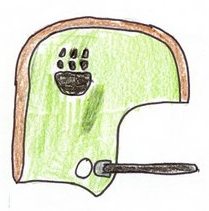
• Castle Bay Warriors: There is no city called Castle Bay in the United States — I just liked the way it sounded, so I went with it. The symbol that “appears on other side: is heavily influenced by the Honorary Warrior claws used in Mic-O-Say, a honors program at the Boy Scout camp in Osceola, Missouri.
• Honolulu Islanders: Some LSU/1980s Illini influences.
• New Orleans Cajuns: An unappetizing blend of the day-glo Bucs and the Saints. This was another team whose design evolved (I love the details like the addition of the long string tie and the crawfish located in the hat).
• Redwood Devils: Another name that I thought sounded good before checking to see if it existed. I assumed there had to be a Redwood, California. Once I found out that there was a Redwood City, I added a small black C to the R in the logo.
• Rhode Island Patriots: My brother wanted a “P with a tail,” which is what I drew. It became more refined over time.
• Rome Gladiators: Luckily, there is a Rome in Georgia. I’m still rather proud of this design, honestly. And here’s a later version.
• Virginia Bay Bulldogs: We didn’t have a dog at the time, so I wasn’t sure if they had three or four toes on their feet.
As other teams came into the mix, my attention was diverted more toward drawing the logos than playing in the back yard. An earlier version of the Anchorage Eskimos design (which I can’t find) had a graphic of the lining of a parka hood around the helmet vertically, just in front of the ear hole.
Finally, I scanned in a complete 30-team league that I drew sometime in early high school (it’s in three parts — here, here, and here). There are some blatant rip-offs of NFL, World League, collegiate, CFL, and USFL helmets there. But I also had some interesting and good ideas, if I do say so myself.
Paul here. Obviously, some of Jim’s early helmet renderings were a bit amateurish, but there’s something very endearing about childhood scribblings like these. Personally, I can’t get enough of this stuff. If you’ve saved similar material from your youth, let’s have it.
Small Masterpieces: Got a major, major contribution yesterday from Todd Vaughn, as follows:
My grandfather worked at Chatham Mills, a textile mill in Pittsboro, North Carolina, after World War II. He collected labels in a scrapbook (dating from perhaps the 1940s to the 1980s), and I just recently got my hands on it and snapped pictures of a few dozen of them. (I also included some items from his WWII scrapbook, because I felt they would pique your interest.) There are hundreds more, but I exceeded my Flickr allotment for the month.
I also have an old catalog that the facility put together, but I’ll will wait till next month to upload images from that.
Oh, man — I’ve gotta get my hands on that scrapbook. Can’t wait to see more of this material. And Todd, I think I speak for everyone when I say, “Upgrade to the no-limit Flickr account!”

April Raffle: Our friends at SoccerPro.com are back on board for another raffle. The winner will get his or her choice of any soccer jersey shown here, home or road. To enter, send a blank e-mail with your name in the subject line to the raffle address (not to the usual Uni Watch e-mail address, please) by next Monday, April 13th, at 10pm eastern. One entry per person, but anyone enrolled in the Uni Watch Membership Program at the time of the drawing can send four entries. I’ll announce the winner next Tuesday.
NCAA Contest Winners: Our five winners are, in order, Retro Beermaker (169 points), RyanKMD (167), Chuck Nottheshow (165), Tequila Sunrise (163), and Peanbo1 (159 plus tiebreaker). Several of you winners had hidden e-mail addresses, so if you haven’t already heard from me, please get in touch pronto to claim your prize. Thanks. Oh, and if anyone out there thinks they got shafted in the scoring, blame Vince.
Uni Watch News Ticker: SSUR founder and longtime Uni Watch confidante Donovan Moore, who probably knows more about team colors than anyone alive, has started a new blog called ColorWerx. Strongly recommended. ”¦ Video highlights of the 1960 Masters — the first one shot in color — here. ”¦ PNC Park has a new field surface, plus they’ve installed a portion of the old Forbes Field outfield wall in the stadium. ”¦ Speaking of ballpark design, Rich Thorne reports that there’s a new feature on Fenway Park’s exterior: a bunch of logo signs celebrating each of the franchise’s World Series titles. ”¦ More patch issues for Ty Lawson: His Final Four patch was missing in the first half on Monday night, then it reappeared in the second half, and by game’s end it was gone again (as spotted by Chris Warfford). ”¦ The A’s memorial patch for the fallen Oakland Police Department officers will look like this. They’ll be wearing it on their home jersey, beginning with their home opener this Friday. ”¦ Speaking of the A’s, I asked equipment manager Steve Vucinich why they’ve been wearing their home batting helmets on the road. His response: “We’ve added more black pieces to our alternate #2 uniform ensemble (helmets, sleeves, belts, socks). We didn’t think we needed three helmet colors, so we eliminated one.” Hmmm, black socks — that means Corey Wimberly would be wearing black stirrups when wearing that uniform. “You’re right!” said Steve. “I better call Twin City and order some black stirrups, just to be ready.” ”¦ The most recent episode of Ace of Cakes featured a Bar Mitzvah cake that was made to look like Lincoln Financial Field. James Huening got a bunch of screen grabs. ”¦ Ryan Miller has a new mask (with thanks to Matt Bachovchin). ”¦ Here’s another masked softball shortstop. Not sure of her name, but she plays for Long Island University. LIU media rep Shawn Sweeney says the team also has a masked third baseman, making for a fully masked left side of the infield. He hopes to get us a photo of both players soon. ”¦ Good catch by Fran Fried, who spotted Chris Spier wearing an Astros helmet during the 1972 All-Star Game. ”¦ Ay yi yi (blame Mike Lipinski). ”¦ HNOB alert — that’s “Hulk” NOB (with thanks to Dan O’Connor). ”¦ White-on-white alert. “That’s Australia’s ACT Brumbies and South Africa’s Free State Cheetahs in their Round 8 Super 14 rugby union clash,” writes Liam Hawkins. And Caleb Borchers adds, “The stadium PA even announced that the Cheetahs would change at halftime. When the teams came out, however, no such luck.” Details here. ”¦ The Philadelphia Phantoms wore Spectrum-patterned stripes. Additional photos here. ”¦ Casey Wurzbach notes that NESN was using the old Devil Rays logo in commercial bumpers yesterday but had the proper logo for the in-game score thingie. ”¦ And speaking of teevee blunders, here’s the typo of the year. ”¦ Hull City kit review here (courtesy of Les Motherby). ”¦ Surprised we haven’t seen the return of the Elmer Fudd caps on the diamond this week, with one exception: Rays skipper Joe Maddon. The media has noticed, too (with thanks to Justine DeCotis for the screen grab). ”¦ Speaking of the Fudds, isn’t it odd that they’re not for sale at MLB.com? According to one of my ESPN colleagues who spoke to someone at MLB, that’s because the MLB folks think the flap-caps “wouldn’t send the right message” for spring and the start of the season and all. Yeah, unlike all the other crap they sell, right? ”¦ DIY update from Matt Powers, who’s made himself a throwback Brewers sweatshirt. ”¦ With longtime NHLer Jim Dowd having announced his retirement, the Asbury Park Press created an illustration showing him in all 10 NHL jerseys he’s worn (with thanks to Steve May). ”¦ How much mileage can one trading card company get from one photo? This much (great work by Joe DeAngelis). ”¦ Two SF Giants notes from Ricky Foley: First, they’ve had several uni number changes; details toward the end of this page. And second, “Capt. Chelsey Sullenberger threw out the first pitch on Tuesday. He was wearing a No. 155 jersey (to represent the number of lives he saved) with a ‘Sully’ NOB” (photo from Laren Richardson, who was at the game). ”¦ Former Blue Jackets goalie Fredrik Norrena is wearing his old Columbus mask for the Russian Ak-Bars Kazan team (good find by Paul Richard Cook). ”¦ What’s that little red cover-up patch? It’s the uniform world’s latest corporate douchebaggery story, of course. Details in the shaded sidebar article on this page (with thanks to Alana Goulden). ”¦ Larry Bodnovich was poking around the SI archives and found some good stuff, including the Pistons wearing Lions colors, an amazing-looking game between the Lakers and Knicks, and a great electric football ad. I like how the Electric Sports Car Race Game looks like an ant farm. ”¦ You’ve probably seen this year’s Stanley Cup Finals logo already, but someone on the Chris Creamer board posted a shot of the actual stitched patch. ”¦ Man, that’s a very blue chest protector. ”¦ Ohio State’s wrestling singlets have a big O, but not on the chest — it’s on the side (as reported by Greg Trandel). ”¦ NHL linesman Tim Nowak, who was working last night’s Blackhawks/Predators game, was wearing a jersey with no number. “I couldn’t get a good look but I think it did have an NHL logo on the front,” says AJ Brandt. Anyone know the story behind this? … Apostrophe catastrophe, the long version.
I’m going to the A’s home opener on Friday. I’m sure there will be a moment of silence and maybe some sort of video tribute. I was the the first Sharks game after the incident too, and there was a moment of silence (sadly, that’s actually how I found out about the tragedy).
RIP
three words…
Buffalo Hot Wings
how great is that?
/awesome job jim…just out of curiosity, how old were you (roughly) when you did these sketches & about what year? because some of those names (namely, the singlular one — “chicago mob”) are priceless!
//also — the (im guessing) baltimore (or maryland) lords helmet is OUTSTANDING — too bad you didn’t sue the ravens ;)
my favorite is the honolulu islanders! followed closely be the cavaliers! but i love those helmets. thanks for sharing jim! great work!
From the Ticker: Speaking of the A’s, I asked equipment manager Steve Vucinich why they’ve been wearing their home batting helmets on the road. His response: “We’ve added more black pieces to our alternate #2 uniform ensemble (helmets, sleeves, belts, socks). We didn’t think we needed three helmet colors, so we eliminated one.”
***
So the A’s now have a black helmet and are ditching what has been a solid tradition for 15 years or so in favor of black? Sheesh. Why not just get rid of the road green cap too? Why not just wear all-black all the time?
I’ve always wondered why there was never a team called the “St. Louis Archers.” Their logo could incorporate a bow-and-arrow motif with the city’s famous architectural landmark.
My electric football game had the teams in two colors-one black jerseys and yellow pants. The other team had red tops and white pants. The cool thing was you could take the top piece off and stick it on the other player. so when I go tired of the Chiefs playing the Steelers, I could always have the Raiders and the Redskins battle. And if sometimes it was the “Zombies” (no torsos) versus the Steelers. It got ugly.
Phil, I see your Buffalo Hot Wings and raise you a Hawaii Punch
Here’s something I hadn’t thought to ask Steve: If Wimberly wears black stirrups, what color will the sanitaries be? White? Yellow? There’s no precedent for this in A’s history.
Paul’s O’s article is live
link
Have the A’s ever worn white sanitaries instead of gold?
great work powers! what material is that made of???
[quote comment=”321939″]Have the A’s ever worn white sanitaries instead of gold?[/quote]
Not since 1965, when they were still in KC:
link
But they’ve never worn black stirrups either, which is what Wimberly would be doing. Everyone else will just be wearing solid black socks. So it’s not clear how they’ll handle this. I just sent a note to Steve Vucinich to get his perspective.
Loved the article today. I did the same thing as a kid, but with baseball teams. Sadly, I think all my drawings are lost forever.
Keep up the good work!
[quote comment=”321937″]Here’s something I hadn’t thought to ask Steve: If Wimberly wears black stirrups, what color will the sanitaries be? White? Yellow? There’s no precedent for this in A’s history.[/quote]
sure there is…1924
*rolls eyes*…feigns shock
/i’d have to think they’d be white (and yet, they could be gold), but you’re absolutely right paul…what would the sanis be?
//anyone even THINK of that little possibility before implementing BFBS?
///maybe corey will just wear solid black socks to avoid all confusion, further adding to the travesty of the black scourge
I hate to go there, I know Jim was just a kid,but does anyone else think that the Albuquerque Arrowheads’ helmet logo is just a little phallic?
I actually did something like this back when I was first tinkering around with computer programming in the ’80s (BASIC and what-not). The league was called the AFA (American Football Association) and was divided into:
LIBERTY CONFERENCE
Independence Division
Freedom Division
UNION CONFERENCE
Republic Division
Federal Division
I sort of stole this idea from the USFL’s aborted 1986 divisional alignment (Liberty and Independence conferences).
I can’t remember all the team names, but they included the New England Rifles (white helmet with 18th-century rifle on each side, angled upward and pointing toward the front), Colorado Miners (navy blue helmet with silver miner’s helmet in profile on each side, with bright yellow light beam projecting forward and wrapping around the front), Michigan Greyhounds(silver helmet with royal blue Greyhound-bus logo), L.A. Comets (black helmet with gold comet/tail arching across a circular starfield, black with white stars bordered in silver), St. Louis Archers (gold helmet with red bow-and-arrow superimposed over silver Gateway Arch), Miami Seagulls (solid blue helmet with white seagull silhouette), Indianapolis Five Hundreds (“Indy 500’s,” bright red helmet with Formula 1 racer on the side), New York Knights (obviously stolen from “The Natural” but with my high school’s uniform and colors: burgundy, silver and white; burgundy helmet, knight-with-sword-and-shield logo), and I can’t remember the others. The drawings/graphics, unfortunately, are long gone…….
This best thing about the Phil Esposito photo is that he is wearing gray “slacks.” As a kid I opened a pack of hockey cards, and since I hated the Bruins, tossed old Espo to the side. My mother picked up the card and said, “Why is that man wearing slacks with his hockey shirt?” I looked at the card, saw the plaid pants he was wearing, and mumbled, “Freakin’ Bruins.” I bet they were sansabelt.
Ah, look at that; another St. Louis Archers idea in link. Very nice.
[quote comment=”321941″][quote comment=”321939″]Have the A’s ever worn white sanitaries instead of gold?[/quote]
Not since 1965, when they were still in KC:
link
But they’ve never worn black stirrups either, which is what Wimberly would be doing. Everyone else will just be wearing solid black socks. So it’s not clear how they’ll handle this. I just sent a note to Steve Vucinich to get his perspective.[/quote]
The A’s messed around with white sanis for one year in the late ’80s, I believe it was. They had Tiger-style piping on the home unis (with white shoes and white sanis) and a wore forest shoes on the road…with white sanis. Have a ton of photos I flickr’d (I don’t think I deleted them) and posted a while back, but can’t access flickr from work for some reason. I believe I posted them in conjunction with a Rickey Henderson weekend entry.
Oh, and I should mention (just for the sake of perspective) that the style Wimberly wears (high stirrups and high pants) was, at the time, kinda the geeky way to wear them. Cool was low stirrups and high pants (Big Red Machine) or pants meeting or almost-meeting the stirrups, either high or low (Frank Robinson and others). The guys who wore ’em like Wimberly were sorta the Napoleon Dynamites of their day.
—Ricko
Also from the “Diamond Venom” store:
link
Now the ladies can show off their tramp stamp tattoos while playing softball!
simply put…
Was never cool to wear your pants any higher than just above mid-calf (don’t wear them as high as where the leg starts to narrow again above the calf. Not cool. Geeky. That’s an invention of the ’80s and ’90s (Deion Sanders and others). Don’t believe me? Look though photos from the ’60s and ’70s. Very, very few players showed any sock that high.
—Ricko
[quote]What’s that little red cover-up patch?[/quote]
Cutest hockey player ever?
[quote comment=”321950″]simply put…
Was never cool to wear your pants any higher than just above mid-calf (don’t wear them as high as where the leg starts to narrow again above the calf. Not cool. Geeky. That’s an invention of the ’80s and ’90s (Deion Sanders and others). Don’t believe me? Look though photos from the ’60s and ’70s. Very, very few players showed any sock that high.
—Ricko[/quote]
I’m talking about the era when players started lengthening stirrups…not the years before that.
I friggin’ love the “Rhode Island Patriots” just for the fact that the helmet has “R.I.P.” on it. Well done sir!
Amazing guest article (Buffalo hot wings, San Diego Missions, Chicago Mob) I kinda did the same thing when I was 7 or 8 years old, to cope with the fact that I didn’t have a ps2, It was called the National Stairball league. I made teams too, (unfortunately, the logo designs were destroyed, but I do still remember them, thanks to the article.)I could redraw the logos, photograph them, and send them via email, and also explain the stairball game, but here are the names I did
and some descriptions of the logos
Eastern Division
Ridgefield (CT) Lightning bolts – basically, I did an orange lightning bolt, reminiscent of the “wonderboy” or “Harry Potter” bolt in a light blue circle.
Delaware Firsts – a red number 1 inside of a blue D
D.C. Stars – a silver star with a black DC inside it
Montreal Frenchies: a purple outlined square divided into 4 sections: Red block M in upper left, Yellow star with green background in upper right, orange star with red background in lower left and a blue block F in lower right
Northern division:
Detroit Autos: a black wheel with red outlined flames
Chicago Wind: light green W, I, N, and D with wavy marks
South Dakota R’s (rushmores) A design similar to the Oakland A’s logo without the yellow trim, the letters inside the ring, the baseball stitching or the A It had the R instead and the letters were outside the circle
Milwaukee Milkers: a black and white cow’s head
with a pink snout
Southern division
Florida Sun: a yellow and orange sun
Oklahoma City Twisters: a maroon tornado
St. Louis Gateways: the arch in silver
Dallas Sheriffs: a gold star with little circles on the points, and around the star was a gold and white band with Dallas Sheriffs written in black
Western Division
Colorado Cold – Light blue C, O, L, and D with purple icicles hanging from each letter
Idaho Potatoes – a large light brown ball with black spots and Idaho written in a high mark
Hawaii Hula – a green hula skirt with the State abbreviation written in brown inside it
San Francisco Earthquakes – a craggy white piece of land with earth on the left, and quakes on the right Earth was colored in black and orange, alternationg each letter: the same was done for quakes on the right.
There you have it: the NSL, and memories of throwing a ball against the basement stairs and trying to catch it.
[quote comment=”321951″]
Cutest hockey player ever?[/quote]
I’d instigate it.
Women hockey players are awesome. When I was in college, the school debuted a women’s hockey team, and the first two years my intramural team would scrimmage with them. They were terrible, until the team started recruiting, and then they got good. Real good. Fortunately not too good to party with us afterward. Good times.
Ricko — A lot of things that back then would have been geeky are cool today — longer shorts, black socks (both of which are okay with me now but never would have been before, though of course the shorts in college hoops are riddiculously long). And of course the short-shorts and tube socks of the 1970s are verboten today.
As for the A’s and white stirrups — I think they wore that uniform in the early 1980s when Billy Martin was the manager. In fact, they mixed it up pretty good there for a while on the uniforms. I remember a picture from Sports Illustrated in April 1981 or so when they even wore white long-john undershirts under their home white jerseys.
As for socks vs. stirrups — socks are preferrable to nothing at all, wouldn’t you say? I’m surprised MLB hasn’t mandated at least some kind of hose a la the NFL.
Hulk used to play in Japan with a team called Tokyo Verdy (green in Portuguese) and well, here is a picture. He then moved on to Porto.
link
[quote comment=”321944″]I hate to go there, I know Jim was just a kid,but does anyone else think that the Albuquerque Arrowheads’ helmet logo is just a little phallic?[/quote]
More than a little. Get that kid some Analysis!
Seriously, though, I love those designs. I thought the “horns on the helmet” design had been done to death, but the Kansas City Steers design is totally cool.
I guess I sent the link to Paul a bit too late for it to be included in the ticker, but here’s the link of that “Ace of Cakes” episode in case anyone’s interested.
Great post today. My favorite line, which sums it all up:
“…we made up imaginary teams that we ‘played for’ in the back yard.”
[quote comment=”321956″]Ricko — A lot of things that back then would have been geeky are cool today — longer shorts, black socks (both of which are okay with me now but never would have been before, though of course the shorts in college hoops are riddiculously long). And of course the short-shorts and tube socks of the 1970s are verboten today.
As for the A’s and white stirrups — I think they wore that uniform in the early 1980s when Billy Martin was the manager. In fact, they mixed it up pretty good there for a while on the uniforms. I remember a picture from Sports Illustrated in April 1981 or so when they even wore white long-john undershirts under their home white jerseys.
As for socks vs. stirrups — socks are preferrable to nothing at all, wouldn’t you say? I’m surprised MLB hasn’t mandated at least some kind of hose a la the NFL.[/quote]
(laughing) Yeah, Dressed to the Nines has the A’s as a total mishmash from about ’81 to ’85. Looks like they were trying to figure out what the A’s wore when…and finally just said “the hell with it, put anything there, they might have worn it.” I saw them play in the forest shoes at the Metrodome. Was the year of that great young outfield of Armas, Henderson and Murphy.
And they most certainly did wear white sleeves there for a while.
I wasn’t saying anything was right or wrong, just putting what was “cool” into its actual time frame.
—Ricko
I like how the Electric Sports Car Race Game looks like an ant farm.
now it can be yours!
link
LOVE the Buffalo Hot Wings. Also love the center stripe on the Redwood City Devils helmet – ends in a pointed devil tail in the back! Does anyone else do that?
Great stuff, Jim!
In honor of Opening Day, The Sun Sentinel here in FLorida compiled a list of the Top Five Worst Opening Pitches. Great stuff!
link
[quote comment=”321961″]I like how the Electric Sports Car Race Game looks like an ant farm.
now it can be yours!
link
Ooooo, shoulda had that yesterday. GRAND PRIX was on Turner Classic Movies.
[quote comment=”321944″]I hate to go there, I know Jim was just a kid,but does anyone else think that the Albuquerque Arrowheads’ helmet logo is just a little phallic?[/quote]
LOL yepp
[quote comment=”321966″][quote comment=”321944″]I hate to go there, I know Jim was just a kid,but does anyone else think that the Albuquerque Arrowheads’ helmet logo is just a little phallic?[/quote]
LOL yepp[/quote]
Check out Florida State’s football helmets from the late ’60s with an outline of the state. Still the all-time “best?” in that category.
Well, that or the Scottish Claymores of the WLAF/NFL Europe
[quote comment=”321959″]I guess I sent the link to Paul a bit too late for it to be included in the ticker, but here’s the link of that “Ace of Cakes” episode in case anyone’s interested.[/quote]
Oops, typo: make that Mitzvah
[quote comment=”321934″]I’ve always wondered why there was never a team called the “St. Louis Archers.” Their logo could incorporate a bow-and-arrow motif with the city’s famous architectural landmark.[/quote]
No objection, but that court the women played on in the NCAA was brutal. (I’ve been away, I’m sure that’s been addressed.)
it may be because it’s early and I am feeling the effects of a cold, but I can’t find the new classifieds link? Wasn’t it supposed to be live today? I’m very excited about it.
[quote comment=”321971″]it may be because it’s early and I am feeling the effects of a cold, but I can’t find the new classifieds link? Wasn’t it supposed to be live today? I’m very excited about it.[/quote]
Actually, there’s no link because I received exactly ZERO ad submissions in response to yesterday’s announcement. I was going to mention that sorry fact in today’s post, but life’s been a little hectic and it got lost in the shuffle.
I’ll post something tomorrow.
[quote comment=”321956″]Ricko — A lot of things that back then would have been geeky are cool today — longer shorts, black socks (both of which are okay with me now but never would have been before, though of course the shorts in college hoops are riddiculously long). And of course the short-shorts and tube socks of the 1970s are verboten today.
As for the A’s and white stirrups — I think they wore that uniform in the early 1980s when Billy Martin was the manager. In fact, they mixed it up pretty good there for a while on the uniforms. I remember a picture from Sports Illustrated in April 1981 or so when they even wore white long-john undershirts under their home white jerseys.
As for socks vs. stirrups — socks are preferrable to nothing at all, wouldn’t you say? I’m surprised MLB hasn’t mandated at least some kind of hose a la the NFL.[/quote]
Between 1981 & 1988 the A’s had some sort of combination that involved white sanitaries. link
Virginia has an OK helmet, but that Cavaliers design would be an upgrade.
[quote comment=”321962″][quote comment=”321956″]Ricko — A lot of things that back then would have been geeky are cool today — longer shorts, black socks (both of which are okay with me now but never would have been before, though of course the shorts in college hoops are riddiculously long). And of course the short-shorts and tube socks of the 1970s are verboten today.
As for the A’s and white stirrups — I think they wore that uniform in the early 1980s when Billy Martin was the manager. In fact, they mixed it up pretty good there for a while on the uniforms. I remember a picture from Sports Illustrated in April 1981 or so when they even wore white long-john undershirts under their home white jerseys.
As for socks vs. stirrups — socks are preferrable to nothing at all, wouldn’t you say? I’m surprised MLB hasn’t mandated at least some kind of hose a la the NFL.[/quote]
(laughing) Yeah, Dressed to the Nines has the A’s as a total mishmash from about ’81 to ’85. Looks like they were trying to figure out what the A’s wore when…and finally just said “the hell with it, put anything there, they might have worn it.” I saw them play in the forest shoes at the Metrodome. Was the year of that great young outfield of Armas, Henderson and Murphy.
And they most certainly did wear white sleeves there for a while.
I wasn’t saying anything was right or wrong, just putting what was “cool” into its actual time frame.
—Ricko[/quote]
For a while there in the late 1970s through about 1980, they just wore the green, gold and white jerseys with the white pants. (Their Bay Area rival emulated them there for a while, with white, orange, and black jerseys with white pants, providing some neat symmetry.) Then they added the gray uniforms, then combined the grey pants with the green jerseys. The only thing I could ever figure out was that the white uniforms were always a home uniform; verything else was fair game. In 1982 (when they did have that fabulous outfield — could never understand why they didn’t do better that year), I think they even wore mostly white at home and grey on the road, but I’m not sure. I wonder if Billy Martin had anything to do with that.
What’s the Austin team name? I can’t make it out.
[quote comment=”321973″]Between 1981 & 1988 the A’s had some sort of combination that involved white sanitaries. link
It’s kinda surprising to me that the Pirates never did the yellow sanitaries with one of their myriad link
[quote comment=”321969″][quote comment=”321959″]I guess I sent the link to Paul a bit too late for it to be included in the ticker, but here’s the link of that “Ace of Cakes” episode in case anyone’s interested.[/quote]
Oops, typo: make that Mitzvah[/quote]
nothing beats SWOOP in a Yarmulke
[quote comment=”321975″][quote comment=”321962″][quote comment=”321956″]Ricko — A lot of things that back then would have been geeky are cool today — longer shorts, black socks (both of which are okay with me now but never would have been before, though of course the shorts in college hoops are riddiculously long). And of course the short-shorts and tube socks of the 1970s are verboten today.
As for the A’s and white stirrups — I think they wore that uniform in the early 1980s when Billy Martin was the manager. In fact, they mixed it up pretty good there for a while on the uniforms. I remember a picture from Sports Illustrated in April 1981 or so when they even wore white long-john undershirts under their home white jerseys.
As for socks vs. stirrups — socks are preferrable to nothing at all, wouldn’t you say? I’m surprised MLB hasn’t mandated at least some kind of hose a la the NFL.[/quote]
(laughing) Yeah, Dressed to the Nines has the A’s as a total mishmash from about ’81 to ’85. Looks like they were trying to figure out what the A’s wore when…and finally just said “the hell with it, put anything there, they might have worn it.” I saw them play in the forest shoes at the Metrodome. Was the year of that great young outfield of Armas, Henderson and Murphy.
And they most certainly did wear white sleeves there for a while.
I wasn’t saying anything was right or wrong, just putting what was “cool” into its actual time frame.
—Ricko[/quote]
For a while there in the late 1970s through about 1980, they just wore the green, gold and white jerseys with the white pants. (Their Bay Area rival emulated them there for a while, with white, orange, and black jerseys with white pants, providing some neat symmetry.) Then they added the gray uniforms, then combined the grey pants with the green jerseys. The only thing I could ever figure out was that the white uniforms were always a home uniform; verything else was fair game. In 1982 (when they did have that fabulous outfield — could never understand why they didn’t do better that year), I think they even wore mostly white at home and grey on the road, but I’m not sure. I wonder if Billy Martin had anything to do with that.[/quote]
[quote comment=”321973″][quote comment=”321956″]Ricko — A lot of things that back then would have been geeky are cool today — longer shorts, black socks (both of which are okay with me now but never would have been before, though of course the shorts in college hoops are riddiculously long). And of course the short-shorts and tube socks of the 1970s are verboten today.
As for the A’s and white stirrups — I think they wore that uniform in the early 1980s when Billy Martin was the manager. In fact, they mixed it up pretty good there for a while on the uniforms. I remember a picture from Sports Illustrated in April 1981 or so when they even wore white long-john undershirts under their home white jerseys.
As for socks vs. stirrups — socks are preferrable to nothing at all, wouldn’t you say? I’m surprised MLB hasn’t mandated at least some kind of hose a la the NFL.[/quote]
Between 1981 & 1988 the A’s had some sort of combination that involved white sanitaries. link
Does anybody have any photographic evidence of the A’s wearing yellow stirrups (as indicated in the to the Nines sketches)? I live in the Bay Area, and never recall seeing those on the field.
Damn. I had about two boxes full of basketball logos and jersey designs from the fictional “CANAM” Basketball association, but I tossed them about 7 years ago before I went to college… if only uniwatch were in my life when I was 18…
[quote comment=”321970″][quote comment=”321934″]I’ve always wondered why there was never a team called the “St. Louis Archers.” Their logo could incorporate a bow-and-arrow motif with the city’s famous architectural landmark.[/quote]
No objection, but that court the women played on in the NCAA was brutal. (I’ve been away, I’m sure that’s been addressed.)[/quote]
brutal is an understatement
wow
link
Any fellow Uniwatchers in the Cincinnati/Dayton area know a good place to have names/numbers screen printed on baseball jerseys? This is a little league team and stitching them is too expensive. Thanks.
[quote comment=”321976″]What’s the Austin team name? I can’t make it out.[/quote]
I read it as “Oilers.”
I once rode in an elevator with Jim Dowd at the United Center! Of course, if he had been wearing that dreadful Gordon’s Fisherman Islanders jersey, I probably would’ve waited for the next elevator.
[quote comment=”321931″]three words…
Buffalo Hot Wings
how great is that?
/awesome job jim…just out of curiosity, how old were you (roughly) when you did these sketches & about what year? because some of those names (namely, the singlular one — “chicago mob”) are priceless!
//also — the (im guessing) baltimore (or maryland) lords helmet is OUTSTANDING — too bad you didn’t sue the ravens ;)[/quote]
Chicago Mob: did they have dark pinstriped unis?
Hawaii [quote comment=”321936″]Phil, I see your Buffalo Hot Wings and raise you a Hawaii Punch[/quote]
Oh, yeah. Hawaii Punch is a prototype I definitely want to see fleshed out.
[quote comment=\”321977\”][quote comment=\”321973\”]Between 1981 & 1988 the A\’s had some sort of combination that involved white sanitaries. link
It\’s kinda surprising to me that the Pirates never did the yellow sanitaries with one of their myriad late ’70s/early ’80s combos[/quote]
Yes. Only a few times did — the Giants did one year, the Padres did for a while.
That visual doesn’t show all nine uniforms the Pirates wore from 1977 to 1979, by the way.
Nowak, I assume, didn’t get his luggage.
It seems to happen a lot to NHL referees and linesmen. Because they are on such tight schedules, occasionally they arrive before their gear does (if at all) in their next city. I’m assuming Nowak is wearing borrowed equipment and a “replacement” blank linesman uniform. After all, the show must go on.
[quote comment=”321987″][quote comment=\”321977\”][quote comment=\”321973\”]Between 1981 & 1988 the A\’s had some sort of combination that involved white sanitaries. link
It\’s kinda surprising to me that the Pirates never did the yellow sanitaries with one of their myriad late ’70s/early ’80s combos[/quote]
Yes. Only a few times did — the Giants did one year, the Padres did for a while.[/quote]
Make that TEAMS, not TIMES. Sorry for the fat fingers.
[quote comment=”321985″]I once rode in an elevator with Jim Dowd at the United Center! Of course, if he had been wearing that dreadful Gordon’s Fisherman Islanders jersey, I probably would’ve waited for the next elevator.[/quote]
Dreadful? I’d have asked him for it right then and there. That thing’s a beauty! :o)
That World Series timeline was actually a new feature at Fenway Park last season. It is on the facade to the right of the players’ parking lot and underneath the windows looking into the weight room.
[quote comment=”321934″]I’ve always wondered why there was never a team called the “St. Louis Archers.” Their logo could incorporate a bow-and-arrow motif with the city’s famous architectural landmark.[/quote]
No St. Louis team had incorporated the Gateway Arch into their logo… until link link this season… much better than that awful NCAA basketball floor!
Liked the Hull City link, amber and black stripes is a good look and makes a pleasant change from all the red and blue in the EPL.
[quote comment=”321988″]That visual doesn’t show all nine uniforms the Pirates wore from 1977 to 1979, by the way.[/quote]
I thought so, because weren’t there also non-pinstriped white jerseys and pants?
Can you imagine if the Yankees did what the Sawx did? A World Series Marker on the out side of the NYS? Man, I Dont think we can get all 26 on the outside of the stadium!
This is a shout out to Rich Thorne. If there is any way I can get copies of those Fenway World Series pics, can you email me at link? My husband is a huge fan and I would love to print those for him!!!
[quote comment=”321994″][quote comment=”321988″]That visual doesn’t show all nine uniforms the Pirates wore from 1977 to 1979, by the way.[/quote]
I thought so, because weren’t there also non-pinstriped white jerseys and pants?[/quote]
Those came later, and at that time they also cut way back on the number of combinations. I think maybe they started wearing only white at home, using the light gold and black jerseys and pants on the road. Not sure, though (KEK would know).
The nine combos prior to that were based on a set of pins, a set of light gold, and a set of black…all combined in nine basic ways, and they’d wear the pin pants on the road but not the jerseys. That was about the only caveat…no white jersey on the road.
—Ricko
“…SSUR founder and longtime Uni Watch confidante Donovan Moore, who probably knows more about team colors than anyone alive, has started a new blog called ColorWerx. Strongly recommended…”
Wow. So here’s a question for Donovan Moore and all UniWatch faithful: What Pantone color is crimson? Harvard and Alabama are all over the place, with a tendency to drift toward (ugh) maroon. We require a Crimson Universal, some permanent standard like that perfect meter rod kept under glass in Paris…
Any help much appreciated, especially from Cantabs and Crimson Tides.
[quote comment=”321990″][quote comment=”321987″][quote comment=\”321977\”][quote comment=\”321973\”]Between 1981 & 1988 the A\’s had some sort of combination that involved white sanitaries. link
It\’s kinda surprising to me that the Pirates never did the yellow sanitaries with one of their myriad late ’70s/early ’80s combos[/quote]
Yes. Only a few times did — the Giants did one year, the Padres did for a while.[/quote]
Make that TEAMS, not TIMES. Sorry for the fat fingers.[/quote]
There are a couple others as well. The White Sox in ’69-’70 wore white stirrups with blue sanitaries, Giants had orange, Brewers wore yellow sanitaries on the road (Hank Aaron era). Can’t think of any others.
More on the floor in St. Louis including a shot of last year’s monstrosity in St. Petersburg as well
link
and this great line
“Next year the women’s Final Four is in San Antonio, so we can only assume there will be a 90-foot drawing of Davey Crockett on the floor.”
[quote comment=”321994″][quote comment=”321988″]That visual doesn’t show all nine uniforms the Pirates wore from 1977 to 1979, by the way.[/quote]
I thought so, because weren’t there also non-pinstriped white jerseys and pants?[/quote]
In 1980 they dropped the pinstripes for plain white uniforms and wore only the whites at home, relegating the black and gold combinations to the road only. Before that, they mixed and matched pinstripes, blacks, and golds and wore them anywhere, anytime (including all-pinstripe at Shea Stadium during one memorable Friday night game in 1977 or ’78).
Clearly the 1979 World Series was the most colorful ever, uniwise.
link
Has anyone ever done a study of colored uniforms in the World Series? The A’s would have had a good run in the 1970s.
[quote comment=”321990″][quote comment=”321987″][quote comment=\”321977\”][quote comment=\”321973\”]Between 1981 & 1988 the A\’s had some sort of combination that involved white sanitaries. link
It\’s kinda surprising to me that the Pirates never did the yellow sanitaries with one of their myriad late ’70s/early ’80s combos[/quote]
Yes. Only a few times did — the Giants did one year, the Padres did for a while.[/quote]
Make that TEAMS, not TIMES. Sorry for the fat fingers.[/quote]
Giants wore orange sanis with white shoes, but only at home. White Sox wore blue sanis under white striped stirrups in ’69 and ’70, home and road.
And, though I’ve never been able to confirm it one way or the other, when the Astros first wore white shoes with Rainbow guts unis, the sanis looked like they were a very, very, VERY light blue. May have been an optical illusion, but by about mid-season they started looking bright white…by comparison, that is, now looked the same color as the shoes. Remember thinking, “Hmmm, they don’t look light blue anymore.”
—Ricko
[quote comment=”321940″]great work powers! what material is that made of???[/quote]
The curseive Milwaukee and state outlines are felt.
Barrel man had to be cotton…the Fabric pen bled too much into the felt.
I’m actually adding a ball in glove as I type…I want the dot of the I to be the ball falling out of the glove!
Johnny O unwittingly gave me the idea last night!
[quote comment=”322004″][quote comment=”321940″]great work powers! what material is that made of???[/quote]
The cursive Milwaukee and state outlines are felt.
Barrel man had to be cotton…the Fabric pen bled too much into the felt.
I’m actually adding a ball in glove as I type…I want the dot of the I to be the ball falling out of the glove!
Johnny O unwittingly gave me the idea last night![/quote]
Here’s Barrel man…
link
Buffalo Hot Wings!!! Great stuff fellas!
Matt Powers! How do you do it?!
[quote comment=”322006″]Buffalo Hot Wings!!! Great stuff fellas!
Matt Powers! How do you do it?![/quote]
His wife and that awesome seamstress from his school? LOL
Kidding! Great job on the Brew Crew sweater, Matt.
Yeah, outstanding.
Nice to see some love for the Beer Barrel Man. Why don’t they just throw the creepy child-molester off the slide and make him the new Bernie Brewer?
[quote comment=”322007″][quote comment=”322006″]Buffalo Hot Wings!!! Great stuff fellas!
Matt Powers! How do you do it?![/quote]
His wife and that awesome seamstress from his school? LOL
Kidding! Great job on the Brew Crew sweater, Matt.[/quote]
All kidding aside…the seamstress at school does the sewing for me…I do everything else with a PC, a light table and exacto knife.
My wife wants NO part of this!
I posted this last night, but check out the other one I”m finishing:
link
link
[quote comment=”322009″][quote comment=”322007″][quote comment=”322006″]Buffalo Hot Wings!!! Great stuff fellas!
Matt Powers! How do you do it?![/quote]
His wife and that awesome seamstress from his school? LOL
Kidding! Great job on the Brew Crew sweater, Matt.[/quote]
All kidding aside…the seamstress at school does the sewing for me…I do everything else with a PC, a light table and exacto knife.
My wife wants NO part of this!
I posted this last night, but check out the other one I”m finishing:
link
link
You’re going to have more DIY clothing than store-bought clothing soon. :o)
I’m waiting for the DIY business suit/tuxedo. LOL
First off, Jim Wagner your stuff is GREAT!
All of our uni-interests probably started in some kind of similar fashion!
And to answer Teebz, no way…the Stonebreaker Bears and “Drunkenmiller” Vatech need to be redone…up close they’re AWFUL!
[quote comment=”322004″][quote comment=”321940″]great work powers! what material is that made of???[/quote]
The curseive Milwaukee and state outlines are felt.
Barrel man had to be cotton…the Fabric pen bled too much into the felt.
I’m actually adding a ball in glove as I type…I want the dot of the I to be the ball falling out of the glove!
Johnny O unwittingly gave me the idea last night![/quote]
So glad I could be of assistance! Please post your updated DIY when the ball in glove logo is added. And again, I am sure a lot of Brew Crew fans would pay good money for one of those.
“You’re going to have more DIY clothing than store-bought clothing soon. :o) ”
Sort of a latter day Walton.
“And so we sleep peacefully, knowing that Barrel Man had once again returned to Powers Mountain.
“Good night, Matt Boy!”
[quote comment=”322002″][quote comment=”321994″][quote comment=”321988″]That visual doesn’t show all nine uniforms the Pirates wore from 1977 to 1979, by the way.[/quote]
I thought so, because weren’t there also non-pinstriped white jerseys and pants?[/quote]
In 1980 they dropped the pinstripes for plain white uniforms and wore only the whites at home, relegating the black and gold combinations to the road only. Before that, they mixed and matched pinstripes, blacks, and golds and wore them anywhere, anytime.[/quote]
It is curious that the Pirates abandoned their colorful wackiness and went with white-only-at-home in the season immediately following their World Series victory. Perhaps there is a jinx in there somewhere, which would explain their lack of post-season success since 1979.
[quote comment=”322008″]Yeah, outstanding.
Nice to see some love for the Beer Barrel Man. Why don’t they just throw the creepy child-molester off the slide and make him the new Bernie Brewer?[/quote]
Oh my GOD! How could I have been so blind? I mean link!
Now I can never take my kids to Miller Park again.
Hey, hearing about all of these original team names and logo stuff today coincides perfectly with a little DIY project I am working on. Before I set out to DIMyself I looked around a bunch of different websites about doing a customized soccer jersey and the best website I found was customink.com. Once you go on the site they have a myriad of images you can do all sorts of things too along with the ability to upload your own images. It has really helped me conceptualize my own jersey I am designing, espeically with the logo I want to use. Additionally, this website ( link ) here has a bunch of different sport team logos that helped me develop my own. It’s essentially a collection of logos this guy has found on the internet and it helped me with my final logo idea. I’ll have to link some pictures after I make the thing.
I have to echo the sentiments of a few of those above by praising the nicknames of Hawaii Punch and Buffalo Hot Wings!
[quote comment=”322003″][quote comment=”321990″][quote comment=”321987″][quote comment=\”321977\”][quote comment=\”321973\”]Between 1981 & 1988 the A\’s had some sort of combination that involved white sanitaries. link
It\’s kinda surprising to me that the Pirates never did the yellow sanitaries with one of their myriad late ’70s/early ’80s combos[/quote]
Yes. Only a few times did — the Giants did one year, the Padres did for a while.[/quote]
Make that TEAMS, not TIMES. Sorry for the fat fingers.[/quote]
Giants wore orange sanis with white shoes, but only at home. White Sox wore blue sanis under white striped stirrups in ’69 and ’70, home and road.
And, though I’ve never been able to confirm it one way or the other, when the Astros first wore white shoes with Rainbow guts unis, the sanis looked like they were a very, very, VERY light blue. May have been an optical illusion, but by about mid-season they started looking bright white…by comparison, that is, now looked the same color as the shoes. Remember thinking, “Hmmm, they don’t look light blue anymore.”
—Ricko[/quote]
Could be the lighting in the Astrodome?
[quote comment=”321983″]Any fellow Uniwatchers in the Cincinnati/Dayton area know a good place to have names/numbers screen printed on baseball jerseys? This is a little league team and stitching them is too expensive. Thanks.[/quote]
Possibly Koch’s?
[quote comment=”322009″][quote comment=”322007″][quote comment=”322006″]Buffalo Hot Wings!!! Great stuff fellas!
Matt Powers! How do you do it?![/quote]
His wife and that awesome seamstress from his school? LOL
Kidding! Great job on the Brew Crew sweater, Matt.[/quote]
All kidding aside…the seamstress at school does the sewing for me…I do everything else with a PC, a light table and exacto knife.
My wife wants NO part of this!
I posted this last night, but check out the other one I”m finishing:
link
link
damn, you’re gettin’ good! great work!!! is the brooklyn sweater all felt too, or is the back takle twill??? don’t you just love working with felt and the end result?!?! keeps you wanting more!
[quote comment=\”321999\”]\”…SSUR founder and longtime Uni Watch confidante Donovan Moore, who probably knows more about team colors than anyone alive, has started a new blog called ColorWerx. Strongly recommended…\”
Wow. So here\’s a question for Donovan Moore and all UniWatch faithful: What Pantone color is crimson? Harvard and Alabama are all over the place, with a tendency to drift toward (ugh) maroon. We require a Crimson Universal, some permanent standard like that perfect meter rod kept under glass in Paris…
Any help much appreciated, especially from Cantabs and Crimson Tides.[/quote]
Apparently, there is a vintage piece of cloth that is used in the case of Harvard:
link
[quote comment=”322009″]My wife wants NO part of this![/quote]
(fixed) ;)
/ya know we love ya matt
Hey Paul, it’s Chris SPEIER wearing the Astros helmet, not Spier.
And one more article on the interplay at Harvard between crimson and magenta:
link
[quote comment=”322021″][quote comment=”322009″]My wife wants NO part of link![/quote]
(fixed) ;)
/ya know we love ya matt[/quote]
They are doing another Batman movie. Matt’s big Hollywood break might come off UW! LOL
I doodled my own helmets, too, but one at a time. I came up with a white helmet with four trapezoids (kind of like the old Chicago Bears) and called them the Dallas Jets. The strips were blue and pink. I also came up with a design based on the winged helmet of Michigan, but the team were the Atlanta Comets, and were navy and lime green. I also came up with a logo with a big letter D on a castle for the Denver Citadels. Their colors were navy and dark gold.
No pictures survive, though.
[quote comment=”321993″][quote comment=”321934″]I’ve always wondered why there was never a team called the “St. Louis Archers.” Their logo could incorporate a bow-and-arrow motif with the city’s famous architectural landmark.[/quote]
No St. Louis team had incorporated the Gateway Arch into their logo… until link link this season… much better than that awful NCAA basketball floor![/quote]
The Rams had an arch in their logo when they moved to St. Louis in 95. link
[quote comment=”322018″][quote comment=”321983″]Any fellow Uniwatchers in the Cincinnati/Dayton area know a good place to have names/numbers screen printed on baseball jerseys? This is a little league team and stitching them is too expensive. Thanks.[/quote]
Possibly Koch’s?[/quote]
Not an answer to your question, but have you considered saving money by using only numbers and no names? It’s Little League; won’t there be kids acidentally leaving their jerseys at home, new kids joining the team, kids not liking the number they’re issued or the size, etc., meaning that some people might have to switch jerseys? Names on the backs would mess that up.
[quote comment=”322021″][quote comment=”322009″]My wife wants NO part of link![/quote]
(fixed) ;)
/ya know we love ya matt[/quote]
ha! my top 5 favorite things about uniwatch:
1) seeing peoples DIY projects and artwork
2) the ticker
3) picking on matt in the comments section
4) rick-o’s knowledge
5) everything else…
lol. only kidding, i love it all!
its not like Espo’s facial expression changed much anyway
The Durham Bulls revealed their new uniforms yesterday. Gone are the vests they’ve worn on their link and link jerseys. Gone are the link caps.
The new stuff? New link and link jerseys. New road link.
All I have to say is that its a shame that Tampa strong-armed them into putting their logo on the jerseys, as well as its a shame they forced them to all but eliminate their iconic orange from their jerseys. Durham has a unique thing going, don’t fuck it up. Shit, for most of the past decade, Durham was keeping the Tampa franchise afloat, not the other way around.
My favorite helmet logo was for the Albuquerque Arrowheads. I didn’t see it as a phallic symbol but as a symbol which combined old and new weaponry. An arrowhead attached to an intercontinental ballistic missile.
The links for the “evolved” logos/helmets dont seem to work.
[quote comment=”322017″][quote comment=”322003″][quote comment=”321990″][quote comment=”321987″][quote comment=\”321977\”][quote comment=\”321973\”]Between 1981 & 1988 the A\’s had some sort of combination that involved white sanitaries. link
It\’s kinda surprising to me that the Pirates never did the yellow sanitaries with one of their myriad late ’70s/early ’80s combos[/quote]
Yes. Only a few times did — the Giants did one year, the Padres did for a while.[/quote]
Make that TEAMS, not TIMES. Sorry for the fat fingers.[/quote]
Giants wore orange sanis with white shoes, but only at home. White Sox wore blue sanis under white striped stirrups in ’69 and ’70, home and road.
And, though I’ve never been able to confirm it one way or the other, when the Astros first wore white shoes with Rainbow guts unis, the sanis looked like they were a very, very, VERY light blue. May have been an optical illusion, but by about mid-season they started looking bright white…by comparison, that is, now looked the same color as the shoes. Remember thinking, “Hmmm, they don’t look light blue anymore.”
—Ricko[/quote]
Could be the lighting in the Astrodome?[/quote]
Kinda what I figured, and that’s possibly what it was. But, still, there was a noticeable difference between early season and midseason games…as far as the “sani area” appearing to have changed to as white as the shoes.
One other very real possibility. Those first Astro “stirrups” that year were those goofy “knit-in” deals…and it simply may have been that, in those early versions of such socks, the navy faded a little with washing, tinting the white. In fact, that may be why they went to regular stirrups.
And it sure would explain it.
—Ricko
[quote comment=”321934″]I’ve always wondered why there was never a team called the “St. Louis Archers.” Their logo could incorporate a bow-and-arrow motif with the city’s famous architectural landmark.[/quote]
I thought the Archers logo with the Centaur was sweet.
Can Paul or anyone else tell me Paul’s email address? The email links unfortunately keep throwing my computer into a panic. I’d like to send him some samples from a hockey league I used to draw as a kid. 30 teams, 20 seasons, yeah it got pretty serious. But I can’t send it without that goldang address haha.
[quote comment=”322030″]The Durham Bulls revealed their new uniforms yesterday. Gone are the vests they’ve worn on their link and link jerseys. Gone are the link caps.
The new stuff? New link and link jerseys. New road link.
All I have to say is that its a shame that Tampa strong-armed them into putting their logo on the jerseys, as well as its a shame they forced them to all but eliminate their iconic orange from their jerseys. Durham has a unique thing going, don’t fuck it up. Shit, for most of the past decade, Durham was keeping the Tampa franchise afloat, not the other way around.[/quote]
I live in the Bull City and that IS depressing. You make one series run and you think you can change everything. Durham has a great thing going with the Bulls downtown. Hate to see it changing.
While I was checking out the Sun’s article on the apostrophe, I found this massive (73 images) gallery of Opening-Day-in-Baltimore images. Apologies if it’s already been linked.
This is my favorite:
link
Check out the font on the city names!
[quote comment=”322024″][quote comment=”322021″][quote comment=”322009″]My wife wants NO part of link![/quote]
(fixed) ;)
/ya know we love ya matt[/quote]
They are doing another Batman movie. Matt’s big Hollywood break might come off UW! LOL[/quote]
i’m sorry, how is this common everyday photo of Matt connected to a Batman movie? What am I missing?
—Ricko
Wimberly’s sanis would probably be white, but it wouldn’t shock me if they were green, which would look like garbage against the black stirrup, but would technically match the rest of their scheme.
Now I have to dig through boxes in the basement this weekend to find my 1974 designs for Major League Football – which did include a variant St. Louis Archers concept. OCD minds think alike, except when they don’t.
Man, I did the same thing as a kid. But I always hid it from my classmates or whatnot because I thought they would think it was dorky. Glad to know I wasn’t the only one.
I’ll have to see if I can dig up some of my old designs. I particularly remember a baseball team I created called the “Washington Presidents” that was basically the Senators/Nationals. When I found out about the Nationals becoming a team I looked back at my old designs and though, “Man, MY logos would have been better than this crap…”
[quote comment=”321973″][quote comment=”321956″]Ricko — A lot of things that back then would have been geeky are cool today — longer shorts, black socks (both of which are okay with me now but never would have been before, though of course the shorts in college hoops are riddiculously long). And of course the short-shorts and tube socks of the 1970s are verboten today.
As for the A’s and white stirrups — I think they wore that uniform in the early 1980s when Billy Martin was the manager. In fact, they mixed it up pretty good there for a while on the uniforms. I remember a picture from Sports Illustrated in April 1981 or so when they even wore white long-john undershirts under their home white jerseys.
As for socks vs. stirrups — socks are preferrable to nothing at all, wouldn’t you say? I’m surprised MLB hasn’t mandated at least some kind of hose a la the NFL.[/quote]
Between 1981 & 1988 the A’s had some sort of combination that involved white sanitaries. link
Meh, I’d love if Steve Vucinich took a look at that Dressed to the Nines page. I’m not at all convinced those 87 and 88 pullover styles, especially the green road jersey, ever existed. I don’t remember them and I’ve never seen one photo of them.
Ah, sorry, the link just takes you to Picture 1. Which is a beaut, but Picture 54 has the minor-league O’s in 1937, showing off their new scoreboard. Hence, my font reference.
[quote comment=”322028″][quote comment=”322021″][quote comment=”322009″]My wife wants NO part of link![/quote]
(fixed) ;)
/ya know we love ya matt[/quote]
ha! my top 5 favorite things about uniwatch:
1) seeing peoples DIY projects and artwork
2) the ticker
3) picking on matt in the comments section
4) rick-o’s knowledge
5) everything else…
lol. only kidding, i love it all![/quote]
I’ve gained 30 fricking pounds this Winter…who can blame her!
And Ryan…the Dodgeres material is all cotton except for the World’s Fair and 1912 patches.
I have heard, from people in the know that felt doesn’t hold up and isn’t washable.
I LOVE working with it, but that spooks me.
[quote comment=”322035″]Can Paul or anyone else tell me Paul’s email address?[/quote]
uniwatch at earthlink dot net
Tampa Bay forced them? Anything behind that?
[quote comment=”322032″]The links for the “evolved” logos/helmets dont seem to work.[/quote]
Some of those links can be wonky. If that happens, just cut/paste the URL back into your browser window and hit enter — that usually does the trick.
[quote comment=”322046″]Tampa Bay forced them? Anything behind that?[/quote]
You’re not going to find anything public about it, but the Bulls have never worn their MLB club’s logo on their jersey. Not since I can remember. Then, after Tampa has the only season in their history where they actually matter, the Bulls suddenly have the Ray on their sleeve and their jerseys suddenly have the feel of a Tampa Bay color scheme. Doesn’t take much thinking to know what was going on there.
I mean, its not like the Bulls needed to alter their schemes to be more popular. They’re already the most popular Minor League team in the nation, and their merchandise revenue dwarfs any other MiLB team. The only reason this would have happened would be if Tampa practically ordered them to change.
Ryan Miller’s new mask looks terrible. It isn’t even close to their team colors no matter what sweater they’re wearing.
[quote comment=”322020″][quote comment=\”321999\”]\”…SSUR founder and longtime Uni Watch confidante Donovan Moore, who probably knows more about team colors than anyone alive, has started a new blog called ColorWerx. Strongly recommended…\”
Wow. So here\’s a question for Donovan Moore and all UniWatch faithful: What Pantone color is crimson? Harvard and Alabama are all over the place, with a tendency to drift toward (ugh) maroon. We require a Crimson Universal, some permanent standard like that perfect meter rod kept under glass in Paris…
Any help much appreciated, especially from Cantabs and Crimson Tides.[/quote]
Apparently, there is a vintage piece of cloth that is used in the case of Harvard:
link
Thank you! Very interesting. Just goes to show: you can have an agreed-upon crimson exemplar, the Standard of Standards, and people will still ignore all that and turn crimson into maroon.
link
Now I got it. Crimson = “Arterial Blood.”
Re: Bulls
I’m no expert, but is it common for a minor league team to carry its affiliate’s MLB logo on its uniform (if the mascots aren’t the same i.e. Iowa Cubs)?
[quote]Doesn’t take much thinking to know what was going on there.[/quote]
fair point, but we generally like some proof of accusations on here
[quote comment=”322051″]Re: Bulls
I’m no expert, but is it common for a minor league team to carry its affiliate’s MLB logo on its uniform (if the mascots aren’t the same i.e. Iowa Cubs)?[/quote]
Not really. Some teams change as the parent club dictates. Some, with long traditions, hold to their own unis. Rochester Red Wings is one that comes to mind. And, until this year anyway, the Durham Bulls.
I’m sure there are people here who can give a much better feel for that.
—Ricko
[quote comment=”322050″]Now I got it. Crimson = “Arterial Blood.”[/quote]
I’m no phlebotomist, but isn’t arterial blood more of a bright red/scarlet hue due to it being oxygen-rich while venous blood is a color that can be described as closer to crimson?
Jim here. Thanks, everyone for the kind words. I loved doing this stuff as a kid and, let’s be honest, I love doing it now. (I’m a graphic designer.) I was just lucky enough that my parents didn’t toss all this stuff when I went off to college.
[quote comment=”321931″]
just out of curiosity, how old were you (roughly) when you did these sketches & about what year? because some of those names (namely, the singlular one — “chicago mob”) are priceless![/quote]
Phil: The really crude crayon drawings were probably from when I was 8 or 9 years old. The later ones were from junior high/early high school.
u-horn: The Austin team is the Oilers.
[quote comment=”322055″]Jim here. Thanks, everyone for the kind words. I loved doing this stuff as a kid and, let’s be honest, I love doing it now. (I’m a graphic designer.) I was just lucky enough that my parents didn’t toss all this stuff when I went off to college.
[quote comment=”321931″]
just out of curiosity, how old were you (roughly) when you did these sketches & about what year? because some of those names (namely, the singlular one — “chicago mob”) are priceless![/quote]
Phil: The really crude crayon drawings were probably from when I was 8 or 9 years old. The later ones were from junior high/early high school.
u-horn: The Austin team is the Oilers.[/quote]
Ah, finally, the artist speaks!
Great job with this, Jim. Sorry I didn’t get a chance to run it sooner. Can’t tell you how much I love this material.
The Jim Dowd shout out made my day. Brick, NJ’s finest potted a HUGE goal for my beloved Devils in the ’95 Finals. Dowd is about my age and like me born in New Jersey, so I remember thinking when I watched him play how that could have been me out there… provided I had little things like, oh, talent and dedication.
[quote comment=”321986]Chicago Mob: did they have dark pinstriped unis?[/quote]I just want to know if it would be difficult or easy to work in the look of the spats? :-))
Yeah, sorry for being late to the party. I was getting a haircut before work, didn’t know I’d be the feature today.
Thanks for running the story, Paul. I had a kick digging this stuff up.
First to Powers: exceptional piece! Not just because it’s me beloved Brewers…but you are getting damn good. I too am venturing into the hoodie world and putting some throwback stuff together…will shoot you some pics when I do.
Wanted to give everyone a heads-up that I currently have some of my DYI jerseys up on ebay…please help me sell them so I can re-paint my Jeep. Here’s just a few, but check out the other listings as well:
link
link
link
I’ll also be one of the first to place an ad with Paul in the Classifieds too…thanks
Frosty
[quote comment=”322058″][quote comment=”321986]Chicago Mob: did they have dark pinstriped unis?[/quote]I just want to know if it would be difficult or easy to work in the look of the spats? :-))[/quote]
here’s a very early prototype of that full uni
[quote comment=”322051″]Re: Bulls
I’m no expert, but is it common for a minor league team to carry its affiliate’s MLB logo on its uniform (if the mascots aren’t the same i.e. Iowa Cubs)?[/quote]
It’s not rare for this to happen. The Trenton Thunder wear the “NY” on their sleeves, and the Portland Sea Dogs wear a pair of red socks on their sleeves. I sort of like the idea of giving the uniforms this minimal connection to the big league team.
And I don’t see the big deal about the changes in the Durham uniform. The changes are subtle and nice. It’s not like the overall ruined a classic look; if anything, the Durham Bulls are enhanced by the change. Wasn’t blue always the dominant color? It still is. I know in recent years the burnt orange started to become a more dominant color in Durham, and it looked bad.
[quote comment=”322058″][quote comment=”321986]Chicago Mob: did they have dark pinstriped unis?[/quote]I just want to know if it would be difficult or easy to work in the look of the spats? :-))[/quote]
That’s easy. Hard part is getting guys to line up against the wall for a team photo.
Thanks Ricko,
It didn’t seem common to me. Though I just remembered the Burlington Royals (close to Durham) who recently changed affiliation from Cleveland to KC have the KC Crown element in their new logos. But they changed mascots as well.
I’m disappointed with the color changes and the “Ray” logo addition.
This just in from Steve Vucinich: If Wimberly wears black stirrups, the sannies will be gold.
[quote comment=”322063″]That’s easy. Hard part is getting guys to line up against the wall for a team photo.[/quote]
Picture?? You takin a picture over dere?
Vito, get the film outta dat camera.
:-))
[quote comment=”322061″]here’s a link of that full uni[/quote]
Nice touch on the dark shirt/white tie. I think the diamond tietack has to show though. And speaking of diamonds: what, no pinky ring?
From the clothing labels, specfically the one noted as a Pep Boys look: personally, I saw it as the top photo from the opening of “My Three Sons”. :-) They’re facing that way at least.
[quote comment=”322062″][quote comment=”322051″]Re: Bulls
I’m no expert, but is it common for a minor league team to carry its affiliate’s MLB logo on its uniform (if the mascots aren’t the same i.e. Iowa Cubs)?[/quote]
It’s not rare for this to happen. The Trenton Thunder wear the “NY” on their sleeves, and the Portland Sea Dogs wear a pair of red socks on their sleeves. I sort of like the idea of giving the uniforms this minimal connection to the big league team.
And I don’t see the big deal about the changes in the Durham uniform. The changes are subtle and nice. It’s not like the overall ruined a classic look; if anything, the Durham Bulls are enhanced by the change. Wasn’t blue always the dominant color? It still is. I know in recent years the burnt orange started to become a more dominant color in Durham, and it looked bad.[/quote]
And before it was burnt orange, the Bulls’ accent color was mustard gold. For a while there, they wore almost a columbia blue instead of royal or navy, too. The constants, I believe, have been the logo and some shade of blue.
[quote comment=”322063″][quote comment=”322058″][quote comment=”321986]Chicago Mob: did they have dark pinstriped unis?[/quote]I just want to know if it would be difficult or easy to work in the look of the spats? :-))[/quote]
That’s easy. Hard part is getting guys to line up against the wall for a team photo.[/quote]
message on bulletin board:
On the Phil Esposito card: I get the feeling Phil didn’t like posing. Looks as if that single photo is just him in a jersey (maybe a replica, doesn’t look like he’s wearing pads) and IMHO, street pants.
[quote comment=”322067″][quote comment=”322061″]here’s a link of that full uni[/quote]
Nice touch on the dark shirt/white tie. I think the diamond tietack has to show though. And speaking of diamonds: what, no pinky ring?[/quote]
I believe this might be a link.
[quote comment=”321951″][quote]What’s that little red cover-up patch?[/quote]
Cutest hockey player ever?[/quote]
Yeah, I definitely missed the patch for the first bit there…
Josh Beckett was wearing an upside-down 6 in yesterday’s Red Sox-Rays game.
link
[quote comment=”322070″]
message on bulletin board:
“TEAM PHOTOS TODAY – 2/14”
ATTENDANCE REQUIRED[/quote]
Yeah, but what kind of a
shoter, I mean what kind of a picture would that be? They’d all be facing away from the “camera”.[quote comment=”322073″]Yeah, I definitely missed the patch for the first bit there…[/quote]
No kidding. Unfortunate that the picture couldn’t have been taken after she took the helmet off. That wouldn’t have affected the true purpose of posting it here or any of the editorial content of these comments.
If I had to guess, I’d bet that over 50% of the regular readers to this site designed their own teams/uniformas/stadiums/etc.
I believe as a pre-teen, I made my own football league, complete with figuring out a schedule for all 10/12/(however many it was) teams.
I can confirm the Fenway World Series things are not new, I link I took of them on September 8th, 2008 (very bottom pics). So they’re at least that old. I did see during the offseason that they were down, probably while they cleaned the park, and now they’re back up, so maybe that’s why the guy thought they were new.
FYI: Watching the Blues and Coyotes game last night and noticed Keith Tkachuk was wearing Warrior gloves instead of his usual Louisville. I think he’s worn Louisville most, if not all, of his career.
[quote comment=”322072″][quote comment=”322067″][quote comment=”322061″]here’s a link of that full uni[/quote]
Nice touch on the dark shirt/white tie. I think the diamond tietack has to show though. And speaking of diamonds: what, no pinky ring?[/quote]
I believe this might be a link.[/quote]
Cheerleaders/Danceline for either the Chicago Enforcers or New Jersey Hitmen of the XFL wore something like that, as I recall.
—Ricko
[quote comment=”322069″][quote comment=”322062″][quote comment=”322051″]Re: Bulls
I’m no expert, but is it common for a minor league team to carry its affiliate’s MLB logo on its uniform (if the mascots aren’t the same i.e. Iowa Cubs)?[/quote]
It’s not rare for this to happen. The Trenton Thunder wear the “NY” on their sleeves, and the Portland Sea Dogs wear a pair of red socks on their sleeves. I sort of like the idea of giving the uniforms this minimal connection to the big league team.
And I don’t see the big deal about the changes in the Durham uniform. The changes are subtle and nice. It’s not like the overall ruined a classic look; if anything, the Durham Bulls are enhanced by the change. Wasn’t blue always the dominant color? It still is. I know in recent years the burnt orange started to become a more dominant color in Durham, and it looked bad.[/quote]
And before it was burnt orange, the Bulls’ accent color was mustard gold. For a while there, they wore almost a columbia blue instead of royal or navy, too. The constants, I believe, have been the logo and some shade of blue.[/quote]
The color scheme has remained unchanged since the movie came out in the 80s. Before then is before my time, so I would have absolutely no idea what to tell ya.
That said, since the movie, the Bulls have used the UTexas brownish-orange as a major highlight color. The piping was generally always doubled and the hat always had the orange. I don’t remember the last time the Bulls wore a regular gameday (non-promotional) jersey where the D on the hat was not that shade of orange.
My problem stems mainly from the changes to the road uni. There is no more orange on the road uni. The cap logo is greyed out and the piping and chest logo are stripped of the accent color. The worst part is the stupid manta ray on the sleeve. It has no business being there. The Bulls have gone >100 years without a MLB logo, and now they do the year after the Rays go to the World Series. This reeks of a strong-arm by the Tampa heads trying to shamelessly capitalize on their new found popularity.
[quote comment=”322037″]While I was checking out the Sun’s article on the apostrophe, I found this massive (73 images) gallery of Opening-Day-in-Baltimore images. Apologies if it’s already been linked.
This is my favorite:
link
Check out the font on the city names![/quote]
On that page you linked to, the Baltimore Sun uses a different styling of O’s, with an equally incorrect apostrophe.
link
Interesting…
[quote comment=”322074″]Josh Beckett was wearing an upside-down 6 in yesterday’s Red Sox-Rays game.
link
Whoops! I posted the wrong image.
Here is a closeup of the number which gives a clearer look the error.
link
[quote comment=”322068″]From the clothing labels, specfically the one noted as a Pep Boys look: personally, I saw it as the top photo from the opening of “My Three Sons”. :-) They’re facing that way at least.[/quote]
That was one of the few labels in the book that came from what seemed to be an individual store rather than a chain or manufacturer. I’ll have to look again.
Anyone aware of changes in the Bulls’ deal with the Rays? I mean, like more significant financial involvement, longer term agreement? Something like that could precipitate a change to a deeper visual association with the parent club, I would think.
As we all know, money talks.
—Ricko
How many people have played around with designing their own stadiums? (give a short holla) I find myself doing this all the time. I guess it’s not uni related, but since we’re all sharing the stuff we hid from others I have to include this. Hmmm, might be neat to share some.
[quote comment=”322052″][quote]Doesn’t take much thinking to know what was going on there.[/quote]
fair point, but we generally like some proof of accusations on here[/quote]
True enough.
Suppositions and conjecture are fun, I was just wondering if you had anything beynd that.
[quote comment=”322042″][quote comment=”321973″][quote comment=”321956″]Ricko — A lot of things that back then would have been geeky are cool today — longer shorts, black socks (both of which are okay with me now but never would have been before, though of course the shorts in college hoops are riddiculously long). And of course the short-shorts and tube socks of the 1970s are verboten today.
As for the A’s and white stirrups — I think they wore that uniform in the early 1980s when Billy Martin was the manager. In fact, they mixed it up pretty good there for a while on the uniforms. I remember a picture from Sports Illustrated in April 1981 or so when they even wore white long-john undershirts under their home white jerseys.
As for socks vs. stirrups — socks are preferrable to nothing at all, wouldn’t you say? I’m surprised MLB hasn’t mandated at least some kind of hose a la the NFL.[/quote]
Between 1981 & 1988 the A’s had some sort of combination that involved white sanitaries. link
Meh, I’d love if Steve Vucinich took a look at that Dressed to the Nines page. I’m not at all convinced those 87 and 88 pullover styles, especially the green road jersey, ever existed. I don’t remember them and I’ve never seen one photo of them.[/quote]
I agree. I don’t ever remember seeing gold or green jerseys, except in teh batting practice jerseys, from about 1987 until the reintroduced a green jersey about ’94 or so. I’m not so sure I can sign off on the 1981-87 ensemble, either. If I recall, there was a year, maybe 1982, where they just went with white and grey. I don’t remember them having two sets of whites. Then again, our ability to monitor these things, especially as a teenager, was limited back then.
[quote comment=”322042″][quote comment=”321973″][quote comment=”321956″]Ricko — A lot of things that back then would have been geeky are cool today — longer shorts, black socks (both of which are okay with me now but never would have been before, though of course the shorts in college hoops are riddiculously long). And of course the short-shorts and tube socks of the 1970s are verboten today.
As for the A’s and white stirrups — I think they wore that uniform in the early 1980s when Billy Martin was the manager. In fact, they mixed it up pretty good there for a while on the uniforms. I remember a picture from Sports Illustrated in April 1981 or so when they even wore white long-john undershirts under their home white jerseys.
As for socks vs. stirrups — socks are preferrable to nothing at all, wouldn’t you say? I’m surprised MLB hasn’t mandated at least some kind of hose a la the NFL.[/quote]
Between 1981 & 1988 the A’s had some sort of combination that involved white sanitaries. link
Meh, I’d love if Steve Vucinich took a look at that Dressed to the Nines page. I’m not at all convinced those 87 and 88 pullover styles, especially the green road jersey, ever existed. I don’t remember them and I’ve never seen one photo of them.[/quote]
Ta-Da!
link
And here’s that batting practice jersey.
link
[quote comment=”321972″][quote comment=”321971″]it may be because it’s early and I am feeling the effects of a cold, but I can’t find the new classifieds link? Wasn’t it supposed to be live today? I’m very excited about it.[/quote]
Actually, there’s no link because I received exactly ZERO ad submissions in response to yesterday’s announcement. I was going to mention that sorry fact in today’s post, but life’s been a little hectic and it got lost in the shuffle.
I’ll post something tomorrow.[/quote]
I was just waiting for a clarification on the formatting and size–I’m in for one!
The latter pic with the batting practice jersey is clearly early Ricky (check out the mini-fro).
And why would Oakland have worn a green (normally road) jersey with “A’s” on it and other (normally home) jerseys with “Oakland” on them and then switch to a green “Oakland” the next year?
[quote comment=”322083″][quote comment=”322074″]Josh Beckett was wearing an upside-down 6 in yesterday’s Red Sox-Rays game.
link
Whoops! I posted the wrong image.
Here is a closeup of the number which gives a clearer look the error.
link
I think I see what you mean, Wally, with the hole in the 9 being too large, but it’s a lot harder to tell for sure than it was on the Randy Moss upside-down 8.
BTW, I did a search for a Josh Beckett jersey and came up with this card showing him wearing #99 with the Marlins. I think he only wore numbers 61 and 21 in actual games with them, though.
link
I come here to make a point and as always, I’m sidetracked by the content or the comments (or more likely, both).
A few days ago there was some discussion as to why people don’t use the current (corporate) name instead of the tradtional names of stadiums. It’s not an entire stadium, but the Cubs have announced that the area that was known as the “Chase Bank Plaza” (and probably Bank One, FNBC before that) is now to be called the “Smirnoff Plaza”. And their new in-stadium restaurant will have some sponsor’s name “for at least the next three years“.
Sure, I’ll be devoting a lot of thought to memorizing that name.
I think ’82 is askew.
link
[quote comment=”322081″]
That said, since the movie, the Bulls have used the UTexas brownish-orange as a major highlight color. The piping was generally always doubled and the hat always had the orange. I don’t remember the last time the Bulls wore a regular gameday (non-promotional) jersey where the D on the hat was not that shade of orange.
My problem stems mainly from the changes to the road uni. There is no more orange on the road uni. The cap logo is greyed out and the piping and chest logo are stripped of the accent color. The worst part is the stupid manta ray on the sleeve. It has no business being there. The Bulls have gone >100 years without a MLB logo, and now they do the year after the Rays go to the World Series. This reeks of a strong-arm by the Tampa heads trying to shamelessly capitalize on their new found popularity.[/quote]
So what’s the supposed rationale for replacing orange with silver on the road cap, if this is the Rays strong-arming the poor, helpless minor league club? Silver isn’t a Rays color.
Plus, you’re wrong about the roads. They still have orange in the chest logo.
I don’t follow either Tampa or the Bulls, but the Ray on the Bulls uni looks absolutely STUPID. Nice job, merchandising jerkoff.
link
The Priates are also off. There is visual evidence of the Pirates wearing the other four combinations from 1977-79.
[quote comment=”322097″]http://exhibits.baseballhalloffame.org/dressed_to_the_nines/uniforms.asp?league=NL&city=Pittsburgh&lowYear=1977&highYear=1980&sort=year&increment=9
The Priates are also off. There is visual evidence of the Pirates wearing the other four combinations from 1977-79.[/quote]
As is my typing. The PIRATES, I say.
We now have our first classified ad, so I’ve created the page for the listings:
link
Instrux on how to place your own ad (basically just copied/pasted from yesterday’s post) here:
link
I’ll announce this for real tomorrow.
[quote comment=”322093″]I come here to make a point and as always, I’m sidetracked by the content or the comments (or more likely, both).
A few days ago there was some discussion as to why people don’t use the current (corporate) name instead of the tradtional names of stadiums. It’s not an entire stadium, but the Cubs have announced that the area that was known as the “Chase Bank Plaza” (and probably Bank One, FNBC before that) is now to be called the “Smirnoff Plaza”. And their new in-stadium restaurant will have some sponsor’s name “for at least the next three years“.
Sure, I’ll be devoting a lot of thought to memorizing that name.[/quote]
I’m aware of the “Bud Light Bleachers” and the “CBOE Seats” but what in God’s name is Smirnoff (nee Chase Bank) Plaza? Is that the little food court-type area that overlooks the intersection of Clark & Addison?
Not really uni-related, but ballpark advertising related:
See the ad for “The Dump” in this picture from Monday’s opening game?
link
It’s directly in front of the Rangers bullpen. Rangers officials got a few complaints and jokes about the quality of the pitching staff and the ad placement, so apparently, they’re moving it this week.
Not uni-related, but worth mentioning
Kudos to Paul for trying to help people get back on their feet…
The producers at FOX? Fuck them straight to hell. Its not bad enough the economy is in the shitter and close to 2 out of every 10 people nationwide is unemployed, but now FOX is link
Sickening
By wearing a “crest” of the parent club, it appears minor league baseball teams are starting to do what NFL Europe did. Sorta. Players in NFL Europe wore a small logo of the NFL team that had assigned them to the European team.
Granted, that’ll got you some weird combinations, i.e., a Barcelona Dragon with a Colts horseshoe on his uni somewhere (or something like that).
Buy, hey, here’s a very real question. Do the Rays own the Bulls? In some instances, that’s the way it is. Or used to be, anyway. Either way, if the Rays agreed to pump a few additional million into the Durham ballclub over the next few years, that’s a significant deal to that operation.
Just sayin’, don’t know that they strong-armed them so much as they may have agreed to contribute more, and to the owners of a minor league club that can be a HUGE factor.
—Ricko
[quote comment=”322097″]http://exhibits.baseballhalloffame.org/dressed_to_the_nines/uniforms.asp?league=NL&city=Pittsburgh&lowYear=1977&highYear=1980&sort=year&increment=9
The Pirates are also off. There is visual evidence of the Pirates wearing the other four combinations from 1977-79.[/quote]
Yes, they most certainly did wear all nine. Long time ago, I created and sent Paul a montage showing them wearing all nine in game situations, collected from baseball cards, clippings…plus a few odd ball combos (changed the hat or something)…that he posted here at UW. Have no idea when exactly that was.
Oh, and I guess I was wrong about Pirates never wearing the white pins jersey on the road. Apparently they did. I always figured with MLB rules that’d be a no-no. Learn something every day here.
—Ricko
[quote comment=”322102″]The producers at FOX? Fuck them straight to hell. Its not bad enough the economy is in the shitter and close to 2 out of every 10 people nationwide is unemployed, but now FOX is link
Sickening[/quote]
I wouldn’t be surprised if there is such outrage toward the show that it gets scratched and never sees the light of day. And if it does make it on the schedule, guarantee you it gets dropped after 3 weeks at the most……
[quote]And if it does make it on the schedule, guarantee you it gets dropped after 3 weeks at the most[/quote]
kinda like the participants
[quote comment=”322089″][quote comment=”322042″][quote comment=”321973″][quote comment=”321956″]Ricko — A lot of things that back then would have been geeky are cool today — longer shorts, black socks (both of which are okay with me now but never would have been before, though of course the shorts in college hoops are riddiculously long). And of course the short-shorts and tube socks of the 1970s are verboten today.
As for the A’s and white stirrups — I think they wore that uniform in the early 1980s when Billy Martin was the manager. In fact, they mixed it up pretty good there for a while on the uniforms. I remember a picture from Sports Illustrated in April 1981 or so when they even wore white long-john undershirts under their home white jerseys.
As for socks vs. stirrups — socks are preferrable to nothing at all, wouldn’t you say? I’m surprised MLB hasn’t mandated at least some kind of hose a la the NFL.[/quote]
Between 1981 & 1988 the A’s had some sort of combination that involved white sanitaries. link
Meh, I’d love if Steve Vucinich took a look at that Dressed to the Nines page. I’m not at all convinced those 87 and 88 pullover styles, especially the green road jersey, ever existed. I don’t remember them and I’ve never seen one photo of them.[/quote]
Ta-Da!
link
And here’s that batting practice jersey.
link
I don’t know if it was intended, but those two pictures are years apart. The first is from 1982 and the second from Ricky’s return to Oakland.
We went through this a couple months back. The white sanis were in 1982 only (at least during the regular season). They were part of the Tiger-esque design that was only used in 1982. Ricko came up with the association with the Tigers unis and it works. “Dressed” is an absolute mess when it comes to the Oakland rundown. Didn’t have ‘em in 1981, 83 or 84 and they only wore two styles in ’82, not five.
P.S. Don’t ever ask me what’s “off” at Dressed to the Nines, in Okkonen’s book, or at any of the pro football uni history web sites, esp. regarding the mid ’50’s to mid ’80s.
It makes my head hurt.
LOL
—Ricko
[quote comment=”322104″][quote comment=”322097″]http://exhibits.baseballhalloffame.org/dressed_to_the_nines/uniforms.asp?league=NL&city=Pittsburgh&lowYear=1977&highYear=1980&sort=year&increment=9
The Pirates are also off. There is visual evidence of the Pirates wearing the other four combinations from 1977-79.[/quote]
Yes, they most certainly did wear all nine. Long time ago, I created and sent Paul a montage showing them wearing all nine in game situations, collected from baseball cards, clippings…plus a few odd ball combos (changed the hat or something)…that he posted here at UW. Have no idea when exactly that was.
Oh, and I guess I was wrong about Pirates never wearing the white pins jersey on the road. Apparently they did. I always figured with MLB rules that’d be a no-no. Learn something every day here.
—Ricko[/quote]
Ricko —
I remember that post, and think it was last summer. I’ve got old ball cards and yearbooks with all nine too. However, I have no visual evidence to support that they wore all-pins at Shea, but I distinctly remember seeing them do it on a summer Friday night, pretty sure in 1977 but posibly in ’78, probably in June. I remember it only because it was so unusual and my father, watching the game with me, said it would be confusing to tell the teams apart during a slide into a base. I never saw them do it again.
Also, like I said above, from 1980 on I never saw them wear anything but white at home, and black or gold on the road.
On another note: What a helluva lot of talent on the Pirate teams all throughout the 1970s. They were good every year from about 1970 through 1982, if I recall.
If anyone can find a picture from the July 15, 1977, game between the Mets and Pirates, you’ll probably see all pinstripes playing each other.
[quote comment=”322109″][quote comment=”322104″][quote comment=”322097″]http://exhibits.baseballhalloffame.org/dressed_to_the_nines/uniforms.asp?league=NL&city=Pittsburgh&lowYear=1977&highYear=1980&sort=year&increment=9
The Pirates are also off. There is visual evidence of the Pirates wearing the other four combinations from 1977-79.[/quote]
Yes, they most certainly did wear all nine. Long time ago, I created and sent Paul a montage showing them wearing all nine in game situations, collected from baseball cards, clippings…plus a few odd ball combos (changed the hat or something)…that he posted here at UW. Have no idea when exactly that was.
Oh, and I guess I was wrong about Pirates never wearing the white pins jersey on the road. Apparently they did. I always figured with MLB rules that’d be a no-no. Learn something every day here.
—Ricko[/quote]
Ricko —
I remember that post, and think it was last summer. I’ve got old ball cards and yearbooks with all nine too. However, I have no visual evidence to support that they wore all-pins at Shea, but I distinctly remember seeing them do it on a summer Friday night, pretty sure in 1977 but posibly in ’78, probably in June. I remember it only because it was so unusual and my father, watching the game with me, said it would be confusing to tell the teams apart during a slide into a base. I never saw them do it again.
Also, like I said above, from 1980 on I never saw them wear anything but white at home, and black or gold on the road.[/quote]
That’s what I recall. After W-S, Pirates ditched the pins and the whole nine-combo deal. Somewhere I have a photo of Willie Stargell dancing with Sister Sledge at the 1980 home opener. He’s wearing the new white (no pins) uni.
—Ricko
I see that no one, not even Paul or Phil, are picking up on the stairball thing. That stinks. Oh well, looks like comment #25 isn’t getting any justice done to it *sigh*
found this looking for something else…
(i know the answer, but lets see how quick you guys can get this):
why is hideki matsui wearing a white bp jersey?
link
Kinda surprised someone hasn’t suggested this is visual evidence that the Lakes wore aqua and orange for at least once game.
Probably “honoring” the ’72 Dolphins.
(snicker)
Honestly, though, I AM surprised–and disappointed—at how truly bad the color integrity is on so many of the scans in the SI Vaults. Like they just assembly-lined them through the scanners with zero quality control.
I say that because in many cases I have clippings from the actual magazine, and they are far, far more accurate than the scans.
—Ricko
Awesome adolescent helmet design work, Jim. I did the same thing to kill time in my boring grade school classes. The only one I can specifically remember designing was the Louisiana Lightning which played in my pseudo-league. The helmet had two lightning bolts intersecting in the shape of a capital L. I recall having a 16 team professional football league and designing a dice game to determine an entire season’s results. I, as commissioner for life of course got to name the championship game after myself.
Ah, the time wasting joys of youth.
[quote comment=”322114″]found this looking for something else…
(i know the answer, but lets see how quick you guys can get this):
why is hideki matsui wearing a link?[/quote]
Cuz they had to get enough pinstripes for C.C. from SOMEWHERE?
[quote comment=”322114″]found this looking for something else…
(i know the answer, but lets see how quick you guys can get this):
why is hideki matsui wearing a link?[/quote]
I’d guess the ’03 or ’04 All-Star Game…
I posted the Electric football ad and old NBA pics. My question is, Did anybody here have electric baseball or basketball? Or any of the other games in the ad.
I had that model of electric football. But as a kid I painted the original red and yellow guys.
I later had an electric tank game that sort of looked like the racing ant farm one. I forget the object of that game.
Phil, is that an All-Star jersey of some kind?
you guys are good
[quote comment=”322119″]I posted the Electric football ad and old NBA pics. My question is, Did anybody here have electric baseball or basketball? Or any of the other games in the ad.
I had that model of electric football. But as a kid I painted the original red and yellow guys.
I later had an electric tank game that sort of looked like the racing ant farm one. I forget the object of that game.[/quote]
I got one of the football games for Christmas. Was incredibly excited.
Noisy experience. And most of the time the ball carrier–the little white felt football precariously perched between his crooked arm and his rib cage—seemed to lack a precise fix on the direction he was supposed to be headed. Was more like “Electric Chinese Fire Drill”.
So I tried passing, flipping that fuzzy little pill around using the special figure with a metal spring-action passing “arm”. Usually the ball ended up flung vaguely in the direction of South Dakota. Hit the open man? That guy couldn’t hit the green metal playing surface.
My joy lasted about 10 minutes, and I put it away forever.
—Ricko
Got to be 2003 as those are the “Whote Sox” All-Star jerseys.
10 minutes Ricko?
HAHAHAHA that was funny
[quote comment=\”322113\”]I see that no one, not even Paul or Phil, are picking up on the stairball thing. That stinks. Oh well, looks like comment #25 isn’t getting any justice done to it *sigh*[/quote]
you were 7 or 8 and sad that you didn’t have a PS2? I was a senior in highschool when the PS2 came out and had to save for 4 months.. Just sayin, there’s far worse things…
LOL
Remembering getting all 22 figures just about set up for another play (finally) and the numbnuts would were playing against would get impatient and fidgety, and his knee would bump the board?
Oh, swell, all 22 guys just moved half an inch in 22 different directions.
That’s why you never saw Wally and The Beav play Tudor Electric Football. As great a big brother as Wally was…he’d have killed young Theodore.
—Ricko
As said in the column today. I think there is something special about anything from our youth. Whether it is hand drawn helmets or uniforms or old DIYs. I have fond memories of sports or equipment or games or toys from my youth.
It is interesting to see others memories or work.
Just like Ricko and his 10 minutes of electric football.
I also had a Hasbro spin a dial game for football. Very basic and it had holes for pegs to move down the field. But only 5 yard increments.
Anyhow I had a blast playing that simple game.
[quote comment=”322081″][quote comment=”322069″][quote comment=”322062″][quote comment=”322051″]Re: Bulls
I’m no expert, but is it common for a minor league team to carry its affiliate’s MLB logo on its uniform (if the mascots aren’t the same i.e. Iowa Cubs)?[/quote]
It’s not rare for this to happen. The Trenton Thunder wear the “NY” on their sleeves, and the Portland Sea Dogs wear a pair of red socks on their sleeves. I sort of like the idea of giving the uniforms this minimal connection to the big league team.
And I don’t see the big deal about the changes in the Durham uniform. The changes are subtle and nice. It’s not like the overall ruined a classic look; if anything, the Durham Bulls are enhanced by the change. Wasn’t blue always the dominant color? It still is. I know in recent years the burnt orange started to become a more dominant color in Durham, and it looked bad.[/quote]
And before it was burnt orange, the Bulls’ accent color was mustard gold. For a while there, they wore almost a columbia blue instead of royal or navy, too. The constants, I believe, have been the logo and some shade of blue.[/quote]
The color scheme has remained unchanged since the movie came out in the 80s. Before then is before my time, so I would have absolutely no idea what to tell ya.
That said, since the movie, the Bulls have used the UTexas brownish-orange as a major highlight color. The piping was generally always doubled and the hat always had the orange. I don’t remember the last time the Bulls wore a regular gameday (non-promotional) jersey where the D on the hat was not that shade of orange.
My problem stems mainly from the changes to the road uni. There is no more orange on the road uni. The cap logo is greyed out and the piping and chest logo are stripped of the accent color. The worst part is the stupid manta ray on the sleeve. It has no business being there. The Bulls have gone >100 years without a MLB logo, and now they do the year after the Rays go to the World Series. This reeks of a strong-arm by the Tampa heads trying to shamelessly capitalize on their new found popularity.[/quote]
Couldn’t it be that the Bulls are “taking advantage” of the Rays newfound popularity? Based on the amount of factual information you have already provided, this is just a possible.
Accusing anyone of employing “strong-armed tactics” just because you don’t like something is just nonsense.
Go to a game and at least get a quote from you beer vendor before you come here with that prattle.
[quote comment=”322111″]If anyone can find a picture from the July 15, 1977, game between the Mets and Pirates, you’ll probably see all pinstripes playing each other.[/quote]
Not the photo you’re looking for but….
link
TCM is having a baseball movie day on Thursday.
Looks like starting at 6AM a 1930 movie.
“Alibi Ike” Joe E Brown is a Chicago Cubs pitcher.
“Stratton Story” after that. “Take me out to the Ball Game”,”Kill the Umpire” and “Safe at Home” with Mantle and Maris
[quote comment=”322111″]If anyone can find a picture from the July 15, 1977, game between the Mets and Pirates, you’ll probably see all pinstripes playing each other.[/quote]
Were the lights back on at Shea by then?
[quote comment=”322100″]I’m aware of the “Bud Light Bleachers” and the “CBOE Seats” but what in God’s name is Smirnoff (nee Chase Bank) Plaza? Is that the little food court-type area that overlooks the intersection of Clark & Addison?[/quote]
Friend, you’re asking the wrong person. I make it to one Cubs game per year if I’m lucky. :-) I got that info from today’s Tribune Business section if that helps.
But now that you mention the CBOE seats: I think there was some publicity about how the new Shea is auctioning seats, and IIRC they said that they were the first to do it. AFAIK the CBOE seats are sold on an auction basis, and have been since at least 2008.
Looks like there is a student journalist at Indiana University that is trying to make a run at your job Paul.
She’s not doing a very good job of it though.
I can never get links to show up.
Here is the story I referenced:
link
[quote comment=”322131″][quote comment=”322111″]If anyone can find a picture from the July 15, 1977, game between the Mets and Pirates, you’ll probably see all pinstripes playing each other.[/quote]
Were the lights back on at Shea by then?[/quote]
Yes. Good question. They went out at 9:30 Wednesday night, July 13, and returned by the next afternoon July 14. I had not associated these two random events from my childhood, but I remember both vividly.
So link may be leaving Cincinnati. IIRC he legally changed his name, but couldn\’t change it on the jersey until the existing \”Johnson 85\” jerseys sold out or he changed teams.
Wouldn\’t it be funny if he went to a team that had retired 85, so he\’d have to wear another number with \”Ocho Cinco\” above it?
[quote comment=”322126″]
That’s why you never saw Wally and The Beav play Tudor Electric Football. As great a big brother as Wally was…he’d have killed young Theodore.
—Ricko[/quote]
Well, if it was “young Theodore” that would mean that Eddie Haskell was playing the Beav (and either Ward or June was within earshot).
:-)
[quote comment=”322136″]So link may be leaving Cincinnati. IIRC he legally changed his name, but couldn\’t change it on the jersey until the existing \”Johnson 85\” jerseys sold out or he changed teams.
Wouldn\’t it be funny if he went to a team that had retired 85, so he\’d have to wear another number with \”Ocho Cinco\” above it?[/quote]
Even better, what is Reebok gonna do with all that brand new stock of Ocho Cinco jerseys if he gets traded? He cannot change his name without buying all the remaining stock, but he can change teams?
[quote comment=”322130″]TCM is having a baseball movie day on Thursday.
Looks like starting at 6AM a 1930 movie.
“Alibi Ike” Joe E Brown is a Chicago Cubs pitcher.
“Stratton Story” after that. “Take me out to the Ball Game”,”Kill the Umpire” and “Safe at Home” with Mantle and Maris[/quote]
Please don’t forget Bang The Drum Slowly. DeNiro, flannel pinstripes, lots of stirrups and an uncluttered Shea Stadium.
I’m surprised no one pointed out that not only did the jersey have a sewn on patch covering the nike swoosh, but she also had black tape on her helmet covering it as well. Interstinlgy not on the side!
Link
[quote comment=”322139″][quote comment=”322130″]TCM is having a baseball movie day on Thursday.
Looks like starting at 6AM a 1930 movie.
“Alibi Ike” Joe E Brown is a Chicago Cubs pitcher.
“Stratton Story” after that. “Take me out to the Ball Game”,”Kill the Umpire” and “Safe at Home” with Mantle and Maris[/quote]
Please don’t forget Bang The Drum Slowly. DeNiro, flannel pinstripes, lots of stirrups and an uncluttered Shea Stadium.[/quote]
Oh ya, I did not go that far on my guide but good reminder.
I have seen most of those. TCM has times when they have all old football movies or baseball ones. Most of the time most are replayed with some different ones added. I have not seen the 1930 one that is supposed to be on.
from here on in, i rag nobody
Bad news: Rockies wearing black vest with black undershirts today in Arizona.
I think I just cried a bit in my eyes.
No, not tiny regurgatations in my oral cervice…
[quote comment=”322142″]from here on in, i rag nobody[/quote]
and play the fife lowly…
Hard to believe who got first billing back then, eh?
[quote comment=”322144″][quote comment=”322142″]from here on in, i rag nobody[/quote]
Almost forgot Tegwar. :-)
[quote comment=”322142″]from here on in, i rag nobody[/quote]
Wait, what? You want we should all stop reading or…?
[quote comment=”322080″][quote comment=”322072″][quote comment=”322067″][quote comment=”322061″]here’s a link of that full uni[/quote]
Nice touch on the dark shirt/white tie. I think the diamond tietack has to show though. And speaking of diamonds: what, no pinky ring?[/quote]
I believe this might be a link.[/quote]
Cheerleaders/Danceline for either the Chicago Enforcers or New Jersey Hitmen of the XFL wore something like that, as I recall.
[/quote]
I don’t know if it’s a blessing or a curse that you can still find images of XFL cheerleaders on the interwebs.
link
link
I recall that they had long jackets they’d wear over their regular outfits for bad weather. Given the XFL season was in the winter/spring this was pretty common.
Speaking of the A’s, I asked equipment manager Steve Vucinich why they’ve been wearing their home batting helmets on the road…
Darn, beaten to the punch! A’s beat writer Susan Slusser had a small piece about this in today’s SF Chronicle. She also says that the smart money’s on Dallas Braden to be the first to pick the black alts, as the A’s are still letting the starting pitcher decide what jersey to wear each day (aside from the turn-back-the-clock games, I think it can be safely assumed).
And in other Bay Area black alternate uniform news, the Sharks wore their black kit link. What makes this interesting, though, is that the game was played in Anaheim. I recall that towards the end of last season the teams in the Pacific division became fond of wearing white at home when playing against each other, but this is the first time I’ve noticed it so far this season.
I’m going to the A’s home opener on Friday. I’m sure there will be a moment of silence and maybe some sort of video tribute. -Scott W
Slusser writes: “…the fallen officers will be recognized during pregame ceremonies that begin at 6:30 pm…The first-pitch ceremony also is expected to honor the men in a particularly moving fashion.” The Warriors will also be link; the Raiders haven’t announced anything.*
*For some reason the link won’t work. Copy and paste: link
[quote comment=”321954″]Amazing guest article (Buffalo hot wings, San Diego Missions, Chicago Mob) I kinda did the same thing when I was 7 or 8 years old, to cope with the fact that I didn’t have a ps2, It was called the National Stairball league. I made teams too, (unfortunately, the logo designs were destroyed, but I do still remember them, thanks to the article.)I could redraw the logos, photograph them, and send them via email, and also explain the stairball game, but here are the names I did and some descriptions of the logos…
There you have it: the NSL, and memories of throwing a ball against the basement stairs and trying to catch it.[/quote]
Pics or it didn’t happen.
Here is my Tudor electric football set box on Christmas day.
link
link
And a set of shoulder pads. My sister got that creepy scary Patty Playpal doll. That we later used to hide in closets or windows or under covers to scare each other.
[quote comment=”322144″][quote comment=”322142″]from here on in, i rag nobody[/quote][/quote]
[quote]Almost forgot Tegwar. :-)[/quote]
The Exciting Game Without Any Rules.
It’s my all-timer in terms of baseball movies and I sometime catch crap for that. Not saying it’s technically great but there is sooooo much that appeals to me personally. The spring training at Aquaclara (Clearwater) is actually at the current complex the Phillies use and where I spend many afternoons. Also, the hotel is the Ft. Harrison which is currently “ground-zero” for L. Ron Hubbard’s gang makes an appearance. The YS scene, though fewer than the Shea scenes, is the YS that I first went to before they screwed it up. Phil Foster, Vincent Gardenia, Danny Aiello all are great and if you can get beyond how bad DeNiro is at baseball it is really a great watch.
Thanks Phil!
[quote comment=”322152″]Thanks Phil![/quote]
took me three tries to get the damn coding down, larry…
but it looks good now
The softball player with the mask is Long Island shortstop Bianca Mejia. She wore it last season when she played for Michigan State and now while playing for LIU. On a side note, UNLV’s Traci Odegard has donned a mask due to having a line drive that broke her nose a few weeks ago. I don’t have any pictures of it yet, but she just pitched with it on for the first time against Arizona State yesterday.
I don’t know if they’ve just been added or if I’ve just noticed them, but there are some baseball sets on the Life archives that are labeled Opening Day.
link
link (Love that Hornets hive patch.)
link
link (This one has been up for a while.)
link
link
[quote comment=”322155″]link[/quote]
world series parade?
/(ducks)
Here is one from the “golf section” Uni Watch… While watchign the Par 3 tournament on ESPN today, I noticed that Rory Sabbatini had a strange sponsor on his bag:
link
When in the world did Nerf become a sponsor of golfers? I have never seen this before for any player.
link
Shortly thereafter, they told Finley to get the flock outta here and move to Oakland.
Or something like that. Maybe it was Finley who said…oh, never mind.
Speaking of Kansas City (hmmm, that COULD be a hint)…What was the last MLB or AAA team to have no lettering whatsoever on one of its regular gamers, nothing but the player’s number on the back?
—Ricko
My tournament softball team will be sporting Mets colors this season and we are wearing those very boombah pants that scared you, paul. I think they’re pretty rad
And the managers are…?
link
Don’t answer if over 40. Let’s see how long it takes for someone to get the answer (I say that cuz is probably too easy for us old farts).
—Ricko
[quote comment=”322159″]My tournament softball team will be sporting Mets colors this season and we are wearing those very boombah pants that scared you, paul. I think they’re pretty rad[/quote]
Well, for starters, they have BOO right there in the name.
[quote comment=”322156″][quote comment=”322155″]link[/quote]
world series parade?
/(ducks)[/quote]
Check out the traffic signals. Are those the “railroad” style signals still being used in the 1950’s?
[quote comment=”322155″]
link[/quote]
…doubling the attendance totals that day…
[quote comment=”322151″]is the YS that I first went to before they screwed it up.[/quote]And IMHO, this is why there’s no great “preservationist” outcry over taking a wrecking ball to old Yankee. Everyone knows that it was really demolished back in the 1970’s.
[quote comment=”322162″][quote comment=”322156″][quote comment=”322155″]link[/quote]
world series parade?
/(ducks)[/quote]
Check out the traffic signals. Are those the “railroad” style signals still being used in the 1950’s?[/quote]
Well, they’re suspended but don’t appear to be semaphores, if that’s what you mean.
(Damn, I love San Francisco).
—Ricko
[quote comment=”322160″]And the managers are…?
link
Don’t answer if over 40. Let’s see how long it takes for someone to get the answer (I say that cuz is probably too easy for us old farts).
—Ricko[/quote]
link
Better look at the Orioles manager. His brow and chin are sort of distinctive.
USL’s Charlotte Eagles link.
Shirt sponsorship in the soccer minors is nothing new. It just took MLS several years to get on board.
[quote comment=”322165″]
Well, they’re suspended but don’t appear to be semaphores, if that’s what you mean.
(Damn, I love San Francisco.)[/quote]
Okay, what I was originally referring to was the style with “arms” that would display at a 90- degree angle, and then go down to be parallel to the upright when hidden.
I didn’t zoom on the picture before, but now I see the “stop” on the one closest to the camera. I am not familar with that style at all.
BTW, I had to look it up but I “KNEW” that Baltimore manager looked familar.
[quote comment=”322160″]And the managers are…?
link
Don’t answer if over 40. Let’s see how long it takes for someone to get the answer (I say that cuz is probably too easy for us old farts).
—Ricko[/quote]
Did one manage the Dodgers and the other manage the White Sox?
[quote comment=”322162″][quote comment=”322156″][quote comment=”322155″]link[/quote]
world series parade?
/(ducks)[/quote]
Check out the traffic signals. Are those the “railroad” style signals still being used in the 1950’s?[/quote]
The parade route is also interesting. Instead of going along Market Street (which runs from Twin Peaks to the Ferry Building, and is basically the main drag of downtown), they’re going down Montgomery Street, crossing Market (which is running horizontally in the photo), and continuing onto New Montgomery Street. The way the crowd’s gathered makes it look like they started either in North Beach on Columbus or on top of Nob Hill and came down California before turning onto Montgomery (more likely). What confuses me is why they chose the route that they did.
Why didn’t they go along Market? Where did they end up? (New Montgomery is only three or four blocks long before ending at Harrison Street.) Why did they skip the seemingly obvious rallying points of Union Square and Civic Center Plaza?
The only thing I can come up with is they chose to go through the heart of the Financial District because the parade happened in the middle of a workday and they wished to present themselves to people who otherwise wouldn’t have been able to escape work.
[quote comment=”322169″][quote comment=”322160″]And the managers are…?
link
Don’t answer if over 40. Let’s see how long it takes for someone to get the answer (I say that cuz is probably too easy for us old farts).
—Ricko[/quote]
Did one manage the Dodgers and the other manage the White Sox?[/quote]
Do our Twins fans recogize the guy between the managers?
Cool video of the making of the crown that tops the scoreboard at Kauffman Stadium in KC.
link
[quote comment=”322159″]My tournament softball team will be sporting Mets colors this season[/quote]
Wow, black is my favorite color!
[quote comment=”322170″]
Why didn’t they go along Market? Where did they end up? (New Montgomery is only three or four blocks long before ending at Harrison Street.) Why did they skip the seemingly obvious rallying points of Union Square and Civic Center Plaza?[/quote]
the original route was to go directly down main street and onto the stemmons freeway, but was changed at the last minute to turn on houston street, and then elm street
Just so you guys know… since a couple people were drooling over the player… the female Canadian hockey player is Meghan Agosta. One helluva hockey player, and a Mercyhurst College student.
[quote comment=”322169″][quote comment=”322160″]And the managers are…?
link
Don’t answer if over 40. Let’s see how long it takes for someone to get the answer (I say that cuz is probably too easy for us old farts).
—Ricko[/quote]
Did one manage the Dodgers and the other manage the White Sox?[/quote]
Yes
[quote comment=”322171″][quote comment=”322169″][quote comment=”322160″]And the managers are…?
link
Don’t answer if over 40. Let’s see how long it takes for someone to get the answer (I say that cuz is probably too easy for us old farts).
—Ricko[/quote]
Did one manage the Dodgers and the other manage the White Sox?[/quote]
Do our Twins fans recogize the guy between the managers?[/quote]
One would hope so.
[quote comment=”322176″][quote comment=”322169″][quote comment=”322160″]And the managers are…?
link
Don’t answer if over 40. Let’s see how long it takes for someone to get the answer (I say that cuz is probably too easy for us old farts).
—Ricko[/quote]
Did one manage the Dodgers and the other manage the White Sox?[/quote]
Yes[/quote]
But not that day.
[quote comment=”322114″]found this looking for something else…
(i know the answer, but lets see how quick you guys can get this):
why is hideki matsui wearing a link?[/quote]
that is the 2003 ASG practice uni, I saw that same photo in a magazine years ago
[quote comment=”322125″][quote comment=\”322113\”]I see that no one, not even Paul or Phil, are picking up on the stairball thing. That stinks. Oh well, looks like comment #25 isn’t getting any justice done to it *sigh*[/quote]
you were 7 or 8 and sad that you didn’t have a PS2? I was a senior in highschool when the PS2 came out and had to save for 4 months.. Just sayin, there’s far worse things…[/quote]
ehh, what are you trying to get across? and was it the ugly box one or the nice flat one? i own the flat one and it still works. I’m sure yours has overheated by now
Relevant to discussion from earlier today….the Pirates nine-color combo montage, with three variations, two of which are not game-action.
link
—Ricko
[quote comment=”322128″]Couldn’t it be that the Bulls are “taking advantage” of the Rays newfound popularity? Based on the amount of factual information you have already provided, this is just a possible.
Accusing anyone of employing “strong-armed tactics” just because you don’t like something is just nonsense.
Go to a game and at least get a quote from you beer vendor before you come here with that prattle.[/quote]
Finally a comment I can agree with. A lot of minor league teams like to draw connections to their major league parent clubs, and the way Durham is doing it is very tastefully done – and much in keeping with the team’s tradition. Compare this to what happened in Scranton, where the Yankees a couple years ago scrapped the classic Red Barons nickname and overhauled the color scheme of the team. In Portland, the Sea Dogs kept their nickname, but the teal and black got replaced by the red and navy blue of the Red Sox.
LOVE that Brewers hoodie!!! Nice, job Matt
[quote comment=”322176″][quote comment=”322169″][quote comment=”322160″]And the managers are…?
link
Don’t answer if over 40. Let’s see how long it takes for someone to get the answer (I say that cuz is probably too easy for us old farts).
—Ricko[/quote]
Did one manage the Dodgers and the other manage the White Sox?[/quote]
Yes[/quote]
Funny, I really wouldn’t know much about Paul Richards (I think all the youngins’ had their chance to answer) unless he had that less than distinguished season with the Sox (’76). I wonder if there was a Veeck connection.
The Rangers are wearing red hats, under shirts and socks tonight with their home white unis. Doesn’t look great with the blue lettering and numbers on the jersey.
the world series signs on the side of fenway since last fall at least
Love the helmets – I used to do that too. Thanks to Google, I see there is a Castle Bay, Alaska, though it looks to be an actual bay and not a town or city.
I am rooting for the Reds for no other reason than I despise the Mets batting helmets.
Good to see Steve Stone back on WGN. I guess the Sox have fewer babies than the Cubs did.
[quote comment=”322185″]The Rangers are wearing red hats, under shirts and socks tonight with their home white unis. Doesn’t look great with the blue lettering and numbers on the jersey.[/quote]
And Salty is wearing the red helmet again tonight, but he’s got it backwards behind the plate now instead of facing forward like he did in the opener.
[quote comment=”322174″][quote comment=”322170″]
Why didn’t they go along Market? Where did they end up? (New Montgomery is only three or four blocks long before ending at Harrison Street.) Why did they skip the seemingly obvious rallying points of Union Square and Civic Center Plaza?[/quote]
the original route was to go directly down main street and onto the stemmons freeway, but was changed at the last minute to turn on houston street, and then elm street[/quote]
Back, and to the left… back, and to the left… back, and to the left.
Seriously, could they have been headed for Seals Stadium? Its only a couple of miles from Market and Montgomery, and they were heading in basically the right direction.
[quote comment=”322037″]While I was checking out the Sun’s article on the apostrophe, I found this massive (73 images) gallery of Opening-Day-in-Baltimore images. Apologies if it’s already been linked.
This is my favorite:
link
Check out the font on the city names![/quote]
Scrolling through that reminded me that Camden Yards is far and away the nicest park in baseball… and I am a Red Sox fan
[quote comment=”322191″][quote comment=”322174″][quote comment=”322170″]
Why didn’t they go along Market? Where did they end up? (New Montgomery is only three or four blocks long before ending at Harrison Street.) Why did they skip the seemingly obvious rallying points of Union Square and Civic Center Plaza?[/quote]
the original route was to go directly down main street and onto the stemmons freeway, but was changed at the last minute to turn on houston street, and then elm street[/quote]
Back, and to the left… back, and to the left… back, and to the left.
Seriously, could they have been headed for Seals Stadium? Its only a couple of miles from Market and Montgomery, and they were heading in basically the right direction.[/quote]
Answered the question with a little googling – they were headed for a reception at the Palace Hotel, which is at the corner of New Montgomery and Market.
link
Here’s a couple pics showing the red gear for the Rangers.
link
This one you can kind of see how the numbers and lettering on the back just don’t go with the red.
link
[quote comment=”322126″]LOL
Remembering getting all 22 figures just about set up for another play (finally) and the numbnuts would were playing against would get impatient and fidgety, and his knee would bump the board?
Oh, swell, all 22 guys just moved half an inch in 22 different directions.
My guys always just spun around and headed straight for the corner of the end zone. Every time. “OK, on two, everyone head for the end zone–the one behind us!”
That’s why you never saw Wally and The Beav play Tudor Electric Football. As great a big brother as Wally was…he’d have killed young Theodore.
—Ricko[/quote]
Well, I mucked that comment up. What I meant to say is:
My guys always just spun around and headed straight for the corner of the end zone. Every time. “OK, on two, everyone head for the end zone—the one behind us!”
It should be noted that the red gear was not intended to be worn with the home whites, according to Rangers broadcasters & reporters it was the players’ collective decision to wear the red. I’m guessing their way of trying to keep the good karma of the Opening Day win (and 96, 98, & 99 red teams) since apparently the red jerseys are only allowed to be worn on certain days.
[quote comment=”322189″]Good to see Steve Stone back on WGN. I guess the Sox have fewer babies than the Cubs did.[/quote]
Well, now that Orlando Cabrera’s in Oakland, at least there shouldn’t be any calls to the official scorer this season…
Anyway, you’re right that Steve Stone’s return to the TV booth is definitely a good thing.
It’ll be interesting to see what Stony does when Hawk goes on one of his inevitable tirades about the home plate umpire squeezing the Sox pitcher.
Conversely, how will he handle it when Hawk goes silent for the better part of an inning?
link
Randy Johnson snagged #51 from Noah Lowry. He’s on the mound now- weird seeing him pitch for the Giants. I’ve despised him all these years..now he’s my guy. Hmmm.
[quote comment=”322192″][quote comment=”322037″]While I was checking out the Sun’s article on the apostrophe, I found this massive (73 images) gallery of Opening-Day-in-Baltimore images. Apologies if it’s already been linked.
This is my favorite:
link
Check out the font on the city names![/quote]
Scrolling through that reminded me that Camden Yards is far and away the nicest park in baseball… and I am a Red Sox fan[/quote]
Haven’t been to AT&T Park, have you.
[quote comment=”322200″]http://www.sfgate.com/cgi-bin/blogs/giants/detail?blogid=22&entry_id=38067
Randy Johnson snagged #51 from Noah Lowry. He’s on the mound now- weird seeing him pitch for the Giants. I’ve despised him all these years..now he’s my guy. Hmmm.[/quote]
so…brinke — you root for the laundry?
what a quaint notion
Looks like the Rangers are gonna throw out some funky stuff this season. Various Rangers-indians goodies:
Salty NOB:
link
Salty brim backwards
link
Red hat, red socks, red accessories:
link
Elvis is in the building:
link
Not everything says “TEXAS”!:
link
Lots of stuff going on with Hamilton–One red sweatband, one red sweatband. Red and gray batting gloves. Red undershirt:
link
And from the Indians, SP Fausto Carmona still has all of his stickers
link
link
Phil, I’m dutifully keeping track of the Rangers’ various uni combos/results/etc. Looks like there will be plenty of combos to sort through.
Sometimes I wonder (heck, closer to all the time)if spending so much time reading blogs is maybe a complete waste of time, and then I come across a post like Jim’s, and I realize I wouldn’t find a gem like this anywhere else. What a wonderful read. Thanks.
[quote]Phil, I’m dutifully keeping track of the Rangers’ various uni combos/results/etc. Looks like there will be plenty of combos to sort through.[/quote]
sweet…those are awesome grabs, btw…those from mlb.tv or do you run the feed thru your computer?
Jays now 2-1 in home whites.
Tough day to be a Toronto sports fan. Jays lose, Leafs lose, Raps lose. Ugh, what a year this has been. Maybe TFC can make sports worth it in this city.
Who am I kidding?
LI Phil,
You still need a person to count wins/losses per uniform situation with the Brew Crew? I said I would in a message a few nights ago, but it was late and such and didn’t know if you got it. So just let me know!
Oh, just thought I’d mention that I’m waiting on a response from MLSE about a job opportunity. Oh baby, would love to work for this organization. Not getting my hopes up, but dear lord would this be awesome. Would give me a great chance to get some uni stuff for the Leafs, Raps and TFC.
[quote comment=”322207″]LI Phil,
You still need a person to count wins/losses per uniform situation with the Brew Crew? I said I would in a message a few nights ago, but it was late and such and didn’t know if you got it. So just let me know![/quote]
course i do, johnny
/got a bunch of replies — so should make for some interesting ASG break & end of season comps
//your boy bill hall’s got some glove
[quote comment=”322205″]
sweet…those are awesome grabs, btw…those from mlb.tv or do you run the feed thru your computer?[/quote]
I’m not that tech-savvy. I just take pictures of my TV screen with my camera, then clean them up a bit with photoshop.
[quote comment=”322203″]
Lots of stuff going on with Hamilton–One red sweatband, one red sweatband. Red and gray batting gloves. Red undershirt:
link
[/quote]
Oops, I meant one red and one blue sweatband of course.
Feels like the neck guard on the ump in the Brewers/Giants game is weird. Aren’t they usually black? Maybe it’s just late and heading into day 11 of this cold that are making me loopy…
Also, Matt Powers, have been searching high and low in Milwaukee for a zip up hoodie I’m happy with to no avail. Please, please, please share your wisdom with me so I can make my own. Are those homemade arm patches or did you buy something. Stupid that I never though to make my own. nicole dot haase at gmail
Thanks!
[quote comment=”322209″][quote comment=”322207″]LI Phil,
You still need a person to count wins/losses per uniform situation with the Brew Crew? I said I would in a message a few nights ago, but it was late and such and didn’t know if you got it. So just let me know![/quote]
course i do, johnny
/got a bunch of replies — so should make for some interesting ASG break & end of season comps
//your boy bill hall’s got some glove[/quote]
He had LASIK eye surgery in the off season. So he better make those plays! Crew didn’t wait too long to bust out the Blue alts. At least Yo had a good game tonight.
First time this year the Crew are un-tucking the uniforms!
Sorry I’m so late with this, but it’s been a long day. The Pirates were still wearing all three colors at home in 1980, although that was the year that they dropped the “pinstripes”. (My recollection of the single games I attended in 1981 and 1982 is that they wore all white.)
[quote comment=”322193″][quote comment=”322191″][quote comment=”322174″][quote comment=”322170″]
Why didn’t they go along Market? Where did they end up? (New Montgomery is only three or four blocks long before ending at Harrison Street.) Why did they skip the seemingly obvious rallying points of Union Square and Civic Center Plaza?[/quote]
the original route was to go directly down main street and onto the stemmons freeway, but was changed at the last minute to turn on houston street, and then elm street[/quote]
Back, and to the left… back, and to the left… back, and to the left.
Seriously, could they have been headed for Seals Stadium? Its only a couple of miles from Market and Montgomery, and they were heading in basically the right direction.[/quote]
Answered the question with a little googling – they were headed for a reception at the Palace Hotel, which is at the corner of New Montgomery and Market.
link
Ahhh, that makes sense. Especially considering that the photograph was taken from the second or third floor of the Palace Hotel.
In my experience I’ve found kids to produce some pretty crappy artwork. Despite their general lack of talent they’ve got this weird sense of entitlement and are fond of publicly displaying their trash.
[quote comment=”322167″]USL’s Charlotte Eagles link.
Shirt sponsorship in the soccer minors is nothing new. It just took MLS several years to get on board.[/quote]
Given their conservative Christian ownership, I’m surprised it isn’t sponsored by The 700 Club …
This photo was from 1958 and welcomed the Giants to San Francisco before opening day. The parade is going down Montgomery Street, across Market, and on to Seals Stadium at 16th and Bryant Street where the Giants played the first couple of years before the infamous Candlestick Park was built. Montgomery Street was San Francisco’s Wall Street and home to many high rise office buildings that housed banks and brokerage houses. They would have important “ticker tape” parades as people would throw the tapes out the window and create a festive atmosphere. Market Street was indeed the “Main Stem” but housed mainly retail businesses that did not have a direct view of the street. At the time, you could open the windows (note people in the building on the upper left). As to the traffic signs, these were called a “birdcage” type that stood on a post at the corner and had a red and a green light in tandem, topped by a revolving drum with “stop” and “go”. They were a bit dangerous as there was no yellow caution light and people were constantly caught by surprise when the light changed, causing many crashes as cars tried to make it through the intersection before the other side started.
[quote comment=”322170″][quote comment=”322162″][quote comment=”322156″][quote comment=”322155″]link[/quote]
world series parade?
/(ducks)[/quote]
Check out the traffic signals. Are those the “railroad” style signals still being used in the 1950’s?[/quote]
The parade route is also interesting. Instead of going along Market Street (which runs from Twin Peaks to the Ferry Building, and is basically the main drag of downtown), they’re going down Montgomery Street, crossing Market (which is running horizontally in the photo), and continuing onto New Montgomery Street. The way the crowd’s gathered makes it look like they started either in North Beach on Columbus or on top of Nob Hill and came down California before turning onto Montgomery (more likely). What confuses me is why they chose the route that they did.
Why didn’t they go along Market? Where did they end up? (New Montgomery is only three or four blocks long before ending at Harrison Street.) Why did they skip the seemingly obvious rallying points of Union Square and Civic Center Plaza?
The only thing I can come up with is they chose to go through the heart of the Financial District because the parade happened in the middle of a workday and they wished to present themselves to people who otherwise wouldn’t have been able to escape work.[/quote]
re: Man, that’s a very blue chest protector. …
That’s a custom-built chest protector built by Cece Carlucci. Cece was a long-time umpire, mentor, and true gentleman who hand-made protective gear for many umpires in Southern California. Mr. Carlucci passed away last September at age 90. In addition to Tim Tschida (shown in the link) Ted Barrett still wears his Carlucci chest protector and you’ll see the blue from under his collar.
Here’s a great article about the man: link