
By Phil Hecken
Follow @PhilHecken
OK, maybe not quite stormy, but drizzly anyway.
Since I didn’t have curling last night due to Presidents Week “break,” I was actually able to watch the entire outdoor Stadium Series 2019 game between the Pittsburgh Penguins and Philadelphia Flyers at the corporately-named stadium in which the Eagles play.
I thought I’d get tired of these outdoor hockey games by now (after all, they’ve played quite a lot of them, beginning with the Heritage Classic in 2003, and followed by the Winter Classic in 2008, and then with the introduction of the “Stadium Series” games in 2014). But I still enjoy them, and oftentimes the weather plays a factor, as it did last night. If you’re interested, Wiki has a list of all outdoor games in NHL history.
It wasn’t announced until Friday, but this year featured a new twist on the outdoor games: giant helmet decals. Both teams wore black-based helmets, with the Penguins having a gold penguin logo decal, and the Flyers having an orange…well Flyers logo.


Interestingly, the Penguins only had the decal on the left side of their helmets, while the Flyers had it on both sides. The Pens had TV numbers on the right side of their buckets.
Up close, the helmet decals looked OK. From any kind of distance, they were more of a color blotch.
Sidney Crosby, fueled by Philadelphia 'boos'. pic.twitter.com/TidLjs0XaA
— Pittsburgh Penguins (@penguins) February 24, 2019
That didn’t detract from the enjoyment — but it may end up being a one-time thing.
I honestly prefer outdoor games in baseball stadia, if only because of the interesting ways they need to configure the rink in order for the best sightlines for the fans in the seats. It’s not as much fun in football stadia — if only because there is pretty much only one way to orient the rink. The NHL always does a good job transforming the locale. Witness the transformation of the “Linc”…


Nice touch making the walkways gold and orange, and shaping them into a keystone (Pennsylvania is, afterall, the Keystone State).
I didn’t know until late Friday night what color breezers the Flyers would wear. I had thought the NHL might attempt a pseudo-NFL “Color Rush” game by giving the Flyers orange pants (to go with their orange sweaters and socks), but fortunately cooler heads prevailed and the Flyers had black pants, which was an aesthetically pleasing look.

As is now par for the course in open air games, both teams had jerseys with giant TV numbers on the sleeves: the Penguins were much more legible as they had gold numbers on black, while the Flyers had black on orange.
The Penguins themselves were in head-to-toe black, while the Flyers were orange/black/orange (with the two-color logoed helmet). This is not quite the inverse of the last time the Flyers and Penguins met in a Stadium Series game (see below for more). In that game, the Pens were in head-to-toe gold (with black breezers) and the Flyers were in mono-black.
I mentioned weather was a factor, as it was either raining or drizzling for most of the game.

As a result, much of the TV was shown from above the rink, with the boards providing more camouflage than a good angle from which to shoot.
The glass was, for all but about 1/2 of the second period, covered with rain droplets.

Get off your feet, @penguins fans.
Sid picks up the first goal of the 2019 @CoorsLight NHL #StadiumSeries. pic.twitter.com/prxuy7vMJK
— NHL (@NHL) February 24, 2019
Photographers did the best they could, with the lucky ones being located near the photog holes in the glass.
The fans were troopers, too:

As mentioned, the Pens were in all black with gold accents, and their names were rendered in gold on the backs of the jerseys. They were relatively easy to read, even from distance.

The Flyers, in contrast, wore black nameplates, with orange lettering. These were nowhere as easy to make out, even up close.

The nameplates did, however, appear to have a reflective sheen to them, which showed up better at certain angles.
I wasn’t paying super-attention, but I didn’t see the Penguins mascot at the game. Gritty however, well, this being his first outdoor game, he was. And he made quite the entrance.

The boyhood dream has come true @GrittyNHL #Flyers #StadiumSeries pic.twitter.com/3VB6XYfY1M
— Patrick Marones (@alexmartiino) February 24, 2019
One of my favorite things that takes place before the outdoor games is class picture day. Awww…don’t they look cute!


Not only are these games and excuse for the teams to get new and special uniforms (and jerseys to sell), the goalies always get special masks for the occasion too. Phillies Goalie Brian Elliott had a really sweet orange getup (notice the nod to the Eagles, with the wings rendered on the mask):

By contrast, Penguins Goalie Matt Murray had a rather pedestrian mask:
Another cool thing about these outdoor games is the walk the teams have from the (football) dressing rooms to the ice. While both teams walked on the colored pathway (see above) out to the ice, inside the stadium, the players paraded past EAGLES signage, reminding the players that, indeed, they’re not in Kansas anymore…

Yet another cool thing about these outdoor games is the fact that the coaches eschew their designer suits for varsity jackets. How can you not love these?

After all was said and done, it was a very enjoyable — if somewhat sloppy and chippy (I’m sure in part due to the weather) — game. I really enjoyed both sets of unis, though I wish the Flyers unis — both NOB and numbers — were easier to read. I’m somewhere between ambivalent and non-caring about the helmet logos. It didn’t really detract from watching the game, but they didn’t seem the least bit necessary. I’m kinda hoping it’s one and done for that “new” element. The excitement was certainly added to when the Flyers scored with 19.2 seconds remaining to tie the score at 3-3. That sent the crowd (99% Flyers fans, it seemed) into a tizzy, and the game into overtime. The resulting three-on-three OT provides lots of room to skate and many offensive chances, and the Flyers prevailed — coming back from down 3-1 late in the third to take the game 4-3 in the extra period. A great present for those fans (most of whom stuck around) in attendance!
You can see tons more photos here.
If you watched the game (or even if you didn’t), I’d love to hear your thoughts, especially about the sartorial choices, helmet logos, and whether you still watch (and enjoy) these outdoor games.
Penguins and Flyers past Stadium Series & Winter Classic looks

The Penguins (4 times) and Flyers (3 times) including once versus one another, have played in both Stadium Series and Winter Classics before.
Let’s take a look back at how they looked in those games:
2008 (Winter Classic)

This was the game that started the craze: the first Winter Classic. A great outdoor game in Buffalo, the Pens, in their best outdoor look, defeated the Buffalo Sabres, 2-1.
2010 (Winter Classic)

This one was played in Fenway Park, with the Boston Bruins serving as the hosts. In a great game, the Broons would prevail 2-1 in overtime. Flyers unis didn’t stray too far from their classic unis.
2011 (Winter Classic)

This game was played against the Washington Capitals, at Heinz Field in Pittsburgh. The home squad would drop the game 3-1 to the Caps. While I love the Pens in non-black & gold, I’m not such a fan of this uni.
2012 (Winter Classic)

For the 2012 edition, the Flyers would host the New York Rangers in the Phillies ballpark. They’d drop the game 3-2 to the Rags, with the Flyers sports lots and lots of orange. And a creamish/gold. Great look, but they didn’t need the “extra” color.
2014 (Stadium Series)

A snowy backdrop made for a great looking game, but unfortunately for the Pens, the host Chicago Blackhawks took them to the woodshed, winning 5-1. It didn’t seem like the uni designers put that much effort into this one.
2017 (Stadium Series

Both teams played in this game, held again at Heinz Field. Unfortunately for the guests, the host Pens won the game 4-2. I liked both these unis.
Another Day…
…Another Podcast

Earlier this week, I was a guest on the “Two to the Table” Podcast, featuring “Two Long Islanders talking and rambling about anything and everything!” (one of whom is my buddy and curling teammate, Johnny Lusardi).
The photo you see above I had to dig deep to find — it’s one of the things we talk about in the pod (about 95% uni talk!) — where I mentioned the Mets and Pirates played a white pins vs. white pins game (that is from April 22, 1977, although there may have been others). I mentioned this as we were talking about the upcoming Red Sawx vs. Yankees game in London, where both teams will wear home uniforms.
There’s LOTS of uni talk, and I think it went really well. Please give it a listen and let me know what you think in the comments below.
Here’s the link to the website where Johnny put up pictures of many of the unis we talked about on the cast, for your easy reference.
If you just want to listen to the podcast, here’s that link. Or you can just click below…
Thanks for listening.

Kreindler’s Korner
I had the distinct pleasure of featuring the wonderful artwork of artist Graig Kriendler on two occasions over the summer and fall of 2017, and more recently, in August of 2018.
For those who don’t wish to click the links, Graig paints baseball heroes (and regular guys) from the past, and is an immense talent.
Occasionally, I will be featuring his work on Uni Watch.
Here’s today’s offering (click to enlarge):

Title: “Thick Air”
Subject: Hank Greenberg, Goose Goslin, Charlie Gehringer and Pete Fox, 1934
Medium: Oil on linen
Size: 35″ x 29″It’s hard to find an image that says ‘baseball’ more than this one. You’ve got three Hall of Famers and one of the era’s great outfielders, all peering out of the dugout at Yankee Stadium, posing for cameramen before a game. In the distance, you can see stands filled with spectators, ushers and vendors. In the foreground, dirt with spike marks, as well as baseball bats and fielding gloves. It’s just all there: Four men from a bygone era in baggy uniforms and the tools of their trade, all with the look of people smack in the middle of the Great Depression.
It was certainly important to me to get the look of the players just right. At that point in 1934, Hank Greenberg was still in the early stages of a brilliant career. Goose Goslin, though nearing the end of his rope, was having a productive season, his first in Detroit. Charlie Gehringer continued to perform consistently and brilliantly. Pete Fox, still a youngster, made the most of his speed offensively on the basepaths and defensively in centerfield.
And yet, for me, this painting was just as much about creating an illusion of a hot and hazy summer day as it was depicting these Tiger greats. I wanted the viewer to look at the scene and feel the steam coming off of the field and into the stands. Also how uncomfortable and heavy those wool uniforms were. I feel like a lot of it was accomplished by control of values along the players’ skin – how light could illuminate sweaty flesh. Little color accents augmented that feeling of the haze and thick air between the players and the fans. Certainly edge control had a lot to do with it as well.
Really, this is how I think about all of my paintings. Yes, a rendering of Hank Greenberg has to look like Hank Greenberg, but I want to show people that there’s more to it than that. Show them that Hank Greenberg was a real person and actually inhabited our world – a world that was not in black and white. I feel like the ability – and responsibility – to do that is what’s most important to me.
Thanks, Graig! You can (and should!) follow Graig on Twitter.
(*Ed Sullivan voice*) A Really Big Thread…


What do the above three things have in common?
Give up?
Well, they’re all answers to this question: “What item of sports memorabilia, clothing, decoration, etc. from your youth you would love to get back today.”
The answers are a plenty in the bye-and-bye.
Those three items, and many many more, are all part of the things folks wish they still had. It’s part of a great thread started by Erik Gamborg. If you have a couple minutes, it’s a really great and sentimental read. Just click on the tweet below:
What is 1 item of sports memorabilia, clothing, decoration, etc. from your youth you would love to get back today? Mine is my Cowboys jacket I had when I was 7. It was very similar to this. What about you? @UniWatch @PhilHecken @JimVilk @kengfunk @HelmetAddict @addicted2helmet pic.twitter.com/HwVkmUinM5
— Erik Gamborg (@ErikRGamborg) February 23, 2019
Click to enlarge
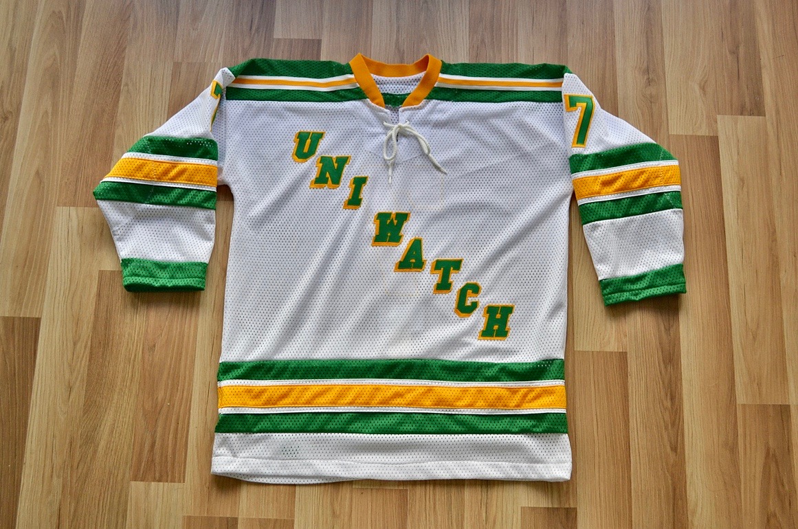
And now some quick words from Paul: Hi there. In case you missed it this past week, we’re currently auctioning off the very excellent Uni Watch hockey jersey shown above, which was made by the one and only Wafflebored. Full details here.
While we’re at it, we also announced this week that Uni Watch is once again partnering with Grey Flannel Auctions to provide free appraisals of your sports-related collectibles.
If you have game-used jerseys, autographs, or other potentially valuable memorabilia, you can submit photos and descriptions to GFA and get a free appraisal, with no further obligation, within 72 hours. It’s like an online version of Antiques Roadshow. If you want to consign your item to GFA, that can be arranged, but you’re under no obligation to do so.
For full details on all of this, look here.
That’s it. We now return you to your regularly scheduled weekend content.
Uni Watch News Ticker
By Phil

Baseball News: This is kind of bizarre. Players for Saint Mary’s University have Mike Tyson pride stickers on the backs of their batting helmets. … Apologies if you’ve seen these before, but the UCF “Pegasus” uniform is pretty sweet (from Brandon Helwig). … “Found a sticker for the iron workers union out of Chicago based on the old @whitesox logo at @elbaitshop” notes Nick Sousa. … Check out the glove being sported in this ST photo of Mike Clevenger (from Cleveland Rocks). … Nice stirrup game, in addition to bloodclot unis for Youngstown State yesterday (from Christina Dodson). … One-for-one, as it were: Frank McGuigan points out “@NBCSPhilly using the wrong @Marlins cap on their fancy trade recap graphic. 🤦🏻♂️ @NBCSPhilly commits their first error of the season…in their first game.” … Here’s a clever ripoff takeoff on the Brewers classic ball-in-glove logo from the Willowbrook High School team (from Jake Burns). … Here’s a look at the giant “a” on the Braves caps this spring. And here’s a look at the 3D giant “a” on their helmets. … If your parent club is the Brewers, then appropriately the High-A affiliate should be the Micro Brews! Couple more looks here (from MiLB Promos). … “Well Played:” Buddy Bell wearing the ball boy jersey works out pretty well for him “BB” (from Jordan Kottke). … Oh sweet! If he makes it to the MLB roster, we have a player with a 13 letter NOB to root for! (from Rusty Flynn). … Looks like the White Sox added front numbers to their Spring Training jerseys this year (left photo from last year, right photo from yesterday). From Hamburger Stand Now.

NFL News: Michael Thomas was wearing an OSU shirt under his Saints jersey vs Cincinnati this past season (good spot by Eric Pittman). … Russell writes, “More TWIPF greatness. Rick Upchurch in Week 1 of 1975 in a plain helmet after his original “split open” on an earlier play according to Pat Summerall. The equipment staff apparently got busy since Upchurch had logos & stripes by the 4th qtr.” … An online (and print?) magazine named Boca Life recently had an author pen a column in which he bemoans the sartorial choices of several football teams, including gems like these: “God was further annoyed earlier this season when ND wore their novelty green jerseys—except the green was not a vibrant Kelly green, but rather an insipid avocado, made even uglier by dark numbers,” and “the Dolphins fired their coach after several disastrous seasons of wearing teal, a very feminine color, as opposed to aqua green.” Yeah, I’m not sure if these are all tongue-in-cheek or just observations of an angry old dude. [*Note to self: consider sending resume to “Boca Life”*] … Did you ever wonder what all 32 NFL teams would look like if they were given a “City” edition jersey? Neither did I, but someone did (thanks, I think, to Marcus Hall). … This really should come as no surprise, but the New Orleans Saints’ color rash uniforms jerseys were voted best uniform by fans in NFL on Fox poll.
College/High School Football News: WHOA. Check out this display case featuring both rings and watches — it’s Coach Mack Brown’s! (from James Gilbert). … OK, this is just awesome: “My 9 day old son with my Dad’ high school football jersey from 1972. St. Edmund’s High School. Eunice, Louisiana,” says Chris Caswell.

Hockey News: On Friday morning, Mike Golic, Jr. was wearing a Sioux Falls Fighting Weiner Dogs jersey on Golic and Wingo. More here. … Prior to last night’s Stadium Series game, on Friday, the Pens & Flyers practiced in new unis, where we got our first looks at the special helmets. … “Beautiful color-on-color game yesterday during the MN Girls Hockey State Tournament,” says Rob Liebhart. “The two teams are the Warroad Warriors in gold/black and the Proctor-Hermantown Mirage in green/blue.” … The Peoria Rivemen of the SPHL wore Hockey Fights Cancer jerseys last evening (from Mike Lucia). … Last evening, Carolina Hurricanes captain Justin Williams wore a full face mask for extra protection (from William Wells). … The Coyotes will celebrate Shane Doan’s career by retiring his No. 19 jersey during a pregame ceremony before today’s game against Winnipeg. … Rogers Arena was throwing it back to the mid-90’s last night (from GOAT Jerseys).

NBA News: Kind of an NBA/NCAA hoops crossover here: “I’m not sure if this is worth mentioning in uni-watch, but I always wondered why Chris Mullin wore #17 in the pros after wearing #20 at St. John’s,” says Kenny Kaplan. “We (SNY) went to cover practice yesterday and I asked him why #17? The simple reason he gave was that he was a fan of John Havlicek who obviously wore #17 for the Celtics.” … You can buy a Rosebar Lounge-themed John Wall jersey to fight cancer. The Rosebar jersey costs $249.99 each from Goonmilk. … It was “90s Night” in Milwaukee, so the Bucks broke out the old logos/graphics last night (from Shaun Meulemans).

College Hoops News: The Illinois hoops squad wore these “FLYING ILLINI” throwback jerseys for “Flyin’ Illini Day” (from Illinois Basketball). … Reader David Steinle says “A women’s college basketball eyesore from Thursday — Florida goes BFBS against LSU in pink.” I’m not sure I’d go that far, but it wasn’t pretty. … Xavier and Villanova will both be wearing throwback uniforms today. Villanova will wear its Navy ’85 retros, while Xavier will wear a retro uniform used during the eighties with the Running Man logo. … Dayton and St. Louis played yesterday and showed why color vs. color isn’t always a good thing (from John Bedell). … The Florida Gators celebrated the 25th anniversary of their first trip to the Final Four in 1994 on Saturday by wearing retro uniforms. … The Albany Great Danes threwback last night to the time they were known as the NYS College for Teachers Pedagogues (via Paul). … K-State wore its lavender and purple throwbacks yesterday. … Throwing it WAAAY back: take a look at the “1920s” uniforms worn by Ball State University yesterday (via Paul).

Soccer News: “Sad times,” writes Panini Cheapskates. “Man Utd got in touch and made us stop selling our wonky drawings of their ex-players. They sent us a bunch of trademark numbers, including some that relate the their badge. So they’re saying that this is intellectual property theft.” … San Antonio FC,a professional soccer team based in San Antonio, Texas that competes in the USL, have introduced a new alternate kit. Here’s (second link sent in by Josh Hinton). … Juan Foyth of Tottenham Hotspur had a rip in his jersey yesterday (from Kyle Dawson). … Here’s some (more) looks at LAFC’s new away kit. … From Josh Hinton: The Louisville City FC 2019 kits were released yesterday evening. … Kyle Beery asks, “flipping through channels and found a Mexican soccer game – a Puebla player wears No. 300. Ever seen anything like that?”

Grab Bag: In the NLL, the Saskatchewan Rush wore special jerseys on Frirday night at home against Colorado. The jersey were in celebration of agriculture in the province for Ag Appreciation night. “They had a cool double green colour scheme,” adds submitter Wade Heidt. … I’m not sure how common this is (apparently not very), but The Stormers, a South African professional rugby union team based in Cape Town, changed their jerseys at halftime to claim their first win of the Rugby season. The article mentions the jersey change was “bizarre.” … I love this tweet from Wetstein: So you know you’re into logos too much when you say “hey I like this logo” and your girlfriend goes let me guess… it’s because the use of negative space right? … The things Uni Watchers notice: my ACC Tracker, Rex Henry writes, “New packaging for #ChickFilA #mayo Old left. New right.” … Interesting older logo for West Virginia. OTB Radio believes it to be pre-1980, when the current logo was established for the football team (it was adopted in 1985 university-wide). UPDATE: Apparently it is a knock off logo and never used in any official capacity (from PF Murphy). … And this last one comes from Jimmer Vilk, who writes, “Watching BYU Cougars volleyball (in white/blue) vs Grand Canyon Antelopes (in blue). I pick on Nike anytime I can but credit where credit is due…great number/letter sizing for GCU and I like the AOB (Antelope On Back).”
Since you asked, I’ve got eight games in 1977 where the Pirates wore the white striped shirts and pants in away games against teams that wore pinstripes. (link) In 1978, they wouldn’t wear white over white on the road, and after that, they stopped wearing white on the road entirely.
3 games in Chicago, 2 each in New York and Atlanta, and 1 in Philadelphia.
Pittsburgh’s practice jersey is better than the actual jersey, in my humble opinion.
The buckets from Pitt/Phil remind me of the James Caan classic “Rollerball”
Me too, and to a distracting degree. As soon as I tuned in, Rollerball and the question of whether or not it was intentional was all I could think about.
Should be an asterisk beside one of the games in the Wikipedia list of NHL outdoor games.
The 2014 Heritage Classic (which I attended) in Vancouver was not actually an outdoor game. The retractable roof at BC Place was closed that day. The decision to close it was due to rain.
Never liked the Brewers’ ‘ball in glove’ logo. Balls and bats can look cool in a logo but a glove looks stupid. If they had some reputation for sterling defense it might make sense. Naahh, it would always look stupid having a glove on your hat.
As for the cleverness of the ‘M’ and ‘B’ forming a glove, that’s just cleverness for cleverness’ sake. It’s a CFCS logo.
It just looks cartoonish and un-classy to me. Much prefer the ‘barley M’.
Regardless of which of the 2 one prefers, both are better than this Brewers logo:
link
I actually *like* that Gothic jumble. Green is such an underused color in baseball.
One more thing about the ‘ball-in-glove’….we read from left to right. That logo doesn’t say ‘mb’. It says ‘bm’.
Haha. That was my exact thought when the Brewers first introduced the ball in glove logo back in, as I like to say, The Day.
I think I’m the only person who prefers the original gold block M on the royal blue cap. Imagine this cap with barley stalks on the brim, a la the Pilots’ wheat stalks. It’d look great and be a nice nod to their franchise history, however short and bitter it may have been.
I respectfully beg to differ, mister umpire, sir. The ball in glove is possibly the greatest logo in the history of any of the four major sports. The barley M is close to being the worst. I hope you didn’t give the Brewers any bad calls just because you didn’t like the logo!
I retired in 1978 specifically because of the ball-in-glove logo. I knew I’d seen enough.
Minus the illegibility factor, I like that the Flyers have remained consistent with the contrasting nameplate color since 2009. It’s a signature element going back to the first time they introduced nameplates back in the ’70’s.
I felt the Pens’ logo on one side was a nod to the Steelers, a nice touch, even if unintentional. I do think the over-sized nature of the logos is a bit ridiculous looking with all the helmet vents, though.
With the color scheme a clear nod to the Steelers’ Color Rash set, the helmet logo seems like going with the theme.
Noted that the Penguins logo on one side and uniforms reminded us of the Steelers uniform.
Though it was not intentional, could not help but think the Flyers uniform looked like a football uniform as well. Looked kind of like a hockey version of the BC Lions uniform.
link
They only had contrasting nameplates for a couple of years, because they didn’t want to invest in a separate set for their orange unis when they were only wearing the nameplates part-time. By the time NOBs became mandatory in 1977, the Flyers had orange nameplates for the orange jerseys.
The fact that they decided to resurrect that little “quirk” has always bugged me, and made worse by the black nameplate on the white jersey (shouldn’t it be orange, then?). Still, I’d rather deal with them doing that than wearing those horrible mutilations of their classic uni designs inflicted by the Edge template they adopted in 2007.
Still, I think their second generation unis were their best. Nice, thick contrasting shoulders that the numbers actually fit inside, nice thick piping… all around, a clean, evolved look.
I grew up with the second generation jerseys, so those will still be nearest and dearest to my heart. I also felt the original black alternate worked nicely into that scheme. Still, I don’t hate the current uni set for the exact reason you said: the horrible Edge unis, which were actually among the better Edge units in the league, but still rather crappy by comparison to the classic Flyers sets.
Interesting uni quirk with UCF baseball coach Greg Lovelady, he always keeps a pen tucked in the right side of his cap
link
link
He didn’t do this as a coach at Miami,
And how do you all feel about Gritty going SFSS? (Streaking for Streaking Sake) link
I want to nominate Gritty for the Calder Trophy. Rookie of the year!
Is that supposed to be his belly button, or a disturbing tumor?
Cubs only team to wear regular home uni’s for first spring game? I know most teams take their home sets with them to AZ and FL to take team pictures, but don’t know if Cubs are the only one. Yankees?
Yes, the Yankees will be wearing pinstripes for their Tampa opener tomorrow if past is prologue.
Also, the Red Sox are wearing home whites today in their second home Grapefruit League game.
Was at the Stadium Series game last night. It was certainly a Flyer crowd but at least 10% Pens fans were in attendance. Also the place was at least half empty by the time Giroux won it in OT. May not have seemed that way with the TV camera views but was the case.
Liked the helmet art, though it was hard to see. Wish more teams tried it, I feel it’s uni territory that can still be explored!
Thanks for the first person overview. I was only reporting what I saw on television, but it *seemed* to be a very pro-Flyers crowd (maybe my % was a bit off) and I didn’t realize the stadium was half empty for the OT. It sure sounded loud (props to the NBC boom ops) and it sounded full. But I guess a bunch of folks probably left at 3-1 down, and even more when it was 3-2 with less than a minute to play. I’m picturing a few “taillights lighting” a la Kirk Gibson in ’88 when Giroux scored that game winner in the extra end.
Phil—I have season tickets for the Eagles and comparatively it was pretty quiet. That’s probably part the weather, part the team being a few points out of a playoff spot and part people upset that Carter Hart wasn’t playing.
I sat top level third row at about the blue line where they Flyers shot the first & third. There was some noise when the Flyers scored to tie at 1-1 but by the end of the 3rd there weren’t enough people left to really rock the decibel level. Most of those who left seemed to clear out after the Pens made it 3-1.
It was a great experience and I’m glad I went. My only complaint would be the upcharge on the concessions. $14 for a beer that costs a still mind numbing $10 or $11 at an Eagles game is just pure gluttony IMO. But of course we all pay, so they charge.
I enjoy the outdoor NHL games. From my living room. I went to one of the games at Yankee Stadium and I was certain I’d be getting frostbite.
Yeah I remember those — Rags played the Devils and Isles — and also how cold it was for one of those two games (wasn’t the air temp like 20 degrees at puck drop?). You never know when you get tickets what the weather will be — but unlike baseball or football, when you play an outdoor game in northern climes in January or February, you’re definitely taking a chance on it being 0 degrees with wind chill.
Something like that. With a brutal wind chill. I scored a last minute ticket when my buddy Tom’s wife refused to go when she saw the weather forecast. She’s much smarter than I am, apparently. ;)
The absence of white in this year’s Stadium Series unis (for both teams) is a serious flaw in my opinion. It makes the whole outfit look muddy – like there’s not enough contrast. I could live with the Pens’ set, as the black and yellow at least counter each other nicely, but the Flyers’ was just flat-out terrible – one of the worst unis the NHL has seen in a while.
I was scrolling thru the comments before making my comment to see if anyone else said this.
NO WHITE ON EITHER TEAM? NOT EVEN TRIM?
These unis look godawful by themselves, even worse in tandem in a game.
And the logos on the helmets are a mess. Must have been a real headache for whomever had to apply them!
And posting the pics of past Pens/Flyers outdoor unis makes the point even stronger — especially those gorgeous 2008 powder blue Pens (sorry but being a hockey fan starting in 1970, the Pens will always be powder/navy blue in my eyes)
asher wojciechowski has played in the MLB before
I think the artwork of Graig Kreindler is the best part of your weekend posts, Phil. Thanks.
Today’s painting is one of Graig’s best yet and they’re all beautiful!
Grammar nitpick of the day: “The fans were troopers, too.” Not unless they were police or military! I’m sure you meant “trouper,” a very common mistake.
link