Over the last several years, we’ve showcased lots of projects by the gifted jersey DIYer who calls himself Wafflebored. In a few instances, Wafflebored has very generously donated some of his homemade jerseys for our year-end raffles. But despite many requests and offers from Uni Watch readers, he has declined to sell his jerseys or to take commissions. He appears to be that rare artist who’s truly interested in art for art’s sake — brilliantly creative but not particularly entrepreneurial (which I mean as a compliment). So those of you who’ve wanted to purchase a Wafflebored jersey have been out of luck.
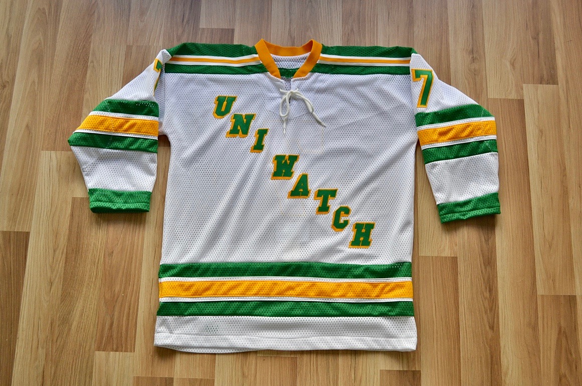
Until now. In a few minutes I’m going to explain how you can acquire his latest creation. Check this out (for all of the photos that follow, you can click to enlarge):
Pretty sweet, right? Here’s the backstory: After I announced the recent unpleasantness, Wafflebored got in touch and asked if he might be able to support Uni Watch by making jerseys that could be sold to raise some cash for the site. That’s an incredibly generous gesture — so generous, frankly, that I wasn’t entirely comfortable with it, because I think Wafflebored should reap some of the rewards from his work. So we’ve decided to split the proceeds evenly.
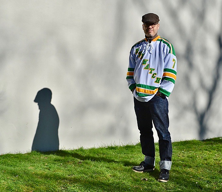
As for the jersey design: As you may recall, back in 2016 we did a T-shirt featuring a hockey player wearing a Rangers-esque Uni Watch jersey. The design concept was mine (I had actually thought of it back in 2015), and the illustration was by Bryan Molloy. I thought that would be a good design for Wafflebored to execute, so that’s what he did (but he opted to make the chest lettering green with gold block-shadowing instead of the other way around, and also omitted the captaincy designation because the magnifying glass would have been too tricky to render in tackle twill).
Here’s how the jersey looks from the back:
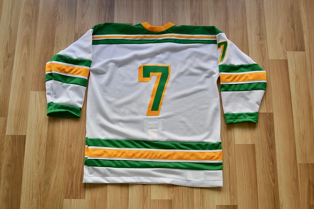
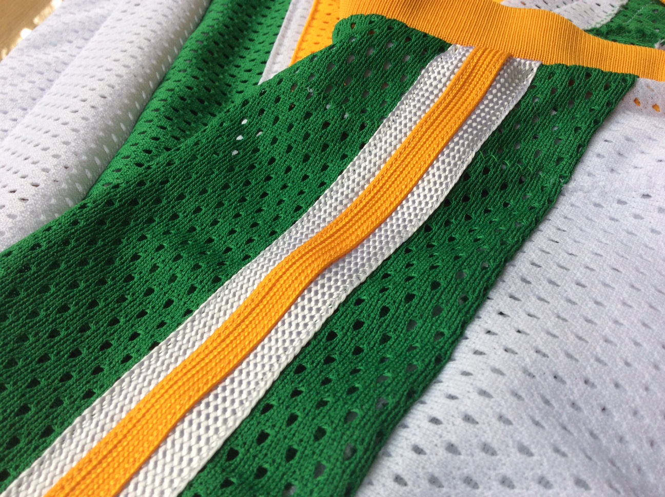
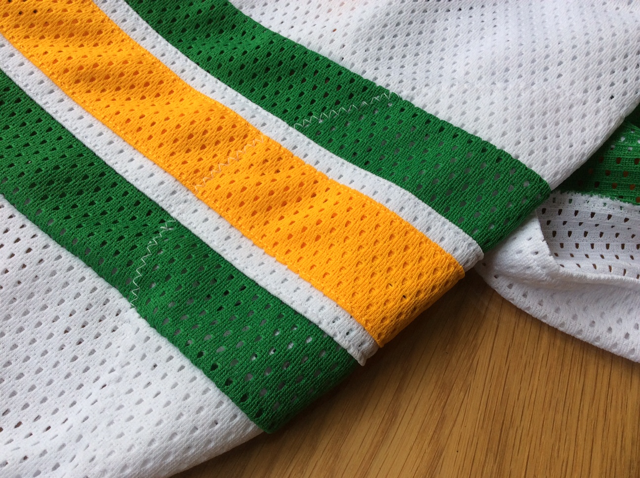
As you can see from that rear-view shot, the jersey includes a fight strap. Other key details include a lace-up collar, reinforced elbows, a “W” inner tag (think of it as a tastefully hidden maker’s mark), and more. Here are some close-up pics:


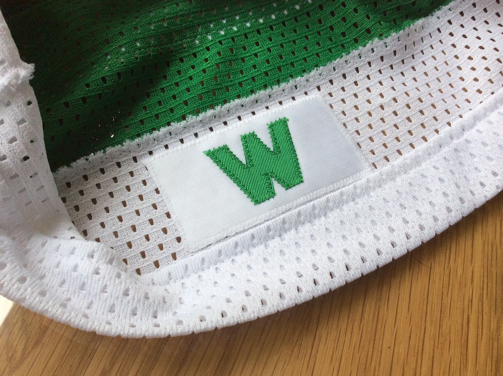
The jersey measures about 25″ pit to pit and 31″ long. The normally camera-shy Wafflebored even took the extra step of providing a photograph of himself wearing the jersey. “I’m about 5’9″, 170 pounds, and am wearing the jersey over a sweatshirt in this photo,” he says.
The jersey is a one-of-a-kind original. Wafflebored will not be making additional versions of it — this is it.
We’re going to sell it via a blind auction, and we’ll start the bidding at $150, although I think it’s fair to say that the jersey is worth a whole lot more than that. (The winning bidder will also have to cover shipping costs from Vancouver, which is where Wafflebored lives.) To participate in the auction, email your bid to me by next Wednesday, Feb. 27, 7pm. High bid wins, and Wafflebored and I will split the proceeds.
If you have any questions, want to see more photos, etc., feel free to be in touch.
I can’t fully express how grateful I am to Wafflebored for doing this — not just for the financial support, but for sharing his remarkable talents and considerable labor on Uni Watch’s behalf. It’s no small thing, and I’m very, very humbled by it.
Also, it’s worth noting that this jersey is really plain by Wafflebored standards. In addition to being someone else’s design (which in turn was based on a real NHL team’s design), there’s no weird collar or other unusual tailoring features, no made-up team name with a fun backstory. Wafflebored usually takes a lot of joy in those types of elements, but he sacrificed all of that in order to make something, well, normal. Although he probably won’t admit it, I suspect this project was fairly tedious and unrewarding compared to his more freewheeling designs. Thanks for being willing to do that, buddy.
Speaking of being humbled: This is just one of many kind gestures that the Uni Watch community has sent my way since I announced the recent unpleasantness two months ago. We’ve had a significant spike in Uni Watch membership card sales, a lot of donations, and a big outpouring of very kind, thoughtful emails. All of this has been super-special, people — thanksthanksthanksthanksthanks.
Lots of you have also asked about how things are shaping up for my post-ESPN career path, and what that will mean for this website. The short answer is that I don’t know yet, although I’m in discussions with several interested parties. I should be able to tell you more soon. Stay tuned, and thanks for your patience.
Nameplate feedback wanted: Last Thursday I reported that the Rays and Indians — the last two MLB teams to use nameplates for their NOBs — are switching to direct-sewn lettering, which will make 2019 MLB’s first nameplate-free season since 1972.
I’m working on an article that explores this issue in greater depth, and I could use some input from fans. I’m particularly interested in hearing from people who purchase retail jerseys fairly regularly and feel strongly about nameplates vs. direct-sewn lettering (you can be either pro-nameplate or anti-nameplate, as long as you have a strong opinion). If you’re a Rays or Indians fan, even better.
I’d also be interested in hearing from Rays and Indians fans who don’t necessarily purchase jerseys but have strong opinions about the change.
If you fit any of these descriptions, please drop me a line. Thanks.
Collector’s Corner
By Brinke Guthrie
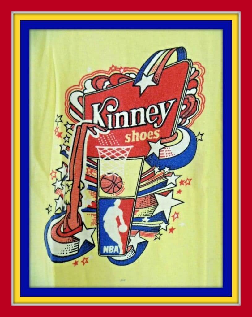
Kinney Shoes offered up this 1970s “Slam Dunk” NBA T-shirt, probably a promo item when you bought a pair of shoes. (Kinney was big-time into the NBA back then, it seems. And how about that upside-down swoosh?) That “zooming stars” motif reminds me of a certain 1970s TV show open, with the rockin’-est theme song ever (“In your satin tights, fightin’ for your rights, and the old red white and bluuuuue”).
Now for the rest of this week’s picks:
• How about this great-looking 1970s Sears trading card locker? Looks like it is made of heavy-duty cardboard with vinyl covering, and plastic shelves inside. It’s covered with generic-looking pro sports players, though the No. 20 football player at lower right looks like Mel Renfro of the Cowboys, and the NBA player above him vaguely resembles Dave Cowens of the Celtics.
• There’s an interesting tidbit (at least to me) in this Terry Bradshaw 8-by-10 photo. Note those shoes he is wearing. There was a period of time when these were all the rage in the NFL. They were from Canada and known as broomball shoes. (Here they are again, on the previously mentioned Mel Renfro.)
• Keep your No. 2 pencils sharp with this 1970s Atlanta Flames hockey puck pencil sharpener.
• Couple of SF Giants items here: this Apex jacket from the 1990s, and this radio station bumper sticker from the 1970s. “For the Good Times.”
• For the diehard St. Louis (football) Cardinals fan, we have this set of four 1970s “see-thru” glasses.
• More NFL glassware: This pair of glasses features the helmets of the NFC’s Eastern Division.
• He shoots, he scores! Buffalo Sabres fans will love this 1970s hockey stick pen. The seller tosses in an ad for Sabres stuff — look at those prices! A knit ski cap just $4, and a men’s tee just $3.50.
• This 1970s Kansas City Chiefs rain jacket was just the thing to keep you dry at then-new Arrowhead Stadium.
• Here’s a set of the 1970 Chiquita banana helmet stickers. Seller says they are “near mint.”
• Waddingtons was a UK puzzle and game maker that went out of biz in 1994. Before they did, they came up with this 500-piece Miami Dolphins puzzle.
Seen an item on eBay that would be good for Collector’s Corner? Send any submissions here.
Click to enlarge
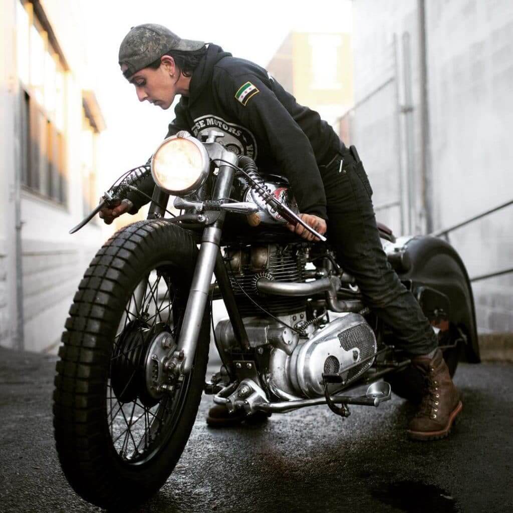
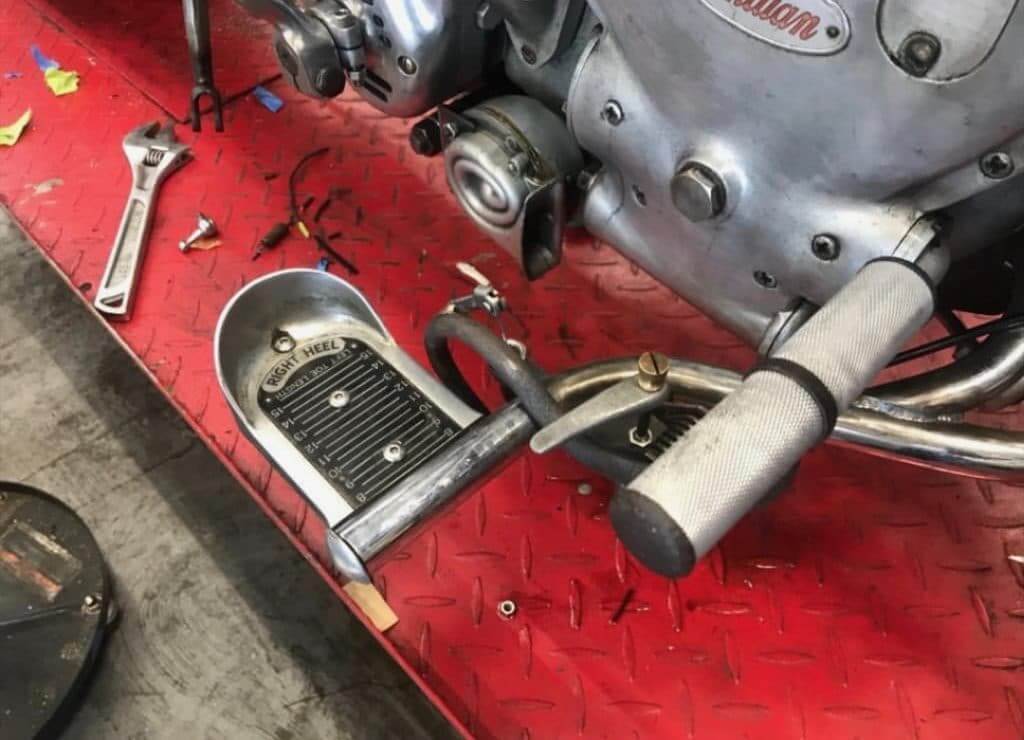
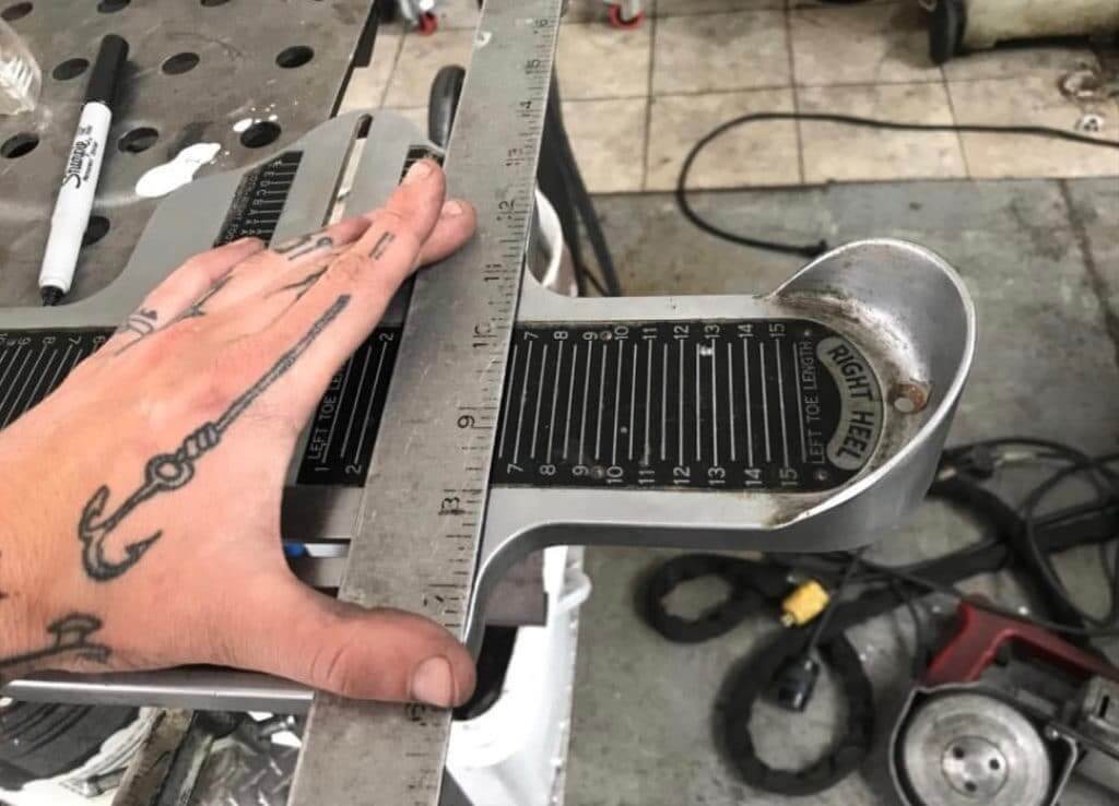
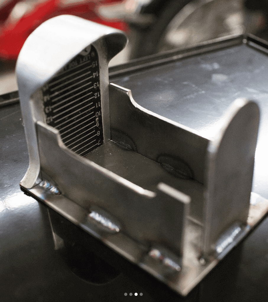
Brannock-cycle update: In last Friday’s Ticker we had an item about a custom Indian motorcycle with foot rests made from a Brannock device (see above). Today we have a bunch of additional photos that show the details much more clearly.
The pics are all from the Instagram account @jshia, which is run by a motorcycle enthusiast. As I’ve mentioned before, a Brannock was used as a gas pedal in the movie Mad Max Fury Road, but this is the first time I’ve seen one used on a real vehicle. Here are some closer looks:
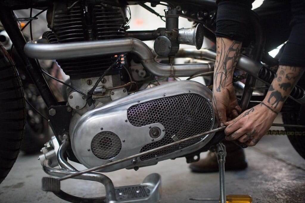

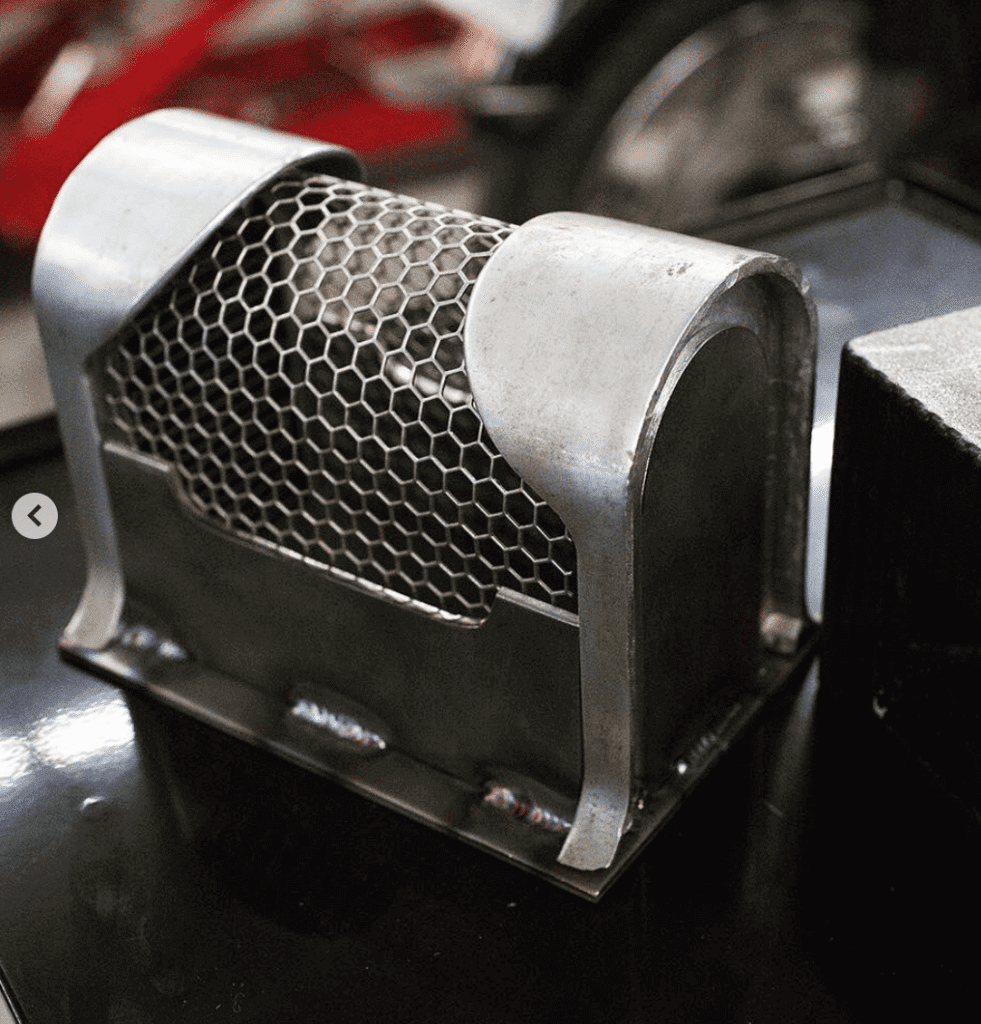
In addition, @jshia used another Brannock to create the motorcycle’s battery box:
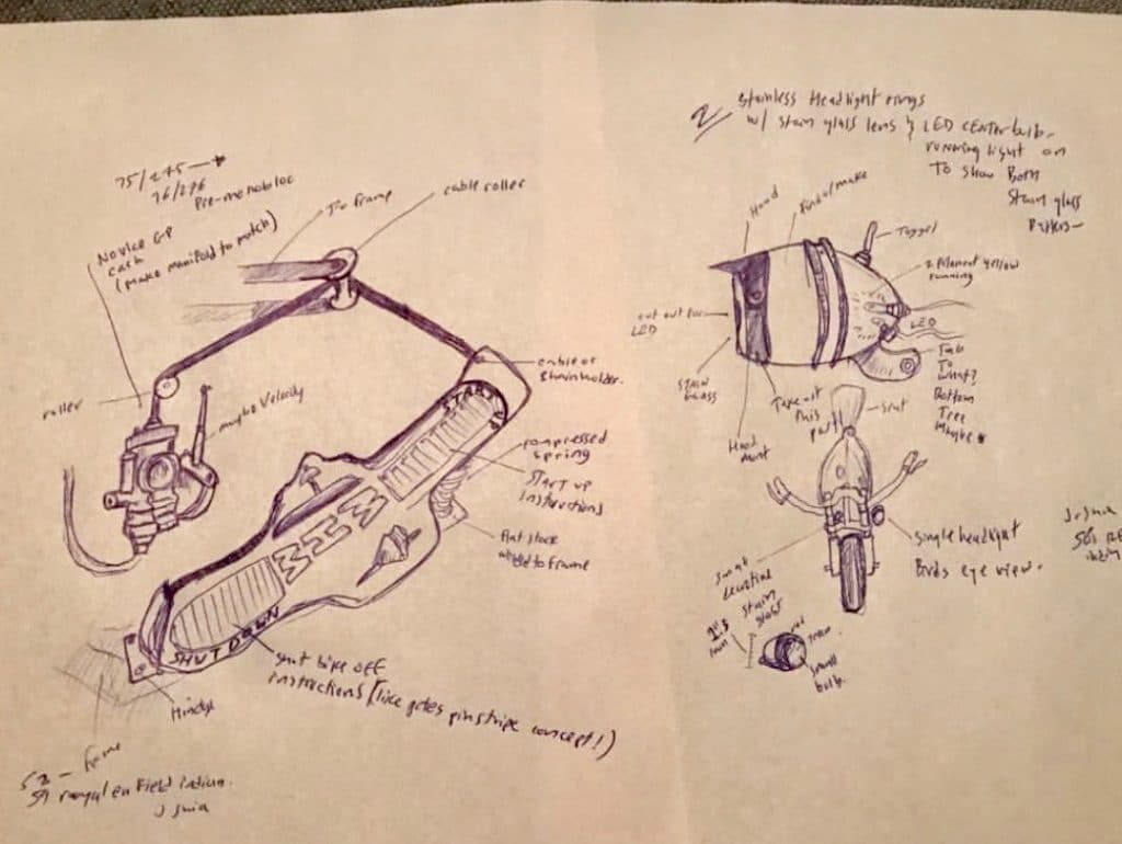
And then there’s this drawing, which I don’t really understand, but it includes a Brannock:
(My thanks to reader James Hayes for first bringing this to my attention, and to reader Timmy Steffes for following up with the additional images.)
“What’s it worth?” reminder: In case you missed it on Monday, Uni Watch is once again partnering with Grey Flannel Auctions to provide free appraisals of your sports-related collectibles.
If you have game-used jerseys, autographs, or other potentially valuable memorabilia, you can submit photos and descriptions to GFA and get an free appraisal, with no further obligation, within 72 hours. It’s like an online version of Antiques Roadshow. If you want to consign your item to GFA, that can be arranged, but you’re under no obligation to do so.
For full details on all of this, look here.

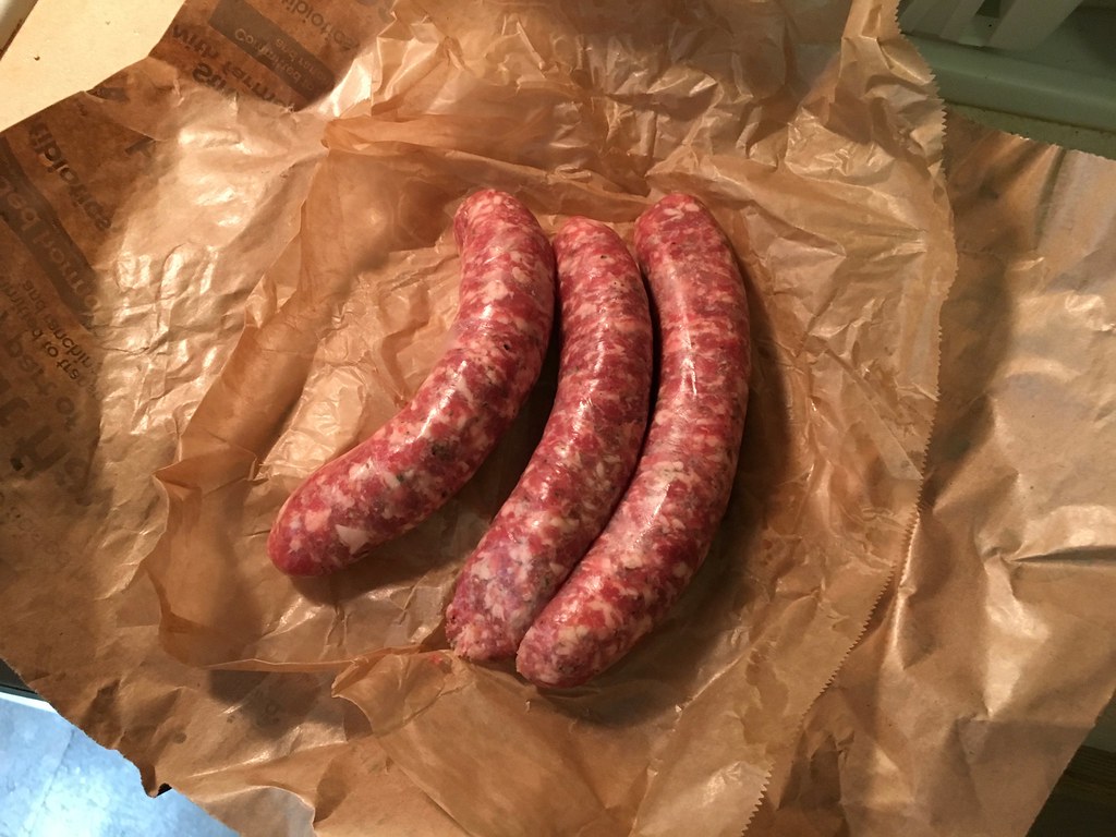
Culinary Corner: A few weeks ago I mentioned that I’d recently had two restaurant renditions of cassoulet — the traditional French casserole that usually features white beans, duck confit (or sometimes goose, or sometimes mutton), garlic sausage, and pancetta or some other type of cured pork — and wanted to try making it myself. Over the weekend, the Tugboat Captain and I did just that.
There are lots of different cassoulet recipes out there, so we did a bit of reading. We were ultimately swayed by this article and an accompanying recipe by the great “Food Lab” chef J. Kenji Lopez-Alt, who argued persuasively for the use of chicken instead of duck confit (it’s cheaper and holds up better during the stewing process) and suggested that we could still impart plenty of duck-y flavor by browning the chicken and several other ingredients in rendered duck fat (which can be purchased, but we happened to have some on hand, rendered from an earlier duck project). Here’s how we did it:
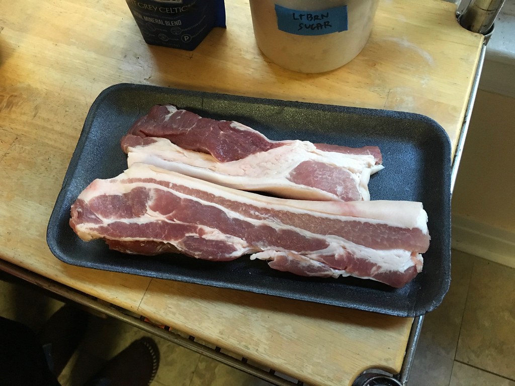
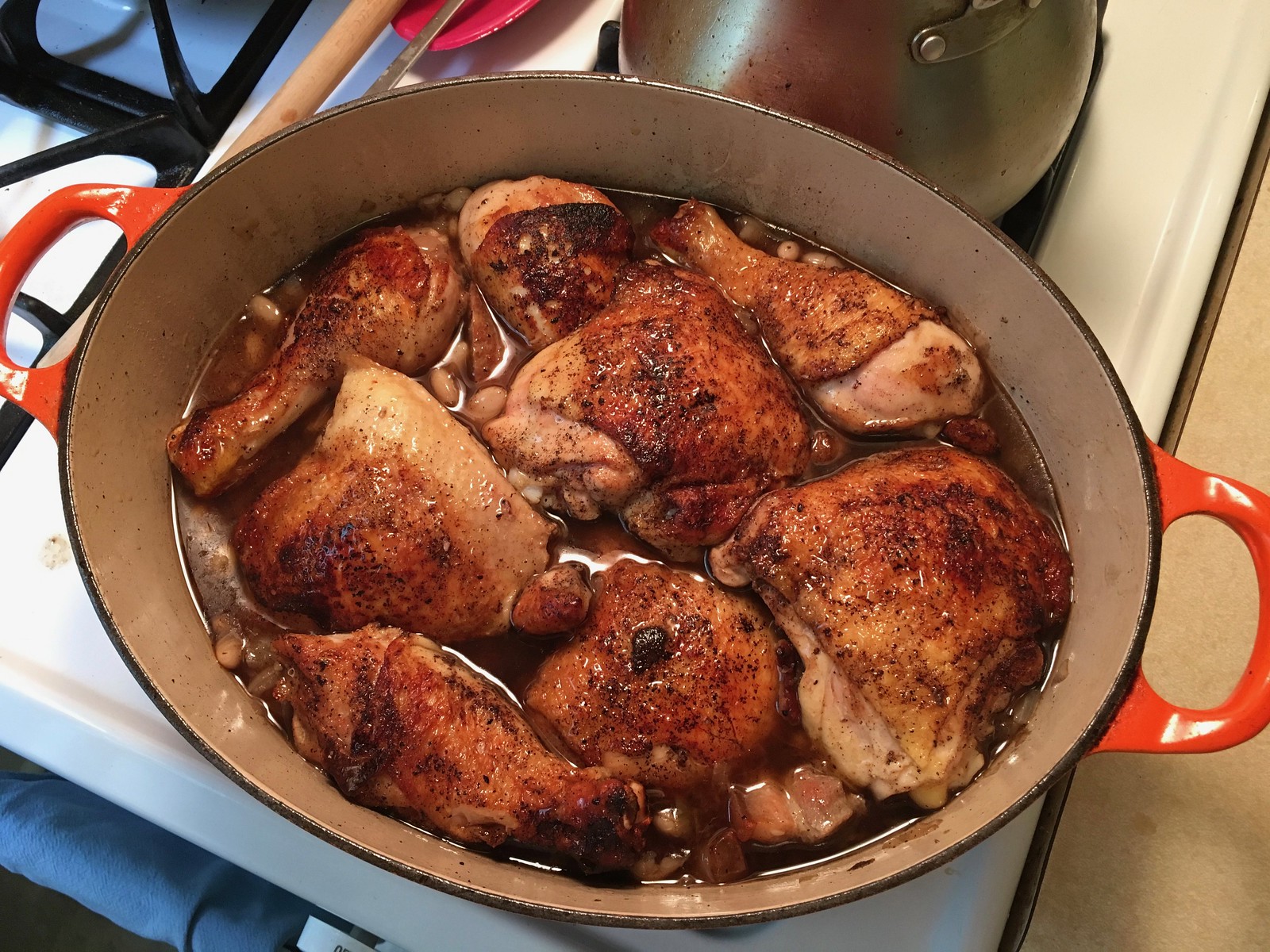
1. Before we could get started, we came up against a problem: The cured pork element in Kenji’s recipe was salt pork belly, which we couldn’t find at any of our local shops. At this point, we had two options: We could substitute a different kind of cured pork (bacon, jowl, pancetta, etc.), or we could make our own salt pork belly. We decided to do the latter.
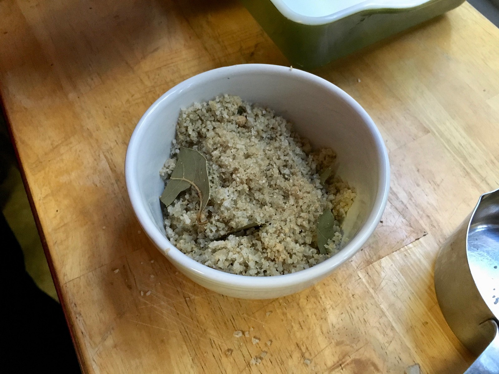
On Saturday we bought a pound of pork belly, made a simple curing rub from sea salt, brown sugar, bay leaves, black pepper, nutmeg, cloves, and ginger (we would have included juniper berries, but we didn’t have any), and coated the pork with the rub. It was sort of like making bacon, but without nitrates or smoking (for all of these photos, you can click to enlarge):

We covered the dish and popped it in the fridge overnight. When we were ready to start cooking at noon on Sunday, a significant transformation had taken place. A lot of liquid had been leeched out of the pork, and the meat was now stiff and firm, as if rigor mortis had set in. A fun and successful chemistry experiment:

2. We rinsed off the curing rub, cut the pork into 3/4-inch cubes, browned the meat in two tablespoons of duck fat, and then removed the cooked meat and set it aside:


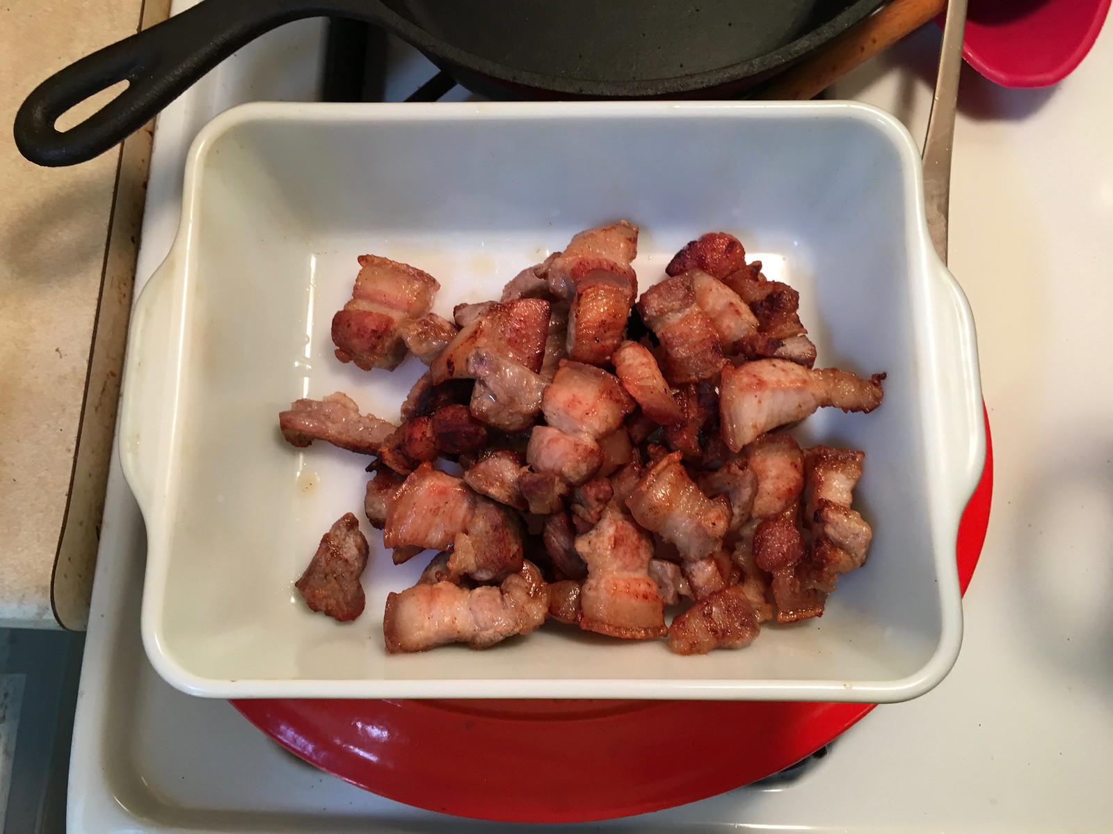
I tasted a nubbin — it was suitably salty. The curing had done its job!
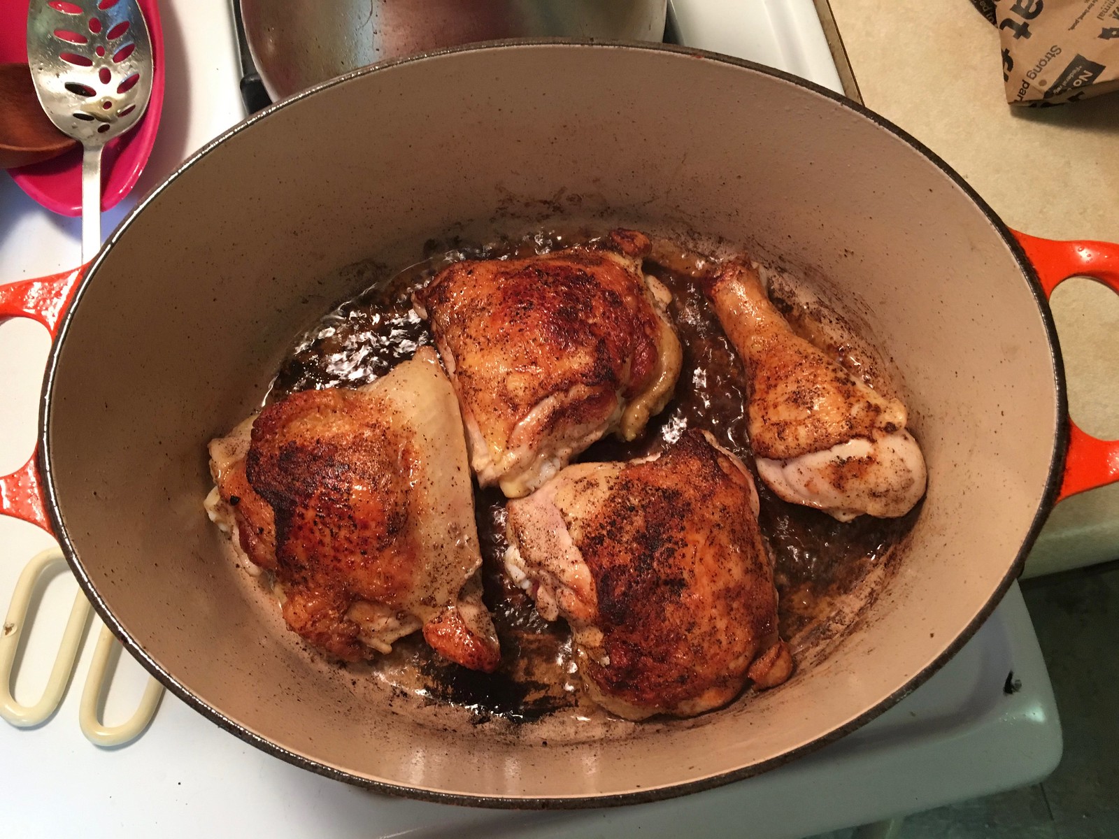
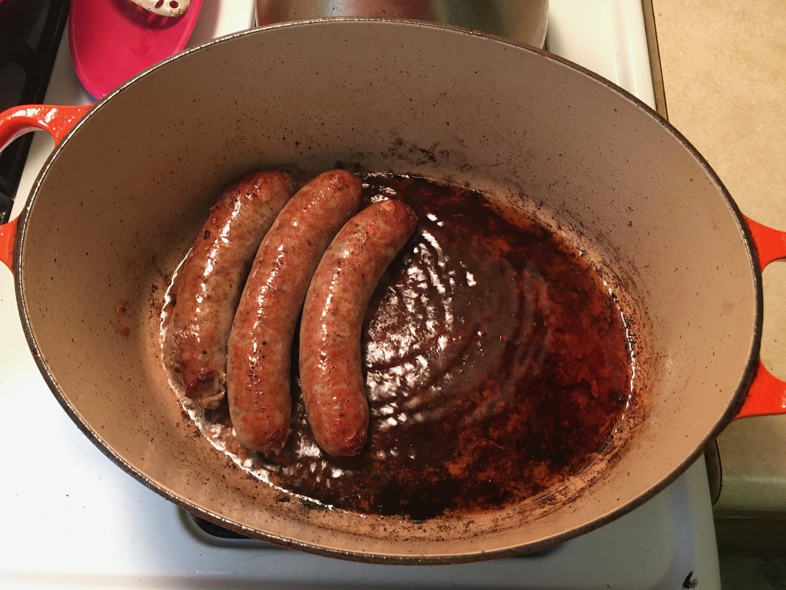
3. We took four leg/thigh chicken quarters, separated the legs from the thighs, seasoned them with pepper, browned them in the same pot where we’d browned the pork, and set them aside:
4. Next up was a pound of garlic sausage. Again, we browned the meat and set it aside:
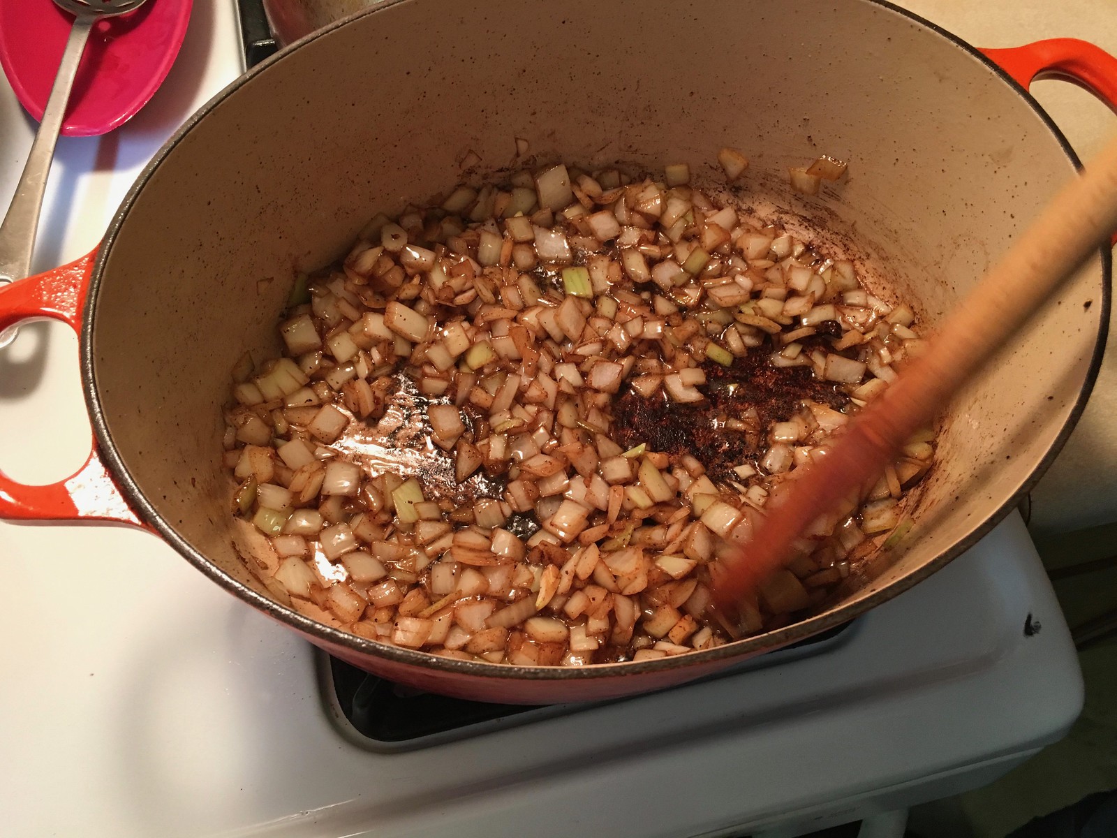
5. The next ingredient to go into the pot was a cup of finely chopped onions:
6. After the onions were browned, we added a pound of white beans (they had been soaking in salted water overnight), along with some aromatics (carrots, celery, parsley, cloves, garlic, bay leaves) and a quart of low-sodium chicken stock:
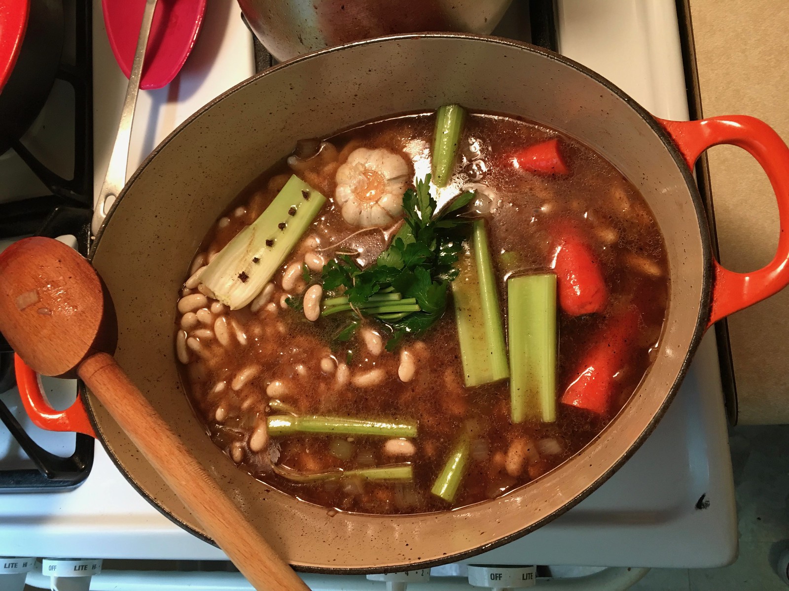
7. We let the pot simmer for about 45 minutes, at which point the beans were mostly tender. Then we removed all of the aromatics (in the previous photo, you can see that the Tugboat Captain very cleverly impaled the six cloves on a celery stalk so we wouldn’t have to find them and fish them out separately, which would’ve been a major pain in the ass) and added all of the browned meat, with the chicken going on top:

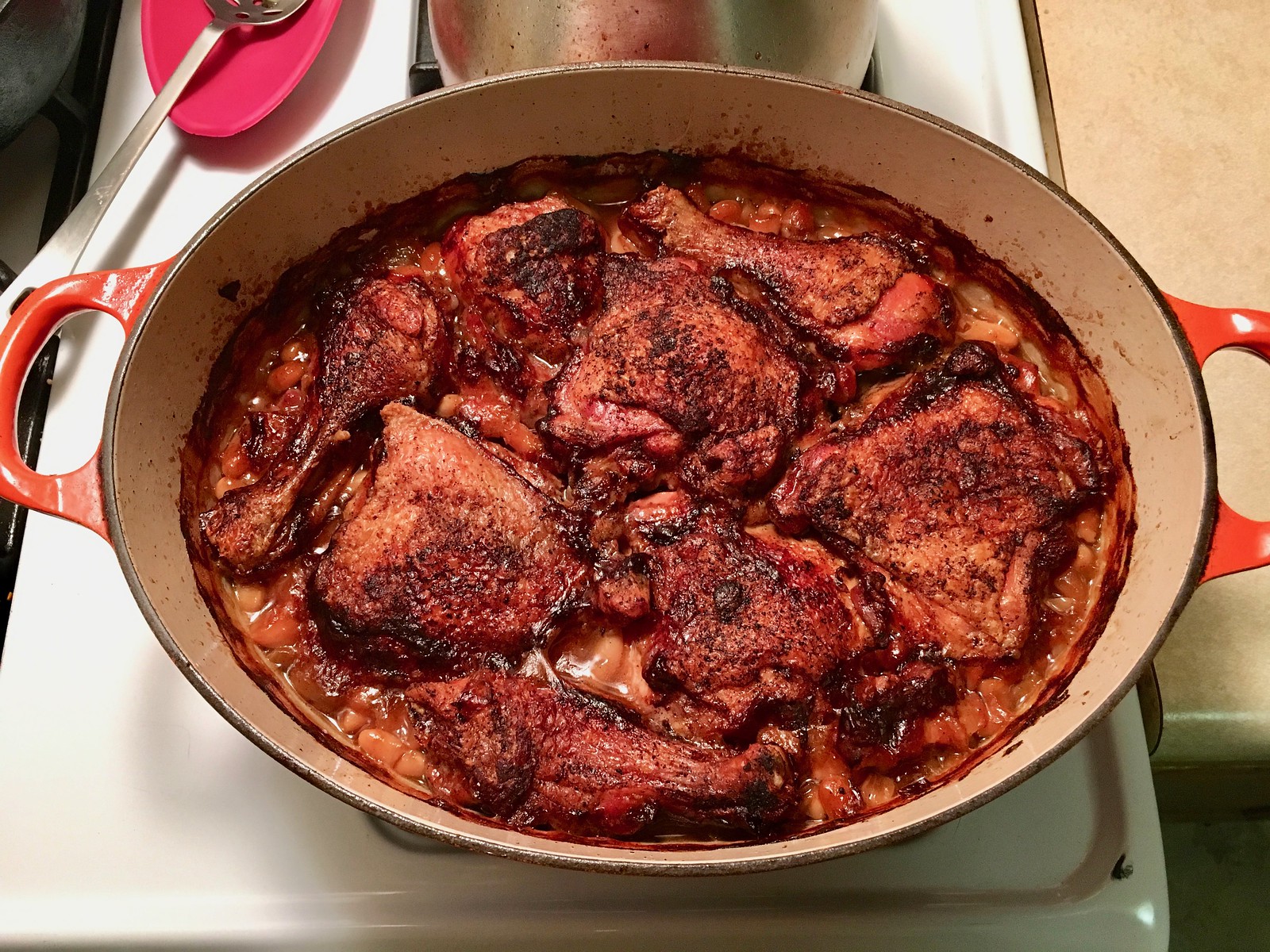
8. We put the pot, uncovered, into a 300º oven, checking on it periodically to make sure the liquid level didn’t go down too far. After a few hours, our friends Matt, Angela, and Nate came over, and we had fun drinking, snacking, and yakking with them while the house smelled increasingly cassoulet-y.
After the cassoulet had been in the oven for a little more than five hours, it looked ready:
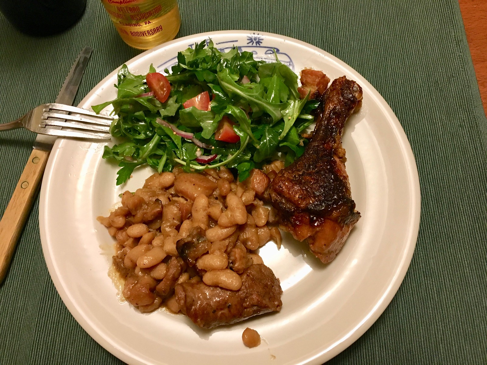
We brought the cassoulet to the table and served it with a simple arugula salad:


———
It was good — very good. The perfect comfort food for a chilly winter day. My only minor gripes were (a) we didn’t end up with much of a crust on top (we had added some gelatin to the chicken stock specifically for this reason, but it didn’t seem to work the way it was supposed to) and (b) the sausage wasn’t as firm and dense as the sausage I’ve had in other cassoulets, so we might have to try a different sausage next time (and there will definitely be a next time).
All in all: a really fun project. Time-consuming, yes, but not difficult to execute. Plenty of leftovers, too. Highly recommended!
The Ticker
By Alex Hider

Baseball News: Paul mentioned last week that the Yankees will be wearing their home pinstripes for their two games in London against the Red Sox, even though the Yanks are the designated away team. Now, reports indicate that it will be a white-on-white series, with both teams wearing their home uniforms (from Brinke). … New White Sox OF Jon Jay is wearing No. 45 as a tribute to Michael Jordan’s baseball days (from Matt Lindner). … Giants skipper Bruce Bochy, who famously has MLB’s largest hat size, announced that he will retire at the end of this season. … The Marlins’ new logo is on display at the team’s spring training facility (from Jake Elman). … Indians SS Francisco Lindor wore Stance stirrups with a Block-C logo during a recent photo shoot. Is that the first time we’ve seen Stance-branded stirrups? (From Jason.) … Good to see Nats P Sean Doolittle raising awareness for the New Era factory workers in western New York who will soon be out of a job, as the company looks to open a union-free operation in Florida (from Sara and Ben). … New caps for the Single-A Asheville Tourists (from Tyler Davis). … The Triple-A Buffalo Bisons will wear Boba Fett Star Wars jerseys on June 8 (from Joseph Pitirri and Mike Lucia). … At first glance, it would appear that Maryland is wearing traditional button-front jerseys with a headspoon. But note the top seam — it looks like these are pullover jerseys with only two functional buttons. The remaining buttons are just decorative (from Billy King). … Looks like the C-Flap is spreading to college. Some Auburn players are now wearing the attachment, and Auburn uni-guru Clint Richardson says he doesn’t remember any Tigers wearing it in the past. … New uniforms for NCAA D-II University of Illinois Springfield (from Erik Flower).

Football News: CNN captured a Guatemalan refugee wearing a 2007-08 Patriots “Perfect Season” hoodie in a video package recently (from @OnlyInBOS). … Charles Noerenberg was watching old Bears highlights from 1991 and spotted Mike Ditka wearing a jacket with a Super Bowl XX champs patch. At that point, the Bears were five years removed from that championship. … Singer Melissa Etheridge uses a Chiefs guitar strap. A quick Google search shows she was born in the Kansas City area (from Michael Hayden). … New band uniforms for Western Kentucky (from Griffin Smith). … It looks like Georgia State will have some new helmet combinations this season (from Doug Hazard). … The Atlanta Legends of the AAF have two players named Jones: brothers WR Seantavious Jones, who goes FIOB and WR Malachi Jones, who wears a traditional NOB (from Ferdinand Cesarano). … Speaking of the AAF, the league’s emphasis on color-on-color matchups can be rough on the viewer (WaPo link) (from Phil). … Whoa, check out the zigzag pants striping worn by the Coosa High School (Georgia) Eagles in the 1970s. Good stuff! (From Austin Gillis.)

Hockey News: Here are the pads that Flyers G Carter Hart will wear in the Stadium Series game against the Penguins on Saturday (from The Goal Net). … Colleyville Heritage High School in Texas appears to have cribbed its logo from the Canadiens. … Check out this great 1928 shot of Ottawa G Alec Connell. “Between the barber-pole sweater, the cap, and the pads and gloves, this is a tremendous photo,” says Jerry Wolper. True enough! … The Blackhawks wore their Winter Classic throwbacks against the Senators last night. … A sign at the Kings’ arena misspelled the Capitals’ team name (from William Yurasko).

Basketball News: On Sunday, the NBA announced that the 2020 All-Star Game will take place in Chicago, and unveiled the game’s logo. … Clippers PG Shai Gilgeous-Alexander wore a double-decker NOB during the Rising Stars game this weekend. I guess there’s no other option for a name like that for a below the number NOB (from Etienne Catalan). … The Erie BayHawks, the Hawks’ D League affiliate, will wear Erie Wave throwbacks on Friday. The Wave were part of the World Basketball League and played from 1990 to 1992. … Virginia Tech wore maroon at home against Virginia last night (from Andrew Cosentino). … Both the Alabama and Auburn women wore pink uniforms on Sunday (from Clint Richardson). … Man, Michael Jordan once wore a jersey with the number and NOB riding really low.

Soccer News: Chelsea defender David Luiz suffered a torn jersey in a match yesterday against Manchester United (from Josh Hinton). … The Celtic FC women’s team wore their bright green third kits with NNOB on Sunday (from Graham Clayton),

Grab Bag: Alex Chu is a freshman on the Wheaton College lacrosse team, but he hasn’t been able to play at all this season — even in practice. That’s because his head is too large to fit into a helmet, and approved helmet manufacturers don’t make helmets his size (from Phil and @Titan4Ever2488). … Wichita State has a new logo that celebrates 50 years of women’s athletics (from Michael MPH). … Reader Aaron Davenport was at the US Curling Nationals in Kalamazoo, Mich., last weekend. He noted that Olympic champion Matt Hamilton was wearing curling-modified Jordan VI shoes and that one team was sponsored by Cold Stone Creamery. “I hate ads on unis, but has there ever been a more perfect (bordering on parody) sponsorship for curling than Cold Stone Creamery?” he said. … A restaurant called the Swan and Mallard has a pretty brilliant logo (from Brendan Armstrong). … A rash of foot injuries has the Army searching for a new kind of boot. … NASCAR pit crew members are now required to wear ID patches on their uniforms. This tweet offers a good explanation as to what they mean (from JayJayDean). … Cricket fans can help choose a retro uni that will be worn by the Australian men’s one-day international team next summer (from Joel Berry). … Cross-listed from the hockey section: Colleyville Heritage High School in Texas appears to have cribbed its logo from the NHL’s Montreal Canadiens. … PGA golfers are now allowed to wear shorts during practice rounds and pro-ams. They had previously been allowed to wear shorts for practice rounds at the PGA championship.
So if one expects the bidding on that beautiful Waffleboard sweater to get too rich for one’s blood, what would be an appropriate surcharge for having the back of the jersey depicted on a membership card?
Yanks-Sox all-white series: Just make it a cricket game already.
Curling advertisers: This being an amateur sport, in most cases the advertisers really are sponsors. In that many of the players and most of the teams could not afford to compete without the support of their sponsors. I know some of the curlers who played at Kalamazoo, and they spend a fair amount of time raising money a few bucks at a time to finance trips to competition and paying coaches and whatnot. Spaghetti dinners and homemade t-shirts and calendar sales, that sort of thing. A couple grand from a business can make the difference between a team being able to play enough events to earn a trip to nationals or not. Some of the ads at Kalamazoo were nationals-only advertisements exploiting the wider video viewership of the event, but a good portion were from real actual team sponsors.
So if one expects the bidding on that beautiful Waffleboard sweater to get too rich for one’s blood, what would be an appropriate surcharge for having the back of the jersey depicted on a membership card?
Ha! Hadn’t even thought of that. But sure, we can do a membership card based on this jersey. I’d even consider including an NOB (vertically arched, of course). Same basic price as for any other membership card.
But it’s a hockey jersey – shouldn’t any NOB be horizontally flat? Though personally, if I were to request any change, it would be a non-7 number and retain NNOB.
Regardless, I’m now planning to put in for a new membership card. Might have to make it a double-order, since I had already just chosen my next-card design. One for my wallet, one to leave in my curling equipment bag.
it’s a hockey jersey – shouldn’t any NOB be horizontally flat?
Depends:
link
I never thought about it before and I’m not sure if it’s ever been brought up here, but baseball doesn’t really need contrasting uniforms. What would be the downside in teams going white v white? Anyone?
Good point.
I don’t know if there’s a “downside” per se, but it would certainly fly in the face of tradition. And it might get old quickly.
Personally, I love road grays–at least if the shirt and pants match. It’s easier on my eyes than the blinding white, and I like how it matches up with certain color schemes like the A’s, Brewers, Orioles, etc.
What really looks like garbage is gray pants with softball tops. Of course, white pants with softball tops look equally like garbage.
First class/test cricket is white/white, of course, and even the colorful short-form uniforms clash on occasion- saw a few matches in the UK involving teams wearing nearly identical white or dark blue uniforms.
You’d suspect that baseball uniforms likely evolved from cricket whites, though I’m surprisingly not finding a lot of research on the subject.
No sport really “needs” contrasting uniforms. But as with most sports, contrasting uniforms marginally improve ease of play for participants in baseball. Visual contrast helps umpires and players “read” what they see on the basepaths. The players on the opposing teams don’t occupy the same space on the field at the same time in baseball, until they do, and by definition when they do it’s vitally important for all participants to easily differentiate between each team’s players.
If anything, baseball needs more contrast. Too many teams have lightened their road unis so much that they’re almost white, especially in sunlight. Regardless of the proliferation of colorful alternative jerseys, most teams wear the same home white and road almost-white pants, and players’ legs are the place where a clear visual contrast would be most valuable to umpires.
the ‘need’ is for officials/umpires/refs to be able to tell the difference between teams when making calls.
as an official i can tell you this is a must for games like soccer, football, basketball and many others. without it officiating would be much harder.
i agree 100% that baseball certainly needs more contrast.
it’s pretty boring of late
The only time baseball “needs” contrast are close plays (close tags at 2nd or home, run-downs, non-routine put-outs at 1st). I seriously doubt that the players need to see the difference, but as an umpire, identical color schemes are difficult. I have too many summer ball teams in Navy/White or (weirdly in Lorain County Ohio) Orange/White and it makes for a less-efficiently called game.
I saw a white vs. white uniform matchup between host McKinney Blue Thunder and the visiting Bay Area Toros in 2008 Continental Baseball League action. While it was possible to follow the action, there was something disconcerting and problematic about watching a sporting event where the teams look almost identical. It made me appreciate all the more that contrast improves the viewing experience.
Typo alert: Flyers-Pens Stadium Series is on Saturday, 2/23. Not Friday.
Got it.
As is explained in the post, The Swan & Mallard doesn’t exist. That’s just a really awesome concept.
Love those Blackhawks’ Winter Classic “sweaters.” They should make them permanent alternates.
I got a similar trading card locker to the one featured in Collectors Corner in the early 1980s. It was made by Topps and you got it by collecting a number of baseball card wax packs and mailing them in, along with the postage and handling. Don’t think I still have the locker but it was a glorious day when it (finally) arrived.
I had a locker too, but it was just plain thick cardboard with one color printing. On the inside, you got labels of the team names to put opposite the slot for that team.
I’ve always wanted to make a cassoulet, but was daunted and overwhelmed by the traditional receipes, but I think that I’m going to try yours. That looks delicious…
Two giant head stories in one day? This means something.
Welp, maybe AAF teams only have one jersey to save costs…
link
Jeez, financial issues already??
Why play game 1 if you don’t know if you can even cover costs for game 2?
Ugh…
Lee
I wonder if they’re just hoping to stay afloat long enough for the NFL to decide, “hey, maybe we would benefit from having a minor/development league that we have more control over than our current relationship with the NCAA.”
Wow – sound like it might be an adventure to try and get through the season. Especially considering some of the “crowds” for the home openers, which one would think should draw larger crowds compared to later games. I know they announced the attendance in Memphis to be over 10,000 fans but it barely looked like that was the case.
The curiosity factor was never going to last long. The NFL is built on household names, fantasy and betting. The AAF has none of those.
as always, this Wafflebored jersey is swell. looks pretty tiny to me though. if there are to be more of these offered at some future point, perhaps a bigger one might get a different set of bidders
Those Coosa High pants stripes brought back memories for me of Port Neches-Groves High near where I grew up in Texas. They had those same stripes on the pants and maybe on the jersey sleeves when I was a kid.
The Bradshaw pic reminded me that he threw the ball with his index finger on the point. How anyone can get a spiral throwing that way is beyond me.
I’ve never been able to when I try that grip.
I was slow to catch on, but it it finally dawned on me that the NBA has standardized the All Star logo. I always looked forward to the logo designs every year, like the SB. Sigh…
Paul…
In step 8 of your instructions for the cassoulet, you mentioned that you checked on it periodically to make sure the liquid level didn’t go down too far.
What was the plan if the liquid did go down too far? Some sort of stock? Other liquid? Take it out of the oven? Other?
Thanks, sound delicious. I wish I had someone to do some real cooking with, and friends to share with like you do, sounds awesome.
Lee
Pour a bit of water down the sides of the pot. It’s explained in greater detail in the article I linked to — definitely read that first if you’re going to do this recipe. Have fun!
Following up on the Dikta shot with the Super Bowl patch, that must be a DeLong jacket he is wearing. I have a Steelers varsity jacket that has that patch honoring their – at the time of production – four Super Bowl titles. The link below shows a Kansas City Chiefs version of the jacket with the Super Bowl patch:
link
Just wanted to comment that Wafflebored’s design is beautiful. Too small of a cut for a man of my carriage to sport but it’s flawless. Now…can we do a road green? :-)
Here’s hoping that we see the Uni-Watch Hockey jersey at the Frozen Four in Buffalo. That event is usually a festival of
Uni- Watching.
You can increase the odds of it appearing there if you bid on it yourself, Jerry!
;)
As a southern guy, I never got into Hockey, but appreciate the beauty of the Uniforms nonetheless. My Mom actually got me a North Stars jersey at some point in the 80’s when she was up there. Wish I still had it. However, my question is about the “fight strap” on the jersey. Please educate me as to what that is? Sounds awesome!!
It is at the back near the botton of the jersey. It straps your jersey to your pants. That way in a hockey fight, the jersey does not get pulled over your head and make you vulnerable.
The “Perfect Season” hoodie reminds me of the first time I saw something like that. I was in Mexico in ’86 and saw a Denver Broncos Super Bowl Champs t-shirt. For every instant champ shirt that appears, there is a twin from the losers that has to be hidden somewhere.
Many thanks for the cassoulet article. I’ll have to try that recipe out myself.
Is that Mr. Fine Wine, soul DJ extraordinaire, chowing down on your cassoulet?
Yes. One of my best friends!
I always thought the Rangers NOB looked better as it was in the 60s and 70s…straight across.
link:
I have to disagree. Lifelong Rangers hater but I love the vertical arching. (Same antipathy for the Red Wings but similar lover for the lettering.) It’s a little touch that makes the uniform work, like the Cardinals and Phillies and the chain-stitching.
link
Question about all the Star Wars nights used in the various minor leagues, and I apologize now if this has been asked and answered before. How do they not get sued by Lucas and Disney for copyright/intellectual property infringement? These teams are making money off the use of the Star Wars properties to some extent. Is there some licensing in play that makes all this legal?
Yes, there’s a licensing deal.