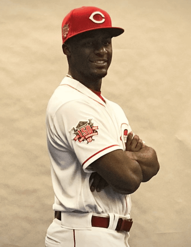
When the MLB 150 patch was recently unveiled, several people asked whether the Reds — who had already unveiled their own 150th-anniversary patch several months earlier — would wear both patches together, doubling up on the sesquicentennial-celebratory action. After all, the MLB 150 patch, with its thin, horizontal orientation, was clearly designed to allow room for another patch appearing on the same sleeve. Would the Reds go that route?
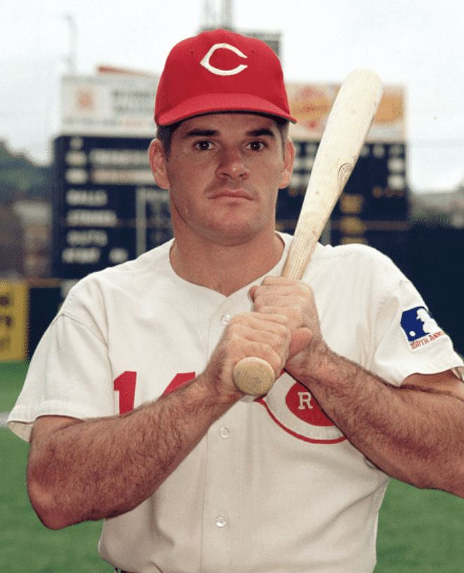
We got a hint at the answer to that question yesterday, when the Reds tweeted some photo-shoot pics like the one shown above, showing the team patch but not the MLB patch. I checked with a team spokesman, who confirmed that the Reds will only wear the team anniversary patch in 2019 — not the MLB patch.
I suppose the Reds’ approach makes sense, since the two patches are essentially commemorating the same thing (i.e., the anniversary of the first salaried baseball team), so having both patches would’ve been redundant. Still, it would’ve been fun to see the stacked 150s. Or maybe I’m just disappointed that I won’t be able to say things like “doubling up on the sesquicentennial-celebratory action” all season long.
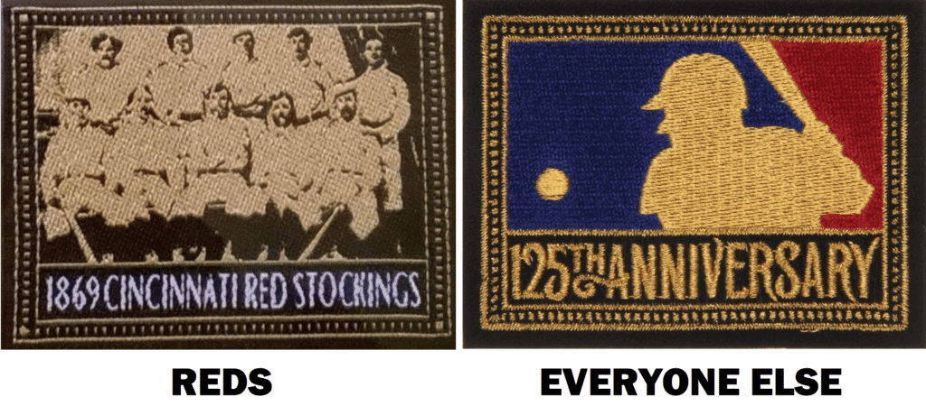
There’s also precedent for the Reds’ move. Back in 1994, while the other teams all wore the MLB 125th-anniversary patch, the Reds wore a team patch — but that patch design, unlike the anniversary patch that the Reds will be wearing this year, was clearly modeled on the MLB patch that the other teams were wearing:
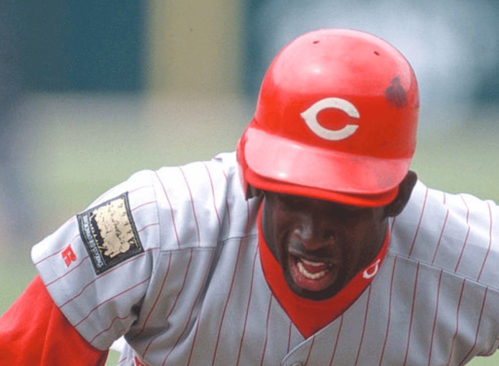
The problem with that patch, of course, is that it mostly looked like a black and gold splotch on the sleeve — and on the chest, for that matter:
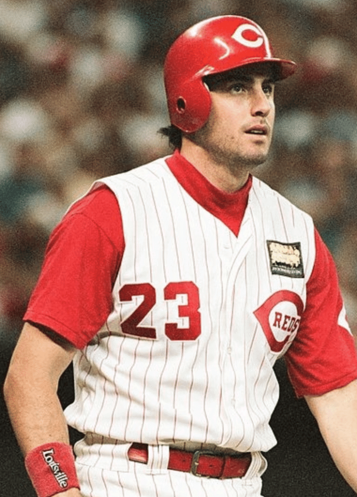
Going back another 25 years before that, in 1969 the Reds wore the MLB centennial patch just like all the other teams, and did not have a separate patch for their own centennial:
Some additional notes:
• The way the Reds are handling this is similar to the situation that’s looming this fall in the NFL, where I’ve been told that the Bears will wear a team centennial patch rather than the NFL centennial patch that everyone else will wear.
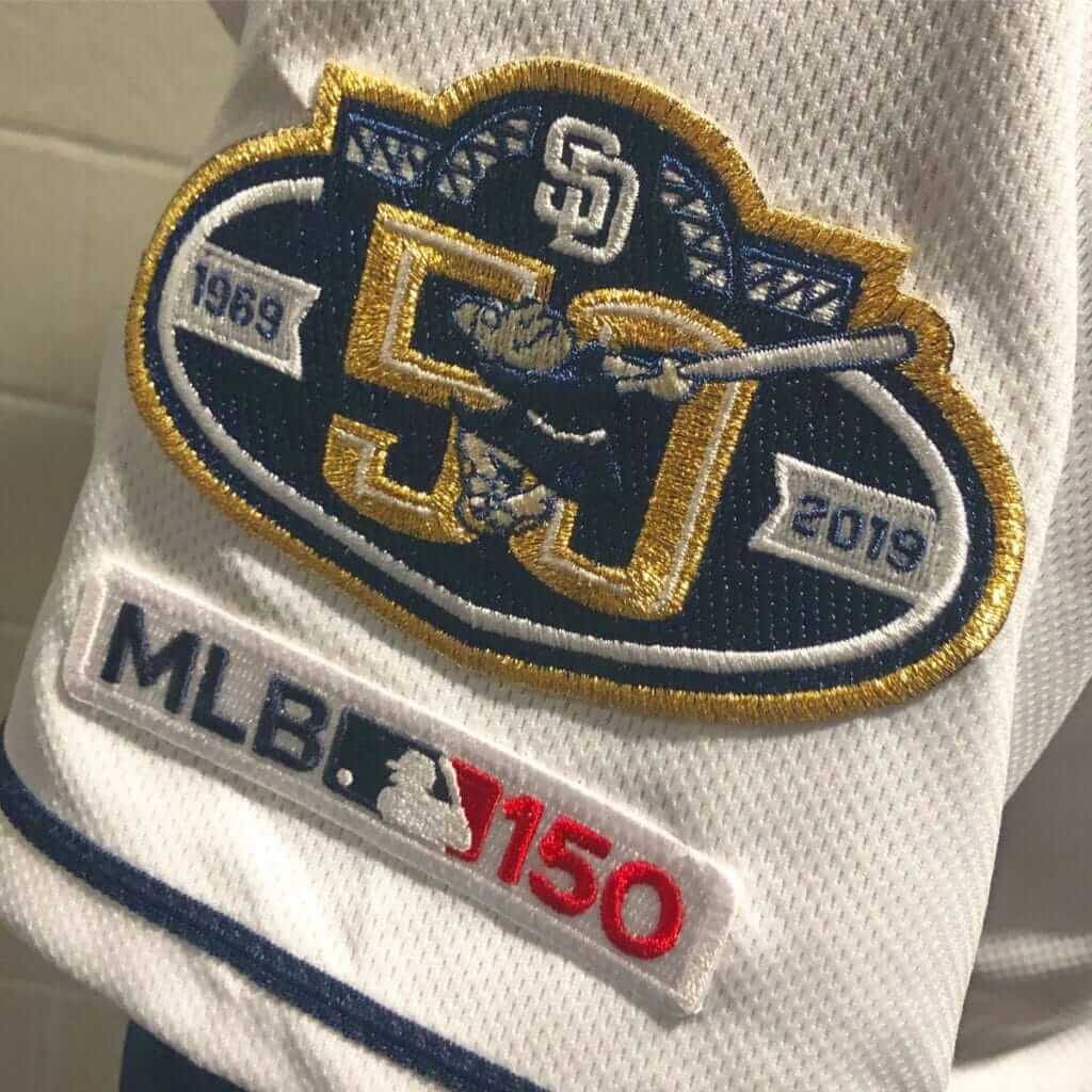
• In case you were wondering, MLB teams celebrating non-150th anniversaries will have a team patch and the MLB patch:
• And in case you’ve forgotten, sleeve patches are the least of the Reds’ uni news this season, as they’ll be trotting out a whopping 15 different throwbacks.
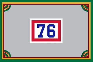
Membership update: Fifteen new designs have been added to the membership card gallery. My favorite of the new batch is Mark LaFountain’s (shown at right), which is based on, of course, the old NBA ref jerseys. An inspired choice!
Ordering a membership card is a good way to support Uni Watch (which, quite frankly, could use your support these days). And remember, a Uni Watch membership card entitles you to a 15% discount on any of the merchandise in our Teespring shop and our Naming Wrongs shop. (If you’re an existing member and would like to have the discount code, email me.) As always, you can sign up for your own custom-designed card here, you can see all the cards we’ve designed so far here, and you can see how we produce the cards here.
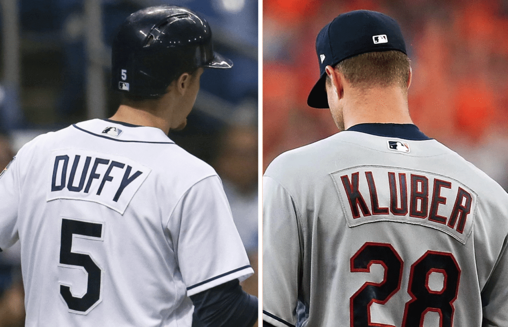
Nameplate feedback reminder: In case you missed it on Tuesday: I’m working on an article that explores how 2019 will be MLB’s first nameplate-free season since 1972, and I could use some input from fans. I’m particularly interested in hearing from people who purchase retail jerseys fairly regularly and feel strongly about nameplates vs. direct-sewn lettering (you can be either pro-nameplate or anti-nameplate, as long as you have a strong opinion). If you’re a Rays or Indians fan, even better.
I’d also be interested in hearing from Rays and Indians fans who don’t necessarily purchase jerseys but have strong opinions about the change.
If you fit any of these descriptions, please drop me a line. Thanks.
Click to enlarge
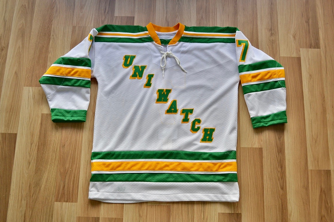
Wafflebored jersey reminder: In case you missed it on Tuesday, we’re currently auctioning off the very excellent Uni Watch hockey jersey shown above, which was made by the one and only Wafflebored. full details here.
While we’re at it, we also announced this week that Uni Watch is once again partnering with Grey Flannel Auctions to provide free appraisals of your sports-related collectibles.
If you have game-used jerseys, autographs, or other potentially valuable memorabilia, you can submit photos and descriptions to GFA and get an free appraisal, with no further obligation, within 72 hours. It’s like an online version of Antiques Roadshow. If you want to consign your item to GFA, that can be arranged, but you’re under no obligation to do so.
For full details on all of this, look here.
The Ticker
By Lloyd Alaban

Baseball News: The Orioles are adding a “20” memorial patch for Frank Robinson. Expect the Reds, Indians, and possibly the Nationals to announce their own Robinson patches in the days and weeks to come (from several readers). … Subtle change for the Royals, who are dropping the team wordmark and drop shadow on their primary logo. This will have no practical effect on their on-field look. … Astros P Forrest Whitley received an unusual NOB from his teammates (from multiple readers). … Interesting Braves logo on P Luis Gohara’s shirt (from William Vaughan). … More Houston news: Here’s some rare footage from the Houston Colt .45s first spring training in 1962. They had some great uniforms! (From @BSmile.) … The Astros won a vote for being best-dressed MLB team (from our own Phil Hecken). … Phil also found this MLB uniform tracker for all uni-related news for this season. … Over 2,000 fans ranked all 30 MLB cap logos from worst to best (from Mike Chamernik). … Brad Eenhuis watched Iowa square off against Pitt in Kissimmee, Fla., and noticed a ton of raised logos on Iowa’s helmets. … New BP jerseys for the Yankees (from @ChrisRiz). … More from @BSmile: Rare footage of the Mets’ first spring training in 1962. … Eastern Kentucky P Aaron Ochsenbein had a stirrup malfunction on the mound yesterday against Louisville (from Joseph Matlock).

Football News: The Tucson Sugar Skulls of the Indoor Football League will have grey turf (from multiple readers). … A trio of Sooners WRs received their uni number assignments yesterday.

Hockey News: The Maple Leafs will wear St. Pats throwbacks on March 15 and 16 (from Mike Lucia). … The Metropolitan Riveters of the National Women’s Hockey League are auctioning off their Pride-themed sweaters and other equipment. … GK Colton Incze of the OHL’s Windsor Spitfires has a set of Top Gun-inspired pads (from Goalie Gear Nerd). … We mentioned in a previous post that actor Patrick Warburton would reprise his role as “Puddy,” a crazed Devils fan, for a game. That game was last night, and fans in attendance received a Puddy bobblehead (from multiple readers).

Basketball News: Check out this classic Cincinnati Royals warmup jacket (from @IUArtifacts). … Penn State men’s wore their “original” colors again last night. The Nittany Lions are now 3-0 on the season when wearing the pink and black unis (from our own Phil Hecken). … Kentucky and Mizzou went color vs. color last night (from multiple readers). … Here’s a behind-the-scenes look at what the Maryland equipment staff goes through (WaPo link) on a road trip (from Tom Turner).

Soccer News: New uniforms for the Colorado Rapids (from Jeff Steiner). … CAI Panama of the Panamanian Football League wore kits last night with Adidas’s 2018 World Cup number and letter font, despite the kits not being made by Adidas (from Erin Perez).

Grab Bag: At last Sunday’s Daytona 500, Jamie McMurray’s No. 40 pit stall sign was a repurposed No. 42, as indicated by the ventilation holes (from Christopher Hickey). … Here are some limited-edition Shamrock-themed shoes for this year’s Shamrock Marathon in Virginia Beach, Va. (from Griffin Smith). … Here’s a list of 10 bad uniforms from the Big Four leagues (plus one European soccer club) (from our own Phil Hecken). … The UNC equipment team had a bit of fun with the Nike swoosh in this “employee of the month photo” (from James Gilbert). … A US Army veteran from Southern California found his long-lost uniform in an antiques shop after it went missing three years ago.
center>• • • • •
Click to enlarge

What Paul did last night: In 1985, while I was in college, I got a great LP by a New Zealand indie-pop band called the Chills. I remember thinking that the whole notion of a Kiwi indie band seemed exotic. I didn’t know that the Chills were part of a burgeoning music scene in New Zealand, or that I would become such a big fan of that scene that I’d end up traveling to New Zealand to see music and make friends in 1993 and again in 1996.
More than three decades later, most of those bands no longer exist, but the Chills are still at it. There’ve been innumerable lineup changes, but the one constant has been frontman Martin Phillipps, whose near-angelic singing voice — pure sugar, never saccharine — remains undiminished by age. (He captured his own mythos in the 1990s songs “Heavenly Pop Hit” and “Soft Bomb,” both of which live up to their titles and are an apt summation of Phillipps’s musical gift.)
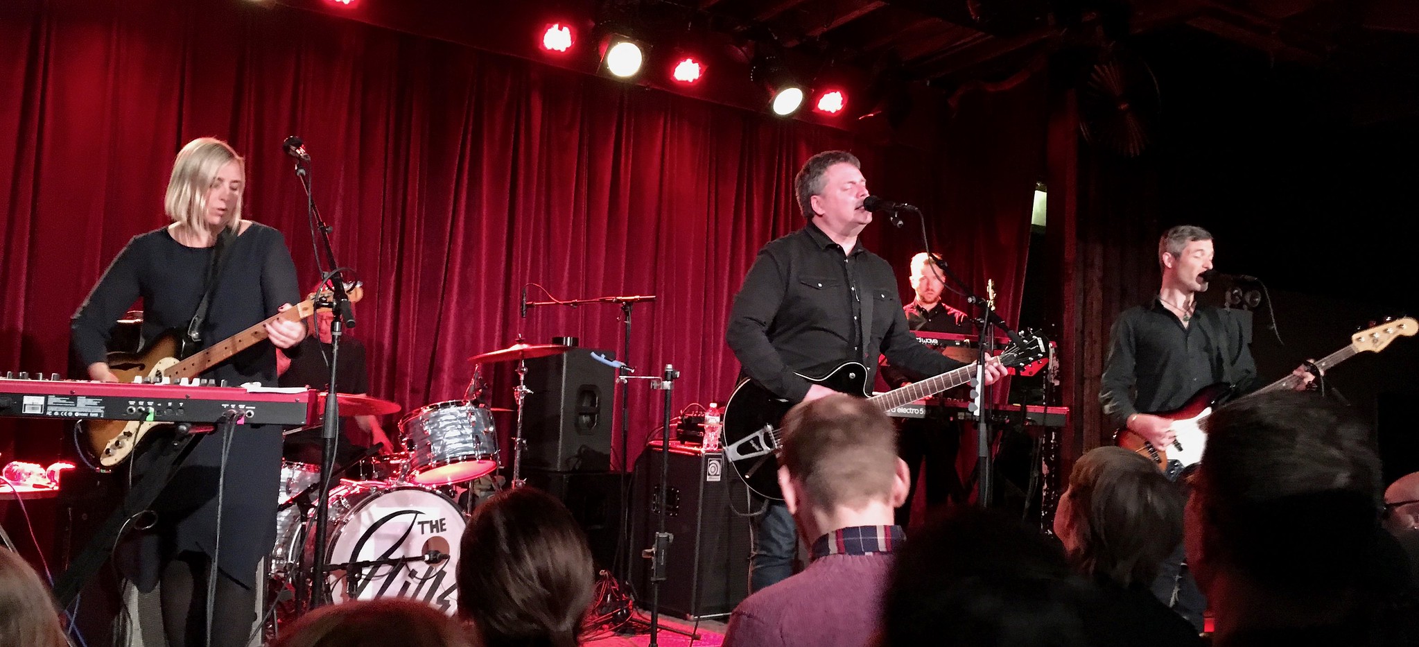
Phillipps brought the latest iteration of the Chills to Brooklyn last night to kick off an American tour. For some reason, they all wore black — an odd choice for a band whose sound evokes all sorts of shimmery colors, but whatever. They alternated between songs off their latest album, Snowbound (so-so) and older favorites (excellent). I bumped into lots of friends, had fun singing along, and was extra-happy when they played my favorite Chills song, “Doledrums”:
After the show, some friends invited me to join them for a nightcap. I said, “No, I have to go home and finish writing about the Reds’ sleeve patch.” Then I realized how absurd that was and decided to join them after all. Got home at 1am, finished writing today’s lede, then wrote this text that you’re reading right now, then went to bed with Chills songs running through my head.
The new BP jerseys are not just for the Yankees but for all teams this season: Majestic has made a lot of new player attire, including the front numbered BP jerseys as well as other hoodies (light and medium weight).
Typo: “Astros P Forrest Whitely”
It’s “Whitley.”
Fixed.
“For some reason, they all wore black”
What could be more appropriate for a group representing New Zealand?
Ha — indeed! Shame on me for Not Getting It™!!
The David Puddy infamous 8-ball jacket also made an appearance. Devils logo replacing the 8-ball.
link
link
Typo in Get Out More. Should be Kiwi.
Yup — already fixed.
Do they spell ‘doldrums’ with an ‘e’ in New Zealand?
It’s because the song is about being on the dole — a pun.
The Reds’ 1994 patch was a case of “good idea, poor execution”. Someone at either the Reds or Russell should have looked at a prototype and said “this is not working”.
I don’t really see how the Royals primary logo change is subtle. I do like the changes however.
Well, removing the script isn’t subtle. But how often did you actually see the graphic and script paired like that anyway?
I bet the Royals and the Orioles changes were for online display reasons. Look at how blurry the old Royals and Cardinals logo are when used as small icons.
link
This was my takeaway from this (and a lot of logo changes: Pirates, Padres, Nats, Rockies, Tigers, etc.) too. At least IMO, it’s only a matter of time before pretty much every team chooses their cap logo or a slimmed down logo like the Royals for their primary to look netter online. I think at least the Yankees and the Red Sox would look much better with their cap logos as their primaries, since that’s what they’re associated with most of the time anyway. Same with the Braves.
“Interesting Braves logo on P Luis Gohara’s shirt (from William Vaughan).”
It looks like one of those bootleg Tees that they used to sell outside of Turner Field along with the jerseys with most of the NOBs misspelled. It was nice to have a place to get those last minute panchos before a rainy game, though. I miss the Ted….
That Padres 50th patch looks much better as a patch than it did as artwork. The Swinging Friar is one of the best logos in all of sports and should be a permanent part of the Pads’ unis.
Me, February 2018: “Those BP jerseys couldn’t get any worse.”
Yankees, February 2019: “Hold my beer.”
“I remember thinking that the whole notion of a Kiki indie band seemed exotic.”
Did you mean Kiwi?
Yes — and I thought I already fixed that typo! Now *definitely* fixed.
“For some reason, they all wore black — an odd choice for a band whose sound evokes all sorts of shimmery colors, but whatever.”
Maybe they were invoking the national team’s unis. Prob not, but would tie your social and professional life together nicely.
Maybe this has already been addressed, but I noticed in Creamers’ post about the Royals that he called the pentagon with the crown on top a “home plate shape.” However, its not the shape of a home plate because the dimensions are way off, but it is the exact shape of the K’s jumbotron. The screen has always been a part of the K and I don’t doubt that they modeled it after a home plate, but I wonder which came first? The logo or the screen? The logo was created before the K was built, but did they know that they were going to make the jumbotron in that shape? As a lifelong Royals fan I cannot believe I haven’t thought about this before.
link
I don’t believe they would choose to have a vertical-shaped jumbotron except to match the team logo.
According to another article on Chris’s page, the logo was announced in November of 1968 but the stadium was already under construction at that time. So it appears the logo was first, but in that same article the designer calls the pentagon a shield! Very interesting!
No big deal I guess, but those Shamrock shoes aren’t just for that Marathon. They are for sale every year around St. Patty’s day even in my local shop here in WV.
It appears that the logo was created first according to this link (link), so you are correct. However in that article the original designer stated the pentagon was a shield not a home plate. I just find it interesting that they matched the scoreboard to the logo. I love it regardless of the reason behind it! I would argue that it is a shield and not a home plate though.
Not surprised with the pick of worst baseball cap logo, very pleased with the best cap logo selection.
Hey Paul – I’m all for having ads on your site but the ones from Vintage where their products rotate around is really annoying to my eyes. Sometimes it’s slow but I’ve had it where it goes fast. So I have to block that one. You may want to let them know..or not. Could just be me.
The Chills! Saw them in Columbus back in ’92 or so (Soft Bomb tour) at a much-too-large venue alongside a much-too-small crowd. Chatted with Martin for a few minutes before the show, who seemed bummed at the turnout. That iteration of the band broke up a few weeks later after ending the tour in NYC. I’m still waiting for a Straitjacket Fits reunion, but I’m glad to see Martin’s still at it. Bee Bah Bee Bah Bee Boe!
Saw Straitjacket Fits in NZ in 1993 — very good. Saw Shayne’s post-SF band, Dimmer, maybe 10 years ago here in Brooklyn. Also a fan of his pre-SF band, Doublehappys!
I’d be okay with the hat insignia rankings if the Blue Jay’s used their original logo which is better than what they have now AND the Marlins was dead last. Seriously that team can’t get it right to save their lives. Not a Yankees fan but their logo is the most recognizable, most iconic logo in all of sports. PERIOD.
I would have thought there would have been more comments on the MLB hat logo rankings. There also seems to be different standards applied. Saying the Rangers are too simple while applauding the Dodgers simplicity? And saying for Colorado that they don’t like crossed letters? That’s what makes baseball hats cool. I love that across all sports. I also don’t see how the blue jays are number one. Anyway…..
I think a lot of people tend skip rankings (and I don’t blame them).
Would rank the San Diego “SD” higher in the future when it is on brown.
All I got from that ranking list is that “iconic” must be the most overused word in the English language today.
Happy when the A’s can finish 4th in anything. Surprised Mets logo so far down when Yankees are #3. I’ve always like the Mets interlock more.
LOVE the Chills. Submarine Bells is such a great record… very 90s yet timeless…
Colorado Rapids new secondary kit pretty bland. Prefer the Rapids going with a secondary kit in Colorado state flag colours.
I feel out of touch with these new BP jerseys. They seem to be a league wide template. The fan merch versions have numbers on sleeves, but none on back. I saw highlights of the Yankees and Judge had a number on his right chest. If these are the jerseys, will they wear them during spring games if they have no numbers on the back? Lot of questions if someone wants to tackle them.
Ohio State wore their red throwbacks at home tonight, against Northwestern in grey for a color-vs.-color game. (I don’t always consider grey a color as opposed to “light”, but this is a fairly dark grey.)
A New Zealand band wearing nothing but black could be paying homage to the All Blacks rugby team.
RE: Metropolitan Riveters… it’s amazing how this image continues to be misidentified. Is this an example of the Mandela effect?