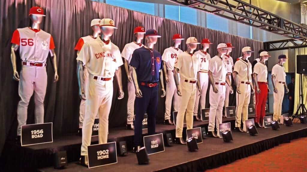
Click to enlarge
The Reds — baseball’s oldest franchise — will be celebrating the 150th anniversary of the Cincinnati Red Stockings next year, and yesterday they announced a major initiative to celebrate that milestone. The logo shown at right will be worn as a sleeve patch, but the real story is a tremendously ambitious throwback program featuring a whopping 15 retro uniforms that will be worn one time apiece during the 2019 season. That blows away the previous single-season record of nine throwbacks that the Cubs wore to celebrate Wrigley Field’s centennial in 2014. When you factor in all the other uniforms the Reds are likely to wear next season (home, road, alternates, assorted holidays, Players Weekend, etc.), there’s a good chance that their total number of 2019 uni designs will be north of two dozen — presumably another record.
Here are the 15 throwbacks. In each case, I’ve accompanied the Reds’ mock-up with a corresponding photo from yesterday’s press conference so you can get a better idea of how these uniforms will look when rendered in contemporary fabrics. For all of the images, you can click to enlarge. Ready? Here we go:
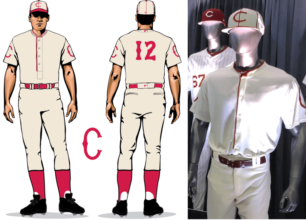
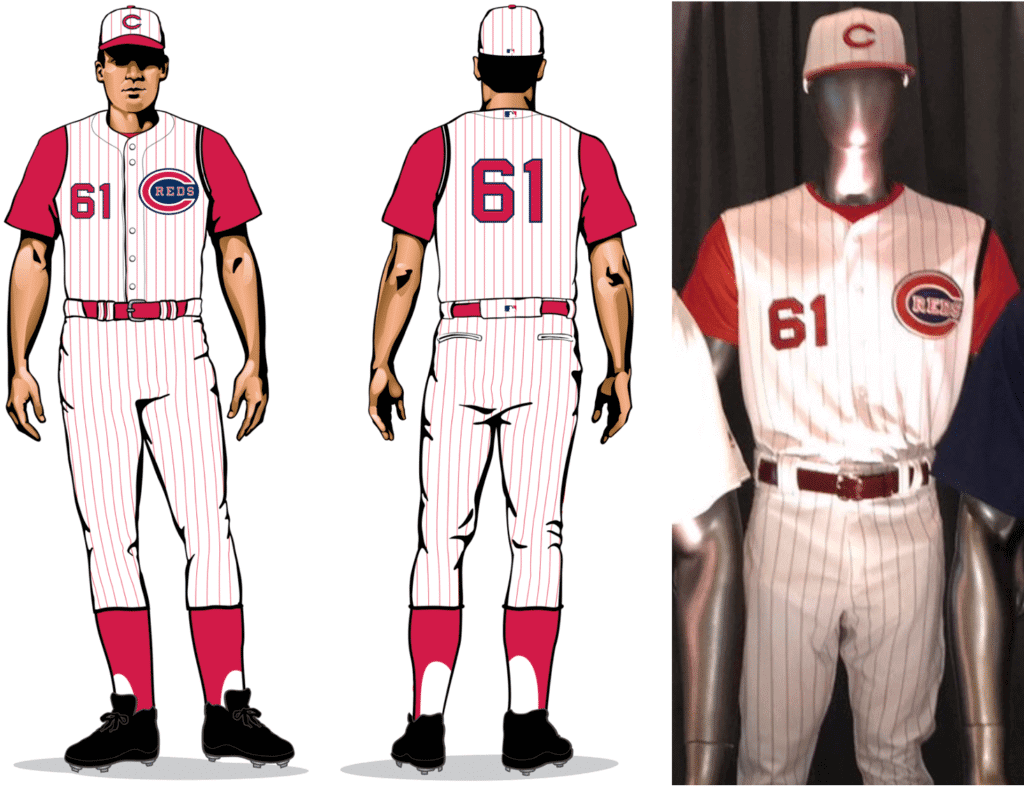
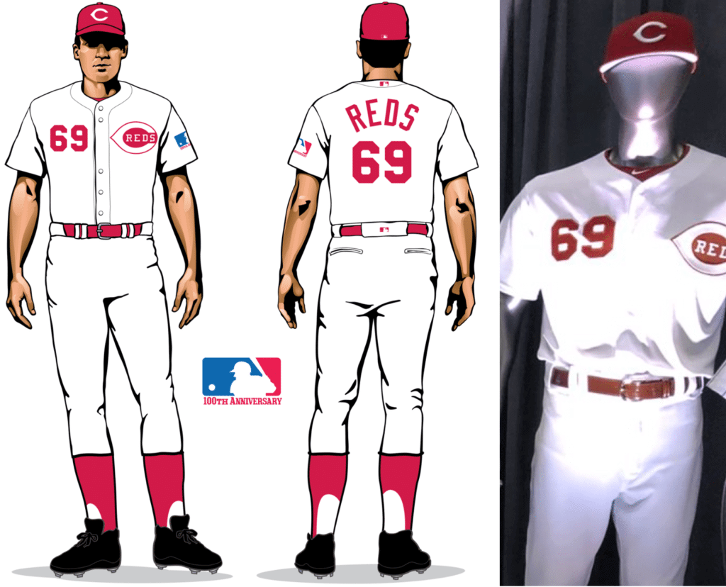
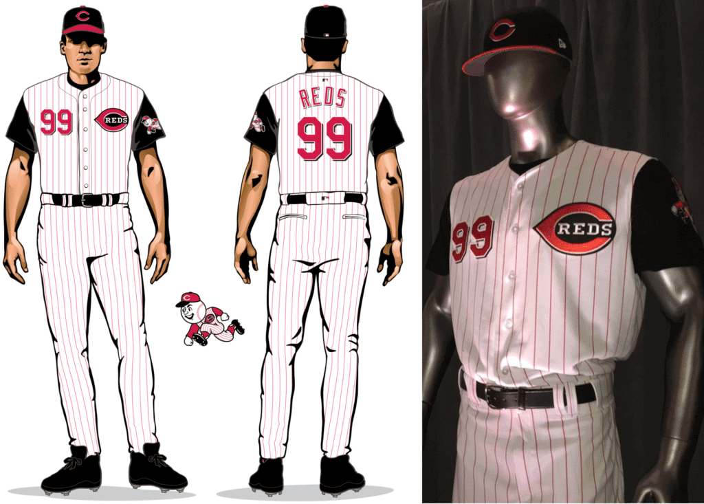
1. 1902 home (to be worn on May 4 vs. the Giants)
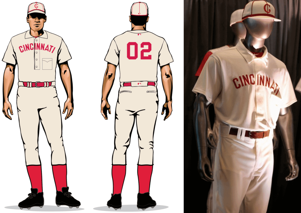
A point-collared pullover with a pocket — yowza! I like the cap, too. Sure, you could quibble with a few modern touches (there were no uni numbers in 1902, the assorted makers’ marks and MLB logos are unfortunate, etc.), but this will still be really fun to see on the field.
2. 1911 road (May 5 vs. Giants)
Another pullover, this time with a cadet collar. I bet the chest logo on the original version was chain-stitched, right? Let’s hope everyone goes high-cuffed so they can show off those two-tone socks.
3. 1912 home (May 19 vs. Dodgers)
Another cadet-collared pullover — with no chest insignia! Interesting to see the two matching sleeve logos, too.
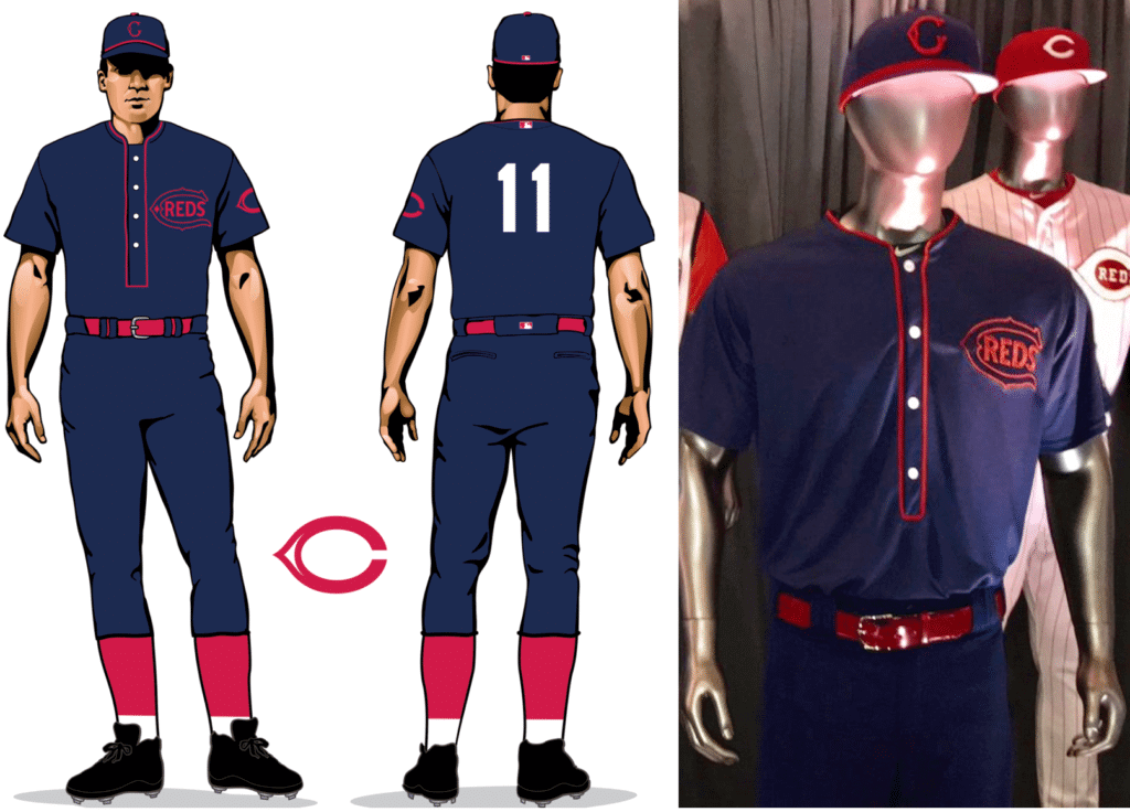
4. 1919 World Series home (June 2 vs. Nationals)
In 1919, the Reds created special uniforms for the World Series. Note that the mock-up in that Dressed to the Nines graphic shows a pullover with a sun collar, while the Reds’ own mock-up, shown above, shows a full-length placket and no sun collar — but the mannequin does have the pullover and the sun collar. Did you follow all of that?
5. 1935 home (June 15 vs. Rangers)
Love all the blue trim on this one. And another insignia-free jersey — with no sleeve patches this time!
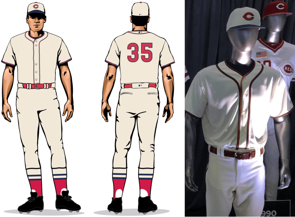
6. 1936 alternate (June 30 vs. Cubs)
Quoting from the Reds’ website: “One of the most unique uniforms ever worn by the Reds was the style that was known as the ‘Palm Beach’ by the uniform’s manufacturer, Cincinnati-based Goldsmith & Sons. This uniform was an attempt to offer players a lighter-weight alternative to the heavily flannel jerseys that were the norm at the time. The open-weave fabric construct of the Palm Beach was designed to make the uniforms more breathable during the hot Cincinnati summers.”
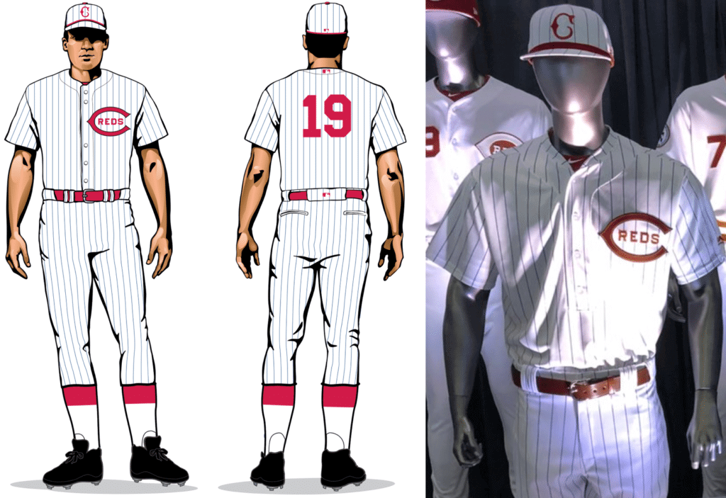
7. 1939 home (July 6 vs. Indians)
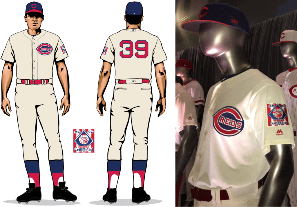
A real keeper. Love the Reds with navy trim. Note the McAuliffe number font!
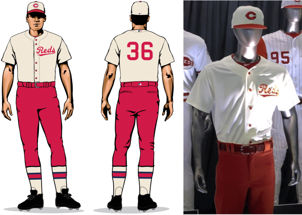
8. 1956 road (July 7 vs. Indians)
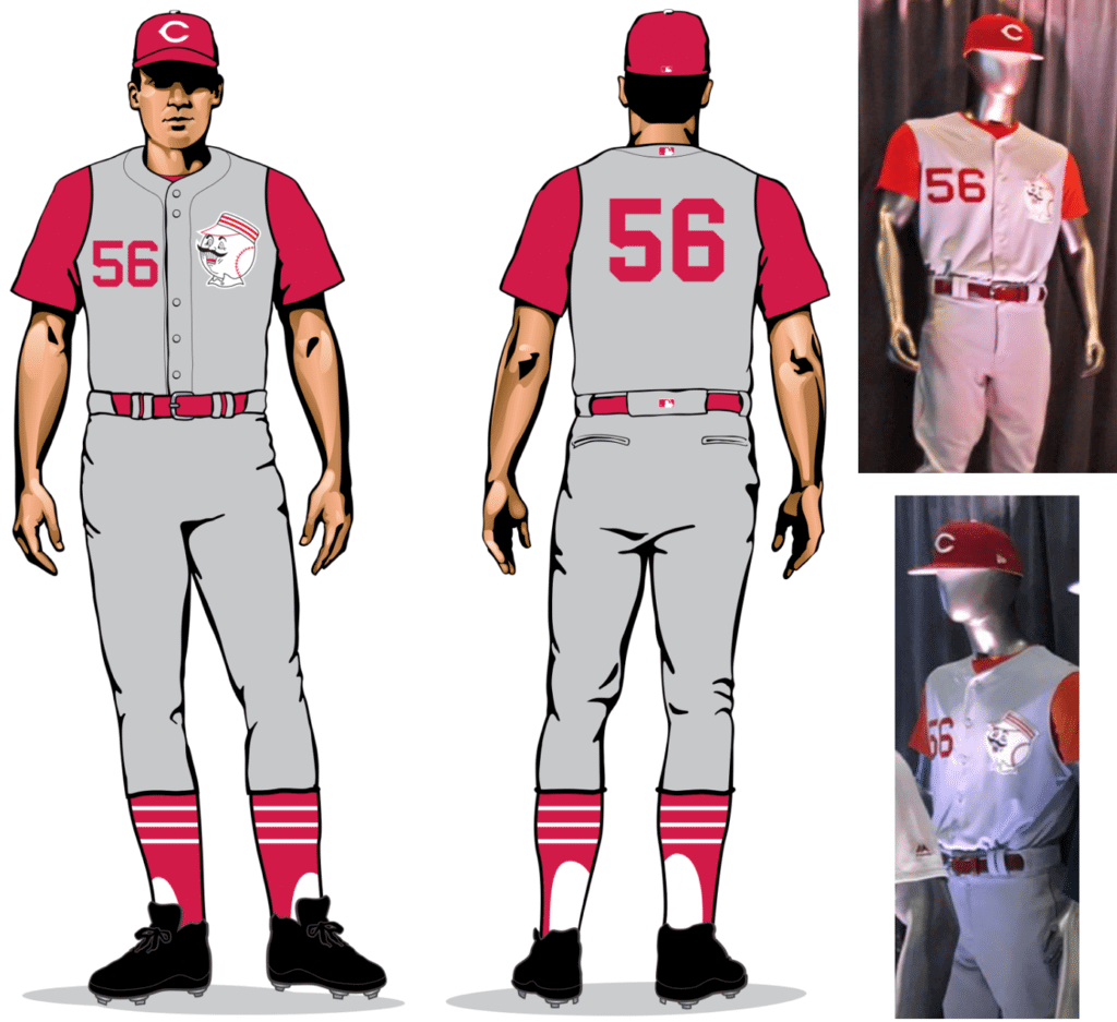
Always loved the Reds in a vest. And if Mr. Redlegs is on the chest, so much the better. Also: Striped stirrups! Disappointing that they’re taking the lazy route of a sleeveless conventional jersey, very broad across the shoulders, instead of going with the narrower classic vest tailoring. (The Cubs got this right in 2014, and the A’s have also gotten it right, so there’s really no excuse.) The real question, though, is whether Joey Votto will rip off his undersleeves à la Big Klu.
9. 1961 home (July 21 vs. Cardinals)
Again with the broad-shouldered vest. Still, this uniform has one of the all-time great little details: black memorial piping on the left armhole, which was in remembrance of team owner Powel Crosley Jr. They liked the black trim so much that they kept it the following season and added it to the other armhole as well. Also, note the non-wishbone-C — rounded, not pointy!
10. 1967 home (July 28 vs. Rockies)
At this point the Reds begin looking like the Big Red Machine. Also, NOBs appear for the first time.
11. 1969 home (Aug. 11 vs. Cubs)
As you may recall, this is the design that our own Alex Hider — a Cincinnati native — singled out as being “Gone Too Soon” earlier this year. A beauty, for sure.
12. 1976 home (Aug. 17 vs. Cardinals)
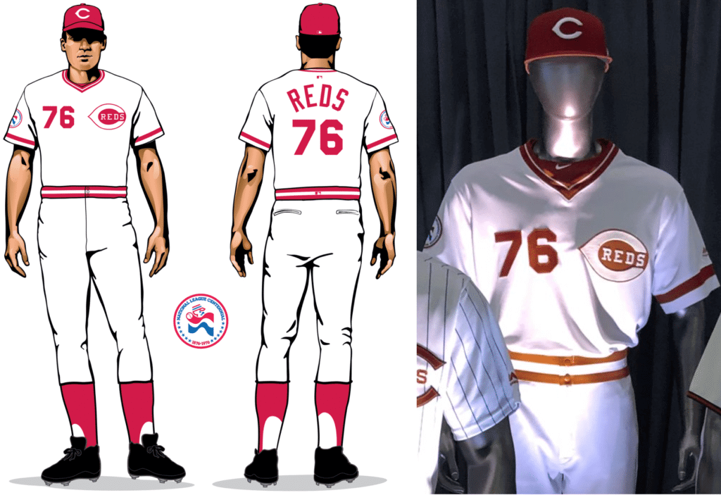
I grew up watching this uniform, so it definitely pushes some buttons. But I’m probably gonna find this throwback disappointing unless the players have the uniforms tailored very fitted like back in the day, which ain’t gonna happen.
13. 1990 World Series home (Aug. 18 vs. Cardinals)
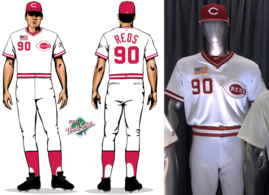
A waste of a throwback, because it’s essentially the same as the 1976 design, except for the addition of the American flag patch, which the Reds added to their jersey for the 1990 World Series to show support for the first Gulf War. Interestingly, if you look at that photo I just linked to, you can see that the original flag patch had a white border, but the one shown at yesterday’s press conference had a yellow border. It’s all about the details, people!
14. 1995 home (Sept. 8 vs. Diamondbacks)
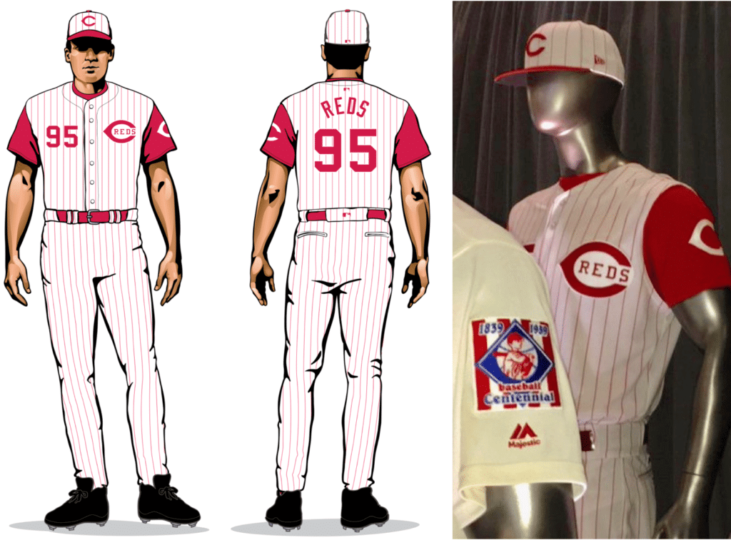
Have I mentioned that I like the Reds in a vest? I also like the team logo on the undershirt, although that’s gonna cause problems on game day, because today’s players often like to wear their own undershirts instead of the team-issued models. I place the over/under on the number of Reds who lack the sleeve logo during the throwback game at six.
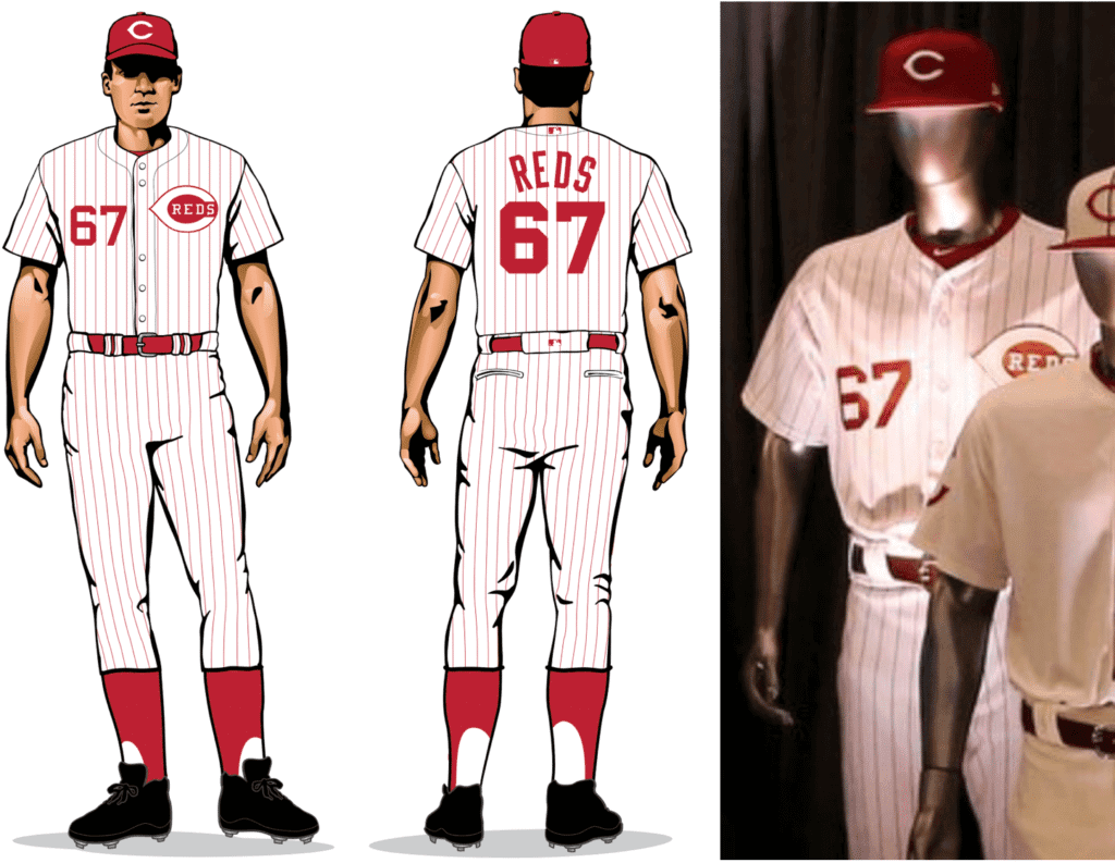
15. 1999 home (Sept. 22 vs. Mets)
A real stinker from MLB’s first wave of BFBS. Two decades later, they still haven’t excised the black drop-shadows from their color scheme. Pfeh — pfeh, I say! Gonna have the same problem noted above for the undershirt, too, especially for a late-September game that’ll probably have some players in short sleeves and others in long sleeves. For this one, I place the over/under on players with logo-free base layers at nine.
———
I asked Ticker assistant Alex Hider and lifelong Reds fan what he thought of all this, and he had an interesting critique: “I’m a little disappointed in the 1956 and 1968-1996 caps. I feel like they’re using the batting helmet version of the wishbone-C, instead of the cap version. The C on the throwback caps is too thick, and the ‘mouth’ of the C is too open.”
Alex adds: “I’m probably most excited to see the 1936 unis [the ones with the red pants] on the field. I don’t particularly care for it as a uniform, but I’m interested to see what it looks like in a modern game.” (For a possible hint, check out Cuba’s World Baseball Classic uniforms.)
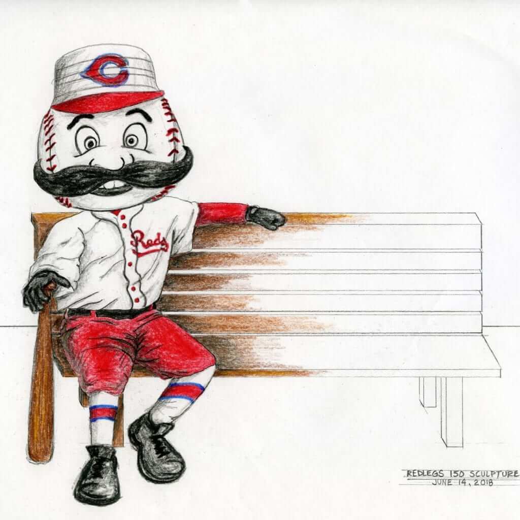
In addition to the throwbacks on the field, the Reds will also be setting up more than 20 “uniform benches” around the city, each of which will feature a statue of Mr. Redlegs wearing one of the throwback uniforms. The idea is that passers-by will be able to sit next to Mr. Redlegs and pose for a photo:
And there’s more: The Reds have also put up a web page that charts the evolution of the team’s logos and jersey insignia.
Finally: If you care about such things (confession: I don’t), the Reds will also have an old-timey logo on their 2019 spring training uniforms:
Take a look at the Reds' 2019 spring training uniform that will be shown tonight as part of the unveiling of the club's 150th anniversary plans. #RedsThreads pic.twitter.com/8MDgeg0Xtf
— Cincinnati Reds (@Reds) November 5, 2018
I have to say, they kept all of this under wraps quite nicely. No advance warning, no pre-event hype — I had no idea any of this was in the hopper except for the anniversary patch. Frankly, I thought my work day was mostly over yesterday when I went for my daily bike ride at about 4:40pm. Then I came home about an hour later and discovered that all of this had dropped. Fortunately, I didn’t have evening plans, and the Tugboat Captain was busy studying for grad school, so I was able to spend the four hours or so that it took to put this entry together. (And while I was scrambling to do that, half of the Twitter-verse was asking me, “Why are the Cowboys wearing blue tonight?” and “When’s the last time they wore blue at home?” and so on. The things I go through for you people!)
Anyway: This project clearly took a ton of work on the Reds’ part. Kudos to them for going all-out — should make for a fun 2019. And I hope we get to invoke many mentions of the excellent word “sesquicentennial” (which I somehow neglected to use until the very end of this entry, go figure!).
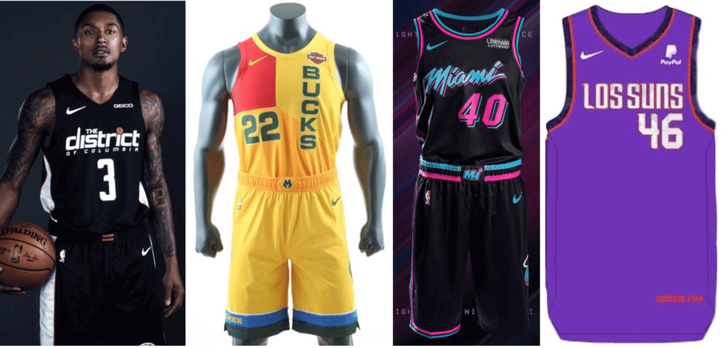
NBA alternates, continued: Last Friday I shared my thoughts on the first round of NBA City alternates. Several more designs have emerged since then, including two — from the Bucks and Heat — that were unveiled yesterday. Here’s my take on this latest batch.
There are 16 teams still to go, all presumably due to unveil at some point this week (because LockerVision indicates that City alternates will start being worn in games on Friday), so I hope to continue doing these roundup pieces on ESPN as the new designs continue to be rolled out.
Click to enlarge
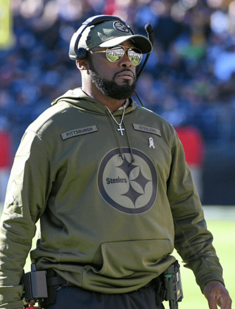
Boys with toys: In yesterday’s Monday Morning Uni Watch report, I neglected to mention the absolutely shameful gear apparel costumes merchandise being worn by many of the coaches around the league.
Now, we all know that Sunday was the start of this season’s G.I. Joevember. We also know that the football world likes to conflate football with military combat, that many football coaches harbor illusions of being part drill sergeant, part field general, and that the NFL is probably trying to re-establish its pro-military bona fides after the situation with the anthem protests.
Still, even by the uni-verse’s well-established standards for pandering, what the coaches were wearing on Sunday set a new standard for playing dress-up soldier. Why not give the coaches toy rifles and get it over with?
If you believe in the concept of stolen valor, then a bunch of grown men, most of whom never served a day in the military, wearing something clearly designed to mimic a military uniform probably qualifies, no? Personally, I’m not so big on the notion of stolen valor; I just think playing dress-up soldier is something you’re supposed to grow out of around the same time you outgrow Saturday-morning cartoons.
It’s nice to see that a few coaches didn’t play along. Pats coach Bill Belichick, who comes from a military family and grew up at the Naval Academy at Annapolis, never wears any of the league’s the scripted theme merch. He was asked about that in his postgame presser on Sunday and gave an eloquent response. Others who wore conventional team attire on Sunday instead of the cosplay nonsense included KC’s Andy Reid, Cleveland’s Gregg Williams, Buffalo’s Sean McDermott, and Houston’s Bill O’Brien.
Click to enlarge
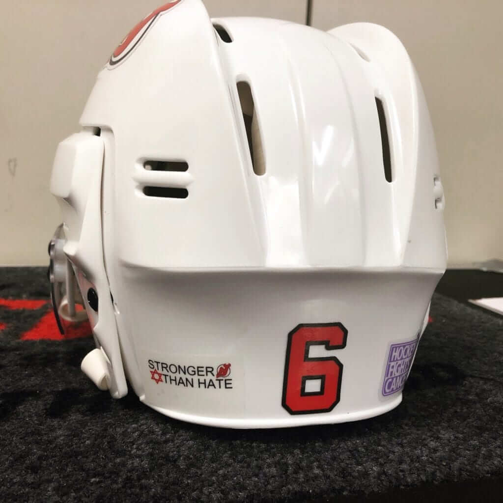
Star of David, continued: The Devils played the Penguins in Pittsburgh last night and became the latest sports team to wear the Star of David in response to the act of domestic terrorism at the Tree of Life Synagogue. There’s something funny, or maybe just weird, about a religious symbol juxtaposed against the logo for a team called the Devils, no?
(My thanks to @OlegKvasha for letting me know about this one.)
Click to enlarge
Collector’s Corner
By Brinke Guthrie
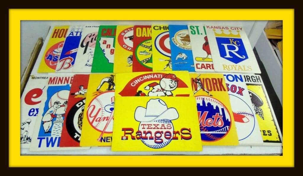
In the early 1970s, MLB Fleer Big Signs dominated many a bedroom. BigSigns were affordable and you could thumbtack them onto your bulletin board (along with the classic NFL poster line, like this one for the 49ers). Didn’t everyone have a bulletin board? Here’s a big set of Big Signs, 19 in all.
Now for the rest of the week:
• Before Arizona, and before St. Louis, they were the Chicago (football) Cardinals, as commemorated on this vintage 1940s pennant.
• Here’s another 1940s pennant, this time for the Cincinnati Reds. Notice no wishbone-C just yet!
• This is quite an elaborate 1960s Baltimore Colts stadium ashtray.
• Here’s a 1970s Patriots V-neck sweater with the helmet facing left, made by “Logo Scuca” of Indianapolis. I know Logo Seven (aka Logo Athletic) used to be in Indy, but I haven’t heard of Logo Scuca before.
• This 1970s-80s Seattle Seahawks helmet radio is in good shape. The auction ends today, so move fast if you want this one!
• The auction for this 1960s Toronto Maple Leafs bobblehead ends today as well!
• Here’s a different Cliff Engle sweater look. Usually I come across versions with the team name in bold print; this one has the helmet of the featured team, the New York Football Giants.
• This auction is for a pair of 1970s NFL Tasco binoculars You get one decorated with all NFC helmets, and then one for the Jets.
• This 1970s coffee mug promotes the Pro Football Hall of Fame in Canton, Ohio.
• Here’s a great polo shirt for Packers fans. It comes embroidered with the “NFL Alumni” shield and “Green Bay Packers.” It also has two pockets, which is unusual, no?
Seen an item on eBay that would be good for Collector’s Corner? Send any submissions here.
My usual Election Day request: Actually, I have two requests. First, if you haven’t already done so, please vote. A healthy democracy requires robust participation!
Second, as longtime readers are aware, I’m fascinated by the phenomenon of TV talking heads wearing purple on Election Day (the idea being that it’s halfway between Democratic blue and GOP red and therefore signals impartiality; further info here). It’s quasi-uni-related, and it’s something I like to document as fully as possible every two years. If you’d like to help, please take screen shots of anyone you spot wearing purple during televised election coverage today and tonight, and then tweet the screen shots with the hashtag #Purple2018. If possible, please mention the name of the TV station and, if applicable, the city where it broadcasts. If you don’t use Twitter but still want to participate, you can email the screen shots to me. Thanks!
The Ticker
By Alex Hider

Baseball News: The Marlins teased what could be their new colors — light blue, black, and orange — in a series of social media posts yesterday (from Mike Chamernik and Kenneth Traisman). … The Single-A Wisconsin Timber Rattlers teased new possible cap color combinations in a Facebook post yesterday (from Brian Kerhin). … The Colorado Springs Sky Sox may have teased new uniforms or logos on their Twitter account yesterday (from Garrett). … Several Red Sox players attended last night’s Boston Bruins game and went on the ice in custom Bruins sweaters with red numbers. Disappointing the numbers weren’t rendered in McAuliffe font, though (thanks to all who shared).

NFL News: In the video game Fortnite, players can now dress characters in NFL jerseys (from Mike Chamernik and Andrew Cosentino). … Rare sight last night, as the Cowboys wore blue at home, paired with their white pants. … The Cowboys use their wordmark on their front bumper, but ESPN put the Riddell logo on the front bumper in a scoreboard graphic last night (from Jason Hillyer). … Monday Night Football also pictured Titans QB Marcus Mariota in an old jersey at some point last night (from Johnny Mann). … ESPN also used an old Titans helmet in a graphic promoting Monday Night Football on its website (thanks to all who shared). … Mike Enriquez noticed Sunday night that someone applied a sticker to the back of Pats WR Josh Gordon. Anyone know what that was about? … According to this Reddit post, some NFL teams won’t allow fans to keep balls that enter the stands (from Jeff Perilman). … You can now get a prepaid debit card with NFL players’ images — but without team or league logos — thanks to a new agreement with the NFLPA (from Ignacio Salazar). … @NCbonfires found this awesome serving tray, featuring circa-1971 NFL helmets, at a thrift store.
College Football News: Looks like Clemson will be wearing orange pants this weekend (from Mark Johnson and Casey Garms1). … NC State will be going mono-black on Thursday night (from Rex Henry).

Hockey News: The NHL has new rules this season regarding goalie chest protectors, and many goaltenders are having problems adjusting to the new equipment (from Brinke). … Nice touch by the Penguins, who added a purple ribbon to the chest logo of their purple cancer awareness jerseys (from Ryan Osborn). … Cross-listed from the baseball section: Several Boston Red Sox players attended last night’s Bruins game and went on the ice in custom Bruins sweaters with red numbers (thanks to all who shared). … Some would say that EA Sports and Adidas desecrated the Original Six franchises with these new designs for the NHL 19 video game. Additional info here (from Tom Servo). … It was a Marvel matchup in the ECHL Saturday between the Cincinnati Cyclones, who wore Ant-Man jerseys, and the Brampton Beast, who wore Black Panther jerseys (from Bill Fenbers).

Soccer News: Stoke winger James McClean, who was born in Northern Ireland, refused to wear a poppy this weekend for Remembrance Day due to continued political tensions between Northern Ireland and the UK. He was jeered by opposing fans for his refusal to wear the patch (from Patrick M. O’Neill). … Manchester United’s Nemanja Matic is also refusing to wear a poppy because of the UK’s 1999 bombing of his native Serbia (from our own Anthony Emerson and Mark Coale). … Speaking of poppies, Mark Emge notes that even fantasy sports providers added poppies to EPL player jerseys for Remembrance Day. … More poppies: All three NBC studio hosts wore poppies during yesterday’s Huddersfield/Fulham game (from Josh Hinton). … Speaking of Fulham, they’ve worn seven uni combinations in their first 11 EPL matches (from Denis Hurley). … Bohemian FC of the League of Ireland updated their earlier Bob Marley-themed away jersey to remove Marley (from Colm Heaney). …With no pockets at his disposal, Bournemouth midfielder Junior Stanislas had to put a note from his coach in his sock during a match on Saturday (from Max Weintraub).
Hi Paul, you refer to the first throwback as a point-collared henley. I thought the defining characteristic of a henley was that it was collar-less. Recently I’ve seen shirts like this described as popovers
Dang — you’re right! Will adjust text accordingly. Thanks for setting me straight!
As I was googling henley I assumed that you were right and I was wrong.
If Clemson is wearing orange pants this Saturday, the game is against Boston College. The Tigers don’t play Duke until November 17.
Got it.
With the big star on their Joevember shirts, the Cowboys staff *almost* looked like they could be Army recruiters or something.
link
I hope that the reds continue/evolving their uniforms by changing them after next season. Get rid of the dropshadows and change the number font.
I wouldn’t say the 1990 throwback is a waste. It represents a major point in the franchise’s history and shows minor differences to the 1976 jersey. Nothing wrong with that.
What are the minor differences you refer to, other than one additional stripe on the sleeve cuff?
There’s also a stripe running down the pants and (perhaps) a subtle difference in number font(?)
The number font is different and slightly bigger; a welcome move away from the massive-NOB-and-tiny-number look.
Alex and Paul, here is some proof of the number font change (inside a video that is a great trip down memory lane) if you’re interested: link.
Most of the Reds uniforms appear to still have the giant NOBs of previous years, but with regular-sized numbers. At 25 seconds into the video, though, you can see #79 Jim Lett of the Reds wearing a jersey with numbers that are visibly smaller than everyone around him. Immediately after, #49 Joe Price comes into the picture, and you can see how his 9 is bigger and squarer.
Jim Lett was a bench coach for the Reds that year, not a staffer, so I can’t see why he had such a weird number, but given Marge Schott’s parsimoniousness, maybe they made him wear a spring training jersey from previous seasons.
Not particularly saying this makes it worth it, but going by the mannequin and the Reds own description, it will have the 1990 World Series patch in addition to the flag.
Just the flag patch and WS patch are worth it for those fans who have attachment to that specific team.
So glad Dallas lost yesterday, maybe they’ll shelf the blue jerseys at home for a while.
Why is it when a team loses big in a BFBS uni *cough*Oregon*cough* they never think of shelving it, but if a team does something a little different with team colors and loses it’s automatically considered a jinx? Never. Understood. That.
The more of the NBA City jerseys I see, the less impressed I am with Nike’s designers. Some of the new designs are decent, but there are also some real duds. At least a few teams are also using the exact same “theme” as last year, too, which would seem problematic given we have at least several more seasons of this annual updating. Three of the four highlighted in today’s post are using basically the exact same uniform as last year, but with updated colors, and the fourth (Milwaukee) has replaced one of last year’s best uniforms with a very poor execution of a decent idea. The Bucks choice to go with a vertical team name looks especially bad with the ad patch on there.
Those Marlins “new colors” look pretty damn similar to their current colors. Guess we aren’t getting any pink accents then
Fix “Brampton Beats” in the hockey ticker
Fixed.
Typo: “the Brampton BEAST, who wore Black Panther jerseys”. “Beats” isn’t a bad nickname; lends itself to advertising possibilities down the road, though (i.e.: by Dre).
“lends itself to advertising possibilities down the road”
Feeling the death glares going your way yet?
XD
Love the Reds 1995 Uniforms. Barry Larkin wearing those is how I always picture the Reds. The pinstripe hat was awesome and a unique look that they should still use.
It should be noted that the Reds are not celebrating their own anniversary (the current franchise was founded in 1881), but the anniversary of the first professional team in baseball, the original Red Stockings. They even say so in the first line of the first link in today’s lede.
Good point. Text now adjusted.
Technically, the modern day Reds are also not “baseball’s oldest franchise” though that is frequently quoted as such in the media, especially back when the traditional opening day game was always played in Cincinnati. The oldest continually operating franchise is what is now the Atlanta Braves, who started as the Boston Red Stockings in 1871. The 1869 Cincinnati Red Stockings disbanded in 1871 and some of those members joined the new Boston team, which joined the National Association, and later, the National League
The current Reds franchise was a founding member of the American Association in 1882; the current Pirates, Dodgers, and Cardinals franchises were also American Association members and so are as old as the Reds.
I very much appreciate that the Reds pay tribute to Cincinnati’s baseball heritage; the 1869 club is an American milestone in a number of ways: Fully professional sports, stockings, attracting a national spectator following. But the team too often elides the distinction between celebrating their city’s baseball heritage and claiming it as the club’s own. It’s rather like the situation in Washington, DC, where the Nats should and do honor the city’s deep baseball heritage, but generally do a better job than the Reds in differentiating between the club’s corporate history and the city’s sporting history.
I remember, in 1992 (I was in 1st/2nd grade), the Cardinals celebrating their 100th anniversary (they, likewise, celebrated their 125th in ’17).
link
link
It’s interesting that they would act as though 1892 was the year of their founding, as nothing specifies “100/125th anniversary of joining the NL.” Especially when, on the other hand, Cincy’s giving their franchise credit for an extra dozen years just because there were two (technically) different franchises with the same name established prior to the current iteration.
I would also add that the current Atlanta Braves franchise has more of a connection to the 1869-70 Cincinnati Red Stockings team than the current Reds (which as previously pointed out, was founded more than a decade later). Cincinnati team captain/CF Harry Wright, his brother George (SS), Charlie Gould (1B), and RF Cal McVey went to Boston along with the team name. LF Andy Leonard would join Boston in 1872, the first of their six league (both in the NA and later the NL) championships in an seven year period.
The oldest operating baseball franchise, still in it’s original city, resides on the north side of the city of Chicago. A fact I take great joy in.
I am expecting the mother of all throwback uniform games between the Cubs and Braves in April 2021.
Personal hot take: I am not a Bucks fan, and have no real rooting interest in their uniform choices… but as bad as that Mecca uniform is, it is infinitely worse when compared to the mock-up version. I guess that’s what you could call ‘horrible-by-proxy’. That mock-up version is gorgeous and makes the actual one they’re going to wear look like a bad joke.
It’s a shame to me that the Reds aren’t still wearing a vest, at least on Sunday home games or something. That’s their signature look, in my opinion.
Would have liked to see the Reds go with the vests with the player name under the numbers.
Yes! I should have mentioned that. As seen here:
link
And here:
link
With all of these (mostly) fine Reds throwbacks I hope the players don’t ruin it and come out wearing pajama pants.
I totally agree. They need to show socks/stirrups and must wear black shoes.
Tip o’ the cap to the Reds for doing this. Hopefully some of their opponents play along (fingers crossed).
In regards to the 1990 throwback, it looks like it will also include the 1990 World Series patch?! When was the last time a team wore a World Series patch in a non-World Series game? Has it ever happened?
The participation of visiting teams is up to the home team. In other words, the opponents will “play along” only if the Reds want them to (and foot the bill for the visiting team’s throwbacks).
I have to imagine that Cleveland will play along. Have you heard anything yet about the visiting teams?
No. As I said, it has less to do with what the visitors want than with what the Reds want.
Also, this brings up the same question I’ve had for a while: is MLB as a whole doing anything for its 150th anniversary? They did 100th anniversary stuff in 1969 and 125th stuff in 1994
It’s hard to imagine that they won’t. But they haven’t yet announced anything.
I like how the Reds are wearing all the appropriate patches, but the ones on the left sleeve all look brutal with the majestic logo underneath.
I haven’t seen any other NHL HFC jerseys yet, but if they’re all the same she’ll at the Pens sweaters, the Adidas mark appears on the left side of the crest, which puts the captency patches on everyone’s right side.
It’s so odd seeing that on anyone but Detroit.
They’re practice jerseys – they all follow the same template.
Between the Cyclones and the Beast, I prefer Cincinnati’s Ant-Man unis, which look like actual hockey uniforms with a creative logo, than Brampton’s superhero-costume-as-jersey.
The conflict is not between “Northern Ireland” and the United Kingdom. The former is a part of the United Kingdom, one of the UK’s last remaining colonies.
The struggle (The Troubles, as it’s been called) has been waged by citizens of the six northern counties of Ireland — Irish nationalists and republicans who are primarily Catholic. Their goals have been a) the gaining of civil rights, and b) the unification of those six counties with the rest of Ireland.
James McClean grew up in Derry, in an Irish nationalist community that was regularly attacked by the British Army.
“The Colorado Springs Sky Sox may have teased new uniforms or logos on their Twitter account yesterday”
Since the Sky Sox are moving, it’s more likely that they were teasing the announcement of the new name for the Pioneer League team that’s replacing the Sox. The finalists were the Rocky Mountain Oysters, Colorado Springs Happy Campers, CS Lamb Chops, CS Punchy Pikas, or the CS Throttle Jockeys.
I really hope they keep the Sky Sox name.
Clevo nailed it. That was a great look
Liked Reds 1964 jersey with NOB below the number, turns out they wore that in the 2009 Civil Rights Game v. White Sox.
Also, ESPN started what will be a heavy year-plus promotion that featured what will apparently be the CFB 150 logo, at least a little better than NFL 100 (which looks CFL’ish).
CFB 150 logo has been public for quite a while now:
link
I’ve never thought of the Reds doing BFBS. The Reds have waffled on a secondary color basically their entire existence, going between white, navy, and black. As far as I can tell, they first used black trim on the logo in 1920. When the 1999 uniform came out I absolutely adored it for all the nods to previous uniforms (the vest, red wishbone filled in dark, the two tone hats) but modernizing it. I’ve also always loved the filled in wishbone look, and like it much better when it’s whatever dark color they are currently using.
Cincy is a borderline case for me. On the one hand, they have not had a stable accent color, and they have some history of using black as an accent color from time to time, and black is a sensible accent color for any team with as strong a primary-color identity as the Reds. But the timing and extent of the black make it pretty clear that the team was in fact chasing a merchandising trend. The Reds of the era do not seem like a team using black for red’s sake, but rather black for its own sake. The late-1990s Reds embrace of black is almost defensible, but in the context of the time, “almost defensible” doesn’t cut it. It’s BFBS by decision, not by knockout.
Exactly. It’s clearly BFBS because it happened right when everyone else was going BFBS. Part of a market-driven trend, not a team-driven aesthetic decision. Classic BFBS.
I’m definitely excited to see the 1936 Reds design. It’s one of the great unicorns of baseball history. Contrasting pants AND buttons.
The 1969 uniform will probably be the biggest treat. Those late 60’s uniforms were gorgeous across all of baseball.
link
Link to show that while Sean McDermott wasn’t playing military dress-up from the neck down, the hat is camo, presumably a nod to honoring those who serve.
Which is a shame, because Sean and I share a HS alma mater, and I’d rather have a full abstainer versus military pandering from the neck up.
But as you can see in the photo I linked to, other members of the Bills staff went full-dress-up. McDermott didn’t. Good for him.
McDermott’s camo hat is totally different than the rest of the staff’s. Does anyone know what hat McDermott is wearing?
This is actually notable because McDermott is a HUGE troop-worshiper. Seeing as he has at numerous times invoked the military, it’s actually surprising that he didn’t take this opportunity to go all in on playing the part.
Maybe he actually understands the difference between supporting and playing dress-up. If so, good for him.
There was only one actual Red Sox player, Joe Kelly, at the Bruins game last night. The other people in the Bruins/Red Sox jerseys are Red Sox owner John Henry and CEO Sam Kennedy.
I wish they’d wear green. Which is what I sometimes do when I go to a Mets-Phillies game in Philly to avoid any … difficulty.
[For the record, I’ve had nothing but positive interactions with Phillies fans when I’ve gone to games there over the last ~25 years.]
Unfortunately, due to the use of chroma key green screens being used in a lot of news broadcasts, green clothing is generally avoided by newscasters lest they end up becoming see-through. That’s a level of transparency we don’t need.
“That’s a level of transparency we don’t need.”
#CommentOfTheDay
True! My daughter went to see the evening news broadcast a while back with her girl scout troop and there’s surprisingly little “set” these days. Its all chromakey.
link
“@NCbonfires found this awesome serving tray, featuring circa-1971 NFL helmets, at a thrift store”
Teams listed in alphabetical order by city (within conference).
Steelers decal on wrong side of helmet though. :^\
Part of the draw of G.I. Joevember is a recruitment drive for the armed services.
What’s always struck me about the “Salute to Service Campaign” is the absence of aesthetic elements focused on rehabbing returning veterans or mourning those who have been lost.
Contrast this with the Armistice Day tributes in Hockey and Soccer where the poppy takes center stage and everyone dusts off “In Flanders Fields” for a solemn reading.
It’s a small thing but I’ve always felt that some bitterness or sadness has to go along with signs of service as a reminder of the real risks and dangers. To treat as just dress up or rah rah fun does not feel right.
PS: Where has the love been for firefighters and EMTs? Generally I tend to think running into burning building to pull people out as a major public service. In recent years we’ve actually lost more firefighters in any given year than we have soldiers.
link
when the EMT and FD pay up, the NFL will “give a shit” about them.
While there are definitely some quibbles with the choices and I’m sure some won’t look great in the field thanks to modern tailoring, overall I love that the Reds are doing this. It’s a cool way to homage history, and I like that they’ve spread out their unform choices all the way through the 1990s.
“The liked the black trim so much…”
Missing ‘y’ in uni #9
Thanks. Fixed.
It looked like the Titans wore mono-colored white socks last night (as opposed to white socks with a blue stripe at the top). Very color-rush-esque, but I thought it looked super clean with the white jerseys/pants.
Someone somewhere else said the Titans are a bottom 3 team in terms on uniform looks.
I was about to protest, but having then realized that Jacksonville upgraded this season, I have to say I pretty much agree.
The Titans are a classic case of ‘trying-too-hard’. Every element seems forced. And so many elements!
What a mess.
Lee
PS- and the all white socks didn’t help anything.
“Others who wore conventional team attire on Sunday instead of the cosplay nonsense included KC’s Andy Reid, Cleveland’s Gregg Williams, Buffalo’s Sean McDermott, and Houston’s Bill O’Brien.”
Has the league fined any of these coaches? Seems like they always do in these situations.
Seems like they always do in these situations.
Really? I’m not aware of coaches having been fined. Can you cite any examples?
Only one, Mike Nolan (49ers) wearing a suit instead of coaching garb.
“Always” was harsh but the NFL does levy a lot of fines.
In other words, what you said about coaches being fined had no basis in fact. As noted in today’s text, Belichick *never* wears the scripted merch — he just wears his hoodie (or whatever, depending on the weather). To my knowledge, it’s never been a problem with the league.
Let’s please try to stick to reality. Thanks.
Bravo. Coaches dressing up as soldiers was disgraceful.
Re: NFL balls being returned:
Not surprised. The regulations and treatment of both K-balls and the offensive footballs prepared by the two starting quarterbacks necessitates that those footballs remain in the rotation of available balls. Otherwise, you may get to a situation like in the 1940 NFL title game when the officials were down to one game ball towards the end of the game because the Bears kicked so many extra points ….
They trounced my ‘skins in that game.
My Dad (a diehard Bears fan) recounts it often.
Compare that to baseball, where I thought I heard Joe buck say that they went through 300 balls in the World Series extra inning game.
At least there was a ball at the end in 1940 NFL title game.
1956 Grey Cup ended with a touchdown on the final play. Edmonton could not kick the convert due to the lack of a ball, which was stolen in the end zone.
link
The only NFL footballs I have seen that were wanted back, durring a game, were the K balls. Durring warm ups the team will want it back also. I have had endzone seats for the 49ers for 20 years and when they got the K ball back they would bring the person another game/practice used ball from the sideline.
Clemson in orange pants. Welcome to the Championship phase of the season (Division, State, Conference, etc).
15 Reds throwbacks?
I can’t wait for a team to celebrate its 162nd season by wearing one uniform from each of its previous 161 seasons.
/eyeroll
Lee
Are the Spring Training “patches” for 2019 silk screened? They’re certainly not traditional patches and they don’t look to have the depth of the “plastic” patches we’ve seen recently. Looks like a huge downgrade.
Hello. The 1964 Reds uniform set was the first to have NOB’s.
Right — assume he meant “of the throwbacks featured.”
A day late comment on the MLB/NHL crossover unis.
2 major gaffes practically rendered the entire effort null and void.
1. Not having the A’s look more like Finley-era California Golden Seals
2. Not having the Padres in brown and gold. Unforgiveable…
-Jet
Something I’ve always wondered about regarding Reds uniforms: in 1938, unlike any of the surrounding years, the players were link, for no reason that I have ever discovered.
And it wasn’t a case of them buying two years’ worth of uniforms at once and using the second half — the previous year they went from 1 up to 38, and the next year (throwbacks of which we will soon see), they went from 1 to 41.
What was going on?
The EA NHL uniforms remind me of the days when I was in the modding community for the PC version of the game back in the early 2000s. The designs for the Bruins, Rangers, and Maple Leafs definitely have that kind of “out there” design.
The design for the Canadiens, though, feels like a concept for a Winter/Heritage Classic, while the Blackhawks’ uni feels like something they’d try for a Stadium Series game. And then there’s the Red Wings, whose uni, more or less, is one we’ve seen in the Winter Classic, just with the winged wheel front-and-center instead of a blackletter D. That makes the Wings the most disappointing of the bunch.
Alex adds: “I’m probably most excited to see the 1936 unis [the ones with the red pants] on the field. I don’t particularly care for it as a uniform.
Jim adds: “I’m
probablydefinitely most excited to see the 1936 unis [the ones with the red pants] on the field. Idon’t particularlyreally care for it as a uniform.I’m glad the Reds are doing all 15 versions (even the Navy For Navy’s Sake and BFBS ones), but next year I would love 81 home games in the ’36 uni and 81 games in the ’69 roads!
Proofreading:
The descriptors for uniforms 14 & 15 have an extra “home” in each of them:
14. 1995 home home (Sept. 8 vs. Diamondbacks)
15. 1999 home home (Sept. 22 vs. Mets)
Both fixed.
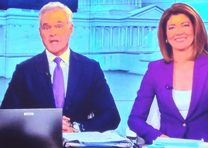
Paul is going to love the red and blue striped tie CBS’ John Dickerson is wearing tonight!
Just a reminder. The form of government in the United States is not a Democracy. It is a Constitutional Republic.
That’s one way of phrasing it. Another is that we have representative democracy (rather than direct democracy).
In common parlance, “democracy” refers to any system in which citizens exercise power by voting, and what we engage in on Election Day is participatory democracy.
There’s splitting hairs, and then there’s just being pedantic. Let’s please move on. Thanks.
Reds missed the boat not featuring the 70’s and 80’s road greys. What about a 1975 game six throwback. Those unis were sweet.
Found it interesting that they gave most of the mannequins Nike undershirts with the visible swoosh. On the one hand, that does give a better sense of what the unis will look like on the field, but a tad disappointing that Nike gets to further steal the spotlight from Majestic on a day meant to celebrate the unveiling of new Majestic uniforms.
Seems to me that the day was meant to celebrate the unveiling of new Cincinnati Reds uniforms, Cork.
Touché. All the more reason to just leave off the undershirts on this day instead of promoting Nike on a day they had nothing to do with.
As I’ve been writing for nearly 20 years now, I wish no uniform element had any maker’s mark. But the reality is that the jerseys, caps, and undershirts all do have the marks. So that’s what they put on the mannequins. I fail to see how that amounts to “promoting Nike” any more than promoting New Era or Majestic.
Is it just me or does the new Marlins logo “M” look like a reverse of the Brewers logo “M”? I know the Marlins logo has a point in the middle of the “M” and the Brewers have a cut off in the middle of the “M”, but it’s not much different except for the colors, the Marlin on Miami’s hat, and the barley sprig on Milwaukee’s hat.